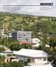
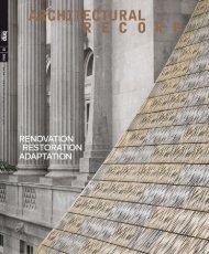
Architect 2014-02.pdf

You also want an ePaper? Increase the reach of your titles
YUMPU automatically turns print PDFs into web optimized ePapers that Google loves.
AIAfuture<br />
about-faCe |<br />
Creating a type for arChitype<br />
37<br />
“What’s in a name?” Juliet famously<br />
asked. Pose that question to the<br />
graphic designers at the design firm<br />
Pentagram and the answer would be:<br />
a lot.<br />
With the help of Pentagram, the<br />
American Institute of <strong>Architect</strong>s<br />
commissioned a new typeface called<br />
Architype for the <strong>2014</strong> AIA National<br />
Convention in Chicago (June 26-28).<br />
Architype is the AIA’s first proprietary<br />
typeface in its 156-year history, and it<br />
will be a key element in the promotion<br />
and branding of this year’s meeting,<br />
“Design with Purpose.”<br />
The decision to design an original<br />
typeface for the convention came<br />
about when Pentagram was hired<br />
to help streamline communications<br />
strategies for the Institute. In<br />
considering the breadth of written<br />
material coming out of the AIA,<br />
the designers had a thought: What<br />
about creating a typeface unique<br />
to the organization for its signature<br />
conference?<br />
“We felt simply doing a logo would<br />
seem like a feeble thing for all of the<br />
communication that AIA does,” says<br />
Michael Bierut, a partner at Pentagram,<br />
which has offices in New York, San<br />
Francisco, London, Berlin, and Austin,<br />
Texas. “We wanted it to be more<br />
fundamental.”<br />
Bierut points to the efficacy of a<br />
recognizable typeface in solidifying<br />
an organization’s identity. Think, for<br />
instance, of the immediate recognition<br />
that comes with the looping swirl of<br />
the Coca-Cola font. “Just as a person’s<br />
voice is associated with his or her<br />
personality, the typographic language<br />
becomes a part of an organization’s<br />
‘voice,’ ” he says. “It’s a fundamental<br />
building block, and if you do it right<br />
and implement it consistently, you can get immediate proprietary<br />
acknowledgement simply by writing ‘hello.’ ”<br />
Designing a Hybrid<br />
Until recently, designing an original typeface had been a laborious<br />
process—a complex industrial endeavor requiring tedious tweaks in<br />
both the form of individual letters and in the way those letters related<br />
to each other, punctuation marks, and the construction of special<br />
symbols. Today, technological advances have made type design a<br />
swifter task, but they do not alleviate the great skill and deliberation<br />
required for creating successful letterforms.<br />
Great care went into crafting Architype. First, the designers<br />
considered whether the font would be<br />
serif—including those little lines at the<br />
ends of letters—or sans serif, which is<br />
a cleaner approach. “Sans serif has a<br />
neutrality that has the broadest range<br />
of interpretations and inclusivity,”<br />
Bierut says. “It seems appropriate to<br />
architecture in the 21st century.”<br />
Pentagram designer Hamish<br />
Smyth, who worked with Bierut, says<br />
the team then chose to craft Architype<br />
from a hybrid of two existing fonts.<br />
The first was the classic 19th-century<br />
typeface Akzidenz-Grotesk, the<br />
mother of all sans-serif fonts that we<br />
know today, including the popular<br />
Helvetica currently used by the<br />
AIA. The second, Trade Gothic, was<br />
designed in 1948 and reads as very<br />
“classic American,” Smyth says.<br />
“We took parts of each of those,<br />
and that formed the basis of the<br />
characters,” Smyth says.<br />
Next, Pentagram engaged a graphic<br />
designer specializing in typefaces<br />
to finesse the letter and number<br />
characters, and ensure that they all<br />
worked together as a whole.<br />
The result is a font that is clean<br />
and contemporary—one that won’t<br />
compete with images of architecture—<br />
but that also has distinguishing<br />
characteristics unique to the AIA. Take<br />
the letter “I” for instance.<br />
“What’s interesting about the ‘I,’<br />
which sits in the middle of the AIA<br />
monogram, is that it suggests a Doric<br />
column,” Bierut says. “We thought,<br />
‘What if we made a typeface that was<br />
sans serif, but it had a Doric-column<br />
style with the letter “I”? ’ ”<br />
That special design element carries<br />
through in other horizontal elements,<br />
such as the letter “E,” and it makes<br />
Architype a rare breed font: one that’s<br />
conventional except for a few moments of distinctive stylization.<br />
Once the print version of the font was completed in November<br />
2013, the team went to work on the digital iteration. Here they<br />
worried about pixels and “hinting,” which is the way that different<br />
operating systems—think Microsoft versus Apple—render fonts.<br />
“There is manual work that you have to do to ‘hint’ the fonts and help<br />
make them appear on screen as we intend them to appear in print,”<br />
Smyth says.<br />
Architype will make its premiere in the marketing for AIA’s annual<br />
convention in Chicago, where the font will serve as the foundation for<br />
the convention’s logo and branding. Look for it in the convention hall<br />
and on collateral materials. —Elizabeth Evitts Dickinson aia<br />
february <strong>2014</strong>