Make no LittLe pLans. aia Convention <strong>2014</strong>: June 26-28, Chicago To register online visit aia.org/convention
AIAfuture about-faCe | Creating a type for arChitype 37 “What’s in a name?” Juliet famously asked. Pose that question to the graphic designers at the design firm Pentagram and the answer would be: a lot. With the help of Pentagram, the American Institute of <strong>Architect</strong>s commissioned a new typeface called Architype for the <strong>2014</strong> AIA National Convention in Chicago (June 26-28). Architype is the AIA’s first proprietary typeface in its 156-year history, and it will be a key element in the promotion and branding of this year’s meeting, “Design with Purpose.” The decision to design an original typeface for the convention came about when Pentagram was hired to help streamline communications strategies for the Institute. In considering the breadth of written material coming out of the AIA, the designers had a thought: What about creating a typeface unique to the organization for its signature conference? “We felt simply doing a logo would seem like a feeble thing for all of the communication that AIA does,” says Michael Bierut, a partner at Pentagram, which has offices in New York, San Francisco, London, Berlin, and Austin, Texas. “We wanted it to be more fundamental.” Bierut points to the efficacy of a recognizable typeface in solidifying an organization’s identity. Think, for instance, of the immediate recognition that comes with the looping swirl of the Coca-Cola font. “Just as a person’s voice is associated with his or her personality, the typographic language becomes a part of an organization’s ‘voice,’ ” he says. “It’s a fundamental building block, and if you do it right and implement it consistently, you can get immediate proprietary acknowledgement simply by writing ‘hello.’ ” Designing a Hybrid Until recently, designing an original typeface had been a laborious process—a complex industrial endeavor requiring tedious tweaks in both the form of individual letters and in the way those letters related to each other, punctuation marks, and the construction of special symbols. Today, technological advances have made type design a swifter task, but they do not alleviate the great skill and deliberation required for creating successful letterforms. Great care went into crafting Architype. First, the designers considered whether the font would be serif—including those little lines at the ends of letters—or sans serif, which is a cleaner approach. “Sans serif has a neutrality that has the broadest range of interpretations and inclusivity,” Bierut says. “It seems appropriate to architecture in the 21st century.” Pentagram designer Hamish Smyth, who worked with Bierut, says the team then chose to craft Architype from a hybrid of two existing fonts. The first was the classic 19th-century typeface Akzidenz-Grotesk, the mother of all sans-serif fonts that we know today, including the popular Helvetica currently used by the AIA. The second, Trade Gothic, was designed in 1948 and reads as very “classic American,” Smyth says. “We took parts of each of those, and that formed the basis of the characters,” Smyth says. Next, Pentagram engaged a graphic designer specializing in typefaces to finesse the letter and number characters, and ensure that they all worked together as a whole. The result is a font that is clean and contemporary—one that won’t compete with images of architecture— but that also has distinguishing characteristics unique to the AIA. Take the letter “I” for instance. “What’s interesting about the ‘I,’ which sits in the middle of the AIA monogram, is that it suggests a Doric column,” Bierut says. “We thought, ‘What if we made a typeface that was sans serif, but it had a Doric-column style with the letter “I”? ’ ” That special design element carries through in other horizontal elements, such as the letter “E,” and it makes Architype a rare breed font: one that’s conventional except for a few moments of distinctive stylization. Once the print version of the font was completed in November 2013, the team went to work on the digital iteration. Here they worried about pixels and “hinting,” which is the way that different operating systems—think Microsoft versus Apple—render fonts. “There is manual work that you have to do to ‘hint’ the fonts and help make them appear on screen as we intend them to appear in print,” Smyth says. Architype will make its premiere in the marketing for AIA’s annual convention in Chicago, where the font will serve as the foundation for the convention’s logo and branding. Look for it in the convention hall and on collateral materials. —Elizabeth Evitts Dickinson aia february <strong>2014</strong>
- Page 1 and 2: Oh, MoMA 22 Skylab, Beyond Twilight
- Page 3: ZIP it tight. Protect your projects
- Page 6 and 7: 4 ARCHITECT the AiA mAgAzine FEbRuA
- Page 8 and 9: 6 02.14 ARCHITECT the AiA mAgAzine
- Page 10 and 11: contact Want to get in touch with a
- Page 12 and 13: STAR TRACK THE MAGAZINE OF THE AMER
- Page 14 and 15: ASTOR TURF THE MAGAZINE OF THE AMER
- Page 16 and 17: 14 DIALOGUE ARCHITECT the AiA mAgAz
- Page 18: 16 ARCHITECT the AiA mAgAzine FebrU
- Page 22 and 23: TOGETHER EQUALS AS WELL AS MORE THI
- Page 24 and 25: Belden delivers more. Ambassador -
- Page 26 and 27: 22 FRONT ARCHITECT THE AIA MAGAZINE
- Page 28 and 29: 24 front ARCHITECT the AiA mAgAzine
- Page 30 and 31: 26 front ARCHITECT the AiA mAgAzine
- Page 32 and 33: 28 front ARCHITECT the AiA mAgAzine
- Page 34 and 35: 30 front ARCHITECT the AiA mAgAzine
- Page 36 and 37: Meet the new addition to our line S
- Page 38 and 39: We built a better way to access AIA
- Page 42 and 43: 38 february 2014 Brand Architecture
- Page 44 and 45: 40 AIAperspective Silver, Gold, or
- Page 46: JUST BECAUSE IT WORKS, DOESN’T ME
- Page 49 and 50: Products 45 ARCHITECT February 2014
- Page 51 and 52: The name that built an industry X X
- Page 53 and 54: WOOD MEETS CODE Explore opportuniti
- Page 55 and 56: CREATING ENVIRONMENTS WHERE PEOPLE
- Page 58 and 59: 54 Products ARCHITECT the AiA mAgAz
- Page 60 and 61: Fueled by passion. Designed with po
- Page 62 and 63: 58 center ARCHITECT the AiA mAgAzin
- Page 64 and 65: 60 center ARCHITECT the AiA mAgAzin
- Page 66 and 67: Center Wagner Architectural special
- Page 68 and 69: 64 CENTER ARCHITECT THE AIA MAGAZIN
- Page 70 and 71: 66 CENTER ARCHITECT THE AIA MAGAZIN
- Page 72 and 73: 68 center In brooklyn, a modular ap
- Page 74 and 75: 70 CENTER ARCHITECT THE AIA MAGAZIN
- Page 76 and 77: Impressive design meets premium dur
- Page 78 and 79: 74 center ARCHITECT the AiA mAgAzin
- Page 80 and 81: 76 CENTER ARCHITECT THE AIA MAGAZIN
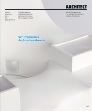
- Page 83 and 84: 79 The 61st Annual Progressive Arch
- Page 85: 81 Tianjin EcoCity Ecology and Plan
- Page 89: 85 View of the model from the south
- Page 93 and 94:
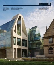
Courtesy Allied Works ArChiteCture
- Page 95 and 96:
View from the south, showing an ove
- Page 97 and 98:
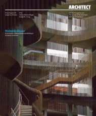
93 Façade Module diagrams ARCHITEC
- Page 99 and 100:
95 East-west section showing the ce
- Page 101 and 102:
97 Olivier BlOuin Soccer Centre at
- Page 103 and 104:
99 Courtesy Diller sCofiDio + renfr
- Page 105 and 106:
Top: CourTesy XefiroTarCh; BoTTom:
- Page 107 and 108:
The World’s Finest Water Features
- Page 109:
esidential 105 Tree House London-ba
- Page 113 and 114:
NEW from W. R. MEADOWS, INC. AIR-SH
- Page 115 and 116:
1MRV4039_Arch_Challenge_Submission_
- Page 117 and 118:
Tree House, page 105 Project Tree H
- Page 119:
A Barrier to Fire. Not Inspiration.
- Page 122 and 123:
Resource SPECIAL ADVERTISING SECTIO
- Page 124 and 125:
120 past progressives ARCHITECT the
- Page 126:
CEILING SYSTEMS Between us, ideas b