

Complete issue 27:2 as one pdf - TUG
Complete issue 27:2 as one pdf - TUG
Complete issue 27:2 as one pdf - TUG

Create successful ePaper yourself
Turn your PDF publications into a flip-book with our unique Google optimized e-Paper software.
The Communications of the TEX Users Group<br />
Volume <strong>27</strong>, Number 2, 2006<br />
<strong>TUG</strong> 2006 Conference Proceedings
TEX Users Group<br />
<strong>TUG</strong>boat (ISSN 0896-3207) is published by the<br />
TEX Users Group.<br />
Memberships and Subscriptions<br />
2006 dues for individual members are <strong>as</strong> follows:<br />
Ordinary members: $85.<br />
Students/Seniors: $45.<br />
The discounted rate of $45 is also available to<br />
citizens of countries with modest economies, <strong>as</strong><br />
detailed on our web site.<br />
Membership in the TEX Users Group is for the<br />
calendar year, and includes all <strong>issue</strong>s of <strong>TUG</strong>boat<br />
for the year in which membership begins or is<br />
renewed, <strong>as</strong> well <strong>as</strong> software distributions and other<br />
benefits. Individual membership is open only to<br />
named individuals, and carries with it such rights<br />
and responsibilities <strong>as</strong> voting in <strong>TUG</strong> elections. For<br />
membership information, visit the <strong>TUG</strong> web site.<br />
Also, (non-voting) <strong>TUG</strong>boat subscriptions are<br />
available to organizations and others wishing to<br />
receive <strong>TUG</strong>boat in a name other than that of an<br />
individual. The subscription rate is $95 per year,<br />
including air mail delivery.<br />
Institutional Membership<br />
Institutional membership is a means of showing<br />
continuing interest in and support for both TEX<br />
and the TEX Users Group, <strong>as</strong> well <strong>as</strong> providing<br />
a discounted group rate and other benefits. For<br />
further information, contact the <strong>TUG</strong> office or see<br />
our web site.<br />
TEX is a trademark of the American Mathematical<br />
Society.<br />
Copyright c○ 2006 TEX Users Group.<br />
Copyright to individual articles within this publication<br />
remains with their authors, and may not be reproduced,<br />
distributed or translated without their permission.<br />
For the editorial and other material not <strong>as</strong>cribed to<br />
a particular author, permission is granted to make and<br />
distribute verbatim copies without royalty, in any medium,<br />
provided the copyright notice and this permission notice are<br />
preserved.<br />
Permission is also granted to make, copy and distribute<br />
translations of such editorial material into another language,<br />
except that the TEX Users Group must approve translations<br />
of this permission notice itself. Lacking such approval, the<br />
original English permission notice must be included.<br />
Printed in U.S.A.<br />
Board of Directors<br />
Donald Knuth, Grand Wizard of TEX-arcana †<br />
Karl Berry, President ∗<br />
Kaja Christiansen ∗ , Vice President<br />
David Walden ∗ , Tre<strong>as</strong>urer<br />
Susan DeMeritt ∗ , Secretary<br />
Barbara Beeton<br />
Jon Breitenbucher<br />
Steve Grathwohl<br />
Jim Hefferon<br />
Klaus Höppner<br />
Ross Moore<br />
Arthur Ogawa<br />
Steve Peter<br />
Cheryl Ponchin<br />
Samuel Rhoads<br />
Philip Taylor<br />
Raymond Goucher, Founding Executive Director †<br />
Hermann Zapf, Wizard of Fonts †<br />
∗ member of executive committee<br />
†<br />
honorary<br />
See http://tug.org/board.html for p<strong>as</strong>t board<br />
members.<br />
Addresses<br />
General correspondence,<br />
payments, etc.<br />
TEX Users Group<br />
P. O. Box 2311<br />
Portland, OR 97208-2311<br />
U.S.A.<br />
Delivery services,<br />
parcels, visitors<br />
TEX Users Group<br />
1466 NW Naito Parkway<br />
Suite 3141<br />
Portland, OR 97209-2820<br />
U.S.A.<br />
Teleph<strong>one</strong><br />
+1 503 223-9994<br />
Fax<br />
+1 206 203-3960<br />
Electronic Mail<br />
(Internet)<br />
General correspondence,<br />
membership, subscriptions:<br />
office@tug.org<br />
Submissions to <strong>TUG</strong>boat,<br />
letters to the Editor:<br />
<strong>TUG</strong>boat@tug.org<br />
Technical support for<br />
TEX users:<br />
support@tug.org<br />
Contact the Board<br />
of Directors:<br />
board@tug.org<br />
World Wide Web<br />
http://www.tug.org/<br />
http://www.tug.org/<strong>TUG</strong>boat/<br />
Have a suggestion? Problems not resolved?<br />
The <strong>TUG</strong> Board wants to hear from you:<br />
Ple<strong>as</strong>e email board@tug.org.<br />
[printing date: December 2006]
<strong>TUG</strong>BOAT Volume <strong>27</strong> (2006), No. 2 <strong>TUG</strong> 2006 Conference Proceedings<br />
Table of Contents (ordered by difficulty)<br />
Introductory<br />
111 Barbara Beeton / Editorial comments<br />
• typography and <strong>TUG</strong>boat news<br />
110 Karl Berry / From the President<br />
• some <strong>TUG</strong> activities and information for 2006<br />
230 Hans Hagen, Jerzy B. Ludwichowski and Volker RW Schaa / The New Font Project: TEX Gyre<br />
• enhancing the free fonts from URW et al. to support more scripts, analogous to Latin Modern<br />
Intermediate<br />
202 Claudio Beccari / LATEX2ε, pict2e and complex numbers<br />
• extending the graphics of the pict2e package via complex number manipuulation<br />
137 Mohamed Jamal Eddine Benatia, Mohamed Elyaakoubi and Azzeddine Lazrek / Arabic text justification<br />
• survey of historical methods of Arabic text justification, and a recommended algorithm<br />
213 Morten Høgholm / Page design in LATEX3<br />
• using L ATEX3 features to e<strong>as</strong>e and generalize page layout definitions<br />
147 Youssef Jabri / The Arabi system — TEX writes in Arabic and Farsi<br />
• an Arabic package for T EX needing no preprocessor, integrated with Babel<br />
228 Jonathan Kew / Unicode and multilingual typesetting with X TEX<br />
• extended abstract demonstrating Arabic typesetting with X TEX<br />
238 F. Mounayerji and M. A. Naal / Arabic font building for LATEX<br />
• outline of procedure for building Arabic fonts from scratch<br />
112 John Owens / The installation and use of OpenType fonts in LATEX<br />
• also discusses b<strong>as</strong>ics of accessing new fonts from L ATEX<br />
241 Chris Rowley / Everything we want to know about Font Resources<br />
• brief discussion and open-ended questions on modern fonts and typesetting engines<br />
181 Apostolos Syropoulos / LATEX <strong>as</strong> a tool for the typographic reproduction of ancient texts<br />
Intermediate Plus<br />
125 Alex A.J. / Typesetting Malayalam using Ω<br />
• installation and use of a new Omega package to support Malayalam<br />
154 Mustapha Eddahibi, Azzeddine Lazrek and Khalid Sami / DadTEX — A full Arabic interface<br />
• T EX-b<strong>as</strong>ed localization of documents to Arabic<br />
197 Adrian Frischauf and Paul Libbrecht / dvi2svg: Using LATEX layout on the Web<br />
• math formul<strong>as</strong> on the Web via DVI to SVG conversion<br />
159 Hossam A.H. Fahmy / AlQalam for typesetting traditional Arabic texts<br />
• enhancements to ArabT EX for Arabic, especially for typesetting the Qur’an<br />
219 Hans Hagen / MKII–MKIV<br />
• integration of LuaT EX with ConTEXt for graphics, I/O, networking, and more<br />
121 Timothy Hall / Brackets around anything<br />
• placing braces of any size and any angle for labeling within a figure<br />
234 Karel Píška / Outline font extensions for Arabic typesetting<br />
• discussion of FontForge and MetaType1 for Arabic fonts<br />
176 Zdeněk Wagner / Babel speaks Hindi<br />
• Hindi support in Babel via devnag, and Unicode vs. Velthuis transliteration<br />
119 Peter Wilson / Glisterings<br />
• empty arguments; clear to even page; capitalizing first characters<br />
Advanced<br />
167 Yannis Haralambous / Infr<strong>as</strong>tructure for high-quality Arabic typesetting<br />
• Supporting Arabic with new features in Ω2<br />
243 Jean-Michel Hufflen / Names in BibTEX and MlBibTEX<br />
• parsing names in bibliographies in a robust and extensible way<br />
187 Elena Smirnova and Stephen M. Watt / Generating TEX from mathematical content<br />
with respect to notational settings<br />
• respecting users’ wishes for T EX output of mathematical notation<br />
Contents of other TEX journals<br />
256 MAPS: Contents of <strong>issue</strong>s 33–34 (2005–06)<br />
258 ArsTEXnica: Contents of <strong>issue</strong> 1 (2006)<br />
258 Biuletyn GUST: Contents of <strong>issue</strong>s 22–23 (2005–06)<br />
Reports and notices<br />
128 <strong>TUG</strong> 2006 conference information<br />
254 Abstracts (Beeton, Bujdosó, Feuerstack, Hagen, Hoekwater, Ludwichowski, Wierda)<br />
263 Calendar<br />
264 EuroBachoTEX 2007 announcement<br />
265 Onofrio de Bari / The 3rd Annual GuIT Meeting<br />
266 Charles Goldie / UK<strong>TUG</strong> sponsors day of LATEX<br />
266 Institutional members<br />
268 TEX consulting and production services<br />
E<br />
E
<strong>TUG</strong>BOAT<br />
Volume <strong>27</strong>, Number 2 / 2006<br />
<strong>TUG</strong> 2006 Conference Proceedings<br />
General Delivery 110 Karl Berry / From the president<br />
111 Barbara Beeton / Editorial comments<br />
<strong>TUG</strong> 2006; Chuck Bigelow goes to RIT;<br />
DEK in the news again;<br />
Corrigendum: <strong>TUG</strong>boat 21:2;<br />
Out-of-copyright books on the Web;<br />
Fonts 112 John Owens / The installation and use of OpenType fonts in LATEX<br />
Hints & Tricks 119 Peter Wilson / Glisterings: Address lists, animated books<br />
121 Timothy Hall / Brackets around anything<br />
Omega 125 Alex A.J. / Typesetting Malayalam using Ω<br />
<strong>TUG</strong> 2006 1<strong>27</strong> Conference program, delegates, and sponsors<br />
131 Taco Hoekwater / <strong>TUG</strong> 2006 report<br />
Multilingual<br />
Document<br />
Processing<br />
137 Mohamed Jamal Eddine Benatia, Mohamed Elyaakoubi and Azzeddine Lazrek /<br />
Arabic text justification<br />
147 Youssef Jabri / The Arabi system — TEX writes in Arabic and Farsi<br />
159 Hossam A.H. Fahmy / AlQalam for typesetting traditional Arabic texts<br />
154 Mustapha Eddahibi, Azzeddine Lazrek and Khalid Sami / DadTEX — A full Arabic interface<br />
167 Yannis Haralambous / Infr<strong>as</strong>tructure for high-quality Arabic typesetting<br />
176 Zdeněk Wagner / Babel speaks Hindi<br />
Philology 181 Apostolos Syropoulos / LATEX <strong>as</strong> a tool for the typographic reproduction of ancient texts<br />
Electronic<br />
Documents<br />
187 Elena Smirnova and Stephen M. Watt / Generating TEX from mathematical content<br />
with respect to notational settings<br />
197 Adrian Frischauf and Paul Libbrecht / DVI2SVG: Using LATEX layout on the Web<br />
LATEX 202 Claudio Beccari / LATEX2ε, pict2e and complex numbers<br />
213 Morten Høgholm / Page design in LATEX3<br />
Software & Tools 219 Hans Hagen / MKII–MKIV<br />
228 Jonathan Kew / Unicode and multilingual typesetting with X<br />
Fonts 230 Hans Hagen, Jerzy B. Ludwichowski and Volker RW Schaa / The New Font Project:<br />
TEX Gyre<br />
234 Karel Píška / Outline font extensions for Arabic typesetting<br />
238 F. Mounayerji, M. A. Naal / Arabic font building for LATEX<br />
241 Chris Rowley / Everything we want to know about Font Resources<br />
Bibliographies 243 Jean-Michel Hufflen / Names in BIBTEX and mlBIBTEX<br />
Abstracts 254 Abstracts (Beeton, Bujdosó, Feuerstack, Hagen, Hoekwater, Ludwichowski, Wierda)<br />
E<br />
TEX<br />
256 MAPS: Contents of <strong>issue</strong>s 33–34 (2005–06)<br />
258 ArsTEXnica: Contents of <strong>issue</strong> 1 (2006)<br />
258 Biuletyn GUST : Contents of <strong>issue</strong>s 22–23 (2005–06)<br />
News 263 Calendar<br />
264 EuroBachoTEX 2007 announcement<br />
265 Onofrio de Bari / The 3rd Annual GuIT Meeting<br />
266 Charles Goldie / UK<strong>TUG</strong> sponsors day of LATEX<br />
<strong>TUG</strong> Business 266 Institutional members<br />
267 <strong>TUG</strong> membership form<br />
Advertisements 268 TEX consulting and production services
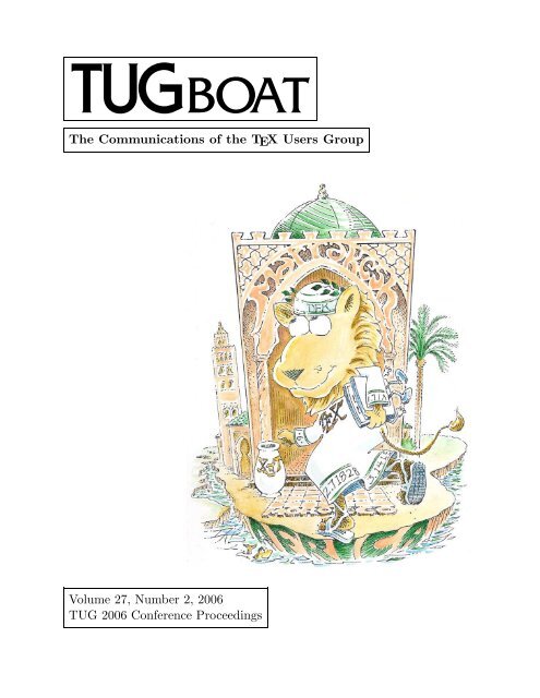
<strong>TUG</strong> 2006 Proceedings<br />
Marrakesh, Morocco<br />
November 9–11, 2006<br />
COMMUNICATIONS OF THE TEX USERS GROUP<br />
<strong>TUG</strong>BOAT EDITOR<br />
PROCEEDINGS EDITORS<br />
BARBARA BEETON<br />
AZZEDDINE LAZREK<br />
KARL BERRY<br />
VOLUME <strong>27</strong>, NUMBER 2 • 2006<br />
PORTLAND • OREGON • U.S.A.
110 <strong>TUG</strong>boat, Volume <strong>27</strong> (2006), No. 2<br />
General Delivery<br />
From the President<br />
Karl Berry<br />
As I write this at the end of November 2006, perhaps<br />
the largest outstanding project is the next edition of<br />
TEX Live; work is ongoing, and we hope it will be<br />
completed by the end of the year. If you can help<br />
build, document, test, or <strong>as</strong>sist in any other area,<br />
ple<strong>as</strong>e see http://tug.org/texlive. Meanwhile,<br />
other recent news follows.<br />
The Utopia fonts freely available (again)<br />
As old-timers may recall, Adobe made the Utopia<br />
font family freely available many years ago. Unfortunately,<br />
the precise wording of the original license<br />
w<strong>as</strong> ambiguous <strong>as</strong> to whether modified versions<br />
could be redistributed. I am happy to report<br />
that Adobe h<strong>as</strong> now clarified the wording in<br />
a slightly revised agreement with <strong>TUG</strong>; the fonts<br />
were always intended to be free (<strong>as</strong> in freedom).<br />
So Utopia will reappear in the next edition of TEX<br />
Live, and are already included in current MiKTEX<br />
and gwTEX updates. The Utopia family h<strong>as</strong> been<br />
extended by several other packages, such <strong>as</strong> vnTEX<br />
and fourier-GUT, so this is especially welcome news.<br />
Major thanks go to Terry O’Donnell at Adobe<br />
for having the patience to shepherd this through the<br />
management there. The specific wording and other<br />
details, <strong>as</strong> well <strong>as</strong> the fonts themselves (which are entirely<br />
unchanged from the original rele<strong>as</strong>e), are available<br />
at http://tug.org/fonts/utopia, and from<br />
CTAN in fonts/utopia.<br />
Colorado State University grant<br />
Another bit of good news: Colorado State University<br />
h<strong>as</strong> awarded a grant of over $40,000 for a new<br />
incarnation of <strong>pdf</strong>TEX, which will include support<br />
for Arabic typesetting and OpenType <strong>as</strong> well <strong>as</strong> the<br />
Lua embedded language.<br />
The implementation effort is being led by Taco<br />
Hoekwater, in conjunction with the MetaPost and<br />
<strong>pdf</strong>TEX teams. Professor Idris Samawi Hamid of<br />
CSU (Philosophy Department) w<strong>as</strong> the instigator of<br />
the grant, and we thank Dr. Hamid and his institution.<br />
Ple<strong>as</strong>e find more information in a separate<br />
editorial in this <strong>issue</strong>, and in the previous <strong>issue</strong> of<br />
<strong>TUG</strong>boat. Taco’s recent installment in the Interview<br />
Corner feature of the <strong>TUG</strong> web site, http://<br />
tug.org/interviews includes an overview of these<br />
projects.<br />
Further <strong>TUG</strong> joint memberships<br />
<strong>TUG</strong> now offers joint memberships with DANTE e.V.<br />
and DK-<strong>TUG</strong>; thanks to their respective memberships<br />
for supporting this, and to Klaus Höppner and<br />
Kaja Christiansen for leading the respective efforts.<br />
These new joint memberships are essentially the<br />
same <strong>as</strong> the agreements with NTG and UK-<strong>TUG</strong><br />
which go back many years. Links to the joint membership<br />
pages are at http://tug.org/join.html.<br />
We are very happy in general to be part of a new<br />
level of co-operation among all the TEX user groups.<br />
We have been working closely together both administratively,<br />
on conference planning and publications<br />
<strong>as</strong> well <strong>as</strong> these joint memberships, and technically,<br />
with the large TEX Collection rele<strong>as</strong>es, the TEX Gyre<br />
font (see the article by Hans Hagen et al. elsewhere<br />
in this <strong>issue</strong>), and other projects.<br />
Board addition and election<br />
Finally, I am happy to announce that Jon Breitenbucher<br />
h<strong>as</strong> joined the <strong>TUG</strong> board. Jon joins us<br />
from the College of Wooster in Ohio, where he h<strong>as</strong><br />
been working to spread TEX usage among students<br />
and staff. His report will soon be published in the<br />
Practical TEX 2006 proceedings <strong>issue</strong> of <strong>TUG</strong>boat.<br />
If you are interested in running for the <strong>TUG</strong><br />
board or president, 2007 will be a <strong>TUG</strong> election year.<br />
Nominations for these openings are now invited; the<br />
deadline to receive nominations is 1 February 2007.<br />
Ple<strong>as</strong>e see http://tug.org/election for information<br />
and forms. (Since a few people have <strong>as</strong>ked —<br />
barring unforeseen events, I expect to run for another<br />
term <strong>as</strong> president.)<br />
Thank you all for supporting TEX and <strong>TUG</strong>.<br />
⋄ Karl Berry<br />
president@tug.org
<strong>TUG</strong>boat, Volume <strong>27</strong> (2006), No. 2 111<br />
Editorial Comments<br />
Barbara Beeton<br />
<strong>TUG</strong> 2006<br />
<strong>TUG</strong> 2006 w<strong>as</strong> a great success, <strong>as</strong> you can read from<br />
Taco’s report later in this <strong>issue</strong>. Marrakesh w<strong>as</strong> a<br />
whole new experience for me, my first visit to the<br />
African continent; the sounds and smells were, in<br />
varying degrees, familiar (I’m always willing to try<br />
a new cuisine, and am a long-time devotee of international<br />
folk music), but the sights were new, and<br />
certainly so were the customs. I w<strong>as</strong>n’t really prepared<br />
for such a garden spot in the middle of what<br />
I expected to be semi-desert.<br />
I brought home many memories — and a determination<br />
to learn how to make mint tea. I learned<br />
that a cape I’ve owned and loved for years is indeed a<br />
genuine Tuareg garment; we saw <strong>one</strong> in the museum<br />
that w<strong>as</strong> woven to the same pattern. And I discovered,<br />
no surprise, that bargaining with merchants is<br />
something better learned when young; al<strong>as</strong>, I’m not<br />
ready to be taught that new trick.<br />
And it w<strong>as</strong> good to see so many old friends, and<br />
make some new <strong>one</strong>s <strong>as</strong> well. Although the number<br />
of participants w<strong>as</strong> not so large, the enthusi<strong>as</strong>m<br />
evoked by a spirited discussion of how to extend TEX<br />
to generate documents of superb calligraphic quality<br />
w<strong>as</strong> <strong>as</strong> high <strong>as</strong> I’ve ever encountered at a <strong>TUG</strong><br />
meeting.<br />
I’d like to extend my personal thanks publicly<br />
to Azzeddine Lazrek for his hospitality, making the<br />
experience so enjoyable for my husband and myself.<br />
Thanks, Azzeddine!<br />
Chuck Bigelow goes to RIT<br />
Charles Bigelow h<strong>as</strong> been named <strong>as</strong> the next Melbert<br />
B. Cary Professor at the Rochester Institute of<br />
Technology. This prestigious chair w<strong>as</strong> previously<br />
held by Alexander Lawson and Hermann Zapf.<br />
Chuck had been contemplating teaching again,<br />
so this opportunity came at a very auspicious time.<br />
He plans first to offer a course on the history, theory,<br />
and technology of typefaces and fonts, followed by<br />
an advanced course on newspaper typography (not<br />
only types and fonts, but also usage and the typographic<br />
image and identity of a newspaper) and<br />
later, advanced typography seminars on other topics,<br />
such <strong>as</strong> how typography contributes to the experience<br />
of super markets, chain stores, and the rest<br />
of our marketed civilization.<br />
Together with Don Knuth, Chuck established a<br />
m<strong>as</strong>ter’s program in digital typography at Stanford<br />
in 1982, and h<strong>as</strong> taught and lectured extensively.<br />
Together with Kris Holmes, he created the Lucida<br />
family, <strong>one</strong> of the first fonts that optimized typography<br />
for output on personal computers and lower<br />
resolution printers. Bigelow & Holmes are also responsible<br />
for some of the first TrueType fonts, including<br />
many of Apple’s “city” fonts.<br />
Best wishes to Chuck in his new position. And<br />
thanks to Jill Bell, who provided much of this information<br />
to the TYPO-L discussion list.<br />
DEK in the news again<br />
A delightful illustrated profile appeared in The Stanford<br />
Magazine l<strong>as</strong>t spring, recounting what Don<br />
Knuth is up to these days.<br />
Read it at http://www.stanfordalumni.org/<br />
news/magazine/2006/mayjun/features/knuth.<br />
html<br />
Corrigendum: <strong>TUG</strong>boat 21:2<br />
In an article on Thai fonts by Werner Lemberg (21:2<br />
(2000), pages 113–120), a reader fluent in Thai encountered<br />
an example that contained a serious typo.<br />
The error h<strong>as</strong> been corrected in the version posted<br />
on the <strong>TUG</strong> web site. Thanks to Werner for <strong>as</strong>sistance<br />
in patching this up.<br />
Out-of-copyright books on the Web<br />
As of the end of August, the Google Book Search<br />
makes it possible for readers to download out-ofcopyright<br />
books to be read at your own pace. The<br />
collection is diverse, including well-known cl<strong>as</strong>sics <strong>as</strong><br />
well <strong>as</strong> more obscure gems.<br />
Go to books.google.com and select the “Full<br />
view” radio button to find out what books can be<br />
downloaded. The collection continues to grow <strong>as</strong><br />
more and more of the world’s books are digitized.<br />
This site also contains many books which are<br />
still protected by copyright. These books can be<br />
searched <strong>as</strong> well, but only a few sentences surrounding<br />
your search term will be displayed, just enough<br />
to enable you to determine whether you’ve found<br />
what you’re looking for.<br />
You may also be interested in Project Gutenberg,<br />
http://www.gutenberg.org, a longstanding<br />
effort which h<strong>as</strong> made over 19,000 books with expired<br />
copyrights freely available.<br />
Happy reading.<br />
⋄ Barbara Beeton<br />
American Mathematical Society<br />
201 Charles Street<br />
Providence, RI 02904 USA<br />
bnb (at) ams dot org
112 <strong>TUG</strong>boat, Volume <strong>27</strong> (2006), No. 2<br />
Fonts<br />
The installation and use of OpenType fonts in L A TEX<br />
Abstract<br />
John D. Owens<br />
The emerging file standard in digital typography is the<br />
OpenType font standard, jointly developed by Microsoft<br />
and Adobe. OpenType fonts are natively supported by<br />
several popular operating systems and have many features<br />
and advantages that make them desirable for highquality<br />
typography. However, OpenType fonts are not<br />
natively supported by the standard TEX engine. This article<br />
is a practical guide to installing OpenType fonts for<br />
use <strong>as</strong> text fonts in L A TEX.<br />
The steps to install an OpenType font for use in L A TEX<br />
are:<br />
1. For each OpenType font file, and for each combination<br />
of attributes for that font file, generate and install<br />
font metric and encoding files.<br />
2. Next, for each font family, generate and install a font<br />
description (.fd) file that maps L A TEX font selection<br />
commands to the installed font files.<br />
3. Finally, write and install a style (.sty) file that allows<br />
the user to select the font and its options for use<br />
within TEX.<br />
We begin by discussing font background, the TEX font<br />
handling scheme, and existing font tools, then describe<br />
each of the three steps above in detail.<br />
1 Font b<strong>as</strong>ics and font families<br />
The advanced typographic features of the OpenType font<br />
format have motivated its widespread use in a variety of<br />
demanding applications. Before we dive into supporting<br />
OpenType in TEX, however, let’s take a step back and look<br />
at our eventual goal. As a TEX user, we are less interested<br />
in using just a single font with a single set of options<br />
and more interested in using a font family: a collection of<br />
compatible font variants, usually from the same typeface,<br />
that can be used together. For instance, we might want to<br />
group together a plain and an italic form of a particular<br />
typeface into a family. We might want to make small caps<br />
available in our family <strong>as</strong> well, or perhaps incorporate<br />
several different weights or optical sizes. Once we have<br />
defined our font family, we would then like to <strong>as</strong>k TEX to<br />
enable the entire family with a single command. As an example,<br />
this document is typeset in an Adobe OpenType<br />
Minion Pro font family with old-style figures, with code<br />
Editor’s note: Due to the nature of this article, it is typeset in<br />
the Adobe Minion and Adobe Myriad typefaces. We thank Adobe for<br />
permission to use these fonts in both the print and web publications.<br />
In different files Within <strong>one</strong> OpenType file<br />
weight (light, black) kerning (VAVAV vs. VAVAV)<br />
width (abc vs. abc) ligatures (fi vs. fi)<br />
optical size figure style (1234 vs. 1234)<br />
variant (e.g. italics) SMALL CAPS<br />
Table 1: Font features provided by different OpenType files (left)<br />
and within a single OpenType file (right).<br />
segments typeset in Adobe’s OpenType Myriad Pro, using<br />
the following L A TEX commands:<br />
\usepackage{minion}<br />
\usepackage[tt,sf,lining,scale=0.92]{myriad}<br />
What are the different typeface alternatives that can be<br />
part of our font family? (Gelderman provides an introduction<br />
to typeface characteristics [3].) We can group<br />
possible alternatives into several broad categories, and<br />
then indicate how OpenType handles each category.<br />
Our first four categories are weight, width, optical<br />
size, and variant. The weight of a typeface refers to the<br />
thickness of the strokes that constitute its glyphs. A font<br />
designer may also vary a typeface’s width relative to its<br />
height. The major advantage of vector font formats (such<br />
<strong>as</strong> OpenType, PostScript Type 1, and TrueType) is their<br />
ability to be scaled to any size. However, type designers<br />
have found that the most visually appealing fonts are <strong>one</strong>s<br />
that are designed for a particular size range, called an optical<br />
size. Finally, the standard upright “roman” style for<br />
fonts is not the only possible style. Font users may also<br />
desire italic or oblique or outline forms of a particular<br />
typeface, which together are termed variants. In L A TEX’s<br />
New Font Selection Scheme (NFSS), the combination of<br />
weight and width is called series and the variant is called<br />
shape; we use this terminology in Section 4.2.<br />
In OpenType, each unique combination of weight,<br />
width, optical size, and variant is <strong>as</strong>sociated with a separate<br />
font file. As an example, the Adobe Kepler typeface<br />
h<strong>as</strong> several alternatives in each of these categories.<br />
Kepler features six weights (light, regular, medium, semibold,<br />
bold, and black), each with four widths (condensed,<br />
semicondensed, regular, and extended). Most of Kepler’s<br />
combinations of weight and width feature four optical<br />
sizes (from smallest to largest, caption, regular, subhead,<br />
and display), and each weight-width-optical-size combination<br />
h<strong>as</strong> both an upright and italic variant. Thus it is little<br />
wonder that Kepler’s many combinations require 168<br />
different OpenType files. And after we catch our breath to<br />
consider all the typographical options already available to<br />
us, we dive into a single OpenType file to find still more<br />
options.<br />
In addition to the categories that require different<br />
files, the OpenType font format also allows a single font
<strong>TUG</strong>boat, Volume <strong>27</strong> (2006), No. 2 113<br />
file to specify a variety of other features. Not all of these<br />
features are currently supported in TEX, but many of them<br />
are. For instance, the kerning feature adjusts the spaces<br />
between pairs of glyphs. Enabling ligatures replaces pairs<br />
of glyphs like ‘f’ and ‘i’ with a single ‘fi’ glyph. Besides<br />
kerning and ligatures, the two cl<strong>as</strong>ses of OpenType features<br />
that we cover in this article are the choice of figure<br />
styles (for example, old-style [01234] vs. lining [01234])<br />
and SMALL CAPS.<br />
Table 1 summarizes the features provided by different<br />
OpenType files and within an OpenType file. With<br />
this overview of the many typeface alternatives that we<br />
would like to <strong>as</strong>semble into families, we can turn to how<br />
TEX interacts with fonts.<br />
2 TEX font handling<br />
In modern operating systems such <strong>as</strong> Microsoft Windows<br />
and Apple Mac OS X, applications that use Open-<br />
Type fonts can read font information directly from the<br />
OpenType file. TEX, on the other hand, stores font information<br />
in a variety of files, and the complexity of creating<br />
and installing these files is the major re<strong>as</strong>on that font handling<br />
h<strong>as</strong> traditionally been a tricky t<strong>as</strong>k in TEX.<br />
The OpenType font format can contain font data in<br />
either of two formats, Adobe PostScript Type 1 or True-<br />
Type. In this section we describe the font files that are<br />
<strong>as</strong>sociated with Type 1 and Type-1-flavored OpenType<br />
fonts. To support a Type 1 font, TEX requires the following<br />
files, each with its own function, with file locations<br />
specified by the TEX Directory Structure standard.<br />
More detailed descriptions of these formats can be found<br />
in Alan Hoenig’s TEX Unbound [5] and Chapter 7 of the<br />
second edition of The L A TEX Companion [11].<br />
TFM “TEX Font Metrics” (tfm) files describe the dimensions<br />
of each character (glyph), along with a few<br />
font-wide parameter, which together are used by<br />
TEX to perform layout.<br />
PFB For Type 1 fonts, “Printer Font Binary” (pfb) files<br />
contain Adobe PostScript Type 1 procedures that<br />
describe the shape of each glyph. These procedures<br />
are included by the output driver (for example, the<br />
dvips or <strong>pdf</strong>tex program) in the output file (for example,<br />
PostScript or PDF).<br />
VF “Virtual Font” files provide a mapping between the<br />
glyphs in the tfm files and the glyph order used by<br />
TEX (which is, in turn, specified with the encoding<br />
file, below). They are not needed for all fonts.<br />
ENC Encoding files specify an ordering of glyphs called<br />
the “font-encoding vector”. While typeset documents<br />
in English might require only the glyphs<br />
in TEX’s default “OT1” font-encoding vector (used<br />
by Computer Modern Roman, for example), other<br />
languages or scripts need more or different glyphs.<br />
In this article, we use the “LY1” encoding, an alternative<br />
to OT1 developed by Y&Y that is well-suited<br />
for Type-1-flavored fonts. (Among other advantages,<br />
the LY1 encoding maps directly to Adobe’s<br />
font encoding and thus requires no virtual fonts.)<br />
MAP Finally, the map files tie the above files together.<br />
map files (and map file formats) are specific to<br />
output drivers and <strong>as</strong>sociate tfm and Type 1 font<br />
names with pfb files, which contain the shapes of<br />
glyphs in those fonts.<br />
Only when these files have been properly installed for a<br />
particular font, and system datab<strong>as</strong>es updated, can TEX<br />
then typeset glyphs from that font in a document.<br />
Writing all these files by hand would be both tedious<br />
and error-pr<strong>one</strong>, so two excellent pieces of software have<br />
automated the font installation process.<br />
• fontinst [6], by Alan Jeffrey, Rowland McDonnell,<br />
and Lars Hellström, automates the installation of<br />
PostScript Type 1 fonts into TEX. Philipp Lehman’s<br />
font installation guide [9] is an outstanding tutorial<br />
for fontinst.<br />
However, fontinst does not offer access to Open-<br />
Type features. Also, fontinst scripts are written in<br />
TEX, and are challenging for non-experts to write<br />
and use.<br />
• Eddie Kohler’s otftotfm [8], part of his LCDF Typetools<br />
suite, creates and installs the required TEX files<br />
(tfm, pfb, vf, enc, and map) from OpenType font<br />
files. Note that otftotfm generates PostScript Type<br />
1 fonts from OpenType; ple<strong>as</strong>e ensure that the legal<br />
license for your fonts allows such a format conversion.<br />
otftotfm is a command-line tool that accepts a<br />
set of options and applies them to a single OpenType<br />
font file.<br />
Section 6 describes two tools built around otftotfm<br />
that both automate calls to otftotfm across multiple<br />
font options and also create the necessary TEX<br />
fd and sty support files.<br />
In this article, we focus on otftotfm <strong>as</strong> the underlying<br />
tool that translates OpenType fonts into a TEX-readable<br />
form. We also focus on the procedure for setting up text<br />
fonts. The setup for math fonts requires additional commands<br />
described in Chapter 7.10.7 of The L A TEX Companion<br />
[11]. The next section outlines how otftotfm installs<br />
OpenType fonts, and the remainder of the article<br />
describes how to extend otftotfm to handle multiple font<br />
files and font families and how to make the installed fonts<br />
available to TEX users.<br />
3 OpenType to TEX<br />
The first step in making OpenType fonts available to TEX<br />
users is to deposit the various font files into the TEX installation<br />
for each variant in the font family. We begin by
114 <strong>TUG</strong>boat, Volume <strong>27</strong> (2006), No. 2<br />
showing how otftotfm installs a single font, using Adobe<br />
Minion Pro’s Semibold Italic font <strong>as</strong> an example.<br />
otftotfm -a -e texnansx -fonum -fkern -fliga \<br />
MinionPro-SemiboldIt.otf \<br />
LY1-MinionPro-SemiboldIt-onum<br />
Let’s analyze this example. -a is the magic “automatic”<br />
flag, automatically installing the relevant TEX font<br />
files from Section 2 (tfm, pfb, vf, enc, and map) into their<br />
proper locations within the TEX directories. -e texnansx<br />
specifies the encoding file for the LY1 encoding. Three<br />
OpenType features (old-style numerals, kerning, and ligatures)<br />
are requested with the -f flags, and the final two<br />
arguments are the names of the OpenType input font file<br />
and the output font name. The otftotfm manual explains<br />
these options in detail, and also enumerates available<br />
OpenType features [8].<br />
Extending otftotfm to more input fonts and more<br />
variants is straightforward: simply call otftotfm for each<br />
and every combination of desired features. For complex<br />
variant combinations and fully featured font families, the<br />
number of calls to otftotfm can exceed many hundreds.<br />
The tools described in Section 6 automate this process.<br />
LCDF’s otfinfo tool [8] can identify the supported<br />
OpenType features for any OpenType font file, but which<br />
features are interesting for TEX users?<br />
• The kerning (kern) and ligature (liga) features should<br />
always be turned on if available.<br />
• OpenType fonts may support several kinds of numerals;<br />
onum (old-style numerals) and lnum (lining<br />
numerals) can both be supported in TEX and are<br />
commonly requested typographic features.<br />
• SMALL CAPS are enabled by the smcp feature.<br />
• Superior (sups) and inferior (sinf) figures are useful<br />
for footnotes, inline fractions, and scientific typesetting;<br />
sw<strong>as</strong>hes (swsh) are more DECORATIVE alternatives<br />
to standard characters.<br />
The otftotfm web page [8], in “otftotfm examples”,<br />
contains examples of more advanced OpenType features,<br />
but <strong>as</strong> we note in Section 7, more advanced features rarely<br />
have high-level support in TEX or L A TEX. In this article<br />
we concentrate on the overall installation procedure for<br />
OpenType fonts and support of more b<strong>as</strong>ic features; readers<br />
in need of more advanced features may consider the<br />
ConTEXt environment [10] or X TEX [7].<br />
After otftotfm finishes installing all font files into<br />
TEX, texh<strong>as</strong>h and updmap must be called to make TEX<br />
aware of the new installation. Now, the new fonts are<br />
available for typesetting in TEX — but how? The next section<br />
describes how to instruct TEX to use the correct font.<br />
TEX uses the “font description” file for this purpose.<br />
E<br />
4 Font description (fd) files<br />
A font description file is a TEX source file that maps installed<br />
font file names to font attributes <strong>as</strong> used in (L A )TEX.<br />
Typically, each font family is described by a single fd file.<br />
As we previously menti<strong>one</strong>d, these techniques are applicable<br />
to text fonts; math fonts require additional commands<br />
[11].<br />
Only two TEX commands are necessary in an fd file.<br />
The first declares a font family, and the second declares<br />
a specific font within that font family. We’ll look at them<br />
<strong>one</strong> at a time.<br />
4.1 \DeclareFontFamily<br />
The \DeclareFontFamily command indicates that a certain<br />
font family is available in a certain encoding scheme. The<br />
names of encoding schemes are fixed (<strong>as</strong> menti<strong>one</strong>d before,<br />
we use LY1 in this paper), but the name of the font<br />
family is arbitrary. The most well-known naming scheme<br />
is Karl Berry’s fontname scheme [1], which concatenates<br />
a unique three-letter code for each typeface with a <strong>one</strong>letter<br />
suffix that indicates the font family (Section 4.4).<br />
(This naming scheme is required when using nfssext.sty,<br />
described in the next section.)<br />
Let us continue with the Minion-Pro-with-old-stylenumerals<br />
example; Minion is abbreviated pmn, and font<br />
families <strong>as</strong>sociated with old-style numerals are designated<br />
by j (more details about what constitutes a font<br />
family are in Section 4.4). The resulting command is:<br />
\DeclareFontFamily{LY1}{pmnj}{}<br />
The third argument to \DeclareFontFamily is less often<br />
used; it can contain special options for font loading and<br />
is explained in The L A TEX Companion [11].<br />
4.2 \DeclareFontShape<br />
The \DeclareFontShape command <strong>as</strong>sociates a particular<br />
font with a particular combination of encoding, font family,<br />
series, and shape, a cl<strong>as</strong>sification which we previously<br />
discussed in Section 1. To cl<strong>as</strong>sify the particular Adobe<br />
Minion font we installed in Section 3, we invoke the following<br />
6-argument command:<br />
\DeclareFontShape{LY1}{pmnj}{sb}{it}{<br />
LY1-MinionPro-SemiboldIt-onum}{}<br />
The first four arguments are the cl<strong>as</strong>sification; the fifth<br />
argument is the font file(s) <strong>as</strong>sociated with that cl<strong>as</strong>sification;<br />
and the l<strong>as</strong>t argument is used in a similar way to<br />
the third argument of \DeclareFontFamily. This particular<br />
command <strong>as</strong>sociates the combination of LY1 encoding,<br />
Minion-with-old-style-numerals font family, semibold<br />
series (sb), and italic shape (it) with the installed<br />
font named LY1-MinionPro-SemiboldIt-onum. Note this<br />
font name is (necessarily) identical to the output name in<br />
the command we invoked in Section 3.
<strong>TUG</strong>boat, Volume <strong>27</strong> (2006), No. 2 115<br />
With only these two commands, you can specify a<br />
completely functional fd file. Three additional commands<br />
are useful, however, for a more fully featured family.<br />
Optical size variants Now, what’s the symbol before<br />
the font name (in the above \DeclareFontShape example)?<br />
It’s the size range and indicates the font sizes <strong>as</strong>sociated<br />
with that font name. is actually a special c<strong>as</strong>e<br />
of the more general notation , meaning “use this<br />
font only for point sizes greater than or equal to n and up<br />
to m”. Removal of n or m removes the bound, so indicates<br />
a match for all font sizes. With this notation, the<br />
extension to multiple font files for a particular combination<br />
at different sizes (necessary for optical size variants)<br />
is straightforward:<br />
\DeclareFontShape{LY1}{pmnj}{sb}{it}{<br />
LY1-MinionPro-SemiboldItCapt-onum<br />
LY1-MinionPro-SemiboldIt-onum<br />
LY1-MinionPro-SemiboldItSubh-onum<br />
LY1-MinionPro-SemiboldItDisp-onum}{}<br />
Font substitution What happens if you’re missing a<br />
particular variant for a font family? The sub command<br />
allows the substitution of <strong>one</strong> variant for another. For instance,<br />
few font families feature a slanted (oblique) variant,<br />
so fd files often substitute italic for slanted if slanted<br />
is requested. The following command <strong>as</strong>ks for any reference,<br />
at any size, to semibold-slanted in our font family<br />
to be satisfied instead by semibold-italic.<br />
\DeclareFontShape{LY1}{pmnj}{sb}{sl}{<br />
sub * pmnj/sb/it}{}<br />
Besides substituting italic for slanted, substituting<br />
bold for bold-extended is also common, <strong>as</strong> in the example<br />
below for the normal (n) shape.<br />
\DeclareFontShape{LY1}{pmnj}{bx}{n}{<br />
sub * pmnj/b/n}{}<br />
Scaling Finally, \DeclareFontShape permits a font to be<br />
automatically scaled through the size command,¹ which<br />
is invoked by placing the scaling factor in brackets between<br />
the size range and the filename. The example below<br />
instructs TEX to typeset Minion’s semibold italic variant<br />
at 95% of its natural size.<br />
\DeclareFontShape{LY1}{pmnj}{sb}{it}{<br />
[0.95] LY1-MinionPro-SemiboldIt-onum}{}<br />
4.3 Naming shape and series<br />
The de facto standard for the abbreviation strings <strong>as</strong>sociated<br />
with shape and series in fd files is described by L A TEX’s<br />
“New Font Selection Scheme” (NFSS) [15]. Any choice<br />
¹ This is most common when two different typefaces that do not<br />
match in size are used together in a document; in the next section we<br />
expose this capability to the document author.<br />
WEIGHT<br />
NFSS SERIES<br />
light<br />
l<br />
book<br />
m<br />
regular<br />
m<br />
medium<br />
mb<br />
demibold<br />
db<br />
semibold<br />
sb<br />
bold<br />
b<br />
black<br />
eb<br />
WIDTH<br />
NFSS SERIES<br />
condensed<br />
c<br />
narrow<br />
n<br />
semicondensed sc<br />
regular —<br />
semiextended<br />
sx<br />
extended<br />
x<br />
VARIANT<br />
NFSS SHAPE<br />
normal (upright) n<br />
italic<br />
it<br />
slanted<br />
sl<br />
oblique<br />
sl<br />
outline<br />
ol<br />
small caps<br />
sc<br />
small caps + italic si<br />
Table 2: A selection of NFSS codes for font weights, widths, and<br />
variants. From Lehman [9].<br />
for shape and series abbreviation strings, including NFSS,<br />
must work together with the font selection commands<br />
in Section 5. Philipp Lehman’s tutorial contains a fairly<br />
complete mapping between weight, width, and variant<br />
names and NFSS encodings [9]; we reproduce common<br />
encodings in Table 2.<br />
Lehman presents the following algorithms for generating<br />
the series and shape abbreviations used in \DeclareFontShape.<br />
First, the weight and width are combined<br />
to create “series”. If both weight and width are “regular”,<br />
the series is set to m; otherwise the series is set to the concatenation<br />
of the weight and width codes, ignoring “regular”<br />
if present. Creating the shape is also straightforward:<br />
if the variant is “regular”, the shape is n, otherwise the<br />
shape is the concatenation of all variant codes, with the<br />
exception of small-caps and italics. This shape is instead<br />
designated si, and font selection using si is described in<br />
Section 5.3.2.<br />
4.4 Font families<br />
Some font features do not fit into the series-shape scheme.<br />
The most common of these features is numerical figure<br />
types, which may vary <strong>as</strong> lining (1234), old-style (1234),<br />
superior (¹²³⁴), inferior (₁₂₃₄), and so on. To handle font<br />
selection with different styles of figures in TEX, typically,
116 <strong>TUG</strong>boat, Volume <strong>27</strong> (2006), No. 2<br />
each type of figures generates its own font family. To generate<br />
the name of the font family, the three-letter font designation<br />
h<strong>as</strong> a <strong>one</strong>-letter suffix appended to its 3-letter<br />
font name. Lining figures are <strong>as</strong>sociated with no suffix<br />
or with x, the “expert” suffix; old-style figures are j; superiors<br />
receive 1 and inferiors 0; and so on. Thus the Minion<br />
(pmn) font family with lining figures is pmnx; Minion<br />
with old-style figures is pmnj; and so on. Section 5.3.3<br />
shows how to perform font selection with different font<br />
families.<br />
5 Style files<br />
At this point we have installed our fonts into TEX (Section<br />
3) and categorized them by family, shape, and series<br />
(Section 4). The final step is to make those fonts available<br />
to the TEX document author <strong>as</strong> text fonts. The tools described<br />
in Section 6 automate the creation of the sty files<br />
that contain the commands in this section.<br />
5.1 Selecting a font family<br />
The default “roman” (text) font family is defined by the<br />
TEX variable \rmdefault. Redefining \rmdefault to another<br />
font family (<strong>as</strong> named by \DeclareFontFamily) resets the<br />
roman font family. For instance, the command below sets<br />
the current font family to our example font family, Adobe<br />
Minion with old-style figures.<br />
\renewcommand*{\rmdefault}{pmnj}<br />
In fact this is all we need to do to use our new font<br />
family. (Similarly, we set the default sans serif font family<br />
by setting the variable \sfdefault, and the typewriter<br />
family with \ttdefault.) However, rather than using <strong>one</strong><br />
of these commands directly in TEX files, it’s typical to instead<br />
wrap it in a style file and invoke \usepackage on<br />
that style file to perform this declaration. A minimal (but<br />
complete) style file called minion.sty for L A TEX2ε that uses<br />
the LY1 encoding follows.<br />
\NeedsTeXFormat{LaTeX2e}<br />
\ProvidesPackage{minion}[Minion Pro OSF v0.99a 9/06]<br />
\RequirePackage[LY1]{fontenc} % uses LY1 encoding<br />
\renewcommand*{\rmdefault}{pmnj}<br />
\endinput<br />
5.2 Selecting between multiple font families<br />
What if we’d like to use the same style file to support Minion<br />
font families with both old-style (pmnj) and lining<br />
(pmnx) figures? We use a package option to choose between<br />
the two font families:<br />
or<br />
\usepackage[oldstyle]{minion}<br />
\usepackage[lining]{minion}<br />
The extended style file that supports these options is:<br />
\NeedsTeXFormat{LaTeX2e}<br />
\ProvidesPackage{minion}[Minion Pro OSF v0.99b 9/06]<br />
\RequirePackage[LY1]{fontenc} % uses LY1 encoding<br />
\DeclareOption{lining}{\renewcommand*{%<br />
\rmdefault}{pmnx}}<br />
\DeclareOption{oldstyle}{\renewcommand*{%<br />
\rmdefault}{pmnj}}<br />
\ExecuteOptions{oldstyle}<br />
\ProcessOptions*<br />
\endinput<br />
5.3 Selecting font variants<br />
Now we know how to select a given font family, which<br />
may feature a large number of font weights, widths, and<br />
variants within it. Once we have selected a font family,<br />
how can we direct TEX to select from our many alternatives<br />
within that font family, such <strong>as</strong> boldface, italic,<br />
small-caps, and so on? The answer is to change the current<br />
series and shape.<br />
While the low-level TEX commands (\fontseries and<br />
\fontshape) directly change the current series and shape,<br />
L A TEX’s higher-level commands are more commonly used.<br />
Most L A TEX users know that \textbf selects boldface; L A TEX<br />
implements this internally by setting the font series to<br />
\bfdefault, which is in turn defined <strong>as</strong> bx. Similarly, \textit<br />
(italics) utilizes italics by setting the font shape to \itdefault,<br />
defined <strong>as</strong> it. And \textsc (small caps) sets the shape<br />
to \scdefault, defined <strong>as</strong> sc.<br />
We can use similar techniques to add more selection<br />
commands for more features that are not part of the<br />
L A TEX core set of commands. Philipp Lehman’s font installation<br />
guide is an excellent tutorial for this t<strong>as</strong>k [9]; it<br />
carefully constructs and explains a style file of NFSS extensions,<br />
nfssext.sty. We now take a closer look at how<br />
to support alternate weights and how nfssext.sty supports<br />
small caps with italics and switching between old-style<br />
and lining figures.<br />
5.3.1 Supporting alternate weights<br />
By default, L A TEX supports a bold (\textbf) weight command.<br />
Let’s say we feel the default bold is a little too dark,<br />
and we’d like to use semibold-condensed instead. We can<br />
accomplish this with a single line in our sty file:<br />
\renewcommand*{\bfdefault}{sbc}<br />
And now we like semibold-condensed so much, we’d like<br />
to add it <strong>as</strong> a new command, \textsb.<br />
\newcommand\sbdefault{sbc}<br />
\DeclareRobustCommand\sbseries<br />
{\not@math@alphabet\sbseries\mathsb<br />
\fontseries\sbdefault\selectfont}<br />
\DeclareTextFontCommand{\textsb}{\sbseries}<br />
For simple features, declaring a default value, a Robust-<br />
Command, and a TextFontCommand suffice to make the<br />
feature available within TEX.
<strong>TUG</strong>boat, Volume <strong>27</strong> (2006), No. 2 117<br />
5.3.2 Supporting small caps with italics<br />
Lehman points out that italics and small caps are both<br />
in the same “variant” category, so the built-in \textit and<br />
\textsc commands do not work harmoniously together.<br />
Barring changes to the core L A TEX font selection primitives,<br />
text set to both italic and small-caps would only<br />
preserve the innermost setting.<br />
nfssext.sty remedies this problem by declaring an si<br />
shape, analogous to it and sc, and its <strong>as</strong>sociated selection<br />
commands:<br />
\newcommand*{\sidefault}{si}<br />
\DeclareRobustCommand{\sishape}{%<br />
\not@math@alphabet\sishape\relax<br />
\fontshape\sidefault\selectfont}<br />
It then changes the italic and small-caps commands to<br />
check the current shape before setting the new shape.<br />
Only if the current shape is italic and the new shape is<br />
small-caps, or vice versa, does it set the new shape to si.<br />
(Recall that we <strong>as</strong>signed the si code to small-caps + italic<br />
variants in Section 4.3.)<br />
THE RESULT is properly NESTED small-cap, italic text.<br />
{\textsc{The \textit{result}} is \textit{properly<br />
\textsc{nested}} small-cap, italic text.<br />
5.3.3 Supporting old-style and lining figures<br />
Section 5.2 showed how to choose old-style or lining figures<br />
by default. However, it may be useful to have <strong>one</strong><br />
<strong>as</strong> the default and use the other via an explicit command.<br />
In nfssext.sty, the new commands \textos selects old-style<br />
figures and \textln lining figures. In this article, for instance,<br />
old-style is the default, so 1234\textln{1234} results<br />
in 12341234.<br />
Because each style of figures is <strong>as</strong>sociated with a different<br />
font family, using an alternate figure style requires<br />
changing the family. nfssext.sty accomplishes this t<strong>as</strong>k <strong>as</strong><br />
follows. Switching to lining figures for the font named<br />
abc first tries font family abcx then font family abc, using<br />
the TEX primitive \selectfont; switching to old-style figures<br />
switches to font family abcj. Fortunately this complexity<br />
is all hidden inside nfssext.sty.<br />
6 Tools<br />
For any OpenType font installation into TEX, the vital tool<br />
is otftotfm [8]. However, otftotfm only installs from a single<br />
OpenType font file with a single set of options, while<br />
users typically would like to install an entire family of<br />
OpenType font files with all available options. In addition,<br />
otftotfm does not address the problem of creating fd<br />
or sty files.<br />
To address these <strong>issue</strong>s, Marc Penninga wrote autoinst<br />
[13] and John Owens wrote otfinst [12], both of<br />
which wrap around otftotfm to install entire TEX font<br />
families. The two tools have far more similarities than<br />
differences and should suffice for most users; the authors’<br />
use of Perl (autoinst) or Python (otfinst) may make<br />
the difference for programmers familiar with <strong>one</strong> or the<br />
other.<br />
Among the features supported by both tools are:<br />
• A command-line interface that takes <strong>one</strong> or more<br />
OpenType font files <strong>as</strong> arguments;<br />
• Installation of font families with the following features<br />
if present: roman and italic text; small-caps;<br />
lining, old-style, superior, and inferior figures; and<br />
sw<strong>as</strong>hes;<br />
• nfssext.sty font selection commands;<br />
• Support of optical sizes; and<br />
• Auto-generation and installation of sty and fd files.<br />
Some of the differences are that autoinst also supports<br />
numerators, denominators, upright sw<strong>as</strong>h, and titling<br />
text, and generates ornaments, while otfinst supports<br />
a scaling option at runtime. otfinst uses fontname<br />
naming, while autoinst is more verbose in its naming<br />
scheme. Finally, otfinst uses the metadata <strong>as</strong>sociated with<br />
each OpenType font to determine the font’s characteristics,<br />
while autoinst extracts the characteristics from the<br />
font’s filename.<br />
6.1 Other tools<br />
Geoffrey W<strong>as</strong>hburn’s otftofd [16] automates the process<br />
of creating fd files from OpenType fonts. W<strong>as</strong>hburn indicates<br />
that it, like autoinst, is designed primarily for Adobe<br />
font conventions. otftofd is a shell script written in the<br />
Caml Shell and uses otftotfm.<br />
The MinionPro TEX package [2] provides extensive<br />
TEX support files for Adobe Minion, including comprehensive<br />
options for figure types, encodings, ornaments,<br />
letterspaced small caps, and calligraphic, math, blackboard,<br />
and Greek fonts. The MinionPro distribution w<strong>as</strong><br />
built using otftotfm and thus contains all TEX support<br />
files without the need for the steps described in this article.<br />
MinionPro includes a package called fontaxes that<br />
extends (and partially replaces) NFSS’s rigid cl<strong>as</strong>sification<br />
of font attributes.<br />
7 Conclusions<br />
This article h<strong>as</strong> described the steps necessary to use Open-<br />
Type fonts in TEX: use otftotfm to install TEX font metric<br />
and encoding files; build a font description file for each<br />
font family; and build a style file for convenient font selection<br />
in a document.<br />
OpenType handling in TEX is still far from ideal,<br />
however. Systems like X TEX [7] use OpenType fonts natively<br />
with truly impressive results, and native OpenType<br />
support is slated for future versions of <strong>pdf</strong>tex [4]. However,<br />
equally important are the other comp<strong>one</strong>nts of TEX<br />
that relate to font selection and invocation.<br />
E
118 <strong>TUG</strong>boat, Volume <strong>27</strong> (2006), No. 2<br />
• NFSS is insufficient to elegantly describe the wide<br />
variety of available font attributes. The combination<br />
of weight and width into series is awkward, multiple<br />
variants may combine into a single shape, and<br />
features such <strong>as</strong> figure styles are not covered at all.<br />
The ideal font selection scheme not only includes<br />
all variants of a typeface but also allows simple, orthogonal<br />
selection of any set of typeface features,<br />
and transparent substitution when features are not<br />
present. New, flexible approaches such <strong>as</strong> fontspec<br />
in X TEX [14] and MinionPro’s fontaxes are encouraging<br />
steps toward such a scheme.<br />
E<br />
• Even within NFSS the codes are not standardized.<br />
Lehman’s scheme appears to be widely used, however,<br />
which is encouraging.<br />
• Even for simple features, font selection is wholly<br />
nonstandardized and non-orthogonal. Selection of<br />
alternate widths is not possible without low-level<br />
commands, the default italic and small caps commands<br />
do not work together because L A TEX’s default<br />
handling of the “variant” category does not address<br />
multiple variants, and using non-standard but desirable<br />
selection commands such <strong>as</strong> \textln in shared<br />
files is discouraged because a default TEX installation<br />
does not support them.<br />
• Finally, while many advanced OpenType features<br />
can be supported in TEX’s font files, invoking those<br />
features with high-level commands is a much more<br />
troublesome t<strong>as</strong>k. For most features beyond the b<strong>as</strong>ic<br />
<strong>one</strong>s, TEX and L A TEX have no standardized support<br />
at the author level (or, in many c<strong>as</strong>es, no support<br />
at all). Features like ornaments, contextual alternates,<br />
and discretionary ligatures would benefit<br />
from a discussion about how they can be invoked by<br />
the programmer in a standard way.<br />
Acknowledgements Many thanks to Karl Berry for encouraging<br />
me to write this article and for his helpful<br />
suggestions along the way. Eddie Kohler’s tools greatly<br />
e<strong>as</strong>e the t<strong>as</strong>k of OpenType support in TEX, and I also<br />
thank Eddie for his prompt and thorough answers to my<br />
many questions about his tools. Karl Berry and Philipp<br />
Lehman were both quite helpful in understanding fontname<br />
and how it’s used within the TEX world. The use<br />
of Philipp’s nfssext.sty w<strong>as</strong> vital in the development of<br />
otfinst. Thom<strong>as</strong> Phinney, Geraldine Wade, and Michael<br />
Duggan provided fonts for testing, and Thom<strong>as</strong> secured<br />
permission to use Adobe fonts for the article itself. Finally,<br />
thanks also to Nelson Beebe, Stephen Hartke, Oleg<br />
Katsitadze, Eddie Kohler, Marc Penninga, Will Robertson,<br />
and Michael Zedler for their thoughtful comments<br />
on the article during the review process.<br />
References<br />
[1] Karl Berry. Filenames for fonts. <strong>TUG</strong>boat,<br />
11(4):517–520, November 1990.<br />
http://www.tug.org/fontname.<br />
[2] Achim Blumensath, Andre<strong>as</strong> Bühmann, and<br />
Michael Zedler. MinionPro, September 2005.<br />
http://www.ctan.org/tex-archive/fonts/minionpro/.<br />
[3] Maarten Gelderman. A short introduction to<br />
font characteristics. <strong>TUG</strong>boat, 20(2):96–104, June<br />
1999.<br />
[4] Taco Hoekwater. Opening up the type. <strong>TUG</strong>boat,<br />
<strong>27</strong>(1):16–17, 2006.<br />
[5] Alan Hoenig. TEX Unbound. Oxford University<br />
Press, New York, NY, 1998.<br />
[6] Alan Jeffrey, Rowland McDonnell, and Lars<br />
Hellström. fontinst: Font installation software for<br />
TEX, December 2004.<br />
http://www.tug.org/applications/fontinst/.<br />
[7] Jonathan Kew. The X TEX typesetting system,<br />
2006. http://scripts.sil.org/xetex.<br />
[8] Eddie Kohler. LCDF type software, 2006.<br />
http://www.lcdf.org/type/.<br />
[9] Philipp Lehman. The font installation guide,<br />
December 2004. http://www.ctan.org/tex-archive/<br />
info/Type1fonts/fontinstallationguide/.<br />
[10] Adam T. Lindsay. OpenType installation b<strong>as</strong>ics<br />
for ConTEXt. The PracTEX Journal, 2005(2), April<br />
2005.<br />
[11] Frank Mittelbach and Michel Goossens. The<br />
L A TEX Companion. Addison-Wesley, Boston, MA,<br />
second edition, 2004.<br />
[12] John Owens. otfinst, 2006. http://www.ctan.org/<br />
tex-archive/fonts/utilities/otfinst/.<br />
[13] Marc Penninga. fontools, 2006. http:<br />
//www.ctan.org/tex-archive/fonts/utilities/fontools/.<br />
[14] Will Robertson. Advanced font features with<br />
X TEX—the fontspec package. <strong>TUG</strong>boat,<br />
26(3):215–223, 2005.<br />
[15] L A TEX3 Project Team. L A TEX2ε font selection, June<br />
1994. http://www.ctan.org/tex-archive/macros/<br />
latex/doc/fntguide.<strong>pdf</strong>.<br />
[16] Geoffrey W<strong>as</strong>hburn. otftofd, 2005. http:<br />
//www.ctan.org/tex-archive/fonts/utilities/otftofd/.<br />
E<br />
E<br />
⋄ John D. Owens<br />
Department of Electrical and<br />
Computer Engineering<br />
University of California<br />
One Shields Avenue<br />
Davis, CA 95616 USA<br />
jowens (at) ece dot ucdavis dot edu<br />
http://www.ece.ucdavis.edu/˜jowens/
<strong>TUG</strong>boat, Volume <strong>27</strong> (2006), No. 2 119<br />
Glisterings<br />
Peter Wilson<br />
Hints & Tricks<br />
Remember still that the loftier minde<br />
That in this world doth seek to glister so,<br />
Blowne on this rock by fonde vainglorious<br />
winde,<br />
Falls headlong down to everl<strong>as</strong>ting wo.<br />
The Ship of safegarde, (1569)<br />
Barnabe Googe<br />
The aim of this column is to provide odd hints or<br />
small pieces of code that might help in solving a<br />
problem or two while hopefully not making things<br />
worse through any errors of mine.<br />
Corrections, suggestions, and contributions will<br />
always be welcome.<br />
1 Address lists<br />
Addresses are given to us to conceal our<br />
whereabouts.<br />
Reginald in Russia,<br />
Saki<br />
For many a year I have been promising my wife that<br />
I would print labels for the envelopes for our Christm<strong>as</strong><br />
cards. I even went <strong>as</strong> far <strong>as</strong> buying some software<br />
to run on an OS that went out of date in the<br />
l<strong>as</strong>t century. This year (2005) I have at l<strong>as</strong>t salved<br />
this part of my conscience with the aid of L A TEX and<br />
Boris Veytsman’s EnvLab package [1].<br />
After some experiments I created a package file,<br />
myenvlab, that gave me the setup that I wanted.<br />
I found that I had to use the EnvLab’s \SetLabel<br />
command to adjust the address spacing to match the<br />
sheets of labels that I w<strong>as</strong> planning to use. I also organised<br />
things so that each label could be framed by<br />
an \fbox and I could then print a page of addresses<br />
onto an ordinary sheet of paper to check if the spacing<br />
w<strong>as</strong> correct for the real label sheets. For further<br />
information consult the package documentation.<br />
% file myenvlab.sty<br />
\usepackage[avery5160label,<br />
noprintbarcodes,<br />
nocapaddress]{envlab}<br />
%% Subtract 0.1 inch from vertical dimensions!!<br />
\SetLabel{4.19in}{1.23in}{0.73in}{0.16in}%<br />
{0.19in}{2}{7}<br />
\newif\ifboxlabel<br />
\let\oldPrintLabel\PrintLabel<br />
\renewcommand{\PrintLabel}[1]{%<br />
\ifboxlabel<br />
\fbox{\oldPrintLabel{#1}}%<br />
\else<br />
\oldPrintLabel{#1}%<br />
\fi}<br />
\boxlabeltrue<br />
\endinput<br />
The myenvlab package could then be used in a<br />
file like the <strong>one</strong> below to print out a set of address<br />
labels, where the \add macro defined the name and<br />
address for a label.<br />
% file xm<strong>as</strong>.tex<br />
\documentcl<strong>as</strong>s[12pt]{letter}<br />
\usepackage{myenvlab}<br />
%%\boxlabelfalse<br />
\newcommand{\add}[1]{%<br />
\mbox{}\mlabel{\mbox{}}{#1}}<br />
\newcommand{\UK}{UNITED KINGDOM}<br />
\startlabels<br />
\begin{document}<br />
\add{John Doe \\<br />
98765 931st St \\ Someplace YN 12345}<br />
\add{A N Other \\<br />
The House \\ The Road \\ Town \\ \UK}<br />
% etc., etc.<br />
\end{document}<br />
Having printed out sheets of labels it occurred<br />
to me that probably other labels would be required<br />
at other times. My wife w<strong>as</strong> also talking about starting<br />
a new address book because the current <strong>one</strong> w<strong>as</strong><br />
becoming illegible due to many deletions, changes,<br />
and additions. I w<strong>as</strong> toying with the idea of subverting<br />
BibTEX into an address datab<strong>as</strong>e but fortunately<br />
hesitated before having the joy of programming with<br />
the BibTEX language. I now keep all the addresses<br />
in a file that looks like this, where I specify a macro<br />
for each name and address, and any other personal<br />
details that might be of interest:<br />
% file addresslist.tex<br />
%%% \add{name}{address}{teleph<strong>one</strong>}{email}{notes}<br />
\newcommand*{\UK}{UNITED KINGDOM}<br />
\newcommand*{\DoeJ}{\add{John Doe}%<br />
{98765 931st St \\ Someplace YN 12345}%<br />
{(981) 123--4567}%<br />
{\url{jd576@email.moc}}%<br />
{birthday 01/01/01}}<br />
\newcommand*{\OtherAN}{\add{A N Other}%<br />
{The House \\ The Road \\ Town \\ \UK}%<br />
{+44 1<strong>27</strong>3 5798 8975}%<br />
{\url{ano@ano.org}}%<br />
{dog: Fido}}<br />
% etc., etc.<br />
\endinput<br />
Using a suitable definition for \add, which in<br />
this c<strong>as</strong>e puts the various arguments into a minipage,<br />
I can print an address book by:<br />
% file addressbook.tex<br />
\documentcl<strong>as</strong>s[12pt,twocolumn]{article}
120 <strong>TUG</strong>boat, Volume <strong>27</strong> (2006), No. 2<br />
\usepackage{url}<br />
\newcommand{\add}[5]{%<br />
\begin{minipage}{\linewidth}\raggedright<br />
#1 \\ #2 \\ #3 \\ #4 \\ #5 \end{minipage}%<br />
\\[\b<strong>as</strong>elineskip]}<br />
\begin{document}<br />
\input{addresslist}<br />
\DoeJ<br />
\OtherAN<br />
% etc., etc.<br />
\end{document}<br />
With a different definition for \add, which here just<br />
uses the first two arguments, namely the name and<br />
address, I can print labels by:<br />
% file xm<strong>as</strong>.tex<br />
\documentcl<strong>as</strong>s[12pt]{letter}<br />
\usepackage{url}<br />
\usepackage{myenvlab}<br />
\newcommand{\add}[5]{%<br />
\mbox{}\mlabel{\mbox{}}{#1\\#2}}<br />
\startlabels<br />
\begin{document}<br />
\input{addresslist}<br />
\DoeJ<br />
\OtherAN<br />
% etc., etc.<br />
\end{document}<br />
Now, here, you see, it takes all the running<br />
you can do, to keep in the same place. If<br />
you want to go somewhere else, you must<br />
run at le<strong>as</strong>t twice <strong>as</strong> f<strong>as</strong>t <strong>as</strong> that.<br />
2 Animated books<br />
Through the Looking Gl<strong>as</strong>s,<br />
Lewis Carroll<br />
While sorting through some old files I found a piece<br />
written by Jeremy Gibbons for his Hey — it works!<br />
column but which w<strong>as</strong> not published before he handed<br />
his baton over to me. Jeremy kindly gave me permission<br />
to include it here.<br />
When I w<strong>as</strong> a child, my father used to make<br />
little booklets, each page with a slightly different<br />
picture; flicking through the booklet quickly makes a<br />
‘movie’. Recently James Willans from York <strong>as</strong>ked on<br />
comp.text.tex how to achieve this effect in L A TEX,<br />
and a Michael Liebling answered. Here I show a<br />
simpler version of Liebling’s approach.<br />
First you need a collection of little pictures; the<br />
following <strong>as</strong>sumes that they are all the same size.<br />
I used METAPOST to generate a running man in<br />
different positions. Here is a representative sample:<br />
The METAPOST file running.mp to create these figures<br />
is linked from the <strong>TUG</strong>boat web page http://<br />
tug.org/<strong>TUG</strong>boat/Contents/contents<strong>27</strong>-1.html.<br />
Next we compute the page number modulo the<br />
number of different pictures:<br />
\def\compute@modulus#1#2{%<br />
\@tempcnta=#2\relax<br />
\divide\@tempcnta by #1\relax<br />
\multiply\@tempcnta by #1\relax<br />
\multiply\@tempcnta by -1\relax<br />
\advance\@tempcnta by #2\relax}<br />
So for example \compute@modulus{12}{\thepage}<br />
computes the page number modulo twelve.<br />
We also work out how far to move the image on<br />
each page, dividing the difference between the text<br />
width and the image width by the number of pages:<br />
\newcount\pagecount<br />
\pagecount=100<br />
\setbox0=\hbox{%<br />
\includegraphics[scale=0.5]{running.0}}<br />
\newdimen\distance<br />
\distance\textwidth<br />
\advance\distance by -\wd0<br />
\divide\distance by \pagecount<br />
Finally, we use the plain page style, and put<br />
the right image in the right place on each page:<br />
\newdimen\offset<br />
\def\@oddfoot{%<br />
\offset=\distance<br />
\multiply\offset by \thepage<br />
\hskip\offset<br />
\compute@modulus{12}{\thepage}%<br />
\includegraphics[scale=0.5]%<br />
{running.\the\@tempcnta}%<br />
\hfil}<br />
\let\@evenfoot\@oddfoot<br />
All that remains is to generate the right number<br />
of pages:<br />
\loop<br />
\mbox{} \newpage<br />
\ifnum \pagecount>0<br />
\advance\pagecount by -1<br />
\repeat<br />
References<br />
[1] Boris Veytsman. Printing Envelopes and Labels<br />
in L A TEX 2ε: EnvLab Package User Guide, June<br />
1996. Available on CTAN in latex/macros/<br />
contrib/envlab.<br />
⋄ Peter Wilson<br />
18912 8th Ave. SW<br />
Normandy Park, WA 98166<br />
USA<br />
herries dot press (at) earthlink dot<br />
net
<strong>TUG</strong>boat, Volume <strong>27</strong> (2006), No. 2 121<br />
Brackets around anything<br />
Timothy Hall<br />
Introduction<br />
It is often the c<strong>as</strong>e when labeling terms in a figure<br />
that the label itself cannot be placed so that it<br />
refers to an unambiguous term in the figure. For<br />
example, consider the label h in Figure 1.<br />
z 1<br />
z 2<br />
h<br />
z 0<br />
Figure 1: Ambiguous label h<br />
Does the h refer to the segment between points<br />
z 0 and z 1 , or only between points z 0 and z 2 ? It<br />
would be clearer if there were a bracket explicitly<br />
delineating the term in the figure corresponding to<br />
h, such <strong>as</strong> that found in Figure 2.<br />
z 1<br />
z 2<br />
h<br />
z 0<br />
Figure 2: Clear label h<br />
The placement of a bracket around terms of interest<br />
in a figure may be accomplished through the use<br />
of the following flexible and e<strong>as</strong>y to use general<br />
purpose METAPOST 1 definition.<br />
1. def sbrack(suffix r,s,d) text c=<br />
2. save a,v;<br />
3. numeric a;<br />
4. pair v;<br />
1 Note that, except for the withcolor modifier,<br />
this definition could also be a METAFONT definition,<br />
should the need ever arise.<br />
5. a=angle(z.r-z.s);<br />
6. v=0.5[z.r,z.s]+((d*pt,0)<br />
7. rotated (a+90));<br />
8. draw z.r{dir (a+90)}<br />
9. ..{dir (a+90)}v{dir (a-90)}<br />
10. ..{dir (a-90)}z.s<br />
11. withcolor c;<br />
12. enddef;<br />
Its syntax is<br />
sbrack(#,#,size)color<br />
where the first # is the bracket’s starting point,<br />
the second # is the bracket’s ending point, and<br />
size is the distance (in standard METAPOST points)<br />
from the midpoint between the starting and ending<br />
points to the “vertex” of the bracket (the distance<br />
being me<strong>as</strong>ured perpendicular to the line segment 2<br />
between the two points). The color refers to the<br />
drawing color 3 of the bracket, and may be specified<br />
by a standard name, such <strong>as</strong> “red,” or by an RGB<br />
triple, such <strong>as</strong> (1, 0, 1) for magenta, or by any<br />
other representation recognized by the METAPOST<br />
modifier withcolor.<br />
Note that the order of the points listed in the<br />
definition is important. The sbrack utility always<br />
draws the bracket to the right <strong>as</strong> it progresses from<br />
the starting point to the ending point. So if the<br />
bracket in Figure 2 were drawn by<br />
sbrack(1,0,36)red;<br />
then the use of<br />
sbrack(0,1,36)red;<br />
would draw the bracket on the other side of the line<br />
(see Figure 3).<br />
z 1<br />
z 2<br />
h<br />
z 0<br />
Figure 3: Bracket on other side<br />
2 A line segment need not be part of the figure<br />
for the midpoint to be calculated; see Figure 5.<br />
3 For black and white printers and displays, the<br />
withcolor modifier will result <strong>as</strong> a “shade of gray”<br />
rendering of the corresponding color.
122 <strong>TUG</strong>boat, Volume <strong>27</strong> (2006), No. 2<br />
Placement of labels<br />
The label h in Figure 2 w<strong>as</strong> placed by<br />
label.lft(%<br />
btex $h$ etex,<br />
0.5[z0,z1]<br />
+((40pt,-6*sind(angle(z1-z0))*pt)<br />
rotated(angle(z1-z0)+90)));<br />
Since the vertex of the bracket w<strong>as</strong> placed 36 points<br />
from the line (in this particular c<strong>as</strong>e), this label is<br />
placed to the left of the vertex by an additional 4<br />
points (for a total of 40 points). The term involving<br />
the sine (in degrees) ensures that the label will be<br />
“pointed to” by the curvature of the path around<br />
the vertex of the bracket.<br />
The label h in Figure 3 w<strong>as</strong> placed by<br />
label.lft(%<br />
btex $h$ etex,<br />
0.5[z0,z1]<br />
+((40pt,4*sind(angle(z0-z1))*pt)<br />
rotated(angle(z0-z1)-90)));<br />
which only differs from before in the order of<br />
the points (z 0 and z 1 are interchanged), and that<br />
positive 4 is used instead of negative 6, and the<br />
rotation angle is 180 degrees from the previous form.<br />
The choice of 4 or 6 is subjective and depends on the<br />
particular circumstances where it is used 4 (and on<br />
the preferences of the user). However, the positive<br />
and negative signs, <strong>as</strong> well <strong>as</strong> the +90 degrees and<br />
−90 degrees choice in the rotation, must be used<br />
correctly depending on which side the bracket is<br />
drawn. Using the wrong values will result in (a)<br />
the label being on the opposite side <strong>as</strong> the bracket,<br />
or (b) the label being significantly misaligned, and<br />
therefore distracting.<br />
The label itself may be rotated to align consistently<br />
with the bracket itself. For example, in<br />
Figure 4, the label w<strong>as</strong> produced by<br />
label.lft(%<br />
btex $\left\|\rho\right\|$ etex,z3)<br />
rotatedabout(z3,angle(z0-z1)-90);<br />
where z 3 is the vertex of the bracket. 5 The complete<br />
METAPOST code for this example is instructional, <strong>as</strong><br />
it combines several <strong>as</strong>pects of displaying a bracketed<br />
figure.<br />
4 In the example given, the nature of the <strong>as</strong>cender<br />
on the left side of the letter “h” is the primary re<strong>as</strong>on<br />
for using 4 rather than 6.<br />
5 Note rotatedabout or rotatedaround must<br />
be used, rather than rotated.<br />
z 0<br />
z 1<br />
‖ρ‖<br />
Figure 4: TEX Label<br />
1. beginfig(4);<br />
2. pickup pencircle scaled1pt;<br />
3.<br />
4. z0=(0,0);<br />
5. z1-z0=(0.50in,-1.00in);<br />
6. z3=0.5[z1,z0]<br />
7. +((12pt,2*sind(angle(z0-z1))*pt)<br />
8. rotated(angle(z0-z1)+90));<br />
9.<br />
10. draw z0..0.5[z0,z1]..z1;<br />
11. sbrack(0,1,12)red;<br />
12.<br />
13. pickup pencircle scaled4pt;<br />
14. drawdot z0;<br />
15. drawdot z1;<br />
16.<br />
17. label.top(btex $z_0$ etex,z0);<br />
18. label.bot(btex $z_1$ etex,z1);<br />
19. label.lft(%<br />
20. btex $\left\|\rho\right\|$etex,z3)<br />
21. rotatedabout(z3,angle(z0-z1)-90);<br />
22. endfig;<br />
Straight line segments are not required for<br />
sbrack to work properly, since its definition only<br />
requires non-identical points, a spacing me<strong>as</strong>ure,<br />
and a drawing color (see Figure 5). N<strong>one</strong> of these<br />
parameters have a default value. Note that it is<br />
up to the individual user to place the brackets and<br />
labels drawn by sbrack so that they do not interfere<br />
with any other terms in the figure.<br />
Summary example<br />
Figure 6 summarizes the flexibility of the sbrack<br />
METAPOST definition. It is drawn by the following<br />
program:
<strong>TUG</strong>boat, Volume <strong>27</strong> (2006), No. 2 123<br />
z 0<br />
z 1<br />
gap<br />
Figure 5: Indicator Label<br />
r<br />
a<br />
Figure 6: Summary Example<br />
1. beginfig(6);<br />
2. path pth[];<br />
3. pickup pencircle scaled1pt;<br />
4. pth[1]=halfcircle scaled4in;<br />
5.<br />
6. z0=(0,0); z1-z0=(0,2in);<br />
7. z1’-z1=(0,0.5in); z1’’=0.5[z1,z1’];<br />
8. z2-z1’=(2in,0);<br />
9. pth[2]=quartercircle scaled1/2in<br />
10. rotated180 shifted z2;<br />
11. z2’-z2=(0,-1in); z3-z2=(0,1in);<br />
12. z4=pth[1] intersectionpoint (z0--z3);<br />
13. z5’-z2=(-1/8in,0); z5’’-z2=(0,1/8in);<br />
14. z5’’’-z2=(0,-1/8in);<br />
15. z6=pth[2] intersectiontimes (z0--z2);<br />
16. pth[3]=subpath (0,x6) of pth[2];<br />
17. pth[4]=subpath (x6,2) of pth[2];<br />
18.<br />
19. draw halfcircle scaled 4in;<br />
x<br />
h<br />
d<br />
β<br />
ψ<br />
z<br />
20. draw z1’--z2; draw z0--z1;<br />
21. draw z0--z2; draw z2--z3;<br />
22. draw z0--z3;<br />
23. draw z2--z2’ d<strong>as</strong>hed evenly scaled2;<br />
24. draw z1--z1’ d<strong>as</strong>hed evenly scaled2;<br />
25. draw z5’--(x5’,y5’’)--z5’’;<br />
26. draw z5’--(x5’,y5’’’)--z5’’’;<br />
<strong>27</strong>. draw pth[3]; draw pth[4];<br />
28. sbrack(1’,1,12)red;<br />
29. sbrack(3,4,24)green;<br />
30. sbrack(0,2,36)(1,0,1);<br />
31. sbrack(1’,2,24)(0,1,1);<br />
32. sbrack(2,3,24)red;<br />
33. sbrack(1,0,24)blue;<br />
34.<br />
35. pickup pencircle scaled4pt;<br />
36. drawdot z0; drawdot z1; drawdot z1’;<br />
37. drawdot z2; drawdot z3; drawdot z4;<br />
38.<br />
39. label.top(btex $x$ etex,<br />
40. 0.5[z1’,z2]+((40pt,<br />
41. -6*sind(angle(z1’-z2))*pt)<br />
42. rotated(angle(z1’-z2)+90)));<br />
43. label.rt(btex $d$ etex,<br />
44. 0.5[z0,z2]+((40pt,<br />
45. 4*sind(angle(z0-z2))*pt)<br />
46. rotated(angle(z0-z2)+90)));<br />
47. label.rt(btex $z$ etex,<br />
48. 0.5[z2,z3]+(24pt,0));<br />
49. label.lft(btex $r$ etex,<br />
50. 0.5[z0,z1]-(24pt,0));<br />
51. label.lft(btex $a$ etex,<br />
52. z1’’-(12pt,0));<br />
53. label.lft(btex $h$ etex,<br />
54. 0.5[z3,z4]+((24pt,<br />
55. -4*sind(angle(z3-z4))*pt)<br />
56. rotated(angle(z3-z4)+90)));<br />
57. label.lft(btex $\beta$ etex,<br />
58. point 3*x6/4 of pth[2]);<br />
59. label.bot(btex $\psi$ etex,<br />
60. point (1+x6/2) of pth[2]);<br />
61. endfig;<br />
Technical note<br />
The term d in the sbrack definition is actually not<br />
a suffix <strong>as</strong> it is labeled. It is a text argument;<br />
indeed, a numeric that is joined with *pt to form the<br />
x-value of a pair. However, the syntax of sbrack<br />
usage is simplified, i.e., made to be of shortest<br />
character length, by placing d with the suffixes,<br />
rather than <strong>as</strong> a separate text or expression. To<br />
wit:
124 <strong>TUG</strong>boat, Volume <strong>27</strong> (2006), No. 2<br />
def sbrack(suffix r,s)(text d)text c =<br />
is cumbersome, not only for the redundant use of<br />
text, but also because the syntax would then be<br />
and for<br />
sbrack(0,1)(24)red;<br />
def sbrack(suffix r,s)(text d,c) =<br />
the calling syntax would be<br />
sbrack(0,1)(24)(red);<br />
both of which require more characters than the<br />
given definition. In fact, using expr in place<br />
of text would be inappropriate, since neither d<br />
nor c should be evaluated. However, if a further<br />
development or enhancement were made to the<br />
sbrack definition to allow d to be a variable, then<br />
the use of expr, in this context, would be not only<br />
appropriate, but required.<br />
Further development and enhancements<br />
A user may, of course, change any of the parameters<br />
found in the definition of sbrack, such <strong>as</strong> changing<br />
the relative position of the vertex (perhaps 75%<br />
of the way from the starting point to the ending<br />
point).<br />
Another possibility is redefining the position<br />
of the label (relative to the vertex) to be on the<br />
opposite side of the vertex <strong>as</strong> is now given. In this<br />
way, the label would appear between the bracket<br />
and a line segment between the defining points.<br />
Yet another value-added enhancement would be<br />
for the macro to calculate a default bracket spacing<br />
value, perhaps in such a way that the bracket does<br />
not “collide” with the term it is enclosing, and does<br />
not interfere with any other terms in the figure.<br />
Some intriguing results come from adding tension<br />
statements to the curves generated by the draw<br />
command, <strong>as</strong> well <strong>as</strong> explicitly defining the control<br />
points of a curve in terms of the label position. Any<br />
such further developments and enhancements may<br />
be incorporated into the sbrack definition to meet<br />
any particular METAPOST (or METAFONT) need.<br />
⋄ Timothy Hall<br />
PQI Consulting<br />
P. O. Box 425616<br />
Cambridge, MA 02142-0012<br />
http://www.pqic.com/<strong>TUG</strong>/baa.htm
<strong>TUG</strong>boat, Volume <strong>27</strong> (2006), No. 2 125<br />
Omega<br />
Typesetting Malayalam using Ω<br />
Alex A.J.<br />
Abstract<br />
This paper explains the installation and usage of<br />
a package for typesetting the Malayalam language<br />
using the Ω system. This package supports both<br />
the Traditional (Old Lipi) and Reformed (New Lipi)<br />
Malayalam scripts and provides two font families.<br />
The ΩTPs and macros are explained in detail.<br />
Introduction<br />
Typesetting Malayalam with TEX w<strong>as</strong> first implemented<br />
by Mr. Jeroen Hellingman, who developed<br />
a package for plain TEX. In this package, Malayalam<br />
text is written in an ASCII transliteration scheme,<br />
which in turn w<strong>as</strong> converted into proper TEX source<br />
using a preprocessor written in C. He also developed<br />
a primitive METAFONT for both the Traditional and<br />
Reformed Malayalam scripts.<br />
A new and improved package for L A TEX w<strong>as</strong><br />
written by Alex A.J. in 2003. Two professional quality<br />
fonts were provided along with proper hyphenation<br />
and many other improvements. However, it<br />
still used the original preprocessor and transliteration<br />
scheme from Hellingman’s package.<br />
Using a preprocessor h<strong>as</strong> several disadvantages.<br />
First of all, there are two source files, a .mm file<br />
(the L A TEX source file with transliterated Malayalam<br />
text) and a .tex file which is produced by the preprocessor.<br />
There is no control over hyphenation; the<br />
preprocessor simply put discretionary hyphens after<br />
every character. It w<strong>as</strong> necessary to use an external<br />
editor to delete unwanted hyphens.<br />
The Ω system, developed by John Plaice and<br />
Yannis Haralambous, h<strong>as</strong> proven to be a useful solution<br />
for Indic language typesetting. It supports<br />
the Unicode standard and accepts UTF-8 encoded<br />
text <strong>as</strong> input files. Thus the use of a preprocessor is<br />
entirely avoided and Malayalam text can be directly<br />
processed by Ω.<br />
Installation and usage<br />
The package is available <strong>as</strong> a tarball and can be installed<br />
using the installation script provided with it.<br />
It can also be downloaded from CTAN. The package<br />
contains a number of ΩTPs, two font families in<br />
Type 1 format, and additional files supporting other<br />
commercial fonts etc.<br />
To typeset Malayalam text, you simply use the<br />
command \mal inside a group, and enter your text<br />
using a UTF-8 enabled editor, such <strong>as</strong> Yudit (http:<br />
//yudit.org).<br />
ΩTPs in detail<br />
This is a technical description of the ΩTPs included<br />
in this package. It <strong>as</strong>sumes some knowledge of Ω<br />
and Malayalam script.<br />
mal-uni01.otp In this short ΩTP, a ‘soft hyphen’<br />
(@"0D4F) is added to every Malayalam syllable, using<br />
lines like the following:<br />
{consonant}{depA} => \1 \2 @"0D4F ;<br />
{consonant}{depi} => \1 \2 @"0D4F ;<br />
{consonant}{depI} => \1 \2 @"0D4F ;<br />
...<br />
The current Unicode standard does not provide<br />
slots for Malayalam ‘Cillu letters’. The general<br />
practice among developers is to use ZWJ and<br />
ZWNJ to differentiate between Cillu letters and normal<br />
virama forms. The government of Kerala h<strong>as</strong><br />
proposed <strong>as</strong>signing code positions 0D7A, 0D7B, 0D7C,<br />
0D7D and 0D7E to the five Cillu letters. In this ΩTP,<br />
the ZWJ forms are mapped to the above locations<br />
using the following lines:<br />
@"0D23 {virama}{zwj} => @"0D7A @"0D4F ;<br />
@"0D28 {virama}{zwj} => @"0D7B @"0D4F ;<br />
...<br />
@"0D33 {virama}{zwj} => @"0D7E @"0D4F ;<br />
mal-uni02.otp In this (also short) ΩTP, unwanted<br />
hyphen characters are removed in several places:<br />
before anuswara, visarga, Cillu letters, and others.<br />
Hyphens at the end of words are also removed.<br />
The final stage In this stage, the Unicode locations<br />
are mapped to character positions in the actual<br />
fonts. Four ΩTPs are provided with the package enabling<br />
the use of many font families. Two of them,<br />
mal-uni2keli.otp and mal-uni2rch.otp provides<br />
typesetting in the Malayalam Reformed Script (]q-<br />
Xob do]o) using the Keli (tIfn) and Rachana (c-<br />
N\) font families. mal-uni2oldrch.otp provides<br />
Traditional Malayalam script (]kb do]o) from the<br />
Rachana family. It is explained below in detail. The<br />
final ΩTP, mal-uni2ism.otp, supports over 35 Malayalam<br />
font families from the Indic language software<br />
‘CDAC ISM Publisher’.<br />
mal-uni2rch.otp First of all, the ligature expressions<br />
(Ir½¸cº³) are identified and mapped to the<br />
corresponding glyph in the font. For example, the<br />
line:<br />
{ka}{virama}{ka} => "\" ;
126 <strong>TUG</strong>boat, Volume <strong>27</strong> (2006), No. 2<br />
identifies the sequence ‘I + m + I’ and produces<br />
the ligature ‘·’, which is glyph 183 in the Rachana<br />
font.<br />
One thing to note is that ligatures coming along<br />
with dependent vowels in which a character is placed<br />
to the left of the ligature (in the above example: t·,<br />
u·, tt·, t·n, and u·n) must have entries before<br />
the plain ligature (·).<br />
Similarly, all ligatures that are present in the<br />
font file have corresponding lines in this ΩTP.<br />
Next, the dependent vowels are mapped to appropriate<br />
locations in the font with the following:<br />
{depA} => "n" ;<br />
{depi} => "o" ;<br />
{depI} => "p" ;<br />
{depu} => "q" ;<br />
{depU} => "r" ;<br />
{deprr} => "s" ;<br />
...<br />
{consonant}{depe} => "A" @"0D4F ;<br />
{A} => "B" @"0D4F ;<br />
{i} => "C" @"0D4F ;<br />
{I} => "\" @"0D4F ;<br />
...<br />
{ka} => "I" ;<br />
{kha} => "J" ;<br />
{ga} => "K" ;<br />
{gha} => "L" ;<br />
...<br />
The fake Unicode character 0D4F, which is used<br />
<strong>as</strong> a soft hyphen, is replaced with a TEX discretionary<br />
hyphen.<br />
@"0D4F => "\-" ;<br />
Producing UTF-8 Indic TEX files<br />
One main objective of developing this package w<strong>as</strong><br />
that the user must be able to see Malayalam text <strong>as</strong><br />
the source file is prepared.<br />
Although OpenOffice supports Malayalam and<br />
produces decent UTF-8 text, the character display<br />
is very primitive; most of the dependent vowels are<br />
shown on the wrong side of the characters they are<br />
<strong>as</strong>sociated with. The same is true of the standard<br />
editor Vim.<br />
A decent solution is the Yudit editor developed<br />
by G<strong>as</strong>par Sinai. It uses OpenType fonts for displaying<br />
text and comes with many transliteration<br />
schemes for almost all Indic languages. Writing a<br />
new transliteration scheme is also very e<strong>as</strong>y. This<br />
package includes support for using Yudit to prepare<br />
Malayalam TEX source files using a ph<strong>one</strong>tic<br />
transliteration scheme.<br />
Fonts<br />
Two font families are included in this package in<br />
Type 1 format. The first <strong>one</strong> is Keli (tIfn) whose<br />
character set includes Malayalam Reformed script<br />
(New Lipi). The second <strong>one</strong>, Rachana (cN\) contains<br />
more than 900 glyphs in six font files. This<br />
font enables typesetting in the Traditional Malayalam<br />
script (Old Lipi).<br />
Conclusion<br />
Ω seems to be capable of handling all the complexities<br />
involved in typesetting Indic languages. Having<br />
UTF-8 support makes it all the e<strong>as</strong>ier for developers<br />
to write ΩTP’s for any given font. Another advantage<br />
is that any UTF-8 compatible editor can be used<br />
for creating source files.<br />
We hope this article will help developers to create<br />
support for other Indic languages.<br />
This work w<strong>as</strong> supported in part by the TEX<br />
Development Fund (http://tug.org/tc/devfund).<br />
⋄ Alex A.J.<br />
Lilly Dale<br />
Mukkolakkal, Nedumangad P.O.<br />
Thiruvananthapuram-695541<br />
India<br />
indicTeX (at) gmail.com<br />
http://sarovar.org/projects/malayalam
Wednesday<br />
November 8<br />
Thursday<br />
November 9<br />
Friday<br />
November 10<br />
Saturday<br />
November 11<br />
Sunday<br />
November 12<br />
<strong>TUG</strong> 2006 — schedule<br />
15:00 registration<br />
16:00 tour around Marrakesh monuments in open bus<br />
08:00 registration<br />
08:30 Khalid Sami, UCAM-FSSM Welcome<br />
09:00 break<br />
Morning session<br />
chair: Hans Hagen<br />
09:30 Thom<strong>as</strong> Feuerstack, Klaus Höppner ProTEXt, a complete TEX system for beginners<br />
10:10 Taco Hoekwater MetaPost developments — autumn 2006<br />
10:50 Jean-Michel Hufflen Names in BIBTEX and mlBIBTEX<br />
11:25 Gerben Wierda, Renée Van Roode TEX Live — Life with TEX<br />
12:00 lunch<br />
Afternoon session<br />
chair: Nelson H. F. Beebe<br />
14:00 Hans Hagen OpenMath and MathML in practice<br />
14:40 Jerzy B. Ludwichowski TEX producing legal documents<br />
15:20 Zdeněk Wagner Babel speaks Hindi<br />
16:00 break<br />
17:30 guided tour of Marrakesh medina/old city and Jamee El-Fna place<br />
Morning session<br />
chair: Jonathan Kew<br />
08:30 Yannis Haralambous Infr<strong>as</strong>tructure for typesetting high-quality Arabic<br />
09:15 Youssef Jabri The Arabi system — TEX writes in Arabic and Farsi<br />
10:00 break<br />
10:15 Hossam A.H. Fahmy AlQalam for typesetting traditional Arabic texts<br />
10:50 Mustapha Eddahibi,<br />
Azzeddine Lazrek, Khalid Sami<br />
DadTEX — A full Arabic interface<br />
12:00 lunch<br />
Afternoon session<br />
chair: Barbara Beeton<br />
14:40 Jonathan Kew Unicode and multilingual typesetting with X TEX<br />
15:20 Mohamed Jamal Eddine Benatia, Arabic text justification<br />
Mohamed Elyaakoubi,<br />
Azzeddine Lazrek<br />
16:00 break<br />
16:15 round table: Arabic typography moderator: Yannis Haralambous<br />
17:30 city tour of Marrakesh<br />
Morning session<br />
chair: Robin Laakso<br />
08:30 Claudio Beccari L A TEX2ε, pict2e and complex numbers<br />
09:15 Morten Høgholm Page design in L A TEX3<br />
10:00 break<br />
10:15 Hans Hagen, Jerzy Ludwichowski,<br />
Volker RW Schaa<br />
The New Font Project: TEX Gyre<br />
10:50 Karel Píška Outline font extensions for Arabic typesetting<br />
11:25 Chris Rowley, Frank Mittelbach Everything we want to know about modern<br />
font technologies<br />
12:00 lunch<br />
Afternoon session<br />
chair: Klaus Höppner<br />
14:00 Elena Smirnova, Stephen M. Watt Generating TEX from mathematical content with respect<br />
to notational settings<br />
14:40 Adrian Frischauf, Paul Libbrecht dvi2svg: Using L A TEX layout on the Web<br />
15:20 Hans Hagen LuaTEX and ConTEXt versions<br />
16:00 break<br />
16:15 Gyöngyi Bujdosó TEX, typography & art together<br />
16:30 Barbara Beeton How to create a TEX journal: A personal journey<br />
16:15 round table: Mathematics on the Web moderator: Stephen M. Watt<br />
19:00 banquet at Chez Ali<br />
08:00 Excursion to Essaouira<br />
(Speakers are in bold.)<br />
E
Sponsors<br />
<strong>TUG</strong> 2006<br />
Cadi Ayyad University CS<strong>TUG</strong> DANTE e.V. GUTenberg Faculty of Sciences<br />
Pole of Competences STIC TEX Users Group<br />
Thanks to all! Thanks also to all the speakers and participants, without whom there would<br />
be no conference. Special thanks to the FSSM Communication Service and Computer<br />
Sciences Department for providing local <strong>as</strong>sistance, and to Duane Bibby for the (<strong>as</strong> always)<br />
excellent drawing.<br />
Program committee<br />
C. Beccari, PT, Italy<br />
K. Berry, <strong>TUG</strong>, USA<br />
H. Hagen, Pragma ADE, Netherlands<br />
Y. Haralambous, ENSTB, France<br />
K. Höppner, DANTE, Germany<br />
B. Hughes, UM, Australia<br />
A. Lazrek, UCAM-FSSM, Morocco<br />
A. Lindsay, Lancs Uni, UK<br />
S. Peter, Beech Stave Press, USA<br />
J. Plaice, UNSW, Australia<br />
B. Raichle, US, Germany<br />
K. Sami, UCAM-FSSM, Morocco<br />
V. RW Schaa, DANTE, Germany<br />
C. Swanepoel, UNISA, South Africa<br />
A. Syropoulos, GTF, Greece<br />
Participants<br />
Claudio Beccari, Politecnico di Torino, Italy<br />
claudio dot beccari (at) polito dot it<br />
Nelson H. F. Beebe, University of Utah, USA<br />
beebe (at) math dot utah dot edu<br />
Barbara Beeton, American Mathematical Society,<br />
USA bnb (at) ams dot org<br />
Mohamed Jamal Eddine Benatia, Ibn Youssef<br />
School, Morocco benatiamje (at) yahoo<br />
dot fr<br />
Gyöngyi Bujdosó, University of Debrecen,<br />
Hungary bujdoso (at) inf dot unideb<br />
dot hu<br />
Marc Dehon, Ibn Ghazi School, Morocco<br />
majdi sam (at) yahoo dot fr<br />
Mustapha Eddahibi, Cadi Ayyad University,<br />
Morocco m dot eddahibi (at) ucam dot ac<br />
dot ma<br />
Mohamed Elyaakoubi, Cadi Ayyad University,<br />
Morocco m dot elyaakoubi (at) ucam dot<br />
ac dot ma<br />
Hossam A. H. Fahmy, Cairo University, Egypt<br />
hfahmy (at) arith dot stanford dot edu<br />
Organizing committee<br />
K. Berry, R. Laakso, <strong>TUG</strong>, USA<br />
M. El Adnani, A. Lazrek,<br />
K. Sami, UCAM-FSSM, Morocco<br />
Thom<strong>as</strong> Feuerstack, FernUniversität, Germany<br />
Thom<strong>as</strong> dot Feuerstack (at) FernUni-Hagen<br />
dot de<br />
Adrian Frischauf, German Research Center for<br />
Artificial Intelligence, Germany adrianf (at)<br />
activemath dot org<br />
Steve Grathwohl, Duke University Press, USA<br />
grath (at) duke dot edu<br />
Hans Hagen, Pragma ADE, The Netherlands<br />
pragma (at) wxs dot nl<br />
Yannis Haralambous, ENSTB, France<br />
yannis.haralambous (at) enst-bretagne<br />
dot fr<br />
Hartmut Henkel, Von Hoerner & Sulger, Germany<br />
hartmut henkel (at) gmx dot de<br />
Taco Hoekwater, Elvenkind BV, The Netherlands<br />
taco (at) elvenkind dot com<br />
Morten Høgholm, L A TEX3 Project, Denmark<br />
morten dot hoegholm (at) latex-project<br />
dot org<br />
Klaus Höppner, DANTE e.V., Germany<br />
(at) dante dot de<br />
klaus
Brian Housley, University of Berne, Switzerland<br />
brian dot housley (at) gccs dot ch<br />
Jean-Michel Hufflen, University of Franche-Comté,<br />
France hufflen (at) lifc dot univ-fcomte<br />
dot fr<br />
Youssef Jabri, Mohammed I University, Morocco<br />
yjabri (at) ensa dot univ-oujda dot ac<br />
dot ma<br />
Steffen Kernstock, WPT Kernstock, Germany<br />
s dot kernstock (at) kernstock dot com<br />
Jonathan Kew, SIL International, UK<br />
jonathan kew (at) sil dot org<br />
Reinhard Kotucha, Hannover, Germany<br />
reinhard dot kotucha (at) web dot de<br />
Robin Laakso, TEX Users Group, USA<br />
(at) tug dot org<br />
office<br />
Azzeddine Lazrek, Cadi Ayyad University,<br />
Morocco lazrek (at) ucam dot ac dot ma<br />
Jerzy B. Ludwichowski, Nicol<strong>as</strong> Copernicus<br />
University, Poland Jerzy.Ludwichowski<br />
(at) uni dot torun dot pl<br />
Karel Píška, Academy of Sciences, The Czech<br />
Republic piska (at) fzu dot cz<br />
Arthur Reutenauer, GUTenberg, France<br />
dot reutenauer (at) gmail dot com<br />
arthur<br />
Jon Riding, Oxford Brookes University, UK jon<br />
dot riding (at) plenumorganum dot org<br />
dot uk<br />
Renée van Roode, R & A, The Netherlands<br />
Renee dot van dot Roode (at) rna dot nl<br />
Chris Rowley, Open University, UK<br />
Rowley (at) open dot ac dot uk<br />
C dot A dot<br />
Khalid Sami, Cadi Ayyad University, Morocco<br />
k sami (at) ucam dot ac dot ma<br />
Volker RW Schaa, DANTE e.V., Germany<br />
volker (at) dante dot de<br />
Elena Smirnova, University of Western Ontario,<br />
Canada elena (at) orcca dot on dot ca<br />
Vyt<strong>as</strong> Statulevicius, VTEX Ltd., Lithuania<br />
vyt<strong>as</strong> (at) vtex dot lt<br />
Ina Talandiene, VTEX Ltd., Lithuania<br />
vtex dot lt<br />
Sigit<strong>as</strong> Tolusis, VTEX Ltd., Lithuania<br />
(at) vtex dot lt<br />
Zdeněk Wagner, Ice Beare Soft, The Czech<br />
Republic wagner (at) cesnet dot cz<br />
ina (at)<br />
sigit<strong>as</strong><br />
Stephen M. Watt, University of Western Ontario,<br />
Canada watt (at) csd dot uwo dot ca<br />
Gerben Wierda, R & A, The Netherlands<br />
Gerben.Wierda (at) rna dot nl
Conference information<br />
The TEX Users Group’s twenty-seventh annual meeting and conference is organized in<br />
collaboration with the Computer Science Department of the Faculty of Sciences Semlalia,<br />
Cadi Ayyad University, located in Marrakesh, Morocco. About thirty talks are expected<br />
to be held over three days, starting on November 9th, 2006. More than forty people are<br />
expected to attend the conference, coming from diverse places: Algeria, Canada, the Czech<br />
Republic, Denmark, Egypt, France, Germany, Greece, Hungary, Italy, Lithuania, Morocco, the<br />
Netherlands, Poland, Switzerland, Syria, the United Kingdom, and the United States.<br />
Topics<br />
After <strong>TUG</strong> 2003 in USA (Hawaii), <strong>TUG</strong> 2004 in Europe (Xanthi, Greece), <strong>TUG</strong> 2005 in<br />
Asia (Wuhan, China), <strong>TUG</strong> 2006 is, for the first time, held in North Africa (Marrakesh,<br />
Morocco). The theme of the meeting is Digital Typography & Electronic Publishing:<br />
Localization & Internationalization.<br />
Our goal is to focus on the new challenges presented by the rapidly growing desire for best<br />
localization. Indeed, processing of multilingual e-documents is now needed beyond the limits<br />
of traditional cultural are<strong>as</strong>. The TEX environment’s localization of languages using an<br />
Arabic-alphabet b<strong>as</strong>ed script are examples of such concerns. Of course, a wealth of material on<br />
various other topics and projects will also be presented. This theme gave us the opportunity to<br />
welcome contributions outside the strict scope of TEX.<br />
Talks and proceedings<br />
We tried to organize the sessions by gathering talks in similar are<strong>as</strong> of interest. Day <strong>one</strong><br />
will focus on <strong>as</strong>pects of the TEX overall environment, discussing various distributions,<br />
important programs, and applications. For the second day, we concentrate on the topic of<br />
Arabic typography and typesetting. The final day brings together topics from the web, fonts,<br />
and L A TEX.<br />
Preprints will be available at the meeting. The final proceedings will be an <strong>issue</strong> of <strong>TUG</strong>boat,<br />
<strong>as</strong> usual, and will be published shortly after the conference.<br />
The drawing<br />
Duane Bibby’s TEX lion and its small computer companion help set the context of the<br />
conference. The Lion is dressed <strong>as</strong> an Arab Calligrapher entering a dome in the island of Africa<br />
from a large Andalusian gate. The word TEX is mirrored and some Arabic Indic numbers are<br />
there to remind that the conference is held in a country which writes in Arabic.<br />
We can also notice the Koutoubia tower (1184–1199). The minaret (tower) is the most famous<br />
monument of Marrakesh. It w<strong>as</strong> used <strong>as</strong> the architectural model for the famous Giralda tower<br />
of Sevilla (Spain) and for the H<strong>as</strong>san tower of Rabat also. The tower’s name is derived from<br />
the Arabic al-Koutoubiyyin (librarians), since it w<strong>as</strong> surrounded by sellers of manuscripts and<br />
calligraphers.<br />
Of course, the palm tree adds a final grace note.<br />
Thanks<br />
First, we must thank all the members of the organizing and programme committees for their<br />
kind and helpful discussions and encouragement. We also thank Karl Berry for his work<br />
preparing the conference (he w<strong>as</strong> unfortunately unable to attend, and sends his regrets). We<br />
also owe thanks to Barbara Beeton — despite not being listed on the formal committees, she<br />
w<strong>as</strong> always present and always helpful. Finally, we thank Khalid Sami for his invaluable help.<br />
Best regards,<br />
Azzeddine Lazrek<br />
Conference chair
<strong>TUG</strong> 2006 Report<br />
Taco Hoekwater<br />
taco (at) elvenkind dot com<br />
Abstract<br />
After <strong>TUG</strong> 2003 in America (Hawaii, USA), <strong>TUG</strong> 2004 in Europe (Xanthi,<br />
Greece), <strong>TUG</strong> 2005 in Asia (Wuhan, China), <strong>TUG</strong> 2006 w<strong>as</strong> held in Africa, more<br />
precisely in Marrakesh. Processing multilingual e-documents went beyond the<br />
limits of its traditional cultural are<strong>as</strong> and new horizons in the internationalization<br />
of TEX were explored.<br />
Keywords: <strong>TUG</strong> 2006, Marrakesh, Arabic, international user meeting<br />
Introduction<br />
The TEX User Group’s <strong>27</strong>th annual meeting and<br />
conference w<strong>as</strong> organized in collaboration with the<br />
Computer Science Department of the Faculty of Sciences<br />
Semlalia, Cadi Ayyad University, located in<br />
Marrakesh, Morocco. About thirty talks were given<br />
over three days, starting on November 9th, 2006.<br />
The conference w<strong>as</strong> attended by more than forty<br />
people from all over the world.<br />
The main topic and subtitle of the conference<br />
w<strong>as</strong>: ‘Digital Typography & Electronic Publishing:<br />
Localization & Internationalization’. It follows that<br />
there w<strong>as</strong> a large focus on Arabic typography, but<br />
even so, a number of interesting presentations on<br />
altogether different subjects were given. A short day<br />
by day overview follows.<br />
Wednesday November 8, arrival<br />
Hans Hagen and I arrived (together with a few other<br />
people) at the airport of Marrakesh late in the morning,<br />
where we were picked up and chauffeur-driven<br />
to our hotel. Luckily, the hotel w<strong>as</strong> only a few hundred<br />
meters away from the conference location, but<br />
that did not stop us from taking more than an hour<br />
to walk over there.<br />
There w<strong>as</strong> no official program for this day, but<br />
because many of the international attendants arrived<br />
in the morning and early afternoon, the local<br />
organization had thoughtfully scheduled a tour<br />
of Marrakesh city by (open) double-decker bus. As<br />
luck would have it, during this tour we had the only<br />
rainfall of the entire week, so we all got wet and had<br />
to hurry inside the bus. But from then on, we had a<br />
steady plus 20 degrees Celsius and lots of sunshine,<br />
so no complaints about the weather.<br />
Thursday November 9, day 1<br />
The day started early, with the official welcoming<br />
speeches starting at half p<strong>as</strong>t eight. We were welcomed<br />
by Boumedine Tanouti of UCAM (the university<br />
itself) and Mohssine Belkoura from FSSM (the<br />
hosting faculty), and of course by <strong>TUG</strong>.<br />
The first talk of the day w<strong>as</strong> by Thom<strong>as</strong> Feuerstack<br />
and Klaus Höppner, who presented “ProTEXt,<br />
a complete TEX system for beginners”. Most Windows-using<br />
readers will have seen the ProTEXt disk<br />
in previous years’ TEX Collection. The very e<strong>as</strong>y to<br />
install and use TEX system b<strong>as</strong>ed on MiKTEX and<br />
TEXnicCenter will of course also be included this<br />
year. They are still looking for a Dutch translator<br />
for the installation manual, so if you want to help<br />
them out, ple<strong>as</strong>e send me a message.<br />
Next w<strong>as</strong> my presentation of the new developments<br />
for the upcoming MetaPost rele<strong>as</strong>e. The most<br />
important news is that MetaPost can now do font<br />
re-encoding and subset-ting. You can read about<br />
that in the previous (EuroTEX) <strong>issue</strong> of <strong>TUG</strong>boat.<br />
Jean-Michel Hufflen talked about the use of person<br />
names in his program MlBibTEX versus the traditional<br />
BibTEX. MlBibTEX (‘Ml’ stands for ‘Multilingual’)<br />
features much improved input and handling<br />
of people’s names. His quite colorful slides demonstrated<br />
a number of problematic names along with<br />
their usage in MlBibTEX.<br />
<strong>TUG</strong>boat, Volume <strong>27</strong> (2006), No. 2 — Proceedings of the 2006 Annual Meeting 131
Taco Hoekwater<br />
The Souks<br />
Hans Hagen, OpenMath<br />
The other two Dutch people present were Renée<br />
van Roode and Gerben Wierda, and together they<br />
talked about ‘TEX Live — Life with TEX’. Renée<br />
gave a very nice overview of the p<strong>as</strong>t six years that<br />
Gerben h<strong>as</strong> been working on the i-Installer and i-<br />
Packages for gwTEX. After that, Gerben took over<br />
with a more technical explanation of what the i-<br />
Installer does. It came <strong>as</strong> bit of a shock to most<br />
of us that the l<strong>as</strong>t slide w<strong>as</strong> titled ‘I Quit’. Other<br />
people will continue to work on TEX for Mac OS X,<br />
but Gerben will be sorely missed.<br />
Moroccan lunches are not be taken lightly. Or<br />
perhaps I should say: Moroccan lunches cannot be<br />
taken in lightly. The food w<strong>as</strong> excellent all through<br />
the conference, and especially so the lunches. These<br />
were served in a restaurant that w<strong>as</strong> situated behind<br />
an unadorned garden door in a residential street.<br />
Considering the outstanding quality (and quantity)<br />
of the food served there, it is no surprise that they<br />
keep it a well guarded secret!<br />
The afternoon program began with Hans Hagen<br />
telling everybody about the Mathadore project. The<br />
Dutch Mathadore project uses OpenMath to provide<br />
courseware for secondary education, and this<br />
content is typeset by ConTEXt after an intermediate<br />
conversion to MathML using an XSLT script that is<br />
part of the ConTEXt distribution.<br />
Next up, Jerzy Ludwichowski talked about how<br />
Copernicus University in Toruń uses TEX to handle<br />
the admission forms for students. These legal documents<br />
are generated automatically from the b<strong>as</strong>e<br />
data in the administrative system, handling tens of<br />
thousands of admissions each year, with a minimum<br />
of effort.<br />
The l<strong>as</strong>t talk of the day w<strong>as</strong> Zdeněk Wagner:<br />
Babel speaks Hindi. The presentation described how<br />
Yannis Haralambous<br />
the Babel module for Hindi w<strong>as</strong> made, and it showed<br />
some of the problems <strong>as</strong>sociated with typesetting<br />
Hindi. For instance, in this script letters are reordered<br />
in the output, creating the need for a preprocessor<br />
to facilitate the input.<br />
In the evening, there followed another visit to<br />
the old city of Marrakesh. We did a walk through<br />
the Souks, and returned to the hotel by means of<br />
horse and carriage.<br />
Friday November 10, day 2<br />
Friday w<strong>as</strong> completely focused on Arabic typography.<br />
The first talk w<strong>as</strong> by Yannis Haralambous. His<br />
talk, ‘Infr<strong>as</strong>tructure for high-quality Arabic typesetting’<br />
kicked off the day by unveiling the plans for<br />
Arabic typesetting support in the coming Ω 2 . He<br />
showed us the planned data structure and the algorithmic<br />
steps that will be used to produce high<br />
quality output in a large number of different languages<br />
that use the Arabic script.<br />
Youssef Jabri then talked about ‘The Arabi system<br />
— TEX writes in Arabic and Farsi’. Arabi is a<br />
132 <strong>TUG</strong>boat, Volume <strong>27</strong> (2006), No. 2 — Proceedings of the 2006 Annual Meeting
<strong>TUG</strong> 2006 Report<br />
newly arrived package that provides Arabic script<br />
support for L A TEX without the need for an external<br />
preprocessor or a special TEX extension. It adds<br />
support for the Arabic and Farsi languages to Babel,<br />
it comes with a set of suitable fonts, and it understands<br />
a number of different input encodings. Support<br />
for Tifinagh, Syriac and even Urdu is planned<br />
for the near future.<br />
Karel Píška demonstrated some interesting techniques<br />
that can be used to improve existing font<br />
technologies. The focus of ‘Outline font extensions<br />
for Arabic typesetting’ w<strong>as</strong> on using a dynamic representation<br />
of the glyph shape so <strong>as</strong> to allow runtime<br />
generation of curvilinear k<strong>as</strong>hida connections<br />
instead of the rule-b<strong>as</strong>ed fillers that are common today.<br />
After the break, Hossam Fahmy introduced us<br />
to his system that aims at typesetting the Qur’an:<br />
AlQalam (“the pen” in Arabic). The system evolved<br />
out of modifications to ArabTEX. Much work is still<br />
needed, especially in the area of fonts, but also when<br />
it comes to low-level support from the typesetting<br />
program. Nevertheless, the intermediate results are<br />
already quite impressive.<br />
Have you ever felt the need to key in L A TEX<br />
commands in your native language? Well, if you are<br />
speaking Arabic, now you can! Mustapha Eddahibi<br />
presented ‘DadTEX — A full Arabic interface’. This<br />
project makes it possible for Arabic-speaking people<br />
who are not familiar with the English language<br />
to use L A TEX. This project also involves Azzeddine<br />
Lazrek and Khalid Sami from UCAM.<br />
Next in line w<strong>as</strong> Taco Hoekwater, acting <strong>as</strong><br />
stand-in for Idris Hamid. He summarized the Oriental<br />
TEX project, its objectives and time-line. He<br />
also explained the relationship between this project,<br />
which is sponsored by Colorado State University<br />
(USA), and the <strong>pdf</strong>TEX successor LuaTEX, <strong>as</strong> well<br />
<strong>as</strong> upcoming MetaPost versions.<br />
After yet another impressive lunch, Jonathan<br />
Kew demonstrated some of the multi-lingual capabilities<br />
of X TEX. Besides a set of ‘prepared earlier’<br />
slides, he also gave an impressive live demonstration.<br />
The second part of his talk w<strong>as</strong> all about the<br />
growing Unicode math support in X TEX. This will<br />
no longer need special TEX fonts but is now able<br />
to use the new Unicode support found in the latest<br />
OpenType fonts.<br />
Mohamed Elyaakoubi presented research on the<br />
justification of Arabic text. Hyphenation of words<br />
h<strong>as</strong> been forbidden in Arabic for centuries. Various<br />
other methods of justification are used instead, like<br />
stretching intermediate connectors between letters<br />
and the use of an elaborate system of ligatures and<br />
E<br />
E<br />
Jonathan Kew<br />
Mohamed Benatia, calligraphing participants’ names<br />
alternative letter forms. The paper corresponding<br />
to this talk w<strong>as</strong> a joint effort with Azzeddine Lazrek<br />
and the calligrapher Mohamed Benatia, who kindly<br />
calligraphed the ph<strong>one</strong>tic representation of all of our<br />
names in Arabic.<br />
Officially, this w<strong>as</strong> to have been the l<strong>as</strong>t talk of<br />
the day, but to kick off the round table discussion<br />
that followed, Yannis Haralambous presented a set<br />
of slides showing all the various languages that use<br />
Arabic script and the enormous amount of variation<br />
that can be found therein. After that, the round<br />
table discussion followed. This w<strong>as</strong> attended by a<br />
fair number of local students <strong>as</strong> well <strong>as</strong> TEX-ies.<br />
Saturday November 11, day 3<br />
Claudio Beccari began the final day of talks, talking<br />
about the use of pict2e, a fairly recent addition<br />
to the L A TEX repertoire of drawing packages. The<br />
focus w<strong>as</strong> on how you can use complex numbers to<br />
simplify drawing.<br />
L A TEX3, and especially page design, w<strong>as</strong> highlighted<br />
by Morten Høgholm. Because he received<br />
<strong>TUG</strong>boat, Volume <strong>27</strong> (2006), No. 2 — Proceedings of the 2006 Annual Meeting 133
Taco Hoekwater<br />
many general questions in preceding days, he also<br />
explained quite a bit about the project infr<strong>as</strong>tructure<br />
and the internals of the upcoming L A TEX3. Although<br />
there is still no rele<strong>as</strong>e date, but the code is<br />
ready enough that interested people are requested<br />
to beta-test the new system.<br />
After the coffee break, there w<strong>as</strong> a session on<br />
fonts. It started with Jerzy Ludwichowski who presented<br />
the TEX Gyre font project.<br />
Macintosh users can be proud of the fact that<br />
the i-Installer already h<strong>as</strong> support for the first three<br />
font families that came out of this project, because<br />
in the next slot, Gerben actually built the required i-<br />
Packages <strong>as</strong> a demonstration of how to use i-Installer<br />
‘from the other side’.<br />
At this point, a presentation w<strong>as</strong> squeezed in.<br />
Yannis Haralambous made a brave attempt to replace<br />
Apostolos Syropoulos b<strong>as</strong>ed on his slides entitled<br />
‘L A TEX <strong>as</strong> a tool for the typographic reproduction<br />
of ancient texts’. For a large number of ancient<br />
scripts, this talk explained some of the problems related<br />
to the script and how well it can be typeset<br />
using current L A TEX. Yannis worked hard to compensate<br />
the missing author by showing examples he<br />
had found of the scripts in question.<br />
For ‘Everything we want to know about modern<br />
font technologies’, Chris Rowley turned his presentation<br />
into a panel session, made possible by the<br />
presence of many font experts. He had prepared<br />
some questions and after discussing them briefly, a<br />
lively discussion followed. Among the topics discussed<br />
were the fundamental differences between the<br />
typesetting of Western scripts (by p<strong>as</strong>ting together<br />
glyphs) and the Arabic script which is still strongly<br />
rooted in the calligraphic world, something not trivial<br />
to do with computers. The discussion ended with<br />
musings about the potential of using MetaPost <strong>as</strong> an<br />
integral part of TEX, enabling the use of dynamically<br />
generated fonts.<br />
Hurray, after that it w<strong>as</strong> time for lunch again!<br />
Following that, Elena Smirnova talked to us about<br />
generating TEX from mathematical content while<br />
honoring notational preferences. To this end, they<br />
convert from an extended form of Content MathML<br />
to Presentation MathML or TEX input, using a specific<br />
notation style that can be selected by the user<br />
using a simple GUI interface. The conversion application<br />
itself is controlled by an XML-b<strong>as</strong>ed catalog<br />
of possible presentations and conversions.<br />
‘dvi2svg: Using L A TEX layout on the web’ w<strong>as</strong><br />
presented by Adrian Frischauf. He convincingly demonstrated<br />
that you can create really good looking<br />
math in web pages by converting the TEX-generated<br />
DVI file into SVG, and then serving the SVG to the<br />
One of the many fant<strong>as</strong>tic lunches.<br />
web browser. The biggest (perhaps only) drawback<br />
of this approach is that right now, it needs a separate<br />
plug-in to be installed in order to view the page.<br />
The built-in support inside web browsers is not yet<br />
good enough to handle complex text native.<br />
Hans Hagen talked about the impact of Lua-<br />
TEX on ConTEXt. He gave an overview of the status<br />
quo of the LuaTEX project and gave some examples<br />
of how and where Lua comes into play.<br />
After the coffee break and the traditional group<br />
photograph, the final session started with a continuation<br />
of Gyöngyi Bujdosó’s talk from EuroTEX 2006.<br />
‘TEX, typography & art together’ focused on the<br />
typographical side of a TEX- and typographical e-<br />
learning system that is being developed in Hungary.<br />
This second half of the system revolves around a<br />
datab<strong>as</strong>e containing typefaces, paintings, page layouts,<br />
and information about their designers.<br />
More than twenty-five years of <strong>TUG</strong>boat history<br />
were summarized by Barbara Beeton in the final<br />
presentation of <strong>TUG</strong> 2006. Barbara presented<br />
a large number of examples that were scanned in<br />
from previous volumes <strong>as</strong> an aid in explaining how<br />
the current layout came to be.<br />
Several talks had dealt with the more trendy<br />
ways of coding (XML) and presenting math (web,<br />
dynamic, right-left). In the final discussion Stephen<br />
Watt challenged the audience to come up with visions<br />
and requests concerning coding and representing<br />
math <strong>as</strong> well <strong>as</strong> current and future demands of<br />
accessing math on the web. Being a member of<br />
the forums that discuss these items in relation to<br />
standards, the author triggered discussion and also<br />
invited the audience to bombard him with emails<br />
regarding the subject.<br />
That night w<strong>as</strong> the banquet, held at a special<br />
place called ‘Chez Ali’. After dinner, a special performance<br />
w<strong>as</strong> held in the center courtyard of the<br />
134 <strong>TUG</strong>boat, Volume <strong>27</strong> (2006), No. 2 — Proceedings of the 2006 Annual Meeting
<strong>TUG</strong> 2006 Report<br />
complex. At the end of that there were fireworks<br />
and a ritual burning of the TEX Users Group logo!<br />
Sunday November 12, excursion and closing<br />
Even though the l<strong>as</strong>t talk w<strong>as</strong> on Saturday, almost<br />
everybody stayed around for the excursion to Essaouira<br />
on Sunday. Perhaps in part because the banquet<br />
w<strong>as</strong> the night before, so that is a trick worth<br />
remembering. After the crowded and metropolitan<br />
Marrakesh, it w<strong>as</strong> nice to see a town that w<strong>as</strong> perhaps<br />
just <strong>as</strong> commercial, but much, much smaller in<br />
scale.<br />
When we got back to the hotel in the evening,<br />
the time had come to officially close the conference.<br />
Many words of thanks were spoken there already,<br />
but let me repeat again: a big thank you to the<br />
local organization and especially Azzeddine Lazrek.<br />
It h<strong>as</strong> been a great <strong>TUG</strong> conference!<br />
(A sampling of conference photos are below, courtesy of<br />
Hartmut Henkel and Volker Schaa. Many more are at<br />
http://bel.gsi.de/tug2006/. Ed.)<br />
Back row: Yannis Haralambous, Arthur Reutenauer, Hartmut Henkel, Mustapha Eddahibi, Jon Riding, local<br />
participant, Sigit<strong>as</strong> Tolusis, Vyt<strong>as</strong> Statulevicius, Adrian Frischauf.<br />
Second from back row: Hans Hagen, Steffen Kernstock, Morten Høgholm, Chris Rowley, Karel Píška, local<br />
participant, Steve Grathwohl, Jerzy Ludwichowski, Khalid Sami, Thom<strong>as</strong> Feuerstack, Klaus Höppner.<br />
Second from front row: Claudio Beccari, Taco Hoekwater, Ina Talandiene, Nelson H.F. Beebe, Brian Housley,<br />
Jonathan Kew, Jean-Michel Hufflen, Reinhard Kotucha, Hossam Fahmy.<br />
Front row: Youssef Jabri, Zdeněk Wagner, Stephen Watt, Elena Smirnova, Barbara Beeton, Mohamed Elyaakoubi,<br />
Gyöngyi Bujdosó, Azzeddine Lazrek.<br />
<strong>TUG</strong>boat, Volume <strong>27</strong> (2006), No. 2 — Proceedings of the 2006 Annual Meeting 135
Taco Hoekwater<br />
Other participants not in the group photo:<br />
Volker RW Schaa (first in back row),<br />
Robin Laakso (l<strong>as</strong>t in front row), Marc Dehon,<br />
Mohamed Jamal Eddine Benatia.<br />
Jemaa el-Fna, guided tour of the old city.<br />
Conversing after another fabulous lunch.<br />
Excursion to Essaouira, on the co<strong>as</strong>t.<br />
Official opening: Khalid Sami (organizing committee),<br />
Barbara Beeton (<strong>TUG</strong>), Boumedine Tanouti (UCAM<br />
vice-president), Mohssine Belkoura (FSSM Vice-doyen),<br />
and Azzeddine Lazrek (conference chair).<br />
Double-decker bus tour on arrival day.<br />
Closing remarks and thank-yous to all.<br />
136 <strong>TUG</strong>boat, Volume <strong>27</strong> (2006), No. 2 — Proceedings of the 2006 Annual Meeting
Arabic text justification<br />
Mohamed Jamal Eddine Benatia,<br />
Mohamed Elyaakoubi and Azzeddine Lazrek<br />
Department of Computer Science,<br />
Faculty of Science, University Cadi Ayyad<br />
P.O. Box 2390, Marrakesh, Morocco<br />
Ph<strong>one</strong>: +212 24 43 46 49 Fax: +212 24 43 74 09<br />
lazrek (at) ucam dot ac dot ma<br />
http://www.ucam.ac.ma/fssm/rydarab<br />
Abstract<br />
Justification of Latin script b<strong>as</strong>ed texts is carried out by handling of hyphenation<br />
and insertion of inter-word glue, which can be stretched or shrunk to some extent.<br />
Due to the cursive nature of Arabic writing, text justification in Arabic h<strong>as</strong> a quite<br />
different logic. So, the cl<strong>as</strong>sical algorithms of text justification must be completely<br />
revised. Justification in Arabic typography h<strong>as</strong> traditional processes inspired by<br />
calligraphy manuals. Words are flexible: on the <strong>one</strong> hand, a word can be resized<br />
through stretching some letters in a curvilinear way; on the other hand, it can<br />
be shrunk via ligatures so that the width of a given letter group is decre<strong>as</strong>ed.<br />
<br />
:<br />
<br />
. <br />
<br />
<br />
<br />
. <br />
<br />
<br />
. <br />
1 Justification in Latin typography<br />
A good many methods to make paragraphs on a<br />
page be visually homogeneous have been developed.<br />
The majority of these methods have already been<br />
implemented in TEX. The hyphenation and justification<br />
algorithm divides a paragraph into lines<br />
in an optimal way, <strong>as</strong> regards time complexity <strong>as</strong><br />
well <strong>as</strong> the visual result obtained [6]. The processing<br />
spreads out beyond the paragraphs, to reach the<br />
level of the page in its totality.<br />
1.1 Typographical hyphenation<br />
Typographical hyphenation is the breaking of words<br />
when they come at the end of a line and would overflow<br />
into the margin. In general, word breaking happens<br />
at syllable boundaries.<br />
In the beginning, the hyphenation of words w<strong>as</strong><br />
d<strong>one</strong> by hand. In 1983, F. M. Liang [8] published a<br />
sophisticated method to find nearly all the suitable<br />
places to insert hyphens in a Latin script b<strong>as</strong>ed written<br />
word. The method is controlled by an organized<br />
tree structure of tries, containing a list of hyphenation<br />
patterns. Combinations of letters which allow,<br />
or prohibit, the word-breaking are listed, and priorities<br />
to breakpoints in letter groups are <strong>as</strong>signed.<br />
Patterns reflect the hyphenation rules of a given language.<br />
So there will be <strong>as</strong> many pattern tree structures<br />
<strong>as</strong> there are normative languages. This is the<br />
algorithm Donald E. Knuth chose to implement in<br />
TEX.<br />
1.2 Spacing<br />
To give a line the flexibility it needs, a space or its<br />
equivalent can presumably be inserted between each<br />
pair of words. Therefore, some of these spaces are<br />
transformed into line ends. Others are transformed<br />
into variable sized spaces called glue. The glue h<strong>as</strong> a<br />
normal size that can be stretched or shrunk. When a<br />
paragraph intended to have a justified right margin<br />
<strong>TUG</strong>boat, Volume <strong>27</strong> (2006), No. 2 — Proceedings of the 2006 Annual Meeting 137
Mohamed Jamal Eddine Benatia, Mohamed Elyaakoubi and Azzeddine Lazrek<br />
Figure 1: Special morphology<br />
Figure 2: An Arabic word with k<strong>as</strong>hida<br />
is composed with TEX, the glue widths of each line<br />
are adjusted so that lines end almost at the right<br />
margin. Generally, the l<strong>as</strong>t line of a paragraph is an<br />
exception, and does not have to end at the margin.<br />
Given this, it is always an extremely difficult<br />
t<strong>as</strong>k to obtain a uniform typographical gray. The<br />
main re<strong>as</strong>on is the impossibility of ensuring an equal<br />
inter-word space in different lines. The composition<br />
accidents of rivers and alleys are uncomfortable for<br />
the reader, and irregular spaces catch his attention.<br />
A solution for such problems h<strong>as</strong> been implemented<br />
by Hàn Thê´ Thành [11]. Instead of (or <strong>as</strong><br />
well <strong>as</strong>) changing inter-word spaces to justify text<br />
lines, the widths of characters are slightly modified.<br />
So, better inter-word spacing can be obtained and<br />
space el<strong>as</strong>ticity can be limited. This width modification<br />
is implemented through horizontal scaling<br />
of fonts in <strong>pdf</strong>TEX. If it is employed parsimoniously<br />
and wisely, this method can appreciably improve appearance<br />
of the typography produced by TEX.<br />
2 Justification in Arabic typography<br />
Arabic writing is cursive in its printed form <strong>as</strong> well<br />
<strong>as</strong> in its handwritten form. The letters’ morphology<br />
changes according to their position in the word,<br />
according to the surrounding letters, and in some<br />
c<strong>as</strong>es, according to the word’s meaning (for example,<br />
ALLAH and Mohamed when it indicates the<br />
prophet’s name in Figure 1). The alternative positions<br />
then depend on the typeset words. The end<br />
of a given glyph is tied to the beginning of the following<br />
glyph, with no possible break.<br />
Remark:<br />
All figures and the table are written from right to<br />
left according to Arabic writing direction.<br />
2.1 K<strong>as</strong>hida<br />
The genuine connections between Arabic letters are<br />
curvilinear strokes that can be stretched or shrunk<br />
according to the writing context. Such curve is called<br />
k<strong>as</strong>hida, tamdid, madda, maT, taTwil, or iTalah.<br />
This variable-sized connection between letters is specific<br />
to Arabic alphabet b<strong>as</strong>ed writing. The k<strong>as</strong>hida<br />
is used in various circumstances:<br />
• emph<strong>as</strong>is: to mark an important piece of a<br />
word. The k<strong>as</strong>hida will then mark the sound<br />
elongation;<br />
• legibility: to give a better character layout on<br />
the b<strong>as</strong>eline, and to lessen the cluttering at the<br />
joint point between two successive letters of the<br />
same word;<br />
• aesthetics, to embellish the writing of a word;<br />
• justification, to justify a text line.<br />
The example in Figure 2 shows a composition of an<br />
Arabic word; the arrows indicate the k<strong>as</strong>hid<strong>as</strong>, with<br />
various degrees of extensibility.<br />
There are mandatory elongations, allowed elongations<br />
and prohibited elongations. The typographical<br />
quality of a text is determined, among other<br />
things, by the absence of mandatory elongations or<br />
the presence of prohibited elongations.<br />
In terms of Arabic text justification, the k<strong>as</strong>hida<br />
is a typographical effect that allows the lengthening<br />
of letters in some carefully selected points of the line,<br />
with determined parameters, in order to produce the<br />
left alignment of a paragraph. The good selection of<br />
characters to be stretched is called tansil.<br />
2.2 Current typesetting systems<br />
In terms of text processing tools, the curvilinear<br />
k<strong>as</strong>hida is, generally, still beyond what the majority<br />
of typesetting systems can afford. The k<strong>as</strong>hida is<br />
not a character in itself, but an elongation of some<br />
character parts while keeping rigid the body’s character.<br />
It is not a simple horizontal scaling to widen<br />
character width. Instead of performing a k<strong>as</strong>hida,<br />
the majority of typesetting systems proceed by inserting<br />
a rectilinear segment between letters; the resulting<br />
typographical quality is unple<strong>as</strong>ant. Due to<br />
the lack of adequate tools, the solution consists of<br />
inserting a glyph, that is, an element of a font. So,<br />
rather than computing (say) parameterized Bézier<br />
curves in real time, a ready-to-use character is inserted.<br />
Moreover, whenever stretching is performed<br />
by means of a parameterized glyph coming from an<br />
external dynamic font, the current font context is<br />
changed.<br />
Curvilinear extensibility of characters can be afforded<br />
by certain systems through the a priori generation<br />
of curvilinear glyphs for some predefined sizes.<br />
138 <strong>TUG</strong>boat, Volume <strong>27</strong> (2006), No. 2 — Proceedings of the 2006 Annual Meeting
Arabic text justification<br />
Figure 3: Presence of<br />
Noon-Meem ligature<br />
(Source: Holy Quran written<br />
by the calligrapher<br />
Alhaj Hafez Mohamed<br />
Amin Alrochdi, scrutinized<br />
and revised by General<br />
Directorate of Endowments,<br />
Baghdad, p. 649.)<br />
Š←,)←++&<br />
Figure 4: Absence of<br />
Noon-Meem ligature<br />
Figure 5: Contextual and aesthetic transformations<br />
Beyond these sizes, the system will choose curvilinear<br />
primitive and linear fragments. Of course, this<br />
will violate the curvilinear shape of letters and symbols<br />
composed at large sizes [3, 9, 10].<br />
A better approach consists of building a dynamic<br />
font [4, 7], through parameterizations of the<br />
composition procedure of each letter. The introduced<br />
parameters indicate the extensibility size or<br />
degree. To handle the elongations, a letter is decomposed<br />
into two parts: the static body of the letter<br />
and the dynamic part, capable of stretching.<br />
2.3 Ligatures<br />
The cursive nature of Arabic writing implies, among<br />
other things, a wide use of ligatures [5]. Indeed,<br />
Arabic writing is rich in ligatures. Some ligatures<br />
are mandatory and obey grammatical and contextual<br />
rules [5]. Others are optional and exist only<br />
for aesthetic re<strong>as</strong>ons, legibility and/or justification.<br />
Moreover, the connection of letters, in the course<br />
of writing cursively, can lead to the introduction of<br />
implicit contextual ligatures. An explicit ligature is<br />
the fusion of two, three, or even more, graphemes.<br />
Some aesthetic ligatures result in some reading<br />
ambiguity. So, precise texts such <strong>as</strong> the Holy<br />
Quran are sometimes written without such ligatures.<br />
Figure 3 shows an example of such ambiguity: the<br />
Noon-Meem ligature can be confused with the initial<br />
form of the letter Ghain. Figure 4 shows the<br />
text without the ligature.<br />
Generally, the ligature width is shorter than the<br />
width of the fused grapheme group. For example,<br />
the aesthetic ligature Š in Figure 5 is 9.65031pt<br />
wide, where<strong>as</strong> the ligature given by simple contextual<br />
substitutions ,) is rather wide (14.754pt).<br />
The control of ligature behavior, by the converdmh2<br />
↖<br />
dm$ ←− ++c+# +c<br />
d# ↙<br />
Figure 6: Various levels of ligatures<br />
sion of implicit ligatures into aesthetic <strong>one</strong>s, brings<br />
some flexibility to the word. So, it can be adapted to<br />
the available space on the line. The example in Figure<br />
6 shows three ligature levels: mandatory simple<br />
substitutions, aesthetic ligatures of second degree,<br />
and finally, aesthetic ligatures of third degree. The<br />
two l<strong>as</strong>t ligature levels provide shrinking possibilities<br />
of the same word.<br />
The use of aesthetic ligatures of second and<br />
third degree h<strong>as</strong> to take into consideration the constraints<br />
of legibility.<br />
A typesetting system should take into account<br />
three levels of recourse to ligatures. In the first<br />
level, there are only implicit contextual ligatures and<br />
mandatory grammatical ligatures of second degree.<br />
This level is recommended for textbook composition,<br />
where it is necessary to avoid any collision between<br />
characters and/or any reading ambiguity. In<br />
a second level, some aesthetic ligatures of second<br />
degree can be used. This level is recommended for<br />
composition of books for the general public. The<br />
third level, where the use of aesthetic ligatures of<br />
higher degrees is allowed and liberties in graphic expressions<br />
can be taken, is possible in special circumstances.<br />
The use (or not) of the explicit ligatures to improve<br />
the justification should take into account the<br />
graphic environment and the block regularity of the<br />
concerned text. In calligraphy, when an aesthetic<br />
ligature is used, there is no obligation to use this<br />
ligature in all text occurrences. The justification<br />
problem can be resolved by the use of k<strong>as</strong>hid<strong>as</strong> in a<br />
text containing only implicit ligatures.<br />
The use of ligatures to justify lines is not solely<br />
an Arabic writing characteristic. Adolf Wild [12],<br />
the Gutenberg museum conservator in Mainz, examined<br />
the Gutenberg Bible from a typographical point<br />
of view. At the level of lines, justification w<strong>as</strong> made<br />
via ligatures, instead of today’s variable spaces.<br />
2.4 Other practices<br />
The b<strong>as</strong>eline (satr alkitabah) is the line on which letters<br />
stand to form words and therefore phr<strong>as</strong>es. In<br />
Arabic writing, the b<strong>as</strong>eline is a virtual line. The<br />
characters <strong>as</strong> well <strong>as</strong> the words do not stay directly<br />
<strong>TUG</strong>boat, Volume <strong>27</strong> (2006), No. 2 — Proceedings of the 2006 Annual Meeting 139
Mohamed Jamal Eddine Benatia, Mohamed Elyaakoubi and Azzeddine Lazrek<br />
Figure 8: Words tangle<br />
Figure 7: Kursy in ta‘lyq style (Source: Badai‘ Alkhat<br />
Al‘arabi, p. 372, Naji Zine Eddine Alm<strong>as</strong>ref)<br />
on a static line with a fixed reference. The letters<br />
flow in an interactive way with the surrounding letters.<br />
They change not only their shape, but also<br />
their position with respect to an imaginary b<strong>as</strong>eline.<br />
Letters <strong>as</strong> well <strong>as</strong> words are free from any absolute<br />
reference. Thereby, the letters <strong>as</strong> well <strong>as</strong> the words<br />
may be tangled. According to Ibn Muqlah [1], good<br />
composition implies three types of interacting forces<br />
among letters and words:<br />
• tarsif, the junction of the conjoint letters, where<br />
each letter seeks the point of join with the preceding<br />
letter;<br />
• ta’lif, the addition of letters in isolated form,<br />
where the isolated letter seeks to fill the blank<br />
left by the typeface of their neighboring letters;<br />
• t<strong>as</strong>tir, the words’ ruling, so that they are held<br />
horizontally.<br />
From another standpoint, positioning variations of<br />
letters and words are at the origin of the chairs<br />
kursy-s [2] theory, that introduces a number of bearing<br />
lines. According to different versions of this theory,<br />
the number of these lines can vary from two to<br />
five, or even seven lines. The heights between lines<br />
vary according to authors of this theory and can not<br />
be respected in practice. Apparently, this theory is<br />
used more in style ta‘lyq, <strong>as</strong> in Figure 7. Thereby,<br />
we can wonder to what extent we can formalize this<br />
concept for a possible automation thereof.<br />
Nevertheless, we can say that for justification,<br />
calligraphers do use the tangling possibilities of letters<br />
and words, <strong>as</strong> in Figure 8, and inter-word space<br />
shortening <strong>as</strong> additional or alternative methods instead<br />
of k<strong>as</strong>hid<strong>as</strong>. The same text w<strong>as</strong> written by<br />
two calligraphers and won a prize in the IRCICA 1<br />
2004 competition. The composition in Figure 9 by<br />
M. T. Alubaidy used more spacing and entangle-<br />
1 http://www.ircica.org/<br />
Figure 9: Justification favoring the use of incre<strong>as</strong>ing<br />
spaces<br />
Figure 10: Justification favoring the use of k<strong>as</strong>hida<br />
ment, while A. Alabdo in Figure 10 favored more<br />
k<strong>as</strong>hida.<br />
Calligraphers also build on other practices for<br />
justification, such <strong>as</strong>:<br />
• word heaping; this consists of putting certain<br />
words above others — especially, the word Allah<br />
above the preceding word (see the end of the<br />
seventh line of Figure 11);<br />
140 <strong>TUG</strong>boat, Volume <strong>27</strong> (2006), No. 2 — Proceedings of the 2006 Annual Meeting
Arabic text justification<br />
Figure 11: Heaping words and hyphenating fragments<br />
Figure 12: Word hyphenation<br />
• moving the broken fragment above the hyphenated<br />
word, <strong>as</strong> in the l<strong>as</strong>t word of the fourth line<br />
in Figure 11;<br />
• word hyphenation, <strong>as</strong> in Figure 12;<br />
• word hyphenation in margin; this is an expulsion<br />
of hyphenated fragments to the line’s margin,<br />
instead of the following line, <strong>as</strong> in Figure<br />
13;<br />
• decre<strong>as</strong>ing of some words at the end of a line,<br />
<strong>as</strong> in Figures 14 and 15;<br />
• curving of the b<strong>as</strong>eline, <strong>as</strong> in Figure 16.<br />
Since the 10 th century, hyphenations at ends of<br />
lines have been strictly prohibited. This w<strong>as</strong> probably<br />
due to the cursive structure of the Arabic language,<br />
and to the possible absence of vocalization<br />
signs. There are even sentences which it is advised<br />
not to hyphenate (ex. salla ALLAH elyh w sallam).<br />
If word hyphenation w<strong>as</strong> accepted in Arabic, legibility<br />
would be considerably affected.<br />
Nowadays, only the famous caesura at hemstitch<br />
boundary is allowed. Regarded <strong>as</strong> a pause,<br />
Figure 13: Expulsion in margin of hyphenated fragment<br />
(Source: Holy Quran written by Yakout Almusta‘simy<br />
with style Ryhany and Kufy in Iran museum)<br />
Figure 14: Decre<strong>as</strong>ing of words at end of line<br />
Figure 15: Decre<strong>as</strong>ing of words at end of line (Source:<br />
Badai‘ Alkhat Al‘arabi, p. 372, Naji Zine Eddine Alm<strong>as</strong>ref)<br />
Figure 16: Curving of the b<strong>as</strong>eline<br />
<strong>TUG</strong>boat, Volume <strong>27</strong> (2006), No. 2 — Proceedings of the 2006 Annual Meeting 141
Mohamed Jamal Eddine Benatia, Mohamed Elyaakoubi and Azzeddine Lazrek<br />
Figure 17: Caesura at hemstitch boundary<br />
Figure 21: Diacritic dots positioning<br />
(Source: Holy Quran written by the calligrapher Alhaj<br />
Hafez Mohamed Amin Alrochdi, Scrutinized and revised by<br />
General Directorate of Endowments, Baghdad, p. 43.)<br />
Figure 18: Stretching Lam<br />
Figure 19: Simple Lam<br />
this does not affect legibility since the hyphenated<br />
word is still held on the same line, <strong>as</strong> shown in Figure<br />
17. There is also a stretching letter, shown in<br />
Figure 18, which is not allowed anymore, Figure 19.<br />
2.5 Diacritic/metric dot<br />
The qalam used to produce the calligraphic style<br />
N<strong>as</strong>kh is a piece of reed like a flute mouthpiece,<br />
shown in Figure 20. The reed’s head shape corresponds<br />
to the graphic style that the qalam or feather<br />
will offer. For example, in the N<strong>as</strong>kh style the shape<br />
is beveled, and in the Maghreby style it is pointed.<br />
The feather’s head in N<strong>as</strong>kh style is a flat rectangle.<br />
During the operation of writing, it h<strong>as</strong> to be maintained<br />
with an inclination angle of approximately<br />
70 ◦ with a virtual b<strong>as</strong>eline.<br />
The diacritic dot which appears <strong>as</strong> a tilted<br />
square is the typographical unit marked by the<br />
Figure 20: Qalam of Arabic calligraphy<br />
{ } = []<br />
{' # } = []<br />
{- +} = [+]<br />
{1 /} = [/]<br />
{7 3} = [3]<br />
{? ;} = [;]<br />
{G C} = [C]<br />
{O K} = [K]<br />
{r h } = [ ¯]<br />
Figure 22: Letter clusters<br />
feather in use.<br />
The system of diacritic dots plays a leading semantic<br />
role. Indeed, certain letters are characterized<br />
by the presence, number and positions of dots. The<br />
b<strong>as</strong>ic glyph x gives rise to several letters according<br />
to the number of diacritic dots which appear<br />
above or below: , , and . Similarly, the<br />
glyph # provokes several letters according to presence<br />
and position of the dot with respect to the b<strong>as</strong>ic<br />
glyph: # , ' and (noted <strong>as</strong> [] in Figure 22).<br />
In the c<strong>as</strong>e of a succession of letters carrying two diacritic<br />
dots, the dots may interfere with each other.<br />
They can thus be placed horizontally <strong>one</strong> next to the<br />
other, or vertically <strong>one</strong> above the other, according to<br />
the available space above or below the b<strong>as</strong>ic glyph,<br />
<strong>as</strong> in Figure 21, or — even better — to stretch letters<br />
for better spacing. Moreover, according to the style,<br />
the size of the diacritic sign also changes according<br />
to the stretching size, also seen in Figure 21.<br />
The importance of the diacritic dot goes beyond<br />
its ph<strong>one</strong>tic role. This dot is also the me<strong>as</strong>ure<br />
unit used for regularizing the dimensions and<br />
the metrics of glyphs. Ibn Muqlah 2 specified letter<br />
me<strong>as</strong>urements in metric dots. In order to give<br />
2 Abou Ali Ben Mohamed Ben Ali bnou Muqlat [<strong>27</strong>2–328<br />
A.H./886–940 A.D.], a native of Shiraz and a minister of the<br />
Abb<strong>as</strong>id caliph in Baghdad, w<strong>as</strong> <strong>one</strong> of the first theorists of<br />
Arabic calligraphy. His contribution to this art w<strong>as</strong> not the<br />
invention of a new script but the application of systematic<br />
rules that determine the surface area and proportions of the<br />
individual letter-shapes with respect to <strong>one</strong> another.<br />
142 <strong>TUG</strong>boat, Volume <strong>27</strong> (2006), No. 2 — Proceedings of the 2006 Annual Meeting
Arabic text justification<br />
• the initial form of the letter Ain should take the<br />
shape of finjani Ain when it is followed by an<br />
<strong>as</strong>cending letter:<br />
Figure 23: Arabic letter Alef metrics<br />
• the initial form of the letter Hah <strong>as</strong> well <strong>as</strong> the<br />
final form of the letter Meem change their morphological<br />
forms in the presence of k<strong>as</strong>hida:<br />
homogeneity to letters, he includes all the Arabic<br />
letters in a circle of six dots diameter, the Alef letter<br />
height. Figure 23 shows the metric of the Arabic<br />
letter Alef in metric dot. Of course, this notion remains<br />
relative and approximate; the dot position in<br />
the line and the position of dots among them lead<br />
to differences among calligraphers.<br />
2.6 Allographs<br />
The allographs are the various shapes that a letter<br />
can take while keeping its place in the word: isolated,<br />
initial, median or final. Letters can have additional<br />
shapes even though, grammatically, there are<br />
only four shapes. Allometry is then the study of allographs:<br />
shape, position, context, etc. Generally, the<br />
election of an allograph responds to aesthetic needs.<br />
So, this choice is left to the writer. However, the<br />
use of an allograph is sometimes desired and even<br />
recommended. The letter’s shape should change according<br />
to the letters in the neighborhood and, in<br />
some c<strong>as</strong>es, according to the presence of k<strong>as</strong>hida.<br />
Some examples:<br />
• the median form of the letter Beh should take<br />
a more acute shape if it interposes two spine<br />
letters:<br />
• the initial form of Beh can take three allograph<br />
shapes, according to its following letter:<br />
• the initial form of the letter Hah may take the<br />
shape of lawzi Hah whenever it precedes an <strong>as</strong>cending<br />
letter:<br />
• the letter Kaf changes its morphological shape<br />
in the c<strong>as</strong>e of stretching and should be changed<br />
into zinadi Kaf:<br />
3 Proposition for Arabic justification<br />
As we have seen, to perform text justification, Arabic<br />
writing provides various techniques coming from<br />
its handwriting traditions. These techniques are not<br />
b<strong>as</strong>ed on the insertion of variable spaces between<br />
words. So, unple<strong>as</strong>ant spaces are avoided and a balanced<br />
<strong>as</strong>pect can result.<br />
The present study will be restricted to a formalism<br />
of the problem of text justification in the<br />
calligraphic style N<strong>as</strong>kh. For re<strong>as</strong>ons of legibility,<br />
the N<strong>as</strong>kh style h<strong>as</strong> been adopted in typesetting<br />
since the first attempts of computerization and standardization<br />
of Arabic typography. The N<strong>as</strong>kh style<br />
stands between the difficult Thuluth style and e<strong>as</strong>y<br />
Ruq‘a style. Our choice for the N<strong>as</strong>kh style is also<br />
motivated by the fact that some calligraphic styles,<br />
such <strong>as</strong> the Ruq‘a style, do not allow the use of<br />
k<strong>as</strong>hida. Other styles, such <strong>as</strong> the kufi style, have<br />
a geometrical structure which goes beyond the rules<br />
of feather and metric dot, while still other styles use<br />
letters stretching only for aesthetic purposes. On<br />
the other hand, the N<strong>as</strong>ta‘liq and Diwani styles are<br />
more generous with number of k<strong>as</strong>hid<strong>as</strong>: a word of<br />
three letters can indeed receive two elongations.<br />
3.1 Breaking a paragraph into lines<br />
Before using ligatures or k<strong>as</strong>hida to justify lines, a<br />
system h<strong>as</strong> to first break paragraphs into lines. A<br />
legitimate place to break a sequence of words into<br />
lines is a position in a place that gives a good length.<br />
Therefore, it may be the border of the l<strong>as</strong>t word of<br />
a horizontal list which generates a width equal to or<br />
less than the value of the line width. Or the border<br />
of the l<strong>as</strong>t word of a horizontal list which generates<br />
<strong>TUG</strong>boat, Volume <strong>27</strong> (2006), No. 2 — Proceedings of the 2006 Annual Meeting 143
Mohamed Jamal Eddine Benatia, Mohamed Elyaakoubi and Azzeddine Lazrek<br />
a width higher than the value of the line width and,<br />
through the use of ligatures of second degree, the<br />
width of the list can be decre<strong>as</strong>ed to result in a value<br />
equal to or less than the line width. In general,<br />
there are several legitimate breaking places, and the<br />
badness of each possibility should be considered so<br />
that the best <strong>one</strong> can be chosen.<br />
3.2 Elongation presence<br />
In the following, we will focus on justification using<br />
k<strong>as</strong>hid<strong>as</strong>. Making a system eager to stretch a<br />
letter leads to overcoming constraints of determination<br />
of the extensibility places with the required<br />
parameters. In this context, letter stretching obeys<br />
a set of calligraphic rules. These rules can be found<br />
in [1] and/or some Arabic treatises on calligraphy<br />
and practices.<br />
The Arabic alphabet is composed of 28 letters:<br />
- + ' # ¥<br />
G ? C ; 7 3 1 /<br />
r n j h c _ [ W S O K<br />
Before giving an account of the rules in detail,<br />
let’s look first at some general rules of k<strong>as</strong>hida:<br />
• The first letter of a word composed only of two<br />
letters may not be stretched, but the second<br />
letter can be stretched;<br />
• No more than <strong>one</strong> letter in the same word can<br />
be stretched;<br />
• On a given line, generally only <strong>one</strong> word can be<br />
stretched (the alb<strong>as</strong>malah sentence in Figure 24<br />
is an exception — there, the first word is always<br />
stretched);<br />
• The use of the k<strong>as</strong>hida is recommended where<br />
there is a succession of spine letters, to remove<br />
reading ambiguity. In particular, the letter Seen<br />
should always be followed by an elongation of<br />
two metric points;<br />
• A word ending with the letter Yeh [q] 3 cannot<br />
be stretched. The presence of k<strong>as</strong>hida in this<br />
c<strong>as</strong>e generates a new letter qantara. On the<br />
other hand, it is better to stretch a word when<br />
it ends with a pronoun: final letter Heh [l ]. In<br />
this c<strong>as</strong>e, the k<strong>as</strong>hida should be placed before<br />
the l<strong>as</strong>t character.<br />
Now, let us consider the rules concerning where<br />
to use k<strong>as</strong>hid<strong>as</strong>, their number and their degree of extensibility.<br />
According to the most general rules we<br />
3 Brackets are used throughout to indicate a letter family,<br />
standing for any glyph which shares this root form, differing<br />
only in the number of dots.<br />
Figure 24: Stretching of letter Seen in alb<strong>as</strong>malah<br />
have found, it is advised to use the k<strong>as</strong>hida in the<br />
middle of the word. In words composed of four or<br />
six letters, the k<strong>as</strong>hida is to be put down on the level<br />
of the second or third letter of the word respectively.<br />
In the following, we proceed first by generalizations;<br />
we cl<strong>as</strong>sify words according to their number of letters,<br />
and enumerate occurrences where stretching is<br />
allowed.<br />
Words with two letters: It is strictly prohibited<br />
to stretch a word with two letters, except in the<br />
c<strong>as</strong>e of or . Though it represents only<br />
<strong>one</strong> letter, the initial form of the letter Seen [5]<br />
can be regarded <strong>as</strong> a succession of three glyphs:<br />
[z] [z] [y].<br />
Words with three letters: Usually, the k<strong>as</strong>hida<br />
is omitted in a word composed of three letters.<br />
Words such <strong>as</strong> and cannot<br />
be stretched. On the other hand, in the alb<strong>as</strong>malah,<br />
the word bismi d6 should always<br />
be stretched in the level of its letter Seen, <strong>as</strong><br />
in Figure 24; this elongation w<strong>as</strong> not imposed<br />
previously, <strong>as</strong> in Figure 12.<br />
According to Imad Eddine Ibn Al‘afif’s 4 opinions,<br />
<strong>one</strong> can stretch a word composed with<br />
three letters when the first letter is a K, C,<br />
[3] or []. According to Azzeftaoui, 5 <strong>one</strong> can<br />
proceed with an elongation if the l<strong>as</strong>t letter is<br />
an Alef or a Lam. If we decide to stretch such a<br />
word, the k<strong>as</strong>hida should be performed on the<br />
level of the second letter.<br />
Words with four letters: Words with four letters<br />
are the most susceptible to be stretched, and it<br />
is preferable to put down k<strong>as</strong>hida on the level<br />
of the second letter. However, <strong>one</strong> should not<br />
stretch words like: , , and bR.<br />
Words with five letters: For this c<strong>as</strong>e also, the<br />
treatises show differences. While Ibn Al‘afif forbids<br />
the use of k<strong>as</strong>hida in a word of five letters<br />
4 The opinions of ‘afif Eddine Mohamed Alhalabi Achirazi<br />
were a reference in the Alqalq<strong>as</strong>handi’s treatise of calligraphy.<br />
One of his disciples w<strong>as</strong> his son Imad Eddine Mohamed.<br />
5 Abou Mohamed Ben Ahmed Azzeftaoui w<strong>as</strong> born in 750<br />
A.H. and p<strong>as</strong>sed away in 806 A.H. He w<strong>as</strong> taught calligraphy<br />
by Chams Eddine Mohamed Ben Ali Bnou Abi Raquiba.<br />
144 <strong>TUG</strong>boat, Volume <strong>27</strong> (2006), No. 2 — Proceedings of the 2006 Annual Meeting
Arabic text justification<br />
Precede<br />
n j h c _ [ W S [K] [C] [;] [3] [/] [+] [] []<br />
¥ Isolated<br />
1 1 1 −1 +1 −1 −1 −1 1 5 []<br />
−1 −1 −1 −1 −1 −1 −1 +1 −1 −1 −1 −1 []<br />
−1 −1 2 −1 2 2 −1 −1 −1 1 2 2 1 −1 −1 2 1 3 [C][;][3]<br />
−1 −1 −1 −1 −1 +1 −1 −1 −1 −1 [K]<br />
−1 −1 −1 −1 +1 −1 −1 −1 1 1 WS<br />
−1 −1 −1 −1 −1 −1 −1 1 1 −1 −1 3 [<br />
−1 −1 −1 −1 −1 −1 3 _<br />
−1 −1 −1 −1 −1 −1 −1 1 1 1 −1 −1 c<br />
−1 −1 −1 −1 1 j<br />
Figure 25: Chart of allowed extensions, by context<br />
<strong>as</strong> such word cannot be divided into two equal<br />
parts, Ibn Khalouf affirms that elongation on<br />
the second letter of the word in this c<strong>as</strong>e is advised<br />
and necessary.<br />
Words with more than five letters: For this<br />
c<strong>as</strong>e, the general rules of letter successions in<br />
Figure 25 are the norm.<br />
3.3 Elongation places<br />
Some special care is necessary to examine historical<br />
calligraphic compositions from a typographical<br />
point of view. Many calligraphers went beyond some<br />
established rules. They used k<strong>as</strong>hid<strong>as</strong> generously<br />
when they were remunerated by the page so that<br />
they were better paid [2].<br />
The heavy use of elongations at the line end<br />
is the preferred method for Ibn Wahid. 6 For Ibn<br />
Al‘afif [1], elongation is best at the end of a line, it<br />
can be tolerated in the beginning, and it is forbidden<br />
in the middle.<br />
The propositions of the treatises on the legitimate<br />
k<strong>as</strong>hida places show differences in some details.<br />
While Ibn Al‘afif allows letter elongation in the middle<br />
of line only when absolutely necessary, Alchirazi<br />
does not have objections.<br />
In terms of justification, the heavy use of the<br />
k<strong>as</strong>hida at the end of a line by Ibn Wahid and Ibn<br />
Al‘afif is due to a particular re<strong>as</strong>on: calligraphers<br />
can estimate the elongation only when nearing the<br />
6 Charaf Eddine Mohamed Bnou Charif Bnou Youssef Azzary,<br />
known <strong>as</strong> Ibn Wahid, w<strong>as</strong> born in Dam<strong>as</strong>cus in 647 A.H.<br />
He studied in Iraq and lived in Egypt. He w<strong>as</strong> <strong>one</strong> of Yacout<br />
Almousta’simi’s disciples.<br />
limit of a line. The k<strong>as</strong>hida is triggered by the distance<br />
to the end of line.<br />
The superposition of two elongations on two<br />
consecutive lines can be seen only <strong>as</strong> a defect, even<br />
by Ibn Al‘afif. To avoid the “stairs” effect resulting<br />
from such superposition, a uniform typographical<br />
grid can be advised.<br />
3.4 Degree of extensibility<br />
The degree of extensibility of stretchable letters depends<br />
on some contextual elements:<br />
• the nature of the letter to stretch;<br />
• the position of the letter in the word;<br />
• the position of the word in the line.<br />
In order to speed up the processing, the letters will<br />
be grouped into families. The glyphs of each family<br />
undergo the same contextual treatment <strong>as</strong> well <strong>as</strong><br />
the same extensibility rules.<br />
Figure 25 gives the degree of extensibility in<br />
metric dot of each letter according to its context.<br />
For example: ”The elongation of letter Beh is authorized,<br />
if it is followed by Dal, and it is prohibited,<br />
if it follows Seen”.<br />
Let us recall that the letters {¥, [+], [/], n} are<br />
never stretchable.<br />
In some c<strong>as</strong>es, several possibilities of treatment<br />
arise. We will focus on the most widespread and<br />
simplest <strong>one</strong>s.<br />
Notice that:<br />
• in boxes, each number ı represents the interval<br />
[ı,12] in metric dots;<br />
• an empty box represents a prohibited elongation;<br />
<strong>TUG</strong>boat, Volume <strong>27</strong> (2006), No. 2 — Proceedings of the 2006 Annual Meeting 145
Mohamed Jamal Eddine Benatia, Mohamed Elyaakoubi and Azzeddine Lazrek<br />
• the plus sign means an allowed and approved<br />
elongation;<br />
• the minus sign means an allowed but not approved<br />
elongation, in a number of these c<strong>as</strong>es,<br />
<strong>one</strong> could use ligatures instead of k<strong>as</strong>hid<strong>as</strong>.<br />
3.5 Process<br />
Here is our proposed method for justifying Arabic<br />
text:<br />
• break the paragraph into lines with a specific<br />
width;<br />
• compute the badness of the individual line;<br />
• refer to the contextual table to determine all<br />
legitimate k<strong>as</strong>hida places;<br />
• establish priorities for k<strong>as</strong>hida points;<br />
• distribute the lines’ badness <strong>as</strong> parameters of<br />
k<strong>as</strong>hida;<br />
• generate curvilinear k<strong>as</strong>hida with determined<br />
parameters;<br />
• stretch letters in the selected points.<br />
4 Conclusion<br />
The justification in Arabic writing differs from other<br />
writing systems on at le<strong>as</strong>t two points. First, for<br />
centuries, hyphenation of words h<strong>as</strong> not been allowed.<br />
Second, Arabic is endowed with a particular<br />
tool for justification, the k<strong>as</strong>hida. If historical treatises<br />
on calligraphy provide us with a list of technical<br />
specifications, our work consists of checking<br />
the agreement among these treatises and the general<br />
use in current manuscripts, and then attempting<br />
to build a formalism of the degrees of the letters’<br />
extensibility according to their context.<br />
Acknowledgements:<br />
Thanks to Barbara Beeton, Karl Berry, and Khalid<br />
Sami for their editorial corrections and contributions.<br />
References<br />
[1] Abi Al-ab<strong>as</strong> Ahmed Ibn Ali Al-qanqachandi<br />
(821h/1418). Sobh al-a’cha fi sna’t al-incha.<br />
Version copied from edition Al-amiriat with<br />
corrections and a detailed indexing. Ministry<br />
for the culture and national orientation,<br />
general Egyptian institution of production,<br />
edition, impression and distribution.<br />
[2] Vlad Atan<strong>as</strong>iu. Le phénomène calligraphique à<br />
l’époque du sultanat mamluk. PhD thesis,<br />
2003.<br />
http://www.atan<strong>as</strong>iu.freesurf.fr/thesis.<br />
[3] Zeev Becker and Daniel Berry. triroff, an<br />
adaptation of the device-independent troff<br />
for formatting tri-directional text. Electronic<br />
Publishing — Origination Dissemination and<br />
Design, 2(3):119–142, October 1989.<br />
[4] Daniel M. Berry. Stretching letter and<br />
slanted-b<strong>as</strong>eline formatting for Arabic,<br />
Hebrew and Persian with ditroff/ffortid<br />
and dynamic PostScript fonts. In Software —<br />
Practice & Experience, number 29:15, pages<br />
1417–1457, 1999.<br />
[5] Yannis Haralambous. Tour du monde des<br />
ligatures. Cahiers Gutenberg, 22:69–80, 1995.<br />
[6] Yannis Haralambous. Voyage au centre de<br />
TEX : composition, paragraphage, césure.<br />
Cahiers Gutenberg, 44-45:3–53, 2004.<br />
[7] Azzeddine Lazrek. CurExt, Typesetting<br />
variable-sized curved symbols. In EuroTEX<br />
2003: 14th European TEX Conference,<br />
<strong>TUG</strong>boat 24:3, pages 323–3<strong>27</strong>, Brest, France,<br />
2003. http://www.ucam.ac.ma/fssm/<br />
rydarab/doc/communic/curext.<strong>pdf</strong>.<br />
[8] Liang, Franklin Mark. Word Hy-phen-a-tion<br />
by Com-put-er. PhD thesis, 1983.<br />
http://tug.org/docs/liang.<br />
[9] Thom<strong>as</strong> Milo. ALI-BABA and the 4.0 Unicode<br />
Characters — Towards the Ideal Arabic<br />
Working Environment, New input output<br />
concepts under Unicode. In EuroTEX 2003:<br />
14th European TEX Conference, <strong>TUG</strong>boat<br />
24:3, pages 502–511, Brest, France, 2003.<br />
[10] Johny Srouji and Daniel M. Berry. Arabic<br />
formatting with ditroff/ffortid. In<br />
Electronic Publishing — Origination<br />
Dissemination and Design, volume 5, pages<br />
163–208, 1992.<br />
[11] Hàn Thê´ Thành. Améliorer la typographie de<br />
TEX. Cahiers Gutenberg, actes du congrès<br />
GUT’99, 32, 1999.<br />
[12] Adolf Wild. La typographie de la Bible de<br />
Gutenberg. Cahiers Gutenberg, 22:5–15, 1995.<br />
146 <strong>TUG</strong>boat, Volume <strong>27</strong> (2006), No. 2 — Proceedings of the 2006 Annual Meeting
The Arabi system —<br />
TEX writes in Arabic and Farsi<br />
Youssef Jabri<br />
École Nationale des Sciences Appliquées,<br />
Oujda, Morocco<br />
yjabri (at) ensa dot univ-oujda dot ac dot ma<br />
Abstract<br />
In this paper, we will present a newly arrived package on CTAN that provides<br />
Arabic script support for TEX without the need for an external pre-processor.<br />
The Arabi package adds <strong>one</strong> of the l<strong>as</strong>t major multilingual typesetting capabilities<br />
to Babel by adding support for the Arabic and Farsi languages.<br />
Other languages using the Arabic script should also be more or less e<strong>as</strong>ily implementable.<br />
Arabi comes with many good quality free fonts, Arabic and Farsi, and may also<br />
use commercial fonts. It supports many 8-bit input encodings (namely, CP-1256,<br />
ISO-8859-6 and Unicode UTF-8) and can typeset cl<strong>as</strong>sical Arabic poetry.<br />
The package is distributed under the L A TEX Project Public License (LPPL),<br />
and h<strong>as</strong> the LPPL maintenance status “author-maintained”. It can be used freely<br />
(including commercially) to produce beautiful texts that mix Arabic, Farsi and<br />
Latin (or other) characters.<br />
<br />
<br />
. TEX « » <br />
( ) <br />
<br />
. <br />
. <br />
<br />
. <br />
. <br />
1 Introduction<br />
The development of Arabi 1 w<strong>as</strong> a response to the<br />
absence of a package that manipulates the Arabic<br />
script and fulfills the following requirements:<br />
1. L A TEX 2ε and Babel compliant, this combination<br />
format/package being the most widely used<br />
in our opinion when mixing different languages.<br />
2. The possibility of using 8-bit input text including<br />
already existing Arabic texts, on different<br />
systems.<br />
3. Able to use existing, commercial and free, beautiful<br />
Arabic fonts.<br />
1 The name of the package should not be misunderstood.<br />
It is not designed to support only the Arabic language, but all<br />
languages that use the Arabic script. Technically speaking,<br />
for Babel, they will all be considered <strong>as</strong> dialects of Arabic.<br />
4. Free (<strong>as</strong> in freedom), meaning a license like the<br />
GNU GPL or LPPL.<br />
Arabi comes with an extensive user manual; this<br />
article gives a general overview of the system.<br />
2 Typesetting Arabic with TEX: the<br />
existing possibilities<br />
TEX and the Arabic script have a long history.<br />
One might imagine that enabling TEX to write<br />
in both directions Right-to-Left (R2L) and Left-to-<br />
Right (L2R) with an Arabic font suffices to typeset<br />
Arabic with TEX.<br />
Unfortunately, although such an extended TEX<br />
may perhaps be used to typeset a R2L language like<br />
Hebrew, this is far from sufficient for a complex<br />
script like Arabic, where the shapes of the glyphs<br />
<strong>TUG</strong>boat, Volume <strong>27</strong> (2006), No. 2 — Proceedings of the 2006 Annual Meeting 147
Youssef Jabri<br />
depend on the context, and may take many forms<br />
(at le<strong>as</strong>t four forms for the majority of Arabic characters<br />
even in the simplest 2 c<strong>as</strong>es).<br />
Many early attempts have been made; they all<br />
relied on a preprocessor that does the contextual<br />
analysis (also known <strong>as</strong> the shaping algorithm).<br />
One attempt, not widely known, due to Terry<br />
Regier from the University of California, Berkeley,<br />
dating from December 1990, relied on the famous<br />
macros of D. Knuth and P. MacKay:<br />
%The lines below are from Knuth and MacKay<br />
% <strong>TUG</strong>boat vol.8, #1, page 14.<br />
\font\revrm=xbmc10 \hyphenchar\revrm=-1<br />
\catcode‘\|=\active<br />
\def|#1|{{\revrm \reflect#1\empty\tcelfer}}<br />
\def\reflect#1#2\tcelfer{\ifx#1\empty\else%<br />
\reflect#2\tcelfer#1\fi}<br />
to do the reflection, after a preprocessor h<strong>as</strong> d<strong>one</strong> a<br />
rough contextual analysis.<br />
The pi<strong>one</strong>ering work by Knuth and MacKay<br />
[11], who implemented the TEX bidirectional algorithm<br />
(which is unrelated to the Unicode Bidirectional<br />
Algorithm; the latter implicitly chooses the<br />
directions of the text) and added to TEX the four<br />
primitives (\beginL, \endL, \beginR and \endR)<br />
made things much better!<br />
Some early attempts were also carried out by<br />
Y. Haralambous, who used the new extended engine<br />
TEX--XET. This includes the non-free Al-Amal 3<br />
(1992, [6]), and the free ArabiTEX 4 (April 1995).<br />
The most widely used system at present is probably<br />
K. Lagally’s ArabTEX [13]. It is a package for<br />
writing Arabic in several languages using the Arabic<br />
script. It consists of a TEX macro package and<br />
<strong>one</strong> Arabic N<strong>as</strong>khi-like font. ArabTEX will run with<br />
Plain TEX and L A TEX; and work with any TEX engine,<br />
because it uses its own bidirectional algorithm.<br />
So, no preprocessor is needed! This makes it a little<br />
slow but with today’s computer power, this is not<br />
really a problem. Its real drawback lies in the fact<br />
that the macros apparently depend heavily on the<br />
glyphs of the font it uses, making it quite impossible<br />
to use any other fonts that may be available to<br />
the user.<br />
For courageous users, there also exist two more<br />
powerful systems<br />
• Ω by Y. Haralambous and J. Plaice, and<br />
• X TEX by J. Kew, if you have the right system<br />
and the right fonts.<br />
E<br />
2 Through typographical simplifications. Some <strong>as</strong>pects of<br />
traditional Arabic typography are described in [5].<br />
3 We did not review it, <strong>as</strong> it w<strong>as</strong> not available to the public<br />
<strong>as</strong> far <strong>as</strong> we know.<br />
4 The source and a DOS executable of the preprocessor<br />
were available through the French <strong>TUG</strong>.<br />
3 Arabic script specifics<br />
The Arabic script is <strong>one</strong> of the most widely used<br />
scripts on earth. It dominates in Arabic countries,<br />
of course, but h<strong>as</strong> a special place for all Muslims<br />
because it’s the script used to write the Koran, the<br />
holy book of Muslims.<br />
The Arabic script, like all other Semitic languages,<br />
is written from Right-to-Left.<br />
Another important <strong>as</strong>pect of the Arabic script<br />
is that no hyphenation is needed, or allowed at all.<br />
So, no hyphenation patterns are needed for any languages<br />
that uses the Arabic script. In very old Arabic<br />
documents, words could be split after a nonconnecting<br />
character, while characters that connect<br />
were never split. In modern Arabic, hyphenation is<br />
forbidden completely. This makes it more difficult<br />
to get justification when long words occur at the<br />
end of a line, but Arabic is also cursive and h<strong>as</strong> (in<br />
modern fonts mimicking the handwritten forms) a<br />
special character called k<strong>as</strong>hida or tatweel (keshideh<br />
is a Farsi word that means stretch) that may be used<br />
between adjoining characters to make the word become<br />
longer. An example is the following word:<br />
that may be written to occupy longer <br />
and longer and much more longer space<br />
.<br />
3.1 The Arabic alphabet<br />
The Arabic alphabet is c<strong>as</strong>eless, but most letters<br />
have either two or four forms. The different forms<br />
are used according to the letter’s position in the<br />
word (initial, medial, final and isolated). The alphabet<br />
is constituted in its b<strong>as</strong>ic form by<br />
• 28 consonants (29 if we count the hamza). But<br />
the number of 28 characters can exceed e<strong>as</strong>ily<br />
1000 glyphs per font if all ligatures are present!<br />
Isolated Initial Medial Final<br />
<br />
<br />
<br />
<br />
Table 1: Some characters’ contextual forms<br />
• Seven diacritical marks specifying the vowels.<br />
They are not used in typical Arabic texts but<br />
appear in poetry, textbooks for people learning<br />
the Arabic language, and some religious texts.<br />
They can be typed and then at the moment of<br />
compiling the document, can be either included<br />
or omitted according to the author’s wish! The<br />
148 <strong>TUG</strong>boat, Volume <strong>27</strong> (2006), No. 2 — Proceedings of the 2006 Annual Meeting
The Arabi system — TEX writes in Arabic and Farsi<br />
three b<strong>as</strong>ic <strong>one</strong>s are called fatha, damma and<br />
k<strong>as</strong>ra: ; the sukun is used<br />
for the absence of vowels; and there are three<br />
tanwin forms written by doubling the three b<strong>as</strong>ic<br />
<strong>one</strong>s: .<br />
The vowel marks are written somewhat like<br />
accents in the Latin script. Above, the drawn<br />
line represents the b<strong>as</strong>eline, with the vowels that<br />
appear above the line being typeset above letters,<br />
while those below the line are typeset below<br />
letters.<br />
3.2 Arabic typography<br />
This <strong>as</strong>pect of Arabic merits much investigation and<br />
so much can be said about it. But in order not to<br />
be too lengthy, we will just cite three points.<br />
In the cl<strong>as</strong>sical Arabic literature, there are no<br />
typographical styles like bold, italic, etc. Different<br />
cl<strong>as</strong>sical typefaces are used instead (req’a, n<strong>as</strong>khi,<br />
thuluth, etc.) to distinguish between different logical<br />
parts of the text. In modern literature, that<br />
depends heavily on computers made by people who<br />
are either unaware of the rules of Arabic typography<br />
or do not have enough time or m<strong>one</strong>y to develop<br />
such possibilities, we use more and more boldface<br />
and italics (slanted to the wrong side many times,<br />
unfortunately).<br />
Concerning spacing and punctuation, there is<br />
a lot of change between books published early in<br />
this century by mechanical means and some more<br />
recent <strong>one</strong>s typeset using computer programs. It<br />
seems that different editors adopted different rules.<br />
Some use English or French rules, while others insert<br />
space before and after each sign — which w<strong>as</strong> the<br />
rule in the older texts!<br />
In general, in Arabic texts, enumerated lists use<br />
the abjad system using letters, in a particular order,<br />
instead of numbers, but numbered lists are used also.<br />
4 The Arabi system<br />
The two main problems faced when typesetting Arabic<br />
with TEX are managed by Arabi <strong>as</strong> follows.<br />
1. The bi-directional capability supposes that the<br />
user h<strong>as</strong> a TEX engine providing the four primitives<br />
\beginR, \endR, \beginL and \endL. This<br />
is the c<strong>as</strong>e with the TEX--XET and ε-TEX engines.<br />
2. The contextual analysis does not need/use any<br />
pre-processor; this is d<strong>one</strong> completely in the<br />
fonts, using the (quite limited) ligature possibilities<br />
of METAFONT.<br />
This second point is the whole secret of Arabi’s compatibility<br />
with most available packages. We tried to<br />
shorten TEX coding to deal with the specifics of the<br />
Arabic script <strong>as</strong> much <strong>as</strong> we could, to avoid eventual<br />
conflicts and cl<strong>as</strong>hes with other code.<br />
The system is also compatible with all other formats,<br />
such <strong>as</strong> plain or ConTEXt. This too is because<br />
the whole contextual analysis is d<strong>one</strong> in the fonts!<br />
4.1 Input and font encodings<br />
Typesetting Arabic and Farsi texts with TEX implies<br />
the use of special input and output encodings, so we<br />
need to use the standard packages inputenc and<br />
fontenc.<br />
We use two special font encodings. For Arabic,<br />
we use LAE for Local Arabic Encoding, while for Farsi<br />
we use LFE that stands for Local Farsi Encoding.<br />
These two encoding are not final. Some character<br />
positions may change, and some empty slots will be<br />
filled with new characters.<br />
Concerning the input encoding, the user simply<br />
creates an ordinary L A TEX file, in which he can use 8-<br />
bit Arabic characters, typed visually on some system<br />
that supports the Arabic script.<br />
For now, the Arabi system supports the following<br />
input code pages:<br />
1. Arabic Windows CP-1256 for Arabic and Farsi.<br />
2. ISO-8859-6 for Arabic, not suitable for Farsi because<br />
many Farsi characters are missing.<br />
3. The multibyte Unicode UTF-8 (ISO-10646) for<br />
Arabic and Farsi.<br />
4.2 What h<strong>as</strong> been d<strong>one</strong> so far?<br />
Currently, with Arabi you can typeset correctly, while<br />
mixing the Arabic and Latin scripts, according to<br />
the context:<br />
• Footnotes, appearing on the right side of the<br />
page.<br />
• Lists, both itemized and enumerated. The standard<br />
enumerate environment uses the abjad<br />
system menti<strong>one</strong>d earlier.<br />
• Floats are typeset with the right caption form<br />
and the appropriate entry is added to the table<br />
of contents.<br />
Moreover, Arabi takes care of the bidirectional formatting<br />
of sectioning, chapters, (sub-)sections, etc.,<br />
according to the context. And the tables (of contents,<br />
figures and tables) are typeset all according<br />
to <strong>one</strong> global text direction, which is the main text<br />
direction <strong>as</strong> specified by the user. This is meant to<br />
<strong>TUG</strong>boat, Volume <strong>27</strong> (2006), No. 2 — Proceedings of the 2006 Annual Meeting 149
Youssef Jabri<br />
\documantcl<strong>as</strong>s{article}<br />
\usepackage[ cp1256 ]{inputenc}<br />
\usepackage[ arabic ,english]{babel}<br />
\begin{document}<br />
\selectlanguage{arabic}<br />
<br />
\\<br />
<br />
<br />
<br />
<br />
<br />
<br />
<br />
<br />
<br />
[\textm<strong>as</strong>h{<br />
<br />
}]<br />
<br />
\L{This is a simple example of Arabic text you may want to type}<br />
\end{document}<br />
. <br />
Figure 1: Sample Arabi input<br />
be the <strong>one</strong> that dominates your text, either an Arabic<br />
(script) document with small amounts of Latin<br />
text included, or a Latin <strong>one</strong> that contains Arabic.<br />
Arabi h<strong>as</strong> also a limited, but almost good, capability<br />
of vocalizing. Some more work needs to be<br />
d<strong>one</strong> in that direction. Things would have been certainly<br />
better if METAFONT had more powerful ligature<br />
possibilities! But if you use X TEX and have<br />
the right fonts, then things are certainly better.<br />
The package also comes with extensive, and, we<br />
hope, clear documentation.<br />
4.3 Current status<br />
At the time of this writing, Arabi is at version 1.0, and<br />
already included in some distributions like MikTEX<br />
and BakomaTEX.<br />
The latest version is always available from the<br />
CTAN archives. You should find it at<br />
CTAN:tex-archive/language/arabic/arabi<br />
E<br />
As menti<strong>one</strong>d earlier, the package is distributed<br />
under the LPPL, and h<strong>as</strong> the status “author-maintained”.<br />
It can be used freely (including commercially)<br />
to produce beautiful texts that mix Arabic<br />
with characters from other scripts.<br />
Figure 1 shows a sample Arabi input document,<br />
and figure 2 the corresponding output.<br />
4.4 Babel compliance<br />
Arabi is fully L A TEX 2ε and Babel compliant. It provides<br />
almost all the language-dependent strings for<br />
the Arabic and Farsi languages and can generate<br />
automatically the official Jalali calendar. The Farsi<br />
captions and the code for the Farsi date are from<br />
the FarsiTEX system. 5 Moreover, all Babel language<br />
switching commands apply.<br />
5 The FarsiTEX system seems unfortunately still not available<br />
with LATEX 2ε. We hope that the Farsi support offered<br />
by Arabi and the Farsi fonts from the Farsi web project that<br />
come with Arabi will be useful to all Farsi users.<br />
150 <strong>TUG</strong>boat, Volume <strong>27</strong> (2006), No. 2 — Proceedings of the 2006 Annual Meeting
The Arabi system — TEX writes in Arabic and Farsi<br />
<br />
<br />
<br />
<br />
<br />
<br />
<br />
<br />
<br />
<br />
<br />
This is a simple example of Arabic text <br />
. you may want to type<br />
Figure 2: Sample Arabi output<br />
4.5 Compatibility<br />
The Arabi package h<strong>as</strong> been tested successfully with<br />
packages such <strong>as</strong> parshape, poster, pstricks (and<br />
many of its derivatives), and, to our great surprise<br />
and ple<strong>as</strong>ure, ArabTEX. It h<strong>as</strong> been tested also on<br />
a Mac OS X system with the teTEX distribution and<br />
TeXShop (see figure 3).<br />
4.6 Arabic fonts<br />
One of the good features in Arabi is its ability to<br />
use any existing fonts that the underlying TEX engine<br />
can access. Arabi comes with a collection of<br />
Arabic and Farsi GNU fonts from, respectively, the<br />
Arabeyes and Farsi Web projects. The TFM files of<br />
some widely available commercial fonts are also included<br />
in the distribution, but the user still h<strong>as</strong> to<br />
manage telling his engine where to find the corresponding<br />
font.<br />
One remark to make here is that when preparing<br />
the vector encoding files for the different fonts,<br />
we learned that there is no standard. Even some<br />
corporations who produce and distribute applications<br />
and fonts that support the Arabic script for<br />
many years use so many names for the same glyphs<br />
that we arrived at the conclusion that <strong>one</strong> can never<br />
know what will be found when the font is opened!<br />
5 Some bells and whistles<br />
Arabi comes also with an experimental module that<br />
produces a transliteration of Arabic texts. No<br />
counterpart h<strong>as</strong> been d<strong>one</strong> for Farsi yet.<br />
When texts are in general not fully vowelized,<br />
the transliteration cannot be expected to be correct.<br />
Moreover, when writing using some 8-bit input encoding<br />
there is absolutely no way to distinguish between<br />
long vowels and the letters alif, yaa and<br />
waw. Neither, it is possible to write correctly the<br />
hamza when on ↪alif, wāw, or yā↪.<br />
To use it, just load the package translit <strong>as</strong><br />
with any other package, and type Arabic text in 8<br />
bits in a Latin context, that is, without issuing a<br />
command that switches to the Arabic language.<br />
1 ↪abw āl↩lā↪ ālm↩ry 1<br />
2 matnuN mubārakuN 2<br />
3 ḥǧ mbrwr 3<br />
Table 2: A little example of transliteration<br />
Cl<strong>as</strong>sical poetry, in both Arabic and Farsi, is<br />
formatted in two “parallel” verses that begin and<br />
end at the same positions. When verses are too<br />
short, they are written closer to the (vertical) center<br />
of the page, <strong>as</strong> in the next example. Arabi relies on<br />
the same idea 6 of spreading the keshida glyph used<br />
by ArabTEX.<br />
6 A contribution by the author to ArabTEX a long time<br />
ago. ArabTEX uses a variable width horizontal “line” while<br />
we stack the k<strong>as</strong>hida glyph the necessary number of times to<br />
get the right width!<br />
<strong>TUG</strong>boat, Volume <strong>27</strong> (2006), No. 2 — Proceedings of the 2006 Annual Meeting 151
Youssef Jabri<br />
Figure 3: Arabi running on Mac OS<br />
<br />
<br />
<br />
<br />
<br />
<br />
<br />
<br />
<br />
<br />
<br />
<br />
<br />
Figure 4: Some Arabic poetry<br />
6 The limits and the problems<br />
The main limit seems to be the capacity of the TFM<br />
format:<br />
• First in its 256-glyph limit, which certainly is<br />
not a sufficient number for a modern font, not<br />
to talk about an Arabic <strong>one</strong>!<br />
• And second in the very limiting way it handles<br />
ligatures. In a script like Arabic, threecharacter<br />
ligatures are the rule, while there are<br />
even four letter ligatures, e.g., . But if we<br />
also want to manage diacritics, which we can<br />
recall play in Arabic the role of vowels in Latin<br />
languages, things become even worse.<br />
There is also an important ε-TEX <strong>issue</strong>, that<br />
the R2L direction is not supported in Mathematics.<br />
So we have to rely on some script à la Knuth and<br />
MacKay to reverse the characters and the words.<br />
7 The future for Arabi<br />
Concerning the future developments of Arabi. In<br />
these early times, we focus on keeping it alive and<br />
152 <strong>TUG</strong>boat, Volume <strong>27</strong> (2006), No. 2 — Proceedings of the 2006 Annual Meeting
The Arabi system — TEX writes in Arabic and Farsi<br />
bringing it to maturity by correcting any bug that<br />
appears and completing the already existing functions,<br />
<strong>as</strong> no <strong>one</strong> is perfect. Let us cite the poet<br />
al-mutanabbi : <br />
<br />
<br />
Ple<strong>as</strong>e do not hesitate to forward suggestions,<br />
questions, or comments on Arabi. Thanks for your<br />
interest.<br />
References<br />
[1] B. Esfahbod and R. Pournader. FarsiTEX and<br />
the Iranian TEX community. <strong>TUG</strong>boat 23(1),<br />
41–45, 2002.<br />
[2] J. Braams. Babel, a multilingual style-option<br />
system for use with L A TEX’s standard<br />
document styles. <strong>TUG</strong>boat 12(2), 291–301,<br />
1992.<br />
[3] J. Braams. An update on the Babel system.<br />
<strong>TUG</strong>boat 14(1), 60–61, 1993.<br />
[4] Michel Goossens and Frank Mittelbach, with<br />
Johannes Braams, David Carlisle, and Chris<br />
Rowley. The L A TEX Companion.<br />
Addison-Wesley, 2nd edition, 2004.<br />
[5] Y. Haralambous. Towards the revival of<br />
traditional Arabic typography . . . through<br />
TEX. Proceedings of the EuroTEX’92<br />
conference, Prague, 1992.<br />
[6] Y. Haralambous. Typesetting the Holy Qur’ān<br />
with TEX. Proceedings of the 2nd<br />
International Conference on Multilingual<br />
Computing (Latin and Arabic script),<br />
Durham, 1992.<br />
[7] A. Hoenig. TEX Unbound: Strategies for<br />
Fonts, Graphics, and More. Oxford University<br />
Press, 1998.<br />
[8] D.E. Knuth. The TEXbook. Addison-Wesley,<br />
Reading, MA, USA, 1986.<br />
[9] D.E. Knuth. The METAFONTbook.<br />
Addison-Wesley, Reading, MA, USA, 1986.<br />
[10] D.E. Knuth. Virtual Fonts: More fun for grand<br />
wizards. <strong>TUG</strong>boat 11(1), 13–23, April 1990.<br />
[11] D.E. Knuth and P. MacKay. Mixing<br />
right-to-left texts with left-to-right texts.<br />
<strong>TUG</strong>boat 8(1), 14–25, April 1987.<br />
[12] A. Lakhdar-Ghazal. Caractères arabes<br />
diacritiques selon l’ASV-CODAR (pour<br />
imprimer les langues arabes). Institut<br />
d’Études et de Recherches pour l’Arabisation,<br />
Rabat, 1993.<br />
[13] K. Lagally. ArabTEX — Typesetting Arabic<br />
with vowels and ligatures. Proceedings of the<br />
EuroTEX92 conference, Prague, 1992<br />
[14] K. Lagally. ArabTEX Arabic and Hebrew,<br />
(Draft) User Manual Version 4.00. March 11,<br />
2004.<br />
[15] L. Lamport. L A TEX: A Document Preparation<br />
System: User’s Guide and Reference Manual.<br />
Addison-Wesley, Reading, MA, USA, second<br />
edition, 1994.<br />
[16] P. MacKay. Typesetting problem scripts.<br />
BYTE 11(2), 201–218, 1986.<br />
[17] The FarsiTEX Project.<br />
http://www.farsitex.org/<br />
[18] The FarsiWeb Project.<br />
http://www.farsiweb.info/<br />
[19] Institute of Standards and Industrial Research<br />
of Iran. http://www.isiri.com<br />
[20] Microsoft. Free download of the Arabic font<br />
pack, arafonts.exe.<br />
http://office.microsoft.com/arabicregion/<br />
Downloads/2000/arafonts.<strong>as</strong>px<br />
[21] X TEX web site and mailing list.<br />
http://scripts.sil.org/xetex<br />
[22] The Unicode standard.<br />
http://www.unicode.org/<br />
E<br />
<strong>TUG</strong>boat, Volume <strong>27</strong> (2006), No. 2 — Proceedings of the 2006 Annual Meeting 153
DadTEX — A full Arabic interface<br />
Mustapha Eddahibi, Azzeddine Lazrek and Khalid Sami<br />
Department of Computer Science,<br />
Faculty of Science, University Cadi Ayyad<br />
P.O. Box 2390, Marrakesh, Morocco<br />
Ph<strong>one</strong>: +212 24 43 46 49 Fax: +212 24 43 74 09<br />
lazrek (at) ucam dot ac dot ma<br />
http://www.ucam.ac.ma/fssm/rydarab<br />
Abstract<br />
This paper presents a TEX-b<strong>as</strong>ed way to localize L A TEX documents for natural<br />
languages with a script b<strong>as</strong>ed on the Arabic alphabet. So, native speakers of<br />
such natural languages who do not know English can use and understand L A TEX.<br />
- <br />
. :<br />
. <br />
<br />
<br />
.<br />
1 Introduction<br />
Although the typesetting system TEX w<strong>as</strong> originally<br />
designed especially for composition of mathematical<br />
documents, it h<strong>as</strong> become a very fine system for<br />
typesetting documents in many other fields. The<br />
Arabic alphabet–b<strong>as</strong>ed scripts are some of the linguistic<br />
contexts where the use of TEX h<strong>as</strong> been progressively<br />
adapted. Many projects, including Arab-<br />
TEX 1 [4], MlTEX, 2 Omega 3 [3], ε-TEX, 4 Aleph, and<br />
others, <strong>as</strong> multilingual systems, have been interested<br />
in typesetting documents containing simple Arabic<br />
text. The system RyDArab 5 h<strong>as</strong> been dedicated to<br />
the composition of mathematical expressions in various<br />
notations used in Arabic, depending on the cultural<br />
context.<br />
At first, TEX w<strong>as</strong> intended for document composition<br />
in English. It w<strong>as</strong> b<strong>as</strong>ed on the ASCII<br />
1 ArabTEX is a multilingual computer typesetting system<br />
developed by Klaus Lagally: http://www.informatik.<br />
uni-stuttgart.de/ifi/bs/research/arab_e.html<br />
2 MlTEX w<strong>as</strong> developed by Michael Ferguson<br />
3 Omega is a 16-bit enhanced version of TEX developed by<br />
John Plaice and Yannis Haralambous: http://omega.enstb.<br />
org/<br />
4 ε-TEX is an extended TEX including the features of<br />
TEX--XET, developed <strong>as</strong> part of the NT S project by Peter<br />
Breitenlohner under the aegis of DANTE e.V. during 1992:<br />
http://www.ctan.org/tex-archive/systems/e-tex/<br />
5 RyDArab is a system for typesetting mathematics in<br />
an Arabic notation: http://www.ucam.ac.ma/fssm/rydarab/<br />
system/zip/rydarab.zip<br />
encoding. To allow direct data entry for particular<br />
letters of Latin languages, a set of packages<br />
(inputenc, Babel, 6 . . . ) have been proposed. The<br />
application encTEX 7 [5], compatible with the standard<br />
8-bit TEX, allows the encoding of input/output<br />
in UTF-8.<br />
Initially, Arabic document composition w<strong>as</strong> performed<br />
through Arabic/Latin transliterations. That<br />
is, the input of Arabic text w<strong>as</strong> d<strong>one</strong> with Latin<br />
characters corresponding to Arabic alphabet glyphs.<br />
The glyph transliterations are accompanied by the<br />
application of a set of contextual operations to find<br />
suitable glyphs. This is necessary because, besides<br />
its right-to-left writing direction, Arabic writing is<br />
cursive and letters have several shapes according<br />
to their positions in the word: initial, median, final,<br />
isolated (e.g.,<br />
). The Omega and<br />
ArabTEX systems were interested in direct Arabic<br />
text input; i.e., text is directly typed in an Arabic<br />
text editor. This operation is performed using<br />
transliteration tables to translate Arabic text from<br />
the text editor encoding to the encoding used by the<br />
typesetting system.<br />
6 Babel provides multilingual support for TEX. It’s developed<br />
by Johannes L. Braams: http://www.ctan.org/<br />
tex-archive/macros/latex/required/babel/babel.<strong>pdf</strong><br />
7 encTEX allows full UTF-8 processing in standard 8-bit<br />
TEX. It’s developed by Petr Olšák: http://www.olsak.net/<br />
enctex.html<br />
154 <strong>TUG</strong>boat, Volume <strong>27</strong> (2006), No. 2 — Proceedings of the 2006 Annual Meeting
DadTEX — A full Arabic interface<br />
Until now, however, there is no system that<br />
allows composing Arabic documents completely in<br />
Arabic. So, the development of a mechanism completely<br />
b<strong>as</strong>ed on TEX to do so w<strong>as</strong> an open question.<br />
Therefore, we developed an interface, called<br />
DadTEX, 8 that allows creation of L A TEX documents<br />
in Arabic. The goal w<strong>as</strong> to allow Arabic users, who<br />
don’t know English, to compose L A TEX documents<br />
containing only Arabic letters, with the addition of<br />
control characters like \, $, . . . and of course with<br />
Latin text for bilingual documents.<br />
Mathematical documents in an Arabic notation,<br />
composed with RyDArab and CurExt, 9 can<br />
so be typeset directly. In order to save the semantic<br />
meaning of mathematical commands and environments,<br />
it w<strong>as</strong> natural to translate the RyDArab<br />
and CurExt macros. Of course, those translations<br />
are not enough. In TEX, besides the commands for<br />
mathematical objects, there are many commands<br />
that specify the mathematical content of the text,<br />
such <strong>as</strong> the theorem environment.<br />
With these translations, Arabic users now hope<br />
that <strong>one</strong> need not use commands like \chapter, in<br />
a standard article. Clearly, if commands are also localized,<br />
it will be e<strong>as</strong>y to understand their meaning;<br />
further, customization of command names allows<br />
TEX to be tailored to local pedagogical approaches.<br />
Also, using English b<strong>as</strong>ed commands with Arabic<br />
text is a source of ambiguity. Some problems<br />
with TEX source editing with bidirectional lines are:<br />
Text selection: selections can be made either in logical<br />
or visual mode. Selections in logical mode<br />
are accompanied by discontinuities which is a<br />
direct consequence of bidirectionality and that<br />
leave the user feeling uncomfortable, while visual<br />
mode selections lead to content ambiguity.<br />
Character positions: in a bidirectional line, the end<br />
and beginning of a run of Arabic text are visually<br />
in the same place.<br />
Semantic ambiguity: characters without explicit<br />
direction inherit the direction of the preceding<br />
text. This misleads the reader of the source<br />
about the meaning of the expression. E.g., the<br />
command \catcode‘\ =11 will be displayed<br />
<strong>as</strong> the incorrect \catcode‘\11= .<br />
With DadTEX, 10 such problems can be avoided by<br />
using only Arabic text and minimizing bidirectional<br />
text in source documents.<br />
The RyDArab system h<strong>as</strong> already made some<br />
steps in the way of TEX localization, by adding commands<br />
for automatic date generation with Arabic<br />
month names and Arabic numbers. Further steps to<br />
be d<strong>one</strong> in this field include exploiting the linguistic<br />
and regional properties from the system settings<br />
and getting notational preferences (such <strong>as</strong> units,<br />
currency, . . . ).<br />
2 DadTEX system<br />
2.1 Process<br />
At the beginning of this work, we thought of creating<br />
an application to convert Arabic text in a source<br />
document into its transliterated version using the<br />
same correspondences <strong>as</strong> those used in the transliterations.<br />
The program would read the source text<br />
character by character and translate each element<br />
into its equivalent. When a control character is met,<br />
the program would operate differently, by seeking in<br />
a commands dictionary the equivalent of this command.<br />
This mechanism is similar to the <strong>one</strong> used in<br />
FarsiTEX 11 [1]. FarsiTEX translates Persian text<br />
to transliterated text via an application program<br />
ftx2tex. Commands are written with Latin characters<br />
but are rendered from right to left. For example,<br />
\begin{document} is written <strong>as</strong> {document}begin\.<br />
This method, b<strong>as</strong>ed on the use of an application<br />
to translate a localized source file, presents several<br />
drawbacks. For instance, it is not direct; it<br />
generates a supplementary file to be processed instead<br />
of the original source file. So, the compilation<br />
time is incre<strong>as</strong>ed. Likewise, additional memory<br />
and free space are required. Therefore, the method<br />
adopted in DadTEX is b<strong>as</strong>ed on a direct use of TEX<br />
through translation of commands into Arabic. The<br />
source file is compiled directly. This makes it possible<br />
to avoid the use of a supplemental application<br />
that could eventually limit the use of DadTEX across<br />
platforms.<br />
Such command name translation is not sufficient<br />
when using some systems, such <strong>as</strong> RyDArab.<br />
8 Dad is an Arabic letter. Its sound doesn’t exist in many<br />
languages, showing the Arabic language’s ph<strong>one</strong>tic precision.<br />
In the Arabic literature, the Arabic language is often called<br />
the Dad language.<br />
9 CurExt is a variable-sized curved symbols typesetting<br />
system: http://www.ucam.ac.ma/fssm/rydarab/<br />
system/zip/curext.zip<br />
10 DadTEX is developed within the framework of global<br />
project “Al-khawarizmy”, acting in the general field of localization<br />
of e-documents and tools: http://www.ucam.ac.ma/<br />
fssm/rydarab/system/zip/dadtex.zip<br />
11 FarsiTEX is a Persian/English bidirectional typesetting<br />
system: http://www.farsitex.org/<br />
<strong>TUG</strong>boat, Volume <strong>27</strong> (2006), No. 2 — Proceedings of the 2006 Annual Meeting 155
Mustapha Eddahibi, Azzeddine Lazrek and Khalid Sami<br />
Indeed, RyDArab is b<strong>as</strong>ed on transliteration of individual<br />
letter-b<strong>as</strong>ed alphabetical symbols [2]. Therefore,<br />
it becomes necessary to redefine the correspondences<br />
using Arabic characters. This operation h<strong>as</strong><br />
to take into account the particular encoding used.<br />
Various systems of numbers are used in Arabic<br />
alphabet-b<strong>as</strong>ed writings: the Arabic numbers notation<br />
system called Arabic or occidental numbers,<br />
used in North African Arabic countries; Arabic-Indic<br />
numbers, used in Middle E<strong>as</strong>tern Arabic countries;<br />
and Persian numbers, used in Iran. In TEX, numbers<br />
are used to control document comp<strong>one</strong>nt sizes,<br />
an action’s frequency, etc. In this work, only the<br />
syntactic <strong>as</strong>pect of numbers will be discussed, the<br />
semantic would be in the scope of a future DadTEX<br />
version.<br />
The method used in DadTEX is not specific<br />
to Arabic language, or languages with an Arabic<br />
alphabet–b<strong>as</strong>ed script. It can be generalized on <strong>one</strong><br />
hand to any right-to-left writing system, and on the<br />
other hand to any non-ASCII encoded documents.<br />
This system would alleviate the learning burden imposed<br />
on non-English speaking people.<br />
2.2 Structure<br />
For purposes of simplification, the first version of<br />
DadTEX is intended to be used with ArabTEX or<br />
Omega. Documents using DadTEX should be encoded<br />
either in the ISO-8859-6 encoding system for<br />
ArabTEX or UTF-8 for Omega. Other encoding systems<br />
can be used, <strong>as</strong> long <strong>as</strong> they are compatible<br />
with ArabTEX or Omega.<br />
DadTEX is composed of four files:<br />
dadalpha.tex: here, ISO-8859-6 Arabic characters<br />
are declared <strong>as</strong> letters using the primitive<br />
\catcode. In TEX, command names are composed<br />
of a control character \ followed by characters<br />
with category code equal to 11.<br />
dadbody.tex: a set of commands used in document<br />
bodies are declared.<br />
dadpreamb.sty: a set of commands used in document<br />
preambles are declared. The encoding<br />
system in use is defined here.<br />
dadadapt.tex: DadTEX users can add their own<br />
commands. It is like a dictionary containing vocabulary<br />
that can be augmented whenever new<br />
keywords are established. Putting them in a<br />
separate dictionary allows for flexible translation.<br />
DadTEX is platform independent; it can be used<br />
in both Windows and Linux. It is extensible, i.e.,<br />
the user can add new commands. It is also flexible;<br />
all command names can be modified. The core of<br />
Figure 1: Arabic document source using ArabTEX<br />
TEX and L A TEX are not modified. In fact, DadTEX<br />
operates like an interface between the Arabic script<br />
user and the typesetting system. The mechanism<br />
used makes it possible to translate command names<br />
for all TEX packages available without limitations.<br />
Figures 1–4 show examples of a TEX document<br />
both with and without DadTEX.<br />
2.3 In action<br />
Besides the DadTEX system, an adapted text editor,<br />
named DadN<strong>as</strong>s, 12 h<strong>as</strong> been developed to simplify<br />
typing of document source, calling TEX commands<br />
and running applications.<br />
In spite of the Arabic interface for composition<br />
of TEX documents, some problems related to the<br />
debugger and to error messages remain. Error messages<br />
from the TEX core or from loaded packages are<br />
still displayed in English. Since DadTEX is b<strong>as</strong>ed on<br />
12 http://www.ucam.ac.ma/fssm/rydarab/system/zip/<br />
dadn<strong>as</strong>s.zip<br />
156 <strong>TUG</strong>boat, Volume <strong>27</strong> (2006), No. 2 — Proceedings of the 2006 Annual Meeting
DadTEX — A full Arabic interface<br />
translation of command names only, error messages<br />
are always the same.<br />
Figure 2: Output document in DVI<br />
Figure 3: Normal equivalent of the document source<br />
Figure 4: Simple Arabic document source using<br />
Omega<br />
2.4 Encoding<br />
DadTEX can be used with any encoding system capable<br />
of representing the Arabic alphabet, <strong>as</strong> long<br />
<strong>as</strong> the encoding is supported by the packages in use.<br />
In this version, we used ISO-8859-6 instead of UTF-<br />
8 because the ArabTEX system still h<strong>as</strong> some problems<br />
when it is used with UTF-8. The encoding system<br />
recommended 13 to represent Arabic text under<br />
Unix is ISO-8859-6.<br />
In ISO-8859-6, Arabic characters are encoded<br />
in <strong>one</strong> byte. It is thus e<strong>as</strong>y to set their category<br />
code into 11.<br />
The <strong>as</strong>signment is d<strong>one</strong> by using a<br />
text editor that supports ISO-8859-6 encoding (e.g.,<br />
\catcode‘\ =11). If the encoding used to encode<br />
Arabic text is UTF-8, then Arabic characters are<br />
presented using two bytes, and the use of a text<br />
editor that supports UTF-8 will lead to errors, because<br />
\catcode is intended to be used with only<br />
<strong>one</strong>-byte characters. For example, instead of using<br />
the command <strong>as</strong> follows \catcode‘\ =11, characters<br />
should be divided into two visible bytes (Ø and<br />
§ in the c<strong>as</strong>e of the Alef) using an ASCII text editor.<br />
Thus, we use the following: \catcode‘\Ø=11<br />
and \catcode‘\§=11. However, in the c<strong>as</strong>e of the<br />
Omega system, the hexadecimal code can be used<br />
directly: \catcode‘^^^^06<strong>27</strong>=11.<br />
Currently available multilingual TEX typesetting<br />
systems require declaring a text’s linguistic environment.<br />
For example, the Arabic text begins<br />
with the command \begin{arab} and ends with<br />
\end{arab}. This way allows TEX to use the suitable<br />
font and change the writing direction. This<br />
is in contr<strong>as</strong>t with browsers, where no specific declaration<br />
of the language is required, thanks to an<br />
advanced level of use of Unicode’s bidirectionality<br />
algorithm, and to the possibility of using available<br />
fonts instead of being tied to only <strong>one</strong> font. This<br />
is due to the multilingual nature of TrueType fonts.<br />
Indeed, all Unicode characters can be presented in<br />
a single TrueType font.<br />
2.5 Document structure<br />
The structure of DadTEX documents is similar to<br />
that used in L A TEX.<br />
The document starts with the Arabic command<br />
, equivalent to \documentcl<strong>as</strong>s with<br />
the translation of the cl<strong>as</strong>s name (e.g., article to<br />
13 “Arabization of graphical user interfaces”, by Franck<br />
Portaneri and Fethi Amara:<br />
http://www.langbox.com/staff/ar<strong>as</strong>tub.html<br />
<strong>TUG</strong>boat, Volume <strong>27</strong> (2006), No. 2 — Proceedings of the 2006 Annual Meeting 157
Mustapha Eddahibi, Azzeddine Lazrek and Khalid Sami<br />
). These cl<strong>as</strong>ses and options specify the b<strong>as</strong>ic<br />
structure for a document.<br />
Next, we can find commands like ,<br />
equivalent to the command \usepackage, which instructs<br />
L A TEX to load some external commands gathered<br />
in a package.<br />
One can possibly use other commands that will<br />
be applied before \begin{document}, for example,<br />
commands that act on the document layout.<br />
The command<br />
is the Arabic translation<br />
of the command \begin{document} which<br />
marks the end of the preamble and declares, <strong>as</strong> its<br />
name indicates, that the document starts here.<br />
The DadTEX system is not intended to be limited<br />
to Arabic script composition packages; all TEX<br />
commands can be translated. Indeed, a document<br />
can simultaneously contain text in Arabic and in<br />
other languages. For this re<strong>as</strong>on, the beginning of<br />
the document is distinguished from the beginning of<br />
the Arabic environment. The command<br />
is used to declare the beginning of the Arabic environment.<br />
For each command (\begin) there<br />
is a corresponding (\end) command that indicates<br />
the end of the environment.<br />
For the Omega-b<strong>as</strong>ed DadTEX version, the first<br />
line of the document is not the Arabic equivalent of<br />
the command \documentcl<strong>as</strong>s. Instead, the Arabic<br />
source begins with the command ,<br />
equivalent to the commands that change ΩCP list,<br />
which will allow to conversion of the input document<br />
encoding into that used by the font, e.g., OT1<br />
or T1. However, there are still some technical problems<br />
with using Omega and DadTEX with RyDArab<br />
to compose Arabic mathematical expressions.<br />
2.6 Compilation<br />
Instead of directly compiling the source document<br />
composed by the user, we use the combination of<br />
following compilation options:<br />
latex \RequirePackage{adapt}<br />
\input myfile.tex -job-name myfile<br />
3 Conclusion<br />
DadTEX allows the TEX user who does not know English<br />
to use command names and parameters written<br />
in his mother tongue. So, TEX can be more userfriendly<br />
and understandable and, therefore, more<br />
widely used among Arabic-speaking people. Conversely,<br />
such users can thus be more concerned with<br />
and interested in TEX development.<br />
In a future version of DadTEX, it will be very<br />
interesting to add support for the Arabi system [6].<br />
Indeed, compared to ArabTEX, Arabi can be used<br />
with other packages with fewer restrictions.<br />
Acknowledgements:<br />
Thanks to Barbara Beeton and Karl Berry for their<br />
editorial corrections and contributions.<br />
References<br />
[1] Behdad Esfahbod and Roozbeh Pournader.<br />
FarsiTEX and the Iranian TEX Community.<br />
<strong>TUG</strong>boat 23:1, pages 41–45, Proceedings of the<br />
2002 <strong>TUG</strong> Annual Meeting, Trivandrum, India,<br />
2002.<br />
[2] Mostafa Banouni, Azzeddine Lazrek<br />
et Khalid Sami. Une translittération<br />
arabe/roman pour un e-document. In 5e<br />
Colloque International sur le Document<br />
Électronique, pages 123–137, Conférence<br />
Fédérative sur le Document, Hammamet,<br />
Tunisi, 2002.<br />
[3] Yannis Haralambous and John Plaice.<br />
Multilingual Typesetting with Ω, a C<strong>as</strong>e Study:<br />
Arabic. In Proceedings of the International<br />
Symposium on Multilingual Information<br />
Processing, pages 137–154, Tsukuba, 1997.<br />
[4] Klaus Lagally. ArabTEX — Typesetting Arabic<br />
with vowels and ligatures. In EuroTEX’92,<br />
Brno, Czechoslovakia, 1992.<br />
[5] Petr Olšák. Second Version of encTEX: UTF-8<br />
Support. <strong>TUG</strong>boat 24:3, pages 499–501,<br />
Proceedings of the EuroTEX 2003 Meeting,<br />
Brest, France, 2003.<br />
[6] Youssef Jabri. The Arabi system — TEX writes<br />
in Arabic and Farsi. In this volume,<br />
pp. 147–153.<br />
158 <strong>TUG</strong>boat, Volume <strong>27</strong> (2006), No. 2 — Proceedings of the 2006 Annual Meeting
§<br />
<br />
<br />
§<br />
¡<br />
<br />
AlQalam for typesetting traditional Arabic texts ∗<br />
Hossam A. H. Fahmy<br />
Electronics and Communications Department,<br />
Faculty of Engineering, Cairo University, Egypt<br />
hfahmy (at) arith dot stanford dot edu<br />
Abstract<br />
AlQalam (“the pen” in Arabic) is our freely available system intended for typesetting<br />
the Qur’an, other traditional texts, and any publications in the languages<br />
using the Arabic script. From a typographical point of view, the Qur’an is <strong>one</strong><br />
of the most demanding texts. However, there is a long historical record of excellent<br />
quality materials (manuscripts and recent printings) to guide the work on a<br />
system to typeset it. Such a system, once complete, can e<strong>as</strong>ily typeset any work<br />
using the Arabic script, including those with mixed languages.<br />
1 Characteristics of Arabic typography<br />
The Arabic alphabet h<strong>as</strong> been adopted for use by<br />
many languages in Africa and Asia, including Arabic,<br />
Dari, Farsi, Jawi, K<strong>as</strong>hmiri, P<strong>as</strong>hto, Punjabi,<br />
Sindhi, Urdu, and Uyghur. The Arabic script is<br />
also used for a number of other languages either to<br />
present how the language used to be written historically<br />
(<strong>as</strong> for Turkish) or how some write it in an<br />
unofficial manner (<strong>as</strong> for Hausa in western Africa).<br />
Similar to the Latin alphabet, with its adoption<br />
by several languages, the Arabic alphabet h<strong>as</strong><br />
acquired new symbols to represent the sounds that<br />
do not exist in Arabic. In contr<strong>as</strong>t to the Latin<br />
alphabet that h<strong>as</strong> dots only on the ‘i’ and ‘j’, the<br />
Arabic alphabet uses dots extensively, both above<br />
and below the letter shapes, to distinguish the different<br />
characters. This explicit distinction between<br />
the different letters in written text using dots w<strong>as</strong> in<br />
itself an addition to the original script, which had no<br />
dots. In the original Arabic script, the distinction<br />
between<br />
¢£ ¤¥ (house) and ¡ ¦ ¢ ¤¥ (girl) when represented<br />
¡ ¢ ¤ <strong>as</strong> w<strong>as</strong> understood from the context. In<br />
¡<br />
general, the symbols developed for other languages<br />
follow the same idea <strong>as</strong> Arabic and use more dots (up<br />
to four) and special marks on the original shapes of<br />
the Arabic letters.<br />
Arabic being a semitic language, usually only<br />
the consonants are written in a word. The equivalent<br />
of short vowel sounds are written <strong>as</strong> additional<br />
marks on top of the letters. Obviously, the different<br />
languages have different vowels and need different<br />
symbols to mark them. In addition to that, since the<br />
geographical area covered by the Arabic script historically<br />
is quite v<strong>as</strong>t, different regions of the world<br />
∗ A project under the author’s supervision. This paper<br />
combines the material presented at two conferences: Euro-<br />
TEX 2006 and <strong>TUG</strong> 2006.<br />
developed different symbols. The result that we see<br />
today is a plethora of additional marks developed<br />
historically.<br />
A beginner learns that Arabic is written from<br />
right to left and must practice writing each letter<br />
and its connection rules to other letters. Because of<br />
this cursive nature, any letter may connect to the<br />
previous and following letters. Hence, a beginner<br />
learns the general four b<strong>as</strong>ic forms of a letter: at<br />
the start of a word, at the middle, at the end, and<br />
isolated.<br />
The simplest example of this rule is the<br />
equivalent of ‘b’ in Arabic: § ¥¨¡©¥ ¥ ¤¥ . A reader<br />
with a sensitive eye will notice that the four shapes<br />
of the same letter differ in their width, height above<br />
the line, and depth below it. The same structural<br />
shape is used for the equivalent of ¤ ‘t’ (<br />
<br />
),<br />
and ‘th’ ¡ ¤ ( ). The equivalent of ‘n’ and<br />
‘y’ share the same shapes <strong>as</strong> ‘b’ in the initial and<br />
medial forms <br />
¦ ¤ ( £ ¤£ and ) but not in the final ¦<br />
or<br />
the isolated ¦ forms (<br />
and ££ ). In many writ-<br />
¦ <br />
ing styles, both traditional calligraphic scripts and<br />
typographical fonts, the final and isolated forms of<br />
‘y’ are written without dots <strong>as</strong> ( ).<br />
In traditional Arabic writing styles (but with<br />
the exception of thuluth, riqā‘, and tawqī‘ [12]), the<br />
letters and their siblings with dots or marks<br />
do not connect to the following letter but only to the<br />
preceding <strong>one</strong>.<br />
The cursive nature of the Arabic script adds another<br />
characteristic: many letters combine together<br />
to produce new shapes <strong>as</strong> ¥ in ¥ becoming .<br />
In the Latin script this phenomena occurs infrequently<br />
and when it happens, a ligature is used to<br />
improve the appearance of the problematic letter<br />
combinations such <strong>as</strong> ‘ff’ and ‘ffl’. In Arabic typography,<br />
on the other hand, the presence of combined<br />
letters is abundant but optional in many c<strong>as</strong>es.<br />
<strong>TUG</strong>boat, Volume <strong>27</strong> (2006), No. 2 — Proceedings of the 2006 Annual Meeting 159
Hossam A. H. Fahmy<br />
Haralambous [1] gives a long list (still not exhaustive)<br />
of possible ‘ligatures’ in Arabic. While speaking<br />
about the history of Arabic typography, Milo [8]<br />
explains that “each letter can have a different appearance<br />
in any combination, something that can<br />
only be crudely imitated with ligatures”. According<br />
to Milo [8], most modern books present the connected<br />
letter groups “<strong>as</strong> ‘ligatures’ and ‘artistic expressions’<br />
without so much <strong>as</strong> a hint at traditional<br />
morphographic rules”.<br />
In 1990, MacKay [7] discussed<br />
the range of context evaluation in Arabic and<br />
concluded that clusters of four, five, six, and sometimes<br />
more letters may combine into a unique shape.<br />
MacKay then proposed the use of virtual fonts with<br />
TEX <strong>as</strong> an adequate solution.<br />
Another feature in the Arabic script is its reliance<br />
on subtle changes to the letter shape to aid<br />
the reader in identifying the beginning and end of<br />
each letter within a combination. The letter h<strong>as</strong><br />
three “teeth” (vertical pen strokes) similar to the<br />
teeth in ¤¥ and ¤ . When is connected to ¤¥ , the tail<br />
of the may be elongated to alert the reader to the<br />
correct grouping of the teeth. Furthermore, the two<br />
words ¡ ¥ and ¡£¢<br />
¤<br />
present different heights for the<br />
teeth of the ¤¥ and ¤ to help the reader <strong>as</strong> well. This<br />
difference in width and height is a type of encoding<br />
to prevent a misreading of the word and to aid the<br />
trained eye in quickly catching the letter combination.<br />
That encoding helps in other c<strong>as</strong>es <strong>as</strong> well. If<br />
for any re<strong>as</strong>on the dots fade away, a reader faced<br />
with ¡£¢ ¤<br />
can guess its correct origin. This encoding<br />
to emph<strong>as</strong>ize the different letters by raising some<br />
teeth is essential in words such ¡ ¦ ¢ £ ¢¥ ¤ <strong>as</strong> ¡ ¥ ¢¥ ¢ ¤<br />
and .<br />
However, the raising of the teeth is only possible by<br />
investigating the group of letters. So the height of<br />
the tooth ¦ for ¡ ¦ ¢ £ ¢¥ ¤ in ¡ ¦ ¢¥ ¤ and is not a feature of<br />
the individual letter but of the whole combination.<br />
The same goes for the height of the dot on top<br />
¥<br />
of<br />
.<br />
that same letter <strong>as</strong> ¥ ¦ ¦ ¢ in ¦ ¦ or<br />
In traditional (manual) writing, the “skeleton”<br />
of the letter combination is written first, then the<br />
dots and the other marks are provided. So, a writer<br />
probably progresses from the skeleton to the dotted<br />
to the vocalized form <strong>as</strong> → ¦ ¦ ¥<br />
→ ¦¦ ¥ <br />
¥ ©<br />
. ¨§¦<br />
In the Arabic script, a good calligrapher justifies<br />
the lines mainly by using optional ligatures or<br />
wider forms of some letters and not by stretching<br />
the spaces between the words, <strong>as</strong> is d<strong>one</strong> with the<br />
Latin script. The use of optional ligatures and wider<br />
forms is the preferred method in high quality works.<br />
Another method is to add an elongation to the tail<br />
of some letters by using the taṭwīl or k<strong>as</strong>hīdah symbol<br />
‘ ’ such <strong>as</strong> ¡©¥ ¥ instead of ¡¥ ¢¥ . This second<br />
method h<strong>as</strong> been widely abused in newspapers and<br />
low quality materials using mechanical typewriters.<br />
The Arabic script h<strong>as</strong> a large number of writing<br />
styles that were developed historically to accommodate<br />
the different languages and different purposes.<br />
Latin scripts use bold, italic, or larger fonts for section<br />
headings and for emph<strong>as</strong>is. Traditional Arabic<br />
writings vary the typeface instead. The printings<br />
of the Qur’an <strong>as</strong> well <strong>as</strong> of most books almost always<br />
use the n<strong>as</strong>kh typeface for the main body. The<br />
headings, the introductory materials, and the back<br />
materials frequently use other typefaces such <strong>as</strong> the<br />
thuluth, ta‘līq, and ruq‘ah.<br />
To summarize, the Arabic script h<strong>as</strong> its own<br />
unique requirements for typesetting:<br />
1. Arabic is written from right to left.<br />
2. Characters in general have four different forms<br />
(initial, medial, final, and isolated).<br />
3. These forms are of different width, height, and<br />
depth.<br />
4. The shape of a specific form depends on its<br />
context. For example, the height of the teeth<br />
(the vertical stroke at the start of the character)<br />
changes to help the reader to distinguish<br />
this character from its neighbors.<br />
5. There are additional marks (mostly for short<br />
vowels) that are put on top or below the character.<br />
6. The horizontal and vertical location of the dots<br />
and marks on the characters is not always at<br />
the same position but depends on the character<br />
and its context.<br />
7. Almost any letter of the script may enter into<br />
a ligature and those ligatures may be up to six<br />
letters long.<br />
8. Ligatures and variable width forms of the letters<br />
are used to justify the lines.<br />
9. Several typefaces are needed for special materials<br />
in a work of good quality.<br />
With all of these <strong>issue</strong>s, to find a suitable position<br />
for the dots and marks on the letter combinations<br />
is sometimes a real challenge even for a human,<br />
let al<strong>one</strong> a machine.<br />
2 Automated typesetting of Arabic<br />
The Arabic script does not enjoy the same luxury<br />
that Latin script h<strong>as</strong> when it comes to automated<br />
typesetting on computers. Milo correctly <strong>as</strong>serts [8]<br />
that the use of individual letters <strong>as</strong> the building<br />
160 <strong>TUG</strong>boat, Volume <strong>27</strong> (2006), No. 2 — Proceedings of the 2006 Annual Meeting
AlQalam for typesetting traditional Arabic texts<br />
block is not suitable for Arabic. Both MacKay [7]<br />
and Milo [9] argue that a layered approach is a better<br />
solution. In such a layered approach, some b<strong>as</strong>ic<br />
elements are provided in the font to represent the<br />
skeleton of some letter combinations, an individual<br />
letter’s skeleton, or even a part of a letter. These<br />
elements are combined first to give the correct skeleton<br />
of the word with all the needed shaping for the<br />
teeth or other style requirements. On top of that<br />
skeleton, a second layer for the dots is added. Then,<br />
the vowel marks and any other marks come in subsequent<br />
layers. Milo [10] developed a system with a<br />
layered approach for his company, DecoType. It is a<br />
proprietary system used by a number of commercial<br />
software tools. Due to its proprietary nature, the<br />
full details and the extent of the capabilities of this<br />
system are not widely known.<br />
Our goal is to provide a freely available system<br />
capable of typesetting the Qur’an, other traditional<br />
texts, and any publications in the languages using<br />
the Arabic script. From a typographical point of<br />
view, the Qur’an is <strong>one</strong> of the most demanding texts.<br />
However, there is a long historical record of excellent<br />
quality materials (manuscripts and recent printings)<br />
to guide the work on a system to typeset it. Such a<br />
system, once complete, can e<strong>as</strong>ily typeset any work<br />
using the Arabic script including those with mixed<br />
languages.<br />
Knuth and MacKay [4] were the first to present<br />
a working solution for including right-to-left text<br />
(for Arabic and Hebrew) in the TEX family. Their<br />
proposed TEX-XET system is an extension of TEX<br />
that produces an extended DVI file. The enhanced<br />
mode of ε-TEX allows bidirectional text processing<br />
and produces regular DVI files, but ε-TEX does not<br />
provide any Arabic fonts or any specific functionalities<br />
that e<strong>as</strong>e the typesetting of Arabic books.<br />
Within the TEX extensions, both Ω [3] and Arab-<br />
TEX [5, 6] have been used for Arabic and have met<br />
some of the b<strong>as</strong>ic requirements to varying degrees.<br />
With the historical trend to extend TEX, Ω<br />
evolved <strong>as</strong> an implementation allowing multilingual<br />
text processing. As an offshoot of the work on Ω,<br />
the Al-Amal system [1] w<strong>as</strong> an early attempt to<br />
typeset the Qur’an specifically. Unfortunately, it is<br />
not freely available and its output (<strong>as</strong> shown in the<br />
example published in the paper describing it) falls<br />
short of the desires of a native reader.<br />
Due to its various attractive features, Ω w<strong>as</strong> the<br />
first choice to achieve our goal. However, the result<br />
of our early experiments with the available Arabic<br />
font provided with Ω and with the system itself were<br />
not satisfactory. Ω in its current state does not e<strong>as</strong>ily<br />
lend itself to the layered approach described earlier.<br />
The modification of Ω is not an e<strong>as</strong>y t<strong>as</strong>k since<br />
it is a very large system and such a modification<br />
means the creation of a new system that is not compatible<br />
with the existing b<strong>as</strong>e of TEX. The newer<br />
developments to Ω [2] — once they are stable, widely<br />
available, and documented — should be a great help<br />
in implementing the layered approach necessary for<br />
typesetting high quality texts in Arabic.<br />
Lagally in ArabTEX [6] preferred to stay within<br />
the stable TEX standard and perform all the necessary<br />
processing with TEX macros. That decision<br />
allowed ArabTEX to be portable to any TEX implementation.<br />
However, ArabTEX had to compromise<br />
on the <strong>issue</strong> of line breaking. Although not a simple<br />
program, ArabTEX is confined to a number of style<br />
files each performing a specific t<strong>as</strong>k. ArabTEX implements<br />
a layered approach where each character<br />
is represented by a skeleton and additional modifiers<br />
(dots and vowels). For high quality work, the<br />
font provided with ArabTEX still needs improvements<br />
but it is an acceptable start. ArabTEX uses<br />
the L A TEX license and hence we changed the name<br />
of our work to AlQalam (‘the pen’ in Arabic).<br />
3 Implementation<br />
As a start, AlQalam grows out of modifications to<br />
ArabTEX [5, 6]. Hence, it inherits ArabTEX’s good<br />
features:<br />
• All the necessary processing is d<strong>one</strong> with TEX<br />
macros which allows it to be portable to any<br />
TEX implementation.<br />
• Although still in need of many improvements,<br />
the font provided with ArabTEX is the best<br />
available within the TEX family.<br />
• The shapes of the letters change with their<br />
context (teeth are raised and automatic detection<br />
of many ligatures).<br />
• A layered approach is used.<br />
Although the use of TEX macros brings the virtue<br />
of portability it also brings severe limitations:<br />
• ArabTEX had to compromise on the <strong>issue</strong> of<br />
line breaking and justification. For right-toleft<br />
text, ArabTEX is forced to handle the line<br />
breaking itself, using a slow and complicated<br />
algorithm, thus byp<strong>as</strong>sing <strong>one</strong> of the best parts<br />
of TEX for the Latin script.<br />
• ArabTEX analyzes the character combinations<br />
to decide on ligatures using TEX macros <strong>as</strong><br />
well. This analysis using macros is<br />
– less efficient than the ligature tables used<br />
for the Latin script in METAFONT; and<br />
<strong>TUG</strong>boat, Volume <strong>27</strong> (2006), No. 2 — Proceedings of the 2006 Annual Meeting 161
©<br />
¡<br />
©<br />
+<br />
<br />
+<br />
Hossam A. H. Fahmy<br />
– limits the extent of the search for alternative<br />
letter combinations. In Arabic, four,<br />
five, six, and sometimes more letters may<br />
combine into a unique shape [7].<br />
4 Specific needs of the Qur’an<br />
Our goal of typesetting the Qur’an and traditional<br />
texts implies a few more challenging requirements<br />
in addition to those for general Arabic typesetting.<br />
To <strong>as</strong>sist the reader in recitation, several indicators<br />
for vowels, joints, text structure, and pausing locations<br />
have historically been added to the text of the<br />
Qur’an. We present here a few symbols.<br />
Signs of pause ¦<br />
§¦¥§©¨ :<br />
¦ 2 ( Hafs<br />
Warsh<br />
3 <br />
<br />
• The sign: the reader may continue but<br />
it is better to pause.<br />
The • sign: it is allowed to pause but it is<br />
better to continue.<br />
• waqf jā’iz sign : equally good to<br />
pause or continue.<br />
¢¤£ <br />
Additional diacritics :<br />
• Ra’s khā’ corresponds to sukūn.<br />
¦ £ ¥ ¢<br />
Qālūn<br />
Al-dūrī * <br />
Figure 1: The first two lines of surat al-ra‘d: an example<br />
from the four printed narrations.<br />
• The ‘ madda ’ appears in the Qur’an on<br />
many letters such <strong>as</strong><br />
<br />
in .<br />
• The ‘ small ’<br />
§<br />
in<br />
.& . ('<br />
<br />
©¦<br />
"<br />
© ) § §<br />
§ , - § ¢<br />
* ¦<br />
¤¥<br />
§<br />
<br />
§ §<br />
#" $ © !<br />
¦ § ¤£<br />
Furthermore, there are different “narrations” of<br />
the Qur’an that differ in the pronunciation in some<br />
locations and hence lead to a plethora of additional<br />
%& and ‘' ’ in<br />
marks needed. The v<strong>as</strong>t majority of the printed<br />
copies of the Qur’an are in the narration known <strong>as</strong><br />
Hafs. Only three other narrations (with their special<br />
marks for the special pronunciations) are printed in<br />
the whole Muslim world. The remaining narrations<br />
(sixteen remaining for a total of twenty) are still in<br />
manuscript form.<br />
Fig. 1 shows an example of the four narrations<br />
that exist in print. To make the comparison e<strong>as</strong>ier,<br />
we present the same two lines from the four narrations<br />
written by the same calligrapher. A simple<br />
look at the first word (top right in each example)<br />
reveals some of the different symbols needed. Those<br />
additional symbols fit well in a layered approach but<br />
would be quite difficult to accommodate otherwise.<br />
/10 The symbol appearing on the first word of the<br />
topmost narration is a pausing sign.<br />
The use of transliteration for a purely Arabic<br />
document that is several hundred pages long is obviously<br />
neither practical nor desirable. Hence, the<br />
default <strong>as</strong>sumption for AlQalam is an input file with<br />
the characters coded in Unicode. Bi-directional editors<br />
such <strong>as</strong> emacs and gedit (we used both) are<br />
good options. Editors have their own limitations<br />
though. If a symbol h<strong>as</strong> a Unicode point <strong>as</strong>sociated<br />
with it but there is no key combination mapped to<br />
that symbol or no glyph in the editor’s font to represent<br />
it, another facility must be used. In a c<strong>as</strong>e<br />
such <strong>as</strong> the user might supply the Unicode value<br />
<strong>as</strong> ^^db^^96. AlQalam interprets this code <strong>as</strong> belonging<br />
to the “signs of pause” category, then raises<br />
it to its correct position such <strong>as</strong> 4<br />
©<br />
5 § in<br />
- . The improvement<br />
of the input method is <strong>one</strong> of the major<br />
steps in future developments.<br />
Another feature of typesetting the Qur’an is<br />
the use of colors. In some printings, certain letters,<br />
marks, or sometimes complete words take a different<br />
color usually to remind the reader of a pronunciation<br />
rule. Educational texts for young children also<br />
often use color encoding schemes to stress new reading<br />
concepts and to help train their eyes in picking<br />
up the distinctive features of the script. A complete<br />
system for dealing with the Arabic text should be<br />
able to color a piece of a letter combination or some<br />
specific marks.<br />
"<br />
£ <br />
162 <strong>TUG</strong>boat, Volume <strong>27</strong> (2006), No. 2 — Proceedings of the 2006 Annual Meeting
§<br />
+ ©<br />
§<br />
¢<br />
§<br />
+<br />
§<br />
§<br />
§<br />
<br />
+<br />
+<br />
<br />
§<br />
+<br />
§<br />
§<br />
§<br />
§<br />
§<br />
§<br />
<br />
<br />
<br />
+<br />
§<br />
¢<br />
+<br />
§<br />
,)<br />
+<br />
4<br />
?<br />
I<br />
§<br />
+<br />
§<br />
§<br />
I<br />
AlQalam for typesetting traditional Arabic texts<br />
5 New features in AlQalam<br />
The first version of AlQalam, which became available<br />
by the end of 2005 and w<strong>as</strong> presented at Euro-<br />
TEX 2006, introduced many additional symbols to<br />
the font to enable the typesetting of quotations from<br />
the Qur’an. It also added an additional layer in<br />
typesetting Arabic text for the pausing marks of the<br />
Qur’an. Three features must exist in this layer:<br />
• the correct vertical and horizontal positioning<br />
of those marks on the underlying word;<br />
• the ability to stack some marks on top of each<br />
other; and<br />
• the scalability of those marks when the size of<br />
the underlying text is scaled.<br />
The first version of AlQalam implemented the concept<br />
of the additional layer but w<strong>as</strong> deficient in regards<br />
to the three features just menti<strong>one</strong>d.<br />
high enough so that an overlap occurs, the pausing<br />
mark is raised further. It is important to note that<br />
AlQalam now allows more than <strong>one</strong> mark to appear<br />
on top of a word. The new algorithm is not linked<br />
to the diacritic mark, <strong>as</strong> in the second method menti<strong>one</strong>d<br />
above, but can handle any underlying text,<br />
be it a diacritic mark or another pausing mark. The<br />
new algorithm thus yields:<br />
for the c<strong>as</strong>e of a single mark and<br />
© ¥¥ § 4<br />
§<br />
¡ ©<br />
5 §<br />
¤ § <br />
"<br />
¡ ¥<br />
<br />
§ " £§<br />
§<br />
¨ 4§ -<br />
<br />
" ¢<br />
§ ¨ § <br />
§ <br />
" 4¥ § 2<br />
§¦ § ©<br />
"<br />
§<br />
¤<br />
¡"<br />
©§<br />
¤¥ ¥<br />
%<br />
for the c<strong>as</strong>e of multiple marks.<br />
As for the third new feature of scaling, if the<br />
user writes<br />
\RL{\vsmaller §<br />
§ ¨ § <br />
¥§¦<br />
<br />
¤*§<br />
§ ¢<br />
§ " §<br />
§<br />
^^db^^96 \larger<br />
^^db^^96 \larger<br />
5.1 Positioning the marks<br />
The different pausing marks vary in their sizes and<br />
shapes. They are raised on top of words that vary<br />
in their heights <strong>as</strong> well. The second sample from the<br />
top in Fig. 1 h<strong>as</strong> four words followed by the same<br />
pausing sign . Its vertical position in<br />
§<br />
§ ¨ §<br />
<br />
§ ¨ §<br />
§ ¨ §<br />
<br />
^^db^^96 \larger §<br />
<br />
^^db^^96 \larger §<br />
<br />
^^db^^96 \larger §<br />
<br />
} <br />
the output is<br />
"<br />
2 "<br />
2<br />
" 2<br />
§<br />
§ ¨ §<br />
<br />
§ ¨ § <br />
"<br />
2 "<br />
2<br />
^^db^^96 \larger<br />
<br />
^^db^^96 \larger<br />
<br />
2 "<br />
2 "<br />
¨ §<br />
2 "<br />
¨ §<br />
is different because of the underlying text.<br />
Two primitive algorithms existed in the initial<br />
version of AlQalam.<br />
¡¡ ¥<br />
§ " £§<br />
¦<br />
and<br />
©<br />
5 §<br />
¡<br />
¤ § <br />
1. Raise the pausing sign at a predefined height<br />
from the b<strong>as</strong>eline regardless of the height of<br />
the underlying text. The worst c<strong>as</strong>e is when a<br />
sign with a descender <strong>as</strong>§ such comes on top<br />
of a diacritic mark on a high letter. With a<br />
fixed height we get:<br />
using this first method.<br />
§ ¨ § ¥ § <br />
2 "<br />
§¦ § ¤<br />
© ¥¥ § ©<br />
"<br />
§<br />
§<br />
<br />
¨ →<br />
"<br />
§ ¨ § <br />
2 "<br />
<br />
§¦ § ¤<br />
<br />
© ¥¥ § ©<br />
2. Raise the pausing sign by a fixed height above<br />
the diacritics on top of the character. This<br />
second method results in<br />
5 §<br />
¤ § § <br />
"<br />
§ ¨ § ¥ § <br />
2 "<br />
§¦ § ¤ " ©<br />
"<br />
§<br />
©§<br />
¤¥ ¥<br />
→<br />
where h<strong>as</strong> a varying vertical position.<br />
©<br />
5 §<br />
¡<br />
¤ §<br />
¡§ <br />
"<br />
¥ §<br />
"<br />
§ ¨ § <br />
§<br />
" <br />
¡¥ § 2<br />
§<br />
§¦ § ©<br />
"<br />
§<br />
<br />
¤<br />
¡"<br />
©§<br />
<br />
¨<br />
<br />
¤¥ ¥<br />
Human calligraphers, in contr<strong>as</strong>t, use neither of<br />
these methods. In the current implementation, we<br />
attempt to come closer to what is d<strong>one</strong> in the best of<br />
the art. Calligraphers never lower the pausing marks<br />
below certain limits. Hence, AlQalam now starts by<br />
raising any pausing sign a minimum height depending<br />
on the current font size. If the underlying text is<br />
LM<br />
which is e<strong>as</strong>ily achieved, since the height at which<br />
the pausing mark is positi<strong>one</strong>d depends on the font<br />
size.<br />
It is obviously not desirable to type sequences<br />
such <strong>as</strong> ^^db^^96 throughout the input file. An editor<br />
capable of understanding user-defined shortcuts<br />
may be used to e<strong>as</strong>e this t<strong>as</strong>k. The user can just<br />
type the shortcut key and the editor puts the correct<br />
UTF-8 code into the file. Furthermore, to help<br />
all users, we also <strong>as</strong>signed some shortcuts for marks<br />
that appear frequently in the Qur’an, such <strong>as</strong> the<br />
! " #<br />
* )<br />
.0/<br />
4§<br />
§<br />
<br />
1<br />
1 56 3<br />
< > < @A =<br />
dagger<br />
¢ NO alif for which the user types ‘!’ instead of<br />
‘^^d9^^b0’. Our system now translates the ‘!’ and<br />
the other shortcuts on the fly to the corresponding<br />
UTF-8 code before processing the file. Here are the<br />
shortcuts currently enabled in AlQalam:<br />
JK<br />
HF JK GF<br />
type ← mark type ← mark type ← mark<br />
3 ← 2 ←<br />
6 Q ←<br />
!<br />
¢<br />
←<br />
1 ←<br />
4NPO N9O<br />
5 ← RN9O 4 ← SNPO NPO<br />
9 TNPO ← 8 NUO ← 7 ← N9O U<br />
. ← NVO 0 ← NPO NPO<br />
^ W ← * X ← + Y ←<br />
¥¤<br />
GF HFLM EF BDC;EF<br />
<br />
<br />
&(' )<br />
<br />
$ %<br />
- <br />
¨ §<br />
2 "<br />
798;:<<br />
<br />
2 1<br />
<strong>TUG</strong>boat, Volume <strong>27</strong> (2006), No. 2 — Proceedings of the 2006 Annual Meeting 163
+¦ §<br />
:<br />
¢<br />
¢<br />
¢<br />
<br />
<br />
§ <br />
<br />
§<br />
§<br />
§<br />
+<br />
+<br />
§ 5<br />
§<br />
§<br />
§<br />
§<br />
§<br />
§<br />
+<br />
+<br />
§<br />
+<br />
+<br />
§<br />
+<br />
+<br />
§<br />
§ §§<br />
+<br />
+<br />
4<br />
E<br />
D<br />
§ ¡<br />
£<br />
%§<br />
%§<br />
%§<br />
%§<br />
¡<br />
¡<br />
¡<br />
¦ ¤ ¦<br />
§<br />
§<br />
§<br />
+<br />
¦ ¤ ¦<br />
¦ ¤ ¦<br />
§<br />
§<br />
¦ §<br />
§§<br />
+<br />
+<br />
¤ ¦<br />
©<br />
©<br />
©<br />
©<br />
+<br />
+<br />
+<br />
+<br />
D1<br />
+ §<br />
§ *§<br />
1K<br />
L<br />
§ <br />
+<br />
§<br />
¢<br />
¢<br />
¢<br />
¢<br />
D<br />
K<br />
%<br />
%<br />
¦ ©<br />
%<br />
¢ ¤£ § ¡<br />
+¦<br />
+¦<br />
+¦<br />
¤ £<br />
¤ £<br />
¤ £<br />
¤ £<br />
§ " ¢<br />
§<br />
§<br />
§<br />
§<br />
¡<br />
§<br />
<br />
<br />
<br />
¨<br />
%<br />
§<br />
D<br />
X<br />
1<br />
1<br />
D<br />
H<br />
4<br />
4C<br />
Z<br />
D<br />
D<br />
<br />
C<br />
R D<br />
Hossam A. H. Fahmy<br />
+¦ §<br />
£§<br />
+¦ §<br />
£§<br />
+¦ §<br />
£§<br />
§"<br />
§"<br />
§"<br />
§ <br />
£ §¦ ¤¥ <br />
§<br />
§ <br />
£ §¦ ¤¥ <br />
§<br />
§ <br />
£ §¦ ¤¥ <br />
§<br />
+ 5 § <br />
© § + -<br />
"<br />
¦ ¤¥<br />
§ " §§<br />
¢ § § ¨ § ¢ - § ¢ §<br />
§<br />
§<br />
¤<br />
"<br />
£ ¢<br />
§ £<br />
¨© <br />
Hafs<br />
<br />
%<br />
©<br />
5 § § § +<br />
<br />
¡<br />
§ " §§<br />
§<br />
¢ § § ¨ § ¢ § §<br />
©<br />
5 §<br />
¡<br />
¤<br />
£ ¢<br />
§ + ¤¥ §<br />
"<br />
§<br />
¢£ ¢<br />
§<br />
¦ ¤¥<br />
¢ ¤<br />
§<br />
<br />
*§<br />
<br />
¦<br />
%<br />
*§<br />
+<br />
-<br />
§<br />
¡ ¥<br />
<br />
§<br />
§ <br />
" £ © §§<br />
9£§ "<br />
§¦ ¦ -<br />
© , -¥¤ Y §¦ £ ©¦ ¡<br />
§ £<br />
§<br />
§<br />
<br />
¦ © § *§<br />
¦<br />
! <br />
*§<br />
§ <br />
¡¡¥ <br />
§<br />
§<br />
" ¥¤ P£§<br />
§ ¡ §¦ ¦ §"¤ Y<br />
¡§¦ £ ©¦ §<br />
$ % '& ( ) * !<br />
Warsh<br />
§ ¨ § <br />
¢ ¤<br />
§§<br />
¦ <br />
§ ¡ §¦ §<br />
" §<br />
§ ¢<br />
§ £<br />
¥¤<br />
§<br />
<br />
¦ © § *§<br />
, ¤<br />
¦ § <br />
¡¡¥<br />
%<br />
*§<br />
© ¡ ¢ ¤£ § -<br />
§<br />
¤£§¦ §3 §¥ §<br />
¢ ¤£ § ¡<br />
¦ ©<br />
§<br />
© ¤£#¦ §3 §¥ § §§£<br />
P£§ "<br />
¦ §"¤ Y<br />
¡§¦ £ ©¦<br />
<br />
$ % +-,#. % * !<br />
Qālūn<br />
0¤<br />
%<br />
<br />
, ¤<br />
¤ ¡ ¢ ¤£ § <br />
§ ¦ © § <br />
" £ © §§<br />
¤£#¦ §3 §¥ §<br />
§ " ¢<br />
§ § <br />
- §<br />
¨%<br />
<br />
¥"<br />
§ " ¢<br />
§<br />
<br />
¨§ § §<br />
¤<br />
§ §<br />
V+<br />
¥"<br />
§ % <br />
%<br />
§ "<br />
¡§ ¢<br />
§<br />
<br />
¨§ § §<br />
¤<br />
§ §<br />
+ <br />
¥"<br />
§ % <br />
%<br />
command \hightrue within the Arabic script environment.<br />
The current algorithm handles the small dagger<br />
alif according to its context. It is considered a<br />
separate character that appears on its own in c<strong>as</strong>es<br />
such<br />
1<br />
S I B I V 7 =8<br />
<strong>as</strong> . On the other hand, it is<br />
considered a mark on top of the underlying character<br />
1<br />
G 4 E<br />
in c<strong>as</strong>es such<br />
4W I B<br />
1<br />
XT1<br />
<strong>as</strong><br />
P Q R1 I1<br />
?T81 Q1<br />
I1 Q1 3 1<br />
U<br />
=8 1<br />
\ 7 =8 I Y6<br />
is a mark, its positioning on the character is similar<br />
to that of the short vowels.<br />
The contextual analysis for the dagger alif is<br />
conceptually simple, although a bit elaborate to program<br />
using TEX macros. The dagger alif is a mark<br />
modifying the underlying character if it is<br />
I B<br />
1<br />
[<br />
1<br />
4W<br />
1<br />
B<br />
1<br />
N<br />
• on the 5 ‘final’ <strong>as</strong> I N<br />
1<br />
B<br />
1<br />
in<br />
R =8<br />
. If the dagger alif<br />
4X6<br />
followed by a connected pronoun <strong>as</strong> in<br />
4?, or<br />
_<br />
1K<br />
B 6<br />
R =8<br />
, even if it is<br />
4X6<br />
I B<br />
1<br />
]<br />
^ I<br />
H >1<br />
^ I<br />
¡ ¥<br />
<br />
§<br />
• on a which is pronounced <strong>as</strong> an <strong>as</strong> in<br />
8 I B<br />
1<br />
?@ D A 1<br />
[<br />
1<br />
B<br />
or<br />
4W I<br />
\ 7 =8<br />
.<br />
?1<br />
5 1<br />
§<br />
£§<br />
¢<br />
+ ©<br />
¤ § + ¤¥ <br />
"<br />
¦<br />
§ "<br />
¦<br />
¥¤<br />
§<br />
P£§ "<br />
§<br />
?1<br />
V<br />
¤¥<br />
§"<br />
£ §¦<br />
¤ <br />
Al-dūrī 2130<br />
4<br />
!/10<br />
§<br />
¢£ ¢<br />
*§<br />
Y §¦ §"¤<br />
§§<br />
"<br />
5 )-6 . 7 ! <br />
Figure 2: The same first two lines of surat al-ra‘d <strong>as</strong> in<br />
Fig. 1, typeset with AlQalam.<br />
Fig. 2 shows the same quotes presented in Fig. 1<br />
<strong>as</strong> typeset by the current version of AlQalam. This<br />
example reveals a few more new features. The interword<br />
spacing in high quality Arabic typography<br />
is much smaller than in Latin-b<strong>as</strong>ed typography. In<br />
some c<strong>as</strong>es it is even completely absent. The reader<br />
relies on the fact that letters at the end of a word<br />
have a different shape in order to separate the words.<br />
A minimal spacing within a right-to-left environment<br />
is the default now, compare:<br />
£ ¤¥ <br />
to<br />
<br />
£ ¤¥ <br />
§ ¥¨ £ 8 ¦ ¥£ ¤¥<br />
§ ¥¨ £ 8 ¦ ¥£ ¤¥<br />
<br />
<br />
¥¨ <br />
§ ¥ ¦ ¥¨<br />
§ ¥ ¦<br />
¥¢ ¨ £ ¡<br />
¥<br />
¢<br />
¥¢ ¨ £ ¡<br />
¥<br />
¢<br />
¦ *#9 §<br />
*!9<br />
The command \newspacefalse w<strong>as</strong> used in the second<br />
c<strong>as</strong>e to retain a large spacing <strong>as</strong> in ArabTEX and<br />
regular Latin script.<br />
The earlier version of AlQalam allows hamzatalw<strong>as</strong>l<br />
(-) to appear only at the start of a word. However,<br />
in the Qur’anic text, it may appear in a medial<br />
form <strong>as</strong> in<br />
1 A8B-C<br />
§ ¦<br />
§ §<br />
§<br />
5.2 Coloring<br />
The coloring scheme h<strong>as</strong> been improved <strong>as</strong> well. In<br />
Fig. 2, the color of ` every ¦ or that h<strong>as</strong> a shaddah<br />
on top of it is different, to indicate its special<br />
pronunciation in the Qur’an. The user chooses<br />
the color by \colmnshadd{colorname} (a few other<br />
commands for various rules were also added). The<br />
<strong>issue</strong> of coloring while maintaining the contextual<br />
analysis to decide on the correct form (initial, medial,<br />
final, or isolated) of the letter is not e<strong>as</strong>ily d<strong>one</strong>.<br />
In the Latin script, it is e<strong>as</strong>y to get ‘text’ via<br />
‘te\textcolor{blue}{x}t’ — <strong>as</strong> long <strong>as</strong> no special<br />
ligatures or kerning are needed between the ‘x’ and<br />
the ‘e’ or ‘t’. However, in Arabic script the command<br />
sequence in the middle of the word breaks the<br />
contextual analysis and the ligature formation.<br />
In our c<strong>as</strong>e, since the coloring rules are known<br />
a priori, we code them in the system. Thus, after all<br />
the contextual analysis to decide on the appropriate<br />
letter form and the ligatures is d<strong>one</strong>, but before the<br />
complete word is fed to the output, we intervene<br />
and check for the existence of the requested letter<br />
sequence. If a part of the word matches the pattern,<br />
we color it. Such a hard-coded “programmatic” way<br />
is not suitable for arbitary coloring that the user<br />
may wish to introduce into regular text outside of<br />
Qur’anic quotations.<br />
§<br />
¢ ¤<br />
¢ §<br />
¨ §<br />
§ ¡ §¦ ¦ §<br />
© § ¦<br />
£ ©¦<br />
, ¤<br />
¤£ ¦ §3 §¥+¦<br />
>1<br />
§<br />
£ ©<br />
217 =8<br />
V ¤<br />
¥"<br />
H1I<br />
6:F C<br />
46<br />
N M<br />
E<br />
which is now possible in the current version.<br />
Another new feature concerns the positioning<br />
of diacritic marks on top of the letters.<br />
1 ;6< =>?@<br />
J =><br />
Compare<br />
"<br />
% to ¢¥¨ "% . The first is the default, while<br />
the second with the raised mark is achieved by the<br />
¢¥¨<br />
5.3 Other improvements<br />
A large number of glyphs in the current font are<br />
improvements of what ArabTEX or the first version<br />
of AlQalam provided. ArabTEX uses a circular pen<br />
for the diacritic marks. We found that a rotated<br />
4?=81 51<br />
G1<br />
7 =81 O11<br />
164 <strong>TUG</strong>boat, Volume <strong>27</strong> (2006), No. 2 — Proceedings of the 2006 Annual Meeting
K<br />
H<br />
<br />
1K<br />
D1<br />
K<br />
1<br />
1<br />
K Q K 1K<br />
<br />
D<br />
S<br />
4<br />
<<br />
K<br />
C<br />
X<br />
D<br />
D1<br />
Q<br />
<br />
1<br />
K<br />
4<br />
C<br />
4<br />
D<br />
<br />
1<br />
<br />
<br />
1K<br />
K K<br />
R 1K<br />
><br />
K<br />
D<br />
K<br />
1 4 1<br />
E<br />
D<br />
<br />
K<br />
1K<br />
T¨<br />
:<br />
1<br />
<br />
K<br />
E<br />
T?<br />
` c B<br />
` B<br />
8<br />
&<br />
AlQalam for typesetting traditional Arabic texts<br />
Figure 3: Effect of changing the pen and improving the<br />
shape on the “shaddah”.<br />
4 B I V 7<br />
=8£¢ E<br />
6 U @<br />
1<br />
H<br />
1<br />
B C ] I <br />
6 ¡681 U1 I1 Q1 3 1 1<br />
16 2 17 =8 C ¡1 D8 11<br />
O1<br />
<br />
7 =8<br />
1K<br />
1 1<br />
I<br />
J >1 81K<br />
T ?@ 1<br />
K<br />
6 <br />
6 S @<br />
¦7<br />
G<br />
=8£<br />
1<br />
78 1 M¡1<br />
C<br />
L1<br />
18 1 ]1<br />
4?1<br />
Y6<br />
1K<br />
=8 C ¤ @216K<br />
Y¥ C T N Z<br />
C@ 6 V<br />
1<br />
O §<br />
C C 4?>1<br />
<br />
1 1K<br />
E B C Y¥ C B <br />
7 =8 ]11 ¦718E C ¡1 D18 © O11<br />
[16 56K 4 >1<br />
X<br />
C:<br />
<br />
6 1<br />
?T1<br />
<br />
;T 6 1<br />
6 S 6 L<br />
1<br />
O<br />
118 C 2 C X1K<br />
<br />
1<br />
> L ! #"<br />
_<br />
6 2 C ¨ => L 6 9 C : 6K<br />
;<br />
1<br />
<br />
1<br />
B<br />
1<br />
D:F 6 9 :16 ;T78<br />
16]4 516 71<br />
L 81K<br />
O I Q1<br />
¢ ; @ 1 I ?@ 6K<br />
J =8= ><br />
<br />
H B<br />
X78C 4W1 A13<br />
C R Q<br />
? 2<br />
4X1 D1 S @<br />
1 Q1<br />
B C .@ @ <br />
+ * &<br />
'.- ,<br />
17 =8 $F!%&'(MI)*<br />
G /F0M<br />
132<br />
1<br />
1 I4F<br />
2 1 6<br />
Figure 4: Marginal notes indicating partitions and<br />
prostrations.<br />
square pen gives a much more satisfying output, <strong>as</strong><br />
shown on the right side of Fig. 3.<br />
To mimic the printed versions of the Qur’an,<br />
we define a \sura command (“sura” is a chapter of<br />
the Qur’an) that produces:<br />
and<br />
C D E FGIHE JLKMKON NPN B<br />
Q RE FG£HE Jed NPNPN B<br />
Q ESRE FG!T R E UWV HYX BZ E []\ D X ^ NPN_N B<br />
f E<br />
gih jlkm E<br />
X BZ E [n\ D X ^ NPNoN H<br />
E aG b E C<br />
c<br />
when given the number of the sura (100 in the first<br />
c<strong>as</strong>e and 112 in the second). AlQalam provides default<br />
values for the remaining information to be displayed<br />
(number of verses and whether the sura w<strong>as</strong><br />
revealed in Makkah or Madinah) if they are not supplied<br />
by the user.<br />
Fig. 4 shows verses with marginal notes indicating<br />
the partitioning and the location of a prostration,<br />
<strong>as</strong> is customary in printings of the Qur’an.<br />
The counter of the partition and the corresponding<br />
note are produced automatically when the user<br />
writes * in the file. The indicator and the note for<br />
the prostration are similarly produced by ^ in the<br />
input file.<br />
6 Future work<br />
E aG b E C<br />
Much more work is needed on the fonts to produce<br />
new typefaces and to enhance the current <strong>one</strong>.<br />
The production of multi-letter ligatures with a layered<br />
approach where the dots, vowels, and additional<br />
marks are stacked on the b<strong>as</strong>ic structure is<br />
still an open <strong>issue</strong>. It might even require changes to<br />
the way TEX and METAFONT (or other font generation<br />
tools) handle ligature tables.<br />
5 6' 7F<br />
The use of TEX macros for programming h<strong>as</strong> its<br />
merits and problems <strong>as</strong> discussed earlier. We think<br />
that we have brought AlQalam quite close to the<br />
limits of such an approach. To handle line breaking<br />
and justification correctly, a much more fundamental<br />
change in TEX itself is needed. After describing<br />
the line breaking algorithm of TEX [11], Pl<strong>as</strong>s and<br />
Knuth propose a refinement where the badness function<br />
for the lines depends on the number of varyingwidth<br />
letters in the paragraph. Neither TEX nor its<br />
descendants have implemented this refinement. In<br />
the c<strong>as</strong>e of the Arabic script, it will not be just the<br />
varying-width letters but also the optional ligatures<br />
that may be formed or broken to change the length<br />
of the text on the line. We hope that <strong>one</strong> of the<br />
current projects to extend TEX (ε-TEX, Ω, X TEX,<br />
Oriental TEX, . . . ) will include this change to the<br />
badness calculation. Much experimentation using<br />
several different languages will be needed to come<br />
up with the most suitable algorithm.<br />
Another <strong>issue</strong> that requires more work is the<br />
contextual analysis to decide on the glyphs used.<br />
This analysis is not only within a word; it must<br />
sometimes look at two consecutive words. The following<br />
example shows why such an inter-word analysis<br />
is needed. In general in Arabic, a silent ‘n’ sound<br />
is pronounced normally before<br />
¦ qsrtq 9 ¢ p<br />
and goes through some form of vocal <strong>as</strong>similation<br />
into the sound of the following letter otherwise. If<br />
the silent ‘n’ sound is at the end of a word in the form<br />
of a tanwin (for example), and the following word<br />
starts by a letter into which the ‘n’ <strong>as</strong>similates,<br />
NPO<br />
the<br />
if the<br />
tanwin will be changed NuO<br />
u<br />
NPO ¦ NPO from N§<br />
NPO v© to<br />
or NUO U NPO TNPO to otherwise. The<br />
following letter is § ¥<br />
first letter of that following word gets a shaddah on<br />
it in the c<strong>as</strong>e of a full <strong>as</strong>similation and does not get<br />
the shaddah for the incomplete <strong>as</strong>similation.<br />
For a program, these rules mean that we must<br />
do our analysis across any intervening spaces or command<br />
sequences, including counters for the verses<br />
and indicators of prostration or partitions that might<br />
come between consecutive words. The inter-word<br />
analysis is needed in many c<strong>as</strong>es, not just for the ‘n’<br />
sound, and it h<strong>as</strong> some implications on the coloring<br />
rules <strong>as</strong> well.<br />
As might be expected, our first attempts to<br />
achieve that endeavor using TEX macros proved to<br />
be quite laborious and are not yet fruitful. Currently,<br />
the user chooses the appropriate shape from<br />
the font manually. Once more we hope that the<br />
future TEX extensions can come to our help by providing<br />
e<strong>as</strong>ier means to program such an analysis.<br />
vO v§<br />
E<br />
<strong>TUG</strong>boat, Volume <strong>27</strong> (2006), No. 2 — Proceedings of the 2006 Annual Meeting 165
Hossam A. H. Fahmy<br />
7 Conclusions<br />
In this article, we provided a summary of the traditional<br />
Arabic typesetting requirements <strong>as</strong> well <strong>as</strong><br />
the first steps of a system to fulfill them. From these<br />
requirements, it appears that a layered approach is<br />
mandatory for high quality typography. We hope<br />
that future changes to TEX and METAFONT will<br />
enable us to achieve better ligature formation, line<br />
justification, and contextual analysis. To the best<br />
of our knowledge, there is no other software system<br />
available to serve the requirements of the different<br />
Qur’anic narrations.<br />
References<br />
[1] Yannis Haralambous. Typesetting the holy<br />
Qur’an with TEX. In Multi-lingual computing:<br />
Arabic and Roman Script: 3rd International<br />
conference, Durham, UK, December 1992.<br />
[2] Yannis Haralambous and Gábor Bella. Omega<br />
becomes a sign processor. In EuroTEX 2005:<br />
Proceedings of the 15 th Annual Meeting of the<br />
European TEX Users, Pont-à-Mousson, France,<br />
pages 8–19, March 2005.<br />
[3] Yannis Haralambous and John Plaice. Multilingual<br />
typesetting with Ω, a c<strong>as</strong>e study: Arabic.<br />
In Proceedings of the International Symposium<br />
on Multilingual Information Processing,<br />
Tsukuba, pages 63–80, March 1997.<br />
[4] Donald E. Knuth and Pierre A. MacKay. Mixing<br />
right-to-left texts with left-to-right texts.<br />
<strong>TUG</strong>boat, 8(1):14–25, 1987.<br />
[5] Klaus Lagally. ArabTEX: A system for typesetting<br />
Arabic. In Multi-lingual computing: Arabic<br />
and Roman Script: 3rd International conference,<br />
page 9.4.1, Durham, UK, December 1992.<br />
[6] Klaus Lagally. ArabTEX — Typesetting Arabic<br />
with vowels and ligatures. In Jiří Zlatuška, editor,<br />
EuroTEX 92: Proceedings of the 7th European<br />
TEX Conference, pages 153–172, Brno,<br />
Czechoslovakia, September 1992. M<strong>as</strong>arykova<br />
Universita.<br />
[7] Pierre A. MacKay. The internationalization<br />
of TEX with special reference to Arabic. Proceedings<br />
of the IEEE International Conference<br />
on Systems, Man and Cybernetics, pages 481–<br />
484, November 1990. IEEE catalog number<br />
90CH2930-6.<br />
[8] Thom<strong>as</strong> Milo. Arabic script and typography:<br />
A brief historical overview. In John D. Berry,<br />
editor, Language Culture Type: International<br />
Type Design in the Age of Unicode, pages 112–<br />
1<strong>27</strong>. Graphis, November 2002.<br />
[9] Thom<strong>as</strong> Milo. Authentic Arabic: A c<strong>as</strong>e study.<br />
right-to-left font structure, font design, and typography.<br />
Manuscripta Orientalia, 8(1):49–61,<br />
March 2002.<br />
[10] Thom<strong>as</strong> Milo. ALI-BABA and the 4.0 Unicode<br />
characters. <strong>TUG</strong>boat, 24(3):502–511, 2003.<br />
[11] Michael F. Pl<strong>as</strong>s and Donald E. Knuth. Breaking<br />
paragraphs into lines. In Donald E. Knuth,<br />
editor, Digital Typography, pages 67–155. CSLI<br />
Publications, Stanford, California.<br />
[12] £¢¡¥ ¦ £<br />
<br />
¤<br />
¥¨ ¦<br />
Mohamed Zakariya. ¤%. Al-Computer,<br />
Communications and Electronics Magazine<br />
53, October 2005.<br />
¥ £ ¦ ¤ §<br />
¥£ ¦<br />
% <br />
§ ¦ ¥ ¥<br />
¤ ¦ <br />
¤£ £ ¥¨ £ , 22(8):48–<br />
166 <strong>TUG</strong>boat, Volume <strong>27</strong> (2006), No. 2 — Proceedings of the 2006 Annual Meeting
Infr<strong>as</strong>tructure for high-quality Arabic typesetting<br />
Yannis Haralambous<br />
Département Informatique, ENST Bretagne<br />
CS 83 818, 29 238 BREST Cedex 3<br />
France<br />
yannis dot haralambous (at) enst d<strong>as</strong>h bretagne dot fr<br />
1 Introduction<br />
This paper presents what we consider to be the<br />
ideal 1 (or at le<strong>as</strong>t a first step towards the ideal)<br />
infr<strong>as</strong>tructure for typesetting in the Arabic script.<br />
This infr<strong>as</strong>tructure is b<strong>as</strong>ed on four tools which have<br />
partly been presented elsewhere:<br />
1. the concept of texteme;<br />
2. OpenType (or AAT) fonts. In fact in this paper<br />
we will talk about “super-OpenType” which<br />
consists in using static OpenType substitutions<br />
and positionings in dynamic typesetting;<br />
3. Ω 2 modules: transformations applied to the<br />
horizontal node list before entering the main<br />
loop;<br />
4. an extended version of TEX’s line-breaking<br />
graph for dynamic typesetting.<br />
Textemes have been presented in [12] and [13].<br />
They are atomic units of text extending the notion<br />
of character. A texteme is a collection of key-value<br />
pairs, some of which are mandatory (but may have<br />
an empty value) and others optional or freely definable<br />
by the user. Mandatory keys are “character”<br />
(a Unicode position), “font” (a font identifier)<br />
and “glyph” (a glyph identifier in the given font).<br />
The latter two keys are, in some sense, the common<br />
part between textemes and TEX’s “character<br />
nodes” (quoted because in fact a “character node”<br />
contains only glyph-related information). Hence, a<br />
first application of textemes is to add character data<br />
to “character nodes”. In fact there are other types<br />
of information which we also add to textemes:<br />
• hyphenation: instead of using discretionary<br />
nodes, we add hyphenation-related information<br />
into textemes;<br />
• color;<br />
• horizontal and vertical offset of glyph (leaving<br />
the abstract box “width × (depth + height)”<br />
unchanged);<br />
1 The author h<strong>as</strong> written several papers on the typesetting<br />
of Arabic: [6, 7, 8, 9, 10, 15, 16], and h<strong>as</strong> developed<br />
Arabic systems using three different methods: a preprocessor<br />
(1990), intelligent ligatures (ArabiTEX, using TEX--XET,<br />
1992) and Ω 1 Translation Processes (Ω 1 distribution and Al-<br />
Āmal, 1994). The system described in this paper will be the<br />
fourth (and hopefully the l<strong>as</strong>t) Arabic system developed by<br />
the author.<br />
• metadata;<br />
• etc.<br />
We will see how — due to the internal structure<br />
of the Arabic writing system — the concept of texteme<br />
happens to be particularly useful for text in the<br />
Arabic script.<br />
There is no need to present OpenType and<br />
AAT fonts; the reader can consult [20] or the corresponding<br />
Web pages at Microsoft and Apple.<br />
Ω 2 modules have been presented in [14]. The<br />
well-known technique of Ω 1 Translation Processes<br />
(ΩTPs) is applied at a later stage of text processing<br />
inside Ω 2 : just before the end_graf procedure,<br />
which is called when the complete list of nodes of a<br />
paragraph h<strong>as</strong> been stored in memory, before we enter<br />
into the line breaking engine which will examine<br />
this list of nodes and insert active nodes at potential<br />
line breaks.<br />
Ω 2 will output the horizontal list of nodes, in<br />
XML. Since we are using textemes, this horizontal<br />
list contains both traditional types of nodes <strong>as</strong><br />
well <strong>as</strong> texteme nodes. External processes will then<br />
transform these XML data and the result is again<br />
read by Ω 2 and replaces the original horizontal list.<br />
Besides the nodes of the horizontal list, Ω 2 also<br />
includes in the XML data global information such <strong>as</strong><br />
font name mapping, the current language, etc.<br />
In the next section we will describe the fourth<br />
tool, namely the extended TEX graph.<br />
2 Dynamic typesetting and<br />
an extended graph<br />
When TEX processes a horizontal list, inserts active<br />
nodes for potential breakpoints, calculates badnesses<br />
for each arc of the graph and finally finds<br />
the shortest path (where we consider badness <strong>as</strong> a<br />
“distance”), glyphs do not change:<br />
• if glyphs are given by “character nodes” then<br />
they are static;<br />
• if they are given by discretionary nodes, then<br />
we have two possibilities: when there is no line<br />
break we have a single node list (possibly containing<br />
<strong>one</strong> or more glyphs) and when there is<br />
a break we have two entirely different lists, the<br />
“pre-break” and the “post-break”. The choice<br />
<strong>TUG</strong>boat, Volume <strong>27</strong> (2006), No. 2 — Proceedings of the 2006 Annual Meeting 167
Yannis Haralambous<br />
depends entirely on the fact whether we break<br />
or not;<br />
• if they are given by ligature nodes, once again<br />
we have two possibilities: when the ligature is<br />
not broken then we have a single static glyph.<br />
When the ligature is broken we return to “characters”<br />
(or at le<strong>as</strong>t to something which is a bit<br />
closer to the concept of character, even though<br />
it is not exactly a character) and apply the main<br />
loop again to the two parts (before and after<br />
the break), which sometimes results in new ligatures.<br />
But once again each node list obtained<br />
that way is unique.<br />
In all three c<strong>as</strong>es glyphs either do not change<br />
or their change depends only on a line break close<br />
to them.<br />
Dynamic typesetting is a method of typesetting<br />
where glyphs can change during the process<br />
of line breaking, for re<strong>as</strong>ons which may depend on<br />
macrotypographic properties such <strong>as</strong> justification of<br />
the line or of the entire paragraph, or more global<br />
phenomena like glyphs on subsequent lines touching<br />
each other or to avoid rivers, etc.<br />
Dynamic typography w<strong>as</strong> applied by Gutenberg<br />
in his Bibles. He w<strong>as</strong> systematically applying ligatures<br />
to optimize justification on the line level. It<br />
is very useful for writing systems using words but<br />
not allowing hyphenation, like Hebrew (where some<br />
letters have large versions without semantic overload,<br />
these letters have been used mostly at the end<br />
of lines, when printers realized that they are facing<br />
justification problems) or Arabic.<br />
To perform dynamic typesetting with Ω 2 we<br />
are extending the graph of badnesses so that we<br />
can have many arcs between two given nodes, each<br />
<strong>one</strong> corresponding to a given width (“width” in the<br />
sense of glue, that is a triple — ideal width, maximal<br />
stretch, maximal shrink) and to its badness.<br />
Using an extended graph means applying the<br />
same principle of optimized typesetting on the paragraph<br />
level to paragraphs where glyphs (or glyph<br />
groups) have alternative forms (in the c<strong>as</strong>e of groups<br />
we call them “ligatures”). Performing the calculation<br />
of shortest path on such a graph means that the solution<br />
will be the best possible paragraph, chosen<br />
among all possible combinations of alternate forms<br />
of glyphs.<br />
Al<strong>as</strong>, such a calculation can explode combinatorially.<br />
Imagine a paragraph of ten lines, each containing<br />
60 glyphs, that is 600 glyphs in total. Imagine<br />
each glyph having two variant forms, that is a<br />
total of three choices for each glyph. No ligatures.<br />
That would already make 3 600 ≈ 1.87·10 286 possible<br />
combinations of glyphs, enough for running Ω 2 until<br />
the next big bang and beyond, for only ten lines of<br />
text . . . a perspective which would delight Dougl<strong>as</strong><br />
Adams if he w<strong>as</strong> still with us.<br />
This is why dynamic typesetting requires a<br />
strategy. Even if choices of glyph variants are mutually<br />
independent, <strong>one</strong> h<strong>as</strong> to define rules to limit<br />
the number of glyph combinations.<br />
For example, a realistic strategy could be the<br />
following:<br />
1. cl<strong>as</strong>sify glyphs into N width cl<strong>as</strong>ses (the higher<br />
N the finer the result will be, but the more<br />
calculations we will have to do);<br />
2. whenever we have to choose between glyphs in<br />
the same cl<strong>as</strong>s, make a single choice, in a random<br />
manner;<br />
3. if we have many choices for which the sum of the<br />
widths of cl<strong>as</strong>ses is relatively constant, choose<br />
a single <strong>one</strong>, randomly.<br />
In other words, we restrict the number of choices<br />
to those that give us different widths on the word<br />
level. Whenever we have different glyph combinations<br />
producing the same global width, we use a<br />
random generator to choose a single combination.<br />
This strategy is useful when there is no semantic<br />
overload. One can imagine refined versions where<br />
the combination chosen is not entirely random but<br />
is b<strong>as</strong>ed on more-or-less strict criteria (for example:<br />
use ligatures preferably at the end of words, or do<br />
not use specific variants in the same word, etc.).<br />
The strategy we have described is b<strong>as</strong>ed solely<br />
on width criteria. But when many different glyph<br />
versions are designed the chances that some of them<br />
are in conflict (for example, may touch each other)<br />
heavily incre<strong>as</strong>es. Due again to combinatorial re<strong>as</strong>ons,<br />
we can’t expect the font designer to anticipate<br />
all possible conflicts between glyphs. We need a tool<br />
which will test each combination (for example, test<br />
whether glyphs are touching) and eventually add an<br />
additional penalty to the corresponding arc of the<br />
graph.<br />
This tool can work on an interline level so that<br />
the calculation of global badness is more complex<br />
than just summing up the badnesses of individual<br />
arcs. The extended TEX graph used by Ω 2 will use<br />
binary arithmetic on flags to add additional badnesses<br />
to given path choices.<br />
Up to now, very few fonts exist with extremely many<br />
variants (<strong>one</strong> of which is, for example, Zapfino which<br />
h<strong>as</strong> ten different ‘d’ letters) and in the c<strong>as</strong>e of calligraphic<br />
fonts the document’s author (who becomes<br />
a “calligrapher”) will probably be more interested<br />
in (manually) choosing a beautiful combination of<br />
168 <strong>TUG</strong>boat, Volume <strong>27</strong> (2006), No. 2 — Proceedings of the 2006 Annual Meeting
Infr<strong>as</strong>tructure for high-quality Arabic typesetting<br />
glyphs than in having the absolutely best justification<br />
by leaving the choice of glyphs to the machine.<br />
The c<strong>as</strong>e of Arabic is different: ligatures are<br />
much more common (especially in traditional writing<br />
styles) and calligraphers have a long tradition of<br />
using them in the frame of a justification-oriented<br />
strategy (see [3]). This is why the extended graph<br />
of TEX will prove especially useful for the Arabic<br />
script.<br />
In the following we describe the infr<strong>as</strong>tructure<br />
necessary for each step of Arabic text processing.<br />
3 Infr<strong>as</strong>tructure for Arabic text processing<br />
3.1 Preliminaries: Dynamicity of<br />
Arabic script<br />
Arabic text justification can be obtained by (in order<br />
of priority):<br />
• using blank spaces of variable width (<strong>as</strong> in other<br />
scripts);<br />
• enabling or disabling ligatures;<br />
• choosing between alternative forms of glyphs;<br />
• inserting “keshideh” connections between letters<br />
(in systems like [3] and [4] which can produce<br />
curvilinear connections; when the “keshideh” is<br />
simply a straight line segment, its esthetic value<br />
is very doubtful).<br />
Article [3] mentions some additional justification<br />
methods (curvilinear b<strong>as</strong>eline, typesetting the<br />
l<strong>as</strong>t words <strong>as</strong> interlinear annotations, etc.), which,<br />
in our humble opinion, are less suited for the visual<br />
paradigm of printed text and fall into the category<br />
of manuscript constructions.<br />
3.2 Preliminaries: Texteme properties<br />
The Arabic script functions in such a way that a lot<br />
of information is unwritten and h<strong>as</strong> to be known in<br />
advance by the reader:<br />
• Some letters are systematically connected and<br />
hence can take up to four different forms according<br />
to their immediate context (in Urdu<br />
script we have up to nine contextual forms).<br />
The form of a glyph can be calculated by contextual<br />
analysis, but in some c<strong>as</strong>es this calculation<br />
must be overridden: for example, <strong>as</strong> we<br />
see in fig. 1, an initial letter meem is used<br />
<strong>as</strong> an abbreviation for mou’annith (= female).<br />
This contradicts contextual rules: that<br />
meem normally should be isolated. Unicode<br />
provides a solution for this c<strong>as</strong>e: to use a zerowidth<br />
joiner character just after the meem.<br />
We consider Unicode’s solution to be particularly<br />
clumsy: a “character” is (according, once<br />
again, to Unicode) the “abstract representation<br />
Figure 1: Abbreviations taken from a French-Arabic<br />
dictionary [1]. Notice on line 5 letter meem in initial<br />
form instead of isolated form which should normally<br />
be used since it is not followed by any other letter. The<br />
same happens with letter heh on line 11.<br />
of a smallest comp<strong>one</strong>nt of written language”<br />
and this can hardly be said for the zero-width<br />
joiner <strong>as</strong> used here. Furthermore, when doing<br />
copy-and-p<strong>as</strong>te operations <strong>one</strong> should be sure<br />
to copy that invisible character, otherwise the<br />
meem will change form. Instead, Ω 2 inserts<br />
Arabic contextual form inside the texteme, <strong>as</strong><br />
a texteme property.<br />
In operating systems there is a dedicated library<br />
(Uniscribe for Windows, Pango for Linux,<br />
ATSUI for Apple) which performs contextual<br />
analysis and then transmits the result to an<br />
OpenType font. This is why OpenType provides<br />
a property for each contextual form (init<br />
for initial, medi for medial, fina for final, isol<br />
for isolated). In our c<strong>as</strong>e, the texteme properties<br />
play the rôle of OpenType property activators.<br />
• Short vowels, although not always written, can<br />
be very useful for NLP (Natural Language<br />
Processing) applications (indexing, automatic<br />
translation, summarizing, etc.). People like<br />
Ahmed Lakhdar Ghazal in proposing a simplification<br />
of the Arabic script ([10], [18]) consider<br />
n<strong>one</strong>theless that vowels should always be explicitly<br />
written in Arabic, to avoid ambiguities.<br />
<strong>TUG</strong>boat, Volume <strong>27</strong> (2006), No. 2 — Proceedings of the 2006 Annual Meeting 169
Yannis Haralambous<br />
Tools like Sakhr’s Diacritizer [19] or other tools<br />
described in [17] can provide the missing vowels.<br />
One can imagine an Ω 2 module b<strong>as</strong>ed on <strong>one</strong> of<br />
these technologies for adding textemes for the<br />
missing vowels (all vowels are represented by<br />
Unicode characters) with a “hidden” property<br />
activated.<br />
Some people may consider full vowelization<br />
<strong>as</strong> archaic. It is true that the average Arabic<br />
reader does not need vowels to understand a<br />
text, except for rare c<strong>as</strong>es (foreign words, etc.),<br />
in which it remains customary to use vowels. By<br />
using “visually hidden” textemes we can provide<br />
linguistically rich text without changing the visual<br />
image of the text and hence people’s reading<br />
practices.<br />
• Most words of Semitic languages are b<strong>as</strong>ed on<br />
three-letter stems called roots. To analyze a<br />
word morphologically it is mostly sufficient to<br />
find its root and to consider the vowels which<br />
are added to the three letters and eventual prefixes<br />
and postfixes. In particular, being in possession<br />
of these data is the ideal condition for<br />
proper indexing of Arabic and the first step for<br />
pertinent automatic translation.<br />
Removing prefixes from Arabic words is necessary<br />
even for alphabetical sorting: it would<br />
be silly to sort liradzul under letter ‘l’ since it<br />
means in fact “for (li-) a man (radzul)” and the<br />
lemma should be radzul.<br />
Once again the solution is provided by textemes:<br />
using an NLP tool <strong>one</strong> can attach properties<br />
such <strong>as</strong> “first/second/third letter of semitic<br />
root”, “prefix”, “postfix”, etc., to textemes. The<br />
sorter/indexer can then use them to operate<br />
properly.<br />
• In some c<strong>as</strong>es we are not sure about some of<br />
the information described above: ancient Arabic<br />
texts have no dots on letters (so that, for<br />
example, letters beh, teh, theh, noon and (in initial<br />
and medial form) yeh are written in exactly<br />
the same way), and even fewer short vowels or<br />
other diacritics. Reading such a text requires<br />
significant human interpretation (<strong>as</strong> in all ancient<br />
languages, but even more because of this<br />
particular <strong>as</strong>pect of Arabic script).<br />
Let us suppose that a scholar considers that a<br />
given letter of his manuscript h<strong>as</strong> a 70% chance<br />
of being intended by its author <strong>as</strong> a beh, a<br />
29.999% chance of being a teh and a chance in<br />
a million to be a theh. How can we insert this<br />
information into the text itself? Once again, we<br />
can use texteme properties. The same method<br />
can be applied for missing vowels. And <strong>one</strong><br />
could develop various visual strategies for representing<br />
such textemes (color, hypertext links<br />
with pop up windows, etc.).<br />
• Let us leave the semantic area <strong>as</strong>ide and delve<br />
again into purely visual <strong>issue</strong>s. Arabic letters<br />
can be connected by curvilinear segments called<br />
keshideh. But the amount of keshideh authorized<br />
between two letters is specified by rules<br />
(see [5], [9] and [16]). A special texteme property<br />
can be used to store the amount of keshideh<br />
allowed (for example, a floating number between<br />
0 and 1 or a glue field) after a given texteme.<br />
Let us note the fact that keshideh h<strong>as</strong> sometimes<br />
a semantic overload: it can be used to emph<strong>as</strong>ize<br />
or to show metric properties of verses<br />
in poetry. In that c<strong>as</strong>e the glue field of the<br />
keshideh property will have a non-zero ideal<br />
value with shrink and stretch values.<br />
This property is important for post-processing:<br />
not only do we need a curvilinear stroke<br />
but the glyphs surrounding the keshideh in<br />
some c<strong>as</strong>es get modified so that they smoothly<br />
fit together.<br />
L<strong>as</strong>t but not le<strong>as</strong>t there is another <strong>as</strong>pect of<br />
keshideh: in some c<strong>as</strong>es they may carry short<br />
vowels or diacritics. Indeed there is a Unicode<br />
character for keshideh: arabic tatweel. This<br />
Unicode character can be used <strong>as</strong> the b<strong>as</strong>e character<br />
for short vowels or diacritics (which are all<br />
combining characters). In that c<strong>as</strong>e we will still<br />
use curvilinear keshideh but, again, with a nonzero<br />
ideal width so that there is room enough<br />
to place the diacritic.<br />
We have presented several c<strong>as</strong>es where injecting<br />
extra information into Arabic textemes can prove<br />
useful for Ω 2 processing or for other t<strong>as</strong>ks (sorting,<br />
indexing, etc.). The other advantage of textemes is<br />
that this information will remain in the textual data<br />
and will be available to any subsequent operation.<br />
In any c<strong>as</strong>e during step 1 of the process we need<br />
to calculate Arabic contextual forms. This is described<br />
next.<br />
3.3 Step 1: Hyphenation<br />
It h<strong>as</strong> been said over and over again that Arabic<br />
is not hyphenated. This is true when we refer to<br />
Arabic language, but false when we refer to Arabic<br />
script. Indeed, there is <strong>one</strong> language written in Arabic<br />
script, namely Uighur, which uses hyphenation<br />
just like any European language. Uighur may use<br />
the Arabic script but is not a Semitic language and<br />
170 <strong>TUG</strong>boat, Volume <strong>27</strong> (2006), No. 2 — Proceedings of the 2006 Annual Meeting
Infr<strong>as</strong>tructure for high-quality Arabic typesetting<br />
buffer and will obstruct contextual analysis. For example,<br />
if we want to colorize a part of an Arabic<br />
word we would normally use a \textcolor command,<br />
but this would enter in conflict with contextual<br />
analysis and the colorized letter would be<br />
typeset always in isolated form.<br />
Performing contextual analysis on the level of<br />
nodes of the horizontal list allows us to obtain a<br />
much more reliable result.<br />
Figure 2: A text in Uighur (Universal Declaration of<br />
Human Rights).<br />
hence does not use implicit short vowels: all vowels<br />
are explicitly written and <strong>one</strong> can e<strong>as</strong>ily identify<br />
syllables and hyphenate words between them. 2<br />
Uighur is indeed hyphenated but if we add soft<br />
hyphen characters we risk obstruction of contextual<br />
analysis, which is the next step. It is e<strong>as</strong>ier to add<br />
potential breakpoints <strong>as</strong> texteme properties, <strong>as</strong> is<br />
d<strong>one</strong> for other languages.<br />
3.4 Step 2: Contextual analysis<br />
This is the step where the forms of Arabic letters are<br />
calculated b<strong>as</strong>ed on the context. In the (rather rare)<br />
c<strong>as</strong>e where the user may want to manually specify<br />
a contextual form he/she just needs to set the corresponding<br />
texteme feature and to lock it, so that<br />
the contextual analysis module will not be able to<br />
change it.<br />
Contextual analysis should be d<strong>one</strong> on the module<br />
level rather than on the ΩTP level because ΩTPs<br />
transform only the contents of a buffer, so that any<br />
command inserted into an Arabic word will end the<br />
2 It seems that <strong>one</strong> of the re<strong>as</strong>ons why hyphenation is not<br />
desirable for Ivrit (although used by Israeli newspapers) is<br />
the fact that the absence of short vowels may lead to bad hyphenations,<br />
a problem which could be solved by vowelization.<br />
3.5 Step 2 ′ : Hamza rules<br />
One of the major contributions of ArabTEX (by<br />
Klaus Lagally) to Arabic text processing w<strong>as</strong> the<br />
fact that it considers Arabic script from a grammatical<br />
point of view, while Unicode is bound, by its<br />
tenth general principle, to follow legacy encodings<br />
like ASMO, which in turn have been b<strong>as</strong>ed on the<br />
character set of Arabic typewriters.<br />
There is <strong>one</strong> c<strong>as</strong>e where the difference between<br />
ArabTEX and Unicode is flagrant: the use of<br />
hamza. This letter represents the glottal stop and<br />
can be represented in four possible ways: <strong>as</strong> an isolated<br />
letter (arabic letter hamza), or carried by<br />
alef (arabic letter alef with hamza), by yeh<br />
(arabic letter yeh with hamza), or by waw<br />
(arabic letter waw with hamza). Four Unicode<br />
characters for what is in fact a single letter.<br />
The rules of visual representation of hamza are<br />
quite strict:<br />
1. at word begin: hamza is carried by alef ;<br />
2. inside a word:<br />
(a) if the hamza is preceded or followed by a<br />
vowel /i/ (short or long), it is carried by<br />
yeh,<br />
(b) otherwise, if it is preceded or followed by a<br />
vowel /u/ (short or long), it is carried by<br />
waw,<br />
(c) if it is preceded by yeh and followed by<br />
short vowel /a/, it is carried by yeh (with<br />
some isolated exceptions where it is carried<br />
by alef ),<br />
(d) if rules (a), (b), (c) do not apply and it is<br />
preceded or followed by a short vowel /a/<br />
it is carried by alef,<br />
(e) if rules (a)–(d) do not apply and it is preceded<br />
by a long vowel /a/ it is written<br />
without carrier;<br />
3. at word end: if it is preceded by a short vowel<br />
/i/, /a/ or /u/ then it is carried by the corresponding<br />
long vowel; if it is preceded by a long<br />
vowel or a consonant, then it is written without<br />
carrier.<br />
<strong>TUG</strong>boat, Volume <strong>27</strong> (2006), No. 2 — Proceedings of the 2006 Annual Meeting 171
Yannis Haralambous<br />
ArabTEX indeed takes an abstract representation<br />
of hamza <strong>as</strong> input and calculates the visual representation<br />
according to the rules (and exceptions)<br />
above. A “hamza module” for Ω 2 could serve either<br />
to facilitate input of Arabic text (but in that c<strong>as</strong>e<br />
<strong>one</strong> should develop the corresponding GUI) or <strong>as</strong> a<br />
“spelling checker” for the specific grammatical <strong>issue</strong>.<br />
3.6 Step 3: Bidi algorithm<br />
The bidi algorithm is part of the Unicode specification.<br />
It deals with the visual representation of mixed<br />
RL (right-to-left) and LR (left-to-right) text. For example,<br />
if we consider capitals to be Arabic, when<br />
typesetting the sentence “My friend said <br />
!”<br />
must the exclamation mark be placed to the right or<br />
to the left of <br />
? In other words: is this exclamation<br />
mark part of the Arabic sentence “ <br />
” or<br />
part of the English sentence “My friend said [. . . ]!”?<br />
In the first c<strong>as</strong>e (“Arabic exclamation mark”) the exclamation<br />
mark is placed “after” <br />
, and “after”<br />
in Arabic means “to the left of it”. In the other c<strong>as</strong>e<br />
it is placed to the right of <br />
.<br />
The problem here is that the exclamation mark<br />
h<strong>as</strong> no explicit directionality: it may be equally well<br />
considered <strong>as</strong> being RL or LR. The bidi algorithm<br />
gives a canonical default solution to this problem<br />
and more generally to the way of rendering a paragraph<br />
containing LR, RL <strong>as</strong> well <strong>as</strong> neutral (with<br />
respect to directionality) characters.<br />
One may <strong>as</strong>k: “why does Unicode care about<br />
rendering <strong>issue</strong>s?” The re<strong>as</strong>on is that <strong>one</strong> does not<br />
always want the canonical solution. To change the<br />
order in which blocks of the paragraph are displayed,<br />
<strong>one</strong> can use special Unicode characters RLE, LRE,<br />
RLO, LRO, PDF, RLM, LRM. This may sound complicated<br />
but in the everyday life of an Arabic language<br />
keyboard user, whenever a paragraph does<br />
not look like he/she expected it, he/she only needs<br />
to insert a character or two among these to obtain<br />
the correct rendering. The bidi algorithm is applied<br />
on-the-fly by WYSIWYG systems.<br />
What happens when such a text is processed by<br />
Ω 2 ? The latter just needs to perform the same calculations<br />
<strong>as</strong> to obtain the same results <strong>as</strong> the WYSI-<br />
WYG system. To do this, <strong>one</strong> needs to consider the<br />
paragraph <strong>as</strong> a whole. And this is only possible on<br />
the level of the horizontal list. This is why a separate<br />
bidi module must be applied, and this is step 3<br />
of the process.<br />
3.7 Step 4: OpenType and<br />
super-OpenType features<br />
In an Arabic rendering process OpenType tables can<br />
fulfill five functions:<br />
1. Supply the glyph corresponding to the pair<br />
(character, contextual form), the form being<br />
provided <strong>as</strong> an OpenType feature [GSUB table,<br />
lookup of type 1 “single substitution”];<br />
2. Supply grammatical (lam-alif ) and esthetic ligatures<br />
[GSUB table, lookup of type 4 “ligature”];<br />
3. Supply alternative forms for glyphs [GSUB table,<br />
lookup of type 3 “variant selection”];<br />
4. Kerning between single or ligatured glyphs<br />
[GPOS table, lookup of type 2 “positioning of<br />
a pair of glyphs”];<br />
5. Place short vowels and other diacritics on isolated<br />
glyphs or on ligature comp<strong>one</strong>nts [GPOS<br />
table, lookups of types 4 “diacritical marks”<br />
and 5 “diacritical marks on ligatures”].<br />
One could imagine some of these features being<br />
contextual, with or without backtrack and lookahead.<br />
One could also imagine an Arabic OpenType<br />
font using the lookup of type 3 “cursive attachment”<br />
of the GPOS table.<br />
Clearly these lookups handle most of the complexity<br />
of Arabic script. In Ω 2 , the GSUB and GPOS<br />
tables of the font are read by corresponding modules,<br />
which will transform the horizontal list of textemes<br />
accordingly.<br />
More precisely, on a first parse of the font we<br />
store the glyphs which start a context or match<br />
a lookup, <strong>as</strong> well <strong>as</strong> the maximum length of context<br />
(with backtrack and lookahead) for each glyph.<br />
Then, when going through the horizontal list of textemes,<br />
for each glyph of a texteme we test whether<br />
it is part of a context and then check the following<br />
glyphs up to the maximum length for that glyph.<br />
According to OpenType rules we must stop at<br />
the first lookup which matches the longest string.<br />
What we call “super-OpenType” is the fact that<br />
we take not only the longest string but also all substrings<br />
starting by the same glyph, and also that we<br />
process all possible lookup matches and not only the<br />
first in the list. By doing this we store all possible<br />
OpenType transformations so that they produce distinct<br />
arcs in the TEX paragraph builder graph. This<br />
behaviour is only valid when we are doing dynamic<br />
typesetting.<br />
For example, <strong>one</strong> can imagine four glyphs<br />
g 1 g 2 g 3 g 4 forming a ligature (like the Arabic word<br />
“muhammad”). In a standard OpenType process,<br />
the application would find this ligature and stop.<br />
In super-OpenType we also store all possible “subligatures”<br />
in our texteme: g 1 g 2 g 3 , g 1 g 2 , g 3 g 4 , etc. <strong>as</strong><br />
well <strong>as</strong> single unligatured glyphs g 1 , g 2 , g 3 , g 4 . Every<br />
choice of ligatures and/or single glyphs results<br />
in a different badness calculation for the given line,<br />
and hence is a different arc of our (extended) graph.<br />
172 <strong>TUG</strong>boat, Volume <strong>27</strong> (2006), No. 2 — Proceedings of the 2006 Annual Meeting
Infr<strong>as</strong>tructure for high-quality Arabic typesetting<br />
The reader may wonder how we deal with hyphenation<br />
(although there is only <strong>one</strong> Arabic script language<br />
which is hyphenated: Uighur). As hyphenation<br />
is performed before OpenType transformations,<br />
we already have “alternative horizontal lists”<br />
(also called “bifurcations”): with and without line<br />
break. We can consider this a split of the horizontal<br />
list into two parts: <strong>one</strong> goes unaltered, and<br />
the other contains the hyphen and a special texteme<br />
property representing a line break. The OpenType<br />
modules go through both parts and apply the necessary<br />
transformations, eventually involving the glyph<br />
of the hyphen and special end-of-line or begin-of-line<br />
features ([11]).<br />
Figure 3: The lam-alif ligature <strong>as</strong> two glyphs.<br />
Let us note en p<strong>as</strong>sant an important problem of Arabic<br />
fonts: ligatures lam-alif are always drawn <strong>as</strong> a<br />
single glyph. This is justified by the fact that the<br />
two letters are always connected, but can be quite<br />
problematic when we want to color <strong>one</strong> of the two<br />
letters. We suggest using the following approach: instead<br />
of implementing lam-alif <strong>as</strong> a single glyph obtained<br />
by a type 4 lookup, divide the ligature glyph<br />
in two parts and implement them <strong>as</strong> variants of the<br />
corresponding glyphs, obtained by type 1 lookups<br />
(“single substitutions”). In that way they can be<br />
colorized separately, but otherwise the visual result<br />
is the same.<br />
This problem occurs only for the lam-alif ligature<br />
since in all other c<strong>as</strong>es we deal with esthetic<br />
(and hence non-mandatory) ligatures and <strong>one</strong> can<br />
simply break the ligature into single and separately<br />
colorizable glyphs.<br />
3.8 Step 5: Fine-tuning<br />
An OpenType font designer is, after all, just a human<br />
being, and cannot possibly anticipate all possible<br />
combinations of glyphs, ligatures, short vowels,<br />
diacritics. To face this problem, and knowing that<br />
automatic positioning of Arabic short vowels and<br />
diacritics h<strong>as</strong> been studied extensively [2], <strong>one</strong> can<br />
adopt at le<strong>as</strong>t two approaches:<br />
1. Develop a system which will either refine the<br />
font tables whenever a conflict appears in a<br />
word (for example two letters touching each<br />
other, or a diacritic touching a letter, or a diacritic<br />
set in such a way that it is not clear<br />
to which letter it belongs) or simply break the<br />
corresponding ligature and return to a nonligatured<br />
state (where no conflicts occur);<br />
2. Develop a system checking the default (Open-<br />
Type) positioning and correcting it accordingly<br />
(by slightly moving some of the visual comp<strong>one</strong>nts).<br />
This solution is especially interesting<br />
when <strong>one</strong> does not have the rights to modify<br />
the font.<br />
This step deals with the latter solution: correcting<br />
a posteriori the positioning of Arabic letters,<br />
short vowels and diacritics, obtained by OpenType<br />
transformations. This involves heavy, but well understood,<br />
calculations b<strong>as</strong>ed on glyph outlines: obtain<br />
the glyph outlines, place them at given horizontal<br />
and vertical offsets, and check whether they<br />
touch or even come closer than a given ε to each<br />
other (with a lot of special c<strong>as</strong>es depending on optical<br />
effects).<br />
Another solution would be to take pixel images<br />
of the various glyphs emboldened (so that we also<br />
catch glyphs getting close without touching), <strong>as</strong>semble<br />
them using the corresponding horizontal and vertical<br />
offsets, and find pixels belonging to more than<br />
<strong>one</strong> glyph.<br />
As always in such c<strong>as</strong>es, a tool <strong>as</strong> the <strong>one</strong><br />
described would need serious optimizations to run<br />
without slowing down the whole typesetting process.<br />
One could imagine a cache mechanism for storing<br />
words that present such problems so that the system<br />
does not need to do redundant calculations.<br />
There are several ways to proceed for solving<br />
this problem. What we wish to point out is the fact<br />
that in an infr<strong>as</strong>tructure <strong>as</strong> the <strong>one</strong> described here, it<br />
is possible to take control of glyphs after they have<br />
been transformed by OpenType rules. 3<br />
3.9 Step 6: Extended graph and strategies<br />
We arrive now at the paragraph builder. After having<br />
g<strong>one</strong> through the five steps described above,<br />
3 At this level we recommend operating only on the glyph<br />
level. Indeed it would be unwise to change character values<br />
of textemes, but, at the very end, this is up to the user to<br />
decide: he/she h<strong>as</strong> full control over the textemes before they<br />
are transmitted to the paragraph builder.<br />
<strong>TUG</strong>boat, Volume <strong>27</strong> (2006), No. 2 — Proceedings of the 2006 Annual Meeting 173
Yannis Haralambous<br />
we have a horizontal list with, occ<strong>as</strong>ionally, variant<br />
glyphs, some of which are logically connected (for<br />
example, when we have a line break). This means<br />
that we have several ways of wandering across the<br />
horizontal list, according to our choices of variant<br />
glyphs and/or line breaks. As in standard TEX we<br />
start defining active nodes and calculate the badness<br />
of (potential) lines brought to the same width.<br />
But in the extended graph we have many graph arcs<br />
sharing the same departure and arrival nodes: <strong>as</strong><br />
many <strong>as</strong> there are combinations of variant glyphs<br />
and activated/de-activated ligatures.<br />
The extended graph is larger than the ordinary<br />
TEX graph, but the process of calculating the shortest<br />
path is the same. Nevertheless we may have<br />
to include logical expressions b<strong>as</strong>ed on flags corresponding<br />
to arcs so that a given path through the<br />
graph may accumulate an extra penalty because<br />
of interline phenomena (lines touching each other,<br />
rivers, etc.).<br />
As already menti<strong>one</strong>d in the introduction, when<br />
a font provides a large number of glyph variants,<br />
the badness calculation will suffer from combinatorial<br />
explosion. To avoid this we need to implement<br />
a strategy before entering into the extended graph.<br />
The goal of the strategy is to significantly decre<strong>as</strong>e<br />
the number of arcs between two given nodes, and<br />
nevertheless obtain the smallest possible badness.<br />
This is possible since the badness of a line depends<br />
only on widths of glyphs and not on the glyphs<br />
themselves. Which means that if we consider cl<strong>as</strong>ses<br />
of glyphs of the same width we obtain the same result<br />
and hence need to perform our calculations only<br />
on the cl<strong>as</strong>s level. Once the optimal cl<strong>as</strong>ses have<br />
been found, <strong>one</strong> can simply choose glyphs randomly<br />
in the same cl<strong>as</strong>s.<br />
But even when using cl<strong>as</strong>ses of glyphs <strong>one</strong> can<br />
obtain the same badness by ordering them differently.<br />
For example, a word can be typeset by using a<br />
“wide” cl<strong>as</strong>s followed by a “narrow” <strong>one</strong>, or the other<br />
way around: the global width will be the same, and<br />
so will be the badness. The next step of the strategy<br />
would be to choose patterns of cl<strong>as</strong>ses or at le<strong>as</strong>t<br />
eliminate arcs b<strong>as</strong>ed on the same glyph cl<strong>as</strong>ses but<br />
in different orders.<br />
Let us not forget that besides the combinatorics<br />
of “rigid” widths provided by variant glyphs, we also<br />
have glue, obtained by blank spaces <strong>as</strong> well <strong>as</strong> by<br />
keshideh. The precision of cl<strong>as</strong>ses of glyph widths<br />
must be set in inverse relation to the amount of glue<br />
we can use. The more keshideh and interword glue<br />
we will use the less precision we need since differences<br />
in width between the glyph cl<strong>as</strong>s and the glyph<br />
actually used will be absorbed by glue.<br />
3.10 Step 7: Post-processing<br />
Multiple m<strong>as</strong>ter tables have been defined for Open-<br />
Type and then dismissed, <strong>as</strong> the Multiple M<strong>as</strong>ter<br />
format is now officially obsolete. AAT variation tables<br />
have been used only in a single experimental<br />
font (Skia). Graphite does provide continuous variation<br />
of glyphs. In <strong>one</strong> word: there is nowadays no<br />
glyph variation in font formats.<br />
How do we deal then with keshideh and other<br />
glyph variations which have to be continuous?<br />
A possible solution would be to use a postprocessor:<br />
a dvips module which will convert glue<br />
(flagged <strong>as</strong> “keshideh glue”) into beautiful curvilinear<br />
strokes and replace the glyphs surrounding the<br />
keshideh by appropriate variants.<br />
One could imagine a continuous stroke generator<br />
for generating keshideh but also a large set of<br />
predesigned keshideh and surrounding glyphs. The<br />
latter solution h<strong>as</strong> the advantage of using hints, that<br />
can be useful at low resolutions, and should accelerate<br />
processing.<br />
3.11 Final result<br />
At the end we obtain textemes containing all the<br />
information accumulated through these seven steps,<br />
<strong>as</strong> well <strong>as</strong> the initial information: Unicode characters,<br />
contextual forms, semitic roots, full vowelization,<br />
etc.<br />
References<br />
[1] Mounged de poche. Dar el-Machreq, 1991.<br />
[2] Gábor Bella. An automatic mark positioning<br />
system for Arabic and Hebrew scripts. M<strong>as</strong>ter’s<br />
thesis, ENST Bretagne, October 2003.<br />
[3] Mohamed Jamal Eddine Benatia, Mohamed<br />
Elyaakoubi, and Azzeddine Lazrek. Arabic text<br />
justification. <strong>TUG</strong>boat, <strong>27</strong>(2):137–146, 2006.<br />
[4] Daniel M. Berry. Stretching letter and slantedb<strong>as</strong>eline<br />
formatting for Arabic, Hebrew and<br />
Persian with ditroff/ffortid and dynamic Post-<br />
Script fonts. Software Practice and Experience,<br />
29(15):1417–1457, 1999.<br />
[5] Carl Faulmann. D<strong>as</strong> Buch der Schrift enthaltend<br />
die Schriftzeichen und Alphabete aller<br />
Zeiten und aller Völker des Erdkreises. Druck<br />
und Verlag der kaiserlich-königlichen Hof- und<br />
Staatsdruckerei, Wien, 1880.<br />
[6] Yannis Haralambous. Arabic, Persian and<br />
Ottoman TEX for Mac and PC. <strong>TUG</strong>boat,<br />
11(4):520–524, 1990.<br />
[7] Yannis Haralambous. Towards the revival of<br />
traditional Arabic typography. In Proceedings<br />
of the 7th European TEX Conference, Prague,<br />
pages 293–305, 1992.<br />
174 <strong>TUG</strong>boat, Volume <strong>27</strong> (2006), No. 2 — Proceedings of the 2006 Annual Meeting
Infr<strong>as</strong>tructure for high-quality Arabic typesetting<br />
[8] Yannis Haralambous. Typesetting the Holy<br />
Qur’ān with TEX. In Proceedings of the 3rd International<br />
Conference and Exhibition on Multilingual<br />
Computing, Durham 1992, 1992.<br />
[9] Yannis Haralambous. The traditional Arabic<br />
typec<strong>as</strong>e extended to the Unicode set of glyphs.<br />
Electronic Publishing—Origination, Dissemination,<br />
and Design, 8(2/3):111–123, 1995.<br />
[10] Yannis Haralambous. Simplification of the<br />
Arabic script: Two different approaches and<br />
their implementations. In Electronic Publishing,<br />
Artistic Imaging and Digital Typography,<br />
volume 1375 of Springer Lecture Notes in Computer<br />
Science, pages 138–156. Springer, 1998.<br />
[11] Yannis Haralambous. New hyphenation techniques<br />
in Ω 2 . <strong>TUG</strong>boat, <strong>27</strong>(1):98–103, 2006.<br />
[12] Yannis Haralambous and Gábor Bella. Injecting<br />
information into atomic units of text. In<br />
Proceedings of the ACM Symposium on Document<br />
Engineering, Bristol, 2005.<br />
[13] Yannis Haralambous and Gábor Bella. Omega<br />
becomes a sign processor. EuroTEX 2005, pages<br />
99–110, 2005.<br />
[14] Yannis Haralambous and Gábor Bella. Openbelly<br />
surgery in Ω 2 . <strong>TUG</strong>boat, <strong>27</strong>(1):91–97,<br />
2006.<br />
[15] Yannis Haralambous and John Plaice. First applications<br />
of Ω: Adobe Poetica, Arabic, Greek,<br />
Khmer. <strong>TUG</strong>boat, 15(3):344–352, 1994.<br />
[16] Yannis Haralambous and John Plaice. Multilingual<br />
typesetting with Ω, a c<strong>as</strong>e study: Arabic.<br />
In Proceedings of the International Symposium<br />
on Multilingual Information Processing,<br />
Tsukuba 1997, pages 137–154. ETL Japan,<br />
1997.<br />
[17] Ruhi Sarikaya Imed Zitouni, Jerey S. Sorensen.<br />
Maximum entropy b<strong>as</strong>ed restoration of Arabic<br />
diacritics. In Proceedings of the 21st International<br />
Conference on Computational Linguistics<br />
and 44th Annual Meeting of the ACL, Sydney,<br />
pages 577–584, 2006.<br />
[18] Ahmed Lakhdar-Ghazal. Pour apprendre et<br />
maîtriser la langue arabe. Éditions La Porte,<br />
1991.<br />
[19] Sakhr. Diacritizer. http://www.sakhr.com/<br />
Sakhr_e/Technology/Diacritization.htm.<br />
[20] Yannis Haralambous (translated into English<br />
by Scott Horne). Fonts & Encodings.<br />
O’Reilly & Associates, 2007.<br />
<strong>TUG</strong>boat, Volume <strong>27</strong> (2006), No. 2 — Proceedings of the 2006 Annual Meeting 175
Babel speaks Hindi<br />
Zdeněk Wagner<br />
Vinohradská 114<br />
13000 Prague 3<br />
Czech Republic<br />
zdenek dot wagner (at) gmail dot com<br />
http://icebearsoft.euweb.cz<br />
Abstract<br />
Babel provides a unified interface for creation of multilingual documents. Unfortunately<br />
no Indic languages are currently supported, so typesetting in Indic<br />
languages is b<strong>as</strong>ed on specialised packages. The most advanced of these<br />
is Velthuis Devanāgarī for TEX, because it already provides Hindi values for<br />
language-dependent strings <strong>as</strong> well <strong>as</strong> a macro for a European-style date. A<br />
language definition file for plugging Hindi into Babel h<strong>as</strong> therefore been recently<br />
developed.<br />
The second part of the paper explains differences between Unicode and<br />
Velthuis transliteration. This is important for understanding the tool that can<br />
convert Hindi and Sanskrit documents from MS Word and OpenOffice.org into<br />
TEX via an XSLT 2.0 processor and a Perl script, <strong>as</strong> well <strong>as</strong> a method of making<br />
the PDF files searchable.<br />
Finally the paper discusses some possibilities of further development: the<br />
advantages offered by X TEX and the forthcoming integration of Lua into <strong>pdf</strong>TEX.<br />
E<br />
1 Introduction<br />
Packages for typesetting in various Indic languages<br />
in both plain TEX and L A TEX have been available<br />
from CTAN for a long time. The authors of these<br />
packages have made substantial efforts to support<br />
the Indic scripts, which present difficulties that cannot<br />
be solved by TEX itself. For example, although<br />
generation of conjuncts and placing dependent vowels<br />
(matr<strong>as</strong>) to subscripts and superscripts could be<br />
handled <strong>as</strong> ligatures in TFM files, the form of a conjunct<br />
depends also on language. While conjuncts kt<br />
(kta) and nn (nna) are used in Sanskrit and traditional<br />
Hindi, they are nowadays often replaced with<br />
the half forms and , respectively. Such matters<br />
can be solved only by using a preprocessor bound to<br />
a (L A )TEX macro package.<br />
The existing packages are used by indologists<br />
from all over the world <strong>as</strong> well <strong>as</strong> by people from India.<br />
It is therefore unfortunate that the packages<br />
support only the script and lack features to support<br />
the language. An exception is the Velthuis Devanāgarī<br />
for TEX package [1]. Since version 2.13, it<br />
contains definitions for language-dependent strings<br />
<strong>as</strong> well <strong>as</strong> a European-style date, and macros for<br />
switching between them and an English version. It<br />
therefore provides a kind of a mini-Babel. The further<br />
natural development step w<strong>as</strong> to prepare a language<br />
definition file which will integrate Hindi into<br />
the Babel system.<br />
2 Birth of the Language Definition File<br />
The aim of our work w<strong>as</strong> to enable transparent use<br />
of Hindi in multilingual documents by means of the<br />
standard Babel invocation:<br />
\usepackage[hindi]{babel}<br />
Preparing a language definition file for Babel is<br />
not a difficult t<strong>as</strong>k. It involves defining languagedependent<br />
macros such <strong>as</strong> \chaptername, and the<br />
date macro \today. These definitions were already<br />
present in the Devanāgarī package and they even<br />
properly handled switching between the Bombay,<br />
Calcutta and Nepali variants of the Devanāgarī fonts.<br />
However, placing them into the language definition<br />
file is not enough. Rendering these words in the Devanāgarī<br />
font requires a lot of special macros. Moreover,<br />
<strong>as</strong> menti<strong>one</strong>d previously, the Hindi text cannot<br />
be fed directly to TEX — preprocessing is mandatory.<br />
It therefore seemed useless to copy the macros<br />
from the Devanāgarī package to the language definition<br />
file and follow the same development in two<br />
different places. It w<strong>as</strong> therefore decided just to<br />
load devanagari.sty and redefine its options <strong>as</strong> language<br />
attributes. As a matter of fact, the language<br />
176 <strong>TUG</strong>boat, Volume <strong>27</strong> (2006), No. 2 — Proceedings of the 2006 Annual Meeting
Babel speaks Hindi<br />
definition file itself without the fonts and the preprocessor<br />
would not work at all. Thus the requirement<br />
to have the Devanāgarī package installed does not<br />
pose a real limitation.<br />
The devanagari.sty package already contains<br />
captions and date macros for English. These definitions<br />
must not be removed because they are already<br />
documented and their removal might damage legacy<br />
documents. On the other hand these definitions collide<br />
with the Babel core.<br />
The package w<strong>as</strong> therefore modified so that the<br />
macros are declared by means of \providecommand<br />
and the definition delayed via \AtBeginDocument.<br />
The macros are thus guaranteed to exist and the<br />
Babel definitions have higher preference no matter<br />
in which order the files are loaded. The language<br />
definition file checks the package version and will<br />
complain if an old version of devanagari.sty is installed.<br />
As already menti<strong>one</strong>d, it is not sufficient to activate<br />
the Hindi language either <strong>as</strong> the main language<br />
or by any of the Babel language switching<br />
environments. The text must be enclosed within a<br />
{\dn ...} group, or the preprocessor will not find<br />
it.<br />
3 Unicode vs. Velthuis transliteration<br />
Devanāgarī originates in an ancient Brāhmī script,<br />
and is an abugida. Each consonant (vyanjana) also<br />
represents an inherent following vowel — a in the<br />
c<strong>as</strong>e of Devanāgarī. Other vowels are added <strong>as</strong> diacritics<br />
in the vicinity of the consonant. Groups of<br />
consonants often form conjuncts, with only a minority<br />
of them written using a virama sign. Initial form<br />
of vowels have a different shape than vowel diacritics<br />
(matr<strong>as</strong>).<br />
Unicode is b<strong>as</strong>ed on characters. The inherent<br />
a is not encoded. Thus U+0915 represents the к<br />
(ka) syllable (akshara). The syllable к (ki) is represented<br />
by the two Unicode characters U+0915 and<br />
U+093F. Reversing the order of glyphs in displayed<br />
output is left to the rendering engine [2].<br />
Independent vowels (initial forms) have distinct<br />
codes, e. g. the code of i (i) is U+0907. The three<br />
characters U+0915 U+094D U+0924 denote a Sanskrit<br />
conjunct kt (kta). However, such a glyph may<br />
not be present in modern Hindi fonts. The rendering<br />
engine will then display . In order to force<br />
the rendering engine to display the latter form even<br />
though the Sanskrit ligature is present in the font,<br />
zero-width-joiner must be inserted. The Unicode<br />
encoding will then be U+0915 U+904D U+200D<br />
U+0924.<br />
In contr<strong>as</strong>t, the transliteration scheme developed<br />
by Frans Velthuis tries to be <strong>as</strong> close to scholarly<br />
practice <strong>as</strong> possible. Devanāgarī is traditionally<br />
transliterated into the Roman alphabet where long<br />
vowel, retroflex consonants, etc., are marked with<br />
diacritics [10]. The practice varies slightly between<br />
different textbooks and dictionaries. The Velthuis<br />
transliteration is a 7-bit encoding so the text can be<br />
input on a standard US keyboard. Transliteration<br />
is b<strong>as</strong>ed on pronunciation, although in Hindi a short<br />
a in the middle of words, <strong>as</strong> well <strong>as</strong> at the end of<br />
words, is very often not pronounced. The inherent<br />
a in the middle of the word must always be written<br />
but the final short a can be omitted. Thus к<br />
must be input <strong>as</strong> karanaa while can be written<br />
just ghar.<br />
Important <strong>as</strong>pects of the differences between<br />
these two approaches will be shown in the following<br />
subsections.<br />
3.1 Conversion into the Velthuis<br />
transliteration<br />
Book production is often a collaborative work of author(s),<br />
editor(s), and a compositor. The authors<br />
rarely supply the texts in TEX; they commonly use<br />
other text editors, mostly MS Word. The first t<strong>as</strong>k<br />
is therefore conversion of the supplied manuscript<br />
into TEX. Almost all markup must be removed and<br />
replaced in order to achieve a particular graphical<br />
design.<br />
We have found it is advantageous to open the<br />
manuscript in OpenOffice.org, and then save in its<br />
native format, which is XML. Although various tools<br />
are freely available, they still retain too much of<br />
the author’s markup. Use of TEXML will also require<br />
much work which can hardly be reused in other<br />
books. Since the OpenOffice.org file format is XML,<br />
conversion can be performed by XSLT. A simple<br />
stylesheet can remove nearly all markup, keeping<br />
just boldface, italics and footnotes.<br />
Another difficulty is that some Unicode characters<br />
are not directly available in TEX. Fortunately,<br />
Saxon 8.x [5], which implements XSLT 2.0, offers<br />
character maps, which allow replacement of such<br />
characters with TEX control sequences. However,<br />
this is not enough for the texts in the Devanāgarī<br />
script. If we just convert Unicode characters to corresponding<br />
Roman letters, all inherent a’s would be<br />
lost.<br />
Although the result of the XSLT transformation<br />
can be fed into TEX, some postprocessing is recommended.<br />
Sometimes bold text is entered such that<br />
each character is emboldened separately. Merging<br />
<strong>TUG</strong>boat, Volume <strong>27</strong> (2006), No. 2 — Proceedings of the 2006 Annual Meeting 177
Zdeněk Wagner<br />
these into a single \textbf command is more e<strong>as</strong>ily<br />
d<strong>one</strong> later in a Perl script than directly in the<br />
stylesheet. Also, the whole OpenOffice.org document<br />
is output on a single line. We need to edit<br />
the resulting file in order to wrap it to a re<strong>as</strong>onable<br />
width. Without any programming, this can be d<strong>one</strong><br />
by the Perl Text::Wrap module.<br />
In addition to such formatting <strong>issue</strong>s, we also<br />
split the main job of conversion between XSLT and<br />
Perl. First of all, long vowels can be encoded in<br />
the Velthuis transliteration either by doubling or<br />
by upperc<strong>as</strong>ing. The stylesheet always uses upperc<strong>as</strong>e<br />
for long vowels in order to prevent ambiguities.<br />
For instance, ки will be converted into kaI because<br />
kaii will be rendered <strong>as</strong> кi, which is wrong. Empty<br />
braces would also solve the problem, but using upperc<strong>as</strong>e<br />
is e<strong>as</strong>ier. The independent vowels are transformed<br />
directly into the corresponding letter(s) in<br />
the Velthuis transliteration. The dependent vowels<br />
(matr<strong>as</strong>) are preceded with an equal sign. The consonants<br />
are followed by equal signs and the virama<br />
is transformed into an underscore.<br />
Afterwards the Perl script takes its turn. In<br />
the input, each paragraph appears on a single line<br />
to be processed. The first t<strong>as</strong>k is to form conjuncts.<br />
This will work for Sanskrit words <strong>as</strong> well <strong>as</strong> modern<br />
Hindi, where some ligatures are not used, e. g.<br />
in a . The virama will be added by the preprocessor.<br />
Conjuncts are created by<br />
while (s/(\{\\dn [^}]*)=_/$1/) {}<br />
In the next step matr<strong>as</strong> are handled. Double<br />
equal signs are simply removed and l<strong>one</strong> equal signs<br />
denote missing inherent a’s to be added. This is<br />
achieved by the following lines.<br />
while<br />
(s/(\{\\dn [^}]*)==([aAiIuU.eo])/$1$2/) {}<br />
while (s/(\{\\dn [^}]*)=/$1a/) {}<br />
Next, we remove the final inherent a unless we<br />
are converting a Sanskrit document.<br />
while (!$opt_sanskrit &&<br />
s/(\{\\dn [^}]*)a([^.a-zA-Z])/$1$2/) {}<br />
Finally the line is wrapped.<br />
eval {<br />
print wrap(’’, ’’, $_); 1;<br />
} or do {<br />
warn "Warning: $@"; print;<br />
};<br />
3.2 Searchable PDF files<br />
PDF files play an important role <strong>as</strong> online documents.<br />
Although the chapter and section names<br />
may be placed into outlines and related parts may<br />
be found by hyperlinks, it is also desirable to be<br />
able to search for words and sentences. Here, Indic<br />
scripts present a big problem. PDF, similar to<br />
PostScript, deals with glyphs, but the field in the<br />
search dialogue accepts Unicode characters. Files<br />
generated by the Devanāgarī package are therefore<br />
unsearchable. X TEX [13] can use OpenType fonts,<br />
but it turns out that a PDF file created by X TEX<br />
is not searchable either, although the situation is<br />
not simple. X TEX can use several engines for PDF<br />
creation and the results differ. OpenOffice.org is<br />
slightly more successful because all simple words<br />
which do not contain conjuncts are searchable.<br />
The key problem stems from the distinction between<br />
glyphs and characters. Mappings between<br />
glyphs and characters can be inserted into so-called<br />
‘ToUnicode’ maps. This feature is already implemented<br />
in the cmap.sty package. An experimental<br />
ToUnicode map w<strong>as</strong> therefore developed for the<br />
Velthuis Devanāgarī package. Since <strong>pdf</strong>TEX inserts<br />
these maps according to the font encoding, each Indic<br />
script will require its own encoding name for<br />
L A TEX. Currently Devanāgarī, Bengali, and Gurmukhi<br />
use encoding U, and all of them rely on preprocessors<br />
with analogous functionality. In the present<br />
experimental project, encoding X0900 w<strong>as</strong> used<br />
in order to refer to the corresponding Unicode block.<br />
The dvng fonts contain single characters, ligatures<br />
and pieces which are glued together by TEX<br />
macros. Single characters and ligatures are directly<br />
mapped to Unicode characters. Half forms of the<br />
consonants are mapped to the corresponding characters<br />
followed by a virama. Vattu is added to a<br />
full consonant, therefore it is mapped to the (ra)<br />
consonant preceded by virama. This makes words<br />
with conjuncts searchable.<br />
Unfortunately it is not possible to solve all problems.<br />
Since PDF works with glyphs, i-matr<strong>as</strong> always<br />
precede the consonants. When searchng such words,<br />
it is necessary to type them into the search field <strong>as</strong><br />
they appear, i. e. to write the i-matra in front of<br />
the consonant. Acrobat Reader is also confused by<br />
placing vowel diacritics below or above consonants<br />
<strong>as</strong> well <strong>as</strong> by vattus. An extra word boundary is<br />
created. Thus when searching for к , two words<br />
к must be typed into the search field. The<br />
word i must be entered in a way impossible in<br />
the Velthuis transliteration, namely <strong>as</strong> two words <br />
i. Unicode allows starting a word with a dependent<br />
vowel which is, of course, incorrect. This misfeature<br />
enables making such words searchable. Extra<br />
word boundaries are not formed if the akshara is<br />
drawn <strong>as</strong> a glyph in the dvng font. The words к<br />
and can be searched for <strong>as</strong> such. More detailed<br />
E<br />
E<br />
E<br />
178 <strong>TUG</strong>boat, Volume <strong>27</strong> (2006), No. 2 — Proceedings of the 2006 Annual Meeting
Babel speaks Hindi<br />
information is present in the documentation of the<br />
experimental ToUnicode map [12].<br />
The ToUnicode map is also used when copying<br />
and p<strong>as</strong>ting the text from a PDF file to another<br />
application. It is no surprise that we get into the<br />
same problems. The p<strong>as</strong>ted text will contain extra<br />
spaces after vattu and both short and long u-matr<strong>as</strong>.<br />
Words with i-matr<strong>as</strong> will look visually correct but<br />
their Unicode representation will be wrong. If a<br />
word such <strong>as</strong> is copied and p<strong>as</strong>ted from PDF<br />
and then sent to a sorting algorithm, it will appear<br />
in a nonsensical place, because the program will see<br />
a word starting with i-matra which is not allowed<br />
by Hindi orthography.<br />
4 Future development<br />
The greatest disadvantage of contemporary Velthuis<br />
Devanāgarī for TEX is the necessity of using the preprocessor.<br />
It does not seem so uncomfortable if a<br />
single language document is being prepared. However,<br />
if a trilingual document in Hindi, Bengali and<br />
Panjabi is being typeset, the source file h<strong>as</strong> to be run<br />
through three preprocessors in series. The devnag<br />
preprocessor can handle a few Bengali or Panjabi<br />
words within a Hindi paragraph using angle brackets<br />
but not all preprocessors are that advanced. The<br />
necessity of using the preprocessor brings about difficulties<br />
with index creation which have not been<br />
solved yet. Replacing the preprocessor with another<br />
mechanism is thus an important step forward.<br />
The first idea w<strong>as</strong> to reimplement the preprocessor<br />
in encTEX [6]. It hooks into TEX’s mouth<br />
and converts input characters to arbitrary tokens<br />
according to the conversion table. Conversion can<br />
be switched on and off by changing the value of<br />
\mubytein. The conversion table can also modify<br />
the file output of \write according to value of<br />
\mubyteout. However, since the conversion acts<br />
upon characters in the TEX’s mouth, it is not possible<br />
to distinguish between characters within words<br />
and characters within control sequences. Reimplementation<br />
of the preprocessor in encTEX would thus<br />
be very difficult and the resulting code inefficient.<br />
More promising is integration of the Lua scripting<br />
language [3] into <strong>pdf</strong>TEX. The preprocessor can<br />
be reimplemented in Lua and moreover new features<br />
can be added. It will be possible to read texts both<br />
in the Velthuis encoding and in Unicode. It will<br />
also be possible to process documents already run<br />
through the preprocessor so that compatibility will<br />
not be lost. When and if Lua is integrated into<br />
X TEX, it will be possible to choose between dvng<br />
and OpenType fonts. Having hooks to TEX’s mouth<br />
E<br />
<strong>as</strong> well <strong>as</strong> output in Lua, it will be e<strong>as</strong>ier to implement<br />
indexing software in Indic languages.<br />
5 Requirements for multilingual<br />
environment<br />
Multilingual support is required not only in TEX,<br />
but also in the whole operating system. First, it<br />
is necessary to display the Unicode characters correctly.<br />
Groups of consonants with viram<strong>as</strong> must be<br />
properly combined into conjuncts and matr<strong>as</strong> moved<br />
to the correct place. It is achieved in Linux by <strong>one</strong> of<br />
the following libraries: ICU [4] and Pango [8]. However,<br />
these libraries are not yet used by all programs.<br />
Even Firefox does not use Pango by default, it must<br />
first be activated by setting MOZ_PANGO_ENABLE=1.<br />
MS Internet Explorer displays Hindi texts correctly.<br />
The text must also be prepared using Unicode.<br />
There remain problems with editors under Linux.<br />
OpenOffice.org, gEdit, and (XML editor)<br />
[7] work well; yudit is also said to work, but I have<br />
not tried it. Support for Indic scripts in other editors<br />
is still missing.<br />
Input in Indic scripts must, of course, be accepted<br />
in all applications and displayed correctly.<br />
This is a problem with Adobe Acrobat Reader under<br />
Windows. I did not manage to enter anything<br />
into the search dialogue directly from the Hindi keyboard<br />
in a usable way (it displayed something but<br />
did not search). It is possible to copy and p<strong>as</strong>te<br />
the text from another application but it is displayed<br />
in Unicode sequences. A comparison of Linux and<br />
Windows versions is shown in Figure 1. The Linux<br />
version is more comfortable for users but both search<br />
equally well.<br />
The search facility and copying texts from PDF<br />
require modification in the CMap encoding. Currently<br />
1:1 and 1:many mappings are available. In<br />
order to be able to reverse the order of glyphs and<br />
handle two part vowels in Dravidian languages, a<br />
many:many mapping is needed. For better understanding,<br />
a few Devanāgarī and Malayālam sylables<br />
are shown in Table 1.<br />
Table 1: Selected Devanāgarī and Malayālam syllables.<br />
Meaning Devanāgarī Malayālam<br />
<br />
ma <br />
maa <br />
mi <br />
mii <br />
me <br />
mo <br />
<strong>TUG</strong>boat, Volume <strong>27</strong> (2006), No. 2 — Proceedings of the 2006 Annual Meeting 179
Zdeněk Wagner<br />
Figure 1: Comparison of search for i (input <strong>as</strong> <br />
Windows XP (right).<br />
i) in Adobe Acrobat Reader 7 in Linux (left) and<br />
6 Conclusion<br />
The paper describes how the Babel module for Hindi<br />
w<strong>as</strong> made. It further presents thoughts concerning<br />
the use of Indic texts <strong>as</strong> online documents. Tools for<br />
conversion from MS Word and OpenOffice.org into<br />
TEX and for making PDF files with Devanāgarī texts<br />
searchable are presented. These tools are available<br />
from the author’s web page [11].<br />
7 Acknowledgement<br />
The author would like to acknowledge the work<br />
of other developers of the Velthuis Devanāgarī for<br />
TEX, <strong>as</strong> the package is the b<strong>as</strong>e for this project, <strong>as</strong><br />
well <strong>as</strong> Karel Píška for converting the Indic fonts<br />
to the Type 1 format [9]. Special thanks belong<br />
to Anshuman Pandey for translating the languagedependent<br />
strings into Hindi, and John Smith and<br />
Arnošt Štědrý for providing test files created by<br />
X TEX. The author would also like to acknowledge<br />
Alexandr Babič for running the test under Ubuntu<br />
and Petr Tomášek for explanation of topics related<br />
to font rendering in X. Finally, the author would like<br />
to acknowledge financial support of his attendance<br />
of the <strong>TUG</strong> 2006 conference by C S <strong>TUG</strong> and TEX<br />
Users Group.<br />
E<br />
References<br />
[1] Devanāgarī for TEX.<br />
http://devnag.sarovar.org/.<br />
[2] Joan Aliprand et al. The Unicode Standard,<br />
chapter South Asian Scripts. The Unicode<br />
Consortium, 2003. http://www.unicode.<br />
org/faq/indic.html#5.<br />
[3] Hans Hagen. LuaTEX: Howling to the<br />
moon. <strong>TUG</strong>boat, 26(2):152–157, 2005.<br />
http://www.tug.org/<strong>TUG</strong>boat/Contents/<br />
contents26-2.html.<br />
[4] International comp<strong>one</strong>nts for Unicode.<br />
http://icu.sourceforge.net/.<br />
[5] Michael Kay. Saxon, the XSLT and XQuery<br />
processor. http://saxon.sourceforge.net/.<br />
[6] Petr Olšák. encTEX.<br />
http://www.olsak.net/enctex.html.<br />
[7] XML editor.<br />
http://www.oxygenxml.com/.<br />
[8] Pango. http://www.pango.org/.<br />
[9] Karel Píška. Indic Type 1 fonts for TEX.<br />
CTAN:fonts/ps-type1/indic.<br />
[10] Transliteration pages. http://homepage.<br />
ntlworld.com/st<strong>one</strong>-catend/translit.htm.<br />
[11] Zdeněk Wagner. My free software.<br />
http://icebearsoft.euweb.cz/sw.php.<br />
[12] Zdeněk Wagner. Searchable PDF with<br />
Devanāgarī texts. http://icebearsoft.<br />
euweb.cz/dvng<strong>pdf</strong>/.<br />
[13] The X TEX typesetting system.<br />
http://scripts.sil.org/xetex.<br />
E<br />
180 <strong>TUG</strong>boat, Volume <strong>27</strong> (2006), No. 2 — Proceedings of the 2006 Annual Meeting
L A TEX <strong>as</strong> a tool for the typographic reproduction of ancient texts<br />
Apostolos Syropoulos<br />
Greek TEX Friends Group<br />
366, 28th October Str.<br />
GR-671 00 Xanthi, Greece<br />
Abstract<br />
Modern digital typography makes it possible to reliably reproduce ancient texts.<br />
In the TEX world, <strong>one</strong> usually employs a macro package and <strong>one</strong> or more Post-<br />
Script fonts in order to accomplish his/her t<strong>as</strong>k. Here we briefly describe some<br />
tools that have not been described in the literature and then we give our own response<br />
to the important question regarding the suitability of the L A TEX tools that<br />
are available for the reproduction of ancient texts. More generally, we are also<br />
concerned about the suitability of our typesetting enginees to handle demanding<br />
typographic problems. Naturally, an answer cannot be definitive, nevertheless,<br />
we conclude that the tools and typesetting engines have provisions to handle all<br />
possible forms of ancient documents.<br />
1 Introduction<br />
The reproduction of ancient texts is an important <strong>issue</strong>,<br />
mainly because by digitally reproducing ancient<br />
documents we can preserve our cultural heritage. Indeed,<br />
digital typography is about culture and art <strong>as</strong><br />
much it is about science and technology. And it is<br />
not surprising that many TEX experts have devoted<br />
much time and energy to develop a number of tools<br />
for the typesetting of ancient scripts. For instance,<br />
Peter Wilson and the present author have created a<br />
number of such tools, which are partially described<br />
in [1, 2, 3]. Obviously, these tools cannot cover all<br />
possible c<strong>as</strong>es, but are good enough for most t<strong>as</strong>ks.<br />
However, the really important question is whether<br />
tools such <strong>as</strong> these can be used to digitally reproduce<br />
any ancient document. Naturally, an answer to this<br />
question cannot be definitive, nevertheless, <strong>as</strong> it will<br />
be demonstrated later on, it seems that these tools<br />
can be used to reproduce any ancient document.<br />
The purpose of this article is not only to show<br />
that modern typesetting tools can be used to reproduce<br />
many ancient documents, but also to describe<br />
a number of tools that have not been described in<br />
the literature so far. For this re<strong>as</strong>on, we will describe<br />
the tools developed to typeset the symbols of<br />
the disk of Phaistos, the symbols of the Linear A<br />
script, the symbols of the Epi-Olmec script, and the<br />
staves used in medieval Iceland. In addition, we will<br />
briefly discuss our project to provide support for the<br />
Cretan hieroglyphics.<br />
In the next section we will review the typesetting<br />
tools for various scripts that have not been<br />
described in the literature. Then we will discuss<br />
whether these tools solve the problem they have<br />
been designed to tackle. We conclude with a short<br />
discussion regarding our future projects.<br />
2 From ancient Greece through ancient<br />
Meso-America to medieval Iceland<br />
The great island of Crete w<strong>as</strong> the site of the Minoan<br />
civilisation. On this island Cretans developed their<br />
various writing systems, including Linear A and Linear<br />
B. Before these scripts gained widespread use<br />
and acceptance, a hieroglyphic script w<strong>as</strong> in use. To<br />
the best of our knowledge, this script h<strong>as</strong> not been<br />
deciphered yet. Also, on the famous Disk of Phaistos<br />
is inscribed a text in an undeciphered script. Wilson<br />
h<strong>as</strong> created a font and a L A TEX package to typeset<br />
Linear B documents, whilst the present author developed<br />
a font and a L A TEX package that can be used<br />
to typeset Linear A tablets.<br />
2.1 The Disk of Phaistos<br />
The present author and Stratos Doumanis have created<br />
a font and an accompanying L A TEX package,<br />
named phaistos, that can be used to digitally reproduce<br />
both sides of the Disk of Phaistos. The<br />
package provides access to the glyphs of the Phaistos<br />
font, via commands of the form \PHxxxx. The<br />
xxxx part of the name follows the “Phaistos Con-<br />
Script Unicode Standard” (http://www.evertype.<br />
com/standards/csur/phaistos.html. The list of<br />
glyph access commands is shown in Table 1.<br />
2.2 Linear A<br />
The package LinearA provides access to the fonts<br />
LinearA and LinearACmplxSigns, which contain both<br />
the simple and compound symbols of the Linear A<br />
<strong>TUG</strong>boat, Volume <strong>27</strong> (2006), No. 2 — Proceedings of the 2006 Annual Meeting 181
Apostolos Syropoulos<br />
\PHpedestrian = A<br />
\PHplumedHead = B<br />
\PHtattooedHead = C<br />
\PHcaptive = D<br />
\PHchild = E<br />
\PHwoman = F<br />
\PHhelmet = G<br />
\PHgaunlet = H<br />
\PHtiara = I<br />
\PHarrow = J<br />
\PHbow = K<br />
\PHshield = L<br />
\PHclub = M<br />
\PHmanacles = N<br />
\PHmattock = O<br />
\PHsaw = P<br />
\PHlid = Q<br />
\PHboomerang = R<br />
\PHbeehive = X<br />
\PHship = Y<br />
\PHhorn = Z<br />
\PHhide = a<br />
\PHbullLeg = b<br />
\PHcat = c<br />
\PHram = d<br />
\PHcarpentryPlane = S\PHeagle = e<br />
\PHdolium = T<br />
\PHdove = f<br />
\PHtunny = g<br />
\PHcomb = U<br />
\PHbee = h<br />
\PHsling = V<br />
\PHplaneTree = i<br />
\PHcolumn = W<br />
\PHvine = j<br />
\PHpapyrus = k<br />
\PHrosette = l<br />
\PHlily = m<br />
\PHoxBack = n<br />
\PHflute = o<br />
\PHgrater = p<br />
\PHstrainer = q<br />
\PHsmallAxe = r<br />
\PHwavyBand = s<br />
Table 1: Glyph access commands provided by the phaistos package.<br />
script. The term compound symbol denotes a symbol<br />
that consists of two or more simple symbols.<br />
For example, the compound symbol is composed<br />
of the symbols and . The two fonts contain 389<br />
glyphs and since there are no “official” names for the<br />
various glyphs, the glyph access commands have the<br />
following general form: \LinearALLLL, where LLLL<br />
is a roman numeral. For example, this Linear A<br />
text:<br />
<br />
w<strong>as</strong> typeset with the following commands:<br />
\LinearAXXIX{\LinearAXLIII}{\LinearAXXXIV}%<br />
\LinearALXVIII{\LinearALX}{\LinearAIV}%<br />
{\LinearAXXII}%<br />
Each command is defined using the \xspace command,<br />
and thus we need to surround the various<br />
commands with curly braces to avoid the production<br />
of extra white space. If a user does not want to<br />
refer to individual glyphs and worry about spacing,<br />
he/she can employ the following redefinition after<br />
the command that includes the LinearA package:<br />
\let\xspace\relax<br />
In Table 2 the reader can see the glyph access commands<br />
provided for the simple symbols of the Linear<br />
A script. Of course it would be nice to have this<br />
<strong>as</strong> a package option, and it is planned for inclusion<br />
in a future rele<strong>as</strong>e.<br />
2.3 Epi-Olmec<br />
The epiolmec package provides the necessary commands<br />
to typeset Epi-Olmec texts and numerals.<br />
The various glyph access commands are shown in<br />
Table 3. The Epi-Olmec people of Meso-America<br />
used the vigesimal numbering system (i.e., a b<strong>as</strong>e 20<br />
numbering system). The package provides two commands<br />
to generate Epi-Olmec numerals, which are<br />
identical to the numerals employed by the Mayan<br />
people. Specifically, the command \vigesimal typesets<br />
a number on a horizontal line, while the command<br />
\StackedVigesimal typesets the same numeral<br />
on a vertical line, which is the historical way<br />
that the Epi-Olmec people wrote numbers.<br />
For example, the command \vigesimal{2006}<br />
produces the symbols ¨˝, while the command<br />
\StackedVigesimal{2006} produces:<br />
2.4 Icelandic<br />
¨<br />
<br />
˝<br />
The package icelandic provides access to the font<br />
icelandic. This font contains the Icelandic runes <strong>as</strong><br />
well <strong>as</strong> most of the Icelandic sorcery and witchcraft<br />
staves. The letters can be accessed by simply typing<br />
the lowerc<strong>as</strong>e Latin equivalent (see Table 4).<br />
For example, the following text: w<strong>as</strong> typeset<br />
with the input ‘island’:<br />
ᛁᛋᛚᚨᚾᛑ<br />
To typeset the staves, <strong>one</strong> uses commands similar<br />
to those provided by the LinearA package (see<br />
Table 5).<br />
182 <strong>TUG</strong>boat, Volume <strong>27</strong> (2006), No. 2 — Proceedings of the 2006 Annual Meeting
L A TEX <strong>as</strong> a tool for the typographic reproduction of ancient texts<br />
\LinearAI = <br />
\LinearAII = <br />
\LinearAIII = <br />
\LinearAIV = <br />
\LinearAV = <br />
\LinearAVI = <br />
\LinearAVII = <br />
\LinearAVIII = <br />
\LinearAIX = <br />
\LinearAX = <br />
\LinearAXI = <br />
\LinearAXII = <br />
\LinearAXIII = <br />
\LinearAXIV = <br />
\LinearAXV = <br />
\LinearAXVI = <br />
\LinearAXVII = <br />
\LinearAXVIII = <br />
\LinearAXIX = <br />
\LinearAXX = <br />
\LinearAXXI = <br />
\LinearAXXII = <br />
\LinearAXXIII = <br />
\LinearAXXIV = <br />
\LinearAXXV = <br />
\LinearAXXVI = <br />
\LinearAXXVII = <br />
\LinearAXXVIII = <br />
\LinearAXXIX = <br />
\LinearAXXX = <br />
\LinearAXXXI = <br />
\LinearAXXXII = <br />
\LinearAXXXIII = <br />
\LinearAXXXIV = <br />
\LinearAXXXV = <br />
\LinearAXXXVI = <br />
\LinearAXXXVII = <br />
\LinearAXXXVIII = <br />
\LinearAXXXIX = <br />
\LinearAXL = <br />
\LinearAXLI = <br />
\LinearAXLII = <br />
\LinearAXLIII = <br />
\LinearAXLIV = <br />
\LinearAXLV = <br />
\LinearAXLVI = <br />
\LinearAXLVII = <br />
\LinearAXLVIII = <br />
\LinearAXLIX = <br />
\LinearAL = <br />
\LinearALI = <br />
\LinearALII = <br />
\LinearALIII = <br />
\LinearALIV = <br />
\LinearALV = <br />
\LinearALVI = <br />
\LinearALVII = <br />
\LinearALVIII = <br />
\LinearALIX = <br />
\LinearALX = <br />
\LinearALXI = <br />
\LinearALXII = <br />
\LinearALXIII = <br />
\LinearALXIV = <br />
\LinearALXV = <br />
\LinearALXVI = <br />
\LinearALXVII = <br />
\LinearALXVIII = <br />
\LinearALXIX = <br />
\LinearALXX = <br />
\LinearALXXI = <br />
\LinearALXXII = <br />
\LinearALXXIII = <br />
\LinearALXXIV = <br />
\LinearALXXV = <br />
\LinearALXXVI = <br />
\LinearALXXVII = <br />
\LinearALXXVIII = <br />
\LinearALXXIX = <br />
\LinearALXXX = <br />
\LinearALXXXI = <br />
\LinearALXXXII = <br />
\LinearALXXXIII = <br />
\LinearALXXXIV = <br />
\LinearALXXXV = <br />
\LinearALXXXVI = <br />
\LinearALXXXVII = <br />
\LinearALXXXVIII = <br />
\LinearALXXXIX = <br />
\LinearALXXXX = <br />
\LinearAXCI = <br />
\LinearAXCII = <br />
\LinearAXCIII = <br />
\LinearAXCIV = <br />
\LinearAXCV = <br />
\LinearAXCVI = <br />
\LinearAXCVII = <br />
\LinearAXCVIII = <br />
\LinearAXCIX = <br />
\LinearAC = <br />
\LinearACI = <br />
\LinearACII = <br />
\LinearACIII = <br />
\LinearACIV = <br />
\LinearACV = <br />
\LinearACVI = <br />
\LinearACVII = <br />
\LinearACVIII = <br />
\LinearACIX = <br />
\LinearACX = <br />
\LinearACXI = <br />
\LinearACXII = <br />
\LinearACXIII = <br />
\LinearACXIV = <br />
\LinearACXV = <br />
\LinearACXVI = <br />
\LinearACXVII = <br />
\LinearACXVIII = <br />
\LinearACXIX = <br />
\LinearACXX = <br />
\LinearACXXI = <br />
\LinearACXXII = <br />
\LinearACXXIII = <br />
\LinearACXXIV = <br />
\LinearACXXV = <br />
\LinearACXXVI = <br />
\LinearACXXVII = <br />
\LinearACXXVIII = <br />
\LinearACXXIX = <br />
\LinearACXXX = <br />
\LinearACXXXI = <br />
\LinearACXXXII = <br />
\LinearACXXXIII = <br />
\LinearACXXXIV = <br />
\LinearACXXXV = <br />
\LinearACXXXVI = <br />
\LinearACXXXVII = <br />
\LinearACXXXVIII = <br />
\LinearACXXXIX = <br />
\LinearACXL = <br />
\LinearACXLI = <br />
\LinearACXLII = <br />
\LinearACXLIII = <br />
\LinearACXLIV = <br />
\LinearACXLV = <br />
\LinearACXLVI = <br />
\LinearACXLVII = <br />
\LinearACXLVIII = <br />
\LinearACXLIX = <br />
\LinearACL = <br />
\LinearACLI = <br />
\LinearACLII = <br />
\LinearACLIII = <br />
\LinearACLIV = <br />
\LinearACLV = <br />
\LinearACLVI = <br />
\LinearACLVII = <br />
\LinearACLVIII = <br />
\LinearACLIX = <br />
\LinearACLX = <br />
\LinearACLXI = <br />
\LinearACLXII = <br />
\LinearACLXIII = <br />
\LinearACLXIV = <br />
\LinearACLXV = <br />
\LinearACLXVI = <br />
\LinearACLXVII = <br />
\LinearACLXVIII = <br />
\LinearACLXIX = <br />
\LinearACLXX = <br />
\LinearACLXXI = <br />
\LinearACLXXII = <br />
\LinearACLXXIII = <br />
\LinearACLXXIV = <br />
\LinearACLXXV = <br />
\LinearACLXXVI = <br />
\LinearACLXXVII = <br />
\LinearACLXXVIII = <br />
Table 2: Glyph access commands for the simple symbols provided by the linearA package.<br />
<strong>TUG</strong>boat, Volume <strong>27</strong> (2006), No. 2 — Proceedings of the 2006 Annual Meeting 183
Apostolos Syropoulos<br />
\EOi = <br />
\EOii = <br />
\EOiii = <br />
\EOiv = <br />
\EOv = ¨<br />
\EOvi = ˝<br />
\EOvii = ˚<br />
\EOviii = ˇ<br />
\EOix = ˘<br />
\EOx = ¯<br />
\EOxi = ˙<br />
\EOxii = ¸<br />
\EOxiii = ˛<br />
\EOxiv = ‚<br />
\EOxv = ‹<br />
\EOxvi = ›<br />
\EOxvii = “<br />
\EOxviii = ”<br />
\EOxix = „<br />
\EOxx = «<br />
\EOzero = <br />
\EOSpan = <br />
\EOJI = <br />
\EOvarji = <br />
\EOvarki = <br />
\EOpi = 0<br />
\EOpe = 1<br />
\EOpuu = 2<br />
\EOpa = 3<br />
\EOvarpa = 4<br />
\EOpu = 5<br />
\EOpo = 6<br />
\EOti = 7<br />
\EOte = 8<br />
\EOtuu = 9<br />
\EOta = :<br />
\EOtu = ;<br />
\EOto = <<br />
\EOtzi = =<br />
\EOtze = ><br />
\EOtzuu = ?<br />
\EOtza = @<br />
\EOvartza = A<br />
\EOtzu = B<br />
\EOki = C<br />
\EOke = D<br />
\EOkuu = E<br />
\EOvarkuu = F<br />
\EOku = G<br />
\EOko = H<br />
\EOSi = I<br />
\EOvarSi = J<br />
\EOSuu = K<br />
\EOSa = L<br />
\EOSu = M<br />
\EOSo = N<br />
\EOsi = O<br />
\EOvarsi = P<br />
\EOsuu = Q<br />
\EOsa = R<br />
\EOsu = S<br />
\EOji = T<br />
\EOje = U<br />
\EOja = V<br />
\EOvarja = W<br />
\EOju = X<br />
\EOjo = Y<br />
\EOmi = Z<br />
\EOme = [<br />
\EOmuu = \<br />
\EOma = ]<br />
\EOni = ^<br />
\EOvarni = _<br />
\EOne = ‘<br />
\EOnuu = a<br />
\EOna = b<br />
\EOnu = c<br />
\EOwi = d<br />
\EOwe = e<br />
\EOwuu = f<br />
\EOvarwuu = g<br />
\EOwa = h<br />
\EOwo = i<br />
\EOye = j<br />
\EOyuu = k<br />
\EOya = l<br />
\EOkak = m<br />
\EOpak = n<br />
\EOpuuk = o<br />
\EOyaj = p<br />
\EOScorpius = q<br />
\EODealWith = r<br />
\EOYear = s<br />
\EOBeardM<strong>as</strong>k = t<br />
\EOBlood = u<br />
\EOBundle = v<br />
\EOChop = w<br />
\EOCloth = x<br />
\EOSaw = y<br />
\EOGuise = z<br />
\EOofficerI = {<br />
\EOofficerII = |<br />
\EOofficerIII = }<br />
\EOofficerIV = ~<br />
\EOKing = Ă<br />
\EOloinCloth = Ą<br />
\EOlongLipII = Ć<br />
\EOLose = Č<br />
\EOmexNew = Ď<br />
\EOMiddle = Ě<br />
\EOPlant = Ę<br />
\EOPlay = Ğ<br />
\EOPrince = Ĺ<br />
\EOSky = Ľ<br />
\EOskyPillar = Ł<br />
\EOSprinkle = Ń<br />
\EOstarWarrior = Ň<br />
\EOTitleII = Ŋ<br />
\EOtuki = Ő<br />
\EOtzetze = Ŕ<br />
\EOChronI = Ř<br />
\EOPatron = Ś<br />
\EOandThen = Ş<br />
\EOAppear = Ť<br />
\EODeer = Ț<br />
\EOeat = Ű<br />
\EOPatronII = Ů<br />
\EOPierce = Ÿ<br />
\EOkij = Ź<br />
\EOstar = Ž<br />
\EOsnake = Ż<br />
\EOtime = IJ<br />
\EOtukpa = İ<br />
\EOflint = đ<br />
\EOafter = §<br />
\EOvarBeardM<strong>as</strong>k = ă<br />
\EOBedeck = ą<br />
\EObrace = ć<br />
\EOflower = č<br />
\EOGod = ď<br />
\EOMountain = ě<br />
\EOgovernor = ę<br />
\EOHallow = ¡<br />
\EOjaguar = ĺ<br />
\EOSini = ľ<br />
\EOknottedCloth = ł<br />
\EOknottedClothStraps = ń<br />
\EOLord = ň<br />
\EOmacaw = ŋ<br />
\EOmonster = ő<br />
\EOmacawI = ŕ<br />
\EOskyAnimal = ś<br />
\EOnow = š<br />
\EOTitleIV = ş<br />
\EOpenis = ť<br />
\EOpriest = ț<br />
\EOstep = ű<br />
\EOsing = ů<br />
\EOskin = ÿ<br />
\EOStarWarrior = ź<br />
\EOsun = ž<br />
\EOthr<strong>one</strong> = ż<br />
\EOTime = ij<br />
\EOHallow = ¡<br />
\EOTitle = £<br />
\EOturtle = À<br />
\EOundef = ´<br />
\EOGoUp = Â<br />
\EOLetBlood = Ã<br />
\EORain = Ä<br />
\EOset = <br />
\EOvarYear = <br />
\EOFold = <br />
\EOsacrifice = <br />
\EObuilding = <br />
Table 3: Glyph access commands provided by the epiolmec package.<br />
184 <strong>TUG</strong>boat, Volume <strong>27</strong> (2006), No. 2 — Proceedings of the 2006 Annual Meeting
L A TEX <strong>as</strong> a tool for the typographic reproduction of ancient texts<br />
Unicode name<br />
runic letter ansuz a<br />
runic letter berkanan beorc rjarkan b<br />
runic letter iwaz eoh<br />
runic letter d<br />
runic letter e<br />
runic letter fehu feoh fe f<br />
runic letter gebo gyfu g<br />
runic letter haglaz h<br />
runic letter isaz is iss i<br />
runic letter thurisaz thurs thorn<br />
runic letter kauna<br />
runic letter laukaz lagu logr l<br />
runic letter mannaz man m<br />
runic letter naudiz nyd naud n<br />
runic letter othalan ethel o<br />
runic letter pertho peorth p<br />
runic letter ingwaz<br />
runic letter raido rad reid r<br />
runic letter sigel long-branch-sol s<br />
runic letter tiwaz tir tyr t<br />
runic letter uruz ur u<br />
Access<br />
character<br />
Table 4: Runic letters supported by the staves package.<br />
3 Are our tools good enough?<br />
The suitability of any tool, in general, is a tantalizing<br />
question that every designer should consider<br />
when creating his/her tools.<br />
In our c<strong>as</strong>e, we need to know whether our tools<br />
can be used to reproduce any ancient document they<br />
were intended to be able to reproduce. The various<br />
scripts presented so far are not especially complicated,<br />
and <strong>one</strong> can safely say that the tools can reliably<br />
reproduce documents writen in these scripts.<br />
However, there are much more esoteric writing<br />
systems, such <strong>as</strong> the Mayan writing system, that<br />
seem quite challenging. The Mayan writing system<br />
is a two-dimensional system, in the sense that there<br />
is a main sign surrounded by other signs. The main<br />
sign is larger than the other signs, which are affixes.<br />
There are four kinds of affixes: prefixes, which are<br />
placed to the left of the main sign, superfixes, which<br />
are placed above the main sign, subfixes, which are<br />
placed below the main sign, and postfixes, which<br />
are placed at the right of the main sign. Affixes<br />
can also be fused within the main glyph and are<br />
called infixes. So this is a v<strong>as</strong>tly more complicated<br />
writing system, and it would be quite challenging to<br />
develop a tool for mechanically typesetting Mayan<br />
documents from sources in some Latinized transliterated<br />
form. It would seem this is a typographic job<br />
particularly well-suited for advanced typesetting engines<br />
such <strong>as</strong> Ω, ℵ, and/or X TEX. 1<br />
1 Ω is the l<strong>as</strong>t letter of the Greek alphabet, while ℵ is<br />
the first letter of the Hebrew alphabet, which makes me<br />
E<br />
a<br />
b<br />
c<br />
d<br />
e<br />
f<br />
g<br />
h<br />
i<br />
j<br />
k<br />
l<br />
m<br />
n<br />
o<br />
p<br />
q<br />
r<br />
s<br />
t<br />
u<br />
On the other hand, to merely literally reproduce<br />
a Mayan script, <strong>one</strong> could use the picture enviroment<br />
or define some other environment/command<br />
to build these complicated compounds. Of course,<br />
this is an unintelligent solution. An appealing solution<br />
would be quite difficult to implement.<br />
So where are we? The answer is that we need<br />
advanced typesetting engines to be able to typeset<br />
complicated writing systems e<strong>as</strong>ily. So far, it seems<br />
that most c<strong>as</strong>es can be handled by existing tools,<br />
but it is necessary to make sure that these tools are<br />
reliable and give always the expected results. This<br />
is quite fe<strong>as</strong>ible, but demands a clear design and<br />
<strong>one</strong> that will not be b<strong>as</strong>ed on previous programming<br />
approaches and design principles..<br />
4 Epilog<br />
We have presented work that we have d<strong>one</strong> over<br />
the l<strong>as</strong>t few years in the field of digital typography.<br />
Specifically, we presented the tools we developed to<br />
typeset ancient documents. This work and other<br />
similar projects prompted us to ponder about the<br />
suitability of our typesetting engines <strong>as</strong> typographic<br />
tools capable to handle any ancient script. We concluded<br />
that an unintelligent design is possible for<br />
any imaginable writing system, but the recreation<br />
of an ancient document from “raw” data is something<br />
that demands very sophisticated typesetting<br />
engines. Thus, we need to examine all writing systems<br />
and to adapt our tools so <strong>as</strong> to be able to handle<br />
all possible c<strong>as</strong>es. This will prompt researchers<br />
and developers to work toward the creation of new<br />
tools and/or the improvement of existing tools.<br />
Acknowledgements<br />
I would like to thank the <strong>TUG</strong>boat reviewers for<br />
their comments and suggestions.<br />
References<br />
[1] Apostolos Syropoulos. Replicating Archaic<br />
Documents: A Typographic Challenge.<br />
<strong>TUG</strong>boat, 24(3):319–322, 2003.<br />
[2] Apostolos Syropoulos, Antonis Tsolomitis,<br />
and Nick Sofroniou. Digital Typography Using<br />
L A TEX. Springer Professional Computing.<br />
Springer-Verlag, New York, 2003.<br />
[3] Peter Wilson. The alphabet tree. <strong>TUG</strong>boat,<br />
26(3):199–214, 2005.<br />
think that Ω w<strong>as</strong> supposed to be the ultimate typesetting<br />
engine, but ℵ showed that probably there is still a long way<br />
to the end. . . A belief that w<strong>as</strong> verified with the emergence of<br />
X TEX!<br />
E<br />
<strong>TUG</strong>boat, Volume <strong>27</strong> (2006), No. 2 — Proceedings of the 2006 Annual Meeting 185
Apostolos Syropoulos<br />
Glyph accesss commands provided by the staves package<br />
\staveI = <br />
\staveII = <br />
\staveIII = <br />
\staveIV = <br />
\staveV = <br />
\staveVI = <br />
\staveVII = <br />
\staveVIII = <br />
\staveIX = <br />
\staveX = <br />
\staveXI = <br />
\staveXII = <br />
\staveXIII = <br />
\staveXIV = <br />
\staveXV = <br />
\staveXVI = <br />
\staveXVII = <br />
\staveXVIII = <br />
\staveXIX = <br />
\staveXX = <br />
\staveXXI = <br />
\staveXXII = <br />
\staveXXIII = <br />
\staveXXIV = <br />
\staveXXV = <br />
\staveXXVI = <br />
\staveXXVII = <br />
\staveXXVIII = <br />
\staveXXIX = <br />
\staveXXX = <br />
\staveXXXI = <br />
\staveXXXII = <br />
\staveXXXIII = <br />
\staveXXXIV = <br />
\staveXXXV = <br />
\staveXXXVI = <br />
\staveXXXVII = <br />
\staveXXXVIII = <br />
\staveXXXIX = <br />
\staveXL = <br />
\staveXLI = <br />
\staveXLII = <br />
\staveXLIII = <br />
\staveXLIV = <br />
\staveXLV = <br />
\staveXLVI = <br />
\staveXLVII = <br />
\staveXLVIII = <br />
\staveXLIX = <br />
\staveL = <br />
\staveLI = <br />
\staveLII = <br />
\staveLIII = <br />
\staveLIV = <br />
\staveLV = <br />
\staveLVI = <br />
\staveLVII = <br />
\staveLVIII = <br />
\staveLIX = <br />
\staveLX = <br />
\staveLXI = <br />
\staveLXII = <br />
\staveLXIII = <br />
\staveLXIV = <br />
\staveLXV = <br />
\staveLXVI = <br />
\staveLXVII = <br />
\staveLXVIII = <br />
a = ᚨ<br />
b = ᛒ<br />
c = ᛇ<br />
d = ᛑ<br />
e = ᛂ<br />
f = ᚠ<br />
g = ᚷ<br />
h = h<br />
i = ᛁ<br />
j = ᚦ<br />
k = ᚲ<br />
l = ᛚ<br />
m = ᛗ<br />
n = ᚾ<br />
o = ᛟ<br />
p = ᛈ<br />
q = ᛜ<br />
r = ᚱ<br />
s = ᛋ<br />
t = ᛏ<br />
u = ᚢ<br />
Table 5: Glyph access commands provided by the staves package.<br />
186 <strong>TUG</strong>boat, Volume <strong>27</strong> (2006), No. 2 — Proceedings of the 2006 Annual Meeting
Generating TEX from mathematical content<br />
with respect to notational settings<br />
Elena Smirnova<br />
Ontario Research Centre for Computer Algebra<br />
The University of Western Ontario<br />
London, ON, N6A 5B7, Canada<br />
elena (at) orcca dot on dot ca<br />
http://www.orcca.on.ca/MathML/elena.html<br />
Stephen M. Watt<br />
Department of Computer Science<br />
The University of Western Ontario<br />
London, ON, N6A 5B7, Canada<br />
watt (at) csd dot uwo dot ca<br />
http://www.csd.uwo.ca/~watt.html<br />
Abstract<br />
We describe how to obtain client-preferred notations in TEX generated from the<br />
output of mathematical software environments. Our approach is b<strong>as</strong>ed on the<br />
fact that most packages can produce MathML or other XML-b<strong>as</strong>ed formats for<br />
mathematical content. Generating TEX from these allows notational choices to<br />
be applied during the translation process. The particular choices of notation<br />
can be made either at the time TEX is generated or later, by the use of TEX<br />
macros. We show how this approach may be applied to the generation of TEX<br />
from both presentationally- and conceptually-oriented mathematical content and<br />
how MathML may be used in the process. Our implementation conserves the<br />
implicit high-level semantics of macro use in both TEX and MathML. Since the<br />
expressions generated by mathematical software may be quite lengthy, we also<br />
discuss <strong>issue</strong>s that arise in line-breaking.<br />
1 Introduction<br />
Most mathematical software systems allow <strong>one</strong> to<br />
export expressions in TEX format. For many mathematical<br />
ide<strong>as</strong> there are several choices of notation,<br />
and typically the TEX formulae generated by software<br />
systems use the notational conventions selected<br />
by the system designers. These choices might be<br />
quite different from what would be selected by the<br />
client of the package, if a choice were offered.<br />
We are interested in the problem of generating<br />
TEX that respects the notational conventions that<br />
are preferred by the client. To see the difference<br />
between a default and a customized rendering of an<br />
expression, compare the formulae of Figure 1a and<br />
Figure 1b. In most c<strong>as</strong>es it is not possible for a<br />
user to obtain TEX output that uses their preferred<br />
notation. If the user of a computer algebra system<br />
or other mathematical software package wishes to<br />
publish the results of a computation, he or she must<br />
either accept the presentation offered by the system,<br />
or rewrite the TEX content. In this paper we present<br />
(a) Default rendering by Maple<br />
(b) Customized rendering via Mozilla<br />
Figure 1: Two renderings of the same expression.<br />
an alternative approach, b<strong>as</strong>ed on adding notation<br />
preferences to mathematical TEX converters.<br />
<strong>TUG</strong>boat, Volume <strong>27</strong> (2006), No. 2 — Proceedings of the 2006 Annual Meeting 187
Elena Smirnova and Stephen M. Watt<br />
This paper is organized <strong>as</strong> follows: Section 2<br />
describes how presentation of mathematical content<br />
can be customized using a Notation Selection Tool.<br />
Section 3 describes a MathML to TEX translator<br />
that is used in multi-stage conversion. Section 4 provides<br />
some details of how line breaking is achieved<br />
in the generated TEX. Section 5 presents our conclusions<br />
and outlines some possible directions for future<br />
work in this area.<br />
Figure 2: Three ways to generate TEX from a<br />
mathematical software system<br />
There are several ways in which TEX for mathematical<br />
expressions may be generated from a software<br />
package such <strong>as</strong> Maple [1], Mathematica [2],<br />
Axiom [3], Aldor [4], etc. One approach is to make<br />
a direct translation to TEX from the internal expression<br />
representation of the software system. Exporting<br />
it to TEX directly from the system will then<br />
produce package-specific presentation of this content<br />
(Figure 2, arrow 1). Another approach may be<br />
taken if the mathematical object h<strong>as</strong> been created in<br />
a web-oriented mathematical environment, such <strong>as</strong><br />
with the MONET web-services [5, 6]. In this situation<br />
the expression will most likely be encoded using<br />
some XML-b<strong>as</strong>ed standard, such <strong>as</strong> OpenMath [7] or<br />
Content MathML [8]. These formats are supported<br />
by most computer algebra systems <strong>as</strong> well <strong>as</strong> many<br />
web browsers and other packages. The objective of<br />
this paper is to demonstrate a flexible technique to<br />
generate of TEX presentation from these XML-b<strong>as</strong>ed,<br />
semantically-oriented formats.<br />
We explore two manners of producing TEX from<br />
XML formats: The first is to do so directly from<br />
mathematical content, taking into account notational<br />
settings (Figure 2, arrow 2). The second approach<br />
is to use a two-stage conversion (Figure 2,<br />
arrow 3). In this c<strong>as</strong>e, MathML — combined with<br />
elements using some extended set of tags — is first<br />
generated from the mathematical content. This extended<br />
MathML is then translated into TEX with<br />
corresponding TEX macros. In this c<strong>as</strong>e, high-level<br />
mathematical constructs may be mapped directly to<br />
TEX macros. This ensures that the semantics of the<br />
original expression are conserved in the output TEX<br />
content.<br />
2 Generating presentation from content<br />
using notational preferences<br />
Any<strong>one</strong> with more than a p<strong>as</strong>sing familiarity with<br />
the subject understands that there is no universal<br />
notation for mathematics. There are mathematical<br />
concepts for which there are several different notations,<br />
and there are notations for which there are<br />
several different mathematical concepts. Figure 3<br />
shows how the choice of different notation can affect<br />
the appearance of mathematical content. This<br />
choice of notation is certainly the major determining<br />
factor in how an expression will appear.<br />
2.1 A notation selection tool<br />
In earlier work we described a Notation Selection<br />
Tool [9, 10] designed to control conversion of mathematical<br />
expressions in XML format. The original<br />
purpose of this tool w<strong>as</strong> to provide a graphical user<br />
interface (Figure 4) for notation selection. The tool<br />
generates an XSLT stylesheet used to transform Content<br />
MathML to Presentation MathML using the desired<br />
notational conventions. The stylesheet and the<br />
generated Presentation MathML are determined by<br />
the user’s choice of notation settings.<br />
2.2 Extending the tool for direct<br />
conversion to TEX<br />
In the present work we use a key feature of the Notation<br />
Selection Tool: Its extensible design allows <strong>one</strong><br />
to add new translation directions without modifying<br />
the software implementation. In particular, we<br />
can add direct conversion of OpenMath and Content<br />
MathML to TEX.<br />
We described in [9] how the Notation Selection<br />
Tool is initialized by a configuration file. This file<br />
is the only comp<strong>one</strong>nt in the design that provides<br />
information about the mathematical concepts that<br />
the converter can handle. It also stores the transformation<br />
rules to be applied for the selected notations.<br />
Because all knowledge of the MathML conversion<br />
is contained in this configuration file, it may<br />
also be used to specify conversions involving other<br />
XML formats for input and other XML or text formats<br />
for output. Updating the configuration file<br />
188 <strong>TUG</strong>boat, Volume <strong>27</strong> (2006), No. 2 — Proceedings of the 2006 Annual Meeting
Generating TEX from mathematical content with respect to notational settings<br />
Figure 3: Generating different notations for the same mathematical content<br />
with new conversion rules, such <strong>as</strong> with OpenMath<br />
<strong>as</strong> source and TEX <strong>as</strong> target, allows the Notation<br />
Selection Tool to perform new conversions according<br />
to desired rules:<br />
<br />
CALCULUS <br />
<br />
<br />
PARTIAL DERIVATIVE <br />
<br />
OpenMath encoding for mathematical<br />
concept PARTIAL DERIVATIVE<br />
<br />
<br />
<br />
<br />
<br />
1 <br />
<br />
<br />
XSLT template for OpenMath<br />
to L A TEX for this notation<br />
<br />
...<br />
<br />
<br />
...<br />
<br />
<br />
...<br />
<br />
<br />
If the user selects the notation D x for partial differentiation<br />
and f ′ for ordinary differentiation, then,<br />
instead of obtaining the default output, the Maple<br />
expression shown in Figure 1a will be converted to<br />
$${{\left(\mathop{exp}{\left({x+3}\right)}\right)}^\prime}\,<br />
{{({{\left({x+3}\right)}^{1/3}})}^{\prime\prime\prime}}\,<br />
{{\mathrm D}_{xxxyy}\left({{x^y}+{y^x}+{x^3}}\right)}$$,<br />
which renders <strong>as</strong><br />
(exp (x + 3)) ′ ((x + 3) 1/3 ) ′′′ D xxxyy<br />
(<br />
x y + y x + x 3) .<br />
The configuration file may define more than<br />
<strong>one</strong> output format, for example both L A TEX and<br />
MathML. In this c<strong>as</strong>e, the conversion rules are selected<br />
according to the target format specified by<br />
the user (see Figure 4). This approach is a special<br />
c<strong>as</strong>e of that described in [11] for the conversion of<br />
mathematical documents into multiple forms.<br />
2.3 The notation selection tool <strong>as</strong> a<br />
front-end in multi-stage conversion<br />
We have discussed extension of the Notation Selection<br />
Tool by modifying the configuration file to<br />
provide new conversions directly to TEX. We can,<br />
instead, do the translation in a series of stages to<br />
incre<strong>as</strong>e flexibility.<br />
We can use the Notation Selection Tool <strong>as</strong> an<br />
intermediate translation stage generating MathML.<br />
This MathML can then be further processed to produce<br />
TEX. This multi-stage mode of generating TEX<br />
from Content MathML or OpenMath can be specified<br />
by a menu selection in the Notation Selection<br />
Tool. In this mode, the Notation Selection Tool first<br />
generates MathML and then p<strong>as</strong>ses it to our configurable<br />
MathML to TEX converter [12].<br />
This multi-stage process allows the Notation<br />
Selection Tool to generate extended markup (i.e.<br />
MathML and other XML) that may then later be<br />
transformed. To do this, the desired extended markup<br />
is placed in the output rules of the configuration<br />
file. This extended markup can use new tags to capture<br />
the semantics of new mathematical concepts<br />
or complex combinations of OpenMath or MathML<br />
constructs. For example, <strong>one</strong> might use a new XML<br />
<strong>TUG</strong>boat, Volume <strong>27</strong> (2006), No. 2 — Proceedings of the 2006 Annual Meeting 189
Elena Smirnova and Stephen M. Watt<br />
Figure 4: The Notation Selection Tool, stand-al<strong>one</strong> application interface<br />
element to capture the semantics of binomial coefficients<br />
or continued fractions, which do not appear<br />
in standard MathML. In such a c<strong>as</strong>e, a new transformation<br />
rule can be added directly to the configuration<br />
file of the Notation Selection Tool:<br />
<br />
<br />
<br />
<br />
<br />
<br />
<br />
<br />
<br />
The output of the XSLT transformation in the<br />
above example will contain Presentation MathML<br />
extended with the new tag mmlx:binomial. The<br />
prefix “mmlx” is defined at the beginning of the generated<br />
XML, and indicates that this element belongs<br />
to a different namespace than the standard<br />
MathML elements. The resulting element can be<br />
either expanded immediately after the conversion<br />
to obtain a combination of appropriate presentation<br />
markup and semantic annotation (possibly using a<br />
element). Alternatively, it may be carried<br />
on to the next step of the translation to TEX,<br />
<strong>as</strong> described in the next section.<br />
3 MathML to TEX conversion<br />
In earlier work we have explored the question of conversion<br />
between TEX and MathML, using a set of<br />
bidirectional transformation rules [13, 14, 15]. Here<br />
we summarize the <strong>as</strong>pects of the converter that are<br />
used in notation selection for TEX via MathML.<br />
3.1 Modes of conversion<br />
In [15] we presented a MathML to TEX translator<br />
that converts expressions in MathML representation<br />
to equivalent TEX expressions. The translator supports<br />
conversion at three different levels of content<br />
granularity: (1) entire files, (2) individual expressions<br />
and (3) separate objects. The l<strong>as</strong>t option allows<br />
the user to manipulate stand-al<strong>one</strong> MathML<br />
and TEX-objects obtained from sources other than<br />
the usual MathML or TEX documents.<br />
To perform the file-level conversion, the translator<br />
processes an entire MathML file and produces<br />
a complete TEX document. The converter can also<br />
handle other XML files containing MathML and replace<br />
the MathML elements with their TEX equivalents,<br />
embedded <strong>as</strong> CDATA sections, <strong>as</strong> shown on Figure<br />
5. This option is useful when our converter is<br />
used <strong>as</strong> a pre-processor for HTML to L A TEX translators<br />
such <strong>as</strong> html2latex [16]. Thus, from a sequence<br />
190 <strong>TUG</strong>boat, Volume <strong>27</strong> (2006), No. 2 — Proceedings of the 2006 Annual Meeting
Generating TEX from mathematical content with respect to notational settings<br />
of two translations we can produce TEX documents<br />
from HTML web pages containing mathematics.<br />
3.2 Implementation<br />
Even though the most natural choice for implementing<br />
a converter for XML-b<strong>as</strong>ed languages such <strong>as</strong><br />
MathML is via XSLT stylesheets, we have taken another<br />
approach. The main argument against using<br />
XSLT for this converter w<strong>as</strong> our desire to provide<br />
a symmetric path for the inverse conversion<br />
from TEX to MathML. We chose to organize both<br />
of the translators b<strong>as</strong>ed on bidirectional mappings<br />
between MathML and TEX constructs. Mapping<br />
rules describe the correspondence between TEX and<br />
MathML patterns in the following format:<br />
<br />
<br />
<br />
<br />
<br />
<br />
<br />
<br />
<br />
<br />
<br />
Templates, such <strong>as</strong> the above, are organized<br />
into mapping files. The same file can be used both<br />
for converting from TEX to MathML and vice versa.<br />
The converter tools are implemented in Java and<br />
read <strong>one</strong> or more mapping files <strong>as</strong> they are initialized.<br />
The converter may be run <strong>as</strong> a stand-al<strong>one</strong><br />
application (Figure 6) or <strong>as</strong> a web service [12]. The<br />
same configuration file is used to control a transformer<br />
in the reverse direction [17], from TEX to<br />
MathML. While it is the core Java program that<br />
is carrying out the actual conversion, its behavior is<br />
defined by the selection of mapping files.<br />
This approach provides the converter with the<br />
desired flexibility: n<strong>one</strong> of the conversion rules are<br />
hard-coded and any of them may be updated by<br />
editing the corresponding templates in the mapping<br />
files. The consistency between the two directions of<br />
conversion is preserved, since any of the mapping<br />
files can be used by either of the converters.<br />
New mappings can be added in a similar way.<br />
Whenever a new pattern, such <strong>as</strong> a TEX macro or<br />
XML template, is introduced, a new template can be<br />
added to a mapping file. This immediately enables<br />
the conversion using a new transformation rule.<br />
3.3 Conserving high-level semantics in<br />
translation<br />
In [13] and in Section 2.3 we have described how<br />
new mathematical constructs can be described with<br />
TEX macros or XSLT template definitions.<br />
Macros are usually used <strong>as</strong> abbreviations for<br />
lengthy expressions, expressions that are particularly<br />
notable, or that appear more than once. These<br />
expressions typically have some meaning that makes<br />
them natural choices for expression by macros.<br />
When converting a mathematical document between<br />
formats, we wish to conserve whatever implicit<br />
semantics is captured by the macro markup.<br />
Expanding macros and then converting loses this<br />
information.<br />
In [13] and [18] we showed that rather than expanding<br />
all macros to low-level formatting instructions,<br />
in many c<strong>as</strong>es it is possible to map highlevel<br />
markup in <strong>one</strong> setting to corresponding markup<br />
in another, thus conserving implied semantics. We<br />
may arrange that each TEX style or cl<strong>as</strong>s file have<br />
a counterpart XSLT stylesheet for use with Presentation<br />
MathML, and each TEX macro have a corresponding<br />
XSLT template definition.<br />
We now give a complete example: Suppose we<br />
are working with documents that involve the Lambert<br />
“W” function of two arguments k and z, denoted<br />
W k (z). It would be possible to denote this<br />
explicitly <strong>as</strong> W_k(x) everywhere in a TEX document,<br />
and <strong>as</strong> corresponding presentation markup in<br />
a MathML document. We prefer, however, to define<br />
a TEX macro, such <strong>as</strong><br />
\newcommand{\LambertW}[2]{W_{#1}\left( {#2} \right)}<br />
and a corresponding XSLT template<br />
<br />
<br />
<br />
W <br />
<br />
<br />
<br />
<br />
We also add a direct mapping rule for \LambertW<br />
and to <strong>one</strong> of the translator mapping<br />
files:<br />
<br />
<br />
<br />
<br />
<br />
<br />
<br />
<br />
<br />
<br />
<br />
Using this mapping, a MathML expression<br />
<br />
1 <br />
z <br />
<br />
<strong>TUG</strong>boat, Volume <strong>27</strong> (2006), No. 2 — Proceedings of the 2006 Annual Meeting 191
Elena Smirnova and Stephen M. Watt<br />
<br />
<br />
XHTML + MathML <br />
<br />
<br />
⇐ Expression 1<br />
<br />
x<br />
2<br />
<br />
+<br />
1<br />
<br />
<br />
<br />
⇐ Expression 2<br />
<br />
A <br />
i <br />
j <br />
<br />
<br />
<br />
<br />
<br />
<br />
<br />
HTML + MathML <br />
<br />
<br />
⇐ Expression 1<br />
<br />
<br />
<br />
<br />
⇐ Expression 2<br />
<br />
<br />
<br />
<br />
<br />
Figure 5: Example of conversion from XHTML with MathML to TEX<br />
will be translated to TEX <strong>as</strong> \LambertW{1}{z} instead<br />
of W_1\left(z\right).<br />
This approach, converting from MathML to<br />
TEX driven by high-level rules, allows a concept-level<br />
translation of user-defined macros. This preserves<br />
mathematical semantics implied by the markup of<br />
the original expression and, most importantly for<br />
the present paper, allows user-preferred notations<br />
to be given by alternative definitions of the target<br />
TEX macros.<br />
4 Automated line breaking<br />
A secondary benefit of using a non-XSLT approach<br />
for conversion from MathML to TEX is that it makes<br />
automated line breaking of long expressions e<strong>as</strong>ier.<br />
4.1 Motivation<br />
In general, automated line-breaking of mathematical<br />
expressions is a complex problem and h<strong>as</strong> been<br />
studied by designers of computer algebra systems for<br />
some three decades [19]. MathML browsers, such <strong>as</strong><br />
Amaya, MathPlayer and those of the Netscape family,<br />
either have their own mechanism for line breaking<br />
in mathematical formulae, or provide a scrolling<br />
region for long expressions. TEX, however, does not<br />
natively support either of these options. Therefore<br />
long TEX formulae generated from MathML may not<br />
fit in the text area of the document. Very often composing<br />
a mathematical paper with long formulae will<br />
give results <strong>as</strong> shown in Figure 7.<br />
Manual line breaking in TEX formulae is viable<br />
only when the size of the expression is relatively<br />
small. However, when MathML content is generated<br />
<strong>as</strong> output from a mathematical software package, or<br />
when numerous documents are to be converted, this<br />
approach is not sufficient. One solution would be to<br />
use the breqn package [20] to display generated TEX<br />
formulae. There are a number of re<strong>as</strong>ons, however,<br />
why we have elected to provide line-breaking <strong>as</strong> part<br />
of the TEX generation:<br />
• Generated TEX formulae can be very large, so<br />
a number of line breaking (and page breaking)<br />
<strong>issue</strong>s arise that do not arise with hand-written<br />
equations. In particular, breqn fails to separate<br />
factors of long products with implied multiplication.<br />
We can handle these situations better<br />
than a human-oriented package such <strong>as</strong> breqn.<br />
• Generated TEX formulae can be idiosyncratic,<br />
so providing our own line breaking of equations<br />
gives finer control.<br />
• As part of the TEX generation we have already<br />
performed much of the analysis that is required<br />
for line breaking.<br />
• As a purely practical consideration, not all TEX<br />
environments support the breqn package.<br />
192 <strong>TUG</strong>boat, Volume <strong>27</strong> (2006), No. 2 — Proceedings of the 2006 Annual Meeting
Generating TEX from mathematical content with respect to notational settings<br />
Figure 6: The MathML to TEX converter, stand-al<strong>one</strong> application interface<br />
4.2 Algorithm overview<br />
The subject of line-breaking for mathematical formulae<br />
is complex, and a full description of our approach<br />
is beyond the scope of this paper. For the<br />
purpose of this article, we highlight only some of the<br />
important <strong>as</strong>pects.<br />
In a manner similar to the total-fit approach to<br />
line breaking implemented for TEX paragraphs by<br />
Knuth and Pl<strong>as</strong>s [21], our algorithm searches for all<br />
possible breakpoints in a formula and tries to find<br />
the combination of line breaks that will produce the<br />
best global arrangement.<br />
In addition to splitting linear text, the method<br />
must take into account the two-dimensional nature<br />
of mathematical content and also consider the implicit<br />
semantics of expressions.<br />
This leads to a number of constraints. For example,<br />
script sub-expressions may not be separated<br />
from their b<strong>as</strong>e expressions. Another common c<strong>as</strong>e<br />
is that of juxtaposition: Immediate function arguments<br />
should not be separated from the name of the<br />
function, e.g. we must avoid<br />
p(x − y, z) sin<br />
(2x + 1) ,<br />
but implicit multiplication can be split between the<br />
factors<br />
p(x − y, z)×<br />
sin(2x + 1) .<br />
Juxtaposition is difficult to distinguish, since function<br />
application and implicit multiplication often<br />
have no explicit indication which operation is intended<br />
(even though MathML provides invisible operators<br />
for this purpose).<br />
In general, every possible breakpoint is <strong>as</strong>signed<br />
a “penalty” value, so for example, signs and relations,<br />
such <strong>as</strong> =, ⇒, etc., <strong>as</strong> well <strong>as</strong> + and − are usually<br />
given priority over division and multiplication.<br />
Preference is given to breaking a formula closer to<br />
the root of the expression tree than within a branch.<br />
This means that a product of sums will preferentially<br />
break at the multiplications, unless the other<br />
penalties make this an overwhelmingly bad choice.<br />
4.3 Customization<br />
In the previous example we saw that when multiplication<br />
is expressed implicitly, line breaking may<br />
force the addition of an explicit multiplication sign.<br />
This may be represented by a central dot ·, times ×,<br />
<strong>TUG</strong>boat, Volume <strong>27</strong> (2006), No. 2 — Proceedings of the 2006 Annual Meeting 193
Elena Smirnova and Stephen M. Watt<br />
Figure 7: TEX article without line breaking in long formulae.<br />
<strong>as</strong>terisk ∗ or other operator ⊗, ⊙, .... Our package<br />
allows the user to specify which is preferred.<br />
Likewise, the positioning of the operator at a<br />
line break can be set to the upper line, the lower<br />
line, or repeated on both lines (see Figure 8). In<br />
addition various indentation styles may be desired<br />
for the multiple lines. These options reflect different<br />
notational and cultural preferences, and can be<br />
customized by the user of the converter through the<br />
GUI interface or command line.<br />
4.4 Line breaking in sub-expressions<br />
As well <strong>as</strong> allowing a formula to fit within a given<br />
page or column width, the line breaking algorithm<br />
also handles situations where certain sub-expressions<br />
are too large for conventional line-breaking. These<br />
situations include long scripts (compare Figures 9<br />
and 10), in fraction numerators and denominators<br />
(Figure 11), and expressions under radicals (Figure<br />
12).<br />
The sizes of the bounding boxes for the folded<br />
sub-expressions are normally calculated automatically,<br />
b<strong>as</strong>ed on an optimal fit in the text area. If<br />
desired, they may instead be specified by the user.<br />
For example, for sub-scripts this is specified <strong>as</strong> a<br />
maximum ratio of the script width to the width of<br />
the b<strong>as</strong>e expression.<br />
x 1 − y 2 + z 3 +<br />
α − β 2 + γ 3 +<br />
f(1) + g(2)<br />
(a) Before break<br />
x 1 − y 2 + z 3<br />
+α − β 2 + γ 3<br />
+f(1) + g(2)<br />
(b) After break<br />
x 1 − y 2 + z 3 +<br />
+α − β 2 + γ 3 +<br />
+f(1) + g(2)<br />
(c) Before and after break<br />
Figure 8: Operator placement at line breaks<br />
For large expressions, line breaking is a true<br />
two-dimensional problem involving box composition.<br />
In this setting, the height and width of individual<br />
terms depend on the choices made in displaying<br />
its sub-expressions. Examples of such nested line<br />
breaking are shown in Figures 10, 11 and 12.<br />
As a practical implementation detail, we use<br />
the array environment to organize multi-line output<br />
in mathematical expressions. This is shown in<br />
194 <strong>TUG</strong>boat, Volume <strong>27</strong> (2006), No. 2 — Proceedings of the 2006 Annual Meeting
Generating TEX from mathematical content with respect to notational settings<br />
∑<br />
(i,j)∈{(α,β) | ax α +bx β =m, m∈R + , α≠β, gcd(a,b)=1}<br />
f(...<br />
Figure 9: Expression without line breaking does not fit<br />
in a text column<br />
(i,j)∈<br />
{<br />
(α,β)<br />
∣<br />
∑<br />
} f(i)g−1 (j)φ(i + j, i − j)<br />
ax α + bx β = m,<br />
m ∈ R + , α ≠ β,<br />
gcd(a, b) = 1<br />
Figure 10: Adding line breaking in subscript allows the<br />
whole expression to fit in a column<br />
10<br />
<strong>27</strong> y2 e (x+3) 3√ (x + 3) W 0 (1.5 + 2.5 ı)×<br />
⎛<br />
x (y−3) ln (x) 2 y 3 + 6 x (y−3) ln (x) y 2 +<br />
6 x (y−3) y − 3 x (y−3) ln (x) 2 y 2 −<br />
12 x (y−3) ln (x) y − 6 x (y−3) +<br />
2 x (y−3) ln (x) 2 y + 4 x (y−3) ln (x) +<br />
y<br />
⎜<br />
(x−2) x 2 ln (y) 3 − y (x−2) x ln (y) 3 +<br />
⎝ 6 y (x−2) x ln (y) 2 + 6 y (x−2) ln (y) −<br />
3 y (x−2) ln (y) 2 − 14 y (x−2) x ln (y)<br />
(x + 3) 3<br />
Figure 11: Line breaking in long fractions<br />
(x + y) 2 − 6 =<br />
√7<br />
⎞<br />
⎟<br />
⎠<br />
(x + y) 14 − 42 (x + y) 12 +<br />
756 (x + y) 10 − 7560 (x + y) 8 +<br />
45360 (x + y) 6 − 163296 ×<br />
(x + y) 4 + 326592 (x + y) 2 − 6 7<br />
Figure 12: Line breaking in long sub-radical<br />
expressions<br />
the code fragment of Figure 13. Note the command<br />
\displaystyle preceding every new line. This ensures<br />
rendering of fractions and scripts in display<br />
mode. To see the effect, compare the appearance of<br />
the formula with fractions of Figure 14a and Figure<br />
14b.<br />
4.5 Open questions<br />
One of the challenges in line breaking is to distinguish<br />
implicit multiplication and application of unspecified<br />
or user-defined functions. We may <strong>as</strong>sume<br />
function application in the c<strong>as</strong>es of explicit markup<br />
or known functions, such <strong>as</strong> \mathop{tg} \alpha or<br />
\tan x. In general, however, we need either good<br />
heuristics, non-trivial semantic analysis, or explicit<br />
$$<br />
\begin{array}{l}<br />
\displaystyle A\,\frac{x+y}{3}+{14\,t}^{3}-\\<br />
\displaystyle B\,\frac{a-b}{4}+{12\,t}^{4}+\\<br />
\displaystyle C\,\frac{m+n}{5}+{10\,t}^{5}<br />
\end{array}<br />
$$<br />
Figure 13: Encoding of multi-line constructions<br />
A x+y<br />
(a+b) 3<br />
B<br />
a−b<br />
(x−y)<br />
+ 12n 14<br />
3<br />
(a) In-line style<br />
+ 14m 12 −<br />
A<br />
x + y<br />
(a + b) 3 + 14m12 −<br />
B<br />
a − b<br />
(x − y) 3 + 12n14<br />
(b) Display style<br />
Figure 14: Array elements (a) without and (b) with<br />
explicit display style.<br />
user markup.<br />
Another challenge, this time from the aesthetic<br />
point of view, is how to arrange mixed expressions,<br />
such <strong>as</strong> shown in Figure 12, where we decide to<br />
maintain a single b<strong>as</strong>eline for the overall expression<br />
and to align sub-expressions in place, instead<br />
of moving them to separate lines and splitting them<br />
there.<br />
The final <strong>issue</strong> we mention is the question of<br />
page breaking in the c<strong>as</strong>e of multi-page content.<br />
This situation frequently arises with output of computer<br />
algebra systems. We have implemented an approach<br />
that takes page size into account, but there<br />
remain a large number of questions with respect to<br />
handling of subexpressions and layout choices.<br />
5 Conclusions and future work<br />
We have explored an alternative approach to generating<br />
TEX expressions from mathematical content<br />
when the content is presented in a conceptually oriented<br />
format.<br />
The main idea of our approach is to maintain<br />
the mathematical markup at a high level, either<br />
in TEX or MathML, allowing extended markup for<br />
new mathematical concepts. This allows higherlevel<br />
transformations among the formats and allows<br />
late binding of user-specified notational choices.<br />
We have shown how the rendering of mathematical<br />
content with TEX can be customized with<br />
our Notation Selection Tool. For this, we considered<br />
<strong>TUG</strong>boat, Volume <strong>27</strong> (2006), No. 2 — Proceedings of the 2006 Annual Meeting 195
Elena Smirnova and Stephen M. Watt<br />
two methods of conversion to TEX: One <strong>as</strong> a direct<br />
translation using features of the Notation Selection<br />
Tool. The second method w<strong>as</strong> to use MathML extended<br />
with new elements. We showed that the second<br />
approach offers a more fine-grained control over<br />
the conversion process. It allows implicit semantics<br />
of mathematical expressions to be mapped from<br />
MathML template definitions to TEX macros. Additionally,<br />
it allows a line breaking implementation<br />
suitable for large, generated mathematical expressions.<br />
We continue to explore certain open problems<br />
in the conversion between MathML and TEX. These<br />
include the automatic generation of templates for<br />
mapping rules and XSLT templates for notation conversions.<br />
We also wish to further investigate enhanced<br />
expression breaking methods in the presence<br />
of selectable notations. In particular, we intend<br />
to explore generating line-breaking hints for a late<br />
stage line breaker (i.e. <strong>one</strong> that operates after notation<br />
specialization). Another point of interest for<br />
our group in the MathML to TEX conversion area<br />
is in automated generation of TEX style files from<br />
XML c<strong>as</strong>cading style sheets [22].<br />
References<br />
[1] Maple User Manual, Maplesoft, a division of<br />
Waterloo Maple Inc., 2005.<br />
[2] Mathematica, Wolfram Research, Inc., 2004,<br />
http://www.wolfram.com.<br />
[3] Richard D. Jenks and Robert Sutor, AXIOM: the<br />
scientific computation system, Springer-Verlag,<br />
New York, 1992.<br />
[4] S.M. Watt, Aldor, pp. 265–<strong>27</strong>0, in Handbook of<br />
Computer Algebra J. Grabmeier, E. Kaltofen,<br />
V. Weispfenning (editors) , Springer Verlag,<br />
Heidelberg, 2003.<br />
[5] Mathematics on the Net, Symbolic Services,<br />
2003, http://www.orcca.on.ca/MONET/.<br />
[6] Mike Dewar, Elena Smirnova and Stephen M.<br />
Watt, XML in Mathematical Web Services, Proc.<br />
XML 2005 Conference — Syntax to Semantics,<br />
Nov 14–18, 2005, Atlanta GA, USA, http:<br />
//www.idealliance.org/proceedings/xml05/.<br />
[7] S. Buswell, O. Caprotti, D.P. Carlisle, M.C.<br />
Dewar, M. Gaetano, M. Kohlh<strong>as</strong>e, et al., The<br />
OpenMath Standard 2.0, 2004,<br />
http://www.openmath.org/cocoon/openmath/<br />
standard/om20/index.html.<br />
[8] R. Ausbrooks et al. Mathematical Markup<br />
Language (MathML) Version 2.0 (Second<br />
Edition), World Wide Web Consortium<br />
Recommendation, 21 October 2003,<br />
http://www.w3.org/TR/2003/<br />
REC-MathML2-20031021.<br />
[9] Elena Smirnova and Stephen M. Watt,<br />
Notation Selection in Mathematical Computing<br />
Environments, pp. 339–355, Proc. Transgressive<br />
Computing 2006: A conference in honor of<br />
Jean Della Dora (TC 2006), April 24–26 2006,<br />
Granada, Spain.<br />
[10] The notation selection on-line tool, 2002,<br />
http://www.orcca.on.ca/MathML/<br />
NotationSelectionTool/.<br />
[11] William Naylor and Stephen M. Watt,<br />
Meta-Stylesheets for the Conversion of<br />
Mathematical Documents into Multiple Forms,<br />
Annals of Mathematics and Artificial Intelligence,<br />
Vol. 38, pp. 3–25, 2003.<br />
[12] MathML to TEX on-line converter, 2001,<br />
http://www.orcca.on.ca/mathml/texmml/<br />
textomml.html.<br />
[13] Stephen M. Watt, Exploiting Implicit<br />
Mathematical Semantics in Conversion<br />
between TEX and MathML, Proc. Internet<br />
Accessible Mathematical Communication,<br />
(IAMC 2002), July 2002, Lille, France, http:<br />
//www.symbolicnet.org/conferences/iamc02.<br />
[14] S.M. Watt, Conserving Implicit Mathematical<br />
Semantics in Conversion between TEX and<br />
MathML, <strong>TUG</strong>boat, Vol. 23, No. 1, p. 108, 2002,<br />
http://www.tug.org/<strong>TUG</strong>boat/Articles/tb23-1/<br />
watt.<strong>pdf</strong>.<br />
[15] E. Smirnova and S.M. Watt, MathML to TEX<br />
Conversion: Conserving High-Level Semantics<br />
in Translation, International Conference on<br />
MathML and Math on the Web (MathML<br />
2002), June 28–30 2002, Chicago, USA, 2002,<br />
http://www.mathmlconference.org/2002/<br />
presentations/smirnova/.<br />
[16] HTML to L A TEX converter, http://www.rpi.<br />
edu/~sofkam/html2latex/1.0/common/doc/<br />
html2latex.html,<br />
[17] TEX to MathML on-line converter,<br />
http://www.orcca.on.ca/mathml/texmml/<br />
mmltotex.html, 2001.<br />
[18] Igor Rodionov and Stephen M. Watt, Content<br />
Faithful Stylesheets for MathML, Ontario<br />
Research Centre for Computer Algebra,<br />
University of Western Ontario, Research Report<br />
TR-00-14, 2000.<br />
[19] John Keith Foderaro, Typesetting MACSYMA<br />
equations, Proc. 2nd. MACSYMA User’s<br />
Conference, June 1979.<br />
[20] Michael Downes, Breaking equations, <strong>TUG</strong>boat,<br />
Volume 18, No. 3, Proceedings of the 1997<br />
Annual Meeting, 1997, http://www.tug.org/<br />
<strong>TUG</strong>boat/Articles/tb18-3/tb56down.<strong>pdf</strong>.<br />
[21] D.E. Knuth and M.F. Pl<strong>as</strong>s, Breaking paragraphs<br />
into lines, Software — Practice and Experience,<br />
1981.<br />
[22] C<strong>as</strong>cading Style Sheets, www.w3.org/Style/CSS/.<br />
196 <strong>TUG</strong>boat, Volume <strong>27</strong> (2006), No. 2 — Proceedings of the 2006 Annual Meeting
dvi2svg: Using L A TEX layout on the Web<br />
Adrian Frischauf and Paul Libbrecht<br />
German Research Center for Artificial Intelligence<br />
Stuhlsatzenhausweg 3<br />
66123 Saarbrücken<br />
Germany<br />
adrianf (at) activemath dot org, paul (at) activemath dot org<br />
http://www.activemath.org/~adrianf<br />
Abstract<br />
The problem of presenting mathematical formul<strong>as</strong> on the Web is non-trivial.<br />
Current systems offer only partial answers to such requirements <strong>as</strong> the guaranteed<br />
layout on the client side or the availability of font glyphs. We describe dvi2svg,<br />
a system to convert TEX’s output into Scalable Vector Graphics. This approach<br />
responds to the requirements above and several others. We also present how it<br />
h<strong>as</strong> been put to use in ActiveMath, a learning environment on the Web which<br />
presents mathematical documents personalized to each learner.<br />
1 Different approaches to supporting<br />
mathematics on the Web<br />
Cl<strong>as</strong>sically, learning content is presented on the Web<br />
using the HTML format. This format, however, is<br />
unable to provide rich graphical constructs that are<br />
needed to render normal mathematical expressions.<br />
HTML’s layout capabilities are limited, unable to<br />
fully render such constructs <strong>as</strong> the square-root or a<br />
fraction with proper b<strong>as</strong>eline alignment. Mathematical<br />
formul<strong>as</strong> also often use characters which may be<br />
unavailable on some operating systems while HTML<br />
offers no method to ensure that a given font glyph<br />
will be available.<br />
Using images for formul<strong>as</strong> solves these two <strong>issue</strong>s<br />
but introduces several other problems. The resulting<br />
formula h<strong>as</strong> no way to align properly inside<br />
a line of text, is not scalable, and does not adapt to<br />
changing text size. Moreover the separate parts of<br />
the formula can not be addressed <strong>as</strong> different objects<br />
by interactive scripts running on the client.<br />
Presentation MathML [3] h<strong>as</strong> the potential to<br />
realize a full featured mathematical presentation but<br />
current browser support h<strong>as</strong> several drawbacks. As<br />
with HTML, the font glyphs have to be available to<br />
display the special characters correctly.<br />
Another possibility for the delivery of mathematical<br />
content over the Web is to use PDF documents.<br />
This h<strong>as</strong> no problem with fonts or layout but<br />
the PDF document does not allow much interactivity.<br />
As an “E-Paper” it is an offline resource and<br />
not an online presentation format.<br />
Our dvi2svg implementation h<strong>as</strong> thus tried to<br />
answer the following requirements:<br />
• provide layout quality <strong>as</strong> high <strong>as</strong> that of L A TEX,<br />
for text, formul<strong>as</strong>, and mixtures of both;<br />
• deliver the content with guaranteed availability<br />
of font glyphs when presented to the client;<br />
• present the content on a platform which can be<br />
dynamically scripted.<br />
Moreover, we wished to integrate such a solution in<br />
the ActiveMath learning environment which combines<br />
and caches individual paragraphs before being<br />
personalized and delivered to the clients.<br />
The specification of clients for the Scalable Vector<br />
Graphics provides an answer to all these requirements<br />
and w<strong>as</strong> chosen for this re<strong>as</strong>on.<br />
2 The Scalable Vector Graphics format<br />
The SVG file format [4] is an XML [1] language for<br />
describing two-dimensional vector graphics. It w<strong>as</strong><br />
<strong>issue</strong>d <strong>as</strong> a recommendation by the W3C in 2003.<br />
This format allows for e<strong>as</strong>y editing by hand, <strong>as</strong> well<br />
<strong>as</strong> e<strong>as</strong>y generation, because of the many libraries<br />
available for manipulating XML. SVG allows font<br />
glyphs to be embedded within the document presented,<br />
and supports and specifies document object<br />
model access through a scripting API. Because of its<br />
graphical nature, the SVG format is able to display<br />
a complete layout faithfully even though it is unable<br />
to compute the layout itself. We thus put to use the<br />
well-known quality of L A TEX layout to create a document<br />
rendered using the modern SVG specification.<br />
3 DVI2SVG<br />
dvi2svg is a converter for DVI files, the format output<br />
by TEX and L A TEX. It is written in Java and<br />
processes streams of DVI tokens. It parses the DVI<br />
<strong>TUG</strong>boat, Volume <strong>27</strong> (2006), No. 2 — Proceedings of the 2006 Annual Meeting 197
Adrian Frischauf and Paul Libbrecht<br />
input file and generates events, each event representing<br />
a command of the input file and holding the<br />
current state of the page (position, font, etc.). The<br />
Writer interprets the commands and produces the<br />
vector graphics XML.<br />
The DVI format, in contr<strong>as</strong>t to SVG, is a document<br />
format with multiple pages. For each page<br />
of the input, dvi2svg produces a separate SVG file.<br />
Each of these pages contains a header with the font<br />
definitions for this specific page. Since the fonts tend<br />
to be large, only the font glyphs used in the page<br />
are actually included. Especially with fonts used for<br />
the formul<strong>as</strong>, partial glyph embedding saves a large<br />
amount of space, since typically only a few characters<br />
of each math font are used in a page.<br />
dvi2svg makes use of the cl<strong>as</strong>sical TEX fonts<br />
<strong>as</strong> translated to SVG by Michel Goossens [5], whose<br />
script converts entire fonts into their SVG glyph<br />
equivalents.<br />
The TEX character encoding is used within this<br />
conversion. This poses a problem since the TEX<br />
fonts contain character codes which are invalid in<br />
an XML document. The ‘’ (the Sigma character<br />
Σ) is an example of such. The solution used<br />
is to map the TEX character codes to the Unicode<br />
private area above 0xE000. No special characters<br />
which break the document occur. The resulting<br />
SVG source document is not human readable and<br />
is also unusable for Web-robots. This <strong>issue</strong> is only<br />
temporary, <strong>as</strong> implementations such <strong>as</strong> the Hermes<br />
translator 1 show that it is possible to extract good<br />
Unicode text from DVI output.<br />
As a command-line tool, dvi2svg can be used<br />
to process static DVI files and publish scientific documents<br />
in SVG on the Web.<br />
3.1 Support for additional L A TEX packages<br />
In addition to the b<strong>as</strong>ic DVI commands, dvi2svg<br />
also supports additional features. L A TEX packages<br />
such <strong>as</strong> color, hyperref or graphicx use special<br />
commands to enrich a document. They are also<br />
translated to SVG.<br />
A TEX command such <strong>as</strong> \special{abc} is copied<br />
<strong>as</strong> ASCII text into the DVI file <strong>as</strong> a special event.<br />
dvi2svg defines a custom language which it is able<br />
to interpret. Since SVG is an XML format, the language<br />
of the specials is closely related to that. Such<br />
a special command in the DVI file looks like:<br />
svg: rect @x=0 @y=0 @width=10 @height=10 /rect<br />
This is transformed into an XML fragment:<br />
<br />
1 Hermes is a translator from LATEX to XHTML+MathML,<br />
see http://hermes.roua.org/.<br />
It is thus possible for an author with little<br />
knowledge of SVG to enrich the document with the<br />
graphics and interactivity that the SVG format supports.<br />
Using this protocol, drivers for the color and<br />
graphicx packages have been designed for dvi2svg.<br />
By compiling L A TEX documents to DVI using these<br />
drivers, pictures, text in colors, rotated texts, etc.,<br />
can be embedded using the same macros <strong>as</strong> those<br />
used, for example, for PDF documents. The supported<br />
image file formats include SVG, GIF, JPEG,<br />
and PNG.<br />
The creation of links with the hyperref package<br />
is also supported. Since dvi2svg produces <strong>one</strong><br />
file per input page, in-document links will be translated<br />
into links to the SVG file for the corresponding<br />
page.<br />
4 Integration with ActiveMath<br />
ActiveMath is a Web-b<strong>as</strong>ed intelligent learning environment<br />
[8]. It presents mathematical documents<br />
transformed from OMDoc [6], an XML language for<br />
semantically representing mathematical documents.<br />
The mathematical formul<strong>as</strong> in OMDoc are encoded<br />
in OpenMath [2].<br />
The presentation engine of ActiveMath [10] h<strong>as</strong><br />
been designed to support the dynamic generation of<br />
content presentation from OMDoc fragments such <strong>as</strong><br />
definitions or examples. It generates documents in<br />
different output formats such <strong>as</strong> HTML, XHTML +<br />
MathML, SVG, and PDF.<br />
It first extracts the OMDoc fragments, injects<br />
related objects, and applies an XSLT transformation:<br />
this is d<strong>one</strong> exactly once per fragment and per<br />
language, and is cached. Once queries from learners<br />
arrive, this cached result is interpreted to inject<br />
personalization parameters:<br />
• special mathematical notations are chosen depending<br />
on the context and user;<br />
• fragments are presented in an order that may<br />
be particular to the learner (the learner can<br />
edit his own books, and have them created by<br />
a course generator [9]);<br />
• exercise links have to be generated with user<br />
information;<br />
• traces of the learner-model are output within<br />
the presentation, which helps the learner’s motivation<br />
and tracking of his progress.<br />
The resulting SVG fragments are <strong>as</strong>sembled using<br />
stream combination and the high-performance<br />
198 <strong>TUG</strong>boat, Volume <strong>27</strong> (2006), No. 2 — Proceedings of the 2006 Annual Meeting
dvi2svg: Using L A TEX layout on the Web<br />
template engine Velocity. 2 This architecture realizes<br />
an effective simultaneous delivery to cl<strong>as</strong>srooms<br />
of learners.<br />
The resulting presentation is enriched with interactivity:<br />
for example, at the time of fragment<br />
extraction, each mathematical symbol used semantically<br />
in the OMDoc source is annotated with its<br />
title. The XSLT transformation outputs the necessary<br />
\special commands so that scripting code<br />
on the client brings up a tooltip-like layer above<br />
the presented symbol. Potentially, other interactive<br />
features made possible by the semantic nature<br />
of the source could be provided, for example, the<br />
formula sub-term highlighting, context menus, and<br />
drag-and-drop presented in [7].<br />
4.1 Example conversion<br />
We present the processing steps into SVG and see<br />
where caching is possible and where personalization<br />
happens. In the first step, the sources are fetched<br />
from the datab<strong>as</strong>e. Such a source might look like:<br />
<br />
<br />
<br />
Definition of SVG<br />
<br />
<br />
<br />
SVG stands for Scalable Vector Graphics<br />
and is a Web graphics format.<br />
<br />
<br />
<br />
<br />
<br />
<br />
<br />
<br />
<br />
<br />
<br />
<br />
Then, using XSLT, this source is transformed<br />
into the following L A TEX fragments:<br />
...<br />
\begin{fragment}<br />
\section*{Definition of SVG}<br />
SVG stands for Scalable Vector Graphics<br />
and is a Web graphics format.<br />
$\frac{1}{\sqrt{2}}$<br />
\end{fragment}<br />
...<br />
Such a fragment is translated to SVG <strong>as</strong> follows.<br />
For readability, the private Unicode-range text parts<br />
2 See http://jakarta.apache.org/velocity/<br />
were replaced by their ASCII representation. In this<br />
SVG document <strong>one</strong> can see the fine control over the<br />
horizontal positioning of each glyph (in the precise<br />
x values), <strong>one</strong> of the major ingredients of L A TEX’s<br />
layout’s quality.<br />
<br />
<br />
<br />
Definition of SVG<br />
<br />
<br />
SVG stands for Scalable<br />
Vector Graphics and is a Web<br />
graphics format.<br />
<br />
<br />
<br />
1<br />
<br />
<br />
<br />
�xE017;<br />
<br />
<br />
2<br />
<br />
<br />
These fragments are embedded into a document<br />
and are then processed into DVI using L A TEX. The<br />
conversion to SVG files using dvi2svg is invoked.<br />
Similar to caching of HTML fragments (for serving<br />
HTML to clients), the SVG fragments are now<br />
cached.<br />
In the l<strong>as</strong>t step, the SVG fragments are <strong>as</strong>sembled<br />
to build a page using Velocity. The Velocity<br />
<strong>TUG</strong>boat, Volume <strong>27</strong> (2006), No. 2 — Proceedings of the 2006 Annual Meeting 199
Adrian Frischauf and Paul Libbrecht<br />
Figure 1: An ActiveMath page using SVG.<br />
page provides an SVG skeleton, includes the fonts,<br />
and embeds the other SVG fragments. This step not<br />
only collects all the items for the page but also determines<br />
the final appearance of the page and the<br />
personalized appearance of the items. In the situation<br />
shown in Figure 1, for example, yellow shaded<br />
rounded rectangles are put around each item.<br />
5 Conclusion<br />
We have presented the dvi2svg processor and how<br />
it h<strong>as</strong> been integrated into ActiveMath.<br />
Compared to other approaches of putting mathematics<br />
on the Web, dvi2svg appears to offer interesting<br />
promises:<br />
• Compared to PDF-b<strong>as</strong>ed solutions, dvi2svg offers<br />
richer interactivity, being b<strong>as</strong>ed on standard<br />
scripting features.<br />
• Compared to other solutions to convert TEXb<strong>as</strong>ed<br />
files to HTML or MathML, dvi2svg ensures<br />
available fonts and the highest quality of<br />
layout provided by the cl<strong>as</strong>sical (L A )TEX algorithms.<br />
• compared to approaches which make use of the<br />
Fl<strong>as</strong>h player, 3 dvi2svg is more open due to using<br />
its XML format; moreover, fragments are<br />
e<strong>as</strong>ier to combine. A feature of the Fl<strong>as</strong>h player<br />
format that we have not yet found in SVG, however,<br />
is the ability to embed an SVG document<br />
within another SVG document and preserve all<br />
3 The Fl<strong>as</strong>h player presents animated vector graphics using<br />
a widespread plugin; see http://www.macromedia.com.<br />
interactivity in the embedded document; this<br />
could have avoided the repeated delivery of the<br />
SVG fonts for TEX.<br />
SVG appears to be a real opportunity for Webb<strong>as</strong>ed<br />
presentation of TEX documents for the future.<br />
For now, some drawbacks remain: mainly that SVG<br />
players which have to be installed before <strong>one</strong> can use<br />
any SVG abilities; SVG support is emerging in developer<br />
versions of the Mozilla and Safari browsers, 4<br />
but this support is incomplete; in particular, it is<br />
lacking the ability to render embedded fonts, a fundamental<br />
ingredient of the dvi2svg approach and<br />
the only way to ensure that all font glyphs will be<br />
available on the client.<br />
At present, the Java-b<strong>as</strong>ed SVG viewer Batik 5<br />
and the latest version of the Adobe SVG plugin, 6<br />
which is available only for Windows, are the only<br />
players which work well with dvi2svg.<br />
We hope to see a renewal of the Adobe family<br />
of plugins following the merger of the two competing<br />
vector graphics leaders: Adobe and MacroMedia<br />
could bring the widely available Fl<strong>as</strong>h vector graphics<br />
plugins to fully support the SVG format.<br />
References<br />
[1] T. Bray, J. Paoli, and C. M. Sperberg-<br />
McQueen. Extensible Markup Language<br />
(XML). W3C Recommendation<br />
PR-xml-971208, World Wide Web<br />
Consortium, December 1997.<br />
http://www.w3.org/TR/PR-xml.html.<br />
[2] Stephen Buswell, Olga Caprotti, David<br />
Carlisle, Mike Dewar, Marc Gaëtano,<br />
and Michael Kohlh<strong>as</strong>e. The OpenMath<br />
standard, version 2.0. Technical report, The<br />
OpenMath Society, June 2004. Available from<br />
http://www.openmath.org/.<br />
[3] D. Carlisle, P. Ion, R. Miner, and<br />
N. Poppelier. Mathematical markup<br />
language, version 2.0, 2001.<br />
http://www.w3.org/TR/MathML2/.<br />
[4] Jon Ferraiolo, Jun Fujisawa, and Dean<br />
Jackson. Scalable vector graphics (SVG)<br />
1.1 specification. Technical report, World<br />
Wide Web Consortium, 2003. Available from<br />
http://www.w3.org/TR/SVG11/.<br />
4 For the current status, see http://www.mozilla.<br />
org/projects/svg/status.html and http://webkit.org/<br />
projects/svg/status.xml.<br />
5 The Batik SVG toolkit is available at http://xml.<br />
apache.org/batik; it is a Java library which supports downloaded<br />
fonts but with limited performance.<br />
6 The Adobe SVG plugin is available at http://www.<br />
adobe.com/svg.<br />
200 <strong>TUG</strong>boat, Volume <strong>27</strong> (2006), No. 2 — Proceedings of the 2006 Annual Meeting
dvi2svg: Using L A TEX layout on the Web<br />
[5] Michel Goossens and Vesa Sivunen. L A TEX,<br />
SVG, fonts. <strong>TUG</strong>boat, 22(4):269–281, 2001.<br />
Available from http://tug.org/<strong>TUG</strong>boat/<br />
Articles/tb22-4/tb72goos.<strong>pdf</strong>.<br />
[6] M. Kohlh<strong>as</strong>e. OMDoc: Towards an<br />
OpenMath representation of mathematical<br />
documents. Seki Report SR-00-02,<br />
Fachbereich Informatik, Universität<br />
des Saarlandes, 2000. See also http:<br />
//www.mathweb.org/omdoc.<br />
[7] Paul Libbrecht and Dominik Jednoralski.<br />
Drag and drop of formulae from a browser.<br />
In Proceedings of MathUI’06, August 2006.<br />
Available from http://www.activemath.org/<br />
~paul/MathUI06/.<br />
[8] E. Melis, G. Goguadze, M. Homik,<br />
P. Libbrecht, C. Ullrich, and S. Winterstein.<br />
Semantic-aware comp<strong>one</strong>nts and services of<br />
ActiveMath. British Journal of Educational<br />
Technology, 37(3):405–423, May 2006.<br />
[9] C. Ullrich. Tutorial planning: Adapting<br />
course generation to today’s needs. In<br />
M. Grandb<strong>as</strong>tien, editor, Young Researcher<br />
Track Proceedings of 12th International<br />
Conference on Artificial Intelligence in<br />
Education, pages 155–160, Amsterdam, The<br />
Netherlands, 2005.<br />
[10] C. Ullrich, P. Libbrecht, S. Winterstein,<br />
and M. Mühlenbrock. A flexible and<br />
efficient presentation-architecture for<br />
adaptive hypermedia: Description and<br />
technical evaluation. In Kinshuk, C. Looi,<br />
E. Sutinen, D. Sampson, I. Aedo, L. Uden,<br />
and E. Kähkönen, editors, Proceedings of<br />
the 4th IEEE International Conference on<br />
Advanced Learning Technologies (ICALT<br />
2004), Joensuu, Finland, pages 21–25, 2004.<br />
<strong>TUG</strong>boat, Volume <strong>27</strong> (2006), No. 2 — Proceedings of the 2006 Annual Meeting 201
L A TEX 2ε, pict2e and complex numbers<br />
Claudio Beccari<br />
Politecnico di Torino<br />
Turin, Italy<br />
claudio dot beccari (at) polito dot it<br />
Abstract<br />
In 2003 the endless list of L A TEX packages w<strong>as</strong> enriched by the package pict2e,<br />
intended to substitute for the dummy <strong>one</strong> that h<strong>as</strong> accompanied every L A TEX distribution<br />
since 1994. This package implements everything <strong>as</strong> stated by Lamport<br />
in the second edition of his L A TEX manual (for L A TEX 2ε). But if you explore the<br />
inner workings of the new pict2e, you discover the new package h<strong>as</strong> some unexpected<br />
potential applications, especially if complex number arithmetic operations<br />
are included in it.<br />
1 Introduction<br />
The original package pict2e which accompanied the<br />
first rele<strong>as</strong>e of L A TEX 2ε in 1994 w<strong>as</strong> just a dummy<br />
package that would simply type out an info message<br />
that the real package w<strong>as</strong> not yet available. Nevertheless,<br />
the L A TEX manual by Leslie Lamport [2]<br />
already described the features of this expected package;<br />
its primary function w<strong>as</strong> to relieve the strong<br />
limitations of the picture environment, mainly due<br />
to the fact that graphic objects were realized by<br />
means of special fonts which necessarily contained<br />
a limited number of “graphic” glyphs.<br />
Any<strong>one</strong> who h<strong>as</strong> used the original picture environment<br />
in L A TEX may have looked forward to the<br />
new pict2e package, so <strong>as</strong> to be able to draw the<br />
usual graphics available with other drawing facilities,<br />
even those that are an integral part of commercial<br />
and/or open source text processors.<br />
The new pict2e [1] relieves all the limitations<br />
of the old picture environment, in particular: the<br />
small set of possible inclinations of segments and<br />
vectors; the limited number of radii for drawing circles;<br />
the rigidity in drawing ovals, whose corners suffered<br />
from the limited number of quarter circle arcs;<br />
the shortest length of segments and vectors limited<br />
to 10pt except for horizontal and vertical <strong>one</strong>s; the<br />
line thickness limited to two values due to the very<br />
limited number of special picture fonts; only second<br />
order Bézier curves which were made up of small<br />
dots partially superimposed on <strong>one</strong> another.<br />
The new pict2e resorts to the output driver facilities,<br />
in the sense that it is dvips or <strong>pdf</strong>(la)tex 1<br />
that takes care of drawing straight and curved lines,<br />
filled and unfilled contours, arrow tips, and the like,<br />
1 Some other drivers are partially or totally supported.<br />
with all the facilities offered by the powerful Post-<br />
Script language, even in its simplified form <strong>as</strong> used<br />
in PDF documents.<br />
Figure 1 shows an example of a set of lines with<br />
slopes of 10 ◦ , 20 ◦ , . . . , 80 ◦ . The following picture<br />
code reflects the usual syntax, with the only exception<br />
that line slopes are three digit integers, instead<br />
of the relatively prime <strong>one</strong> digit integers limited to<br />
a magnitude of 6 <strong>as</strong> in the “old” picture environment.<br />
The coefficients of the line slopes are simply<br />
obtained by rounding to the closest integers the sines<br />
and cosines of the angular slopes multiplied by 1000.<br />
\unitlength=1mm<br />
\begin{picture}(70,70)<br />
...<br />
\put(0,0){\line(985,174){68.95}}<br />
\put(0,0){\line(940,342){65.80}}<br />
\put(0,0){\line(866,500){60.62}}<br />
...<br />
\put(0,0){\line(342,940){23.94}}<br />
\put(0,0){\line(174,985){12.18}}<br />
\end{picture}<br />
Depending on the output driver, pict2e inserts<br />
the necessary \special commands with the appropriate<br />
syntax, so that when running <strong>pdf</strong>latex the<br />
output PDF file contains the drawings that are directly<br />
visible with the PDF viewer. When running<br />
latex, the DVI file generally 2 must be processed<br />
with dvips to get a PostScript file where the drawings<br />
are directly visible with the PostScript viewer,<br />
and/or the PostScript file may be processed with<br />
ps2<strong>pdf</strong> to get a self-contained PDF file.<br />
2 Several DVI file previewers can interpret the PostScript<br />
\specials, but this is not universally true.<br />
202 <strong>TUG</strong>boat, Volume <strong>27</strong> (2006), No. 2 — Proceedings of the 2006 Annual Meeting
L A TEX 2ε, pict2e and complex numbers<br />
y<br />
+1<br />
sin φ<br />
0<br />
2 4 6<br />
φ<br />
−1<br />
Figure 2: A sine wave<br />
Figure 1: Line segments with angular slopes that are<br />
multiples of 10 ◦ , drawn with pict2e<br />
x<br />
When dealing with pict2e, I believe the latex<br />
+ dvips + ps2<strong>pdf</strong> procedure is less interesting than<br />
the direct production of a PDF file by means of<br />
<strong>pdf</strong>latex, because in the former c<strong>as</strong>e the author<br />
may alternatively use the well-known and more powerful<br />
PSTricks [3].<br />
I would like to encourage any L A TEX users who<br />
may be unaware of the availability of pict2e to<br />
download the package from CTAN, if necessary, and<br />
experiment with the new features. In particular, I<br />
would like to draw to the attention of Linux users<br />
that TEX distributions coming with some Linux systems<br />
are quite out-of-date with respect to CTAN.<br />
My own Linux-b<strong>as</strong>ed distribution (2005/08/15), for<br />
example, contains only <strong>issue</strong> 14 of latexnews.dvi<br />
dated 2001/06/01, while my updated MiKTEX distribution<br />
contains <strong>issue</strong> 16 dated 2003/12/01. The<br />
new pict2e w<strong>as</strong> announced in <strong>issue</strong> 15, also dated<br />
2003/12/01. The current version (<strong>as</strong> of September<br />
2006) of pict2e w<strong>as</strong> updated 2004/08/06. The<br />
current version is available in current and future distributions<br />
of MiKTEX and TEX Live.<br />
In the following sections I will give some examples<br />
of pict2e usage, and then describe some<br />
enhancements of the package, how to use some internal<br />
commands and how to build powerful new<br />
commands to draw arbitrary curves by means of<br />
third order Bézier curves. I will also need to describe<br />
some elementary properties of complex numbers and<br />
therefore how to implement complex number arithmetic<br />
by means of L A TEX and the underlying TEX<br />
macros and primitives.<br />
Figure 3: A curve containing a cusp<br />
2 Examples<br />
Our first example is an accurate sine wave, <strong>as</strong> in<br />
figure 2. This can be created <strong>as</strong> follows:<br />
\Curve(0,0)%<br />
0 deg<br />
(1.570796,1)% 90 deg<br />
(4.712389,-1)% <strong>27</strong>0 deg<br />
(6.283185,0)% 360 deg<br />
where the parentheses contain the curve node coordinates<br />
and the angle brackets contain the direction<br />
coefficients of the curve tangents at each node.<br />
A diagram with a cusp is shown in figure 3; the<br />
code used is the following:<br />
\Curve(2.5,0)(5,3.5)%<br />
(2.5,3.5)[-.5,1]%<br />
(0,3.5)(2.5,0)<br />
Another example is given in figure 4 where the<br />
\polyline macro, described later, is used. The code<br />
for generating the heptagon and star vertices is the<br />
following:<br />
\begin{picture}(5,5)(-2.5,-2.5)<br />
\DividE 360pt by 7pt to\Seventh<br />
\DirFromAngle\Seventh to\Dir<br />
\CopyVect 0,2.5 to\V<strong>one</strong><br />
\MultVect\V<strong>one</strong> by\Dir to\Vtwo<br />
\MultVect\Vtwo by\Dir to\Vthree<br />
\MultVect\Vthree by\Dir to\Vfour<br />
\MultVect\Vfour by\Dir to\Vfive<br />
\MultVect\Vfive by\Dir to\Vsix<br />
\MultVect\Vsix by\Dir to\Vseven<br />
<strong>TUG</strong>boat, Volume <strong>27</strong> (2006), No. 2 — Proceedings of the 2006 Annual Meeting 203
Claudio Beccari<br />
Figure 4: Heptagon and seven pointed star<br />
\polyline(\V<strong>one</strong>)(\Vtwo)(\Vthree)(\Vfour)%<br />
(\Vfive)(\Vsix)(\Vseven)(\V<strong>one</strong>)<br />
\thicklines<br />
\polyline(\V<strong>one</strong>)(\Vfour)(\Vseven)%<br />
(\Vthree)(\Vsix)(\Vtwo)(\Vfive)(\V<strong>one</strong>)<br />
\end{picture}<br />
3 Extensions to the pict2e package<br />
The pict2e package, according to the description<br />
in [2], retains the limitation that the slope parameters<br />
of the picture segments are represented with<br />
integer numbers. According to the authors, Rolf<br />
Niepr<strong>as</strong>chk and Hubert Gäßlein, this limitation is<br />
due to the specific division routine used, <strong>as</strong> well <strong>as</strong><br />
fulfilling the line and vector specifications specified<br />
by Lamport.<br />
In a previous paper [4] I complained about the<br />
fact that even ε-TEX does not implement real floating<br />
number calculations and I invited developers to<br />
extend ε-TEX functionality in that direction.<br />
Meanwhile, the L A TEX programmer must rely on<br />
“poor man” methods. The only TEX object that is<br />
representable with a fractional number in the input<br />
flow is the scale factor used for scaling lengths: when<br />
you type<br />
\newlength{\dimA} \newlength{\dimB}<br />
\setlength{\dimA}{33.25pt}<br />
\setlength{\dimB}{1.44\dimA}<br />
\showthe\dimB<br />
you expect to see on the log file (and on the screen)<br />
that the dimension register \dimB contains the value<br />
of 47.88pt. Actually the log file will exhibit the<br />
value of 47.88008pt because of conversion, rounding<br />
and truncation errors during the whole process.<br />
Here is where the floating point arithmetic would<br />
be handy. . . in the future. But notice that 47.88 is<br />
the arithmetic product of the fractional me<strong>as</strong>ure in<br />
points of the register \dimA multiplied by the fractional<br />
number 1.44. Multiplication is then relatively<br />
an e<strong>as</strong>y t<strong>as</strong>k provided we can convert back and forth<br />
fractional numbers and dimensions.<br />
The trick is e<strong>as</strong>y, and despite being cl<strong>as</strong>sified <strong>as</strong><br />
“dirty” in The TEXbook [5, page 375], it h<strong>as</strong> been<br />
used by almost every<strong>one</strong> needing to use this poor<br />
man approach to fractional number multiplication.<br />
Division is trickier because it can produce overflows<br />
(like multiplication), the division by zero error,<br />
and it does not have any relation to scale factors, the<br />
only objects that TEX can use <strong>as</strong> multipliers.<br />
Integer division is generally unusable and so the<br />
routine Gäßlein and Niepr<strong>as</strong>chk used accepts integer<br />
dividend and divisor transformed into lengths, but<br />
yields a length whose me<strong>as</strong>ure in points is the required<br />
fractional quotient.<br />
At the time pict2e became available I had been<br />
using a division routine for several years; it w<strong>as</strong> part<br />
of a package of mine that w<strong>as</strong> never published. The<br />
good point is that I had been using that package for<br />
years and that routine always worked reliably, although<br />
no controls were actually performed to avoid<br />
overflows or divisions by zero (they could be possibly<br />
be d<strong>one</strong> before calling the routine). This routine<br />
actually divides two lengths and yields their ratio <strong>as</strong><br />
a fractional signed decimal number. The code may<br />
be seen in figure 5.<br />
TEX programming w<strong>as</strong> used together with some<br />
plain TEX macros that are also available in the kernel<br />
of L A TEX. I chose to use the delimited argument<br />
facility of TEX, which is not available in L A TEX,<br />
because coding becomes more readable; the funny<br />
choice of the name with initial and final capitals<br />
h<strong>as</strong> a long and insignificant history, but I did not<br />
want to change it here, for the sake of avoiding contradictions.<br />
For the same re<strong>as</strong>on I did not translate<br />
\segno into, say, \Sign, but I suppose that its<br />
meaning is understandable by everybody. In practice<br />
\DividE implements a long division between the<br />
numerator and denominator lengths translated into<br />
scaled points (this is what TEX does when a counter<br />
is <strong>as</strong>signed a length value) stored into two numerical<br />
counters; at every iteration the remainder is multiplied<br />
by ten and the single digit new quotient \q is<br />
appended to the overall quotient \Q.<br />
The only test I added to this l<strong>as</strong>t version of the<br />
routine is to <strong>as</strong>sign a positive maximum TEX value<br />
to the quotient in c<strong>as</strong>e of division by zero, so that<br />
the best TEX approximation to infinity is used.<br />
With this division routine at hand, we can extend<br />
the slope argument of segments to any re<strong>as</strong>onable<br />
fractional number; the \line of pict2e may<br />
be changed to the code in figure 6.<br />
Some comments are in order because some of<br />
204 <strong>TUG</strong>boat, Volume <strong>27</strong> (2006), No. 2 — Proceedings of the 2006 Annual Meeting
L A TEX 2ε, pict2e and complex numbers<br />
\def\DividE#1by#2to#3{%<br />
\begingroup<br />
\dimendef\Numer=254\relax \dimendef\Denom=252\relax<br />
\countdef\Num 254\relax \countdef\Den 252\relax \countdef\I=250\relax<br />
\Numer #1\relax \Denom #2\relax<br />
\ifdim\Denom\z@ \do{\DividEDec\advance\I\m@ne}%<br />
\fi<br />
\xdef#3{\segno\Q}\endgroup<br />
}%<br />
\def\DividEDec{\Numer=10\Numer \Num=\Numer \divide\Num\Den<br />
\edef\q{\number\Num}\edef\Q{\Q\q}\advance\Numer -\q\Denom}%<br />
Figure 5: Another division routine for fractional values<br />
the code may seem redundant. The \line macro<br />
behaves <strong>as</strong> in the original pict2e, except that the<br />
“only” argument #1 actually h<strong>as</strong> the usual format<br />
of two fractional or integer numbers separated by<br />
a comma; this is the form I will give to the representation<br />
of complex numbers; the \line macro<br />
does not actually need this machinery, but since the<br />
necessary macros are already there, why not?<br />
The \DirOfVect macro takes the two direction<br />
comma-separated coefficients p<strong>as</strong>sed in argument<br />
#1, interprets them <strong>as</strong> the horizontal and vertical<br />
comp<strong>one</strong>nts of a vector and determines the directing<br />
cosines, or, if you prefer, normalizes these<br />
two vector comp<strong>one</strong>nts to the length of the vector itself,<br />
so that they are both fractional numbers whose<br />
magnitude does not exceed unity. This is good for<br />
the following operations and division calculations.<br />
The rest of the macro is very similar to the original<br />
<strong>one</strong>. But it may be observed that the above normalization<br />
does not depend on the integer or fractional<br />
nature of the directional coefficients; it even<br />
neglects the fact that their magnitude may be larger<br />
than 1000, which is the l<strong>as</strong>t constraint remaining in<br />
the original pict2e \line macro.<br />
Of course these coefficients should not be too<br />
large, even though the length of the vector computation<br />
implies some powers of two and a square root;<br />
computations are made in such a way <strong>as</strong> to extract<br />
from the root the largest of the two comp<strong>one</strong>nts,<br />
so that a number not exceeding unity gets squared<br />
and the radicand never exceeds 2. The \ModOfVect<br />
macro actually executes this square root and I have<br />
never observed any deficiency in its calculations.<br />
This extension suggests another <strong>one</strong>; since the<br />
direction coefficients may be of any re<strong>as</strong>onable magnitude,<br />
why should we maintain the picture syntax<br />
for defining lines, where along with the direction<br />
coefficients it is necessary to specify the horizontal<br />
projection of the segment? Why not define the<br />
line with its absolute horizontal and vertical comp<strong>one</strong>nts?<br />
Everything would be much cleaner and<br />
the execution time would be much shorter. Thus, I<br />
defined an alternative line description, <strong>as</strong> follows:<br />
\def\Line(#1,#2){%<br />
\pIIe@moveto\z@\z@<br />
\pIIe@lineto{#1\unitlength}%<br />
{#2\unitlength}%<br />
\pIIe@strokeGraph}%<br />
where the arguments p<strong>as</strong>sed to the macro represent<br />
the actual comp<strong>one</strong>nts of the segment, and no length<br />
is specified. With \put you put the segment origin<br />
<strong>as</strong> usual and the \Line macro does the rest.<br />
The “moveto”, “lineto” and “stroke” keywords<br />
are those used in PostScript and in many descriptive<br />
graphic languages; these are some of the new<br />
keywords introduced by pict2e and they may induce<br />
a small revolution in considering graphics with<br />
L A TEX.<br />
For example it is possible to define a macro for<br />
tracing a polygonal line joining an arbitrary number<br />
<strong>TUG</strong>boat, Volume <strong>27</strong> (2006), No. 2 — Proceedings of the 2006 Annual Meeting 205
Claudio Beccari<br />
\def\line(#1)#2{\begingroup<br />
\@linelen #2\unitlength<br />
\ifdim\@linelen
L A TEX 2ε, pict2e and complex numbers<br />
of nodes <strong>as</strong> such, <strong>as</strong> in \polyline here: 3<br />
\def\polyline(#1){\beveljoin<br />
\GetCoord(#1)\d@mX\d@mY<br />
\pIIe@moveto{\d@mX\unitlength}%<br />
{\d@mY\unitlength}%<br />
\p@lyline}%<br />
\def\p@@lyline(#1){%<br />
\GetCoord(#1)\d@mX\d@mY<br />
\pIIe@lineto{\d@mX\unitlength}%<br />
{\d@mY\unitlength}%<br />
\p@lyline}%<br />
\let \lp@r( \let\rp@r)<br />
\def\p@lyline{%<br />
\@ifnextchar\lp@r{\p@@lyline}%<br />
{\pIIe@strokeGraph\ignorespaces}%<br />
}%<br />
This simple macro \polyline would be rather difficult<br />
to realize without the moveto, lineto and<br />
stroke keywords.<br />
A final small improvement consists in setting<br />
the shape of the line terminators; by default they are<br />
square caps but when tracing thick lines that meet<br />
at the same point it is better to set them round. See<br />
figure 7 for a comparison. The following code gives<br />
access to these settings:<br />
\ifc<strong>as</strong>e\pIIe@mode\relax<br />
\or %PostScript<br />
\def\roundcap{\special{ps:: 1 setlinecap}}%<br />
\def\squarecap{\special{ps:: 0 setlinecap}}%<br />
\def\roundjoin{\special{ps:: 1 setlinejoin}}%<br />
\def\beveljoin{\special{ps:: 2 setlinejoin}}%<br />
\or %<strong>pdf</strong><br />
\def\roundcap{\<strong>pdf</strong>literal{1 J}}%<br />
\def\squarecap{\<strong>pdf</strong>literal{0 J}}%<br />
\def\roundjoin{\<strong>pdf</strong>literal{1 j}}%<br />
\def\beveljoin{\<strong>pdf</strong>literal{2 j}}%<br />
\fi<br />
I prefer to have the round cap version <strong>as</strong> the default<br />
setting, but this is a question of personal t<strong>as</strong>te. Apparently<br />
these settings, set up by means of the special<br />
programming language of the destination file,<br />
are global <strong>one</strong>s so it is necessary to countermand<br />
them once the default h<strong>as</strong> to be restored; it is not<br />
possible to rely on groups in the usual TEX way. I<br />
also have the impression that at each closing of a picture<br />
environment any setting is lost; I do not know<br />
the PostScript language well enough to understand<br />
if some internal pict2e command executes this reset,<br />
but after all it is no trouble to reset the preferred<br />
settings at the beginning of each picture.<br />
3 Of course with delimited arguments it is not possible to<br />
use the LATEX macro definition commands.<br />
y<br />
Figure 7: Square and round caps<br />
x<br />
It happens that the line terminator choice does<br />
not work with the original pict2e \line definition<br />
when the drawn segments are purely horizontal or<br />
vertical, while it does work with my redefinition, <strong>as</strong><br />
can be seen in figure 7. After all the original pict2e<br />
definition of \line mimics the original “L A TEX 2.09”<br />
<strong>one</strong>, where it w<strong>as</strong> important to avoid drawing lines<br />
by means of the special graphic fonts when horizontal<br />
and vertical lines could be more e<strong>as</strong>ily and<br />
efficiently drawn with the low level DVI commands<br />
TEX uses for vertical and horizontal rules. When<br />
lines are drawn with the device driver facilities it is<br />
no longer necessary to make horizontal and vertical<br />
lines special c<strong>as</strong>es.<br />
I should remark that several other graphic packages<br />
are available; among them the curves package<br />
by Ian Maclaine [6] certainly is the first <strong>one</strong> that<br />
might benefit from these new facilities introduced<br />
by pict2e. There is also the package bundle pgf by<br />
Till Tantau [7]; PGF stands for “portable graphic<br />
format” and its intention is to provide L A TEX with a<br />
portable set of macros providing nearly <strong>as</strong> much <strong>as</strong><br />
PSTricks, even when running <strong>pdf</strong>latex. The latter<br />
program is at the b<strong>as</strong>e of the excellent presentation<br />
document cl<strong>as</strong>s beamer and is certainly worth using<br />
because of its fine properties. In the event, I did not<br />
extend pgf because I found some difficulties in writing<br />
some macros, such <strong>as</strong> to relocate output to specified<br />
coordinates. Moreover I believe that pict2e,<br />
although much simpler then pgf, is part of L A TEX,<br />
not a major extension <strong>as</strong> pgf is. 4<br />
4 Complex numbers<br />
As h<strong>as</strong> partially been seen, drawing implies treating<br />
directions; in particular, it is necessary to manipulate<br />
vectors and their directions. METAFONT<br />
[8], the program for drawing fonts written by Knuth<br />
himself, treats all these objects with complex numbers.<br />
Knuth hardly ever cites complex numbers in<br />
4 With pict2e I had no difficulties rewriting the macros<br />
of a package of mine for drawing electronic circuits; I w<strong>as</strong> not<br />
able to do the same with pgf; of course the <strong>one</strong> to blame is<br />
just myself.<br />
y<br />
x<br />
<strong>TUG</strong>boat, Volume <strong>27</strong> (2006), No. 2 — Proceedings of the 2006 Annual Meeting 207
Claudio Beccari<br />
The METAFONTbook, but all the inner and outer<br />
workings are d<strong>one</strong> by means of pairs that are nothing<br />
else but complex numbers. The manipulation of<br />
directions and angles is always d<strong>one</strong> in an alternating<br />
change from Cartesian to polar representation of<br />
complex numbers; here and there some of the operations<br />
available on pairs are explicit complex number<br />
operations.<br />
Most people don’t know or don’t like complex<br />
numbers; perhaps this is due to the fact that they<br />
contain imaginary quantities, something far away<br />
from the everyday reality of numbers.<br />
Mathematicians, on their side, usually do little<br />
to e<strong>as</strong>e students’ learning of complex numbers, and<br />
with their love for abstraction and generalization<br />
they sometimes miss conveying the message that<br />
these entities are nothing more than “scale-rotate”<br />
operators: they simply scale an object up and down<br />
and rotate it around a pivoting point. Almost everybody<br />
is familiar with these operators, from using<br />
<strong>one</strong> of the many interactive drawing programs, even<br />
relatively simple <strong>one</strong>s.<br />
To see this, take a vector ⃗v drawn from the<br />
origin of a Cartesian plane defined with axes x and y;<br />
if you project the above vector on the x axis you get<br />
the horizontal comp<strong>one</strong>nt ⃗v x , while if you project it<br />
on the y axis you get the vertical comp<strong>one</strong>nt ⃗v y . If<br />
you define two unit vectors, ⃗u x parallel to the x axis<br />
and pointing to incre<strong>as</strong>ing x values, and similarly ⃗u y<br />
for the y axis, you can separate in every comp<strong>one</strong>nt<br />
the information of its magnitude from that of its<br />
direction and you can write<br />
⃗v = ⃗v x + ⃗v y = v x ⃗u x + v y ⃗u y<br />
Now let us emph<strong>as</strong>ize the link the vector ⃗v h<strong>as</strong><br />
with the unit direction along the x axis by writing<br />
⃗v = [v x + (⃗u y /⃗u x )v y ]⃗u x<br />
so that we may interpret the contents of the square<br />
brackets <strong>as</strong> the operator that acts on the unit x<br />
vector, by scaling it according to the magnitude of<br />
⃗v, and by rotating it by a certain angle, the angle<br />
of ⃗v with respect to the x axis. The contents of<br />
the square brackets have the same characteristics <strong>as</strong><br />
those we anticipated for complex numbers.<br />
The ratio ⃗u y /⃗u x is generally given the name of<br />
‘i’ by the mathematicians and ‘j’ by most technologists.<br />
5 Its application h<strong>as</strong> the geometric meaning of<br />
changing the unit vector ⃗u x to the unit vector ⃗u y ,<br />
i.e. rotating the unit vector ⃗u x 90 ◦ counterclockwise.<br />
If we apply twice in a row the 90 ◦ rotation operator<br />
‘i’ to the unit vector ⃗u x , producing a total<br />
5 Notice that this mathematical operator is not a variable<br />
and therefore according to international standards must be<br />
written with an upright font.<br />
rotation of 180 ◦ , we get the renowned expression<br />
i ⃗u y = i(i ⃗u x ) = i 2 ⃗u x = −1⃗u x<br />
that is<br />
i 2 = −1 or i = √ −1<br />
which induced XVI century mathematicians to call<br />
‘i’ the imaginary unit.<br />
If we further process the above results, we get<br />
(<br />
vx<br />
v x + (⃗u y /⃗u x )v y = v x + i v y = |⃗v|<br />
|⃗v| + i v )<br />
y<br />
|⃗v|<br />
where<br />
√<br />
|⃗v| = vx 2 + vy<br />
2<br />
We recognize that if the original vector ⃗v is inclined<br />
by an angle θ counterclockwise with respect<br />
to the x axis, then the two above fractions represent<br />
the cosine and sine of such an angle<br />
v x<br />
|⃗v|<br />
v y<br />
= cos θ<br />
= sin θ<br />
|⃗v|<br />
The scaling factor of the operator acting on the unit<br />
x vector is |⃗v| and the direction of the x unit vector<br />
is changed by the angle θ counterclockwise. The<br />
operator is actually a scale-rotate operator, i.e. a<br />
complex number.<br />
If we apply two scale-rotate operators in a row<br />
to the unit x vector, we make the following observations:<br />
1. the two scaling factors behave <strong>as</strong> two multipliers<br />
and are commutative;<br />
2. the two rotation angles add up and are commutative;<br />
3. the total effect produced by the two operators<br />
is therefore equivalent to that of a single operator<br />
whose magnitude is the product of the two<br />
magnitudes and whose angle is the sum of the<br />
two angles.<br />
In order to represent such effects with the operation<br />
of multiplication it is advisable to use magnitudes<br />
<strong>as</strong> regular factors, and to use angles <strong>as</strong> exp<strong>one</strong>nts of<br />
a suitable b<strong>as</strong>e; the mathematicians tell us that a<br />
scale-rotate operator of magnitude a and of angle θ<br />
can be represented <strong>as</strong><br />
a(cos θ + i sin θ) = a e i θ<br />
which is called Euler’s formula. There are many<br />
serious re<strong>as</strong>ons for choosing ‘e’ <strong>as</strong> the b<strong>as</strong>e and for<br />
representing the exp<strong>one</strong>nt <strong>as</strong> an imaginary quantity,<br />
but we are not concerned here with them; we simply<br />
note that given two scale-rotate operators a exp(i θ)<br />
and b exp(i φ) their total effect is (ab) exp[i(θ + φ)].<br />
This observation together with Euler’s formula<br />
lets us understand the meaning of division by a complex<br />
number, i.e. a scale-rotate operator; in fact, the<br />
208 <strong>TUG</strong>boat, Volume <strong>27</strong> (2006), No. 2 — Proceedings of the 2006 Annual Meeting
L A TEX 2ε, pict2e and complex numbers<br />
division is nothing but the inverse operator of a multiplication,<br />
and this can be expressed <strong>as</strong><br />
[<br />
a e i θ] −1 1 =<br />
a e− i θ<br />
where we observe that the scaling factor is simply<br />
the reciprocal of the multiplicative <strong>one</strong>, while the rotation<br />
term is just in the opposite direction relative<br />
to the multiplicative <strong>one</strong>.<br />
The scale-rotate interpretation of complex numbers<br />
also lets us understand very e<strong>as</strong>ily the meaning<br />
of addition and subtraction of such entities — which<br />
end up being the same <strong>as</strong> addition and subtraction<br />
of vectors. Moreover the vector notation becomes<br />
redundant, since the scale-rotate operators always<br />
act on the unit x vector, which can thus be taken<br />
for granted and omitted from the complex number<br />
expressions. These expressions therefore maintain<br />
the meaning of vector operations and of complex<br />
number relationships.<br />
For our present purposes, let us emph<strong>as</strong>ize that<br />
exp(i θ) h<strong>as</strong> unit magnitude, and therefore contains<br />
only the information on the direction. Furthermore,<br />
exp(− i θ) represents a rotation in the opposite direction;<br />
if we have the means of multiplying by such<br />
factors we can change the direction of any vector the<br />
way we like, either counterclockwise or clockwise.<br />
For TEX arithmetic it is better to use simple<br />
multiplications without exp<strong>one</strong>ntials, but Euler’s<br />
formula lets us change back ad forth from the exp<strong>one</strong>ntial<br />
form to the Cartesian <strong>one</strong>; the exp<strong>one</strong>ntial<br />
form gives us an e<strong>as</strong>y interpretation of the rotating<br />
effects while the Cartesian form gives us an e<strong>as</strong>y<br />
mechanism for executing the complex multiplication<br />
and therefore the required rotation.<br />
5 Complex number TEX macros<br />
I am not going to include here the code for every<br />
complex number operation [9]; let me just list the<br />
macro names of the operations I wanted to realize,<br />
with some explanations to clarify detail.<br />
Notice that I decided to maintain most if not<br />
all fractional numbers in control sequences. I also<br />
use control sequences to p<strong>as</strong>s complex values to the<br />
macros, so that in order to operate on the complex<br />
number parts a macro (\GetCoord) is needed to separate<br />
them, and another (\MakeVectorFrom) to re<strong>as</strong>semble<br />
them.<br />
Most macros have delimited arguments, with<br />
the main command is followed by the sequence of arguments<br />
separated by keywords; rarely, arguments<br />
must be enclosed in the traditional curly braces, <strong>as</strong><br />
normally necessary in L A TEX. For example in order<br />
to extract the magnitude (modulus) and the<br />
direction from a given vector the macro name is<br />
\ModAndDirOfVect but the various arguments are<br />
separated by the words to and and so that a typical<br />
call might be<br />
\ModAndDirOfVect\VectorA to\ModA and\DirA<br />
In this context the word “vector” is synonymous<br />
with complex number or scale-rotate operator; the<br />
word “direction” refers to a complex number with<br />
unit magnitude so that the scaling factor is unity.<br />
In the following list of macros the parameters<br />
#1, #2,. . . are the arguments p<strong>as</strong>sed to the various<br />
macros. The macro names are <strong>as</strong>sumed to be self<br />
explanatory.<br />
\SinOf#1to#2<br />
\CosOf#1to#2<br />
\TanOf#1to#2<br />
\MakeVectorFrom#1#2to#3<br />
\CopyVect#1to#2<br />
\ModOfVect#1to#2<br />
\DirOfVect#1to#2<br />
\ModAndDirOfVect#1to#2and#3<br />
\GetCoord(#1)#2#3<br />
\DistanceAndDirOfVect#1minus#2to#3and#4<br />
\XpartOfVect#1to#2<br />
\YpartOfVect#1to#2<br />
\DirFromAngle#1to#2<br />
\ScaleVect#1by#2to#3<br />
\ConjVect#1to#2<br />
\AddVect#1and#2to#3<br />
\SubVect#1from#2to#3<br />
\MultVect#1by#2to#3<br />
\MultVect#1by*#2to#3<br />
\DivVect#1by#2to#3<br />
The list ends with the usual four arithmetic operations<br />
performed on any mathematical entity; the<br />
variant of the multiplication that contains an <strong>as</strong>terisk<br />
performs the multiplication of the first operand<br />
by the complex conjugate of the second operand; the<br />
complex conjugate of a complex number is just the<br />
scale-rotate operator where the rotation direction<br />
h<strong>as</strong> been reversed.<br />
The above list starts with the usual trigonometric<br />
functions. Actually, I stated earlier that arithmetic<br />
in TEX should be d<strong>one</strong> with numbers and directions;<br />
angles, that are so expressive in Euler’s<br />
formula, should be avoided. Nevertheless, at some<br />
point it’s necessary to convert angles to their sines<br />
and cosines, but switching back and forth from the<br />
Euler representation to the Cartesian <strong>one</strong> implies<br />
the computation of both direct and inverse trigonometric<br />
functions. TEX can do both operations (with<br />
acceptable approximations) but it slows down quite<br />
a bit with frequent transformations. I implemented<br />
the computation of the direct trigonometric functions<br />
of angles in degrees, not in radians, by means<br />
of the continued fraction expansion of the half angle<br />
<strong>TUG</strong>boat, Volume <strong>27</strong> (2006), No. 2 — Proceedings of the 2006 Annual Meeting 209
Claudio Beccari<br />
tangent and the parametric formul<strong>as</strong>:<br />
2 tan x<br />
sin θ =<br />
1 + tan 2 x<br />
cos θ = 1 − tan2 x<br />
1 + tan 2 x<br />
2 tan x<br />
tan θ =<br />
1 − tan 2 x<br />
where<br />
1<br />
tan x =<br />
1<br />
x − 1<br />
3<br />
x − 1<br />
5<br />
x − 1<br />
7<br />
x − · · ·<br />
and x = θ/114.591559 is the half angle in degrees<br />
converted to radians.<br />
This iterative formula for the tangent is quite<br />
f<strong>as</strong>t and its precision is remarkable if we consider<br />
the modest performance of TEX calculations with<br />
fractional numbers. I decided to stop the continued<br />
fraction with the term containing the coefficient ‘11’;<br />
probably it is a little too much for TEX capabilities<br />
but I prefer to perform <strong>one</strong> extra cycle than to miss<br />
the target.<br />
Unfortunately I could not find similar f<strong>as</strong>t algorithms<br />
for the inverse trigonometric functions; I decided<br />
to avoid using such inverse functions. META-<br />
FONT implements both algorithms, but METAFONT<br />
is not TEX: the former w<strong>as</strong> designed to perform fractional<br />
number calculations (although represented in<br />
fixed radix notation) while the latter w<strong>as</strong> designed<br />
for efficiently typesetting text, with calculations reduced<br />
to integer operations with some simple tricks<br />
to cope with the necessity of fractional “factors”.<br />
The macro \DirFromAngle is the only <strong>one</strong> that<br />
uses trigonometric functions; further on, just direction<br />
vectors are used.<br />
6 Circular arcs<br />
pict2e implements only the drawing commands<br />
specified by Lamport in [2]; it can draw full circles<br />
or quarter circles but it cannot draw arcs of<br />
any other specified angle amplitude. Or better: it<br />
cannot draw them because of the lack of user commands,<br />
but it h<strong>as</strong> all the potentialities.<br />
Suppose we want to draw an arc by specifying<br />
its center, its starting point and its angle amplitude.<br />
The center and the starting point may be absolute<br />
coordinates in the picture environment space or<br />
may be relative to the position specified with a \put.<br />
With pict2e we can resort to third order Bézier<br />
curves <strong>as</strong> it is d<strong>one</strong> in METAFONT; if the third order<br />
curve is not misused, it can approximate up to a half<br />
P 2<br />
Q 2<br />
θ<br />
A<br />
B<br />
θ<br />
O<br />
Figure 8: Circular arc elements<br />
circle with remarkable precision. The problem is to<br />
find the arc end point and the correct control points<br />
of the Bézier curve.<br />
With reference to figure 8 it is a simple exercise,<br />
given the center O, the starting point P 1 , and the<br />
arc angle 2θ, to determine the coordinates of the end<br />
arc point P 2 and the two control points Q 1 and Q 2 .<br />
For the end point P 2 it suffices to take the vector<br />
−−−−→ P 1 − O and rotate it about the center point by<br />
the given angle 2θ; this operation is simplified by<br />
the complex number arithmetic described above.<br />
A little trickier is the determination of the<br />
control points. It is evident that they lie on the<br />
segments perpendicular to the vectors −−−−→ P 1 − O and<br />
−−−−→<br />
P 2 − O, but how long are the vectors −−−−−→ Q 1 − P 1 and<br />
−−−−−→<br />
Q 2 − P 2 ? To answer, it is necessary to know the<br />
cubic Bézier equation:<br />
Q 1<br />
P = P 1 (1 − t) 3 + 3Q 1 t(1 − t) 2 + 3Q 2 t 2 (1 − t) + P 2 t 3<br />
that can be found (using other symbols) in The<br />
METAFONTbook.<br />
P is the generic point on the curve; the start<br />
and end points and the control points form the coefficients<br />
of the equation; t is a parameter that runs<br />
from 0 to 1 while P moves from P 1 to P 2 . The<br />
above equation in reality represents the pair of equations<br />
obtained when the point coordinates are substituted;<br />
therefore it represents the pair of parametric<br />
equations that describe the curve in the usual xy<br />
Cartesian plane.<br />
If we move the origin of the coordinates to point<br />
B of figure 8 and exploit the obvious symmetry, the<br />
similar triangles, the Bézier equation, and the fact<br />
that point A must be distant from O just <strong>as</strong> P 1 and<br />
P 2 , it turns out that the length K of the required<br />
P 1<br />
210 <strong>TUG</strong>boat, Volume <strong>27</strong> (2006), No. 2 — Proceedings of the 2006 Annual Meeting
L A TEX 2ε, pict2e and complex numbers<br />
vectors is<br />
K = 4 1 − cos θ<br />
R<br />
3 sin θ<br />
where R is the arc radius, the length of the vector<br />
−−−−→<br />
P 1 − O. Again, with the complex number operations<br />
we have at our disposal, it is straightforward<br />
to exploit the information we have to trace the cubic<br />
Bézier curve from P 1 to P 2 ; the result is indistinguishable<br />
from a true circle when the total arc angle<br />
does not exceed 90 ◦ and is not noticeable with the<br />
naked eye when the total arc angle does not exceed<br />
180 ◦ .<br />
Therefore a good \Arc macro should check the<br />
amount of the total arc angle and possibly split the<br />
total arc into sub-arcs n<strong>one</strong> of which exceeds a half<br />
circle, or, even better, a quarter circle. This is why<br />
in actual computations it is much better to me<strong>as</strong>ure<br />
angles in sexagesimal degrees than in radians; with<br />
radians the reduction of angles by amounts corresponding<br />
to quarter or half circles intrinsically requires<br />
approximation due to the irrational nature of<br />
π; TEX introduces its own approximation errors, so<br />
let us not contribute with further <strong>one</strong>s.<br />
7 General curves<br />
The abovementi<strong>one</strong>d package curves [6] by Ian<br />
Maclaine offers the user the possibility of tracing<br />
arbitrary curves by stating just the curve nodes;<br />
METAFONT is entirely built on this possibility, although<br />
it uses much finer mathematics and it offers<br />
the user the opportunity to optionally specify node<br />
tangents and arc tensions.<br />
From the user’s point of view these differences<br />
are great by themselves, but there is another important<br />
difference: curves uses quadratic Bézier<br />
curves, while METAFONT uses cubic <strong>one</strong>s. This produces<br />
dramatic differences when the curve nodes imply<br />
the presence of inflection points. In this c<strong>as</strong>e the<br />
algorithm devised by Maclaine more often than not<br />
produces anomalous loops; such loops are very rare<br />
with cubic Bézier curves — it is necessary to work<br />
hard just to find examples of such loops.<br />
Of course Maclaine had to sacrifice some graphical<br />
functionality in favor of simpler mathematics,<br />
which, <strong>as</strong> we know, is not TEX’s best feature.<br />
I tried to devise a chain of macros that trace <strong>one</strong><br />
cubic Bézier arc at a time, and p<strong>as</strong>s <strong>one</strong> another the<br />
end point tangent directions. These macros are<br />
\StartCurveAt#1WithDir#2<br />
\CurveTo#1WithDir#2<br />
\CurveFinish<br />
where the first argument is a point coordinate pair<br />
(a complex number) and the second argument is a<br />
direction (a complex number with unit magnitude).<br />
The first macro initializes the process and memorizes<br />
the first point direction; the second macro gives<br />
the destination program the necessary information<br />
on the arc nodes and control points, and the third<br />
macro eventually strokes the curve with the syntax<br />
of the destination program.<br />
The first macro b<strong>as</strong>ically uses the moveto keyword,<br />
the second macro curveto, and the final<br />
macro stroke; we have already partially seen these<br />
keywords while discussing lines and polylines. The<br />
first and second macros also normalize the directions<br />
given, so the end user does not need to make<br />
preliminary calculations in order to normalize the<br />
direction magnitude. They also memorize the specified<br />
and normalized direction for the benefit of the<br />
next \CurveTo call.<br />
The \CurveTo macro is the <strong>one</strong> that h<strong>as</strong> to do<br />
the main work in determining the position of the<br />
control points. Obviously it must start by checking<br />
the trivial situations where the directions form<br />
zero or 180 ◦ angles with the arc chord; it must also<br />
distinguish the situations where the tangents form<br />
90 ◦ angles with the chord. It must behave correctly<br />
even if the end nodes and the directions imply an inflection<br />
point. But in most c<strong>as</strong>es it h<strong>as</strong> to deal with<br />
normal situations where the control point directions<br />
relative to the respective end points are given but<br />
the distances of the control points from the nodes<br />
must be determined.<br />
There is a great margin for arbitrary decisions.<br />
I decided to divide the chord in two parts that are<br />
more or less proportional to the projection of the<br />
directions on the chord and to determine the distance<br />
K of each control point from its neighboring<br />
node with the same formula <strong>as</strong> for circular arcs. The<br />
chord fraction is treated <strong>as</strong> half the chord of a circular<br />
arc and the corresponding radius is determined<br />
so <strong>as</strong> to use the menti<strong>one</strong>d formula. This choice is<br />
totally arbitrary but, <strong>as</strong> it is e<strong>as</strong>ily understandable,<br />
it is a re<strong>as</strong>onable <strong>one</strong>.<br />
This d<strong>one</strong>, the usual complex number arithmetic<br />
can be used to locate the position of the control<br />
point and to give the internal command for instructing<br />
the destination program how to draw the<br />
desired curve. In figure 2 there is a simple example<br />
of a sine curve that h<strong>as</strong> been drawn with three arcs:<br />
from the origin to the maximum, from this point to<br />
the minimum, and l<strong>as</strong>tly from the minimum to the<br />
end of the cycle.<br />
Actually the three above macros are the ingredients<br />
of the general macro \Curve that operates on<br />
an arbitrary number of couples of nodes and directions:<br />
<strong>TUG</strong>boat, Volume <strong>27</strong> (2006), No. 2 — Proceedings of the 2006 Annual Meeting 211
Claudio Beccari<br />
\Curve(〈P 0 〉)(〈P 1 〉)...<br />
(〈P n 〉)<br />
whose code is the following:<br />
\def\Curve(#1){%<br />
\StartCurveAt#1WithDir{#2}%<br />
\@ifnextchar\lp@r\@Curve{%<br />
\PackageWarning{curve2e}{%<br />
Curve specifications must contain at le<strong>as</strong>t<br />
two nodes!\Messagebreak<br />
Ple<strong>as</strong>e, control your Curve<br />
specifications\MessageBreak}}}<br />
\def\@Curve(#1){%<br />
\CurveTo#1WithDir{#2}%<br />
\@ifnextchar\lp@r\@Curve{%<br />
\@ifnextchar[\@ChangeDir\CurveFinish}}<br />
\def\@ChangeDir[#1]{\ChangeDir\@Curve}<br />
For each node it is necessary to specify the direction<br />
of the tangent to that node, but these tangent<br />
direction coefficients need not be normalized. They<br />
are normally given within angle brackets. If there<br />
is a cusp, the tangent changes abruptly so that a<br />
new direction must be specified before continuing<br />
to draw the curve; this “optional” change in direction<br />
is indicated with a direction enclosed in square<br />
brackets; see the code implementing the heart shape<br />
in figure 3.<br />
In the light of that example it is not a burden<br />
to specify all the directions at each node, although<br />
a simpler syntax such <strong>as</strong> that used in METAFONT<br />
would be desirable.<br />
8 Conclusion<br />
I wanted to illustrate the use of fractional number<br />
TEX arithmetic applied to complex numbers. These<br />
are formidable tools for graphics applications and<br />
the necessary macros are actually within the range<br />
of every TEXnician; there is no need to be a guru.<br />
I hope the ide<strong>as</strong> I gave here may be exploited<br />
better than I can do for extending the existing<br />
graphic packages so <strong>as</strong> to get the best from the<br />
pict2e package. This package in particular may<br />
benefit from some simple extensions, or may incorporate<br />
the user macros for drawing circular arcs and<br />
arbitrary curves, possibly even with the filling capabilities<br />
that are being offered by other programs.<br />
There might even be some expert programmer<br />
who feels challenged to write a user graphical interface<br />
that exploits the suggested extensions.<br />
The pict2e package may still have minor<br />
glitches, 6 but even right now it opens many possibilities<br />
that were unthinkable when the standard<br />
L A TEX 2.09 picture environment provided the only<br />
native graphics for L A TEXers. They eventually had to<br />
give up and move to other dedicated programs; these<br />
are fine, but they do not necessarily produce completely<br />
compatible code and generally, with some<br />
remarkable exceptions (such <strong>as</strong> pgf), require special<br />
treatment in order to insert the same fonts used in<br />
the main text.<br />
I hope the features described here will be included<br />
in future rele<strong>as</strong>es of the menti<strong>one</strong>d packages.<br />
Until that time, I have made a package curve2e<br />
available from CTAN [9] for any<strong>one</strong> who wishes to<br />
make use of them.<br />
References<br />
[1] Gäßlein H. and Niepr<strong>as</strong>chk R., The pict2e<br />
package, PDF document attached to the “new”<br />
pict2e bundle; the bundle may be downloaded<br />
from CTAN.<br />
[2] Lamport L., L A TEX: A Document Preparation<br />
System. Addison Wesley Publishing Co., Reading,<br />
M<strong>as</strong>sachusetts, 1994.<br />
[3] van Zandt T., PSTricks, CTAN. See also<br />
http://www.tug.org/PSTricks for further documentation<br />
and examples.<br />
[4] Beccari C., Floating point numbers and Metafont,<br />
MetaPost, TEX, and PostScript Type 1<br />
fonts, <strong>TUG</strong>boat 23:3/4, 2002, pp. 261-269.<br />
[5] Knuth D.E., Computers & Typesetting volume<br />
A: The TEXbook, Addison Wesley Publishing<br />
Co., Reading, M<strong>as</strong>sachusetts, Millennium Edition.<br />
[6] Maclaine I., curves and curvesls, CTAN.<br />
[7] Tantau T., User’s Guide to the PGF Package,<br />
included in the pgf bundle downloadable from<br />
CTAN.<br />
[8] Knuth D.E., Computers & Typesetting volume<br />
C: The METAFONTbook, Addison Wesley Publishing<br />
Co., Reading, M<strong>as</strong>sachusetts, Millennium<br />
Edition.<br />
[9] Beccari C., curve2e, CTAN.<br />
6 With the version I have at hand, pict2e traces vectors<br />
a little bit thicker than segments, although the line thickness<br />
is maintained constant; with my redefinition of \vector this<br />
glitch appears to be corrected.<br />
212 <strong>TUG</strong>boat, Volume <strong>27</strong> (2006), No. 2 — Proceedings of the 2006 Annual Meeting
Page design in L A TEX3<br />
Morten Høgholm<br />
L A TEX3 Project<br />
morten dot hoegholm (at) latex d<strong>as</strong>h project dot org<br />
Abstract<br />
Choosing a page layout in L A TEX is e<strong>as</strong>y for the user with the help of packages<br />
like geometry and typearea. However, users face various problems when wishing to<br />
change the layout parameters mid-document — something which happens quite<br />
often: title pages, rotated pages (with rotated header and footer), special pages<br />
or spreads including large images, and other situations where manual fiddling is<br />
a difficult and error pr<strong>one</strong> process.<br />
This article describes an interface for defining, storing, and retrieving complete<br />
page layouts. It will take a look under the hood to see how the data<br />
structures and programming constructs provided by the L A TEX3 kernel e<strong>as</strong>e the<br />
programming t<strong>as</strong>k.<br />
1 Introduction<br />
Setting and understanding the page layout parameters<br />
in standard L A TEX is not the e<strong>as</strong>iest of t<strong>as</strong>ks.<br />
There is no interface at all so it must be d<strong>one</strong> by<br />
setting all parameters manually and then hope you<br />
got them right. The packages geometry and typearea<br />
both provide an interface for changing the parameters<br />
for the entire document but there are situations<br />
where <strong>one</strong> may wish to use a different layout for just<br />
a few pages of the document:<br />
• Title and back pages, where content is often<br />
centered on the physical page.<br />
• Rotated pages, where some users want to also<br />
rotate header and footer.<br />
• Page spreads containing material crossing page<br />
borders.<br />
Additionally, the ubiquitousness of PDF documents<br />
on the Internet h<strong>as</strong> opened up a new window of opportunity:<br />
changing page size mid-document.<br />
2 The current solutions<br />
Before trying to figure out a way to deal with page<br />
layout in L A TEX3, it is probably a good idea to take<br />
a closer look at the existing solutions within the<br />
L A TEX 2ε framework.<br />
2.1 The b<strong>as</strong>e distribution<br />
The L A TEX kernel doesn’t really have much of an interface<br />
when it comes to modifying the layout. The<br />
only way to change anything is to set the dimensions<br />
by hand by means of commands such <strong>as</strong><br />
\setlength\paperheight{29.7cm}<br />
\setlength\paperwidth{21cm}<br />
Using the “raw” L A TEX commands like this is not<br />
an ideal interface for a designer. The layout package<br />
from the tools bundle alleviates this a bit by drawing<br />
the layout for you so that you can check if it looks <strong>as</strong><br />
intended. This way you may also discover conflicting<br />
settings, <strong>as</strong> the kernel does not check this itself.<br />
Should <strong>one</strong> wish to change some parameters<br />
temporarily mid-document their values must either<br />
be stored or the changes d<strong>one</strong> locally. However, the<br />
parameters are global (in the sense that they are set<br />
at the top level in the document preamble) and it<br />
is bad practice to do local changes to global parameters.<br />
In short: there are no technical hindrances<br />
for the adventurous user to change the parameters<br />
at will but it is at best a tedious and error pr<strong>one</strong><br />
procedure.<br />
Another problem is that recto and verso pages<br />
are exactly the same except for \evensidemargin<br />
and \oddsidemargin. As a consequence, certain<br />
types of designs become much harder to do in L A TEX<br />
than you’d expect. For example, defining a page<br />
layout where every odd page is six lines shorter (because,<br />
say, this is reserved for supplementary text) is<br />
slightly difficult because <strong>one</strong> h<strong>as</strong> to manually change<br />
the text height from page to page.<br />
2.2 The geometry and typearea packages<br />
The most popular package for changing the page<br />
layout is the geometry package [4]. It provides an<br />
e<strong>as</strong>ier interface, <strong>one</strong> using a 〈key〉 = 〈value〉 syntax<br />
whereby the designer/user is shielded from the direct<br />
form of the L A TEX parameters. The syntax is<br />
almost self-explanatory:<br />
<strong>TUG</strong>boat, Volume <strong>27</strong> (2006), No. 2 — Proceedings of the 2006 Annual Meeting 213
Morten Høgholm<br />
\usepackage{geometry}<br />
\geometry{<br />
paper = a4paper ,<br />
textwidth = 6in ,<br />
lines = 42<br />
}<br />
Not surprisingly this makes the textwidth 6 in and<br />
puts 42 lines of text on A4 paper. geometry does<br />
not try to enforce typographic rules of thumb on<br />
the user except for choosing margin ratios suitable<br />
for printed books. Other than that, the user is responsible<br />
for everything.<br />
A different approach is taken by the typearea<br />
package from the koma-script bundle [3]. B<strong>as</strong>ed on<br />
the document font, it tries to produce a textwidth<br />
of about 60–70 characters and then defines the layout<br />
in accordance with good typographic practice,<br />
such <strong>as</strong> a 1:2 relationship between top and bottom<br />
margin.<br />
For a more in-depth discussion of both geometry<br />
and typearea, see [2]. Common to both packages<br />
is that they work only for the entire document:<br />
All settings must be d<strong>one</strong> in the preamble and thus<br />
we have not yet solved <strong>one</strong> of our initial problems:<br />
changing the parameters mid-document.<br />
3 A new solution<br />
In order to come up with a solution to the problems,<br />
let’s take a step back and look at what sort of are<strong>as</strong><br />
may appear on a page.<br />
3.1 The parts of a page<br />
Instead of defining recto and verso pages we will define<br />
<strong>one</strong> standard page description so that all different<br />
page types have the same set of parameters, each<br />
parameter corresponding to a letter <strong>as</strong> shown in Figure<br />
1. The indices w, h, and s denote width, height,<br />
and separation respectively. The central thing on<br />
the page is the textblock T itself. The textblock<br />
is surrounded on all sides by header, footer, left<br />
area and right area. The left and right are<strong>as</strong> are<br />
where margin notes may be positi<strong>one</strong>d or <strong>as</strong> seen<br />
in some designs where the designer uses the right<br />
margin to place captions, section headings etc. and<br />
outside these are<strong>as</strong> are the actual margins. Finally<br />
the final paper size is often different from the stock<br />
size so we must take this into account too. We can<br />
notice several relationships:<br />
S w = t L + t R + p w<br />
S h = t T + t B + p h<br />
p w = m L + L w + L s + T w + R w + R s + m R<br />
p h = m T + H h + H s + T h + F s + F h + m B<br />
These relationships are similar to what can be found<br />
in geometry and e<strong>as</strong>e the t<strong>as</strong>k of autocompletion and<br />
error checking.<br />
The output routine will have to know which<br />
values to use and the e<strong>as</strong>iest way is probably to use<br />
a set of global parameters with names such <strong>as</strong><br />
\g_page_std_textheight_dim<br />
\g_page_std_textwidth_dim<br />
etc. For those unfamiliar with the L A TEX3 naming<br />
conventions, these are global dimension registers belonging<br />
to the page module and going by the name<br />
std_〈parameter〉. In a similar manner we will make<br />
each page type have an identical set of parameters,<br />
except these go by names like<br />
\l_page_〈type 〉_textheight_dim<br />
\l_page_〈type 〉_textwidth_dim<br />
etc., i.e., they are local parameters and then the<br />
shipout routine can handle setting the global parameters<br />
to the value of the local <strong>one</strong>s. Defining<br />
a complete set of parameters for each page type<br />
uses quite a number of dimension registers but since<br />
L A TEX3 uses ε-TEX (or better) we are not tied to solutions<br />
working within the tightly confined space of<br />
the Knuthian TEX engine.<br />
Since we have decided that all page types share<br />
the same parameters, we must also solve the problem<br />
of storing and retrieving parameter values since<br />
they must change between, for instance, recto and<br />
verso pages. For this t<strong>as</strong>k we turn our attention to<br />
some of the tools provided by the L A TEX3 kernel.<br />
3.2 Tools<br />
TEX comes with only a few kinds of registers and<br />
anything dealing with lists must be d<strong>one</strong> in macros.<br />
The tools for list processing in the L A TEX 2ε kernel<br />
are restricted to token lists and comma separated<br />
lists, and even then there are only mapping functions.<br />
The L A TEX3 kernel alleviates this by both extending<br />
the list of data structures with sequences<br />
and property lists <strong>as</strong> well <strong>as</strong> providing a complete<br />
set of tools for each data type: mapping, push/pop<br />
operations, etc. For the problem at hand we will use<br />
property lists.<br />
3.2.1 Property lists<br />
A property list is a list structure consisting of a series<br />
of keys, each with its own information field, of the<br />
form<br />
\〈key 1 〉{〈info 1 〉}<br />
\〈key 2 〉{〈info 2 〉} ...<br />
For example, a small test file for the cross referencing<br />
module of L A TEX3 contains a property list<br />
\g_xref_mylabel_plist which expands to<br />
214 <strong>TUG</strong>boat, Volume <strong>27</strong> (2006), No. 2 — Proceedings of the 2006 Annual Meeting
Page design in L A TEX3<br />
✻t T<br />
❄<br />
✻<br />
m T<br />
✻<br />
✻<br />
❄<br />
✻H h Header<br />
❄<br />
✻H s<br />
✛ t ❄<br />
L✲<br />
✛ ✛ ✻<br />
L w<br />
✲✛<br />
L ✛ ✻<br />
T ✲ ✛ ✻<br />
s<br />
✲<br />
w<br />
✛R s<br />
✲ R w<br />
✲ ✛ t R<br />
m L<br />
✲<br />
✛m R<br />
✲ ✲<br />
L h L<br />
R h R<br />
❄<br />
❄<br />
T h<br />
S h p h<br />
✛<br />
S w<br />
✲<br />
✛<br />
p w<br />
✲<br />
❄<br />
✻F s<br />
❄<br />
✻F h Footer<br />
❄<br />
✻<br />
m B<br />
❄<br />
✻t B<br />
❄<br />
Figure 1: The parts of a page: S is stock size, p is paper size, t are trims, m is margin, T is the text block, L and<br />
R are marginal note are<strong>as</strong>, and F and H are footer and header resp.<br />
❄<br />
❄<br />
<strong>TUG</strong>boat, Volume <strong>27</strong> (2006), No. 2 — Proceedings of the 2006 Annual Meeting 215
Morten Høgholm<br />
\xref_name_key {This is a name}<br />
\xref_valuepage_key {1}<br />
\xref_page_key {i}<br />
Property lists are a natural way to store series/collections<br />
of information. One such application could<br />
be the babel language strings or, <strong>as</strong> we shall see, an<br />
array of length registers with saved values.<br />
For our purposes we will store the property lists<br />
with names like \g_page_recto_plist with the following<br />
contents:<br />
\l_page_recto_textheight_dim<br />
{\l_page_recto_textheight_dim}<br />
\l_page_recto_textwidth_dim<br />
{\l_page_recto_textwidth_dim}<br />
...<br />
The re<strong>as</strong>on is that we can have some application setting<br />
these parameters locally and then we can use<br />
the extended list processing tools of the L A TEX3 kernel<br />
to map a function on each info-pair and extract<br />
the data. Here’s a small example of how this is d<strong>one</strong>:<br />
\tlp_gset:Nx \g_page_recto_tlp {<br />
\prop_map_function:NN<br />
\g_page_recto_plist<br />
\page_extract_dimensions:Nn<br />
}<br />
\def_new:NNn\page_extract_dimensions:Nn 2{<br />
\exp_not:N\dim_set:Nn #1{\dim_use:N #2}<br />
}<br />
\tlp_gset:Nx does an \xdef on its second argument<br />
and stores it in the global token list pointer<br />
\g_page_recto_tlp. \prop_map_function:NN is<br />
an expandable mapping operation which places its<br />
second argument in front of each info-pair of the<br />
property list, which is given <strong>as</strong> the first argument. In<br />
our example this argument is the auxiliary function<br />
\page_extract_dimensions:Nn which is called to<br />
get the current value of the parameter and preparing<br />
it to be set. The end result is a macro containing<br />
\dim_set:Nn\l_page_recto_textheight_dim<br />
{536.0pt}<br />
\dim_set:Nn\l_page_recto_textwidth_dim<br />
{310.0pt}<br />
...<br />
At the time of the shipout this list is run and then<br />
we also run a simple<br />
\dim_gset:Nn<br />
\g_page_std_textheight_dim<br />
{\l_page_recto_textheight_dim}<br />
\dim_gset:Nn<br />
\g_page_std_textwidth_dim<br />
{\l_page_recto_textwidth_dim}<br />
...<br />
Note that all of this does not touch the original property<br />
list, so a number of operations can be performed<br />
by mapping functions onto it. For example, <strong>one</strong><br />
could reset all parameters to some special value (typically<br />
negative) and then a second mapping function<br />
could check if all parameters have indeed been set.<br />
3.2.2 Templates<br />
L A TEX3 provides the concept of templates, which are,<br />
in short, parameterized functions. As arguments, a<br />
template takes a list of named parameters given in<br />
the well-known ‘keyval’ syntax plus additional arguments,<br />
which are often user input. The template<br />
converts the named parameters into macro or register<br />
<strong>as</strong>signments and uses these when running the<br />
actual code in the template. While a template can<br />
be used directly, <strong>one</strong> often defines various named<br />
instances of a template, which is the template function<br />
run with a specific set of parameters. Defining<br />
and using an instance instead of running the entire<br />
template at runtime is f<strong>as</strong>ter in terms of execution<br />
time but also h<strong>as</strong> the advantage that <strong>one</strong> can store<br />
several different versions of a template and then use<br />
specific instances depending on the needs at hand.<br />
As a small example, let’s imagine a template<br />
type for producing split level fractions such <strong>as</strong> 3 / 7 .<br />
The template type receives three arguments from<br />
the user:<br />
1. Numerator.<br />
2. Separator. In c<strong>as</strong>e of \NoValue, i.e., no argument,<br />
use a default symbol instead.<br />
3. Denominator.<br />
So for this template type <strong>one</strong> can define several different<br />
templates depending on the needs of the user<br />
and the font in question. With fonts not containing<br />
superior and inferior numbers <strong>one</strong> will have to manually<br />
raise and lower the characters where<strong>as</strong> more<br />
advanced font sets such <strong>as</strong> Minion Pro contain these<br />
characters and then <strong>one</strong> can use a much simpler template,<br />
which b<strong>as</strong>ically just inserts the user input <strong>as</strong>is.<br />
Figure 2 shows a complete example of a simple<br />
template and a possible user interface to the template<br />
using xparse, while Figure 3 shows the resulting<br />
output. The template defined in this example<br />
uses \textfractionsolidus <strong>as</strong> the default separator<br />
symbol.<br />
In the example you can see how <strong>one</strong> can run the<br />
template directly, how to define instances and how<br />
to use instances <strong>as</strong> part of defining document syntax<br />
with xparse. An interesting observation is that using<br />
the solidus from Times works rather well with Computer<br />
Modern instead of the unusually large solidus<br />
found there.<br />
216 <strong>TUG</strong>boat, Volume <strong>27</strong> (2006), No. 2 — Proceedings of the 2006 Annual Meeting
Page design in L A TEX3<br />
\documentcl<strong>as</strong>s[12pt]{article}<br />
\usepackage{template,xparse,textcomp,l3box}<br />
\CodeStart<br />
\dim_new:N \l_splitfrac_size_dim<br />
\dim_new:N \l_splitfrac_pre_kern_dim<br />
\dim_new:N \l_splitfrac_post_kern_dim<br />
\box_new:N \l_splitfrac_tmpa_box<br />
\DeclareTemplateType{splitfrac}{3}<br />
\DeclareTemplate{splitfrac}{text}{3}{<br />
numerator-format = f1 [#1] \splitfrac_numerator_format:n ,<br />
denominator-format = f1 [#1] \splitfrac_denominator_format:n ,<br />
separator-format = f1 [#1] \splitfrac_separator_format:n ,<br />
numerator-scale = n [.6] \l_splitfrac_scale_tlp ,<br />
separator-symbol<br />
= n [\textfractionsolidus]<br />
\l_splitfrac_separator_symbol_tlp,<br />
separator-font = n [\DelayEvaluation{\f@family}] \l_splitfrac_separator_font_tlp ,<br />
separator-pre-kern = l [\DelayEvaluation{-.1em}] \l_splitfrac_pre_kern_dim ,<br />
separator-post-kern = l [\DelayEvaluation{-.15em}] \l_splitfrac_post_kern_dim<br />
}<br />
{<br />
\DoParameterAssignments<br />
\sbox\l_splitfrac_tmpa_box{<br />
\splitfrac_separator_format:n {<br />
\fontfamily{\l_splitfrac_separator_font_tlp }\selectfont<br />
\IfNoValueTF{#2}{\l_splitfrac_separator_symbol_tlp}{#2}<br />
} }<br />
\mbox{<br />
\dim_set:Nn\l_splitfrac_size_dim {<br />
\l_splitfrac_scale_tlp \dim_eval:n{\f@size pt} }<br />
\raisebox{\box_ht:N \l_splitfrac_tmpa_box -\height }{<br />
\splitfrac_numerator_format:n {<br />
\fontsize{\l_splitfrac_size_dim }{\b<strong>as</strong>elineskip}\selectfont<br />
#1 } }<br />
\kern\l_splitfrac_pre_kern_dim<br />
\box_use:N \l_splitfrac_tmpa_box<br />
\kern\l_splitfrac_post_kern_dim<br />
\raisebox{-\box_dp:N \l_splitfrac_tmpa_box}{<br />
\splitfrac_denominator_format:n {<br />
\fontsize{\l_splitfrac_size_dim }{\b<strong>as</strong>elineskip}\selectfont<br />
#3 } } }<br />
}<br />
\DeclareDocumentCommand\splitfrac{mom}{<br />
\IfExistsInstanceTF{splitfrac}{\f@family}<br />
{\UseInstance{splitfrac}{\f@family}}<br />
{\UseTemplate{splitfrac}{text}{}}<br />
{#1}{#2}{#3}<br />
}<br />
\CodeStop<br />
\begin{document}<br />
\UseTemplate{splitfrac}{text}{}{34}{\NoValue}{15},<br />
\fontfamily{ptm}\selectfont\text<strong>one</strong>half,<br />
\UseTemplate{splitfrac}{text}{<br />
separator-pre-kern=0pt,<br />
separator-post-kern=0pt}{1}{\NoValue}{2},<br />
\DeclareInstance{splitfrac}{ptm}{text}{<br />
separator-pre-kern=0pt,<br />
separator-post-kern=0pt}<br />
\UseInstance{splitfrac}{ptm}{1}{\NoValue}{2},<br />
\splitfrac{34}{56},<br />
\normalfont<br />
\splitfrac{34}{56},<br />
\UseTemplate{splitfrac}{text}{<br />
separator-font=ptm,<br />
separator-pre-kern=0pt,<br />
separator-post-kern=0pt}{34}{\NoValue}{15}<br />
\end{document}<br />
Figure 2: Example document for split level fractions using templates.<br />
<strong>TUG</strong>boat, Volume <strong>27</strong> (2006), No. 2 — Proceedings of the 2006 Annual Meeting 217
Morten Høgholm<br />
34<br />
⁄ 15<br />
, ½, 1 ⁄2, 1 ⁄2, 34 ⁄56, 34 ⁄ 56<br />
, 34 ⁄15<br />
Figure 3: Output from running the example document<br />
shown in Figure 2.<br />
Templates are an integral part of the design <strong>as</strong>pect<br />
in L A TEX3 and worth a closer look; see the documentation<br />
in [1]. We will not discuss them further<br />
here, but this brief introduction should be enough<br />
to give you an idea of the potential. At this point<br />
it should come <strong>as</strong> no surprise that our present page<br />
layout parameters are well suited for templates.<br />
3.3 Putting the pieces together<br />
We’ve now presented the tools and are ready to define<br />
templates for setting the page layouts. A template<br />
for setting all parameters is likely to be very<br />
large, so we’ll just show a minimal example. We<br />
define a template type pagelayout which takes <strong>one</strong><br />
argument: the name for the page type. Next we<br />
declare the template minimal which h<strong>as</strong> two keys:<br />
textheight and textwidth with default values of<br />
8 in and 6.5 in respectively (same <strong>as</strong> in the standard<br />
L A TEX cl<strong>as</strong>s file minimal). The template then sets the<br />
local parameters for the page type and stores them<br />
in the token list pointer <strong>as</strong> shown Section 3.2.1. This<br />
simple template setup looks like this:<br />
\DeclareTemplateType{pagelayout}{1}<br />
\DeclareTemplate{pagelayout}{minimal}{1}{<br />
textheight = l [8in]<br />
\g_page_std_textheight_dim ,<br />
textwidth<br />
= l [6.5in]<br />
\g_page_std_textwidth_dim ,<br />
}{<br />
\DoParameterAssignments<br />
\dim_set:cn {l_page_#1_textheight_dim}<br />
{\g_page_std_textheight_dim}<br />
\dim_set:cn {l_page_#1_textwidth_dim}<br />
{\g_page_std_textwidth_dim}<br />
\page_store_page_dimensions:n {#1}<br />
}<br />
Using the template is fairly straightforward. The<br />
defaults are used unless you use a key in which c<strong>as</strong>e<br />
the new value is used. For demonstration purposes,<br />
we will make the recto and verso layouts different in<br />
height; the recto is <strong>one</strong> inch longer than the verso.<br />
\UseTemplate{pagelayout}{minimal}<br />
{ textheight= 9in } {minimal-recto}<br />
\UseTemplate{pagelayout}<br />
{minimal}{}{minimal-verso}<br />
\UsePageLayout{2}<br />
{minimal-recto,minimal-verso}<br />
The \UsePageLayout command instructs L A TEX to<br />
switch between two different parameter sets which<br />
are then given <strong>as</strong> a comma separated list in the second<br />
argument. The command takes effect on the<br />
following page so it can also be used mid-document.<br />
The attentive reader may have noticed that the<br />
interface presented above does not allow for defining<br />
two page layouts at a time with common margin<br />
ratios etc., <strong>as</strong> would usually be required. This will be<br />
supported, but it requires a different template type,<br />
taking two arguments. Alternatively, a package like<br />
geometry in its L A TEX3 incarnation could e<strong>as</strong>ily stick<br />
to the same user interface <strong>as</strong> it h<strong>as</strong> now and simply<br />
p<strong>as</strong>s the information on to two templates at a time<br />
if two-sided documents are produced.<br />
4 Concluding remarks<br />
The interface for page layouts described in this article<br />
exists only <strong>as</strong> an unrele<strong>as</strong>ed prototype at the<br />
time of writing. There is still a bit of work to do<br />
on it, especially in the area of integrating it with<br />
the experimental output routine xor. Currently xor<br />
stands at 5000+ lines so this is something which h<strong>as</strong><br />
to be d<strong>one</strong> very carefully! When this is d<strong>one</strong> it will<br />
be possible to specify page layouts on a per-page<br />
b<strong>as</strong>is, which is especially useful for float pages.<br />
Other than that we will produce various different<br />
templates plus provide tools for autocompletetion<br />
and error checking. When ready for rele<strong>as</strong>e it<br />
will be put in our publically available Subversion<br />
(SVN) repository which can be reached by pointing<br />
your SVN client to<br />
http://www.latex-project.org/svnroot/<br />
experimental/trunk/<br />
References<br />
[1] Various authors. L A TEX project web site<br />
directory for experimental code.<br />
http://www.latex-project.org/svnroot/<br />
experimental/trunk.<br />
[2] Frank Mittelbach, Michel Goossens, Johannes<br />
Braams, David Carlisle, Chris Rowley,<br />
Christine Detig, and Joachim Schrod.<br />
The L A TEX Companion. Tools and Techniques<br />
for Computer Typesetting. Addison-Wesley,<br />
Reading, MA, USA, second edition, 2004.<br />
[3] Frank Neukam, Markus Kohm, Axel Kielhorn,<br />
and Jens-Uwe Morawski. The KOMA-Script<br />
Bundle, March 2005.<br />
[4] Hideo Umeki. The geometry package, July<br />
2002.<br />
218 <strong>TUG</strong>boat, Volume <strong>27</strong> (2006), No. 2 — Proceedings of the 2006 Annual Meeting
MKII–MKIV<br />
Hans Hagen<br />
H<strong>as</strong>selt, The Netherlands<br />
http://luatex.org<br />
http://pragma-ade.com<br />
pragma (at) wxs dot nl<br />
Abstract<br />
Some time ago the <strong>pdf</strong>TEX development team set a road map for the next generation<br />
of <strong>pdf</strong>TEX. It w<strong>as</strong> decided that within a re<strong>as</strong>onable timeframe <strong>pdf</strong>TEX<br />
would go 24/32 bit and support OpenType fonts. At the same time, after some<br />
preliminary experiments, it w<strong>as</strong> decided that it made sense to embed the Lua<br />
scripting engine into TEX.<br />
Currently, Taco Hoekwater and I spend a lot of time exploring the possibilities<br />
of a TEX engine enhanced in this way. Downward compatibility <strong>as</strong> well <strong>as</strong><br />
the traditional stability are very important conditions in this proces. Because<br />
we’re both actively involved in the development of ConTEXt and both know the<br />
internals quite well, we can e<strong>as</strong>ily test Lua b<strong>as</strong>ed alternatives and explore possible<br />
routes and needed extensions.<br />
This paper presents some possible features of LuaTEX (some may go, some<br />
may change, others will be added). I will discuss how they may influence the way<br />
ConTEXt will be organized in the future <strong>as</strong> well <strong>as</strong> how code development may<br />
change in nature and influence users. I will also demonstrate some of the features<br />
of that LuaTEX currently offers.<br />
1 Introduction<br />
The development of LuaTEX started with a few<br />
email exchanges between me and Hartmut Henkel.<br />
I had played a bit with Lua in SCITE and somehow<br />
felt that it would fit into TEX quite well. Hartmut<br />
made me a version of <strong>pdf</strong>TEX which provided<br />
a \lua command. After exploring this road a bit<br />
Taco Hoekwater took over and we quickly reached<br />
a point where the <strong>pdf</strong>TEX development team could<br />
agree on following this road to the future.<br />
The development w<strong>as</strong> boosted by a substantial<br />
grant from Colorado State University in the context<br />
of Professor Idris Samawi Hamid’s Oriental TEX<br />
Project. This project aims at bringing features into<br />
TEX that will permits ConTEXt to do high quality<br />
Arab typesetting. Due to this grant Taco could<br />
spend substantial time on development, which in<br />
turn meant that I could start playing with more advanced<br />
features.<br />
This document is not so much a manual <strong>as</strong> a<br />
report on the state of affairs. Things may evolve<br />
and the way things are d<strong>one</strong> may change, but it felt<br />
right to keep track of the process.<br />
2 From Mark II to Mark IV<br />
In 2005 the development of LuaTEX started, a further<br />
development of <strong>pdf</strong>TEX and a precursor to <strong>pdf</strong>-<br />
TEX version 2. This TEX variant will provide:<br />
• 21–32 bit internals plus a code cleanup<br />
• flexible support for OpenType fonts<br />
• an internal UTF data flow<br />
• the bidirectional typesetting of Aleph<br />
• Lua callbacks to relevant TEX internals<br />
• some extensions to TEX (for instance math)<br />
• efficient communication with MetaPost<br />
In the tradition of TEX this successor will be downward<br />
compatible in essential ways and in the end,<br />
there is still <strong>pdf</strong>TEX version 1 <strong>as</strong> fall back.<br />
In the mean time we have seen another Unicode<br />
variant show up: X TEX, which is under active development,<br />
uses external libraries, provides access to<br />
the fonts on the operating system, etc.<br />
From the beginning, ConTEXt always worked<br />
with all engines. This w<strong>as</strong> achieved by conditional<br />
code blocks: depending on what engine w<strong>as</strong> used,<br />
different code w<strong>as</strong> put in the format and/or used<br />
E<br />
<strong>TUG</strong>boat, Volume <strong>27</strong> (2006), No. 2 — Proceedings of the 2006 Annual Meeting 219
Hans Hagen<br />
at runtime. Users normally were unaware of this.<br />
Examples of engines are ε-TEX, Aleph, and X TEX.<br />
Because nowadays all engines provide the ε-TEX features,<br />
in August 2006 we decided to consider those<br />
features to be present and drop providing the standard<br />
TEX compatible variants. This is a small effort<br />
because all code that is sensitive for optimization<br />
already h<strong>as</strong> ε-TEX code branches for many years.<br />
However, with the arrival of LuaTEX, we need<br />
a more dr<strong>as</strong>tic approach. Quite a lot existing code<br />
can go away, to be replaced by different solutions.<br />
Where TEX code ends up in the format file, along<br />
with its state, Lua code will be initiated at run time,<br />
after a Lua instance is started. ConTEXt reserves its<br />
own instance of Lua.<br />
Most of this will go unnoticed for the users because<br />
the user interface will not change. For developers<br />
however, we need to provide a mechanism to<br />
deal with these <strong>issue</strong>s. This is why, for the first time<br />
in ConTEXt’s history, we will officially use a kind<br />
of version tag. When we changed the low level interface<br />
from Dutch to English we jokingly talked of<br />
version 2. So, it makes sense to follow this lead.<br />
• ConTEXt Mark I At that moment we still<br />
had a low level Dutch interface, invisible for<br />
users but not for developers.<br />
• ConTEXt Mark II We now have a low level<br />
English interface, which we hoped (and indeed<br />
saw happen) would trigger more development<br />
by users.<br />
• ConTEXt Mark IV This is the next generation<br />
of ConTEXt, with parts re-implemented.<br />
At some points, it’s a dr<strong>as</strong>tic system overhaul.<br />
Keep in mind that the functionality does not change,<br />
although in some places, for instance fonts, Mark IV<br />
may provide additional functionality. Most users<br />
will not notice the difference (maybe apart from<br />
performance and convenience) since at the user interface<br />
level nothing changes (most of it deals with<br />
typesetting, not low level details).<br />
The hole in the numbering permits us to provide<br />
a Mark III version <strong>as</strong> well. Once X TEX is stable,<br />
we may use that slot for X TEX specific implementations.<br />
As of August 2006 the banner h<strong>as</strong> been adapted<br />
to this distinction:<br />
ver: 2006.09.06 22:46 MK II fmt: 2006.9.6<br />
ver: 2006.09.06 22:47 MK IV fmt: 2006.9.6<br />
E<br />
E<br />
E<br />
This numbering system is reflected at the file<br />
level in such a way that we can keep developing the<br />
way we do, i.e. no files all over the place, in subdirectories,<br />
etc.<br />
Most of the system’s core files are not affected,<br />
but some may be, like those dealing with fonts, input<br />
and output encodings, file handling, etc. Those files<br />
may come with different suffixes:<br />
• somefile.tex: the main file, implementing<br />
the interface and common code<br />
• somefile.mkii: mostly existing code, suitable<br />
for good old TEX (ε-TEX, <strong>pdf</strong>TEX,<br />
Aleph).<br />
• somefile.mkiv: code optimized for use with<br />
LuaTEX, which could follow completely different<br />
approaches<br />
• somefile.lua: Lua code, loaded at format<br />
generation time and/or runtime<br />
As said, some day somefile.mkiii code may show<br />
up. Which variant is loaded is determined automatically<br />
at format generation time and/or at run time.<br />
3 How Lua fits in<br />
Introduction<br />
Here I will discuss a few of the experiments that<br />
drove the development of LuaTEX. It describes the<br />
state of affairs around the time that we were preparing<br />
for <strong>TUG</strong> 2006. This development w<strong>as</strong> rather demanding<br />
for Taco and me but also much fun. We<br />
were in a kind of permanent Skype chat session, with<br />
binaries flowing in <strong>one</strong> direction and TEX and Lua<br />
code the other way. By gradually replacing (even<br />
critical) comp<strong>one</strong>nts of ConTEXt we had a real test<br />
bed and torture tests helped us to explore and debug<br />
at the same time. Because Taco uses Linux<br />
<strong>as</strong> platform and I mostly use Windows, we could<br />
investigate platform dependent <strong>issue</strong>s conveniently.<br />
While reading this text, keep in mind that this is<br />
just the beginning of the game.<br />
I will not provide sample code here. When possible,<br />
the Mark IV code transparently replaces Mark II<br />
code and users will seldom notices that something<br />
happens in different way. Of course the potential<br />
is there and future extensions may be unique to<br />
Mark IV.<br />
Compatibility<br />
The first experiments, already conducted with the<br />
220 <strong>TUG</strong>boat, Volume <strong>27</strong> (2006), No. 2 — Proceedings of the 2006 Annual Meeting
MKII–MKIV<br />
experimental versions involved runtime conversion<br />
of <strong>one</strong> type of input into another. An example of this<br />
is the (TI) calculator math input handler that converts<br />
a rather natural math sequence into TEX and<br />
feeds that back into TEX. This mechanism eventually<br />
will evolve into a configurable math input handler.<br />
Such applications are unique to Mark IV code<br />
and will not be backported to Mark II. The question<br />
is where downward compatibility will become<br />
a problem. We don’t expect many problems, apart<br />
from occ<strong>as</strong>ional bugs that result from splitting the<br />
code b<strong>as</strong>e, mostly because new features will not affect<br />
older functionality. Because we have to reorganize<br />
the code b<strong>as</strong>e a bit, we also use this opportunity<br />
to start making a variant of ConTEXt which consists<br />
of building blocks: MetaTEX. This is less interesting<br />
for the average user, but may be of interest for those<br />
using ConTEXt in workflows where only part of the<br />
functionality is needed.<br />
MetaPost<br />
Of course, when I experiment with such new things,<br />
I cannot let MetaPost leave untouched. And so, in<br />
this early stage of LuaTEX development I decided to<br />
play with two MetaPost related features: conversion<br />
and runtime processing.<br />
Conversion from MetaPost output to PDF is currently<br />
d<strong>one</strong> in pure TEX code. Apart from convenience,<br />
this h<strong>as</strong> the advantage that we can let TEX<br />
take care of font inclusions. The tricky part of this<br />
conversion is that MetaPost output h<strong>as</strong> some weird<br />
<strong>as</strong>pects, like dvips specific linewidth snapping. Another<br />
n<strong>as</strong>ty element in the conversion is that we need<br />
to transform paths when pens are used. Anyhow,<br />
the converter h<strong>as</strong> reached a rather stable state by<br />
now.<br />
One of the ide<strong>as</strong> with MetaPost version 1 + is<br />
that we will have an alternative output mode. From<br />
the perspective of LuaTEX it makes sense to have<br />
a Lua output mode. Whatever converter we use,<br />
it needs to deal with Metafun specials. These are<br />
responsible for special features like transparency,<br />
graphic inclusion, shading, and more. Currently we<br />
misuse colors to signal such features, but the new<br />
pre/post path hooks permit more advanced implementations.<br />
Experimenting with such new features<br />
is e<strong>as</strong>ier in Lua than in TEX.<br />
The Mark IV converter is a multi-p<strong>as</strong>s converter.<br />
First we clean up the MetaPost output, then convert<br />
the PostScript code into Lua calls. We <strong>as</strong>sume<br />
that this Lua code can eventually be output directly<br />
from MetaPost. We then evaluate this converted<br />
Lua blob, resulting in TEX commands. Example:<br />
1.2 setlinejoin<br />
turned into:<br />
mp.setlinejoin(1.2)<br />
becoming:<br />
\PDFcode{1.2 j}<br />
which is, when the <strong>pdf</strong>TEX driver is active, equivalent<br />
to:<br />
\<strong>pdf</strong>literal{1.2 j}<br />
Of course, when paths are involved, more things<br />
happen behind the scenes, but in the end an<br />
mp.path enters the Lua machinery.<br />
When the Mark IV converter reached a stable<br />
state, tests demonstrated then the code w<strong>as</strong> up to<br />
20% slower that the pure TEX alternative on average<br />
graphics, and but f<strong>as</strong>ter when many complex path<br />
transformations (due to penshapes) need to be d<strong>one</strong>.<br />
This slowdown w<strong>as</strong> due to the cleanup (using expressions)<br />
and intermediate conversion. Because Taco<br />
both develops LuaTEX and maintains and extends<br />
MetaPost, we conducted experiments that combine<br />
features of these programs. As a result of this, shortcuts<br />
found their way into the MetaPost output.<br />
o␣e␣p␣s<br />
Figure 1<br />
Our converter test figure.<br />
Cleaning up the MetaPost output using Lua expressions<br />
takes relatively much time. However, starting<br />
with version 0.970 MetaPost uses a preamble, which<br />
permits not only short commands, but also gets rid<br />
of the weird linewidth and filldraw related Post-<br />
Script constructs. The moderately complex graphic<br />
that we use for testing (figure 1) takes over 16 seconds<br />
when converted 250 times. When we enable<br />
shortcuts we can avoid part of the cleanup and runtime<br />
goes down to under 7.5 seconds. This is significantly<br />
f<strong>as</strong>ter than the Mark II code. We did experiments<br />
with simulated Lua output from MetaPost<br />
and then the Mark IV converter really flies. The<br />
<strong>TUG</strong>boat, Volume <strong>27</strong> (2006), No. 2 — Proceedings of the 2006 Annual Meeting 221
Hans Hagen<br />
values on Taco’s system are given in parentheses:<br />
prologues/ 1/0 1/1 2/02/1<br />
mpprocset<br />
Mark II 8.5 ( 5.7) 8.0 (5.5) 8.8 8.5<br />
Mark IV 16.1 (10.6) 7.2 (4.5) 16.3 7.4<br />
The main re<strong>as</strong>on for the huge difference in the<br />
Mark IV times is that we do a rigorous cleanup of the<br />
older MetaPost output in order to avoid the messy<br />
(but f<strong>as</strong>t) code that we use in the Mark II converter.<br />
Think of:<br />
0 0.5 dtransform truncate idtransform<br />
setlinewidth pop<br />
closepath gsave fill grestore stroke<br />
In the Mark II converter, we push every number<br />
or keyword on a stack and use keywords <strong>as</strong> trigger<br />
points. In the Mark IV code we convert the stack<br />
b<strong>as</strong>ed PostScript calls to Lua function calls. The<br />
top-level 0...pop and closepath...stroke expressions<br />
are each converted to single calls first. When<br />
prologues is set to 2, such lines no longer show<br />
up and are replaced by simple calls accompanied by<br />
definitions in the preamble. Not only that, instead<br />
of verbose keywords, <strong>one</strong> or two character shortcuts<br />
are used. This means that the Mark II code can be<br />
f<strong>as</strong>ter when procsets are used because shorter strings<br />
end up in the stack and comparison happens f<strong>as</strong>ter.<br />
On the other hand, when no procsets are used, the<br />
runtime is longer because of the larger preamble.<br />
Because the converter is used outside ConTEXt<br />
<strong>as</strong> well, we support all combinations in order not to<br />
get error messages, but the converter is supposed to<br />
work with the following settings:<br />
prologues := 1 ;<br />
mpprocset := 1 ;<br />
We don’t need to set prologues to 2 (font encodings<br />
in file) or 3 (also font resources in file). So,<br />
in the end, the comparison in speed comes down to<br />
8.0 seconds for Mark II code and 7.2 seconds for the<br />
Mark IV code when using the latest greatest Meta-<br />
Post. When we simulate Lua output from MetaPost,<br />
we end up with 4.2 seconds runtime and when Meta-<br />
Post could produce the converter’s TEX commands,<br />
we need only 0.3 seconds for embedding the 250 instances.<br />
This includes TEX taking care of handling<br />
the specials, some of which demand building moderately<br />
complex PDF data structures.<br />
But, conversion is not the only factor in convenient<br />
MetaPost usage. First of all, runtime Meta-<br />
Post processing takes time. The actual time spent<br />
on handling embedded MetaPost graphics is also dependent<br />
on the speed of starting up MetaPost, which<br />
in turn depends on the size of the TEX trees used:<br />
the bigger these are, the more time KPSE spends<br />
on loading the ls-R datab<strong>as</strong>es. Eventually this bottleneck<br />
may go away when we have MetaPost <strong>as</strong> a<br />
library. (In ConTEXt <strong>one</strong> can also run MetaPost between<br />
runs. Which method is f<strong>as</strong>ter depends on the<br />
amount and complexity of the graphics.)<br />
Another factor in dealing with MetaPost, is the<br />
usage of text in a graphic (btex, textext, etc.).<br />
Taco Hoekwater, Fabrice Popineau and I did some<br />
experiments with a persistent MetaPost session in<br />
the background in order to simulate a library. The<br />
results look very promising: the overhead of embedded<br />
MetaPost graphics goes to nearly zero, especially<br />
when we also let the parent TEX job handle<br />
the typesetting of texts. A side effect of these experiments<br />
w<strong>as</strong> a new mechanism in ConTEXt (and<br />
Metafun) where TEX did all typesetting of labels,<br />
and MetaPost only worked with an abstract representation<br />
of the result. This way we can completely<br />
avoid nested TEX runs (the <strong>one</strong>s triggered by Meta-<br />
Post). This also works ok in Mark II mode.<br />
Using a persistent MetaPost run and piping data<br />
into it is not the final solution if only because the<br />
terminal log becomes messed up too much, and also<br />
because intercepting errors becomes very messy. In<br />
the end we need a proper library approach, but the<br />
experiments demonstrated that we needed to go this<br />
way: handling hundreds of complex graphics that<br />
hold typeset paragraphs (being slanted and rotated<br />
and more by MetaPost), took mere seconds compared<br />
to minutes when using independent MetaPost<br />
runs for each job.<br />
Characters<br />
Because LuaTEX is UTF b<strong>as</strong>ed, we need a different<br />
way to deal with input encoding. For this purpose<br />
there are callbacks that intercept the input and convert<br />
it <strong>as</strong> needed. For ConTEXt this means that the<br />
regime-related modules get Lua-b<strong>as</strong>ed counterparts.<br />
As a prelude to advanced character manipulations,<br />
we already load extensive Unicode and conversion<br />
tables, with the benefit of being able to handle c<strong>as</strong>e<br />
handling with Lua.<br />
The character tables are derived from Unicode<br />
tables and Mark II ConTEXt data files, and generated<br />
using mtxtools. The main character table is<br />
222 <strong>TUG</strong>boat, Volume <strong>27</strong> (2006), No. 2 — Proceedings of the 2006 Annual Meeting
MKII–MKIV<br />
pretty large, and this made us experiment a bit with<br />
efficiency. It w<strong>as</strong> in this stage that we realized that<br />
it made sense to use precompiled Lua code (using<br />
luac). During format generation we let ConTEXt<br />
keep track of used Lua files and compile them on<br />
the fly. For a production run, the compiled files<br />
were loaded instead.<br />
Because at that stage LuaTEX w<strong>as</strong> already a<br />
merge between <strong>pdf</strong>TEX and Aleph, we had to deal<br />
with pretty large format files. Thus, on 2006-09-18<br />
the ConTEXt format with the English user interface<br />
amounted to:<br />
luatex <strong>pdf</strong>tex xetex aleph<br />
9 552 042 7 068 643 8 374 996 7 942 044<br />
One re<strong>as</strong>on for the large size of the format file is<br />
that the memory footprint of a 32-bit TEX is larger<br />
than that of good old TEX, even with some of the<br />
clever memory allocation techniques used in Lua-<br />
TEX. After some experiments where size and speed<br />
were me<strong>as</strong>ured Taco decided to compress the format<br />
using level 3 zip compression. This brilliant move<br />
lead to the following sizes on 2006-10-23:<br />
luatex <strong>pdf</strong>tex xetex aleph<br />
3 135 568 7 095 775 8 405 764 7 973 940<br />
The first zipped versions were smaller (around 2.3<br />
meg), but in the meantime we moved the Lua code<br />
into the format and the character related tables take<br />
some space.<br />
Debugging<br />
In the process of experimenting with callbacks I<br />
played a bit with handling TEX error information.<br />
An option is to generate an HTML page instead of<br />
the usual blob of text on the terminal.<br />
Playing with such features gives us an impression<br />
of what kind of access we need to TEX’s internals. It<br />
also formed a starting point for conversion routines<br />
and a mechanism for embedding Lua code in HTML<br />
pages generated by ConTEXt.<br />
File I/O<br />
Replacing TEX’s input and output handling is nontrival.<br />
Not only is the code quite interwoven in the<br />
Web2C source, but there is also the KPSE library to<br />
deal with. This means that quite a few callbacks are<br />
needed to handle the different types of files. Also,<br />
there is output to the log and terminal to deal with.<br />
Getting this d<strong>one</strong> took us quite some time and<br />
testing and debugging w<strong>as</strong> good for some headaches.<br />
The mechanisms changed a few times, and TEX and<br />
Lua code w<strong>as</strong> thrown away <strong>as</strong> soon <strong>as</strong> better solutions<br />
came around. Because we were testing on real<br />
documents, using a fully loaded ConTEXt we could<br />
converge to a stable version after a while.<br />
Getting this I/O stuff d<strong>one</strong> is tightly related to<br />
generating the format and starting up LuaTEX. If<br />
you want to overload the file searching and I/O handling,<br />
you need overload <strong>as</strong> soon <strong>as</strong> possible. Because<br />
LuaTEX is also supposed to work with the<br />
existing KPSE library, we still have that <strong>as</strong> fallback,<br />
but in principle <strong>one</strong> could think of a KPSE free version,<br />
in which c<strong>as</strong>e the default file searching is limited<br />
to the local path and memory initialization also<br />
reverts to the hard coded defaults. A complication<br />
is that the soure code h<strong>as</strong> KPSE calls and references<br />
to KPSE variables all over the place, so occ<strong>as</strong>ionally<br />
we run into interesting bugs.<br />
Anyhow, while Taco hacked his way around the<br />
code, I converted my existing Ruby b<strong>as</strong>ed KPSE<br />
variant into Lua and started working from that<br />
point. The advantage of having our own I/O handler<br />
is that we can go beyond KPSE. For instance, since<br />
LuaTEX h<strong>as</strong>, among a few others, the zip libraries<br />
linked in, we can read from zip files, and keep all<br />
TEX related files in TDS compliant zip files <strong>as</strong> well.<br />
This means that <strong>one</strong> can say:<br />
\input zip::somezipfile::somefile.tex<br />
\input zip://some.zip/subdir/somefile.tex<br />
and use similar references to access files. Of course<br />
we had to make sure that KPSE like searching in<br />
the TDS (standardized TEX trees) works smoothly.<br />
There are plans to link the curl library into LuaTEX,<br />
so that we can go beyond this and access network<br />
repositories.<br />
Of course, in order to be more or less KPSE<br />
and Web2C compliant, we also need to support this<br />
paranoid file handling, so we provide mechanisms for<br />
that <strong>as</strong> well. In addition, we provide ways to create<br />
sandboxes for system calls.<br />
Getting to intercept all log output (well, most<br />
log output) w<strong>as</strong> a problem in itself. For this I used<br />
a (preliminary) XML b<strong>as</strong>ed log format, which will<br />
make log parsing e<strong>as</strong>ier. Because we have full control<br />
over file searching, opening and closing, we can<br />
also provide more information about what files are<br />
loaded. For instance we can now e<strong>as</strong>ily trace what<br />
TFM files TEX reads.<br />
Implementing additional methods for locating<br />
<strong>TUG</strong>boat, Volume <strong>27</strong> (2006), No. 2 — Proceedings of the 2006 Annual Meeting 223
Hans Hagen<br />
and opening files is not that complex because the<br />
library that ships with ConTEXt is already prepared<br />
for this. For instance, implementing support for:<br />
\input http://example.net/somefile.tex<br />
involved just a few lines of code, most of which deals<br />
with caching the files. Because we overload the<br />
whole I/O handling, this means that the following<br />
works ok:<br />
\placefigure<br />
{http handling}<br />
{\externalfigure<br />
[http://www.pragma-ade.com/show-gra.<strong>pdf</strong>]<br />
[page=1,width=\textwidth]}<br />
Other protocols, like FTP, are also supported, so <strong>one</strong><br />
can say:<br />
\typefile {ftp://anonymous:@ctan.org/\<br />
tex-archive/systems/knuth/lib/plain.tex}<br />
On the agenda is playing with datab<strong>as</strong>es, but by<br />
the time that we enter that stage linking the curl<br />
libraries into LuaTEX should have taken place.<br />
pretty printing, all these mechanism were handled<br />
at once. It proved to be a pretty good test c<strong>as</strong>e for<br />
writing Lua results back to TEX, because anything<br />
you can imagine can and will interfere (line endings,<br />
catcode changes, looking ahead for arguments, etc).<br />
This is <strong>one</strong> of the are<strong>as</strong> where Mark IV code will<br />
make things look more clean and understandable,<br />
especially because we could move all kind of postprocessing<br />
(needed for pretty printing, i.e. syntax<br />
highlighting) to Lua.<br />
Pretty printing 1000 small (<strong>one</strong> line) buffers and<br />
5000 simple \type commands perform <strong>as</strong> follows:<br />
TEX normal TEX pretty Lua normal Lua pretty<br />
buffer 2.5 (2.35) 4.5 (3.05) 2.2 (1.8) 2.5 (2.0)<br />
inline 7.7 (4.90) 11.5 (7.25) 9.1 (6.3) 10.9 (7.5)<br />
Between braces the runtime on Taco’s more modern<br />
machine is shown. It’s not that e<strong>as</strong>y to draw conclusions<br />
from this because TEX uses files for buffers<br />
and with Lua we store buffers in memory. For inline<br />
verbatim, Lua calls bring some overhead, but with<br />
more complex content, this becomes less noticeable.<br />
Also, the Lua code is probably less optimized than<br />
the TEX code, and we don’t know yet what benefits<br />
a Just In Time Lua compiler will bring.<br />
Verbatim<br />
The advance of LuaTEX also permitted us to play<br />
with a long standing wish for catcode tables, a mechanism<br />
to quickly switch between different ways of<br />
treating input characters. An example of a place<br />
where such changes take place is verbatim (and, in<br />
ConTEXt, when dealing with XML input).<br />
We had already encountered the phenomena that<br />
when piping back results from Lua to TEX, we<br />
needed to take care of catcodes so that TEX would<br />
see the input <strong>as</strong> we wished. Earlier experiments<br />
with applying \scantokens to a result and thereby<br />
interpreting the result conforming the current catcode<br />
regime w<strong>as</strong> not sufficient or at le<strong>as</strong>t not handy<br />
enough, especially in the perspective of fully expandable<br />
Lua results. To be h<strong>one</strong>st, \scantokens w<strong>as</strong><br />
rather useless for this purposes due to its pseudo file<br />
nature and its end-of-file handling but in LuaTEX<br />
we now have a convenient \scantextokens which<br />
h<strong>as</strong> no side effects.<br />
Once catcode tables were in place, and the relevant<br />
ConTEXt code adapted, I could start playing<br />
with <strong>one</strong> of the trickier parts of TEX programming:<br />
typesetting TEX using TEX, or verbatim. Because<br />
in ConTEXt verbatim is also related to buffering and<br />
XML<br />
One interesting result is that the first experiments<br />
with XML processing don’t show the expected gain<br />
in speed. This is due to the fact that the ConTEXt<br />
XML parser is highly optimized. However, if we want<br />
to load a whole XML file, for instance the formal<br />
ConTEXt interface specification cont-en.xml, then<br />
we can bring down loading time (<strong>as</strong> well <strong>as</strong> TEX<br />
memory usage) down from multiple seconds to a<br />
blink of an eye. Experiments with internal mappings<br />
and manipulations demonstrated that we may not so<br />
much need an alternative for the current parser, but<br />
can add additional, special purpose <strong>one</strong>s.<br />
We may consider linking XSLTPROC into Lua-<br />
TEX, but this is yet undecided. After all, the problem<br />
of typesetting does not really change, so we may<br />
<strong>as</strong> well keep the process of manipulating and typesetting<br />
separated.<br />
Multip<strong>as</strong>s data<br />
Those who know ConTEXt a bit will know that it<br />
may need multiple p<strong>as</strong>ses to typeset a document.<br />
ConTEXt not only keeps track of index entries, list<br />
entries, cross references, but also optimizes some of<br />
224 <strong>TUG</strong>boat, Volume <strong>27</strong> (2006), No. 2 — Proceedings of the 2006 Annual Meeting
MKII–MKIV<br />
the output b<strong>as</strong>ed on information gathered in previous<br />
p<strong>as</strong>ses. Especially so-called “two-p<strong>as</strong>s data” and<br />
positional information put some demands on memory<br />
and runtime. Two-p<strong>as</strong>s data is collapsed in lists<br />
because otherwise we would run out of memory (at<br />
le<strong>as</strong>t this w<strong>as</strong> true years ago when these mechanisms<br />
were introduced). Positional information is stored<br />
in h<strong>as</strong>hes and h<strong>as</strong> always put a bit of a burden on<br />
the size of a so-called utility file (ConTEXt stores all<br />
information in <strong>one</strong> auxiliary file).<br />
These two datatypes were the first we moved to<br />
a Lua auxiliary file and eventually all information<br />
will move there. The advantage is that we can use<br />
efficient h<strong>as</strong>hes (without limitations) and only need<br />
to run over the file once. And Lua is incredibly f<strong>as</strong>t<br />
in loading the tables where we keep track of these<br />
things. For instance, a test file storing and reading<br />
10 000 complex positions takes 3.2 seconds runtime<br />
with LuaTEX but 8.7 seconds with traditional <strong>pdf</strong>-<br />
TEX. Imagine what this will save when dealing with<br />
huge files (400 page 300 Meg files) that need three or<br />
more p<strong>as</strong>ses to be typeset. And, now we can without<br />
problems bump position tracking to the millionth<br />
decimal place.<br />
4 Initialization revised<br />
Initializing LuaTEX in such a way that it does what<br />
you want it to do your way can be tricky. This h<strong>as</strong> to<br />
do with the fact that if we want to overload certain<br />
features (using callbacks) we need to do that before<br />
the originals start doing their work. For instance,<br />
if we want to install our own file handling, we must<br />
make sure that the built-in file searching does not<br />
get initialized. This is particularly important when<br />
the built in search engine is b<strong>as</strong>ed on the KPSE library.<br />
In that c<strong>as</strong>e the first serious file access will<br />
result in loading the ls-R filename datab<strong>as</strong>es, which<br />
will take an amount of time more or less linear with<br />
the size of the TEX trees. Among the re<strong>as</strong>ons why<br />
we want to replace KPSE are the facts that we want<br />
to access zip files, do more specific file searches, use<br />
HTTP, FTP and whatever comes around, integrate<br />
ConTEXt specific methods, etc.<br />
Although modern operating systems will cache<br />
files in memory, creating the internal data structures<br />
(h<strong>as</strong>hes) from the rather dumb files take some<br />
time. On the machine where I w<strong>as</strong> developing the<br />
first experimental LuaTEX code, we’re talking about<br />
0.3 seconds for <strong>pdf</strong>TEX. One would expect a Lua<br />
b<strong>as</strong>ed alternative to be slower, but it is not. This<br />
may be due to the different implementation, but<br />
for sure the more efficient file cache plays a role<br />
<strong>as</strong> well. So, by completely disabling KPSE, we can<br />
have more advanced I/O related features (like reading<br />
from zip files) at about the same speed (or even<br />
f<strong>as</strong>ter). In due time we will also support progname<br />
(and format) specific caches, which speeds up loading.<br />
In c<strong>as</strong>e <strong>one</strong> wonders why we bother about a<br />
mere few hundreds of milliseconds: imagine frequent<br />
runs from an editor or sub-runs during a job. In such<br />
situation every speed up matters.<br />
So, back to initialization: how do we initialize<br />
LuaTEX. The method described here is developed<br />
for ConTEXt but is not limited to this macro package;<br />
when <strong>one</strong> tells TEXexec to generate formats using<br />
the --luatex directive, it will generate the Con-<br />
TEXt formats <strong>as</strong> well <strong>as</strong> mpto<strong>pdf</strong> using this engine.<br />
For practical re<strong>as</strong>ons, the Lua b<strong>as</strong>ed I/O handler<br />
is KPSE compliant. This means that the normal<br />
texmf.cnf and ls-R files can be used. However,<br />
their content is converted in a more Lua friendly<br />
way. Although this can be d<strong>one</strong> at runtime, it makes<br />
more sense to do this in advance using the luatools<br />
utility. The files involved are:<br />
input raw input runtime input /<br />
fallback<br />
ls-R files.luc /<br />
files.lua<br />
texmf.lua temxf.cnf configuration.luc /<br />
configuration.lua<br />
In due time luatools will generate the directory listing<br />
itself (for this some extra libraries need to be<br />
linked in). The configuration file(s) eventually will<br />
move to a Lua table format, and when a texmf.lua<br />
file is present, that <strong>one</strong> will be used.<br />
luatools --generate<br />
This command will generate the relevant datab<strong>as</strong>es.<br />
Optionally you can provide --minimize<br />
which will generate a leaner datab<strong>as</strong>e, which in turn<br />
will bring down loading time to (on my machine)<br />
about 0.1 sec instead of 0.2 seconds. The --sort<br />
option will give nicer intermediate (.lua) files that<br />
are more handy for debugging.<br />
When d<strong>one</strong>, you can use luatools roughly like<br />
kpsewhich, for instance to locate files:<br />
luatools texnansi-lmr10.tfm<br />
luatools --all tufte.tex<br />
You can also inspect its internal state, for instance:<br />
<strong>TUG</strong>boat, Volume <strong>27</strong> (2006), No. 2 — Proceedings of the 2006 Annual Meeting 225
Hans Hagen<br />
luatools --variables --pattern=TEXMF<br />
luatools --expansions --pattern=context<br />
This will show you the (expanded) variables from<br />
the configuration files. Normally you don’t need to<br />
go that deep into the belly.<br />
The luatools script can also generate a format<br />
and run LuaTEX. For ConTEXt this is normally d<strong>one</strong><br />
with the TEXexec wrapper, for instance:<br />
texexec --make --all --luatex<br />
When dealing with this process we need to keep<br />
several things in mind:<br />
• LuaTEX needs a Lua startup file in both ini<br />
and runtime mode<br />
• these files may be the same but may also be<br />
different<br />
• here we use the same files but a compiled <strong>one</strong><br />
in runtime mode<br />
• we cannot yet use a file location mechanism<br />
A .luc file is a precompiled Lua chunk. In order to<br />
guard consistency between Lua code and tex code,<br />
ConTEXt will preload all Lua code and store them in<br />
the bytecode table provided by LuaTEX. How this is<br />
d<strong>one</strong> is another story. Contrary to these tables, the<br />
initialization code can not be put into the format,<br />
if only because at that stage we still need to set up<br />
memory and other parameters.<br />
In our c<strong>as</strong>e, especially because we want to overload<br />
the I/O handler, we want to store the startup<br />
file in the same path <strong>as</strong> the format file. This means<br />
that scripts that deal with format generation also<br />
need to take care of (relocating) the startup file.<br />
Normally we will use TEXexec but we can also use<br />
luatools.<br />
Say that we want to make a plain format. We<br />
can call luatools <strong>as</strong> follows:<br />
luatools --ini plain<br />
This will give us (in the current path):<br />
120,808 plain.fmt<br />
2,650 plain.log<br />
80,767 plain.lua<br />
64,807 plain.luc<br />
From now on, only the plain.fmt and plain.luc<br />
file are important. Processing a file<br />
test \end<br />
can be d<strong>one</strong> with:<br />
luatools --fmt=./plain.fmt test<br />
This returns:<br />
This is luaTeX, Version 3.141592-0.1-alpha-<br />
20061018 (Web2C 7.5.5)<br />
(./test.tex [1] )<br />
Output written on test.dvi (1 page, 260 bytes).<br />
Transcript written on test.log.<br />
which looks rather familiar. Keep in mind that at<br />
this stage we still run good old Plain TEX. In due<br />
time we will provide a few files that will making<br />
work with Lua more convenient in Plain TEX, but<br />
at this moment you can already use, for instance,<br />
\directlua.<br />
In c<strong>as</strong>e you wonder how this is related to Con-<br />
TEXt, well only to the extent that it uses a couple<br />
of rather generic ConTEXt related Lua files.<br />
ConTEXt users can best use TEXexec which will<br />
relocate the format related files to the regular engine<br />
path. In luatools terms we have two choices:<br />
luatools --ini cont-en<br />
luatools --ini --compile cont-en<br />
The first c<strong>as</strong>e uses context.lua <strong>as</strong> the startup<br />
file. This Lua file creates the cont-en.luc runtime<br />
file. In the second c<strong>as</strong>e, luatools will create a conten.lua<br />
file and compile that <strong>one</strong>. An even more<br />
specific call would be:<br />
luatools --ini --compile \<br />
--luafile=foo.lua cont-en<br />
luatools --ini --compile \<br />
--lualibs=foo1.lua,foo2.lua cont-en<br />
This call does not make much sense for ConTEXt.<br />
Keep in mind that luatools does not set up user<br />
specific configurations, for instance the --all switch<br />
in TEXexec will set up all patterns.<br />
I know that it sounds a bit messy, but till we have<br />
a more clear picture of where LuaTEX is heading<br />
this is the way to proceed. The average ConTEXt<br />
user won’t notice those details, because TEXexec will<br />
take care of things.<br />
Currently we follow the TDS and Web2C conventions,<br />
but in the future we may follow different or<br />
additional approaches. This may <strong>as</strong> well be driven<br />
226 <strong>TUG</strong>boat, Volume <strong>27</strong> (2006), No. 2 — Proceedings of the 2006 Annual Meeting
MKII–MKIV<br />
by more complex I/O models. For the moment extensions<br />
still fit in. For instance, in order to support<br />
access to remote resources and related caching, we<br />
have added to the configuration file the variable:<br />
TEXMFCACHE = $TMP;$TEMP;$TMPDIR;$HOME;\<br />
$TEXMFVAR;$VARTEXMF;.<br />
5 An example: CalcMath<br />
introduction<br />
For a long time TEX’s way of coding math h<strong>as</strong> dominated<br />
the typesetting world. However, this kind<br />
of coding is not that well suited for non-academics,<br />
such <strong>as</strong> schoolchildren. Often kids do know how to<br />
key in math because they use advanced calculators.<br />
So, when a couple of years ago we were implementing<br />
a workflow where kids could fill in their math<br />
workbooks (with exercises) on-line, it made sense to<br />
support so-called “Tex<strong>as</strong> Instruments” math input.<br />
Because we had to parse the form data anyway, we<br />
could use [[ and ]] <strong>as</strong> math delimiters instead of $.<br />
The conversion took place right after the form w<strong>as</strong><br />
received by the web server.<br />
By combining Lua with TEX, we can do the conversion<br />
from calculator math to TEX immediately,<br />
without auxiliary programs or complex parsing using<br />
TEX macros.<br />
TEX<br />
In a ConTEXt source <strong>one</strong> can use the \calcmath<br />
command, <strong>as</strong> in:<br />
The strange formula<br />
\calcmath{sqrt(sin^2(x)+cos^2(x))}<br />
boils down to ...<br />
One needs to load the module first, using:<br />
\usemodule[calcmath]<br />
Because the amount of code involved is rather<br />
small, eventually we may decide to add this support<br />
to the Mark IV kernel.<br />
XML<br />
Coding math in TEX is rather efficient. In XML<br />
<strong>one</strong> needs way more code. Presentation MathML<br />
provides a few b<strong>as</strong>ic constructs and boils down to<br />
combining those building blocks. Content MathML<br />
is better, especially from the perspective of applications<br />
that need to interpret the formul<strong>as</strong>. It permits<br />
for instance the ConTEXt content MathML handler<br />
to adapt the rendering to cultural driven needs. The<br />
OpenMath way of coding is like content MathML,<br />
but more verbose with fewer tags. Calculator math<br />
is more restrictive than TEX math and less verbose<br />
than any of the XML variants. It looks like this:<br />
sqrt(sin^2(x)+cos^2(x)) test<br />
And in display mode:<br />
sqrt(sin^2(x)+cos^2(x)) test<br />
Speed<br />
This script (which you can find in the ConTEXt distribution<br />
<strong>as</strong> soon <strong>as</strong> the Mark IV code variants are<br />
added) is the first real TEX related Lua code that<br />
I’ve written; before this I had only written some<br />
wrapping and spell checking code for the SCITE editor.<br />
It also made a nice demo for a couple of talks<br />
that I held at usergroup meetings. The script h<strong>as</strong><br />
a lot of expressions. These convert <strong>one</strong> string into<br />
another. They are less powerful than regular expressions,<br />
but pretty f<strong>as</strong>t and adequate. The feature I<br />
miss most is alternation like (l|st)uck but it’s a<br />
small price to pay. As the Lua manual explains:<br />
adding a POSIX compliant regexp parser would take<br />
more lines of code than Lua currently does.<br />
On my machine, running this first version took<br />
3.5 seconds for typesetting 2500 times the previously<br />
shown square root of sine and cosine. Of this, 2.1<br />
seconds were spent on typesetting and 1.4 seconds<br />
on converting. After optimizing the code, 0.8 seconds<br />
were used for conversion. A stand al<strong>one</strong> Lua<br />
takes .65 seconds, which includes loading the interpreter.<br />
On a test of 25 000 sample conversions,<br />
we could gain some 20% conversion time using the<br />
LuaJIT just in time compiler.<br />
<strong>TUG</strong>boat, Volume <strong>27</strong> (2006), No. 2 — Proceedings of the 2006 Annual Meeting 2<strong>27</strong>
Unicode and multilingual typesetting with X TEX<br />
Jonathan Kew<br />
SIL International<br />
Horsleys Green<br />
High Wycombe HP14 3XL<br />
England<br />
jonathan_kew (at) sil dot org<br />
E<br />
This extended abstract demonstrates how extending<br />
TEX to natively handle the Unicode character<br />
set greatly simplifies the t<strong>as</strong>k of multilingual<br />
and multi-script typesetting. Because all characters<br />
of all the world’s scripts are included in a single standard,<br />
it is not necessary to convert external encodings<br />
to a special internal representation, or to manage<br />
multiple input encodings for different languages,<br />
and any combination of scripts and languages can be<br />
freely mixed in a single document — even in a single<br />
line of text. The X TEX extension of TEX makes it<br />
simple to use Unicode throughout, from input text<br />
to hyphenation tables and font access.<br />
In addition to adopting Unicode <strong>as</strong> the standard<br />
character encoding, X TEX h<strong>as</strong> built-in support<br />
for modern font technologies (TrueType, Open-<br />
Type, AAT), including glyph layout behavior defined<br />
in font tables. This means that complex scripts<br />
such <strong>as</strong> Indic and Arabic can be typeset with no<br />
special font setup and configuration. For example,<br />
using an off-the-shelf Arabic font, whether from a<br />
major vendor or a free font developer, involves no<br />
complex conversion processes or the creation of an<br />
“alphabet soup” of .tfm, .vf, .ocp, .map, .enc,<br />
.fd, etc. files; just drop the .otf or .ttf file into<br />
the computer’s Fonts directory, and select the typeface<br />
in a TEX document.<br />
Including Arabic in a L A TEX document can then<br />
be <strong>as</strong> simple <strong>as</strong> declaring the font to be used:<br />
\usepackage{fontspec}<br />
\newfontinstance{\arfont}[Script=Arabic]<br />
{Scheherazade}<br />
% for in-line Arabic we need R-L control<br />
\newenvironment{ar}<br />
{\beginR\arfont}{\endR}<br />
E<br />
To include ا ا in a document, we can just<br />
enter \begin{ar} ... \end{ar} in the source text,<br />
with Unicode Arabic text within the ar environment<br />
(not shown here because cmtt does not include Arabic<br />
characters).<br />
For extended p<strong>as</strong>sages of Arabic, <strong>one</strong> additional<br />
factor needs to be taken into account: the overall<br />
paragraph direction should be made right-to-left, so<br />
E<br />
إن ا اق وات ااردة ا ٕ ان،<br />
دون أي ، ا أو ان أو ا أو ا أو ا أو اأي<br />
ا أو أي رأي آ، أو أ ا أو ٕ ا أو اوة أو اد أو أي<br />
و آ، دون أ ال واء.<br />
وً م ن ك أي أ ا ا أو ا<br />
أو او أو ا ا إ اد اء ن ا ا أو ا<br />
ً أو ا أو اا أو د ٔي <br />
اد.<br />
Figure 1: Arabic text typeset by X TEX using the minimal<br />
declarations shown in the text<br />
that the paragraph indent and alignment of the l<strong>as</strong>t<br />
line behave <strong>as</strong> expected:<br />
% simple environment for R-L paragraphs<br />
\newenvironment{ArabicPar}<br />
{\everypar={\setbox0\l<strong>as</strong>tbox \beginR<br />
\box0 \arfont}}{}<br />
This environment allows Arabic paragraphs to<br />
be properly laid out, <strong>as</strong> in figure 1.<br />
Because X TEX uses Unicode text and fonts,<br />
rather than a complex collection of macros to provide<br />
the script support, it is trivial to include other<br />
scripts such <strong>as</strong> Japanese, Devanagari, or many others<br />
in the same document. All we need is an appropriate<br />
Unicode font that covers the required character<br />
repertoire:<br />
E<br />
E<br />
% Japanese, with proper line-breaking<br />
\newfontinstance{\japfont}<br />
{Hiragino Kaku Gothic Pro}<br />
\newenvironment{Japanese}<br />
{\XeTeXlinebreaklocale "jp"<br />
\XeTeXlinebreakskip0pt plus 1pt<br />
\japfont}{}<br />
% Hindi<br />
\newfontinstance{\devfont}{Devanagari MT}<br />
\newenvironment{Hindi}<br />
{\devfont}{}<br />
With these declarations, we can set Japanese<br />
and Hindi just <strong>as</strong> e<strong>as</strong>ily <strong>as</strong> Arabic. Figure 2 shows<br />
two examples using fonts included <strong>as</strong> standard with<br />
228 <strong>TUG</strong>boat, Volume <strong>27</strong> (2006), No. 2 — Proceedings of the 2006 Annual Meeting
Unicode and multilingual typesetting with X TEX<br />
E<br />
<br />
<br />
<br />
<br />
<br />
<br />
<br />
<br />
<br />
<br />
सभी को इस घोषणा सिनहत सभी अधकार और<br />
आज़ाद को ात कर का हक़ और इस माम जात, वण,<br />
लग, भाषा, धम, राजनीत या अय वचार-णाली, कसी श<br />
या समाज वषश जम, सपि या कसी कार की अय<br />
मयदा आद कारण दभाव का वचार न कया जागा।<br />
इस अतरत, चा कोीई श या श वतद हो,<br />
सरित हो, या वशासन रहत हो या परिमत भसा वाला<br />
हो, उस श या श की राजनतक, ीय या अतरीय<br />
िथत आधार पर वह नवास त कोई फ़रक़ न रहा<br />
जाएगा।<br />
Figure 2: Japanese and Hindi text set by X TEX<br />
E<br />
⎧ ⎫<br />
⎪⎨<br />
α = f(z) { }<br />
⎪⎬ x = α 2 α = f(z)<br />
β = f(z 2 − β<br />
)<br />
β = f(z ) x = α − β<br />
<br />
⎪⎩ ⎪⎭ y = 2γ<br />
γ = f(z 3 )<br />
γ = f(z y = 2γ<br />
)<br />
∞∑ (<br />
p 1 (n) = lim 1 − cos 2m (ν! n π/n) ) <br />
p <br />
(n) = lim 1 − cos (ν! π∕n)<br />
→<br />
m→∞<br />
ν=0<br />
Figure 3: Math displays in Computer Modern (with custom encodings and multiple fonts) and Cambria Math (a<br />
single Unicode font, with no .tfm, etc.), typeset from the same source text<br />
<br />
Mac OS X; similar results are obtained with Open-<br />
Type fonts available on Windows, GNU/Linux, and<br />
other systems.<br />
A more thorough implementation of script and<br />
language switching should of course also change hyphenation<br />
patterns, quote-mark styles, and other typographic<br />
niceties according to the language in use.<br />
These minimal examples show how e<strong>as</strong>ily multilingual<br />
fonts can be used; producing high-quality typography<br />
in varying scripts may require additional<br />
refinements.<br />
Ongoing work on X TEX includes some experimental<br />
features to support the use of OpenType<br />
math fonts, which can contain a huge collection of<br />
E<br />
math alphabets (italic, bold, blackboard, fraktur,<br />
script, etc.) and symbols, all encoded according to<br />
the Unicode standard. Forthcoming Microsoft products<br />
will include the Cambria Math font, and other<br />
projects such <strong>as</strong> the STIX fonts can be expected<br />
to support the same OpenType standard for math<br />
metrics. X TEX aims to be able to use such fonts<br />
directly, without needing to create custom-encoded<br />
subfonts, .tfm files, etc., and the current status of<br />
these features will be demonstrated. A couple of examples<br />
from The TEXbook are shown in figure 3, in<br />
both the original Computer Modern and Unicodecompliant<br />
Cambria Math fonts.<br />
E<br />
<strong>TUG</strong>boat, Volume <strong>27</strong> (2006), No. 2 — Proceedings of the 2006 Annual Meeting 229
The New Font Project: TEX Gyre<br />
Hans Hagen<br />
Pragma ADE, Holland<br />
pragma (at) wxs dot nl<br />
Jerzy B. Ludwichowski<br />
Nichol<strong>as</strong> Copernicus University, Toruń, Poland<br />
Jerzy.Ludwichowski (at) uni dot torun dot pl<br />
Volker RW Schaa<br />
GSI, Darmstadt, Germany<br />
v.r.w.schaa (at) gsi dot de<br />
http://www.gust.org.pl/e-foundry/tex-gyre<br />
Abstract<br />
In this short presentation, we will introduce a new project: the “LM-ization”<br />
of the free fonts that come with TEX distributions. We will discuss the project<br />
objectives, timeline and cross-LUG funding <strong>as</strong>pects.<br />
1 Introduction<br />
The New Font Project is a brainchild of Hans Hagen,<br />
triggered mainly by the very good reception<br />
of the Latin Modern (LM) font project by the TEX<br />
community. After consulting other LUG leaders,<br />
Bogus̷law Jackowski and Janusz M. Nowacki, aka<br />
“GUST type.foundry”, were <strong>as</strong>ked to formulate the<br />
project.<br />
The next section contains its outline, <strong>as</strong> prepared<br />
by Bogus̷law Jackowski and Janusz M. Nowacki.<br />
The remaining sections were written by us.<br />
2 Project outline<br />
Our aim is to prepare a family of fonts, equipped<br />
with a broad repertoire of Latin diacritical characters,<br />
b<strong>as</strong>ed on the freely available good quality fonts.<br />
We think of an “LM-ization” of freely available fonts,<br />
i.e., providing about <strong>as</strong> many diacritical characters<br />
per font <strong>as</strong> we prepared for the Latin Modern font<br />
package (ca. 400 characters) which would cover all<br />
European languages <strong>as</strong> well <strong>as</strong> some non-European<br />
<strong>one</strong>s (Vietnamese, Navajo).<br />
Since the provided character sets would be so<br />
close, such “LM-ized” fonts would work with all the<br />
TEX packages that the LM fonts work with, which<br />
would e<strong>as</strong>e their integration. The result would be<br />
distributed, like the LM fonts, in the form of Post-<br />
Script Type 1 fonts, OpenType fonts, MetaType1<br />
sources and the supporting TEX machinery.<br />
We would like to emph<strong>as</strong>ize that the preparing<br />
of fonts in the OpenType format is an important<br />
<strong>as</strong>pect of the project. OpenType fonts are becoming<br />
more and more popular, they are Unicode-b<strong>as</strong>ed,<br />
can be used on various platforms and claim to be a<br />
replacement for Type 1 and TrueType fonts. Moreover,<br />
Type 1 fonts were declared obsolete by Adobe<br />
a few years ago.<br />
Since TFM format is restricted to 256 distinct<br />
character widths, it will still be necessary to prepare<br />
multiple metric and encoding files for each font. We<br />
look forward to an extended TFM format which will<br />
lift this restriction and, in conjunction with Open-<br />
Type, simplify delivery and usage of fonts in TEX.<br />
We especially look forward to <strong>as</strong>sistance from<br />
<strong>pdf</strong>TEX users, because the <strong>pdf</strong>TEX team is working<br />
on the implementation on the support for OpenType<br />
fonts.<br />
An important consideration from Hans Hagen:<br />
“In the end, even Ghostscript will benefit, so I can<br />
even imagine those fonts ending up in the Ghostscript<br />
distribution.”<br />
The idea of preparing such font families w<strong>as</strong><br />
suggested by the <strong>pdf</strong>TEX development team. Their<br />
proposal triggered a lively discussion by an informal<br />
group of representatives of several TEX user<br />
groups — notably Karl Berry (<strong>TUG</strong>), Hans Hagen<br />
(NTG), Jerzy Ludwichowski (GUST), Volker RW<br />
Schaa (DANTE) — who suggested that we should<br />
approach this project <strong>as</strong> a research, technical and<br />
implementation team, and promised their help in<br />
taking care of promotion, integration, supervising<br />
and financing.<br />
230 <strong>TUG</strong>boat, Volume <strong>27</strong> (2006), No. 2 — Proceedings of the 2006 Annual Meeting
The New Font Project: TEX Gyre<br />
The amount of time needed to carry out the<br />
t<strong>as</strong>k depends on the number of fonts to be included<br />
in the collection, but it can be safely estimated that<br />
a 4-font family (regular, italic, bold, and bold italic)<br />
can be prepared within 1–2 months, depending on<br />
the state of original material), which, for the collection<br />
of fonts menti<strong>one</strong>d below, would mean that<br />
the project can be accomplished within about two<br />
years. Assuming that the launch of the project could<br />
be made in the middle of 2006, the conclusion of the<br />
first stage of the project might be expected by the<br />
end of 2008.<br />
The following fonts are presently considered<br />
worthy of enhancement:<br />
1. The collection of 33 b<strong>as</strong>ic PostScript fonts, donated<br />
by URW++ and distributed with Ghostscript,<br />
consisting of eight 4-font families:<br />
• URW Gothic (i.e., Avant Garde)<br />
• URW Bookman<br />
• Century Schoolbook<br />
• Nimbus Sans (i.e., Helvetica)<br />
• Nimbus Sans Condensed (i.e., Helvetica<br />
condensed)<br />
• Nimbus Roman (i.e., Times)<br />
• Nimbus Mono (i.e., Courier)<br />
• URW Palladio (i.e., Palatino)<br />
and <strong>one</strong> single-font “family”:<br />
• URW Chancery (i.e., Zapf Chancery)<br />
(Symbol and Zapf Dingbats fonts are left out.)<br />
2. Donated by Bitstream (4-font families):<br />
• Charter<br />
• Vera<br />
3. Donated by Adobe (4-font family):<br />
• Utopia<br />
4. Other families donated by URW++:<br />
• Letter Gothic<br />
• URW Garamond<br />
Perhaps other interesting free fonts will emerge in<br />
the future.<br />
As to the budget — for the fonts listed above —<br />
there are altogether thirteen 4-font families and the<br />
1-font URW Chancery. We would be satisfied if we<br />
could get a support of 1,500 EUR per a 4-font family<br />
and 500 EUR per a 1-font family. In the c<strong>as</strong>e of the<br />
fonts listed above this adds up to 20,000 EUR. We<br />
propose that the funding is made step-wise, i.e., the<br />
payments are made after the rele<strong>as</strong>e of an enhanced<br />
family of fonts.<br />
Obviously, there is scope for a second stage: the<br />
fonts can be further developed, <strong>as</strong> <strong>one</strong> can think for<br />
example of adding cap-small-caps, old style digits,<br />
proportional digits, and more. Once the first stage<br />
of the project is finished, we could embark on further<br />
enhancements. This would be somewhat simpler,<br />
but still a laborious t<strong>as</strong>k; we estimate the effort to<br />
be about 60–70% of the first stage.<br />
3 Funding<br />
The project can be divided into three stages:<br />
• stage 1: combining existing fonts into LM compatible<br />
layouts and identifying gaps<br />
• stage 2: filling in the gaps<br />
• stage 3: math companion fonts<br />
For these the estimated fundings needed are:<br />
• stage 1: around 20,000 EUR<br />
• stage 2: around 15,000 EUR<br />
• stage 3: unknown<br />
The exact figure for the second stage depends<br />
on what is needed and missing. We imagine the<br />
project to be extended with additional stages in order<br />
to bring more scripts into Open Type and/or to<br />
clean up other fonts <strong>as</strong> well.<br />
The current financial state of the project:<br />
• <strong>TUG</strong> India: 2,000 USD for the first year of the<br />
project and — if possible — a contribution for<br />
the next year.<br />
• CS<strong>TUG</strong>: 500 EUR per year for the project duration,<br />
and expenses directly connected with implementing<br />
good Czech and Slovak support.<br />
• NTG: 20% of the project costs, i.e., 4,000 EUR<br />
for the first stage.<br />
• DANTE: 7,500 EUR this year; additional funding<br />
will be proposed at the September user<br />
group meeting.<br />
• GUST: local infr<strong>as</strong>tructure and expenses of font<br />
developers.<br />
• <strong>TUG</strong>: positive but the amount is yet unknown,<br />
depends on contributions to the project fund,<br />
more info later this year.<br />
Since the first stage runs this year and next year<br />
(start: May 2006) and since payments will take place<br />
after delivery of each completed font family, we can<br />
safely conclude that project expenses in 2006 can be<br />
covered and given the above we can also be confident<br />
that the rest of the first stage is secured.<br />
The second stage is partly secured <strong>as</strong> well. We<br />
will try to broaden funding <strong>as</strong> soon and <strong>as</strong> much <strong>as</strong><br />
possible. It would be good if this project can also<br />
take care of the needs of Indian, Greek, Cyrillic,<br />
Hebrew and Arab scripts, but we’ll have to see . . .<br />
The suite of fonts will be officially presented on<br />
a special font CD for members of user groups.<br />
<strong>TUG</strong>boat, Volume <strong>27</strong> (2006), No. 2 — Proceedings of the 2006 Annual Meeting 231
Hans Hagen, Jerzy B. Ludwichowski and Volker RW Schaa<br />
Figure 1: The TEX Gyre logotype<br />
4 Co-ordination<br />
This will d<strong>one</strong> by DANTE e.V. in close co-operation<br />
with (at le<strong>as</strong>t) NTG, GUST, and <strong>TUG</strong>.<br />
5 Late-breaking news: the name of<br />
the game<br />
Nowhere above is explained the mysterious “TEX<br />
Gyre” which appears in the title. After this paper,<br />
consisting of the preceding sections, w<strong>as</strong> presented<br />
at the BachoTEX 2006 conference, a discussion on<br />
how to name the collection of the New Font Project<br />
fonts w<strong>as</strong> started by Bogus̷law Jackowski. A collective<br />
name for the project itself <strong>as</strong> well <strong>as</strong> names for<br />
the individual font families were looked for. In another<br />
lively mail exchange among the above people<br />
and others, between 23 rd May 2006 and 5 th June<br />
2006, the final proposal w<strong>as</strong> hammered out.<br />
Some of the collective names proposed: TEX-<br />
Modern, TEXSurge, TEXFountain, TEXSuper, TEX<br />
Font Foundry, TEXelent, not to mention stranger<br />
concoctions for individual families like TEXOnitalap<br />
(Palatino reversed) or — for Bookman reversed —<br />
TEXMankoob. A minimalist proposal of TEXF prevailed<br />
for a while, then TEX Fountain Collection<br />
fought against TEX Fount and even TEXFun w<strong>as</strong><br />
proposed until TEX Gyre w<strong>as</strong> coined by Karl Berry.<br />
This w<strong>as</strong> liked by Bogus̷law: it nicely plays with<br />
the logotype he used in his presentations of the LM<br />
project, Figure 1. It is meant to symbolize the neverending<br />
striving for perfection <strong>as</strong> well <strong>as</strong> the “LMization”<br />
of the families.<br />
The reader might not have previously encountered<br />
the word “gyre”. For ple<strong>as</strong>ure, here are a few<br />
dictionary explanations and examples of use in literature<br />
and on the web.<br />
• the Collins Dictionary of the English Language<br />
defines “gyre” <strong>as</strong>:<br />
– a circular or spiral movement or path<br />
– a ring, circle, or spiral<br />
• the Webster’s Third New International Dictionary,<br />
Unabridged, says the following:<br />
– to cause to turn around: revolve, spin,<br />
whirl; to move in a circle or spiral<br />
– circular motion by a moving body: revolution;<br />
a circular or spiral form: ring,<br />
vortex<br />
– in Scottish: a malignant spirit or spook<br />
• more entertaining nearby terms from Webster’s:<br />
– gyre carline, in Scottish: witch, hag<br />
– gyrencephalate: a group of higher mammals:<br />
having the surface of the brain convoluted<br />
• Wikipedia (http://en.wikipedia.org/wiki/<br />
Gyre) reports this:<br />
– a gyre is any manner of swirling vortex<br />
– W. B. Yeats uses the word in many of his<br />
poems, including “The Second Coming”<br />
– Lewis Carroll used the word <strong>as</strong> a verb in<br />
the opening stanza of his poem “Jabberwocky”:<br />
’Tw<strong>as</strong> brillig, and the slithy toves<br />
Did gyre and gimble in the wabe;<br />
All mimsy were the borogoves,<br />
And the mome raths outgrabe.<br />
defining it <strong>as</strong> “to go round and round like<br />
a gyroscope”<br />
• “The Widening Gyre”, home of slistuk, the UK<br />
survival listserver (http://dnausers.d-n-a.<br />
net/dnetIULU), describes itself <strong>as</strong> “A site for<br />
the preparedness minded”<br />
• Gyre, The Old Sow Whirlpool (http://www.<br />
oldsowwhirlpool.com), the biggest whirlpool<br />
in the Western Hemisphere, of over 70 meters<br />
in diameter, on the border of Canada and the<br />
United States, on the e<strong>as</strong>t co<strong>as</strong>t of North America.<br />
We will spare the reader’s patience by not presenting<br />
the details of the discussion leading to the<br />
names of the individual font families. The general<br />
motivation when trying to find the names w<strong>as</strong> that<br />
people dealing with fonts are likely to be familiar<br />
232 <strong>TUG</strong>boat, Volume <strong>27</strong> (2006), No. 2 — Proceedings of the 2006 Annual Meeting
The New Font Project: TEX Gyre<br />
with the original PostScript names, so names resembling<br />
the original <strong>one</strong>s were desired.<br />
We first tried to find the shortest English nouns<br />
that have some relationship to the original Post-<br />
Script names, with possibly positive or neutral connotations,<br />
but this proved futile. In the end, Latin<br />
words were adopted. The result is presented in the<br />
following table (check the meanings at, e.g., http:<br />
//archives.nd.edu/latgramm.htm).<br />
Original URW name<br />
URW Gothic L<br />
URW Bookman L<br />
Nimbus Mono L<br />
Nimbus Sans L<br />
URW Palladio L<br />
Nimbus Roman No9 L<br />
Century Schoolbook L<br />
URW Chancery L<br />
PostScript name<br />
OpenType name<br />
TFM name root *<br />
TeXGyreAdventor<br />
TeX Gyre Adventor<br />
qag<br />
TeXGyreBonum<br />
TeX Gyre Bonum<br />
qbk<br />
TeXGyreCursor<br />
TeX Gyre Cursor<br />
qcr<br />
TeXGyreHeros<br />
TeX Gyre Heros<br />
qhv<br />
TeXGyrePagella<br />
TeX Gyre Pagella<br />
qpl<br />
TeXGyreTermes<br />
TeX Gyre Termes<br />
qtm<br />
TeXGyreSchola<br />
TeX Gyre Schola<br />
qcs<br />
TeXGyreChorus<br />
TeX Gyre Chorus<br />
qzc<br />
* For example, TFM files for the members of the<br />
Pagella family are named qplr.tfm, qplri.tfm,<br />
qplb.tfm, qplbi.tfm for the regular, italic, bold<br />
and bold italic faces, respectively. Encodings will be<br />
specified <strong>as</strong> a prefix such <strong>as</strong> ec-, <strong>as</strong> in Latin Modern.<br />
The families listed in items 2, 3 and 4 of Section<br />
2 have not yet been given TEX Gyre names. We<br />
are going to continue in the same spirit.<br />
At the time of this writing (November, 2006),<br />
the Pagella and Termes families are at version 1.00,<br />
the Bonum family is at version 0.995 and should very<br />
soon be fully rele<strong>as</strong>ed, i.e., arrive at version 1.00.<br />
They can be found at http://www.gust.org.pl/<br />
e-foundry/tex-gyre. There is more to the fonts<br />
than w<strong>as</strong> promised in Section 2:<br />
• over 1100 glyphs are available, including Cyrillic<br />
(though this w<strong>as</strong> just carried over from the<br />
original without more ado);<br />
• the complete Greek alphabet (for technical purposes<br />
rather than typesetting in Greek) is included<br />
— comments are welcome;<br />
• cap-small-caps and old style digits are provided;<br />
this w<strong>as</strong> initially planned for the second stage<br />
of the project.<br />
Watch that space and enjoy!<br />
P.S. X TEX (http://scripts.sil.org/xetex), an<br />
addition to the TEX family developed relatively recently<br />
by Jonathan Kew, shows that the decision<br />
to provide TEX Gyre OpenType font versions w<strong>as</strong><br />
a good <strong>one</strong>: X TEX already uses the OTF version<br />
of the LM fonts. Now also the OTF TEX Gyre fonts<br />
bring the advantages of this format to the TEX world<br />
. . .<br />
E<br />
E<br />
Jackowocky<br />
’Tw<strong>as</strong> brillig and the slithy Poles<br />
Did gyre and gimble in the wabe<br />
All mimsy were the borogoves<br />
And the mome raths outgrabe<br />
With apologies to Lewis Carroll (and Poland!)<br />
— Chris Rowley<br />
<strong>TUG</strong>boat, Volume <strong>27</strong> (2006), No. 2 — Proceedings of the 2006 Annual Meeting 233
Outline font extensions for Arabic typesetting<br />
Karel Píška<br />
Institute of Physics, Academy of Sciences<br />
182 21 Prague, Czech Republic<br />
piska (at) fzu dot cz<br />
Abstract<br />
The contribution demonstrates applications of the programs FontForge (by<br />
George Williams) and MetaType1 (by Bogus̷law Jackowski et al.) for development<br />
and maintenance of outline versions of Arabic fonts and shows tools for<br />
glyph transformations. Generating of stretchable glyphs is also discussed. Building<br />
of Type 1 fonts for Arabic typesetting with MetaType1 (“LM-ization”) is<br />
under development process.<br />
1 Introduction<br />
The current text describes selected “technical techniques”<br />
of creating, modifying and maintaining outline<br />
fonts for use with Arabic typography.<br />
We start with some font adaptations and modifications<br />
using FontForge for relatively simple glyph<br />
transformations. Executing more complex changes<br />
would be inefficient.<br />
The next examples demonstrate representation<br />
of glyphs in MetaType1 (in fact, it is METAPOST),<br />
font modifications and some results of Type 1 fonts<br />
dynamically generated by MetaType1.<br />
2 Font transformations with FontForge<br />
The open source font editor FontForge [15], developed<br />
by George Williams, contains many commands<br />
for the creation and modification of fonts in numerous<br />
standard formats. Along with its interactive<br />
facilities, FontForge h<strong>as</strong> a scripting language which<br />
allows automatic batch processing. Thus, existing<br />
fonts, e.g., Computer Modern Type 1 mathematical<br />
fonts, can be adapted into fonts oriented to<br />
Arabic presentation by executing appropriate glyph<br />
transformation commands. The example in fig. 1<br />
demonstrates how to flip (reverse, mirror) a symbol<br />
to achieve the effect described in the paper on<br />
‘Dynamic Arabic Mathematical Fonts’ ([11], fig. 1)<br />
in our Type 1 representation. The original symbol<br />
(left) h<strong>as</strong> been flipped horizontally (middle) and<br />
then vertically (right):<br />
#!/usr/local/bin/fontforge<br />
Open("cmex10.pfb");<br />
Select("summationtext");<br />
HFlip(CharInfo("Width")/2); VFlip();<br />
CorrectDirection();<br />
SetFontNames("amcmex10",\<br />
"ArabicComputerModern",\<br />
Figure 1: Flip twice or rotate.<br />
"ArabicMathCMEX10");<br />
Generate("amcmex10.pfb","",0x240000);<br />
# no flex hints, hints, round,<br />
# no afm, no tfm<br />
The identical transformation could be d<strong>one</strong> by rotation:<br />
Select("summationtext");<br />
Rotate(180);<br />
3 Font development with MetaType1<br />
MetaType1 [6], developed by Bogus̷law Jackowski,<br />
Janusz M. Nowacki, and Piotr Strzelczyk, is a META-<br />
POST-b<strong>as</strong>ed package for producing, auditing, enhancing<br />
and otherwise handling outline PostScript<br />
fonts in the Type 1 format. One part of the package<br />
is a converter from Type 1 to MetaType1 source. A<br />
practical approach to maintaining a font with Meta-<br />
Type1 is to start from an existing Type 1 font or<br />
from a font just converted into Type 1 (e.g., from<br />
METAFONT sources). In the present c<strong>as</strong>e for Arabic<br />
we can and want to use <strong>as</strong> a b<strong>as</strong>e (for further<br />
modifications, extensions, etc.) the xnsh14 font in<br />
the N<strong>as</strong>khi style available from the ArabTEX distribution<br />
[9].<br />
The most important ide<strong>as</strong> of the MetaType1<br />
package are:<br />
234 <strong>TUG</strong>boat, Volume <strong>27</strong> (2006), No. 2 — Proceedings of the 2006 Annual Meeting
Outline font extensions for Arabic typesetting<br />
• programmable font description in source form,<br />
(the language is METAPOST with extensions for<br />
font support);<br />
• the glyphs are defined in their outline representation<br />
(the recommended approach);<br />
• very simple definition of composite glyphs, especially<br />
glyphs with accents, which is significant<br />
for all Latin fonts;<br />
• automatic generation of glyph and metric files<br />
(pfb, afm, tfm, pfm) from scratch;<br />
• the glyphs are (may be and must be) denoted<br />
by (PostScript) names, therefore the number of<br />
glyphs is not limited, although the Type 1, tfm<br />
output and encodings are restricted (no more<br />
than 256 encoded characters available);<br />
• the glyph definitions also contain metric data:<br />
dimensions (width, height, depth, italic correction),<br />
ligatures, kerning pairs and other information,<br />
to allow for e<strong>as</strong>ier further conversion<br />
into OpenType or Type 3.<br />
These features have been applied during the development<br />
of the Latin Modern collection [7] and<br />
other fonts produced by the authors. Similar “LMization”<br />
could be executed for Arabic because there<br />
is no fundamental difference between Latin accents<br />
and Arabic diacritic marks.<br />
The following example and fig. 2 illustrate producing<br />
composite Arabic glyphs with MetaType1.<br />
def mark_down(text glyh_acc_,glyh_,acc_) =<br />
standard_introduce(glyh_acc_);<br />
beginglyph(glyh_acc_);<br />
use_glyph(glyh_);<br />
use_glyph(acc_) % offset of the accent =<br />
(round((wd.uni_name(glyh_)-wd.uni_name(acc_))/2),<br />
dp.uni_name(glyh_)-ht.uni_name(acc_));<br />
% recalculation of metrics<br />
wd.uni_name(glyh_acc_)=wd.uni_name(glyh_);<br />
ht.uni_name(glyh_acc_)=ht.uni_name(glyh_);<br />
dp.uni_name(glyh_acc_)=dp.uni_name(glyh_)<br />
-ht.uni_name(acc_)+dp.uni_name(acc_);<br />
fix_hsbw(wd.uni_name(glyh_acc_),0,0);<br />
endglyph;<br />
enddef;<br />
mark_down("bah")("bah_s")("<strong>one</strong>_dot_down");<br />
mark_down("pah")("bah_s")("three_dots_down");<br />
% definition of "mark_up" macro is similar<br />
mark_up("tah")("bah_s")("two_dots_up");<br />
The next example shows an excerpt from the<br />
Type 1 representation in the readable form dis<strong>as</strong>sembled<br />
by t1dis<strong>as</strong>m from the t1utils package. The<br />
dot mark in nun is omitted.<br />
/nun.fin {<br />
0 433 hsbw<br />
-<strong>27</strong>8 70 hstem<br />
0 71 hstem<br />
0 35 vstem<br />
Figure 2: Composite glyphs: b — p — t.<br />
[...]<br />
} ND<br />
356 36 vstem<br />
451 67 rmoveto<br />
-11 4 rlineto<br />
-<strong>27</strong> 0 -19 13 -22 22 rrcurveto<br />
-11 4 rlineto<br />
-24 -67 rlineto<br />
13 -38 6 -40 0 -40 rrcurveto<br />
0 -13 -1 -12 -2 -13 rrcurveto<br />
-49 -84 -78 -11 -34 0 rrcurveto<br />
closepath<br />
endchar<br />
The result of conversion into the METAPOST/<br />
MetaType1 representation (in an absolute coordinate<br />
system!) is:<br />
beginglyph(_nun.fin);<br />
save p; path p[];<br />
z0 0=(451,67);<br />
z0 1=(440,71); z0 1a=(413,71); z0 2b=(394,84);<br />
z0 2=(372,106);<br />
z0 3=(361,110);<br />
z0 4=(337,43); z0 4a=(350,5); z0 5b=(356,-35);<br />
z0 5=(356,-75); z0 5a=(356,-88); z0 6b=(355,-100);<br />
z0 6=(353,-113); z0 6a=(304,-197); z0 7b=(226,-208);<br />
[...]<br />
z0 21=(426,0);<br />
p0=compose_path.z0(21); Fill p0;<br />
fix_hstem(71)(p0) candidate_list(y)(0, 71);<br />
[...]<br />
standard_exact_hsbw("nun.fin");<br />
endglyph;<br />
And my subsequent conversion of the path definition<br />
into relative coordinates, <strong>as</strong> it will be necessary<br />
to eliminate the dependence on absolute coordinate<br />
values:<br />
def nunf_z(suffix nz) =<br />
z.nz 0=(451,67);<br />
z.nz 1=z.nz 0+(-11,4);<br />
z.nz 1a=z.nz 1+(-28,0); z.nz 2b=z.nz 1a+(-17,12);<br />
z.nz 2=z.nz 2b+(-23,23);<br />
[...]<br />
z.nz 7=z.nz 7b+(-34,0);<br />
z.nz 7a=z.nz 7+(-61,0);<br />
z.nz 8b=z.nz 7a+(-70,35);<br />
[...]<br />
z.nz 15=z.nz 15b+(111,0);<br />
z.nz 15a=z.nz 15+(111,0);<br />
<strong>TUG</strong>boat, Volume <strong>27</strong> (2006), No. 2 — Proceedings of the 2006 Annual Meeting 235
Karel Píška<br />
[...]<br />
z.nz 22=z.nz 0;<br />
enddef;<br />
This path h<strong>as</strong> been slightly modified and will be<br />
further adapted in an extended stretchable definition<br />
of the letter nun in the final position (without<br />
the dot) — see later.<br />
The METAPOST macro definitions may define<br />
glyphs or their parts, and we can use them to describe<br />
glyphs already present in a font or to compose<br />
modified or new glyphs.<br />
The transformations we saw in fig. 1 can be expressed<br />
in METAPOST to produce the same results:<br />
numeric l,d; l:=wd._summationtext;<br />
d=dp._summationtext;<br />
% Horizontal Flip:<br />
p0=compose_path.z0(22)<br />
reflectedabout((l/2,0),(l/2,1));<br />
correct_path_directions(p0)(p);<br />
% Horizontal and Vertical Flip:<br />
p1=compose_path.z0(22)<br />
reflectedabout((l/2,0),(l/2,1))<br />
reflectedabout((0,d/2),(1,d/2));<br />
correct_path_directions(p1)(p);<br />
% Rotation<br />
p2=compose_path.z0(22)<br />
rotated 180 shifted (l,d);<br />
4 Glyph stretching with MetaType1<br />
Azzeddine Lazrek et al., in the papers about typesetting<br />
Arabic (RyDArab [12] and CurExt packages<br />
[10] and dynamic fonts [11]), describe the use of dynamic<br />
Type 3 fonts and corresponding tfm, map and<br />
enc files for generating final PostScript documents<br />
with (L A )TEX and dvips. The supported version of<br />
MetaType1 supports producing only Type 1 fonts,<br />
and Type 1 (and also metric) files cannot be dynamic.<br />
But tfm (<strong>as</strong> the RyDArab system does) and<br />
Type 1 can be generated dynamically. As the next<br />
consecutive step after generating metrics we can produce<br />
(dynamically with MetaType1) the Type 1 font<br />
corresponding to the equivalent Type 3 font and substituting<br />
it.<br />
The variable-width k<strong>as</strong>hida is demonstrated in<br />
fig. 3. The Type 3 commands from [11] were rewritten<br />
into METAPOST macros giving the similar commands<br />
in Type 1 where, of course, each glyph should<br />
have its own charstring definition. Glyphs, like metrics,<br />
can be generated on the fly for a given width.<br />
Figure 3: Stretchable k<strong>as</strong>hida in Type 1.<br />
Figure 4: Stretchable glyph with an hrule filler.<br />
Fig. 4 shows a primitive glyph elongation where<br />
only a horizontal rule <strong>as</strong> the filler is inserted and<br />
the right and left part of the glyph nun in the final<br />
position (without dot) are shifted.<br />
The following METAPOST commands and fig. 5<br />
demonstrate a more sophisticated elongation algorithm:<br />
the parameter addwx changes control points<br />
and control vectors. The solution w<strong>as</strong> inspired by<br />
methods described by Daniel M. Berry [1]. Here we<br />
have decided to preserve glyph heights and also their<br />
right and left parts. Probably more complex outline<br />
contour curves could be defined.<br />
def nunf_z(suffix nz)(expr addwx) =<br />
addwxa:=round(addwx/2);<br />
z.nz 0=(451,67)+(addwx,0);<br />
z.nz 1=z.nz 0+(-11,4);<br />
z.nz 1a=z.nz 1+(-28,0); z.nz 2b=z.nz 1a+(-17,12);<br />
[...]<br />
z.nz 7=z.nz 7b+(-34,0)-(addwxa,0);<br />
z.nz 7a=z.nz 7+(-61,0)-(addwxa,0);<br />
z.nz 8b=z.nz 7a+(-70,35);<br />
[...]<br />
z.nz 15=z.nz 15b+(111,0)+(addwxa,0);<br />
z.nz 15a=z.nz 15+(111,0)+(addwxa,0);<br />
[...]<br />
z.nz 22=z.nz 0;<br />
enddef;<br />
def nun_fin_v(suffix code)(expr addx) =<br />
standard_introduce("nun.fin_v" & decimal(code));<br />
wd._nun.fin_v.code:=wd._nun.fin+addx;<br />
ht._nun.fin_v.code:=ht._nun.fin;<br />
dp._nun.fin_v.code:=dp._nun.fin;<br />
beginglyph(_nun.fin_v.code);<br />
save p; path p[];<br />
nunf_z(0)(addx); p0=compose_path.z0(21);<br />
Fill p0;<br />
standard_exact_hsbw("nun.fin_v" & decimal(code));<br />
endglyph;<br />
enddef;<br />
nun_fin_v(300)(+300);<br />
Figure 5: Stretchable glyph.<br />
236 <strong>TUG</strong>boat, Volume <strong>27</strong> (2006), No. 2 — Proceedings of the 2006 Annual Meeting
Outline font extensions for Arabic typesetting<br />
D. Berry [1] and A. Lazrek [11] propose to use<br />
PostScript Type 3 fonts and W. Bzyl [2, 3] reintroduced<br />
Type 3 fonts and showed how to extend the<br />
MetaType1 package to produce Type 3 (but it did<br />
not find the support in recent MetaType1 distributions).<br />
For me the future of Type 3 fonts is not clear,<br />
screen rendering algorithms for Type 3 are worse<br />
than for other font formats, probably nobody is going<br />
to improve them, and I do not include Type 3<br />
in my contribution.<br />
5 Conclusion<br />
I have no detailed information about commercial<br />
and copyrighted products of Thom<strong>as</strong> Milo [13] (and<br />
I do not have these products). I expect the development<br />
and use of Arabic fonts will be discussed with<br />
authors of packages for multilingual typesetting including<br />
Arabic: Y. Haralambous [14], H. Fahmy [4],<br />
K. Lagally [9], J. Kew [8], A. Lazrek, and others. I<br />
have no support for integrating dynamically generated<br />
or stretchable fonts into TEX. Some new line<br />
breaking and justification algorithms could be developed,<br />
for example, to spread the word box to a<br />
specified width and then to generate dynamically<br />
the appropriate glyph instance by demand on the fly<br />
to composite a compound “ligature”. Or to produce<br />
glyphs only in a restricted set of point sizes and apply<br />
some variant of a micro-typographic alignment<br />
or justification <strong>as</strong> in <strong>pdf</strong>TEX [5].<br />
This approach uses “small” (max. 256 glyphs)<br />
tfm and pfb files. We could convert them into Open-<br />
Type (<strong>as</strong> the LM fonts have been converted). But<br />
I do not know: “Could we integrate Type 3 into<br />
OpenType?” or “Is it possible to create dynamic<br />
OpenType?”<br />
A limitation to <strong>one</strong> direction, the current trend<br />
towards a single, huge and static outline OpenType<br />
font file (for each typeface in important point sizes),<br />
may not be wise. It’s unlikely this will be the final<br />
termination point of font development, and thus will<br />
not be the best solution in the future development<br />
of computer font technology.<br />
References<br />
[1] Daniel M. Berry. Stretching Letter and Slantedb<strong>as</strong>eline<br />
Formatting for Arabic, Hebrew, and<br />
Persian with ditroff/ffortid and Dynamic Post-<br />
Script Fonts. Software—Practice & Experience,<br />
29(15), 1417–1457, 1999.<br />
[2] W̷lodzimierz Bzyl. Reintroducing Type 3 fonts<br />
to the world of TEX. Proceedings of the<br />
XII European TEX Conference, pp. 219–243,<br />
Kerkrade, the Netherlands, 23–<strong>27</strong> September<br />
2001, 2001.<br />
[3] W̷lodzimierz Bzyl. The Tao of Fonts, <strong>TUG</strong>boat<br />
23(1):<strong>27</strong>–40, 2002.<br />
[4] Hossam A. H. Fahmy. AlQalam for typesetting<br />
traditional Arabic texts. In this volume,<br />
pp. 159–166.<br />
[5] Hàn Thê´ Thành. Micro-typographic extensions<br />
to the TEX typesetting system. <strong>TUG</strong>boat 21(4),<br />
317–434, 2000.<br />
[6] Bogus̷law Jackowski, Janusz M. Nowacki, Piotr<br />
Strzelczyk. Programming PostScript Type 1<br />
Fonts Using MetaType1: Auditing, Enhancing,<br />
Creating. EuroTEX 2003 Proceedings, <strong>TUG</strong>boat<br />
24(3):575–581, 2003; ftp://bop.eps.gda.pl/<br />
pub/metatype1.<br />
[7] Bogus̷law Jackowski, Janusz M. Nowacki. Enhancing<br />
Computer Modern with accents, accents,<br />
accents. <strong>TUG</strong>boat 24(1):64–74, 2003;<br />
CTAN:/fonts/lm.<br />
[8] Jonathan Kew. X TEX, the Multilingual Lion:<br />
TEX meets Unicode and smart font technologies.<br />
<strong>TUG</strong> 2005 Conference Proceedings, <strong>TUG</strong>boat<br />
26(2):115–124, 2005.<br />
E<br />
[9] Klaus Lagally. ArabTEX — Typesetting Arabic<br />
with vowels and ligatures. EuroTEX 92: Proceedings<br />
of the 7th European TEX Conference,<br />
ed. J. Zlatuška, pp. 152–172, Brno, Czechoslovakia,<br />
1992.<br />
[10] Azzeddine Lazrek. CurExt, typesetting<br />
variable-sized curved symbols. EuroTEX 2003<br />
Proceedings, <strong>TUG</strong>boat 24(3):323–3<strong>27</strong>, 2003.<br />
[11] Mostafa Banouni, Mohamed Elyaakoubi, and<br />
Azzeddine Lazrek. Dynamic Arabic mathematical<br />
fonts. Preprints for the 2004 Annual Meeting,<br />
Xanthi, Greece, pp. 48–53, 2004.<br />
[12] Azzeddine Lazrek. RyDArab — Typesetting<br />
Arabic mathematical expressions. <strong>TUG</strong>boat<br />
25(2):141–149, 2004.<br />
[13] Thom<strong>as</strong> Milo. ALI-BABA and the 4.0 Unicode<br />
characters — Towards the ideal Arabic working<br />
environment. EuroTEX 2003 Proceedings,<br />
<strong>TUG</strong>boat 24(3):502–511, 2003.<br />
[14] Yannis Haralambous and John Plaice. Multilingual<br />
Typesetting with Ω, a C<strong>as</strong>e Study: Arabic.<br />
Proceedings of the International Symposium on<br />
Multilingual Information Processing, pp. 137–<br />
154, Tsukuba, 1997.<br />
[15] George Williams. Font creation with Font-<br />
Forge. EuroTEX 2003 Proceedings, <strong>TUG</strong>boat<br />
24(3):531–544, 2003; http://fontforge.<br />
sourceforge.net.<br />
<strong>TUG</strong>boat, Volume <strong>27</strong> (2006), No. 2 — Proceedings of the 2006 Annual Meeting 237
Arabic font building for L A TEX<br />
F. Mounayerji, M. A. Naal<br />
Department of Computer Engineering<br />
University of Aleppo, Syria<br />
Fares_Mounayerji (at) hotmail dot com<br />
Abstract<br />
This contribution aims to describe a new solution for building arabic font for<br />
L A TEX. We focus on the font generation for Arabic calligraphy. This solution is<br />
b<strong>as</strong>ed on the determination of control points that gives precise METAFONT code<br />
for the given Arabic font glyph. Using the METAFONT compiler, the new font is<br />
compiled and finally installed on a L A TEX distribution.<br />
1 Introduction<br />
The Arabic language is <strong>one</strong> of the ten most commonly<br />
used languages worldwide. Over 300,000,000<br />
people living in the Arab world use this language in<br />
everyday and official writing. This creates an important<br />
potential for Arabic text editor users.<br />
L A TEX is an elegant and advantageous typesetting<br />
program and is strongly recommended for scientific<br />
writing. Its capabilities and especially its mathematical<br />
capabilities are well known.<br />
L A TEX uses a logical structure or WYMIWYG<br />
(What You Mean Is What You Get) concept instead<br />
of WYSIWYG (What You See Is What You<br />
Get), which makes L A TEX unique in its approach<br />
for building texts, and building structure-oriented<br />
rather than formatting-oriented text, which reduces<br />
errors and incre<strong>as</strong>es concentration on the idea of the<br />
text.<br />
There is a growing interest in globalizing L A TEX<br />
by supporting the most important languages all over<br />
the world, and <strong>as</strong> we know, the Arabic language is<br />
important and widely used, which generates a need<br />
for even more extensive support than that of the existing<br />
ArabTEX and other Arabic support packages.<br />
We also need to give the Arabic user of L A TEX more<br />
options, such <strong>as</strong> font selection, font adding, special<br />
Arabic effects, etc.<br />
Because of all the previous factors menti<strong>one</strong>d,<br />
we see the importance to expand the support for this<br />
important language.<br />
2 L A TEX Principles<br />
2.1 What is L A TEX?<br />
L A TEX is a programming language used to build large<br />
text documents (e.g., books, articles, theses) presentations,<br />
etc. We can also use the term L A TEX for a<br />
Figure 1: Simplified L A TEX system structure<br />
L A TEX compiler. Figure 1 shows a simplified view of<br />
the structure of L A TEX processing.<br />
2.2 What is a L A TEX distribution?<br />
A (L A )TEX distribution is a set of folders and files<br />
containing a (L A )TEX compiler, in addition to supporting<br />
tools such <strong>as</strong> a previewer, METAFONT compiler,<br />
and much more. Some L A TEX distribution is<br />
needed to run L A TEX on a given machine; optionally,<br />
a front-end like TEXnicCenter or WinEdt can<br />
also be used. L A TEX is free and open source software,<br />
which h<strong>as</strong> led to an enormous number of distributions,<br />
but only a few of them are recognized<br />
worldwide, such <strong>as</strong> MiKTEX on Microsoft Windows,<br />
238 <strong>TUG</strong>boat, Volume <strong>27</strong> (2006), No. 2 — Proceedings of the 2006 Annual Meeting
Arabic font building for L A TEX<br />
MacTEX on Mac OS X, and teTEX which is usually<br />
installed by default on Linux platforms.<br />
Standard distributions follow the TDS (TEX Directory<br />
Structure) conventions, which describe how<br />
to organize a distribution’s files and folders, and in<br />
relation to our main subject of font files, the TDS<br />
specifies where to put the font files such <strong>as</strong> .pk, .tfm<br />
and .mf.<br />
2.3 METAFONT<br />
METAFONT is a font building programing language<br />
used to build fonts for (L A )TEX. It h<strong>as</strong> a special syntax<br />
to do this, depending on the control points of<br />
the letter and their ordering. A line is drawn p<strong>as</strong>sing<br />
between the control points, sometimes a straight<br />
line, and sometimes a curved line [5].<br />
3 The solution<br />
Because of the importance of the Arabic language,<br />
Arabic fonts are important too. Every user should<br />
have the ability to design the font that he wants to<br />
use with his distribution of L A TEX. To achieve this<br />
goal we built a solution that permits any character,<br />
or actually any shape, to be processed in different<br />
stages in order to achieve the font <strong>as</strong> the user wants<br />
it to be. The main stages in achieving this goal are:<br />
• drawing the font on paper,<br />
• scanning the font <strong>as</strong> an image,<br />
• analyzing the image,<br />
• finding the relations between control points,<br />
• and generating the METAFONTcode.<br />
We will talk about each of these stages in detail in<br />
the following sections.<br />
3.1 Drawing the font on paper<br />
This step is drawing the Arabic character like , <br />
or any other characters on paper, respecting Arabic<br />
calligraphy. We don’t need to draw the doublestruck<br />
letter forms because there is an algorithm to<br />
extract it from the standard form. 1<br />
3.2 Scanning the font<br />
This will be a simple procedure of scanning the font<br />
in order to enter it into the computer machine, and<br />
deal with it <strong>as</strong> a simple colored image. 2 We also<br />
include applying some changes to the image to be<br />
ready for the next step.<br />
1 It is worth mentioning that we can build our font <strong>as</strong> a<br />
dynamic font [2] by using the k<strong>as</strong>hida, a curvilinear variable<br />
lengthening of letters along the b<strong>as</strong>eline.<br />
2 Usually black and white, with the font being black and<br />
the background white.<br />
First stage Transform the image into a grayscale<br />
image, and then into a black and white image.<br />
Next stage Applying certain algorithms in order<br />
to prepare the image for determining the control<br />
points, such <strong>as</strong> the contour algorithm for<br />
the double-struck letter, and the skeleton algorithm<br />
for the standard form, <strong>as</strong> we can see<br />
in Figure 2.<br />
Figure 2: Standard, skeleton and contour<br />
3.3 Analyzing the image<br />
This step will deal with the output image of the<br />
previous step, and it will be responsible for two main<br />
objectives:<br />
• Determining the control points of the letter <strong>as</strong><br />
precisely <strong>as</strong> possible. Since these points will be<br />
used later to build the METAFONT code, this<br />
procedure is the main work here. We will scan<br />
the image line by line until we find a black<br />
point; this point will be the start of the letter<br />
(generally but not always — the font could<br />
be composed of lines and curves, separated or<br />
connected). After that, we will move on those<br />
curves and lines point by point, and during<br />
this p<strong>as</strong>s we will save the information that we<br />
get about them in matrices, in order to be used<br />
in a later stage for building the font <strong>as</strong> it appears<br />
in the image.<br />
• Determining the path between those points is<br />
very important here because we will lose the<br />
original shape of the letter without knowing<br />
the exact path between its control points. 3<br />
Figure 3 shows how we handle the standard c<strong>as</strong>e<br />
by using the skeleton algorithm, and Figure 4 shows<br />
how we handle the contour c<strong>as</strong>e or the double-struck<br />
character.<br />
3.4 Finding the relations between the<br />
control points<br />
This is an important step for simplifying the META-<br />
FONT code, because many relations between the control<br />
points could be found. Simplifying will make the<br />
3 The control points cannot be repeated but the path<br />
points can be repeated.<br />
<strong>TUG</strong>boat, Volume <strong>27</strong> (2006), No. 2 — Proceedings of the 2006 Annual Meeting 239
F. Mounayerji, M. A. Naal<br />
Figure 3: Standard, skeleton and control points<br />
Figure 4: Double-struck and control points<br />
work for building the METAFONT file e<strong>as</strong>ier, and the<br />
result more professional. Those relations can vary<br />
from two points or more which have the same x or y,<br />
to two points have a point which fall between them<br />
in three c<strong>as</strong>es:<br />
• x 3 = (x 1 + x 2 )/2<br />
• y 3 = (y 1 + y 2 )/2<br />
• z 3 = (z 1 + z 2 )/2<br />
3.5 Generating the METAFONT code<br />
This step will include transforming the results of<br />
the previous steps into code readable by the META-<br />
FONT compiler. First of all we need to transform<br />
the Cartesian coordinates of the solution environment<br />
into the Cartesian coordinates of the META-<br />
FONTcompiler. Secondly we will have to transform<br />
the points of the path into the METAFONT form.<br />
And finally add the METAFONT instructions that<br />
will draw the lines between the previous points.<br />
3.6 Installing the new font<br />
This step actually depends on the particular (L A )TEX<br />
distribution, but we can specify the main stages in<br />
a general way [1]. Assuming that the METAFONT<br />
file is arab.mf:<br />
• From the command line, run<br />
mf ’\mode=ljfour; mode_setup; input arab.mf’<br />
• The output files will be arab.tfm and<br />
arab.600gf (or similar). 4<br />
• Now you still need to pack the gf file into a<br />
usable format. You do so with this command:<br />
gftopk arab.600gf arab.pk<br />
• And that’s it! Your font is now available to<br />
every L A TEX document whose source is in the<br />
same directory <strong>as</strong> the font files. I mean here<br />
both file with the extensions .pk and .tfm.<br />
We can also install it permanently, which is a<br />
process that depends on the distribution [3].<br />
References<br />
[1] Christophe Grandsire, The METAFONT tutorial,<br />
Version 0.33.<br />
[2] Mostafa Banouni, Mohamed Elyaakoubi and<br />
Azzeddine Lazrek, Dynamic Arabic Mathematical<br />
Fonts. Preprints for the 2004 Annual Meeting,<br />
Xanthi, Greece, pp. 48–53, 2004.<br />
[3] <strong>TUG</strong> Working Group on a TEX Directory Structure<br />
(TWG-TDS), A Directory Structure for<br />
TEX Files, version 1.1, June 23, 2004.<br />
[4] Azzeddine Lazrek, N<strong>as</strong>X Arabic literal symbols<br />
font, May 2, 2004.<br />
[5] Peter Flynn, Formatting information: A beginner’s<br />
introduction to typesetting with L A TEX,<br />
2005.<br />
[6] The UK TEX FAQ, Your 396 Questions Answered,<br />
version 3.15a, date 2005/11/29.<br />
[7] Jeff Clark, L A TEX Tutorial, revised February 26,<br />
2002.<br />
[8] Klaus Lagally, ArabTEX, Typesetting Arabic and<br />
Hebrew, User Manual, Version 4.002, March 11,<br />
2004.<br />
4 The number 600 indicates that the precision is 600 dpi<br />
(dots per inch).<br />
240 <strong>TUG</strong>boat, Volume <strong>27</strong> (2006), No. 2 — Proceedings of the 2006 Annual Meeting
Everything we want to know about Font Resources<br />
Chris Rowley<br />
Open University, UK<br />
c dot a dot rowley (at) open dot ac dot uk<br />
Abstract<br />
A brief discussion of Font Resources: subsystems that know how to ‘visualize’<br />
a string of (Unicode) characters. We mention existing Font Resources, desired<br />
capabilities for L A TEX, and questions for further study.<br />
1 Introduction<br />
This article is b<strong>as</strong>ed on my introduction to a discussion<br />
of font resources and their use that took<br />
place towards the end of the <strong>TUG</strong> 2006 conference.<br />
By that time, a lot of useful detailed information<br />
(much of it correct!) about modern font resources<br />
had been provided, both formally and informally,<br />
to me by many delegates (whilst others, naturally,<br />
<strong>as</strong>sumed that we all knew everything before they<br />
started talking).<br />
I therefore decided to focus on more general<br />
ide<strong>as</strong> about the philosophy behind the new technology<br />
and how this fits with the cl<strong>as</strong>sical approach of<br />
TEX-b<strong>as</strong>ed typesetters.<br />
The bibliography points to a few of the many<br />
relevant web resources.<br />
2 L A TEX-related work<br />
There are many specific questions to be <strong>as</strong>ked and<br />
decisions to be made before building a L A TEX [4]<br />
system for automated selection from the available<br />
choices offered by modern font resources, due to the<br />
large range of variants within what w<strong>as</strong> once a single<br />
font. We shall also need to extend the font-changing<br />
commands; work on glyph selection in math mode<br />
h<strong>as</strong> been started already. Most of these ide<strong>as</strong> are<br />
being pi<strong>one</strong>ered by Will Robertson in his work with<br />
X TEX [8], particularly the fontspec [3] package.<br />
E<br />
3 What is a Font Resource ?<br />
For current purposes I shall use the following informal<br />
answer. A Font Resource is a subsystem that<br />
‘knows how to visualize a string of (Unicode) characters’.<br />
Note that this is not quite the same <strong>as</strong> saying<br />
that a font resource is itself capable of rendering the<br />
character string; thus, for example, a TEX .tfm file<br />
is a Font Resource although it contains only metric<br />
information, not rendering information.<br />
So is that all a Font Resource can do? And<br />
must it be able to visualise any text string? These<br />
are two questions that do not need precise answers,<br />
I pose them only to get you thinking!<br />
An important extra property of any Font Resource<br />
that can be really useful to a typesetter (either<br />
human or software) is flexibility and the major<br />
advantage of modern fonts is that they have a lot<br />
more abilities than cl<strong>as</strong>sical fonts. Equally important<br />
for flexible Font Resources is that they should<br />
be self-aware: they need to know about these abilities<br />
and how much flexibility they provide.<br />
4 What can we <strong>as</strong>k of a Font Resource ?<br />
A flexible Font Resource needs to be self-aware so<br />
that the font selection system of a typesetter (such<br />
<strong>as</strong> L A TEX’s NFSS) can <strong>as</strong>k it about its abilities. Typical<br />
modern fonts can be queried in this way by typesetting<br />
software such <strong>as</strong> X TEX (although the interface<br />
is not very intuitive), so it will be possible to<br />
extend the NFSS to exploit their added flexibility.<br />
5 Exemplary types of Font Resource<br />
This is not a cl<strong>as</strong>sification of types of Font Resource<br />
but merely some more-or-less mythical examples of<br />
the range of possibilities that are now, or maybe<br />
soon, available.<br />
simple just stacks aligned glyphs in <strong>one</strong> writing direction<br />
(maybe ‘returns the advance width’)<br />
TEX tfm . . . adds (a fixed set of)<br />
• kerns<br />
• ligatures (mandatory, aesthetic, Knuthian)<br />
• italic corrections<br />
AAT/OpenType . . . adds (the possibility of)<br />
• (importantly) script plus language<br />
• (usefully) choice of ligatures<br />
• (for fun fonts) choice of sw<strong>as</strong>hes, etc.<br />
• . . . many other things (see Apple Advanced<br />
Typography [1] and the Microsoft/Adobe<br />
version [5])<br />
FreeType 2 . . . use various font resource types [2]<br />
Ω 2 . . . adds many more features (see the article by<br />
Yannis Haralambous in these proceedings)<br />
ParaType . . . adds line-breaking and justification<br />
(perhaps?)<br />
E<br />
<strong>TUG</strong>boat, Volume <strong>27</strong> (2006), No. 2 — Proceedings of the 2006 Annual Meeting 241
Chris Rowley<br />
6 The discussion<br />
At this point some well-known gurus were dragged<br />
onto the platform to answer questions and provoke<br />
further discussion. We started off with some rhetorical<br />
questions that allowed the panelists to remove<br />
many of my misunderstandings. Particular thanks<br />
are due to Yannis Haralambous, Taco Hoekwater,<br />
Jonathan Kew & Arthur Reutenauer.<br />
The questions:<br />
• What is a Font Resource?<br />
• Should there be a clear interface between Font<br />
Resource and the Typesetter?<br />
The discussion ranged far and wide, drifting<br />
into political <strong>as</strong> well <strong>as</strong> technical are<strong>as</strong>. Here are<br />
some highlights.<br />
• Clarification of the various parts of current font<br />
technology and their relationship to <strong>as</strong>pects of<br />
micro-formatting — including paragraph making!<br />
• Font Resources may do a lot . . . and the typesetter<br />
may need control too; but there is no<br />
clear division between them.<br />
• Currently, middleware is important for typesetting,<br />
especially for complex scripts: examples<br />
are Pango [6] and Uniscribe [7].<br />
• Important: a modern typesetter should be<br />
able to use whatever Font Resources are available<br />
and not need specialised formats such <strong>as</strong><br />
.tfm files.<br />
7 The questions continue<br />
Here are some further questions which are still open.<br />
I hope they will stimulate further discoveries leading<br />
to articles in <strong>TUG</strong>boat.<br />
7.1 Questions for a Font Resource<br />
• What can be <strong>as</strong>ked about a visualisation?<br />
• What can be <strong>as</strong>ked about the abilities?<br />
• How practical is it to query the tables in a modern<br />
Font Resource?<br />
– Is it inefficient?<br />
– Can all information be extracted?<br />
7.2 Handling deficiencies in<br />
a Font Resource<br />
How should a typesetting system best handle a modern<br />
font resource that does not explicitly provide<br />
all the information required by a typesetter (such<br />
<strong>as</strong> accurate vertical metrics or italic corrections)?<br />
Some possibilities, <strong>as</strong>suming that the extra information<br />
can be calculated or found elsewhere:<br />
• Add to existing tables using standard methods:<br />
do these exist?<br />
• Add extra tables in the Font Resource: is this<br />
fe<strong>as</strong>ible?<br />
• Produce external tables that enhance/override<br />
internals: is this fe<strong>as</strong>ible?<br />
Such activities also raise legal and moral questions<br />
about the licencing terms of modern font resources:<br />
should there be a distinction between the<br />
rendering information (the glyphs themselves), the<br />
metric information and the ‘use information’ (i.e.,<br />
whether to use ligatures and other features).<br />
Finally some questions for (or demands of) font<br />
designers:<br />
• What tables are needed for high quality typesetting?<br />
• How should the glyphs, metrics and other information<br />
be enhanced/extended/corrected?<br />
References<br />
[1] http://www.apple.com/macosx/features/<br />
fontbook<br />
[2] http://www.freetype.org<br />
[3] http://www.ctan.org/tex-archive/<br />
macros/xetex/latex/fontspec<br />
[4] http://www.latex-project.org<br />
[5] http://www.adobe.com/uk/type/opentype<br />
[6] http://www.pango.org<br />
[7] http://www.microsoft.com/typography/<br />
developers/uniscribe<br />
[8] http://scripts.sil.org/xetex<br />
242 <strong>TUG</strong>boat, Volume <strong>27</strong> (2006), No. 2 — Proceedings of the 2006 Annual Meeting
Names in BibTEX and MlBibTEX<br />
Jean-Michel Hufflen<br />
LIFC (FRE CNRS 2661)<br />
University of Franche-Comté<br />
16, route de Gray<br />
25030 Besançon Cedex<br />
France<br />
hufflen (at) lifc.univ-fcomte.fr<br />
http://lifc.univ-fcomte.fr/~hufflen<br />
Abstract<br />
Within the bibliographical entries managed by BibTEX, the bibliography processor<br />
usually <strong>as</strong>sociated with L A TEX, person and organisation names are specified<br />
with a rough syntax, whose details are not very well known. Likewise, the features<br />
related to formatting names within bibliography styles are often viewed <strong>as</strong> obscure.<br />
We explain these points in detail, giving some c<strong>as</strong>es difficult or impossible<br />
to handle with BibTEX. Then we show how these problems can be solved within<br />
MlBibTEX, our reimplementation of BibTEX focusing on multilingual features<br />
and using an extension of XSLT <strong>as</strong> the language for bibliography styles.<br />
Keywords BibTEX, MlBibTEX, Bibliographies, bibliography styles, specifying<br />
and formatting person names.<br />
1 Introduction<br />
Specifying meta-information related to persons is a<br />
difficult problem within datab<strong>as</strong>es from a general<br />
point of view. It is well known that the parts constituting<br />
the name of a person are insufficient to<br />
characterise only <strong>one</strong> person. However, we do not go<br />
thoroughly into this point and only focus on names<br />
we can find within bibliographical datab<strong>as</strong>es. Managing<br />
this information is crucial: it may be used for<br />
searching bibliographical datab<strong>as</strong>es, and many bibliography<br />
styles sort references w.r.t. alphabetical<br />
order of authors or editors.<br />
When users typeset documents with the L A TEX<br />
word processor [15], searching bibliographical datab<strong>as</strong>es<br />
for citations and <strong>as</strong>sembling references into a<br />
‘Bibliography’ section, put at the end of a printed<br />
document, is usually d<strong>one</strong> with the BibTEX bibliography<br />
processor [20]. Formats for names are<br />
defined <strong>as</strong> part of bibliography styles: first names<br />
may be abbreviated or put in extenso, they can be<br />
written before or after the l<strong>as</strong>t name, . . . BibTEX<br />
uses a rough syntax for specifying authors’ and editors’<br />
names within bibliographical entries. This<br />
syntax is suitable for simple c<strong>as</strong>es, and powerful<br />
since it includes many interesting and useful features,<br />
sometimes not well known due to their complexity.<br />
In addition, some of these features are documented<br />
only partially, <strong>as</strong> far <strong>as</strong> we know, although<br />
many details are given in the second edition of the<br />
L A TEX Companion [16, § 13.2.2]. Likewise, the primitive<br />
format.name$ function, which formats names<br />
within BibTEX’s bibliography styles [19] is powerful<br />
but uses quite complicated patterns, documented<br />
only partially. In fact, only a small fraction of its<br />
expressive power is used in practice.<br />
So we begin by describing BibTEX’s syntax for<br />
names, with its advantages and limitations. We<br />
also show how names are formatted, <strong>as</strong> precisely <strong>as</strong><br />
possible. Then we explain how these points have<br />
been improved within MlBibTEX (for ‘MultiLingual<br />
BibTEX) [7], our reimplementation focusing on multilingual<br />
<strong>as</strong>pects. L<strong>as</strong>t, we discuss <strong>as</strong>pects of internationalization.<br />
Reading this article requires good knowledge of<br />
BibTEX <strong>as</strong> an end-user, and a bit of experience with<br />
bibliography styles, that is, a good knowledge of the<br />
notions described in [16, § 13.6]. We will recapitulate<br />
more technical points, however.<br />
2 How names are processed by BibTEX<br />
2.1 Names’ comp<strong>one</strong>nts<br />
Inside AUTHOR and EDITOR fields, BibTEX allows the<br />
specification of successive names, separated by the<br />
‘and’ keyword, <strong>as</strong> shown in Figure 1. A large list<br />
of names that is not typed in extenso is ended with<br />
‘and others’:<br />
{Karl-Heinz Scheer and Clark Darlton and<br />
others}<br />
<strong>TUG</strong>boat, Volume <strong>27</strong> (2006), No. 2 — Proceedings of the 2006 Annual Meeting 243
Jean-Michel Hufflen<br />
@BOOK{feist-wurts1991,<br />
AUTHOR = {Raymond E. Feist and<br />
Janny Wurts},<br />
TITLE = {Servant of the Empire},<br />
PUBLISHER = {Grafton Books},<br />
ADDRESS = {London},<br />
YEAR = 1991}<br />
Figure 1: Example of a BibTEX bibliographical entry.<br />
A name consists of four comp<strong>one</strong>nts: First (for<br />
a first name), von (for a particle), L<strong>as</strong>t (for a l<strong>as</strong>t<br />
name), and Junior (for a suffix), and recognizes<br />
them in the following possible syntaxes [20, § 4]:<br />
(i) First von L<strong>as</strong>t<br />
(ii) von L<strong>as</strong>t, First<br />
(iii) von L<strong>as</strong>t, Junior, First<br />
As suggested by the word capitalisation used within<br />
this terminology — originating from BibTEX — the<br />
words belonging to the von field are supposed to<br />
begin with a lowerc<strong>as</strong>e character, where<strong>as</strong> the words<br />
belonging to the First and L<strong>as</strong>t fields are supposed<br />
to begin with an upperc<strong>as</strong>e character, e.g.:<br />
Catherine Crook<br />
} {{ }<br />
First<br />
de<br />
}{{}<br />
von<br />
Camp<br />
} {{ }<br />
L<strong>as</strong>t<br />
The rule common to these three syntaxes: if there<br />
is only <strong>one</strong> word, it is taken <strong>as</strong> the L<strong>as</strong>t part, even if<br />
this word does not begin with an upperc<strong>as</strong>e letter,<br />
e.g.:<br />
{-}ky<br />
} {{ }<br />
L<strong>as</strong>t<br />
If we consider the (i) syntax, two other rules are<br />
used when a name is split into its comp<strong>one</strong>nts:<br />
• the von part takes <strong>as</strong> many words <strong>as</strong> possible,<br />
provided that its first and l<strong>as</strong>t words begin with<br />
a lowerc<strong>as</strong>e letter, e.g.: 1<br />
Jean<br />
} {{ }<br />
First<br />
de la Fontaine du<br />
} {{ }<br />
von<br />
Bois Joli<br />
} {{ }<br />
L<strong>as</strong>t<br />
let us notice that the First part can be empty,<br />
where<strong>as</strong> the L<strong>as</strong>t part cannot:<br />
jean de la fontaine du bois<br />
} {{ }<br />
von<br />
joli<br />
} {{ }<br />
L<strong>as</strong>t<br />
• if all the words begin with an upperc<strong>as</strong>e letter,<br />
the l<strong>as</strong>t word is the L<strong>as</strong>t comp<strong>one</strong>nt, and the<br />
First part groups the other words, e.g.:<br />
1 Only the following name is imaginary (although it is<br />
derived from a French poet’s name). All the others — some<br />
being pseudonyms — name real persons, even if some look<br />
strange. That is, the problems raised by BibTEX in the examples<br />
we give may arise in real situations.<br />
Kim Stanley<br />
} {{ }<br />
First<br />
Robinson<br />
} {{ }<br />
L<strong>as</strong>t<br />
If we consider the (ii) or (iii) syntaxes, the von part<br />
takes <strong>as</strong> many words <strong>as</strong> possible, provided that only<br />
its l<strong>as</strong>t word begins with a lowerc<strong>as</strong>e letter, e.g.:<br />
De la Fontaine du<br />
} {{ }<br />
von<br />
2.2 Using braces<br />
Bois<br />
} {{<br />
Joli<br />
}<br />
,<br />
}<br />
Jean<br />
{{ }<br />
L<strong>as</strong>t First<br />
If the first letter of a word is surrounded by braces, 2<br />
it is supposed to be upperc<strong>as</strong>e, unless it follows a<br />
TEX command and is lowerc<strong>as</strong>e. Here are some examples:<br />
• Alfred Elton {van}<br />
} {{ }<br />
First<br />
Vogt<br />
} {{ }<br />
L<strong>as</strong>t<br />
• Alfred<br />
} {{<br />
Elton<br />
}<br />
{\relax van} Vogt<br />
} {{ } } {{ }<br />
First<br />
van L<strong>as</strong>t<br />
(\relax is a dummy command [14, Ch. 24]),<br />
• Alfred Elton {\relax Van} Vogt<br />
} {{ } } {{ }<br />
First<br />
L<strong>as</strong>t<br />
Remark 1 Non-letter characters are ignored when<br />
BIBTEX determines whether the first letter of a word<br />
is lower- or upperc<strong>as</strong>e. That is why it considers<br />
‘{-}ky’ (see above) to begin with a lowerc<strong>as</strong>e letter,<br />
ignoring the hyphen sign between braces.<br />
As menti<strong>one</strong>d in [16, § 13.2.2], enclosing some<br />
characters between braces serves four purposes:<br />
• treating accented letters — accented by means<br />
of TEX commands — <strong>as</strong> single letters:<br />
Christian Vil{\‘{a}}<br />
• treating multiple words <strong>as</strong> <strong>one</strong>, especially when<br />
a comp<strong>one</strong>nt (L<strong>as</strong>t) consists of a single word by<br />
default:<br />
Michael<br />
} {{ }<br />
First<br />
{Marshall Smith}<br />
} {{ }<br />
L<strong>as</strong>t<br />
this feature being commonly used for specifying<br />
an organisation name, which consists of only a<br />
L<strong>as</strong>t part:<br />
EDITOR =<br />
{{Science Fiction and Fant<strong>as</strong>y<br />
Writers of America, Inc.}}<br />
• treating ‘and’ <strong>as</strong> an ordinary word 3 (see the example<br />
above);<br />
• delimiting substrings which should not change<br />
c<strong>as</strong>e when the change.c<strong>as</strong>e$ function [16, Table<br />
13.8] is applied. 4<br />
2 In the following, we do not consider the braces that<br />
might delimit the value of a BibTEX field. ‘Braces’ should<br />
be understood <strong>as</strong> ‘additional braces’ in such a c<strong>as</strong>e.<br />
3 ‘and’ is viewed <strong>as</strong> a keyword only at the topmost level,<br />
not surrounded by additional braces.<br />
4 . . . although this use is rare within AUTHOR or EDITOR<br />
fields. See more details in Figure 3.<br />
244 <strong>TUG</strong>boat, Volume <strong>27</strong> (2006), No. 2 — Proceedings of the 2006 Annual Meeting
Names in BibTEX and MlBibTEX<br />
"Charles" text.length$ pushes #7 % ‘#’ begins a number.<br />
"{Ch}arles" text.length$ ...... #7<br />
"{\relax Ch}arles" text.length$ ...... #6<br />
"{ \relax Ch}arles" text.length$ ...... #15 % Space after ‘{’.<br />
"Charles" #1 #1 substring$ ...... "C"<br />
"{Ch}arles" #1 #1 substring$ ...... "{" % Unbalanced brace!<br />
"{\relax Ch}arles" #1 #2 substring$ ...... "{\"<br />
"B{\’a}rt{\’o}k" #-2 #3 substring$ ...... "’o}"<br />
"Charles" #1 text.prefix$ ...... "C"<br />
"{Ch}arles" #1 text.prefix$ ...... "{C}"<br />
"}{Ch}arles" #1 text.prefix$ ...... "}{C}"<br />
"{\relax Ch}arles" #1 text.prefix$ ...... "{\relax Ch}"<br />
"{ \relax Ch}arles" #8 text.prefix$ ...... "{ \relax }"<br />
"{ \relax Ch}arles" #3 text.prefix$ ...... "{ \r}" % Truncate command name!<br />
Figure 2: Examples of functions dealing with strings in bst.<br />
2.3 Words vs tokens<br />
In the above subsections, ‘word’ h<strong>as</strong> been used in<br />
the common sense, that is, ‘an independent unit of<br />
the vocabulary of a language’ [18], so that adjacent<br />
words are syntactically separated by space characters<br />
or punctuation signs. In fact, if we wish to characterise<br />
this notion in the sense of successive tokens<br />
handled by BibTEX inside a string representing a<br />
name, the separators are whitespace characters 5 —<br />
space, tabulation, line feed, form feed, and carriage<br />
return — unbreakable space characters, specified by<br />
‘~’ <strong>as</strong> in TEX, and the hyphen sign ‘-’. Such a choice<br />
allows BibTEX to process all the comp<strong>one</strong>nts of a<br />
first name more e<strong>as</strong>ily when it is abbreviated, even<br />
if these tokens are separated by hyphen signs, <strong>as</strong> in<br />
French:<br />
Jean-Pierre Andrevon<br />
However this design choice causes strange behaviour<br />
to happen in some particular c<strong>as</strong>es:<br />
Jean-Claude<br />
} {{<br />
Smit<br />
}<br />
-<br />
}{{}<br />
le -B{\’e}n{\’e}dicte<br />
} {{ }<br />
First<br />
von<br />
L<strong>as</strong>t<br />
where<strong>as</strong> this name h<strong>as</strong> only First and L<strong>as</strong>t parts, <strong>as</strong><br />
suggested by the single space character. Of course,<br />
this name should be specified by:<br />
Jean-Claude<br />
} {{ }<br />
First<br />
{Smit-le-B{\’e}n{\’e}dicte}<br />
} {{ }<br />
L<strong>as</strong>t<br />
More precisely, BibTEX retains only the first separator<br />
between two tokens, omitting any additional<br />
separators from the output:<br />
Edgar␣␣Rice =⇒ Edgar␣Rice<br />
Edgar␣~Rice =⇒ Edgar␣Rice<br />
Edgar~␣Rice =⇒ Edgar~Rice<br />
Karl-␣Heinz =⇒ Karl-Heinz<br />
5 This terminology originates from the Scheme programming<br />
language [11, § 6.3.4]: such characters are recognised by<br />
the char-whitespace? function of this language.<br />
It also omits any separator before the first token.<br />
Remark 2 That is why we put the hyphen sign between<br />
braces in ‘{-}ky’ (see above). If the braces<br />
are removed, the hyphen disappears.<br />
Now let us <strong>as</strong>sume that there is no von part.<br />
• If the L<strong>as</strong>t part follows the ‘~’ sign, the ‘~’ is<br />
omitted:<br />
Kenneth<br />
} {{ }<br />
~Robeson<br />
} {{ }<br />
First L<strong>as</strong>t<br />
• If the L<strong>as</strong>t part follows the ‘-’ character, the<br />
word before belongs to this part, too:<br />
Louis-Albert<br />
} {{ }<br />
L<strong>as</strong>t<br />
2.4 Applying a bibliography style<br />
In general, we can see that strings are not handled<br />
homogeneously in bst, the language used to write<br />
BibTEX’s bibliography styles [19]. Let us consider<br />
the three following bst functions:<br />
S text.length$<br />
S I text.prefix$<br />
S I 1 I 2 substring$<br />
where S is a string and I, I 1 , I 2 are integers. The<br />
bst language is b<strong>as</strong>ed on handling a stack, so the<br />
arguments are p<strong>as</strong>sed to a function by putting their<br />
values before the function name. 6 These three functions<br />
respectively push (return) the length of S; the<br />
first I characters of S; and I 2 characters of S, starting<br />
at position I 1 if I 1 > 0, or ending at this position<br />
if I 1 < 0, in which c<strong>as</strong>e positions are counted<br />
backward from the end of the string.<br />
Braces do not count when the text.length$<br />
function is called, but they do for the substring$<br />
function, <strong>as</strong> shown by the examples of Figure 2. We<br />
6 MlBibTEX’s compatibility mode allows users to see how<br />
this stack works [9].<br />
<strong>TUG</strong>boat, Volume <strong>27</strong> (2006), No. 2 — Proceedings of the 2006 Annual Meeting 245
Jean-Michel Hufflen<br />
"frank"<br />
=⇒ "FRANK"<br />
"{frank}"<br />
=⇒ "{frank}"<br />
"{\relax frank}" =⇒ "{\relax FRANK}"<br />
"{\relax {frank}}" =⇒ "{\relax {FRANK}}"<br />
"{\relax {{frank}}}" =⇒ "{\relax {{FRANK}}}"<br />
"{\a frank \b f}" =⇒ "{\a FRANK \b F}"<br />
"{ \relax frank}" =⇒ "{ \RELAX FRANK}"<br />
"{{\relax frank}}" =⇒ "{{\relax frank}}"<br />
Figure 3: ... "u" c<strong>as</strong>e.change$ results.<br />
also see that the substring$ function may push a<br />
string where braces are unbalanced. Braces do not<br />
count for the text.prefix$ function, either, and we<br />
can observe strange behaviour:<br />
• if an unbalanced left or right brace is encountered,<br />
it is put into the string pushed,<br />
• right braces closing unbalanced left braces are<br />
added at the end of the string pushed.<br />
The substring$ function counts each character, in<br />
the sense that any typed character is relevant, including<br />
enclosed braces and characters surrounded<br />
by braces. Other functions — text.length$ and<br />
text.prefix$ — consider that if a left brace is immediately<br />
followed by a ‘\’ character, the complete<br />
group between the left enclosing brace and the corresponding<br />
right <strong>one</strong> is viewed <strong>as</strong> <strong>one</strong> single character.<br />
Such a group is called special character within<br />
BibTEX’s terminology [16, pp. 768–769]. This distinction<br />
between special characters and other groups<br />
surrounded by braces explains some results shown in<br />
Figure 2. Anyway, let us notice that this distinction<br />
is recognised by the change.c<strong>as</strong>e$ function:<br />
S S 0 change.c<strong>as</strong>e$<br />
— where S is a string — converts S to lowerc<strong>as</strong>e<br />
(resp. upperc<strong>as</strong>e) if S 0 is the string "l" (resp. "u"),<br />
and pushes the result. If S 0 is "t", S is converted to<br />
lowerc<strong>as</strong>e except for the first character or the first<br />
group if S begins with a left brace. As shown by the<br />
examples given in Figure 3, the non-command parts<br />
of a special character are processed like ordinary<br />
characters — even if some subparts are surrounded<br />
by braces — where<strong>as</strong> all the other groups surrounded<br />
by braces are left unchanged by the change.c<strong>as</strong>e$<br />
function. That recalls what is written in [16, p. 768]<br />
about protecting some upperc<strong>as</strong>e letters . . . provided<br />
that the first character after a left brace is<br />
not a ‘\’ character.<br />
Let us now go back to the operations returning<br />
subparts of a string. We see that this data structure<br />
is handled with difficulty in the bst language,<br />
except for simple strings. If we consider values of<br />
the AUTHOR and EDITOR fields, the usual way to deal<br />
"Frank Frazetta" =⇒ "Frazetta, +Frank:"<br />
"{-}ky" =⇒ "{-}ky, :"<br />
Figure 4: ... "{ll}, {+ff}:" format.name$ results.<br />
with them is the format.name$ function, used <strong>as</strong><br />
follows:<br />
S 1 I S 2 format.name$<br />
where S 1 , S 2 are strings and I is a natural number.<br />
This function formats the Ith name of S 1 according<br />
to the pattern given by S 2 , and pushes the result.<br />
The pattern is written <strong>as</strong> follows:<br />
• if characters are not enclosed by braces, they<br />
are unconditionally inserted into the result;<br />
• at the first level:<br />
– if braces enclose other characters than letters,<br />
they also are unconditionally inserted<br />
into the result;<br />
– if braces enclose letters other than ‘f’, ‘j’,<br />
‘l’, ‘v’ (for ‘First’, ‘Junior’, ‘L<strong>as</strong>t’, ‘von’),<br />
it is an error; 7<br />
– a single letter (‘f’, etc.) inserts an abbreviation<br />
of the corresponding part (see below),<br />
while a doubled letter (‘ff’) inserts<br />
the complete part.<br />
Examples are given in Figure 4.<br />
Let us say that ‘f’ or ‘ff’, ‘j’ or ‘jj’, . . . are<br />
called subpatterns. 8 Each part is processed <strong>as</strong> follows:<br />
• if this part is absent within the person name,<br />
the complete specification surrounded by braces<br />
is ignored;<br />
• if this part is not empty:<br />
– all the characters before the subpattern<br />
are inserted before the corresponding part;<br />
– if the subpattern is immediately followed<br />
by a group surrounded by braces, this l<strong>as</strong>t<br />
group — which may be empty — replaces<br />
the separator between two adjacent tokens<br />
of the corresponding part;<br />
– the other characters following the subpattern<br />
are inserted after the corresponding<br />
part.<br />
If ‘~’ characters are put at the end of characters<br />
following a subpattern or a separator replacement:<br />
• <strong>one</strong> ‘~’ causes a space character (‘␣’) to be inserted<br />
after the name’s part,<br />
7 If an error occurs, such a bst function pushes a dummy<br />
value: an empty string in this c<strong>as</strong>e.<br />
8 This terminology is used within the source files of<br />
MlBibTEX’s compatibility mode.<br />
246 <strong>TUG</strong>boat, Volume <strong>27</strong> (2006), No. 2 — Proceedings of the 2006 Annual Meeting
Names in BibTEX and MlBibTEX<br />
l<strong>as</strong>t => Le Clerc De La Herverie<br />
first => Jean-Michel-Georges-Albert<br />
"{ll}" =⇒ Le~Clerc De La~Herverie "{f}" =⇒ J.-M.-G.-A<br />
"{ll/}" =⇒ Le~Clerc De La~Herverie/ "{f/}" =⇒ J.-M.-G.-A/<br />
"{ll/,}" =⇒ Le~Clerc De La~Herverie/, "{f/,}" =⇒ J.-M.-G.-A/,<br />
"{ll{/},}" =⇒ Le/Clerc/De/La/Herverie, "{f{/},}" =⇒ J/M/G/A,<br />
"{ll{},}" =⇒ LeClercDeLaHerverie, "{f{},}" =⇒ JMGA,<br />
"{ll~}" =⇒ Le~Clerc␣De␣La~Herverie␣ "{f~}" =⇒ J.-M.-G.-A<br />
"{ll~~}" =⇒ Le~Clerc De La~Herverie~ "{f~~}" =⇒ J.-M.-G.-A~<br />
"{ll{~}~}" =⇒ Le~Clerc~De~La~Herverie␣ "{f{~}~}" =⇒ J~M~G~A␣<br />
"{ll{~}~~}" =⇒ Le~Clerc~De~La~Herverie~ "{f{~}~~}" =⇒ J~M~G~A~<br />
"{ll{/},~}" =⇒ Le/Clerc/De/La/Herverie,␣ "{f{/},~}" =⇒ J/M/G/A,␣<br />
"{ll{/}~,~}" =⇒ Le/Clerc/De/La/Herverie~,␣ "{f{/}~,~}" =⇒ J/M/G/A~,␣<br />
"{ll{/}~~,~~}" =⇒ Le/Clerc/De/La/Herverie~~,~<br />
"{f{/}~~,~~}" =⇒ J/M/G/A~~,~<br />
l<strong>as</strong>t => Zeb Chillicothe Mantey<br />
l<strong>as</strong>t => Cousin De Grainville<br />
"{ll}" =⇒ Zeb~Chillicothe~Mantey "{ll}" =⇒ Cousin De~Grainville<br />
Figure 5: Examples of using patterns with the format.name$ function of BibTEX.<br />
• if there are several ‘~’ characters, the first is<br />
dropped, while the others are inserted after the<br />
name’s part.<br />
At other places, tilde characters are inserted like ordinary<br />
characters. 9<br />
Let us <strong>as</strong>sume that there are several tokens for<br />
a name’s part. By default — without separator redefinition<br />
— a ‘~’ character is inserted:<br />
• always between the next-to-l<strong>as</strong>t and l<strong>as</strong>t tokens,<br />
• between the first and second tokens: if there are<br />
three or more tokens, and the first token is <strong>one</strong><br />
or two letters long, a special character or period<br />
belonging to an abbreviated word is counted <strong>as</strong><br />
<strong>one</strong> letter.<br />
All these c<strong>as</strong>es are summarised in the examples given<br />
in Figure 5.<br />
A token is abbreviated by retaining only its first<br />
letter. So, other characters inserted before this first<br />
letter may be dropped. When BibTEX abbreviates a<br />
name part, it recognises special characters, <strong>as</strong> shown<br />
in Figure 6. But it does not insert braces for other<br />
groups surrounded by braces, <strong>as</strong> the text.prefix$<br />
function would do: compare the examples given in<br />
Figures 2 & 6 for the string {Ch}arles. L<strong>as</strong>t, let us<br />
mention that by default — without separator redefinition<br />
— this first letter is followed by a period character<br />
and the separator — a space, ‘~’ or ‘-’ character<br />
— put after this token. This mark after the first<br />
letter is not appended after the abbreviation of the<br />
l<strong>as</strong>t token. Some of these rules might seem strange<br />
if we think of them only in relation to abbreviating<br />
first names, but let us recall that some styles<br />
9 Let us notice that, in contr<strong>as</strong>t, any occurrence of the<br />
space character is processed w.r.t. a ‘standard way’.<br />
use initials of the von and L<strong>as</strong>t parts <strong>as</strong> labels of<br />
bibliographical references. For example, the alpha<br />
bibliography style uses the {v{}}{l{}} pattern to<br />
generate these labels.<br />
2.5 Criticism<br />
The functions provided by BibTEX work fine in most<br />
practical c<strong>as</strong>es, in the sense that most BibTEX endusers<br />
accept the results of the standard bibliography<br />
styles. However, the c<strong>as</strong>es not ‘naturally’ included<br />
in this framework are difficult to handle. A simple<br />
example is given by abbreviations. Let us consider<br />
the two following names:<br />
Edgar Rice Burroughs<br />
Jon L White<br />
The {f.} subpattern would cause a period to be<br />
appended after ‘R’ in ‘E. R. Burroughs’, but incorrectly<br />
abbreviates the second example to ‘J. L.<br />
White’. 10 The {f} subpattern correctly puts ‘J. L<br />
White’ in the second c<strong>as</strong>e, but then a period is missing<br />
after Edgar Rice Burroughs’ middle name. In<br />
addition, it is difficult to specify a particular abbreviation<br />
for a middle name only. For example,<br />
Nichol<strong>as</strong> deBelleville Katzenbach’s middle name is<br />
correctly abbreviated to ‘deB.’.<br />
From a general point of view, some workarounds<br />
exist, but may be viewed <strong>as</strong> hacks. Often they consist<br />
in inserting L A TEX commands into fields’ values.<br />
For example:<br />
• a command deferring the right c<strong>as</strong>e [16, p. 767]:<br />
Maria {\MakeUpperc<strong>as</strong>e{d}e La} Cruz<br />
} {{ }<br />
von<br />
10 Anyway, [2, § 14.4] recommends the systematic use of<br />
a final period. But such a sign is supposed to replace some<br />
letters omitted.<br />
<strong>TUG</strong>boat, Volume <strong>27</strong> (2006), No. 2 — Proceedings of the 2006 Annual Meeting 247
Jean-Michel Hufflen<br />
Charles<br />
=⇒ C<br />
{Ch}arles =⇒ C<br />
{\relax Ch}arles =⇒ {\relax Ch}<br />
{-}ky<br />
=⇒ k<br />
Figure 6: Abbreviating first names in bst.<br />
so BibTEX interprets ‘{de...}’ <strong>as</strong> the beginning<br />
of the von part, because the ‘d’ letter is<br />
lowerc<strong>as</strong>e, even though L A TEX will typeset ‘De’<br />
when the command is processed;<br />
• inserting a dummy accent command [13, § 251]:<br />
{\relax Ph}ilippe Djian<br />
in order for this French first name to be abbreviated<br />
to ‘Ph.’ because French digraphs — ‘ch’<br />
is a digraph for ‘[M]’ — should not be reduced.<br />
Other ‘tricks’ are more subtle. For example,<br />
standard bibliography styles put a space character<br />
between the von and L<strong>as</strong>t part. That is suitable for<br />
most c<strong>as</strong>es, e.g., ‘Lyon Sprague de Camp’, but not<br />
when the particle ends with an elision, e.g., ‘Guy<br />
d’Antin’. Testing whether or not the von part ends<br />
with an apostrophe character (“ ’ ”) is tedious, because<br />
the bst language does not provide a natural<br />
way to store part of a name in a variable. In addition,<br />
let us not forget that there may be several<br />
names inside an AUTHOR or EDITOR field, which complicates<br />
the search of the accurate indices. One solution<br />
is:<br />
Guy d’\unskip Antin<br />
— see [14, Ch. 24] about the \unskip command —<br />
but this is not fully satisfactory: it works only if<br />
we are sure that the text.prefix$ function is not<br />
applied to the von part for a prefix length greater<br />
than 2. Likewise, the change.c<strong>as</strong>e$ function should<br />
not be used (cf. supra). Protecting this \unskip<br />
command by braces:<br />
Guy d’{\unskip} Antin<br />
would solve these problems but annihilate the effect<br />
of this command. The insertion of an \aftergroup<br />
command [14, Ex. 24.7], deferring some tokens until<br />
the end of a group is processed:<br />
Guy d’{\aftergroup\unskip} Antin<br />
is useless because the offending space character follows<br />
the brace closing the group with \aftergroup.<br />
And this space, not surrounded by braces, is needed<br />
when BibTEX separates the von and L<strong>as</strong>t parts. The<br />
best solution — cf. [14, Ch. 24] — is:<br />
Guy d’{\aftergroup\ignorespaces} Antin<br />
in the sense that it works in most c<strong>as</strong>es, provided<br />
that the abbreviated first name is not to be followed<br />
by a delimiter, <strong>as</strong> in ‘[Guy d’]Antin’.<br />
<br />
<br />
<br />
<br />
Lyon Sprague<br />
<br />
de<br />
Camp<br />
<br />
<br />
<br />
<br />
<br />
David<br />
Drake<br />
<br />
<br />
<br />
Figure 7:<br />
MlBibTEX.<br />
The internal representation of names in<br />
As menti<strong>one</strong>d above, the format.name$ function<br />
allows good control of separators between the<br />
tokens belonging to a same part. However, some<br />
limitations exist. For example, let us consider:<br />
Ursula Kroeber {Le~Guin}<br />
By default — that is, using the {ff} pattern — an<br />
unbreakable space character will be inserted between<br />
the ‘actual’ first name (‘Ursula’) and the middle<br />
name (’Kroeber’). If we would like to allow a linebreak<br />
after the first name because the bibliography<br />
will be typeset on a small text width, we can do that<br />
by the ‘{ff{ }}’ pattern. But such a redefinition is<br />
impossible for the two tokens of the l<strong>as</strong>t name (‘Le<br />
Guin’), surrounded by braces. In such a c<strong>as</strong>e, the<br />
name may be specified by:<br />
Le Guin, Ursula Kroeber<br />
but braces are needed for an organisation name:<br />
AUTHOR = {{Hidalgo~Trading~Company}}<br />
and redefining the separator between words becomes<br />
impossible by means of the format.name$ function<br />
since BibTEX considers there to be only <strong>one</strong> token.<br />
We can program this operation with the functions<br />
substring$ and * — concatenation of two strings<br />
[16, Table 13.8] — but it is very tedious.<br />
From our point of view, the use of additional<br />
braces belongs to BibTEX’s ‘philosophy’, but is complicated<br />
in the sense that some functions process<br />
braced groups opening a TEX command differently<br />
from other groups surrounded by braces. Often this<br />
design choice is good — for example, it allows the<br />
change.c<strong>as</strong>e$ function to change the c<strong>as</strong>e of accented<br />
letters typed by means of TEX commands —<br />
248 <strong>TUG</strong>boat, Volume <strong>27</strong> (2006), No. 2 — Proceedings of the 2006 Annual Meeting
Names in BibTEX and MlBibTEX<br />
<br />
<br />
<br />
<br />
<br />
<br />
<br />
<br />
Figure 8: Putting a particle’s name down.<br />
but other operations are difficult to perform. The<br />
insertion of (L A )TEX commands seems to us to be<br />
just a workaround. It works since BibTEX is used<br />
in conjunction with L A TEX. That w<strong>as</strong> true when<br />
BibTEX came out, 11 but is not always the c<strong>as</strong>e nowadays.<br />
BibTEX may be used to generate bibliographies<br />
displayed on Web pages written in HTML, 12<br />
by means of a converter like BibTEX2HTML [3]. Another<br />
example, closer to L A TEX, is Hans Hagen’s format<br />
ConTEXt [4]. Using L A TEX commands within<br />
values <strong>as</strong>sociated with BibTEX fields can cause trouble<br />
when these programs run (some examples concerning<br />
ConTEXt and solutions are given in [10]).<br />
3 How names are processed by MlBibTEX<br />
3.1 Implementation <strong>issue</strong>s<br />
We suggest that the comp<strong>one</strong>nts of a name should be<br />
directly accessible by means of different placeholders<br />
within the functions of a bibliography style. As<br />
explained in [7], parsing bibliographical entries from<br />
a .bib file results in an XML 13 tree in MlBibTEX. 14<br />
The organisation of our elements is a revision and<br />
extension of the DTD 15 given in [6], influenced by<br />
BibTEX. Concerning names, fields related to authors<br />
and editors are split into subtrees, <strong>as</strong> shown<br />
in the example of Figure 7. In fact, this figure is a<br />
‘pretty-printing’ of such a tree: in reality, the contents<br />
of text nodes — e.g., first, von, l<strong>as</strong>t — are<br />
‘space-normalised’, that is, stripped of leading and<br />
trailing whitespace characters, multiple consecutive<br />
occurrences of whitespace characters being replaced<br />
by a single space character. Likewise, most of the<br />
blank nodes 16 pictured in Figure 7 do not exist in<br />
11 Initially, BibTEX w<strong>as</strong> designed to work with Scribe [22].<br />
12 HyperText Markup Language. See [17] for an introduction.<br />
13 EXtensible Markup Language. See [21] for an introduction.<br />
14 More precisely, an XML tree represented in Scheme using<br />
the conventions of SXML (Scheme implementation of XML)<br />
[12].<br />
15 Document Type Definition. A DTD defines a document<br />
markup model [21, Ch. 5].<br />
16 Anonymous text nodes whose contents are only whitespace<br />
characters; two examples can be found around the and<br />
the ‘actual’ representation. Besides, this representation<br />
uses Latin 1 encoding, 17 and some special characters<br />
of L A TEX are processed; for example, the ‘~’<br />
character is replaced by an unbreakable space character<br />
(numbered 160 in Latin 1). In addition, some<br />
L A TEX commands are expanded; for example, accent<br />
commands applied to suitable letters are replaced<br />
by the corresponding accented letters included in<br />
Latin 1 [9].<br />
Bibliography styles are written using the nbst 18<br />
language, close to XSLT, 19 a language of transformations<br />
used for XML texts. This nbst language is<br />
described in [7].<br />
An example written using nbst is given in Figure<br />
8. If the von part of a name exists, this template<br />
is invoked, the contents of this von part is written<br />
down. This part is followed by a space character,<br />
unless its l<strong>as</strong>t character is an apostrophe. This template<br />
allows the two examples given above — ‘Lyon<br />
Sprague de Camp’ and ‘Guy d’Antin’ — to be displayed<br />
nicely. Of course, this is an ad hoc solution,<br />
but it shows that we get the full expressive power of<br />
a programming language. In addition, we can call<br />
functions written in Scheme — the implementation<br />
language of MlBibTEX — for difficult c<strong>as</strong>es [7, 8].<br />
3.2 Syntactic <strong>issue</strong>s<br />
MlBibTEX can process any .bib file designed for ‘old’<br />
BibTEX, except that square brackets are syntactic<br />
delimiters used for multilingual features [7]. So,<br />
most of the ‘tricks’ used within ‘old’ .bib files should<br />
work. In addition, MlBibTEX allows more explicit<br />
syntax for the comp<strong>one</strong>nts of a person name and the<br />
abbreviation of a first name, when needed:<br />
first => ..., von => ..., l<strong>as</strong>t => ...,<br />
junior => ..., abbr => ...<br />
tag in Figure 7. In XML, all characters are preserved [21,<br />
p. 38].<br />
17 Future versions of MlBibTEX should be able to deal with<br />
Unicode characters [24].<br />
18 New Bibliography STyles.<br />
19 EXtensible Stylesheet Language Transformations. See<br />
[21, Ch. 6] for <strong>as</strong>hort introduction.<br />
<strong>TUG</strong>boat, Volume <strong>27</strong> (2006), No. 2 — Proceedings of the 2006 Annual Meeting 249
Jean-Michel Hufflen<br />
The order of the keywords is irrelevant and some<br />
may be absent, provided that the l<strong>as</strong>t name is specified.<br />
For example:<br />
first => Kim Stanley, l<strong>as</strong>t => Robinson<br />
where the von field is empty, and the abbreviation of<br />
the first name is standard, that is, ‘K.~S.’ Let us notice<br />
that in MlBibTEX, the period character ending<br />
an abbreviation belongs to it by default. In addition,<br />
this new syntax can be used with ‘old’ bibliography<br />
styles, written in bst, <strong>as</strong> we show in Appendix A.<br />
You can mix the ‘old’ and ‘new’ syntaxes, in<br />
which c<strong>as</strong>e a name is parsed like (i) if no comma<br />
occurs before a keyword, like (ii) (resp. (iii)) if the<br />
number of comm<strong>as</strong> not followed with a keyword is<br />
<strong>one</strong> (resp. two) and the keywords give additional<br />
information. Let us give some examples:<br />
Robinson, first => Kim Stanley<br />
is allowed, because ‘Robinson’ is parsed <strong>as</strong> the L<strong>as</strong>t<br />
part, so ‘Kim Stanley’ is allowed to be the First<br />
part. But:<br />
Kim Stanley, l<strong>as</strong>t => Robinson WRONG!<br />
is an incorrect specification, because ‘Stanley’ is<br />
supposed to be the L<strong>as</strong>t part, so this part cannot be<br />
redefined to ‘Robinson’.<br />
In practice, mixing the old and new syntaxes is<br />
useful when we have just to give a specific abbreviation<br />
for a first name:<br />
Lyon Sprague de Camp, abbr => L. Sprague<br />
Roughly speaking, this syntax is close to Ada’s for<br />
p<strong>as</strong>sing values inside a subprogram call [23, § 6.4].<br />
Other keywords can be used for both an organisation<br />
name and a key for sorting:<br />
EDITOR = {org => \<strong>TUG</strong> 2006,<br />
sortingkey => <strong>TUG</strong>2006}<br />
As in BibTEX, co-authors are connected with<br />
the ‘and’ keyword. After the different co-authors,<br />
MlBibTEX allows the addition of collaborators, introduced<br />
by the ‘with’ keyword: 20<br />
Clive Cussler with Paul Kemprecos<br />
The format for several co-authors and collaborators:<br />
... and ... and ... with ... with ...<br />
In the present article’s bibliography, reference [16]<br />
gives an example of how such an entry using several<br />
co-authors and collaborators is formatted. As in<br />
BibTEX, the ‘others’ keyword can be used when<br />
additional names are left unspecified: ‘and others’<br />
(resp. ‘with others’) for additional unspecified coauthors<br />
(resp. collaborators).<br />
20 . . . at the topmost level only. See Footnote 3, p. 244.<br />
Multilingual switches with a default 21 are allowed<br />
for names, which is useful for names originating<br />
in languages using other alphabets:<br />
AUTHOR =<br />
{[Сергей Сергеевич Прокофьев] * russian<br />
[Sergey Sergeyevich Prokofiev]}<br />
4 Internationalization of names<br />
MlBibTEX allows names to be displayed according<br />
the cultural background of a language. For example,<br />
accurate templates of the nbst language [8] allow<br />
names of Hungarian people:<br />
AUTHOR = {[Béla Bartók] : magyar}<br />
to be displayed like ‘Bartók Béla’ — that is, the l<strong>as</strong>t<br />
name at first, followed by the first name — where<strong>as</strong><br />
other names (English, French, . . . ) are displayed<br />
<strong>as</strong> usual, that is, the first name followed by the<br />
l<strong>as</strong>t name. However, the specification of any person<br />
name h<strong>as</strong> to be dispatched into the four comp<strong>one</strong>nts<br />
inherited from BibTEX. This is not a problem related<br />
to parsing, because the new keywords allow us<br />
to specify each comp<strong>one</strong>nt separately. In practice,<br />
some c<strong>as</strong>es are solved by extending the First part in<br />
order to include:<br />
• a middle name for American people:<br />
Ursula K. Le Guin<br />
• a patronym (father’s first name) for a Russian<br />
name, here ‘Sergey, Sergey’s son’:<br />
Сергей Сергеевич Прокофьев<br />
Other c<strong>as</strong>es may more difficult to handle. Here are<br />
some exotic examples given in [<strong>27</strong>]:<br />
• an Assyrian name consisted of a personal name,<br />
the father’s name, and the grandfather’s name,<br />
• in South India, a personal name may be preceded<br />
by the father’s name, usually written<br />
<strong>as</strong> an initial, and possibly replaced or supplemented<br />
by the birthplace or mother’s house<br />
name, e.g. ‘Trivandrum R. S. Mani’. 22<br />
We plan to go thoroughly into this notion when<br />
the document model of the bibliographies handled<br />
by MlBibTEX is revised by using schem<strong>as</strong>. For small<br />
examples of using the XML Schema standard for<br />
describing an organisation for names, [25, pp. 91–<br />
107] can be consulted. DocBook, an XML system<br />
for writing structured documents [26], proposes a<br />
more open approach: some optional elements are<br />
21 This means that something is always produced, even if<br />
no information is available in the reference’s language. In<br />
other words, this kind of switch never yields nothing. See [7]<br />
for more details.<br />
22 In such a c<strong>as</strong>e, periods are sometimes omitted.<br />
250 <strong>TUG</strong>boat, Volume <strong>27</strong> (2006), No. 2 — Proceedings of the 2006 Annual Meeting
Names in BibTEX and MlBibTEX<br />
<br />
Sir<br />
Arthur<br />
Conan Doyle<br />
<br />
<br />
Edgar<br />
Burroughs<br />
Rice<br />
<br />
<br />
J.-H.<br />
Rosny<br />
<br />
<br />
aîné<br />
<br />
<br />
Figure 9: Names specified using DocBook.<br />
defined — e.g., honorific (see Figure 9) — including<br />
a hold-all element, othername, for information<br />
that does not fit in other categories. This element —<br />
which may be repeated — h<strong>as</strong> a role attribute that<br />
cl<strong>as</strong>sifies the different kinds of these ‘other’ names.<br />
However, official documents do not make precise the<br />
possible values for this attribute: so names’ taxonomy<br />
is not really fixed in DocBook, except for cl<strong>as</strong>sic<br />
c<strong>as</strong>es, for example, ‘mi’ for ‘middle names’, <strong>as</strong> given<br />
in [26, p. 149]. Figure 9 shows a DocBook example,<br />
including language information. This information is<br />
not only a single identifier, like an option of the babel<br />
package, but allows the specification of variants of a<br />
language. It consists of a two-letter language code<br />
using lowerc<strong>as</strong>e letters, optionally followed by a twoletter<br />
country code using upperc<strong>as</strong>e letters [1]: ‘fr’<br />
is for the French language, ‘BE’ for Belgium. Such elements<br />
are not limited to a bibliography: <strong>as</strong> another<br />
example, the specification of an author’s article also<br />
uses them [26, p. 143].<br />
Another formalism belonging to the XML family<br />
widely used for bibliographical metadata is the<br />
Dublin Core, 23 but here the contents of the elements<br />
representing people’s names are just strings; such elements<br />
are not structured by means of subelements<br />
<strong>as</strong> in DocBook. For example, an entity primarily responsible<br />
for making the content of a resource may<br />
be a person name and is specified by the dc:creator<br />
element. BibTEX-like syntax is used in practice, <strong>as</strong><br />
shown in Figure 10; [<strong>27</strong>] gives some guidelines.<br />
23 The Dublin Core metadata standard is a simple yet effective<br />
element set for describing a wide range of networked<br />
resources. See [5] for more details.<br />
Kay, Guy Gavriel<br />
<br />
<br />
Pierre Pelot<br />
<br />
Figure 10: Examples with the Dublin Core.<br />
5 Further development and conclusion<br />
As menti<strong>one</strong>d above, MlBibTEX includes a compatibility<br />
mode, so it can apply ‘old’ bibliography styles,<br />
written using bst. 24 To put this implementation of<br />
bst into action, of course, we studied the behaviour<br />
of this language’s functions precisely, preparing very<br />
many tests. That is why we hope that, in particular,<br />
we know precisely how BibTEX deals with names.<br />
This t<strong>as</strong>k of reverse engineering showed us that it<br />
w<strong>as</strong> designed in order for current format operations<br />
to be specified concisely. The price paid is complicated<br />
specification of general c<strong>as</strong>es.<br />
Due to the huge number of BibTEX datab<strong>as</strong>e<br />
files written by end-users, a successor of BibTEX h<strong>as</strong><br />
to ensure compatibility with existing .bib files. So<br />
we have to pay attention whenever we introduce new<br />
syntactic sugar: could existing files be processed <strong>as</strong><br />
previously? Another question is: could we add more<br />
and more syntactic sugar to a formalism without<br />
damaging it? Redefining a new <strong>one</strong> might be better<br />
. . .<br />
We think that the work on the new features of<br />
MlBibTEX should be d<strong>one</strong> b<strong>as</strong>ed on a specification<br />
in XML, and some improvements can be given syntactic<br />
sugar, usable within .bib files. For example,<br />
we plan to add a space-after attribute to the von<br />
element:<br />
d'<br />
and specify empty space after a particle by an additional<br />
comma in AUTHOR and EDITOR fields:<br />
{first => Guy, von => d’„ l<strong>as</strong>t => Antin}<br />
or — when the von part is specified l<strong>as</strong>t — :<br />
{first => Gilles, l<strong>as</strong>t => Argyre,<br />
von => d’,}<br />
On the contrary, future features related to person<br />
names whose structure is to be studied will be<br />
added only to the XML document model of bibliographies,<br />
when it is ready. We think that BibTEX<br />
h<strong>as</strong> not been much used for such names, so there<br />
should be no need for additional syntactic sugar and<br />
24 See [9] for an overview of the functions of this mode.<br />
<strong>TUG</strong>boat, Volume <strong>27</strong> (2006), No. 2 — Proceedings of the 2006 Annual Meeting 251
Jean-Michel Hufflen<br />
first => J.-H., l<strong>as</strong>t => Rosny, junior => jeune and<br />
first => Pierre Alexis, l<strong>as</strong>t => Ponson du Terrail and<br />
first => Eric, von => Van, l<strong>as</strong>t => Lustbader<br />
((*name*)<br />
"Rosny, jeune, J.-H. and Ponson du Terrail, Pierre Alexis and Van Lustbader, Eric" .<br />
#(#((14 . 19) (7 . 12) (0 . 5) #f) ; The order is First, Junior, L<strong>as</strong>t, von. The First part of the first<br />
; element starts at position 14 and ends just before position 19. This<br />
; element does not have a von part.<br />
#((43 . 56) #f (24 . 41) #f)<br />
#((76 . 80) #f (65 . 74) (61 . 64))))<br />
Figure 11: How MlBibTEX’s names are sent to original BibTEX’s functions.<br />
MlBibTEX should be able to get such information by<br />
parsing XML files.<br />
6 Acknowledgements<br />
Many end-users told me that they had difficulty understanding<br />
names’ specification within BibTEX. I<br />
w<strong>as</strong> thinking of them when I w<strong>as</strong> writing this article<br />
and I hope they will enjoy reading it <strong>as</strong> much <strong>as</strong> I<br />
enjoyed writing it. Many thanks to Karl Berry and<br />
Barbara Beeton, both of whom proofread a first version,<br />
suggested some improvements and additional<br />
examples.<br />
A<br />
MlBibTEX’s names within<br />
compatibility mode<br />
As menti<strong>one</strong>d above, MlBibTEX allows users to run<br />
‘old’ bibliography styles of BibTEX [19], by means<br />
of a compatibility mode, sketched in [9]. This compatibility<br />
mode, programmed in Scheme, actually<br />
uses a stack and allows users to learn the bst language<br />
e<strong>as</strong>ily, since they can run a bst program step<br />
by step. The data used within the result of parsing<br />
.bib files are serialised w.r.t. types used within the<br />
bst language’s functions, that is, strings, integers,<br />
and literals [16, Table 13.8]. Each function belonging<br />
to the bst library is implemented by a Scheme<br />
function.<br />
If you push a string and would like to give it to<br />
the Scheme function implementing format.name$,<br />
only the conventions of BibTEX will be put into<br />
action. If the value of an AUTHOR or EDITOR h<strong>as</strong><br />
been processed by MlBibTEX’s parser and h<strong>as</strong> to be<br />
p<strong>as</strong>sed to the compatibility mode, the transmitted<br />
value is a list consisting of a string S, followed by a<br />
vector, 25 whose size is the number of the names of<br />
S. Let us consider a name belonging to S, for each<br />
part of it — First, Junior, L<strong>as</strong>t, von, w.r.t. this order<br />
— a pair of indices shows where this part begins<br />
25 Vectors of Scheme are analogous to arrays of ‘cl<strong>as</strong>sical’<br />
programming languages.<br />
and ends. This part is replaced by the false value —<br />
#f — if it does not exist. Unless a name only consists<br />
of a L<strong>as</strong>t part, the possible syntaxes for the string<br />
S are either (ii) or (iii) — cf. § 2.1.<br />
An example is given in Figure 11: given three<br />
person names specified by means of keywords, we<br />
show the three elements of the corresponding structure<br />
p<strong>as</strong>sed to the compatibility mode. Index pairs<br />
are organised into vectors: <strong>one</strong> vector for the parts<br />
of each, these three vectors being elements of a vector<br />
of vectors. If such a list, beginning with the<br />
‘*name*’ marker, is popped by function other than<br />
b-bst-format.name$ and b-bst-num.names$, the<br />
implementations of format.name$ and num.names$,<br />
only the string is retained.<br />
This design choice allows us to have BibTEX’s<br />
behaviour by default if these two functions are given<br />
only a string. But if end-users take advantage of the<br />
keyword specification of name parts, we do not need<br />
workarounds within the strings p<strong>as</strong>sed to these two<br />
functions. We do not have to use additional braces<br />
or dummy L A TEX commands. Besides, our indices<br />
are coherent with the way used by Scheme for selecting<br />
substrings: they are characters beginning with<br />
a first inclusive index and ending with a second exclusive<br />
index. For example, let s be the long string<br />
given in Figure 11: the expression (substring s<br />
14 19) evaluates to the string "J.-H.".<br />
L<strong>as</strong>t, the names of collaborators, introduced after<br />
an occurrence of the ‘with’ keyword (cf. § 3.2),<br />
are ruled out. Finally, let us remark that these<br />
names would be processed improperly by BibTEX’s<br />
bibliography styles.<br />
References<br />
[1] Harald Tveit Alvestrand: Request for<br />
Comments: 1766. Tags for the Identification<br />
of Languages. UNINETT, Network Working<br />
Group. March 1995. http://www.cis.<br />
ohio-state.edu/cgi-bin/rfc/rfc1766.<br />
html.<br />
252 <strong>TUG</strong>boat, Volume <strong>27</strong> (2006), No. 2 — Proceedings of the 2006 Annual Meeting
Names in BibTEX and MlBibTEX<br />
[2] The Chicago Manual of Style. The University<br />
of Chicago Press. The 14th edition of a<br />
manual of style revised and expanded. 1993.<br />
[3] Jean-Christophe Filliâtre and Claude<br />
Marché: The BibTEX2HTML Home Page.<br />
June 2006. http://www.lri.fr/~filliatr/<br />
bibtex2html/.<br />
[4] Hans Hagen: ConTEXt, the Manual.<br />
November 2001. http://www.pragma-ade.<br />
com/general/manuals/cont-enp.<strong>pdf</strong>.<br />
[5] Diane Hillman: Using Dublin Core.<br />
November 2005. http://dublincore.org/<br />
documents/usageguide/.<br />
[6] Jean-Michel Hufflen: “Multilingual Features<br />
for Bibliography Programs: From XML to<br />
MlBibTEX”. In: EuroTEX 2002, pp. 46–59.<br />
Bachotek, Poland. April 2002.<br />
[7] Jean-Michel Hufflen: “MlBibTEX’s Version<br />
1.3”. <strong>TUG</strong>boat, Vol. 24, no. 2, pp. 249–262.<br />
July 2003.<br />
[8] Jean-Michel Hufflen: “Bibliography Styles<br />
E<strong>as</strong>ier with MlBibTEX”. In: Proc. EuroTEX<br />
2005, pp. 179–192. Pont-à Mousson, France.<br />
March 2005.<br />
[9] Jean-Michel Hufflen: “BibTEX, MlBibTEX<br />
and Bibliography Styles”. Biuletyn GUST,<br />
Vol. 23, pp. 76–80. In BachoTEX 2006<br />
conference. April 2006.<br />
[10] Jean-Michel Hufflen: “MlBibTEX Meets<br />
ConTEXt”. In: EuroTEX 2006 conference,<br />
preprints, pp. 71–76. Debrecen, Hungary. July<br />
2006.<br />
[11] Richard Kelsey, William D. Clinger,<br />
Jonathan A. Rees, Harold Abelson,<br />
Norman I. Adams iv, David H. Bartley,<br />
Gary Brooks, R. Kent Dybvig, Daniel P.<br />
Friedman, Robert Halstead, Chris<br />
Hanson, Christopher T. Haynes,<br />
Eugene Edmund Kohlbecker, Jr, Donald<br />
Oxley, Kent M. Pitman, Guillermo J.<br />
Roz<strong>as</strong>, Guy Lewis Steele, Jr, Gerald Jay<br />
Sussman and Mitchell Wand: “Revised 5<br />
Report on the Algorithmic Language<br />
Scheme”. HOSC, Vol. 11, no. 1, pp. 7–105.<br />
August 1998.<br />
[12] Oleg E. Kiselyov: XML and Scheme.<br />
September 2005. http://okmij.org/ftp/<br />
Scheme/xml.html.<br />
[13] Marie-Paule Kluth : FAQ L A TEX française<br />
pour débutants et confirmés. Vuibert<br />
Informatique, Paris. Également disponible sur<br />
CTAN:help/LaTeX-FAQ-francaise/. Janvier<br />
1999.<br />
[14] Donald Ervin Knuth: Computers<br />
& Typesetting. Vol. A: The TEXbook.<br />
Addison-Wesley Publishing Company,<br />
Reading, M<strong>as</strong>sachusetts. 1984.<br />
[15] Leslie Lamport: L A TEX: A Document<br />
Preparation System. User’s Guide and<br />
Reference Manual. Addison-Wesley Publishing<br />
Company, Reading, M<strong>as</strong>sachusetts. 1994.<br />
[16] Frank Mittelbach and Michel Goossens,<br />
with Johannes Braams, David Carlisle,<br />
Chris A. Rowley, Christine Detig and<br />
Joachim Schrod: The L A TEX Companion.<br />
2nd edition. Addison-Wesley Publishing<br />
Company, Reading, M<strong>as</strong>sachusetts. August<br />
2004.<br />
[17] Chuck Musciano and Bill Kennedy: HTML<br />
& XHTML: The Definitive Guide. 5th edition.<br />
O’Reilly & Associates, Inc. August 2002.<br />
[18] Oxford Advanced Learner’s Dictionary of<br />
Current English. Oxford University Press.<br />
1989.<br />
[19] Oren Pat<strong>as</strong>hnik: Designing BibTEX<br />
Styles. February 1988. Part of the BibTEX<br />
distribution.<br />
[20] Oren Pat<strong>as</strong>hnik: BibTEXing. February 1988.<br />
Part of the BibTEX distribution.<br />
[21] Erik T. Ray: Learning XML. O’Reilly<br />
& Associates, Inc. January 2001.<br />
[22] Brian Keith Reid: SCRIBE Document<br />
Production System User Manual. Technical<br />
Report, Unilogic, Ltd. 1984.<br />
[23] S. Tucker Taft and Robert A. Duff, eds.:<br />
Ada 95 Reference Manual. Language and<br />
Standard Libraries. No. 1246 in LNCS.<br />
Springer-Verlag. International Standard<br />
ISO/IEC 8652:1995(E). 1995.<br />
[24] The Unicode Consortium: The Unicode<br />
Standard Version 4.0. Addison-Wesley.<br />
August 2003.<br />
[25] Eric van der Vlist: XML Schema. O’Reilly<br />
& Associates, Inc. June 2002.<br />
[26] Norman Walsh and Leonard Muellner:<br />
DocBook: The Definitive Guide. O’Reilly<br />
& Associates, Inc. October 1999.<br />
[<strong>27</strong>] Andrew Waugh: Representing People’s<br />
Names in Dublin Core. February 1998.<br />
http://dublincore.org/documents/<br />
name-representation/.<br />
<strong>TUG</strong>boat, Volume <strong>27</strong> (2006), No. 2 — Proceedings of the 2006 Annual Meeting 253
Abstracts<br />
How to Create a TEX Journal:<br />
A Personal Journey<br />
Barbara Beeton<br />
When <strong>TUG</strong> w<strong>as</strong> first formed, the Internet w<strong>as</strong> not<br />
generally available; the logical channel for communication<br />
with and among <strong>TUG</strong>’s members w<strong>as</strong> on<br />
paper. So <strong>TUG</strong>boat came into being.<br />
As TEX h<strong>as</strong> matured, the needs of the community<br />
have evolved, but paper is still a logical medium<br />
for showc<strong>as</strong>ing a typesetting tool.<br />
This talk will introduce high- and low-lights in<br />
the history of <strong>TUG</strong>boat, some re<strong>as</strong>ons for choosing<br />
its particular format and mode of presentation,<br />
several experiments, and lots of my personal experiences<br />
<strong>as</strong> editor.<br />
(This w<strong>as</strong> the keynote address at the Practical TEX 2006<br />
conference, and the full paper will be published in that<br />
proceedings. Ed.)<br />
TEX, typography & art together<br />
Gyöngyi Bujdosó<br />
In my previous talk presented at EuroTEX 2006, the<br />
TEX side of a TEX and typographical e-learning system<br />
w<strong>as</strong> presented.<br />
In this talk the main <strong>as</strong>pects of the other, typography-related,<br />
part of the system will be shown.<br />
The design of this part contains topics that can be<br />
of <strong>as</strong>sistance to TEX users in designing their documents<br />
by presenting various fonts, page layouts and<br />
illustrations. The presentations of the type designers,<br />
typographers and artists of the sample creations<br />
will also be discussed.<br />
ProTEXt, a complete TEX system for<br />
beginners<br />
Thom<strong>as</strong> Feuerstack and Klaus Höppner<br />
One of TEX’s largest strengths is the high modularity<br />
and flexibility of the program and related tools.<br />
Besides the processor itself, every TEXnican may use<br />
the editors, post processor programs, etc. he prefers<br />
most. On the other hand, for beginners or only interested<br />
persons this advantage can lead to difficulties,<br />
especially in times, where users have gotten accustomed<br />
at “complete environments”.<br />
To come to the details: While the overall information<br />
technology scene is regarded <strong>as</strong> f<strong>as</strong>t moving,<br />
the principle of working with data remains essentially<br />
unchanged. People still “feed” programs<br />
with sources and expect transformed data <strong>as</strong> a result<br />
— the difference is in the bandwidth of the programs<br />
they use. When I started working with TEX<br />
in the early 1980s, I used IBM’s xedit for input,<br />
which w<strong>as</strong> the same editor I used for all other programs,<br />
i. e. SAS or PL/1 sources. Nowadays all those<br />
former “programs” have incre<strong>as</strong>ed to suites, which<br />
means they are shipped with their own editor, postprocessing<br />
routines, etc., while TEX is still an exception,<br />
because of its traditional delivery of core<br />
functionality.<br />
At this point you may imagine the difficulties a<br />
newbie will run into when planning to use TEX. Expecting<br />
a single and simple installation, like other<br />
tools, he will soon find himself confronted with the<br />
fact that he h<strong>as</strong> to take care for several tools in addition<br />
to TEX — most of which he h<strong>as</strong> never imagined<br />
might be needed. Asking “the experts” which procedures<br />
are best to follow, may in the worst c<strong>as</strong>e<br />
even incre<strong>as</strong>e confusion.<br />
According to our experiences, leading beginners<br />
to a new system will hopefully end in success, if we<br />
take heed of the following simple advice:<br />
• A beginner prefers a system which is big enough<br />
to satisfy his needs, and which is likewise small<br />
enough so that he doesn’t lose a general overview.<br />
For example, he normally doesn’t want<br />
to w<strong>as</strong>te time in choosing the best editor, especially<br />
when he can’t estimate the result.<br />
• A newbie expects an complete system instead of<br />
single comp<strong>one</strong>nts, especially when he can’t see<br />
the connection between them. If this isn’t possible<br />
(like with TEX), collect the smallest size of<br />
comp<strong>one</strong>nts needsed to achieve a first success,<br />
and give him a simple and short overview/introduction<br />
of the relationship which these modules<br />
have to each other.<br />
• In addition to the l<strong>as</strong>t point, it is nice when you<br />
can start with the newest tools, but this is not a<br />
requirement. In other words: in only the rarest<br />
c<strong>as</strong>es will you start your driving career with a<br />
brand new Mercedes Benz, and most likely you<br />
won’t regard this <strong>as</strong> a disadvantage.<br />
To come to the end, in our mind the best solution<br />
for the problem menti<strong>one</strong>d above would be<br />
a se<strong>as</strong>onable single-installation comparable to the<br />
suites described above.<br />
In the meantime, ProTEXt w<strong>as</strong> introduced to<br />
enable even beginners to e<strong>as</strong>ily setup a complete<br />
254 <strong>TUG</strong>boat, Volume <strong>27</strong> (2006), No. 2 — Proceedings of the 2006 Annual Meeting
Abstracts<br />
running system, eliminating <strong>one</strong> of the main obstacles<br />
in using TEX. We will present the current status<br />
of the project, experiences from the previous rele<strong>as</strong>es<br />
and recent or planned changes.<br />
OpenMath and MathML in practice<br />
Hans Hagen<br />
The Dutch Mathadore project is an experiment that<br />
h<strong>as</strong> <strong>as</strong> main objective to provide content that can<br />
be used for math courses in secondary education <strong>as</strong><br />
well <strong>as</strong> supplementary courses in permanent education.<br />
The content is highly interactive and this made<br />
the team decide for OpenMath. This choice is also<br />
driven by the fact that the University of Eindhoven<br />
is on of the participants.<br />
In this talk I will discuss the role that TEX plays<br />
in this game. I will present the way we deal with<br />
OpenMath, intermediate MathML and the final representation<br />
on paper. I will also discuss the way<br />
authors are dealing with the input, what problems<br />
they encounter and how they need to deal with the<br />
lack of control in XML b<strong>as</strong>ed environments.<br />
MetaPost developments — autumn 2006<br />
Taco Hoekwater<br />
The new rele<strong>as</strong>e of MetaPost includes some new features<br />
<strong>as</strong> well <strong>as</strong> a number of bug fixes. The new functionality<br />
includes: the possibility of using a template<br />
for the naming of output files; support for CMYK<br />
and greyscale color models; per-object PostScript<br />
specials; the option to generate Encapsulated Post-<br />
Script files adhering to Adobe’s Document Structuring<br />
Conventions; the ability to embed re-encoded<br />
and/or subsetted fonts; and support for the GNU<br />
implementation of troff (groff).<br />
(This talk w<strong>as</strong> also presented at EuroTEX 2006, and<br />
therefore the full paper w<strong>as</strong> already published in that<br />
proceedings, <strong>TUG</strong>boat <strong>27</strong>:1. The paper is also available<br />
online at http://tug.org/metapost/articles. Ed.)<br />
TEX producing legal documents<br />
Jerzy Ludwichowski<br />
A subsystem for producing legally binding documents<br />
for the admission system of the Nicol<strong>as</strong> Copernicus<br />
University, Toruń, Poland, will be presented.<br />
The documents are generated b<strong>as</strong>ed on data that<br />
comes from the system’s datab<strong>as</strong>e. It will be shown<br />
how using the simplest means helps to achieve results<br />
which look almost impossible to those uninitiated<br />
to TEX.<br />
The presentation will give the motivation for<br />
using plain TEX and L A TEX <strong>as</strong> the b<strong>as</strong>e for the production<br />
of the documents, difficulties encountered<br />
and solved, the general design and the (not very advanced)<br />
TEX mechanisms used.<br />
The approach used is a standard <strong>one</strong>, used before<br />
and publicly described an uncountable number<br />
of times. N<strong>one</strong>theless, it should be interesting<br />
for the conference participants who are not expert<br />
TEXnicians.<br />
TEX Live — Life with TEX<br />
Gerben C. Th. Wierda and<br />
Renée M. E. van Roode<br />
When Mac OS X first appeared, people soon started<br />
to work on getting TEX to run on it. Being a Unix<br />
system with PDF <strong>as</strong> the screen language, soon front<br />
ends appeared that made use of a (hidden) standard<br />
Unix TEX (with <strong>pdf</strong>TEX) in the background and the<br />
built-in ability of Mac OS X to handle PDF. teTEX<br />
w<strong>as</strong> an obvious choice <strong>as</strong> a downloadable distribution.<br />
Soon, the process of downloading, compiling<br />
and installing w<strong>as</strong> d<strong>one</strong> on behalf of users and the<br />
first TEX installers (b<strong>as</strong>ed on a precompiled teTEX)<br />
appeared.<br />
Over time, <strong>one</strong> of these became popular. This<br />
redistribution of TEX first w<strong>as</strong> a redistribution of<br />
teTEX (precompiled with b<strong>as</strong>ic configuration options<br />
like paper size), then it quickly became a mix of<br />
TEX Live <strong>as</strong> the b<strong>as</strong>is for the programs (because<br />
it w<strong>as</strong> richer than teTEX) and teTEX for the b<strong>as</strong>ic<br />
texmf tree (because it w<strong>as</strong> well maintained and a<br />
near perfect starter set).<br />
Now that teTEX <strong>as</strong> a separate distribution is<br />
no longer maintained it h<strong>as</strong> become time to migrate<br />
this Mac OS X redistribution (which for want of a<br />
better name we will call gwTEX) to something that<br />
is b<strong>as</strong>ed on a subset of TEX Live. The talk will focus<br />
on this migration and what w<strong>as</strong> learned about TEX<br />
along the way.<br />
The presentation will end with a short accompanying<br />
guest talk entitled “Life with TEX”.<br />
<strong>TUG</strong>boat, Volume <strong>27</strong> (2006), No. 2 — Proceedings of the 2006 Annual Meeting 255
256 <strong>TUG</strong>boat, Volume <strong>27</strong> (2006), No. 2<br />
MAPS 33 (Fall 2005), 34 (Spring 2006)<br />
MAPS is the publication of NTG, the Dutch language<br />
TEX user group. Their web site is http:<br />
//www.ntg.nl.<br />
MAPS 33, Fall 2005<br />
Wybo Dekker, Redacti<strong>one</strong>el [From the editor];<br />
p. 1<br />
Overview of the <strong>issue</strong>’s contents.<br />
Maarten Sneep, Wachten op een Ca-t<strong>as</strong>-tro-fe<br />
[Waiting for a Cata-strophe]; pp. 2–3<br />
Opinion on the new Dutch spelling rules.<br />
Dennis van Dok, Jewel c<strong>as</strong>e listings for MP3<br />
CD-ROMs; pp. 4–13<br />
Making jewel c<strong>as</strong>e listings for MP3 CD-ROMs is<br />
a particular challenge, since up to about ten times<br />
<strong>as</strong> much information h<strong>as</strong> to be on them <strong>as</strong> on jewel<br />
c<strong>as</strong>es for regular audio discs. Here TEX’s abilities to<br />
adjust entire paragraphs, <strong>as</strong> opposed to just single<br />
lines, shine.<br />
Siep Kro<strong>one</strong>nberg, Font installation the shallow<br />
way; pp. 14–18<br />
[Printed in <strong>TUG</strong>boat <strong>27</strong>:1.]<br />
Idris Samawi Hamid, Installing expert fonts:<br />
Minion Pro; pp. 19–35<br />
Installing fonts for ConTEXt can be an intimidating<br />
business. In this <strong>issue</strong> we take on a real<br />
monster: a collection of Adobe Minion Pro expert<br />
fonts. We hope our installation of this collection will<br />
provide an illustrative example for ConTEXt users,<br />
and help to e<strong>as</strong>e the pain of installing new fonts (if<br />
you can install Minion Pro, Myriad Pro and Poetica,<br />
you can install just about anything!).<br />
Hans Hagen, Hyphenation patterns; pp. 36–40<br />
[Printed in <strong>TUG</strong>boat 26:3.]<br />
Taco Hoekwater, What do you do with<br />
ConTEXt?; pp. 41–45<br />
User responses to the question: “What do you<br />
do with ConTEXt?”.<br />
Piet van Oostrum, Een uittreksel uit recente<br />
bijdragen in het CTAN archief [An extract<br />
from recent contributions to the CTAN archive];<br />
pp. 46–51<br />
This article describes a number of recent contributions<br />
to the CTAN archive (and possibly other<br />
Internet sources). The selection is b<strong>as</strong>ed upon what<br />
I find interesting myself and what I think will be<br />
interesting for others. It is not a complete overview.<br />
Neither are the summaries to be considered <strong>as</strong> manuals.<br />
Look on it <strong>as</strong> a kind of menu to whet your<br />
appetite.<br />
This installment focuses on graphical packages<br />
(amongst others PGF/TikZ, pst-<strong>pdf</strong>), some graphical<br />
programs (fig2vect, L A TEXPiX, sketch, and some<br />
conversion programs) and special applications like<br />
chemistry, music and sudoku.<br />
Jan van de Craats, Color separation; pp. 52–53<br />
The book B<strong>as</strong>isboek wiskunde (B<strong>as</strong>ic Mathematics)<br />
by Jan van de Craats and Rob Bosch w<strong>as</strong><br />
typeset in L A TEX and submitted for printing <strong>as</strong> <strong>one</strong><br />
big PDF file. In this book <strong>one</strong> extra color (blue) w<strong>as</strong><br />
used for titles, headings, footings, important formul<strong>as</strong>,<br />
figures and also <strong>as</strong> a background color for certain<br />
pages or parts of text. Jan van de Craats, who did<br />
the typesetting, reports on a trick for obtaining color<br />
separation without flaws.<br />
Hendri Adriaens, Powerdot — making<br />
presentations with L A TEX; pp. 54–58<br />
This article describes some technical details of<br />
the powerdot cl<strong>as</strong>s which w<strong>as</strong> developed during the<br />
summer holidays of 2005.<br />
Siep Kro<strong>one</strong>nberg, Managing a network TEX<br />
installation under Windows; pp. 59–64<br />
[Printed in <strong>TUG</strong>boat <strong>27</strong>:1.]<br />
Ovidiu Gheorghies, An Introduction to<br />
MetaUML—Exquisite UML Diagrams in MetaPost;<br />
pp. 65–86<br />
MetaUML is a GNU GPL MetaPost library for<br />
typesetting exquisite UML (Unified Modeling Language)<br />
diagrams. MetaUML offers a highly customizable,<br />
object-oriented API, designed with e<strong>as</strong>e<br />
of use in mind. This paper presents usage examples<br />
<strong>as</strong> well <strong>as</strong> a description of MetaUML infr<strong>as</strong>tructure.<br />
This infr<strong>as</strong>tructure may prove useful for general<br />
MetaPost typesetting, providing object-oriented<br />
replacements and enhancements to the functionality<br />
offered by the boxes package.<br />
MAPS 34, Spring 2006<br />
Taco Hoekwater & Wybo Dekker, Editorial;<br />
p. 1<br />
Taco Hoekwater, Een laatste dingetje . . . [One<br />
l<strong>as</strong>t thing . . . ]; p. 2<br />
Hans Hagen, What tools do ConTEXt users<br />
have?; pp. 3–7<br />
[Printed in <strong>TUG</strong>boat <strong>27</strong>:1.]
<strong>TUG</strong>boat, Volume <strong>27</strong> (2006), No. 2 257<br />
Taco Hoekwater & Hans Hagen,<br />
Announcement: ConTEXt user meeting 2007;<br />
p. 8<br />
Hans Hagen, MKII–MKIV; pp. 9–21<br />
[Printed in this <strong>issue</strong> of <strong>TUG</strong>boat, pp. 256= 219<br />
256–2<strong>27</strong>.]<br />
Aditya Mahajan, Display Math in ConTEXt;<br />
pp. 22–34<br />
This article explains how to do various kinds<br />
of alignments in ConTEXt. A visual output is presented,<br />
and it is then shown how that effect can be<br />
achieved in L A TEX and ConTEXt. We hope that article<br />
will make the transition from L A TEX with the<br />
‘amsmath’ package to ConTEXt e<strong>as</strong>ier.<br />
Taco Hoekwater, MetaPost developments;<br />
pp. 35–37<br />
[Printed in <strong>TUG</strong>boat <strong>27</strong>:1.]<br />
Jerzy Ludwichowski, Announcement:<br />
EuroBachoTEX 2007; p. 38<br />
Bogus̷law Jackowski, Appendix G illuminated;<br />
pp. 39–46<br />
[Printed in <strong>TUG</strong>boat <strong>27</strong>:1.]<br />
Hans Hagen & Jerzy Ludwichowski &<br />
Volker Schaa, The New Font Project: TEX<br />
Gyre; pp. 47–50<br />
[Printed in this <strong>issue</strong> of <strong>TUG</strong>boat, pp. 256= 230<br />
256–233.]<br />
Taco Hoekwater & Hans Hagen, The making<br />
of a (TEX) font; pp. 51–54<br />
[Printed in <strong>TUG</strong>boat <strong>27</strong>:1.]<br />
Paul Lemmens, Je proefschrift in L A TEX zetten<br />
[Typesetting your thesis in L A TEX]; pp. 55–64<br />
In this article I will describe how I typeset my<br />
thesis in L A TEX. I will mention my work environment,<br />
the extra packages I used, the (local) tricks I<br />
applied inside the source document, the problems I<br />
found, and the solutions for those.<br />
Hans van der Meer, Random bit generator in<br />
TEX; pp. 65–67<br />
A random bit generator code in TEX macros<br />
makes it possible to integrate random numbers and<br />
decisions in the production of documents.<br />
Pawe̷l Jackowski, Enjoy TEX pearls diving!;<br />
pp. 68–77<br />
The BachoTEX 2006 conference continued the<br />
Pearls of TEX Programming open session, introduced<br />
in 2005, during which volunteers present<br />
TEX-related tricks and short answers.<br />
Siep Kro<strong>one</strong>nberg, Eps<strong>pdf</strong>; pp. 78–80<br />
This article introduces eps<strong>pdf</strong>, a converter between<br />
EPS, PostScript and PDF which can be run either<br />
via a graphical interface or from the commandline.<br />
Frans Goddijn, David Walden interview;<br />
pp. 81–84<br />
There’s a tre<strong>as</strong>ure of a url (http://tug.org/<br />
interviews/) on the <strong>TUG</strong> site, where Dave Walden<br />
h<strong>as</strong> collected a number of excellent interviews with<br />
key people of the TEX community — a lively “Who’s<br />
Who” for any<strong>one</strong> who h<strong>as</strong> met some TEX luminaries<br />
or seen them in action during conferences. The<br />
interviews go way beyond the obvious <strong>as</strong> Dave invites<br />
his guests to respond to his lucid questions.<br />
The result is a growing collection of significantly<br />
detailed portraits of the people who have made the<br />
TEX landscape the way it is today. Even if you’ve<br />
known <strong>one</strong> of the featured people for years, you’re<br />
certain to discover something interesting about this<br />
person that you’ve never been aware of. Although<br />
there is an excellent interview with Dave himself<br />
(http://tug.org/interviews/interview-files/<br />
dave-walden.html) on the site, conducted by Karl<br />
Berry, we decided to interview Dave for MAPS, exploring<br />
some subjects that were menti<strong>one</strong>d in his<br />
online conversation with Berry. You might want to<br />
read that interview first to have context for some of<br />
the questions and answers in this interview.<br />
Wybo Dekker, The ‘isodoc’ cl<strong>as</strong>s; pp. 85–101<br />
The ‘isodoc’ cl<strong>as</strong>s can be used for the preparation<br />
of letters, invoices, and, in the future, similar<br />
documents. Documents are set up with options,<br />
thus making the cl<strong>as</strong>s e<strong>as</strong>ily adaptable to user wishes<br />
and extensible to other document types.<br />
Geert C.H.M. Verhaag, Creating a Dust-cover<br />
in ConTEXt; pp. 102–104<br />
This short article describes how to set up a<br />
dust-cover for a book, using the standard features<br />
available in ConTEXt.<br />
Taco Hoekwater, <strong>TUG</strong> 2006 report;<br />
pp. 105–108<br />
[Printed in this <strong>issue</strong> of <strong>TUG</strong>boat, pp. 256= 131<br />
256–136.]<br />
[Received from Wybo Dekker and<br />
Taco Hoekwater]
258 <strong>TUG</strong>boat, Volume <strong>27</strong> (2006), No. 2<br />
ArsTEXnica<br />
Contents of <strong>issue</strong> 1<br />
(April 2006)<br />
Editor’s note: ArsTEXnica is the journal of g u It,<br />
the Italian TEX user group. The journal’s web site<br />
is http://www.guit.sssup.it/arstexnica.<br />
M<strong>as</strong>similiano Dominici, Editoriale [From the<br />
editor]; p. 3<br />
Brief exposition of the journal’s purposes with<br />
an overview of the <strong>issue</strong>’s contents.<br />
Gianluca Pignalberi, Intervista a Donald<br />
Knuth [Interview with Donald Knuth]; pp. 5–7<br />
The Italian translation of the interview with<br />
Donald Ervin Knuth, which first appeared in Free<br />
Software Magazine no. 7, and w<strong>as</strong> republished in<br />
<strong>TUG</strong>boat volume 26, number 6.<br />
[Translation by the author]<br />
Claudio Beccari, I registri token: questi<br />
sconosciuti [The token registers: these mysteries];<br />
pp. 8–13<br />
In this tutorial I show how to use some of TEX’s<br />
primitive commands and objects, not directly accessible<br />
from L A TEX, to define useful macros to be used<br />
with (<strong>pdf</strong>)L A TEX. These are tokens and token registers,<br />
that are seldom, not to say never, treated in<br />
L A TEX manuals. [Translation by G. Pignalberi]<br />
Enrico Gregorio, Ridefinire i comandi primitivi<br />
TEX e applicazioni a L A TEX [Redefining TEX’s<br />
primitive commands and applications in L A TEX];<br />
pp. 14–19<br />
L A TEX’s typesetting is b<strong>as</strong>ed on several primitive<br />
commands directly implemented inside the TEX<br />
program. It is possible, if you know what you are<br />
doing, to redefine such commands. I will discuss<br />
some examples of this kind, which will give ide<strong>as</strong> for<br />
other command redefinitions.<br />
[Translation by the author]<br />
M<strong>as</strong>simo C<strong>as</strong>chili, Semplici figure con<br />
l’ambiente picture [Simple figures using the picture<br />
environment]; pp. 20–28<br />
A short guide on how to use picture, the L A TEX<br />
standard environment for creating simple but effective<br />
figures.<br />
[Translation by G. Pignalberi]<br />
Gustavo Cevolani, Norme tipografiche per<br />
l’italiano in L A TEX [The typographic rules of the<br />
Italian language, <strong>as</strong> applied to L A TEX]; pp. 29–42<br />
This article briefly describes the Italian language’s<br />
main typesetting rules, to be followed when<br />
typesetting general purpose articles, theses and<br />
books. For each rule discussed, it shows how to apply<br />
the rule in L A TEX. Perhaps the article could be<br />
useful to users of other typesetting programs also.<br />
[Translation by G. Pignalberi]<br />
Biuletyn GUST 22 (2005), 23 (2006)<br />
Editor’s note: Biuletyn GUST is the publication of<br />
GUST, the Polish language TEX user group. Their<br />
web site is http://www.gust.org.pl.<br />
Biuletyn GUST 22, 2005<br />
Paweł Jackowski, Ciekawe pętle i iteracje na<br />
drugą nóżkę [Interesting loops and iterations];<br />
pp. 3–6<br />
Tom<strong>as</strong>z Łuczak, SlaX-TL — budowa, rozwój<br />
i wykorzystanie w praktyce [SlaX-TL — structure,<br />
development and usage]; pp. 7–11<br />
Wojciech Myszka, L A TEX a logotyp Politechniki<br />
Wrocławskiej [L A TEX and the Wrocław University<br />
of Technology logotype]; pp. 12–16<br />
The authorities of the Wrocław University of<br />
Technology (WUT) h<strong>as</strong> published Guidelines for Use<br />
of the University logotype. The guide contains not<br />
only the history and very formal description of the<br />
WUT’s logo but also examples of acceptable and<br />
unacceptable use and templates. The question for<br />
L A TEX users are: ‘how to use TEX tools for preparing<br />
templates of documents following the guide?’; ‘how<br />
to use Pant<strong>one</strong> (spot) colors and prepare material<br />
for printers?’; ‘how to choose and prepare optimal<br />
L A TEX slide environments following PowerPoint templates?’;<br />
and ‘how to mimic all these Office tools?’<br />
The author h<strong>as</strong> prepared a web environment using<br />
(<strong>pdf</strong>)L A TEX for generating stati<strong>one</strong>ry (business<br />
cards, letterhead, envelope). Some questions still remain<br />
open — for example, an elegant way to change<br />
page layout between the first and next pages.<br />
Jean-Michel Hufflen, MlBibTEX in Scheme;<br />
pp. 17–22<br />
We present the main functions of MlBibTEX’s<br />
implementation using Scheme. In particular, that<br />
allows us to see how the modules are organised and<br />
how to run the different parts of MlBibTEX step<br />
by step. Let us recall that MlBibTEX deals with<br />
several data formats (syntaxes w.r.t. TEX, bibliography<br />
files, XML) and we show how such coexistence<br />
is managed.
<strong>TUG</strong>boat, Volume <strong>27</strong> (2006), No. 2 259<br />
Jean-Michel Hufflen, TEX’s language within<br />
the history of programming languages; pp. 23–32<br />
We connect some representative statements of<br />
TEX’s language to analogous features belonging to<br />
other programming languages, from a historical point<br />
of view. Some features that look strange now are explained<br />
e<strong>as</strong>ily if we consider the era when TEX w<strong>as</strong><br />
created. By comparing programming in TEX with<br />
other paradigms, we also show what TEX can do<br />
e<strong>as</strong>ily and what is tedious for it.<br />
Bogusław Jackowski and Janusz M.<br />
Nowacki, Latin Modern fonts: how less means<br />
more; pp. 33–39<br />
This article concerns the latest rele<strong>as</strong>e of the<br />
Latin Modern family of fonts. At present the LM<br />
family consists of 57 fonts, each containing 665 glyphs<br />
on the average, mainly diacritics. For the first time<br />
source files for the glyphs were rele<strong>as</strong>ed <strong>as</strong> well (the<br />
LM fonts were developed with the MetaType1 system,<br />
which is b<strong>as</strong>ed on MetaPost).<br />
Tom<strong>as</strong>z Barb<strong>as</strong>zewski, Oprogramowanie<br />
otwarte. Dlaczego cz<strong>as</strong>em nam nie idzie? [Why<br />
it is sometimes hard to succeed with open source<br />
software]; pp. 40–45<br />
Krzysztof Leszczyński, Świat parserów [The<br />
world of parsers]; pp. 46–52<br />
Andrzej Tom<strong>as</strong>zewski, Sto pociech i dwieście<br />
utrapień z realizacją pomysłów redaktora<br />
[Implementing editor’s ide<strong>as</strong> — lots of fun,<br />
sometimes even more trouble]; pp. 53–54<br />
Piotr Bolek, IPC w TEXu [IPC in TEX];<br />
pp. 55–58<br />
Taco Hoekwater, METAPOST developments;<br />
pp. 59–63<br />
The METAPOST system (by John Hobby) implements<br />
a picture-drawing language very much like<br />
that of METAFONT except that it outputs Encapsulated<br />
PostScript files instead of run-length-encoded<br />
bitmaps. METAPOST is a powerful language for producing<br />
figures for documents to be printed on Post-<br />
Script printers, either directly or embedded in TEX<br />
documents. It includes facilities for directly integrating<br />
TEX text and mathematics with graphics.<br />
Jean-Michel Hufflen, Introduction to XSLT;<br />
p. 64<br />
We propose a didactic demonstration of XSLT,<br />
the language of transformations used for XML texts.<br />
We use the xsltproc program, built via the libxml2<br />
library. Both are written using the C programming<br />
language and are parts of the Gnome project. Both<br />
are running on Windows and Linux, but our demonstration<br />
is performed on the latter.<br />
David K<strong>as</strong>trup, The bigfoot bundle for critical<br />
editions; pp. 65–70<br />
The L A TEX package bigfoot and supporting packages<br />
solve many of today’s problems occurring in the<br />
contexts of single and multiple blocks of footnotes,<br />
and more. The main application is with philological<br />
works and publications, but simpler problems can be<br />
solved painlessly <strong>as</strong> well without exercising all of the<br />
package’s complexities. For other problems not yet<br />
tackled in this area, a solid framework is provided.<br />
David K<strong>as</strong>trup, Designing an implementation<br />
language for a TEX successor; p. 71<br />
Managing the complexity of TEX’s codeb<strong>as</strong>e is<br />
an arduous t<strong>as</strong>k, so arduous that few mortals can<br />
hope to manage the underlying complexity. Its original<br />
author’s computational roots date back to a<br />
time where the maturity and expressive power of<br />
existing programming languages w<strong>as</strong> such that he<br />
chose to employ the <strong>as</strong>sembly language of a fictional<br />
processor for the examples in his seminal work The<br />
Art of Computer Programming. In a similar vein,<br />
TEX is written in a stripped-down subset of a nowextinct<br />
P<strong>as</strong>cal dialect. Current adaptations of the<br />
code b<strong>as</strong>e include more or less literal translations<br />
into Java (NT S and exTEX), C++ (the Omega-2.0<br />
codeb<strong>as</strong>e), mechanically generated C (Web2C) and<br />
a few others. In practically all currently available<br />
c<strong>as</strong>es, the data structures and control flow and overall<br />
program structure mimic the original program to<br />
a degree that again requires the resourcefulness of a<br />
highly skilled programmer to manage its complexity.<br />
As a result, almost all of those projects have turned<br />
out to be b<strong>as</strong>ically single-person projects, and few<br />
projects have shown significant progress beyond providing<br />
an imitation of TEX. It is the persu<strong>as</strong>ion of<br />
the author that progressing significantly beyond the<br />
state of the art <strong>as</strong> represented by TEX will require<br />
the expressiveness and e<strong>as</strong>e of use of a tailor-made<br />
implementation and extension language. Even a language<br />
<strong>as</strong> thwarted <strong>as</strong> Emacs Lisp h<strong>as</strong>, due to its<br />
conciseness, rapid prototyping nature, extensibility<br />
and custom data types and its coevolution with the<br />
Emacs editor itself, enabled progress and add-ons<br />
reaching far beyond the original state <strong>as</strong> conceived<br />
by its original authors. This talk tries to answer<br />
the question what b<strong>as</strong>ic features an implementation<br />
platform and language for future typesetting needs<br />
should possess.
260 <strong>TUG</strong>boat, Volume <strong>27</strong> (2006), No. 2<br />
Barbara Beeton, Karl Berry, David<br />
Carlisle, Taco Hoekwater, David<br />
K<strong>as</strong>trup, Bogusław Jackowski, Krzysztof<br />
Leszczyński, Frank Mittelbach, Petr<br />
Olšák, Bernd Raichle, Martin Schroeder,<br />
Philip Taylor, Pearls of TEX programming;<br />
pp. 72–79<br />
Published in <strong>TUG</strong>boat 26:3.<br />
Biuletyn GUST 23, 2006<br />
Jonathan Kew, The X TEX project: typesetting<br />
for the rest of the world; pp. 3–8<br />
This paper will introduce the X TEX project, an<br />
extension of TEX that integrates its typesetting capabilities<br />
with the Unicode text encoding standard,<br />
supporting all the world’s scripts, and with modern<br />
font technologies provided by today’s operating<br />
systems and text layout services.<br />
X TEX offers the potential to be “TEX for the<br />
rest of the world” in several senses, <strong>as</strong> will be discussed<br />
and demonstrated. Much of the intimidating<br />
complexity of managing a TEX installation — in<br />
particular, the process of installing and using new<br />
fonts — is eliminated by X TEX’s integration with<br />
the host operating system’s font management. This<br />
greatly reduces the “barrier to entry” into the TEX<br />
world for many non-technical users, and provides a<br />
richer and more flexible typographic environment.<br />
Because X TEX is b<strong>as</strong>ed on Unicode, the universal<br />
character encoding standard, and uses Open-<br />
Type and AAT layout features in modern fonts to<br />
support complex non-Latin writing systems, it can<br />
work with Asian, Middle E<strong>as</strong>tern, and other traditionally<br />
“difficult” languages just <strong>as</strong> readily <strong>as</strong> with<br />
European languages.<br />
X TEX w<strong>as</strong> initially designed and implemented<br />
for Mac OS X, leveraging some key technologies available<br />
on that platform. However, this meant it w<strong>as</strong><br />
available only to a fairly small minority of potential<br />
users. However, with the introduction of X TEX for<br />
Linux, the benefits of X TEX become available to a<br />
new and wider community of users.<br />
E<br />
E<br />
E<br />
E<br />
E<br />
E<br />
E<br />
E<br />
Bogusław Jackowski and Janusz M.<br />
Nowacki, Rodzina fontów Latin Modern [The<br />
Latin Modern font family]; pp. 9–12<br />
The Latin Modern family of fonts is a collection<br />
of fonts, b<strong>as</strong>ed on Donald E. Knuth’s Computer<br />
Modern family. At present, Latin Modern fonts are<br />
rele<strong>as</strong>ed in the PostScript Type 1 and OpenType<br />
formats; METAPOST (MetaType1) sources are also<br />
available.<br />
The main feature of the Latin Modern fonts is<br />
its rich collection of diacritical characters, covering<br />
all European Latin scripts <strong>as</strong> well <strong>as</strong> some other languages<br />
that use Latin alphabets, e.g., Vietnamese.<br />
The aim of the Latin Modern project w<strong>as</strong> to replace<br />
(but only <strong>as</strong> the default) a plethora of various<br />
relatives of the Computer Modern fonts, such <strong>as</strong> the<br />
CS, PL and VN fonts.<br />
We hope that the presentation will convince at<br />
le<strong>as</strong>t Polish TEX users that the LM fonts are a good<br />
replacement for the PL fonts at le<strong>as</strong>t in MeX and<br />
only <strong>as</strong> the default.<br />
Hans Hagen and Jerzy B. Ludwichowski<br />
and Volker RW Schaa, The new font project;<br />
pp. 13–14<br />
In this short presentation, we will introduce a<br />
new project: the LM-ization of the free fonts that<br />
come with TEX distributions. We will discuss the<br />
project objectives, timeline and cross-LUG funding<br />
<strong>as</strong>pects.<br />
Jerzy B. Ludwichowski, GUST font licenses;<br />
pp. 15–18<br />
For some time the problem of font licenses w<strong>as</strong><br />
discussed at the BachoTEX conferences and in various<br />
mail exchanges. The approach presented here<br />
tries to address the following <strong>issue</strong>s: first, making<br />
sure that fonts developed for the TEX world, where<br />
backwards compatibility is very important, will not<br />
be broken by “uncontrolled” modifications and second,<br />
addressing the <strong>issue</strong> of the notion of font source<br />
code files. As a result, two GUST font licenses were<br />
formulated.<br />
Petr Olšák, OFS — A macro package to manage<br />
your fonts; pp. 19–30<br />
OFS (Olsak’s Font System) gives you a possibility<br />
to keep track of your fonts; especially if you have<br />
many fonts. It provides tools for making font catalogues,<br />
a comfortable user environment for font selection<br />
etc. The OFS w<strong>as</strong> presented at EuroTEX 2003<br />
(Brest, France) but many new features were implemented<br />
in 2004. This article presents the latest version<br />
of this package.<br />
Taco Hoekwater, METAPOST: terminally ill or<br />
just playing dead?; pp. 31–34<br />
In recent years, there is evidence of a renewed<br />
interest in the use of METAPOST for various drawing<br />
t<strong>as</strong>ks. Simultaneously, it seems that just about<br />
every METAPOST user runs into some kind of limitation<br />
that makes the use of METAPOST far from<br />
ideal for the proposed t<strong>as</strong>k.<br />
The diagnosis we have to make is whether these<br />
symptoms indicate a fatal dise<strong>as</strong>e in the program, or<br />
if they are only idiosyncr<strong>as</strong>ies and scratches that can<br />
be cured with some therapy and a few band-aids.
<strong>TUG</strong>boat, Volume <strong>27</strong> (2006), No. 2 261<br />
Halina Wątróbska and Ryszard Kubiak, Od<br />
XML-a do TEX-a, używając Emacsa i H<strong>as</strong>kella<br />
[From XML to TEX, using Emacs and H<strong>as</strong>kell];<br />
pp. 35–39<br />
A bi-language Old Church Russian-Polish dictionary<br />
is being created at the University of Gdańsk.<br />
The dictionary is b<strong>as</strong>ed on a relic of Old Slavonic<br />
writing, called Izbornik of the XIII century. All word<br />
forms from the relic are translated into Polish.<br />
The whole dictionary w<strong>as</strong> written in an XML<br />
notation. Specific features of the XML tagging applied<br />
<strong>as</strong> well <strong>as</strong> a collection of H<strong>as</strong>kell programs for<br />
processing the material of the dictionary are discussed<br />
in the article. The programs <strong>as</strong>sist in building<br />
of the dictionary using Emacs, serve to analyse its<br />
various <strong>as</strong>pects and to convert it to the language of<br />
TEX.<br />
Bogusław Jackowski and Marcin Woliński,<br />
Prolegomena do fenomenologii parametrycznego<br />
behawioru TEX-a [Prolegomena to the<br />
phenomenology of the parametric behaviour<br />
of TEX]; pp. 40–42<br />
TEX users certainly encouter situations where<br />
TEX surprises them. Of course, TEX wizards may<br />
never be surprised, but they are not addressed by<br />
our presentation. Our aim is to show a few such surprising<br />
— at le<strong>as</strong>t at the first glance — c<strong>as</strong>es, without<br />
detailed analysis. It is worthy of knowing that such<br />
things may happen in the realm of TEX.<br />
Michał Wronka, Wersjonowanie dokumentów<br />
TEX-owych w pracy samodzielnej i grupowej<br />
[Versioning of TeX documents in individual and<br />
group work]; pp. 43–46<br />
Using version control in TEX typesetting gives<br />
users a new range of possibilities. Tracking changes<br />
in documents to begin with, followed by synchronization<br />
across multiple machines, coordination of<br />
group work and managing simultaneous versions. In<br />
this article, I show how to adapt Subversion for use<br />
in typesetting with TEX.<br />
Joanna Ryćko, Typografia dla początkujących;<br />
pp. 47–52<br />
As we all know, hours and hours can be spent<br />
talking and listening about typography. But on this<br />
occ<strong>as</strong>ion I will only write about absolute b<strong>as</strong>ics of<br />
the subject and this also in a telegraphic manner.<br />
The aim of the article is to show how to construct<br />
simple and typographically correct documents with<br />
L A TEX.<br />
Joanna Ryćko, Minimalny przykład [How to<br />
report (L A )TEX problems: a minimal example and<br />
other rules]; pp. 53–57<br />
This is a Polish translation of the German text<br />
written by Christian Faulhammer. It shows how to<br />
prepare a minimal example, which can be sent to<br />
a newsgroup while <strong>as</strong>king a question about L A TEX.<br />
The original text in German and its English translation<br />
can be found at http://www.minimalbeispiel.<br />
de.<br />
Wojciech Myszka, Jak przeżyć w nieprzyjaznym<br />
środowisku WYSIWYG [How to survive in a<br />
hostile WYSIWYG environment]; pp. 58–62<br />
Hans Hagen, LuaTEX: Howling to the moon;<br />
pp. 63–68<br />
Occ<strong>as</strong>ionally we reach the boundaries of TEX<br />
and programming then becomes rather cumbersome.<br />
This is partly due to the limitations of the typesetting<br />
engine, but more important is that a macro<br />
language is not always best suited for the t<strong>as</strong>k at<br />
hand.<br />
Jean-Michel Hufflen, Advanced techniques in<br />
XSLT; pp. 69–75<br />
This talk focus on some advanced techniques<br />
used within XSLT, such <strong>as</strong> sort procedures, keys,<br />
interface with identifier management, and priority<br />
rules among templates matching an XML node. We<br />
recall how these features work and propose some examples,<br />
some being related to bibliography styles. A<br />
short comparison between XSLT and nbst, the language<br />
used within BibTEX for bibliography styles,<br />
is given, too.<br />
Jean-Michel Hufflen, BibTEX, mlBibTEX and<br />
bibliography styles; pp. 76–80<br />
The first part of this talk about BibTEX will focus<br />
on some difficult points related to syntax of bibliography<br />
files, e.g., the specification of person and<br />
organisation names. In addition, we show how some<br />
successors of BibTEX (BibTEX8, Bibulus, mlBibTEX)<br />
improve them. In a second part, we explain how bibliography<br />
styles are built. Some demonstrations of<br />
the BibTEX program are given <strong>as</strong> part of this talk,<br />
and some technical points could be made clearer by<br />
using functions belonging to mlBibTEX.<br />
Gabriela Grusza, BibTEX jako narzędzie<br />
automatyzujące pracę z bibliografią [BibTEX <strong>as</strong> a<br />
tool for automating t<strong>as</strong>ks around bibliographies];<br />
pp. 81–87<br />
This article is designed for TEX beginners. It<br />
presents b<strong>as</strong>es of BibTEX usage including its advantages.<br />
Some of attention is given to bib styles with
262 <strong>TUG</strong>boat, Volume <strong>27</strong> (2006), No. 2<br />
extended discussion about jurabib package and program<br />
makebst. Besides, some tools that simplify the<br />
creation of the file containing the bibliographic data<br />
(Emacs, JabRef, Tkbibtex) are introduced.<br />
Tom<strong>as</strong>z Łuczak, TEX w biurze i jego<br />
wykorzystanie również przez nie-TEXników<br />
[TEX in the office, and for non-TEXies]; pp. 88–90<br />
It is possible to deploy TEX in an office for<br />
preparing typical documents by employees who have<br />
not even have heard of TEX.<br />
A simple and functional user interface allows for<br />
a wider use of L A TEX documents in daily correspondence,<br />
offers or contracts. Batch processing allows<br />
combining with other programs (<strong>as</strong> printing support<br />
through <strong>pdf</strong>) and wrapping with different interfaces<br />
(GUI <strong>as</strong> a stand-al<strong>one</strong> application or a browser interface,<br />
both using TEX in the background).<br />
Besides dedicated programs I will also mention<br />
the LyX editor which allows for an e<strong>as</strong>y transition<br />
from the WYSIWYG world to the world of pretty<br />
documents. When describing the TEX-nical part of<br />
these solutions I will also present some observations<br />
regarding the “soft” part of the deployment (the employees<br />
attitude towards TEX), i.e., why it became<br />
a success.<br />
Robert Bialik, L A TEX w środowisku naukowym.<br />
Spostrzeżenia, uwagi i propozycje [L A TEX in the<br />
research community]; pp. 91–92<br />
How to convince people to use the TEX environment?!<br />
“Arguments versus habits” — a few words<br />
about introducing TEX to academics. During the<br />
presentation, results of an “academics attitude towards<br />
TEX” survey will be presented.<br />
Jacek Kmiecik and Marek Wójtowicz, Z<br />
TEX-em w tle [With TEX in the background];<br />
pp. 93–95<br />
Wojciech Birula, Czy TEX polubi CATy? [TEX<br />
and computer aided translation]; pp. 96–97<br />
The article briefly describes some problems encountered<br />
while trying to use CAT programs in the<br />
process of translating TEX files. The author’s experience<br />
concerns mainly L A TEX, however presented<br />
problems are similar for other TEX formats.<br />
Maciej Jan Głowacki, LiTeX: łatwość<br />
pierwszego kroku [LiTeX: a TEX micro-distribution];<br />
pp. 98–98<br />
LiTeX is a new project aimed at reducing the<br />
size and ensuring e<strong>as</strong>e of use of the TEX system<br />
in the Linux system environment for PC machines<br />
(i586). The set of packages w<strong>as</strong> designed primarily<br />
with TEX beginners, typesetting in the Polish<br />
language, in mind: it contains amongst others the<br />
newest versions of all the Polish and polonized fonts<br />
which are available with a license allowing free usage<br />
and copying. A complete and clear Polish language<br />
documentation constitutes an integral part of<br />
the distribution. LiTeX works completely independently<br />
of other TEX installations, e.g., it does not<br />
use the TDS. Instead, it is firmly set within the<br />
Linux Standard B<strong>as</strong>e.<br />
Piotr Bolek and Jakub Kulesza, Gentoo —<br />
powrót do źródeł [Gentoo Linux: back to sources];<br />
pp. 99–103<br />
Gentoo Linux is a good and useful source-b<strong>as</strong>ed<br />
Linux distribution. The presentation will cover the<br />
following topics: The history of Gentoo Linux and<br />
the history of open source and the Linux system;<br />
facts and numbers, popularity and aplications of<br />
Gentoo Linux; the re<strong>as</strong>ons of growing popularity<br />
of Gentoo Linux; advantages and flaws of Gentoo<br />
Linux; Gentoo and TEX.<br />
Jean-Michel Hufflen, Writing structured and<br />
semantics-oriented documents: TEX vs. XML;<br />
pp. 104–108<br />
Using XML-like syntax for documents gives them<br />
a tree structure, inducing a notion of structured document.<br />
Defining domain-dependent tags introduces<br />
a notion of semantics-oriented writing. These two<br />
points result in a new view about document production.<br />
In fact, they have already existed within TEX,<br />
but in another shape. This article aims to point out<br />
these notions and the differences between them. It<br />
ends with some proposals about the evolution of the<br />
tools belonging to TEX’s world.<br />
Przemysław Scherwentke, Te nieszczęsne<br />
wiszące litery [Those wretched at-end-of-line<br />
conjunctives]; pp. 109–110<br />
A set of macros to automate some Polish typesettig<br />
rules is presented. In particular, the problem<br />
of single characters at the end of a line is solved.<br />
Jerzy B. Ludwichowski, Bogusław<br />
Lichoński, Tom<strong>as</strong>z Przechlewski and<br />
Stanisław Wawrykiewicz, Edukacyjny portal<br />
GUSTu [The open educational GUST portal];<br />
pp. 111–112<br />
Hans Hagen, Taco Hoekwater, Bogusław<br />
Jackowski, Paweł Jackowski, Frank<br />
Mittelbach, Bernd Raichle, Piotr<br />
Strzelczyk, Enjoy TEX Pearls diving!;<br />
pp. 113–121<br />
This year’s perils of TEX programming will be<br />
presented by a team led by Paweł Jackowski.<br />
[Received from Tom<strong>as</strong>z Przechlewski]
<strong>TUG</strong>boat, Volume <strong>27</strong> (2006), No. 2 263<br />
Calendar<br />
2006<br />
Dec 4 – 7<br />
Dec 8 –<br />
Jan 24<br />
2007<br />
Jan 12<br />
Feb 1<br />
Mar 7 – 9<br />
Feb 9 –<br />
Mar 18<br />
Mar 24 – 25<br />
, Boston, M<strong>as</strong>sachusetts.<br />
For information, visit<br />
http://2006.xmlconference.org/.<br />
Guild of Book Workers 100th Anniversary<br />
Exhibition: A traveling juried exhibition<br />
of books by members of the Guild of<br />
Book Workers. Special Collections,<br />
Michigan State University Libraries,<br />
E<strong>as</strong>t Lansing, Michigan. Sites<br />
and dates are listed at http://<br />
palimpsest.stanford.edu/byorg/gbw.<br />
Type Directors Club typography and<br />
typeface design competitions, deadline<br />
for entries. For information, visit<br />
http://www.tdc.org/calls.<br />
<strong>TUG</strong> Election: Deadline for<br />
nominations<br />
For information and forms, visit<br />
http://www.tug.org/election.<br />
DANTE 2007, 36 th meeting, Westfälische<br />
Wilhelms-Universität, Münster,<br />
Germany. For information, visit<br />
http://www.dante.de/dante2007.<br />
Guild of Book Workers 100th Anniversary<br />
Exhibition: A traveling juried exhibition<br />
of books by members of the Guild<br />
of Book Workers. Utah Museum of<br />
Fine Arts, Salt Lake City, Utah. Sites<br />
and dates are listed at http://<br />
palimpsest.stanford.edu/byorg/gbw.<br />
First international ConTEXt User<br />
Meeting, Epen, The Netherlands.<br />
For information, visit<br />
http://context.aanhet.net/epen2007.<br />
Apr 9 –<br />
May 20<br />
Apr 28 –<br />
May 2<br />
<strong>TUG</strong> 2007<br />
Practicing TEX,<br />
San Diego, California.<br />
Jul 17<br />
Jul 18 – 20<br />
Aug 5 – 9<br />
Guild of Book Workers 100th<br />
Anniversary Exhibition: A traveling<br />
juried exhibition of books by<br />
members of the Guild of Book<br />
Workers. Branford P. Millar Library,<br />
Portland State University, Oregon.<br />
Sites and dates are listed at http://<br />
palimpsest.stanford.edu/byorg/gbw.<br />
17 th EuroTEX Conference +<br />
15 th BachoTEX Conference =<br />
EuroBachoTEX 2007, Bachotek,<br />
Poland. For information, visit<br />
http://www.gust.org.pl/BachoTeX/<br />
EuroBachoTeX2007.<br />
Workshops (free for attendees).<br />
The 28 th annual meeting of the TEX<br />
Users Group. For information, visit<br />
http://www.tug.org/tug2007.<br />
SIGGRAPH 2007, San Diego,<br />
California. For information, visit<br />
http://www.siggraph.org/s2007/.<br />
Aug 6 – 10 Extreme Markup Languages 2007,<br />
Montréal, Québec. For information, visit<br />
http://www.extrememarkup.com/extreme/.<br />
Aug 28 – 31<br />
Sep<br />
ACM Symposium on Document<br />
Engineering, University of Manitoba,<br />
Winnipeg, Canada. For information, visit<br />
http://www.documentengineering.org/.<br />
Association Typographique Internationale<br />
(ATypI) annual conference, Brighton,<br />
UK. For information, visit<br />
http://www.atypi.org/.<br />
Status <strong>as</strong> of 25 November 2006<br />
For additional information on <strong>TUG</strong>-sponsored events listed here, contact the <strong>TUG</strong> office<br />
(+1 503 223-9994, fax: +1 206 203-3960, e-mail: office@tug.org). For events sponsored<br />
by other organizations, ple<strong>as</strong>e use the contact address provided.<br />
An updated version of this calendar is online at http://www.tug.org/calendar/.<br />
Additional type-related events are listed in the Typophile calendar, at<br />
http://www.icalx.com/html/typophile/month.php?cal=Typophile.
Invitation to EuroTEX 2007<br />
EuroTEX 2007, April 28th until May 2nd, 2007, will be organized<br />
jointly by CS <strong>TUG</strong>, the Czechoslovak TEX Users Group and GUST,<br />
the Polish TEX Users Group, at Bachotek, near Brodnica, in the<br />
north-e<strong>as</strong>t of Poland. This is the place where the annual GUST<br />
BachoTEX conferences are organized yearly since 1992. EuroTEX<br />
2007 will also be the XV BachoTEX, hence you might find it referred<br />
to <strong>as</strong> the EuroBachoTEX 2007 conference.<br />
We are trying to make it e<strong>as</strong>ier for you to get there: if justified by<br />
the number of p<strong>as</strong>engers, two EuroTEX busses might be organized:<br />
<strong>one</strong> coming from the south, from the Czech Republic or perhaps<br />
even from Hungary, and <strong>one</strong> from the west, from Holland. For<br />
details watch the conference site.<br />
The preliminary motto of the conference is<br />
TEX: Paths to the Future<br />
It seems to be justified by the recent developments which address<br />
the current shortcomings of our beloved system. These developments<br />
will be presented during the conference and should make<br />
it very interesting. In no particular order, they are:<br />
• new <strong>pdf</strong>TEX rele<strong>as</strong>e,<br />
• METAPOST v. 1.1,<br />
• a batch of new font familes from the new project called TEX Gyre,<br />
• a working version of Omega 2,<br />
• LuaTEX,<br />
• X TEX, and<br />
• many more.<br />
E<br />
Watch the conference site:<br />
http://www.gust.org.pl/BachoTeX/EuroBachoTeX2007<br />
where you also can find a Google Maps pointer to the conference<br />
location. The site is going to be updated <strong>as</strong> new information becomes<br />
available.<br />
Ple<strong>as</strong>e consider to contribute papers to make EuroBachoTEX 2007<br />
even more interesting. Dates for abstracts and paper submissions<br />
will be published soon at the conference web page.<br />
And, of course: put this event into your calendar and then come<br />
and join the TEXies from around Europe and the world. You can<br />
not afford to miss it!<br />
Jerzy Ludwichowski<br />
(for the Organizing Committee)
<strong>TUG</strong>boat, Volume <strong>27</strong> (2006), No. 2 265<br />
(These reports were written for The PracTEX Journal<br />
<strong>issue</strong> 2006-4; we thank the authors and editors for allowing<br />
their inclusion here also. The online version at<br />
http://tug.org/pracjourn also includes photos, which<br />
we regretfully had to omit. Ed.)<br />
The 3rd Annual g u It (Italian TEX Users)<br />
Meeting<br />
— Onofrio de Bari, g u It vice president<br />
• The g u It06 site, with additional information<br />
and photos: http://www.guit.sssup.it/<br />
GuITmeeting/2006/2006.en.php.<br />
• A podc<strong>as</strong>t of the conference, provided by<br />
Kaveh Bazargan of River Valley Technologies:<br />
http://web.mac.com/kaveh1000/iWeb/GUIT_<br />
2006/Podc<strong>as</strong>t/Podc<strong>as</strong>t.html.<br />
The third annual meeting of g u It, the Italian TEX<br />
User Group, w<strong>as</strong> held on 21st October 2006 in Pisa,<br />
Italy. Because of all the activities since g u It w<strong>as</strong> founded<br />
in 2004, we are ple<strong>as</strong>ed to see ourselves rapidly reaching<br />
the level of interest that other European national<br />
user groups receive in their countries. The founding of<br />
g u It with a charter, the publication of our journal, Ars<br />
TEXnica, and the annual meetings are the result of very<br />
intense but gratifying work. In particular, we are very<br />
happy to receive many requests from Italian users to join<br />
g u It and help with our efforts.<br />
The annual meeting is always a special day, giving<br />
g u It members the chance to abandon their ”net anonymity”<br />
and to meet each other in person to discuss L A TEX,<br />
its use and its future, both in Italy and internationally.<br />
The talks at this year’s meeting covered a wide range of<br />
topics, and were chosen to appeal to all levels of users.<br />
The conference started with an introductory speech<br />
by Lance Carnes, editor of The PracTEX Journal, about<br />
PracTEX and what it means for regular TEX users.<br />
Next w<strong>as</strong> Enrico Gregorio who spoke about category<br />
codes; in particular, he described an application he<br />
developed for entering math expressions by redefining<br />
L A TEX category codes and commands.<br />
Gustavo Cevolani introduced a review of several<br />
methods to create booklets using L A TEX packages. Some<br />
methods were custom-developed for a specific purpose,<br />
while others were adaptations of existing methods to obtain<br />
the desired result.<br />
A paper on L A TEX tables by Lapo Mori, who could<br />
not attend in person, w<strong>as</strong> presented by Maurizio Himmelman.<br />
He gave a detailed description of the problems<br />
that can arise when creating tables, and solutions supplied<br />
by numerous packages to solve these <strong>issue</strong>s.<br />
Kaveh Bazargan, of River Valley Technologies, gave<br />
a talk about mimicking the vertical grid spacing common<br />
in traditional typesetting with L A TEX. This w<strong>as</strong><br />
a very interesting subject, presented with ”eye-candy”<br />
slides which caught every<strong>one</strong>’s attention.<br />
The morning session ended with a talk by Jean-<br />
Michel Hufflen who talked about MlBibTEX, a reimplementation<br />
of BibTEX. The goal of this project is to<br />
improve BibTEX to work better in a multilingual environment.<br />
In the afternoon it w<strong>as</strong> time for me to give my talk,<br />
about GNU Emacs. I tried my best to make people aware<br />
of b<strong>as</strong>ic GNU Emacs editing features for L A TEX, and continued<br />
by analyzing features of sophisticated TEX and<br />
L A TEX environments such <strong>as</strong> AUCTeX and preview-latex.<br />
Salvatore Palma presented the use of L A TEX to produce<br />
interactive mathematics tests for high schools. His<br />
results are impressive, and this subject will be developed<br />
further in the future.<br />
The final three talks were about critical editions<br />
using L A TEX. In the first talk Jeronimo Leàl presented<br />
a course given to university students about critical editions.<br />
The next two presentations were about the Maurolico<br />
Project, oriented to critical editions of the works<br />
of the Italian mathematician, Francisco Maurolico. Pier<br />
Daniele Napolitani, head of the project, and M<strong>as</strong>similiano<br />
Dominici supplied a general introduction to MauroTEX<br />
(the language built for the project) and a review<br />
of its features and developments. Roberta Tucci described<br />
her experience using MauroTEX for the critical<br />
edition of a single mathematical work.<br />
L<strong>as</strong>tly, g u It president Maurizio Himmelmann closed<br />
the meeting with some brief remarks and thanked the<br />
speakers and organizers.<br />
The level of attendance at the meeting w<strong>as</strong> extremely<br />
satisfying. During the day about eighty people<br />
attended the conference. Thirty attendees were from<br />
outside Tuscany, who came by car, train or plane to attend<br />
the event; among them were Claudio Beccari (<strong>one</strong><br />
of the first TEX users in Italy), Gianluca Gorni, and<br />
many others who will forgive me if I don’t mention their<br />
names here.<br />
As vice president of g u It, I am very ple<strong>as</strong>ed to say<br />
that the scientific level of this year’s meeting w<strong>as</strong> extremely<br />
high. Most of all, speaking for all g u It members,<br />
I want to say thanks to Lance Carnes, editor of The<br />
PracTEX Journal and Kaveh Bazargan of River Valley<br />
Technologies. Their contributions to the meeting were<br />
invaluable, not only for their presentations but also for<br />
their personal interest in our evolving user group.<br />
I cannot omit, of course, to say thanks to the Sant’<br />
Anna School of Advanced Studies who provided the meeting<br />
facilities, and in particular to Prof. Giulio Bottazzi<br />
of the Laboratory of Economics and Management, without<br />
whose support this meeting would not have been<br />
possible.<br />
L<strong>as</strong>t but not le<strong>as</strong>t, <strong>as</strong> is often said in such c<strong>as</strong>es, a<br />
big “thank you” to the g u It staff and to the attendees.<br />
We have received and still receive emails of congratulation<br />
which encourage us greatly in what we are trying<br />
to do for the Italian and international TEX community.<br />
Our hope is to make g u It an organization which will improve<br />
and grow in coming years.
266 <strong>TUG</strong>boat, Volume <strong>27</strong> (2006), No. 2<br />
UK<strong>TUG</strong> sponsors day of L A TEX<br />
— Charles Goldie, UK<strong>TUG</strong> Committee Member<br />
• L A TEX Workshop slides and handouts:<br />
http://uk.tug.org/events/workshops/<br />
living-and-working-with-latex<br />
The UK TEX Users’ Group (UK<strong>TUG</strong>) held a workshop<br />
“Living and Working with L A TEX” on October 20,<br />
2006. This w<strong>as</strong> something of a renewal event for the<br />
Group, which in recent years h<strong>as</strong> found it hard to find<br />
volunteer energy enough to mount any major event. The<br />
breakthrough came with the realisation that it would<br />
make sense to outsource the practical <strong>as</strong>pects of the day,<br />
leaving the volunteer organisers to concentrate on where<br />
knowledge of the TEX world w<strong>as</strong> needed, namely deciding<br />
on a theme and recruiting presenters relevant to<br />
it. The outcome w<strong>as</strong> a meeting run <strong>as</strong> far <strong>as</strong> practical<br />
matters were concerned by the London Mathematical<br />
Society, at its new conference facility in central London.<br />
The workshop focussed on using L A TEX to write<br />
technical documents, theses, books and articles. A major<br />
theme w<strong>as</strong> using L A TEX better, for example to make it<br />
e<strong>as</strong>ier to collaborate and to re-use and revise documents.<br />
Centrepieces of the day were three major presentations:<br />
• Peter Flynn: “Sorry, Professor, the dog ate my<br />
thesis: how to expect the unexpected when using<br />
L A TEX”,<br />
• Nicola Talbot: “Writing a thesis in L A TEX: hints,<br />
tips and advice”,<br />
• Jonathan Fine: “Avoiding problems, solving problems,<br />
<strong>as</strong>king for help”.<br />
About 55 attended, essentially filling the room used<br />
for the plenary sessions. Groups on particular topics<br />
formed naturally in breakout sessions in between the<br />
presentations. Participants seemed to be a mixture of<br />
relative newcomers and experienced TEX-setters. Most<br />
found that what they gained from the workshop w<strong>as</strong><br />
commensurate with their input: <strong>as</strong>king a question or<br />
making a point forces you to formulate your thoughts<br />
clearly; then back come reactions, help, collateral information<br />
and the identification of others with similar<br />
concerns.<br />
Presentations and background materials are on the<br />
web under http://uk.tug.org/events/. UK<strong>TUG</strong> expresses<br />
its heartfelt thanks to the three presenters for<br />
their contribution to the success of the day. The Group<br />
w<strong>as</strong> encouraged by the outcome, and hopes to mount a<br />
further event or events on a similar model in the future.<br />
Institutional<br />
Members<br />
Aalborg University, Department<br />
of Mathematical Sciences,<br />
Aalborg, Denmark<br />
American Mathematical Society,<br />
Providence, Rhode Island<br />
Banca d’Italia, Roma, Italy<br />
Center for Computing Science,<br />
Bowie, Maryland<br />
Certicom Corp.,<br />
Mississauga, Ontario Canada<br />
CNRS - IDRIS, Orsay, France<br />
CS<strong>TUG</strong>, Praha, Czech Republic<br />
Florida State University,<br />
School of Computational Science<br />
and Information Technology,<br />
Tallah<strong>as</strong>see, Florida<br />
IBM Corporation,<br />
T J Watson Research Center,<br />
Yorktown, New York<br />
Institute for Defense Analyses,<br />
Center for Communications<br />
Research, Princeton, New Jersey<br />
MacKichan Software,<br />
W<strong>as</strong>hington/New Mexico, USA<br />
Marquette University,<br />
Department of Mathematics,<br />
Statistics and Computer Science,<br />
Milwaukee, Wisconsin<br />
M<strong>as</strong>aryk University, Faculty of<br />
Informatics, Brno, Czechoslovakia<br />
Moravian College, Department<br />
of Mathematics and Computer<br />
Science, Bethlehem, Pennsylvania<br />
New York University,<br />
Academic Computing Facility,<br />
New York, New York<br />
Princeton University,<br />
Department of Mathematics,<br />
Princeton, New Jersey<br />
Springer-Verlag Heidelberg,<br />
Heidelberg, Germany<br />
Stanford Linear Accelerator Center<br />
(SLAC), Stanford, California<br />
Stanford University,<br />
Computer Science Department,<br />
Stanford, California<br />
Stockholm University, Department<br />
of Mathematics, Stockholm, Sweden<br />
United States Environmental<br />
Protection Agency,<br />
Narragansett, Rhode Island<br />
University College, Cork,<br />
Computer Centre, Cork, Ireland<br />
University of Delaware,<br />
Computing and Network Services,<br />
Newark, Delaware<br />
Université Laval,<br />
Ste-Foy, Québec, Canada<br />
University of Oslo,<br />
Institute of Informatics,<br />
Blindern, Oslo, Norway<br />
Vanderbilt University,<br />
N<strong>as</strong>hville, Tennessee
TEX Users Group<br />
Membership Form<br />
2006<br />
Promoting the use<br />
of TEX throughout<br />
the world.<br />
mailing address:<br />
P. O. Box 2311<br />
Portland, OR 97208-2311<br />
USA<br />
shipping address:<br />
1466 NW Naito PKWY, Suite 3141<br />
Portland, OR 97209-2820 USA<br />
ph<strong>one</strong>: +1 503-223-9994<br />
fax: +1 206-203-3960<br />
email:<br />
office@tug.org<br />
web: http://www.tug.org<br />
President<br />
Karl Berry<br />
Vice-President Kaja Christiansen<br />
Tre<strong>as</strong>urer David Walden<br />
Secretary Susan DeMeritt<br />
Executive Director<br />
Robin Laakso<br />
<strong>TUG</strong> membership rates are listed below. Ple<strong>as</strong>e check the appropriate boxes and<br />
mail the completed form with payment (in US dollars) to the mailing address at<br />
left. If paying by credit/debit card, you may alternatively fax the form to the<br />
number at left or join online at http://tug.org/join.html. The web page also<br />
provides more information than we have room for here.<br />
Status (check <strong>one</strong>) New member Renewing member<br />
Automatic membership renewal in future years<br />
Using the same payment information; just contact office to cancel.<br />
Early bird membership for 2006<br />
After May 31, dues are $85.<br />
Special membership for 2006<br />
You may join at this special rate ($55 after May 31) if you are a<br />
senior (62+), student, new graduate, or from a country with a<br />
modest economy. Ple<strong>as</strong>e circle accordingly.<br />
Rate<br />
$75<br />
$45<br />
Subscription for 2006 (non-voting) $95<br />
Institutional membership for 2006<br />
$500<br />
Includes up to eight individual memberships.<br />
Don’t ship any physical benefits (<strong>TUG</strong>boat, software) deduct $20<br />
<strong>TUG</strong>boat and software distributions are available electronically.<br />
Send l<strong>as</strong>t year’s TEX Collection 2005 right away<br />
n/a<br />
Instead of this year’s TEX Collection 2006.<br />
Send CTAN 2006 on CD (shipped on DVD to every<strong>one</strong>) $15<br />
Purch<strong>as</strong>e l<strong>as</strong>t year’s materials<br />
<strong>TUG</strong>boat volume for 2005 (3 <strong>issue</strong>s) $20<br />
TEX Collection 2005<br />
$20<br />
2 CD’s & 1 DVD with proTEXt, MacTEX, TEX Live, CTAN.<br />
CTAN 2005 CD-ROMs $15<br />
Voluntary donations<br />
General <strong>TUG</strong> contribution<br />
Bursary Fund contribution<br />
TEX Development Fund contribution<br />
CTAN contribution<br />
L A TEX 3 contribution<br />
Total $<br />
Amount<br />
Tax deduction: The membership fee less $35 is generally deductible, at le<strong>as</strong>t in the US.<br />
Multi-year orders: To join for more than <strong>one</strong> year at this year’s rate, just multiply.<br />
Payment (check <strong>one</strong>) Payment enclosed Visa/M<strong>as</strong>terCard/AmEx<br />
Account Number:<br />
Signature:<br />
Exp. date:<br />
Privacy: <strong>TUG</strong> uses your personal information only to send products, publications, notices, and (for voting members)<br />
official ballots. <strong>TUG</strong> does not sell or otherwise provide its membership list to any<strong>one</strong>.<br />
Electronic notices will generally reach you much earlier than printed <strong>one</strong>s. However, you may choose not to receive<br />
any email from <strong>TUG</strong>, if you prefer.<br />
Do not send me any <strong>TUG</strong> notices via email.<br />
Name<br />
Department<br />
Institution<br />
Address<br />
City<br />
Postal code<br />
Email address<br />
Ph<strong>one</strong><br />
Position<br />
State/Province<br />
Country<br />
Fax<br />
Affiliation
268 <strong>TUG</strong>boat, Volume <strong>27</strong> (2006), No. 2<br />
TEX Consultants<br />
The information here comes from the consultants<br />
themselves. We do not include information we<br />
know to be false, but we cannot check out any of<br />
the information; we are transmitting it to you <strong>as</strong> it<br />
w<strong>as</strong> given to us and do not promise it is correct.<br />
Also, this is not an official endorsement of the<br />
people listed here. We provide this list to enable<br />
you to contact service providers and decide for<br />
yourself whether to hire <strong>one</strong>.<br />
<strong>TUG</strong> also provides an online list of consultants<br />
at http://tug.org/consultants.html. If<br />
you’d like to be listed, ple<strong>as</strong>e fill out the form at<br />
https://www.tug.org/consultants/listing.html<br />
or email us at consult-admin@tug.org. To<br />
place a larger ad in <strong>TUG</strong>boat, ple<strong>as</strong>e see<br />
http://tug.org/<strong>TUG</strong>boat/advertising.html.<br />
Kinch, Richard J.<br />
7890 Pebble Beach Ct<br />
Lake Worth, FL 33467<br />
561-966-8400<br />
Email: kinch (at) truetex.com<br />
Publishes TrueTEX, a commercial implementation<br />
of TEX and L A TEX. Custom development for<br />
TEX-related software and fonts.<br />
Martinez, Mercè Aicart<br />
C/Tarragona 102 4 o 2 a<br />
08015 Barcelona, Spain<br />
+34 9322678<strong>27</strong><br />
Email: m.aicart (at) menta.net<br />
Web: www.edilatex.com/index_eng.html<br />
We provide, at re<strong>as</strong>onable low cost, TEX and<br />
L A TEX typesetting services to authors or publishers<br />
world-wide. We have been in business since the<br />
beginning of 1990.<br />
MCR Inc.<br />
731 Beta Drive #G<br />
Mayfield Village, OH 44143<br />
(440) 484-3010; fax: (440) 484-3020<br />
Email: sales (at) mcr-inc.com<br />
Web: www.mcr-inc.com<br />
Contract typesetting/printing services.<br />
MicroPress Inc.<br />
68-30 Harrow Street<br />
Forest Hills, NY 11375<br />
+1 718-575-1816; fax: +1 718-575-8038<br />
Email: support (at) micropress-inc.com<br />
Web: www.micropress-inc.com<br />
Makers of VTEX, fully integrated TEX system<br />
running on Windows. VTEX system is capable of<br />
<strong>one</strong>-p<strong>as</strong>s output of PDF, PS, SVG and HTML;<br />
VTEX IDE includes Visual Tools for writing<br />
equations, function plots and other enhancements<br />
and a large number of fonts, many not available<br />
elsewhere. Makers of many new and unique<br />
mathematical font families for use with TEX, see<br />
http://www.micropress-inc.com/fonts. Makers<br />
of microIMP, a fully WYSIWYG L A TEX-b<strong>as</strong>ed<br />
Word Processor. microIMP supports TEX and<br />
AMSTEX math, lists, tables, slides, trees, graphics<br />
inclusion, many languages and much else — all<br />
without any need for knowing TEX commands, see<br />
http://www.microimp.com. See our web page for<br />
other products and services. Serving TEX users<br />
since 1989.<br />
Peter, Steve<br />
310 Hana Road<br />
Edison, NJ 08817<br />
+1 (732) 287-5392<br />
Email: speter (at) dandy.net<br />
Specializing in foreign language, linguistic, and<br />
technical typesetting using TEX, L A TEX, and<br />
ConTEXt, I have typeset books for Oxford<br />
University Press, Routledge, and Kluwer, and have<br />
helped numerous authors turn rough manuscripts,<br />
some with dozens of languages, into beautiful<br />
camera-ready copy. I have extensive experience in<br />
editing, proofreading, and writing documentation.<br />
I also tweak and design fonts. I have an MA in<br />
Linguistics from Harvard University and live in the<br />
New York metro area.<br />
Veytsman, Boris<br />
2239 Double Eagle Ct.<br />
Reston, VA 20191<br />
(703) 860-0013<br />
Email: borisv (at) lk.net<br />
Web: http://users.lk.net/~borisv<br />
TEX/L A TEX consulting. Integration with<br />
datab<strong>as</strong>es, full automated document preparation<br />
systems, conversions and more.
<strong>TUG</strong>BOAT Volume <strong>27</strong>, Number 2 — <strong>TUG</strong> 2006 Conference Proceedings 2006


