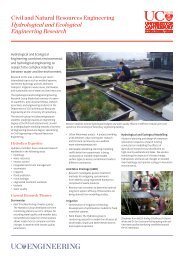
Poster Tutorial
Poster Tutorial
Poster Tutorial

You also want an ePaper? Increase the reach of your titles
YUMPU automatically turns print PDFs into web optimized ePapers that Google loves.
<strong>Poster</strong> <strong>Tutorial</strong>
<strong>Poster</strong> Design<br />
Clear message<br />
Accurate information<br />
Balanced with<br />
Visual appeal
<strong>Poster</strong> Design<br />
• This is a sales job<br />
• Convince the reader:<br />
• You speak their language<br />
• You have the solution to a problem<br />
• Make it easy for your reader to<br />
understand what you are presenting
General Design Issues<br />
• Ensure logical flow<br />
• Everything used has a reason<br />
• Images and colour – all demand attention<br />
• photos, drawings, maps, graph, logos<br />
• Background images – tasteful, not to complex<br />
• Complimentary colours – simple palette<br />
• Not to many fancy fonts<br />
• Asymmetry (groups of 3 or 5)<br />
• White space = breathing room
Content – must haves<br />
• Background<br />
• Why you are doing this research and possibly for whom<br />
• What / How<br />
• You visited 16 sites, worked on an oil rig, ran<br />
simulations…whatever it was<br />
• …built 5 specimens and burned them under different<br />
conditions.<br />
• Outcome/Conclusions<br />
• What did your test reveal – what you expected? Not what you<br />
expected? Do you suggest more research be done?<br />
• University logo
Visual - images<br />
• Use images that add value<br />
• Background images<br />
• simple – non-distracting – relevant<br />
• Keep the same style<br />
• Good quality for printing<br />
• Consider copyright issues
Microbrewery Planning Summary<br />
Colour<br />
Background images – tasteful, not to<br />
complex<br />
Complimentary colours – shades plus<br />
a highlight<br />
Simple palette<br />
Not to many fancy fonts<br />
Asymmetry (groups of 3 or 5)<br />
White space<br />
Ensure logical flow<br />
Everything used has a reason<br />
‘YES’ design:<br />
logical,<br />
simple,<br />
coordinated<br />
Colour<br />
Background images –<br />
tasteful, not to complex<br />
Complimentary colours –<br />
shades plus a highlight<br />
Simple palette<br />
Not to many fancy fonts<br />
Asymmetry (groups of 3 or<br />
5)<br />
White space<br />
Ensure logical flow<br />
Everything used has a<br />
reason<br />
tasteful, not to complex<br />
Complimentary colours –<br />
shades plus a highlight<br />
Simple palette<br />
Not to many fancy fonts<br />
Asymmetry (groups of 3 or<br />
5)<br />
White space<br />
Ensure logical flow<br />
Everything used has a<br />
reasontasteful, not to<br />
complex<br />
Complimentary colours –<br />
shades plus a highlight<br />
Simple palette<br />
Not to many fancy fonts<br />
Asymmetry (groups of 3 or<br />
5)<br />
White space<br />
Ensure logical flow<br />
Everything used has a<br />
reason<br />
This text is more important as it has some<br />
sort of comclusion or outcome here.
‘NO’ design<br />
busy,<br />
distracting,<br />
unprofessional<br />
Microbrewery<br />
Planning Summary<br />
Colour<br />
Background<br />
images –<br />
tasteful, not<br />
to complex<br />
Complimentary<br />
colours –<br />
shades plus a<br />
highlight<br />
Simple palette<br />
Not to many<br />
fancy<br />
Colour<br />
Background images –<br />
tasteful, not to<br />
complex<br />
Complimentary colours<br />
– shades plus a<br />
highlight<br />
Simple palette<br />
Not to many fancy<br />
fonts<br />
Asymmetry (groups of<br />
3 or 5)<br />
White space<br />
Ensure logical flow<br />
Everything used has a<br />
reason<br />
Colour<br />
Background images – tasteful, not to<br />
complex<br />
Complimentary colours – shades plus<br />
a highlight<br />
Simple palette<br />
Not to many fancy fonts<br />
Asymmetry (groups of 3 or 5)<br />
White space<br />
Ensure logical flow<br />
Everything used has a reason<br />
Colour<br />
Background images – tasteful, not to<br />
complex<br />
Complimentary colours – shades plus<br />
a highlight<br />
Simple palette<br />
Not to many fancy fonts<br />
Asymmetry (groups of 3 or 5)<br />
White space<br />
Ensure logical flow<br />
Everything used has a reason<br />
Colour<br />
Background images – tasteful, not to<br />
complex<br />
Complimentary colours – shades plus<br />
a highlight<br />
Simple palette<br />
Not to many fancy fonts<br />
Asymmetry (groups of 3 or 5)<br />
White space<br />
Ensure logical flow<br />
Everything used has a reason<br />
This text is way to big hard to read and is very very<br />
distracting…. This text is way to big hard to read<br />
This text is way to small and too hard to read – why is it here??
Tools (Corel and you)<br />
• Corel 12 Suite is available in the Grotto<br />
and on many of the machines in the Civil<br />
computer lab.<br />
• Use CorelDraw for your poster layout and<br />
Corel Photopaint to edit your images.<br />
• Feel free to ask me questions.<br />
My office is in the civil computer suite,<br />
2 nd floor of the Civil/Mech<br />
building. or<br />
call me on ext 7338 or email me at<br />
melody.callahan@civil.canterbury.ac.nz
CorelDraw 12<br />
The next set of slides provides some<br />
information on the basic tools available to<br />
you in CorelDraw.<br />
These should help you get started – if you<br />
need more help just let me know.
How to set<br />
your page<br />
size.
Object Manager<br />
Use your object<br />
manager for ease of<br />
manipulating your<br />
poster content.
Object Manager<br />
• Set up layers, grid and<br />
guidelines<br />
• Control layer function<br />
with eye, printer and<br />
pencil icons.<br />
• Lock layers things<br />
can’t move around<br />
Tip: make one layer for<br />
images and another for<br />
text
Toolbar – Key tools<br />
• 1 st Arrow – move whole objects<br />
• 2 nd Arrow – edit objects (bezier(<br />
curves)<br />
• Magnifing glass – zooms in on drawing<br />
• Line tool<br />
• Shape tools (squares, circles, grids, etc..)<br />
• Text<br />
• Interactive flyout<br />
• Paint
CorelDraw12 – Text tools<br />
• When writing blocks<br />
of text – use<br />
Paragraph Text<br />
• Titles, callouts and<br />
captions – use<br />
Artistic Text<br />
• Keep fonts to<br />
Verdana, Arial, Times<br />
New Roman<br />
• Don’t go below 18pts<br />
for text (unless it’s a<br />
caption or callout)<br />
Tip: Cut and paste<br />
text from MSWord.
Adding images<br />
• Cut and paste (works but can<br />
be unstable or have strange<br />
results)<br />
• File: Import (very stable, but<br />
must have image ready to<br />
put in)<br />
Tip: Do your image edits<br />
BEFORE importing them if<br />
possible. Resize, crop, rotate,<br />
colour…etc
Drawing<br />
• Use the bezier line tool.<br />
• Line width no less than 1pt<br />
Tips:<br />
Straight line: Hold down the Ctrl<br />
key and click where you want<br />
each end of the line<br />
Curved line: click starting point,<br />
move to ending point click again.<br />
With mouse button down, drag<br />
mouse – will form a curve.
UC Logo usage<br />
• Do not change it in any way<br />
• If possible put on the right hand side<br />
• Make sure there is space around the logo
Dos and Don’ts<br />
Do<br />
• Keep it simple, clear and<br />
consise<br />
• Follow given criteria<br />
• Use good images (hi-res<br />
images – not something<br />
stolen from the web and<br />
blownup 300%)<br />
Don’t<br />
• Regurgitate your entire<br />
report on to an A1 poster<br />
• Use to much techno-jargon<br />
• Use too many fonts or<br />
fancy fonts<br />
• Wait until the last minute<br />
• Think outside the square
Finishing<br />
• Proof read and spell check!<br />
• Have someone else proof read your<br />
poster.<br />
• Printing and laminating is done at the<br />
Library Copy Centre. Must be done during<br />
working hours.
Don’t t leave it to the last<br />
minute !!!