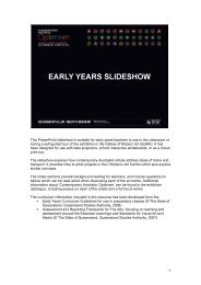
1 This PowerPoint slide show is suitable for primary teachers to use ...
1 This PowerPoint slide show is suitable for primary teachers to use ...
1 This PowerPoint slide show is suitable for primary teachers to use ...

You also want an ePaper? Increase the reach of your titles
YUMPU automatically turns print PDFs into web optimized ePapers that Google loves.
<strong>Th<strong>is</strong></strong> <strong>PowerPoint</strong> <strong>slide</strong> <strong>show</strong> <strong>is</strong> <strong>suitable</strong> <strong>for</strong> <strong>primary</strong> <strong>teachers</strong> <strong>to</strong> <strong>use</strong> in the classroom or<br />
during a self-guided <strong>to</strong>ur of the exhibition in the Gallery of Modern Art (GoMA). It has<br />
been designed <strong>for</strong> <strong>use</strong> with data projec<strong>to</strong>rs, school interactive whiteboards, or as a colour<br />
print-out.<br />
The <strong>slide</strong><strong>show</strong> explores how art<strong>is</strong>ts in the exhibition have chosen <strong>to</strong> <strong>use</strong> colour and light<br />
in different ways <strong>to</strong> communicate optim<strong>is</strong>tic moods and messages.<br />
Light and colour are inextricably linked. We can only see objects and colours when there<br />
<strong>is</strong> light. Just as sunny days help brighten our mood, so do vibrant colours such as red,<br />
orange and yellow.<br />
The notes sections provide background reading <strong>for</strong> <strong>teachers</strong>, and include questions (in<br />
italics) which can be read aloud when d<strong>is</strong>cussing each of the art works. Additional<br />
in<strong>for</strong>mation about ‘Contemporary Australia: Optim<strong>is</strong>m’ can be found in the exhibition<br />
catalogue, including essays on each of the art<strong>is</strong>ts featured.<br />
The curriculum in<strong>for</strong>mation included in th<strong>is</strong> resource has been developed from the:<br />
• Assessment and Reporting Framework <strong>for</strong> The Arts, focusing on learning and<br />
assessmentt around the Essential Learnings and Standards <strong>for</strong> V<strong>is</strong>ual Art and<br />
Media (© The State of Queensland, Queensland Studies Authority, 2007).<br />
1
CURRICULUM INFORMATION<br />
(NB: Relevant art<strong>is</strong>ts <strong>for</strong> specific curriculum areas are noted in brackets.)<br />
Art<strong>is</strong>ts <strong>use</strong> and combine colour in many ways and <strong>for</strong> many reasons. They may choose<br />
colours that are reminders of specific things or ideas, or they may choose colours purely<br />
<strong>for</strong> the effect they have on your eye.<br />
<strong>Th<strong>is</strong></strong> <strong>slide</strong><strong>show</strong> presentation will provide <strong>primary</strong> students with an understanding of:<br />
• the dec<strong>is</strong>ion-making processes art<strong>is</strong>ts engage in, in terms of their placement of<br />
colour<br />
• colour choices, including the absence of colour.<br />
ESSENTIAL LEARNINGS BY THE END OF YEAR 5<br />
V<strong>is</strong>ual Art<br />
V<strong>is</strong>ual Art involves selecting v<strong>is</strong>ual arts elements, concepts, processes and <strong>for</strong>ms (both<br />
2-D and 3-D) <strong>to</strong> express ideas, considering different audiences and purposes, through<br />
images and objects.<br />
Students will explore the ways:<br />
• colour shades (adding black <strong>to</strong> a colour) and tints (adding colour <strong>to</strong> white) are<br />
<strong>use</strong>d <strong>to</strong> create balance, contrast and patterns (e.g. Robert MacPherson and<br />
(Kee Vernon Ah<br />
• curved, angular, symmetrical, asymmetrical and overlapping shapes are <strong>use</strong>d <strong>to</strong><br />
create balance, contrast and patterns (e.g. Robert Owen, Gemma Smith and<br />
Sally Gabori).<br />
Media<br />
Media involves selecting media languages and technologies <strong>to</strong> create representations<br />
and construct meaning, considering different audiences and purposes.<br />
Students will explore the ways:<br />
• still and moving images, sounds and words are selected <strong>to</strong> construct media texts<br />
(Maguire (e.g. Tarryn Gill and Pilar Mata Dupont, Vernon Ah Kee and Tim<br />
2
• representations in media texts are selected from different settings, including time<br />
and place, and <strong>for</strong> different audiences and purposes (e.g. Tarryn Gill and Pilar<br />
Mata Dupont, and Chr<strong>is</strong>tian de Vietri).<br />
ESSENTIAL LEARNINGS BY THE END OF YEAR 7<br />
V<strong>is</strong>ual Art<br />
V<strong>is</strong>ual Art involves modifying v<strong>is</strong>ual arts elements, concepts, processes and <strong>for</strong>ms (both<br />
2-D and 3-D) <strong>to</strong> express ideas, considering intended audiences and purposes, through<br />
images and objects.<br />
Students are able <strong>to</strong>:<br />
• respond by analysing and evaluating arts works in social, cultural, h<strong>is</strong><strong>to</strong>rical and<br />
spiritual contexts, using arts elements and languages (e.g. Sally Gabori, Vernon<br />
(Kee Ah<br />
• reflect on learning, apply new understandings and identify future applications<br />
(e.g. Tim Maguire).<br />
Media<br />
Media involves constructing meaning, considering intended audiences and purposes, by<br />
modifying media languages and technologies <strong>to</strong> create representations.<br />
Students will explore the ways:<br />
• still and moving images, sounds and words are applied and modified, using genre<br />
(Kee conventions, <strong>to</strong> construct media texts (e.g. Tim Maguire; Vernon Ah<br />
• representations in media texts have specific purposes and are modified <strong>to</strong><br />
maxim<strong>is</strong>e audience impact (e.g. Tarryn Gill and Pilar Mata Dupont, and Vernon<br />
Ah Kee).<br />
3
Sally Gabori<br />
Sally Gabori’s application of paint, in various states of drying, creates striking and<br />
interesting clashes of colour and transition and, although produced quickly, her works are<br />
carefully planned. Her paintings convey a combination of vitality, immediacy and<br />
supreme confidence. The working of paints in<strong>to</strong> and over each other at different stages of<br />
the drying process has created differing v<strong>is</strong>ual effects — colour fields meet, with wet<br />
paints blending <strong>to</strong>gether <strong>to</strong> create soft transitions; and painting over dry sections has<br />
created harder and bolder transitions.<br />
(Bruce McLean, ‘Sally Gabori: Intimate country’, in Contemporary Australia: Optim<strong>is</strong>m<br />
7.(−pp.94 [exhibition catalogue], Queensland Art Gallery, Br<strong>is</strong>bane, 2008,<br />
Gemma Smith<br />
In the same way that each move of a chess piece affects the entire board, each colour<br />
Gemma Smith adds <strong>to</strong> the board reflects on and reacts with all the other colours. <strong>Th<strong>is</strong></strong><br />
necessitates the re-evaluation of the pre-ex<strong>is</strong>ting colour relationships. There<strong>for</strong>e, every<br />
addition, like each move in a chess game, must take in<strong>to</strong> account the ever-changing<br />
conditions of the board. These seemingly old-fashioned interests in the grid, colour<br />
theory and the painterly qualities of the works could easily slip in<strong>to</strong> cliché. But, rather than<br />
slipping in<strong>to</strong> the repetitive realm, Smith’s works seem <strong>to</strong> paint a rainbow of colour over<br />
the volumes of literature on the death of painting.<br />
(Ellie Buttrose, ‘Gemma Smith: One step ahead’, in Contemporary Australia: Optim<strong>is</strong>m<br />
11.(−pp.208 [exhibition catalogue], Queensland Art Gallery, Br<strong>is</strong>bane, 2008,<br />
Questions <strong>for</strong> d<strong>is</strong>cussion<br />
• Look at the way colours are overlapped and combined in paintings by Sally<br />
Gabori and Gemma Smith and compare the colour relationships <strong>to</strong> those on a<br />
colour wheel. As a class, how many words can you think of <strong>to</strong> describe the <strong>use</strong> of<br />
colour?<br />
• Do you think the colours have been selected carefully or at random? Both art<strong>is</strong>ts’<br />
<strong>use</strong> of colour <strong>is</strong> carefully considered. Can you see any evidence of th<strong>is</strong> in Smith’s<br />
(.title painting? (Hint: Look at the<br />
• What sorts of things do you think the art<strong>is</strong>ts considered when choosing the<br />
colours?<br />
4
• How do the pictures make you feel? Bright colours are often associated with<br />
happiness. Would you describe these art<strong>is</strong>ts’ <strong>use</strong> of colour as ‘optim<strong>is</strong>tic’? Why or<br />
why not?<br />
5
Robert Owen<br />
Robert Owen plots h<strong>is</strong> feelings and sensations in<strong>to</strong> a graphic system of colours, each<br />
band representing approximately 24 hours in h<strong>is</strong> life. <strong>Th<strong>is</strong></strong> work was made in direct<br />
response <strong>to</strong> the invitation <strong>to</strong> participate in ‘Contemporary Australia: Optim<strong>is</strong>m’. Owen<br />
does not reveal exact correspondences between the colours and different states in h<strong>is</strong><br />
emotional reg<strong>is</strong>ter. He does, however, indicate that although pigments are subject <strong>to</strong> the<br />
laws of physics, the emotional affect of colour defies definition: its impact on individuals <strong>is</strong><br />
essentially unclassifiable.<br />
(Angela Goddard, ‘Robert Owen: How the light gets in’, in Contemporary Australia:<br />
7.(−pp.174 Optim<strong>is</strong>m [exhibition catalogue], Queensland Art Gallery, Br<strong>is</strong>bane, 2008,<br />
Questions <strong>for</strong> d<strong>is</strong>cussion<br />
• Do you think colours have emotional effects on people? If so, are these emotions<br />
universal or specific <strong>to</strong> the individual?<br />
• Do colours signify different meanings depending on where you are in the world?<br />
• Examine the following pigments and think about what they symbol<strong>is</strong>e in Western<br />
society:<br />
• black<br />
• white<br />
• red and green<br />
• purple and gold<br />
• red, white and blue.<br />
• Do any of these colours symbol<strong>is</strong>e something else in another culture?<br />
Tim Maguire<br />
For h<strong>is</strong> Falling snow prints, Tim Maguire begins with a found pho<strong>to</strong>graph that he then<br />
puts through a computer program, separating the image in<strong>to</strong> three colour components:<br />
cyan, magenta and yellow. He paints each of these images with black oil paint on<strong>to</strong> a<br />
separate piece of film, removing areas with solvent <strong>to</strong> create the white of the snow.<br />
Scanned back in<strong>to</strong> the computer, re-treated with their respective colours and then<br />
digitally overlaid, these painted layers of the old pho<strong>to</strong>graph <strong>for</strong>m a new composition,<br />
becoming the large digital prints we see.<br />
6
The pho<strong>to</strong>graphic image <strong>is</strong> pulled apart, ‘handled’ and put back <strong>to</strong>gether again. However,<br />
the pieces do not quite fit. Maguire’s slightly imprec<strong>is</strong>e painting of the pho<strong>to</strong>graph on<strong>to</strong><br />
film often results in a m<strong>is</strong>-reg<strong>is</strong>tration of the white snow particles, allowing the colour of<br />
each of the three sheets <strong>to</strong> seep in<strong>to</strong> the next layer. The effect <strong>is</strong> at once familiar and<br />
strange, and fingerprints and brushstrokes create additional diversions.<br />
(Ruth McDougall, ‘Tim Maguire: An uncertain place’, in Contemporary Australia:<br />
5.(−pp.142 Optim<strong>is</strong>m [exhibition catalogue], Queensland Art Gallery, Br<strong>is</strong>bane, 2008,<br />
Questions <strong>for</strong> d<strong>is</strong>cussion<br />
• Do the white snow particles in th<strong>is</strong> work look familiar or strange <strong>to</strong> you?<br />
• Do the particles appear <strong>to</strong> be still or moving across the surface of the work?<br />
• Which of these words best sums up the way Maguire’s work makes you feel?<br />
Compare your response with that of your neighbour (e.g. peaceful, optim<strong>is</strong>tic,<br />
afraid, uncertain, lost, or free).<br />
7
Tarryn Gill and Pilar Mata Dupont<br />
Tarryn Gill and Pilar Mata Dupont hybrid<strong>is</strong>e the glorious technicolour of the well-loved<br />
world of Hollywood musicals with Australian surf lifesaving carnivals in <strong>to</strong> question Aussie<br />
national<strong>is</strong>m and standard gender roles. The female lifeguards wearing sequined caps<br />
and gold swimsuits resemble a chorus line from a 1940s Esther Williams water ballet,<br />
rather than the bronzed surf lifesavers we are <strong>use</strong>d <strong>to</strong> seeing on our shores. All of the<br />
moments captured in ‘Heart of Gold Project 5’ are synonymous with action, physical<br />
strength and hero<strong>is</strong>m, which are not the sort of qualities that we expect from glamorous<br />
young women with ruby red lips and halter-neck swimsuits. Our expectations are<br />
constantly thwarted.<br />
(Kate Ravenswood, ‘Tarryn Gill and Pilar Mata Dupont: In<strong>to</strong> the heart of nationhood’, in<br />
Contemporary Australia: Optim<strong>is</strong>m [exhibition catalogue], Queensland Art Gallery,<br />
5.(−pp.102 Br<strong>is</strong>bane, 2008,<br />
Questions <strong>for</strong> d<strong>is</strong>cussion<br />
• Do these look like typical lifesavers you would see at the beach? What time<br />
period do the women look like they’re from?<br />
• If you were <strong>to</strong> apply sound and words <strong>to</strong> th<strong>is</strong> pho<strong>to</strong>graph <strong>to</strong> tell us about<br />
Australian identity, what would it say?<br />
• What does it mean <strong>to</strong> be Australian? Is there more than one type of Australian?<br />
• How do people overseas view Australians (i.e. the type of people that we are)?<br />
How do they get these ideas?<br />
Chr<strong>is</strong>tian de Vietri<br />
Tim 2006 <strong>is</strong> a statue of the ‘archetypal’ street per<strong>for</strong>mer — the kind that attempts <strong>to</strong><br />
convince its audience that it really <strong>is</strong> a statue. There <strong>is</strong> an elegant v<strong>is</strong>ual pun inherent in a<br />
statue of a person pretending <strong>to</strong> be a statue. Tim <strong>is</strong> the name of one of the art<strong>is</strong>t’s models<br />
who posed in th<strong>is</strong> costume <strong>for</strong> the art work. One of the prominent pro<strong>to</strong>types <strong>for</strong> Tim 2006<br />
<strong>is</strong> the Termina<strong>to</strong>r — the cyborg assassin from the future. The sunglasses, the eyepiece,<br />
the metallic silver of aluminium all point unm<strong>is</strong>takably <strong>to</strong> th<strong>is</strong> pop culture reference.<br />
(Emma Cain, ‘Chr<strong>is</strong>tian de Vietri: How many statues does it take <strong>to</strong> change an<br />
archetype?’, in Contemporary Australia: Optim<strong>is</strong>m [exhibition catalogue], Queensland Art<br />
3.(−pp.70 Gallery, Br<strong>is</strong>bane, 2008,<br />
8
Questions <strong>for</strong> d<strong>is</strong>cussion<br />
• Have you ever seen a street per<strong>for</strong>mer? Where?<br />
• Why do per<strong>for</strong>mers choose <strong>to</strong> act like statues? Why do the statues am<strong>use</strong> us,<br />
and make us laugh?<br />
• Tim <strong>is</strong> quite large in scale. When you look at the statue in the Gallery space, it<br />
seems like it <strong>is</strong> watching us in the same way that we watch it (i.e. we feel like<br />
we’re an object being stared at). Why do you think the art<strong>is</strong>t wanted <strong>to</strong> create th<strong>is</strong><br />
feeling?<br />
• How do you think the sculpture was made? What materials do you think were<br />
<strong>use</strong>d? What do you associate with these materials?<br />
• Think about some of the silver things you might have at home. Shiny, metallic<br />
objects reflect images back <strong>to</strong> us. What ideas might Tim reflect back about who<br />
we are?<br />
• If a friend was <strong>to</strong> describe who you are, what would they say about you?<br />
• What aspects of your life reveal who you are (e.g. what you wear, where you live,<br />
what hobbies you enjoy)?<br />
In summary<br />
These art works draw our attention <strong>to</strong> the various identities we per<strong>for</strong>m as individuals and<br />
as Australians. We come <strong>to</strong> understand that our sense of who we are, both individually<br />
and collectively, <strong>is</strong> something that we have learned <strong>to</strong> ‘act out’, and that it does not<br />
necessarily stem from some innate place within ourselves.<br />
9
Robert MacPherson<br />
Robert MacPherson’s Mayfair paintings and installations are based on road signs.<br />
Named after h<strong>is</strong> favourite sandwich bar in Br<strong>is</strong>bane, the works are inspired by the<br />
amateur signage relating <strong>to</strong> food, travel and various <strong>for</strong>ms of community that <strong>is</strong><br />
ubiqui<strong>to</strong>us in the Australian countryside. Mayfair: 18 signs, 18 paintings, "green lizard",<br />
"Double sars" + "Maiden's blush” <strong>for</strong> D.R.M. 1997–2005 has its origins in signs that are<br />
meant <strong>to</strong> be read while moving past in a vehicle. For many travellers, signs evoke a<br />
nostalgia <strong>for</strong> those journeys through rural areas signposted by small handpainted notices<br />
announcing items <strong>for</strong> sale. MacPherson <strong>is</strong> drawn less <strong>to</strong> the exact connotations of words<br />
than <strong>to</strong> the way in which language can conjure images. He util<strong>is</strong>es the slick painted<br />
lettering and erotic wordplay of advert<strong>is</strong>ing sign-writing <strong>to</strong> create a work that <strong>is</strong> humorous,<br />
elegant and provocative. MacPherson highlights the d<strong>is</strong>junction between the ordered<br />
system of language and the world’s chaotic plethora of things that language describes.<br />
(Lynne Seear, ‘Robert MacPherson: Are we there yet?’, in Contemporary Australia:<br />
Optim<strong>is</strong>m [exhibition catalogue], Queensland Art Gallery, Br<strong>is</strong>bane, 2008, pp.138−141.)<br />
Vernon Ah Kee<br />
Vernon Ah Kee takes statements from books, songs, quotes and everyday life and<br />
creates slogans which confront and encourage dialogue about contemporary Aboriginal<br />
experience. In Who let the dogs out 2008 Ah Kee introduces us <strong>to</strong> a character or alterego<br />
that speaks h<strong>is</strong> slogans. ‘Red Hat’ alters, chops up and runs-on words <strong>to</strong> dilute their<br />
negative connotations and <strong>to</strong> change their meaning. Red Hat <strong>is</strong> an anagram of the word<br />
‘hatred’ and Ah Kee bases h<strong>is</strong> character on iconic bushranger Ned Kelly, using a red hat<br />
or helmet, <strong>to</strong> personify the new concept. To Ah Kee, Red Hat has become an Aboriginal<br />
spirit in much the same way. The introduction of th<strong>is</strong> m<strong>is</strong>chievous spirit figure brings a<br />
different reading <strong>to</strong> Ah Kee’s otherw<strong>is</strong>e black-and-white texts. Red Hat also speaks in<br />
Shakespearian verse, reciting lines from h<strong>is</strong> favourite plays and recontextual<strong>is</strong>ing their<br />
ambiguous meanings. Red Hat’s slogans ooze bo<strong>is</strong>terous, boy<strong>is</strong>h appeal.<br />
(Bruce McLean, ‘Vernon Ah Kee: Keeping them in line’, in Contemporary Australia:<br />
Optim<strong>is</strong>m [exhibition catalogue], Queensland Art Gallery, Br<strong>is</strong>bane, 2008, pp.38−41.)<br />
10
Questions <strong>for</strong> d<strong>is</strong>cussion<br />
• Compare some of the words that each art<strong>is</strong>t includes in their works. How are the<br />
types of words <strong>use</strong>d different, or similar, in both? What statements or s<strong>to</strong>ries are<br />
the art<strong>is</strong>ts representing?<br />
• What personal experiences do you think MacPherson and Ah Kee were thinking<br />
about when they created their works?<br />
• What <strong>is</strong> the impact of black and white? Do you think the art works have more or<br />
less impact if they were in colour?<br />
• Reading can sometimes conjure images in our minds. What kind of images do<br />
you imagine when you read the words in these art works? Do you think these<br />
art<strong>is</strong>ts are interested in images as much as text?<br />
• Do you think that each person reading the text in these art works would<br />
experience a different feeling? Why?<br />
• In-Gallery questions: Can you read the words all at once, or are the art works <strong>to</strong>o<br />
large? How big or small do you feel when looking at the art works? Why do you<br />
think the art<strong>is</strong>ts chose <strong>to</strong> work on th<strong>is</strong> kind of scale?<br />
11
Reflection exerc<strong>is</strong>e<br />
L<strong>is</strong>t the key points on a blackboard <strong>for</strong> the students <strong>to</strong> reflect upon and consider.<br />
12
Knowledge and understanding<br />
• Examine colour combinations on a colour wheel. What happens when you put<br />
certain colours alongside each other? Talk about the colours in rainbow and the<br />
order of the colours.<br />
• D<strong>is</strong>cuss different colour classifications, e.g. metallic, warm, cool or bright. How do<br />
we classify and describe colours? What colours would you select as optim<strong>is</strong>tic<br />
colours?<br />
Creating<br />
• Assemble a range of coloured items, including: paper, plastic, textiles, water, jelly<br />
and string. Encourage the students <strong>to</strong> construct colour combinations by folding,<br />
tw<strong>is</strong>ting, bending, tearing, ripping, making holes and projecting light through<br />
these objects. D<strong>is</strong>cuss the compar<strong>is</strong>ons.<br />
• Using cellophane, old film strips, transparencies, wrappers and chip packets,<br />
make three or four colour transparencies and place them on<strong>to</strong> a projec<strong>to</strong>r in a<br />
very dark room. Use th<strong>is</strong> as a backdrop <strong>for</strong> a play or s<strong>to</strong>ry. Invite the students <strong>to</strong><br />
try various d<strong>is</strong>tances and surfaces, and <strong>to</strong> vary the size by controlling the focus.<br />
Presenting<br />
• When you think of the word ‘red’ what kind of red do you see? How would you<br />
describe it? Is th<strong>is</strong> the same colour your friend sees when they think of red?<br />
Conduct a group survey in the class and evaluate which shade of red the<br />
students thought of the most.<br />
Responding<br />
• Respond <strong>to</strong> colour by words. Ask students <strong>to</strong> paint a sheet of colour and stare at<br />
it <strong>for</strong> three minutes, and without looking away, jot down their responses. What<br />
can you find in the sheet? These might be memories, images, dreams, fantasies,<br />
surreal references. Then link your words up <strong>to</strong> write a poem.<br />
Reflecting<br />
• In a very dark room, <strong>use</strong> coloured sheets and explore how the colours appear <strong>to</strong><br />
change when you project different colours on<strong>to</strong> them. You might like <strong>to</strong> project<br />
red, green and blue on<strong>to</strong> a multi-coloured sheet and see if the students can<br />
13
emember what the colours were like in normal daylight. Do colours change<br />
under different lighting conditions?<br />
• Can you think of an experience that you’ve had which made you feel hopeful<br />
about the future? If you were creating a work of art, what colours would you<br />
choose (from the colour wheel) <strong>to</strong> depict th<strong>is</strong>?<br />
14