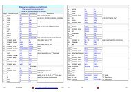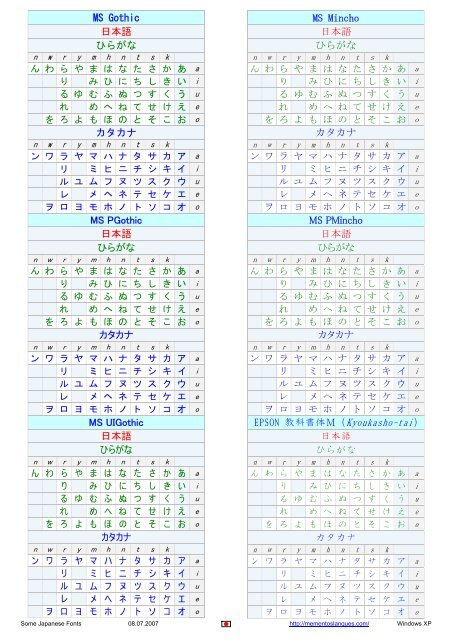
MS Gothic 日本語 ひらがな カタカナ MS PGothic 日本語 ひらがな ...
MS Gothic 日本語 ひらがな カタカナ MS PGothic 日本語 ひらがな ...
MS Gothic 日本語 ひらがな カタカナ MS PGothic 日本語 ひらがな ...

Create successful ePaper yourself
Turn your PDF publications into a flip-book with our unique Google optimized e-Paper software.
<strong>MS</strong> <strong>Gothic</strong><br />
日 本 語<br />
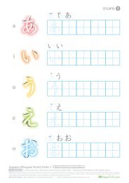
<strong>ひらがな</strong><br />
n w r y m h n t s k<br />
ん わ ら や ま は な た さ か あ a<br />
り み ひ に ち し き い i<br />
る ゆ む ふ ぬ つ す く う u<br />
れ め へ ね て せ け え e<br />
を ろ よ も ほ の と そ こ お o<br />
<strong>カタカナ</strong><br />
n w r y m h n t s k<br />
ン ワ ラ ヤ マ ハ ナ タ サ カ ア a<br />
リ ミ ヒ ニ チ シ キ イ i<br />
ル ユ ム フ ヌ ツ ス ク ウ u<br />
レ メ ヘ ネ テ セ ケ エ e<br />
ヲ ロ ヨ モ ホ ノ ト ソ コ オ o<br />
<strong>MS</strong> P<strong>Gothic</strong><br />
日 本 語<br />
<strong>ひらがな</strong><br />
n w r y m h n t s k<br />
ん わ ら や ま は な た さ か あ a<br />
り み ひ に ち し き い i<br />
る ゆ む ふ ぬ つ す く う u<br />
れ め へ ね て せ け え e<br />
を ろ よ も ほ の と そ こ お o<br />
<strong>カタカナ</strong><br />
n w r y m h n t s k<br />
ン ワ ラ ヤ マ ハ ナ タ サ カ ア a<br />
リ ミ ヒ ニ チ シ キ イ i<br />
ル ユ ム フ ヌ ツ ス ク ウ u<br />
レ メ ヘ ネ テ セ ケ エ e<br />
ヲ ロ ヨ モ ホ ノ ト ソ コ オ o<br />
<strong>MS</strong> UI<strong>Gothic</strong><br />
日 本 語<br />
<strong>ひらがな</strong><br />
n w r y m h n t s k<br />
ん わ ら や ま は な た さ か あ a<br />
り み ひ に ち し き い i<br />
る ゆ む ふ ぬ つ す く う u<br />
れ め へ ね て せ け え e<br />
を ろ よ も ほ の と そ こ お o<br />
<strong>カタカナ</strong><br />
n w r y m h n t s k<br />
ン ワ ラ ヤ マ ハ ナ タ サ カ ア a<br />
リ ミ ヒ ニ チ シ キ イ i<br />
ル ユ ム フ ヌ ツ ス ク ウ u<br />
レ メ ヘ ネ テ セ ケ エ e<br />
ヲ ロ ヨ モ ホ ノ ト ソ コ オ o<br />
<strong>MS</strong> Mincho<br />
日 本 語<br />
<strong>ひらがな</strong><br />
n w r y m h n t s k<br />
ん わ ら や ま は な た さ か あ a<br />
り み ひ に ち し き い i<br />
る ゆ む ふ ぬ つ す く う u<br />
れ め へ ね て せ け え e<br />
を ろ よ も ほ の と そ こ お o<br />
<strong>カタカナ</strong><br />
n w r y m h n t s k<br />
ン ワ ラ ヤ マ ハ ナ タ サ カ ア a<br />
リ ミ ヒ ニ チ シ キ イ i<br />
ル ユ ム フ ヌ ツ ス ク ウ u<br />
レ メ ヘ ネ テ セ ケ エ e<br />
ヲ ロ ヨ モ ホ ノ ト ソ コ オ o<br />
<strong>MS</strong> PMincho<br />
日 本 語<br />
<strong>ひらがな</strong><br />
n w r y m h n t s k<br />
ん わ ら や ま は な た さ か あ a<br />
り み ひ に ち し き い i<br />
る ゆ む ふ ぬ つ す く う u<br />
れ め へ ね て せ け え e<br />
を ろ よ も ほ の と そ こ お o<br />
<strong>カタカナ</strong><br />
n w r y m h n t s k<br />
ン ワ ラ ヤ マ ハ ナ タ サ カ ア a<br />
リ ミ ヒ ニ チ シ キ イ i<br />
ル ユ ム フ ヌ ツ ス ク ウ u<br />
レ メ ヘ ネ テ セ ケ エ e<br />
ヲ ロ ヨ モ ホ ノ ト ソ コ オ o<br />
EPSON 教 科 書 体 M (Kyoukasho-tai)<br />
日 本 語<br />
<strong>ひらがな</strong><br />
n w r y m h n t s k<br />
ん わ ら や ま は な た さ か あ a<br />
り み ひ に ち し き い i<br />
る ゆ む ふ ぬ つ す く う u<br />
れ め へ ね て せ け え e<br />
を ろ よ も ほ の と そ こ お o<br />
<strong>カタカナ</strong><br />
n w r y m h n t s k<br />
ン ワ ラ ヤ マ ハ ナ タ サ カ ア a<br />
リ ミ ヒ ニ チ シ キ イ i<br />
ル ユ ム フ ヌ ツ ス ク ウ u<br />
レ メ ヘ ネ テ セ ケ エ e<br />
ヲ ロ ヨ モ ホ ノ ト ソ コ オ o<br />
Some Japanese Fonts 08.07.2007 http://mementoslangues.com/ Windows XP
Japanese typefaces<br />
http://www.nihongoresources.com/language/writing/typefaces.html<br />
Japanese has, like most languages, a few different writing styles. Quite obviously you know a few different ones<br />
for English/American, because your handwriting isn't going to look like the "Microsoft sans serif" font when this is<br />
typed in, and neither will something written in cursive italics look much like either this sans serif font or your<br />
handwriting. In fact, the "A" alone will look completely different in all three scripts. Japanese has a few common<br />
faces, which have come from the various approaches to the Kanji system as employed since +/- 600 a.d.<br />
Aside from normal printform styles, there are also old block-print styles, and the cursive styles that come from the<br />
artistic approach. (Compare this to our use of gothic caligraphy). As an illustration of the differences in Japanese<br />
fonts, let's look at the various forms one might encounter as main writing forms, if they can indeed so be called,<br />
since most were derived from brushes or woodblocks rather than pens.<br />
Ming dynasty print style<br />
This is the 明 朝 (Minchō) typeface. This is the most used typeface in Japan, found in newspapers, in your word<br />
processor, etc. It is characterised by clearely identifiable strokes, thick verticals and thin horizontals, angular<br />
corners and serifs at the end of strokes.<br />
<strong>Gothic</strong> print style<br />
This is the ゴシック (<strong>Gothic</strong>) typeface. This is the second most used typeface in Japan. You will find it for<br />
instance on signs and the likes. Unlike minchō it doesn't have all the serifs or thickness differences. it just shows<br />
the essence of a Kanji without the pleasantries and decorations.<br />
Text book print style<br />
The 教 科 書 (Kyōkasho) or "text book" typeface is used quite often in - not surprisingly - text books and the likes.<br />
It is similar to the Minchō typeface, but feels slightly less computer inspired, and looks more a mix between a<br />
computer font and a carefully pencilled one.<br />
Block style<br />
This style, called 楷 書 , is the typeface originating from wood block carving. Every stroke is "written" individually,<br />
and thus makes it an intensive typeface to write (brush) in. While prettier than the Kaisho scripts, it's also<br />
sometimes harder to read. It is actually similar to the Minchō typeface, which also originated from woodblock<br />
carving, but differs in style by being less rigid and having serifs at different strokes.<br />
Japanese Typefaces 2/4 http://mementoslangues.com/ Styles
Flowing and semi-cursive style<br />
A cursive simplified way of writing, in " 行 書 " style the strokes 'flow' more and in some places, more complex<br />
compounds are simplified. This style is typically used in hand writing, such as letters or memos. The first of the<br />
two images shows a "readable" Gyōsho style, close to neat handwriting, while the second is a far more flowing<br />
style and closer to how someone who writes fast would probably write Japanese, connecting up strokes and<br />
simplifying along the way..<br />
Cursive or "grass" style<br />
The artistic "shorthand" form of writing, in " 草 書 " style most compounds are stroked without the brush or pen ever<br />
actually leaving the paper. This means there are a lot of thin connecting lines between actual strokes which can<br />
confuse reading, but also most compounds are simplified, which makes recognition of Sōsho Kanji very hard to<br />
impossible if one is not familiar with it. (the "grass" in the style name comes from the fact that the 草 in 草 書<br />
means grass or weeds)<br />
Seal style<br />
This style, called 添 書 is almost exclusively used for 判 子 (Hanko), name seals. They're used in the red<br />
"signatures" you see on Chinese and Japanese caligraphic art, as well as being used as normal signature in<br />
Japan, where you are expected to have a little stamp with your name in Tensho for signing for your mail order<br />
packages, as contract signatures, etc.<br />
Handwriting<br />
Finally an important style: handwriting. You don't really have a block of wood or a paintbrush and some<br />
caligraphical paper at hand most of the time, so it's not unimportant to note that handwritten japanese of course<br />
also has its own distinct look. There are some differences between handwritten and printed japanese, and these<br />
are probably apparent if you compare the following two images<br />
Japanese Typefaces 3/4 http://mementoslangues.com/ Styles
The top two scripts are different hand writings, the bottom two are the standard <strong>Gothic</strong> and Minchō scripts. There<br />
are clear differences in both several Hiragana, and many graphical components in Kanji, which to have a<br />
"proper" handwriting, you need to learn. Luckily, many books on learning Kanji will list both the printed version<br />
and the handwritten version so you can learn to read both forms, and write the correct form.<br />
Some examples<br />
It is interesting to note the differences between these styles if we look at how several Kanji are written across<br />
these typefaces:<br />
We see the obvious differences in the first four/five rows, but the really problematic changes come in the sixth<br />
and seventh row, which are the cursive styles. In the sixth row (Gyōsho) we see many stroke getting combined<br />
and many forms simplified so that they can be brushed easier, and in the seventh row we essentially abandon all<br />
hope of being able to figure out what the character was...<br />
Or do we ? Complex as it may look, there are rigid style guides on what are and what aren't proper Gyōsho and<br />
Sōsho forms, and there are books and even dictionaries available that teach you how to read and write these<br />
forms. With practice, you can learn to read and write these forms almost as fast and probably faster than<br />
"regular" writing respectively.<br />
An interesting set is the two characters 女 , woman and 天 , heaven. In their Sōsho form they look a remarkable<br />
amount like め and て, which is because め and て originaly come from exactly these Kanji, in this form. All of the<br />
modern Hiragana come from Sōsho forms of certain Kanji (Katakana originated as subcomponents from Kanji in<br />
square style) and for some Sōsho texts it's not easy to tell whether you're dealing with aSōsho Kanji or a cursive<br />
Hiragana thrown into the mix.<br />
Japanese Typefaces 4/4 http://mementoslangues.com/ Styles