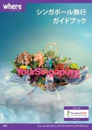
General Information - Singapore Tourism Board
General Information - Singapore Tourism Board
General Information - Singapore Tourism Board

Create successful ePaper yourself
Turn your PDF publications into a flip-book with our unique Google optimized e-Paper software.
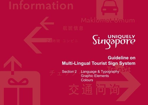
<strong>Information</strong><br />
Guideline on<br />
Multi-Lingual Tourist Sign System<br />
Section 2<br />
Language & Typography<br />
Graphic Elements<br />
Colours
Contents<br />
i<br />
Introduction<br />
ii<br />
Scope of Application<br />
Guidelines<br />
iii<br />
<strong>General</strong> Instructions for<br />
Users<br />
1 Visitor <strong>Information</strong> Identity<br />
1.1 Master System Identity Variants<br />
1.1.1 Option A<br />
1.1.2 Option B<br />
1.1.3 Option C<br />
1.2 Custom System Identity<br />
2 Language & Typography<br />
2.1 Language Requirements<br />
2.2 Typographic Requirements<br />
3 Graphic Elements<br />
3.1 Primary Graphics - Pictograms<br />
3.2 Primary Graphics - Arrows<br />
3.3 Secondary Graphics<br />
4 Colours<br />
4.1 Primary Master System Colours<br />
4.2 Secondary Master system Colours<br />
4.3 Custom System Colours<br />
Header Panel (cont’d)<br />
5.1.2 Extended Length<br />
5.2 Directional Panel<br />
5.2.1 Standard Layout<br />
5.2.2 Sample Layouts<br />
5.2.3 Alternative Layouts<br />
5.3 Locator Panel<br />
5.3.1 Standard Layout<br />
5.3.2 Alternative Layout<br />
5.3.3 Sample Layouts<br />
5.4 Miscellaneous<br />
5.4.1 Map Directory - Standard Layout<br />
5.4.2 Map Directory - Alternative Layout<br />
5.4.3 <strong>Information</strong> / Instruction Panel -<br />
Standard Layout<br />
5.4.4 <strong>Information</strong> / Instruction Panel -<br />
Alternative Layout<br />
5 Signtypes<br />
6 Conclusion<br />
5.1 Header Panel<br />
5.1.1 Standard Length<br />
Launched May 2005
Language & Typography<br />
<strong>General</strong> <strong>Information</strong><br />
ShinnMedium for<br />
English<br />
This section provides information<br />
on language requirements and<br />
typographic guidelines used for the<br />
primary and secondary languages in<br />
both Master and Custom Systems.<br />
一 般 资 讯<br />
Maklumat Umum<br />
総 合 案 内<br />
Sample Text only<br />
Shinn typefaces for STB-endorsed sign<br />
systems only<br />
Hei Regular for<br />
Simplified Chinese<br />
Shinn Book for<br />
Bahasa Melayu<br />
Osaka Regular for<br />
Japanese<br />
The typefaces for English and<br />
Bahasa Melayu are only to be used<br />
for Master System signs.<br />
For the Custom System, typefaces<br />
for English and Bahasa Melayu<br />
should be replaced with alternative<br />
typefaces. <strong>Information</strong> on minimum<br />
requirements for alternative<br />
typefaces can be found in the final<br />
page of this section.<br />
The typefaces for Simplified Chinese<br />
and Japanese can be used in both<br />
sign systems.<br />
2
Language Requirements<br />
<strong>General</strong> <strong>Information</strong><br />
一 般 资 讯<br />
Maklumat Umum<br />
総 合 案 内<br />
Sample Text only<br />
Correct placement order<br />
<strong>General</strong> <strong>Information</strong><br />
Maklumat Umum<br />
一 般 资 讯<br />
総 合 案 内<br />
<strong>General</strong><br />
- The inclusion of multi-lingual text is geared<br />
towards use by tourist-relevant venues<br />
and infrastructure; and<br />
- Inclusion of all of <strong>Singapore</strong>’s four official<br />
languages is not the focus of this multilingual<br />
sign system.<br />
Uses<br />
- All tourist-relevant venues or infrastructure<br />
that are encouraged to use or introduce the<br />
multi-lingual sign system to enhance their<br />
service offerings.<br />
Minimum Requirements<br />
- English as the primary language<br />
is mandatory;<br />
- Simplified Chinese and Bahasa Melayu<br />
must be used as the two mandatory<br />
secondary languages;<br />
- Inclusion of a third secondary language<br />
is recommended. This third secondary<br />
language should be relevant to an attraction<br />
the sign system is being applied to, for<br />
example, Japanese or Korean;<br />
Minimum Requirements (cont’d)<br />
- Simplified Chinese terms should be based<br />
on Mainland Chinese language terms;<br />
- Malay terms should be based on<br />
Bahasa Melayu; and<br />
- Terms used must be as concise and<br />
clear as possible, to save space and avoid<br />
any potential confusion.<br />
Sample Text only<br />
Incorrect placement order<br />
Additional Notes<br />
- <strong>General</strong> placement order principle is to<br />
separate languages with same writing<br />
systems from each other;<br />
- In practical terms, placing English and<br />
Bahasa Melayu (Romanised alphabet<br />
system) one after the other is to be avoided.<br />
The same principle applies to Simplified<br />
Chinese and Japanese (which are derived<br />
from a common character-based system);<br />
and<br />
- Using the above layout as an example,<br />
English and Bahasa Melayu is separated by<br />
Simplified Chinese, while the Bahasa Melayu<br />
term separates the Simplified Chinese and<br />
Japanese terms.<br />
- All information presented within the sign<br />
system must be accompanied by multilingual<br />
text, unless otherwise indicated<br />
within the guidelines;<br />
- To reduce potential confusion, there are<br />
prescribed placement orders for each<br />
language. Refer to visuals on this page;<br />
- English terms and spellings should be<br />
based on UK and <strong>Singapore</strong>an language<br />
terms. Examples include Lift (instead of<br />
Elevators), MRT, Hawker Centre;<br />
2.1
Typographic Requirements<br />
<strong>General</strong> <strong>Information</strong><br />
一 般 资 讯<br />
Maklumat Umum<br />
総 合 案 内<br />
Sample Text only<br />
- 150pt kerning for English and Bahasa<br />
Melayu. 50pt kerning for Simplified Chinese<br />
and Japanese; and<br />
- San-serif typefaces for all languages.<br />
<strong>General</strong><br />
- The Master System has exclusive use<br />
of the Shinn typefaces for English and<br />
Bahasa Melayu;<br />
- Hei Regular is for Simplified Chinese and<br />
Osaka Regular is for Japanese. These two<br />
typefaces can be used on both Master and<br />
Custom Systems; and<br />
- Alternative typefaces will be reviewed on a<br />
case-by-case basis, but general requirement<br />
is that the typefaces must be ‘sans-serif’ type<br />
and legible from a distance.<br />
Minimum Requirements<br />
- Minimum type size for English 50mm, with<br />
the exception of directional panels, which<br />
has a minimum requirement of 25mm;<br />
- Minimum type size for secondary<br />
languages 15mm;<br />
<strong>General</strong> <strong>Information</strong><br />
一 般 资 讯<br />
Maklumat Umum<br />
<br />
Sample Text only<br />
- No kerning provided for all languages<br />
compromises legibility when read from<br />
a distance because individual characters<br />
look are very close to one another; and<br />
- Relative type size of secondary languages<br />
must not be more than 75% of English<br />
primary language; and<br />
- Refer to visual on this page for more<br />
typographical requirements.<br />
- Serif typefaces difficult to read due to<br />
different character stroke widths.<br />
2.2
Graphic Elements<br />
This section provides information on<br />
the graphic elements for both the<br />
Master and Custom Systems and<br />
how they are to be applied.<br />
3
Primary Graphics - Pictograms<br />
<strong>General</strong><br />
- There are two major groups of primary<br />
graphic elements, pictograms and arrows;<br />
and<br />
Male<br />
Lift<br />
Female<br />
Escalator<br />
Nursing<br />
Room<br />
$<br />
ATM<br />
Handicap<br />
¥<br />
€<br />
$<br />
Currency<br />
Exchange<br />
- Their use and minimum requirements<br />
are the same for both the Master and<br />
Custom Systems.<br />
Uses<br />
- Pictograms are to represent tourism-related<br />
amenities or infrastructure.<br />
Minimum Requirements<br />
- Use of these pictograms, where relevant,<br />
are mandatory;<br />
Locker<br />
Public<br />
Phone<br />
MRT<br />
Food &<br />
Beverage<br />
Standard Pictogram Family<br />
- Standard set of pictograms for commonlyused<br />
tourism-related amenities; and<br />
- More pictograms may be added as and<br />
when required.<br />
Bus<br />
First-Aid<br />
Taxi<br />
Gift Shop<br />
- Design of pictograms must not be altered<br />
in any way;<br />
- Where possible, pictograms used on<br />
directional signs panels and directory<br />
boards should be accompanied by<br />
primary and secondary languages unless<br />
otherwise indicated;<br />
- Only pictograms appearing at location of<br />
amenities or infrastructure represented may<br />
not need any language attached;<br />
- Where new pictograms are required for a<br />
specific offering or amenity, the design of the<br />
pictogram has to follow the visual direction of<br />
the current standard set of pictograms. Any<br />
new pictogram design must be submitted to<br />
the working team for comments and approval<br />
prior to application; and<br />
- Refer to the Layout section for<br />
more information on prescribed relative<br />
positions and sizes for pictograms and<br />
arrows.<br />
3.1
Primary Graphics - Arrows<br />
<strong>General</strong><br />
- There are two major groups of primary<br />
graphic elements, pictograms and arrows;<br />
and<br />
Up Left /<br />
45˚ Left Ahead<br />
Up Right /<br />
45˚ Right Ahead<br />
Left Turn Ahead<br />
Right Turn Ahead<br />
- Their use and minimum requirements<br />
are the same for both the Master and<br />
Custom Systems.<br />
Left<br />
Down Left<br />
Straight<br />
Ahead<br />
Right<br />
Down Right<br />
U-Turn Left<br />
U-Turn Right<br />
Non-Standard Arrow Family<br />
- Above arrows only to be used<br />
when standard arrow options<br />
not adequate.<br />
Uses<br />
- Arrows are for indicating direction<br />
of travel.<br />
Minimum Requirements<br />
- Use of these arrows, where relevant, are<br />
mandatory;<br />
- Design of arrows may be customised but<br />
must not compromise clarity of message;<br />
and<br />
Standard Arrow Family<br />
- Standard set of arrows for<br />
indicating directions.<br />
- Refer to the Layout section for<br />
more information on prescribed relative<br />
positions and sizes for pictograms and<br />
arrows.<br />
3.2
Secondary Graphics<br />
<strong>General</strong><br />
- Secondary graphics provide visual interest<br />
and localised flavour to the multi-lingual sign<br />
system;<br />
Set of Peranakan Motifs<br />
- Motifs extracted from the ‘Uniquely<br />
<strong>Singapore</strong>’ Brand Manual; and<br />
- Use of these motifs must follow the<br />
guidelines set out by the Brand Manual.<br />
- Usually in the form of a watermarked<br />
graphic. Colour accents may also act as<br />
secondary graphics but its use must be<br />
balanced by need for colour coding for<br />
certain situations. Refer to the Colours<br />
section for more information; and<br />
- The example shown here is the secondary<br />
graphic used for the multi-lingual sign system<br />
used in <strong>Singapore</strong> Visitors Centres.<br />
Uses<br />
- The examples shown here are only to be<br />
used on Master Systems;<br />
- Usually applied onto backgrounds of sign<br />
panels as a faint watermark; and<br />
- For colour accents as secondary<br />
graphics, refer to the Colours section for<br />
more information.<br />
Minimum Requirements<br />
- Use of secondary graphics is optional;<br />
- Graphics must not compromise the legibility<br />
and clarity of any message or information<br />
when applied onto a sign system; and<br />
Example of Secondary Graphic on Master<br />
System Visitor <strong>Information</strong> Identity<br />
- Cropped version of one of the peranakan<br />
motifs used; and<br />
- Colour of motif is 70% of the respective<br />
coloured backgrounds it appears in.<br />
- Design of a secondary graphic should<br />
reflect the local flavour or an aspect of the<br />
tourist venue you are trying to project. If<br />
no such needs are required, or are already<br />
adequately addressed by other means, the<br />
secondary graphic should not be used.<br />
3.3
System Colours<br />
This section provides information on<br />
the colours for the Master System<br />
and how they are to be used.<br />
<strong>Information</strong> on the minimum<br />
requirements for colours used in<br />
Custom System is also included.<br />
4
Primary Master System Colours<br />
PMS 201C<br />
- English portion of identity<br />
- Sign panel base colour;<br />
and<br />
- Graphic portion of<br />
pictograms.<br />
PMS 135C<br />
- Base colour for ‘i’ icon;<br />
and<br />
- Base colour for<br />
pictograms.<br />
70% of PMS 201C<br />
- Watermark graphic.<br />
70% of PMS 135C<br />
- Watermark graphic.<br />
PMS 199C<br />
- Secondary language<br />
portion of identity; and<br />
- Colour accent for Master<br />
System.<br />
White<br />
- Text and characters; and<br />
- Arrow colour.<br />
<strong>General</strong><br />
- Primary colours for the Master System are<br />
shown on this page.<br />
Uses<br />
- Used as another means of identifying a sign<br />
system, in this case, the Master System;<br />
- Provide visual consistency within a sign<br />
system; and<br />
- Improve message and information legibility<br />
through correct use of complimentary colours<br />
and contrast ratios.<br />
Minimum Requirements<br />
- There must not be any reassignment of<br />
colours within the Master system.<br />
Additional Note<br />
- For watermark graphic, the general rule is<br />
to use 70% of the base colour; and<br />
- The printed colours in this document are<br />
for reference only. All colour matchings must<br />
be done in accordance to original Pantone<br />
colour swatches or samples.<br />
Master Sign System - Visitor <strong>Information</strong> Identity<br />
Example - Directional message<br />
4.1
Secondary Master System Colours<br />
PMS 201C<br />
PMS 151C<br />
PMS 520C<br />
PMS 383C<br />
PMS 199C<br />
PMS 123C<br />
PMS 258C<br />
PMS 382C<br />
<strong>General</strong><br />
- Secondary colours for the Master System<br />
are shown on this page.<br />
Uses<br />
- Used on header panels of brochure racks<br />
or stands only; and<br />
- As a rudimentary means of colour coding<br />
for individual brochure subject matter.<br />
Minimum Requirements<br />
- There must not be any reassignment of<br />
colours within the Master system.<br />
Additional Notes<br />
- Colours specified specific to category listing<br />
only. No other usage has been specified;<br />
- Additional brochure subject categories may<br />
be added in future, but will be allocated one<br />
of the existing secondary colours; and<br />
- Additional colours required for specialised<br />
pictograms, for examples, No Smoking or<br />
First Aid, are not considered as part of the<br />
Master System secondary system colours,<br />
as the colours are based on international<br />
conventions and specifications. Refer to<br />
page 3.1 for visuals and further information;<br />
and<br />
- The printed colours in this document are<br />
for reference only. All colour matchings must<br />
be done in accordance to original Pantone<br />
colour swatches or samples.<br />
Subject categories for Brochures<br />
Samples shown based on Layout A under<br />
Brochure Header section<br />
4.2
Custom System Colours<br />
ABC<br />
Good Contrast<br />
Better legibility.<br />
ABC<br />
Poor Contrast<br />
Legibility compromised,<br />
especially from a distance.<br />
<strong>General</strong><br />
- Colour requirements for the Custom<br />
System are shown on this page.<br />
Uses<br />
- Used as another means of identifying a sign<br />
system, in this case, the Custom System;<br />
ABC<br />
F<br />
ABC<br />
Restroom<br />
Lifts<br />
Carpark<br />
Good Colour Combination<br />
Offers enough contrast and<br />
colours complement each<br />
other.<br />
Watermarked Graphic<br />
Subtle watermarked graphic<br />
is fine as message is still clear<br />
and legible.<br />
Colours for Colour Coding<br />
Colour coding may be<br />
introduced. Example shows<br />
yellow being used for amenities<br />
and white for services.<br />
ABC<br />
ABC F<br />
ABC<br />
Poor colour Combination<br />
While contrast is there,<br />
combination affects definition<br />
of text, creating ‘fuzzy’ outlines<br />
around each letter.<br />
Bold Background Graphic<br />
Interferes with text,<br />
compromising legibility,<br />
especially from a distance.<br />
Too Many Colours<br />
Introduction of colours without<br />
any specific function is to be<br />
avoided.<br />
- Provide visual consistency within<br />
a sign system; and<br />
- Improve message and information legibility<br />
through correct use of complimentary colours<br />
and contrast ratios.<br />
Minimum Requirements<br />
- Provide sufficient contrast between<br />
background and message;<br />
- Colours used must not compromise<br />
legibility of message;<br />
- A flat background colour is preferred. If a<br />
background pattern or graphic element is<br />
desired, it should be a faint watermark that<br />
does not interfere with the message;<br />
- Avoid use of too many colours on a single<br />
message panel, unless they are used for<br />
colour coding; and<br />
- See graphics on this page for general<br />
visualisations of requirements.<br />
4.3