Estimation, Evaluation, and Selection of Actuarial Models
Estimation, Evaluation, and Selection of Actuarial Models
Estimation, Evaluation, and Selection of Actuarial Models

Create successful ePaper yourself
Turn your PDF publications into a flip-book with our unique Google optimized e-Paper software.
4.4. GRAPHICAL COMPARISON OF THE DENSITY AND DISTRIBUTION FUNCTIONS71<br />
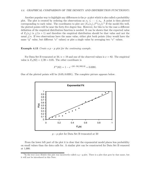
Another popular way to highlight any differences is the p−p plot which is also called a probability<br />
plot. The plot is created by ordering the observations as x 1 ≤ ··· ≤ x n . A point is then plotted<br />
corresponding to each value. The coordinates to plot are (F n (x j ),F ∗ (x j )). 3 If the model fits well,<br />
the plotted points will be near the forty-five degree line. However, for this to be the case a different<br />
definition <strong>of</strong> the empirical distribution function is needed. It can be shown that the expected value<br />
<strong>of</strong> F n (x j ) is j/(n +1) <strong>and</strong> therefore the empirical distribution should be that value <strong>and</strong> not the<br />
usual j/n. If two observations have the same value, either plot both points (they would have the<br />
same “y” value, but different “x” values) or plot a single value by averaging two “x” values.<br />
Example 4.13 Create a p − p plot for the continuing example.<br />
For Data Set B truncated at 50, n =19<strong>and</strong> one <strong>of</strong> the observed values is x =82. The empirical<br />
value is F n (82) = 1/20 = 0.05. The other coordinate is<br />
F ∗ (82) = 1 − e −(82−50)/802.32 =0.0391.<br />
One <strong>of</strong> the plotted points will be (0.05, 0.0391). The complete picture appears below.<br />
Exponential Fit<br />
F(x)<br />
1<br />
0.9<br />
0.8<br />
0.7<br />
0.6<br />
0.5<br />
0.4<br />
0.3<br />
0.2<br />
0.1<br />
0<br />
0 0.2 0.4 0.6 0.8 1<br />
F n (x)<br />
p − p plot for Data Set B truncated at 50<br />
Fromthelowerleftpart<strong>of</strong>theplotitisclearthattheexponentialmodelplaceslessprobability<br />
on small values than the data calls for. A similar plot can be constructed for Data Set B censored<br />
at 1,000.<br />
3 In the text Loss <strong>Models</strong> this plot was incorrectly called a q − q plot. There is a plot that goes by that name, but<br />
it will not be introduced in this Note.