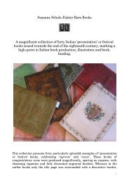
Typography and Printing - Schulz-Falster Rare Books
Typography and Printing - Schulz-Falster Rare Books
Typography and Printing - Schulz-Falster Rare Books

You also want an ePaper? Increase the reach of your titles
YUMPU automatically turns print PDFs into web optimized ePapers that Google loves.
<strong>Typography</strong> <strong>and</strong><br />
<strong>Printing</strong><br />
Susanne <strong>Schulz</strong>-<strong>Falster</strong> <strong>Rare</strong> <strong>Books</strong><br />
Antiquariat Michael Banzhaf<br />
1
Susanne <strong>Schulz</strong>-<strong>Falster</strong><br />
22 Compton Terrace<br />
London N1 2UN<br />
Telephone 0044 - (0)20 - 7704 9845<br />
Email: sfalster@btinternet.com<br />
www.schulz-falster.com<br />
Antiquariat Michael Banzhaf<br />
Moempelgarder Weg 17<br />
D - 72072 Tuebingen<br />
Telephone: 0049 - (0)7071 - 552314<br />
Fax: 0049 - (0)7071 - 552315<br />
Email: Antiquariat-Banzhaf@t-online.de<br />
VAT. No. DE 147 148 385<br />
www.antiquariat-banzhaf.de<br />
2
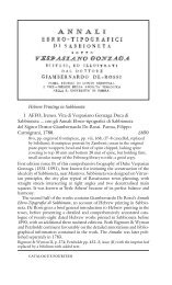
1 The first book-length type specimen printed in Italy<br />
Brogiotti, Andrea. Indice de caratteri, con l‘inventori, & nomi di<br />
essi, esistenti nella Stampa Vaticana, & Camerale. All‘ Ill.mo &<br />
R.mo Sig Francesco Card. Barberino. Rome, [Stampa Vaticana e<br />
Camerale], 1628. ll. 74 (i.e. 72), printed on rectos only, title in red<br />
<strong>and</strong> black with woodcut Barberini arms, pagination includes<br />
68 pages of type specimens, <strong>and</strong> four pages of music, one also<br />
printed in red <strong>and</strong> black; very faint trace of damp to margin of<br />
first signature; contemporary full vellum over boards, Spanish<br />
lettering along the spine, ownership inscription to title of Enea<br />
Corradini; a fine copy.<br />
€ 12000.00<br />
Bigmore & Wyman I, 84; Birrell & Garnett 2; Blades, p. 14; Jammes 10;<br />
Mosley, p. 84; Updike I pp. 166-168; see also the facsimile with extended<br />
introduction by H.D.L. Vervliet (1967). First edition of the first booklength<br />
type specimen to be published in Italy. ‚The ‚Indice‘ is among the<br />
most interesting specimens in the history of printing, <strong>and</strong> shows the<br />
material of a seventeenth-century Italian printing office at its simplest<br />
<strong>and</strong> best‘ (Updike I, pp. 168 ff). Brogiotti was director of the Stamperia<br />
Vaticana, which evolved out of the Typographia Apostolica Vaticana (the<br />
learned press) <strong>and</strong> the Stamperia Camerale, responsible for printing<br />
official documents. He gives information on the origin of the type faces<br />
before presenting first a series of woodcut alphabets, then those in metal<br />
type. He first shows the older faces (mostly French) followed by the newer<br />
ones of Italian origin, such as those designed by Granjon during his time<br />
in Rome <strong>and</strong> later typefounders. In each case he indicates they origin.<br />
Included are Hebrew, Arabic, Cyrillic, Gothic Greek <strong>and</strong> Latin alphabets,<br />
together with four specimens of plain-song music types.<br />
3
2 Etching <strong>and</strong> engraving in Portugal – first Portuguese<br />
translation of Bosse’s engraving manual<br />
Bosse, Abraham. Tratado da Gravura a agua forte, e a buril, e em maneira negra com<br />
o modo de construir as prensas modernas, e de imprimir em talho doce. Nova ediçao<br />
traduzida do francez ... por José Joaquim Viegas Menezes. Lisbon, Arco do Cego, 1801.<br />
Tall 8vo (208 x 152 mm), engraved title, pp. [x], ix, [1], 189, [1] errata, with 21<br />
engraved plates; plates printed on slightly darker stock; a wide-margined<br />
clean copy in recent full calf, gilt.<br />
€ 2000.00<br />
Innocencio IV, 415; Moraes p. 11; see Bigmore & Wyman I, 72 <strong>and</strong> Cicognara<br />
255 for French edition. First Portuguese translation of Bosse‘s classic introduction<br />
to copperplate etching <strong>and</strong> engraving, Traité des manières de graver<br />
en taille douce. This Portuguese translation by José Joaquim Viegas Menezes<br />
is clearly taken from the Jombert edition <strong>and</strong> reproduces the same plates,<br />
though newly engraved with subtle adaptations; an extensive introduction<br />
precedes the text.<br />
4
3 With Bonnet’s instructions on colour printing<br />
Bosse, Abraham. De la Manière de Graver a l‘Eau<br />
forte et au Burin. Et de la Gravûre en Manière noire.<br />
Avec la façon de construire les Presses modernes, &<br />
d‘imprimer en Taille-douce. Nouvelle Édition, Augmentée de l‘Impression qui imite<br />
les tableaux, de la Gravure en maniere de crayon, & de celle qui imite le lavis. Enrichie<br />
de vignettes & de vingt-une Planches en taille-douce. Paris, Charles-Antoine Jombert,<br />
1758 [vere ca 1773]. Tall 8vo (196 x120 mm), engraved frontispiece, pp. xxxii (including<br />
engraved dedication), 205, [3] privilege, with four finely engraved vignettes (one<br />
after Cochin, <strong>and</strong> one after Bosse), 21 engraved folding throw-out plates; contemporary<br />
full catspaw calf, spine decoratively gilt in compartments, gilt-lettered spine label;<br />
expert repair at head of upper joint; a fine crisp copy.<br />
€ 2800.00<br />
Bigmore & Wyman I, 72; Cicognara 255; see En Français dans le Texte, 92; see Arthur M. Hind, ‚A<br />
note on C.N. Cochin‘s second revision of Abraham Bosse‘s Traicté des manières de graver‘, Burlington<br />
Magazine (1907), p. 390 ff. Second Jombert edition (<strong>and</strong> fourth edition in all) of Bosse‘s Traité,<br />
with extensive additions on colour printing, dated 1758 but in fact apparently printed in 1773 (see<br />
below). This fourth edition adds two new plates by Louis-Marin Bonnet, the inventor of the Crayon<br />
manner of colour printing <strong>and</strong> a separate chapter on this method of colour<br />
printing. As for the date of publication, Arthur M. Hind argues that due<br />
to a number of references in the text <strong>and</strong> the citing of the ‚gravure‘<br />
article in the Encyclopédie the date of publication has to be<br />
some fifteen years later than stated both on the title <strong>and</strong><br />
the imprint.In addition to a wealth of technical information,<br />
the work includes scenes of the engraving studio<br />
<strong>and</strong> the copperplate press, <strong>and</strong> several wonderfully<br />
informative step-by-step scenes of printmakers at work<br />
appear as engraved headpieces at the start of each new<br />
chapter (one of them a copy of Bosse‘s large plate of 1643).<br />
As adaptations were made to all subsequent editions, the work has<br />
remained an important introduction to print-making which is of practical<br />
use to the printmaker even today.<br />
5
4 Bosse’s printing & engraving manual<br />
Bosse, Abraham. Traité des Manières à graver en taille douce sur l‘Airain, par le Moyen<br />
des Eaux Fortes & des Vernis durs & mols. D‘Imprimer les Planches, & de construire<br />
la Presse. Paris, [Aubouin & Clousier] paste-over label: Paris, Claude Jombert, 1701.<br />
8vo, engraved title, engraved frontispiece, pp. [viii], 70, [2] with 16 numbered engraved<br />
plates, <strong>and</strong> two unnumbered plates, i.e. engraved dedication <strong>and</strong> unnumbered plate<br />
signed by Ertinger; contemporary full calf, spine gilt in compartments, extremities a<br />
little rubbed, discreet repair to lower corner.<br />
€ 3000.00<br />
See Bigmore & Wyman I, 72; Cicognara 254;<br />
see En Français dans le Texte, 92; for LeClerc<br />
see Colour <strong>Printing</strong> with the Crayon Method<br />
Thieme/Becker XXII, p. 523. First LeClerc edition<br />
of Bosse‘s manual of etching, engraving <strong>and</strong><br />
printing. Bosse‘s treatise was aimed both at the<br />
professional engraver <strong>and</strong> at the amateur <strong>and</strong> is<br />
extensively illustrated, with detailed engravings<br />
based on Bosse‘s own designs. Subsequent editions,<br />
the present one by LeClerc <strong>and</strong> a further<br />
one edited by Cochin, are all valuable in their<br />
own right as they reflect changes in printing<br />
<strong>and</strong> engraving technique. This LeClerc edition<br />
has one extra plate <strong>and</strong> a newly written chapter<br />
explaining the use of the shallow etching bath.<br />
6
5 Early Spanish colour printing<br />
Rueda, Manuel de. Instruccion para gravar en cobre, y perfeccionarse en el gravado<br />
à buril, al agua fuerte, y al humo, con el nuevo methodo de gravar las planchas para<br />
estampar en colores, à imitacion de la pintura; y un compendio historico de los mas<br />
célebres gravadores, que se han conocide desde su invencion hasta el presente.<br />
Madrid, Ibarra, 1761. 12mo, 12 partly folded engraved plates, pp. [xxxii], 230; contemporary<br />
half calf, spine lettered in gilt; edges a little worn.<br />
€ 5800.00<br />
Bigmore & Wyman II, 278. UCBA II, 1791. First edition. A detailed<br />
manual on engraving, of special interest is a section on colour<br />
printing on pages 167 to 192 after the method of Le Blon<br />
illustrated with one plate. Some marginal foxing else a nice<br />
copy of a scarce book.<br />
7
6 Model for 18th century commercial h<strong>and</strong>-writing<br />
Snell, Charles. The Art of Writing; in it’s Theory <strong>and</strong> Practice. by Charles Snell,<br />
writing Master at the Free Writing-School in Forster-Lane, London: with whom youth<br />
may board. George Bickham, sculpsit. London, Henry Overton, 1712. [bound with:]<br />
The st<strong>and</strong>ard rules of the round <strong>and</strong> round-text-h<strong>and</strong>s: mathematically demonstrating<br />
how better alphabets of those h<strong>and</strong>s may be performed than have ever yet been<br />
published in Great Britain. London, Henry Overton, 1723. Two works in one volume.<br />
Oblong folio (217 x 350 mm), engraved portrait bound as frontispiece, pp. [iv], v, [1]<br />
advertisement, engraved title, engraved dedication, <strong>and</strong> 25 engraved plates (numbered<br />
4–8); [iv], viii, <strong>and</strong> six engraved plates (A to F); some light browning, the advertisement<br />
<strong>and</strong> engraved title shaved at foot; nineteenth-century half vellum over marbled<br />
boards, gilt-lettered red morocco spine label.<br />
€ 3300.00<br />
I. ESTC t139398; See A. Heal, The English writing masters, 1931, p. 161; II. this issue not found<br />
in ESTC, see ESTC n23247 for the 1717 edition. Two engraved writing manuals by the highly successful<br />
writing-master Charles Snell <strong>and</strong> engraved by George Bickham, first edition of the first work,<br />
unrecorded edition of the second. Charles Snell (1667 - 1733) was for many years London’s most<br />
prominent writing master <strong>and</strong> accountant. He was highly influential in replacing Puritan flourish<br />
with a plainer <strong>and</strong> more efficient round h<strong>and</strong>, which set the st<strong>and</strong>ard for commercial h<strong>and</strong>writing in<br />
the eighteenth century, ‚his practice <strong>and</strong> teaching of a simpler <strong>and</strong> st<strong>and</strong>ardized mode of h<strong>and</strong>writing<br />
most effectively met the need of clerks in the growing number of commercial houses. This is his<br />
principal claim to fame’ (Oxford DNB). The second work, The st<strong>and</strong>ard rules of the round <strong>and</strong> roundtext-h<strong>and</strong>,<br />
was first published in 1715, the present edition is unrecorded. Here Snell gives a brief<br />
introduction to his st<strong>and</strong>ardized round-h<strong>and</strong>, both in the letterpress text <strong>and</strong> in the engraved plates,<br />
which clearly outline the strength <strong>and</strong> thickness of strokes for forming legible letters <strong>and</strong> figures.<br />
8
7 Unrecorded calligraphy manual<br />
Duval, Nicolas. Nouvelles Ecritures de Finance & italienne batarde, en usage avec<br />
un traité pour apprendre l’Orthographe par Nicolas Duval secrétaire ordinaire de<br />
la chambre du Roy & M. Escrivain juré à Paris. Paris, Veuve Jean Henault & François<br />
Henault, 1674. Oblong small folio (196 x 310 mm), ll. [2] (engraved title <strong>and</strong> dedication),<br />
pp. 4, [1-]15, [1], 8 (letterpress text), ll. 20 (engraved text); engraved title with<br />
elaborate border, each engraved leaf with the text extended to form elegant calligraphic<br />
borders, the letterpress text often in columns, typographical rules; margins of<br />
plates showing evidence of old dampstains <strong>and</strong> fraying, the lower blank forecorner of<br />
title worn or torn with slight loss (not touching text) lately expertly repaired, the engraved<br />
border cropped at head with slight loss; limp vellum wrappers re-used from an<br />
earlier manuscript on vellum with traces of original text <strong>and</strong> various later scribbles<br />
<strong>and</strong> pen-tests; spine expertly repaired.<br />
€ 5400.00<br />
See Becker, 88 <strong>and</strong> 89 (editions of c. 1670 <strong>and</strong> after 1686), this issue not in OCLC or in any of the<br />
usual catalogues. Nicolas Duval was an influential figure in the development of French calligraphy<br />
<strong>and</strong> worked at the heart of the French government<br />
as Secretaire Ordinaire de la Chambre<br />
du Roy. He issued a number of fine engraved<br />
manuals with differing sequences of plates<br />
<strong>and</strong> letterpress explanations <strong>and</strong> this example<br />
is apparently otherwise unrecorded. There<br />
does not appear to be any other work with the<br />
same title or, indeed, the same composition of<br />
text <strong>and</strong> plates. Surviving examples of these<br />
manuals are rare, <strong>and</strong> it is clear that Duval altered<br />
titles <strong>and</strong> contents to suit circumstances<br />
(perhaps on taking on a new student) so that<br />
each title may have been unique or issued in<br />
only very small numbers.<br />
9
8 <strong>Printing</strong> Greek, Hebrew <strong>and</strong> Arabic –<br />
a guide for compositors<br />
Oliveira, Custodio José de. Diagnosis typografica dos caracteres<br />
gregos, hebraicos, e arabigos, addiccionada com algumas notas<br />
sobre a divisao orthografica da lingua latina, e outras da Europa,<br />
a que se ajuntao alguns preceitos da Arte Typografica para<br />
melhor correcção, e uso dos compositores, e aprendizes da Imprensa<br />
Regia. Lisbon, Impressao Regia, 1804. 8vo, pp. [xvi], viii,<br />
72, with pp. 4 of engraved plates showing ligatures <strong>and</strong> abbreviations<br />
bound after f4; numerous type specimens in the text;<br />
contemporary limp pattern paper boards; spine strengthened.<br />
€ 1450.00<br />
Bigmore & Wyman II, 90; Collins, Catalogue Bonaparte, 1981; Innocêncio<br />
II, 113.; Fonseca, Aditamentos 104; Monteverde 3822. First <strong>and</strong> only<br />
edition of this practical instruction manual for compositors when using<br />
Hebrew, Greek <strong>and</strong> Arabic alphabets, <strong>and</strong> the only Portuguese manual<br />
of typesetting. Alphabets <strong>and</strong> numbers of these languages together with<br />
their Roman letter equivalents are illustrated on the large number of tables<br />
<strong>and</strong> inserts in the text. Oliveira also includes explanations of formats<br />
<strong>and</strong> signatures, compositorial exercises <strong>and</strong> extensive information on<br />
Greek typography (in the form of a twenty-page footnote) together with<br />
four engraved plates showing ligatures <strong>and</strong> abbrevations of Greek.<br />
9 Flügel, J(ohann) G(ottfried). Literarische Sympathien oder<br />
industrielle Buchmacherei. Ein Beitrag zur Geschichte der<br />
neueren englischen Lexicographie. ... nebst einem Vorwort von<br />
Professor Dr. Gottfried Hermann. Leipzig, Weichardt 1843. 8vo,<br />
pp. vi, 41; publisher’s printed wrappers; wrappers dust-soiled.<br />
€ 250.00<br />
Kat. Bibliothek d. Börsenvereins dt. Buchhändler I, 496. First edition.<br />
Flügel published in 1847 <strong>and</strong> 1852 a „Praktisches Englisch-Deutsches<br />
und Deutsch-Englisches Wörterbuch“. In this pamphlet he strongly<br />
argues against other publishers of English-German or German-English<br />
dictionaries.<br />
10
10 Unrecorded second (?) edition of a scarce Spanish type specimen<br />
Espinosa de los Monteros y Abadia, Antonio. Muestras de los caracteres que se funden<br />
por direccion de D. Antonio Espinosa de los Monteros y Abadia, academico de la Real<br />
de San Fern<strong>and</strong>o, uno de sus primeros pensionados, en matrices hechas enteramente<br />
por el mismo, con punzones, que igualmente prosigue trabaj<strong>and</strong>o hasta concluir un<br />
surtido completo. No place, no date (Madrid, 1775?). 4to (205 x 148 mm), ll. [xxxii]<br />
typefaces, of which 4 large folding; mostly within different borders; contemporary<br />
mottled calf; flat spine, richly gilt, head of spine defective.<br />
€ 4500.00<br />
Updike II 80–81. Cf. Palau 184145 (only 24 leaves) <strong>and</strong> Birrell & Garnett 181. Probably second<br />
enlarged edition. On KVK there is a supposed 1770 edition (3 copies worldwide) with only 24<br />
leaves. Our copy with an additional contemporary manuscript title-leaf “Fabrica nueva de caracteres<br />
de imprimir cuyos punzones y matrices inventa y graba D. Ant. Espinosa de los Monteros – Academico<br />
de las nobles artes y grabador principal de la Casa de Moneda de Segovia 1775”. ”It shows<br />
a series of slightly condensed old style types<br />
which are remarkable in one respect – that roman<br />
characters in some cases, <strong>and</strong> italic in all, have an<br />
extraordinary quality of pen-work” (Updike, II, 81).<br />
A nice copy of an extremely scarce Spanish type<br />
specimen book.<br />
11
11 Gillé’s type specimen <strong>and</strong> sample book – for in-house use?<br />
Gillé, Joseph-Gaspard. Extensive Type Specimen Sample Album, Fonderie et Imprimerie<br />
J. Gillé. Rue St Jean de Beauvais no. 28, Paris. Paris, Gillé, 1800 - 1813. Folio (430 x<br />
290mm), album of ll. 50 of Gillé’s typical wrappers printed on strong blue paper with<br />
classical decorative border; partially inserted, partially bound in are ll. 150 of type<br />
specimens, specimens of vignettes, decorative borders, advertising circulars, sample<br />
title pages etc.; bound in contemporary marbled boards, with red paper spine <strong>and</strong><br />
corners, gilt-lettered red roan label to upper board, reading ‚Fonderie et Imprimerie<br />
J. Gillé, rue St. Jean de Beauvais, no 28, à Paris’; binding rubbed <strong>and</strong> corners bent, but<br />
in very good condition.<br />
€ 14000.00<br />
See Audin 75-79; Birrell & Garnett 47; Gaskell,<br />
Barber & Warrilow, F9; Barber, French Letterpress<br />
printing p. 14; Fleuron 6, pp. 167 etc.; D.B. Updike,<br />
‚A translation of the reports of Berlier & Sobry on<br />
Types of Gillé fils. A fascinating type specimen album<br />
serving arguably both as a file copy <strong>and</strong> advertising<br />
tool for the firm of the Paris typefounder <strong>and</strong><br />
printer Gillé fils. Gillé is particularly important as a<br />
promoter of the newer styles of ornament, offering<br />
typographic decoration to the printers of France, in a<br />
kind of stereotype, which he asserted was in design<br />
<strong>and</strong> method of reproduction destined to overthrow<br />
the outdated woodcuts of the ancien regime. (see<br />
Fleuron VI, p. 167 ff). The type specimen combines<br />
traditional forms of presenting new type faces,<br />
12
with ‚promotional’ literature, <strong>and</strong> an extensive range of borders <strong>and</strong> decorative devices. This type<br />
specimen has arguably been compiled within the firm of Gillé fils to provide an overview of his type<br />
specimens, advertisements <strong>and</strong> prospectuses published in the first decade of the nineteenth century.<br />
Amongst French type-founders at the end of the eighteenth <strong>and</strong> in the early years of the nineteenth<br />
century, the two Gillés, père et fils, held a prominent position. Gillé fils ‚was not content to rest on<br />
his father’s laurels after taking over the foundry in 1789. With the help of a workforce numbering<br />
between 80 <strong>and</strong> 100, he added substantially to his father’s range of types <strong>and</strong> ornaments. He also<br />
made a considerable personal reputation by successfully combining artistic talent, commercial<br />
ambition, <strong>and</strong> the ability to keep himself well informed about technical developments in printing<br />
at home <strong>and</strong> abroad’ (Dreyfus). Gillé produced a number of type specimens, bound normally in the<br />
wrappers which serve here as the dividers in the scrapbook. A number of these type<br />
specimens exist, all of them differ somewhat in their composition.<br />
This Gillé album includes not just the rarest items, such<br />
as the prospectus <strong>and</strong> a number of large<br />
folding type-specimen,<br />
but also some unrecorded<br />
examples. (a full listing is<br />
available on request).<br />
13
12 Weiss-Fraktur type specimen<br />
Weiß, E(mil) R(udolf). Weiß-Fraktur.<br />
Die Schrift des Tempel-Verlages. Frankfurt,<br />
Leipzig, Barcelona und Madrid,<br />
Bauersche Gießerei (1913). Oblong- 4to.<br />
pp. 104 with various types, vignettes<br />
partly printed in colour, publisher’s boards, printed paper label<br />
mounted to front cover, covers dust-soiled, spine-ends slightly<br />
damaged. € 250.00<br />
Jolles 198. First edition.<br />
14<br />
13 New York private press<br />
Corell Press. A Book to show certaine goodlie types for printing in olde style. New<br />
York, Ye Corell Press, & ye Press of ye Classical School Associated Printers in ye olde<br />
style at University Place & Ninth Street in ye goodlie City of Neu Amsterdam (ca.<br />
1895). 8vo (218 x 136 mm), pp. [xx] of type specimen; original printed blue wrappers,<br />
uncut. € 260.00<br />
An obscure press which eventually moved to the tiny town of Mt. Washington, Mass. “This brochure<br />
is issued in accordance with the theory that the history of typography should, to a proper extent,<br />
govern the work of the modern printer“ (preface). Slightly soiled.
14 Early type specimen of the Arnhem printers C.A. Thieme<br />
Thieme, Carl Albert. Letterproef der Boekdrukkery van C.A. Thieme, te Arnhem.<br />
Arnhem, [Thieme], 1830. Folio (320 x 205 mm), ll. 44 comprising title page, with small<br />
vignette showing a printer’s studio, ll. 28 of types including music, 5 of ‚Bloemen’<br />
(fleurons <strong>and</strong> rules), 1 of numbers, 1 of algebraic symbols <strong>and</strong> fractions, 3 of coats<br />
of arms of the Netherl<strong>and</strong>s, <strong>and</strong> 5 of vignettes; original grey printed boards, the title<br />
on the upper board <strong>and</strong> a Stanhope press on the lower, both within fleuron borders,<br />
spine paper covering mostly worn off <strong>and</strong> clumsily lettered in manuscript, sides <strong>and</strong><br />
corners a little soiled <strong>and</strong> worn.<br />
€ 4400.00<br />
Not in Bigmore & Wyman, Davis<br />
<strong>and</strong> Orioli or Jammes; not in<br />
John A. Lane et al, Dutch type<br />
founders’ type specimen, 1998;<br />
OCLC lists Amsterdam University<br />
Library only; Marinus Anthonie<br />
Sipman, Drukkerij G.J. Thieme,<br />
Arnhem en Nijmegen, Thieme,<br />
1913. Apparently only edition of<br />
this early type specimen of the<br />
Arnhem printers C. A. Thieme.<br />
The firm was founded by H.C.A.<br />
Thieme, who came to Zutphen in<br />
1770 from Wesel in Germany. He<br />
married into a local printing firm,<br />
<strong>and</strong> his four sons continued the<br />
business, two in Arnhem, one in<br />
Nijmegen <strong>and</strong> one in Zutphen.<br />
The firm remained active well<br />
into the 20th century (see<br />
H<strong>and</strong>book Concise History of the<br />
Printed Book in the Netherl<strong>and</strong>s).<br />
15
15 Italian provincial type specimen<br />
Capriolo, Luigi. Campione dei Caratteri, Vignette<br />
e Fregi della Tipografia Capriolo in Aless<strong>and</strong>ria.<br />
Aless<strong>and</strong>ria, Luigi Capriolo, 1855. Tall 8vo, (200 x<br />
148mm), ll. 171, all printed on one side only, within<br />
decorative border; occasionally a little browned, due<br />
to paper stock, <strong>and</strong> title page strengthened in gutter<br />
margin; contemporary full sheep, flat spine decorated<br />
<strong>and</strong> lettered in gilt, quite rubbed, joints weakening,<br />
but holding firm.<br />
€ 2500.00<br />
Not found in OCLC, not in St Bride catalogue, Mosley or<br />
Jammes. Very rare type specimen of the publishers <strong>and</strong><br />
printers Luigi Capriolo in Aless<strong>and</strong>ria, Italy. Thirty leaves of<br />
text type are followed ca. 60 ll. of display types of all shapes<br />
<strong>and</strong> sizes, 7 leaves showing typographic borders, <strong>and</strong> ca. 70<br />
ll. of vignettes, including woodcut borders. About half the<br />
leaves are printed l<strong>and</strong>scape. Particularly expressive are the<br />
display types, <strong>and</strong> bulked-up roman letters, ‚fatface, shaded<br />
<strong>and</strong> decorated types’. The large size woodcut borders include<br />
architectural designs, but also figurative borders, similar<br />
to sixteenth century designs. The printers, publishers <strong>and</strong><br />
booksellers Luigi Capriolo were active in Aless<strong>and</strong>ria from the<br />
end of the 18th century.<br />
16
16 Proof copy<br />
Oomkens, J & J. Zoon. Proef van Letteren, Bloemen, enz. der Boekdrukkery van J.<br />
Oomkens J. Zoon. Groningen, Oomkens, 1807. 8vo, ll. [iv], half-title, title <strong>and</strong> preface,<br />
followed by ll. [67] of type specimen, mostly printed within border of type ornaments,<br />
<strong>and</strong> including a large number of loose proof sheets, without signatures etc.; preserved<br />
in old boards, with lozenge-shaped printed label loosely inserted; a very fine <strong>and</strong> crisp<br />
copy.<br />
€ 3200.00<br />
Bigmore & Wyman II, 93; not in Birrell & Garnett; not in Jammes. Proof copy of the first type specimen<br />
of the printers J. Oomkens. Oomkens (1772 - 1851) states in his preface that after acquiring<br />
the printing house in 1802 he intended to publish a type specimen, but decided to hold back until<br />
he had built up a representative stock. This proof copy indicates his careful selection of suitable type<br />
faces, <strong>and</strong> the care with which he presented them. The type specimen not only gives a comprehensive<br />
overview of his display <strong>and</strong> text types, vignettes, borders <strong>and</strong> lines, but is particularly attractive,<br />
with every specimen printed within a different border of type ornaments. His son Alle van der Veen<br />
Oomkens (1814 – 1872) later added a type-foundry to the printing works. In addition to display<br />
type <strong>and</strong> text type, Oomkens includes Greek, Hebrew, Syriac, <strong>and</strong> Arabic letters. He offers a large<br />
selection of mathematical <strong>and</strong> commercial abbreviations, figures, fractions <strong>and</strong> superscript, almanac<br />
cyphers, <strong>and</strong> medical <strong>and</strong> alchemical symbols. The type specimen concludes with vignettes, fleurons,<br />
<strong>and</strong> typographical ornaments.<br />
17
17 H. W. Caslon & Co Ltd. Specimens of types & borders <strong>and</strong> illustrated catalogue<br />
of printers’ joinery <strong>and</strong> materials. 2 parts in one volume. London, Caslon, (1913). 4to<br />
(290 x 235 mm), frontispiece portrait of William Caslon, pp. I., [viii], 660; 126 with<br />
many text illustrations of printing materials; publisher’s brown cloth, spine lettered<br />
in gilt, black title on front cover; all edges red; slight wear to edges.<br />
€ 700.00<br />
A massive type specimen book of this famous type foundry. The first part covers text type, poster<br />
<strong>and</strong> display type <strong>and</strong> numerous ornamental dashes, together with decorated borders <strong>and</strong> corners.<br />
With a loosely inserted 4-page price-list.<br />
18
18 Spanish calligraphy<br />
(Anduaga y Garimberti, José de). Arte de escribir por reglas y<br />
sin muestras, establecido de orden superior en los reales sitios<br />
de San Ildefonso y Valsain despues de haberse experimentado<br />
en ambos la utilidad de su ensenanza, y sus ventajas respecto<br />
del metodo usado hasta ahora en las escuelas e primeras letras.<br />
Madrid, Imprenta Real de la Gazeta 1781. 4to (250 x 178 mm), pp. [iv], xxxix (1), 99, (5),<br />
30 plates with 53 engravings; contemporary green Spanish morocco, spine richly gilt;<br />
sides with gilt fillets; a.e.g., marbled end-papers. Fine.<br />
€ 6000.00<br />
Cotarelo y Mori, Diccionario Biográfico y Bibligráfico de los Calígrafos Españoles, p. 101. Palau<br />
12350 “De esta primera edicion no hemos visto ejemplar“. Salva 2197. Bonacini 75. First edition,<br />
very rare. A large paper copy in a lavishly decorated contemporary Spanish binding.<br />
19
19 ‘The most important lithographic manual<br />
published in Engl<strong>and</strong>’<br />
Hullm<strong>and</strong>el, Charles. The Art of Drawing on Stone, giving a full explanation<br />
of the various styles, of the different methods to be employed to<br />
ensure success, <strong>and</strong> of the modes of correcting, as well as of the several<br />
causes of failure. London, C. Hullm<strong>and</strong>el, R. Ackermann, [1824]. 4to, pp. [ii] lithograph title, xvi,<br />
vii, [1] blank, 92, [2] advertisement for various lithographic works, with 19 lithograph plates in<br />
various techniques (two with tinted background); uncut in recent pale blue boards; some light<br />
foxing <strong>and</strong> spotting due to paper quality; early ownership inscription to title by M. Leather; a<br />
good copy. € 1450.00<br />
Bigmore & Wyman I, 349; Bridson & Wakeman D20; Jackson Burke 1025; Twyman, Lithography, p. 114. First<br />
edition of ‚the most important lithographic manual published in Engl<strong>and</strong> in the the first half of the century with<br />
the most explicit illustrated instructions for the artist working in the tonal style‘ (Bridson & Wakeman, p. 132.)<br />
Hullm<strong>and</strong>el had studied lithographic printing under Senefelder, the inventor of the process, <strong>and</strong> gives a thorough<br />
introduction to the technique of crayon drawing for lithography. His sufficiently high st<strong>and</strong>ards in printing attracted<br />
competent draughtsmen to draw on stone, <strong>and</strong> during the 1820s <strong>and</strong> 1830s he was responsible for making<br />
many important improvements to the printing process, which in turn was responsible for the success of lithographic<br />
printing in Engl<strong>and</strong>. A full analysis of the work <strong>and</strong> its importance in making the lithographic printing process<br />
more popular is given in Twyman, Lithography 1800-1850, pp. 114-31. The plates include a map, samples of<br />
h<strong>and</strong>writing, demonstrations of techniques <strong>and</strong> effects, with one example in two colours.<br />
20<br />
20 P. Piette’s copy with his printed label <strong>and</strong><br />
additional manuscript material<br />
Didot, Paul Firmin. Nouveau mode de blanchiment. (Paris, Firmin Didot<br />
frères 1855). 14 pages, one large folding engraved plate. – Together with: 3<br />
contemporary large folding technical wash-drawings (ca 500 x 400 mm)<br />
on tracing paper with technical devices for the bleaching of paper-stuff<br />
<strong>and</strong> rags. Due to fragility of the paper with some tears in folds (but no<br />
loss of image). Contemporary cloth, gilt title to spine; covers soiled, with<br />
printed label of P. Piette to front fly-leaf. € 2600.00<br />
Not in Weiss, Papiergeschichte. Garcon, Bibliographie des industries tinctoriales II,<br />
p. 205. Rieger II, 170. Bigmore & Wyman I, 180 (variant title). First <strong>and</strong> only edition.<br />
”Paul Firmin is the son of Hyacinthe. He was born in 1826, <strong>and</strong> has devoted much<br />
attention to chemical investigations, with the view of improving the manufacture of<br />
paper. He published jointly with M. Barruel „Un nouveau methode de blanchiment<br />
des chiffons et des plantes textiles, par l’adjonction du gaz acide carbonique“ in 8vo.<br />
This is a work which led to several improvements in the processes of paper-making,<br />
especially in the bleaching of rags <strong>and</strong> of paper-stuff made from fibrous plants“<br />
(Bigmore & Wyman).
21 Magnificently printed by Didot for the<br />
education of the Dauphin<br />
Massillon, Jean-Baptiste. Petit Carême. … Imprimé par ordre du<br />
roi pour l’éducation de Monsigneur le Dauphin. Paris, Didot<br />
l’aîné, 1789. Large 4to, woodcut-vignette on title, pp. [viii], 312,<br />
contemporary red morocco, flat spine richly gilt; frame gilt<br />
borders to covers; all edges gilt; marbled endpapers; printed<br />
bookseller ticket “Chez les Fr. Gay, St. Petersburg & Moscow“ on<br />
front paste-down. Minor rubbing.<br />
€ 2800.00<br />
One of 200 copies. “Cette édition a été imprimée, au nombre de 200<br />
exemplaires, avec les nouveaux caractères de la fonderie de Didot l’aîné,<br />
gravés par Firmin, son second fils, sur papier vélin de la fabrique de MM.<br />
Dervaud et Frères Henry, d’Angoulême“ (from the prelims). One of the<br />
magnificently printed <strong>and</strong> bound works which were made by order of<br />
Louis XVI for the education of the Dauphin. The h<strong>and</strong>ful of titles were all<br />
limited to an edition of 200 copies, <strong>and</strong> were printed with the types cast<br />
by Firmin Didot on special paper ’velin’, that the Didots first introduced in<br />
France in 1780. A fine broad margined copy in a decorative contemporary<br />
binding.<br />
21
22 Urania type foundry<br />
Urania. Catalogo articoli di Fonderia Caratteri di Testo Fantasie, Fregi e Fili in Ottone<br />
e Piombo, fusetti grappe ecc. Milan, Urania ca 1900. 8vo, pp. lxxviii, [2], 83, [1], 47, [1],<br />
112; with some specimens in colour; original printed cloth. € 600.00<br />
Fine type specimen of the little-known Milan type-foundry, founded in the early twentieth century.<br />
To strengthen its market share, it merged in 1908 with the Turin Nebiolo foundry in a kind of<br />
holding company, called Augusta. After the first world war, the firm which by now incorporated<br />
other type foundries too, was renamed Nebiolo type foundry, under which name it still exists today,<br />
though better known for producing printing presses. The type specimen includes a large selection of<br />
text <strong>and</strong> display types, some printed in colour, lines, borders, <strong>and</strong> devices.<br />
22<br />
23 Regulating the Italian printing industry<br />
<strong>Printing</strong> – Law. Tabella che stabilisce il numero degli stampatori nel Regno. Milan,<br />
Reale Stamperia, 1812. Broadside (420 x 550 mm), printed on recto only, with arms of<br />
Eugenio Napoleone at head, printed in double dolumns, with table to lower half of<br />
broadside; foldmarks. For the French decree of 1810 see Carla Hesse, Publishing <strong>and</strong><br />
Cultural Politics in Revolutionary Paris, 1789-1810, 1991. € 600.00<br />
First edition of this decree on the regulation of printing in Italy, in particular the strict limitation of<br />
the numbers of printers licensed per town or city. This regulation passed in the Napoleonic Kingdom<br />
of Italy is basically an extension <strong>and</strong> adaptation of French rulings which had been passed in 1810.<br />
After the expansion of the print <strong>and</strong> publishing market during the revolutionary<br />
years, a large number of printers <strong>and</strong> publishers faced bankruptcy<br />
in the early 19th century, due to lack of regulation, changes<br />
in copyright law, a wider availability of small presses, which had<br />
led to a flooding of the market, <strong>and</strong> general oversupply. Signed<br />
by secretary of state Antonio Strigelli (1755–1835), this decree<br />
limits the number of printers per community. The lower half<br />
of the broadside shows the number of printers allowed by<br />
department <strong>and</strong> per city. Whereas 18 printers were allowed<br />
for Venice <strong>and</strong> Milan, Verona <strong>and</strong> Bologna could have 6,<br />
towns like Padua <strong>and</strong> Brescia had to make do with 4, Modena<br />
<strong>and</strong> Novara with just two, etc. figures are given<br />
for 72 towns <strong>and</strong> cities of the Napoleonic Kingdom<br />
of Italy. Exceptions were made for specialist printers,<br />
such as those printing music or printing in foreign<br />
<strong>and</strong> exotic languages.
24 Lamesle’s type specimen – from Updike’s library<br />
Lamesle, Claude. Épreuves Générales des Caracteres qui<br />
se trouvent chez Claude Lamesle Fondeur des Caracteres<br />
d’Imprimerie. Paris, Rue Gal<strong>and</strong>e, 1742. Small 4to, ll. 81, title<br />
<strong>and</strong> 80 leaves of type specimens, of which 10 are oblong in<br />
size, folded, <strong>and</strong> mounted on guards; title <strong>and</strong> music specimens<br />
printed in red <strong>and</strong> black; printed throughout within<br />
double border; contemporary full panelled calf, joints <strong>and</strong><br />
corners expertly repaired; from the library of the well-known<br />
type historian D.B. Updike, with his ownership inscription in<br />
ink to title page; a wide-margined copy.<br />
€ 4500.00<br />
Audin, 27; Bigmore & Wyman I, 417; Birrell & Garnett 35; see A. F.<br />
Johnson, The Type specimens of Claude Lamesle, a facsimile edition<br />
of the first edition printed at Paris in 1742, Amsterdam 1965; John<br />
Dreyfus, Aspects of French Eighteenth Century <strong>Typography</strong>, Cambridge, Roxborough Club, 1982.<br />
First edition of Lamesle’s first type specimen, a fine association copy of a splendid stock of types,<br />
containing examples of work by some of the finest French punchcutters, such as Peter Schoeffer the<br />
younger, Claude Garamond <strong>and</strong> Robert Granjon. ’Lamesle’s specimen book of 1742 was meticulously<br />
planned, with much of the text used for the specimen settings running on continuously from<br />
roman to italic <strong>and</strong> from one size to the next. His types were consistently numbered from start to<br />
finish, with Greek <strong>and</strong> Hebrew included in the numeration. Ornaments, signs, titlings <strong>and</strong> initial<br />
letters of various sizes were shown at appropriate junctures in the sequence, making the book a<br />
very comprehensive <strong>and</strong> helpful guide to printers deciding what they needed to order from him’<br />
(Dreyfus). This copy comes from the collection of the American printer <strong>and</strong> historian of typography<br />
Updike who was fulsome in his praise: ‚This book, both in type <strong>and</strong> ornaments, I think presents<br />
better than any other,<br />
the output of French<br />
foundries during the<br />
last quarter of the<br />
XVIIth <strong>and</strong> the first half<br />
of the XVIIIth century.<br />
The collection of types<br />
is remarkably fine’<br />
(Updike I, p. 270).<br />
23
25 Playing cards <strong>and</strong> papermaking<br />
Breitkopf, Johann Gottlob Immanuel. Versuch den Ursprung der Spielkarten, die<br />
Einführung des Leinenpapieres und den Anfang der Holzschneidekunst in Europa zu<br />
erforschen. Erster Theil, welcher die Spielkarten und das Leinenpapier enthält. Mit<br />
vierzehn Kupfertafeln. Leipzig, Breitkopf, 1784. 4to, pp. iv, 136, with 14 engraved plates,<br />
mostly folding; contemporary half sheep over paste-paper<br />
boards, spine in compartments, ruled in gilt; a good copy with<br />
modern ownership inscription to front free endpaper.<br />
€ 1800.00<br />
Bigmore & Wyman I, 81; St. Bride catalogue 8947. First edition of two<br />
extended illustrated essays on the history of printing by the eminent Leipzig<br />
printer <strong>and</strong> typographer Breitkopf (1719 - 1794), covering the history of<br />
playing cards <strong>and</strong> the origin of linen paper in Europe, <strong>and</strong> in particular in<br />
Germany. A third essay on woodcuts <strong>and</strong> their invention was to follow in<br />
1801 <strong>and</strong> is not present here. This first part was clearly meant as an independent<br />
publication, with a detailed concluding subject <strong>and</strong> author index.<br />
Breitkopf gives a thorough history of playing cards, the origin of cards, their<br />
iconography, <strong>and</strong> their printing. The second essay covers papermaking, both<br />
from cotton <strong>and</strong> linen, <strong>and</strong> its distribution <strong>and</strong> development in various European<br />
countries. Both essays are accompanied by very detailed bibliographical<br />
references <strong>and</strong> annotations.<br />
24
26 From the library of<br />
Johann Gottlieb Immanuel Breitkopf<br />
Vitray, Antoine. Linguarum orientalium Hebraicae, Rabinicae,<br />
Samaritanae, Syriacae, Graecae, Arabicae, Turcicae, Armenicae,<br />
alphabeta. Paris, Antonio Vitray, 1636 (colophon 1635).<br />
4to (187 x 144 mm), pp. [iv], 54, (2) pages with oriental types,<br />
woodcut vignette to title; 18th century marbled wrappers in<br />
modern half leather binding; front paste-down with printed<br />
label of the Librairie Orientale de Dondey-Dupré père et fils;<br />
colophon-leaf with mounted woodcut bookplate of Johann<br />
Gottl. Imman. Breitkopf “Lipsiae ex Ioh. Gottl. Imman. Breitkopfii<br />
Bibliotheca“, the famous German printer <strong>and</strong> publisher.<br />
€ 7500.00<br />
Birrell & Garnett 34 “Extremely scarce“. Not in Bigmore & Wyman <strong>and</strong> in Smitskamp, Philologia orientalis.<br />
Cf. Updike I, 208-209. First <strong>and</strong> only edition. Antoine Vitray (ca 1600-1674) became King’s<br />
printer for Oriental languages in 1622, <strong>and</strong> in 1635 he succeeded Antoine Estienne as printer to the<br />
clergy. He is best known as the printer of the great Paris polyglot of Gui Michel Le Jay, published in<br />
ten volumes in 1645. The Oriental types used were partly from the collection of Oriental types formed<br />
by Savary de Brèves, French ambassador to Constantinople <strong>and</strong> Rome. In 1632 after de Brèves<br />
death Louis XIII ordered Vitray to buy them <strong>and</strong> to add Armenian <strong>and</strong> Ethiopian. Vitray employed<br />
Jacques de Sanlecque to cut the punches <strong>and</strong> strike the matrices for the Armenian type. The types<br />
after being used in the famous Paris polyglot were finally h<strong>and</strong>ed over to the Imprimerie Royale<br />
after Vitray’s death in 1674. A few spots, else a fine copy with a distinguished provenance.<br />
25
27 Unrecorded broadside type specimen by Didot<br />
Didot. Fonderie de Firmin Didot, Rue Jacob, no 24, à Paris, Feuille d’Epreuve no 4.<br />
Paris, Firmin Didot, 1818. Full sheet (465 x 610 mm), type specimen arranged in three<br />
sections, printed within decorative border; on laid paper, indistinct watermark, some<br />
weakening of paper in old folds <strong>and</strong> short tears repaired on the verso, two small pin<br />
holes; margins dust-soiled.<br />
€ 2500.00<br />
Not in Birrell & Garnett, Bigmore & Wyman, or Jammes. A fine broadsheet type specimen from the<br />
Firmin Didot typefoundery, to present to printers the new selection of vignettes <strong>and</strong> fleurons. The<br />
type specimen illustrates 71 different borders <strong>and</strong> vignettes, of which 35 typographic borders, ca 10<br />
individual fleurons, mostly fleurs de lys, 13 composite rules <strong>and</strong> flower borders, <strong>and</strong> 14 individual<br />
vignettes, showing lyres, urns, satyres etc. The firm of Firmin Didot was founded in around 1775 by<br />
François Ambroise Didot, the inventor of the point system. Continued over a number of generations<br />
of typefounders, printers <strong>and</strong> publishers, the firm of Firmin Didot proved immensely influential<br />
on French typographic usage, until the mid-nineteenth century when the firm was absorbed in the<br />
Fonderie Générale.<br />
26
28 ‘The most important book on French<br />
eighteenth century typography’<br />
Fournier, Pierre Simon. Manuel Typographique, utile aux Gens de Lettres, & à ceux<br />
qui exercent les différents parties de l‘Art de l‘Imprimerie. Tome I [-II]. Two volumes.<br />
Paris, the Author, J. Barbou, 1764/1766 [vere 1768]. Two volumes, 8vo, pp. [iv] two engraved<br />
frontispieces, xxxii, 323, [1] errata, [4] privilege, <strong>and</strong> 8 folding engraved plates;<br />
[iv] frontispiece <strong>and</strong> title, xliv, [ii], 306, <strong>and</strong> 8 folding engraved plates, pages 177–186<br />
as fold-out pages with printed music; type specimen printed within decorative<br />
border; contemporary full calf, spine decoratively gilt, with two gilt-lettered labels<br />
<strong>and</strong> numbering pieces, sides with Greek rule, gilt dentelles, a.e.g.; a little rubbing to<br />
joints, front free endpaper removed; a fine copy, with engraved book-plate to front<br />
pastedown.<br />
€ 4200.00<br />
Audin, 55,56; Bigmore & Wyman I, 228; Birrell & Garnett 37; Jackson Burke<br />
527; <strong>Printing</strong> <strong>and</strong> the Mind of Man (Exhibition Catalogue) II, 112; see Updike,<br />
<strong>Printing</strong> Types, 1951, I, pp. 250-266 with numerous sample pages. First<br />
edition, a fine copy, of Fournier‘s masterpiece, a magnificent type specimen,<br />
which is regarded as ‚the most important book on French eighteenth century<br />
typography‘ (Birrell & Garnett 37). His types dominated European printing for<br />
fifty years (PMM II, 112). It includes 186 pages of specimens of type <strong>and</strong> 101<br />
alphabets, ancient <strong>and</strong> modern, <strong>and</strong> was ‚intended to explain to the layman<br />
the intricacies <strong>and</strong> nuances of the typographic art‘ ( Jackson Burke 527).<br />
Fournier‘s contribution to typography cannot be overestimated. ‚His grasp<br />
of typography was so complete <strong>and</strong> so firm that he could venture into every<br />
corner of it, its literature, its history, its relation to greater things, writing,<br />
architecture, music.‘ His first contribution had been his ‚table des proportions<br />
qu‘il faut observer entre les caractères‘, an attempt to st<strong>and</strong>ardize type<br />
sizes by a point system - a st<strong>and</strong>ard which is still in use today. He was a great<br />
innovator <strong>and</strong> moderniser of type faces, <strong>and</strong> his type specimen gives ample<br />
proof of this.<br />
27
29 Conspectus of type specimens of the Propag<strong>and</strong>a Fide<br />
[Propag<strong>and</strong>a Fide:] Thirteen books of alphabets: Armenian, Ge‘ez, Arabic, Burmese,<br />
Hindustani, Syriac, Estrangelo (ancient Syriac), Coptic, Greek, ancient Etruscan,<br />
Georgian; a set of charts of 12 eastern scripts <strong>and</strong> alphabets; <strong>and</strong> a Hebrew alphabet;<br />
from the press of the Sacred Congregation for the Propagation of the Faith. Rome,<br />
1629-1776. 13 works bound in one volume (details see below); eighteenth-century<br />
manuscript list of contents to front free endpaper recto; overall in very good condition<br />
(1st title-page has 2 parts of blank cut away <strong>and</strong> replaced with new paper), some<br />
mild browning; eighteenth-century vellum boards.<br />
€ 7500,–<br />
An excellent conspectus of type-specimens from the printing-press of the Sacred Congregation for<br />
the Propagation of the Faith, the Catholic missionary organization established in 1622. Present are<br />
the press‘s earliest dated alphabets, in Georgian (1629), Ge‘ez (1631), Syriac (1634), <strong>and</strong> Estrangelo<br />
(1636). Most of the alphabets are combined with material in the respective languages,<br />
including the Lord‘s Prayer, the Ave Maria <strong>and</strong> the Apostle‘s Creed. This sammelb<strong>and</strong><br />
contains twelve of the sixteen alphabets listed by the director Giovanni Cristofano<br />
Amaduzzi (1740-1792) in his 1773 bibliography of the press; as well as a<br />
Burmese alphabet from 1776. The twelfth item in the book is particularly<br />
unusual. It comprises: „three alphabets of Adam, the first from the<br />
Vatican Library, the second by Giacomo Bonaventura, the third<br />
by Lorenzo Schrader; four Hebrew alphabets [...] the third by<br />
Garamond, <strong>and</strong> the fourth Rabbinic by Garamond, a character<br />
discovered by Tomaso da Novara at the foot of Mt. Horeb; an<br />
analysis of the same by Athanasius Kircher; Samaritan <strong>and</strong><br />
Estrangelo alphabets [...], Chaldaean alphabet [...]“ (Birrell &<br />
Garnett).<br />
28
The contents, in total, are:<br />
1. Alphabetum Armenum, iussu S.D.N. Gregorij XV. & Sacrae Congregationis De Propag<strong>and</strong>a Fide<br />
impressum. 1673. Pp. [16] (Amaduzzi p. 7; Birrell & Garnett 10). 2. Alphabetum Aethiopicum, sive<br />
Abyssinicum. Cum oratione Dominicali Salutatione Angelica, Symbolo Fidei, & Praeceptis Decalogi,<br />
Latina lingua compositis, & Charactere Aethiopico impressis. 1631. Pp. 16 (Amaduzzi p. 7; not in<br />
Birrell & Garnett). 3. Alphabetum Arabicum, una cum Oratione Dominicali, Salutatione Angelica, &<br />
Simbolo Apostolico. 1715. Pp. 15 [1] (Amaduzzi p. 7; not in Birrell & Garnett). 4. Alphabetum Barmanum<br />
seu Bomanum regni Avae finitimarumque regionum. 1776. Pp. XLIV 51 [1] + engraved foldout.<br />
First leaf a blank (Birrell & Garnett 18). 5. Alphabetum Brammhanicum seu Indostanum, universitatis<br />
Kasi‘. 1771. Pp. XX 152 (Amaduzzi p. 7; Birrell & Garnett 12). 6. Alphabetum Chaldaicum,<br />
cum Oratione Dominicali, Salutatione Angelica, & Salutatio ad Virginem Mariam. Latina, & Chaldaica<br />
lingua compositis, & impressis. 1634. Pp. [12] (Amaduzzi p. 8; Birrell & Garnett 5). 7. Alphabetum<br />
Chaldaicum antiquum Estranghelo dictum, una cum alphabeto syriaco, Oratione Dominicali, Salutatione<br />
Angelica, & Symbolo Fidei. 1636. Pp. [16] (Amaduzzi p. 7; Birrell & Garnett 7). 8. Alphabetum<br />
Cophtum sive Aegyptiacum. N.d. (c.1670?) Pp. [8] (Amaduzzi p. 8; Birrell & Garnett 9). 9. Alphabetum<br />
Graecum, cum Oratione Dominicali, Salutatione Angelica, Symbolo Fidei, & Praeceptis Decalogi.<br />
1771. Pp. 15 [1] (Amaduzzi p. 8; Birrell & Garnett 15). 10. Alphabetum veterum Etruscorum, et<br />
nonnulla eorundem monumenta. 1771. Pp. 37 [3] (Amaduzzi p. 8; not in Birrell & Garnett). 11.<br />
Alphabetum Ibericum, sive Georgianum, cum Oratione Dominicali, Salutatione Angelica, Symbolo<br />
Fidei, Praeceptis Decalogi, Ecclesiae Sacramentis, & operibus Misericordiae. Latine, & Iberica lingua<br />
compositis, & Charactere Georgiano impressis: Accesserunt Litaniae B.V. eisdem lingua, & characetibus<br />
Ibericis. 1629. Pp. [32] (Amaduzzi p. 8; Birrell & Garnett 3). 12. [P. 1:] Alfabeto del protoparente<br />
Adamo I. delineato nella Libraria Vaticana. n.d. [1770?]. Pp. [16] (Amaduzzi p. 7; Birrell & Garnett 4).<br />
13. Alphabetum Hebraicum, addito Samaritano et Rabbinico, cum Oratione Dominicali, Salutatione<br />
Angelica, & Symbolo Apostolico. 1771. Pp. 16 [12] (Amaduzzi p. 8; Birrell & Garnett 14).<br />
29
30 Exotic characters<br />
Goupy, Victor. Spécimen des Caractères étrangers. Paris, Victor Goupy, [n.d., ca 1860s].<br />
Oblong 8vo, pp. [iv], with ll. 32 [vere 36 8a-d], all printed within a green decorative border;<br />
original printed wrappers, spine strengthened, a little dog-eared, else fine.<br />
€ 600.00<br />
Not in Bigmore & Wyman, not in Jammes; Bibliotheque Paris-Bulac lists just ll. 28; see Bigmore &<br />
Wyman I, 274 for Goupy’s 1874 publication. An interesting type specimen of excotic characters,<br />
including Greek, Hebrew, Polish, Armenien, Ethiopian, Arabic, Coptic, Sanscrit, Manchurian, Tamil,<br />
Mongolian, Syriac, Tibetan, Samaritan, Iranian, Japanese, Chinese, Tuareg, Cuneiforme <strong>and</strong> hieroglyphics.<br />
The longer texts are the beginning of the Lord’s Prayer, otherwise the different fonts are given<br />
in various sizes <strong>and</strong> on a number of different bodies. Victor Goupy later wroter on the collection of<br />
oriental types at the Imprimerie Nationale (1874).<br />
30<br />
31 Oriental type<br />
Tipografia Orientale. Saggi di Caratteri della Tipografia Orientale del R. Istituto di<br />
Studi Superiori. [pubblicati in occasione del quarto Congresso Internazionale degli<br />
Orientalisti in Firenze.] Florence, Tipografia dei Succs. Le Monnier, 1887. Oblong<br />
4to (192 x 275mm), pp. 31; printed on recto only; original printed wrappers; a little<br />
dog-eared <strong>and</strong> dust-soiled, spine covering worn; some spotting to wrappers, but clean<br />
internally. € 900.00<br />
Not in Bigmore & Wyman, OCLC lists copies at the Bibliothèque Nationale <strong>and</strong> Erfurt only. First <strong>and</strong><br />
only edition of this type specimen published on the occasion of the IV international Orientalist congress<br />
in Florence in September 1887. Included are a variety of characters, both Arab <strong>and</strong> Hebrew,<br />
including Syriac, Coptic, Sanscrit, Rabbinic type, Chinese <strong>and</strong> Japanese.
32 <strong>Rare</strong> French type specimen<br />
V(euv)e Lacroix & Boucault. Spécimen des caractères de la<br />
fonderie de Ve Lacroix & Boucault, son neveu. Premier cahier<br />
(= all published). Paris, P. Baudouin 1837. 8vo, ll. 2 (title <strong>and</strong> advertisement),<br />
ll. [64] <strong>and</strong> 2 folding leaves, printed on rectos only;<br />
publisher’s printed wrappers; spine-ends slightly damaged.<br />
€ 2750.00<br />
Cf. Audin p. 43. First <strong>and</strong> only edition. According to Audin the typefoundry<br />
was active between 1837-1840. Folding leaf with traces of worming<br />
in folds. A nice copy of this scarce type specimen. No copy found in<br />
any library worldwide on KVK.<br />
31
33 English writing master<br />
Champion, Joseph. New <strong>and</strong> complete<br />
alphabets in all the various h<strong>and</strong>s of<br />
Great Britain, with the Greek, Hebrew,<br />
<strong>and</strong> German characters. London, Robert<br />
Sayer, ca. 1760. Oblong 4to, (165 x 225<br />
mm); ll. 21 engraved on one side only; paper a little browned <strong>and</strong> dust-soiled; title<br />
with repair to verso, possibly resulting from the removal of a book-plate; recent calfbacked<br />
boards, with original label mounted to upper board.<br />
€ 720.00<br />
ESTC t149007; see Heal, p. 181; Becker 213; Bonacini 349-50, Berlin 5067, all apparently other<br />
editions. An attractive copy book by the writing master <strong>and</strong> accountant Joseph Champion (1709<br />
-1768), who published a number of works on calligraphy. In addition to English <strong>and</strong> Italian capitals,<br />
a secretary alphabet, an italic script alphabet, a number of court alphabets, a chancery alphabet, <strong>and</strong><br />
Greek <strong>and</strong> Hebrew alphabets are included. There appear to be a number of issues/editions of this<br />
work, the original c. 1754 engraved by Bickham (watermark crowned shield with fleur-de-lis over<br />
LVG), another undated edition engraved by John Howard, printed on the same paper (this one), <strong>and</strong><br />
a 1790s edition on wove paper. The present copy is dedicated to the Princess of Wales.<br />
34 Demonstrating the economical <strong>and</strong> ethical<br />
foundations of the publishing trade<br />
Perthes, Friedrich Christoph. Der deutsche Buchh<strong>and</strong>el als<br />
Bedingung des Daseyns einer deutschen Literatur. (Hamburg,<br />
Perthes) 1816, im July. 8vo, pp. 35, (1), sewn as issued, spine<br />
covered with marbled paper strip, title <strong>and</strong> last leaf slightly<br />
dust-soiled, last leaf with two tiny rust holes in white margin.<br />
€ 900.00<br />
Lexikon des Gesamten Buchwesens V, 601. ADB XXV, 394-399. First<br />
edition. Perthes (1772-1843) was among the most important 19th<br />
century German publishers. “Von seinen programmatischen Schriften ist<br />
die wichtigste und heute noch maßgebliche ‘Der deutsche Buchh<strong>and</strong>el‘.<br />
Sie zeigt prägnant die ethischen und wirtschaftlichen Grundlagen des<br />
Buchh<strong>and</strong>els“ (LGB V, 601).<br />
32
35 Calligraphy <strong>and</strong> typography –<br />
a sample book<br />
Calligraphy. Calligraphy <strong>and</strong> <strong>Typography</strong> Sample book, including Heinrigs, Jean.<br />
Le Maitre d‘Ecriture des Commercans en Caractère Français, Anglais, Holl<strong>and</strong>ais,<br />
Italien et Alleman. Der kaufmännische Schreibmeister. Krefeld, Heinriggs, 1813.<br />
[n.p.] ca 1820. Folio, (400 x 255 mm), ll. 50, first 20 ll., Heinriggs‘ calligraphy manual,<br />
the remainder examples of engraved calligraphy, cut out <strong>and</strong> pasted on, partly in the<br />
form of model title pages (31), printed alphabets <strong>and</strong> sample book title pages (13),<br />
2 manuscript calligraphy samples in ink, 40 business- <strong>and</strong> calling cards in German,<br />
English, <strong>and</strong> French <strong>and</strong> employing a number of techniques (engraved, stencil,<br />
embossed, porcelain finish), 17 finely engraved ciphers with names micro-engraved<br />
within them, examples of assignats, advertising material, sample invoices, circular<br />
letters, <strong>and</strong> bankdrafts, etc; contemporary half calf over blue boards, lozenge-shape<br />
title label to upper board. Spine <strong>and</strong> corners quite worn, head <strong>and</strong> tails chipped, but<br />
holding; occasionally a little spotted <strong>and</strong> with some light damp-staining, but overall<br />
in very good condition.<br />
€ 2500.00<br />
A fascinating source-book of late eighteenth <strong>and</strong> early nineteenth century lettering, calligraphy,<br />
calling card design, <strong>and</strong> book- <strong>and</strong> title page lay-out possibly prepared as a sample book for a local<br />
jobbing printer, illustrating a wide variety of designs. The most likely origin of the album is the<br />
Rhinel<strong>and</strong>, but numerous French <strong>and</strong> English examples are included as well.<br />
33
36 Secrets & recipes, including paper-marbling<br />
<strong>and</strong> book-binding<br />
Smith, Godfrey. The Laboratory or School of Arts: in which are<br />
faithfully exhibited <strong>and</strong> fully explain’d, I.A variety of curious<br />
<strong>and</strong> valuable experiments in refining, calcining, melting,<br />
assaying, casting, alaying, <strong>and</strong> toughening of gold; with several<br />
other curiosities relating to gold <strong>and</strong> silver; … Second Edition.<br />
To which is added, An Appendix: Teaching, I. The Art <strong>and</strong><br />
Management of Dying Silks, Worsteds, Cottons, & c in various<br />
Colours. II. The Art of preparing Rockets, Crackers, Fire-globes,<br />
Stars, Sparks, & Recreative Fire-works. Illustrated with copper<br />
plates. Two parts in one volume. London, J. Hodges, J. James <strong>and</strong><br />
T. Cooper, 1740. 8vo, engraved frontispiece, pp. [viii], 240 with 5<br />
engraved plates; [ii], lxxx, [6] index, [2] blank, with three engraved<br />
plates (two of which folding), dampstain to gutter margin<br />
of last two leaves; ownership inscription partly removed from<br />
title page <strong>and</strong> at head of preface; ink inscription with dyeing<br />
recipes in ink pasted on front free endpaper; contemporary calf,<br />
rubbed <strong>and</strong> bent; lacking spine label.<br />
€ 1250.00<br />
34<br />
ESTC t 65470; C. Philip, Bibliography of firework books, S160.5. Second<br />
edition, much enlarged, of Godfrey Smith’s compendium of secrets <strong>and</strong><br />
recipes first published in 1738. Smith here includes the earliest descriptions<br />
<strong>and</strong> illustrations of paper marbling (p. 142 ff), <strong>and</strong> gives a thorough<br />
introduction to book-binding (see Pollard & Potter, Early bookbinding<br />
manuals, no 73, <strong>and</strong> Richard Wolfe, Marbled paper, p. 64-65, illustrating<br />
the plate). This is the true second edition, reset, rather than a re-issue of<br />
the first with a cancel title-page. It contains a new section on cosmetics<br />
(Part XII), the Appendix is a re-issue, with the date changed to Roman<br />
numerals <strong>and</strong> the price removed.
37 The beginning of colour printing<br />
Le Blon, Jacques-Christophe. L’Art d’imprimer les Tableaux.<br />
Traité d’après les Ecrits, les Opérations & les Instructions<br />
verbales. Paris, P.G. Mercier, Jean-Luc Nyon, & Michel Lambert,<br />
1756. 8vo, pp. xi, [1] blank; vi, [2], [xiii] - xxv, [26]-180, with one<br />
h<strong>and</strong>-coloured sepia mezzotint (possibly very slightly shaved<br />
at foremargin) <strong>and</strong> two black <strong>and</strong> white folding plates, bound<br />
without the final Privilege du Roy, which was clearly never<br />
present in this copy; contemporary full calf, flat spine in compartments,<br />
with gilt-lettered spine label; joints a little rubbed<br />
<strong>and</strong> corners bumped, a good copy.<br />
€ 8200.00<br />
Bigmore & Wyman I, 67; Franklin, Early Colour <strong>Printing</strong>, p. 40; J.M. Friedman, Color <strong>Printing</strong> in Engl<strong>and</strong><br />
1486-1870, 13. Second edition of Le Blon’s l<strong>and</strong>mark introduction to the three colour process<br />
of printing mezzotints, based on Newton’s colour theory <strong>and</strong> generally regarded as the foundation<br />
of modern colour printing - <strong>and</strong> the first edition to include practical information on the printing<br />
process. ‚Le Blon’s process consisted of printing three mezzotint plates, each in one of the primary<br />
colours of red, blue <strong>and</strong> yellow, on the same sheet of paper, thereby reproducing all the compound<br />
colours visible in an original picture. ... Le Blon made his first colour prints after his own designs in<br />
Amsterdam, c. 1704. In 1715,<br />
hoping to be granted a royal privilege<br />
of monopoly for his process,<br />
he visited The Hague <strong>and</strong> Paris,<br />
<strong>and</strong> eventually settled in Engl<strong>and</strong>.<br />
It was during this time, that he<br />
published details of his process in<br />
the virtually unobtainable Coloritto,<br />
or the Harmony of Colours in<br />
Painting, (1723), which explained<br />
the theory but not the practice of<br />
his process. Coloritto, with text<br />
both in English <strong>and</strong> French, is<br />
incorporated in this book, which<br />
was published after Le Blon’s<br />
death by A. Gautier de Montdorge,<br />
one of his French followers.<br />
35
38 Security engraving to prevent forgery of bank notes<br />
Forgery. Report of the Committee of the Society of Arts, &c. together with the approved<br />
communications <strong>and</strong> evidence upon the same relative to the mode of preventing<br />
the forgery of bank notes. Printed by order of the society. London, T.C. Hansard, 1819.<br />
8vo, pp. [iv], 72 [i.e. 76], with 6 engraved plates, one folding, large paper copy; uncut in<br />
original boards, rebacked, a fine copy.<br />
€ 1750.00<br />
Goldsmiths‘-Kress 22503. First edition, uncommon, of a proposal for the introduction of a number<br />
of different printing processes designed to prevent the forgery of bank notes. Suggestions include<br />
Hansard‘s typographic bank note, machine engraved copper-plates, engine turned ornaments, delicate<br />
steel-engravings. The report is well illustrated with plates showing examples of the suggested<br />
printing process. The two plates illustrating steel-engraving, are some of the earliest successful<br />
examples of the technique which was to dominate book illustration between 1835 <strong>and</strong> 45. Early<br />
bank-notes were simply printed forms, in which the amounts were written by h<strong>and</strong>. They were<br />
usually for large amounts (£40 <strong>and</strong> upwards) <strong>and</strong> were printed upon water-marked paper; <strong>and</strong>,<br />
although no precautions were taken in the engraving to prevent fraudulent imitation, forgeries<br />
were comparatively rare. But, when at the end of the 18th century small notes for £1<br />
<strong>and</strong> £2 were put in circulation, forgery became rife, <strong>and</strong> from that time to the present<br />
a constant trial of skill has been going on between the makers of bank-notes <strong>and</strong><br />
the counterfeiters.<br />
36
39 The first book to be successfully printed with<br />
the crayon method of colour printing<br />
Fossé, Charles-Louis. Idées d‘un Militaire pour la Disposition des Troupes confiées<br />
aux jeunes officiers dans la Défense et l‘attaque des Petits Postes. Paris, Franc, Amb.<br />
Didot l‘ainé, 1783. 4to, pp. [xiv], 116, 60, with 11 colour printed plates (ten of which<br />
folding) each with a leaf of letterpress printed explanation, <strong>and</strong> pp. [2] privilege; with<br />
arms of the dedicatee, the Duc du Chatelet also printed in colour; all plates sigened<br />
Bonnet ‚premier graveur de ce genre‘, <strong>and</strong> bound in sideways for ease of use, rather<br />
than at head; contemporary full mottled calf, flat spine with red roan overlay, ruled<br />
<strong>and</strong> lettered in gilt; extremities a little worn; a good copy.<br />
€ 4000.00<br />
Benezet II, p. 5; Brunet II 1354; Graesse II 620; NBG XVII, c 247-8; Thieme-Becker IV, 311; Waddleton,<br />
<strong>Books</strong> with colour printed illustrations, 1783.2. First edition of the first book to be successfully<br />
printed with colour-plates, following the crayon method. Louis-Marin Bonnet (1736–1793) imitated<br />
the effect of multi-colour drawings by using several crayon-manner plates, each inked with a<br />
different colour; this is the only book illustrated by him using this method. In the first<br />
part Fossé (1734–1812), a French infantry officer <strong>and</strong> mathematician, discusses<br />
questions of tactics, the second part, however, is concerned with the best<br />
methods of producing coloured military maps <strong>and</strong> charts. The attractive<br />
plates are drawn by Fossé, <strong>and</strong> engraved by Bonnet.<br />
37
40 Strickl<strong>and</strong>, Agnes. The little Tradesman, or, A peep into<br />
English Industry. Accompanied with forty-eight copper-plates<br />
(vere 24 copperplates). London, William Darton, [1824]. pp. 91,<br />
[1] advertisement, with 24 illustrations on twelve engraved plates,<br />
one bound as a frontispiece; contemporary red roan-backed<br />
marbled boards, corners a little rounded.<br />
€ 540.00<br />
Osborne Coll., I,187 & 212./ Date from date on plates: 9mo. 2nd.<br />
1824./ Publisher’s ads, [1] p. at end. A fine introduction to trades <strong>and</strong><br />
professions for children by the prolific children’s author Agnes Strickl<strong>and</strong><br />
(1796-1874). The charming plates show a great variety of tradesmen <strong>and</strong><br />
artisans in their workshop surroundings. The accompanying text gives<br />
extensive factual information on the professions<br />
<strong>and</strong> their use <strong>and</strong> role in society, followed by<br />
a brief poem.<br />
41 The tercentenary of printing – Gutenberg celebrated<br />
Leich, Johan Heinrich. Gepriesenes Andencken von Erfindung der Buchdruckerey<br />
wie solches in Leipzig beym Schluß des dritten Jahrhunderts von den gesammten<br />
Buchdruckern daselbst gefeyert worden. Leipzig, 1740. 4to, pp. lvi, 88, 81-102, [3] - 176;<br />
with engraved title vignette, two further engraved vignettes, showing the interior of a<br />
printing office, portraits of Gutenberg <strong>and</strong> Fust<br />
etc.; numerous decorative initials <strong>and</strong> head<strong>and</strong><br />
tail -pieces; very clean <strong>and</strong> crisp in contemporary<br />
vellum.<br />
€ 780.00<br />
Bigmore & Wyman I, 8. First <strong>and</strong> only edition of this full<br />
account of the public proceedings at Leipzig to celebrate<br />
the third centenary of the invention of printing.<br />
Included are a listing of all printers, an assessment of the<br />
importance of the invention of printing, a celebration of<br />
Gutenberg, orations by Fred. Menzius <strong>and</strong> Ernesti in Latin,<br />
Gottsched’s <strong>and</strong> Mayer’s eulogies in German, <strong>and</strong> number<br />
of celebratory poems, one of them in Hebrew.<br />
38
42 Trades & professions illustrated, including printers,<br />
engravers <strong>and</strong> book-binders<br />
Luyken, Jan <strong>and</strong> Caspar. Spiegel van het Menselyk Bedryf, vertoonende honderd<br />
verscheiden ambachten, konstig afgebeeld, en met godlyke spreuken en stichtelyke<br />
verzen verrykt. Amsterdam, Jan Roman de Jonge, 1749. 8vo, pp. [viii] including<br />
engraved title, 208, [3] index <strong>and</strong> advertisement, with one hundred engraved plates<br />
of trades; contemporary full vellum, blindstamped with central device to upper <strong>and</strong><br />
lower board; spine lettered in ink; a fine crisp copy.<br />
€ 2500.00<br />
L<strong>and</strong>wehr, Emblem <strong>and</strong> Fable books printed in the Low Countries<br />
1542-1813, 3rd edition 536; van Eeghen 244, pp. 262. Later<br />
edition of Jan <strong>and</strong> Caspar Luyken’s book of trades (first<br />
1694), presenting in one hundred plates all trades <strong>and</strong><br />
professions practised in the Netherl<strong>and</strong>s at the end of<br />
the seventeenth century. This was one of the most popular<br />
children’s books of the eighteenth century, <strong>and</strong><br />
served not just as a depiction of how things were made,<br />
but also as a guide to professions to take up. The work gives a<br />
fascinating overview of the professions active in the Netherl<strong>and</strong>s<br />
<strong>and</strong> elsewhere in Northern Europe at the time. In each case the<br />
professional is shown in his typical working environment surrounded by<br />
tools, customers, <strong>and</strong> equipment.<br />
39
43 Lithography <strong>and</strong> bookbinding<br />
Mairet, F(rancois-Ambroise). Notice sur la lithographie, deuxième édition suivie d’un<br />
essai sur la reliure et le blanchiment des livres et gravures; ... Chatillon-Sur-Seine, C.<br />
Cornillac 1824. 8vo, pp. 228, four lithograph plates, one engraved plate; contemporary<br />
half leather, gilt label to spine; repair to foot of spine.<br />
€ 2000.00<br />
Bigmore & Wyman II, 14. Mejer I, 1927. Pollard <strong>and</strong> Potter, Bookbinding manuals 52. Twyman,<br />
Lithography 1800-1850 pp. 92-95. Second edition. First with the second part (beginning on p. 69)<br />
which deals exclusively with the art of bookbinding. The author names himself on the title “Relieur<br />
et imprimeur“. The lithographed plates with l<strong>and</strong>scapes in various techniques, the engraved plate<br />
with a lithographic press. A nice uncut copy with only marginal spotting to a few pages.<br />
40
44 One of the most important French printing manuals<br />
Momoro, Antoine François. Traité élémentaire de l’Imprimerie,<br />
ou Le Manuel de l’Imprimeur; avec 36 planches en taille-douce.<br />
Paris, Veuve Tilliard & Son, 1796. 8vo, pp. [iv] (cancel title), 347,<br />
[1] errata, with 36 engraved plates (numbered 1-28, <strong>and</strong> 1, 2, 13-<br />
18) <strong>and</strong> 1 folding engraved table bound in; some light browning<br />
of the paper; contemporary full calf, flat spine gilt, gilt-lettered<br />
spine label; repairs to joints <strong>and</strong> head <strong>and</strong> tail of spine; overall a<br />
good copy.<br />
€ 3300.00<br />
Bigmore & Wyman, II, 48; Gaskell, Barber & Warrilow, F6; Jackson Burke<br />
984. Re-issue of the first edition with a cancel title page of ‚one of the<br />
most important French [printing] manuals. A brief introduction covers<br />
the history of printing, the different types, <strong>and</strong> parts of the press, as well<br />
as the principal operations of printing. The rest of the work consists of<br />
articles, in alphabetical order, dealing with every aspect of printing <strong>and</strong><br />
the printing world <strong>and</strong> often giving detailed descriptions of contemporary<br />
practice. An alphabetical list of the headings used follows together with<br />
specimen impositions, case layouts, <strong>and</strong> engraved proof-correction sheet<br />
<strong>and</strong> nine other plates’ (Gaskell, Barber & Warrilow, F6). The other plates<br />
show views of the printing office, illustrating type-setting, paper-making<br />
<strong>and</strong> printing, <strong>and</strong> also show a number of different printing presses with<br />
close-ups of individual parts <strong>and</strong> tools.<br />
41
45 Early Austrian lithography<br />
Gaheis, Franz de Paula. Buergerfeyer am 30. October 1804, bey der Einsetzung des<br />
Wohlgebornen Herrn Stephan Edlen von Wohlleben ... in die Wuerde eines Buergermeisters<br />
der K.K. Haupt- und Residenz-Stadt Wien, dann Ernennung desselben zum<br />
Obersten des loeblichen Wiener Buerger-Regiments. Herausgegeben zum Besten der<br />
armen Buerger in der Versorgungs-Anstalt zu St. Marks. Wien, Joseph Hraschanzky<br />
for Franz Joseph Roetzl 1804. Two parts in one volume. Folio, pp. 55, with three engraved<br />
vignettes, 2 aquatint portraits, – <strong>and</strong>: Cantate im Klavierauszuge, welche den 5ten<br />
November 1804 bey Gelegenheit des Bürgermeister-Festes ... abgesungen wurde. Die<br />
Worte sind von Herrn Franz Gaheis magistratischem Secretair, in Musick (!) gesezt<br />
von Herrn Kapellmeister Preindl. Wien, gestochen in der K. K. priv. chemischen<br />
Druckerey (1804). Folio, pp. 15 lithograph pages with music including lithograph<br />
title with floral border by J. N. F. A. Senefelder. Publisher’s brown silk binding, oval<br />
typographical label mounted to front board; binding slightly soiled.<br />
€ 1600.00<br />
42<br />
Holzmann-Bohatta I, 8408a. Bibliotheca Viennensis 2080. Goedeke VI, 547,33. First <strong>and</strong> only edition.<br />
Contains an early <strong>and</strong> important Austrian incunable of lithography from the lithographic press<br />
founded by Senefelder in Vienna. “Diese 8 Blätter umfassende Notenbeilage ist nach der Bezeichnung<br />
eine in der Chemischen Durckerei ’gestochene’, eigentlich aber chemisch gedruckte Kantate<br />
im Klavierauszug von Preindl und Gaheis; ihr Titelblatt weist eine der ersten in Wien entst<strong>and</strong>enen<br />
lithographischen Verzierungen auf und ist deshalb bemerkenswert, auch wenn diese Darstellung, ein<br />
Blumenkranz mit einer Umrahmung des unteren Schriftr<strong>and</strong>es, noch recht derb und unbeholfen mit<br />
der Feder gezeichnet ist“ (Schwarz, Anfänge der Lithographie in Österreich p. 178). A fine copy.
46 Early German incunable of lithography printed in only 150 copies<br />
Schiller, (Friedrich von). Reiterlied von Schiller. SteinDruck. Stuttgardt in der Steindruckerey<br />
und Tübingen in der J. G. Cotta’schen Buchh<strong>and</strong>lung. J. Carl Ausfeld 1807.<br />
Large folio, ll. [5], lithographed throughout in 3 different techniques, one frontispiece<br />
(chalk drawing), title-page (verso blank) <strong>and</strong> pp. 4 of text (engraving on stone), pp.<br />
2 music (pen drawing), all signed <strong>and</strong> dated 1807; publisher’s green wrappers; some<br />
minor dust-soiling <strong>and</strong> browning to covers, corners dog-eared, spine damaged.<br />
€ 8000.00<br />
Fischer, Cotta-Verlagsbibliographie 676. Winkler 029 (for Ausfeld) <strong>and</strong> 703 (for Seele). Cat. Von Senefelder<br />
zu Daumier 129. Slg. Aufseesser 536 (with illustration) “Von grösster Seltenheit.“ First <strong>and</strong><br />
only edition, printed in only 150 copies. “Erst im Januar 1808 fertiggestellt und ausgegeben. ... Nach<br />
der Anzeige im Morgenblatt für gebildete Stände 1808, Nr. 9 bildet das Werk ein Musterstück des<br />
von Rapp und Cotta betriebenen Stuttgarter Steindruck-Instituts für verschiedene lithographische<br />
Techniken: Feder- und Kreidelithographie sowie Steingravur“ (Fischer I, S. 757). This publication was<br />
intended by Rapp as a showcase specimen book for various lithographic techniques. The lithography<br />
was done by Rapp himself. After only 3 years (1807-1810) the lithographic office was sold.<br />
43
47 With fine lithograph illustrations of printer,<br />
engraver, typesetter & paper-maker etc.<br />
Comenius - Gailer, J.E. Neuer Orbis Pictus für die Jugend, oder Schauplatz der Natur,<br />
der Kunst und des Menschenlebens in 322 lithographirten Abbildungen mit genauer<br />
Erklärung in deutscher, lateinischer, französischer und englischer Sprach nach der<br />
früheren Anlage des Comenius bearbeitet und dem jetzigen Zeitbedürfnisse gemäss<br />
eingerichtet. Reutlingen, Johann Conrad Mäcken, 1835. 8vo, frontispiece, pp. x, 706,<br />
[3] index, [1] imprint, <strong>and</strong> 320 lithograph illustrations on 160<br />
plates illustrating professions, etc., [1] final lithograph; contemporary<br />
half roan over marbled boards, flat spine gilt, red giltlettered<br />
spine label; label with central crease, but an unusually<br />
attractive copy.<br />
€ 1500.00<br />
Pilz, Die Ausgaben des Orbis Sensualium Pictus, pp. 363-66. Third Gailer<br />
edition (the first published in 1832) <strong>and</strong> the first to include English of this<br />
nineteenth century re-working of Comenius’ Orbis Pictus. In his interesting<br />
preface Gailer mentions that the religious content has been toned down,<br />
<strong>and</strong> that he has attempted to include information on recent scientific discoveries,<br />
such as electricity <strong>and</strong> the air pump. The work includes are number<br />
of depictions of papermakers, printers, & booksellers.<br />
44
48 First collection of l<strong>and</strong>scape lithography<br />
published in Engl<strong>and</strong><br />
Barker, Thomas. Forty lithographic impressions from drawings by Thomas Barker,<br />
selected from rustic figures after nature. Published by subscription at Bath. December<br />
1813. Folio, ll. [3], letterpress text (title, ‘advertisement’ <strong>and</strong> ‘subscriber’s list’),<br />
40 lithograph plates on tinted paper mounted on board.<br />
[bound with:]<br />
Barker, Thomas. Thirty two lithographic impressions from pen drawings of l<strong>and</strong>scape<br />
scenery. Only fifty copies printed. Printed under the direction of Mr. Barker by D.<br />
Redman. Bath, 1814. Folio. lithograph title, ll. 2 letterpress text (‘advertisement’ und<br />
‘index’), 32 lithograph plates mounted on board; contemporary green half calf, spine<br />
lettered in gilt, mounted gilt leather label to front cover; front fly leaf with binder’s<br />
stamp of “David Chivers, Bath, Greenstreet 20“; spine renewed with original spine<br />
laid down; inner hinges strengthened.<br />
€ 6500.00<br />
Ad I. Twyman 182; not in Abbey, Life in Engl<strong>and</strong>, Aufseesser collection <strong>and</strong> Grolier<br />
Club (ed.), Catalogue of a centenary of artistic lithography 1796-1896. One of two<br />
hundred copies. Minor brown spots to margins else fine. “This is the most substantial<br />
English album of lithographic incunables“ (Ray, Engl<strong>and</strong> 80).<br />
Ad II. Twyman, 181/182. Not in Abbey, Life in Engl<strong>and</strong>, Aufsesser collection <strong>and</strong><br />
Grolier Club (ed.), Catalogue of a centenary of artistic lithography 1796-1896. One of<br />
only 50 copies. “One early example from the incunabula of lithography in the pen <strong>and</strong><br />
ink style deserves mention ... since it was the first important collection of l<strong>and</strong>scape<br />
lithography to be published in Engl<strong>and</strong>. ... At the time Bath possessed what was probably<br />
the only lithographic press in Engl<strong>and</strong> which catered for the printing of artists’<br />
drawings ... “ (Twyman p. 181 <strong>and</strong> 182). Boards heavily browned due to glue, plates<br />
not affected. With one variant of plate XI loosely laid in mounted on new cardboard.<br />
From the Winkler collection with his small stamp on verso of plate VI. A nice sammelb<strong>and</strong><br />
with two early English incunables of lithography.<br />
45
49 Colour printing <strong>and</strong> art<br />
Ploos van Amstel, Cornelis. A sammelb<strong>and</strong> with 35 mounted plates in various techniques.<br />
(Amsterdam, around 1770).<br />
I. Cornelis Ploos van Amstel. Folio (425 x 385 mm), 18 plates, of which 9 printed in<br />
colours (dated between1763 <strong>and</strong> 1769).<br />
II. Cornelis van Noorde. 10 plates of which 2 printed in colours (dated between 1765<br />
<strong>and</strong> 1769).<br />
III. Johannes Jacobus Bylaert. 4 plates (dated between 1768 <strong>and</strong> 1770).<br />
IV. William Baillie. 3 watercolour paintings (dated 1758 <strong>and</strong> 1761). All plates mounted<br />
on heavy paper with grey watercolour borders. - <strong>and</strong>: Enschede, Johann. Aan de<br />
Beminnaars der Teken- en Schilder-Konst (drop-title). Harlem, 24. Juny 1769. Pp. 4<br />
text. Contemporary calf, gilt spine, covers gilt, all edges gilt, marbled endpapers, spine<br />
<strong>and</strong> corners renewed.<br />
€ 18000.00<br />
I. Laurentius, Th.; J. W. Niemeijer und G. Ploos van Amstel: Cornelis Ploos van Amstel 1726-1798<br />
Kunstverzamelaar en prentuitgever. Assen, 1980. For Ploos van Amstel (1726-1798). With all 18<br />
prints made by himself in his newly developed techniques. Each print with his stamp on back <strong>and</strong><br />
h<strong>and</strong>written annotations. “It is clear from all this that after 1770 Ploos confined himself to initiating<br />
<strong>and</strong> organizing the work <strong>and</strong> made no more prints himself. … In the first five years of the undertaking<br />
more coloured prints were published than black <strong>and</strong> white, but after 1770 interest in them<br />
flagged <strong>and</strong> the last was published 1775. … We know from Ploos’ own records that 350 impressions<br />
were made of each print. ... many of which were gifts or presentation copies, the latter always bearing<br />
inscriptions in his own h<strong>and</strong> on the back“ (Warde in C. Ploos van Amstel pp. 323-333-334 <strong>and</strong><br />
Laurentius, Catalogus der Hoofdprenten No- 1-18).<br />
46
II. Thieme-B. XXV, S. 509. For Cornelis van Noorde (1731-1795). With the<br />
famous engraving of Jan van Eyck’s “Die heilige Barbara“ with pen <strong>and</strong><br />
ink frame <strong>and</strong> cont. h<strong>and</strong>written caption “Joh. Enschede, Harlemensis,<br />
Possessor hujus picturae originalis, excudit 1769. Corn. van Noorde,<br />
Harlemensis sculpsit ex originali 1769“. This print goes<br />
together with the letterpress item by Enschede.<br />
III. Johannes Jacobus Bylaert (1734-1809). “Er erf<strong>and</strong> eine<br />
Crayon-Manier, die von der von Ploos van Amstel und von<br />
Cootwyk verschieden ist und über die er 1772 in Leiden ein<br />
Buch publizierte“ (Thieme-B. V, 314). All prints by van Noorde<br />
<strong>and</strong> Bylaert with manuscript captions on back naming artist, subject<br />
<strong>and</strong> date of the print.<br />
IV. William Baillie (1723-192), Art dealer <strong>and</strong> artist amateur “Von 1760-<br />
1779 fertigte er Jahr für Jahr einige Werke in Ätz-, Kreide-, Tusch-, Schabund<br />
Farbenmanier ...“ (Thieme-B. II, 369). An interesting compilation of<br />
prints in the most advanced graphique techniques, partly invented or<br />
improved by the artists themselves for reproducing paintings as similar to<br />
the original as possible.<br />
47
50 First English edition<br />
Senefelder, Aloys. A complete course of lithography: Containing<br />
clear <strong>and</strong> explicit instructions in all the different branches<br />
<strong>and</strong> manners of that art: Accompanied by illustrative specimens<br />
of drawings. To which is prefixed a history of lithography,<br />
from its origin to the present time. With a preface by Frederic<br />
von Schlichtegroll. Translated from the German, by A. S.<br />
London, Ackermann, 1819. 4to, pp. xxviii, (4), 342 (recte 340),<br />
(2) <strong>and</strong> 14 lithographed plates (of which one folding), a few<br />
woodcut text-illustrations; contemporary half calf, two gilt red<br />
morocco labels, richly gilt spine, gilt borders on sides, marbled<br />
endpapers <strong>and</strong> marbled edges. Binder’s ticket of „James Condie,<br />
Paisley“ on front pastedown, edges very lightly rubbed.<br />
€ 3000.00<br />
First English edition. ”It contains a history of the art from 1796 to 1817<br />
– two years before the publication of the work. The rest of the work is<br />
devoted to an elucidation of the practical working <strong>and</strong> applications of<br />
lithography, <strong>and</strong> is illustrated by 14 plates in the various styles, including<br />
a portrait of Senefelder“ (Bigmore & Wyman II, 340). A few insignificant<br />
brown spots especially to margins of plates. Clean <strong>and</strong> fine, a broadmargined<br />
copy, printed on thick paper.<br />
48
51 First French edition<br />
Senefelder, Aloys. L’art de la lithographie, ou instruction pratique contenant la<br />
description claire et succincte des différens procédés à suivre pour dessiner, graver<br />
et imprimer sur pierre; précédée d’une histoire de la lithographie et de ses divers<br />
progrès. Text <strong>and</strong> atlas in one volume. Paris, Treuttel et Würtz 1819. 4o, lithograph<br />
frontispiece portrait of Senefelder, pp. [vi], 262, with 20 plates in various lithographic<br />
techniques; purple half morocco around 1860, gilt title to spine.<br />
€ 8000.00<br />
First French edition with variant plates in comparison to the German edition. Slight marginal<br />
spotting to a few leaves. A broad-margined <strong>and</strong> bright copy.<br />
49
52 <strong>Printing</strong> <strong>and</strong> publishing on an industrial scale<br />
Mame, Alfred. Notice et spécimens. Tours, Alfred Mame 1867. Folio (400 x 280 mm),<br />
pp. [iv] 18, 7 woodcut plates (of which one double-page), 57 leaves with sample pages<br />
of their publications; including full-page illustrations in various techniques, mounted<br />
specimens, gilt <strong>and</strong> silver printing; publisher’s red pebble-grain cloth, spine gilt,<br />
front cover with gilt title; covers rubbed <strong>and</strong> soiled. € 600.00<br />
Bigmore & Wyman II, 16. First edition of this documentation of the innovative printing works of<br />
Alfred Mame, who was the first to unite under one roof all industries relevant to producing books.<br />
In the first part the various buildings of the establishment are illustrated, giving inside views of the<br />
composition room, press room, printed paper storeroom, binding room <strong>and</strong> showroom together<br />
with a double-page view of the huge factory grounds. The second part shows sample pages of their<br />
publications.<br />
50<br />
53 Maurer & Dimmick. Denkschrift der werten Kundschaft, (…) gewidmet<br />
aus Anlaß des fünfundzwanzigjährigen Bestehens unserer Firma Maurer &<br />
Dimmick Buch- und Kunstdruckerei, Verlag, Rotationsdruck Stereotypie,<br />
Buchbinderei 1889-1914. (Berlin, Selbstverlag 1914). 4to (340 x 240 mm), ll.<br />
12 with 12 plates of portraits of the company owners <strong>and</strong> the various print<br />
rooms, mounted on board, text <strong>and</strong> plates within Art nouveau borders;<br />
colour illustrated wrappers, uncut. € 380.00<br />
A fine company commemorative publication.
54 Most comprehensive German work on printing published<br />
in the 19th century<br />
Waldow, Alex<strong>and</strong>er. Die Buchdruckerkunst in ihrem technischen und kaufmännischen<br />
Betriebe. 3 volumes (2 text- <strong>and</strong> one atlas-volume). Leipzig, Waldow 1874-<br />
1877-1875. 4to, chromolithograph title <strong>and</strong> half-title, [xii], 479, (5), set in blue <strong>and</strong><br />
green typographical frame with numerous text-illustrations <strong>and</strong> a few colour printed<br />
initials, 3 (2 folding) plates; chromolithograph title <strong>and</strong> half-title, [vi], 444 pages set in<br />
red typographical border, numerous text-illustrations, 19 plates (of which 2 folding<br />
<strong>and</strong> 12 chromolithograph); [vi] text, 66 numb. Wood-engraved plates (8 double-page<br />
or folding). Publisher’s half calf, richly gilt <strong>and</strong> embossed front cover with portrait of<br />
Gutenberg, bindings expertly restored.<br />
€ 2500.00<br />
Bigmore & Wyman III, 61 (wrong collation of atlas volume). First <strong>and</strong> only edition of this most<br />
comprehensive German work on printing published in the 19th century. The first volume deals<br />
with composition, the second contains detailed instructions on printing. This includes<br />
chapters on printing equipment with numerous illustrations; colour printing with<br />
colour progressive proofs <strong>and</strong> other chromolithographed specimens; ink with<br />
several pages of ink specimens. Also included are specimens of colour<br />
map printing <strong>and</strong> embossed „printing“ for the blind. The atlas volume<br />
contains illustrations of German, English, American <strong>and</strong> French<br />
presses. A fine <strong>and</strong> clean copy. <strong>Rare</strong> complete set.<br />
51
55 Printer’s oath<br />
Struck, Johann Hieronymus. Formel nach welcher das deutsche<br />
Buchdrucker-Postulat in Stralsund von der dasigen Gesellschaft<br />
an zwey gepruefte Liebhaber dieser Kunst am 8ten August 1764<br />
oeffentlich ertheilet worden. Stralsund, Hiernonymus Johann<br />
Struck (1764). 8vo, pp. 28, stitched as issued, first <strong>and</strong> last leaf<br />
soiled.<br />
€ 550.00<br />
Not in the cat. of the Börsenvereins d. dt. Buchh<strong>and</strong>els. A very interesting<br />
booklet, containing the speeches of various members of the printer’s<br />
guild in Stralsund to mark the occasion of the integration of Johann Franz<br />
Struck (son of Johann Hieronymus) <strong>and</strong> a certain Johann Carl Friedrich<br />
Hennings into the guild of printers. <strong>Rare</strong>.<br />
56 Colour printing<br />
Bernhard Ullmann & Co. Blattmetall-, Bronzefarben- und Brocat-Fabriken.<br />
(Fuerth, Lion’s Buch- und Kunstdruckerei 1893). 4to (294 x 234 mm). pp. [iv],<br />
15, with numerous text-illustrations, 2 sample plates with gilt embossed<br />
printing. Cloth-backed illustrated boards, silver title<br />
on front cover. With loosely inserted gilt printed <strong>and</strong><br />
folded trade card of this firm (134 x 90 mm), verso<br />
with 29 variant colour samples.<br />
€ 600.00<br />
Not in the Internationalen Bibliographie zur Papiergeschichte.<br />
A rare <strong>and</strong> beautifully executed publicity<br />
booklet.<br />
52
57 Industry manual<br />
Hartmann, Carl. Encyklopaedisches H<strong>and</strong>buch des Maschinenund<br />
Fabrikenwesens für Kameralisten, Architekten, Künstler,<br />
Fabrikanten und Gewerbetreibende jeder Art; Ersten Theiles<br />
erste - (dritte) Abtheilung und zweiten Theiles erste - (zweite)<br />
Abtheilung. Two parts bound in 5 sections (= all published).<br />
Leipzig und Darmstadt, Carl Wilhelm Leske 1838-1839. 4to, pp.<br />
viii, iv, iv, 618 columns, viii; xvi columns, 1546 columns. 137<br />
numb. lithograph plates on 112 partly<br />
folding leaves (folding plates numbered<br />
twice). Publisher’s yellow printed boards,<br />
covers rubbed <strong>and</strong> soiled, spines slightly<br />
defective.<br />
€ 1200.00<br />
Poggendorff I, 1025. First edition. A first-h<strong>and</strong><br />
account of industrialization in its various branches.<br />
<strong>Printing</strong> <strong>and</strong> lithography are described in<br />
the second sections of the first part, illustrated<br />
with 6 plates (mostly printing <strong>and</strong> lithographic<br />
presses). Text lightly evenly browned, some<br />
plates spotted. A nice uncut copy in its original<br />
binding.<br />
58 Modern printer’s marks<br />
Heichen, Paul. Die Drucker- und Verleger-Zeichen der Gegenwart.<br />
Mit Voranstellung einiger wichtigen älteren Drucker-<br />
Signete. Berlin, Heichen & Skopnik 1892. Oblong- 4to, pp.<br />
36; 94), 28 plates with 398 illustrations of various printer’s<br />
devices. Publisher’s illustrated boards, cloth spine. Slightly<br />
soiled. € 300.00<br />
First <strong>and</strong> only edition.<br />
53
59 ‘Artistic <strong>Printing</strong>’ for the jobbing printer<br />
Harpel, Oscar H. Harpel‘s Typograph or Book of Specimens containing useful information,<br />
suggestions <strong>and</strong> a collection of examples of letterpress job printing arranged<br />
for the assistance of Master Printers, Amateurs, Apprentices, <strong>and</strong> others. Cincinnati,<br />
the author, 1870. Tall 8vo, colour printed frontispiece, colour printed title, pp. 252,<br />
[16] advertiser‘s addenda, with with in all 22 inserted leaves (of which 12 colour printed,<br />
some printed on recto <strong>and</strong> verso, <strong>and</strong> some folding); short tears in two folding<br />
plates; original gilt-stamped cloth, with title to upper board, edges red, inner hinge<br />
strengthened; a good copy.<br />
€ 2900.00<br />
Bigmore & Wyman I, 306; St Bride Catalgoue, p. 412; Gray, Nineteenth Century<br />
Ornamented Type-Faces, p. 146-150; see David Pankow, The Printer‘s Manual - An<br />
Illustrated History, p. 54. Only edition of a highly influential h<strong>and</strong>book of printing<br />
<strong>and</strong> type-faces, which catalysed the artistic printing movement in America with<br />
an important section on the use of colour. ‚One of the first American sample<br />
books for job printers was Oscar Harpel’s Typograph, or Book of Specimens,<br />
published in Cincinnati in 1870. It was a collection of job work he had<br />
produced for all kinds of businesses. The book was printed with great care<br />
<strong>and</strong> precision, <strong>and</strong> designed with imagination <strong>and</strong> sensitivity. Although<br />
ornate, the results are very attractive today. The book had a strong<br />
influence on job printing all over the United States for at least a<br />
decade after its appearance, <strong>and</strong> led to the ‚Artistic <strong>Printing</strong>‘ style<br />
of the late century.<br />
54
60 Diploma specimens<br />
Förster & Borries. Musterbuch B. Diplome (gilt title to front cover). (Zwickau, Förster<br />
& Borries, ca 1912). Oblong folio (490 x 360 mm), ll. 54 (folded) with mostly coloured<br />
designs for diplomas in various techniques (chromolithograph, collotype, wood<br />
engraving) <strong>and</strong> ll. 2 with ornamental stamps; publisher’s printed wrappers; folded in<br />
publisher’s printed brown cloth portfolio with gilt title to front cover; Covers rubbed.<br />
€ 2400.00<br />
A spectacular specimen book with large designs (up to 600 x 480<br />
mm) for diplomas most of them in bold art nouveau style. A few leaves<br />
slightly spotted in margins, a few unobtrusive tears, else remarkably<br />
well preserved. Very scarce.<br />
61 The Italian state printing house for cartography<br />
Istituto Geografico. Campionario dei Caratteri. Istituto Geografico<br />
Militare. Florence, 1934.<br />
€ 720.00<br />
8vo, ll. [60], type specimen printed in black within decorative border<br />
printed in sienna; original printed limp boards, a little spotted, else fine.<br />
Not found in KVK or OCLC. First edition of this type specimen showing<br />
all the type faces, ornaments, borders etc. produced for the Italian<br />
Military Geographic Institute (Istituto Geografico Militare), the major<br />
state printing house for cartography. It evolved out of the regional<br />
topographical offices existing before Italian unification in 1871. A large<br />
number of type faces are presented, <strong>and</strong> illustrated in various sizes <strong>and</strong><br />
arrangements, using rousing commentary by Mussolini.<br />
55
62 Commemorative volume with mounted stamp samples<br />
Hirschfeld, Johannes Bernhard. J. B. Hirschfeld. Hundert Jahre<br />
einer Leipziger Buchdruckerei. Leipzig, Selbstverlag 1900. Folio<br />
(378 x 298 mm), pp. [iv], 61, (1) with numerous partly wholepage<br />
text illustrations <strong>and</strong> manuscript facsimiles, 6 plates in<br />
variant techniques (photogravure, chromolithography, wood<br />
engraving); publisher’s decorated cloth; all edges red.<br />
€ 500.00<br />
<strong>Rare</strong> commemorative printing, richly illustrated with sample pages from<br />
their publications. A special chapter is devoted to the printing of stamps,<br />
illustrated with mounted original samples.<br />
56<br />
63 Virtuoso display of microengraving<br />
Jones, William. Poikilographia, or various<br />
specimens of ornamental penmanship<br />
comprising twenty two different alphabets.<br />
London W. Jones, Private Teacher of<br />
Writing, &c., (ca. 1825). Folio, engraved<br />
portrait frontispiece, ll. 22 in-cluding<br />
engraved title <strong>and</strong> engraved introduction,<br />
micro-engraved leaves mostly separated<br />
by tissue; some foxing; contemporary<br />
half calf over marbled boards, quite worn<br />
<strong>and</strong> upper joint cracked but holding;<br />
engraved title label to upper board.<br />
€ 1450.00
64 ‘Exceedingly rare book relating to the<br />
oldest record of papermaking discovered<br />
in nature’<br />
Senger, G(erhard). A(nton). Die aelteste Urkunde<br />
der Papier-fabrication in der Natur entdeckt nebst<br />
Vorschlaegen zu neuen Papierstoffen. Dortmund<br />
<strong>and</strong> Leipzig, Gebr. Malinckrodt 1799. 8vo, pp. 96;<br />
original printed wrappers. Wrappers with a few<br />
unobtrusive tears in margins. Spine slightly<br />
discoloured.<br />
€ 8000.00<br />
Internationale Bibliographie zur Papiergeschichte II,<br />
10598. Weiss, Papiergeschichte p. 222. Hunter p. 46<br />
(with facsimile). Engelmann, Bibl. Mech.-tech. 356. A<br />
broadmargined uncut copy. „An exceedingly rare book<br />
relating to the oldest record of papermaking discovered in<br />
nature, with proposals for new materials for making paper. The essay is printed on paper fabricated<br />
from conferva, a water plant, called by Senger water wool. He stated that water wool, or river paper,<br />
was the oldest form of papermaking in nature. This material he termed a coralline product, being the<br />
web of water insects, seed capsules, or insects’ eggs. Senger discusses the probability of sufficient<br />
conferva being found as a substitute for rags in papermaking.“ (Hunter). Old stamp on title<br />
else very good.<br />
First edition of Jones’ complete guide to<br />
penmanship, illustrating a wide variety of of<br />
styles, alphabets <strong>and</strong> flourishes, most of them<br />
including examples of micro-engraving. The<br />
first five plates present various alphabets <strong>and</strong><br />
their use in dedications, the second half mostly<br />
makes use of biblical texts. On the De-calogue<br />
plate the entire text of the Ten Comm<strong>and</strong>ments<br />
is engraved on Moses‘ two tables, with the<br />
English text contained in the Hebrew word.<br />
The Lord‘s prayer is micro-engraved on a small<br />
tablet measuring just 10mm across; the letters<br />
‚DEUS EST AMOR‘ are formed entirely out of<br />
micro-engraved text from Corinthians 12.<br />
57
65 With 273 mounted paper samples<br />
Weichelt, August. Buntpapier-Fabrikation. Mit 247 Abbildungen und 273 eingeklebten<br />
Mustern. Berlin, Verlag der Papier-Zeitung (1927). 8vo, pp. viii, 448, with 247<br />
text-illustrations, 273 mounted paper<br />
samples, publisher’s half cloth, gilt title<br />
to spine, extremities slightly worn,<br />
covers rubbed.<br />
€ 950.00<br />
Herbst, 1791. Cf. Haemmerle p. 194. Third <strong>and</strong><br />
best edition with many more samples of marbled<br />
<strong>and</strong> fancy papers contained compared to the first<br />
edition of 1903 with only 93 samples.<br />
66 Chromatics for the printer<br />
Biering, Wilhelm. Druckfarben, Bindemittel, Trockenstoffe. Kurzgefaßte graphische<br />
Farbenkunde für den praktischen Gebrauch. Berlin, Verlag des Bildungsverb<strong>and</strong>es<br />
der Deutschen Buchdrucker 1928. 4to, pp. [x], 34, [4] with 43 mounted colour samples,<br />
illustrated boards, cloth spine; rear cover with small water<br />
stain. € 400.00<br />
Not in Schießl <strong>and</strong> in Faber Birren-Collection. Second edition. A concise<br />
chromatics for the printer. The first edition of 1926 had been privately<br />
issued in only a small number by the Kunstgewerbeschule in Frankfurt.<br />
58
67 With fifty-four marbling samples<br />
Woolnough, Charles W. The Whole Art of Marbling as applied to paper, book-edges<br />
etc. containing a full description of the nature <strong>and</strong> properties of the materials used,<br />
the method of preparing them, <strong>and</strong> of executing every kind of marbling in use at the<br />
present time, with numerous illustrations <strong>and</strong> examples. London, Bell, 1881. 8vo, pp.<br />
82, with one inserted lithograph plate (facsimile letter from Michael Faraday), <strong>and</strong> 54<br />
specimens of marbled paper, of which twenty mounted on five plates, the remainder<br />
full-page; original publisher’s green cloth, gilt lettering to spine <strong>and</strong> to upper board;<br />
clumsily rebacked, <strong>and</strong> inner hinges strengthened; later book-plate to front pastedown;<br />
still a good copy.<br />
€ 1950.00<br />
Ph. J. Easton, Marbling: A History <strong>and</strong> Bibliography, p. 178. Second, much enlarged edition of<br />
the most important English book on paper marbling. First published in 1853, but with far fewer<br />
specimens of marbled paper, the work was also reprinted in 1854. Woolnough gives a very detailed<br />
account of the methods <strong>and</strong> materials of the craft of marbling <strong>and</strong> gives practical instructions on<br />
making thirty-two traditional <strong>and</strong> ‚modern’<br />
patterns. He includes information on<br />
the stages involved in producing<br />
different patterns, all illustrated on<br />
the specimen pages, which were<br />
produced expressly for the book.<br />
Woolnough concludes with instructions<br />
on the use of marbled papers<br />
in bookbinding, how to marble on<br />
vellum or cloth, <strong>and</strong> how to marble<br />
book edges. Until well into the<br />
nineteenth century the marbling<br />
process had remained a closely<br />
guarded secret. Apprentices were<br />
taught only separate stages of the<br />
craft, not the entire procedure.<br />
59
68 Pencils & crayons– for office, school <strong>and</strong> design<br />
Trade catalogue. A.W. Faber Castell-Bleistift-Fabrik A.G. Gegründet<br />
1761, Stein bei Nürnberg. Katalog Ausgabe 1932. Nuremberg, 1932.<br />
Folio, pp. 176, xviii, [2], with 3 colour plates, with pp. 16 printed price<br />
list inserted in the inside back pocket; original cloth, with Faber Castell company<br />
pattern, post-screw folder. € 980.00<br />
A fine copy of the 1932 trade catalogue of the well-known German pencil & crayon factory, founded<br />
in 1761. The well-illustrated catalogue (accompanied by the current price list) shows the full product<br />
range, from classic pencils, to polychromos, available in 60 colours to match water-colour paints,<br />
erasers, sharpeners etc. All manner of show- <strong>and</strong> display packs are illustrated, for the office, art &<br />
design, science <strong>and</strong> architecture market. Illustrated product catalogues well designed <strong>and</strong> printed<br />
for the retailers have been a trade mark of the Faber Castell company since the mid- 19th century.<br />
‚Never before has a pencil factory issued such a beautifully designed price list, Lothar von Faber<br />
proudly wrote to his brother Eberhard in New York, who had moved there to manage a local branch<br />
office back in 1849.‘<br />
69 Catalogue of printing inks<br />
Prinvault, A. Encres Typographiques.<br />
Paris, n.d. (but circa 1910?).<br />
€ 900.00<br />
Oblong folio (280 x 224 mm), title, 86 plates<br />
with ink specimens on glazed paper, pp. 4<br />
pricelist loosely inserted; publisher‘s cloth,<br />
gilt, all edges red, marbled endpapers, corners<br />
bumped. A fine copy.<br />
60
70 Berlingska Boktryckeri- och Stilgjuteri-Aktiebolaget.<br />
Stilprof. Lund, privately published (1888-1909). 4to (255 x 190<br />
mm), 2 chromolithograph titles, 5 chromolithograph half titles,<br />
430 unnumbered. leaves, 5 folding plates; richly illustrated<br />
publisher’s cloth; all edges red.<br />
€ 1200.00<br />
A splendid type specimen with numerous types <strong>and</strong> ornaments, some of<br />
them printed in colours. A fine <strong>and</strong> fresh copy.<br />
61
71 Artistic lithography<br />
Duchatel, E. Manuel de lithographie artistique pour l’artiste & l’imprimeur. Préface<br />
de Leonce Benedite. Paris, Minot (1907). 4to, pp. [viii], iv, (7)-108, [5], 12 numbered<br />
<strong>and</strong> 11 unnumbered partly chromolithograph plates (13 mounted on china-paper);<br />
publisher’s illustrated wrappers; front cover with a few small tears in margins.<br />
€ 1100.00<br />
Cf. SMPK (ed.). Ornamentale Vorlagenwerke 2719 (First edition 1893). Enlarged second edition:<br />
One of 500 copies. This copy without numbering in colophon. Contains eleven signed lithographs by<br />
the following artists: A. Faivre, C. Lé<strong>and</strong>re, L. Métivet, L. Monod, M. Neumont, G. Redon, L. Vallet, A.<br />
Willette, P. Maurou, D. Lucas, A. Belleroche und A. Cahard. A fresh <strong>and</strong> broad margined copy.<br />
72 In-house catalogue with stunning<br />
Art Nouveau illustrations<br />
Imprimerie artistique Revellat. (Catalogue de<br />
specimens d’imprimerie – Art Noveau). (Paris,<br />
privately published around 1902). Oblong 4to (355<br />
x 252 mm), ll. 82 with 977 monochrome illustrations<br />
printed in blue, green red etc. of corners,<br />
vignettes, billheads, cartes de visite, trade cards,<br />
etc., arranged in manuscript in numerical order;<br />
contemporary plain brown cloth, marbled endpapers;<br />
spine-ends slightly frayed. € 1500.00<br />
In-house catalogue of this Paris based printing office - 25 quai des Gr<strong>and</strong>s Augustins.<br />
A really unusual specimen book emphasizing Art nouveau<br />
ornamentation. Contents slightly soiled.<br />
62
73 One hundred years of Czech lithography<br />
Kor<strong>and</strong>a, V(aclav). Pametní spis. Vydaný na oslavu sté rocnice<br />
vynálezu litografie v Praze 1899. Prague, Haase 1899. 4to, pp.<br />
chromolithograph title, 120, (1), numerous illustrations in the<br />
text, 18 colour plates printed in various lithographic techniques;<br />
publisher’s illustrated cloth, slightly soiled.<br />
€ 800.00<br />
First edition. <strong>Rare</strong> publication to commemorate one hundred years<br />
of lithography.<br />
63
74 Wine labels<br />
Lintz, Jacob. Buch- und Steindruckerei. (Sample book with wine labels). Trier, Jacob<br />
Lintz 1925-1933. 4to (210 x 168 mm), ll. [92] blank leaves with ca 370 mounted colour<br />
printed <strong>and</strong> chromolithographed wine labels; publisher’s illustrated half cloth with<br />
printed name on front cover “Jacob Lintz. Buch- und Steindruckerei. Etikettenfabrik.<br />
Trier a.d. Mosel“. Edges a little worn. € 450.00<br />
A nice <strong>and</strong> very well preserved sample book.<br />
75 Sample book with chromos<br />
Rayer, J. [compiler.] Musterbuch von J. Rayer (cover title). No<br />
place, no date (Stuttgart, Eckstein & Stähle, ca. 1880-1910). Folio<br />
(490 x 330 mm); ll. 88, collection of around 450 mounted chromolithographic<br />
prints, various sizes <strong>and</strong> subjects; contemporary<br />
half cloth, front cover with gilt lettering.<br />
€ 2200.00<br />
A fascinating documentation of chromolithographic printing in various<br />
fields, probably compiled by an employee of a lithographic office. Included<br />
are labels for cigar boxes, billheads, book covers, book illustrations in<br />
a great variety of subjects, greeting cards, seed packets, cigarette labels,<br />
etc. A few samples removed, a few with<br />
marginal surface loss due to sticking<br />
together. A fine copy.<br />
64
76 Chromolithograph wine labels, partly cut-out <strong>and</strong> embossed<br />
Rau & Blümlein. Lith. Kunst-Anstalt in Frankfurt a. M. Three volumes<br />
with mounted wine labels. (Frankfurt, Rau & Blümlein 1857-1865). With<br />
altogether over 700 mounted chromolithograph partly embossed labels<br />
in various sizes <strong>and</strong> forms, mostly printed on glazed paper. 4to (320 x<br />
185 mm); contemporary red half leather, gilt name on front cover; <strong>and</strong> 2<br />
volumes oblong- 8vo (130 x 185 mm), contemporary half calf, one spine<br />
renewed.<br />
€ 4500.00<br />
A fine <strong>and</strong> colourful collection of wine labels <strong>and</strong> a few illustrated trade cards of<br />
hotels <strong>and</strong> pubs. Many of the wine labels with views of the wine-growing villages <strong>and</strong><br />
small towns, but also phantasy labels partly with gilt embossed frames.<br />
65
77 Ephemera printing<br />
Buchdruckerei Berichthaus. IV. Internationaler Radiologenkongress<br />
Zürich und St. Moritz. 24. – 31. Juli 1934. Archive copy of<br />
all the printing carried out for the IV. Congress on radiology<br />
held in Zurich <strong>and</strong> St. Moritz. Zurich, Berichthaus, 1934. Folio<br />
(340 x 240 mm), ll. 68 grey board with numerous mounted<br />
prints, <strong>and</strong> three mounted richly decorated brass badges;<br />
contemporary half cloth, gilt title to spine in contemporary<br />
marbled slip-case. Covers slightly rubbed, else fine.<br />
€ 500.00<br />
Contains all the printing for this radiologist congress, including a<br />
142 page congress guide.<br />
66
78 Fabulous Art Nouveau colour printing<br />
Elsner, Otto. Buchdruckerei und Verlagsbuchh<strong>and</strong>lung. Elsnerdruck.<br />
Für Freunde guter Druckkunst. Berlin, Elsner, 1914. Folio<br />
(465 x 330 mm), ll. [21] with 8 double-page ornamental plates<br />
printed in blue, black <strong>and</strong> silver, <strong>and</strong> 12 plates with mounted<br />
polychrome ephemera, (leaflets, posters, <strong>and</strong> advertisements) all designed by W. H.<br />
Deffke; publisher’s cloth; spine with title printed in black; front cover with red trademark<br />
designed by Deffke; rear cover with some faint brown spots.<br />
€ 8000.00<br />
Sumptuous commemorative volume of this Berlin based printing <strong>and</strong> publishing house on the<br />
occasion of its 33 years in business. The industrial artist <strong>and</strong> book designer F. W. H. Deffke (1887-<br />
1950) worked from 1909-1910 in the studio of Peter Behrens, <strong>and</strong> from 1912-1914 for Otto<br />
Elsner. “Er gehörte zur<br />
Avantgarde der Neuen<br />
Typographie und<br />
wurde zum Schöpfer<br />
eines modernen Typs<br />
des Fabrik- und Warenzeichens“<br />
(Saur XXV,<br />
181). A fine copy.<br />
67
22 Compton Terrace · London N1 2UN<br />
Telephone 0044 · (0)20 · 7704 9845 · sfalster@btinternet.com<br />
www.schulz-falster.com<br />
Mömpelgarder Weg 17 · 72072 Tübingen · Germany<br />
Telephone 0049 · (0)7071 · 55 23 14 · Fax 0049 · (0)7071 · 55 23 15<br />
antiquariat-banzhaf@t-online.de · www.antiquariat-banzhaf.de<br />
68