Heuristic evaluation report - ReStore
Heuristic evaluation report - ReStore
Heuristic evaluation report - ReStore

You also want an ePaper? Increase the reach of your titles
YUMPU automatically turns print PDFs into web optimized ePapers that Google loves.
Exploring Online Research Methods: A virtual Training<br />
Environment<br />
<strong>Heuristic</strong> Evaluation<br />
Julia Meek<br />
April 2005<br />
This <strong>report</strong> is divided into two sections, the first reflects on the findings of the first heuristic<br />
<strong>evaluation</strong> (October 2004) and how the website has been changed as a result of the<br />
recommendations from this early <strong>evaluation</strong>. The second presents the findings of a heuristic<br />
<strong>evaluation</strong> and review of the content of the web site undertaken in April 2005 (draft version of the<br />
site, /aprfile 140405).<br />
Reflection on the <strong>Heuristic</strong> Evaluation (October 2004)<br />
The key issues highlighted by this initial <strong>evaluation</strong> related to navigation and content design.<br />
The issues raised on navigation were the several different means of navigating through the<br />
website; top menu bar, side menu bar, hot links in the text, bottom menu bar. The side menu bar<br />
was only activated when you click on the option of the home page. Several of the evaluators drew<br />
attention to this and felt that is should be permanently available and that the normal position for a<br />
menu bar is the left hand side of the screen not the right. This change has been implemented the<br />
drop down menu bar is now permanently available on the left of the screen. The left hand side bar<br />
is present on all screens and provides a consistent approach to navigation for the user. There<br />
remain different options for navigation e.g. tabs and hot links but the user has the consistency of<br />
the left hand side bar for navigation, if they become lost in the site.<br />
The evaluators in the early <strong>evaluation</strong> noted the number of hot links in the text. The number of<br />
initial links has been reduced. The hot links within the module text refer to papers/ articles/web<br />
sites of interest and are very useful.<br />
The evaluators highlighted the in balance in the content e.g. there was initially a lot of information<br />
about the project and no modules. This in balance has now been corrected as the content of the<br />
site has been added.<br />
Overall the web site has improved significantly since the early heuristic <strong>evaluation</strong>. The look and<br />
feel of the site is good and it is easy to use. The <strong>report</strong> on the following page describes my reaction<br />
to the site and lists some minor problems I have encountered.<br />
Evaluation (May 2005) Evaluation Consultant Julia Meek 1
Evaluator Report<br />
The quotes used on the entry page are now consistent; all appearing and then fade in the same<br />
way, the time delay seems fine.<br />
Page design is clear, the use of the left side bar with drop down menu and logos of sponsors is<br />
effective. It is a good navigation feature to have this permanently available. Although there are still<br />
several means of navigating through the site (top bar and side bar) these are consistent on each<br />
page and so should not confuse the user.<br />
Enabling the user to control when they see the text on screen is useful, as they are not<br />
overwhelmed by text and are in control. Occasionally when you enter a screen all the text appears<br />
and then disappears into the bullet points (see examples of this in table below).<br />
There is inconsistency in the use of the “Close” option at the bottom of sections of text, some<br />
sections have it some don’t. I think this feature should be consistent for all pop up sections of text.<br />
The use of arrows changing direction once the text has been accessed works well; you can clearly<br />
see what you have read.<br />
Information boxes work well.<br />
I like the feature of the personal reference list. Have users been observed using this feature, if so<br />
did they find it easy to use. If users have not been observed it should be focused upon in future<br />
user studies to ensure the instructions are clear and easy to use.<br />
The Quiz and activities at the end of the module is a good feature to reinforce learning.<br />
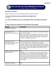
I have worked through the questionnaire and interview modules. The following table lists some<br />
minor problems that I have come across.<br />
Description of the problem Where did the problem occur Severity<br />
rating<br />
“Advantages and disadvantages of online Modules/Introduction/Contents 3<br />
research” – this is not an active link.<br />
Typo “legth” should read “length” Questionnaire/Aims/point 5 3<br />
Sampling issue/ recruitment- the text does Questionnaire/sampling issues/ 3<br />
not have a “close” link at the end.<br />
recruitment<br />
Text does not have a “close” link at the Questionnaire/sampling issues/ 3<br />
end.<br />
To improve response rates a<br />
checklist<br />
Text does not have a “close” link at the Questionnaire/sampling issues/ 3<br />
end.<br />
The title for the final case study does not<br />
remain visible while you are accessing the<br />
info.<br />
The different screen sizes open a link but<br />
there is no info.<br />
All the text is immediately available on<br />
screen.<br />
Clicking the close button on the first<br />
example for this section closes the<br />
Incentives<br />
Questionnaire/sampling issues/<br />
case studies/ case study 3<br />
Questionnaire/ design issues 1/ 2<br />
appearance<br />
Questionnaire/ design issues 2 2<br />
Questionnaire/ design issues /<br />
multi media stimuli<br />
Evaluation (May 2005) Evaluation Consultant Julia Meek 2<br />
2<br />
2
complete link not just the example<br />
Page not found error<br />
http://www.sosig.ac.uk/roads/subjectlisting/World-cat/quanmeth.html<br />
When you close the window for this pop up<br />
link it completely closes itself and<br />
Exploring online research methods site.<br />
http://www.w-lab.de/lab-united/actual.php<br />
Questionnaire/ Implementation/<br />
Analysis<br />
Questionnaire/ FAQs/Question 1 4<br />
No “close” option on the pop up text Questionnaire/ FAQs 2<br />
When you close the window for both the<br />
pop up links they completely close<br />
themselves and Exploring online research<br />
methods site.<br />
Questionnaire/ FAQs/Question<br />
“How can I create boxes in a word<br />
document<br />
4<br />
No text for the last question “Will I run into Questionnaire/ FAQs/ Last 2<br />
problems if …<br />
Question<br />
All the text immediately appears on the Questionnaire/ Glossary 3<br />
page.<br />
When you close the window for this pop up Questionnaire/ Further<br />
4<br />
link it completely closes itself and<br />
Exploring online research methods site.<br />
http://www.htmlgoodies.com/<br />
Resources/ web design/ websites<br />
No authorised to view this page error Questionnaire/ Further<br />
4<br />
http://developer.irt.org/script/form.htm Resources/ web design/ websites<br />
All the text appears immediately on screen Interviews/ Introduction 2<br />
All the text appears immediately on screen Interviews/ Advantages and 2<br />
disadvantages<br />
References some appear in red text, is this Interviews/ Advantages and 2<br />
because they are not active links?<br />
Inconsistent with appearance of other<br />
references.<br />
disadvantages<br />
All the text appears immediately on screen Interviews/ Types 2<br />
Error message page can not be found Interview/ Technical Guide<br />
2<br />
Evaluation (May 2005) Evaluation Consultant Julia Meek 3