Chapter 2: Graphs, Charts, and Tables--Describing Your Data
Chapter 2: Graphs, Charts, and Tables--Describing Your Data
Chapter 2: Graphs, Charts, and Tables--Describing Your Data

You also want an ePaper? Increase the reach of your titles
YUMPU automatically turns print PDFs into web optimized ePapers that Google loves.
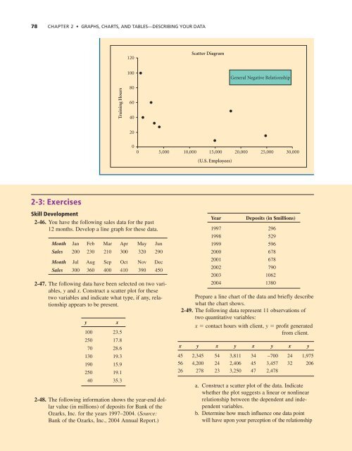
78 CHAPTER 2 • GRAPHS, CHARTS, AND TABLES—DESCRIBING YOUR DATA<br />
120<br />
Scatter Diagram<br />
100<br />
General Negative Relationship<br />
Training Hours<br />
80<br />
60<br />
40<br />
20<br />
0<br />
0<br />
5,000<br />
10,000<br />
15,000<br />
20,000<br />
25,000<br />
30,000<br />
(U.S. Employees)<br />
2-3: Exercises<br />
Skill Development<br />
2-46. You have the following sales data for the past<br />
12 months. Develop a line graph for these data.<br />
Month Jan Feb Mar Apr May Jun<br />
Sales 200 230 210 300 320 290<br />
Month Jul Aug Sep Oct Nov Dec<br />
Sales 300 360 400 410 390 450<br />
2-47. The following data have been selected on two variables,<br />
y <strong>and</strong> x. Construct a scatter plot for these<br />
two variables <strong>and</strong> indicate what type, if any, relationship<br />
appears to be present.<br />
y<br />
x<br />
100 23.5<br />
250 17.8<br />
70 28.6<br />
130 19.3<br />
190 15.9<br />
250 19.1<br />
40 35.3<br />
2-48. The following information shows the year-end dollar<br />
value (in millions) of deposits for Bank of the<br />
Ozarks, Inc. for the years 1997–2004. (Source:<br />
Bank of the Ozarks, Inc., 2004 Annual Report.)<br />
Year<br />
Deposits (in $millions)<br />
1997 296<br />
1998 529<br />
1999 596<br />
2000 678<br />
2001 678<br />
2002 790<br />
2003 1062<br />
2004 1380<br />
Prepare a line chart of the data <strong>and</strong> briefly describe<br />
what the chart shows.<br />
2-49. The following data represent 11 observations of<br />
two quantitative variables:<br />
x contact hours with client, y profit generated<br />
from client.<br />
x y x y x y x y<br />
45 2,345 54 3,811 34 −700 24 1,975<br />
56 4,200 24 2,406 45 3,457 32 206<br />
26 278 23 3,250 47 2,478<br />
a. Construct a scatter plot of the data. Indicate<br />
whether the plot suggests a linear or nonlinear<br />
relationship between the dependent <strong>and</strong> independent<br />
variables.<br />
b. Determine how much influence one data point<br />
will have upon your perception of the relationship