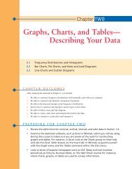
Chapter 2: Graphs, Charts, and Tables--Describing Your Data
Chapter 2: Graphs, Charts, and Tables--Describing Your Data
Chapter 2: Graphs, Charts, and Tables--Describing Your Data

Create successful ePaper yourself
Turn your PDF publications into a flip-book with our unique Google optimized e-Paper software.
44 CHAPTER 2 • GRAPHS, CHARTS, AND TABLES—DESCRIBING YOUR DATA<br />
FIGURE 2.3<br />
Histograms Showing<br />
Different Centers<br />
(a)<br />
100<br />
200 300 400 500 600 700 800<br />
(b)<br />
100 200 300 400 500 600 700 800<br />
(c)<br />
100 200 300 400 500 600 700 800<br />
We showed earlier that Excel <strong>and</strong> Minitab both provide the capability of constructing<br />
frequency distributions. Both software packages are also quite capable of generating<br />
grouped data frequency distributions <strong>and</strong> histograms.<br />
Consider Capital Credit Union (CCU) in Mobile, Alabama, which recently began<br />
issuing a new credit card. Managers at CCU have been wondering how customers have<br />
been using the card, so a sample of 300 customers was selected. <strong>Data</strong> on the current credit<br />
card balance (rounded to the nearest dollar) <strong>and</strong> the genders of the cardholders appear in<br />
the file Capital, which is stored on your CD-ROM.<br />
As with the manual process, the first step in Excel or Minitab is to determine the number<br />
of classes. Recall that the rule of thumb is to use between 5 <strong>and</strong> 20 classes, depending<br />
on the amount of data. Suppose we decide to use 10 classes.<br />
FIGURE 2.4<br />
Histograms—Same<br />
Center, Different Spread<br />
(a)<br />
100<br />
200 300 400 500 600 700 800<br />
(b)<br />
100 200 300 400 500 600 700 800<br />
(c)<br />
100 200 300 400 500 600 700 800