Multivariate Analysis of Ecological Data using CANOCO
Multivariate Analysis of Ecological Data using CANOCO
Multivariate Analysis of Ecological Data using CANOCO

Create successful ePaper yourself
Turn your PDF publications into a flip-book with our unique Google optimized e-Paper software.
This page intentionally left blank
<strong>Multivariate</strong> <strong>Analysis</strong> <strong>of</strong> <strong>Ecological</strong> <strong>Data</strong> <strong>using</strong> <strong>CANOCO</strong><br />
This book is primarily written for ecologists needing to analyse data resulting<br />
from field observations and experiments. It will be particularly useful for<br />
students and researchers dealing with complex ecological problems, such as<br />
the variation <strong>of</strong> biotic communities with environmental conditions or the<br />
response <strong>of</strong> biotic communities to experimental manipulation. Following a<br />
simple introduction to ordination methods, the text focuses on constrained<br />
ordination methods (RDA, CCA) and the use <strong>of</strong> permutation tests <strong>of</strong> statistical<br />
hypotheses about multivariate data. An overview <strong>of</strong> classification methods, or<br />
modern regression methods (GLM, GAM, loess), is provided and guidance on<br />
the correct interpretation <strong>of</strong> ordination diagrams is given. Seven case studies<br />
<strong>of</strong> varying difficulty help to illustrate the suggested analytical methods, <strong>using</strong><br />
Canoco for Windows s<strong>of</strong>tware. The case studies utilize both the descriptive<br />
and manipulative approaches, and they are supported by data sets and project<br />
files available from the book website.<br />
Jan Lepš is Pr<strong>of</strong>essor <strong>of</strong> Ecology in the Department <strong>of</strong> Botany, at the<br />
University <strong>of</strong> South Bohemia, and in the Institute <strong>of</strong> Entomology at the Czech<br />
Academy <strong>of</strong> Sciences, Czech Republic.<br />
Petr Šmilauer is Lecturer in <strong>Multivariate</strong> Statistics at the University <strong>of</strong> South<br />
Bohemia, Czech Republic.
<strong>Multivariate</strong><br />
<strong>Analysis</strong> <strong>of</strong><br />
<strong>Ecological</strong> <strong>Data</strong><br />
<strong>using</strong> <strong>CANOCO</strong><br />
Jan Lepš<br />
University <strong>of</strong> South Bohemia, and<br />
Czech Academy <strong>of</strong> Sciences,<br />
Czech Republic<br />
Petr Šmilauer<br />
University <strong>of</strong> South Bohemia,<br />
Czech Republic
CAMBRIDGE UNIVERSITY PRESS<br />
Cambridge, New York, Melbourne, Madrid, Cape Town, Singapore, São Paulo<br />
Cambridge University Press<br />
The Edinburgh Building, Cambridge CB2 2RU, United Kingdom<br />
Published in the United States <strong>of</strong> America by Cambridge University Press, New York<br />
www.cambridge.org<br />
Information on this title: www.cambridge.org/9780521814096<br />
© Jan Leps and Petr Smilauer 2003<br />
This book is in copyright. Subject to statutory exception and to the provision <strong>of</strong><br />
relevant collective licensing agreements, no reproduction <strong>of</strong> any part may take place<br />
without the written permission <strong>of</strong> Cambridge University Press.<br />
First published in print format 2003<br />
ISBN-13 978-0-511-07818-7 eBook (NetLibrary)<br />
ISBN-10 0-511-07818-8 eBook (NetLibrary)<br />
ISBN-13 978-0-521-81409-6 hardback<br />
ISBN-10 0-521-81409-X hardback<br />
ISBN-13 978-0-521-89108-0 paperback<br />
ISBN-10 0-521-89108-6 paperback<br />
Cambridge University Press has no responsibility for the persistence or accuracy <strong>of</strong><br />
URLs for external or third-party internet websites referred to in this book, and does not<br />
guarantee that any content on such websites is, or will remain, accurate or appropriate.
Contents<br />
Preface<br />
page ix<br />
1. Introduction and data manipulation 1<br />
1.1. Why ordination? 1<br />
1.2. Terminology 4<br />
1.3. Types <strong>of</strong> analyses 6<br />
1.4. Response variables 7<br />
1.5. Explanatory variables 7<br />
1.6. Handling missing values in data 9<br />
1.7. Importing data from spreadsheets – WCanoImp program 11<br />
1.8. Transformation <strong>of</strong> species data 13<br />
1.9. Transformation <strong>of</strong> explanatory variables 15<br />
2. Experimental design 16<br />
2.1. Completely randomized design 16<br />
2.2. Randomized complete blocks 17<br />
2.3. Latin square design 18<br />
2.4. Most frequent errors – pseudoreplications 19<br />
2.5. Combining more than one factor 19<br />
2.6. Following the development <strong>of</strong> objects in time – repeated<br />
observations 21<br />
2.7. Experimental and observational data 23<br />
3. Basics <strong>of</strong> gradient analysis 25<br />
3.1. Techniques <strong>of</strong> gradient analysis 26<br />
3.2. Models <strong>of</strong> species response to environmental gradients 26<br />
3.3. Estimating species optima by the weighted averaging method 29<br />
3.4. Calibration 32<br />
v
vi<br />
Contents<br />
3.5. Ordination 33<br />
3.6. Constrained ordination 36<br />
3.7. Basic ordination techniques 37<br />
3.8. Ordination diagrams 38<br />
3.9. Two approaches 38<br />
3.10. Testing significance <strong>of</strong> the relation with environmental variables 40<br />
3.11. Monte Carlo permutation tests for the significance <strong>of</strong> regression 41<br />
4. Using the Canoco for Windows 4.5 package 43<br />
4.1. Overview <strong>of</strong> the package 43<br />
4.2. Typical flow-chart <strong>of</strong> data analysis with Canoco for Windows 48<br />
4.3. Deciding on the ordination method: unimodal or linear? 50<br />
4.4. PCA or RDA ordination: centring and standardizing 51<br />
4.5. DCA ordination: detrending 52<br />
4.6. Scaling <strong>of</strong> ordination scores 54<br />
4.7. RunningCanoDrawforWindows4.0 57<br />
4.8. New analyses providing new views <strong>of</strong> our data sets 58<br />
5. Constrained ordination and permutation tests 60<br />
5.1. Linear multiple regression model 60<br />
5.2. Constrained ordination model 61<br />
5.3. RDA: constrained PCA 62<br />
5.4. Monte Carlo permutation test: an introduction 64<br />
5.5. Null hypothesis model 65<br />
5.6. Test statistics 65<br />
5.7. Spatial and temporal constraints 68<br />
5.8. Split-plot constraints 69<br />
5.9. Stepwise selection <strong>of</strong> the model 70<br />
5.10. Variance partitioning procedure 73<br />
6. Similarity measures 76<br />
6.1. Similarity measures for presence–absence data 77<br />
6.2. Similarity measures for quantitative data 80<br />
6.3. Similarity <strong>of</strong> samples versus similarity <strong>of</strong> communities 85<br />
6.4. Principal coordinates analysis 86<br />
6.5. Non-metric multidimensional scaling 89<br />
6.6. Constrained principal coordinates analysis (db-RDA) 91<br />
6.7. Mantel test 92<br />
7. Classification methods 96<br />
7.1. Sample data set 96<br />
7.2. Non-hierarchical classification (K-means clustering) 97<br />
7.3. Hierarchical classifications 101<br />
7.4. TWINSPAN 108
Contents<br />
vii<br />
8. Regression methods 117<br />
8.1. Regression models in general 117<br />
8.2. General linear model: terms 119<br />
8.3. Generalized linear models (GLM) 121<br />
8.4. Loess smoother 123<br />
8.5. Generalized additive models (GAM) 124<br />
8.6. Classification and regression trees 125<br />
8.7. Modelling species response curves with<br />
CanoDraw 126<br />
9. Advanced use <strong>of</strong> ordination 140<br />
9.1. Testing the significance <strong>of</strong> individual constrained ordination<br />
axes 140<br />
9.2. Hierarchical analysis <strong>of</strong> community variation 141<br />
9.3. Principal response curves (PRC) method 144<br />
9.4. Linear discriminant analysis 147<br />
10. Visualizing multivariate data 149<br />
10.1. What we can infer from ordination diagrams: linear<br />
methods 149<br />
10.2. What we can infer from ordination diagrams: unimodal<br />
methods 159<br />
10.3. Visualizing ordination results with statistical models 162<br />
10.4. Ordination diagnostics 163<br />
10.5. t-value biplot interpretation 166<br />
11. Case study 1: Variation in forest bird assemblages 168<br />
11.1. <strong>Data</strong> manipulation 168<br />
11.2. Deciding between linear and unimodal ordination 169<br />
11.3. Indirect analysis: portraying variation in bird community 171<br />
11.4. Direct gradient analysis: effect <strong>of</strong> altitude 177<br />
11.5. Direct gradient analysis: additional effect <strong>of</strong> other habitat<br />
characteristics 180<br />
12. Case study 2: Search for community composition patterns and<br />
their environmental correlates: vegetation <strong>of</strong> spring<br />
meadows 183<br />
12.1. The unconstrained ordination 184<br />
12.2. Constrained ordinations 187<br />
12.3. Classification 192<br />
12.4. Suggestions for additional analyses 193
viii<br />
Contents<br />
13. Case study 3: Separating the effects <strong>of</strong> explanatory<br />
variables 196<br />
13.1. Introduction 196<br />
13.2. <strong>Data</strong> 197<br />
13.3. <strong>Data</strong> analysis 197<br />
14. Case study 4: Evaluation <strong>of</strong> experiments in randomized<br />
complete blocks 206<br />
14.1. Introduction 206<br />
14.2. <strong>Data</strong> 207<br />
14.3. <strong>Data</strong> analysis 207<br />
15. Case study 5: <strong>Analysis</strong> <strong>of</strong> repeated observations <strong>of</strong> species<br />
composition from a factorial experiment 215<br />
15.1. Introduction 215<br />
15.2. Experimental design 216<br />
15.3. Sampling 216<br />
15.4. <strong>Data</strong> analysis 216<br />
15.5. Univariate analyses 218<br />
15.6. Constrained ordinations 218<br />
15.7. Further use <strong>of</strong> ordination results 222<br />
15.8. Principal response curves 224<br />
16. Case study 6: Hierarchical analysis <strong>of</strong> crayfish community<br />
variation 236<br />
16.1. <strong>Data</strong> and design 236<br />
16.2. Differences among sampling locations 237<br />
16.3. Hierarchical decomposition <strong>of</strong> community variation 239<br />
17. Case study 7: Differentiating two species and their hybrids with<br />
discriminant analysis 245<br />
17.1. <strong>Data</strong> 245<br />
17.2. Stepwise selection <strong>of</strong> discriminating variables 246<br />
17.3. Adjusting the discriminating variables 249<br />
17.4. Displaying results 250<br />
Appendix A: Sample datasets and projects 253<br />
Appendix B: Vocabulary 254<br />
Appendix C: Overview <strong>of</strong> available s<strong>of</strong>tware 258<br />
References 262<br />
Index 267
Preface<br />
The multidimensional data on community composition, properties <strong>of</strong><br />
individual populations, or properties <strong>of</strong> environment are the bread and butter<br />
<strong>of</strong> an ecologist’s life. They need to be analysed with taking their multidimensionality<br />
into account. A reductionist approach <strong>of</strong> looking at the properties <strong>of</strong><br />
each variable separately does not work in most cases. The methods for statistical<br />
analysis <strong>of</strong> such data sets fit under the umbrella <strong>of</strong> ‘multivariate statistical<br />
methods’.<br />
In this book, we present a hopefully consistent set <strong>of</strong> approaches to answering<br />
many <strong>of</strong> the questions that an ecologist might have about the studied systems.<br />
Nevertheless, we admit that our views are biased to some extent, and<br />
we pay limited attention to other less parametric methods, such as the family<br />
<strong>of</strong> non-metric multidimensional scaling (NMDS) algorithms or the group<br />
<strong>of</strong> methods similar to the Mantel test or the ANOSIM method. We do not want<br />
to fuel the controversy between proponents <strong>of</strong> various approaches to analysing<br />
multivariate data. We simply claim that the solutions presented are not the only<br />
ones possible, but they work for us, as well as many others.<br />
We also give greater emphasis to ordination methods compared to classification<br />
approaches, but we do not imply that the classification methods are<br />
not useful. Our description <strong>of</strong> multivariate methods is extended by a short<br />
overview <strong>of</strong> regression analysis, including some <strong>of</strong> the more recent developments<br />
such as generalized additive models.<br />
Our intention is to provide the reader with both the basic understanding <strong>of</strong><br />
principles <strong>of</strong> multivariate methods and the skills needed to use those methods<br />
in his/her own work. Consequently, all the methods are illustrated by examples.<br />
For all <strong>of</strong> them, we provide the data on our web page (see Appendix A),<br />
and for all the analyses carried out by the <strong>CANOCO</strong> program, we also provide<br />
the <strong>CANOCO</strong> project files containing all the options needed for particular analysis.<br />
The seven case studies that conclude the book contain tutorials, where the<br />
ix
x<br />
Preface<br />
analysis options are explained and the s<strong>of</strong>tware use is described. The individual<br />
case studies differ intentionally in the depth <strong>of</strong> explanation <strong>of</strong> the necessary<br />
steps. In the first case study, the tutorial is in a ‘cookbook’ form, whereas a detailed<br />
description <strong>of</strong> individual steps in the subsequent case studies is only provided<br />
for the more complicated and advanced methods that are not described<br />
in the preceding tutorial chapters.<br />
The methods discussed in this book are widely used among plant, animal<br />
and soil biologists, as well as in the hydrobiology. The slant towards plant community<br />
ecology is an inevitable consequence <strong>of</strong> the research background <strong>of</strong><br />
both authors.<br />
This handbook provides study materials for the participants <strong>of</strong> a course regularly<br />
taught at our university called <strong>Multivariate</strong> <strong>Analysis</strong> <strong>of</strong> <strong>Ecological</strong> <strong>Data</strong>.<br />
We hope that this book can also be used for other similar courses, as well as by<br />
individual students seeking improvement in their ability to analyse collected<br />
data.<br />
We hope that this book provides an easy-to-read supplement to the more<br />
exact and detailed publications such as the collection <strong>of</strong> Cajo Ter Braak’s papers<br />
and the Canoco for Windows 4.5 manual. In addition to the scope <strong>of</strong> those publications,<br />
this book adds information on classification methods <strong>of</strong> multivariate<br />
data analysis and introduces modern regression methods, which we have found<br />
most useful in ecological research.<br />
In some case studies, we needed to compare multivariate methods with their<br />
univariate counterparts. The univariate methods are demonstrated <strong>using</strong> the<br />
Statistica for Windows package (version 5.5). We have also used this package<br />
to demonstrate multivariate methods not included in the <strong>CANOCO</strong> program,<br />
such as non-metric multidimensional scaling or the methods <strong>of</strong> cluster analysis.<br />
However, all those methods are available in other statistical packages so the<br />
readers can hopefully use their favourite statistical package, if different from<br />
Statistica. Please note that we have omitted the trademark and registered trademark<br />
symbols when referring to commercial s<strong>of</strong>tware products.<br />
We would like to thank John Birks, Robert Pillsbury and Samara Hamzéfor<br />
correcting the English used in this textbook. We are grateful to all who read<br />
drafts <strong>of</strong> the manuscript and gave us many useful comments: Cajo Ter Braak,<br />
John Birks, Mike Palmer and Marek Rejmánek. Additional useful comments<br />
on the text and the language were provided by the students <strong>of</strong> Oklahoma State<br />
University: Jerad Linneman, Jerry Husak, Kris Karsten, Raelene Crandall and<br />
Krysten Schuler. Sarah Price did a great job as our copy-editor, and improved<br />
the text in countless places.<br />
Camille Flinders, TomášHájek and Milan Štech kindly provided data sets,<br />
respectively, for case studies 6, 2 and 7.
Preface<br />
xi<br />
P.Š. wants to thank his wife Marie and daughters Marie and Tereza for their<br />
continuous support and patience with him.<br />
J.L. insisted on stating that the ordering <strong>of</strong> authorship is based purely on the<br />
alphabetical order <strong>of</strong> their names. He wants to thank his parents for support<br />
and his daughters Anna and Tereza for patience.
1<br />
Introduction and data manipulation<br />
1.1. Why ordination?<br />
When we investigate variation <strong>of</strong> plant or animal communities across a<br />
range <strong>of</strong> different environmental conditions, we usually find not only large differences<br />
in species composition <strong>of</strong> the studied communities, but also a certain<br />
consistency or predictability <strong>of</strong> this variation. For example, if we look at the<br />
variation <strong>of</strong> grassland vegetation in a landscape and describe the plant community<br />
composition <strong>using</strong> vegetation samples, then the individual samples can be<br />
usually ordered along one, two or three imaginary axes. The change in the vegetation<br />
composition is <strong>of</strong>ten small as we move our focus from one sample to<br />
those nearby on such a hypothetical axis.<br />
This gradual change in the community composition can <strong>of</strong>ten be related to<br />
differing, but partially overlapping demands <strong>of</strong> individual species for environmental<br />
factors such as the average soil moisture, its fluctuations throughout<br />
the season, the ability <strong>of</strong> species to compete with other ones for the available<br />
nutrients and light, etc. If the axes along which we originally ordered the samples<br />
can be identified with a particular environmental factor (such as moisture<br />
or richness <strong>of</strong> soil nutrients), we can call them a soil moisture gradient, a nutrient<br />
availability gradient, etc. Occasionally, such gradients can be identified in<br />
a real landscape, e.g. as a spatial gradient along a slope from a riverbank, with<br />
gradually decreasing soil moisture. But more <strong>of</strong>ten we can identify such axes<br />
along which the plant or animal communities vary in a more or less smooth,<br />
predictable way, yet we cannot find them in nature as a visible spatial gradient<br />
and neither can we identify them uniquely with a particular measurable environmental<br />
factor. In such cases, we speak about gradients <strong>of</strong> species composition<br />
change.<br />
The variation in biotic communities can be summarized <strong>using</strong> one <strong>of</strong> a<br />
wide range <strong>of</strong> statistical methods, but if we stress the continuity <strong>of</strong> change<br />
1
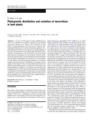
2 1. Introduction and data manipulation<br />
-2 3<br />
PeucOstr<br />
AnemNemo PhytSpic<br />
VeroCham<br />
PoteErec<br />
TrisFlav CardHall<br />
GaliMoll<br />
AchiMill GeraSylv CirsHete<br />
NardStri AgroCapi<br />
JuncFili<br />
HypeMacu<br />
BrizMedi DescCesp<br />
LuzuCamp<br />
RanuAcer<br />
AgroCani FestRubr<br />
CarxNigr MyosNemo AlopPrat<br />
CarxEchi AnthOdor<br />
HeraSpho<br />
CirsPalu<br />
AegoPoda<br />
FestNigr<br />
UrtiDioi<br />
JuncArti<br />
PoaTrivi ChaeHirs<br />
ViolPalu AngeSylvRanuRepe<br />
FiliUlma<br />
LotuPedu<br />
EquiArve<br />
PoaPrate<br />
CirsOler<br />
ScirSylv GaliPalu<br />
CardAmar<br />
-2 3<br />
Figure 1-1. Summarizing grassland vegetation composition with ordination:<br />
ordination diagram from correspondence analysis.<br />
in community composition, the so-called ordination methods are the tools<br />
<strong>of</strong> trade. They have been used by ecologists since the early 1950s, and during<br />
their evolution these methods have radiated into a rich and sometimes<br />
conf<strong>using</strong> mixture <strong>of</strong> various techniques. Their simplest use can be illustrated<br />
by the example introduced above. When we collect recordings (samples)<br />
representing the species composition <strong>of</strong> a selected quadrat in a vegetation<br />
stand, we can arrange the samples into a table where individual species<br />
are represented by columns and individual samples by rows. When we analyse<br />
such data with an ordination method (<strong>using</strong> the approaches described<br />
in this book), we can obtain a fairly representative summary <strong>of</strong> the grassland<br />
vegetation <strong>using</strong> an ordination diagram, such as the one displayed in<br />
Figure 1-1.<br />
The rules for reading such ordination diagrams will be discussed thoroughly<br />
later on (see Chapter 10), but even without their knowledge we can<br />
read much from the diagram, <strong>using</strong> the idea <strong>of</strong> continuous change <strong>of</strong> composition<br />
along the gradients (suggested here by the diagram axes) and the idea<br />
that proximity implies similarity. The individual samples are represented
1.1. Why ordination? 3<br />
in Figure 1-1 by grey circles. We can expect that two samples that lie near to<br />
each other will be much more similar in terms <strong>of</strong> list <strong>of</strong> occurring species and<br />
even in the relative importance <strong>of</strong> individual species populations, compared to<br />
samples far apart in the diagram.<br />
The triangle symbols represent the individual plant species occurring in the<br />
studied type <strong>of</strong> vegetation (not all species present in the data were included in<br />
the diagram). In this example, our knowledge <strong>of</strong> the ecological properties <strong>of</strong><br />
the displayed species can aid us in an ecological interpretation <strong>of</strong> the gradients<br />
represented by the diagram axes. The species preferring nutrient-rich<br />
soils (such as Urtica dioica, Aegopodium podagraria, orFilipendula ulmaria) are located<br />
at the right side <strong>of</strong> the diagram, while the species occurring mostly in soils<br />
poor in available nutrients are on the left side (Viola palustris, Carex echinata,or<br />
Nardus stricta). The horizontal axis can therefore be informally interpreted as a<br />
gradient <strong>of</strong> nutrient availability, increasing from the left to the right side. Similarly,<br />
the species with their points at the bottom <strong>of</strong> the diagram are from the<br />
wetter stands (Galium palustre, Scirpus sylvaticus, orRanunculus repens) than the<br />
species in the upper part <strong>of</strong> the diagram (such as Achillea millefolium, Trisetum<br />
flavescens,orVeronica chamaedrys). The second axis, therefore, represents a gradient<br />
<strong>of</strong> soil moisture.<br />
As you have probably already guessed, the proximity <strong>of</strong> species symbols (triangles)<br />
with respect to a particular sample symbol (a circle) indicates that these<br />
species are likely to occur more <strong>of</strong>ten and/or with a higher (relative) abundance<br />
than the species with symbols more distant from the sample.<br />
Our example study illustrates the most frequent use <strong>of</strong> ordination methods<br />
in community ecology. We can use such an analysis to summarize community<br />
patterns and compare the suggested gradients with our independent<br />
knowledge <strong>of</strong> environmental conditions. But we can also test statistically the<br />
predictive power <strong>of</strong> such knowledge; i.e. address the questions such as ‘Does<br />
the community composition change with the soil moisture or are the identified<br />
patterns just a matter <strong>of</strong> chance?’ These analyses can be done with the help<br />
<strong>of</strong> constrained ordination methods and their use will be illustrated later in<br />
this book.<br />
However, we do not need to stop with such exploratory or simple confirmatory<br />
analyses and this is the focus <strong>of</strong> the rest <strong>of</strong> the book. The rich toolbox <strong>of</strong> various<br />
types <strong>of</strong> regression and analysis <strong>of</strong> variance, including analysis <strong>of</strong> repeated<br />
measurements on permanent sites, analysis <strong>of</strong> spatially structured data, various<br />
types <strong>of</strong> hierarchical analysis <strong>of</strong> variance (ANOVA), etc., allows ecologists to<br />
address more complex, and <strong>of</strong>ten more realistic questions. Given the fact that<br />
the populations <strong>of</strong> different species occupying the same environment <strong>of</strong>ten<br />
share similar strategies in relation to the environmental factors, it would be
4 1. Introduction and data manipulation<br />
very pr<strong>of</strong>itable if one could ask similar complex questions for the whole biotic<br />
communities. In this book, we demonstrate that this can be done and we show<br />
the reader how to do it.<br />
1.2. Terminology<br />
The terminology for multivariate statistical methods is quite complicated.<br />
There are at least two different sets <strong>of</strong> terminology. One, more general<br />
and abstract, contains purely statistical terms applicable across the whole field<br />
<strong>of</strong> science. In this section we give the terms from this set in italics and mostly in<br />
parentheses. The other represents a mixture <strong>of</strong> terms used in ecological statistics<br />
with the most typical examples coming from the field <strong>of</strong> community ecology.<br />
This is the set on which we will focus, <strong>using</strong> the former just to refer to the<br />
more general statistical theory. In this way, we use the same terminology as the<br />
<strong>CANOCO</strong> s<strong>of</strong>tware documentation.<br />
In all cases, we have a data set with the primary data. This data set contains<br />
records on a collection <strong>of</strong> observations – samples (sampling units). ∗ Each<br />
sample comprises values for multiple species or, less <strong>of</strong>ten, the other kinds<br />
<strong>of</strong> descriptors. The primary data can be represented by a rectangular matrix,<br />
where the rows typically represent individual samples and the columns represent<br />
individual variables (species, chemical or physical properties <strong>of</strong> the water<br />
or soil, etc.). †<br />
Very <strong>of</strong>ten our primary data set (containing the response variables) is accompanied<br />
by another data set containing the explanatory variables. If our primary data<br />
represent community composition, then the explanatory data set typically contains<br />
measurements <strong>of</strong> the soil or water properties (for the terrestrial or aquatic<br />
ecosystems, respectively), a semi-quantitative scoring <strong>of</strong> human impact, etc.<br />
When we use the explanatoryvariables in a model to predict the primary data (like<br />
community composition), we might divide them into two different groups.<br />
The first group is called, somewhat inappropriately, the environmental<br />
variables and refers to the variables that are <strong>of</strong> prime interest (in the role <strong>of</strong><br />
predictors) in our particular analysis. The other group represents the covariables<br />
(<strong>of</strong>ten referred to as covariates in other statistical approaches), which are<br />
∗ There is an inconsistency in the terminology: in classical statistical terminology, sample means a<br />
collection <strong>of</strong> sampling units, usually selected at random from the population. In community ecology,<br />
sample is usually used for a description <strong>of</strong> a sampling unit. This usage will be followed in this text.<br />
The general statistical packages use the term case with the same meaning.<br />
† Note that this arrangement is transposed in comparison with the tables used, for example, in<br />
traditional vegetation analyses. The classical vegetation tables have individual taxa represented by<br />
rows and the columns represent the individual samples or community types.
1.2. Terminology 5<br />
also explanatory variables with an acknowledged (or hypothesized) influence<br />
on the response variables. We want to account for (subtract, partial-out) such an<br />
influence before foc<strong>using</strong> on the influence <strong>of</strong> the variables <strong>of</strong> prime interest<br />
(i.e. the effect <strong>of</strong> environmental variables).<br />
As an example, let us imagine a situation where we study the effects <strong>of</strong> soil<br />
properties and type <strong>of</strong> management (hay cutting or pasturing) on the species<br />
composition <strong>of</strong> meadows in a particular area. In one analysis, we might be<br />
interested in the effect <strong>of</strong> soil properties, paying no attention to the management<br />
regime. In this analysis, we use the grassland composition as the species<br />
data (i.e. primary data set, with individual plant species as individual response<br />
variables) and the measured soil properties as the environmental variables<br />
(explanatory variables). Based on the results, we can make conclusions about<br />
the preferences <strong>of</strong> individual plant species’ populations for particular environmental<br />
gradients, which are described (more or less appropriately) by the<br />
measured soil properties. Similarly, we can ask how the management type<br />
influences plant composition. In this case, the variables describing the management<br />
regime act as environmental variables. Naturally, we might expect that<br />
the management also influences the soil properties and this is probably one<br />
<strong>of</strong> the ways in which management acts upon the community composition.<br />
Based on such expectation, we may ask about the influence <strong>of</strong> the management<br />
regime beyond that mediated through the changes <strong>of</strong> soil properties. To<br />
address such a question, we use the variables describing the management<br />
regime as the environmental variables and the measured soil properties as<br />
the covariables. ∗<br />
One <strong>of</strong> the keys to understanding the terminology used by the <strong>CANOCO</strong><br />
program is to realize that the data referred to by <strong>CANOCO</strong> as the species data<br />
might, in fact, be any kind <strong>of</strong> data with variables whose values we want to<br />
predict. For example, if we would like to predict the quantities <strong>of</strong> various metal<br />
ions in river water based on the landscape composition in the catchment area,<br />
then the individual ions would represent the individual ‘species’ in <strong>CANOCO</strong><br />
terminology. If the species data really represent the species composition <strong>of</strong> a<br />
community, we describe the composition <strong>using</strong> various abundance measures,<br />
including counts, frequency estimates, and biomass estimates. Alternatively,<br />
we might have information only on the presence or absence <strong>of</strong> species in individual<br />
samples. The quantitative and presence-absence variables may also<br />
occur as explanatory variables. These various kinds <strong>of</strong> data values are treated in<br />
more detail later in this chapter.<br />
∗ This particular example is discussed in the Canoco for Windows manual (Ter Braak & Šmilauer, 2002),<br />
section 8.3.1.
6 1. Introduction and data manipulation<br />
Table 1-1. The types <strong>of</strong> the statistical models<br />
Response<br />
Predictor(s)<br />
variable(s) ... Absent Present<br />
...is one • distribution summary • regression models sensu lato<br />
...are many • indirect gradient analysis • direct gradient analysis<br />
(PCA, DCA, NMDS)<br />
• cluster analysis<br />
• discriminant analysis (CVA)<br />
CVA, canonical variate analysis; DCA, detrended correspondence analysis; NMDS,<br />
non-metric multidimensional scaling; PCA, principal components analysis.<br />
1.3. Types <strong>of</strong> analyses<br />
If we try to describe the behaviour <strong>of</strong> one or more response variables,<br />
the appropriate statistical modelling methodology depends on whether we<br />
study each <strong>of</strong> the response variables separately (or many variables at the same<br />
time), and whether we have any explanatory variables (predictors) available<br />
when we build the model.<br />
Table 1-1 summarizes the most important statistical methodologies used in<br />
these different situations.<br />
If we look at a single response variable and there are no predictors available,<br />
then we can only summarize the distributional properties <strong>of</strong> that variable<br />
(e.g. by a histogram, median, standard deviation, inter-quartile range, etc.).<br />
In the case <strong>of</strong> multivariate data, we might use either the ordination approach<br />
represented by the methods <strong>of</strong> indirect gradient analysis (most prominent<br />
are the principal components analysis – PCA, correspondence analysis – CA,<br />
detrended correspondence analysis – DCA, and non-metric multidimensional<br />
scaling – NMDS) or we can try to (hierarchically) divide our set <strong>of</strong> samples into<br />
compact distinct groups (methods <strong>of</strong> cluster analysis, see Chapter 7).<br />
If we have one or more predictors available and we describe values <strong>of</strong> a single<br />
variable, then we use regression models in the broad sense, i.e. including both<br />
traditional regression methods and methods <strong>of</strong> analysis <strong>of</strong> variance (ANOVA)<br />
and analysis <strong>of</strong> covariance (ANOCOV). This group <strong>of</strong> methods is unified under<br />
the so-called general linear model and was recently extended and enhanced<br />
by the methodology <strong>of</strong> generalized linear models (GLM) and generalized<br />
additive models (GAM). Further information on these models is provided in<br />
Chapter 8.<br />
If we have predictors for a set <strong>of</strong> response variables, we can summarize<br />
relations between multiple response variables (typically biological species)<br />
and one or several predictors <strong>using</strong> the methods <strong>of</strong> direct gradient analysis
1.5. Explanatory variables 7<br />
(most prominent are redundancy analysis (RDA) and canonical correspondence<br />
analysis (CCA), but there are several other methods in this category).<br />
1.4. Response variables<br />
The data table with response variables ∗ is always part <strong>of</strong> multivariate<br />
analyses. If explanatory variables (see Section 1.5), which may explain the values<br />
<strong>of</strong> the response variables, were not measured, the statistical methods can<br />
try to construct hypothetical explanatory variables (groups or gradients).<br />
The response variables (<strong>of</strong>ten called species data, based on the typical context<br />
<strong>of</strong> biological community data) can <strong>of</strong>ten be measured in a precise (quantitative)<br />
way. Examples are the dry weight <strong>of</strong> the above-ground biomass <strong>of</strong> plant<br />
species, counts <strong>of</strong> specimens <strong>of</strong> individual insect species falling into soil traps,<br />
or the percentage cover <strong>of</strong> individual vegetation types in a particular landscape.<br />
We can compare different values not only by <strong>using</strong> the ‘greater-than’, ‘lessthan’<br />
or ‘equal to’ expressions, but also <strong>using</strong> their ratios (‘this value is two<br />
times higher than the other one’).<br />
In other cases, we estimate the values for the primary data on a simple, semiquantitative<br />
scale. Good examples are the various semi-quantitative scales<br />
used in recording the composition <strong>of</strong> plant communities (e.g. original Braun-<br />
Blanquet scale or its various modifications). The simplest possible form <strong>of</strong> data<br />
are binary (also called presence-absence or 0/1) data. These data essentially correspond<br />
to the list <strong>of</strong> species present in each <strong>of</strong> the samples.<br />
If our response variables represent the properties <strong>of</strong> the chemical or physical<br />
environment (e.g. quantified concentrations <strong>of</strong> ions or more complicated<br />
compounds in the water, soil acidity, water temperature, etc.), we usually get<br />
quantitative values for them, but with an additional constraint: these characteristics<br />
do not share the same units <strong>of</strong> measurement. This fact precludes the<br />
use <strong>of</strong> some <strong>of</strong> the ordination methods † and dictates the way the variables are<br />
standardized if used in the other ordinations (see Section 4.4).<br />
1.5. Explanatory variables<br />
The explanatory variables (also called predictors or independent variables)<br />
represent the knowledge that we have about our samples and that we can<br />
use to predict the values <strong>of</strong> the response variables (e.g. abundance <strong>of</strong> various<br />
∗ also called dependent variables.<br />
† namely correspondence analysis (CA), detrended correspondence analysis (DCA), or canonical<br />
correspondence analysis (CCA).
8 1. Introduction and data manipulation<br />
species) in a particular situation. For example, we might try to predict the composition<br />
<strong>of</strong> a plant community based on the soil properties and the type <strong>of</strong> land<br />
management. Note that usually the primary task is not the prediction itself. We<br />
try to use ‘prediction rules’ (derived, most <strong>of</strong>ten, from the ordination diagrams)<br />
to learn more about the studied organisms or systems.<br />
Predictors can be quantitative variables (concentration <strong>of</strong> nitrate ions in<br />
soil), semi-quantitative estimates (degree <strong>of</strong> human influence estimated on a<br />
0–3 scale) or factors (nominal or categorical – also categorial – variables). The<br />
simplest predictor form is a binary variable, where the presence or absence <strong>of</strong><br />
a certain feature or event (e.g. vegetation was mown, the sample is located in<br />
study area X, etc.) is indicated, respectively, by a 1 or 0 value.<br />
The factors are the natural way <strong>of</strong> expressing the classification <strong>of</strong> our samples<br />
or subjects: For example, classes <strong>of</strong> management type for meadows, type<br />
<strong>of</strong> stream for a study <strong>of</strong> pollution impact on rivers, or an indicator <strong>of</strong> the<br />
presence/absence <strong>of</strong> a settlement near the sample in question. When <strong>using</strong> factors<br />
in the <strong>CANOCO</strong> program, we must re-code them into so-called dummy<br />
variables, sometimes also called indicator variables (and, also, binary variables).<br />
There is one separate dummy variable for each different value (level) <strong>of</strong><br />
the factor. If a sample (observation) has a particular value <strong>of</strong> the factor, then<br />
the corresponding dummy variable has the value 1.0 for this sample, and the<br />
other dummy variables have a value <strong>of</strong> 0.0 for the same sample. For example,<br />
we might record for each <strong>of</strong> our samples <strong>of</strong> grassland vegetation whether it is<br />
a pasture, meadow, or abandoned grassland. We need three dummy variables<br />
for recording such a factor and their respective values for a meadow are 0.0, 1.0,<br />
and 0.0. ∗<br />
Additionally, this explicit decomposition <strong>of</strong> factors into dummy variables<br />
allows us to create so-called fuzzy coding. Using our previous example, we<br />
might include in our data set a site that had been used as a hay-cut meadow<br />
until the previous year, but was used as pasture in the current year. We can reasonably<br />
expect that both types <strong>of</strong> management influenced the present composition<br />
<strong>of</strong> the plant community. Therefore, we would give values larger than 0.0<br />
and less than 1.0 for both the first and second dummy variables. The important<br />
restriction here is that the values must sum to 1.0 (similar to the dummy variables<br />
coding normal factors). Unless we can quantify the relative importance <strong>of</strong><br />
the two management types acting on this site, our best guess is to use values<br />
0.5, 0.5,and0.0.<br />
∗ In fact, we need only two (generally K −1) dummy variables to code uniquely a factor with three<br />
(generally K ) levels. But the one redundant dummy variable is usually kept in the data, which is<br />
advantageous when visualizing the results in ordination diagrams.
1.6. Handling missing values in data 9<br />
If we build a model where we try to predict values <strong>of</strong> the response variables<br />
(‘species data’) <strong>using</strong> the explanatory variables (‘environmental data’), we <strong>of</strong>ten<br />
encounter a situation where some <strong>of</strong> the explanatory variables affect the species<br />
data, yet these variables are treated differently: we do not want to interpret<br />
their effect, but only want to take this effect into account when judging<br />
the effects <strong>of</strong> the other variables. We call these variables covariables (or, alternatively,<br />
covariates). A typical example is an experimental design where samples<br />
are grouped into logical or physical blocks. The values <strong>of</strong> response variables<br />
(e.g. species composition) for a group <strong>of</strong> samples might be similar due to their<br />
spatial proximity, so we need to model this influence and account for it in our<br />
data. The differences in response variables that are due to the membership<br />
<strong>of</strong> samples in different blocks must be removed (i.e. ‘partialled-out’) from the<br />
model.<br />
But, in fact, almost any explanatory variable can take the role <strong>of</strong> a covariable.<br />
For example, in a project where the effect <strong>of</strong> management type on butterfly<br />
community composition is studied, we might have the localities at different<br />
altitudes. The altitude might have an important influence on the butterfly<br />
communities, but in this situation we are primarily interested in the management<br />
effects. If we remove the effect <strong>of</strong> the altitude, we might get a clearer<br />
picture <strong>of</strong> the influence that the management regime has on the butterfly<br />
populations.<br />
1.6. Handling missing values in data<br />
Whatever precautions we take, we are <strong>of</strong>ten not able to collect all the<br />
data values we need: a soil sample sent to a regional lab gets lost, we forget to<br />
fill in a particular slot in our data collection sheet, etc.<br />
Most <strong>of</strong>ten, we cannot go back and fill in the empty slots, usually because the<br />
subjects we study change in time. We can attempt to leave those slots empty,<br />
but this is <strong>of</strong>ten not the best decision. For example, when recording sparse<br />
community data (we might have a pool <strong>of</strong>, say, 300 species, but the average<br />
number <strong>of</strong> species per sample is much lower), we interpret the empty cells in a<br />
spreadsheet as absences, i.e. zero values. But the absence <strong>of</strong> a species is very different<br />
from the situation where we simply forgot to look for this species! Some<br />
statistical programs provide a notion <strong>of</strong> missing values (it might be represented<br />
as a word ‘NA’, for example), but this is only a notational convenience. The<br />
actual statistical method must deal further with the fact that there are missing<br />
values in the data. Here are few options we might consider:<br />
1. We can remove the samples in which the missing values occur. This works<br />
well if the missing values are concentrated in a few samples. If we have,
10 1. Introduction and data manipulation<br />
for example, a data set with 30 variables and 500 samples and there are<br />
20 missing values from only three samples, it might be wise to remove<br />
these three samples from our data before the analysis. This strategy is<br />
<strong>of</strong>ten used by general statistical packages and it is usually called<br />
‘case-wise deletion’.<br />
2. On the other hand, if the missing values are concentrated in a few<br />
variables that are not deemed critical, we might remove the variables<br />
from our data set. Such a situation <strong>of</strong>ten occurs when we are dealing with<br />
data representing chemical analyses. If ‘every thinkable’ cation<br />
concentration was measured, there is usually a strong correlation among<br />
them. For example, if we know the values <strong>of</strong> cadmium concentration in<br />
air deposits, we can usually predict the concentration <strong>of</strong> mercury with<br />
reasonable precision (although this depends on the type <strong>of</strong> pollution<br />
source). Strong correlation between these two characteristics implies that<br />
we can make good predictions with only one <strong>of</strong> these variables. So, if we<br />
have a lot <strong>of</strong> missing values in cadmium concentrations, it might be best<br />
to drop this variable from our data.<br />
3. The two methods <strong>of</strong> handling missing values described above might<br />
seem rather crude, because we lose so much <strong>of</strong> our data that we <strong>of</strong>ten<br />
collected at considerable expense. Indeed, there are various imputation<br />
methods. The simplest one is to take the average value <strong>of</strong> the variable<br />
(calculated, <strong>of</strong> course, only from the samples where the value is not<br />
missing) and replace the missing values with it. Another, more<br />
sophisticated one, is to build a (multiple) regression model, <strong>using</strong> the<br />
samples with no missing values, to predict the missing value <strong>of</strong> a variable<br />
for samples where the values <strong>of</strong> the other variables (predictors in the<br />
regression model) are not missing. This way, we might fill in all the holes<br />
in our data table, without deleting any samples or variables. Yet, we are<br />
deceiving ourselves – we only duplicate the information we have. The<br />
degrees <strong>of</strong> freedom we lost initially cannot be recovered.<br />
If we then use such supplemented data in a statistical test, this test makes<br />
an erroneous assumption about the number <strong>of</strong> degrees <strong>of</strong> freedom (number<br />
<strong>of</strong> independent observations in our data) that support the conclusion made.<br />
Therefore, the significance level estimates are not quite correct (they are ‘overoptimistic’).<br />
We can alleviate this problem partially by decreasing the statistical<br />
weight for the samples where missing values were estimated <strong>using</strong> one<br />
or another method. The calculation can be quite simple: in a data set with<br />
20 variables, a sample with missing values replaced for five variables gets<br />
a weight 0.75 (=1.00 − 5/20). Nevertheless, this solution is not perfect. If<br />
we work only with a subset <strong>of</strong> the variables (for example, during a stepwise
1.7. Importing data from spreadsheets – WCanoImp 11<br />
selection <strong>of</strong> explanatory variables), the samples with any variable being<br />
imputed carry the penalty even if the imputed variables are not used.<br />
The methods <strong>of</strong> handling missing data values are treated in detail in a book<br />
by Little & Rubin (1987).<br />
1.7. Importing data from spreadsheets – WCanoImp program<br />
The preparation <strong>of</strong> input data for multivariate analyses has always<br />
been the biggest obstacle to their effective use. In the older versions <strong>of</strong> the<br />
<strong>CANOCO</strong> program, one had to understand the overly complicated and unforgiving<br />
format <strong>of</strong> the data files, which was based on the requirements <strong>of</strong><br />
the FORTRAN programming language used to create the <strong>CANOCO</strong> program.<br />
Version 4 <strong>of</strong> <strong>CANOCO</strong> alleviates this problem by two alternative means. First,<br />
there is now a simple format with minimum requirements for the file contents<br />
(the free format). Second, and probably more important, is the new, easy<br />
method <strong>of</strong> transforming data stored in spreadsheets into <strong>CANOCO</strong> format<br />
files. In this section, we will demonstrate how to use the WCanoImp program<br />
for this purpose.<br />
Let us start with the data in your spreadsheet program. While the majority<br />
<strong>of</strong> users will work with Micros<strong>of</strong>t Excel, the described procedure is applicable<br />
to any other spreadsheet program running under Micros<strong>of</strong>t Windows. If the<br />
data are stored in a relational database (Oracle, FoxBASE, Access, etc.) you can<br />
use the facilities <strong>of</strong> your spreadsheet program to first import the data into it.<br />
In the spreadsheet, you must arrange your data into a rectangular structure, as<br />
laid out by the spreadsheet grid. In the default layout, the individual samples<br />
correspond to the rows while the individual spreadsheet columns represent the<br />
variables. In addition, you have a simple heading for both rows and columns:<br />
the first row (except the empty upper left corner cell) contains the names <strong>of</strong> variables,<br />
while the first column contains the names <strong>of</strong> the individual samples. Use<br />
<strong>of</strong> heading(s) is optional, because WCanoImp is able to generate simple names<br />
there. When <strong>using</strong> the heading row and/or column, you must observe the limitations<br />
imposed by the <strong>CANOCO</strong> program. The names cannot have more than<br />
eight characters and the character set is somewhat limited: the safest strategy<br />
is to use only the basic English letters, digits, dot, hyphen and space. Nevertheless,<br />
WCanoImp replaces any prohibited characters by a dot and also shortens<br />
any names longer than the eight characters. Uniqueness (and interpretability)<br />
<strong>of</strong> the names can be lost in such a case, so it is better to take this limitation into<br />
account when initially creating the names.<br />
The remaining cells <strong>of</strong> the spreadsheet must only be numbers (whole or<br />
decimal) or they must be empty. No coding <strong>using</strong> other kinds <strong>of</strong> characters is
12 1. Introduction and data manipulation<br />
Figure 1-2. The main window <strong>of</strong> the WCanoImp program.<br />
allowed. Qualitative variables (‘factors’) must be coded for the <strong>CANOCO</strong> program<br />
<strong>using</strong> a set <strong>of</strong> ‘dummy variables’ – see Section 1.5 for more details.<br />
When the data matrix is ready in the spreadsheet program, you must select<br />
the rectangular region (e.g. <strong>using</strong> the mouse pointer) and copy its contents to<br />
the Windows Clipboard. WCanoImp takes the data from the Clipboard, determines<br />
their properties (range <strong>of</strong> values, number <strong>of</strong> decimal digits, etc.) and<br />
allows you to create a new data file containing these values, and conforming to<br />
one <strong>of</strong> two possible <strong>CANOCO</strong> data file formats. Hopefully it is clear that the<br />
requirements concerning the format <strong>of</strong> the data in a spreadsheet program<br />
apply only to the rectangle being copied to the Clipboard. Outside <strong>of</strong> it, you<br />
can place whatever values, graphs or objects you like.<br />
The WCanoImp program is accessible from the Canoco for Windows program<br />
menu (Start > Programs > [Canoco for Windows folder]). This import utility<br />
has an easy user interface represented chiefly by one dialog box, displayed in<br />
Figure 1-2.<br />
The upper part <strong>of</strong> the dialog box contains a short version <strong>of</strong> the instructions<br />
provided here. Once data are on the Clipboard, check the WCanoImp options<br />
that are appropriate for your situation. The first option (Each column is a Sample)<br />
applies only if you have your matrix transposed with respect to the form described<br />
above. This might be useful if you do not have many samples (because<br />
Micros<strong>of</strong>t Excel, for example, limits the number <strong>of</strong> columns to 256) but a high<br />
number <strong>of</strong> variables. If you do not have names <strong>of</strong> samples in the first column,<br />
you must check the second checkbox (i.e. ask to Generate labels for: ...Samples),<br />
similarly check the third checkbox if the first row in the selected spreadsheet
1.8. Transformation <strong>of</strong> species data 13<br />
rectangle corresponds to the values in the first sample, not to the names <strong>of</strong> the<br />
variables. The last checkbox (Save in Condensed Format) governs the actual format<br />
used when creating the data file. The default format (used if this option is not<br />
checked) is the so-called full format; the alternative format is the condensed<br />
format. Unless you are worried about <strong>using</strong> too much hard disc space, it does<br />
not matter what you select here (the results <strong>of</strong> the statistical methods will be<br />
identical, whatever format is chosen).<br />
After you have made sure the selected options are correct, you can proceed<br />
by clicking the Save button. You must first specify the name <strong>of</strong> the file to be generated<br />
and the place (disc letter and folder) where it will be stored. WCanoImp<br />
then requests a simple description (one line <strong>of</strong> ASCII text) for the data set being<br />
generated. This one line then appears in the analysis output and reminds you<br />
<strong>of</strong> the kind <strong>of</strong> data being used. A default text is suggested in case you do not<br />
care about this feature. WCanoImp then writes the file and informs you about<br />
its successful creation with another dialog box.<br />
1.8. Transformation <strong>of</strong> species data<br />
As will be shown in Chapter 3, ordination methods find the axes<br />
representing regression predictors that are optimal for predicting the values<br />
<strong>of</strong> the response variables, i.e. the values in the species data. Therefore, the<br />
problem <strong>of</strong> selecting a transformation for the response variables is rather similar<br />
to the problem one would have to solve if <strong>using</strong> any <strong>of</strong> the species as a<br />
single response variable in the (multiple) regression method. The one additional<br />
restriction is the need to specify an identical data transformation for all<br />
the response variables (‘species’), because such variables are <strong>of</strong>ten measured on<br />
the same scale. In the unimodal (weighted averaging) ordination methods (see<br />
Section 3.2), the data values cannot be negative and this imposes a further restriction<br />
on the outcome <strong>of</strong> any potential transformation.<br />
This restriction is particularly important in the case <strong>of</strong> the log transformation.<br />
The logarithm <strong>of</strong> 1.0 is zero and logarithms <strong>of</strong> values between 0 and 1 are<br />
negative. Therefore, <strong>CANOCO</strong> provides a flexible log-transformation formula:<br />
y ′ = log(A · y + C )<br />
You should specify the values <strong>of</strong> A and C so that after the transformation is applied<br />
to your data values (y ), the result (y ′ ) is always greater or equal to zero. The<br />
default values <strong>of</strong> both A and C are 1.0, which neatly map the zero values again<br />
to zero, and other values are positive. Nevertheless, if your original values are<br />
small (say, in the range 0.0 to 0.1), the shift caused by adding the relatively large
14 1. Introduction and data manipulation<br />
value <strong>of</strong> 1.0 dominates the resulting structure <strong>of</strong> the data matrix. You can adjust<br />
the transformation in this case by increasing the value <strong>of</strong> A to 10.0. But the<br />
default log transformation (i.e. log(y + 1)) works well with the percentage data<br />
on the 0 to 100 scale, or with the ordinary counts <strong>of</strong> objects.<br />
The question <strong>of</strong> when to apply a log transformation and when to use the<br />
original scale is not an easy one to answer and there are almost as many answers<br />
as there are statisticians. We advise you not to think so much about distributional<br />
properties, at least not in the sense <strong>of</strong> comparing frequency histograms<br />
<strong>of</strong> the variables with the ‘ideal’ Gaussian (Normal) distribution. Rather try to<br />
work out whether to stay on the original scale or to log-transform by <strong>using</strong> the<br />
semantics <strong>of</strong> the hypothesis you are trying to address.<br />
As stated above, ordination methods can be viewed as an extension <strong>of</strong> multiple<br />
regression methods, so this approach will be explained in the simpler<br />
regression context. You might try to predict the abundance <strong>of</strong> a particular<br />
species in samples based on the values <strong>of</strong> one or more predictors (environmental<br />
variables, or ordination axes in the context <strong>of</strong> ordination methods). One<br />
can formulate the question addressed by such a regression model (assuming<br />
just a single predictor variable for simplicity) as ‘How does the average value <strong>of</strong><br />
species Y change with a change in the environmental variable X by one unit?’<br />
If neither the response variable nor the predictors are log-transformed, your<br />
answer can take the form ‘The value <strong>of</strong> species Y increases by B if the value <strong>of</strong><br />
environmental variable X increases by one measurement unit’. Of course, B is<br />
then the regression coefficient <strong>of</strong> the linear model equation Y = B 0 + B · X + E .<br />
But in other cases, you might prefer to see the answer in a different form, ‘If the<br />
value <strong>of</strong> environmental variable X increases by one unit, the average abundance<br />
<strong>of</strong> the species increases by 10%’. Alternatively, you can say ‘The abundance<br />
increases 1.10 times’. Here you are thinking on a multiplicative scale, which is<br />
not the scale assumed by the linear regression model. In such a situation, you<br />
should log-transform the response variable.<br />
Similarly, if the effect <strong>of</strong> a predictor (environmental) variable changes in a<br />
multiplicative way, the predictor variable should be log-transformed.<br />
Plant community composition data are <strong>of</strong>ten collected on a semiquantitative<br />
estimation scale and the Braun–Blanquet scale with seven<br />
levels (r , +, 1, 2, 3, 4, 5) is a typical example. Such a scale is <strong>of</strong>ten quantified in<br />
the spreadsheets <strong>using</strong> corresponding ordinal levels (from 1 to 7 in this case).<br />
Note that this coding already implies a log-like transformation because the<br />
actual cover/abundance differences between the successive levels are generally<br />
increasing. An alternative approach to <strong>using</strong> such estimates in data analysis<br />
is to replace them by the assumed centres <strong>of</strong> the corresponding range <strong>of</strong> percentage<br />
cover. But doing so, you find a problem with the r and+levelsbecause
1.9. Transformation <strong>of</strong> explanatory variables 15<br />
these are based more on the abundance (number <strong>of</strong> individuals) <strong>of</strong> the species<br />
than on their estimated cover. Nevertheless, <strong>using</strong> very rough replacements<br />
such as 0.1 for r and 0.5 for + rarely harms the analysis (compared to the<br />
alternative solutions).<br />
Another useful transformation available in <strong>CANOCO</strong> is the square-root<br />
transformation. This might be the best transformation to apply to count data<br />
(number <strong>of</strong> specimens <strong>of</strong> individual species collected in a soil trap, number <strong>of</strong><br />
individuals <strong>of</strong> various ant species passing over a marked ‘count line’, etc.), but<br />
the log-transformation also handles well such data.<br />
The console version <strong>of</strong> <strong>CANOCO</strong> 4.x also provides the rather general ‘linear<br />
piecewise transformation’ which allows you to approximate the more complicated<br />
transformation functions <strong>using</strong> a poly-line with defined coordinates <strong>of</strong><br />
the ‘knots’. This general transformation is not present in the Windows version<br />
<strong>of</strong> <strong>CANOCO</strong>, however.<br />
Additionally, if you need any kind <strong>of</strong> transformation that is not provided<br />
by the <strong>CANOCO</strong> s<strong>of</strong>tware, you might do it in your spreadsheet s<strong>of</strong>tware and<br />
export the transformed data into <strong>CANOCO</strong> format. This is particularly useful<br />
in cases where your ‘species data’ do not describe community composition<br />
but something like chemical and physical soil properties. In such a case, the<br />
variables have different units <strong>of</strong> measurement and different transformations<br />
might be appropriate for different variables.<br />
1.9. Transformation <strong>of</strong> explanatory variables<br />
Because the explanatory variables (‘environmental variables’ and<br />
‘covariables’ in <strong>CANOCO</strong> terminology) are assumed not to have a uniform scale,<br />
you need to select an appropriate transformation (including the popular ‘no<br />
transformation’ choice) individually for each such variable. <strong>CANOCO</strong> does not<br />
provide this feature; therefore, any transformations on the explanatory variables<br />
must be done before the data are exported into a <strong>CANOCO</strong>-compatible<br />
data file.<br />
But you should be aware that after <strong>CANOCO</strong> reads in the environmental<br />
variables and/or covariables, it centres and standardizes them all, to bring<br />
their means to zero and their variances to one (this procedure is <strong>of</strong>ten called<br />
standardization to unit variance).
2<br />
Experimental design<br />
<strong>Multivariate</strong> methods are no longer restricted to the exploration <strong>of</strong><br />
data and to the generation <strong>of</strong> new hypotheses. In particular, constrained<br />
ordination is a powerful tool for analysing data from manipulative experiments.<br />
In this chapter, we review the basic types <strong>of</strong> experimental design,<br />
with an emphasis on manipulative field experiments. Generally, we expect<br />
that the aim <strong>of</strong> the experiment is to compare the response <strong>of</strong> studied<br />
objects (e.g. an ecological community) to several treatments (treatment levels).<br />
Note that one <strong>of</strong> the treatment levels is usually a control treatment (although<br />
in real ecological studies, it might be difficult to decide what is the control;<br />
for example, when we compare several types <strong>of</strong> grassland management,<br />
which <strong>of</strong> the management types is the control one?). Detailed treatment <strong>of</strong><br />
the topics handled in this chapter can be found for example in Underwood<br />
(1997).<br />
If the response is univariate (e.g. number <strong>of</strong> species, total biomass), then<br />
the most common analytical tools are ANOVA, general linear models (which<br />
include both ANOVA, linear regression and their combinations), or generalized<br />
linear models. Generalized linear models are an extension <strong>of</strong> general linear<br />
models for the cases where the distribution <strong>of</strong> the response variable cannot be<br />
approximated by the normal distribution.<br />
2.1. Completely randomized design<br />
The simplest design is the completely randomized one (Figure 2-1).<br />
We first select the plots, and then randomly assign treatment levels to individual<br />
plots. This design is correct, but not always the best, as it does not control<br />
for environmental heterogeneity. This heterogeneity is always present as an<br />
unexplained variability. If the heterogeneity is large, use <strong>of</strong> this design might<br />
decrease the power <strong>of</strong> the tests.<br />
16
2.2. Randomized complete blocks 17<br />
Figure 2-1. Completely randomized design, with three treatment levels and four<br />
replicates (or replications).<br />
ENVIRONMENTAL GRADIENT<br />
Block 1<br />
Block 2 Block 3 Block 4<br />
Figure 2-2. The randomized complete blocks design.<br />
2.2. Randomized complete blocks<br />
There are several ways to control for environmental heterogeneity.<br />
Probably the most popular one in ecology is the randomized complete blocks<br />
design. Here, we first select the blocks so that they are internally as homogeneous<br />
as possible (e.g. rectangles with the longer side perpendicular to the environmental<br />
gradient, Figure 2-2). The number <strong>of</strong> blocks is equal to the number
18 2. Experimental design<br />
Figure 2-3. Latin square design.<br />
<strong>of</strong> replications. Each block contains just one plot for each treatment level, and<br />
their spatial position within a block is randomized.<br />
If there are differences among the blocks, ∗ this design provides a more powerful<br />
test than the completely randomized design. On the other hand, when<br />
applied in situations where there are no differences among blocks, the power<br />
<strong>of</strong> the test will be lower in comparison to the completely randomized design,<br />
because the number <strong>of</strong> degrees <strong>of</strong> freedom is reduced. This is particularly true<br />
for designs with a low number <strong>of</strong> replications and/or a low number <strong>of</strong> levels <strong>of</strong><br />
the experimental treatment. There is no consensus among statisticians about<br />
when the block structure can be ignored if it appears that it does not explain<br />
anything.<br />
2.3. Latin square design<br />
Latin square design (see Figure 2-3) assumes that there are gradients,<br />
both in the direction <strong>of</strong> the rows and the columns <strong>of</strong> a square. The square is<br />
constructed in such a way that each column and each row contains just one <strong>of</strong><br />
the levels <strong>of</strong> the treatment. Consequently, the number <strong>of</strong> replications is equal<br />
to the number <strong>of</strong> treatments. This might be an unwanted restriction. However,<br />
more than one Latin square can be used. Latin squares are more popular<br />
in agricultural research than in ecology. As with randomized complete blocks,<br />
the environmental variability is powerfully controlled. However, when there<br />
is no such variability (i.e. that explainable by the columns and rows), then the<br />
test is weaker than a test for a completely randomized design, because <strong>of</strong> the<br />
loss <strong>of</strong> degrees <strong>of</strong> freedom.<br />
∗ And <strong>of</strong>ten there are: the spatial proximity alone usually implies that the plots within a block are more<br />
similar to each other than to the plots from different blocks.
2.5. Combining more than one factor 19<br />
Figure 2-4. Pseudoreplications: the plots are not replicated, but within each plot<br />
several subsamples are taken.<br />
2.4. Most frequent errors – pseudoreplications<br />
Pseudoreplications (Figure 2-4) are among the most frequent errors in<br />
ecological research (Hurlbert 1984). A possible test, performed on the data collected<br />
<strong>using</strong> such a design, evaluates differences among plot means, not the<br />
differences among treatments. In most cases, it can be reasonably expected<br />
that the means <strong>of</strong> contiguous plots are different: just a proximity <strong>of</strong> subplots<br />
within a plot compared with distances between subplots from different main<br />
plots suggests that there are some differences between plots, regardless <strong>of</strong> the<br />
treatment. Consequently, the significant result <strong>of</strong> the statistical test does not<br />
prove (in a statistical sense) that the treatment has any effect on the measured<br />
response.<br />
2.5. Combining more than one factor<br />
Often, we want to test several factors (treatments) in a single experiment.<br />
For example, in ecological research, we might want to test the effects <strong>of</strong><br />
fertilization and mowing.<br />
Factorial designs<br />
The most common way to combine two factors is through factorial<br />
design. This means that each level <strong>of</strong> one factor is combined with each level<br />
<strong>of</strong> the second factor. If we consider fertilization (with two levels, fertilized<br />
and non-fertilized) and mowing (mown and non-mown), we get four possible<br />
combinations. Those four combinations have to be distributed in space either<br />
randomly, or they can be arranged in randomized complete blocks or in a Latin<br />
square design.
20 2. Experimental design<br />
P<br />
N P<br />
N<br />
C C C<br />
N<br />
P<br />
N<br />
C<br />
P<br />
C<br />
N<br />
P<br />
N<br />
P<br />
C<br />
Figure 2-5. The split-plot design. In this example, the effect <strong>of</strong> fertilization was<br />
studied on six plots, three <strong>of</strong> them on limestone (shaded) and three <strong>of</strong> them on<br />
granite (empty). The following treatments were established in each plot: control<br />
(C), fertilized by nitrogen (N), and fertilized by phosphorus (P).<br />
Hierarchical designs<br />
In hierarchical designs, each main plot contains several subplots. For<br />
example, we can study the effect <strong>of</strong> fertilization on soil organisms. For practical<br />
reasons (edge effect), the plots should have, say, a minimum size <strong>of</strong> 5 m × 5 m.<br />
This clearly limits the number <strong>of</strong> replications, given the space available for the<br />
experiment. Nevertheless, the soil organisms are sampled <strong>using</strong> soil cores <strong>of</strong><br />
diameter 3 cm. Common sense suggests that more than one core can be taken<br />
from each <strong>of</strong> the basic plots. This is correct. However, the individual cores are<br />
not independent observations. Here we have one more level <strong>of</strong> variability – the<br />
plots (in ANOVA terminology, the plot is a random factor).<br />
The plots are said to be nested within the treatment levels (sometimes,<br />
instead <strong>of</strong> hierarchical designs, they are called nested design). In such a<br />
design, a treatment effect is generally tested against the variability on the nearest<br />
lower hierarchical level. In the example above, the effect <strong>of</strong> fertilization<br />
is tested against the variability among plots (within a fertilization treatment<br />
level), not against the variability among soil cores. By taking more soil cores<br />
from a plot we do not increase the error degrees <strong>of</strong> freedom; however, we decrease<br />
the variability among the plots within the treatment level, and increase the<br />
power <strong>of</strong> the test in this way.<br />
Sometimes, this design is also called a split-plot design. More <strong>of</strong>ten, the<br />
split-plot design is reserved for another hierarchical design, where two (or<br />
more) experimental factors are combined as shown in Figure 2-5.<br />
In this case, we have the main plots (with three replications for each level)<br />
and the split-plots. The main plots are alternatively called whole plots.
2.6. Following the development <strong>of</strong> objects in time 21<br />
The effect <strong>of</strong> the bedrock must be tested against the variability among<br />
the main plots within the bedrock type. Note that this design is different and<br />
consequently has to be analysed differently from the factorial design with two<br />
factors, bedrock and fertilization – there is one additional level <strong>of</strong> variability,<br />
that <strong>of</strong> the plots, which is nested within the bedrock type.<br />
2.6. Following the development <strong>of</strong> objects in<br />
time – repeated observations<br />
The biological/ecological objects (whether individual organisms or<br />
communities studied as permanent plots) develop in time. We are usually<br />
interested not only in their static state, but also in the dynamics <strong>of</strong> their<br />
development, and we can investigate the effect <strong>of</strong> experimental manipulations<br />
on their dynamics. In all cases, the inference is much stronger if the baseline<br />
data (the data recorded on the experimental objects before the manipulation<br />
was imposed) are available. In this case, we can apply a BACI (before after control<br />
impact) design (Green 1979).<br />
In designed manipulative experiments, the objects should be part <strong>of</strong> a correct<br />
statistical design; we then speak about replicated BACI designs.<br />
As has been pointed out by Hurlbert (1984), the non-replicated BACI is not<br />
a statistically correct design, but it is <strong>of</strong>ten the best possibility in environmental<br />
impact studies where the ‘experiment’ is not designed in order to enable<br />
testing <strong>of</strong> the effect. An example is given in Figure 2-6. In this case, we want to<br />
assess the effect <strong>of</strong> a newly built factory on the quality <strong>of</strong> water in a river (and,<br />
consequently, we do not have replicated sites). We can reasonably expect that<br />
upstream <strong>of</strong> the factory, the water should not be affected, so we need a control<br />
site above the factory and an impact site below the factory (nevertheless, there<br />
might be differences in water quality along the river course). We also need to<br />
know the state before the factory starts operating and after the start (but we<br />
should be aware that there might be temporal changes independent <strong>of</strong> the factory’s<br />
presence). We then consider the changes that happen on the impact site<br />
but not on the control site ∗ to be a pro<strong>of</strong> <strong>of</strong> the factory’s impact.<br />
Nevertheless, the observations within a single cell (e.g. on the control site<br />
before the impact) are just pseudoreplications. Even so, the test performed in<br />
this way is much more reliable than a simple demonstration <strong>of</strong> either temporal<br />
changes on the impact site itself or the differences between the impact and<br />
control sites in the time after the impact was imposed. †<br />
∗ In ANOVA terminology, this is the interaction between time and the site factors.<br />
† The only possibility <strong>of</strong> having a replicated BACI design here would be to build several factories <strong>of</strong> the<br />
same kind on several rivers, which is clearly not a workable suggestion!
22 2. Experimental design<br />
Before:<br />
control<br />
impact<br />
After:<br />
control<br />
impact<br />
Figure 2-6. The non-replicated BACI (before after control impact) design.<br />
Even if we miss the ‘before’ situation, we can usually demonstrate a lot by a<br />
combination <strong>of</strong> common sense and some design. For example, in our example<br />
case, we can have a series <strong>of</strong> sites along the river and an abrupt change<br />
just between the two sites closest to the factory (one above and one below it),<br />
with the differences between the other sites being gradual. ∗ This is <strong>of</strong>ten a suggestive<br />
demonstration <strong>of</strong> the factory effect (see Reckhow 1990 for additional<br />
discussion).<br />
Another possibility is to repeat the sampling over time and use time points<br />
as (possibly correlated) replication (Stewart-Oaten et al. 1986; Ter Braak &<br />
Šmilauer 2002).<br />
In designed experiments, the replicated BACI is probably the best solution.<br />
In this design, the individual sampling units are arranged in some correct<br />
design (e.g. completely randomized or in randomized complete blocks). The<br />
first measurement is done before the experimental treatment is imposed (the<br />
baseline measurement), and then the development (dynamics) <strong>of</strong> the objects is<br />
followed. In such a design, there should be no differences among the experimental<br />
groups in the baseline measurement. Again, the interaction <strong>of</strong> treatment<br />
and time is <strong>of</strong> greatest interest, and usually provides a stronger test than<br />
a comparison <strong>of</strong> the state at the end <strong>of</strong> experiment. Nevertheless, even here we<br />
have various possible analyses, with differing emphases on the various aspects<br />
that we are interested in (see Lindsey 1993). As we control the environmental<br />
∗ Or similarly, time series from the impacted site, with an abrupt change temporarily coincident with<br />
the impact-ca<strong>using</strong> event.
2.7. Experimental and observational data 23<br />
T0<br />
treatment<br />
T1<br />
T2<br />
control<br />
impact<br />
control<br />
impact<br />
impact<br />
control<br />
Figure 2-7. Replicated BACI design. The objects (individual plants) are completely<br />
randomized and measured at the first time T 0 . Thereafter, the impact<br />
(fertilization) is imposed and the development is followed (with two sampling<br />
times T 1 and T 2 in our example). The null hypothesis we are interested in is: The<br />
growth is the same in the control and impact groups.<br />
heterogeneity by knowing the initial state, the block structure is usually not as<br />
efficient as in the static comparisons. An example is given in Figure 2-7.<br />
One should be aware that, with 5% probability, there will be significant differences<br />
between treatments in the baseline data (when tested at α = 0.05). It<br />
is therefore advisable to test the baseline data before imposing the treatments,<br />
and when significant differences are found re-assign the treatments to the units<br />
(with the same random process as used originally).<br />
With the continuing development <strong>of</strong> statistical methods, the designs are<br />
becoming more and more flexible. Often the design <strong>of</strong> our experiment is a<br />
compromise between the statistical requirements and the feasibility <strong>of</strong> the<br />
implied manipulations in the field. The use <strong>of</strong> pseudoreplication in designed<br />
experiments is, nevertheless, one <strong>of</strong> the most common mistakes and can lead to<br />
serious errors in our conclusions. Each researcher is advised to have a clear idea<br />
about how the data will be analysed before performing the experiment. This<br />
will prevent some disappointment later on.<br />
2.7. Experimental and observational data<br />
Manipulative experiments in ecology are limited both in space and<br />
time (Diamond 1986). For larger spatial or temporal scales we have to rely on<br />
observational data. Also, each manipulation has inevitably some side-effects
24 2. Experimental design<br />
and, consequently, the combination <strong>of</strong> observational data and manipulative<br />
experiments is necessary. Generally, the observational data are more <strong>of</strong>ten used<br />
in hypotheses generation, whereas the data from manipulative experiments<br />
are used for hypotheses testing. However, this need not always be so. In manipulations<br />
on the community level, we usually affect a whole chain <strong>of</strong> causally<br />
interconnected variables (e.g. in the fertilization experiment in Case Study 3<br />
(Chapter 13), fertilization affected the cover <strong>of</strong> the crop, which, together with<br />
the direct effect <strong>of</strong> the nutrients, affected the weed community). In replicated<br />
manipulative experiments on a community level in space and time, there are<br />
many factors that we are not able to control, but still affect the results (weather<br />
in a year, bed rock <strong>of</strong> a site). When the response is species community composition,<br />
we <strong>of</strong>ten know the biological traits <strong>of</strong> some species (which we are not<br />
able to manipulate). We primarily test the hypothesis concerning change <strong>of</strong><br />
species composition, but the results very <strong>of</strong>ten suggest new hypotheses on the<br />
relationship between species traits and species response to the manipulation.<br />
All those situations call for careful exploration <strong>of</strong> data, even in the analysis <strong>of</strong><br />
manipulative experiments (Hallgren et al., 1999).<br />
Also in non-manipulative studies, we <strong>of</strong>ten collect data to test a specific<br />
hypothesis. It is useful to collect data in a design that resembles the manipulative<br />
experiment. Diamond (1986) even coined the term ‘natural experiment’,<br />
for the situations in nature that resemble experimental designs and can<br />
be analysed accordingly (for example, to compare the abundance <strong>of</strong> spiders<br />
on islands with and without lizards). According to Diamond, such situations<br />
are under-utilized: ‘While field experimentalists are laboriously manipulating<br />
species abundances on tiny plots, analogous ongoing manipulations on a<br />
gigantic scale are receiving little attention (e.g. expansion <strong>of</strong> parasitic cowbirds<br />
in North America and the West Indies, decimation <strong>of</strong> native fish by introduced<br />
piscivores, and on-going elimination <strong>of</strong> American elms by disease).’ In nonmanipulative<br />
situations, however, one can never exclude the possibility <strong>of</strong> confounding<br />
effects – consequently, special attention should be paid to sampling<br />
design that minimizes this danger.
3<br />
Basics <strong>of</strong> gradient analysis<br />
The methods for analysing species composition are usually divided<br />
into gradient analysis and classification. The term gradient analysis<br />
is used here in the broad sense, for any method attempting to relate<br />
species composition to the (measured or hypothetical) environmental<br />
gradients.<br />
Traditionally, the classification methods, when used in plant community<br />
ecology, were connected with the discontinuum approach (or vegetation<br />
unit approach) or sometimes even with the Clementsian superorganismal<br />
approach, whereas the methods <strong>of</strong> gradient analysis were connected<br />
with the continuum concept or with the Gleasonian individualistic concept<br />
<strong>of</strong> (plant) communities (Whittaker 1975). While this might reflect the history<br />
<strong>of</strong> the methods, this distinction is no longer valid. The methods are<br />
complementary and their choice depends mainly on the purpose <strong>of</strong> a study.<br />
For example, in vegetation mapping some classification is necessary. Even<br />
if there are no distinct boundaries between adjacent vegetation types, we<br />
have to cut the continuum and create distinct vegetation units for mapping<br />
purposes. Ordination methods can help find repeatable vegetation<br />
patterns and discontinuities in species composition, and show any transitional<br />
types, etc. These methods are now accepted even in phytosociology.<br />
Also, the methods are no longer restricted to plant community ecology.<br />
They became widespread in most studies <strong>of</strong> ecological communities with<br />
major emphasis on species composition and its relationship with the underlying<br />
factors. In fact, it seems to us that the advanced applications <strong>of</strong><br />
gradient analysis are nowadays found outside the vegetation sciences, for<br />
example in hydrobiological studies (see the bibliographies by Birks et al. 1996,<br />
1998).<br />
25
26 3. Basics <strong>of</strong> gradient analysis<br />
3.1. Techniques <strong>of</strong> gradient analysis<br />
Table 3-1 provides an overview <strong>of</strong> the problems solved by gradient<br />
analysis and related methods (the methods are categorized according to Ter<br />
Braak & Prentice 1988). The methods are selected mainly according to the data<br />
that are available for the analysis and according to the desired result (which is<br />
determined by the question we are asking).<br />
The goal <strong>of</strong> regression is to find the dependence <strong>of</strong> a univariate response<br />
(usually the quantity <strong>of</strong> a species, or some synthetic characteristics <strong>of</strong> a community,<br />
such as diversity or biomass) on environmental (explanatory) variables.<br />
As the environmental variables can also be categorical ones, this group <strong>of</strong> methods<br />
also includes analysis <strong>of</strong> variance (ANOVA). By calibration we understand<br />
the estimation <strong>of</strong> values <strong>of</strong> environmental characteristics based on the species<br />
composition <strong>of</strong> a community. Typical examples are the estimates based on<br />
Ellenberg indicator values (‘Zeigerwerte’, Ellenberg 1991), or estimates <strong>of</strong><br />
water acidity based on the species composition <strong>of</strong> diatom communities<br />
(Batterbee 1984; Birks 1995). To use calibration procedures, we need to<br />
know a priori the species’ responses to the environmental gradients being<br />
estimated.<br />
The goal <strong>of</strong> ordination is to find axes <strong>of</strong> the greatest variability in the community<br />
composition (the ordination axes) for a set <strong>of</strong> samples and to visualize<br />
(<strong>using</strong> an ordination diagram) the similarity structure for the samples and<br />
species. It is <strong>of</strong>ten expected that the ordination axes will coincide with some<br />
measurable environmental variables, and when those variables are measured<br />
we usually correlate them with the ordination axes. The aim <strong>of</strong> constrained<br />
ordination is to find the variability in species composition that can be explained<br />
by the measured environmental variables. Ordination and constrained<br />
ordination are also available in partial versions (not shown in Table 3-1), as<br />
partial ordination and partial constrained ordination. In partial analyses,<br />
we first subtract the variability in the species composition explainable by the<br />
covariables and then perform a (constrained) ordination on the residual variability.<br />
In hybrid ordination analyses, first x (x is usually 1, 2 or 3) ordination<br />
axes are constrained and the remaining axes are unconstrained.<br />
The environmental variables and the covariables can be both quantitative<br />
and categorical.<br />
3.2. Models <strong>of</strong> species response to environmental gradients<br />
The species response to a continuous environmental variable can<br />
be described by a rich variety <strong>of</strong> shapes. Modern regression methods deal
Table 3-1. Methods <strong>of</strong> gradient analysis<br />
3.2. Models <strong>of</strong> species response to environmental gradients 27<br />
A priori<br />
<strong>Data</strong> used in<br />
knowledge <strong>of</strong><br />
calculations<br />
species--<br />
No <strong>of</strong> envir. No <strong>of</strong> environment<br />
variables species relationships Method Result<br />
1, n 1 No Regression Dependence <strong>of</strong> the species on<br />
environmental variables<br />
50<br />
Cover [%]<br />
40<br />
30<br />
20<br />
10<br />
0<br />
6.0 7.0 8.0 9.0<br />
pH<br />
None n Yes Calibration Estimates <strong>of</strong> environmental<br />
values<br />
None n No Ordination Axes <strong>of</strong> variability in species<br />
composition<br />
Glechoma<br />
S4<br />
Rubus<br />
S1<br />
Cirsium<br />
S3<br />
S2<br />
Galium<br />
1, n n No Constrained<br />
ordination<br />
Variability in species<br />
composition explained by<br />
the environmental variables<br />
Relationship <strong>of</strong><br />
environmental variables to<br />
the species axes<br />
Glechoma<br />
S4<br />
N<br />
S3<br />
pH<br />
S2 Rubus<br />
Cirsium<br />
S1<br />
Galium<br />
Methods categorized according to Ter Braak & Prentice (1986).
28 3. Basics <strong>of</strong> gradient analysis<br />
Species abundance<br />
Species abundance<br />
Environmental variable (e.g. pH, elevation)<br />
Environmental variable (e.g. pH, elevation)<br />
Figure 3-1. Comparison <strong>of</strong> the suitability <strong>of</strong> linear approximation <strong>of</strong> a unimodal<br />
response curve over a short part <strong>of</strong> the gradient (left diagram) and over a larger<br />
part <strong>of</strong> the gradient (right diagram). The horizontal bar shows the part <strong>of</strong> the<br />
gradient we are interested in.<br />
with this variety and also handle response variables characterized by various<br />
distributions (see Chapter 8). However, the regression can also be a part <strong>of</strong><br />
the algorithm <strong>of</strong> multivariate analyses, where many regression models are<br />
fitted simultaneously. For this purpose, we need a relatively simple model,<br />
which can be easily fitted to the data. Two models <strong>of</strong> species response to<br />
environmental gradient are frequently used: the model <strong>of</strong> a linear response<br />
and that <strong>of</strong> a unimodal response. The linear response is the simplest approximation,<br />
whereas the unimodal response model assumes that the species has<br />
an optimum on the environmental gradient. To enable simple estimation,<br />
the unimodal model assumes that the relationship is symmetrical around<br />
the species optimum (see Hutchinson 1957, for the concept <strong>of</strong> resource<br />
gradients and species optima). When <strong>using</strong> ordination methods, we must<br />
first decide which <strong>of</strong> the two models should be used. Generally, both models<br />
are just approximations, so our decision depends on which <strong>of</strong> the two<br />
approximations is better for our data. Even the unimodal response is a simplification:<br />
in reality (Whittaker 1967), the response is seldom symmetrical,<br />
and also more complicated response shapes can be found (e.g. bimodal<br />
ones). Moreover, the method <strong>of</strong> fitting the unimodal model imposes further<br />
restrictions.<br />
Over a short gradient, a linear approximation <strong>of</strong> any function (including<br />
the unimodal one) works well, but over a long gradient the approximation<br />
by the linear function is poor (Figure 3-1). Even if we have no measured<br />
environmental variables, we can expect that, for relatively homogeneous<br />
data, the underlying gradient is short and the linear approximation<br />
appropriate.
3.3. Estimating species optima by weighted averaging 29<br />
3.3. Estimating species optima by the weighted<br />
averaging method<br />
The linear response is usually fitted by the classical method <strong>of</strong> (least<br />
squares) regression. For the unimodal response model, the simplest way to<br />
estimate the species optimum is by calculating the weighted average (WA(Sp))<br />
<strong>of</strong> the values <strong>of</strong> environmental variables in the n samples where the species is<br />
present. The species importance values (abundances) are used as the weights in<br />
calculating the average:<br />
WA(Sp) =<br />
n∑<br />
Env i × Abund i<br />
i=1<br />
n∑<br />
Abund i<br />
i=1<br />
where Env i is the value <strong>of</strong> environmental variable in the ith sample, and Abund i<br />
is the abundance <strong>of</strong> the species in the ith sample. ∗ If needed, the species<br />
tolerance (the width <strong>of</strong> the bell-shaped curve) can be calculated as the square<br />
root <strong>of</strong> the weighted mean <strong>of</strong> the squared differences between the species optimum<br />
and the actual values in a sample. The value is analogous to standard<br />
deviation (and is a basis for the definition <strong>of</strong> SDunits for measuring the length<br />
<strong>of</strong> ordination axes, see Section 10.2):<br />
n∑<br />
(Env i − WA(Sp)) 2 × Abund i<br />
SD =<br />
i=1<br />
√<br />
n∑<br />
Abund i<br />
i=1<br />
The method <strong>of</strong> the weighted averaging is reasonably good when the whole<br />
range <strong>of</strong> a species’ distribution is covered by the samples. Consider the dependence<br />
displayed in Figure 3-2. If the complete range is covered, then the<br />
estimate is correct (Table 3-2).<br />
On the other hand, if only a part <strong>of</strong> the range is covered, the estimate is<br />
biased. The estimate is shifted in the direction <strong>of</strong> the tail that is not truncated.<br />
An example is presented in Table 3-3.<br />
∗ Another possibility is to explicitly state the functional form <strong>of</strong> the unimodal curve and estimate its<br />
parameters by the methods <strong>of</strong> non-linear regression, but this option is more complicated and not<br />
suitable for the simultaneous calculations that are usually used in ordination methods.
30 3. Basics <strong>of</strong> gradient analysis<br />
5<br />
Species abundance<br />
4<br />
3<br />
2<br />
1<br />
0<br />
0 20 40 60 80 100 120 140 160 180 200<br />
Environmental variable<br />
Figure 3-2. Example <strong>of</strong> a unimodal species response with a range completely<br />
covering the response curve.<br />
When the covered portion <strong>of</strong> the gradient is short, most <strong>of</strong> the species will<br />
have their distributions truncated, and the optimum estimates will be biased.<br />
The longer the axis, the more the species will have their optima estimated<br />
correctly. We can reasonably expect that the more homogeneous the data, the<br />
shorter the gradient.<br />
The techniques based on the linear response model are suitable for<br />
homogeneous data sets; the weighted averaging techniques are<br />
suitable for more heterogeneous data.<br />
The decision is usually made on the basis <strong>of</strong> gradient length in detrended correspondence<br />
analysis (DCA), which estimates the heterogeneity in community<br />
composition (see Section 4.3).
3.3. Estimating species optima by weighted averaging 31<br />
Table 3-2. Estimation <strong>of</strong> species optimum from the<br />
response curve displayed in Figure 3-2, <strong>using</strong> a<br />
weighted averaging algorithm when a complete range<br />
<strong>of</strong> species distribution is covered<br />
Environmental value Species abundance Product<br />
0 0.1 0<br />
20 0.5 10<br />
40 2.0 80<br />
60 4.2 252<br />
80 2.0 160<br />
100 0.5 50<br />
120 0.1 12<br />
Total 9.4 564<br />
n∑<br />
Env i × Abund i<br />
i=1<br />
WA(Sp) =<br />
= 564/9.4 = 60<br />
n∑<br />
Abund i<br />
i=1<br />
Table 3-3. Estimation <strong>of</strong> species optimum from the<br />
response curve displayed in Figure 3-2, <strong>using</strong> a<br />
weighted averaging algorithm when only a part <strong>of</strong> the<br />
range <strong>of</strong> species distribution is covered<br />
Environmental value Species abundance Product<br />
60 4.2 252<br />
80 2.0 160<br />
100 0.5 50<br />
120 0.1 12<br />
Total 6.8 474<br />
n∑<br />
Env i × Abund i<br />
i=1<br />
WA(Sp) =<br />
= 474/6.8 = 69.7<br />
n∑<br />
Abund i<br />
i=1
32 3. Basics <strong>of</strong> gradient analysis<br />
3.4. Calibration<br />
The goal <strong>of</strong> calibration is to estimate the values <strong>of</strong> environmental<br />
descriptors on the basis <strong>of</strong> species composition. ∗ This procedure can be used<br />
only if we know beforehand the behaviour <strong>of</strong> species in relation to the environmental<br />
variables to be estimated. Theoretically, the procedure assumes that we<br />
have a training set with both species and environmental data available, which<br />
are used to estimate the relationships <strong>of</strong> species and environment (e.g. species<br />
optima with respect to environmental gradients). Those quantified relationships<br />
are then used to estimate the unknown environmental characteristics for<br />
samples, where only the species composition is known.<br />
The most commonly used method is weighted averaging. For this purpose,<br />
the estimates <strong>of</strong> species optima in relation to selected environmental<br />
gradients must be available. These estimated optima values are sometimes<br />
called indicator values. For example in Central Europe, the indicator values<br />
<strong>of</strong> most species are available (on relative scales) for light, nitrogen availability,<br />
soil moisture, etc. (e.g. Ellenberg 1991). † The environmental value in a sample<br />
(WA(Samp)) can then be estimated as a weighted average <strong>of</strong> the indicator values<br />
<strong>of</strong> all the s present species, their abundances being used as weights:<br />
WA(Samp) =<br />
s∑<br />
IV i × Abund i<br />
i=1<br />
s∑<br />
Abund i<br />
i=1<br />
where IV i is the indicator value <strong>of</strong> ith species (presumably its optimum) and<br />
Abund i is the abundance <strong>of</strong> ith species in a sample. The procedure is based<br />
on the assumption <strong>of</strong> existence <strong>of</strong> species optima (and, consequently, <strong>of</strong> the<br />
∗ A common-sense motivation: the presence <strong>of</strong> polar bears indicates low temperatures; the presence <strong>of</strong><br />
Salicornia species, high soil salinity; and the presence <strong>of</strong> common stinging nettle, a high concentration<br />
<strong>of</strong> soil nitrogen.<br />
† However, these species indicator values are not based on the analyses <strong>of</strong> training sets, but rather on<br />
personal experience <strong>of</strong> the authors.
Table 3-4. Estimation <strong>of</strong> nitrogen availability for two samples, Sample 1 and<br />
Sample 2<br />
3.5. Ordination 33<br />
Nitrogen IV Sample 1 IV × abund. Sample 2 IV × abund.<br />
Drosera rotundifolia 1 2 2 0 0<br />
Andromeda polyp<strong>of</strong>ila 1 3 3 0 0<br />
Vaccinium oxycoccus 1 5 5 0 0<br />
Vaccinium uliginosum 3 2 6 1 3<br />
Urtica dioica 8 0 0 5 40<br />
Phalaris arundinacea 7 0 0 5 35<br />
Total 12 16 11 78<br />
Nitrogen (WA) 1.333 7.090<br />
(= 16/12) (= 78/11)<br />
The nitrogen indicator values (IV) are listed first (according to Ellenberg, 1991). The a priori<br />
known indicator values are shown in bold style (in the Nitrogen IV column), the collected data<br />
and the calculations are shown in standard typeface.<br />
unimodal species’ responses). However, the procedures for calibration based on<br />
the assumption <strong>of</strong> a linear response also exist (even if they are seldom used in<br />
ecology).<br />
An example <strong>of</strong> the calibration procedure is giveninTable3-4.<br />
Opinion on the use <strong>of</strong> indicator values and calibration differs among<br />
ecologists. It is generally argued that it is more reliable to measure the abiotic<br />
environment directly than to use a calibration. However, for historical<br />
records (not only relevés (samples) done in the past, but also palynological and<br />
paleolimnological evidence, etc.) the calibration provides information that<br />
may not be completely reliable, but it is <strong>of</strong>ten the only available.<br />
Calibration is also one <strong>of</strong> the steps used in more complicated analyses, such<br />
as ordination methods.<br />
3.5. Ordination<br />
ways:<br />
The problem <strong>of</strong> an unconstrained ordination can be formulated in two<br />
1. Find a configuration <strong>of</strong> samples in the ordination space so that the<br />
distances between samples in this space do correspond best to the<br />
dissimilarities <strong>of</strong> their species composition. This is explicitly done by<br />
multidimensional scaling (MDS) methods (Kruskal 1964; Legendre &<br />
Legendre 1998). The metric MDS (also called principal coordinates<br />
analysis, see Section 6.4) considers the samples to be points in<br />
a multidimensional space (e.g. where species are the axes and the
34 3. Basics <strong>of</strong> gradient analysis<br />
position <strong>of</strong> each sample is given by the corresponding species<br />
abundance). Then the goal <strong>of</strong> ordination is to find a projection <strong>of</strong> this<br />
multidimensional space into a space with reduced dimensionality that<br />
will result in a minimum distortion <strong>of</strong> the spatial relationships. Note<br />
that the result is dependent on how we define the ‘minimum distortion’.<br />
In non-metric MDS (NMDS), we do not search for projection rules, but<br />
<strong>using</strong> a numerical algorithm we seek for a configuration <strong>of</strong> sample points<br />
that best portrays the rank <strong>of</strong> inter-sample distances (see Section 6.5).<br />
2. Find ‘latent’ variable(s) (ordination axes) that represent the best<br />
predictors for the values <strong>of</strong> all the species. This approach requires the<br />
model <strong>of</strong> species response to such latent variables to be explicitly<br />
specified: the linear response model is used for linear ordination methods<br />
and the unimodal response model for weighted averaging methods. In<br />
linear methods, the sample score is a linear combination (weighted sum)<br />
<strong>of</strong> the species scores. In weighted averaging methods, the sample score is<br />
a weighted average <strong>of</strong> the species scores (after some rescaling).<br />
Note: The weighted averaging algorithm contains an implicit<br />
standardization by both samples and species. In contrast, we can<br />
select in linear ordination the standardized and non-standardized<br />
forms.<br />
The two formulations may lead to the same solution. ∗ For example, principal<br />
component analysis can be formulated either as a projection in Euclidean<br />
space, or as a search for latent predictor variables when linear species responses<br />
are assumed.<br />
In the <strong>CANOCO</strong> program, the approach based on formulation 2 is adopted.<br />
The principle <strong>of</strong> ordination methods can be elucidated by their algorithm. We<br />
will use the weighted averaging methods as an example. We try to construct<br />
the ‘latent’ variable (the first ordination axis) so that the fit <strong>of</strong> all the species<br />
<strong>using</strong> this variable as the predictor will be the best possible fit. The result<br />
<strong>of</strong> the ordination will be the values <strong>of</strong> this latent variable for each sample<br />
(called the sample scores) and the estimate <strong>of</strong> species optimum on that variable<br />
for each species (the species scores). Further, we require that the species<br />
optima be correctly estimated from the sample scores (by weighted averaging)<br />
and the sample scores be correctly estimated as weighted averages <strong>of</strong> the<br />
species scores (species optima). This can be achieved by the following iterative<br />
algorithm:<br />
∗ If samples with similar species composition were distant on an ordination axis, such an axis could not<br />
serve as a good predictor <strong>of</strong> their species composition.
3.5. Ordination 35<br />
Step 1 Start with some (arbitrary) initial site scores {xi }<br />
Step 2 Calculate new species scores {yi } by (weighted averaging)<br />
regression from {x i }<br />
Step 3 Calculate new site scores {xi } by (weighted averaging) calibration<br />
from {y i }<br />
Step 4 Remove the arbitrariness in the scale by standardizing site scores<br />
(stretch the axis)<br />
Step 5 Stop on convergence, else go to Step 2<br />
We can illustrate the calculation by an example, presented in Table 3-5.The<br />
data table (with three samples and four species) is displayed <strong>using</strong> bold letters.<br />
The initial, arbitrarily chosen site scores are displayed in italics. From those,<br />
we calculate the first set <strong>of</strong> species scores by weighted averaging, SPWA1 (Step<br />
2 above). From these species scores, we calculate new sample scores (SAWA1),<br />
again by weighted averaging (Step 3). You can see that the axis is shorter (with<br />
the range from 1.095 to 8.063 instead <strong>of</strong> from 0 to 10). The arbitrariness in<br />
the scale has to be removed by linear rescaling and the rescaled sample scores<br />
SAWA1resc are calculated (Step 4 above):<br />
x rescaled =<br />
x − x min<br />
x max − x min<br />
× length<br />
where x max and x min are the maximum and minimum values <strong>of</strong> x in the nonrescaled<br />
data and ‘length’ is the desired length <strong>of</strong> the ordination axis. Note that<br />
the length parameter value is arbitrary, 10.0 in our case. This is true for some<br />
ordinations but there are methods where the length <strong>of</strong> the axis reflects the heterogeneity<br />
<strong>of</strong> the data set (see e.g. detrended correspondence analysis (DCA)<br />
with Hill’s scaling, Section 10.2). Now, we compare the original values with the<br />
newly calculated set. Because the values are very different, we continue by calculating<br />
new species scores, SPWA2. We repeat the cycle until the consecutive<br />
sample scores SAWANresc and SAWAN+1resc have nearly the same value (some<br />
criterion <strong>of</strong> convergence is used, for example we considered in our case values<br />
0.240 and 0.239 to be almost identical).<br />
Table 3-5 was copied from the file ordin.xls. By changing the initial values<br />
in this file, you can confirm that the final values are completely independent<br />
<strong>of</strong> the initial values. In this way, we get the first ordination axis. ∗ The higher<br />
ordination axes are derived in a similar way, with the additional constraint that<br />
they have to be linearly independent <strong>of</strong> all the previously derived axes.<br />
∗ In the linear methods, the algorithm is similar, except the regression and calibration are not<br />
performed <strong>using</strong> weighted averaging, but in the way corresponding to the linear model – <strong>using</strong> the<br />
least squares algorithm.
36 3. Basics <strong>of</strong> gradient analysis<br />
Table 3-5. Calculation <strong>of</strong> the first ordination axis by the weighted averaging (WA)<br />
method. Further explanation is in the text<br />
Samp1 Samp2 Samp3 SPWA1 SPWA2 SPWA3 SPWA4<br />
Cirsium 0 0 3 10.000 10.000 10.000 10.000<br />
Glechoma 5 2 1 2.250 1.355 1.312 1.310<br />
Rubus 6 2 0 1.000 0.105 0.062 0.060<br />
Urtica 8 1 0 0.444 0.047 0.028 0.027<br />
Initial value 0 4 10<br />
SAWA1 1.095 1.389 8.063<br />
SAWA1resc. 0.000 0.422 10.000<br />
SAWA2 0.410 0.594 7.839<br />
SAWA2resc. 0.000 0.248 10.000<br />
SAWA3 0.376 0.555 7.828<br />
SAWA3resc. 0.000 0.240 10.000<br />
SAWA4 0.375 0.553 7.827<br />
SAWA4resc. 0.000 0.239 10.000<br />
The whole method can be also formulated in terms <strong>of</strong> matrix algebra and<br />
eigenvalue analysis. For practical needs, we should note that the better the<br />
species are fitted by the ordination axis (the more variability the axis explains),<br />
the less the axis ‘shrinks’ in the course <strong>of</strong> the iteration procedure (i.e.<br />
the smaller is the difference between SAWA and SAWAresc). Consequently,<br />
the value<br />
λ = x max − x min<br />
length<br />
is a measure <strong>of</strong> the explanatory power <strong>of</strong> the axis and, according to the matrix<br />
algebraic formulation <strong>of</strong> the problem, it is called the eigenvalue. Using the<br />
method described above, each axis is constructed so that it explains as much<br />
variability as possible, under the constraint <strong>of</strong> being independent <strong>of</strong> the previous<br />
axes. Consequently, the eigenvalues decrease with the order <strong>of</strong> the axis. ∗<br />
3.6. Constrained ordination<br />
Constrained ordination can be best explained within the framework <strong>of</strong><br />
ordinations defined as a search for the best explanatory variables (i.e. problem<br />
formulation 2 in the previous section). Whereas in unconstrained ordinations<br />
we search for any variable that best explains the species composition (and this<br />
∗ A strictly mathematically correct statement is that they do not increase, but for typical data sets they<br />
always do decrease.
Table 3-6. Basic types <strong>of</strong> ordination techniques<br />
3.7. Basic ordination techniques 37<br />
Linear methods<br />
Weighted averaging<br />
Unconstrained Principal components analysis Correspondence analysis (CA)<br />
(PCA)<br />
Constrained Redundancy analysis (RDA) Canonical correspondence<br />
analysis (CCA)<br />
variable is taken as the ordination axis), in constrained ordinations the ordination<br />
axes are weighted sums <strong>of</strong> environmental variables. Numerically, this is<br />
achieved by a slight modification <strong>of</strong> the above algorithm, in which we add one<br />
extra step:<br />
Step 3a Calculate a multiple regression <strong>of</strong> the site scores {xi } on the<br />
environmental variables and take the fitted values <strong>of</strong> this regression as<br />
new site scores<br />
Note that the fitted values in a multiple regression are a linear combination<br />
<strong>of</strong> the predictors and, consequently, the new site scores are linear combinations<br />
<strong>of</strong> the environmental variables. The fewer environmental variables<br />
we have, the stricter is the constraint. If the number <strong>of</strong> environmental variables<br />
is greater than the number <strong>of</strong> samples minus 2, then the ordination is<br />
unconstrained.<br />
The unconstrained ordination axes correspond to the directions <strong>of</strong> the<br />
greatest variability within the data set. The constrained ordination axes correspond<br />
to the directions <strong>of</strong> the greatest data set variability that can be explained<br />
by the environmental variables. The number <strong>of</strong> constrained axes cannot be<br />
greater than the number <strong>of</strong> environmental variables.<br />
3.7. Basic ordination techniques<br />
Four basic ordination techniques can be distinguished based on<br />
the underlying species response model and whether the ordination is constrained<br />
or unconstrained (see Table 3-6, based on Ter Braak & Prentice, 1988).<br />
The unconstrained ordination is also called indirect gradient analysis and the<br />
constrained ordination is called direct gradient analysis.<br />
For weighted averaging methods, detrended versions exist (i.e. detrended<br />
correspondence analysis (DCA) implemented in the legendary DECORANA<br />
program, Hill & Gauch 1980, and detrended canonical correspondence analysis<br />
(DCCA, see Section 4.5). For all methods, partial analyses exist. In partial<br />
analyses, the effect <strong>of</strong> covariables is first removed and the analysis is then
38 3. Basics <strong>of</strong> gradient analysis<br />
performed on the remaining variability. The number <strong>of</strong> constrained axes cannot<br />
exceed the number <strong>of</strong> environmental variables. When we use just one<br />
environmental variable, only the first ordination axis is constrained and the<br />
remaining axes are unconstrained.<br />
The hybrid analyses represent a ‘hybrid’ between constrained and unconstrained<br />
ordination methods. In standard constrained ordinations, there are as<br />
many constrained axes as there are independent explanatory variables and only<br />
the additional ordination axes are unconstrained. In a hybrid analysis, only a<br />
pre-specified number <strong>of</strong> canonical axes are calculated and any additional ordination<br />
axes are unconstrained. In this way, we can specify the dimensionality<br />
<strong>of</strong> the solution <strong>of</strong> the constrained ordination model.<br />
With ‘release’ from the constraint (after all the constrained axes are calculated),<br />
the procedure is able to find a ‘latent’ variable that may explain more<br />
variability than the previous, constrained ones. Consequently, in most cases,<br />
the first unconstrained axis explains more then the previous constrained axis<br />
and, therefore, the corresponding eigenvalue is higher than the previous one.<br />
3.8. Ordination diagrams<br />
The results <strong>of</strong> an ordination are usually displayed as ordination diagrams.<br />
Plots (samples) are displayed by points (symbols) in all the methods.<br />
Species are shown by arrows in linear methods (the direction in which the<br />
species abundance increases) and by points (symbols) in weighted averaging<br />
methods (estimates <strong>of</strong> the species optima). Quantitative environmental variables<br />
are shown by arrows (direction in which the value <strong>of</strong> environmental<br />
variable increases). For qualitative environmental variables, the centroids are<br />
shown for individual categories (the centroid <strong>of</strong> the plots, where the category is<br />
present). More information on the interpretation <strong>of</strong> ordination diagrams can<br />
be found in Chapter 10.<br />
Typical examples <strong>of</strong> ordination diagrams produced from the results <strong>of</strong> the<br />
four basic types <strong>of</strong> ordination methods are shown in Figure 3-3.<br />
3.9. Two approaches<br />
Having both environmental data and data on species composition, we<br />
can first calculate an unconstrained ordination and then calculate a regression<br />
<strong>of</strong> the ordination axes on the measured environmental variables (i.e. to project<br />
the environmental variables into the ordination diagram) or we can calculate<br />
directly a constrained ordination. The two approaches are complementary<br />
and both should be used! By calculating the unconstrained ordination first,
3.9. Two approaches 39<br />
-1.0 +1.0<br />
AvenFlex<br />
GentAscl<br />
OxalAcet<br />
PhegDryo<br />
PiceAbie<br />
S2<br />
S4<br />
SoldHung S1<br />
S5<br />
S3<br />
S6<br />
S7<br />
PCA<br />
S10<br />
PinuMugo<br />
S14<br />
S11<br />
VaccViti<br />
S12<br />
HierAlpi<br />
OreoDist<br />
JuncTrif<br />
FestSupi<br />
S13<br />
-1.0 +1.0<br />
S8<br />
S9<br />
-1.0 +1.0<br />
S7<br />
CA<br />
S10<br />
AvenFlex S11<br />
DryoDila<br />
VaccViti<br />
GentAscl S6<br />
S12<br />
OxalAcet<br />
PhegDryo PiceAbie LiguMute CampAlpi<br />
S4<br />
OreoDist<br />
SoldHung S5 S3<br />
FestSupi<br />
S1 S2 JuncTrif<br />
S13<br />
S14<br />
-1.0 +1.0<br />
S8<br />
S9<br />
PinuMugo<br />
-1.0 +1.0<br />
GentAscl<br />
S1<br />
DryoDila<br />
S7<br />
AvenFlex<br />
PhegDryo limestone<br />
S3<br />
HomoAlpi<br />
PiceAbie<br />
S5<br />
OxalAcet<br />
SoldHung S2<br />
S4<br />
SorbAucu<br />
RDA<br />
granite<br />
S10<br />
basalt<br />
S12<br />
VaccViti<br />
elevation<br />
S14 LiguMute<br />
CampAlpi<br />
FestSupi<br />
S13 HierAlpi<br />
OreoDist JuncTrif<br />
S11<br />
slope<br />
-1.0 +1.0<br />
S8<br />
S6<br />
S9<br />
-1.0 +1.0<br />
CCA<br />
S1<br />
GentAscl S7 VaccViti<br />
S12<br />
DryoDila AvenFlex<br />
basalt<br />
elevation<br />
PhegDryo granite<br />
S3 PiceAbie S10 LiguMute<br />
OxalAcet S5<br />
FestSupi<br />
HierAlpi S13<br />
limestone OreoDist<br />
SoldHung<br />
S14<br />
JuncTrif<br />
S2<br />
S4<br />
S6<br />
S8<br />
SorbAucu<br />
S11<br />
slope<br />
-1.0 +1.0<br />
Figure 3-3. Examples <strong>of</strong> typical ordination diagrams. Analyses <strong>of</strong> species<br />
composition <strong>of</strong> 14 samples (S1 to S14), located on an elevation gradient, in plots<br />
differing in slope and located on various bedrock types. The species are labelled by<br />
the first four letters <strong>of</strong> the generic name and the first four letters <strong>of</strong> the specific<br />
name. The quantitative environmental variables are elevation and slope, the<br />
qualitative variable is the bedrock type, represented by three categories (basalt,<br />
granite, limestone). Samples (relevés) are displayed as crosses. Partly artificial data.<br />
S9<br />
we do not miss the main part <strong>of</strong> the variability in species composition, but we<br />
can miss that part <strong>of</strong> the variability that is related to the measured environmental<br />
variables. By calculating a constrained ordination, we do not miss the main<br />
part <strong>of</strong> the biological variability explained by the environmental variables, but<br />
we can miss the main part <strong>of</strong> the variability that is not related to the measured<br />
environmental variables.
40 3. Basics <strong>of</strong> gradient analysis<br />
When you publish your results, always be careful to specify the method<br />
<strong>of</strong> analysis used. From an ordination diagram, it is impossible to distinguish<br />
between constrained and unconstrained ordinations; because many authors do<br />
not follow the convention <strong>of</strong> <strong>using</strong> arrows for species in linear methods, even<br />
distinction between linear and unimodal methods is not unequivocal.<br />
3.10. Testing significance <strong>of</strong> the relation with<br />
environmental variables<br />
In an ordinary statistical test, the value <strong>of</strong> the test statistic calculated<br />
from the data is compared with the expected distribution <strong>of</strong> the statistic under<br />
the null hypothesis being tested. Based on this comparison, we estimate the<br />
probability <strong>of</strong> obtaining results as different (or even more different) from those<br />
expected under the null hypotheses, as in our data. The distribution <strong>of</strong> the test<br />
statistic is derived from the assumption about the distribution <strong>of</strong> the original<br />
data (this is why we assume the normal distribution <strong>of</strong> the response residuals<br />
in least squares regression). In <strong>CANOCO</strong>, the distribution <strong>of</strong> the test statistic<br />
∗ under the null hypothesis <strong>of</strong> independence is not known. This distribution<br />
depends on the number <strong>of</strong> environmental variables, their correlation<br />
structure, the distribution <strong>of</strong> the species abundances, etc. However, the distribution<br />
can be simulated and this is done in a Monte Carlo permutation<br />
test.<br />
In this test, an estimate <strong>of</strong> the distribution <strong>of</strong> the test statistic under the null<br />
hypothesis is obtained in the following way. The null hypothesis states that the<br />
response (the species composition) is independent <strong>of</strong> the environmental variables.<br />
If this hypothesis is true, then it does not matter which observation <strong>of</strong><br />
explanatory variable values is assigned to which observation <strong>of</strong> species composition.<br />
Consequently, the values <strong>of</strong> the environmental variables are randomly<br />
assigned to the individual samples <strong>of</strong> species composition, ordination analysis<br />
is done with this permuted (‘shuffled’) data set, and the value <strong>of</strong> the test statistic<br />
is calculated. In this way, both the distribution <strong>of</strong> the response variables<br />
and the correlation structure <strong>of</strong> the explanatory variables remain the same in<br />
the real data and in the null hypothesis simulated data. The significance level<br />
(probability <strong>of</strong> type I error) <strong>of</strong> this test is then calculated as:<br />
P = n x + 1<br />
N + 1<br />
∗ The F -ratio, used in the later versions <strong>of</strong> <strong>CANOCO</strong>, is a multivariate counterpart <strong>of</strong> the ordinary<br />
F -ratio, the eigenvalue was used in previous versions.
3.11. Monte Carlo permutation tests for significance <strong>of</strong> regression 41<br />
Table 3-7. Example <strong>of</strong> permutation test for a simple linear regression<br />
Plant Nitrogen 1st 2nd 3rd 4th 5th<br />
height (as measured) permutation permutation permutation permutation etc.<br />
5 3 3 8 5 5 ···<br />
7 5 8 5 5 8 ···<br />
6 5 4 4 3 4 ···<br />
10 8 5 3 8 5 ···<br />
3 4 5 5 4 3 ···<br />
F -value 10.058 0.214 1.428 4.494 0.826 0.###<br />
where n x is the number <strong>of</strong> permutations where the test statistic was not lower in<br />
the random permutation than in the analysis <strong>of</strong> original data, and N is the total<br />
number <strong>of</strong> permutations. This test is completely distribution-free. This means<br />
that it does not depend on any assumption about the distribution <strong>of</strong> the species<br />
abundance values. More thorough treatment <strong>of</strong> permutation tests in general<br />
can be found in Legendre & Legendre (1998), pp. 20–26.<br />
The permutation scheme can be ‘customized’ according to the experimental<br />
design from which the analysed data sets come. The above description corresponds<br />
to the basic version <strong>of</strong> the Monte Carlo permutation test, but more<br />
sophisticated approaches are actually used in the <strong>CANOCO</strong> program – see<br />
Chapter 5 and the Canoco for Windows manual (Ter Braak & Šmilauer,<br />
2002).<br />
3.11. Monte Carlo permutation tests for the significance<br />
<strong>of</strong> regression<br />
The permutation tests can be used to test virtually any relationship.<br />
To illustrate its logic, we will show its use for testing the significance <strong>of</strong> a simple<br />
regression model that describes the dependence <strong>of</strong> plant height on the soil<br />
nitrogen concentration.<br />
We know the heights <strong>of</strong> five plants and the content <strong>of</strong> nitrogen in the soil<br />
in which they were grown (see Table 3-7). We calculate the regression <strong>of</strong> plant<br />
height on nitrogen content. The relationship is characterized by the F-value<br />
<strong>of</strong> the analysis <strong>of</strong> variance <strong>of</strong> the regression model. Under some assumptions<br />
(normality <strong>of</strong> the data), we know the distribution <strong>of</strong> the F-values under the null<br />
hypothesis <strong>of</strong> independence (F-distribution with 1 and 4 degrees <strong>of</strong> freedom).<br />
Let us assume that we are not able to use this distribution (e.g. normality is violated).<br />
We can simulate this distribution by randomly assigning the nitrogen<br />
values to the plant heights. We construct many random permutations and for
42 3. Basics <strong>of</strong> gradient analysis<br />
each one we calculate the regression (and corresponding F-value) <strong>of</strong> the plant<br />
height on the (randomly assigned values <strong>of</strong>) nitrogen content. As the nitrogen<br />
values were assigned randomly to the plant heights, the distribution <strong>of</strong> the<br />
F-values corresponds to the null hypothesis <strong>of</strong> independence. Significance <strong>of</strong><br />
the regression is then estimated as:<br />
1 + no. <strong>of</strong> permutations where (F ≥ 10.058)<br />
1 + total number <strong>of</strong> permutations<br />
The F -ratio in <strong>CANOCO</strong> has a similar meaning as the F -value in ANOVA <strong>of</strong> the<br />
regression model and the Monte Carlo permutation test is used in an analogous<br />
way.
4<br />
Using the Canoco for Windows 4.5 package<br />
4.1. Overview <strong>of</strong> the package<br />
The Canoco for Windows package is composed <strong>of</strong> several programs. In<br />
this section we summarize the role <strong>of</strong> each program in data analysis and in the<br />
interpretation <strong>of</strong> results. The following sections then deal with some typical<br />
aspects <strong>of</strong> this s<strong>of</strong>tware use. This chapter is not meant to replace the documentation<br />
distributed with the Canoco for Windows package, but provides a<br />
starting point for efficient use <strong>of</strong> this s<strong>of</strong>tware.<br />
Canoco for Windows 4.5<br />
This is the central piece <strong>of</strong> the package. Here you specify the data you<br />
want to use, the ordination model to apply, and the analysis options. You can<br />
also select subsets <strong>of</strong> the explained and explanatory variables to use in the<br />
analysis or change the weights for the individual samples. All these choices are<br />
collected in a <strong>CANOCO</strong> project.<br />
Canoco for Windows allows one to use quite a wide range <strong>of</strong> ordination<br />
methods. The central ones are the linear methods (principal components<br />
analysis, PCA, and redundancy analysis, RDA) and the unimodal methods<br />
(correspondence analysis, CA, detrended correspondence analysis, DCA, and<br />
canonical correspondence analysis, CCA), but based on them you can use<br />
<strong>CANOCO</strong> to apply other methods such as multiple discriminant analysis<br />
(canonical variate analysis, CVA) or metric multidimensional scaling (principal<br />
coordinates analysis, PCoA) to your data set. From the widely used ordination<br />
methods, only non-metric multidimensional scaling (NMDS) is missing.<br />
<strong>CANOCO</strong> 4.5<br />
This program can be used as a less user-friendly, but slightly more<br />
powerful alternative to the Canoco for Windows program. It represents a<br />
43
44 4. Using the Canoco for Windows 4.5 package<br />
non-graphical console (with the text-only interface) version <strong>of</strong> this s<strong>of</strong>tware.<br />
The user interface is similar to that <strong>of</strong> previous versions <strong>of</strong> the <strong>CANOCO</strong> program<br />
(namely versions 3.x), but the functionality <strong>of</strong> the original program has<br />
been extended.<br />
The console version is much less interactive than the Windows version. If a<br />
mistake is made and an incorrect option specified, there is no way to change<br />
incorrect entries. The program must be terminated and the analysis restarted.<br />
Nevertheless, there are a few ‘extras’ in the console version’s functionality.<br />
The most important is the acceptance <strong>of</strong> ‘irregular’ design specifications. You<br />
can have, for example, data repeatedly collected from permanent plots in three<br />
localities. If the duration <strong>of</strong> data collection varies among sites, there is no way to<br />
specify this design to the Windows version <strong>of</strong> the package so as to ensure correct<br />
permutation restrictions during the Monte Carlo permutation test. The<br />
console version allows you to specify the arrangement <strong>of</strong> the samples (in terms<br />
<strong>of</strong> spatial and temporal structure and/or the general split-plot design) independently<br />
for each block <strong>of</strong> samples.<br />
Another advantage <strong>of</strong> the console version is its ability to read the analysis<br />
specification, which is normally entered by the user as the answers to individual<br />
program questions, from a ‘batch’ file. Therefore, it is possible to generate<br />
such batch files and run few to many analyses at the same time. This option is<br />
obviously an advantage only for experienced users.<br />
WCanoImp and CanoImp.exe<br />
The functionality <strong>of</strong> the WCanoImp program is described in<br />
Section 1.7. When <strong>using</strong> this program, you are limited by the memory<br />
capacity <strong>of</strong> the Windows’ Clipboard and also by the capacity <strong>of</strong> the sheet <strong>of</strong><br />
your spreadsheet program. For Micros<strong>of</strong>t Excel, you cannot have more than<br />
255 columns <strong>of</strong> data (assuming the first column contains the row labels); therefore,<br />
you must limit yourself to a maximum <strong>of</strong> 255 variables or 255 samples.<br />
The other dimension is more forgiving: Micros<strong>of</strong>t Excel 97 allows 65,536<br />
rows.<br />
If your data do not fit into those limits, you can either split the table, export<br />
the individual parts <strong>using</strong> WCanoImp and then merge the resulting <strong>CANOCO</strong><br />
files <strong>using</strong> the CanoMerge program (see next subsection, CanoMerge) or you<br />
can use the console form (command line) <strong>of</strong> the WCanoImp program – program<br />
file canoimp.exe. Both WCanoImp and canoimp programs have the same purpose<br />
and the same functionality, but there are two important differences.<br />
The first difference is that the input data must be stored in a text file<br />
for canoimp. The content <strong>of</strong> this file should be in the same format as data<br />
pasted from a spreadsheet program; namely, a textual representation <strong>of</strong> the
4.1. Overview <strong>of</strong> the package 45<br />
spreadsheet cells, with transitions between columns marked by TAB characters<br />
and the transition between rows marked by new-line characters. The simplest<br />
way to produce such an input file for the canoimp.exe program is to proceed<br />
as if <strong>using</strong> the WCanoImp program, up to the point that data are copied to<br />
the Clipboard. From there, switch to the WordPad program (in Windows 9x<br />
or Windows ME) or the Notepad program (in Windows NT, Windows 2000,<br />
or Windows XP), create a new document, and select the Edit > Paste command.<br />
Then save the document as an ASCII file (WordPad program supports other formats<br />
as well). Alternatively, save the sheet from the spreadsheet program <strong>using</strong><br />
the File > Save As ...command and select the format called Text file (Tab separated)<br />
(the format name can somewhat vary across the Excel versions). Note that this<br />
works flawlessly only if the data table is the only content <strong>of</strong> the spreadsheet<br />
document.<br />
The second difference between the WCanoImp utility and the canoimp program<br />
is the way in which options are selected. Whilst both programs have<br />
the same options available, in WCanoImp they are easily selected by ticking<br />
checkboxes; however, in canoimp the options must be typed on a command line<br />
together with the names <strong>of</strong> the input and output files. So, a typical execution<br />
<strong>of</strong> the program from the command prompt looks like this:<br />
d:\canoco\canoimp.exe -C -P inputdta.txt output.dta<br />
where the –C option means the output is in condensed format, while the –P<br />
option means a transposition <strong>of</strong> the input data (i.e. the rows in the input<br />
text file represent variables). The TAB-separated format will be read from<br />
inputdta.txt and CanoImp will create a new data file (and overwrite any existing<br />
file with the same name) named output.dta, <strong>using</strong> the <strong>CANOCO</strong> condensed<br />
format.<br />
CanoMerge<br />
Program CanoMerge can be used for three different purposes, <strong>of</strong>ten<br />
combined at the same time.<br />
1. The primary task <strong>of</strong> this program is to merge two or more datafiles,<br />
containing the same set <strong>of</strong> samples but different variables. This is useful<br />
in situations described in the previous subsection, where we want to start<br />
with a data table stored in a Micros<strong>of</strong>t Excel spreadsheet and both the<br />
number <strong>of</strong> samples and the number <strong>of</strong> variables (e.g. species) exceed 255.<br />
You can divide such a table into several sheets, each with the same<br />
number <strong>of</strong> rows (representing the samples), but with the set <strong>of</strong> variables
46 4. Using the Canoco for Windows 4.5 package<br />
Figure 4-1. CanoMerge program user interface.<br />
split over the sheets (e.g. the first 255 species in the first sheet, the next<br />
255 species in the second one, etc.). If you export such partial tables<br />
separately from the Excel file into the data files with <strong>CANOCO</strong> format,<br />
you can use the CanoMerge application (see Figure 4-1) to join them into<br />
one large datafile, which will contain all the species.<br />
You select all the files containing the partial tables, <strong>using</strong> the Add<br />
files button and the program creates the new merged data table after you<br />
clicked the Merge button.<br />
2. The CanoMerge program can be used to export your datafiles into<br />
ASCII files with the TAB-separated file format. This is useful particularly<br />
if you do not have your data available in the Excel spreadsheets or if the<br />
data table is too large to fit there. The TAB-separated format files are<br />
accepted by most statistical packages. Note that you can transform even a<br />
single input datafile in this way: you simply specify just the one file in the<br />
dialog shown after the Add files button was clicked.<br />
3. Finally, you can create a new datafile from an existing one(s), which will<br />
contain only the frequently occurring species. CanoMerge allows you to<br />
filter the set <strong>of</strong> input variables (species, presumably, in this context) that<br />
are copied to the output file depending on the number <strong>of</strong> non-zero values<br />
(occurrences) they have in the data. This is quite a useful feature, because<br />
in the <strong>CANOCO</strong> program you can delete particular species or make them<br />
supplementary, but there is no easy way to exclude less frequent species,<br />
beyond the ‘downweighting <strong>of</strong> rare species’ feature. You can exclude<br />
species with fewer than X occurrences <strong>using</strong> the Exclude variables with less<br />
than X positive values field in the CanoMerge program.
CanoDraw 3.1<br />
4.1. Overview <strong>of</strong> the package 47<br />
The CanoDraw 3.1 program was distributed with the Canoco for<br />
Windows package when it first appeared, in version 4.0. The new versions <strong>of</strong><br />
the <strong>CANOCO</strong> package (from version 4.5) contain the CanoDraw for Windows<br />
program and we will stick to the new CanoDraw version in this book.<br />
CanoDraw for Windows<br />
CanoDraw for Windows is the program for visualizing ordination results<br />
obtained with the <strong>CANOCO</strong> program and exploring them in the context<br />
<strong>of</strong> the original data used in the ordination analyses and any additional information<br />
available for the project samples or variables.<br />
Similar to Canoco for Windows, your work with CanoDraw is also centred<br />
on projects. Each CanoDraw project is usually based on one <strong>CANOCO</strong> analysis.<br />
To create it, you specify the name <strong>of</strong> an existing (and already analysed)<br />
<strong>CANOCO</strong> project. CanoDraw reads the analysis options from the .con (project)<br />
file, imports the analysis results (from the <strong>CANOCO</strong> .sol file), and also<br />
imports the original data files referred by the <strong>CANOCO</strong> project (files with<br />
species data, and with environmental and supplementary variables, and with<br />
covariables, if available). After the CanoDraw project has been created and<br />
saved into a file (<strong>using</strong> the name with a .cdw extension), it is independent <strong>of</strong><br />
the existence and location <strong>of</strong> the original files that were used or produced by<br />
<strong>CANOCO</strong>.<br />
CanoDraw for Windows supports the creation <strong>of</strong> ordination diagrams, as<br />
well as <strong>of</strong> various XY and contour plots, in which fitted regression models can<br />
be displayed.<br />
PrCoord<br />
The PrCoord program calculates the full solution <strong>of</strong> principal coordinates<br />
analysis (for which the abbreviation PCoA is used in this book, but be<br />
aware that elsewhere the abbreviation PCO may be used), also known as metric<br />
multidimensional scaling. Principal coordinates analysis allows you to summarize<br />
(dis-)similarity (or distance) among a set <strong>of</strong> samples in a few dimensions,<br />
starting from an N × N matrix <strong>of</strong> dissimilarity coefficients (or distance measures).<br />
In this respect, PCoA is a kind <strong>of</strong> unconstrained ordination, like PCA<br />
or CA, but with it you can specify the distance measure used by the method,<br />
while in PCA and CA the type <strong>of</strong> measure is implied (Euclidean distance in PCA<br />
and chi-square distance in CA). The <strong>CANOCO</strong> program alone provides the possibility<br />
to calculate PCoA on an input matrix <strong>of</strong> intersample distances, but you
48 4. Using the Canoco for Windows 4.5 package<br />
must have the matrix available in the <strong>CANOCO</strong>-compatible format and it is also<br />
quite difficult to obtain all the principal coordinates in <strong>CANOCO</strong> (by default,<br />
only the first four axes are calculated).<br />
More advanced methods starting from the PCoA solution, such as distancebased<br />
RDA (Legendre & Anderson 1999), require the use <strong>of</strong> all the principal<br />
coordinates, and PrCoord program stores them all ∗ in a datafile in <strong>CANOCO</strong>compatible<br />
format. In addition, not only can PrCoord read an existing matrix<br />
<strong>of</strong> intersample distances, it can also calculate it for a relatively wide range <strong>of</strong> distance<br />
measures, from a primary data matrix submitted in a file with <strong>CANOCO</strong><br />
format.<br />
4.2. Typical flow-chart <strong>of</strong> data analysis with Canoco<br />
for Windows<br />
Figure 4-2 shows a typical sequence <strong>of</strong> actions taken when analysing<br />
multivariate data. You first start with the data sets recorded in a spreadsheet<br />
and export them into <strong>CANOCO</strong>-compatible data files, <strong>using</strong> the WCanoImp<br />
program. In the Canoco for Windows program, you either create a new<br />
<strong>CANOCO</strong> project or clone an existing one <strong>using</strong> the File > Save as... command.<br />
Cloning retains all the project settings and we can change only the settings that<br />
need to be changed.<br />
The decision about the ordination model, shown in Figure 4-2, refers to asking<br />
new questions about your data, as well as to iterative improvement <strong>of</strong> the<br />
ordination model that is used to address those various questions. The consequent<br />
changes in ordination models then involve different standardization <strong>of</strong><br />
response variables, change in the set <strong>of</strong> used environmental variables and covariables,<br />
optional transformations <strong>of</strong> predictor variables, etc.<br />
Each <strong>CANOCO</strong> project is represented by two windows (views). The Project<br />
View summarizes the most important project properties (e.g. type <strong>of</strong> ordination<br />
method, dimensions <strong>of</strong> the data tables and names <strong>of</strong> the files in which the<br />
data are stored). Additionally, the Project View features a column <strong>of</strong> buttons<br />
providing shortcuts to the commands most <strong>of</strong>ten used when working with the<br />
projects: running analysis, modifying project options, starting the CanoDraw<br />
program, saving the analysis log, etc. The Log View records the users’ actions<br />
on the project and the output created during the project analysis. Some <strong>of</strong> the<br />
statistical results provided by <strong>CANOCO</strong> are available only from this log. Other<br />
results are stored in the ‘SOL file’, containing the actual ordination scores. You<br />
∗ More precisely, PrCoord stores all the principal coordinates with positive eigenvalues after an eventual<br />
adjustment for negative eigenvalues, as described by Legendre & Anderson, 1999.
4.2. <strong>Data</strong> analysis with Canoco for Windows 49<br />
Write data into<br />
a spreadsheet<br />
Export data into<br />
Canoco-format files<br />
with WCanoImp<br />
Decide about the<br />
ordination model<br />
Fit selected<br />
ordination model<br />
with <strong>CANOCO</strong><br />
Explore results and<br />
create diagrams<br />
with CanoDraw<br />
Figure 4-2. A simplified flow-chart <strong>of</strong> data analysis with Canoco for Windows.<br />
can extend the contents <strong>of</strong> the Log View by entering new text (comments) into<br />
the log: the Log View works as a simple text editor.<br />
You can define the project settings <strong>using</strong> the Project setup wizard. This wizard<br />
can be invoked by clicking the Options button in Project View. <strong>CANOCO</strong><br />
displays the first page from a sequence <strong>of</strong> pages containing various pieces <strong>of</strong><br />
information the program needs to know to run the analysis. This sequence is<br />
not a static one; the page displayed at a certain time depends on the choices<br />
made in the preceding pages. For example, some <strong>of</strong> the options are specific to<br />
linear ordination methods, so these pages are displayed only if a linear method<br />
(PCA or RDA) was chosen. You proceed between pages <strong>using</strong> the Next button.<br />
You may return to the preceding pages <strong>using</strong> the Back button. Some <strong>of</strong> the critical<br />
choices to be made with the setup wizard are discussed in more detail later in<br />
this chapter. On the last page, the Finish button replaces the Next button. After<br />
you click this button, the changes in the options are applied to the project. If<br />
you were defining a new project, <strong>CANOCO</strong> now asks for the name <strong>of</strong> the file in<br />
which the project will be saved.<br />
Once the project is defined, the analysis can be performed (the data analysed)<br />
by clicking the Analyze button in Project View (or, alternatively, by <strong>using</strong><br />
the shortcut button from the toolbar or <strong>using</strong> the menu command). If successful,<br />
the results are stored in the solution file (its name was specified on<br />
the second Project setup wizard page) and additional information is placed<br />
into the Log View, where it might be inspected. In the Log View, you can<br />
find a statistical summary for the first four ordination axes, information on<br />
the correlation between the environmental variables and the ordination axes,
50 4. Using the Canoco for Windows 4.5 package<br />
an indication <strong>of</strong> any outlier observations and the results <strong>of</strong> the Monte Carlo<br />
permutation tests. Part <strong>of</strong> this information is essential for performing certain<br />
tasks, but nothing needs to be retained for plotting the ordination diagrams<br />
with CanoDraw. CanoDraw needs only the results stored in the solution<br />
file. ∗ With CanoDraw, you can explore the ordination results and combine them<br />
with the information from the original data. You can specify not only what is<br />
plotted, but also various plot properties – range <strong>of</strong> axes, which items are plotted,<br />
contents <strong>of</strong> the attribute plots, etc. The resulting diagrams can be further<br />
adjusted: you can change the type <strong>of</strong> symbols, their size and colours, fonts used<br />
for individual labels, line types, etc.<br />
4.3. Deciding on the ordination method: unimodal or linear?<br />
This section provides a simple-to-use ‘cookbook’ for deciding whether<br />
you should use ordination methods based on a model <strong>of</strong> linear species response<br />
to the underlying environmental gradient or weighted-averaging (WA) ordination<br />
methods, corresponding to a model <strong>of</strong> unimodal species response. The<br />
presented recipe is unavoidably over-simplified, so it should not be followed<br />
blindly.<br />
In the Canoco for Windows project that you use to decide between the unimodal<br />
and linear methods, you try to match as many choices that you will make<br />
in the final analysis as possible. If you have covariables, you use them here as<br />
well; if you use only a subset <strong>of</strong> the environmental variables, use the subset here<br />
too. If you log-transform (or square-root-transform) species data, you do it here<br />
as well.<br />
For this trial project, you select the weighted-averaging method with<br />
detrending. This means either DCA for indirect gradient analysis or detrended<br />
canonical correspondence analysis (DCCA) for a constrained analysis. Then you<br />
select the option ‘detrending by segments’ (which also implies the Hill’s scaling<br />
<strong>of</strong> ordination scores) and the other options as in the final analysis and run<br />
the analysis. You then look at the analysis results stored in Log View. At the end<br />
<strong>of</strong> the log, there is the Summary table and in it is a row starting with ‘Lengths<br />
<strong>of</strong> gradient’, looking like the following example:<br />
Lengths <strong>of</strong> gradient : 2.990 1.324 .812 .681<br />
∗ There is an exception to this rule: when you are creating scores for principal response curves (PRC, see<br />
Section 9.3) with CanoDraw, you must have the Log View contents available in a text file. Use the Save<br />
log button to create such a file.
4.4. PCA or RDA ordination: centring and standardizing 51<br />
The gradient length measures the beta diversity in community composition<br />
(the extent <strong>of</strong> species turnover) along the individual independent gradients (ordination<br />
axes). Now you locate the largest value (the longest gradient) and if<br />
that value is larger than 4.0, you should use unimodal methods (DCA, CA, or<br />
CCA). Use <strong>of</strong> a linear method would not be appropriate, since the data are<br />
too heterogeneous and too many species deviate from the assumed model <strong>of</strong><br />
linear response (see also Section 3.2). On the other hand, if the longest gradient<br />
is shorter than 3.0, the linear method is probably a better choice (not necessarily,<br />
see Section 3.4 <strong>of</strong> Ter Braak & Šmilauer 2002). In the range between 3 and<br />
4, both types <strong>of</strong> ordination methods work reasonably well.<br />
When deciding whether to use the linear or unimodal type <strong>of</strong><br />
ordination method, you must take into account another important<br />
difference among them. The unimodal methods always implicitly<br />
workwith standardized data. CCA, CA or DCA methods summarize<br />
variation in the relative frequencies <strong>of</strong> the response variables<br />
(species). An important implication <strong>of</strong> this fact is that these methods<br />
cannot workwith ‘empty’ samples, i.e. records in which no species<br />
is present. Also, the unimodal methods cannot be used when the<br />
response variables do not have the same units.<br />
4.4. PCA or RDA ordination: centring and standardizing<br />
Centring and standardization choices (see Section 6.2) made in linear<br />
ordination methods in the <strong>CANOCO</strong> program may substantially change the<br />
outcome <strong>of</strong> the analyses. In fact, you can address different questions about your<br />
data (see the discussion in Section 14.3). Here we provide brief guidance for<br />
selecting the right centring and standardization options.<br />
This project setup wizard page is displayed for linear ordination methods<br />
(PCA and RDA) and refers to the manipulations with the species data matrix<br />
before the ordination is calculated.<br />
Centring by samples (left column <strong>of</strong> the wizard page, Figure 4-3) results in<br />
a zero average for each row. Similarly, centring by species (right column <strong>of</strong> the<br />
wizard page, Figure 4-3) results in a zero average for each column. Centring by<br />
species is obligatory for the constrained linear method (RDA) or for any partial<br />
linear ordination method (i.e. where covariables are used).<br />
Standardization by species (samples) results in the norm <strong>of</strong> each column<br />
(each row) being equal to one. The norm is the square root <strong>of</strong> sum <strong>of</strong> squares<br />
<strong>of</strong> the column (row) values. If you apply both centring and standardization, the<br />
centring is done first. After centring and standardizing by species, the columns
52 4. Using the Canoco for Windows 4.5 package<br />
Figure 4-3. Centring and standardization options in the Project setup wizard.<br />
represent variables with zero average and unit variance. As a consequence, PCA<br />
performed on the species data then corresponds to a ‘PCA on a matrix <strong>of</strong> correlations’<br />
(between species). If you do not standardize by species norm, the<br />
resulting PCA is the ‘PCA on variance-covariance matrix’. Note that the standardization<br />
by species in situations where species differ substantially in their<br />
average frequency and/or average quantity in the data can put rather too much<br />
weight on rare species in the analysis.<br />
Also note that you must always standardize by species (and probably not<br />
standardize or centre by samples) in situations, where your response variables<br />
(‘species data’) differ in their measurement scales; for example, when you study<br />
the variability <strong>of</strong> various physico-chemical parameters with PCA.<br />
If you have environmental variables available in the ordination method<br />
(always in RDA and optionally in PCA), you can select the standardization by<br />
error variance. In this case, <strong>CANOCO</strong> calculates, separately for each species,<br />
how much <strong>of</strong> its variance was not explained by the environmental variables<br />
(and covariables, if there are any). The inverse <strong>of</strong> that error variance is then<br />
used as the species weight. Therefore, the better a species is described by<br />
the environmental variables provided, the greater weight it has in the final<br />
analysis.<br />
4.5. DCA ordination: detrending<br />
The detrending <strong>of</strong> second and higher ordination axes <strong>of</strong> correspondence<br />
analysis (leading to detrended correspondence analysis, DCA) is <strong>of</strong>ten
4.5. DCA ordination: detrending 53<br />
-2 CA Axis 2 4<br />
-2 CA Axis 1<br />
8<br />
Figure 4-4. Scatter <strong>of</strong> samples from a correspondence analysis, featuring the<br />
so-called arch effect. You can see the ‘arch’ by rotating your book by 180 degrees.<br />
used to cope with the so-called arch effect, illustrated in Figure 4-4 by a diagram<br />
with sample positions on the first two axes <strong>of</strong> correspondence analysis (CA).<br />
The positions <strong>of</strong> the samples on the second (vertical) axis are strongly (but<br />
not linearly) dependent on their positions on the first (horizontal) axis. This<br />
effect can be interpreted as a limitation <strong>of</strong> the method in which the consecutive<br />
axes are made mutually independent (only the linear independence is<br />
sought) or, alternatively, as a consequence <strong>of</strong> the projection <strong>of</strong> the non-linear<br />
relations <strong>of</strong> response variables to the underlying gradients into a linear<br />
Euclidean drawing space (see Legendre & Legendre 1998, pp. 465–472 for<br />
more detailed discussion). Detrending by segments (Hill & Gauch 1980),<br />
while lacking a convincing theoretical basis and considered as inappropriate by<br />
some authors (e.g. Knox 1989 or Wartenberg et al. 1987), is the most <strong>of</strong>ten used<br />
approach for making the recovered compositional gradient straight (linear).<br />
When you opt for detrending in your unimodal ordination model, <strong>CANOCO</strong><br />
displays the Detrending Method page, illustrated in Figure 4-5.<br />
Use <strong>of</strong> detrending by segments is not recommended for unimodal<br />
ordination methods where either covariables or environmental variables<br />
are present. In such cases if a detrending procedure is needed, detrending by<br />
polynomials is the recommended choice. You are advised to check the Canoco<br />
for Windows manual for more details on deciding among the polynomials <strong>of</strong><br />
second, third, or fourth degree (Section 7.6 <strong>of</strong> Ter Braak & Šmilauer 2002).<br />
The detrending procedure is usually not needed for a constrained unimodal<br />
ordination. If an arch effect occurs in CCA, this is usually a sign <strong>of</strong> some
54 4. Using the Canoco for Windows 4.5 package<br />
Figure 4-5. Detrending method selection in the Project setup wizard.<br />
redundant environmental variables being present. There may be two or more<br />
environmental variables strongly correlated (positively or negatively) with each<br />
other. If you retain only one variable from such a group, the arch effect <strong>of</strong>ten<br />
disappears. The selection <strong>of</strong> a subset <strong>of</strong> environmental variables with a low<br />
cross-correlation can be performed <strong>using</strong> the forward selection <strong>of</strong> the environmental<br />
variables in Canoco for Windows.<br />
4.6. Scaling <strong>of</strong> ordination scores<br />
The most important result <strong>of</strong> an ordination method applied to particular<br />
data is the ordination diagram. Using this diagram, it is theoretically<br />
possible to reconstruct (with a certain level <strong>of</strong> error) not only the primary<br />
data table (the species data), but also the matrix <strong>of</strong> (dis-)similarities among<br />
our samples and the species correlation matrix. ∗ Nobody attempts to recover<br />
such data from an ordination diagram because the measured values are<br />
available, but it is useful to go part way when interpreting the content <strong>of</strong><br />
the ordination diagram and generating interesting research hypotheses. The<br />
precision <strong>of</strong> conclusions about the similarity <strong>of</strong> samples, relations between<br />
species and/or environmental variables, etc. depends partly on the relative scaling<br />
<strong>of</strong> the scores on the individual ordination axes. One kind <strong>of</strong> scaling is<br />
more favourable if the viewer’s attention is focused on the relation between<br />
∗ For linear ordination methods; the matrix <strong>of</strong> dissimilarities (Chi-square distances) among samples<br />
and among species is implied by the results <strong>of</strong> unimodal ordination methods.
4.6. Scaling <strong>of</strong> ordination scores 55<br />
samples, whereas another is favoured if the relation between species is to be<br />
interpreted.<br />
The alternative scaling options allow you to support alternative aspects<br />
<strong>of</strong> the visual interpretation <strong>of</strong> the ordination results. The choices made in<br />
these pages do not change other aspects <strong>of</strong> the analysis (such as the amount<br />
<strong>of</strong> variability explained by individual ordination axes, the strength and direction<br />
<strong>of</strong> relations between the explanatory variables and ordination axes, or<br />
the type I error estimates provided by the significance tests in constrained<br />
ordinations).<br />
The options are somewhat similar in linear and unimodal ordination methods<br />
(see Figure 4-6). First, the decision must be made as to whether the viewer’s<br />
attention will focus on the samples (this includes the comparison <strong>of</strong> classes<br />
<strong>of</strong> samples, as portrayed by the nominal environmental variables) or on the<br />
species during the interpretation <strong>of</strong> the resulting ordination diagrams.<br />
Then, for the linear model, you must decide whether the lengths <strong>of</strong> arrows<br />
should mirror the differences in the abundances <strong>of</strong> individual species in<br />
the data (with dominant species generally having longer arrows than those<br />
with small abundance values) or whether the abundance <strong>of</strong> individual species<br />
should be transformed to a comparable scale. This latter choice corresponds<br />
to the correlation biplots. If you select for the species scores to be divided by the<br />
species standard deviation, then the length <strong>of</strong> each species arrow expresses how<br />
well the values <strong>of</strong> that species are approximated by the ordination diagram. If<br />
you decide, on the other hand, that the scores are not to be divided by the standard<br />
deviation, the arrow length shows the variability in that species’ values<br />
across the displayed ordination (sub)space.<br />
In the case <strong>of</strong> unimodal ordination, you should also decide on the method<br />
for interpreting the ordination diagrams. For data with very long composition<br />
gradients (with large beta diversity across samples), ∗ the distance rule is more<br />
appropriate and so is Hill scaling. In other cases, biplot scaling provides ordination<br />
diagrams that can be interpreted in a more quantitative way.<br />
If you plot separate scatter-plots <strong>of</strong> samples or species, your choice <strong>of</strong> focus<br />
upon species or samples is irrelevant, because CanoDraw for Windows <strong>of</strong>fers<br />
automatic adjustment <strong>of</strong> <strong>CANOCO</strong>-produced scores. In this way, the resulting<br />
scatter-plots are always scaled in the optimum way. Note, however, that this<br />
effect cannot be achieved in ordination diagrams where several types <strong>of</strong> entities<br />
are plotted together.<br />
More information about the scaling <strong>of</strong> scores and its relation to interpretation<br />
<strong>of</strong> ordination diagrams is provided in Sections 10.1 and 10.2.<br />
∗ Ordination axes with length in SD(species-turnover) units approximately more than 3.
Figure 4-6. Scaling options for linear and for unimodal methods in the Project setup wizard.
4.7. Running CanoDraw for Windows 4.0<br />
4.7. Running CanoDraw for Windows 4.0 57<br />
The Canoco for Windows application takes your specification <strong>of</strong> multivariate<br />
statistical analysis and applies it to the data file(s) you have chosen.<br />
In <strong>CANOCO</strong>, you can do an interactive selection <strong>of</strong> explanatory variables and<br />
review the overall quality <strong>of</strong> the fitted ordination model (amount <strong>of</strong> variability<br />
explained by particular ordination axes) as well as the results <strong>of</strong> significance<br />
tests (Monte Carlo permutation tests). But the ecologically interpretable results<br />
are obtained mostly from the ordination diagrams, created from the output<br />
information provided by <strong>CANOCO</strong>. This is the niche for the CanoDraw program.<br />
CanoDraw can be started directly from the Canoco for Windows program,<br />
<strong>using</strong> the CanoDraw button displayed in the Project View window.<br />
When creating a new diagram with CanoDraw, you should concentrate on<br />
the graph contents first: the range <strong>of</strong> the diagram axes, the plotted items, the<br />
appropriate type <strong>of</strong> labelling <strong>of</strong> items in the diagram, etc. First and foremost,<br />
you must decide what kind <strong>of</strong> diagram you want to produce. When summarizing<br />
a <strong>CANOCO</strong> project where both species (community composition) and<br />
environmental data were used, the biplot diagram, which includes species and<br />
environmental variables, is the most appropriate first choice. Before creating<br />
that diagram, two important decisions must be made about its content:<br />
The qualitative (categorical) environmental variables (i.e. factors) are best<br />
represented by the centroid scores for the individual dummy variables.<br />
For a factor, each dummy variable corresponds to one factor level. As its<br />
name suggests, each centroid symbol represents the centroid (barycentre)<br />
<strong>of</strong> the scores <strong>of</strong> samples belonging to that particular class (factor level).<br />
CanoDraw uses these scores only for the variables that you specified as<br />
nominal variables. You can select them (separately for environmental and<br />
supplementary variables), <strong>using</strong> the two menu commands in the Project ><br />
Nominal variables submenu.<br />
For typical community composition data, it <strong>of</strong>ten does not make sense to<br />
display the scores <strong>of</strong> all species. Some are so rare in the data that no<br />
relevant information can be provided about their ecological preferences.<br />
Other species might not be characterized well by the explanatory<br />
variables used in the analysis. We usually try to define a subset <strong>of</strong> species<br />
appearing in an ordination diagram <strong>using</strong> a combination <strong>of</strong> two criteria:<br />
species fit and species weight. Both are accessible from the Inclusion Rules<br />
page <strong>of</strong> the dialog box invoked by the Project > Settings menu command.<br />
1. Species fit represents the percentage <strong>of</strong> variability in species values<br />
explained by the ordination subspace onto which the species scores are<br />
projected (usually the first two ordination axes). Informally, the
58 4. Using the Canoco for Windows 4.5 package<br />
species fit can be characterized as the quality <strong>of</strong> the description <strong>of</strong> the<br />
‘behaviour’ <strong>of</strong> species values, derived from the particular combination<br />
<strong>of</strong> ordination axes. This characteristic is not available for the<br />
unimodal-model-based analyses where detrending by segments was<br />
applied.<br />
2. Species weight is normally usable only for unimodal ordination<br />
models and is equal to the sum <strong>of</strong> abundances <strong>of</strong> the species taken over<br />
all the samples.<br />
To limit the set <strong>of</strong> plotted species, we usually increase the lower values <strong>of</strong><br />
both criteria ranges for unimodal ordination methods. However, for a<br />
linear ordination method where all species have the same weight the only<br />
option is to increase the minimum species fit. Note that you can<br />
selectively manipulate the selection range concerning the fit <strong>of</strong> species to<br />
horizontal (lower-order) axis <strong>of</strong> a displayed ordination diagram. This is<br />
particularly useful when you use only one explanatory variable in<br />
constrained analysis and, therefore, only the first axis reflects the relation<br />
<strong>of</strong> species abundances to such a predictor.<br />
Once the diagram is created (use the Create > Simple Ordination Plot command<br />
and select the first item on the list for the species-environmental variables biplot),<br />
you can reposition the individual labels, modify their properties (font<br />
type, size, colour) or add some extra information (additional text, arrows pointing<br />
to some notable species, etc.). Alternatively, if you are not satisfied with<br />
the diagram contents (too many species are displayed, for example), you can<br />
adjust the program settings <strong>using</strong> the commands in the View and Project submenus<br />
and recreate the graph <strong>using</strong> the Create > Recreate graph command. Note,<br />
however, that in such a case all post-creation changes to your graph will be<br />
discarded.<br />
You can save the current state <strong>of</strong> any CanoDraw graph in a file with a .cdg<br />
extension. CanoDraw provides basic support for managing multiple graphs<br />
for each project and also for working with multiple projects at the same<br />
time. CanoDraw graphs can be printed directly from the program, copied to<br />
other applications through the Windows Clipboard, or exported in a variety<br />
<strong>of</strong> exchange formats (BMP, PNG, Adobe Illustrator, and Enhanced Metafile<br />
Format).<br />
4.8. New analyses providing new views <strong>of</strong> our data sets<br />
Working with multivariate data usually has an iterative aspect. You<br />
might find it useful to modify the explanatory variables, based on your exploration<br />
<strong>of</strong> the results you get from the initial analyses. This includes a selection
4.8. New analyses providing new views <strong>of</strong> our data sets 59<br />
<strong>of</strong> the subset <strong>of</strong> environmental (explanatory) variables based on the knowledge<br />
you gain during the forward selection <strong>of</strong> environmental variables in <strong>CANOCO</strong>.<br />
Based on the exploration <strong>of</strong> the relationship <strong>of</strong> explanatory variables<br />
to the ordination axes and to individual species, you can transform the<br />
environmental variables to maximize their linear relation with the gradients<br />
being recovered by the ordination model.<br />
In some cases, the ordination results reveal two or more distinct groups <strong>of</strong><br />
samples, based on their different composition. In that case, it is <strong>of</strong>ten useful<br />
to enhance the results by further separate analyses for each <strong>of</strong> those groups. In<br />
a direct gradient analysis, this <strong>of</strong>ten leads to a different picture: the environmental<br />
variables identifiable with the differences between the groups are frequently<br />
different from the variables acting within such groups.<br />
Another type <strong>of</strong> follow-up analysis is used when you identify some environmental<br />
variables that are important for explaining part <strong>of</strong> the structure in the<br />
species data. In such a case you can turn those variables into covariables and<br />
either test the additional effects <strong>of</strong> other potentially interesting explanatory<br />
variables (partial direct gradient analysis) or just inspect the ‘residual’ variation<br />
and try to informally interpret any pattern found in that way (partial indirect<br />
gradient analysis).
5<br />
Constrained ordination and<br />
permutation tests<br />
In this chapter, we discuss constrained ordination and related<br />
approaches: stepwise selection <strong>of</strong> a set <strong>of</strong> explanatory variables, Monte Carlo<br />
permutation tests and variance partitioning procedure.<br />
5.1. Linear multiple regression model<br />
We start this chapter with a summary <strong>of</strong> the classical linear regression<br />
model, because it is very important for understanding the meaning <strong>of</strong> almost<br />
all aspects <strong>of</strong> direct gradient analysis.<br />
Figure 5-1 presents a simple linear regression used to model the dependence<br />
<strong>of</strong> the values <strong>of</strong> a variable Y on the values <strong>of</strong> a variable X. The figure shows the<br />
fitted regression line and also the difference between the true (observed) values<br />
<strong>of</strong> the response variable Y and the fitted values ( ˆY; on the line). The difference<br />
between these two values is called the regression residual and is labelled as e<br />
in Figure 5-1.<br />
An important feature <strong>of</strong> all statistical models (including regression<br />
models) is that they have two main components. The systematic component<br />
describes the variability in the values <strong>of</strong> the response variable(s) that can be<br />
explained by one or more explanatory variables (predictors), <strong>using</strong> a parameterized<br />
function. The simplest function is a linear combination <strong>of</strong> the explanatory<br />
variables, which is the function used by (general) linear regression models.<br />
The stochastic component is a term referring to the remaining variability in<br />
the values <strong>of</strong> the response variable, not described by the systematic part <strong>of</strong> the<br />
model. The stochastic component is usually defined <strong>using</strong> its probabilistic, distributional<br />
properties.<br />
We judge the quality <strong>of</strong> the fitted model by the amount <strong>of</strong> the response variable’s<br />
variance that can be described by the systematic component. We usually<br />
compare this to the amount <strong>of</strong> the unexplained variability that is represented<br />
60
5.2. Constrained ordination model 61<br />
Y<br />
Y i<br />
e<br />
v<br />
Y i<br />
Y = b + bX + e<br />
0 1<br />
X<br />
Figure 5-1. Graphical representation <strong>of</strong> a simple linear regression model.<br />
by the stochastic component. We tend to present such a regression model only<br />
where all the predictors significantly contribute to its quality. We can select an<br />
appropriate subset <strong>of</strong> the predictors <strong>using</strong> a stepwise selection. Its most frequently<br />
used type is forward selection. We start forward selection with a null<br />
model with no predictors, assuming that no part <strong>of</strong> the variability in the<br />
response variable can be predicted and that it represents only stochastic variability.<br />
We then select a single predictor from the set <strong>of</strong> available variables –<br />
usually the one leading to a regression model that explains the greatest amount<br />
<strong>of</strong> the variability. +<br />
Even when adding the best predictor, its contribution to the model might be<br />
just due to chance: if we randomly swapped that predictor’s values, even such a<br />
nonsense variable would still explain a positive amount <strong>of</strong> the variability in the<br />
values <strong>of</strong> the response variable, so we must test the contribution <strong>of</strong> the considered<br />
candidate predictor. If the contribution <strong>of</strong> the selected candidate predictor<br />
is judged to be non-random (‘statistically significant’), we can accept it and<br />
repeat the process and try to find another good predictor in the pool <strong>of</strong> the remaining<br />
variables. We should again test its contribution and stop this selection<br />
as soon as the ‘best’ among the remaining predictors is not ‘good enough’.<br />
5.2. Constrained ordination model<br />
In Chapter 3, the linear and unimodal methods <strong>of</strong> unconstrained<br />
ordination (PCA and CA, respectively) were defined as methods seeking one<br />
or more (mutually independent) gradients representing ‘optimal’ predictors<br />
for fitting the regression models <strong>of</strong> linear or unimodal species response. The<br />
+ Under the constraint <strong>of</strong> <strong>using</strong> only one predictor, <strong>of</strong> course.
62 5. Constrained ordination and permutation tests<br />
optimality is limited by the assumptions <strong>of</strong> these methods and judged over all<br />
the species in the primary data.<br />
The methods <strong>of</strong> constrained ordination * have an identical task, but the<br />
gradients that these methods ‘are allowed to find’ are further restricted.<br />
Namely, these gradients must be linear combinations <strong>of</strong> the provided<br />
explanatory (environmental) variables. Therefore, we try to explain again the<br />
abundances <strong>of</strong> (all) individual species <strong>using</strong> synthetic variables (ordination<br />
axes), but these variables are further defined <strong>using</strong> the values <strong>of</strong> the observed<br />
(environmental) characteristics.<br />
In this way, the methods <strong>of</strong> direct gradient analysis resemble the model <strong>of</strong><br />
multivariate multiple regression. But in such a regression with m response variables<br />
(number <strong>of</strong> species) and p predictors (the environmental variables), we<br />
must estimate m · p parameters (regression coefficients) from the data. This is<br />
not the case with a constrained ordination, where the effect <strong>of</strong> predictors on<br />
the response variables is ‘focused’ through a low number <strong>of</strong> intermediate gradients<br />
– the ordination axes, called here the canonical (or constrained) axes.<br />
There are as many canonical axes as there are independent explanatory variables,<br />
but we typically use only the first few <strong>of</strong> them.<br />
In <strong>CANOCO</strong>, we quite <strong>of</strong>ten perform partial analyses when we use so-called<br />
covariables in addition to the environmental (explanatory) variables. These<br />
covariables represent the effects we want to account for, and therefore remove<br />
from the resulting ordination model. Covariables are used in a similar context<br />
in analysis <strong>of</strong> variance. There we <strong>of</strong>ten specify quantitative covariables in<br />
addition to factors. In traditional regression analysis, the notion <strong>of</strong> covariables<br />
is not frequently used, as the difference among them and the ‘true’ explanatory<br />
variables is only in the way we look at them. Both types are explanatory variables<br />
in a regression model (and in an ANOVA or ordination model) and it is<br />
only the role we attribute to them that differs.<br />
5.3. RDA: constrained PCA<br />
We will illustrate the concepts introduced in the previous section by<br />
means <strong>of</strong> redundancy analysis (RDA, van den Wollenberg 1977), a constrained<br />
form <strong>of</strong> the linear ordination method <strong>of</strong> principal components analysis (PCA,<br />
Hotelling 1933). We will use a very simple setup, where we try to determine<br />
only the first ordination axis (the first principal component) and we have two<br />
environmental variables (z 1 and z 2 ) available which define (‘constrain’) the<br />
ordination axis <strong>of</strong> RDA.<br />
* Also called direct gradient analysis or canonical ordination methods.
5.3. RDA: constrained PCA 63<br />
Both PCA and RDA methods try to find values <strong>of</strong> a new variable (we will<br />
denote it X) that represents ‘the best’ predictor for the values <strong>of</strong> all the species<br />
(response variables). The value <strong>of</strong> that new variable for the ith sample is X i and<br />
we use it to predict the values <strong>of</strong> the kth species in the ith sample based on the<br />
following equation:<br />
Y ik = b 0k + b 1k X i + e ik<br />
Here both PCA and RDA must estimate two sets <strong>of</strong> parameters: the values X i ,<br />
which are the sample scores on the first ordination axis, and the regression<br />
coefficients for each species (b 1k ), which are the species scores on the first<br />
ordination axis. The additional parameter for each species (b 0k ) represents the<br />
‘intercept’ <strong>of</strong> the fitted regression line and we can eliminate its estimation by<br />
centring the primary data by species (i.e. subtracting the species averages, see<br />
Section 4.4).<br />
Here the similarity between PCA and RDA ends, because in the constrained<br />
model <strong>of</strong> RDA the values <strong>of</strong> the sample scores are further constrained. They<br />
are defined as a linear combination <strong>of</strong> the explanatory variables. In our<br />
example, we have two such variables, z 1 and z 2 , so this constraint can be<br />
written as:<br />
X i = c 1 z i1 + c 2 z i2<br />
Note that the parameters estimated here (c j for jth environmental variable) do<br />
not represent the scores <strong>of</strong> the environmental variables that are usually plotted<br />
in the ordination diagrams. Rather, they represent the Regr scores in the<br />
output from a <strong>CANOCO</strong> analysis.<br />
We may combine the above two equations into a single one, further<br />
illustrating the relation <strong>of</strong> constrained ordination to multiple multivariate<br />
regression:<br />
Y ik = b 0k + b 1k c 1 z i1 + b 1k c 2 z i2 + e ik<br />
The expressions b ik · c j represent the actual coefficients <strong>of</strong> a multiple multivariate<br />
regression model, which describes the dependency <strong>of</strong> abundance <strong>of</strong><br />
a particular species k on the values <strong>of</strong> (two) environmental variables z 1 and<br />
z 2 . If we fit such models independently for each <strong>of</strong> m species, we need to<br />
estimate m · p regression coefficients (for p environmental variables). But in<br />
RDA, the estimated coefficients are constrained by their definition (i.e. they are<br />
defined as b · c ): if we use only the first canonical axis, we need to estimate only<br />
m + p parameters (the b 1k and c j coefficients, respectively). To use the first two
64 5. Constrained ordination and permutation tests<br />
Figure 5-2. Introductory page <strong>of</strong> the Project setup wizard for selecting the Monte<br />
Carlo permutation type.<br />
constrained axes, we need 2 · (m + p) parameters. * This is, for most datasets,<br />
still a large saving compared with the m · p parameters.<br />
5.4. Monte Carlo permutation test: an introduction<br />
<strong>CANOCO</strong> has the ability to test the significance <strong>of</strong> constrained ordination<br />
models described in the preceding section, <strong>using</strong> Monte Carlo permutation<br />
tests. These statistical tests relate to the general null hypothesis,<br />
stating the independence <strong>of</strong> the primary (species) data on the values <strong>of</strong> the<br />
explanatory variables. The principles <strong>of</strong> the permutation tests were introduced<br />
in Chapter 3, Sections 3.10 and 3.11, in an example <strong>of</strong> testing a regression<br />
model and <strong>using</strong> the simplest possible type <strong>of</strong> permutation, i.e. completely<br />
random permutation. But <strong>CANOCO</strong> provides a rich toolbox <strong>of</strong> specific setups<br />
for the tests applied to data sets with a particular spatial, temporal or logical<br />
internal structure, which is related to the experimental or sampling design, as<br />
can be seen from Figure 5-2.<br />
This figure shows the first page <strong>of</strong> a sequence <strong>of</strong> pages available in the Project<br />
setup wizard to specify the properties <strong>of</strong> the permutation test. The following<br />
four sections provide more detailed treatment <strong>of</strong> permutation testing with the<br />
* This estimate disregards the remaining freedom in b and c values. For example, <strong>using</strong> 4 · b and c /4<br />
instead <strong>of</strong> b and c would yield the same model. A more careful mathematical argument shows that the<br />
number <strong>of</strong> parameters is somewhat different (Robinson 1973; Ter Braak & Šmilauer 2002,p.56).
5.6. Test statistics 65<br />
<strong>CANOCO</strong> program. The practical aspects <strong>of</strong> the testing are further illustrated<br />
in most <strong>of</strong> the case studies in this book.<br />
5.5. Null hypothesis model<br />
The null model <strong>of</strong> the independence between the corresponding rows<br />
<strong>of</strong> the species data matrix and <strong>of</strong> the environmental data matrix (the rows<br />
referring to the same sample) is the basis for the permutation test in <strong>CANOCO</strong>.<br />
While the actual algorithm used in <strong>CANOCO</strong> does not directly employ the<br />
approach described here, we use it to better illustrate the meaning <strong>of</strong> the permutation<br />
test.<br />
We start by randomly re-shuffling (permuting) the samples (rows) inthe<br />
environmental data table, while keeping the species data intact. Any<br />
combination <strong>of</strong> the species and environmental data obtained in that way<br />
is as probable as the ‘true’ data set, if the null hypothesis is true.<br />
For each <strong>of</strong> the data sets permuted in this manner, we calculate the<br />
constrained ordination model and express its quality in a way similar to<br />
that used when judging the quality <strong>of</strong> a regression model. In a regression<br />
model, we use an F-statistic, which is the ratio between the variability <strong>of</strong><br />
the response variable explained by the regression model (divided by the<br />
number <strong>of</strong> the model parameters) and the residual variability (divided by<br />
the number <strong>of</strong> residual degrees <strong>of</strong> freedom). In the case <strong>of</strong> constrained<br />
ordination methods, we use similar statistics, described in more detail in<br />
the following section.<br />
We record the value <strong>of</strong> such a statistic for each permuted (randomized)<br />
version <strong>of</strong> the data set. The distribution <strong>of</strong> these values defines the<br />
distribution <strong>of</strong> this test statistic under the null model (the histogram in<br />
Figure 5-3). If it is highly improbable that the test statistic value obtained<br />
from the actual data (with no permutation <strong>of</strong> the rows <strong>of</strong> the<br />
environmental data table) comes from that distribution (being much<br />
larger, i.e. corresponding to an ordination model <strong>of</strong> higher quality), we<br />
reject the null hypothesis. The probability that the ‘data-derived’ value <strong>of</strong><br />
the test statistics originates from the calculated null model distribution<br />
then represents the probability <strong>of</strong> a type I error, i.e. the probability <strong>of</strong><br />
rejecting a correct null hypothesis.<br />
5.6. Test statistics<br />
The previous section described the general principle <strong>of</strong> permutation<br />
tests and here we discuss the possible choices for the test statistics used in such
66 5. Constrained ordination and permutation tests<br />
tests. We mentioned that such a statistic resembles the F-statistic used in the<br />
parametric significance test <strong>of</strong> a regression model. But the choice <strong>of</strong> definition<br />
for this statistic in constrained ordination is difficult, because <strong>of</strong> the multidimensionality<br />
<strong>of</strong> the obtained solution. In general, the variability in species<br />
data, described by the environmental variables, is expressed by more than one<br />
canonical axis. The relative importance <strong>of</strong> the canonical axes decreases from the<br />
first up to the last canonical axis, but we can rarely ignore all the canonical axes<br />
beyond the first one. Therefore, we can either express the accounted variance<br />
<strong>using</strong> all canonical axes or focus on one canonical axis, typically the first one.<br />
This corresponds to the two test statistics available in <strong>CANOCO</strong> version 3.x and<br />
4.x and the two corresponding permutation tests:<br />
Test <strong>of</strong> the first canonical axis uses an F -statistic defined in the following<br />
way:<br />
F 1 =<br />
λ 1<br />
RSS/(n − p − q)<br />
The variance explained by the first (canonical) axis is represented by its<br />
eigenvalue (λ 1 ). The residual sum <strong>of</strong> squares (RSS) term corresponds to<br />
the difference between the total variance in the species data and the<br />
amount <strong>of</strong> variability explained by the first canonical axis (and also by the<br />
covariables, if any are present in the analysis). The number <strong>of</strong> covariables<br />
is q. The number <strong>of</strong> independent environmental variables (i.e. the total<br />
number <strong>of</strong> canonical axes) is p. The total number <strong>of</strong> ordination axes is n.<br />
Test <strong>of</strong> the sum <strong>of</strong> the canonical eigenvalues, in which the overall effect <strong>of</strong><br />
p explanatory variables, revealed on (up to) p canonical axes, is used:<br />
p∑<br />
λ i /p<br />
i=1<br />
F trace =<br />
RSS/(n − p − q)<br />
The RSS term in this formula represents the difference between the total<br />
variability in the species data and the sum <strong>of</strong> eigenvalues <strong>of</strong> all the<br />
canonical ordination axes (adjusted, again, for the variability explained<br />
by covariables, if there are any).<br />
As explained in the previous section, the value <strong>of</strong> one <strong>of</strong> the two test statistics,<br />
calculated from the original data, is compared with the distribution <strong>of</strong><br />
the statistic under the null model assumption (with the relation between the<br />
species data and the environmental variables subjected to permutations). This<br />
is illustrated by Figure 5-3.<br />
In this figure, we see a histogram approximating the shape <strong>of</strong> the distribution<br />
<strong>of</strong> the test statistic. The histogram was constructed from the F values
5.6. Test statistics 67<br />
120<br />
100<br />
Number <strong>of</strong> values<br />
80<br />
60<br />
40<br />
20<br />
F data<br />
0<br />
0.6 0.8 1.0 1.2 1.4 1.6 1.8 2.0 2.2 2.4 2.6 2.8 3.0 3.2 3.4<br />
F perm<br />
Figure 5-3. The distribution <strong>of</strong> the F -statistic values from a Monte Carlo<br />
permutation test compared wiht the F -statistic value <strong>of</strong> the ‘true’ data sets. The<br />
black area corresponds to permutation based F -ratio values exceeding the F -ratio<br />
value based on the ‘true data’.<br />
calculated <strong>using</strong> the permuted data. * The position <strong>of</strong> the vertical arrow marks<br />
the value calculated from the ‘real’ data. The permutations where the corresponding<br />
F-like statistic values are above this level represent the evidence in<br />
favour <strong>of</strong> not rejecting the null hypothesis and their relative frequency represents<br />
our estimate <strong>of</strong> the type I error probability. The actual formula, which was<br />
introduced in the Section 3.10, is repeated here:<br />
P = n x + 1<br />
N + 1<br />
where n x is the number <strong>of</strong> the permutations yielding an F-statistic as large<br />
or larger than that from the real data and N is the total number <strong>of</strong> permutations.<br />
The value 1 is added to both numerator and denominator because<br />
(under the assumption <strong>of</strong> the null model) the statistic value calculated<br />
from the actually observed data is also considered to come from the nullmodel<br />
distribution and, therefore, to ‘vote against’ the null hypothesis rejection.<br />
The usual choices <strong>of</strong> the number <strong>of</strong> permutations (such as 99, 199, or<br />
499) follow from this specific pattern <strong>of</strong> adding one to both numerator and<br />
denominator.<br />
* The ‘true’ value was also included, however.
68 5. Constrained ordination and permutation tests<br />
Figure 5-4. Project setup wizard page for selecting restrictions for a permutation<br />
test.<br />
5.7. Spatial and temporal constraints<br />
The way the permutation test was described in the preceding section<br />
is correct only when the collected set <strong>of</strong> samples does not have any implied internal<br />
structure; namely, if the samples are sampled randomly, independently<br />
<strong>of</strong> each other. In this case, we can fully randomly re-shuffle the samples,<br />
because under the null model each sample’s environmental data (values <strong>of</strong><br />
explanatory variable) can be matched with any other sample’s species data with<br />
equal probability.<br />
This is no longer true when the ‘relatedness’ between different samples is<br />
not uniform across the whole data set. The basic three families <strong>of</strong> the internal<br />
data set structure recognized by Canoco for Windows are represented by the<br />
choices in the setup wizard page illustrated in Figure 5-4.<br />
The samples may be arranged along a linear transect through space or along<br />
a time axis. In such cases, the samples cannot be permuted randomly, because<br />
we must assume an autocorrelation between the individual observations in<br />
both the species and the environmental data. We should not disturb this correlation<br />
pattern during the test because our hypothesis concerns the relations<br />
between the species and environmental data, not the relations within these<br />
data sets. To respect this autocorrelation structure, <strong>CANOCO</strong> (formally) bends<br />
the sequence <strong>of</strong> samples in both the species and the environmental data into a<br />
circular form and a re-assignment is performed by ‘rotating’ the environmental<br />
data band with respect to the species data band. The Canoco for Windows
5.8. Split-plot constraints 69<br />
manual should be consulted for more details <strong>of</strong> this and other permutation<br />
restrictions.<br />
A similar spatial autocorrelation occurs when we generalize the location <strong>of</strong><br />
samples on a linear transect into positioning <strong>of</strong> samples in space. <strong>CANOCO</strong><br />
supports only the placement <strong>of</strong> samples on a rectangular grid.<br />
The most general model <strong>of</strong> the internal structure for data sets is provided<br />
by the split-plot design, the last item in the dialog in Figure 5-4. This type<br />
<strong>of</strong> permutation restrictions is described in more detail in the following section<br />
and an example <strong>of</strong> its use is shown in Chapters 15 and 16.<br />
All these restrictions can be further nested within another level representing<br />
the blocks. Blocks can be defined in your analysis <strong>using</strong> nominal covariables<br />
and they represent groups <strong>of</strong> samples that are similar to each other<br />
more than to the samples from the other blocks. To account for variation<br />
due to blocks, check the Blocks defined by covariables option in the dialog illustrated<br />
in Figure 5-2. In the permutation test, the samples are permuted only<br />
within those blocks, never across the blocks. If we compare a constrained ordination<br />
model with a model <strong>of</strong> the analysis <strong>of</strong> variance, the blocks can be seen<br />
as a random factor with its effect not being interesting for interpretation<br />
purposes.<br />
5.8. Split-plot constraints<br />
The split-plot design restriction available in Canoco for Windows 4.0<br />
and 4.5 allows us to describe a structure with two levels <strong>of</strong> variability (with two<br />
‘error levels’) – see Section 2.5. +<br />
The higher level <strong>of</strong> the split-plot design is represented by so-called wholeplots.<br />
Each <strong>of</strong> the whole-plots contains the split-plots, which represent the<br />
lower level <strong>of</strong> the design (see also Figure 2-5). <strong>CANOCO</strong> provides great flexibility<br />
in permuting samples at the whole-plot and/or the split-plot levels,<br />
ranging from no permutation, through spatially or temporally restricted permutations<br />
up to free exchangeability at both levels (see the setup wizard page<br />
in Figure 5-5). In addition, <strong>CANOCO</strong> allows for the notion <strong>of</strong> dependence <strong>of</strong> the<br />
split-plot structure across the individual whole-plots. In this case, the particular<br />
permutations <strong>of</strong> the split-plots within the whole-plots are identical across<br />
the whole-plots.<br />
The availability <strong>of</strong> the permutation types supporting the split-plot design<br />
in <strong>CANOCO</strong> is important because it is also <strong>of</strong>ten used for evaluation <strong>of</strong> data<br />
+ Another level can be added, in some cases, <strong>using</strong> permutation within blocks defined by covariables (see<br />
Section 5.7).
70 5. Constrained ordination and permutation tests<br />
Figure 5-5. Project setup wizard page for specifying permutation restrictions for a<br />
split-plot design.<br />
where community composition at sampling plots was repeatedly evaluated at<br />
different times. See Chapter 15 for additional details.<br />
5.9. Stepwise selection <strong>of</strong> the model<br />
At the end <strong>of</strong> Section 5.1, the forward selection <strong>of</strong> explanatory variables<br />
for a regression model was described in some detail. The forward selection<br />
available in the <strong>CANOCO</strong> program has the same purpose and methodology.<br />
It uses a partial Monte Carlo permutation test to assess the usefulness <strong>of</strong><br />
each potential predictor (environmental) variable for extending the subset <strong>of</strong><br />
explanatory variables used in the ordination model.<br />
If we select an interactive (‘manual’) forward selection procedure in the<br />
Canoco for Windows program, <strong>CANOCO</strong> presents an interactive dialog during<br />
the analysis (Figure 5-6).<br />
Figure 5-6 illustrates the state <strong>of</strong> the forward selection procedure where two<br />
best explanatory variables (moisture and manure) were already selected (they<br />
are displayed in the lower part <strong>of</strong> the window). The values in the upper part<br />
<strong>of</strong> the window show that the two selected variables account for approximately<br />
57%(0.624 <strong>of</strong> 1.098) <strong>of</strong> the total variability explained by all the environmental<br />
variables (i.e. explained when all the variables in the top list are included in the<br />
ordination model).<br />
The list <strong>of</strong> variables in the upper part <strong>of</strong> the window shows the remaining<br />
‘candidate predictors’ ordered by the decreasing contribution that the variable
5.9. Stepwise selection <strong>of</strong> the model 71<br />
Figure 5-6. Dialog box for the forward selection <strong>of</strong> environmental variables.<br />
would provide when added to the set <strong>of</strong> variables already selected. We can see<br />
that the variable ‘HF’ (‘hobby farming’ type <strong>of</strong> management) is a hot candidate.<br />
It would increase the amount <strong>of</strong> explained variability from 0.624 to 0.760<br />
(0.624 + 0.136).<br />
To judge whether such an increase is larger than a random contribution,<br />
we can use a partial Monte Carlo permutation test. In this test, we use the<br />
candidate variable as the only explanatory variable (so we get an ordination<br />
model with just one canonical axis). The environmental variables already<br />
selected (moisture and manure, in our example) are used in this test as covariables,<br />
together with any a priori selected covariables. If we reject the null<br />
hypothesis for this partial test, we can include that variable in the subset.<br />
The effect <strong>of</strong> the variable tested in such a context is called its conditional<br />
(or partial) effect and it depends on the variables already selected. But at the<br />
start <strong>of</strong> the forward selection process, when no environmental variable has yet<br />
entered the selected subset, we can test each variable separately, to estimate its<br />
independent, marginal effect. This is the amount <strong>of</strong> variability in the species<br />
data that would be explained by a constrained ordination model <strong>using</strong> that<br />
variable as the only explanatory variable. The discrepancy between the order<br />
<strong>of</strong> variables sorted based on their marginal effects and the order corresponding<br />
to a ‘blind’ forward selection (achieved by always picking the best candidate) is<br />
caused by the correlations between the explanatory variables. If the variables<br />
were completely linearly independent, both orders would be identical.<br />
If the primary purpose <strong>of</strong> the forward selection is to find a sufficient subset<br />
<strong>of</strong> the explanatory variables that represents the relation between the species
72 5. Constrained ordination and permutation tests<br />
and environmental data, then we have a problem with the ‘global’ significance<br />
level referring to the whole subset selection. If we proceed by selecting the<br />
environmental variables as long as the best candidate has a type I error estimate<br />
(P ) lower than some pre-selected significance level α, then the ‘global’<br />
type I error probability is, in fact, higher than this level. We do not know how<br />
large it is, but we know that it cannot be larger than N c · α. N c is the maximum<br />
number <strong>of</strong> tests (comparisons) that can be made during the selection<br />
process.<br />
The adjustment <strong>of</strong> the significance threshold levels on each partial test<br />
where we select only the variables with a type I error probability estimate less<br />
than α/N c is called a Bonferroni correction (Cabin & Mitchell 2000; Rice<br />
1989). Here the value <strong>of</strong> N c represents the maximum possible number <strong>of</strong> steps<br />
during the forward selection (i.e. the number <strong>of</strong> independent environmental<br />
variables). Use <strong>of</strong> Bonferroni correction is a controversial issue: some statisticians<br />
do not accept the idea <strong>of</strong> ‘pooling’ the risk <strong>of</strong> multiple statistical tests.<br />
There are also other methods <strong>of</strong> correcting the significance levels in partial<br />
tests, reviewed in Wright (1992). They are slightly more complicated than Bonferroni<br />
correction, but result in more powerful tests.<br />
We can also look at the problem <strong>of</strong> selecting a subset <strong>of</strong> ‘good’ explanatory<br />
variables from a larger pool from a different angle: the probability that a variable<br />
will be a significant predictor (e.g. <strong>of</strong> the species composition) purely due<br />
to chance equals our pre-specified significance level. If we have, in constrained<br />
ordination analysis, 20 environmental variables available, we can expect that<br />
on average one <strong>of</strong> them will be judged significant even if the species are not<br />
related to any <strong>of</strong> them. If we select a subset <strong>of</strong> the best predictors, drop the other<br />
variables, and then test the resulting model, we will very probably get a significant<br />
relationship, regardless <strong>of</strong> whether the environmental variables explain<br />
the species composition or not.<br />
Let us illustrate the situation with a simple example. For real data on species<br />
composition <strong>of</strong> plots on an elevation gradient (Lepš etal.1985; filetatry.xls,<br />
the tatry sheet), we have generated 50 random variables with a uniform distribution<br />
<strong>of</strong> values between zero and a random number between zero and 100<br />
(sheet tatrand ). * Now, we suggest you use those 50 variables as the environmental<br />
data. Use CCA (canonical correspondence analysis) with the default settings<br />
and the manual forward selection. During the forward selection, use the<br />
‘standard’ procedure, i.e. test each variable, and finish the forward selection<br />
if the best variable has the significance level estimate P > 0.05. In this way,<br />
* The macro used to generate the values <strong>of</strong> environmental variables is included in the same Excel file so<br />
that you can check how the variables were generated.
5.10. Variance partitioning procedure 73<br />
three variables are selected (var20,var31 and var47). If you now test the resulting<br />
model, the global permutation test estimates the type I error probability<br />
P = 0.001 (with 999 permutations). Clearly, the forward selection (or any stepwise<br />
procedure) is a powerful tool for model building. However, when you need<br />
to test the significance <strong>of</strong> the built model, use <strong>of</strong> an independent data set is necessary.<br />
If your data set is large enough, then the best solution is to split the data<br />
into a part used for model building, and a part used for model testing (Hallgren<br />
et al. 1999).<br />
Another difficulty that we might encounter during the process <strong>of</strong> forward<br />
selection <strong>of</strong> environmental variables occurs when we have one or more factors<br />
coded as dummy variables and used as explanatory (environmental) variables.<br />
The forward selection procedure treats each dummy variable as an independent<br />
predictor, so we cannot evaluate the contribution <strong>of</strong> the whole factor at<br />
once. This is primarily because the whole factor contributes more than one<br />
degree <strong>of</strong> freedom to the constrained ordination model. Similarly, a factor<br />
with K levels contributes K −1 degrees <strong>of</strong> freedom in a regression model. In a<br />
constrained ordination, K −1 canonical axes are needed to represent the contribution<br />
<strong>of</strong> such a factor. While this independent treatment <strong>of</strong> individual factor<br />
levels can make interpretation difficult, it also provides an opportunity to evaluate<br />
the extent <strong>of</strong> differences between the individual classes <strong>of</strong> samples defined<br />
by such a factor. The outcome is partly analogous to the multiple comparison<br />
procedure in analysis <strong>of</strong> variance. $<br />
5.10. Variance partitioning procedure<br />
In the previous section, we explained the difference between the conditional<br />
and marginal effects <strong>of</strong> individual explanatory (environmental) variables<br />
upon the species data (the response variables). We also stated that the discrepancy<br />
in the importance <strong>of</strong> explanatory variables, as judged by their marginal<br />
effects and their conditional effects, is caused by the correlations between those<br />
explanatory variables. Any two explanatory variables that are correlated share<br />
part <strong>of</strong> their effect exercised * upon the species data. The amount <strong>of</strong> the explanatory<br />
power shared by a pair <strong>of</strong> explanatory variables (A and B, say) is equal to<br />
the difference between variable A’s marginal effect and its conditional effect<br />
evaluated in addition to the effect <strong>of</strong> variable B. +<br />
$ But here we compare the partial effect <strong>of</strong> a particular factor level with a pooled effect <strong>of</strong> the not-yet<br />
selected factor levels.<br />
* In a statistical, not necessarily causal, sense.<br />
+ The relation is symmetrical – we can label any <strong>of</strong> the two considered variables as A and the other as B.
74 5. Constrained ordination and permutation tests<br />
D<br />
A<br />
C<br />
B<br />
X 1 X 2<br />
Figure 5-7. Partitioning <strong>of</strong> the variance in the species data into the contributions <strong>of</strong><br />
two subsets <strong>of</strong> environmental variables (A, B, and the shared portion C) and the<br />
residual variance (D).<br />
This concept forms the basis <strong>of</strong> the variance partitioning X procedure<br />
(Borcard et al. 1992). In this procedure, we usually do not quantify the effects <strong>of</strong><br />
just two explanatory variables: rather, we attempt to quantify the effects (and<br />
their overlap) <strong>of</strong> two or more groups <strong>of</strong> environmental variables representing<br />
some distinct, ecologically interpretable phenomena. A separation <strong>of</strong> the variability<br />
<strong>of</strong> community composition in space and in time might serve as a typical<br />
example.<br />
We will describe the variance partitioning procedure <strong>using</strong> the simplest<br />
example with two groups <strong>of</strong> explanatory variables (X 1 and X 2 ). Each group<br />
contains one or more individual environmental variables. The diagram in<br />
Figure 5-7 presents the breakdown <strong>of</strong> the total variability in the species data<br />
according to those two groups <strong>of</strong> variables.<br />
The area marked as Dcorresponds to the residual variability, i.e. the variability<br />
not explained by the ordination model, which includes the environmental<br />
variables from both the X 1 and the X 2 groups. Fraction A represents the partial<br />
effect <strong>of</strong> the variables from group X 1 , similarly fraction B represents the partial<br />
effect <strong>of</strong> the variables in group X 2 . The effect shared by both groups is the<br />
fraction C. The amount <strong>of</strong> variability explained by group X 1 , when ignoring<br />
variables from group X 2 , is equal to A + C. We estimate the individual fractions<br />
A, B and C <strong>using</strong> partial constrained ordinations.<br />
We estimate A from the analysis where variables from X 1 are used as environmental<br />
variables and the variables from X 2 as covariables. Similarly, we estimate<br />
B as the sum <strong>of</strong> the eigenvalues <strong>of</strong> canonical axes from the analysis where<br />
X Variance partitioning is also called variation partitioning (Legendre & Legendre, 1998), which is a<br />
more appropriate name if we include unimodal ordination models in our considerations.
5.10. Variance partitioning procedure 75<br />
X 2 act as environmental variables and X 1 as covariables. We then calculate the<br />
size <strong>of</strong> C by subtracting the sum <strong>of</strong> A and B from the amount <strong>of</strong> variability<br />
explained by an ordination model with the variables from both X 1 and X 2<br />
acting as explanatory variables. Occasionally, a shared variance fraction (such<br />
as C in our example) might have a negative value, indicating that the joint explanatory<br />
effect <strong>of</strong> the two groups <strong>of</strong> variables is stronger than a sum <strong>of</strong> their<br />
marginal effects. See Legendre and Legendre (1998), p. 533 for a more detailed<br />
discussion <strong>of</strong> this issue.
6<br />
Similarity measures<br />
In many multivariate methods, one <strong>of</strong> the first steps is to calculate<br />
a matrix <strong>of</strong> similarities (resemblance measures) either between the samples<br />
(relevés) or between the species. Although this step is not explicitly done in all<br />
the methods, in fact each <strong>of</strong> the multivariate methods works (even if implicitly)<br />
with some resemblance measure. The linear ordination methods can be related<br />
to several variants <strong>of</strong> Euclidean distance, while the weighted-averaging ordination<br />
methods can be related to chi-square distances. The resemblance functions<br />
are reviewed in many texts (e.g. Gower & Legendre 1986; Legendre & Legendre<br />
1998; Ludwig & Reynolds 1988; Orloci1978), so here we will introduce only<br />
the most important ones.<br />
In this chapter, we will use the following notation: we have n samples<br />
(relevés), containing m species. Y ik represents the abundance <strong>of</strong> the kth species<br />
(k = 1, 2,...,m) in the ith sample (i = 1, 2,...,n).<br />
It is technically possible to transpose the data matrix (or exchange i and<br />
k in the formulae), thus any <strong>of</strong> the resemblance functions can be calculated<br />
equally well for rows or columns (i.e. for samples or species). Nevertheless,<br />
there are generally different kinds <strong>of</strong> resemblance functions suitable for<br />
expressing the (dis)similarity among samples, and those suitable for describing<br />
similarity among the species. * This is because the species set is usually<br />
a fixed entity: if we study vascular plants, then all the vascular plants in<br />
any plot are recorded – or at least we believe we have recorded them. But<br />
the sample set is usually just a (random) selection, something which is not<br />
fixed. Accordingly, the similarity <strong>of</strong> (the vascular flora <strong>of</strong>) two samples is a<br />
* By similarity <strong>of</strong> samples, we mean the similarity in their species composition. By similarity <strong>of</strong><br />
species, we mean the similarity <strong>of</strong> their distribution among the samples, which presumably reflects<br />
the similarity <strong>of</strong> their ecological behaviour (those are <strong>of</strong>ten called species association measures).<br />
76
6.1. Similarity measures for presence–absence data 77<br />
meaningful characteristic, regardless <strong>of</strong> the sample set with which we are<br />
working. +<br />
On the other hand, similarity <strong>of</strong> two species has a meaning only within<br />
some data sets; for example, Oxycoccus quadripetalus and Carex magellanica might<br />
exhibit a high similarity within a landscape (because they are found together on<br />
peat bogs), whereas they will have a low similarity within a peat bog (because<br />
Oxycoccus is found on hummocks and Carex in hollows). The set <strong>of</strong> analysed samples<br />
is considered a random selection <strong>of</strong> all possible samples in the studied area<br />
(in classical statistical terminology, a sample <strong>of</strong> a population <strong>of</strong> sampling units).<br />
The species similarity in the analysed data set can be considered an estimate <strong>of</strong><br />
the species similarity in the studied area. Therefore, standard errors <strong>of</strong> estimate<br />
can be (and in some cases have been) derived for the species similarities (see, e.g.<br />
Pielou 1977,p.210). Naturally, when the studied area is a peat bog, the results<br />
will be different from those when the studied area is a mountain complex.<br />
Also, there is a reasonable null model for species similarity: the species occur<br />
independently <strong>of</strong> each other (this corresponds to the null hypothesis for a<br />
2 × 2 contingency table or for a correlation analysis). Consequently, many <strong>of</strong><br />
the measures <strong>of</strong> species similarity are centred around zero, with the zero value<br />
corresponding to species independence (all the coefficients mentioned in the<br />
following text). For similarities <strong>of</strong> samples, there is no similar null model.<br />
6.1. Similarity measures for presence–absence data<br />
There are two classical similarity indices that are used in vegetation<br />
studies for evaluating the similarity <strong>of</strong> samples: the Jaccard coefficient<br />
(Jaccard 1901) and the Sörensen (Sörensen 1948) coefficient. To be able to<br />
present their formulae, we first define values <strong>of</strong> a, b, c and d <strong>using</strong> a 2 × 2 frequency<br />
table:<br />
Species in sample B<br />
present<br />
absent<br />
Species in present a b<br />
sample A absent c d<br />
Therefore, a is the number <strong>of</strong> species present in both samples being compared,<br />
b is the number <strong>of</strong> species present in sample A only, c is the number <strong>of</strong><br />
+ When the sample set is extended, new species might appear in the whole data set, but all <strong>of</strong> them are<br />
absent from the samples already present in the original set.
78 6. Similarity measures<br />
species present in sample B only, and d is the number <strong>of</strong> species absent from<br />
both samples. The Sörensen coefficient is then defined as<br />
S =<br />
2a<br />
2a + b + c<br />
and the Jaccard coefficient as<br />
a<br />
J =<br />
a + b + c<br />
Although there are some differences between these two coefficients, the results<br />
based on them are roughly comparable. For both coefficients, the similarity <strong>of</strong><br />
identical samples equals 1 and the similarity <strong>of</strong> samples sharing no species is 0.<br />
When we need to express the dissimilarity <strong>of</strong> samples, usually 1 − S,or1 − J<br />
is used. X Note that the above coefficients do not use the d value. The number <strong>of</strong><br />
species absent from both samples does not convey any ecologically interesting<br />
information, except in some specific cases.<br />
For calculating the similarity <strong>of</strong> species, a, b, c and d are defined as follows:<br />
Species B<br />
present<br />
absent<br />
Species A<br />
present a b<br />
absent c d<br />
where a is the number <strong>of</strong> samples where both species are present, b is the number<br />
<strong>of</strong> samples only supporting species A, c is the number <strong>of</strong> samples with<br />
species B only, and d is the number <strong>of</strong> samples where neither <strong>of</strong> the two species<br />
is present. As a measure <strong>of</strong> species similarity, we usually employ the measures<br />
<strong>of</strong> ‘association’ in a 2 × 2 table. The most useful ones are probably the V coefficient<br />
(based on the classical chi-square statistic for 2 × 2 tables):<br />
ad − bc<br />
V = √<br />
(a + b)(c + d)(a + c )(b + d)<br />
and the Q coefficient:<br />
ad − bc<br />
Q =<br />
ad + bc<br />
Values <strong>of</strong> both V and Q range from −1 to +1, with 0 corresponding to the<br />
case where the two species are found in common exactly at the frequency corresponding<br />
to the model <strong>of</strong> their independence (i.e. where the probability <strong>of</strong><br />
X But you should use square-roots <strong>of</strong> these values when you need to obtain dissimilarities (distances)<br />
with metric properties.
6.1. Similarity measures for presence–absence data 79<br />
common occurrence P ij is a product <strong>of</strong> the independent probabilities <strong>of</strong> occurrences<br />
<strong>of</strong> the species: P ij = P i · P j ). Positive values mean a positive association,<br />
negative values imply a negative association.<br />
The difference between the V and Q measures is in their distinguishing<br />
between complete and absolute association (see Pielou 1977). Complete association<br />
is the maximum (minimum) possible association under given species<br />
frequencies. This means that for a complete positive association, it is sufficient<br />
that either b or c is zero (i.e. the rarer <strong>of</strong> the species is always found in the<br />
samples where the more common species is present). Similarly, for complete<br />
negative association, a or d must be zero. Absolute positive association occurs<br />
when both species have the same frequency and are always found together<br />
(i.e. b = c = 0). Absolute negative association means that each <strong>of</strong> the samples<br />
contains just one <strong>of</strong> the two species (i.e. a = d = 0). V is also called the point<br />
correlation coefficient because its value is equal to the value <strong>of</strong> the Pearson<br />
correlation coefficient <strong>of</strong> the two species, when we use the value <strong>of</strong> 1 for the<br />
presence <strong>of</strong> species and 0 for its absence. This is a very useful property, because<br />
qualitative data are usually coded this way and the classical Pearson correlation<br />
coefficient is readily available in virtually all computer programs. *<br />
Note that, unlike the similarity <strong>of</strong> samples, the d value is absolutely necessary<br />
for the similarity <strong>of</strong> species (contrary to recommendations <strong>of</strong>, for example,<br />
Ludwig and Reynolds 1988, and others). We illustrate this by an example:<br />
Table A<br />
Table B<br />
Species B<br />
Species B<br />
present<br />
absent<br />
present<br />
absent<br />
Species present 50 50<br />
A absent 50 1000<br />
Species present 50 50<br />
A absent 50 5<br />
In Table A, the two species, both with a low frequency, are found together<br />
much more <strong>of</strong>ten than expected under the hypothesis <strong>of</strong> independence (this<br />
might be the example <strong>of</strong> Carex and Oxycoccus at the landscape scale). Accordingly,<br />
both V and Q are positive. On the other side, in Table B, both species<br />
have relatively high frequencies, and are found much less in common than<br />
expected under the independence hypothesis (e.g. Carex and Oxycoccus within a<br />
* However, we cannot trust here the related statistical properties <strong>of</strong> the Pearson correlation coefficient,<br />
such as confidence intervals, statistical significance, etc., because their derivation is based on the<br />
assumption <strong>of</strong> normality. For the statistical properties <strong>of</strong> V and Q coefficients, see Pielou (1977,<br />
p. 210).
80 6. Similarity measures<br />
peat bog). In this case, both V and Q are negative. Clearly, the species similarity<br />
has a meaning only within the data set we are analysing. Therefore, the similarity<br />
indices that ignore the d value are completely meaningless. Our experience<br />
shows that their value is determined mainly by the frequencies <strong>of</strong> the two<br />
species being compared. For further reading about species association, Pielou<br />
(1977) is recommended.<br />
6.2. Similarity measures for quantitative data<br />
Transformation and standardization<br />
When we use the (dis)similarities based on species presence–absence,<br />
the information on species quantity in a sample is lost. From an ecological<br />
point <strong>of</strong> view, it may be very important to know whether the species is a subordinate<br />
species found in a single specimen or whether it is a dominant species<br />
in the community. There are various quantitative measures <strong>of</strong> species representation<br />
(sometimes generally called importance values): number <strong>of</strong> individuals,<br />
biomass, cover, or frequency in subunits. Often the quantity is estimated on<br />
some semi-quantitative scale (e.g. the Braun–Blanquet scale for data about vegetation).<br />
The quantitative data are sometimes transformed and/or standardized<br />
(see Sections 1.8 and 4.4). Transformation is an algebraic function<br />
Y ′ = f (Y ik ik) which is applied to each value independently <strong>of</strong> the other values.<br />
Standardization is done, on the other hand, with respect to either the values<br />
<strong>of</strong> other species in the same sample (standardization by samples) or the values<br />
<strong>of</strong> the same species in the other samples (standardization by species).<br />
In vegetation ecology, the two extremes are presence–absence and nontransformed<br />
species cover (similar results would be obtained <strong>using</strong> nontransformed<br />
numbers <strong>of</strong> individuals, biomass or basal area values). In between,<br />
there are measures such as an ordinal transformation <strong>of</strong> the Braun–Blanquet<br />
scale (i.e. replacement <strong>of</strong> the original scale values r, +, 1 ...with the numbers<br />
1, 2, 3, ...) which roughly corresponds to a logarithmic transformation <strong>of</strong> the<br />
cover data (or log-transformed cover, biomass, etc.). In many vegetation studies,<br />
this is a reasonable and ecologically interpretable compromise. Similarly<br />
in animal ecology, the two extremes are presence–absence, and numbers <strong>of</strong><br />
individuals or biomass. The log transformation is again <strong>of</strong>ten a reasonable<br />
compromise.<br />
Van der Maarel (1979) showed that there is a continuum <strong>of</strong> transformations<br />
that can be approximated by the relation Y transf = Y z (see also McCune and<br />
Mefford 1999). When z = 0 the data values are reduced to presence and<br />
absence. As the value <strong>of</strong> z increases, the final result is increasingly affected by
6.2. Similarity measures for quantitative data 81<br />
the dominant species. For similar purpose, the Box–Cox transformation (Sokal<br />
& Rohlf 1995) could also be used.<br />
We have shown (Lepš & Hadincová 1992) that, when the analysis is based on<br />
cover values, ignoring all species in a relevé that comprise less than 5% <strong>of</strong> the<br />
total cover does not significantly affect the results. The results in this case are<br />
completely dependent on the dominant species. Because <strong>of</strong> the typical distribution<br />
<strong>of</strong> species importance values in most ecological communities (i.e. few<br />
dominants and many subordinate species, whose counts and/or biomass are<br />
much lower than those <strong>of</strong> the dominant ones), the same will be true for nontransformed<br />
counts <strong>of</strong> individuals or biomass data. A log(Y + 1) transformation<br />
might be used to increase the influence <strong>of</strong> subordinate species.<br />
The data can also be standardized (and centred) by samples and/or by<br />
species. Centring (‘centering’ in <strong>CANOCO</strong> user interface) means subtraction <strong>of</strong><br />
the mean so that the resulting variable (species) or sample has a mean <strong>of</strong> zero.<br />
Standardization usually means division <strong>of</strong> each value by the standard deviation.<br />
After standardization by the sample (species) norm (square root <strong>of</strong> the<br />
sum <strong>of</strong> squares <strong>of</strong> the values), the vector corresponding to the resulting sample<br />
or species values has a unit length. * We can also standardize individual samples<br />
or species by the total <strong>of</strong> all the values in a sample (species), thus changing the<br />
values to percentages.<br />
We should be extremely careful with standardization by species (either with<br />
or without centring). The intention <strong>of</strong> this procedure is to give all the species<br />
the same weight. However, the result is <strong>of</strong>ten counter-productive, because a<br />
species with a low frequency <strong>of</strong> occurrence might become very influential. If<br />
the species is found in one sample only, then all <strong>of</strong> its quantity is in this sample<br />
alone, which makes this sample very different from the others. On the other<br />
hand, the species that are found in many samples do not attain, after standardization,<br />
a high share in any <strong>of</strong> them and their effect is relatively small.<br />
When we calculate similarities on data other than species quantities, <strong>of</strong>ten<br />
each variable has its own scale. In this case, it is necessary to standardize the<br />
variables by calculating the z-scores. This procedure corresponds to centring<br />
and subsequent standardization by the variable norm. A typical example <strong>of</strong><br />
this comes from classical taxonomy: each object (individual, population) is described<br />
by several characteristics, measured in different units (e.g. number <strong>of</strong><br />
petals, density <strong>of</strong> hairs, weight <strong>of</strong> seeds, etc.). When the similarity is calculated<br />
from the rough data, the weight <strong>of</strong> individual variables changes when we<br />
change their units – and the final result is completely meaningless.<br />
* The standardization by sample (or species) norm (also called normalization) is equivalent to<br />
standardization by the standard deviation value if the sample (or species) vectors have been centred<br />
first. When we mention standardization in further text, we refer to standardization by the norm.
82 6. Similarity measures<br />
The standardization by samples (either by sample norm or by the total) has<br />
a clear ecological meaning. If we use it, we are interested only in proportions <strong>of</strong><br />
species (both for the standardization by totals and by the sample norm). With<br />
standardization, two samples containing three species, in the first sample with<br />
50, 20 and 10 individuals and in the second sample with 5, 2 and 1 individual,<br />
will be found to be identical. X Standardization by the total (i.e. to percentages)<br />
is more intuitive; for example, zoologists frequently use those values and call<br />
them ‘dominance’. The standardization by sample norm is particularly suitable<br />
when applied before calculating the Euclidean distance (see below). The<br />
standardization by samples should be routinely used when the abundance<br />
total in a sample is affected by the sampling effort or other factors that<br />
we are not able to control, but which should not be reflected in the calculated<br />
similarities. +<br />
Similarity or distance between samples<br />
Probably the most common measure <strong>of</strong> dissimilarity between samples<br />
is Euclidean distance (ED). For a data matrix with m species, with the value <strong>of</strong><br />
the kth species in the ith sample written as Y ik , the EDis the Euclidean distance<br />
between the two points:<br />
∑<br />
ED 1,2 = √ m (Y 1k − Y 2k ) 2<br />
k=1<br />
If we consider the samples to be points in multidimensional space, with each<br />
dimension corresponding to a species, then EDis the Euclidean distance between<br />
the two points in this multidimensional space. EDis a measure <strong>of</strong> dissimilarity,<br />
its value is 0 for completely identical samples and the upper limit<br />
(when the samples have no species in common) is determined by the representation<br />
<strong>of</strong> the species in the samples. Consequently, the EDmight be relatively<br />
low, even for samples that do not share any species, if the abundances <strong>of</strong> all<br />
present species are very low. This need not be considered a drawback, but it<br />
must be taken into account in our interpretations. For example, in research on<br />
seedling recruitment, the plots with low recruitment can be considered similar<br />
to each other in one <strong>of</strong> the analyses, regardless <strong>of</strong> their species composition,<br />
and this is then correctly reflected by the values <strong>of</strong> EDwithout standardization<br />
(see Chapter 14). If we are interested mainly in species composition,<br />
then standardization by sample norm is recommended. With standardization<br />
X The differences in ecological interpretations <strong>of</strong> analyses with and without standardization by sample<br />
norm are discussed in Chapter 14.<br />
+ For example, the number <strong>of</strong> grasshoppers caught in a net depends on the sampling effort and also on<br />
the weather at the time <strong>of</strong> sampling. If we are not sure that both factors were constant during all the<br />
sampling, it is better to standardize the data.
6.2. Similarity measures for quantitative data 83<br />
Table 6-1. Hypothetical table<br />
Samples<br />
Species 1 2 3 4 1t 2t 3t 4t 1n 2n 3n 4n<br />
1 10 5 1 0.33 1 0.58<br />
2 10 5 1 0.33 1 0.58<br />
3 5 0.33 0.58<br />
4 5 0.33 0.58<br />
5 5 0.33 0.58<br />
6 5 0.33 0.58<br />
Hypothetical table with samples 1 and 2 containing one species each and samples 3 and 4, containing<br />
three equally abundant species each (for standardized data the actual quantities are not<br />
important). Sample 1 has no species in common with sample 2 and sample 3 has no species in<br />
common with sample 4. The samples with t in their labels contain values standardized by the<br />
total; those with n are samples standardized by sample norm. For samples standardized by total,<br />
ED 1,2 = 1.41(= √ 2), whereas ED 3,4 = 0.82, whereas for samples standardized by sample norm,<br />
ED 1,2 = ED 3,4 = 1.41.<br />
by sample norm (sometimes called standardized Euclidean distance or the<br />
chord distance, Orloci 1967), the upper limit <strong>of</strong> the dissimilarity is √ 2 (i.e. the<br />
distance between two perpendicular vectors <strong>of</strong> unit length).<br />
Legendre & Gallagher (2001) discuss various data transformations and their<br />
effect on the Euclidean distance (sometimes a special name is coined for the ED<br />
after a particular data transformation is used).<br />
The use <strong>of</strong> EDis not recommended with standardization by sample totals.<br />
With this standardization, the length <strong>of</strong> the sample vector decreases with the<br />
species richness and, consequently, the samples become (according to ED) more<br />
and more similar to each other. We will illustrate this situation by an example<br />
in Table 6-1. The decrease in similarity with species richness <strong>of</strong> the sample is<br />
quite pronounced. For example, for two samples sharing no common species,<br />
with each sample having 10 equally abundant species, the EDwill be only 0.45.<br />
Among the ordination methods, the linear methods (PCA, RDA) reflect the<br />
Euclidean distances between the samples (with the corresponding standardization<br />
used in the particular analysis).<br />
Another very popular measure <strong>of</strong> sample similarity is percentage (or<br />
proportional) similarity. Percentage similarity <strong>of</strong> samples 1 and 2 is<br />
defined as<br />
∑<br />
2 m min(Y 1k , Y 2k )<br />
k=1<br />
PS 1,2 = m∑<br />
(Y 1k + Y 2k )<br />
k=1
84 6. Similarity measures<br />
Its value is 0 if the two samples have no common species, and it is 1.0 for two<br />
identical samples (sometimes it is multiplied by 100 to produce values on the<br />
percentage scale). If needed, it can be used as the percentage dissimilarity<br />
PD = 1–PS (or PD = 100–PS, when multiplied by 100), also called the<br />
Bray–Curtis distance (Bray & Curtis, 1957). When used with presence–<br />
absence data (0 = absence, 1 = presence), it is identical to the Sörensen coefficient.<br />
If it is used with data standardized by the sample total, then its value is:<br />
with<br />
PS 1,2 =<br />
Y ′<br />
ik =<br />
m∑<br />
k=1<br />
Y ik<br />
m∑<br />
Y ik<br />
k=1<br />
min(Y ′<br />
1k , Y ′<br />
2k )<br />
These resemblance measures are used under a plethora <strong>of</strong> names (see, for<br />
example, Chapter 7 in Legendre & Legendre 1998, or McCune & Mefford 1999).<br />
Chi-squared distance is rarely used explicitly in ecological studies.<br />
However, as linear ordination methods reflect Euclidean distance, unimodal<br />
(weighted-averaging) ordination methods (CA, DCA, CCA) reflect chi-square<br />
distances. In its basic version, the distance between samples 1 and 2 is<br />
defined as:<br />
χ 2 1,2 = √ √√√ m∑<br />
k=1<br />
S ++<br />
S +k<br />
[<br />
Y1k<br />
S 1+<br />
− Y 2k<br />
S 2+<br />
] 2<br />
where S +k is the total <strong>of</strong> the kth species values over all samples:<br />
n∑<br />
S +k =<br />
i=1<br />
Y ik<br />
S i+ is the total <strong>of</strong> all the species values in the ith sample:<br />
m∑<br />
S i+ =<br />
k=1<br />
Y ik<br />
and S ++ is the grand total:<br />
n∑ m∑<br />
S ++ =<br />
i=1 k=1<br />
Y ik<br />
The chi-squared distance is similar to Euclidean distance, but it is weighted<br />
by the inverse <strong>of</strong> the species totals. As a consequence, the species with<br />
low frequencies are over-emphasized. * The chi-square distance value for two<br />
* This is why the optional ‘downweighting <strong>of</strong> rare species’ is available in unimodal methods.
6.3. Similarity <strong>of</strong> samples versus similarity <strong>of</strong> communities 85<br />
identical samples is 0 and its upper limit depends on the distribution <strong>of</strong> the<br />
species values. Legendre & Gallagher (2001) have shown that the chi-square distance<br />
is actually used when the Euclidean distance is calculated after a particular<br />
type <strong>of</strong> data standardization.<br />
Similarity between species<br />
For species similarity based on quantitative data, the classical Pearson<br />
correlation coefficient is <strong>of</strong>ten a reasonable choice. When it is used for qualitative<br />
(presence–absence) data, it is identical to the V coefficient. This shows<br />
that it is a good measure <strong>of</strong> covariation for a wide range <strong>of</strong> species abundance<br />
distributions (nevertheless, the critical values for the Pearson correlation coefficient<br />
are valid only for the data with an assumed two-dimensional normal<br />
distribution). An alternative choice is provided by one <strong>of</strong> the rank correlation<br />
coefficients, Spearman or Kendall coefficients. Values <strong>of</strong> all the correlation coefficients<br />
range from −1 for a deterministic negative dependence to +1 for a<br />
deterministic positive dependence, with the value <strong>of</strong> 0 corresponding to independence.<br />
Note that both rank correlation coefficients are independent <strong>of</strong> the<br />
standardization by samples.<br />
6.3. Similarity <strong>of</strong> samples versus similarity <strong>of</strong> communities<br />
The above-described sample similarity measures describe just the similarities<br />
between two selected samples. It is <strong>of</strong>ten expected that the samples<br />
are representative <strong>of</strong> their communities. In plant ecology, this is usually<br />
correct: either we believe in the minimal area concept – Moravec (1973)<br />
(and consequently the relevés are taken accordingly and we believe that<br />
they are good representatives <strong>of</strong> the respective communities and, therefore,<br />
do not care any further) – or we are interested in the variation in species<br />
composition at the spatial scale corresponding to the size <strong>of</strong> our samples<br />
(quadrats).<br />
The situation is very different in many insect community studies. There,<br />
the individuals in a sample represent a selection (usually not a completely random<br />
one) from some larger set <strong>of</strong> individuals forming the community. This<br />
is especially true in the tropics, where species richness is high and not only a<br />
fraction <strong>of</strong> individuals but also a small fraction <strong>of</strong> taxa is represented in the<br />
sample. Even in large samples, many species are represented by single individuals<br />
and consequently the probability that the species will be found again in a<br />
sample from a similar community is not high. For example, in samples (greater<br />
than 2000 individuals) <strong>of</strong> insects feeding on tree species in Papua New Guinea,<br />
over 40% <strong>of</strong> species were represented by singletons (Novotný & Basset 2000).
86 6. Similarity measures<br />
Consequently, the similarity <strong>of</strong> the two random samples taken from the community<br />
might be low and depends on the sample size.<br />
There are methods that attempt to measure the similarity <strong>of</strong> the sampled<br />
communities, and so to adjust for the size <strong>of</strong> the compared samples. One such<br />
measure is the normalized expected species shared index (NESS, Grassle<br />
& Smith 1976). It is calculated as the expected number <strong>of</strong> species in common<br />
between two random subsamples <strong>of</strong> a certain size drawn from the two<br />
compared larger samples without replacement, normalized (divided) by the<br />
average <strong>of</strong> the expected number <strong>of</strong> shared species in the two subsamples taken<br />
randomly from the first sample and in two subsamples taken randomly from<br />
the second sample. These measures, however, are not computationally simple<br />
and are not available in common statistical packages. The Morisita index<br />
(1959), popular in zoological studies, is a special case <strong>of</strong> the NESS index. It<br />
measures the probability that two individuals selected randomly from different<br />
subsamples will be the same species. This probability is standardized by the<br />
probability that two individuals selected randomly from the same subsample<br />
will be the same species. It is calculated as:<br />
∑<br />
2 m Y 1k Y 2k<br />
k=1<br />
Morisita 1,2 =<br />
(λ 1 + λ 2 )S 1+ S 2+<br />
where<br />
λ i =<br />
m∑<br />
Y ik (Y ik − 1)<br />
k=1<br />
S i+ (S i+ − 1)<br />
The index can be used for numbers <strong>of</strong> individuals only, so:<br />
S i+ =<br />
m∑<br />
k=1<br />
Y ik<br />
is the total number <strong>of</strong> individuals in the ith sample.<br />
6.4. Principal coordinates analysis<br />
Principal coordinates analysis (PCoA or PCO, also called metric multidimensional<br />
scaling, and described by Gower 1966) is a multivariate method<br />
that attempts to represent in the Cartesian coordinate system a configuration<br />
<strong>of</strong> n objects (samples), defined by a n × n matrix <strong>of</strong> dissimilarities (distances)<br />
or similarities between these objects. Unlike the principal component analysis<br />
(PCA), which can also be defined in similar way, PCoA is able to represent a wide
6.4. Principal coordinates analysis 87<br />
range <strong>of</strong> similarity (or distance) measures in the space <strong>of</strong> principal coordinates.<br />
Similar to PCA, the first axis (principal coordinate) <strong>of</strong> the PCoA solution represents<br />
the true distances in the matrix in the best possible way as can be achieved<br />
with one dimension. As in PCA, each axis has an eigenvalue that indicates its<br />
importance. Therefore, starting from the first axis, the importance <strong>of</strong> principal<br />
coordinates decreases in the order <strong>of</strong> their decreasing eigenvalues.<br />
There is, however, one additional ‘problem’, which <strong>of</strong>ten occurs in the PCoA<br />
solution. Not all the (dis)similarity measures can be fully represented in the<br />
Euclidean space. If this happens, PCoA produces one or more axes with negative<br />
eigenvalues. Because the eigenvalues represent the variance explained<br />
on the corresponding principal coordinates, the scores <strong>of</strong> samples (objects)<br />
on those axes are not real, but rather complex numbers (with an imaginary<br />
component). These cannot be plotted, due to their non-Euclidean properties.<br />
Consequently, the sum <strong>of</strong> absolute values <strong>of</strong> such negative eigenvalues related<br />
to the sum <strong>of</strong> absolute values <strong>of</strong> all the eigenvalues represents the distortion<br />
<strong>of</strong> the original distance matrix properties caused by projection into Euclidean<br />
space. Anyway, in the standard applications <strong>of</strong> PCoA, we do not typically plot<br />
all the principal coordinates corresponding to the positive eigenvalues. Rather,<br />
only the first few axes are interpreted, similar to other ordination methods.<br />
To eliminate the presence <strong>of</strong> negative eigenvalues, at least two different<br />
correction methods have been developed. These methods adjust the original<br />
distance matrix to enable its full embedding in the Euclidean space <strong>of</strong> PCoA.<br />
Instead <strong>of</strong> <strong>using</strong> such non-intuitive adjustments, we prefer either to choose a<br />
different (dis)similarity measure or to perform its simple, monotonic transformation.<br />
For example, when the distances are based on a complement-to-1 (i.e.<br />
1 minus the coefficient value) <strong>of</strong> a non-metric similarity coefficient (such as the<br />
Sörensen coefficient, see Section 6.1), then the square-root transformation <strong>of</strong><br />
such distance has the required metric properties.<br />
To calculate PCoA in the <strong>CANOCO</strong> program, you can use the PrCoord program,<br />
available from version 4.5. You can use either a pre-computed matrix <strong>of</strong><br />
distances or you can specify a data file in <strong>CANOCO</strong> format and select one <strong>of</strong><br />
the distances that PrCoord is able to calculate. PrCoord produces a new data<br />
file (in <strong>CANOCO</strong> format) which contains sample coordinates on all PCoA axes<br />
with positive eigenvalues. This format is handy for <strong>using</strong> the PCoA results to<br />
calculate the constrained PCoA (the distance-based RDA, see Section 6.6) with<br />
<strong>CANOCO</strong>, but you can also use this file to display just the PCoA results with the<br />
CanoDraw program. You must use the file produced by PrCoord as the species<br />
data file in the <strong>CANOCO</strong> analysis and specify the principal component analysis<br />
(PCA) method, with scaling <strong>of</strong> scores focused on inter-sample distances, no<br />
post-transformation <strong>of</strong> species scores and centring by species only.
88 6. Similarity measures<br />
1.0<br />
10<br />
8<br />
9<br />
0.0<br />
DryoDila<br />
AvenFlex<br />
OxalAcet GentAscl<br />
PhegDryo 6<br />
4 3 5 PiceAbie<br />
2 SoldHung<br />
1<br />
7<br />
PinuMugo<br />
11<br />
VaccViti<br />
Elevation<br />
Ax1 12<br />
HierAlpi<br />
JuncTrif OreoDist<br />
CampAlpi FestSupi<br />
13 CareSemp<br />
Ax2<br />
14<br />
-1.0<br />
-1.0 0.0 1.5<br />
Figure 6-1. First two axes <strong>of</strong> PCoA with passively projected species centroids<br />
(shown as empty triangles), altitude variable (shown as an arrow with shaded<br />
head), and position <strong>of</strong> individual samples (filled circles, labelled with sample<br />
numbers). The arrows for the original scores on PCoA axes are also displayed<br />
(the first two axes, labelled Ax1 and Ax2).<br />
We will illustrate the application <strong>of</strong> PCoA <strong>using</strong> the Tatry data set, described<br />
in detail in Section 7.1. To calculate PCoA, start the PrCoord program, specify<br />
the tatry.spe file as the input datafile, with no transformations, Bray–Curtis<br />
distance, and Do not use treatment <strong>of</strong> negative eigenvalues. For example, specify<br />
tat pcoa.dta for the Output file. After you click the Calculate button, PrCoord<br />
runs the analysis and reports that there are 14 principal coordinates (the<br />
dimensionality is limited here by the number <strong>of</strong> samples): 10 first coordinates<br />
have positive eigenvalues, one has an eigenvalue equal to zero, and then there<br />
are three coordinates with negative eigenvalues. Also note the dominating<br />
extent <strong>of</strong> variation explained on the first axis (λ 1 = 1.226), compared with the<br />
second axis (λ 2 = 0.434).<br />
Now create a new project in Canoco for Windows, specifying the tat pcoa.dta<br />
file as species data. You can use the original species composition data (tatry.spe)<br />
as supplementary variables, if you want to project them post hoc into the PCoA<br />
space. The resulting diagram is shown in Figure 6-1.
6.5. Non-metric multidimensional scaling 89<br />
Here we specified both tatry.spe and tatry.env as supplementary data, and we<br />
assumed a unimodal response <strong>of</strong> individual species along the gradient, so that<br />
the supplementary variables representing plant species are shown as ‘nominal<br />
variables’ (i.e. at centroids <strong>of</strong> the samples in which they occur).<br />
Note that the original PCoA axes are precisely aligned with the axes <strong>of</strong> the<br />
intermediate PCA and that this data set has probably just one interpretable,<br />
altitudinal gradient, represented by the first principal coordinate. This is also<br />
documented by the artificial character <strong>of</strong> the second axis, displaying the arch<br />
effect. See Section 7.1 for additional ecological interpretation <strong>of</strong> the revealed<br />
patterns.<br />
6.5. Non-metric multidimensional scaling<br />
The method <strong>of</strong> ordination can be formulated in several ways (see<br />
Section 3.5). A very intuitive one is finding a configuration in the ordination<br />
space in which distances between samples in this space best correspond to dissimilarities<br />
<strong>of</strong> their species composition. Generally, n objects could be ordinated<br />
in n − 1 dimensional space without any distortion <strong>of</strong> dissimilarities. The<br />
need <strong>of</strong> clear visual presentations, however, dictates the necessity <strong>of</strong> reduction<br />
<strong>of</strong> dimensionality (two-dimensional ordination diagrams are most <strong>of</strong>ten presented<br />
in journals).<br />
This reduction could be done in a metric way, by explicitly looking for projection<br />
rules (<strong>using</strong> principal coordinates analysis, see previous section), or in a<br />
non-metric way, by non-metric multidimensional scaling (NMDS, Cox & Cox<br />
1994; Kruskal 1964; Shepard 1962). This method analyses the matrix <strong>of</strong> dissimilarities<br />
between n objects (i.e. samples) and aims to find a configuration<br />
<strong>of</strong> these objects in k-dimensional ordination space (k is a priori determined), so<br />
that those distances in ordination space correspond to dissimilarities. A statistic<br />
termed ‘stress’ is designed to measure the ‘lack <strong>of</strong> fit’ between distances in<br />
ordination space and dissimilarities:<br />
stress = [d ij − f (δ ij )] 2<br />
where d ij is the distance between sample points in the ordination diagram,<br />
δ ij is the dissimilarity in the original matrix <strong>of</strong> distances, calculated from the<br />
data, and f () is a non-metric monotonous transformation. In this way, the<br />
‘correspondence’ is defined in a non-metric way, so that the method reproduces<br />
the general rank-ordering <strong>of</strong> dissimilarities (not exactly the dissimilarity<br />
values). The algorithm re-shuffles the objects in the ordination space<br />
to minimize the stress. The algorithm is necessarily an iterative one, and its
90 6. Similarity measures<br />
convergence depends on the initial configuration; also, the global minimum is<br />
not always achieved and, consequently, it is worthwhile trying various initial<br />
configurations. The NMDS method is now available in most general statistical<br />
packages, as well as in specialized multivariate packages. The implementation<br />
details differ among these programs (for example, it is possible to start from<br />
various initial configurations and automatically select the result with lowest<br />
stress).<br />
In contrast to the other ordination method, the input data (in both metric<br />
and non-metric multidimensional scaling) are not the original samples by<br />
species table, but a matrix <strong>of</strong> similarities between objects. Consequently, virtually<br />
any measure <strong>of</strong> (dis)similarity could be used. * Unlike other methods, in<br />
NMDS the number <strong>of</strong> ordination axes (i.e. the dimensionality <strong>of</strong> the ordination<br />
space) is given a priori. In real applications, various dimensionalities (number<br />
<strong>of</strong> axes, k) are tried, and the ‘proper’ number <strong>of</strong> dimensions is decided according<br />
to the ‘quality’ <strong>of</strong> resulting models. The quality is measured by the stress<br />
<strong>of</strong> the resulting configuration. As the method is normally used as an indirect<br />
ordination, the interpretability <strong>of</strong> the results is usually one <strong>of</strong> the criteria. As<br />
with the other indirect methods, the axes could be a posteriori interpreted <strong>using</strong><br />
measured environmental variables, which could be a posteriori projected to the<br />
ordination diagram.<br />
We will demonstrate the use <strong>of</strong> this method with the Statistica program, on<br />
the example data from the elevation gradient in the Tatry Mts., described in<br />
Section 7.1. During the classification, you save the dissimilarity matrix in file<br />
tatrydis.sta (see Section 7.3), and use this matrix now as the input data (or you<br />
can calculate any (dis)similarity matrix, e.g. in Excel, and enter it according to<br />
the rules for (dis)similarity matrices in Statistica). The startup panel is very<br />
simple: you have to specify that you want to analyse all the variables (which<br />
implies all the samples, in our case) and the number <strong>of</strong> dimensions to be used<br />
(we will use two in this example). The other options are related to the details <strong>of</strong><br />
the numerical procedure, and the default values probably need not be changed.<br />
The starting configuration will be Standard G-L, which means that the starting<br />
configuration is calculated by <strong>using</strong> PCA. Then you could follow the numerical<br />
procedure (particularly important when there are problems with convergence).<br />
The most important result for us is, however, the final configuration in the<br />
ordination space. Even when you use more than two dimensions, graph the<br />
final configuration as two-dimensional graphs, combining the axes as needed.<br />
The final result is shown in Figure 6-2.<br />
* Recall that this matrix is implicitly determined by selection <strong>of</strong> linear/unimodal model in the<br />
response-model-based ordinations.
6.6. Constrained principal coordinates analysis (db-RDA) 91<br />
Dimension 2<br />
1.2<br />
0.8<br />
0.4<br />
0.0<br />
-0.4<br />
1 2 3<br />
4<br />
5 6<br />
7<br />
8 9<br />
11<br />
14<br />
12<br />
13<br />
-0.8<br />
-1.2<br />
10<br />
-1.6<br />
-1.2 -0.6 0.0 0.6 1.2 1.8<br />
Dimension 1<br />
Figure 6-2. Ordination diagram <strong>of</strong> NMDS <strong>of</strong> the Tatry data set, based on Euclidean<br />
distances.<br />
You can see that the method reasonably reconstructed the elevation<br />
gradient: the first axis is strongly correlated with the elevation. The second axis<br />
is difficult to interpret, and is clearly a quadratic function <strong>of</strong> the first axis – even<br />
the NMDS do not escape the arch effect.<br />
NMDS is, however, used more <strong>of</strong>ten with dissimilarity measures other than<br />
Euclidean distance. We applied it to the matrix <strong>of</strong> percent dissimilarities. The<br />
matrix was calculated <strong>using</strong> a macro in Excel, file persim.xls – see Chapter 7.The<br />
results <strong>of</strong> NMDS based on percent dissimilarities (Figure 6-3) are (in this case)<br />
very similar to those based on the Euclidean distances – including the quadratic<br />
dependence <strong>of</strong> the second axis on the first.<br />
The specialized programs provide more advanced options for NMDS than<br />
the Statistica program. For example, the PCORDprogram provides a procedure<br />
assisting you with the selection <strong>of</strong> an optimum dimensionality for the NMDS<br />
solution.<br />
6.6. Constrained principal coordinates analysis (db-RDA)<br />
A constrained PCoA method, representing a canonical form for the<br />
analysis <strong>of</strong> a matrix <strong>of</strong> (dis)similarities, was proposed by Legendre & Anderson<br />
(1999) under the name distance-based RDA (db-RDA). To perform this type<br />
<strong>of</strong> analysis, the analysis <strong>of</strong> principal coordinates must be performed on the<br />
matrix <strong>of</strong> sample (dis)similarities and the resulting sample coordinates (<strong>using</strong><br />
all the axes with positive eigenvalues, after optional correction for negative
92 6. Similarity measures<br />
1.4<br />
1.0<br />
10<br />
9<br />
Dimension 2<br />
0.6<br />
0.2<br />
-0.2<br />
-0.6<br />
4<br />
3<br />
1 2<br />
5<br />
7<br />
6<br />
8<br />
11 12<br />
13<br />
14<br />
-1.0<br />
-1.2 -0.6 0.0 0.6 1.2 1.8<br />
Dimension 1<br />
Figure 6-3. Ordination diagram <strong>of</strong> NMDS <strong>of</strong> the Tatry data set, based on percent<br />
dissimilarities.<br />
eigenvalues, see Section 6.4) are entered as species data into a redundancy<br />
analysis (RDA).<br />
This method enables us to test hypotheses about the effects <strong>of</strong> explanatory<br />
variables on community composition, while (almost) freely selecting the measure<br />
<strong>of</strong> (dis)similarity among the collected samples. Distance-based RDA can<br />
use covariables and also reflect non-random sampling or the experimental<br />
design during Monte Carlo permutation tests.<br />
Note, however, that we pay for this flexibility by losing the model <strong>of</strong><br />
species relation with the (constrained) ordination axes, which is fruitfully<br />
used when interpreting the standard constrained ordinations (RDA or CCA).<br />
While we can project selected species a posteriori into the db-RDA diagram,<br />
there is no implied model <strong>of</strong> species response. Therefore, our decision to<br />
show species as arrows (implying linear change <strong>of</strong> species abundances across<br />
the db-RDA space) or as centroids (implying unimodal models) is an arbitrary<br />
choice, with no guaranteed coherence with the selected (dis)similarity<br />
coefficient.<br />
6.7. Mantel test<br />
In some studies, we are interested in the relationship <strong>of</strong> two similarity<br />
or distance matrices. For example, we have n individuals in a plant population,<br />
each individual being characterized by its genetic constitution (e.g.<br />
allelic composition, determined by methods <strong>of</strong> molecular biology such as PCR
6.7. Mantel test 93<br />
(polymerase chain reaction) or RFLP (restriction fragment length polymorphism)),<br />
and also by its position at a locality (as X and Y coordinates). We want<br />
to test whether the distance between plants reflects genetic similarity. We can<br />
use the X and Y variables as predictors and the allelic composition as a response<br />
matrix and apply some constrained ordination. However, this would test for a<br />
spatial trend in the genetic composition, and would show no relationship if the<br />
population were composed <strong>of</strong> spatially restricted groups <strong>of</strong> genetically similar<br />
individuals scattered over the locality.<br />
An alternative approach is to calculate two matrices: the matrix <strong>of</strong> genetic<br />
similarities and the matrix <strong>of</strong> physical distances between the individuals. We<br />
can directly calculate the classical (Pearson) correlation coefficient (r ) between<br />
the corresponding values <strong>of</strong> physical distance and genetic similarity (or we can<br />
use a regression <strong>of</strong> genetic similarity on the physical distance). Such analyses<br />
provide reasonable measures <strong>of</strong> how closely the two matrices are related (r )or<br />
how much <strong>of</strong> the genetic similarity is explained by the physical proximity (coefficient<br />
<strong>of</strong> determination R 2 ). However, the parametric test <strong>of</strong> significance for<br />
r (or the estimate <strong>of</strong> standard error <strong>of</strong> r ) will not be correct, because both are<br />
based on the assumption that the observations are independent, which is not<br />
true: the number <strong>of</strong> degrees <strong>of</strong> freedom is greatly inflated, as we have n(n − 1)/2<br />
pairs (distances) that enter the analysis, but only n independent observations.<br />
If there is an individual which is genetically different from the others, all its<br />
n − 1 similarities to other individuals will be very low, all based on a single<br />
independent observation.<br />
The best solution is to estimate the distribution <strong>of</strong> the test statistics (e.g. the<br />
Pearson linear correlation r ) under the null hypothesis <strong>using</strong> Monte Carlo permutations.<br />
If there is no relationship between the spatial distance and genetic<br />
similarity, then the locations <strong>of</strong> individuals can be randomly permuted, and<br />
all the spatial arrangements are equally likely. Consequently, in the permutation,<br />
not the individual similarities (distances), but the identity <strong>of</strong> individuals<br />
is permuted in one <strong>of</strong> the matrices (it does not matter which one). In this way,<br />
the internal dependencies within each <strong>of</strong> the matrices are conserved in all the<br />
permutations, and only the relationship between the spatial coordinates and<br />
genetic properties is randomized.<br />
One-tailed or two-tailed tests could be used, depending on the nature <strong>of</strong><br />
the null hypothesis. In the above example, we would very probably use the<br />
one-tailed test, i.e. the null hypothesis would be that the genetic similarity<br />
is either independent <strong>of</strong>, or increases with, physical distance, and the<br />
alternative hypothesis would be that the genetic similarity decreases with<br />
the distance (we can hardly imagine mechanisms that cause the genetic similarity<br />
to increase with physical distance between individuals). Because the
94 6. Similarity measures<br />
alternative hypothesis suggests negative r values, the estimate <strong>of</strong> type I error<br />
probability is:<br />
P = n x + 1<br />
N + 1<br />
where n x is number <strong>of</strong> simulations where r < r data ; for the two-tailed test, n x is<br />
the number <strong>of</strong> simulations where |r | > |r data |.<br />
In practical calculations, the sum <strong>of</strong> products (which is quicker to calculate)<br />
is used instead <strong>of</strong> r (which is, on the other hand, more intuitive). However, it<br />
can be shown that the results are identical. Also, instead <strong>of</strong> permutations, an<br />
asymptotic approximation can be used.<br />
One <strong>of</strong> the two compared distance (or similarity) matrices can also be constructed<br />
<strong>using</strong> arbitrary values, reflecting the alternative hypothesis in the test.<br />
For example, when studying differences between two or more groups <strong>of</strong> objects<br />
or samples, we can use a distance matrix, where the within-group distances<br />
are set to 0 and the between-group distances are set to 1. See Section 10.5.1,<br />
<strong>of</strong> Legendre & Legendre (1998), for further discussion.<br />
The other examples <strong>of</strong> the use <strong>of</strong> the Mantel test in ecology are as follows.<br />
1. It can be expected that species with similar phenology compete more<br />
than species with different phenology. Species that compete more can be<br />
expected to have negative ‘inter-specific association’, i.e. they are found<br />
together less <strong>of</strong>ten than expected, when recorded on a very small scale in<br />
a homogeneous habitat (because <strong>of</strong> competitive exclusion). Two matrices<br />
were calculated, the matrix <strong>of</strong> phenological similarity <strong>of</strong> species and the<br />
matrix <strong>of</strong> species associations, and their relationship was evaluated by the<br />
Mantel test (Lepš & Buriánek 1990). No relation was found in this study.<br />
2. In a tropical forest, a herbivore community <strong>of</strong> various woody plant<br />
species was characterized by all the insect individuals (determined to the<br />
species) collected on various individuals <strong>of</strong> the woody species in the<br />
course <strong>of</strong> one year. Then, the abundance <strong>of</strong> all the investigated woody<br />
species in about 100 quadrats was recorded. The two matrices – matrix <strong>of</strong><br />
similarities <strong>of</strong> woody species’ herbivore communities, and matrix <strong>of</strong><br />
‘inter-specific associations’ <strong>of</strong> woody species, based on the quadrat<br />
study – were compared <strong>using</strong> the Mantel test. It was shown that species<br />
with similar distribution also had similar herbivore communities, even<br />
when the relationship was weak (Lepšetal.2001).<br />
The Mantel test is now available in specialized statistical packages, such as<br />
the PCORDor PRIMER programs (see Appendix C). Note that the Mantel test is<br />
also sometimes applied to problems where the two matrices are calculated from
6.7. Mantel test 95<br />
the species composition data table and the table with explanatory variables.<br />
Therefore, the various constrained ordination methods (CCA, RDA, db-RDA)<br />
can also be applied to the same problem, with the extra advantage <strong>of</strong> visualizing<br />
the relation between the ecological community and the environment in<br />
terms <strong>of</strong> individual species.
7<br />
Classification methods<br />
The aim <strong>of</strong> classification is to obtain groups <strong>of</strong> objects (samples,<br />
species) that are internally homogeneous and distinct from the other groups.<br />
When the species are classified, the homogeneity can be interpreted as<br />
their similar ecological behaviour, as reflected by the similarity <strong>of</strong> their<br />
distributions. The classification methods are usually categorized as in<br />
Figure 7-1.<br />
Historically, numerical classifications were considered an objective<br />
alternative to subjective classifications (such as the Zürich-Montpellier<br />
phytosociological system, Mueller-Dombois & Ellenberg 1974). They are<br />
indeed ‘objective’ by their reproducibility, i.e. getting identical results with<br />
identical inputs (in classical phytosociology, the classification methods<br />
obviously provide varying results). But also in numerical classifications, the<br />
methodological choices are highly subjective and affect the final result.<br />
7.1. Sample data set<br />
The various possibilities <strong>of</strong> data classification will be demonstrated<br />
<strong>using</strong> vegetation data <strong>of</strong> 14 relevés from an altitudinal transect in N ızké ´ Tatry<br />
Mts, Slovakia. Relevé 1 was recorded at an altitude <strong>of</strong> 1200 metres above sea<br />
level (m a.s.l.), relevé 14 at 1830 m a.s.l. Relevés were recorded <strong>using</strong> the Braun–<br />
Blanquet scale (r, +, 1–5, see Mueller-Dombois & Ellenberg 1974). For calculations,<br />
the scale was converted into numbers 1 to 7 (ordinal transformation,<br />
Van der Maarel 1979). <strong>Data</strong> were entered as a classical vegetation data table (file<br />
tatry.xls) and further imported (<strong>using</strong> the WCanoImp program) into the condensed<br />
Cornell (<strong>CANOCO</strong>) format (file tatry.spe), to enable use <strong>of</strong> the <strong>CANOCO</strong><br />
and TWINSPAN programs. The data were also imported into a Statistica file<br />
(file tatry.sta).<br />
96
7.2. Non-hierarchical classification 97<br />
non-hierarchical<br />
(e.g. K-means clustering)<br />
hierarchical<br />
divisive<br />
agglomerative<br />
(classical cluster analysis)<br />
monothetic<br />
(e.g. Association analysis)<br />
polythetic<br />
(e.g. TWINSPAN)<br />
Figure 7-1. Types <strong>of</strong> classification methods.<br />
First, we look at the similarity structure displayed by the DCA ordination<br />
method (see Section 3.7). The resulting diagram with species and samples is<br />
showninFigure7-2.<br />
The graph (Figure 7-2) demonstrates that there is linear variation in the<br />
data, corresponding to the altitudinal gradient. Samples 1 to 5 are from<br />
the spruce forest (characterized by plant species Picea abies, Dryopteris dilatata,<br />
Avenella flexuosa, etc.), and samples 12 to 14 are from typical alpine grassland<br />
(e.g. Oreochloa disticha), and there is also a dwarf-pine (Pinus mugo) zone in<br />
between (with Calamagrostis villosa, Vaccinium myrtillus, see Figure 7-3). Now we<br />
will explore how the particular classification methods divide this gradient into<br />
vegetation types and also demonstrate how to perform the individual analyses.<br />
7.2. Non-hierarchical classification (K-means clustering)<br />
The goal <strong>of</strong> this method is to form a pre-determined number <strong>of</strong><br />
groups (clusters). The groups should be internally homogeneous and different<br />
from each other. All the groups are on the same level, there is no hierarchy.<br />
Here, we will use K-means clustering as a representative <strong>of</strong> non-hierarchical<br />
classifications.<br />
For the computation, an iterative relocation procedure is applied. The procedure<br />
starts with k (desired number <strong>of</strong> ) clusters, and then moves the objects<br />
to minimize the within-cluster variability and maximize the between-cluster
98 7. Classification methods<br />
-2 3<br />
Oxalis acetosella<br />
Athyrium distentifolium<br />
10 Ligusticum mutelina<br />
Calamagrostis villosa<br />
Oreochloa disticha<br />
Veratrum lobel.<br />
Picea abies Avenella flexuosa<br />
13<br />
Soldanella hungarica 3 4 Soldanella carpatica Altitude<br />
1<br />
5<br />
Homogyne alpina<br />
Dryopteris dilatata 2 6 7 11 12<br />
14<br />
Vaccinium myrtillus<br />
9<br />
8<br />
Pinus mugo<br />
Gentiana asclepiadea<br />
Vaccinium vitis-idaea<br />
Sorbus aucuparia<br />
-2 4<br />
Figure 7-2. Species-samples ordination diagram with results <strong>of</strong> DCA <strong>of</strong> the<br />
altitudinal transect in Tatry Mts (sample altitude is passively projected into the<br />
diagram). Only the species with the highest weight (the most frequent ones) were<br />
selected for display.<br />
variability. When the clusters are different, then ANOVA for (at least some)<br />
species shows significant results, so the procedure can be thought <strong>of</strong> as ‘ANOVA<br />
in reverse’, i.e. forming groups <strong>of</strong> samples to achieve the most significant differences<br />
in ANOVA for the maximum number <strong>of</strong> species (variables).<br />
The relocation procedure stops when no move <strong>of</strong> an object (sample)<br />
improves the criterion. You should be aware that you might get a local extreme<br />
with this algorithm, and you can never be sure that this is the global extreme.<br />
It is advisable to start with different initial clusters and check if the results<br />
are the same for all <strong>of</strong> them.<br />
We will use the Statistica program (procedure K-means clustering). In<br />
Statistica, choose the Cluster <strong>Analysis</strong> procedure and select K-means clustering.<br />
The variables to be used in clustering must be selected. To do so, click on the<br />
Variables button and select the variables you want to use. Alternatively, you can<br />
click on the Variables button and select only a subset and calculate the classification<br />
<strong>using</strong> selected species only (just the herbs, for example).
7.2. Non-hierarchical classification 99<br />
0 Species abundance 14<br />
PiceAbie<br />
AvenFlex<br />
DryoDila<br />
PinuMugo<br />
OreoDist<br />
CareSemp<br />
JuncTrif<br />
1000 2000<br />
Altitude [m a.s.l.]<br />
Figure 7-3. Response curves <strong>of</strong> the important species on the elevation gradient,<br />
fitted in CanoDraw by a second-order polynomial predictor (GLM procedure) –<br />
see Chapter 8. m a.s.l. means metres above sea level.<br />
Figure 7-4. Dialog box for specifying K-means clustering in the Statistica for<br />
Windows program.<br />
In the next panel, select for Members <strong>of</strong> each cluster & distances. Here we learn<br />
that samples 1–6 are in the first cluster, samples 7–11 are in the second cluster,<br />
and the samples 12–14 are in the third one. The fact that the samples in<br />
each cluster are contiguous in numbering is caused by the linear character <strong>of</strong><br />
the variation in our data. For other data sets, we can get one group containing,<br />
for example, samples 1, 3 and 5, and the other group containing samples 2
100 7. Classification methods<br />
and 4. For each cluster, we see the distances to the centre <strong>of</strong> the corresponding<br />
cluster, e.g. for cluster 1:<br />
Members <strong>of</strong> Cluster Number 1 (tatry.sta)<br />
and Distances from Respective Cluster Center<br />
Cluster contains 6 cases<br />
Case No. Case No. Case No. Case No. Case No. Case No.<br />
C 1 C 2 C 3 C 4 C 5 C 6<br />
Distance 0.49637 0.577225 0.456277 0.600805 0.520278 1.017142<br />
The samples seem to form a homogeneous cluster, with the exception <strong>of</strong><br />
sample 6, being an outlier (similarly, sample 10 is an outlier in cluster 2). The<br />
results are in agreement (including the determination <strong>of</strong> outliers) with the DCA<br />
results.<br />
Now, we can select for Cluster means and Euclidean distances. The table <strong>of</strong> the<br />
Euclidean distances provides information on the similarity among the individual<br />
clusters, and the table <strong>of</strong> cluster means displays the mean values <strong>of</strong> the<br />
species in the particular clusters.<br />
We can see that the most similar are clusters 1 and 2, the most dissimilar are<br />
1 and 3 (as expected):<br />
Euclidean Distances between Clusters (tatry.sta)<br />
Distances below diagonal<br />
Squared distances above diagonal<br />
No. 1 No. 2 No. 3<br />
No. 1 0 1.616661 3.178675<br />
No. 2 1.27148 0 2.212292<br />
No. 3 1.782884 1.487377 0<br />
Further, the representation <strong>of</strong> species in the individual clusters is clear from<br />
the table <strong>of</strong> means:<br />
Cluster Means (tatry.sta)<br />
Cluster Cluster Cluster<br />
No. 1 No. 2 No. 3<br />
PICEABIE 5.416667 1.6 0<br />
SORBAUCU 1.75 1.4 0<br />
PINUMUGO 0.333333 6.4 1.333333<br />
SALISILE 0 0.8 0<br />
Clearly, Picea abies is common in cluster 1 (spruce forests) and missing in<br />
cluster 3 (alpine meadows). The dwarf pine, Pinus mugo, is rare outside the
7.3. Hierarchical classifications 101<br />
middle ‘krumbholz’ zone. Further useful information is provided by the<br />
<strong>Analysis</strong> <strong>of</strong> variance:<br />
Between SS df Within SS df F signif. p<br />
PICEABIE 71.68095 2 21.40831 11 18.41552 0.000309<br />
SORBAUCU 6.3 2 23.575 11 1.469778 0.271826<br />
PINUMUGO 107.6571 2 15.2 11 38.9549 1.02E-05<br />
SALISILE 2.057143 2 12.8 11 0.883929 0.440566<br />
JUNICOMM 6.547619 2 4.666667 11 7.716836 0.00805<br />
VACCMYRT 0.32381 2 20.03333 11 0.0889 0.915588<br />
OXALACET 16.16667 2 19.33333 11 4.599139 0.035353<br />
HOMOALPI 1.414286 2 4.3 11 1.808971 0.209308<br />
SOLDHUNG 18.66666 2 7.333336 11 13.99999 0.000948<br />
AVENFLEX 16.89524 2 4.033331 11 23.03897 0.000117<br />
CALAVILL 0.928572 2 40.875 11 0.124945 0.88378<br />
GENTASCL 7.295238 2 5.633332 11 7.122571 0.010368<br />
DRYODILA 8.914286 2 4.8 11 10.21428 0.003107<br />
For each species, an ANOVA comparing the means in the three clusters is<br />
calculated. Note that you should not interpret the p-values as ordinary type I<br />
error probabilities, because the clusters were selected to maximize the differences<br />
between them. Nevertheless, the p-values provide a useful indication<br />
as to which species differ considerably between clusters (or on which<br />
species the classification is based). Picea abies, Pinus mugo, orSoldanella hungarica<br />
averages differ considerably between the clusters, whereas Vaccinium<br />
myrtillus averages do not (this species is relatively common along the whole<br />
transect).<br />
Program Statistica does not allow standardization, but it might be a reasonable<br />
decision to standardize the data by sample norm. If you decide to, you have<br />
to carry out the standardization in the spreadsheet, before importing the data<br />
into the Statistica program.<br />
7.3. Hierarchical classifications<br />
In hierarchical classifications, groups are formed that contain subgroups,<br />
so there is a hierarchy <strong>of</strong> levels. When the groups are formed from the<br />
bottom (i.e. the method starts with joining the two most similar objects), then<br />
the classifications are called agglomerative. When the classification starts<br />
with division <strong>of</strong> the whole data set into two groups, which are further split,<br />
the classification is called divisive. The term cluster analysis is <strong>of</strong>ten used for<br />
agglomerative methods only.
102 7. Classification methods<br />
Field sampling<br />
importance value<br />
Raw data<br />
(Dis)similarity matrix<br />
transformation,<br />
standardization,<br />
similarity measure<br />
clustering algorithm<br />
Tree (=dendrogram)<br />
Figure 7-5. The methodological decisions affecting the results <strong>of</strong> an agglomerative<br />
hierarchical classification.<br />
Agglomerative hierarchical classification (cluster analysis)<br />
The aim <strong>of</strong> these methods is to form a hierarchical classification (i.e.<br />
groups containing subgroups) which is usually displayed by a dendrogram.<br />
The groups are formed ‘from the bottom’, i.e. the most similar objects are first<br />
joined to form the first cluster, which is then considered as a new object, and the<br />
joining continues until all the objects are joined in the final cluster, containing<br />
all the objects. The procedure has two basic steps: in the first step, the similarity<br />
matrix is calculated for all the pairs <strong>of</strong> objects. ∗ In the second step, the objects<br />
are clustered/amalgamated so that, after each amalgamation, the newly formed<br />
group is considered to be an object and the similarities <strong>of</strong> the remaining objects<br />
to the newly formed one are recalculated. The individual methods (algorithms)<br />
differ in the way they recalculate the similarities.<br />
You should be aware that there are several methodological decisions affecting<br />
the final result <strong>of</strong> a classification (see Figure 7-5).<br />
Agglomerative hierarchical classifications are readily available in most statistical<br />
packages. We will demonstrate their use in the Statistica package;<br />
however, the rules are similar in most packages. Statistica, similar to other<br />
programs, allows for a direct input <strong>of</strong> the similarity matrix. This is useful<br />
because Statistica contains only a limited number <strong>of</strong> dis/similarity measures. It<br />
∗ The matrix is symmetrical, and on the diagonal there are either zeroes – for dissimilarity – or the<br />
maximum possible similarity values.
7.3. Hierarchical classifications 103<br />
Figure 7-6. Dialog box for hierarchical, agglomerative clustering in Statistica for<br />
Windows.<br />
is possible to prepare a simple macro, e.g. in Excel, that will calculate the similarities<br />
and then import the similarity matrix into the Statistica program. ∗<br />
In its basic form, the procedure used in the Statistica program is quite<br />
simple:<br />
Select Joining (tree clustering) in the startup panel: for clustering <strong>of</strong> samples,<br />
use the options in Figure 7-6.<br />
ALL the variables are selected (you can also do the analysis with a subset <strong>of</strong><br />
variables).<br />
Raw data means that the raw data are in your data file, not the similarity<br />
matrix.<br />
We selected the Complete Linkage amalgamation (clustering) procedure.<br />
There are other possibilities and the decision affects the resulting<br />
dendrogram. There are ‘shorthand’ methods (e.g. Single Linkage)in<br />
which the distance between the clusters is defined as the distance<br />
between the closest points in the two compared clusters. These<br />
methods produce dendrograms characterized by a high level <strong>of</strong><br />
chaining. The ‘longhand’ methods (e.g. Complete Linkage) in which the<br />
distance between two clusters is defined as the distance between the<br />
furthest points, tend to produce compact clusters <strong>of</strong> roughly equal size<br />
(Figure 7-7).<br />
∗ You need to prepare the file according to the rules for similarity matrices in Statistica: a symmetrical<br />
square matrix, with column names being the same as the row names, and an additional four rows as<br />
follows. The first and second rows, which must be called Means and Std. dev., respectively, contain<br />
averages and standard deviations <strong>of</strong> variables (necessary only for the correlation and covariance type).<br />
The first column <strong>of</strong> the third row, which is called No Cases, contains the number <strong>of</strong> items on which the<br />
similarities are based (this does not affect the results <strong>of</strong> clustering). And , finally, the first column <strong>of</strong> the<br />
fourth row, which must be called Matrix, contains the matrix type: 1 = correlation, 2 = similarities,<br />
3 = dissimilarities, and 4 = covariance.
104 7. Classification methods<br />
A<br />
B<br />
Figure 7-7. Distance between two clusters, A and B, as defined in the single linkage<br />
(solid line) and in the complete linkage (dashed line) algorithms.<br />
After completing the analysis, it is useful to save the distance matrix,<br />
<strong>using</strong> the ‘save distance matrix’ button, in a file with the name tatrydis.sta.<br />
This file can be used for calculating the non-metric multidimensional<br />
scaling (NMDS, see Section 6.5).<br />
There are many other methods whose underlying approach usually falls<br />
somewhere between the two above-described methods. Among them, the<br />
average linkage method used to be very popular. However, this term was<br />
used inconsistently. The term unweighted-pair groups method (UPGMA)<br />
describes its most common variant. In ecology, the ‘short hand’ methods are<br />
usually <strong>of</strong> little use. Compare the resulting dendrograms on the left and right<br />
sides <strong>of</strong> Figure 7-8. The results <strong>of</strong> the complete linkage algorithm are more<br />
ecologically interpretable: when these groups are compared to our external<br />
knowledge <strong>of</strong> the nature <strong>of</strong> the data, they can be judged as better reflecting the<br />
elevation gradient. See Sneath (1966) for a comparison <strong>of</strong> various clustering<br />
methods.<br />
We first selected the Euclidean distance as a measure <strong>of</strong> sample similarity.<br />
If you prefer to use the standardized Euclidean distance (chord distance)<br />
instead, the data must be standardized before being imported into Statistica.<br />
Unlike other s<strong>of</strong>tware (PCORDs<strong>of</strong>tware, for example, provides a much wider<br />
selection <strong>of</strong> (dis)similarity measures, McCune & Mefford 1999), the Statistica<br />
program has quite a limited selection <strong>of</strong> options, but you can use its ability to<br />
import matrix <strong>of</strong> similarities from external sources (see above for additional<br />
details). We have prepared a simple Visual Basic macro in Excel (file persim.xls),<br />
which calculates percentage dissimilarities and saves them in a spreadsheet<br />
in a form that can be directly imported into the Statistica program (including<br />
the names <strong>of</strong> cases and variables). Figure 7-8 contains, for comparison, classifications<br />
based both on Euclidean distances and percentage dissimilarity. The
Linkage Distance<br />
Linkage Distance<br />
11<br />
10<br />
9<br />
8<br />
7<br />
6<br />
5<br />
4<br />
3<br />
0.45<br />
0.40<br />
0.35<br />
0.30<br />
0.25<br />
0.20<br />
0.15<br />
7.3. Hierarchical classifications 105<br />
Single Linkage<br />
Complete Linkage<br />
Euclidean distances Euclidean distances<br />
16<br />
14<br />
12<br />
10<br />
8<br />
6<br />
4<br />
2<br />
10 13 11 8 6 2 3<br />
14 12 9 7 4 5 1<br />
Linkage Distance<br />
14<br />
13<br />
12<br />
10<br />
11<br />
9<br />
8<br />
7<br />
6<br />
2<br />
5<br />
4<br />
3<br />
1<br />
Single Linkage<br />
Complete linkage<br />
Percent Dissimilarities Percent Dissimilarities<br />
0.9<br />
0.8<br />
0.7<br />
0.6<br />
0.5<br />
0.4<br />
0.3<br />
0.2<br />
0.1<br />
10 9 13 11 6 5 3<br />
14 8 12 7 2 4 1<br />
Linkage Distance<br />
14<br />
13<br />
12<br />
11<br />
10<br />
9<br />
8<br />
7<br />
6<br />
5<br />
4<br />
3<br />
2<br />
1<br />
Figure 7-8. Comparison <strong>of</strong> single linkage (left panel) and complete linkage (right<br />
panel) clustering <strong>of</strong> the samples, based on Euclidean distances (top) and<br />
percentage dissimilarities (bottom). Note the higher degree <strong>of</strong> chaining in the<br />
two dendrograms from single linkage (samples 14 and 10 do not belong to any<br />
cluster, but are chained to the large cluster containing all the other samples).<br />
The complete linkage results can be interpreted more easily.
106 7. Classification methods<br />
1 2 3 4 2 1 4 3<br />
Figure 7-9. Two different dendrograms that represent the same results <strong>of</strong> cluster<br />
analysis. The order <strong>of</strong> subgroups within a group is arbitrary.<br />
percentage-dissimilarity-based dendrogram <strong>using</strong> the single linkage method<br />
is also difficult to interpret. However, the complete linkage results seem to<br />
reflect the elevation gradient slightly better than those based on Euclidean<br />
distances.<br />
Also, one <strong>of</strong> the most important decisions greatly affecting the similarity values<br />
is data transformation: according to our experience (Kovář & Lepš 1986),<br />
the decision whether to use the original measurements (abundance, biomass<br />
or cover), the log-transformation <strong>of</strong> these values, or the presence–absence data<br />
influences the resulting classification more than the selection <strong>of</strong> the clustering<br />
rule. The standardization by samples has a major effect when the sample totals<br />
are very different.<br />
For most ordinary agglomerative classifications the same result can be presented<br />
by many different dendrograms. What matters in a dendrogram is<br />
which entities (e.g. samples or sample groups) are joined. However, it does not<br />
matter which <strong>of</strong> the two groups is on the left and which on the right side.<br />
Figure 7-9 shows two dendrograms that represent exactly the same result <strong>of</strong><br />
cluster analysis. We cannot say, for example, whether the samples 1 and 4 are<br />
more similar to each other than samples 2 and 3. Unlike in the TWINSPAN<br />
method (described below), the orientation <strong>of</strong> the subgroups in the agglomerative<br />
classification dendrogram is arbitrary (usually depends on the order in<br />
which the data are entered) and, therefore, should not be interpreted as being<br />
a result <strong>of</strong> the analysis.<br />
It is interesting to compare the results <strong>of</strong> the classifications with DCA<br />
ordination. The results <strong>of</strong> detrended correspondence analysis (Figure 7-2)suggest<br />
that there is a fairly homogeneous group <strong>of</strong> samples 1 to 5 (the samples<br />
from spruce forest). All the classification methods also recognized this group as<br />
being distinct from the remaining samples. DCA suggests that there is rather<br />
continuous variation with increasing elevation. The individual classifications<br />
differ in the way this continuous variation is split into groups. For example,<br />
sample 11 is in an intermediate position between the sub-alpine shrubs and
7.3. Hierarchical classifications 107<br />
2.0<br />
Complete Linkage<br />
1-Pearson r<br />
Linkage Distance<br />
1.5<br />
1.0<br />
0.5<br />
0.0<br />
PRIMMINI<br />
SALEHERB<br />
CARESEMP<br />
CAMPALPI<br />
HUPESELA<br />
SOLDCARP<br />
LIGUMUTE<br />
POTEAURE<br />
FESTSUPI<br />
JUNCTRIF<br />
OREODIST<br />
VACCVITI<br />
HIERALPI<br />
TRISFUSC<br />
PULSALBA<br />
RANUMONT<br />
JUNICOMM<br />
STELNEMO<br />
RUMEARIF<br />
ATHYDIST<br />
CALAVILL<br />
LUZULUZU<br />
SOLIVIRG<br />
GEUNMONT<br />
ANTHALPI<br />
ADENALLI<br />
RUBUIDAE<br />
HYPEMACU<br />
SALISILE<br />
LUZUALPI<br />
VACCMYRT<br />
GENTPUNC<br />
VERALOBE<br />
PINUMUGO<br />
LUZUSYLV<br />
PRENPURP<br />
LUZUPILO<br />
DRYODILA<br />
AVENFLEX<br />
SOLDHUNG<br />
OXALACET<br />
SOAUCJU<br />
POLYVERT<br />
SORBAUCU<br />
GENTASCL<br />
HOMOALPI<br />
PHEGDRYO<br />
PICEABIE<br />
Figure 7-10. The classification <strong>of</strong> species. Note that the procedure distinguished a<br />
group <strong>of</strong> alpine grassland species reasonably well (Primula minima, Salix herbacea,<br />
Carex sempervirens, Campanula alpina) on the left side <strong>of</strong> the diagram. Similarly,<br />
species <strong>of</strong> the spruce forest are on the right side <strong>of</strong> the diagram.<br />
alpine meadows in the ordination diagram and even the complete linkage<br />
classifications differ in their ‘decision’: the sample is allocated to the sub-alpine<br />
group when the classification is based on Euclidean distances, and to the alpine<br />
group when classification is based on percentage similarity.<br />
You can also perform cluster analysis <strong>of</strong> variables (i.e. <strong>of</strong> the species in our<br />
example). In this case, the correlation coefficient will probably be a reasonable<br />
measure <strong>of</strong> species distributional similarity (to convert it to dissimilarity,<br />
1−r is used). Note that the appropriate similarity measures differ according to<br />
whether we cluster samples or species. The results <strong>of</strong> the clustering <strong>of</strong> species<br />
are displayed in Figure 7-10.<br />
Divisive classifications<br />
In divisive classifications, the whole set <strong>of</strong> objects is divided ‘from the<br />
top’: first, the whole data set is divided into two parts, each part is then considered<br />
separately and is divided further. When the division is based on a single<br />
attribute (i.e. on a single species), the classification is called monothetic,<br />
when based on multiple species, the classification is polythetic. The significance<br />
<strong>of</strong> monothetic methods is mostly a historical one. The classical<br />
‘association analysis’ was a monothetic method (Williams & Lambert 1959).<br />
The advantage <strong>of</strong> the divisive methods is that each division is accompanied by
108 7. Classification methods<br />
a rule used for the division, e.g. by a set <strong>of</strong> species typical for either part <strong>of</strong> the<br />
dichotomy.<br />
The most popular among the divisive classification methods is the<br />
TWINSPAN method, described thoroughly in the following section.<br />
7.4. TWINSPAN<br />
The TWINSPAN method (from Two Way INdicator SPecies ANalysis,<br />
Hill 1979; Hill et al. 1975) is a very popular method (and the program has<br />
the same name) among community ecologists and it was partially inspired by<br />
the classificatory methods <strong>of</strong> classical phytosociology (use <strong>of</strong> indicators for the<br />
definition <strong>of</strong> vegetation types). We treat it separately, based on its popularity<br />
among ecologists. The idea <strong>of</strong> an indicator species is basically a qualitative one.<br />
Consequently, the method works with qualitative data only. In order not to lose<br />
the information about the species abundances, the concepts <strong>of</strong> pseudo-species<br />
and pseudo-species cut levels were introduced. Each species can be represented<br />
by several pseudo-species, depending on its quantity in the sample. A<br />
pseudo-species is present if the species quantity exceeds the corresponding cut<br />
level. Imagine that we selected the following pseudo-species cut levels: 0, 1, 5<br />
and 20. Then the original table is translated to the table used by TWINSPAN as<br />
follows:<br />
Species Sample 1 Sample 2<br />
Original<br />
table<br />
Cirsium oleraceum 0 1<br />
Glechoma hederacea 6 0<br />
Juncus tenuis 15 25<br />
Cirsoler1 0 1<br />
Glechede1 1 0<br />
Table with pseudo-species used in<br />
TWINSPAN<br />
Glechede2 1 0<br />
Junctenu1 1 1<br />
Junctenu2 1 1<br />
Junctenu3 1 1<br />
Junctenu4 0 1<br />
In this way, quantitative data are translated into qualitative (presence–absence)<br />
data.<br />
In TWINSPAN, the dichotomy (division) is constructed on the basis <strong>of</strong> a<br />
correspondence analysis (CA) ordination. The ordination is calculated and the
7.4. TWINSPAN 109<br />
0<br />
1<br />
00 01<br />
Figure 7-11. Sample splits in a TWINSPAN classification.<br />
samples are divided into the left (negative) side and the right (positive) side <strong>of</strong><br />
the dichotomy according to their score on the first CA axis. The axis is divided<br />
at the centre <strong>of</strong> gravity (centroid). However, usually there are many samples<br />
near the centre <strong>of</strong> gravity. Consequently, many samples are close to the border,<br />
and their classification would depend on many factors. Therefore, a new ordination<br />
is constructed, which gives a higher weight to the ‘preferentials’, i.e. the<br />
species preferring one or the other side <strong>of</strong> the dichotomy. The algorithm is<br />
rather complicated, but the aim is to get a polarized ordination, i.e. an ordination<br />
where most <strong>of</strong> the samples are not positioned close to the centre <strong>of</strong> gravity.<br />
Therefore, the classification <strong>of</strong> the samples is not based so much on the species<br />
common to both parts <strong>of</strong> the dichotomy, but mostly on the species typical <strong>of</strong> one<br />
part <strong>of</strong> the dichotomy and consequently (in concordance with phytosociological<br />
tradition) these species can be considered to be good indicators <strong>of</strong> particular<br />
ecological conditions.<br />
In the first division, the polarity (i.e. which part <strong>of</strong> the dichotomy will be<br />
negative and which positive) is arbitrarily set. In the subsequent divisions,<br />
polarity is determined according to the similarity <strong>of</strong> dichotomy parts to the<br />
‘sister’ group in a higher-level division. For example, in the dendrogram in<br />
Figure 7-11, group 01 is more similar to group 1 than group 00 is to group 1.<br />
A result <strong>of</strong> this process is that the samples are ordered in the final table, and we<br />
get a table that is similar to an ordered phytosociological table.<br />
Also, the determined ‘rule’ (i.e. the set <strong>of</strong> species, that were important for<br />
a particular division) is printed by the program at each step. This greatly<br />
increases the interpretability <strong>of</strong> the final results. The classification <strong>of</strong> samples<br />
is complemented by a classification <strong>of</strong> species and the final table is based on this<br />
two-way classification.<br />
TWINSPAN analysis <strong>of</strong> the Tatry samples<br />
In the following text, we will demonstrate the use <strong>of</strong> TWINSPAN for<br />
the analysis <strong>of</strong> 14 relevés from the altitudinal transect that we used in previous<br />
sections. TWINSPAN is useful for large data sets, but the small data set is
110 7. Classification methods<br />
used here for simplicity. We used the file tatry.spe, i.e. the file imported <strong>using</strong><br />
the WCanoImp program into the Cornell-condensed (<strong>CANOCO</strong>) format. In our<br />
sample analysis, we asked for the long output to show what information can be<br />
obtained from the program (usually, only short output is requested – even the<br />
short output is pretty long).<br />
First, the headings are printed and the program lists the options selected.<br />
The important ones are:<br />
Cut levels:<br />
.00 1.00 2.00 3.00 4.00 5.00<br />
Because the data were converted into numeric values <strong>using</strong> ordinal transformation,<br />
there is no reason to further ‘downweight’ the higher values. When<br />
the data are in the form <strong>of</strong> estimated cover, it is reasonable to use the default<br />
cut levels, i.e. 025....The cut levels 0 1 10 100 1000 give results corresponding<br />
to a logarithmic transformation and are useful when the data are numbers<br />
<strong>of</strong> individuals, differing in order <strong>of</strong> magnitude.<br />
From further options note the following (all have their default values):<br />
1. Minimum group size for division: 5<br />
2. Maximum number <strong>of</strong> indicators per division: 7<br />
3. Maximum number <strong>of</strong> species in final tabulation: 100<br />
4. Maximum level <strong>of</strong> divisions: 6<br />
Option 1 means that groups containing fewer than 5 relevés are terminal,<br />
i.e. they are not further divided. For small data sets, it might be reasonable to<br />
decrease this value to 4.<br />
Option 2 represents the number <strong>of</strong> indicators per division; usually, the<br />
default value is a reasonable choice.<br />
Option 3: if you have more than 100 species, only the 100 most common<br />
species will be included in the final tabulation. You can increase the value, if<br />
necessary.<br />
Option 4 represents an alternative way to control the divisions (controlling<br />
by the size <strong>of</strong> the group <strong>using</strong> option 1 is a better solution). For a data set <strong>of</strong><br />
reasonable size, the value 6 is usually sufficient.<br />
The program output starts with the description <strong>of</strong> first division:<br />
DIVISION 1 (N= 14) I.E. GROUP ∗<br />
Eigenvalue .565 at iteration 1<br />
INDICATORS, together with their SIGN<br />
Oreo Dist1(+)
7.4. TWINSPAN 111<br />
The indicator for the first division is Oreochloa disticha (the 1 at the end means<br />
that the first pseudospecies cut level was used, i.e. the presence <strong>of</strong> the species is<br />
enough for the indicator to be considered present).<br />
Maximum indicator score for negative group 0 Minimum indicator score for<br />
positive group 1<br />
Items in NEGATIVE group 2 (N= 10) i.e. group ∗0<br />
Samp0001 Samp0002 Samp0003 Samp0004 Samp0005 Samp0006 Samp0007 Samp0008<br />
Samp0009 Samp0010<br />
BORDERLINE negatives (N= 1)<br />
Samp0009<br />
Items in POSITIVE group 3 (N= 4) i.e. group ∗1<br />
Samp0011 Samp0012 Samp0013 Samp0014<br />
The output displayed above represents the division <strong>of</strong> samples. Note the<br />
warning for sample 9 that this sample was on the border between the two<br />
groups (this warning appears only when you ask for a long output).<br />
Now, the species preferring one side <strong>of</strong> the dichotomy (preferentials) are<br />
listed, with the number <strong>of</strong> occurrences in each <strong>of</strong> the groups (e.g. Picea abies was<br />
present in seven samples from the negative group and in one sample from the<br />
positive group). Note that the preferentials are determined with respect to the<br />
number <strong>of</strong> samples in each group and also for each pseudospecies cut level separately.<br />
Preferentials are provided in the long output only.<br />
NEGATIVE PREFERENTIALS<br />
Pice Abie1( 7, 1) Sorb Aucu1( 7, 0) Oxal Acet1( 7, 0) Sold Hung1( 5, 0)<br />
Aven Flex1( 10, 1) Gent Ascl1( 8, 0) Dryo Dila1( 8, 0) Pheg Dryo1( 6, 0)<br />
Pren Purp1( 2, 0) Poly Vert1( 3, 0) SoAu cJu 1( 3, 0) Luzu Pilo1( 2, 0)<br />
etc ...<br />
POSITIVE PREFERENTIALS<br />
Juni Comm1( 0, 2) Ligu Mute1( 4, 4) Sold Carp1( 2, 4) Ranu Mont1( 1, 2)<br />
Hupe Sela1( 3, 3) Geun Mont1( 2, 2) Vacc Viti1( 2, 4) Puls Alba1( 0, 2)<br />
Gent Punc1( 2, 3) Soli Virg1( 1, 1) Luzu Luzu1( 1, 1) Oreo Dist1( 0, 4)<br />
etc ...<br />
NON-PREFERENTIALS<br />
Pinu Mugo1( 5, 2) Vacc Myrt1( 10, 4) Homo Alpi1( 10, 4) Cala Vill1( 8, 3)<br />
Rume Arif1( 4, 1) Vera Lobe1( 5, 3) Pinu Mugo2( 5, 2) Vacc Myrt2( 10, 4)<br />
Homo Alpi2( 10, 4) Cala Vill2( 8, 3) Rume Arif2( 4, 1) Vera Lobe2( 5, 3)<br />
etc ...<br />
End <strong>of</strong> level 1
112 7. Classification methods<br />
0 1<br />
will be further<br />
divided<br />
Oreochloa disticha<br />
S11,S12,S13,S14<br />
Figure 7-12. The first division in the TWINSPAN example.<br />
We can now start with drawing the dendrogram. The part that is now clear<br />
is displayed in Figure 7-12.<br />
The positive group is terminal, because it is smaller than five samples, which<br />
is the selected minimum size for division. The next level follows (without the<br />
preferentials shown):<br />
DIVISION 2 (N= 10) I.E. GROUP ∗0<br />
Eigenvalue .344 at iteration 1<br />
INDICATORS, together with their SIGN<br />
Pice Abie1(-)<br />
Maximum indicator score for negative group -1 Minimum indicator score for<br />
positive group 0<br />
Items in NEGATIVE group 4 (N= 7) i.e. group ∗00<br />
Samp0001 Samp0002 Samp0003 Samp0004 Samp0005 Samp0006 Samp0007<br />
Items in POSITIVE group 5 (N= 3) i.e. group ∗01<br />
Samp0008 Samp0009 Samp0010<br />
DIVISION 3 (N= 4) I.E. GROUP ∗1<br />
DIVISION FAILS - There are too few items<br />
End <strong>of</strong> level 2
7.4. TWINSPAN 113<br />
0 1<br />
00 01<br />
Oreochloa disticha<br />
Picea abies<br />
will be further<br />
divided<br />
S8, S9, S10<br />
S11,S12,S13,S14<br />
Figure 7-13. The second-level division in the TWINSPAN example.<br />
In a similar way, we can continue to construct the dendrogram (Figure 7-13).<br />
The next division level is displayed here:<br />
DIVISION 4 (N= 7) I.E. GROUP ∗00<br />
Eigenvalue .279 at iteration 1<br />
INDICATORS, together with their SIGN<br />
Pinu Mugo1(+)<br />
Maximum indicator score for negative group 0 Minimum indicator score for<br />
positive group 1<br />
Items in NEGATIVE group 8 (N= 5) i.e. group ∗000<br />
Samp0001 Samp0002 Samp0003 Samp0004 Samp0005<br />
Items in POSITIVE group 9 (N= 2) i.e. group ∗001<br />
Samp0006<br />
Samp0007<br />
Note the meaning <strong>of</strong> indicator species Pinus mugo here. It is an indicator<br />
within group 00 (containing seven samples), where it is present in just two<br />
<strong>of</strong> the samples, 6 and 7 (forming the positive group 001). However, it is also<br />
common in samples 8, 9, 10, 11 and 12. This illustrates that the indicators are<br />
determined and should be interpreted just in a particular division context, not<br />
for the whole data set. Group 001 is characterized by the presence <strong>of</strong> Pinus mugo<br />
in contrast to group 000, and not within the whole data set. The advantage <strong>of</strong><br />
TWINSPAN becomes clear here, as the orientation <strong>of</strong> groups (i.e. which group<br />
will be negative and which positive) depends on which <strong>of</strong> the groups is more
114 7. Classification methods<br />
0 1<br />
00 01<br />
Oreochloa disticha<br />
Picea abies<br />
000 001<br />
Pinus mugo<br />
S8, S9, S10<br />
S11,S12,S13,S14<br />
S1,S2,S3,S4,S5<br />
S6, S7<br />
Figure 7-14. Final state <strong>of</strong> the TWINSPAN classification for the sample data.<br />
similar to group 01 (and this group, among others, has Pinus mugo in all <strong>of</strong> its<br />
samples).<br />
We will not show further divisions (group 000 contains five samples and<br />
still can be divided further), and will finish the dendrogram at this level<br />
(Figure 7-14). The fact that each division is accompanied by only one indicator<br />
is rather exceptional (probably a consequence <strong>of</strong> the small data size).<br />
Usually, each division is accompanied by several indicators for each part <strong>of</strong> the<br />
dichotomy. However, note that the indicators are the species used in the divisions.<br />
They might be very few and might be available only for one side <strong>of</strong> the<br />
dichotomy. This does not mean that there are no more species characteristic <strong>of</strong><br />
either side <strong>of</strong> the dichotomy. If you want to characterize the division by more<br />
species, you should use the ‘preferentials’ from the TWINSPAN output.<br />
In a similar way, TWINSPAN also constructs the classification (dendrogram)<br />
for species.<br />
Finally, the TWINSPAN output contains the sorted data table. It resembles<br />
a classical ordered phytosociological table and is accompanied by the classification<br />
<strong>of</strong> both samples and species (Table 7-1).
Table 7-1. Final sorted species data table,<br />
produced by TWINSPAN<br />
SSSSSSSSSSSSSS<br />
aaaaaaaaaaaaaa<br />
mmmmmmmmmmmmmm<br />
pppppppppppppp<br />
00000000000000<br />
00000000000000<br />
00000000011111<br />
21345678901234<br />
4 Sali SIle ---------5---- 0000<br />
29 Anth Alpi -----2---3---- 0000<br />
30 Hype Macu ------2--3---- 0000<br />
31 Rubu Idae ------2--3---- 0000<br />
28 Aden Alli -----2---2---- 0001<br />
1 Pice Abie 6666665---5--- 001000<br />
7 Oxal Acet 55344-4--3---- 001001<br />
9 Sold Hung 43444--------- 001001<br />
18 Luzu Pilo 2-2----------- 001001<br />
20 Luzu Sylv --3243-------- 001001<br />
12 Gent Ascl 23333333------ 001010<br />
14 Pheg Dryo 4333-33------- 001010<br />
15 Pren Purp 2----3-------- 001011<br />
16 Poly Vert 3----33------- 001011<br />
22 Stel Nemo ---2--3------- 001011<br />
2 Sorb Aucu 42-23444------ 00110<br />
10 Aven Flex 34543443343--- 00110<br />
13 Dryo Dila 333333-3-3---- 00110<br />
17 SoAu cJu 3-----32------ 00110<br />
19 Athy Dist 3-23335--53--- 00111<br />
6 Vacc Myrt 54646666636653 01<br />
8 Homo Alpi 44454454334334 01<br />
11 Cala Vill 33365-54-6445- 01<br />
21 Rume Arif --23--4--33--- 01<br />
3 Pinu Mugo -----3666665-- 10<br />
23 Vera Lobe ----2333-4322- 10<br />
27 Hupe Sela -----223--22-3 10<br />
36 Soli Virg ---------2--2- 10<br />
33 Vacc Viti -------33-3343 1100<br />
35 Gent Punc -------3-4333- 1100<br />
37 Luzu Luzu ---------3--4- 1100<br />
24 Ligu Mute ----233--23333 1101<br />
25 Sold Carp -----54---3333 1101<br />
26 Ranu Mont -----2-----33- 1101<br />
32 Geun Mont ------2--3-33- 1101<br />
5 Juni Comm -----------24- 111<br />
34 Puls Alba -----------32- 111<br />
38 Oreo Dist ----------5564 111<br />
39 Fest Supi ----------3444 111<br />
40 Camp Alpi ----------34-4 111<br />
41 Junc Trif ----------4453 111<br />
42 Luzu Alpi ----------33-- 111<br />
43 Hier Alpi ----------233- 111<br />
44 Care Semp -----------545 111<br />
45 Tris Fusc -----------33- 111<br />
46 Pote Aure ------------32 111<br />
47 Sale Herb -------------5 111<br />
48 Prim Mini -------------4 111<br />
00000000001111<br />
0000000111<br />
0000011
116 7. Classification methods<br />
Note that we can read the three levels <strong>of</strong> division and memberships <strong>of</strong> all the<br />
samples in corresponding groups from the bottom three lines. For example,<br />
samples 11–14 are in group 1 (which is not further divided).<br />
The TWINSPAN program was written in the late seventies (Hill, 1979).<br />
Computer time was precious then and, consequently, very lax convergence<br />
criteria were used, which might lead to unstable solutions in some data sets<br />
(Oksanen & Minchin, 1997). Be sure that you are <strong>using</strong> a more recent program<br />
version with strict convergence criteria.
8<br />
Regression methods<br />
Regression models allow us to describe the dependence <strong>of</strong> (usually) one<br />
response variable (which might be quantitative or qualitative) on one or more<br />
predictor variables. These can be quantitative variables and/or factors. In this<br />
broad view, regression models also include statistical methods such as analysis<br />
<strong>of</strong> variance (ANOVA) and the analysis <strong>of</strong> contingency tables.<br />
During the eighties, many new types <strong>of</strong> regression models were suggested,<br />
usually extending in some way the well-established ones. This chapter provides<br />
a short summary <strong>of</strong> those methods that we find useful for a posteriori<br />
analysis <strong>of</strong> the patterns <strong>of</strong> individual response variables (species) or predictors<br />
(environmental variables) in ordination space, or generally for exploration <strong>of</strong><br />
ecological data.<br />
Most <strong>of</strong> the regression models introduced in this chapter (except the regression<br />
and classification trees) are available in the CanoDraw 4 program and we<br />
illustrate their use in the concluding, tutorial, part <strong>of</strong> this chapter.<br />
8.1. Regression models in general<br />
All regression models share some assumptions about the response variable(s)<br />
and the predictor(s). To introduce these concepts, we will restrict our<br />
attention to the most frequently used kind <strong>of</strong> regression model, where exactly<br />
one response variable is modelled <strong>using</strong> one or more predictors.<br />
The simplest way to describe any such type <strong>of</strong> regression model is the<br />
following:<br />
Y = EY + e<br />
where Y refers to the values <strong>of</strong> response variable, EY is the value <strong>of</strong> the response<br />
variable expected for particular values <strong>of</strong> the predictor(s) and e is the variability<br />
<strong>of</strong> the true values around those expected values EY. The expected value <strong>of</strong> the<br />
117
118 8. Regression methods<br />
Table 8-1. Summary <strong>of</strong> the differences between systematic and stochastic components <strong>of</strong><br />
a statistical model<br />
Systematic component (EY)<br />
Is determined by our research hypothesis<br />
Its parameters (regression coefficients) are<br />
estimated by fitting the model<br />
We interpret it and perform (partial) tests on it or<br />
on its individual parameters<br />
Stochastic component (e)<br />
Mirrors a priori assumptions <strong>of</strong> the model<br />
Its parameter(s) are estimated during or after<br />
fitting (variance <strong>of</strong> response variable)<br />
We use it to estimate the model quality<br />
(regression diagnostics)<br />
response can be formally described as a function <strong>of</strong> the predictor values:<br />
EY = f (X 1 ,...,X p )<br />
In the terms <strong>of</strong> Section 5.1, the EY part is <strong>of</strong>ten called the systematic<br />
component <strong>of</strong> the regression model, while the e part is called the stochastic<br />
component <strong>of</strong> the model. The properties and roles they have, when we apply<br />
regression models to our data, are compared in Table 8-1.<br />
When we fit a regression model to our data, our assumptions about its<br />
stochastic component ∗ are fixed, but we can manipulate the contents and complexity<br />
<strong>of</strong> the systematic component. In the simplest example <strong>of</strong> the classical<br />
linear regression model with one response variable Y and one predictor X, the<br />
systematic component can be specified as:<br />
EY = f (X ) = β 0 + β 1 · X<br />
But we can, in fact, achieve a larger complexity in modelling the dependence <strong>of</strong><br />
Y on X by a polynomial model. We can shift the model complexity along a range<br />
starting with a null model EY = β 0 , through the linear dependency given<br />
above, to the quadratic polynomial dependency EY = β 0 + β 1 · X + β 2 · X 2 ,<br />
up to a polynomial <strong>of</strong> the nth degree, where n is the number <strong>of</strong> data observations<br />
we have available, minus one. This most complex polynomial model<br />
(representing the so-called full model) goes exactly through all the data<br />
points, but provides no simplification <strong>of</strong> the reality (which is one <strong>of</strong> the basic<br />
tasks <strong>of</strong> a statistical model). We have simply replaced the n data points with n<br />
regression parameters (β 0 ,...,β n−1 ). The null model, on the other hand, simplifies<br />
the reality so much that we do not learn anything new from such a<br />
model, † and advance <strong>of</strong> our knowledge is another essential service provided by<br />
statistical models.<br />
∗ Usually assumptions about the distributional properties, the independence <strong>of</strong> individual<br />
observations, or a particular type <strong>of</strong> cross-dependence between the individual observations.<br />
† Not a completely correct statement: from a null model we learn about the average value <strong>of</strong> the<br />
response variable.
8.2. General linear model: terms 119<br />
From our discussion <strong>of</strong> the two extreme cases <strong>of</strong> regression model complexity,<br />
we can clearly see that the selection <strong>of</strong> model complexity spans a gradient<br />
from simple, not so precise models to (overly) complex models. Also, the more<br />
complicated models have another undesired property: they are too well fitted<br />
to our data sample, but they provide biased prediction for the non-sampled<br />
part <strong>of</strong> the statistical population. Our task is, in general terms, to find a<br />
compromise, a model as simple as possible for it to be useful, but neither more<br />
simple nor more complex than that. Such a model is <strong>of</strong>ten referred to as a parsimonious<br />
model or the minimal adequate model.<br />
8.2. General linear model: terms<br />
The first important stop on our tour over the families <strong>of</strong> modern<br />
regression methods is the general linear model. Note the word general –<br />
another type <strong>of</strong> regression method uses the word generalized in the same<br />
position, but meaning something different. In fact, the generalized linear<br />
model (GLM), discussed in the next section, is based on the general linear<br />
model (discussed here) and represents its generalization. ∗<br />
What makes the general linear model different from the traditional linear<br />
regression model is, from the user’s point <strong>of</strong> view, mainly that both the quantitative<br />
variables and qualitative variables (factors) can be used as predictors.<br />
Therefore, the methods <strong>of</strong> analysis <strong>of</strong> variance (ANOVA) belong to the family<br />
<strong>of</strong> general linear models. For simplicity, we can imagine that any such factor is<br />
replaced (encoded) by k − 1 ‘dummy’, 0/1 variables, if the factor has k different<br />
levels.<br />
In this way, we can represent the general linear model by the following<br />
equation:<br />
Y i = β 0 +<br />
p∑<br />
β j · X ji + ε<br />
j=1<br />
but we must realize that a factor is usually represented by more than one predictor<br />
X j and, therefore, by more than one regression coefficient. The symbol ε<br />
refers to the random, stochastic variable representing the stochastic component<br />
<strong>of</strong> the regression model. In the context <strong>of</strong> general linear models,<br />
this variable is most <strong>of</strong>ten assumed to have a zero mean and a constant<br />
variance.<br />
This model description immediately shows one very important property <strong>of</strong><br />
the general linear model – it is additive. The effects <strong>of</strong> the individual predictors<br />
∗ We mean this sentence seriously, really ☺
120 8. Regression methods<br />
are mutually independent. ∗ If we increase, for example, the value <strong>of</strong> one <strong>of</strong> the<br />
predictors by one unit, this has a constant effect (expressed by the value <strong>of</strong><br />
the regression coefficient corresponding to that variable), independent <strong>of</strong> the<br />
values the other variables have and even independent <strong>of</strong> the original value <strong>of</strong><br />
the variable we are incrementing.<br />
The above-given equation refers to the (theoretical) population <strong>of</strong> all possible<br />
observations, which we sample when collecting our actual data set. Based<br />
on such a finite sample, we estimate the true values <strong>of</strong> the regression coefficients<br />
β j , and these estimates are usually labelled as b j . Estimation <strong>of</strong> the values<br />
<strong>of</strong> regression coefficients is what we usually mean when we refer to fitting<br />
a model. When we take the observed values <strong>of</strong> the predictors, we can calculate<br />
the fitted (predicted) values <strong>of</strong> the response variable as:<br />
ˆ Y = b 0 +<br />
p∑<br />
b j · X j<br />
j=1<br />
The fitted values allow us to estimate the realizations <strong>of</strong> the random variable<br />
representing the stochastic component – such a realization is called the regression<br />
residual and labelled as e i :<br />
e i = Y i − ˆ Y i<br />
Therefore, the residual is the difference between the observed value <strong>of</strong> the<br />
response variable and the corresponding value predicted by the fitted regression<br />
model.<br />
The variability in the values <strong>of</strong> the response variable can be expressed by the<br />
total sum <strong>of</strong> squares, defined as<br />
TSS =<br />
n∑<br />
(Y i − Y ) 2<br />
i=1<br />
where Y is the mean <strong>of</strong> Y.<br />
From the point <strong>of</strong> view <strong>of</strong> a fitted regression model, this amount <strong>of</strong> variability<br />
can be further divided into two parts – the variability <strong>of</strong> the response variable<br />
explained by the fitted model – the model sum <strong>of</strong> squares, defined as<br />
MSS =<br />
n∑<br />
i=1<br />
( Y ˆ i − Y ) 2<br />
∗ This does not mean that the predictors cannot be correlated!
and the residual sum <strong>of</strong> squares defined as<br />
RSS =<br />
n∑<br />
i=1<br />
(Y i − ˆ Y i ) 2 =<br />
n∑<br />
i=1<br />
e 2 i<br />
8.3. Generalized linear models (GLM) 121<br />
Obviously TSS = MSS + RSS. We can use these statistics to test the significance<br />
<strong>of</strong> the model. Under the global null hypothesis (‘the response variable is independent<br />
<strong>of</strong> the predictors’) MSS is not different from RSS if both are divided by<br />
their respective number <strong>of</strong> degrees <strong>of</strong> freedom. ∗<br />
8.3. Generalized linear models (GLM)<br />
Generalized linear models (McCullagh & Nelder 1989) extend the general<br />
linear model in two important ways.<br />
First, the expected values <strong>of</strong> the response variable (EY) are not supposed to<br />
be always directly equal to the linear combination <strong>of</strong> the predictor variables.<br />
Rather, the scale <strong>of</strong> the response depends on the scale <strong>of</strong> the predictors through<br />
some simple parametric function called the link function:<br />
g(EY ) = η<br />
where η is the linear predictor and is defined in the same way as the whole<br />
systematic component <strong>of</strong> the general linear model, namely as:<br />
η = β 0 + ∑ β j X j<br />
The use <strong>of</strong> the link function has the advantage that it allows us to map values<br />
from the whole real-valued scale <strong>of</strong> the linear predictor (reaching, generally,<br />
from −∞ to +∞) into a specific interval making more sense for the response<br />
variable (such as non-negative values for counts or values between 0 and 1 for<br />
probabilities).<br />
Second, generalized linear models have less specific assumptions about the<br />
stochastic component compared to general linear models. The variance needs<br />
not be constant but can depend on the expected value <strong>of</strong> the response variable,<br />
EY. This mean–variance relation is usually specified through the statistical<br />
distribution assumed for the stochastic part (and, therefore, for the response<br />
variable). But note that the mean–variance relation (described by the variance<br />
function, see Table 8-2), not the specific statistical distribution, is the essential<br />
property <strong>of</strong> the model specification. †<br />
∗ See any statistical textbook for more details, e.g. Sokal & Rohlf (1995).<br />
† This is known as the quasi-likelihood approach to generalized linear modelling.
122 8. Regression methods<br />
Table 8-2. Summary <strong>of</strong> useful combinations <strong>of</strong> link functions and types <strong>of</strong> response<br />
variable distributions<br />
Typical link Reference Variance function<br />
Type <strong>of</strong> variables function distribution (mean-variance relation)<br />
Counts (frequency) Log Poisson V ∝ EY<br />
Probability Logit Binomial V ∝ EY · (1 − EY )<br />
(relative frequency) or probit<br />
Dimensions, ratios Inverse or log Gamma V ∝ EY 2<br />
Quite rare type <strong>of</strong> Identity Gaussian V = const<br />
measurements<br />
(‘normal’)<br />
The assumed relation between the variance (V ) <strong>of</strong> the stochastic part and the expected values <strong>of</strong><br />
response variable (EY) is also indicated.<br />
The options we have for the link functions and for the assumed type <strong>of</strong><br />
distribution <strong>of</strong> the response variable cannot be combined independently, however.<br />
For example, the logit link function maps the real scale onto a range<br />
from 0 to +1, so it is not a good link function for, say, an assumed Poisson<br />
distribution, and it is useful mostly for modelling probability as a parameter<br />
<strong>of</strong> the binomial distribution. Table 8-2 lists some typical combinations<br />
<strong>of</strong> the assumed link functions and the expected distribution <strong>of</strong> the response<br />
variable, together with a short characteristic for the response variables matching<br />
these assumptions. Note that as with classical linear regression models<br />
and ANOVA, it is not assumed that the response variable has the particular<br />
types <strong>of</strong> distribution, but that it can be reasonably approximated by such a<br />
distribution.<br />
With this knowledge, we can summarize what kinds <strong>of</strong> regression models<br />
are embraced by the GLMs:<br />
‘classical’ general linear models (including most types <strong>of</strong> analysis <strong>of</strong><br />
variance)<br />
extension <strong>of</strong> those classical linear models to variables with non-constant<br />
variance (counts, relative frequencies)<br />
analysis <strong>of</strong> contingency tables (<strong>using</strong> log-linear models)<br />
models <strong>of</strong> survival probabilities used in toxicology (probit analysis)<br />
The generalized linear models extend the concept <strong>of</strong> a residual sum <strong>of</strong> squares.<br />
The extent <strong>of</strong> discrepancy between the true values <strong>of</strong> the response variable<br />
and those predicted by the model is expressed by the model’s deviance. Therefore,<br />
to assess the quality <strong>of</strong> a model, we use statistical tests based on the<br />
analysis <strong>of</strong> deviance, quite similar in concept to an analysis <strong>of</strong> variance <strong>of</strong> a<br />
regression model.
8.4. Loess smoother 123<br />
An important property <strong>of</strong> the general linear model, namely its linearity,is<br />
retained in the generalized linear models on the scale <strong>of</strong> the linear predictor.<br />
The effect <strong>of</strong> a particular predictor is expressed by a single parameter – linear<br />
transformation coefficient (the regression coefficient). Similarly, the model<br />
additivity is kept on the linear predictor scale. On the scale <strong>of</strong> the response<br />
variable, things might look differently, however. For example with a logarithmic<br />
link function, the additivity on the scale <strong>of</strong> linear predictor corresponds to<br />
a multiplicative effect on the scale <strong>of</strong> the response variable.<br />
8.4. Loess smoother<br />
The term smoother is used for the method <strong>of</strong> deriving a (nonparametric)<br />
regression function from observations. The fitted values produced<br />
by smoothing (i.e. by application <strong>of</strong> a smoother) are less variable than the observed<br />
ones (hence the name ‘smoother’).<br />
There are several types <strong>of</strong> smoothers, some <strong>of</strong> them not very good, but<br />
simple to understand. An example <strong>of</strong> such a smoother is the moving average<br />
smoother. An example <strong>of</strong> a better smoother is the loess smoother (earlier<br />
also named lowess). This smoother is based on a locally weighted linear regression<br />
(Cleveland & Devlin 1988; Hastie & Tibshirani 1990). The area (band for a<br />
single predictor) around the estimation point, which is used to select data for<br />
the local regression model fit, is called the bandwidth and it is specified as<br />
a fraction <strong>of</strong> the total available data set. Therefore, bandwidth value α = 0.5<br />
specifies that at each estimation point half <strong>of</strong> the observations (those closest to<br />
the considered combination <strong>of</strong> the predictors’ values) are used in the regression.<br />
The complexity <strong>of</strong> the local linear regression model is specified by the<br />
second parameter <strong>of</strong> the loess smoother, called degree (λ). Typically, only two<br />
values are available: 1 for a linear regression model and 2 for a second-order<br />
polynomial model.<br />
Furthermore, the data points used to fit the local regression model do not<br />
enter it with the same weight. Their weights depend on their distance from the<br />
considered estimation point in the predictors’ space. If a data point has exactly<br />
the required values <strong>of</strong> the predictors, its weight is equal to 1.0 and the weight<br />
smoothly decreases to 0.0 at the edge <strong>of</strong> the smoother bandwidth.<br />
An important feature <strong>of</strong> the loess regression model is that we can express<br />
its complexity <strong>using</strong> the same kind <strong>of</strong> units as in traditional linear regression<br />
models – the number <strong>of</strong> degrees <strong>of</strong> freedom (DF) taken from the data by<br />
the fitted model. These are, alternatively, called the equivalent number <strong>of</strong><br />
parameters. Further, because the loess model produces fitted values <strong>of</strong> the<br />
response variable (like other models), we can work out the variability in the
124 8. Regression methods<br />
values <strong>of</strong> the response accounted for by the fitted model and compare it with the<br />
residual sum <strong>of</strong> squares. As we have the number <strong>of</strong> DFs <strong>of</strong> the model estimated,<br />
we can calculate the residual DFs and calculate the sum <strong>of</strong> squares per one<br />
degree <strong>of</strong> freedom (corresponding to the mean square in an analysis <strong>of</strong> variance<br />
<strong>of</strong> a classical regression model). Consequently, we can compare loess models<br />
<strong>using</strong> an analysis <strong>of</strong> variance in the same way we do for general linear models.<br />
Good alternative smoothers are the various types <strong>of</strong> smoothing splines, see<br />
Eubank (1988) for more details.<br />
8.5. Generalized additive models (GAM)<br />
The generalized additive models (GAMs, Hastie & Tibshirani 1990)<br />
provide an interesting extension to generalized linear models (GLMs). The socalled<br />
additive predictor replaces the linear predictor <strong>of</strong> a GLM here. It is also<br />
represented by a sum <strong>of</strong> independent contributions <strong>of</strong> the individual predictors;<br />
nevertheless the effect <strong>of</strong> a particular predictor variable is not summarized<br />
<strong>using</strong> a simple regression coefficient. Instead, it is expressed – for the jth predictor<br />
variable – by a smooth function s j , describing the transformation from<br />
the predictor values to the (additive) effect <strong>of</strong> that predictor upon the expected<br />
values <strong>of</strong> the response variable.<br />
η A = β 0 + ∑ s j (X j )<br />
The additive predictor scale is again related to the scale <strong>of</strong> the response variable<br />
via the link function.<br />
We can see that generalized additive models include generalized linear<br />
models as a special case, where for each <strong>of</strong> the predictors the transformation<br />
function is defined as:<br />
s j (X j ) = β j · X j<br />
In the more general case, however, smooth transformation functions (usually<br />
called ‘smooth terms’) are fitted <strong>using</strong> a loess smoother or a cubic spline<br />
smoother. When fitting a generalized additive model, we do not prescribe the<br />
shape <strong>of</strong> the smooth functions <strong>of</strong> the individual predictors, but we must specify<br />
the complexity <strong>of</strong> the individual curves, in terms <strong>of</strong> their degrees <strong>of</strong> freedom.<br />
We also need to select the type <strong>of</strong> smoother used to find the shape <strong>of</strong> the smooth<br />
transformation functions for the individual predictors.<br />
With generalized additive models, we can do a stepwise model selection<br />
including not only a selection <strong>of</strong> the predictors used in the systematic part <strong>of</strong><br />
the model but also a selection <strong>of</strong> complexity in their smooth terms.
8.6. Classification and regression trees 125<br />
Generalized additive models cannot be easily summarized numerically, in<br />
contrast to generalized linear models where their primary parameters – the<br />
regression coefficients – summarize the shape <strong>of</strong> the regression model. The fitted<br />
additive model is best summarized by plotting the estimated smooth terms<br />
representing the relation between the values <strong>of</strong> a predictor and its effect on the<br />
modelled response variable.<br />
8.6. Classification and regression trees<br />
Tree-based models are probably the most non-parametric kind <strong>of</strong><br />
regression models one can use to describe the dependence <strong>of</strong> the response<br />
variable values on the values <strong>of</strong> the predictor variables. They are defined by a<br />
recursive binary partitioning <strong>of</strong> the data set into subgroups that are successively<br />
more and more homogeneous in the values <strong>of</strong> the response variable. ∗<br />
At each partitioning step, exactly one <strong>of</strong> the predictors is used to define the<br />
binary split. The split that maximizes the homogeneity and the difference<br />
between the resulting two subgroups is then selected. Each split uses<br />
exactly one <strong>of</strong> the predictors – these might be either quantitative or qualitative<br />
variables.<br />
The response variable is either quantitative (in the case <strong>of</strong> regression trees)<br />
or qualitative (for classification trees). The results <strong>of</strong> the fitting are described<br />
by a ‘tree’ portraying the successive splits. Each branching is described by a specific<br />
splitting rule: this rule has the form <strong>of</strong> an inequality for quantitative predictors<br />
(e.g. ‘VariableX2 < const ’) or the form <strong>of</strong> an enumeration <strong>of</strong> the possible<br />
values for a factor (e.g. ‘VariableX4 has value a, c,ord’). The two subgroups<br />
defined by such a split rule are further subdivided, until they are too small or<br />
sufficiently homogeneous in the values <strong>of</strong> the response. The terminal groups<br />
(leaves) are then identified by a predicted value <strong>of</strong> the response value (if this is a<br />
quantitative variable) or by a prediction <strong>of</strong> the object membership in a class (if<br />
the response variable is a factor).<br />
When we fit a tree-based model to a data set, we typically create (‘grow’)<br />
an overcomplicated tree based on our data. Then we try to find an optimum<br />
size for the tree for the prediction <strong>of</strong> the response values. A cross-validation<br />
procedure is used to determine the ‘optimum’ size <strong>of</strong> the tree. In this procedure,<br />
we create a series <strong>of</strong> progressively reduced (‘pruned’) trees <strong>using</strong> only a<br />
subset <strong>of</strong> the available data and then we use the remaining part <strong>of</strong> the data set to<br />
assess the performance <strong>of</strong> the created tree: we pass these observations through<br />
∗ The division is very similar to recursive binary splitting done by TWINSPAN, but there the<br />
multivariate data set is split and also the splitting method is different.
126 8. Regression methods<br />
the hierarchical system <strong>of</strong> the splitting rules and compare the predicted value<br />
<strong>of</strong> the response variable with its known value. For each size (‘complexity’) <strong>of</strong> the<br />
tree model, we do it several times. Typically, we split the data set into 10 parts<br />
<strong>of</strong> approximately the same size and, for each <strong>of</strong> these parts, we fit a tree model<br />
<strong>of</strong> given complexity <strong>using</strong> the remaining nine parts and then we use the current<br />
one for performance assessment. A graph <strong>of</strong> the dependency <strong>of</strong> the tree<br />
model ‘quality’ on its complexity (model size) has typically a minimum corresponding<br />
to the optimum model size. If we use a larger tree, the model is<br />
overfitted – it provides a close approximation <strong>of</strong> the collected sample, but a<br />
biased description <strong>of</strong> the sampled population.<br />
8.7. Modelling species response curves with CanoDraw<br />
This section is a short tutorial for fitting the various regression models<br />
that describe the relationship between a quantity <strong>of</strong> a particular species and<br />
the environmental gradients or gradients <strong>of</strong> community variation. The process<br />
<strong>of</strong> fitting various regression models (generalized linear models, generalized<br />
additive models and loess smoother) will be illustrated for the CanoDraw<br />
for Windows program, distributed with <strong>CANOCO</strong>. In this tutorial, you will<br />
study the change in abundance <strong>of</strong> six selected sedge species in wet meadow<br />
communities, along the compositional gradient represented by the first ordination<br />
axis <strong>of</strong> DCA. This sample study uses the same data set that is used<br />
in Case study 2 (Chapter 12), and you should check that chapter for a more<br />
detailed description. The selected sedge species belong to the more frequently<br />
occurring sedges in the species data and their optima (approximated by their<br />
scores in the ordination space) span the whole range <strong>of</strong> compositional variation<br />
in the sampled community types, as can be seen from Figure 8-1.<br />
The first ordination axis represents a gradient <strong>of</strong> increasing trophic level <strong>of</strong><br />
underground water (from left to right in the diagram) and decreasing concentration<br />
<strong>of</strong> Ca, Mg and Na ions. In your regression models describing the change<br />
<strong>of</strong> species abundances, the ‘species response curves’, you will use the scores<br />
<strong>of</strong> individual samples on the first DCA axis as the explanatory variable. The<br />
results <strong>of</strong> the detrended correspondence analysis are stored in the file containing<br />
CanoDraw project, regress.cdw. Open the project in CanoDraw for Windows<br />
if you want to work through this tutorial.<br />
Start with building a regression model for Carex panicea (labelled as CarxPani<br />
in the sample project). To get your first impression about the change <strong>of</strong> abundance<br />
<strong>of</strong> this species along the first ordination axis, create an XY-scatterplot and<br />
supplement it with the non-parametric loess model. To do so, use the Create ><br />
Attribute Plots > XY(Z) Plot and in the dialog box select <strong>Analysis</strong> Results > Sample
8.7. Modelling species response curves with CanoDraw 127<br />
0 DCA Axis 2 4<br />
CarxFlac<br />
NO3<br />
CarxPani<br />
CarxFlav SO4<br />
Ca Mg<br />
slope<br />
Na<br />
PO4 Corg<br />
conduct pH Si<br />
NH3<br />
Fe CarxNigr<br />
CarxEchi<br />
CarxDemi<br />
-1 DCA Axis 1<br />
4<br />
Figure 8-1. Biplot <strong>of</strong> environmental variables and the selected six Carex species,<br />
based on a DCA method.<br />
scores > Samp.1 in the X VARIABLE list. In the Y VARIABLE list select <strong>Data</strong> Files ><br />
Species data and there the CarxPani item. In the lower left corner select the Loess<br />
option and also check the Supplement model with datapoints option. The desired<br />
final state <strong>of</strong> the dialog is illustrated in Figure 8-2.<br />
Often, you will be interested in a species response to measured environmental<br />
variables, rather than to compositional gradients (represented by the ordination<br />
axes). In such a case, you should select in the X VARIABLE area the<br />
required variable in one <strong>of</strong> the folders within the <strong>Data</strong> Files or the Imported data<br />
folders.<br />
After you press the OK button, you must confirm or change the options for<br />
the loess model. Keep the default choices there (Local linear model,noParametric<br />
fit,noDrop square, Normalize scale,andRobust fitting,andSpan equal to 0.67). After<br />
the model is fitted, CanoDraw summarizes it in another dialog. Close the dialog<br />
by clicking the OK button. CanoDraw displays the diagram, similar to the<br />
one shown in Figure 8-3.<br />
Note that in your diagram the individual data points are labelled. To remove<br />
the labels, select any one <strong>of</strong> them by clicking it with the left mouse button<br />
and then press Ctrl-H to select the other labels. Remove the labels by pressing<br />
the Delete key on the keyboard. You can see in the diagram that the vertical<br />
coordinates <strong>of</strong> plotted points are surprisingly regularly spaced. This is<br />
because the abundances <strong>of</strong> individual species in this data set were recorded<br />
on a semi-quantitative estimation scale with values ranging from 0 to 7.
128 8. Regression methods<br />
Figure 8-2. Selections to be made in the XY Diagram Options dialog when fitting<br />
the loess model.<br />
-2 CarxPani<br />
8<br />
-1 Samp.1<br />
4<br />
Figure 8-3. Abundance <strong>of</strong> Carex panicea plotted against the first DCA axis together<br />
with a fitted loess model.
8.7. Modelling species response curves with CanoDraw 129<br />
Figure 8-4. GLM Settings dialog: options for fitting unimodal response curves.<br />
The curve estimated by the loess smoother suggests a unimodal shape <strong>of</strong> the<br />
response.<br />
You will now fit the classical unimodal response curve (‘Gaussian model’,<br />
see Section 3.9.3 in Ter Braak & Šmilauer 2002) to the same data, i.e. response<br />
curve describing change <strong>of</strong> CarxPani values along the first ordination axis.<br />
Repeat the steps used in the previous fitting, including the selection <strong>of</strong> variables<br />
in the XY Diagram Options, as illustrated in Figure 8-2. Change in this<br />
dialog box the following options: use the GLM choice instead <strong>of</strong> Loess in the<br />
VISUALIZATION MODEL area and in the middle part <strong>of</strong> the dialog change the<br />
Labelling option value from Labels to None (to remove sample labels more easily<br />
than for the previous diagram).<br />
After you press the OK button, CanoDraw displays new dialog box where<br />
you can modify the specification for the fitted generalized linear model. The<br />
required settings are illustrated in Figure 8-4.<br />
You are fitting a generalized linear model with the predictor variable (scores<br />
<strong>of</strong> samples on the first ordination axis) used in the form <strong>of</strong> a second-order polynomial.<br />
In addition, you specify the Poisson distribution, with an implied log<br />
link function. Note that we do not assume that the response variable values<br />
really have the Poisson distribution. But we find this is the best choice amongst<br />
the available options, particularly because the (implied) log link function is
130 8. Regression methods<br />
Figure 8-5. Summary <strong>of</strong> a fitted unimodal response curve.<br />
needed to fit the Gaussian-shaped response curve (with the tails approaching<br />
zero), rather than the plain second-order polynomial parabolic curve. Additionally,<br />
the choice <strong>of</strong> Poisson distribution implies that the variance is proportional<br />
to the mean (see Table 8-2), and this does not seem unreasonable. After<br />
you close this dialog with the OK button, the regression model is fitted and fitting<br />
results are summarized in another dialog box, shown in Figure 8-5.<br />
Information in the upper part <strong>of</strong> the dialog summarizes the model properties,<br />
which you specified in the preceding dialogs. The fitted model is<br />
compared with the null model (EY = const) and the dialog shows both the raw<br />
deviance values for both models as well as a deviance-based F test comparing<br />
the difference between the deviances <strong>of</strong> the null model and the fitted model<br />
(in the numerator <strong>of</strong> the F statistic ratio) with the deviance <strong>of</strong> the null model<br />
(in the denominator). Both terms are adjusted for the number <strong>of</strong> degrees <strong>of</strong><br />
freedom, so they correspond to the mean-square terms in the traditional F<br />
statistic used in ANOVA models.<br />
In the white area at the bottom <strong>of</strong> this summary dialog, the estimated values<br />
<strong>of</strong> individual regression coefficients, as well as the standard errors <strong>of</strong> the estimates<br />
are shown. ∗ The last column gives the ratio between the estimate and its<br />
∗ CanoDraw ignores the estimated scale parameter (or dispersion parameter) in these error estimates.
8.7. Modelling species response curves with CanoDraw 131<br />
standard error. In classical regression models these ratios are used for testing<br />
the partial hypotheses about individual regression coefficients, i.e. H 0 : b j = 0.<br />
Under the null hypothesis (and fulfilled assumptions about the distributional<br />
properties <strong>of</strong> the response variable and independence <strong>of</strong> individual observations),<br />
these statistics have the t (Student) distribution. Note, however, that this<br />
approximation does not work very well for the whole family <strong>of</strong> generalized linear<br />
models, so comparison <strong>of</strong> the values with the critical values <strong>of</strong> the t distribution<br />
is not recommended.<br />
The area above the list <strong>of</strong> coefficient estimates is used only if a secondorder<br />
polynomial model was fitted, <strong>using</strong> either the log or logit link function<br />
(i.e. the Distribution type was specified as Binomial, Poisson, orGamma with log<br />
link). In such cases, CanoDraw attempts to estimate the two parameters <strong>of</strong> the<br />
species response curve. The first parameter is the position <strong>of</strong> the curve maximum<br />
on the gradient represented by the predictor variable (Samp.1 in your<br />
case), called Optimum. The second parameter is the ‘width’ <strong>of</strong> the fitted curve,<br />
named Tolerance. Depending on the meaning <strong>of</strong> the predictor variable, the tolerance<br />
parameter can be sometimes interpreted as the width <strong>of</strong> the species niche<br />
with respect to a particular resource gradient (‘niche dimension’). Depending<br />
on the quality <strong>of</strong> the fitted unimodal model, CanoDraw can provide the<br />
estimated variability <strong>of</strong> the two parameters (the S.E . fields) and, in the case <strong>of</strong><br />
the optimum, estimate the 0.95 confidence interval for the estimate. The<br />
Max. value field specifies the fitted (predicted) abundance <strong>of</strong> the species at<br />
the predictor value equal to the optimum estimate (i.e. the ‘height <strong>of</strong> the<br />
curve’).<br />
The estimated values <strong>of</strong> the tolerances and optima <strong>of</strong> individual species can<br />
be used for further data exploration or testing <strong>of</strong> hypotheses concerning the<br />
behaviour <strong>of</strong> individual species. Note, however, that you must be careful to<br />
select an appropriate predictor for such models. If you use the sample scores<br />
on the first DCA axis as the predictor variable, you can use the resulting models<br />
to illustrate in much detail the meaning <strong>of</strong> the ordination results, but you cannot<br />
draw any independent conclusions from the positions <strong>of</strong> species optima<br />
(or change in species tolerances) along the DCA axis. This is because the dispersion<br />
<strong>of</strong> the species scores, as well as the variation <strong>of</strong> the sample scores<br />
(affecting the width <strong>of</strong> the fitted response curves) are systematically modified<br />
by the weighted averaging (and also the detrending) algorithm.<br />
To obtain valid tests <strong>of</strong> differences among the species in relation to resource<br />
gradients, you would need to specify in CanoDraw independently measured<br />
explanatory variables as your predictors. In that case, the ordination analysis<br />
performed with <strong>CANOCO</strong> is not involved at all, but it still provides a useful<br />
‘framework’, representing a rich source <strong>of</strong> ideas about which environmental
132 8. Regression methods<br />
-2 CarxPani<br />
8<br />
-1 Samp.1<br />
4<br />
Figure 8-6. Fitted species unimodal response model, <strong>using</strong> GLM with a<br />
second-order polynomial predictor.<br />
gradients can be important for variation in community composition and which<br />
species respond to which factors.<br />
The fitted regression model is shown in Figure 8-6.<br />
The second-order polynomial is a very strict specification for the shape<br />
<strong>of</strong> the response curve. The response <strong>of</strong> species <strong>of</strong>ten takes more complicated<br />
shapes and it is difficult to describe them with the more complicated polynomial<br />
terms. Therefore, other families <strong>of</strong> regression models can be useful here,<br />
e.g. generalized additive models. Before you try to fit the response curve for<br />
CarxPani with a generalized additive model, you should first explore whether<br />
the just-fitted regression model provides an adequate description <strong>of</strong> the species<br />
behaviour along the DCA axis.<br />
To do so, we will plot the GLM regression residuals against the predictor<br />
values (Samp.1). Click onto any empty place in the diagram with the right<br />
mouse button and select the Residual plots command from the pop-up menu.<br />
CanoDraw displays a dialog where you can specify what to plot in the regression<br />
diagnostics plot and how to plot it. Specify the options as illustrated<br />
in Figure 8-7. You select the Raw residuals option rather than the Absolute values<br />
one because this type <strong>of</strong> residual is better for identifying an inappropriate<br />
shape <strong>of</strong> the fitted response curve along the ordination axis. The absolute<br />
residual values (eventually square-root transformed) are better for identifying<br />
change in the variability with the fitted response values (termed heteroscedasticity<br />
in classical regression models). You also checked the Add LOESS model<br />
option because the smoother line can help you to identify any such systematic
8.7. Modelling species response curves with CanoDraw 133<br />
Figure 8-7. Residual plot settings for identifying the appropriateness <strong>of</strong> model type<br />
and complexity.<br />
deviation from the postulated polynomial model. Note that you must also ask<br />
to save the residuals and fitted values here. You will use these data when comparing<br />
two types <strong>of</strong> fitted response curve later in this tutorial.<br />
Before the residual plot is shown, CanoDraw asks you to approve or change<br />
settings for the loess smoother used to summarize behaviour <strong>of</strong> the regression<br />
residuals with respect to predictor values (keep the default settings<br />
there) and then summarizes the fitted loess model. Note that the predictor<br />
variable does not explain much about the residual variability (coefficient <strong>of</strong><br />
determination, labelled Multiple-R squared, has a value <strong>of</strong> 0.027, implying that<br />
less than 3% <strong>of</strong> the variability was explained). The resulting graph is shown in<br />
Figure 8-8. In our opinion, there is no substantial trend neglected by the unimodal<br />
generalized linear model. The regularly curved patterns <strong>of</strong> the points<br />
are a consequence <strong>of</strong> the limitation <strong>of</strong> the response variable values to whole<br />
numbers.<br />
You will now compare the fitted response curve with another one, estimated<br />
with a generalized additive model (GAM). To compare the two kinds <strong>of</strong> models<br />
‘head-to-head’, you need to fit a generalized additive model not only with the<br />
same type <strong>of</strong> distribution assumed for the response variable (and with the same<br />
link function), but also with a comparable amount <strong>of</strong> complexity. To compare<br />
with a second-order polynomial model, you must specify smooth term complexity<br />
as 2 DF. But we think it is better to let CanoDraw compare models <strong>of</strong> differing<br />
complexity (but with an identical predictor, i.e. the sample scores on the<br />
first DCA axis) and select the best one. CanoDraw will measure the performance
134 8. Regression methods<br />
-4 GLM(CarxPani).Residuals 2<br />
-1 Samp.1<br />
4<br />
Figure 8-8. Regression residuals from the GLM model plotted against the<br />
predictor values.<br />
<strong>of</strong> individual candidate models <strong>using</strong> the Akaike Information Criterion (AIC). This<br />
criterion attempts to measure model ‘parsimony’, so it penalizes a candidate<br />
model for its complexity, measured <strong>using</strong> the number <strong>of</strong> model degrees <strong>of</strong> freedom<br />
(see Hastie & Tibshirani 1990, or Chambers & Hastie 1992, for additional<br />
discussion).<br />
So, start your fitting with the same dialog box (XY Diagram Options), but<br />
specify the GAM option in the lower left corner <strong>of</strong> this dialog. When you close<br />
it, CanoDraw displays dialog where you set options for the fitted generalized<br />
additive model. Make sure you change the default settings to match those<br />
shown in Figure 8-9.<br />
You specified value 4 in the Predictor 1 (DF=) field. If the Stepwise selection<br />
<strong>using</strong> AIC option was not selected, a generalized additive model with a smooth<br />
term for Samp.1 with complexity <strong>of</strong> four degrees <strong>of</strong> freedom would be fitted.<br />
But the model selection option is enabled (checked), so CanoDraw will fit a null<br />
model (which is, in fact, identical to the null model we mentioned when fitting<br />
GLM) and four alternative generalized additive models with increasing<br />
complexity (DF equal to 1, 2, 3, 4). If you specify a non-integer number in the<br />
Predictor 1 field, CanoDraw fits a model with the integer sequence <strong>of</strong> DFs up to<br />
the integer immediately below the specified value and then the model with the<br />
specified complexity. For example, if the field value were 3.5, CanoDraw would<br />
make a comparison between a null model and the models with 1, 2, 3,and3.5<br />
DFs. Note that the distribution specification is identical to the one you used<br />
when fitting the generalized linear model.
8.7. Modelling species response curves with CanoDraw 135<br />
Figure 8-9. Settings for generalized additive model with model complexity<br />
selection.<br />
After you press the OK button, CanoDraw selects the model complexity and<br />
informs you about it with the ModelSelectionReport dialog. We reproduce its contents<br />
here:<br />
AIC-BASED MODEL SELECTION<br />
Response: CarxPani<br />
Predictor: Samp.1<br />
Selected model is marked by asterisk<br />
Model<br />
AIC<br />
------------------------<br />
Null model 80.16<br />
s(X,1) 77.19<br />
s(X,2) 69.18<br />
* s(X,3) 68.66<br />
s(X,4) 69.14<br />
As you can see, the model with three degrees <strong>of</strong> freedom (s(X, 3)) has the lowest<br />
AIC value (the highest parsimony). This is the one which CanoDraw accepts,<br />
summarizes in the following dialog box, and plots in the diagram illustrated<br />
in Figure 8-10.
136 8. Regression methods<br />
-2 CarxPani<br />
8<br />
-1 Samp.1<br />
4<br />
Figure 8-10. Species response curve fitted with a generalized additive model with<br />
df = 3.<br />
The curve has an asymmetrical shape, but in general corresponds well to the<br />
generalized linear model you fitted before. To compare these two models together,<br />
you can plot fitted values <strong>of</strong> CarxPani from one model against the fitted<br />
values from the other model. Alternatively, you can similarly plot the residuals<br />
from the two models. The two alternatives provide complementary information,<br />
because the residuals are defined as the actual response variable values<br />
minus the fitted values, and the two models share the values <strong>of</strong> the response<br />
variable. Whatever option we choose, we need to store the fitted values and<br />
residuals <strong>of</strong> this generalized additive model in the project and there is no other<br />
way to do so than to create a residual plot. So, repeat the procedure illustrated<br />
for the generalized linear model and make sure that the Save resids and fitted option<br />
is checked. Note that no difference from the previously created residual plot<br />
can be seen in the new residual plot (not shown here).<br />
You will compare the fitted GAM and GLM by plotting the residuals from<br />
GAM against the residuals from GLM. To do so, use again the Create > Attribute<br />
Plots > XY(Z) Plot command, and make your choices as shown in Figure 8-11.<br />
Note that no regression model is fitted this time (option None in the VISUAL-<br />
IZATION MODEL field) and that the diagram aspect ratio is fixed with the Isoscaling<br />
option. The resulting graph is shown in Figure 8-12.<br />
You can see there is little discrepancy between the two fitted models.<br />
Finally, we illustrate how to fit and plot species response models for multiple<br />
species at the same time, determining the appropriate model complexity<br />
for each species (response variable) independently. You should return to the
8.7. Modelling species response curves with CanoDraw 137<br />
Figure 8-11. XY Diagram Options for the diagram comparing the residuals <strong>of</strong> two<br />
regression models.<br />
-4 GAM(CarxPani).Residuals 2<br />
-4 GLM(CarxPani).Residuals 2<br />
Figure 8-12. XY diagram comparing the residuals <strong>of</strong> two alternative regression<br />
models.<br />
beginning <strong>of</strong> this section and study the diagram in Figure 8-1, containing six<br />
selected sedge species which you will compare with respect to their distribution<br />
along the main gradient <strong>of</strong> meadow community variation, represented by<br />
the first DCA axis. Because it is quite possible that you may need to refer to<br />
this species group in several diagrams, you should define the group explicitly
138 8. Regression methods<br />
Figure 8-13. Definition <strong>of</strong> the group <strong>of</strong> sedge species.<br />
within the project. Go to the Project menu and select the Define Groups <strong>of</strong> ><br />
Species. A new dialog (named Species Group Manager) appears and you should<br />
click the By Selection button in the Create area. Another dialog appears and you<br />
should select the appropriate species names in the left list and move them to<br />
the right list by clicking the Select button. The desired final state is illustrated<br />
in Figure 8-13.<br />
After you close this dialog with the OK button, you can change the default<br />
group name (Group <strong>of</strong> species 1) <strong>using</strong> the Rename button in the group manager<br />
dialog. Leave the dialog <strong>using</strong> the Close button.<br />
To create a diagram with response curves <strong>of</strong> multiple species, you can use<br />
the same command you used when you fitted response curves for CarxPani,<br />
because you can select multiple variables in the Y VARIABLE list. But you will<br />
take a shortcut here and use the Create > Attribute Plots > Species response curves<br />
command. In the dialog box, which appears after you select the command,<br />
select the Generalized Additive Model (GAM) option in the Response Model Type area.<br />
In the middle part, select the name <strong>of</strong> the group you just created in the righthand<br />
list. You can check that the group members were selected in the lefthand<br />
list (titled Species to plot). Now you should select the predictor variable.<br />
Click the Axis 1 in the left listbox in the lower part <strong>of</strong> the dialog. As you can<br />
see, you can alternatively fit the response curves with respect to individual<br />
environmental variables. If you want to use a different kind <strong>of</strong> predictors (e.g.<br />
sample richness, values <strong>of</strong> covariates, or values <strong>of</strong> supplementary variables),<br />
you must use the XY(Z) diagram command. Confirm your choices with the OK<br />
button.
8.7. Modelling species response curves with CanoDraw 139<br />
-1 Response<br />
6<br />
CarxFlac<br />
CarxFlav<br />
CarxPani<br />
CarxNigr<br />
CarxEchi<br />
CarxDemi<br />
-1 Axis 1<br />
4<br />
Figure 8-14. Response curves <strong>of</strong> six sedge species, fitted <strong>using</strong> generalized additive<br />
models.<br />
Note that in the dialog that appears now (titled GAM Options) you will specify<br />
options for all the response variables (species) at once. To compare multiple<br />
species models, you probably want to keep the fitted curves simple. Specify,<br />
therefore, value 3 in the Predictor 1 field. Use the Poisson option in the Distribution<br />
area and make sure the Stepwise selection <strong>using</strong> AIC option is checked.<br />
After you close this dialog, CanoDraw selects ‘optimum’ model complexity<br />
for each <strong>of</strong> the specified species and reports about the model selection and<br />
about the selected model properties. Finally, the diagram is drawn, similar to<br />
the one in Figure 8-14.<br />
Note that your diagram has all the response curves drawn with solid lines <strong>of</strong><br />
different colour, but with uniform width. We modified the line appearance to<br />
better support the black and white reproduction.<br />
We will remind you here that the roughly unimodal shape <strong>of</strong> the response<br />
curves for all the species is not an artefact <strong>of</strong> the specified model type (unlike the<br />
situation where you would fit second-order polynomial GLMs without model<br />
complexity selection). Generalized additive models are able to fit monotonically<br />
changing or a bimodal response shape, even with the limit <strong>of</strong> three degrees<br />
<strong>of</strong> freedom imposed in our example.
9<br />
Advanced use <strong>of</strong> ordination<br />
This chapter introduces four specialized or more advanced techniques,<br />
which build on the foundations <strong>of</strong> ordination methods and can be used with<br />
the Canoco for Windows package. All four methods are illustrated in one <strong>of</strong> the<br />
case studies presented in Chapters 11–17.<br />
9.1. Testing the significance <strong>of</strong> individual constrained<br />
ordination axes<br />
If you use several (partially) independent environmental variables in<br />
a constrained ordination, the analysis results in several constrained (canonical)<br />
ordination axes. In <strong>CANOCO</strong>, it is easy to test the effect <strong>of</strong> the first (most<br />
important) constrained axis or the effect <strong>of</strong> the whole set <strong>of</strong> constrained axes.<br />
But you may be interested in reducing the set <strong>of</strong> constrained axes (the dimensionality<br />
<strong>of</strong> the canonical ordination space), and to do so you need to find<br />
how many canonical axes effectively contribute to the explanation <strong>of</strong> the<br />
response variables (to the explanation <strong>of</strong> community variation, typically). To<br />
do so, you must test the effects <strong>of</strong> individual constrained axes. Their independent<br />
(marginal) effects do not differ from their additional (conditional) effects,<br />
<strong>of</strong> course, because they are mutually linearly independent by their definition.<br />
Let us start with the simplest situation, when you have a constrained ordination<br />
(RDA or CCA) with no covariables. If you need to test the significance<br />
<strong>of</strong> a second (or higher) canonical axis for such constrained analysis, you should<br />
clone the corresponding <strong>CANOCO</strong> project, i.e. create a new project, similar to<br />
the original one but containing, in addition, covariable data. You will use the<br />
scores <strong>of</strong> the samples on the constrained axes, which were calculated in the<br />
original project. If you specify the sample scores (environment-derived scores<br />
SamE) on the first axis as your only covariable, <strong>CANOCO</strong> will, in the new analysis,<br />
attempt to construct the constrained axes so that they are independent <strong>of</strong><br />
140
9.2. Hierarchical analysis <strong>of</strong> community variation 141<br />
this covariable. Therefore, the first axis found in the new analysis will be identical<br />
to the second constrained axis <strong>of</strong> the original analysis. Now, you can simply<br />
use the test <strong>of</strong> the first canonical axis, which is directly available in the <strong>CANOCO</strong><br />
program. This test will, in effect, refer to the original second constrained (second<br />
most important) axis. Similarly, if you want to test the effect <strong>of</strong> a third constrained<br />
axis, you must specify both the first and the second constrained axes<br />
<strong>of</strong> the original analysis as two covariables in a new project.<br />
To turn one or more constrained axes into covariables, you can open the<br />
solution (.sol) file produced in the original project with the Micros<strong>of</strong>t Excel<br />
program and extract the SamE scores from there with the help <strong>of</strong> the<br />
WCanoImp program (see Section 1.7). Note that the constrained sample scores<br />
(which are defined as linear combinations <strong>of</strong> the environmental variables) are<br />
usually placed at the very end <strong>of</strong> the solution file. The sample scores calculated<br />
from the species scores (the Samp scores) are near the beginning <strong>of</strong> the file, so<br />
make sure you do not use them by mistake.<br />
There is a shortcut, which allows you to skip the export <strong>of</strong> the sample scores<br />
from the solution file. <strong>CANOCO</strong> is able to use a solution file as its input data.<br />
The problem with this approach is, however, that <strong>CANOCO</strong> reads the incorrect<br />
set <strong>of</strong> sample scores (the Samp scores, not the SamE scores), unless you modify<br />
the solution file manually in a way that causes <strong>CANOCO</strong> to miss the first occurrence<br />
<strong>of</strong> sample scores. The required change to the solution file is described in<br />
Section 8.2.4.2 <strong>of</strong> the <strong>CANOCO</strong> reference manual (Ter Braak & Šmilauer 2002).<br />
If your original constrained analysis contained some covariables, you must,<br />
<strong>of</strong> course, combine these covariables with the constrained sample scores, so<br />
you must create a new data file before you can analyse the project testing the<br />
significance <strong>of</strong> second and higher constrained axes.<br />
Also note that the above-suggested algorithm for testing the higher constrained<br />
axes cannot be used in a DCCA (detrended canonical correspondence<br />
analysis). If you use detrending by segments, the tests cannot be performed<br />
at all, and if you select detrending by polynomials the required algorithm is<br />
much more complicated and it is described in Section 8.2.4.3 <strong>of</strong> the <strong>CANOCO</strong><br />
reference manual (Ter Braak & Šmilauer 2002).<br />
Check Section 12.2 in Case study 2 for an example <strong>of</strong> testing the significance<br />
<strong>of</strong> the second constrained axis.<br />
9.2. Hierarchical analysis <strong>of</strong> community variation<br />
If you study variation in a biotic community at several spatial or temporal<br />
scales, you must take into account the hierarchical arrangement <strong>of</strong> the<br />
individual scale levels when analysing the data. If your sampling design allows
142 9. Advanced use <strong>of</strong> ordination<br />
doing so, you may ask questions that involve the hierarchical nature <strong>of</strong> your<br />
data:<br />
1. How large are the fractions <strong>of</strong> the total community variation that can be<br />
explained at the individual scale levels?<br />
2. Is it possible to identify levels that influence significantly the community<br />
composition?<br />
In this section, we will illustrate the required procedures on a theoretical<br />
level. An example <strong>of</strong> studying community variation on different spatial<br />
(landscape) levels is provided by Case study 6 in Chapter 16, <strong>using</strong> crayfish communities<br />
as an example.<br />
Let us start with the definitions <strong>of</strong> terms used in the following discussion.<br />
We will assume your species data (Y ) were collected at three spatial levels. Let<br />
us assume a hypothetical project, for which you can imagine that three mountain<br />
ranges were sampled, in each <strong>of</strong> them three mountain ridges were selected<br />
(at random), and then three peaks were selected within each <strong>of</strong> the nine ridges.<br />
Species data were collected <strong>using</strong> five randomly positioned samples on each <strong>of</strong><br />
the 27 mountains (peaks). We will describe the spatial location <strong>of</strong> each sample<br />
by three dummy variables representing mountain ranges (SLA1 to SLA3), by<br />
another nine dummy variables identifying the ridges (SLB1 to SLB9), and<br />
another 27 dummy variables identifying the mountain peaks (SLC1 to SLC27).<br />
The term ‘variation explained by’ refers to classical variance when linear<br />
ordination methods (PCA, RDA) are used. When weighted-averaging (unimodal)<br />
ordination methods (CA, CCA) are used, it refers to so-called inertia.<br />
For simplicity, we will refer to linear methods when describing the required<br />
kind <strong>of</strong> analysis.<br />
Total variation<br />
The total variation in species (response) data can be calculated <strong>using</strong><br />
the unconstrained PCA, with no environmental variables or covariables. We<br />
can describe the corresponding ordination model (similar to the formal<br />
description <strong>of</strong> regression models, used in some statistical packages) as:<br />
Y = const<br />
i.e. this is the null model, with no predictors.<br />
The total variation in X can be decomposed into four additive components:<br />
variation explained at the range level, variation explained at the ridge<br />
level, variation explained at the mountain peaks level and the within-peak (or<br />
residual) variation.
9.2. Hierarchical analysis <strong>of</strong> community variation 143<br />
Variation among ranges<br />
To estimate the variation explained at the highest spatial level <strong>of</strong><br />
ranges (SLA), in an RDA we must use the SLA variables as environmental variables<br />
(predictors) and ignore the other SLx variables, i.e. the ordination model<br />
will be:<br />
Y = SLA<br />
To test this effect (the differences among mountain ranges), we can use a Monte<br />
Carlo permutation test where we randomly reassign the membership in SLA<br />
classes (i.e. which mountain range the data come from). We should keep the<br />
other, lower-level spatial arrangement intact (not randomized), however, so<br />
that we test only the effect at this spatial level. Therefore, we must permute<br />
the membership <strong>of</strong> whole mountain ridges within the ranges, i.e. we must<br />
use a split-plot design where the ridges (not the ranges) represent the whole<br />
plots and the groups <strong>of</strong> 15 samples within each ridge represent the split-plots.<br />
The whole plots will be permuted randomly (they will randomly change their<br />
membership in ranges), while the split-plots will not be permuted at all.<br />
Variation among ridges<br />
When estimating the variation explained at the intermediate spatial<br />
level <strong>of</strong> ridges (SLB), we must use the SLB variables as predictors. This is not<br />
enough, however, because their marginal (independent) effect includes the<br />
effect at the higher spatial level (SLA), which we have estimated already. ∗ Therefore,<br />
the SLA variables should be used as covariables in the partial RDA. We can<br />
formally describe this partial constrained ordination as:<br />
Y = SLB | SLA<br />
i.e. we extract from X the effect <strong>of</strong> level SLB, after we have accounted for the<br />
effect at level SLA. In other words, we model here the variability among ridges,<br />
but within ranges.<br />
When testing the SLB level effect (differences between the ridges), we must<br />
randomly (in an unrestricted way) permute the membership <strong>of</strong> mountain<br />
peaks within the ridges (with all five samples from each peak holding together<br />
during the permutations), but we shall not permute across the mountain<br />
ranges (the SLA level). To achieve this, we must do the restricted (split-plot type)<br />
permutations within blocks defined by the SLA covariables.<br />
∗ We have nine ridges: from the identity <strong>of</strong> a ridge (coded by SLB1 to SLB9 dummy variables), we can tell<br />
to which mountain range a sample belongs.
144 9. Advanced use <strong>of</strong> ordination<br />
Variation among peaks<br />
The variation explained by the mountain peaks can be estimated (and<br />
tested) with a similar (partial RDA) setup as used before, except we are now<br />
working at a lower level. We will use the SLC variables as environmental<br />
variables and the SLB variables as covariables:<br />
Y = SLC | SLB<br />
Further, we will not use the split-plot design permutation restrictions here.<br />
Instead, we will randomly allocate mountain peak identity to our samples, but<br />
only within the permutation blocks defined by the SLB covariables (i.e. within<br />
each <strong>of</strong> the nine mountain ridges).<br />
Residual variation<br />
We still have one hierarchical component to estimate. It is the variation<br />
in community composition among the individual samples collected at the individual<br />
peaks. This is the residual, lowest-level variation, so we cannot test it.<br />
To estimate its size, we will perform partial unconstrained ordination, i.e.<br />
a PCA with SLC variables used as the covariables and with no environmental<br />
variables.<br />
Note also the following aspect <strong>of</strong> hierarchical partitioning <strong>of</strong> community variation.<br />
As we move from the top levels <strong>of</strong> the hierarchy towards the lower levels,<br />
the number <strong>of</strong> degrees <strong>of</strong> freedom for spatial levels increases exponentially: we<br />
have only three mountain ranges, but nine ridges and 27 peaks. Predictably,<br />
this fact alone will lead to the increasing size <strong>of</strong> variation explained by the progressively<br />
lower levels. The amount <strong>of</strong> explained variation (represented by the<br />
sum <strong>of</strong> canonical eigenvalues) corresponds to the sum-<strong>of</strong>-squares explained by<br />
a regression term in a linear regression, or by a factor in an ANOVA model. To<br />
compare the relative importance <strong>of</strong> individual hierarchical levels, we should<br />
divide the individual variation fractions by their respective degrees <strong>of</strong> freedom.<br />
The method for calculating the number <strong>of</strong> DFs for individual hierarchical levels<br />
is outlined in Section 16.3.<br />
9.3. Principal response curves (PRC) method<br />
When we experimentally manipulate whole communities, we <strong>of</strong>ten<br />
evaluate the effect <strong>of</strong> the experimental treatments over a longer period. The<br />
response to disturbance imposed on an ecosystem or to the addition <strong>of</strong> nutrients<br />
has a strong temporal aspect. When we need to compare the community<br />
composition at sites differing in experimental treatment, with the
9.3. Principal response curves (PRC) method 145<br />
-0.4 PRC1<br />
0.6<br />
1994 1995 1996 1997<br />
Time<br />
M R F M+R<br />
M+F F+R MFR Control<br />
3<br />
2<br />
1<br />
0<br />
-1<br />
-2<br />
-3<br />
-4<br />
descespi<br />
festprat<br />
angesilv<br />
poaprate<br />
festrubr<br />
galipalu<br />
carepuli<br />
hylosple scorhumi<br />
planlanc<br />
carepale<br />
carepani<br />
brizmed<br />
luzumult<br />
climdend<br />
carepilu<br />
nardstri prunvulg<br />
rhitsqua<br />
aulapalu<br />
Figure 9-1. Sample diagram with principal response curves, from Section 15.8.Mis<br />
for mowing the plot; F is for its fertilization and R is for the experimental removal<br />
<strong>of</strong> the dominant plant species.<br />
control (unmodified) plots at different sampling times, it is quite difficult<br />
to do so <strong>using</strong> an ordination diagram from a standard constrained ordination.<br />
The temporal trajectory is usually not running straight through the<br />
ordination diagram, so it is difficult to evaluate the extent <strong>of</strong> differences<br />
among the individual time steps and also among the individual treatments.<br />
Van den Brink & Ter Braak (1998, 1999) developed a new method called<br />
principal response curves (PRC), which focuses exactly on this aspect <strong>of</strong> the<br />
data.<br />
The primary result <strong>of</strong> the PRC method is one or several sets <strong>of</strong> response<br />
curves, representing temporal trajectories <strong>of</strong> community composition for each<br />
<strong>of</strong> the experimental treatments. An example <strong>of</strong> a set <strong>of</strong> eight principal response<br />
curves (corresponding to eight experimental treatments applied to grassland<br />
vegetation) is shown in Figure 9-1.<br />
A diagram displaying principal response curves can be usefully supplemented<br />
by a one-dimensional diagram showing the species scores on the corresponding<br />
RDA axis, as illustrated in Figure 9-1. We can combine the value read
146 9. Advanced use <strong>of</strong> ordination<br />
from a PRC for a particular treatment and time with the species score: if we<br />
calculate an exponential transformation <strong>of</strong> their multiple, the value predicts<br />
the relative size <strong>of</strong> that species abundance in comparison to its abundance in<br />
the plots with the control treatment at the same time. For example, the species<br />
Scorzonera humilis (scorhumi) has its score equal to −1.0 on the first RDA axis. We<br />
can predict from the diagram that in the third year its cover will be 32% lower<br />
on the fertilized-only plots, compared with the control plots. This is because<br />
the F curve value in 1996 is (approximately) 0.38, so we predict the relative<br />
species cover as exp (−1.0 · 0.38) = 0.68. Note that such a quantitative interpretation<br />
rule requires log-transformation <strong>of</strong> the original species data and that<br />
it was derived with the assumption <strong>of</strong> count data. However, the interpretation<br />
also carries on to the log-transformed cover estimates used in the study from<br />
which Figure 9-1 originates.<br />
The PRC method is based on a partial redundancy analysis. If we have<br />
K treatment levels, coded as Z 1 , ..., Z K dummy variables in a <strong>CANOCO</strong> data<br />
file, and we measure the community composition at permanent sites at L<br />
time points, coded as T 1 , ..., T L dummy variables, then we should set up the<br />
redundancy analysis model where T variables are used as covariables, and the<br />
interactions <strong>of</strong> the Z and T variables are used as the environmental variables.<br />
Because we want the control treatment to represent a reference point for each<br />
measurement time, we must omit the interactions involving the Z 1 variable (if<br />
the control treatment is represented by this variable).<br />
The canonical (regression) coefficients (the Regr scores) <strong>of</strong> the remaining<br />
interaction terms for the first RDA axis then represent the extent <strong>of</strong> the difference<br />
between the particular treatment and the control, at a particular time<br />
point. The canonical coefficients must be transformed, however, to undo the<br />
standardization which <strong>CANOCO</strong> performs on the environmental variables and<br />
the species data. The actual formula for transforming the Regr scores can be<br />
found in the <strong>CANOCO</strong> reference manual (Ter Braak & Šmilauer 2002, section<br />
8.3.10), but the necessary calculations can be performed by CanoDraw for<br />
Windows (<strong>using</strong> the Project > Import variables > Setup PRC scores command). There<br />
are as many response curves originating from the first RDA axis as there are<br />
treatment levels, in addition to control treatment.<br />
Because the effect <strong>of</strong> experimental treatments at different sampling times<br />
cannot usually be summarized with only one constrained axis, we can construct<br />
second or even a further set <strong>of</strong> principal response curves. Note that the<br />
effect represented by the first-order and the additional response curves should<br />
be ascertained <strong>using</strong> a permutation test on the first canonical axis (or <strong>using</strong><br />
the method outlined in this chapter, Section 9.1, to test for second and further<br />
constrained RDA axes). In the permutation test, we should randomly reallocate
9.4. Linear discriminant analysis 147<br />
the experimental treatment <strong>of</strong> each whole time series. That means that all<br />
the samples taken at a particular permanent site ‘travel’ together during each<br />
permutation. The easiest way to assure this is to specify in the <strong>CANOCO</strong> program<br />
the individual time series (all the samples, taken through time at one site)<br />
as whole plots and ask for random permutations <strong>of</strong> the whole plots and no<br />
permutation <strong>of</strong> the split-plots.<br />
The construction and testing <strong>of</strong> PRC is illustrated in Case study 5, in<br />
Chapter 15.<br />
9.4. Linear discriminant analysis<br />
In some situations, we have an a priori classification <strong>of</strong> the studied objects<br />
(individuals <strong>of</strong> various species, sampling plots for vegetation description,<br />
etc.) and we want to find a quantitative classification rule <strong>using</strong> the values <strong>of</strong><br />
measured (explanatory) variables to predict membership <strong>of</strong> an object in one <strong>of</strong><br />
the pre-specified classes. This is a task for classical discriminant analysis. We<br />
will focus here on discriminant analysis seen as an ordination method that best<br />
reflects group membership.<br />
Fisher’s linear discriminant analysis (LDA), also called canonical variate<br />
analysis (CVA, used for example in <strong>CANOCO</strong> reference manual, Ter Braak &<br />
Šmilauer 2002), is a method that allows us to find the scores for the classified<br />
objects (i.e. the samples in <strong>CANOCO</strong> terminology). The object scores<br />
are expressed as linear combinations <strong>of</strong> the explanatory variables that optimally<br />
separate the a priori defined groups. The method is available in Canoco<br />
for Windows with some additional features not available in the standard<br />
implementations <strong>of</strong> this method.<br />
To perform LDA in <strong>CANOCO</strong>, the classification <strong>of</strong> samples must be used as<br />
the species data. Each variable then represents a single class and the samples<br />
belonging to a class have a value <strong>of</strong> 1.0 for this variable and zero values for<br />
the other variables. This is the appropriate coding for classical discriminant<br />
analysis, where the classification is ‘crisp’. ∗<br />
The variables we want to use for the discrimination enter the analysis in<br />
<strong>CANOCO</strong> as environmental variables. We then select a canonical correspondence<br />
analysis (CCA) <strong>using</strong> Hill’s scaling with a focus on the species distances<br />
(value −2 in the console version <strong>of</strong> <strong>CANOCO</strong>).<br />
∗ <strong>CANOCO</strong> allows us to perform a discriminant analysis based on a ‘fuzzy’ classification, where (some)<br />
samples can belong to several classes at the same time. This situation might represent a true partial<br />
membership in several classes or our uncertainty about the true membership for those samples. The<br />
only requirement for fuzzy coding is that the sum <strong>of</strong> sample values in the species data is equal<br />
to one.
148 9. Advanced use <strong>of</strong> ordination<br />
The one distinct advantage <strong>of</strong> doing LDA in <strong>CANOCO</strong> is that we might<br />
perform a partial discriminant analysis. In such an analysis, we can look<br />
for explanatory variables allowing us to discriminate between given classes in<br />
addition to other known discriminatory variables.<br />
Other distinct features <strong>of</strong> LDA in <strong>CANOCO</strong> are the ability to select a subset<br />
<strong>of</strong> the discriminating (explanatory) variables by means <strong>of</strong> forward selection <strong>of</strong><br />
environmental variables and the ability to test the discriminatory power <strong>of</strong> the<br />
variables by the non-parametric Monte Carlo permutation test.<br />
When plotting the results, the species scores represent the means (centroids)<br />
<strong>of</strong> the individual classes in the discriminatory space. Scores <strong>of</strong> samples (the<br />
SamE scores) are the discriminant scores for the individual observations. A<br />
biplot diagram containing biplot scores <strong>of</strong> environmental variables ( BipE)<br />
presents the table <strong>of</strong> averages <strong>of</strong> individual explanatory variables within individual<br />
classes, while the regression/canonical coefficients ( Regr scores) <strong>of</strong> environmental<br />
variables represent the loadings <strong>of</strong> the individual variables on the<br />
discriminant scores.<br />
Note that the lengths <strong>of</strong> the arrows for discriminating descriptors (plotted<br />
as the biplot scores <strong>of</strong> environmental variables) do not correspond properly to<br />
the discriminatory power <strong>of</strong> the particular variable. The <strong>CANOCO</strong> manual suggests<br />
in Section 8.4.3.1 how to rescale the length <strong>of</strong> individual arrows to reflect<br />
their efficiency for separating the a priori classes. The necessary steps are also<br />
illustrated in Case study 7, Chapter 17.
10<br />
Visualizing multivariate data<br />
The primary device for presenting the results <strong>of</strong> an ordination model<br />
is the ordination diagram. The contents <strong>of</strong> an ordination diagram can be used<br />
to approximate the species data table, the matrix <strong>of</strong> distances between individual<br />
samples, or the matrix <strong>of</strong> correlations or dissimilarities between individual<br />
species. In ordination analysis including environmental variables, we can use<br />
the ordination diagram to approximate the contents <strong>of</strong> the environmental<br />
data table, the relationship between the species and the environmental variables,<br />
the correlations among environmental variables, etc. The following two<br />
sections summarize what we can deduce from ordination diagrams that result<br />
from linear and unimodal ordination methods.<br />
Before we discuss rules for interpreting ordination diagrams, we must stress<br />
that the absolute values <strong>of</strong> coordinates <strong>of</strong> objects (samples, species, explanatory<br />
variables) in ordination space do not have, in general, any meaning. ∗ When<br />
interpreting ordination diagrams, we use relative distances, relative directions,<br />
or relative ordering <strong>of</strong> projection points.<br />
10.1. What we can infer from ordination diagrams:<br />
linear methods<br />
An ordination diagram based on a linear ordination method (PCA<br />
or RDA) can display scores for samples (represented by symbols), species<br />
(represented by arrows), quantitative environmental variables (represented by<br />
arrows) and nominal dummy variables (represented by points – centroids –<br />
corresponding to the individual levels <strong>of</strong> a factor variable). Table 10-1 (after<br />
∗ There are some exceptions to this statement. In analyses with particular options selected, distances<br />
between sample points measure their dissimilarity in composition turnover (SD) units; in other cases<br />
one can project tips <strong>of</strong> arrows <strong>of</strong> environmental variables onto ordination axes to read the value <strong>of</strong><br />
correlation between the variable and the sample scores on an ordination axis.<br />
149
Table 10-1. Relations between species, samples and environmental variables that can be read from an ordination<br />
diagram for a linear method for the two types <strong>of</strong> scaling <strong>of</strong> ordination scores<br />
Scaling 1 Scaling 2<br />
Compared entities Focus on sample distances Focus on species correlations<br />
Species × samples (Fitted) abundance values in the species data<br />
Samples × samples Euclidean distances among samples n.a.<br />
Species × species n.a. Linear correlations among species<br />
Species × EV Linear correlations between species and environmental variables<br />
Samples × EV n.a. Values <strong>of</strong> variables in the<br />
environmental data<br />
EV × EV Marginal effects <strong>of</strong> environmental Correlations among environmental<br />
variables on sample scores variables<br />
Species × nominal EV Mean species abundances within sample classes<br />
Samples × nominal EV Membership <strong>of</strong> samples in classes<br />
Nominal EV × nominal EV Euclidean distances between sample n.a.<br />
classes<br />
EV × nominal EV n.a. Averages <strong>of</strong> environmental variables<br />
within the sample classes<br />
Biplot with this scaling is called: Distance biplot Correlation biplot<br />
Species arrow length shows: Contribution <strong>of</strong> species to the Approximate standard deviation <strong>of</strong><br />
√<br />
ordination subspace definition<br />
√<br />
the species values<br />
Length <strong>of</strong> the radius <strong>of</strong> ‘equilibrium d/p s j d/p<br />
contribution’ circle:<br />
EV means environmental variables. In the definition <strong>of</strong> the equilibrium contribution circle, d expresses the dimensionality <strong>of</strong> the<br />
displayed ordination spaces (usually the value is 2), p means the dimensionality <strong>of</strong> the whole ordination space (usually equal to<br />
the number <strong>of</strong> species), and s j is the standard deviation <strong>of</strong> the values <strong>of</strong> jth species.
10.1. Reading ordination diagrams from linear methods 151<br />
-1.0 1.0<br />
Sa1<br />
Sa3<br />
Spc_1<br />
Spc_2<br />
Sa4<br />
Sa5<br />
Sa2<br />
-1.0 1.5<br />
Figure 10-1. Projecting sample points onto species vector (<strong>of</strong> the Spc 2 species) in a<br />
biplot from a linear ordination. Here we predict the largest abundance <strong>of</strong> Spc 2 in<br />
samples Sa4 and Sa2,thensampleSa3 is predicted to have a lower abundance near<br />
the average <strong>of</strong> Spc 2 values, and the expected abundance decreases even more for<br />
Sa1 and Sa5.<br />
Ter Braak 1994) summarizes what can be deduced from ordination diagrams<br />
based on these scores. Additionally, the meaning <strong>of</strong> the length <strong>of</strong> species arrows<br />
in the two types <strong>of</strong> ordination scaling is discussed, and information<br />
about calculating the radius <strong>of</strong> the equilibrium contribution circle is given.<br />
In the ordination diagram the equilibrium contribution circle displays the<br />
expected positions <strong>of</strong> the heads <strong>of</strong> species arrows, under the assumption that<br />
the particular species contribute equally to the definition <strong>of</strong> all the ordination<br />
axes. Note that an equilibrium contribution circle has a common radius<br />
for all species only in a biplot diagram foc<strong>using</strong> on inter-sample distances (see<br />
Legendre & Legendre 1998, for additional discussion).<br />
If we project the sample points perpendicular to a species’ arrow, we obtain<br />
an approximate ordering <strong>of</strong> the values <strong>of</strong> this species across the projected samples<br />
(see Figure 10-1). If we use the sample scores that are a linear combination<br />
<strong>of</strong> the environmental variables $ (SamE scores, typically in RDA), we approximate<br />
the fitted, not the observed, values <strong>of</strong> those abundances. + This interpretation<br />
is correct for both kinds <strong>of</strong> scaling. If centring by species was performed, ∗<br />
$ Program CanoDraw uses the SamE scores for samples in the ordination diagrams from direct gradient<br />
analyses (RDA, CCA). This default option can be changed, however.<br />
+ See Section 5.3 for a description <strong>of</strong> the linear ordination techniques in terms <strong>of</strong> fitting models <strong>of</strong><br />
a species linear response.<br />
∗ This is the case in the majority <strong>of</strong> analyses <strong>using</strong> linear ordination methods.
152 10. Visualizing multivariate data<br />
-1.0 1.0<br />
Sa1<br />
Sa3<br />
Sa4<br />
Sa5<br />
Sa2<br />
-1.0 1.5<br />
Figure 10-2. Distances between sample points in an ordination diagram. If we<br />
measured the dissimilarity between sample Sa5 and the other samples <strong>using</strong><br />
Euclidean distance, the distance between sample Sa5 and Sa2 is predicted to be<br />
the shortest one, the distance to samples Sa3 and Sa4 the next shortest, and finally<br />
the distance to sample Sa1 the longest (i.e. samples Sa1 and Sa5 are predicted to<br />
show the greatest dissimilarity).<br />
a sample point projecting onto the beginning <strong>of</strong> the coordinate system (perpendicular<br />
to a species arrow) is predicted to have an average value <strong>of</strong> the corresponding<br />
species. The samples projecting further from zero in the direction<br />
<strong>of</strong> the arrow are predicted to have above-average abundances, while the sample<br />
points projecting in the opposite direction are predicted to have below-average<br />
values.<br />
The perpendicular projection <strong>of</strong> points onto the vectors (arrows) is called the<br />
biplot rule in this context.<br />
Only in the scaling focused on sample distances does the distance between<br />
the sample points approximate their dissimilarity, expressed <strong>using</strong> Euclidean<br />
distance (see Figure 10-2). ∗<br />
Only in the scaling focused on species correlations do the relative directions<br />
<strong>of</strong> the species arrows approximate the (linear) correlation coefficients<br />
among the species (Figure 10-3). In the case <strong>of</strong> covariance-based biplots (where<br />
species scores are not post-transformed) the approximated correlation between<br />
two variables is equal to the cosine <strong>of</strong> the angle between the corresponding<br />
∗ Note that the actual distance measure approximated in an ordination diagram may <strong>of</strong>ten be different<br />
from the rough Euclidean distance. For example, if you specify standardization by sample norm in<br />
<strong>CANOCO</strong>, the distances between sample points approximate so called Chord distance (see Legendre<br />
& Gallagher 2001, and Section 6.2).
10.1. Reading ordination diagrams from linear methods 153<br />
-1.0 1.0<br />
Spc_1<br />
α<br />
Spc_2<br />
-1.0 1.5<br />
Figure 10-3. Angles between the species arrows in a diagram from a linear<br />
ordination method. As the arrows for the two species Spc 1 and Spc 2 meet nearly at<br />
right angles, the species are predicted to have a low (near-to-zero) correlation.<br />
More precise approximation in the default scaling options (with species scores<br />
being post-transformed) is achieved by the biplot projection rule.<br />
arrows. Therefore, arrows pointing in the same direction correspond to species<br />
that are predicted to have a large positive correlation, whereas species with<br />
a large negative correlation are predicted to have arrows pointing in opposite<br />
directions.<br />
If the species scores are post-transformed (divided by species standard<br />
deviation), we can estimate the correlations by perpendicularly projecting<br />
the arrow tips <strong>of</strong> the other species onto a particular species arrow. In most<br />
cases, we obtain very similar conclusions with both alternative interpretation<br />
rules.<br />
We can apply a similar approximation when comparing the species and<br />
(quantitative) environmental variable arrows (see Figure 10-4). For example, if<br />
the arrow for an environmental variable points in a similar direction to a species<br />
arrow, the values for that species are predicted to be positively correlated with<br />
the values for that environmental variable. This interpretation is correct for<br />
both types <strong>of</strong> scaling <strong>of</strong> ordination scores.<br />
The sample points can also be projected perpendicularly to the arrows <strong>of</strong><br />
environmental variables (see Figure 10-5). This gives us the approximate ordering<br />
<strong>of</strong> the samples in order <strong>of</strong> increasing value <strong>of</strong> that environmental variable (if<br />
we proceed towards the arrow tip and beyond it). The environmental variables<br />
(and covariables) are always centred (and standardized) before the ordination<br />
model is fitted. Thus, similar to projecting the sample points on the species
154 10. Visualizing multivariate data<br />
-1.0 1.0<br />
Spc_1<br />
A<br />
α1<br />
α2<br />
Spc_2<br />
-1.0 1.5<br />
B<br />
Figure 10-4. Angles between arrows <strong>of</strong> species and environmental variables in an<br />
ordination diagram from a linear method. When comparing the correlation <strong>of</strong><br />
environmental variable B with the two species, we predict from the angles that B<br />
is slightly negatively correlated with species Spc 1 and has a larger positive<br />
correlation with species Spc 2 (the higher the value <strong>of</strong> B, the higher the expected<br />
value <strong>of</strong> Spc 2). The biplot projection <strong>of</strong> the species arrow tips onto the arrow <strong>of</strong> an<br />
environmental variable provides a more precise approximation.<br />
-1.0 1.0<br />
Sa1<br />
Sa3<br />
A<br />
Sa4<br />
-1.0 1.5<br />
B<br />
Sa5<br />
Sa2<br />
Figure 10-5. Projecting sample points onto the arrows <strong>of</strong> a quantitative<br />
environmental variable. Note that variable A is predicted to have similar values<br />
for the samples Sa3 and Sa4 even though they are located at different distances<br />
from the environmental variable line.
10.1. Reading ordination diagrams from linear methods 155<br />
-1.0 1.0<br />
A<br />
α<br />
-1.0 1.5<br />
Figure 10-6. Measuring angles between arrows <strong>of</strong> quantitative environmental<br />
variables. The angle between the two variables suggests that they are almost<br />
non-correlated.<br />
B<br />
arrows, a projection point near zero (the coordinate system origin) corresponds<br />
to the average value <strong>of</strong> that particular environmental variable in that sample. ∗<br />
The angle between the arrows <strong>of</strong> the environmental variables can be used to<br />
approximate the correlations among those variables in the scaling focused on<br />
species correlations (see Figure 10-6). Note, however, that this approximation<br />
is not as good as the one we would achieve if analysing the environmental data<br />
table as the primary data in a PCA. If the scaling is focused on inter-sample distances,<br />
we can interpret each arrow independently as pointing in the direction<br />
in which the sample scores would shift with an increase <strong>of</strong> that environmental<br />
variable’s value. The length <strong>of</strong> the arrow allows us to compare the size <strong>of</strong> such an<br />
effect across the environmental variables (remember that all the environmental<br />
variables enter the analysis with a zero average and a unit variance).<br />
<strong>CANOCO</strong> output allows a different (and usually a more useful) interpretation<br />
for the dummy environmental variables. These variables have only the 0<br />
and 1 values and they are created by re-coding a factor variable. Such variables<br />
can be represented by symbols that are placed at the centroids <strong>of</strong> the scores for<br />
samples that have a value <strong>of</strong> 1 for the particular dummy variable. We can view<br />
the original factor variable as a classification variable and then the individual<br />
dummy variables correspond to the individual sample classes. We can say that<br />
∗ Note, however, that the constrained ordination model is aimed at approximating the relations<br />
between species data and the environmental variables, rather than an optimal approximation <strong>of</strong> the<br />
environmental values for the individual samples.
156 10. Visualizing multivariate data<br />
-1.0 1.0<br />
n_I<br />
Spc_1<br />
n_II<br />
Spc_2<br />
n_III<br />
-1.0 1.5<br />
Figure 10-7. Projecting centroids <strong>of</strong> dummy environmental variables on species<br />
arrows in an ordination diagram from a linear method. Here we predict the<br />
largest average abundance <strong>of</strong> species Spc 2 for the samples belonging to the class<br />
n II, with samples from the n Iandn III classes having a lower (and similar)<br />
average predicted abundance.<br />
the centroid score for a dummy variable (referred to as CenE in the <strong>CANOCO</strong><br />
documentation) represents the average <strong>of</strong> the scores <strong>of</strong> samples belonging to<br />
that class.<br />
If we project the centroids <strong>of</strong> dummy environmental variables onto a species<br />
arrow, we can approximate the average values <strong>of</strong> this species in the individual<br />
classes (Figure 10-7). Similarly, the distance between the centroids <strong>of</strong><br />
environmental variables approximates (in the scaling focused on inter-sample<br />
distances) the dissimilarity <strong>of</strong> their species composition, expressed <strong>using</strong><br />
Euclidean distance (i.e. how different is the species composition <strong>of</strong> the classes). ∗<br />
In both types <strong>of</strong> scaling, the distance between the centroids <strong>of</strong> individual<br />
sample classes and a particular sample point allows us to predict membership<br />
<strong>of</strong> that sample (Figure 10-8). A sample has the highest probability <strong>of</strong> belonging<br />
to the class with its centroid closest to that sample point. We must note<br />
that in a constrained analysis, where the dummy variables are used as the only<br />
explanatory variables, the constrained sample scores (SamE scores) have identical<br />
coordinates to the CenE scores <strong>of</strong> the classes to which the samples belong.<br />
∗ Note, however, that if we do compare the positions <strong>of</strong> centroids in a constrained ordination model<br />
(RDA or, with the unimodal model, CCA), the underlying ordination model is ‘optimized’ to show the<br />
differences between the classes. An unbiased portrait can be obtained from an unconstrained<br />
ordination with the centroids <strong>of</strong> dummy environmental variables post hoc projected into the<br />
ordination space.
-1.0 1.0<br />
n_I<br />
Sa1<br />
10.1. Reading ordination diagrams from linear methods 157<br />
Sa3<br />
n_II<br />
n_III<br />
Sa4<br />
Sa5<br />
Sa2<br />
-1.0 1.5<br />
Figure 10-8. Measuring the distance between sample points and centroids <strong>of</strong><br />
dummy environmental variables. We can predict here that sample Sa1 has the<br />
highest probability <strong>of</strong> belonging to class n I, and has the lowest probability <strong>of</strong><br />
belonging to class n III.<br />
-1.0 1.0<br />
n_I<br />
A<br />
n_II<br />
n_III<br />
-1.0 1.5<br />
B<br />
Figure 10-9. Projecting centroids <strong>of</strong> environmental variables onto arrows <strong>of</strong><br />
quantitative environmental variables. The samples from class n II are predicted to<br />
have the largest average value <strong>of</strong> variable A, followed by samples from class n I; the<br />
samples from n III have the lowest average value <strong>of</strong> the variable A.<br />
If we project the centroids <strong>of</strong> dummy environmental variables onto an arrow<br />
<strong>of</strong> a quantitative environmental variable, we can deduce the approximate<br />
ordering <strong>of</strong> that variable’s average values in the individual sample classes<br />
(see Figure 10-9).
Table 10-2. Relation between species, samples and environmental variables that can be read from an ordination<br />
diagram <strong>of</strong> the weighted-averaging (unimodal) ordination method for two types <strong>of</strong> scaling <strong>of</strong> ordination scores<br />
Scaling 1 Scaling 2<br />
Focus on sample distances and Focus on species distances and<br />
Compared entities Hill’s scaling biplot scaling<br />
Species × samples (Fitted) relative abundances <strong>of</strong> the species data table<br />
Samples × samples Turnover distances among samples χ 2 distances among samples<br />
(if eigenvalues comparable)<br />
Species × species n.a. χ 2 distances among species<br />
distributions<br />
Species × EV Weighted averages – the species optima with respect to particular<br />
environmental variable<br />
Samples × EV n.a. Values <strong>of</strong> environmental variables in<br />
the samples<br />
EV × EV Marginal effects <strong>of</strong> environmental Correlations among environmental<br />
variables variables<br />
Species × nominal EV Relative total abundances in sample classes<br />
Samples × nominal EV Membership <strong>of</strong> samples in the classes<br />
Nominal EV × nominal EV Turnover distances between sample χ 2 distances (if λs comparable)<br />
classes between sample classes<br />
EV × nominal EV n.a. Averages <strong>of</strong> environmental variables<br />
within sample classes<br />
Species-samples diagram with this Joint plot Biplot<br />
scaling is called:<br />
EV means environmental variables. Lambda represents the eigenvalue <strong>of</strong> the considered ordination axis.
10.2. Reading ordination diagrams from unimodal methods 159<br />
10.2. What we can infer from ordination diagrams:<br />
unimodal methods<br />
The interpretation <strong>of</strong> ordination diagrams based on a unimodal ordination<br />
model is summarized in Table 10-2 (following Ter Braak & Verdonschot<br />
1995). It has many similarities with the interpretation we discussed in detail<br />
for the linear ordination model in the preceding section, so we will point the<br />
reader to the preceding section when required.<br />
The main difference in interpreting ordination diagrams from linear and<br />
unimodal ordination methods lies in the different model <strong>of</strong> the species<br />
response along the constructed gradients (ordination axes). While a linear<br />
(monotonic) change was assumed in the preceding section, here (many <strong>of</strong> ) the<br />
species are assumed to have an optimum position along each <strong>of</strong> the ordination<br />
axes with their abundances (or probability <strong>of</strong> occurrence for presence–absence<br />
data) decreasing symmetrically in all directions from that point. ∗ The estimated<br />
position <strong>of</strong> that species’ optimum is displayed as its score, i.e. as a point<br />
(symbol). These positions are calculated as the weighted averages <strong>of</strong> the sample<br />
positions with weights related to the species’ abundances in the respective<br />
samples.<br />
Another important difference is that the dissimilarity between samples is<br />
based on the chi-square metric, implying that any two samples with identical<br />
relative abundances (say two samples with three species present and their<br />
values being 121and 10 20 10, respectively) are judged to be identical by a<br />
unimodal ordination method. The dissimilarity <strong>of</strong> the distribution <strong>of</strong> different<br />
species is judged <strong>using</strong> the same kind <strong>of</strong> metric, being applied to a transposed<br />
data matrix.<br />
The mutual position <strong>of</strong> sample and species points allows us to approximate<br />
the relative abundances in the species data table. The species scores are near<br />
the points for samples in which they occur with the highest relative abundance<br />
and, similarly, the sample points are scattered near the positions <strong>of</strong> species that<br />
tend to occur in those samples (see Figure 10-10). This kind <strong>of</strong> interpretation is<br />
called the centroid principle. Its more quantitative form works directly with<br />
∗ The question about how many species in one’s data should show a linear or a unimodal response with<br />
respect to the environmental variables frequently arises among canoco users in trying to decide<br />
between linear and unimodal ordination methods. The key fact for answering this is that the<br />
ordination model is simply a model. We must pay for the generalization it provides us with some<br />
(sometimes quite crude) simplification <strong>of</strong> the true community patterns. We should try to select the<br />
type <strong>of</strong> ordination model (linear or unimodal), improved by an appropriate transformation <strong>of</strong> the<br />
species data, which fits better than the alternative one, not the one which fits ‘perfectly’. While this<br />
might sound like a highly disputable view, we do not think that data sets where the choice <strong>of</strong> one or<br />
the other ordination type would be inappropriate occur very <strong>of</strong>ten.
160 10. Visualizing multivariate data<br />
-1.0 1.0<br />
Sa1<br />
Spc_1<br />
Sa3<br />
Spc_2<br />
Sa4<br />
Sa5<br />
Sa2<br />
-1.0 1.5<br />
Figure 10-10. The distance between a species point and the sample points. The<br />
species Spc 2 is predicted to have the highest relative abundance in the samples Sa3<br />
and Sa4 and the lowest one in sample Sa5 (it is probably absent from this sample).<br />
distances between points. If we order the samples based on their distance to<br />
a point for a particular species, this ordering approximates the ordering based<br />
on the decreasing relative abundance <strong>of</strong> that species in the respective samples.<br />
For shorter gradient lengths (less than 2 SDunits, approximately) we can<br />
interpret the positions <strong>of</strong> species and samples in the ordination plot <strong>using</strong> the<br />
biplot rule (see Figure 10-11). This is similar to the interpretation used in<br />
the ordination diagrams based on the linear ordination methods. We simply<br />
connect the species points to the origin <strong>of</strong> the coordinate system and project<br />
the sample points perpendicular to this line. ∗<br />
The distance between the sample points approximates the chi-square distances<br />
between samples in the biplot scaling with the focus on species, but only<br />
if the ordination axes used in the ordination diagram explain a similar amount<br />
<strong>of</strong> variability (if they have comparable eigenvalues).<br />
If we use Hill’s scaling with its focus on inter-sample distances, then the distance<br />
between the samples is scaled in ‘species turnover’ units X that correspond<br />
to the labelling <strong>of</strong> the ordination axes. The samples that are at least four units<br />
apart have a very low probability <strong>of</strong> sharing any species, because a ‘half change’<br />
distance in the species composition is predicted to occur along one SDunit.<br />
The distance between species points in the biplot scaling (with its focus<br />
on the species distances) approximates the chi-square distance between the<br />
species distributions (see Figure 10-12).<br />
∗ In DCA, use the centroid <strong>of</strong> sample scores instead <strong>of</strong> the coordinates’ origin.<br />
X These units are called SD units, a term derived from the ‘standard deviation’ (i.e. width) <strong>of</strong> a species<br />
response curve (see Hill & Gauch 1980).
10.2. Reading ordination diagrams from unimodal methods 161<br />
-1.0 1.0<br />
Sa3<br />
Sa1<br />
Spc_1<br />
Spc_2<br />
Sa4<br />
Sa5<br />
Sa2<br />
-1.0 1.5<br />
Figure 10-11. Biplot rule applied to species and sample points in an ordination<br />
diagram from a unimodal ordination method. The species Spc 2 is predicted to<br />
have the highest relative frequency in samples Sa4 and Sa2 and the lowest one in<br />
sample Sa5. This species is predicted to occur in samples Sa3 and Sa1 with its<br />
average relative frequency.<br />
-1.0 1.0<br />
Spc_1<br />
Spc_2<br />
-1.0 1.5<br />
Figure 10-12. Measuring the distance between species points.<br />
If we project species points onto an arrow <strong>of</strong> a quantitative environmental<br />
variable, we get an approximate ordering <strong>of</strong> those species’ optima with respect<br />
to that environmental variable (see Figure 10-13). Similarly, we can project<br />
sample points on the arrow for a quantitative environmental variable to<br />
approximate values in the environmental data table, but only if biplot scaling<br />
is used.
162 10. Visualizing multivariate data<br />
-1.0 1.0<br />
Spc_1<br />
A<br />
Spc_2<br />
-1.0 1.5<br />
B<br />
Figure 10-13. Projecting species points onto arrows <strong>of</strong> quantitative environmental<br />
variables. We can interpret the graph by saying that species Spc 2 is predicted to<br />
have its optimum with respect to environmental variable B at higher values <strong>of</strong> that<br />
variable than species Spc 1.<br />
Interpretation <strong>of</strong> the relationships between environmental variable arrows<br />
(either <strong>using</strong> the angle between the arrows or comparing the relative directions<br />
and size <strong>of</strong> the impact) is similar to the interpretation used in linear methods,<br />
described in the preceding section (see also Figure 10-6).<br />
For centroids <strong>of</strong> dummy environmental variables (see previous section for<br />
an explanation <strong>of</strong> their meaning), we can use the distance between the species<br />
points and those centroids to approximate the relative total abundances <strong>of</strong><br />
the species in the samples <strong>of</strong> that class (summed over all the samples in the<br />
particular class) – see Figure 10-14.<br />
Comparison between the sample points and centroids <strong>of</strong> dummy variables<br />
and between the centroids and the arrows for the quantitative environmental<br />
variables proceeds as in linear models, as described in the previous section.<br />
The distance between the particular centroids <strong>of</strong> dummy environmental<br />
variables is interpreted similarly to the distance (dissimilarity) between<br />
the sample points. In this case the distance refers to the average chi-square<br />
distances (or turnover, depending on the scaling) between the samples <strong>of</strong> the<br />
corresponding two sample classes.<br />
10.3. Visualizing ordination results with statistical models<br />
The results <strong>of</strong> ordination methods can be summarized in one or a<br />
few ordination diagrams; in addition, the determined compositional gradients<br />
(ordination axes) can be used as a framework within which we can study
10.4. Ordination diagnostics 163<br />
-1.0 1.0<br />
n_I<br />
Spc_1<br />
n_II<br />
Spc_2<br />
n_III<br />
-1.0 1.5<br />
Figure 10-14. Measuring the distance between species points and centroids <strong>of</strong><br />
dummy environmental variables. The average relative frequency <strong>of</strong> species Spc 1 is<br />
predicted to be highest in class n I, followed by n II and then by class n III.<br />
the behaviour <strong>of</strong> individual variables, various sample characteristics (such<br />
as species richness or diversity), or even the relationship between various<br />
variables.<br />
The relationships between various variables (including independent variables,<br />
as well as the scores <strong>of</strong> samples or species on the ordination axes) can<br />
be abstracted (‘formalized’) with the help <strong>of</strong> regression models and their use<br />
is illustrated in the tutorial in Section 8.7. Program CanoDraw also contains<br />
other visualization methods, which we illustrated here.<br />
You can create, for example, a plot displaying the values <strong>of</strong> a particular<br />
environmental variable in ordination space. The actual value <strong>of</strong> the selected<br />
variable in a sample is displayed at the sample position <strong>using</strong> a symbol with<br />
its size proportional to the value. If we expect the value <strong>of</strong> the environmental<br />
variable to change monotonically across the ordination (sub)space (or even linearly,<br />
as in the constrained ordination model), we might recognize such a pattern<br />
from this symbol plot (see Figure 10-15). However, plotting individual<br />
sample values for even a medium-sized data set <strong>of</strong>ten does not allow for an<br />
efficient summary <strong>of</strong> the pattern. In such case, some kind <strong>of</strong> regression model<br />
should be used (GLM, GAM, or loess smoother, see Chapter 8).<br />
10.4. Ordination diagnostics<br />
Ordination diagrams and attribute plots can also be used to check how<br />
well the data analysed with an ordination method fulfil the assumptions <strong>of</strong> the<br />
underlying model.
164 10. Visualizing multivariate data<br />
-1.0 1.0<br />
2<br />
1 1 1<br />
1<br />
1<br />
BF<br />
HF<br />
Manure<br />
2<br />
1<br />
1<br />
2<br />
2<br />
5<br />
4<br />
SF<br />
4<br />
5<br />
NM<br />
5<br />
Use<br />
5<br />
5<br />
5 Moisture<br />
A1 hor<br />
5<br />
-0.6 1.0<br />
Figure 10-15. Attribute plot with symbols, illustrating the variation in the values <strong>of</strong><br />
the Moisture variable. BF, NM, SF and HF are nominal (qualitative)<br />
environmental variables, while Use, A1 hor, Moisture and Manure are<br />
(semi-)quantitative environmental variables.<br />
The first obvious check concerns our assumption <strong>of</strong> the shape <strong>of</strong> the species<br />
response along the ordination axes, which represent the ‘recovered’ gradients<br />
<strong>of</strong> the community composition change. ∗ We can fit regression models describing<br />
the change <strong>of</strong> species values along the ordination axes with the Create ><br />
Attribute Plots > Species response curves command. In the case <strong>of</strong> both linear and<br />
unimodal ordination methods, we should probably let CanoDraw select the<br />
regression model complexity, whether we use generalized linear or generalized<br />
additive models. The steps needed, as well as additional considerations,<br />
are given in Section 8.7.<br />
Another assumption <strong>of</strong> constrained ordination methods (both RDA and<br />
CCA) is that the gradients <strong>of</strong> community composition change depend on the<br />
environmental descriptors in a linear way. This is enforced by the constrained<br />
ordination methods, where the constrained ordination axes are defined as<br />
∗ With an underlying environmental interpretation in the case <strong>of</strong> constrained ordination methods.
10.4. Ordination diagnostics 165<br />
-1.0 1.0<br />
Vic lat<br />
Ant odo<br />
Pla lan<br />
Leo aut<br />
BF<br />
Ach mil<br />
Tri pra Bel per<br />
Lol per<br />
Bro hor<br />
Poa pra<br />
Rum ace<br />
Ely rep<br />
HF<br />
Manure<br />
Poa tri<br />
Sal rep<br />
Air pra<br />
SF<br />
Hyp rad<br />
Jun art<br />
Use<br />
Alo gen<br />
NM<br />
Agr sto<br />
Che alb<br />
Cal cus<br />
Emp nig<br />
A1 hor<br />
Pot pal<br />
Ran fla<br />
Ele pal<br />
-0.6 1.0<br />
Moisture<br />
Figure 10-16. Attribute plot showing the values <strong>of</strong> the fit <strong>of</strong> species into the<br />
ordination space (the CFit statistics in <strong>CANOCO</strong> output).<br />
linear combinations <strong>of</strong> the submitted environmental variables. Nevertheless,<br />
<strong>of</strong>ten a simple monotone transformation <strong>of</strong> a predictor can lead to its substantially<br />
higher predictive power. This happens, for example, if you study<br />
the successional development <strong>of</strong> (plant or other kind <strong>of</strong> ) a community during<br />
secondary succession. The pace <strong>of</strong> community change is usually highest at the<br />
beginning and slows down continually. If you use the time since the start <strong>of</strong><br />
succession as a predictor, the community change is usually better explained by<br />
the log-transformed predictor. This corresponds to a non-uniform response <strong>of</strong><br />
community composition along the successional time gradient.<br />
The <strong>CANOCO</strong> manual refers to ordination diagnostics with a somewhat<br />
different meaning; namely, it refers to the statistics calculated with the ordination<br />
method. These statistics describe, in general terms, how well the properties<br />
<strong>of</strong> individual samples and <strong>of</strong> individual species are characterized by the<br />
fitted ordination model. This statistic is named CFit in the case <strong>of</strong> species (see<br />
Ter Braak and Šmilauer 2002, Section 6.3.11.2) and can be used in CanoDraw<br />
to select which species occur in the ordination diagram. Additionally, we can<br />
plot these values in the ordination space (see Figure 10-16).
166 10. Visualizing multivariate data<br />
-2 2<br />
Vic lat<br />
Ely rep<br />
Tri rep<br />
Rum ace<br />
Tri pra<br />
Bel per Pla lan<br />
Bro hor Ach mil<br />
Lol per<br />
Poa pra<br />
A1 hor<br />
Pot pal<br />
Ele pal<br />
Cal cus<br />
Ran fla<br />
Agr sto<br />
Jun art<br />
Hyp rad<br />
Air pra<br />
Alo gen<br />
Moisture<br />
Che alb<br />
Jun buf<br />
Sag pro<br />
Sal rep Emp nig<br />
-2 2<br />
Figure 10-17. An example <strong>of</strong> t-value biplot. Jun art is Juncus articulatus; Ran fla is<br />
Ranunculus flammula, Pla lan is Plantago lanceolata, Ach mil is Achillea millefolium and<br />
Lol per is Lolium perenne.<br />
10.5. t-value biplot interpretation<br />
A t-value biplot is a diagram containing arrows for the species and arrows<br />
or symbols for the environmental variables. It is primarily used to reveal<br />
statistically significant pair-wise relationships between species and environmental<br />
variables (i.e. which species depend on which environmental variables).<br />
We interpret the t-value biplot <strong>using</strong> the biplot rule (see Section 10.1). Using<br />
the biplot projections, we approximate the t-values <strong>of</strong> the regression coefficients,<br />
which we would get for a multiple regression with the particular species<br />
acting as a response variable and all the environmental variables as predictors.<br />
To interpret the t-value biplot (see Figure 10-17 for an example), we project<br />
the tips <strong>of</strong> the environmental variable arrows onto a line overlying the arrow<br />
<strong>of</strong> a particular species. If the environmental variable arrow’s tip projects on<br />
the line further from the origin than the species’ arrowhead, we deduce that<br />
the t-value <strong>of</strong> the corresponding regression coefficient is larger than 2.0.This<br />
also holds true for projection onto the part <strong>of</strong> the line going in the opposite
10.5. t-value biplot interpretation 167<br />
direction, with the t-value being less than −2.0. Projection points between<br />
these limits (including the coordinate system origin) correspond to t-values<br />
between −2 and +2, with the predicted value <strong>of</strong> a T statistic being 0.0 for the<br />
coordinates’ origin.<br />
If we want to find which species have a significant positive relationship<br />
with a particular environmental variable, we can draw a circle with its centre<br />
mid-way between the arrowhead for that variable and the origin <strong>of</strong> the coordinate<br />
system. The circle’s diameter is equal to the length <strong>of</strong> that variable’s<br />
arrow. Species lines that end in that circle have a positive regression coefficient<br />
for that environmental variable with the corresponding t-value larger<br />
than 2.0. We can draw a similar circle in the opposite direction, corresponding<br />
to a significant negative regression coefficient. These two circles are so-called<br />
Van Dobben circles (see Ter Braak & Šmilauer 2002, Section 6.3.12) and they<br />
are illustrated in Figure 10-17 for the variable Moisture. We can deduce (under<br />
the assumption <strong>of</strong> a sufficient number <strong>of</strong> samples – data points) that increasing<br />
moisture positively affects species such Jun art or Ran fla, and negatively<br />
affects the abundance <strong>of</strong> species such as Pla lan, Ach mil or Lol per. Note that there<br />
are as many independent pairs <strong>of</strong> Van Dobben circles as there are explanatory<br />
(environmental) variables.<br />
Additional information on t-value biplots can be found in Ter Braak &<br />
Šmilauer (2002), Section 6.3.12.
11<br />
Case study 1: Variation in forest bird<br />
assemblages<br />
The primary goal <strong>of</strong> the analyses demonstrated in this case study is to<br />
describe the variability <strong>of</strong> bird communities, related to the differences in their<br />
habitat.<br />
The data set originates from a field study by Mirek E. Šálek et al.<br />
(unpublished data) in Velka Fatra Mts. (Slovak Republic) where the bird<br />
assemblages were studied <strong>using</strong> a grid <strong>of</strong> equidistant points placed over the<br />
selected area <strong>of</strong> montane forest, representing a mix <strong>of</strong> spruce-dominated<br />
stands and beech-dominated stands. There was a varying cover <strong>of</strong> deforested<br />
area (primarily pastures) and the individual quadrats differed in their altitude,<br />
slope, forest density, cover and nature <strong>of</strong> shrub layer, etc. (see the next section<br />
for description <strong>of</strong> environmental variables). The primary data (species data)<br />
consist <strong>of</strong> the number <strong>of</strong> nesting pairs <strong>of</strong> individual bird species, estimated by<br />
listening to singing males at the centre points <strong>of</strong> each quadrat. The data values<br />
represent an average <strong>of</strong> four observations (performed twice in each <strong>of</strong> two<br />
consecutive seasons).<br />
11.1. <strong>Data</strong> manipulation<br />
The data are contained in the Excel spreadsheet file named birds.xls.<br />
This file has two sheets. We will use the data contained in the first sheet (named<br />
birds ), where the bird species observed in only one <strong>of</strong> the quadrats were omitted<br />
(the full data are available in the other sheet, labelled birds-full ). Note that<br />
the birds sheet contains both the species data (average abundance <strong>of</strong> individual<br />
bird species) and the environmental data (description <strong>of</strong> habitat characteristics<br />
for the particular quadrat). The species data are contained in the columns A to<br />
AL (column A contains sample labels and then there are data for 37 species) and<br />
the environmental data in the columns AN to BA (column AN contains sample<br />
labels again, followed by 13 environmental variables).<br />
168
11.2. Deciding between linear and unimodal ordination 169<br />
There is only one quantitative variable, Altit, specifying the average altitude<br />
<strong>of</strong> the sampled quadrat in metres above sea level. The next eight columns represent<br />
a mixture <strong>of</strong> semi-quantitative and strictly ordinal variables, describing:<br />
forest cover in the whole quadrat (Forest ), average density <strong>of</strong> forest stands<br />
(ForDens ), relative frequency <strong>of</strong> broad-leaved tree species in the tree layer (BrLeaf,<br />
with 0 value meaning spruce forest, and 4 only broad-leaved trees), total shrub<br />
layer cover (E2), percentage <strong>of</strong> coniferous species (spruce) in the shrub layer<br />
(E2Con), cover <strong>of</strong> the herb layer (E1) and its average height (E1Height). The variable<br />
Slope has a more quantitative character; it corresponds to slope inclination<br />
in degrees, divided by five. The last four variables represent two pairs <strong>of</strong> dummy<br />
variables coding two possible levels <strong>of</strong> two factors: the presence <strong>of</strong> larger rocks<br />
in the quadrat (Rocks and NoRocks) and the position <strong>of</strong> the quadrat on the sunny<br />
(south-east, south, and south-west) slopes (Warm and Cold ).<br />
To analyse these data with <strong>CANOCO</strong>, you must transform them into text<br />
files with <strong>CANOCO</strong> format. The species and environmental data must be processed<br />
separately and stored in independent data files. First select the rectangular<br />
area in the birds sheet representing the species data (columns A to AL and<br />
rows 1 to 44). Copy the selected region to the Windows Clipboard (e.g. <strong>using</strong><br />
the Edit > Copy command) and store the data in a file with the <strong>CANOCO</strong> format<br />
named, for example, bird spe.dta, <strong>using</strong> the WCanoImp program, as described<br />
in Section 1.7. You can use either the condensed or the full format. Similarly,<br />
the environmental data stored in columns AN to BA and rows 1 to 44 should be<br />
exported into the file named bird env.data. Parts <strong>of</strong> the contents <strong>of</strong> the two files<br />
are illustrated in Table 11-1.<br />
11.2. Deciding between linear and unimodal ordination<br />
Start your analysis with the decision about the appropriate kind <strong>of</strong><br />
ordination model, <strong>using</strong> the method outlined in Section 4.3. Note again that<br />
this procedure is recommended only when you do not have an indication <strong>of</strong><br />
which <strong>of</strong> the two families <strong>of</strong> ordination methods to use, based either on the<br />
peculiarities <strong>of</strong> your data set or on your experience. In our particular example,<br />
it is difficult to decide a priori about the method and so it is good to estimate<br />
the heterogeneity in the species data, <strong>using</strong> the length <strong>of</strong> the community<br />
composition gradients in species turnover units, as calculated by detrended<br />
correspondence analysis. Define a new <strong>CANOCO</strong> project and in the project<br />
setup wizard make the following choices:<br />
1. You have Species and environmental data available. While you do not need<br />
the environmental variables in this step, you can acknowledge their
170 11. Case study 1<br />
Table 11-1. Part <strong>of</strong> the contents <strong>of</strong> the two data files used in this case study<br />
Part <strong>of</strong> the created species data file<br />
Bird species assemblages in montane forest, Velka Fatra, Slovak Rep.<br />
(I5,1X,6(I6,F5.1))<br />
6<br />
1 9 1.0 12 2.0 14 1.0 17 1.0 19 1.0 22 1.0<br />
1 25 1.0 27 1.0<br />
2 9 1.5 12 3.0 13 0.5 14 2.0 17 0.8 19 0.5<br />
2 21 0.5 22 1.0 23 0.5 24 1.0 27 0.5 29 0.8<br />
2 32 0.3<br />
3 7 1.0 9 1.0 12 3.0 14 2.0 15 0.5 22 0.5<br />
3 23 0.5 24 1.0 26 0.5 27 0.5 30 0.5 32 0.5<br />
3 33 0.3 34 0.5 35 0.5<br />
4 9 1.5 12 2.8 14 1.0 22 0.5 28 0.5 29 0.5<br />
4 32 0.5 34 0.3 35 0.5<br />
...<br />
43 3 1.0 9 2.0 12 1.5 14 1.0 19 1.5 20 0.5<br />
43 21 1.0 22 1.0 24 0.5 27 1.0 28 0.5 29 0.5<br />
0<br />
AegiCaudAlauArveAnthTrivCertFamiColuPaluCorvCoraCucuCanoDryoMartEritRubeFiceAlbi<br />
FiceParvFrinCoelLoxiCurvParuAterParuCrisParuMajoParuMontPhoePhoePhylCollPhylSibi<br />
PhylTro PrunModuPyrrPyrrReguReguReguIgniSittEuroSylvAtriTrogTrogTurdMeruTurdPhil<br />
TurdViscTurdTorqCardSpinRegu sp.ParuPaluMotaCineOriOri<br />
R1 R2 R3 R4 R5 R6 R7 R8 R9 R10<br />
R11 R12 R13 R14 R15 R16 R17 R18 R19 R20<br />
R21 R27 R28 R29 R30 R31 R32 R37 R38 R39<br />
R40 R41 R42 R43 R46 R47 R48 R49 R50 R51<br />
R54 R55 R56<br />
Part <strong>of</strong> the created environmental data file:<br />
Birds data - habitat characteristics, Velka Fatra Mts., Slovak Rep.<br />
(I5,1X,13F5.0)<br />
13<br />
1 860 4 3 2 2 2 3 1 8 0 1 0 1<br />
2 1010 4 3 2 0 0 1 1 5 1 0 0 1<br />
3 1070 4 2 2 2 2 4 1 8 0 1 0 1<br />
4 1050 4 2 2 2 2 3 1 9 0 1 0 1<br />
5 1030 4 2 2 2 2 6 1 7 0 1 0 1<br />
...<br />
42 1050 4 2 3 0 0 9 2 7 0 1 1 0<br />
43 1045 1 2 4 3 1 9 2 8 0 1 1 0<br />
0 0 0 0 0 0 0 0 0 0 0 0 0 0<br />
Altit Forest ForDens BrLeaf E2 E2Con E1 E1HeightSlope Rocks<br />
NoRocks Warm Cold<br />
R1 R2 R3 R4 R5 R6 R7 R8 R9 R10<br />
R11 R12 R13 R14 R15 R16 R17 R18 R19 R20<br />
R21 R27 R28 R29 R30 R31 R32 R37 R38 R39<br />
R40 R41 R42 R43 R46 R47 R48 R49 R50 R51<br />
R54 R55 R56
11.3. Indirect analysis 171<br />
availability here, because you will use this project setup as the starting<br />
point <strong>of</strong> your other <strong>CANOCO</strong> projects in this case study. At the bottom <strong>of</strong><br />
the first setup wizard page, select the indirect gradient analysis option,<br />
however.<br />
2. On the next page, locate the source data files with species and<br />
environmental data and also specify a name for the file containing<br />
<strong>CANOCO</strong> results and the directory where it will be placed. Note that for a<br />
new analysis <strong>CANOCO</strong> <strong>of</strong>fers the s<strong>of</strong>tware’s installation directory after<br />
the Browse button is pressed, which might not be appropriate,<br />
particularly if you work with a networked installation.<br />
3. On the next setup wizard page, select the DCA method and by segments in<br />
the Detrending Method page. On the next page, use Log transformation. ∗<br />
4. Do not check any option on the following page (<strong>Data</strong> Editing Choices).<br />
Pressing the Next button here brings you to the last setup wizard page<br />
and you conclude the setup by selecting the Finish button there. The<br />
resulting analysis must be saved now (e.g. under the name dca.con) and<br />
you can run the analysis <strong>using</strong> the Analyze ...button in Project<br />
View.<br />
5. You should now switch to the Log View to see the results. The first two<br />
axes explain approximately 23% <strong>of</strong> the variability in the species data.<br />
More important at this stage is the line giving the lengths <strong>of</strong> recovered<br />
composition gradients (DCA axes):<br />
Lengths <strong>of</strong> gradient : 2.001 1.634 1.214 1.613<br />
The gradients are not very long, so you are advised to use the linear ordination<br />
methods for analyses.<br />
11.3. Indirect analysis: portraying variation in bird community<br />
1. Start with an indirect analysis <strong>of</strong> the species data, <strong>using</strong> PCA as the<br />
method to summarize the community variation. Even when the<br />
unconstrained analysis does not need the environmental variables, we<br />
keep them in the analysis – in an indirect analysis they are passively<br />
projected into the resulting ordination space and can suggest<br />
interpretations for the principal components. You can start a new<br />
<strong>CANOCO</strong> project <strong>using</strong> the previous one, where several choices (names <strong>of</strong><br />
the input data files, transformation <strong>of</strong> species data) remain appropriate<br />
for this analysis. With the dca.con project opened in the Canoco for<br />
∗ The alternative square-root transformation would work as well, with the additional bonus <strong>of</strong> escaping<br />
the problem <strong>of</strong> the constant we must add to the data values before calculating the logarithm, to<br />
prevent taking the log <strong>of</strong> the zero values.
172 11. Case study 1<br />
Windows workspace, select the File > Save As ...command from the menu<br />
and specify a new name for your <strong>CANOCO</strong> project (pca.con is suggested<br />
here). Select Clear the log window when prompted by the <strong>CANOCO</strong><br />
program.<br />
2. Now click the Options ...button in the Project View to invoke the setup<br />
wizard again. On the first page, leave the Species and environment data<br />
available choice, as well as the interpret patterns extracted from all variation<br />
(indirect gradient analysis). On the next page, you should change the name<br />
<strong>of</strong> the <strong>CANOCO</strong> results file (pca.sol is suggested here), and then change<br />
from DCA to PCA on the next page. The options on the Scaling:Linear<br />
Methods wizard page have default values appropriate for your analysis. ∗<br />
Keep the transformation options as they were defined in the test project<br />
with DCA (changing them would partly invalidate the conclusions made<br />
in the previous section).<br />
3. The choices to be made in the next setup wizard page (Centering and<br />
Standardization) are crucial for the interpretation <strong>of</strong> the PCA results. In the<br />
right half <strong>of</strong> this page, the default value is Center by species. The centring is<br />
appropriate in almost any linear analysis, while the standardization<br />
(most <strong>of</strong>ten to be performed in addition to centring) is not so easy. In this<br />
case, if you stress the fact that the abundances <strong>of</strong> all species are in the same<br />
units (counts <strong>of</strong> nesting pairs over comparable areas) and are therefore<br />
comparable, you might prefer not to standardize. If, on the other hand,<br />
you take the view that different bird species with different territory size,<br />
sociability and feeding habits differ in their potential frequency <strong>of</strong><br />
occurrence in the landscape, you might prefer to make the counts <strong>of</strong><br />
different species comparable by their standardization. The choice is not<br />
easy, but in this tutorial follow the ‘no standardization, centre-only’<br />
path. Further consideration for this choice is that the log transformation<br />
makes the frequencies comparable, to some extent, as it lets the analysis<br />
focus on relative change (see also Section 1.8). For the choices on the left<br />
half <strong>of</strong> this wizard page, see more comments in Section 14.3, where linear<br />
ordinations with and without standardization by sample norms are<br />
compared. Your analysis aims to portray both the differences in the<br />
proportions taken by individual species and the difference in their<br />
absolute counts. So, leave the None option selected here (see Figure 11-1).<br />
4. Leave the wizard page with <strong>Data</strong> Editing Choices at its default state<br />
(nothing selected there) and then close the project setup wizard sequence.<br />
Run the analysis in the same way as before and check the summary <strong>of</strong> the<br />
∗ We are more interested in the correlation among the counts <strong>of</strong> individual species and between the<br />
species and environmental variables, rather than in the precise positioning <strong>of</strong> sample points in the<br />
ordination space.
11.3. Indirect analysis 173<br />
Figure 11-1. Resulting state <strong>of</strong> the Centering and Standardization setup wizard page.<br />
analysis results in the Log View. The following text provides comments<br />
on selected parts <strong>of</strong> the <strong>CANOCO</strong> output displayed in this view. More<br />
information can be found in the Canoco for Windows manual (Ter Braak<br />
& Šmilauer 2002).<br />
No samples omitted<br />
Number <strong>of</strong> samples 43<br />
Number <strong>of</strong> species 37<br />
Number <strong>of</strong> occurrences 533<br />
This summary information (you have to scroll up in the Log View to find it)<br />
is a good place to check the correctness <strong>of</strong> your data sets and/or <strong>of</strong> the project<br />
choices. If the displayed numbers differ from those you expected, you should<br />
investigate the reasons for the discrepancies.<br />
****** Check on influence in covariable/environment data ******<br />
The following sample(s) have extreme values<br />
Sample Environmental Covariable + Environment space<br />
variable Influence influence influence<br />
8 9 6.0x<br />
14 2 6.1x<br />
14 3 7.4x<br />
****** End <strong>of</strong> check ******
174 11. Case study 1<br />
The information in this section can be used for different purposes and one<br />
<strong>of</strong> them is checking for typing errors in the file with explanatory (environmental)<br />
variables. Because <strong>CANOCO</strong> uses regression to relate the variation in the<br />
species data to the values <strong>of</strong> environmental variables, + you can use the concepts<br />
<strong>of</strong> ‘influence’ or ‘leverage’ to identify outlying observations in your data sets.<br />
These observations correspond to samples with unusual values <strong>of</strong> environmental<br />
variables and/or covariables. In this example the output flagged sample 8 as<br />
unusual for the environmental variable 9 (i.e. the variable Slope). If you check<br />
the file with environmental data, you can see that in sample 8, the variable 9<br />
has a value <strong>of</strong> 1, the smallest value found in the data set and the second smallest<br />
value is 3,not2, so this quadrat on a flat part <strong>of</strong> the otherwise inclined study<br />
area differs quite a lot from the other ones.<br />
Yet, after comparing the value with the lab protocols, it was concluded that<br />
this is a correct value. In many other real-world situations such an indication<br />
can, in fact, correspond to a typing error in the spreadsheet, where the decimal<br />
point was incorrectly shifted right or left from its true position (such as<br />
entering value 21 instead <strong>of</strong> 2.1). Therefore, it is worthwhile to check all the<br />
indicated cases before proceeding with the analysis. The other two ‘spotted’<br />
outlying values are for the two variables describing forest cover and forest<br />
density in quadrat 14. Again, this quadrat is really different from the other<br />
ones, as it is the only one without any forest cover (i.e. only with the sub-alpine<br />
pastures).<br />
Most interesting is the Summary table at the end <strong>of</strong> the <strong>CANOCO</strong> output.<br />
Total<br />
Axes 1 2 3 4 variance<br />
Eigenvalues : 0.207 0.132 0.094 0.074 1.000<br />
Species-environment correlations : 0.886 0.778 0.675 0.603<br />
Cumulative percentage variance<br />
<strong>of</strong> species data : 20.7 33.9 43.3 50.8<br />
<strong>of</strong> species-environment relation : 36.8 54.8 64.5 70.6<br />
Sum <strong>of</strong> all eigenvalues 1.000<br />
Sum <strong>of</strong> all canonical eigenvalues 0.442<br />
You can see from this that the first two PCA axes (principal components)<br />
explain 33.9% (0.207 + 0.132) <strong>of</strong> the variability in species data. You can<br />
see that the amount <strong>of</strong> variability explained by individual axes decreases<br />
gradually, so you must face the difficult problem <strong>of</strong> how many ordination<br />
+ As part <strong>of</strong> the ordination space calculation in the case <strong>of</strong> direct gradient analysis and as a post hoc<br />
interpretation in the case <strong>of</strong> indirect gradient analysis, see Sections 3.5 and 3.6 for further details.
11.3. Indirect analysis 175<br />
axes to present and interpret. One approach is to select all the ordination<br />
axes explaining more than the average variability explained per axis. This<br />
threshold value can be obtained by dividing the total variability (which is<br />
set to 1.0 in linear ordination methods in <strong>CANOCO</strong>) by the total number<br />
<strong>of</strong> axes. In our linear unconstrained analysis, the total number <strong>of</strong> axes is<br />
equal to the smaller value <strong>of</strong> the number <strong>of</strong> species and <strong>of</strong> the number<br />
<strong>of</strong> samples decreased by one, i.e. min (37, 43 − 1) = 37. This means that<br />
<strong>using</strong> this approach we would need to display and interpret all the principal<br />
components with eigenvalues larger than 0.0270, therefore not only<br />
the first four principal components, but possibly more. The results from<br />
this approach probably overestimate the number <strong>of</strong> interpretable ordination<br />
axes. Alternatively, the so-called broken-stick model is used (see Legendre &<br />
Legendre 1998,p.409, for additional details). Using this approach, we compare<br />
the relative amount <strong>of</strong> the total variability explained by the individual axes,<br />
with the relative lengths <strong>of</strong> the same number <strong>of</strong> pieces into which a stick with a<br />
unit length would separate when selecting the breaking points randomly. The<br />
predicted relative length for the jth axis is equal to:<br />
E (length j ) = 1 N<br />
N∑<br />
x= j<br />
1<br />
x<br />
where N is the total number <strong>of</strong> axes (pieces).<br />
For the number <strong>of</strong> axes equal to 37, the broken-stick model predicts the values<br />
0.1136, 0.0865, 0.0730 and 0.0640 for the first four principal components.<br />
Again, this implies that the fractions <strong>of</strong> variability explained by the four axes<br />
exceed values predicted by the null model and that all the axes describe nonrandom,<br />
interpretable variation in the species data. See Jackson (1993) for an<br />
additional discussion <strong>of</strong> selecting the number <strong>of</strong> interpretable axes in indirect<br />
ordination methods. For simplicity, we will limit our attention here to just the<br />
first two (most important) principal components.<br />
The decision about the number <strong>of</strong> interpretable ordination axes is somewhat<br />
simpler for the constrained ordinations, where we can test the significance<br />
<strong>of</strong> all individual constrained (canonical) axes. Note that the distinction<br />
between the uncertainty in selecting an interpretable number <strong>of</strong> unconstrained<br />
axes and the much more clear-cut solution for the constrained<br />
axes stems from the semantic limitations <strong>of</strong> the word interpretable. Inan<br />
unconstrained analysis, we do not provide a specific criterion to measure<br />
‘interpretability’, while in the constrained one we look for interpretability in<br />
relation to the values <strong>of</strong> selected explanatory variables.<br />
From the Summary table, you can also see that if you used the environmental<br />
variables to explain the variability in bird community composition, you
176 11. Case study 1<br />
-0.6 0.8<br />
PhylSibi<br />
Forest<br />
BrLeaf Slope<br />
FiceAlbi<br />
SylvAtri<br />
TrogTrog<br />
ParuCris<br />
ForDens<br />
NoRocks<br />
E2<br />
E1Height<br />
E1<br />
FrinCoel<br />
Warm<br />
PhoePhoe<br />
Cold<br />
PhylColl<br />
ParuAter<br />
Regu_sp.<br />
ReguRegu<br />
LoxiCurv<br />
E2Con<br />
TurdMeru<br />
AlauArve<br />
PrunModu<br />
PhylTro<br />
Rocks<br />
PyrrPyrr<br />
Altit<br />
CucuCano<br />
AnthTriv<br />
TurdTorq<br />
-0.8 1.0<br />
Figure 11-2. Species–environment biplot diagram from the PCA with<br />
environmental variables passively projected into the resulting ordination space.<br />
wouldbeabletoexplainupto44.2% <strong>of</strong> the total variability. Note, however,<br />
that you are performing an indirect analysis, where the environmental<br />
variables are post hoc projected into the already determined ordination space.<br />
The results <strong>of</strong> this analysis are best presented by a species–environmental<br />
variable biplot. The four dummy variables are displayed as centroids and the<br />
reader is advised to consult Chapter 10 for more information about visualizing<br />
the effects <strong>of</strong> categorical variables.<br />
To create the biplot diagram shown in Figure 11-2, you must click the<br />
CanoDraw button and in the CanoDraw for Windows program (which was<br />
started by <strong>CANOCO</strong>) confirm saving a CanoDraw project file ( pca.cdw) containing<br />
the information for creating diagrams for this project. To create the<br />
biplot, first specify the nominal variables Rocks, NoRocks, Warm and Cold (<strong>using</strong><br />
the Project > Nominal variables > Environmental variables command), and then<br />
select Create > Simple ordination plot > Species and environmental variables. There<br />
are too many species arrows and labels in the resulting diagram, so you should<br />
display only the bird species, which are well characterized by the first two<br />
principal components. To do so, use the Project > Settings command and in the
11.4. Direct gradient analysis: effect <strong>of</strong> altitude 177<br />
Inclusion Rules page specify the value 15 in the From field <strong>of</strong> the Species Fit Range<br />
area, and close the dialog with the OK button. Then apply the new rule to your<br />
graph <strong>using</strong> the Create > Recreate graph menu command.<br />
The first principal component is correlated mainly with altitude (increasing<br />
from the left to the right side <strong>of</strong> the diagram) and with the relative importance<br />
<strong>of</strong> broad-leaved trees in the tree layer (increasing in the opposite direction).<br />
Species such as Turdus torquatus or Cuculus canorus or Anthus trivialis tend to have<br />
larger abundance (or higher probability <strong>of</strong> occurrence) at higher altitude (their<br />
arrows point in similar directions as the arrows for Altit), and also in the spruce<br />
forest (their arrows point in opposite direction to the BrLeaf arrow). The second<br />
ordination axis is more correlated with the cover <strong>of</strong> the herb layer (E1),<br />
the height <strong>of</strong> the herb layer ( E1Height), average forest density (ForDens), and<br />
the average cover <strong>of</strong> the shrub layer (E2). The ForDens versus the other<br />
descriptors have their values negatively correlated (because their arrows point<br />
in opposite directions).<br />
The pairs <strong>of</strong> triangle symbols <strong>of</strong> the related dummy variables (Rocks and<br />
NoRocks or Cold and Warm) are not distributed symmetrically with respect to the<br />
coordinate origin. This is because their frequency in data is not balanced; for example,<br />
the samples that have rocks present (and therefore have value 1 for Rocks<br />
and 0 for No Rocks) are less frequent, so the corresponding symbol for Rocks lies<br />
further from the origin.<br />
11.4. Direct gradient analysis: effect <strong>of</strong> altitude<br />
There are several questions you can address with data sets concerning<br />
the relationship between explanatory variables and species composition.<br />
This tutorial is restricted only to detection <strong>of</strong> the extent <strong>of</strong> differences in<br />
composition <strong>of</strong> bird assemblages explainable by the quadrat average altitude<br />
(this section), and to studying the effects the other environmental variables<br />
have in addition to the altitudinal gradient (see the next section). To quantify<br />
the effect <strong>of</strong> altitude upon the bird community, you will perform a redundancy<br />
analysis (RDA), <strong>using</strong> Altit as the only environmental variable.<br />
1. Start by saving the original <strong>CANOCO</strong> project with PCA under anew<br />
name: rda1.con is suggested.<br />
2. Now you must make a few changes in the project setup. You invoke the<br />
project setup wizard, as in the previous section, by the Options ... button.<br />
On the first wizard page, change the option at the bottom from indirect<br />
gradient analysis to direct gradient analysis. On the next page, change the<br />
name <strong>of</strong> the file containing the <strong>CANOCO</strong> results (rda1.sol). You can see on
178 11. Case study 1<br />
the following wizard page ( Type <strong>of</strong> <strong>Analysis</strong>) that the method was changed<br />
from PCA to RDA because <strong>of</strong> changes on the first page.<br />
3. You do not need to make any changes on the following pages, up to the<br />
<strong>Data</strong> Editing Choices page. There, you should check the box for deletion <strong>of</strong><br />
environmental variables. After you click the Next button, another page<br />
with the title Delete Environmental Variables appears. Here you select the<br />
variables 2 to 13 (all the variables except Altit) and transfer them to the<br />
right list <strong>using</strong> the >> button.<br />
4. The next wizard page allows you to specify whether and in what way you<br />
want to select the retained environmental variables. Because we have only<br />
one environmental variable left, it does not make sense to subset it any<br />
further. Therefore, the Do not use forward selection option should remain<br />
selected.<br />
5. The next page is the first one concerning Monte Carlo permutation tests<br />
and here you decide whether to perform the tests at all and what kind <strong>of</strong><br />
test to use. You have only one explanatory variable, so there will be only<br />
one constrained (canonical) axis in this redundancy analysis. Therefore,<br />
<strong>CANOCO</strong> will produce the same results whether you choose the<br />
Significance <strong>of</strong> first ordination axis or the Significance <strong>of</strong> all canonical axes<br />
option. So select the test <strong>of</strong> the first ordination axis and in the right half<br />
<strong>of</strong> the page keep the value 499 as the number <strong>of</strong> permutations. On the<br />
next page, you select Unrestricted permutations and close the setup wizard<br />
on the following page <strong>using</strong> the Finish button.<br />
6. After running the analysis, the resulting summary table appears in the<br />
Log View:<br />
Total<br />
Axes 1 2 3 4 variance<br />
Eigenvalues : 0.115 0.152 0.118 0.075 1.000<br />
Species-environment correlations: 0.792 0.000 0.000 0.000<br />
Cumulative percentage variance<br />
<strong>of</strong> species data : 11.5 26.7 38.5 46.0<br />
<strong>of</strong> species-environment relation : 100.0 0.0 0.0 0.0<br />
Sum <strong>of</strong> all eigenvalues 1.000<br />
Sum <strong>of</strong> all canonical eigenvalues 0.115<br />
The canonical axis (axis 1) explains 11.5% <strong>of</strong> the total variability in the<br />
species data and you can see that the first two <strong>of</strong> the following<br />
unconstrained axes explain individually more variability than the<br />
canonical axis (15.2% for axis 2,and11.8%foraxis3). Nevertheless, the<br />
explanatory effect <strong>of</strong> the Altitude is significant.<br />
This is confirmed by the report about the performed significance<br />
(Monte Carlo permutation) test, which follows the Summary<br />
table:
11.4. Direct gradient analysis: effect <strong>of</strong> altitude 179<br />
-0.6 0.4<br />
Altitude<br />
AnthTriv<br />
CucuCano<br />
TurdTorq<br />
AlauArve<br />
PyrrPyrr<br />
PhylSibi<br />
MotaCine<br />
-1.2 0.4<br />
Figure 11-3. Species–environment biplot from RDA summarizing differences in<br />
bird assemblages along the altitudinal gradient.<br />
**** Summary <strong>of</strong> Monte Carlo test ****<br />
Test <strong>of</strong> significance <strong>of</strong> all canonical axes : Trace = 0.115<br />
( 499 permutations under reduced model)<br />
F-ratio = 5.323<br />
P-value = 0.0020<br />
Note that the reported significance level estimate (P = 0.0020)isthe<br />
lowest achievable value given the number <strong>of</strong> permutations you used<br />
[(0 + 1)/(499 + 1)]. This means that none <strong>of</strong> the 499 ordinations based on<br />
the permuted data sets achieved as good a result as the ‘true’ one.<br />
7. You can again summarize the results <strong>of</strong> this constrained analysis <strong>using</strong><br />
the species–environment variable biplot (as shown in Figure 11-3). To do<br />
so, you must create a new CanoDraw project specific for this analysis (see<br />
previous section for summary <strong>of</strong> steps to be taken). Note that the diagram<br />
has ‘mixed contents’: the first (horizontal) axis is constrained,<br />
representing the variation in bird abundances explainable by the quadrat<br />
altitude, while the second (vertical) ordination axis is already<br />
unconstrained, representing the residual variation that is not explained<br />
by the Altit variable. It is, therefore, advisable to display in this biplot<br />
diagram only the species that have their abundances well explained by<br />
the first ordination axis, i.e. by the altitude.<br />
Such species can be selected as species well fitted by the sample scores on the<br />
first ordination axis (see Section 5.3 for additional details about interpretation
180 11. Case study 1<br />
<strong>of</strong> PCA/RDA axes as regression predictors). Because the first RDA axis explains<br />
approximately 11% <strong>of</strong> the variability in species data, you can say that a species<br />
with an average ‘explainability’ by the first ordination axis will have at least<br />
11% <strong>of</strong> the variability in its values explained by that axis. You can set this threshold<br />
in the CanoDraw program <strong>using</strong> the dialog box invoked by the Project ><br />
Settings menu command, <strong>using</strong> the Inclusion Rules page. Note that you must<br />
use the Species field in the Lower Axis Minimum Fit, because only the horizontal<br />
(‘lower’) axis is involved here. Note that only seven bird species pass this<br />
criterion.<br />
11.5. Direct gradient analysis: additional effect <strong>of</strong> other habitat<br />
characteristics<br />
We will conclude this case study with a more advanced partial constrained<br />
ordination, which helps to address the following question:<br />
Can we detect any significant effects <strong>of</strong> the other measured habitat<br />
descriptors upon the bird community composition, when we have<br />
already removed the compositional variability explained by the<br />
average quadrat altitude?<br />
This question can be addressed <strong>using</strong> a redundancy analysis where the Altit<br />
variable is used as a covariable, while the other descriptors are used as the<br />
environmental variables.<br />
1. Start your analysis again by ‘cloning’ the previous one, saving the rda1.con<br />
project under the name rda2.con. Then, invoke the project setup wizard<br />
and start by changing the project settings on the first page. You should<br />
use covariables this time, so you must change the selection from the<br />
second to the third option in the upper part <strong>of</strong> this page. In the next page,<br />
you now have the third field enabled and you can copy there the contents<br />
<strong>of</strong> the second field, because you will use the same file for both the<br />
environmental variables and the covariables. You should also change the<br />
name <strong>of</strong> the solution file here (to rda2.sol).<br />
2. Keep the choices on the following wizard pages up to the page <strong>Data</strong><br />
Editing Choices. Here, you can see that setup wizard has automatically<br />
checked the deletion <strong>of</strong> covariables, because it is obvious that you need to<br />
differentiate the two sets <strong>of</strong> explanatory variables. After clicking the Next<br />
button, you must change the list <strong>of</strong> environmental variables to be deleted,<br />
actually swapping the contents <strong>of</strong> the two lists. You need to delete only<br />
variable 1 and not variables 2–13. On the next page (titled Delete<br />
covariables), you should delete variables 2–13 from the set <strong>of</strong> covariables
11.5. Direct gradient analysis: other habitat characteristics 181<br />
and keeponlytheAltit variable there. Then leave the Do not use forward<br />
selection option selected in the next page.<br />
3. On the next wizard page, select Significance <strong>of</strong> canonical axes together,asyou<br />
cannot a priori expect that one constrained axis is sufficient to describe the<br />
influence <strong>of</strong> the 12 environmental variables on the bird communities. On<br />
the next page, keep the option Unrestricted permutations selected, and do<br />
not check the option Blocks defined by covariables (our covariable is a<br />
quantitative descriptor and <strong>CANOCO</strong> would create a separate block for<br />
each unique altitude value). Finally, close the project setup wizard on the<br />
following page.<br />
4. After the analysis, the resulting Summary table is displayed (with the<br />
other <strong>CANOCO</strong> output) in the Log View:<br />
**** Summary ****<br />
Total<br />
Axes 1 2 3 4 variance<br />
Eigenvalues : 0.112 0.067 0.042 0.034 1.000<br />
Species-environment correlations : 0.886 0.810 0.818 0.765<br />
Cumulative percentage variance<br />
<strong>of</strong> species data : 12.6 20.3 25.0 28.8<br />
<strong>of</strong> species-environment relation : 34.2 54.7 67.4 77.8<br />
Sum <strong>of</strong> all eigenvalues 0.885<br />
Sum <strong>of</strong> all canonical eigenvalues 0.328<br />
You can see that the amount <strong>of</strong> variability explained by the other<br />
habitat descriptors (in addition to the information provided by the<br />
quadrat altitude) is quite high (32.8% <strong>of</strong> the total variability in the bird<br />
counts data) compared with the variability explained by the altitude<br />
(11.5%, seen also from this Summary table, as the Total variance − Sum <strong>of</strong> all<br />
eigenvalues = 1.000 − 0.885). But you should realize that the current<br />
ordination model is much more complex (with DF = 10, given that<br />
variable 11 is linearly dependent on variable 10 and, similarly, variable 13<br />
is linearly dependent on variable 12).<br />
5. The Summary table for this analysis is followed by the report on the<br />
Monte Carlo permutation test. From it, you can see that the additional<br />
contribution <strong>of</strong> the 12 descriptors is highly statistically significant<br />
(P = 0.0020).<br />
The species–environment biplot diagram summarizing the additional<br />
effects <strong>of</strong> the other habitat characteristics, when the altitude effects are<br />
already accounted for, is shown in Figure 11-4. Similar to the graph<br />
in the preceding section, only the ‘well-fitting’ species are<br />
included.
182 11. Case study 1<br />
-1.0 0.8<br />
Rocks<br />
E2Con<br />
AlauArve<br />
TurdTorq<br />
ParuAter<br />
PyrrPyrr<br />
LoxiCurv<br />
ParuMont<br />
ForDens<br />
Cold<br />
FrinCoel<br />
Forest<br />
PhylTro<br />
TurdVisc<br />
E2<br />
SylvAtri<br />
PhoePhoe<br />
TrogTrog<br />
SittEuro<br />
ParuMajo<br />
PhylSibi<br />
E1Height<br />
E1<br />
NoRocks<br />
Slope<br />
FiceAlbi<br />
Warm<br />
-0.8 0.8<br />
BrLeaf<br />
Figure 11-4. Species–environment biplot diagram summarizing the effects <strong>of</strong><br />
habitat descriptors upon bird communities, after removing the altitudinal<br />
gradient.<br />
We can see that the current first axis partly reflects the difference<br />
between the beech-dominated stands (on the right side) and the spruce<br />
forest (on the left side) and also the differences in the development <strong>of</strong> the<br />
herblayer (more developed in the sites on the right side <strong>of</strong> the ordination<br />
diagram). The second ordination axis correlates (negatively) with the<br />
total cover <strong>of</strong> the forest in the quadrat and, to a lesser extent, with average<br />
forest density.
12<br />
Case study 2: Search for community<br />
composition patterns and their<br />
environmental correlates: vegetation <strong>of</strong><br />
spring meadows<br />
In this case study, we will demonstrate a common application <strong>of</strong><br />
multivariate analysis: the search for a pattern in a set <strong>of</strong> vegetation samples with<br />
available measurements <strong>of</strong> environmental variables. The species data comprise<br />
classical vegetation relevés (records <strong>of</strong> all vascular plants and bryophytes, with<br />
estimates <strong>of</strong> their abundance <strong>using</strong> the Braun–Blanquet scale) in spring fen<br />
meadows in the westernmost Carpathian mountain ranges. The data represent<br />
an ordinal transformation <strong>of</strong> the Braun–Blanquet scale, i.e. the r , +,and1 to 5<br />
values <strong>of</strong> the Braun–Blanquet scale are replaced by values 1 to 7. ∗ The relevés<br />
are complemented with environmental data – chemical analyses <strong>of</strong> the spring<br />
water, soil organic carbon content and slope <strong>of</strong> the locality. The ion concentrations<br />
represent their molarity: note that the environmental data are standardized<br />
in all <strong>CANOCO</strong> procedures and, consequently, the choice <strong>of</strong> units does not<br />
play any role (as long as the various units are linearly related). + The data are<br />
courtesy <strong>of</strong> Michal Hájek and their analysis is presented in Hájek et al. (2002).<br />
The aim <strong>of</strong> this case study is to describe basic vegetation patterns and their relationship<br />
with available environmental data, mainly to the chemical properties<br />
<strong>of</strong> the spring water.<br />
The data are stored in the file meadows.xls, where one sheet represents the<br />
species data, and the other one the environmental data (in comparison with the<br />
original, the data are slightly simplified). The data were imported to <strong>CANOCO</strong><br />
∗ Note that the scale is not linear with respect to species cover and roughly corresponds to logarithmic<br />
transformation <strong>of</strong> cover, see Section 1.8.<br />
+ The environmental variables are not transformed, but the ion concentrations, which are always<br />
non-negative and <strong>of</strong>ten have a skew distribution, are log-transformed in such cases.<br />
183
184 12. Case study 2<br />
format, <strong>using</strong> the WCanoImp program. Two files were created, meadows.spe<br />
and meadows.env. Note that in the Excel file, the species data are transposed<br />
(i.e. species as rows, samples as columns). This will <strong>of</strong>ten be the case in similar<br />
broad-scale surveys, because the number <strong>of</strong> species is usually higher than<br />
the number <strong>of</strong> columns in ordinary spreadsheets. If both the number <strong>of</strong> species<br />
and the number <strong>of</strong> samples exceed the maximum number <strong>of</strong> columns, you can<br />
use either the CanoMerge program (see Section 4.1), or you must use some <strong>of</strong><br />
the specialized programs for storing large databases, to create the data file with<br />
a <strong>CANOCO</strong> format (the data presented here were extracted from a database<br />
in the TURBOVEG program; Hennekens & Schaminee 2001). In fact, the analysed<br />
data set (70 samples, 285 species) is rather small in the context <strong>of</strong> recent<br />
phytosociological surveys.<br />
12.1. The unconstrained ordination<br />
In the first step, you will calculate an unconstrained ordination – the<br />
detrended correspondence analysis (DCA). No data transformation is needed,<br />
because the ordinal transformation has a logarithmic nature with respect to<br />
cover and provides reasonable weighting <strong>of</strong> species dominance. In DCA with<br />
detrending by segments and Hill’s scaling, the length <strong>of</strong> the longest axis provides<br />
an estimate <strong>of</strong> the beta diversity in the data set (the value 3.9 for our data<br />
set suggests that the use <strong>of</strong> unimodal ordination methods is quite appropriate<br />
here). The unconstrained ordination provides the basic overview <strong>of</strong> the compositional<br />
gradients in the data. It is also useful to include the environmental data<br />
in the analysis – they will not influence the species and samples ordination, but<br />
they will be projected afterwards to the ordination diagram.<br />
Let’s first inspect the summary in the log file:<br />
Axes 1 2 3 4 Total inertia<br />
Eigenvalues : 0.536 0.186 0.139 0.118 5.311<br />
Lengths <strong>of</strong> gradient : 3.945 2.275 2.049 2.015<br />
Species-environment correlations : 0.898 0.409 0.531 0.632<br />
Cumulative percentage variance<br />
<strong>of</strong> species data : 10.1 13.6 16.2 18.4<br />
<strong>of</strong> species-environment relation: 26.4 28.4 0.0 0.0<br />
Sum <strong>of</strong> all eigenvalues 5.311<br />
Sum <strong>of</strong> all canonical eigenvalues 1.560<br />
You can see that the first gradient is by far the longest one, explaining about<br />
10% <strong>of</strong> the total species variability (which is a lot, given the number <strong>of</strong> species<br />
in these data), whereas the second and higher axes explain much less. Also,
12.1. The unconstrained ordination 185<br />
-0.10 0.15<br />
NO3<br />
slope<br />
conduct<br />
SO4<br />
Na<br />
PO4<br />
Corg<br />
Mg<br />
K<br />
Ca pH<br />
Si Cl Fe NH3<br />
-0.60 0.40<br />
-0.5 3.0<br />
EpipPalu<br />
CampStel<br />
CarxFlac<br />
ErioLati<br />
PoteErec<br />
JuncArti<br />
CratoCom<br />
BrizMedi<br />
BryumPse<br />
DactMaja<br />
ErioAngu<br />
CarxFlav<br />
AulaPalu CarxEchi<br />
PlagElat<br />
CarxPani<br />
AgroCani<br />
CallCusp<br />
CarxNigr<br />
EquiPalu ClimDend<br />
FestRubr<br />
RanuAcri<br />
AnthOdor<br />
CirsRivu ValeSimp LysiVulg<br />
-1.0 5.0<br />
Figure 12-1. The species–samples (triangles and circles, respectively) biplot <strong>of</strong> the<br />
DCA <strong>of</strong> the whole data set in the lower diagram (only species with the highest<br />
weight are shown), and retrospective projection <strong>of</strong> the environmental variables in<br />
the upper diagram.<br />
the first axis is very well correlated with the environmental data (r = 0.898),<br />
and the correlation for the other axes is considerably lower. All this suggests<br />
that the whole data set is governed by a single dominant gradient. The sum <strong>of</strong><br />
all canonical eigenvalues in the printout corresponds to the sum <strong>of</strong> all canonical<br />
eigenvalues in the corresponding canonical analysis (i.e. it says how much<br />
could be explained by the environmental variables if they were used in similar,<br />
but constrained, analysis). The percentage variance <strong>of</strong> the species–environment<br />
relationship values represents percentages <strong>of</strong> this value. The number <strong>of</strong> axis<br />
scores calculated for a species–environmental variable biplot is restricted in<br />
a DCA, by default, to two. This is why the explained variability for the third<br />
and fourth axis is shown as 0.<br />
Let us now create an ordination diagram. We suggest that you present the<br />
results in the form shown in Figure 12-1, i.e. a separate species–samples biplot,
186 12. Case study 2<br />
with an added plot <strong>of</strong> fitted environmental variables. It is not possible to<br />
include all the 285 species in the ordination diagram without total loss <strong>of</strong> clarity.<br />
In the DCA, the only possibility is to select species according to their weight,<br />
i.e. according to their sum over all the samples. ∗ Consequently, only one-tenth<br />
<strong>of</strong> the total number <strong>of</strong> species is shown. Although this is probably the most<br />
feasible way to show the diagram in a publication, one should be aware that<br />
there is a substantial loss <strong>of</strong> information. You can accommodate more species<br />
in such a plot by not plotting the sample symbols (or plotting them in a separate<br />
scatterplot). Still, you will be able to plot only a minority <strong>of</strong> all the species.<br />
We recommend inspecting the <strong>CANOCO</strong> solution (.sol) file, to get information<br />
on more species. The other possibility is to create several scatterplots <strong>of</strong> species<br />
<strong>of</strong> varying frequency (in CanoDraw, the Project > Settings > Inclusion rules page<br />
enables you to first select the species with weight higher than 30%, then species<br />
with weight in the 25%to30% interval, etc.). Journal editors will probably not<br />
allow you to include all the plots in your paper, but you can learn about the<br />
species behaviour from those plots. Another possibility for this data set is to put<br />
the bryophyte species into one plot, and the vascular plants into another one.<br />
The samples are shown here without labels. Inspection <strong>of</strong> their general distribution<br />
suggests that there is a continuous variation <strong>of</strong> species composition<br />
in the whole data set and that we are not, therefore, able to find distinct vegetation<br />
types in the data set. The projection <strong>of</strong> environmental variables reveals<br />
that the first axis is negatively correlated with the pH gradient, with conductivity<br />
(conduct), and with the increasing concentration <strong>of</strong> cations (Ca, Mg and also<br />
Na), and positively correlated with soil organic carbon (Corg). The position <strong>of</strong> individual<br />
species supports this interpretation – with Carex flacca,orCratoneuron<br />
commutatum being typical for the calcium-rich spring fens, and Aulacomnium<br />
palustre, Carex echinata and Agrostis canina for the acidic ones. The relationships<br />
<strong>of</strong> the species to the pH gradient are generally well known, and probably any<br />
field botanist with basic knowledge <strong>of</strong> local flora would identify the first axis<br />
with the pH gradient, even without any measured chemical characteristics. †<br />
The second axis is more difficult to interpret, as there are several variables<br />
weakly correlated with it.<br />
The positions <strong>of</strong> arrows for environmental variables suggest that there is<br />
a group <strong>of</strong> variables that are mutually highly positively correlated ( pH, Ca,<br />
∗ Fit <strong>of</strong> species, which is another statistic useful for their selection into the ordination diagram, is not<br />
available for analyses with detrending by segments. You can, therefore, consider detrending by<br />
polynomials or a non-detrended analysis, and eventually define a group <strong>of</strong> well-fitting species there<br />
and import it into this DCA project.<br />
† The situation might be rather different with other types <strong>of</strong> organisms, or in less known areas where<br />
such intimate knowledge <strong>of</strong> individual species ecology is not available.
12.2. Constrained ordinations 187<br />
Mg, Na, conductivity), and negatively correlated with organic carbon (Corg).<br />
However, you should recall that the diagram with environmental variables<br />
is based purely on their effect on species composition. A closer inspection<br />
<strong>of</strong> the correlation matrix in the <strong>CANOCO</strong> Log View shows that the variables<br />
are indeed correlated, but in some cases the correlation is not very great<br />
(particularly the negative correlation with organic carbon). The correlation<br />
matrix also confirms that the correlation <strong>of</strong> all the measured variables with<br />
the second axis is rather weak.<br />
12.2. Constrained ordinations<br />
Now you can continue with the direct (constrained) ordinations.<br />
Whereas in DCA you first extract the axes <strong>of</strong> maximum variation in species<br />
composition, and only then fit the environmental variables, now you directly<br />
extract the variation that is explainable by the measured environmental variables.<br />
You will start with a canonical correspondence analysis (CCA) <strong>using</strong> all<br />
the available environmental variables. In the Global Permutation Test page <strong>of</strong><br />
the setup wizard, specify that both types <strong>of</strong> permutation tests are performed.<br />
Both the test on the first axis and the test on all axes (on the trace) are highly significant<br />
(P = 0.002 with 499 permutations, which is the maximum under the<br />
given number <strong>of</strong> permutations). However, the F value is much higher for the<br />
test on the first axis (F = 4.801) than for the test on the trace (F = 1.497). This<br />
pattern also appears in the Summary table, where the first axis explains more<br />
than the second, third and fourth axes do together.<br />
Total<br />
Axes 1 2 3 4 inertia<br />
Eigenvalues : 0.434 0.172 0.120 0.101 5.311<br />
Species-environment correlations : 0.921 0.831 0.881 0.880<br />
Cumulative percentage variance<br />
<strong>of</strong> species data : 8.2 11.4 13.7 15.6<br />
<strong>of</strong> species-environment relation : 27.8 38.9 46.6 53.1<br />
Sum <strong>of</strong> all eigenvalues 5.311<br />
Sum <strong>of</strong> all canonical eigenvalues 1.560<br />
You can compare this summary with that from the DCA you used before. You<br />
will notice that the percentage variance explained by the first axis is very close<br />
to that explained by the first axis in the unconstrained DCA (8.2 in comparison<br />
with 10.1), and also that the species–environment correlation is only slightly<br />
higher. This suggests that the measured environmental variables are those
188 12. Case study 2<br />
responsible for species composition variation. And indeed, in the ordination<br />
diagrams <strong>of</strong> DCA (Figure 12-1) and CCA (not shown here), the first axis <strong>of</strong> CCA<br />
is very similar (both for the species and for the sample scores) to the first axis <strong>of</strong><br />
DCA. However, the second axes differ: the CCA shows a remarkable arch effect –<br />
the quadratic dependence <strong>of</strong> the second axis on the first one. Rather than trying<br />
the detrended form <strong>of</strong> CCA (i.e. DCCA), we suggest that the arch effect is<br />
caused by a redundancy in the set <strong>of</strong> explanatory variables (many highly correlated<br />
variables), and that you should try to reduce their number <strong>using</strong> a forward<br />
selection <strong>of</strong> environmental variables.<br />
Before <strong>using</strong> the forward selection, it might be interesting to know<br />
whether the second axis is worth interpreting, i.e. whether it is statistically<br />
significant. To test its statistical significance, calculate the partial CCA with<br />
the environmental variables identical to those in the first CCA, and the sample<br />
scores (SamE, i.e. those calculated as linear combinations <strong>of</strong> the values <strong>of</strong> measured<br />
environmental variables) on the first axis used as the only covariable (see<br />
Section 9.1 for additional details). In this analysis, the variability explained by<br />
the original first axis is partialled out by the covariable, and the original second<br />
axis becomes the first one in this analysis, the third axis becomes the second<br />
one, etc. By testing the significance <strong>of</strong> the first axis in this analysis, you test, in<br />
fact, the second axis <strong>of</strong> the original analysis.<br />
How do you prepare the file with the covariable? The easiest way is to<br />
open the solution file as a spreadsheet (e.g. in Excel) and copy the appropriate<br />
kind <strong>of</strong> sample scores to the Windows Clipboard. Be sure that you are <strong>using</strong><br />
the SamE scores – they are at the end <strong>of</strong> the solution file. The copied scores<br />
must be in one column. Then, you will use the WCanoImp program to create<br />
a <strong>CANOCO</strong>-format data file.<br />
It is worthwhile checking that the axes correspond to the original analysis<br />
(i.e. that the original second axis is now the first axis, etc.). Indeed, the results<br />
exactly correspond to the original analysis:<br />
Axes<br />
Total<br />
inertia<br />
Eigenvalues : 0.172 0.120 0.101 0.096 5.311<br />
Species-environment correlations : 0.831 0.881 0.880 0.911<br />
Cumulative percentage variance<br />
<strong>of</strong> species data : 3.5 6.0 8.1 10.0<br />
<strong>of</strong> species-environment relation: 15.3 26.0 35.0 43.5<br />
Sum <strong>of</strong> all eigenvalues 4.877<br />
Sum <strong>of</strong> all canonical eigenvalues 1.126
12.2. Constrained ordinations 189<br />
Table 12-1. Marginal and conditional effects obtained from the summary <strong>of</strong> forward<br />
selection<br />
Marginal effects<br />
Conditional effects<br />
Lambda<br />
Variable Var.N Lambda1 Variable Var.N A P F<br />
Ca 1 0.35 Ca 1 0.35 0.002 4.79<br />
Conduct 14 0.32 Conduct 14 0.13 0.002 1.79<br />
Mg 2 0.30 Corg 12 0.11 0.002 1.60<br />
pH 13 0.24 Na 5 0.12 0.002 1.58<br />
Corg 12 0.24 NH 3 10 0.10 0.020 1.45<br />
Na 5 0.18 Fe 3 0.09 0.018 1.34<br />
NH 3 10 0.15 Cl 11 0.10 0.082 1.39<br />
Si 6 0.12 pH 13 0.08 0.056 1.25<br />
SO 4 7 0.12 Si 6 0.08 0.126 1.17<br />
K 4 0.12 Mg 2 0.08 0.188 1.11<br />
Fe 3 0.10 NO 3 9 0.08 0.332 1.07<br />
Cl 11 0.10 SO 4 7 0.06 0.488 0.99<br />
Slope 15 0.10 K 4 0.06 0.842 0.86<br />
NO 3 9 0.09 PO 4 8 0.06 0.812 0.85<br />
PO 4 8 0.08 Slope 15 0.06 0.814 0.83<br />
The test <strong>of</strong> the first axis is significant (F = 1.979, P = 0.018). This shows<br />
that the original first axis, despite being clearly dominant, is not sufficient to<br />
explain the species–environment relationships in the data. In a similar manner,<br />
we could continue with testing the third and higher axes; but the third<br />
axis is not significant for this project.<br />
You now know that there is a close correlation between environmental<br />
variables and species composition. You will use the forward selection to<br />
build a simpler model (with fewer explanatory variables), but one that still<br />
sufficiently explains the species composition patterns. First, it is useful to<br />
inspect the marginal effects <strong>of</strong> all environmental variables (i.e. the independent<br />
effect <strong>of</strong> each environmental variable). They can be easily obtained in<br />
<strong>CANOCO</strong> by asking for automatic forward selection, with the best k equal<br />
to the number <strong>of</strong> variables. You should ask for the Monte Carlo tests during<br />
the automatic forward selection, and you will also see the sequence <strong>of</strong><br />
the forward selection steps, together with corresponding conditional effects<br />
(i.e. the effect that each variable brings in addition to all the variables<br />
already selected). Both tables can be obtained by <strong>using</strong> the ‘FS-summary’ button<br />
in the Project View in Canoco for Windows. The results are shown in<br />
Table 12-1.<br />
From the table with marginal effects, you can see that the calcium (Ca)<br />
concentration is the most important factor for species composition, followed<br />
by the conductivity, Mg concentration and pH. All these variables are closely
190 12. Case study 2<br />
correlated, as expected from their causal relationships – conductivity is in<br />
fact a measure <strong>of</strong> dissolved ions, and similarly pH is a function <strong>of</strong> the dissolved<br />
ion concentration. It is, consequently, not surprising that, after the Ca<br />
variable is selected, the conditional effects <strong>of</strong> conductivity, pH and Mg decrease<br />
dramatically. In fact, only the conductivity qualifies for the final model when<br />
the 0.05 probability threshold level for entry <strong>of</strong> a variable is adopted. Finally,<br />
the following variables are included in the model: Ca, conductivity, organic<br />
carbon (Corg), Na, NH 3 and Fe. The last two variables have relatively small<br />
marginal effects. However, they are independent <strong>of</strong> the other variables (note<br />
their low inflation factors in the Log View) and, because they probably affect the<br />
species composition, they add an explanatory power to the previously selected<br />
variables. You should note that the final selection tells you, in fact, that this<br />
is a sufficient set <strong>of</strong> predictors, and that further addition <strong>of</strong> variables does not<br />
significantly improve the fit. You should be extremely careful when trying to<br />
interpret the identified effects as the real causal relationships (e.g. by concluding<br />
that the effect <strong>of</strong> Mg is negligible because it is not included in the final selection).<br />
If variables in a group are closely correlated, then only a limited number<br />
<strong>of</strong> them is selected. It is <strong>of</strong>ten simply a matter <strong>of</strong> chance which <strong>of</strong> them is best<br />
correlated. After the best variable is selected, the conditional effects <strong>of</strong> variables<br />
correlated with it drop, sometimes dramatically. Even if they are functionally<br />
linked with the response (i.e. community composition), the test is rather weak.<br />
Also, the results <strong>of</strong> selection sometimes change with even a relatively minor<br />
change in the set <strong>of</strong> predictors from which we select the final model. However,<br />
this is a general problem <strong>of</strong> all observational studies with many correlated<br />
predictors.<br />
The ordination diagram (Figure 12-2) reveals the same dominant gradient<br />
that was found in the previous analyses. However, the arch effect is less pronounced<br />
(without the use <strong>of</strong> detrending). Also, the effects <strong>of</strong> individual selected<br />
predictors can be better distinguished. When plotting the diagram, you can<br />
select the species either according to their weight or according to their fit to<br />
axes. But you should usually combine both methods – the species with highest<br />
weights are useful for comparison with the DCA, whereas the species with the<br />
highest fit are <strong>of</strong>ten ecologically more interesting. (Here, only the species with<br />
highest weight are shown in Figure 12-2,toenable comparison with the results<br />
<strong>of</strong> DCA in Figure 12-1.)<br />
The diagram in Figure 12-2 shows the possible danger in selecting species<br />
according to the highest weight. X Potentilla erecta, Festuca rubra, Carex nigra,<br />
X But similar problems can occur even when you combine fit and weight as selection criteria, because the<br />
species have to pass both limits to be included in the graph.
12.2. Constrained ordinations 191<br />
-1.0 1.5<br />
ErioLati RanuAcri<br />
PlagElat<br />
EquiPalu<br />
BryumPse<br />
ValeSimp<br />
JuncArti<br />
BrizMedi CarxPani<br />
CarxFlav<br />
EpipPalu<br />
CampStel<br />
CallCusp<br />
CratoCom<br />
ClimDend<br />
CirsRivu<br />
Na<br />
conduct<br />
Ca<br />
Fe<br />
Corg<br />
ErioAngu<br />
CarxEchi<br />
DactMaja<br />
AnthOdor<br />
NH3<br />
CarxNigr<br />
FestRubr<br />
PoteErec<br />
-2.0 2.0<br />
Figure 12-2. The species–environmental variables biplot <strong>of</strong> CCA with<br />
environmental variables selected by the forward selection procedure. The species<br />
with the highest weight are shown.<br />
Anthoxanthum odoratum and Carexechinata are suggested as most typical species<br />
for stands with a high soil carbon content; in fact, they are not very typical <strong>of</strong><br />
such habitats. Because the acidic habitats were rare in comparison with the<br />
calcium-rich stands, their typical species were present in few samples, and<br />
consequently they did not have sufficient weight in the analysis. The selection<br />
according to the fit would display Sphagnum species to be typical for acidic bog<br />
habitats.<br />
Now we can also inspect some synthetic community characteristics. In<br />
Figure 12-3, the size <strong>of</strong> the symbols corresponds to the species richness in<br />
individual samples.<br />
To obtain this graph, select the Create > Attribute Plots > <strong>Data</strong> Attribute<br />
Plots command. In the Attribute Plot Options dialog, click in the Select variable<br />
to plot window on Species > Sample Stats > Number <strong>of</strong> species, and in the<br />
right side <strong>of</strong> the dialog select Labeling: No labels, Visualization method: Symbol,<br />
and Additional content: Environmental variables. You can see in the resulting<br />
diagram that the traditional wisdom <strong>of</strong> higher species diversity in calciumrich<br />
habitats does not apply to this data set. When working with the number<br />
<strong>of</strong> species, one should be sure that the size <strong>of</strong> the sample plots was constant.<br />
In our case (as in other similar phytosociological surveys), the plot size<br />
changes slightly between samples. However, the noise that can be caused
192 12. Case study 2<br />
-1.0 1.0<br />
conduct<br />
Ca<br />
Na<br />
Fe<br />
NH3<br />
Corg<br />
-2.0 3.0<br />
Figure 12-3. The sample–environmental variables biplot with symbol size<br />
corresponding to the number <strong>of</strong> species in the sample.<br />
by variability in plot size is small relative to richness differences in the<br />
data.<br />
12.3. Classification<br />
Another insight for this data set can be obtained from its classification.<br />
The TWINSPAN results are presented here as an example (Figure 12-4). The<br />
TWINSPAN was run with the default options (see Section 7.4), and the pseudospecies<br />
cut levels were 0, 2, 4 and 6. We will present the results only up to the<br />
second division (i.e. classification with four groups), although there were more<br />
divisions in the program output.<br />
There are several possibilities as to how to use the environmental variables<br />
when interpreting classification (TWINSPAN) results. You can run, at each<br />
division, a stepwise discriminant analysis for the two groups defined by<br />
the division ∗ ; in this way, you will get a selection <strong>of</strong> environmental variables<br />
and a discriminant function, constructed as a linear combination <strong>of</strong> the<br />
selected environmental variables. The other possibility is to inspect, for each<br />
division, which environmental variables show the greatest differences between<br />
the groups (e.g. based on ordinary t-tests <strong>of</strong> all the variables; in such a heuristic<br />
procedure, you need not be too scrupulous about the normality). The environmental<br />
variables selected by the stepwise procedure will <strong>of</strong>ten not be those<br />
with the largest differences between the groups, because the stepwise selection<br />
is based on the largest conditional effects in each step, which means that<br />
∗ The DISCRIM program doing exactly that is described in Jongman et al. (1987) and is available from<br />
the Microcomputer Power Co., USA, http://www.microcomputerpower.com
12.4. Suggestions for additional analyses 193<br />
ErioLati<br />
CirsRivu<br />
BryumSpe<br />
0 1<br />
ViolPalu<br />
NardStri<br />
CaleStra<br />
CratoCom2<br />
CarxFlac<br />
JuncInfl<br />
00 01 RanuAcri 10 11<br />
ClimDend BrizMedi<br />
CarxEchi2 SphaSubs<br />
MyosNemo<br />
PlanLanc<br />
33 samples 16 samples 8 samples 13 samples<br />
PolyComm<br />
Figure 12-4. The results <strong>of</strong> the TWINSPAN classification. Each division is<br />
accompanied by the indicator species. More explanations are given in the<br />
text.<br />
the predictors correlated with variables already selected are excluded. Both<br />
approaches, however, provide information that is potentially interesting. You<br />
can also compare the environmental values among the final groups only (as in<br />
Figure 12-5). But in this case, you will not obtain information about the importance<br />
<strong>of</strong> individual variables for individual divisions. Because these procedures<br />
involve data exploration rather than hypothesis testing, we are not concerned<br />
here about multiple testing and Bonferroni correction.<br />
The search for a pattern is an iterative process, and is (at least in plant communities)<br />
usually based on the intimate biological knowledge <strong>of</strong> the species.<br />
Unlike hypothesis testing, at this stage the researcher uses his/her extensive<br />
field experience (i.e. the information that is external to the data set analysed).<br />
We have demonstrated here what can be inferred from multivariate data analyses.<br />
Further interpretations would be based on our knowledge <strong>of</strong> the biology<br />
<strong>of</strong> the species.<br />
12.4. Suggestions for additional analyses<br />
There are many other analyses that one could do during the data<br />
exploration. Here we suggest just four interesting approaches:<br />
1. The Ca and Mg ions are usually highly correlated in nature. We can be<br />
interested in the effect <strong>of</strong> one <strong>of</strong> them when the other one is kept<br />
constant. This can be achieved with two partial analyses: each <strong>of</strong> the<br />
variables will be a (single) environmental variable in one <strong>of</strong> the analyses<br />
and a (single) covariable in the other one.
194 12. Case study 2<br />
Ca<br />
9<br />
8<br />
7<br />
6<br />
5<br />
4<br />
3<br />
2<br />
1<br />
0<br />
00 01 10 11<br />
Twinspan group<br />
Mg<br />
1.0<br />
0.8<br />
0.6<br />
0.4<br />
0.2<br />
0.0<br />
00 01 10 11<br />
Twinspan group<br />
NH 3<br />
0.8<br />
0.6<br />
0.4<br />
0.2<br />
0.0<br />
00 01 10 11<br />
Twinspan group<br />
Corg<br />
30<br />
25<br />
20<br />
15<br />
10<br />
5<br />
0<br />
00 01 10 11<br />
Twinspan group<br />
Figure 12-5. Box and whisker plots <strong>of</strong> molarity values <strong>of</strong> calcium (Ca), magnesium<br />
(Mg), NH 3 in the spring waters, and <strong>of</strong> the weight percentage <strong>of</strong> soil organic<br />
carbon, categorized according to the four groups defined by the TWINSPAN<br />
classification. Whiskers reach to the non-outlier extremes; outliers are shown as<br />
points.<br />
2. We might be interested in how well correlated the species composition<br />
gradients are in vascular plants and in bryophytes. We can calculate the<br />
unconstrained ordination (DCA) first based on vascular plants only, and<br />
then on the bryophyte taxa only and then we can compare the sample<br />
scores on the ordination axes.<br />
3. We might be interested in which <strong>of</strong> the environmental variables are the<br />
most important ones for vascular plants, and which for bryophytes. We<br />
can calculate separate constrained ordinations, and compare the<br />
importance <strong>of</strong> individual environmental variables (for example, by<br />
comparing models selected by the forward selection).<br />
4. Further analyses are also possible with synthetic community<br />
characteristics, such as species richness, diversity and their relation to the<br />
environmental variables.<br />
We have stressed several times that we are concentrating on a search for patterns<br />
in this case study, and not on hypotheses testing. If you are interested
12.4. Suggestions for additional analyses 195<br />
in testing the hypotheses, and you have a large enough data set, you should<br />
consider <strong>using</strong> the method suggested by Hallgren et al. (1999). They split the<br />
data set into two parts. The first one is used for data diving, i.e. for the search<br />
for patterns, without any restrictions (i.e. try as many tests as you want, any<br />
‘statistical fishing’ is permitted). By this procedure, you will generate a limited<br />
number <strong>of</strong> hypotheses that are supported by the first part <strong>of</strong> the data set. Those<br />
hypotheses are then formally tested <strong>using</strong> the second part <strong>of</strong> the data set, which<br />
was not used in the hypothesis generation. See Hallgren et al. (1999) for the<br />
details.
13<br />
Case study 3: Separating the effects<br />
<strong>of</strong> explanatory variables<br />
13.1. Introduction<br />
In many cases, the effects <strong>of</strong> several explanatory variables need to be<br />
separated, even when the explanatory variables are correlated. The example<br />
below comes from a field fertilization experiment (Pyšek and Lepš 1991). A<br />
barley field was fertilized with three nitrogen fertilizers (ammonium sulphate,<br />
calcium-ammonium nitrate and liquid urea) and two different total nitrogen<br />
doses. For practical reasons, the experiment was not established in a correct<br />
experimental design; i.e. plots are pseudo-replications. The experiment was<br />
designed by hydrologists to assess nutrient run<strong>of</strong>f and, consequently, smaller<br />
plots were not practical. * In 122 plots, the species composition <strong>of</strong> weeds was<br />
characterized by classical Braun–Blanquet relevés (for the calculations, the<br />
ordinal transformation was used, i.e. numbers 1–7 were used for grades <strong>of</strong> the<br />
Braun-Blanquet scale: r, +, 1,....,5). The percentage cover <strong>of</strong> barley was estimated<br />
in all relevés.<br />
The authors expected the weed community to be influenced both directly by<br />
fertilizers and indirectly through the effect <strong>of</strong> crop competition. Based on the<br />
experimental manipulations, the overall fertilizer effect can be assessed. However,<br />
barley cover is highly correlated with fertilizer dose. As the cover <strong>of</strong> barley<br />
was not manipulated, there is no direct evidence <strong>of</strong> the effect <strong>of</strong> barley cover<br />
on the weed assemblages. However, the data enable us to partially separate the<br />
direct effects <strong>of</strong> fertilization from indirect effects <strong>of</strong> barley competition. This<br />
is done in a similar way to the separation <strong>of</strong> the effects <strong>of</strong> correlated predictors<br />
on the univariate response in multiple regression. The separation can be done<br />
<strong>using</strong> the variable <strong>of</strong> interest as an explanatory (environmental) variable and<br />
the other ones as covariables.<br />
* We ignore this drawback in the following text.<br />
196
Table 13-1. The results <strong>of</strong> ANOVA on the complete regression model<br />
(calculated in the Statistica program)<br />
<strong>Analysis</strong> <strong>of</strong> Variance; DV: NSP (fertenv.sta)<br />
Sums <strong>of</strong><br />
Mean<br />
Squares DF Squares F p-level<br />
Regress. 382.9215 2 191.4607 57.7362 2.98E-18<br />
Residual 394.6195 119 3.31613<br />
Total 777.541<br />
13.3. <strong>Data</strong> analysis 197<br />
13.2. <strong>Data</strong><br />
In this case study, you will work with simplified data, ignoring fertilizer<br />
type, and taking into account only the total fertilizer dose. <strong>Data</strong> are in the<br />
files fertil.spe (relevés) and fertil.env (fertilizer dose and barley cover) and also in<br />
the Excel file fertil.xls (so that you can try creating your own files for <strong>CANOCO</strong><br />
<strong>using</strong> the WCanoImp utility). The dose <strong>of</strong> the fertilizer is 0 for unfertilized<br />
plots, 1 for 70 kg <strong>of</strong> N/ha, and 2 for 140 kg N/ha. The Fertenv worksheet also<br />
contains the number <strong>of</strong> species in each relevé. These data were also imported<br />
into the Statistica format ( fertenv.sta). You will first do a univariate analysis <strong>of</strong><br />
species numbers and then the corresponding analysis <strong>of</strong> species composition.<br />
13.3. <strong>Data</strong> analysis<br />
The univariate analysis will be demonstrated first. We have two predictors<br />
(explanatory, or ‘independent’ variables), cover and dose, and one response,<br />
number <strong>of</strong> species. + You will use multiple regression. In multiple regression,<br />
two tests are carried out. First, the complete model is tested by an analysis <strong>of</strong><br />
variance. The null hypothesis states: the response is independent <strong>of</strong> all the<br />
predictors. The test results are in Table 13-1.<br />
The null hypothesis was clearly rejected, and you can see that the regression<br />
sum <strong>of</strong> squares is roughly half <strong>of</strong> the total sum <strong>of</strong> squares (consequently,<br />
R 2 = 0.5), which means that this model explains half <strong>of</strong> the variability in the<br />
number <strong>of</strong> species. However, you still do not know which <strong>of</strong> the two explanatory<br />
variables is more important. This can be seen from the regression summary<br />
(Table 13-2).<br />
The results show that the number <strong>of</strong> weed species decreases with both cover<br />
and dose, that the direct effect <strong>of</strong> cover is much more important, and also that<br />
+ This is also a simplification: one <strong>of</strong> the independent variables, cover, is dependent on the dose and<br />
consequently the use <strong>of</strong> path analysis might be a feasible solution here (see Legendre & Legendre 1998,<br />
p. 546). Nevertheless, from the point <strong>of</strong> view <strong>of</strong> the weed community, dose and cover can be considered<br />
as two correlated predictors.
198 13. Case study 3<br />
Table 13-2. The multiple regression summary, as calculated by the Statistica program<br />
Regression Summary for Dependent Variable: NSP (fertenv.sta)<br />
R = .70176746 R 2 = .49247757 Adjusted R 2 = .48394778<br />
F(2,119) = 57.736 p
13.3. <strong>Data</strong> analysis 199<br />
in the species composition (many species appearing and disappearing) then<br />
weighted averaging is better.<br />
The authors <strong>of</strong> the published paper (Pyšek & Lepš 1991) used CCA. In this<br />
example, you will use RDA. RDA enables use <strong>of</strong> both the standardized and nonstandardized<br />
analyses. Standardization by samples allows you to differentiate<br />
between the effect upon the total cover and upon the species composition. Use<br />
RDA (with the fertilizer dose and the barley cover as environmental variables) on<br />
data not standardized by sample norm. These results will reflect both the differences<br />
in total cover and the differences in the relative species composition.<br />
Also use RDA on data standardized by the sample norm where the results will<br />
reflect only the differences in relative representations <strong>of</strong> particular species. + In<br />
this case, the results <strong>of</strong> analyses with species data standardized by sample norm<br />
or non-standardized were rather similar (and were also similar to the output <strong>of</strong><br />
CCA # ). Only results <strong>of</strong> the non-standardized RDA will be shown in this tutorial.<br />
For the third step, test the significance by a Monte Carlo permutation test,<br />
<strong>using</strong> unconstrained permutations. This is a test <strong>of</strong> the H 0 : there is no effect<br />
<strong>of</strong> the environmental variables on species representation, i.e. the effect<br />
<strong>of</strong> both variables is zero. Because the analysis does not standardize the species<br />
values, even a proportional increase <strong>of</strong> all the species is considered a change in<br />
species composition. The rejection <strong>of</strong> the null hypothesis means that at least<br />
one <strong>of</strong> the variables has some effect on the species composition <strong>of</strong> the vegetation.<br />
The meaning <strong>of</strong> this test is analogous to an overall ANOVA <strong>of</strong> the multivariate<br />
regression model.<br />
Next, inspect the analysis results. The effects <strong>of</strong> environmental variables<br />
are highly significant (P = 0.002 with 499 permutations – the highest possible<br />
with this number <strong>of</strong> permutations). The ordination diagram suggests the<br />
relationships <strong>of</strong> the species to the explanatory variables (Figure 13-1). As usual,<br />
the species with the highest fit with the axes are selected (Project > Settings ><br />
Inclusion Rules). The diagram shows that the explanatory variables are positively<br />
correlated, and most <strong>of</strong> the weed species are negatively correlated with both the<br />
dose and cover <strong>of</strong> barley. Only Galium aparine, a species able to climb stems <strong>of</strong><br />
barley, is positively correlated.<br />
There are other possibilities for displaying and exploring the results <strong>of</strong> the<br />
analysis provided by CanoDraw. In Figure 13-2, the sample scores based on the<br />
species data are displayed, with the size <strong>of</strong> each symbol corresponding to the<br />
number <strong>of</strong> species in the relevé. The environmental variables are also projected<br />
+ However, you should note that the interpretation <strong>of</strong> standardized data based on the species data values<br />
estimated on an ordinal scale may be problematic.<br />
# This corresponds well to the fact that the length <strong>of</strong> the first DCA axis in turnover (SD) units indicated<br />
that both linear and unimodal methods would perform well.
200 13. Case study 3<br />
-0.4 0.8<br />
cover<br />
dose<br />
Galium aparine<br />
Stellaria media<br />
Veronica persica<br />
Myosotis arvensis<br />
Arenaria serpyllifolia<br />
Falopia convolvulus<br />
Vicia angustifolia<br />
Veronica arvensis<br />
Medicago lupulina<br />
Thlaspi arvense<br />
-1.2 0.8<br />
Figure 13-1. The ordination diagram <strong>of</strong> RDA with non-standardized data, with two<br />
explanatory variables, cover and dose.<br />
onto the diagram. The diagram displays clearly how the species richness<br />
decreases with both dose and cover.<br />
In this figure, the sample scores that are based on species compositions (i.e.<br />
sample scores that are linear combinations <strong>of</strong> species in the sample, the Samp<br />
scores in a <strong>CANOCO</strong> solution file) are used. In CanoDraw, the default for constrained<br />
ordination is to use the sample scores that are linear combinations<br />
<strong>of</strong> the environmental values (SamE scores in a <strong>CANOCO</strong> solution file). Although<br />
the constrained ordination is constructed to minimize the difference between<br />
the Samp and SamE scores, each <strong>of</strong> the two sets provides different information.<br />
SamE scores are the values fitted by the model; in other words these scores<br />
indicate where the samples should be according to the fitted model. As a result,<br />
when the SamE scores are displayed, all the samples with the same values <strong>of</strong><br />
environmental variables (i.e. all the samples with the same treatment in this<br />
example) have exactly the same position in the ordination diagram.<br />
Here it might be better to use the Samp scores to display the variability in the<br />
species composition. To do this in CanoDraw, select Project > Settings > Contents<br />
and check the Plot SAMP scores even for ...option. To create the diagram from<br />
Figure 13-2, select the Create > Attribute Plots > <strong>Data</strong> Attribute Plot command,<br />
select the Species > Sample Stats > Number <strong>of</strong> species in the listbox and select (or<br />
check) the No labels, Symbols and Environmental variables options on the right side<br />
<strong>of</strong> the dialog.
13.3. <strong>Data</strong> analysis 201<br />
-1.0 1.0<br />
cover<br />
dose<br />
-1.5 1.0<br />
Figure 13-2. The biplot diagram with environmental variables and sites, with the<br />
size <strong>of</strong> the site symbols corresponding to species richness (number <strong>of</strong> species in<br />
relevé).<br />
The same information can also be presented by smoothed data (particularly<br />
when you have many samples). To do this, select again the Create > Attribute<br />
Plots > <strong>Data</strong> Attribute Plot command. In the dialog, select again Species > Sample<br />
Stats > Number <strong>of</strong> species, and in the Visualization Method area an appropriate<br />
method for smoothing (e.g. Loess). Do not forget to check the Environmental variables<br />
option in the Additionalcontents area. After you click the OK button, you will<br />
be asked to specify details <strong>of</strong> the smoothing method. The plot in Figure 13-3<br />
was obtained by <strong>using</strong> the default values for the loess method.<br />
Finally, it is necessary to calculate two separate partial constrained ordinations.<br />
In the first case, use the fertilizer dose as the environmental variable<br />
and the barley cover as the covariable. The analysis will reflect the effect <strong>of</strong><br />
fertilization, which cannot be explained by the effect caused by the increased<br />
barley cover (the conditional effect <strong>of</strong> fertilizer).<br />
In the second analysis, use barley cover as the environmental variable and<br />
fertilizer dose as the covariable. Here you ask about the conditional effect <strong>of</strong><br />
barley cover. This analysis reflects the variability caused by the differences in
202 13. Case study 3<br />
-1.0 1.0<br />
cover<br />
dose<br />
3<br />
4 5<br />
-1.5 1.0<br />
Figure 13-3. The isolines <strong>of</strong> species richness <strong>of</strong> samples, plotted in the RDA<br />
ordination diagram.<br />
6<br />
7<br />
8<br />
barley cover that cannot be attributed to fertilization effects. Use both the analyses<br />
standardized and not standardized by sample norm. It is possible to use<br />
constrained permutations (permutations within blocks) in the Monte Carlo<br />
permutation test when dose is used as a covariable. Because dose has three separate<br />
values, the plots with the same value <strong>of</strong> the dose can be considered to form<br />
a block. However, with the reduced model, use <strong>of</strong> within-block permutations<br />
is not necessary, and unconstrained permutations might provide a stronger<br />
test. The meaning <strong>of</strong> these tests <strong>of</strong> conditional effects is analogous to a test <strong>of</strong><br />
significance <strong>of</strong> particular regression coefficients in multiple regression.<br />
Note that it may sometimes happen (not in this data set) that the<br />
analysis with both variables used as explanatory variables is (highly)<br />
significant, whereas none <strong>of</strong> the analyses with one <strong>of</strong> the variables<br />
used as an explanatory variable, and the other as a covariable, is<br />
significant. This case is equivalent to the situation in a multiple linear<br />
regression where the ANOVA on the total regression model is<br />
significant and none <strong>of</strong> the regression coefficients differ significantly<br />
from zero. This happens when the predictors are highly correlated.
13.3. <strong>Data</strong> analysis 203<br />
You are then able to say that the predictors together explain<br />
a significant portion <strong>of</strong> total variability, but you are not able to say<br />
which <strong>of</strong> them is the important one.<br />
Variation partitioning (see Section 5.10 for additional information) decomposes<br />
the total variability into a part that can be explained solely by the dose and<br />
a part solely explained by the cover. As the two variables are highly correlated,<br />
it is impossible to say, for some part <strong>of</strong> the variability, which <strong>of</strong> the variables<br />
causes it. To calculate the individual parts <strong>of</strong> the variability decomposition,<br />
you can use the results <strong>of</strong> the redundancy analyses that you have already<br />
calculated:<br />
1. The RDA with both variables used as explanatory (environmental)<br />
variables. You get:<br />
Total<br />
Axes 1 2 3 4 variance<br />
Eigenvalues : 0.097 0.046 0.200 0.131 1.000<br />
Species-environment<br />
correlations : 0.705 0.513 0.000 0.000<br />
Cumulative percentage variance<br />
Cumulative percentage variance<br />
<strong>of</strong> species data : 9.7 14.3 34.4 47.5<br />
<strong>of</strong> species-environment<br />
relation : 67.8 100.0 0.0 0.0<br />
Sum <strong>of</strong> all eigenvalues 1.000<br />
Sum <strong>of</strong> all canonical eigenvalues 0.143<br />
The results show that 14.3% <strong>of</strong> the total variation in species data can be<br />
explained by both variables together.<br />
2. Now use the partial analysis with cover as the explanatory<br />
(environmental) variable and dose as a covariable:<br />
Total<br />
Axes 1 2 3 4 variance<br />
Eigenvalues : 0.074 0.200 0.131 0.102 1.000<br />
Species-environment<br />
correlations : 0.590 0.000 0.000 0.000<br />
Cumulative percentage variance<br />
<strong>of</strong> species data : 8.0 29.5 43.6 54.5<br />
<strong>of</strong> species-environment<br />
relation : 100.0 0.0 0.0 0.0<br />
Sum <strong>of</strong> all eigenvalues 0.931<br />
Sum <strong>of</strong> all canonical eigenvalues 0.074<br />
The sum <strong>of</strong> all eigenvalues is after fitting covariables<br />
Percentages are taken with respect to residual variances<br />
i.e. variances after fitting covariables
204 13. Case study 3<br />
Cover<br />
Dose<br />
7.4 % 2.2 % 4.7 %<br />
Figure 13-4. Partitioning <strong>of</strong> variance <strong>of</strong> species composition, explained by the cover<br />
and dose factors.<br />
This shows that cover explains 7.4% <strong>of</strong> the total variability in the species<br />
data, which cannot be explained by dose. Note that you do not use the<br />
percentage presented in the cumulative percentage variance <strong>of</strong> species<br />
data (8%), because it is taken with respect to the residual variation (i.e.<br />
calculated after fitting the covariable), but you directly use the<br />
appropriate canonical eigenvalue.<br />
3. In a similar manner, you can now use the partial ordination with dose as<br />
the explanatory variable and cover as a covariable:<br />
Total<br />
Axes 1 2 3 4 variance<br />
Eigenvalues : 0.047 0.200 0.131 0.102 1.000<br />
Species-environment<br />
correlations : 0.500 0.000 0.000 0.000<br />
Cumulative percentage variance<br />
<strong>of</strong> species data : 5.2 27.4 41.9 53.2<br />
<strong>of</strong> species-environment<br />
relation : 0.0 0.0 0.0<br />
Sum <strong>of</strong> all eigenvalues 0.904<br />
Sum <strong>of</strong> all canonical eigenvalues 0.047<br />
The dose explains 4.7% <strong>of</strong> variability not accounted for by the cover.<br />
4. Now you can calculate: total explained variability is 14.3%. Of those, 7.4%<br />
can be explained solely by the effect <strong>of</strong> barley cover and 4.7% by the effect<br />
<strong>of</strong> fertilizer dose. It is impossible to decide which <strong>of</strong> the environmental<br />
variables is responsible for the remaining 2.2% <strong>of</strong> variability. The results<br />
<strong>of</strong> variation partitioning can be displayed in a diagram (Figure 13-4).<br />
Do not be discouraged that the explained variability is only 14.3%! The<br />
explained variability also depends on the number <strong>of</strong> species and sites (on the
13.3. <strong>Data</strong> analysis 205<br />
dimensionality <strong>of</strong> the problem). In the RDA with both variables, the third (i.e.<br />
unconstrained) axis explains only 20%, and the first axis in a corresponding<br />
PCA explains only 23.9%. The first axis <strong>of</strong> PCA can be understood as expressing<br />
how much the data could be explained by the best possible environmental<br />
variable. From this point <strong>of</strong> view, the explanatory power <strong>of</strong> cover and dose is<br />
not so bad. When evaluating the results <strong>of</strong> the variance partitioning procedure,<br />
you should always compare the explained amounts <strong>of</strong> variance with the results<br />
<strong>of</strong> unconstrained analyses. Nevertheless, we do not think that you should<br />
really ignore the unexplained fraction <strong>of</strong> variability, as some authors suggest<br />
(e.g. Okland 1999).<br />
When you compare the results obtained here with those <strong>of</strong> Pyšek & Lepš<br />
(1991), you will find important differences. This is caused by the omission <strong>of</strong><br />
fertilizer type as an explanatory variable in your sample analyses. There were<br />
relatively large differences in cover among the fertilizer types within a dose. All<br />
these differences are now ascribed to the effect <strong>of</strong> barley cover. This also illustrates<br />
how biased the results can be when some <strong>of</strong> the important predictors<br />
in the data are ignored in a situation when predictors are not experimentally<br />
manipulated and are interdependent.
14<br />
Case study 4: Evaluation <strong>of</strong> experiments in<br />
randomized complete blocks<br />
14.1. Introduction<br />
Randomized complete blocks design is probably the most popular<br />
experimental design in ecological studies, because it controls in a powerful<br />
way the environmental heterogeneity. For a univariate response (e.g. number<br />
<strong>of</strong> species, total biomass) the results <strong>of</strong> experiments set in randomized complete<br />
blocks are evaluated <strong>using</strong> a two-way ANOVA without interactions. The<br />
interaction mean square is used as the error term – the denominator in the<br />
calculation <strong>of</strong> F -statistics. In the following tutorial, you will use the program<br />
<strong>CANOCO</strong> in a similar way to evaluate the community response (i.e. a multivariate<br />
response <strong>of</strong> the species composition <strong>of</strong> the vegetation). The example<br />
is based on an experiment studying the effect <strong>of</strong> dominant species, plant litter<br />
and moss on the composition <strong>of</strong> a community <strong>of</strong> vascular plants, with special<br />
attention paid to seedling recruitment. In this way, some <strong>of</strong> the aspects <strong>of</strong><br />
the importance <strong>of</strong> regeneration niche for species coexistence were tested. The<br />
experiment was established in four randomized complete blocks, the treatment<br />
had four levels and the response was measured once. The experiment is<br />
described in full by Špačková et al. (1998). Here is a simplified description <strong>of</strong> the<br />
experiment.<br />
The experiment was established in March 1994, shortly after snowmelt, in<br />
four randomized complete blocks. Each block contained four plots, each with<br />
a different treatment: (1) a control plot where the vegetation remained undisturbed;<br />
(2) a plot with the removal <strong>of</strong> litter; (3) a plot with removal <strong>of</strong> the dominant<br />
species Nardus stricta; and (4) a plot with removal <strong>of</strong> litter and mosses. ∗<br />
Each plot was 2 m × 2 m square. The original cover <strong>of</strong> Nardus stricta was about<br />
∗ It seems that one treatment is missing – removal <strong>of</strong> mosses only; however, for practical reasons it was<br />
impossible to remove mosses without removing the litter.<br />
206
14.3. <strong>Data</strong> analysis 207<br />
25%. Its removal was very successful, with nearly no re-growth. The removal<br />
in the spring caused only minor soil disturbance that was not apparent in the<br />
summer.<br />
14.2. <strong>Data</strong><br />
In each central 1 m 2 plot, cover <strong>of</strong> adult plants and bryophytes was<br />
visually estimated in August 1994. At that time, a new square (0.5 m × 0.5 m)<br />
was marked out in the centre <strong>of</strong> each plot and divided into 25 0.1 m × 0.1 m<br />
subplots. In each subplot adult plant cover and numbers <strong>of</strong> seedlings were<br />
recorded. In this case study, you will use the seedling totals in the 0.5 m ×<br />
0.5 m plots. The data are in the <strong>CANOCO</strong>-format files seedl.spe (species data)<br />
and seedl.env (design <strong>of</strong> the experiment). In the seedlenv.sta file, the data on total<br />
number <strong>of</strong> seedlings in quadrats are also presented. Those will be used to<br />
demonstrate the analogous univariate analysis. Original data are in the seedl.xls<br />
spreadsheet file.<br />
14.3. <strong>Data</strong> analysis<br />
You may ask whether it is necessary to use a multivariate method.<br />
Would it not be better to test the effect on each species separately by a univariate<br />
method (i.e. either by ANOVA, or by analysis <strong>of</strong> deviance)? It is much better<br />
to use a multivariate method. There is a danger in <strong>using</strong> many univariate<br />
tests. If you perform several tests at the nominal significance level α = 0.05,<br />
the probability <strong>of</strong> a type I error is 0.05 in each univariate test. This means that<br />
when testing, say, 40 species, you could expect two significant outcomes just as<br />
a result <strong>of</strong> type I error. This can lead to ‘statistical fishing’, when one picks up<br />
just the results <strong>of</strong> significant tests and tries to interpret them. We could overcome<br />
this by <strong>using</strong> the Bonferroni correction, ∗ but this leads to an extremely<br />
weak test. We consider it possible (but some other statisticians probably would<br />
not) to use the univariate methods for particular species when we find the community<br />
response significant; however, you should keep in mind that the probability<br />
<strong>of</strong> a type I error is α in each separate test. You should be aware that if<br />
you select the most responsive species according to the results <strong>of</strong> ordination,<br />
∗ Bonferroni correction means, in this context, dividing the nominal significance level by the number<br />
<strong>of</strong> tests performed and performing the particular tests on the resulting significance level. This assures<br />
that the overall probability <strong>of</strong> the type I error in at least one <strong>of</strong> the tests is equal or smaller than α<br />
(see Rice 1989 or Cabin & Mitchell 2000).
208 14. Case study 4<br />
Table 14-1. Results <strong>of</strong> ANOVA on randomized complete blocks design<br />
Summary <strong>of</strong> all Effects; design: (seedlenv.sta)<br />
1-TREATMEN, 2-BLOCK<br />
Df MS df MS<br />
Effect Effect Error Error F p-level<br />
1 3 4513.229 9 1068.84 4.222548 0.040278<br />
2 3 215.5625 9 1068.84 0.201679 0.892645<br />
12<br />
BLOCK 1 BLOCK 2 BLOCK 3 BLOCK 4<br />
Control Litter+Moss<br />
removal<br />
Nardus<br />
removal<br />
Litter<br />
removal<br />
1 8 11 14<br />
Litter<br />
removal<br />
2<br />
Control Litter+Moss<br />
removal<br />
Nardus<br />
removal<br />
5 12 15<br />
Nardus<br />
removal<br />
Litter<br />
removal<br />
3 6<br />
Control<br />
Litter+Moss<br />
removal<br />
9 16<br />
Litter+Moss<br />
removal<br />
Nardus<br />
removal<br />
Litter<br />
removal<br />
4 7 10<br />
Control<br />
13<br />
Figure 14-1. The design <strong>of</strong> the experiment.<br />
those species very probably will give significant differences, and the univariate<br />
test does not provide any further information in addition to the results <strong>of</strong><br />
ordination. Nevertheless, even when there are no differences between the treatments<br />
at all, in your data set some species will be more common in some <strong>of</strong> the<br />
treatments, just by chance. When you then plot the ordination diagram, select<br />
the ‘most responsive’ species (by eye) and test them by ANOVA, the result will<br />
very probably be significant.<br />
The design <strong>of</strong> the experiment is shown in Figure 14-1. Each quadrat is characterized<br />
by (1) the type <strong>of</strong> the treatment, and (2) the block number. Performing<br />
the univariate analysis is quite simple. In the ANOVA/MANOVA module <strong>of</strong> the<br />
Statistica program you declare TREATMENtandBLOCK to be the independent<br />
variables and SEEDLSUM (the total number <strong>of</strong> seedlings in a quadrat) to be the<br />
dependent variable. In randomized complete blocks, the interaction between<br />
treatment and blocks is used as the error term. State this in the next panel (by<br />
<strong>using</strong> Pooled effect/error term > Error, and then selecting TREATMEN*BLOCK). You<br />
will get the ANOVA table (Table 14-1).
14.3. <strong>Data</strong> analysis 209<br />
200<br />
180<br />
TOTAL NO. OF SEEDLINGS<br />
160<br />
140<br />
120<br />
100<br />
80<br />
60<br />
40<br />
20<br />
CONTROL LITTER NARDUS LITT/MOSS<br />
TREATMENT<br />
Min-Max<br />
25% to 75%<br />
Median value<br />
Figure 14-2. Box-and-whisker plot <strong>of</strong> number <strong>of</strong> seedlings in individual<br />
treatments.<br />
The analysis results show that the treatment effect is significant, but there<br />
are hardly any differences between the blocks. Because the block does not<br />
explain any variability, the analysis is weaker than it would be if you disregarded<br />
the block effects (then, p = 0.015).<br />
Now, you can use the multiple comparisons for testing pair-wise differences<br />
(a little tricky in Statistica for ANOVA in randomized complete blocks), and/or<br />
inspect the box-and-whisker plot (Figure 14-2). You can see that only the<br />
removal <strong>of</strong> both litter and moss has a significant effect on the total seedling<br />
number. ∗<br />
For the analysis with <strong>CANOCO</strong>, you should note that both treatment and<br />
block are categorical variables and consequently have to be coded as a set <strong>of</strong><br />
‘dummy’ variables. The variables characterizing the block structure will be<br />
used as covariables and the treatment variables will be the environmental variables.<br />
The corresponding data set is displayed in Table 14-2. <strong>CANOCO</strong> asks separately<br />
for the environmental data and for the covariables, so each <strong>of</strong> those can<br />
be in a separate file. If all the environmental variables and covariables are in the<br />
same file, you have to specify the same file name (seedl.env in this case) for both<br />
the environmental variables and the covariables and then omit the treatment<br />
variables from the covariable list and the block variables from the list <strong>of</strong> environmental<br />
variables. It is very convenient to have the environmental variables<br />
∗ Using the Duncan test, the combined removal treatment is different from all the other treatments,<br />
while Tukey’s test, which is usually recommended, shows that the treatment differs only from the<br />
Nardus removal.
210 14. Case study 4<br />
Table 14-2. Environmental data characterizing the design <strong>of</strong> the experiment<br />
(<strong>CANOCO</strong> file in full format)<br />
Ohrazeni 1994-seedlings, design <strong>of</strong> experiment<br />
(i3,8(f3.0))<br />
8<br />
1 1 0 0 0 1 0 0 0<br />
2 0 1 0 0 1 0 0 0<br />
3 0 0 1 0 1 0 0 0<br />
4 0 0 0 1 1 0 0 0<br />
5 1 0 0 0 0 1 0 0<br />
6 0 1 0 0 0 1 0 0<br />
7 0 0 1 0 0 1 0 0<br />
8 0 0 0 1 0 1 0 0<br />
9 1 0 0 0 0 0 1 0<br />
10 0 1 0 0 0 0 1 0<br />
11 0 0 1 0 0 0 1 0<br />
12 0 0 0 1 0 0 1 0<br />
13 1 0 0 0 0 0 0 1<br />
14 0 1 0 0 0 0 0 1<br />
15 0 0 1 0 0 0 0 1<br />
16 0 0 0 1 0 0 0 1<br />
control litter−rnardus−rlit+mossblock1 block2 block3 block4<br />
rel1 rel2 rel3 rel4 rel5 rel6 rel7 rel8 etc.<br />
rel11 rel12 rel13 rel14 rel15 rel16<br />
and the covariables in the same file. You can select various subsets <strong>of</strong> environmental<br />
variables and covariables in various partial analyses.<br />
The fourth environmental variable describing the last type <strong>of</strong> treatment (the<br />
last level <strong>of</strong> the factor) is not necessary here: three ‘dummy’ variables are sufficient<br />
for coding one categorical variable with four categories. The fourth variable<br />
will be omitted from the calculations, as it is a linear combination <strong>of</strong> the<br />
previous three variables (‘ lit + moss’ = 1 − ‘control’ − ‘litter-r’ − ‘nardus-r’).<br />
However, it is useful to include it in the analysis because we will need to plot<br />
the results <strong>using</strong> CanoDraw after the calculations. In this case, you would like<br />
to plot the centroids <strong>of</strong> all four categories. Similarly, the separate (co-)variable<br />
for the fourth block is not necessary.<br />
As the vegetation in the plots is very homogeneous and you also have<br />
only categorical explanatory variables, you will use redundancy analysis<br />
(RDA), the method based on the linear model. Also, the length <strong>of</strong> the gradientonthefirstaxis<strong>of</strong>aDCAis1.98;<br />
on the second axis, 1.41. ∗ Even<br />
more importantly, RDA (unlike CCA) also enables you to carry out both the<br />
∗ See Section 4.3 for explanation.
14.3. <strong>Data</strong> analysis 211<br />
standardized and non-standardized analyses. Now, you can test (at least) two<br />
hypotheses:<br />
1. The first null hypothesis can be stated as follows: there is no effect <strong>of</strong><br />
the manipulation on the seedlings. To reject this hypothesis, it is<br />
enough if the total number <strong>of</strong> seedlings differs between treatments, even<br />
if the proportion <strong>of</strong> individual seedling species remains constant. When<br />
the proportion <strong>of</strong> seedlings changes or when both the proportion and the<br />
total number <strong>of</strong> seedlings change, the null hypothesis will obviously also<br />
be rejected.<br />
2. The second null hypothesis can be stated as: the relative proportions <strong>of</strong><br />
species among the seedlings do not differ between the treatments.<br />
Rejecting this hypothesis means that the seedlings <strong>of</strong> different species<br />
differ in their reaction to the treatment. The first hypothesis can be tested<br />
only when you use no standardization by samples (the default in<br />
<strong>CANOCO</strong>). When you use a standardization by samples (usually by the<br />
sample norm), then you test the second null hypothesis. ∗ The test <strong>of</strong> the<br />
first hypothesis above is usually more powerful, but the rejection <strong>of</strong> the<br />
second hypothesis is more ecologically interesting: the fact that seedlings<br />
<strong>of</strong> different species respond in different ways to particular treatments is<br />
a good argument for the importance <strong>of</strong> the regeneration niche for<br />
maintenance <strong>of</strong> species diversity.<br />
The calculation <strong>of</strong> RDA proceeds in a standard way. Just take care <strong>of</strong> the<br />
following issues:<br />
1. When you have environmental variables and covariables in the same file<br />
do not forget to omit the appropriate variables. Omitting <strong>of</strong> covariables is<br />
more important, because if the same variable is among the covariables<br />
and the environmental variables, it will be automatically omitted from<br />
the environmental variables, as it does not explain any variability.<br />
2. When performing the Monte Carlo permutation test, you can ask for<br />
permutation within blocks, conditioned by all three covariables (the<br />
fourth is collinear and is omitted from the analyses). Each permutation<br />
class will then correspond to a block in the experiment. The permutation<br />
within blocks is shown in Table 14-3. This is the approach recommended<br />
in the versions <strong>of</strong> <strong>CANOCO</strong> before 4.x (under the null hypothesis, the<br />
treatments are freely exchangeable within a block). In the newer versions,<br />
∗ Note that the standardization is part <strong>of</strong> the averaging algorithm in canonical correspondence analysis.<br />
Consequently, a CCA would not find any difference between the plots differing in total number <strong>of</strong><br />
seedlings, but with constant proportions <strong>of</strong> individual species.
212 14. Case study 4<br />
Table 14-3. Permutations within blocks<br />
original block perm1 perm2 perm3 perm 4 perm 5<br />
1 1 2 4 1 etc.<br />
2 1 4 3 4 etc.<br />
3 1 3 2 2 etc.<br />
4 1 1 1 3 etc.<br />
5 2 7 5 7 etc.<br />
6 2 8 8 6 etc.<br />
7 2 5 7 8 etc.<br />
8 2 6 6 5 etc.<br />
9 3 11 9 9 etc.<br />
10 3 9 12 12 etc.<br />
11 3 10 10 11 etc.<br />
12 3 12 11 10 etc.<br />
13 4 14 16 14 etc.<br />
14 4 15 13 15 etc.<br />
15 4 16 15 13 etc.<br />
16 4 13 14 16 etc.<br />
when <strong>using</strong> the reduced model test, the residuals after subtracting the<br />
effect <strong>of</strong> covariables are permuted. In this case, we recommend <strong>using</strong><br />
unrestricted permutations (the increased strength is achieved without<br />
inflating the type I error rate) (Anderson & Ter Braak 2002). The test<br />
based on the within-block permutations is particularly weak with a low<br />
number <strong>of</strong> blocks and/or a low number <strong>of</strong> treatment levels.<br />
Of the two suggested analyses, only the RDA on data not standardized by<br />
sample norm shows significant results (P = 0.028 for the test on the first axis,<br />
P = 0.056 for the test on all constrained axes, <strong>using</strong> 499 unrestricted permutations<br />
in each test). The fact that the test <strong>of</strong> the first axis is much stronger<br />
suggests that there is a strong univariate trend in the data. Accordingly, the<br />
second canonical axis is not significant (see Section 9.1 for a description <strong>of</strong><br />
testing the significance <strong>of</strong> higher axes). Also, the ordination diagram (species–<br />
environment biplot, Figure 14-3) confirms that the most different treatment is<br />
the removal <strong>of</strong> moss and litter, with the samples with this treatment separated<br />
from the others on the first canonical axis.<br />
In Log View, you should notice the striking difference between the eigenvalues<br />
corresponding to the first and to the second ordination axes (0.281 and<br />
0.031, respectively). This again suggests that the explanatory power <strong>of</strong> the<br />
second axis is very weak. Also, with this difference between eigenvalues, there<br />
is a huge difference between graphs produced with scaling focused on species<br />
correlation and on the inter-sample distances. As the centroids <strong>of</strong> treatments<br />
are calculated as averages <strong>of</strong> individual sample positions, the scaling focused
14.3. <strong>Data</strong> analysis 213<br />
-0.8 1.0<br />
control<br />
Cardamine<br />
Angelica<br />
litter<br />
SaliAuri<br />
Nardus<br />
Lathyrus<br />
Lychnis<br />
Galium<br />
Selinum<br />
Pinusmoss+litter<br />
Potentilla<br />
Cirsium<br />
Ranunculus<br />
a<br />
-0.4 1.0<br />
-0.3 0.3<br />
Cardamine Angelica<br />
control<br />
Lathyrus<br />
litter<br />
Nardus<br />
SaliAuri<br />
Lychnis<br />
Selinum<br />
Galium<br />
Pinus<br />
Potentilla<br />
Cirsium<br />
Ranunculus<br />
moss+litter<br />
-0.4 1.0<br />
Figure 14-3. Species–environment biplot <strong>of</strong> RDA on non-standardized data.<br />
Species are shown by arrows and labelled by their generic names only, and the<br />
centroids <strong>of</strong> treatments are displayed by triangles. Both diagrams show the scores<br />
on the first two axes <strong>of</strong> identical analysis, but the left one (a) was produced with<br />
scaling <strong>of</strong> scores focused on inter-species correlations and the right one (b) with<br />
scaling focused on inter-sample distances.<br />
b<br />
on species correlations exaggerates the differences between treatments on the<br />
second axis (compare the two diagrams in Figure 14-3).<br />
If you needed to make multiple comparisons, you would have to calculate<br />
separate analyses with pairs <strong>of</strong> treatments (omitting all the samples with the<br />
other treatments than the two compared; this change can be performed during<br />
the project setup), and then use the Bonferroni correction (in effect to multiply<br />
each P value obtained in a particular test by the number <strong>of</strong> tests executed). This<br />
gives, however, a very weak test.<br />
When plotting the ordination diagram, the species–environment biplot is<br />
the most informative display. In CanoDraw, two things should not be forgotten:<br />
(1) specify the experimental treatments as nominal variables (Project ><br />
Nominal variables > Environmental variables) and (2) restrict the number <strong>of</strong> species<br />
in the final graph. The species can be selected manually, but more useful<br />
is the selection <strong>of</strong> species with the highest fit. Use Project > Settings ><br />
Inclusion Rules and modify (by the trial-and-error method) the lower limit <strong>of</strong> the<br />
Species Fit Range option to achieve a reasonable number <strong>of</strong> species in the final<br />
plot.<br />
The ordination diagram also shows that Ranunculus, Potentilla and Cirsium<br />
are the species responsible for differentiation and all <strong>of</strong> them prefer the treatment<br />
with the removal <strong>of</strong> moss and litter. Although it seems that particular<br />
species prefer particular treatments, the standardized RDA was not significant
214 14. Case study 4<br />
(P ∼ 0.5), so you are not able to confirm that there are differences between<br />
species in their seedlings’ reaction to the treatments.<br />
There is an important difference between the ecological implications <strong>of</strong><br />
significant treatment effect in the standardized-by-samples and the nonstandardized<br />
analyses. The theory <strong>of</strong> a regeneration niche (Grubb 1977) suggests<br />
that differential establishment <strong>of</strong> seedlings <strong>of</strong> various species in various<br />
microhabitats is a mechanism that supports species coexistence. The described<br />
experiment tests this suggestion. If there was differential establishment, then<br />
we could expect the proportions <strong>of</strong> species to be different in different treatments.<br />
Unfortunately, we were not able to demonstrate this. We were only able<br />
to show that mosses and litter suppress seedling recruitment, but this conclusion<br />
does not directly support Grubb’s theory.<br />
In this experiment, there were hardly any differences between the blocks<br />
(P ∼ 0.5). Consequently, when you ignore the blocks, both in ANOVA and in<br />
RDA, you will get stronger tests. This is a nice illustration <strong>of</strong> the fact that the<br />
blocks that do not explain any variability decrease the power <strong>of</strong> the tests (for<br />
the non-standardized RDA, P would be 0.015 and 0.036 for the tests on the<br />
first axis and on the sum <strong>of</strong> canonical eigenvalues, respectively).
15<br />
Case study 5: <strong>Analysis</strong> <strong>of</strong> repeated<br />
observations <strong>of</strong> species composition<br />
from a factorial experiment<br />
15.1. Introduction<br />
Repeated observations <strong>of</strong> experimental units are typical in many areas<br />
<strong>of</strong> ecological research. In experiments, the units (plots) are sampled first before<br />
the experimental treatment is imposed on some <strong>of</strong> them. In this way, you<br />
obtain ‘baseline’ data, i.e. data where differences between the sampling units<br />
are caused solely by random variability. After the treatment is imposed, the<br />
units are sampled once or several times to reveal the difference between the<br />
development (dynamics) <strong>of</strong> experimental and control units. This design is<br />
sometimes called replicated BACI – before after control impact. To analyse the<br />
univariate response (e.g. number <strong>of</strong> species, or total biomass) in this design, you<br />
can usually apply the repeated measurements model <strong>of</strong> ANOVA.<br />
There are two possibilities for analysing such data. You can use the splitplot<br />
ANOVA with time, i.e. the repeated measures factor, being the ‘within<br />
plot’ factor, ∗ or you can analyse the data <strong>using</strong> MANOVA. Although the theoretical<br />
distinction between those two is complicated, the first option is usually<br />
used because it provides a stronger test. Nevertheless, it also has stronger<br />
assumptions for its validity (see e.g. Lindsey 1993; Von Ende 1993). The interaction<br />
between time and the treatment reflects the difference in the development<br />
<strong>of</strong> the units between treatments. <strong>CANOCO</strong> can analyse the repeated observations<br />
<strong>of</strong> the species composition in a way equivalent to the univariate repeated<br />
measurements ANOVA. Whereas all the model terms are tested simultaneously<br />
in ANOVA, in <strong>CANOCO</strong> you must run a separate analysis to test each <strong>of</strong> the<br />
terms. We will illustrate the approach with an analysis <strong>of</strong> a factorial experiment<br />
∗ This is called a ‘univariate repeated measurements ANOVA’.<br />
215
216 15. Case study 5<br />
applying fertilization, mowing and dominant removal to an oligotrophic wet<br />
meadow. The description <strong>of</strong> the experiment is simplified; a full description is<br />
in Lepš(1999).<br />
15.2. Experimental design<br />
In this experiment, we tested the reaction <strong>of</strong> a plant community to various<br />
management regimes and their combinations (mowing, fertilization), and<br />
the effect <strong>of</strong> the dominant species tested by its removal. We were interested<br />
in the temporal dynamics <strong>of</strong> species richness and species composition under<br />
various treatments, and also in which species traits are important for their<br />
reaction.<br />
The experiment was established <strong>using</strong> a factorial design with three replications<br />
<strong>of</strong> each combination <strong>of</strong> treatments in 1994. The treatments were fertilization,<br />
mowing and removal <strong>of</strong> the dominant species (Molinia caerulea). This<br />
implies eight combinations in three replications, yielding 24 2m × 2m plots.<br />
The fertilization treatment is an annual application <strong>of</strong> 65 g/m 2 <strong>of</strong> commercial<br />
NPK fertilizer. The mowing treatment is the annual scything <strong>of</strong> the quadrats<br />
in late June or early July. The cut biomass is removed after mowing. Molinia<br />
caerulea was manually removed (<strong>using</strong> a screwdriver) in April 1995 with a minimum<br />
<strong>of</strong> soil disturbance. New individuals are removed annually.<br />
15.3. Sampling<br />
Plots were sampled in the growing season (June or July) each year, starting<br />
in 1994. Note that initial sampling was conducted before the first experimental<br />
manipulation in order to have baseline data for each plot. The cover <strong>of</strong><br />
all vascular species and mosses was visually estimated in the central 1 m 2 <strong>of</strong> the<br />
2 m × 2 mplot.<br />
15.4. <strong>Data</strong> analysis<br />
<strong>Data</strong> are in the form <strong>of</strong> repeated measurements; the same plot was sampled<br />
four times. For a univariate characteristic (the number <strong>of</strong> species) the corresponding<br />
repeated measurements ANOVA model was used (Von Ende 1993).<br />
For species composition, RDA was used: RDA, a method based on a linear<br />
species response, was used because the species composition in the plots was<br />
rather homogeneous and the explanatory variables were categorical. Because<br />
Molinia cover was manipulated, this species was specified as a supplementary<br />
species in the analyses. This is very important because otherwise
15.4. <strong>Data</strong> analysis 217<br />
we would show (with high significance) that Molinia has a higher cover<br />
in the plots from which it was not removed. By <strong>using</strong> the various combinations<br />
<strong>of</strong> explanatory (‘environmental’ in <strong>CANOCO</strong> terminology) variables<br />
and covariables in RDA with the appropriate permutation scheme in the<br />
Monte Carlo test, we were able to construct tests analogous to the testing <strong>of</strong><br />
significance <strong>of</strong> particular terms in ANOVA models (including repeated measurements).<br />
Because the data form repeated observations that include the baseline<br />
(before treatment) measurements, the interaction <strong>of</strong> treatment and<br />
time is <strong>of</strong> the greatest interest and corresponds to the effect <strong>of</strong> the experimental<br />
manipulation. When we test for the interaction, the plot identifiers (coded<br />
as many dummy variables) are used as covariables. In this way we subtract the<br />
average (over years) <strong>of</strong> each plot, and only the changes within each plot are<br />
analysed. Values <strong>of</strong> time were 0, 1, 2 and 3 for the years 1994, 1995, 1996 and<br />
1997, respectively. This corresponds to a model where the plots <strong>of</strong> various treatments<br />
do not differ in 1994 and the linear increase in difference is fitted by the<br />
analysis. ∗<br />
The other possibility is to consider time as a categorical (i.e. nominal) variable<br />
(each year would be a separate category) and to code it as several dummy<br />
variables. In a ‘classical’ analysis <strong>using</strong> constrained ordination and diagrams,<br />
both approaches can be used (but only the analyses <strong>using</strong> time as a quantitative<br />
variable will be shown in this tutorial). A novel method <strong>of</strong> visualization <strong>of</strong><br />
results <strong>of</strong> repeated measurements analysis, the principal response curves<br />
method (PRC, Van den Brink & Ter Braak 1999) has been suggested. It is an<br />
extension <strong>of</strong> constrained ordinations and time is used as a categorical variable.<br />
In this chapter, we will demonstrate the univariate analysis, the classical constrained<br />
ordinations and the PRC method. Because the creation <strong>of</strong> PRC curves<br />
is more tricky than the other topics, we present it in a more detailed, cookbook<br />
fashion.<br />
The original data are in Excel file ohraz.xls. The species data are in the worksheet<br />
ohrazspe, and the design <strong>of</strong> the experiment is in the ohrazenv worksheet.<br />
Using the program WCanoImp, prepare condensed-format <strong>CANOCO</strong> species<br />
file ohraz.spe and environmental data file ohraz.env. In both files, the samples are<br />
in the following order: samples from 1994 have numbers 1 to 24, samples<br />
from 1995 are numbered 25 to 48, etc. The knowledge <strong>of</strong> this ordering will be<br />
important for the description <strong>of</strong> the permutation scheme. The names <strong>of</strong> samples<br />
are constructed in the following way: r94p1 means a sample recorded in<br />
1994, plot 1. In the environmental data file, the first three variables (MOWING,<br />
∗ This approach is analogous to the linear polynomial contrasts rather than the ordinary testing <strong>of</strong><br />
effects in repeated measurement ANOVA.
218 15. Case study 5<br />
FERTIL, REMOV) describe which treatments were applied <strong>using</strong> the following<br />
values: 1 = treated, 0 = non-treated. The next variable, Year, is the time from<br />
the start <strong>of</strong> experiment, i.e. time as a quantitative variable. The next four<br />
variables (Yr0, Yr1, Yr2 and Yr3) are dummy variables, describing the sampling<br />
year as a categorical variable (so for all the records done in 1994,Yr0 = 1, and<br />
Yr1 = 0,Yr2 = 0 and Yr3 = 0). The following variables, P 1 to P 24, are the plot<br />
identifiers (e.g. for all the records from plot one, P1 = 1 and P2 to P24 are zero).<br />
You will use this file as both environmental variables and covariables and select<br />
(delete) appropriate variables in each context.<br />
15.5. Univariate analyses<br />
At first, the univariate analysis <strong>of</strong> the data on number <strong>of</strong> species in<br />
quadrats will be demonstrated <strong>using</strong> the ANOVA/MANOVA module in the Statistica<br />
program. The data on species numbers are in the worksheet ohrstat and<br />
also in the Statistica file ohrazenv.sta. Note that unlike for the multivariate analysis,<br />
where each relevé has to be presented as a separate sample, here each plot<br />
is a separate sample, characterized by four variables (i.e. the repeated measurements<br />
<strong>of</strong> the species richness in the four consecutive years). The data on species<br />
richness will be analysed by a repeated measurement ANOVA.<br />
In Statistica, you first state that the independent variables are MOWING,<br />
FERTILization and REMOVal, and the dependent variables are numbers <strong>of</strong><br />
species in the four consecutive years (i.e. NSP0, NSP1, NSP2 and NSP3). Then you<br />
specify that the repeated measure design variable has four levels, and its name<br />
is TIME. After confirming the information and asking for all the effects, you<br />
will get the ANOVA table (Table 15-1).<br />
Together, 15 various tests were performed. ∗ Of greatest interest here are the<br />
interactions <strong>of</strong> treatments with time highlighted in Table 15-1 (and all <strong>of</strong> them<br />
are significant). The main effects and their interactions are also <strong>of</strong> interest, because<br />
sometimes they may provide a stronger test than the interaction.<br />
15.6. Constrained ordinations<br />
For most <strong>of</strong> the tests shown in Table 15-1 it is possible to construct<br />
a counterpart in the <strong>CANOCO</strong> analysis by a combination <strong>of</strong> environmental<br />
variables and covariables.<br />
∗ Interestingly, when you perform several t-tests instead <strong>of</strong> multiple comparisons controlling the<br />
experiment-wise type I error rate, you will get a clear response from some journal reviewers; when one<br />
performs 15 tests in a multiway ANOVA, the type I error rate is also given for each individual test, and<br />
nobody cares. (We realize that there is a difference between these two situations, but both provide an<br />
opportunity for ‘statistical fishing’.)
15.6. Constrained ordinations 219<br />
Table 15-1. Results <strong>of</strong> univariate repeated measurements analysis <strong>of</strong> variance<br />
from the Statistica program<br />
Summary <strong>of</strong> all Effects; design: (ohrazenv.sta)<br />
1-MOWING, 2-FERTIL, 3-REMOV, 4-TIME<br />
df MS df MS<br />
Effect Effect Error Error F p-level<br />
1 1 65.01041 16 40.83333 1.592092 0.225112<br />
2 1 404.2604 16 40.83333 9.900255 0.006241<br />
3 1 114.8438 16 40.83333 2.8125 0.112957<br />
4 3 87.95486 48 7.430555 11.83692 6.35E-06<br />
12 1 0.260417 16 40.83333 0.006378 0.937339<br />
13 1 213.0104 16 40.83333 5.216582 0.036372<br />
23 1 75.26041 16 40.83333 1.843112 0.193427<br />
14 3 75.53819 48 7.430555 10.16589 2.69E-05<br />
24 3 174.2882 48 7.430555 23.45561 1.72E-09<br />
34 3 41.48264 48 7.430555 5.58271 0.002286<br />
123 1 6.510417 16 40.83333 0.159439 0.694953<br />
124 3 14.67708 48 7.430555 1.975234 0.130239<br />
134 3 11.48264 48 7.430555 1.545327 0.214901<br />
234 3 2.565972 48 7.430555 0.345327 0.792657<br />
1234 3 3.538194 48 7.430555 0.476168 0.700348<br />
Interactions <strong>of</strong> treatments with time are displayed in bold typeface.<br />
Table 15-2. Results <strong>of</strong> the analyses <strong>using</strong> RDA applied to cover estimates <strong>of</strong> the species in<br />
1m × 1m plots<br />
Explanatory % expl. r<br />
<strong>Analysis</strong> variables Covariables 1st axis 1st axis F ratio P<br />
C1 Yr, Yr ∗ M, Yr ∗ F, Yr ∗ R PlotID 16.0 0.862 5.38 0.002<br />
C2 Yr ∗ M, Yr ∗ F, Yr ∗ R Yr, PlotID 7.0 0.834 2.76 0.002<br />
C3 Yr ∗ F Yr,Yr ∗ M, Yr ∗ R, PlotID 6.1 0.824 4.40 0.002<br />
C4 Yr ∗ M Yr,Yr ∗ F, Yr ∗ R, PlotID 3.5 0.683 2.50 0.002<br />
C5 Yr ∗ R Yr,Yr ∗ M, Yr ∗ F, PlotID 2.0 0.458 1.37 0.084<br />
<strong>Data</strong> are centred by species. No standardization by samples was done. Explanatory variables are<br />
environmental variables in <strong>CANOCO</strong> terminology. % expl. 1st axis: percentage <strong>of</strong> species variability<br />
explained by the first ordination axis, a measure <strong>of</strong> the explanatory power <strong>of</strong> the variables. r 1st axis:<br />
species–environment correlation on the first axis. F ratio:theF -ratio statistics for the test on the<br />
trace. P : corresponding probability value obtained by the Monte Carlo permutation test, <strong>using</strong><br />
499 random permutations. Yr: serial number <strong>of</strong> the year; M: mowing; F : fertilization, R: Molinia removal,<br />
PlotID: identifier <strong>of</strong> each plot. The asterisk ( ∗ ) between two terms indicates their interaction.<br />
We selected to test the following null hypotheses (see Table 15-2):<br />
C1: there are no directional changes in time in the species composition<br />
that are common to all the treatments or specific for particular<br />
treatments. This corresponds to the test <strong>of</strong> all within-subject effects in<br />
a repeated measures ANOVA.
220 15. Case study 5<br />
C2: The temporal trend in the species composition is independent <strong>of</strong> the<br />
treatments.<br />
C3 (C4, C5): Fertilization (or removal or mowing) has no effect on the<br />
temporal changes in the species composition. This corresponds to the<br />
tests <strong>of</strong> particular terms in a repeated measures ANOVA (the three<br />
highlighted rows in Table 15-1).<br />
Note that when PlotID is used as a covariable, the main effects (i.e. M, F and<br />
R) do not explain any variability and it is meaningless to use them, either as<br />
covariables or as the explanatory variables.<br />
In these analyses, time is considered as a quantitative (continuous) variable.<br />
This means that you will use Year and delete the four variables Yr0 to Yr3.This<br />
corresponds to a search for a linear trend in the data. If you look for general<br />
differences in the temporal dynamics, you can consider time to be a categorical<br />
variable and use the variables Yr0 to Yr3 (one <strong>of</strong> them is redundant, but useful<br />
for plotting in the ordination diagrams) and delete the variable Year.Inthis<br />
case, however, the interaction between treatment and time must be defined as<br />
interactions with all four dummy variables Yr0 to Yr3.<br />
During the project setup in Canoco for Windows, you should not forget to<br />
tick the checkboxes Deletespecies (and delete Molinia; alternatively, you can make<br />
this species supplementary), Delete environmental variables, Delete covariables and<br />
Define interactions <strong>of</strong> environmental variables and/or covariables, where necessary.<br />
When defining an interaction, you can use the effects that were deleted<br />
from the variables. So, for testing hypotheses C2 to C5 all the environmental<br />
variables should be deleted and then their interactions defined.<br />
The null hypothesis C1 is a little more complicated and difficult to interpret<br />
ecologically. This analysis is useful for a comparison with the other analyses<br />
in terms <strong>of</strong> the explained variability and <strong>of</strong> the species – environment correlation<br />
on the first axis. For the other analyses, under the null hypotheses, the<br />
dynamics are independent <strong>of</strong> the treatments imposed. This means that if the<br />
null hypothesis is true, then the plots are interchangeable; however, the records<br />
from the same plot should be kept together. Technically speaking, the records<br />
done in different years in the same plot are subplots (within-plots) <strong>of</strong> the same<br />
main plot (whole-plot) and the main plots are permuted. To do this, the following<br />
options should be used during the project setup in Canoco for Windows:<br />
Perform test: people usually use Both above tests. However, the procedure when<br />
one performs both tests and then uses the one that gives a better result is not<br />
correct. It may be expected that the test <strong>of</strong> the first ordination axis is stronger<br />
when there is a single dominant gradient; the test <strong>of</strong> all constrained axes together<br />
is stronger when there are several independent gradients in the data.<br />
Note that with a single explanatory variable, the first axis and all the axes are
15.6. Constrained ordinations 221<br />
Figure 15-1. Project setup page Split-Plot Design I.<br />
the same. Use <strong>of</strong> the permutation under reduced model is recommended. Depending<br />
on your time available, computer speed and size <strong>of</strong> the problem, the number<br />
<strong>of</strong> permutations can be increased. The permutations should be Restricted<br />
for spatial or temporal structure or split-plot design, then in the next setup wizard<br />
page (see Figure 15-1) named Split-plot design, the Number <strong>of</strong> split-plots in wholeplot<br />
is 4 (i.e. four records from each plot) and the split-plots are selected by the<br />
rule Take 1 Skip 23. This corresponds to the order <strong>of</strong> records in the file: in our<br />
case, the records from the same plot are separated by 23 records from the other<br />
plots. ∗ The whole-plots are freely exchangeable and ‘no permutation’ is recommended<br />
at the split-plot level. †<br />
After running the analysis, it is advisable to check in the Log View the permutation<br />
scheme. In your case, the output is:<br />
∗∗∗ Sample arrangement in the permutation test ∗∗∗<br />
Whole plot 1 :<br />
1 25 49 73<br />
Whole plot 2 :<br />
2 26 50 74<br />
Whole plot 3 :<br />
3 27 51 75<br />
etc ...<br />
∗ Take care: if you use permutation within blocks – which is not your case here, then the number <strong>of</strong><br />
plots to skip is the number <strong>of</strong> plots to skip within a block.<br />
† According to the <strong>CANOCO</strong> manual: Optionally, the time point could be permuted also, but this ...has a less<br />
secure basis than the permutation <strong>of</strong> sites.
222 15. Case study 5<br />
-0.3 0.4<br />
FER*Yr (P=0.002)<br />
REM*Yr (P=0.084)<br />
Ange silv<br />
Poa spp.<br />
Fest prat<br />
Lath prat<br />
Fest rubr<br />
Des cespi<br />
Care hirt<br />
Ranu acer<br />
Ranu flam<br />
MOW*Yr (P=0.002)<br />
Cyno cris<br />
Nard stri Sali auri<br />
Scor humi<br />
Aula palu<br />
Care pale<br />
Clim dend<br />
Luzu mult<br />
Anth odor<br />
Cirs palu Hylo sple<br />
Sene rivu<br />
Rhit squa<br />
Care pilu<br />
Prun vulg<br />
-0.6 0.6<br />
Figure 15-2. Results <strong>of</strong> the C2 analysis. The significance <strong>of</strong> individual explanatory<br />
variables is taken from the analyses C3–C5.<br />
This shows that the whole-plots are composed <strong>of</strong> the records from the same<br />
plot, which is correct.<br />
The relationship <strong>of</strong> particular species to experimental manipulations can<br />
be visualized by ordination diagrams. Probably the best possibility is to display<br />
the results <strong>of</strong> the analysis <strong>of</strong> C2 by a biplot with environmental variables<br />
and species (Figure 15-2). Because you used year as a continuous variable, the<br />
interactions <strong>of</strong> time with the treatments are also continuous variables and are<br />
shown by the arrows. Because time was used as a covariable, the trends should<br />
be seen as relative to the average trend in the community. For example, the concordant<br />
direction <strong>of</strong> a species arrow with the FER ∗ YEAR arrow means either that<br />
the species cover increases in the fertilized plots or that it decreases in the nonfertilized<br />
plots (or both).<br />
15.7. Further use <strong>of</strong> ordination results<br />
The results <strong>of</strong> the analyses can be further used for other purposes. One<br />
<strong>of</strong> the possibilities is to use the species scores. Species scores on the constrained<br />
axis from the analyses where time ∗ treatment was the only explanatory variable<br />
and the other factors were covariables (C3 to C5) can be considered characteristics<br />
<strong>of</strong> the species response to the particular treatment. Then the following
15.7. Further use <strong>of</strong> ordination results 223<br />
biological characteristics <strong>of</strong> species were tested as possible predictors <strong>of</strong> this<br />
response:<br />
1. Species height, taken as the middle <strong>of</strong> the height range given in the local<br />
flora.<br />
2. Presence <strong>of</strong> arbuscular mycorrhiza (AM), based on data from Grime et al.<br />
(1988) and from the <strong>Ecological</strong> Flora <strong>Data</strong>base.<br />
3. Seedling relative growth rate (RGR) from Grime et al. (1988).<br />
4. Because we expected that species similar to Molinia would benefit most<br />
from Molinia removal, we also used a fourth (ordinal) variable,<br />
dissimilarity <strong>of</strong> the species from Molinia, for predicting the effects <strong>of</strong><br />
Molinia removal. A value <strong>of</strong> 1 was assigned to graminoids higher than<br />
50 cm, 2 to broad-leaved graminoids smaller than 50 cm, 3 to<br />
narrow-leaved graminoids smaller than 50 cm, and 4 to forbs. Spearman<br />
correlation was used for the analysis <strong>of</strong> the relationship <strong>of</strong> this value with<br />
the RDA score <strong>of</strong> Molinia removal.<br />
You can easily transfer the results <strong>of</strong> analyses from the solution (.sol) file<br />
into a spreadsheet (use Excel and read the .sol file as delimited text format).<br />
Then you can use the species scores as a response and add the biological characteristics<br />
<strong>of</strong> the species you want to study (plant height, mycorrhizal status,<br />
etc.) and use them as predictor variables. It is reasonable to omit the<br />
species that have a low frequency in the data (those species show no response<br />
in a majority <strong>of</strong> sampling units, simply because they were not present before<br />
or after the treatment). Often, you will also be forced to omit the species for<br />
which biological characteristics are not available. Then you can use the data<br />
in any ordinary statistical package – we have done this <strong>using</strong> the Statistica<br />
program.<br />
Alternatively, you can import the external variables, describing biological<br />
characteristics <strong>of</strong> species, into CanoDraw for Windows. To do so, you can use the<br />
Project > Import variables > From Clipboard command. When importing species<br />
characteristics, make sure you specify that the imported data refer to species,<br />
not to samples. Also, if you do not have the characteristic values available for<br />
all your species, you must import the actual data values together with species<br />
indices, identical to those used in the <strong>CANOCO</strong> project.<br />
In our case study, plant height appears to be a good predictor <strong>of</strong> the species<br />
response to fertilization: with increased availability <strong>of</strong> nutrients, the competition<br />
for light became more important, thus the potentially taller plants increased<br />
their cover. This might be illustrated by the dependence <strong>of</strong> the species<br />
score on the constrained axis <strong>of</strong> the analysis C3 on plant height (Figure 15-3).
224 15. Case study 5<br />
RDA (FERTILIZATION)<br />
0.4<br />
0.3<br />
0.2<br />
0.1<br />
0.0<br />
-0.1<br />
-0.2<br />
-0.3<br />
-0.4<br />
-0.5<br />
0 20 40 60 80 100 120<br />
POTENTIAL PLANT HEIGHT (cm)<br />
Figure 15-3. Dependence <strong>of</strong> the response to fertilization (expressed as the RDA<br />
score on the constrained axis <strong>of</strong> analysis C3) on potential plant height. The species<br />
with low frequency were omitted.<br />
In this case, we considered the species to be independent entities and no<br />
phylogenetic corrections (Silvertown & Dodd 1996) were applied.<br />
On the contrary, the plant mycorrhizal status has nearly no predictive<br />
power – the response <strong>of</strong> plants to fertilization does not depend on whether they<br />
are mycorrhizal or not. In a similar way, the response <strong>of</strong> plant species to the<br />
other factors can be compared with the species’ biological characteristics.<br />
15.8. Principal response curves<br />
The method <strong>of</strong> principal response curves (PRC, see Section 9.3) provides<br />
an alternative presentation <strong>of</strong> the data analysed in this case study. The<br />
resulting response curve shows us the extent and directions <strong>of</strong> the development<br />
<strong>of</strong> grassland vegetation under different experimental treatments, compared<br />
with the control treatment. Additionally, we can interpret the directions<br />
<strong>of</strong> such composition changes <strong>using</strong> the response <strong>of</strong> individual plant species,<br />
which can be well integrated with a PRC diagram.<br />
The vertical scores <strong>of</strong> PRC curves are based on the scores <strong>of</strong> environmental<br />
variables from a redundancy analysis (RDA), where the sampling time indicators<br />
are used as covariables and the interactions between the treatment levels<br />
and sampling times stand as environmental variables (see Section 9.3).<br />
We will start with data stored in the Excel file ohrazprc.xls, in which the necessary<br />
changes have already been applied. You can compare its contents with<br />
the data used in the preceding analyses (present in the file ohraz.xls). Note that
15.8. Principal response curves 225<br />
the main change has happened in the explanatory variables (the Design sheet).<br />
You will use the sampling year only in the form <strong>of</strong> a factorial variable (coded<br />
as four dummy variables Yr0 to Yr3) and the experimental treatments are coded<br />
differently from the previous analyses. Each <strong>of</strong> the eight possible combinations<br />
<strong>of</strong> the three experimental treatments (mowing, fertilization and removal <strong>of</strong><br />
Molinia) is coded as a separate factor level (separate dummy variable, from 0 to<br />
MFR).<br />
Export the two tables (from the Species and Design sheets) into <strong>CANOCO</strong>format<br />
data files named, for example, prc spe.dta and prc env.dta. Create a new<br />
project in Canoco for Windows: it will be a constrained (direct gradient) partial<br />
analysis, i.e. with both environmental variables and covariables. Specify<br />
the prc spe.dta file as the species data and use the prc env.dta for both the<br />
environmental and the covariable data. We suggest you name the solution file<br />
ohrazprc.sol and the whole project (when you are asked to save it at the end <strong>of</strong><br />
its setup) ohrazprc.con. Ask for the redundancy analysis (RDA) and on the Scaling<br />
page select the Inter-sample distances and Do not post-transform options. Ask for<br />
log transformation <strong>of</strong> the species data, and on the next page specify centring<br />
by species; for samples, the None option should be selected. On the <strong>Data</strong> Editing<br />
Choices page, remember to check the MAKE SUPPLEMENTARY checkbox in the<br />
Species row. The DELETE option for Env. variables and Covariables should be prechecked,<br />
because you specified identical file for both types <strong>of</strong> explanatory variables.<br />
Additionally, you must check the DEFINE INTERACTIONS option in the<br />
Env. variables row.<br />
In the Supplementary Species page move the first species (molicaer) to the right<br />
list, as the species presence was experimentally manipulated so it does not represent<br />
a response <strong>of</strong> the community. In the Delete Environmental Variables page,<br />
move everything to the right list, as you will not use any <strong>of</strong> the original variables<br />
in the analysis. Instead, interactions between the treatments and years<br />
(which you will define soon) will be used. Keep only the year indicators (Yr0 to<br />
Yr3)intheDelete Covariables page and move the other variables to the right list.<br />
In the next setup page, you must define interactions between the sampling<br />
year indicators and the treatments. Note that the control treatment (with<br />
label 0) should be excluded and not used for treatment definitions. Therefore,<br />
7 × 4 = 28 interaction terms should be defined. To create an interaction term<br />
between, say, the first year and the mowing-only treatment, select the Yr0 variable<br />
in the First variable list, the M variable in the Second variable list, and then<br />
click the Add button. Continue similarly with the other 27 possible combinations.<br />
Finally, the page contents should look as illustrated in Figure 15-4. Note<br />
that the decision, which <strong>of</strong> the treatment levels should be regarded as control,<br />
is not unequivocal. Our decision to use the abandoned grassland (with no
226 15. Case study 5<br />
Figure 15-4. Defining interactions <strong>of</strong> time and treatment for PRC analysis.<br />
mowing present) as a reference line is questionable and we will return to this<br />
point later.<br />
In the Forward Selection page keep the Do not use ...option, but ask for<br />
a permutation test <strong>of</strong> Significance <strong>of</strong> first canonical axis in the next setup page<br />
(Global Permutation Test). We will be testing the differences between the whole<br />
time series (four years <strong>of</strong> measurement) for each <strong>of</strong> the permanent plots.<br />
Keep the Number <strong>of</strong> permutations default value <strong>of</strong> 499. Inthenext page, select<br />
the Restricted for ...option, and then select the Split-plot design option in the<br />
Permutation Restrictions area. The four yearly measurements for each permanent<br />
plot in the data file are interleaved with the measurements on the other<br />
plots. Therefore, in the Split-Plot Design I page, you must not only specify that<br />
there are four split-plots (i.e. four years <strong>of</strong> measurement) within each whole<br />
plot, but also – on the right side <strong>of</strong> the page – that to collect the four splitplots<br />
representing one whole-plot <strong>CANOCO</strong> must take 1 and skip the following<br />
23 samples. On the next page, keep the default settings. They imply that you<br />
will randomly permute the whole plots (the permanent plots with four years<br />
<strong>of</strong> measurement) and the split-plots will not be permuted at all (the temporal<br />
ordering <strong>of</strong> samples within each permanent plot will not be changed). Use<br />
the Finish button to close the setup wizard and save the project under the name<br />
ohrazprc.con.<br />
After you have analysed the project, switch to <strong>CANOCO</strong> Log View. At its<br />
end, you can see the results <strong>of</strong> the test for the first RDA axis, which is – in<br />
our case – also the significance test <strong>of</strong> the first principal curve. There are other<br />
items <strong>of</strong> interest in the analysis log if you calculate the PRC scores. Move up to
15.8. Principal response curves 227<br />
the table <strong>of</strong> means, standard deviations and variance inflation factors for the<br />
environmental variables. You can see that all the interaction terms have identical<br />
values there, thanks to the strictly balanced experimental design. Such<br />
uniformity does not occur in every analysis; for example, if you have a different<br />
number <strong>of</strong> replicates for individual treatment levels. The standard deviation<br />
values for each interaction term are needed to calculate the PRC scores,<br />
together with the species data standard deviation, presented under the name<br />
TAU further up in the Log View (with value 0.59246). You can save yourself the<br />
calculations with the help <strong>of</strong> the CanoDraw for Windows program. Nevertheless,<br />
you must save the analysis log in a text file. To do so, select the File > Save<br />
log command from the Canoco for Windows menu. <strong>CANOCO</strong> <strong>of</strong>fers the name<br />
identical to the project name, but with the .log extension and we suggest you<br />
accept it.<br />
A question naturally arises as to whether just the principal response curves<br />
for the first RDA axis are sufficient to represent the trends in the community<br />
dynamics for vegetation under different experimental treatments. To answer<br />
the question, you must test the significance <strong>of</strong> the second and (if second was<br />
found significant) higher constrained RDA axes, <strong>using</strong> the method suggested<br />
in Section 9.1. Note that in this project, you already have covariables (the Yrx<br />
dummy variables) so you must create a new data file with covariables, containing<br />
not only the four year indicators, but also the SamE scores from the current<br />
analysis, exported from the ohrazprc.sol file.<br />
We will not demonstrate the individual steps for testing the significance<br />
<strong>of</strong> the higher RDA axes, but the results <strong>of</strong> the tests indicate that the PRCs<br />
corresponding to the second RDA axis are not significant (P = 0.338 with<br />
499 permutations).<br />
Now, you will create a diagram with the principal response curves. Create<br />
a new CanoDraw project from the ohrazprc.con project (click, for example, on<br />
the CanoDraw button in <strong>CANOCO</strong> Project View). We will start the creation <strong>of</strong><br />
the PRC diagram by defining the PRC scores for the first RDA axis. Select the<br />
Project > Import variables > Setup PRC scores command. Select all the interaction<br />
terms in the listbox, keep the default setting <strong>of</strong> importing PRC scores just for<br />
the first RDA axis, and locate the ohrazprc.log file <strong>using</strong> the Browse button. The<br />
final look <strong>of</strong> the dialog contents should resemble the contents <strong>of</strong> Figure 15-5.<br />
After you click the OK button, the PRC scores are created and stored among<br />
the imported variables. Note, however, that you must still set up the horizontal<br />
coordinates for the PRC diagram. These correspond to a quantitative time<br />
(year) value for each combination <strong>of</strong> treatment and year. It is important to<br />
realize that the individual points in this diagram do not correspond to project<br />
samples, but rather to individual environmental variables (their interaction
228 15. Case study 5<br />
Figure 15-5. Importing the PRC scores into a CanoDraw project.<br />
Figure 15-6. Copying labels <strong>of</strong> environmental variables to the Windows Clipboard.<br />
terms). The easiest way <strong>of</strong> creating a variable with the required X coordinates<br />
is described in the following paragraphs.<br />
Select the View > Project Details command and expand the Project Results ><br />
Labels folder in the new window which appears after that. When you click the<br />
item labelled EnvV.Labels with the right mouse button, CanoDraw displays a<br />
summary <strong>of</strong> this particular variable (which stores the labels for environmental<br />
variables). Click the Copy button in the Variable Summary dialog to copy both<br />
indices and labels <strong>of</strong> environmental variables to the Windows Clipboard (see<br />
Figure 15-6).
15.8. Principal response curves 229<br />
Open a new document in Micros<strong>of</strong>t Excel and paste the data from the Clipboard.<br />
Two columns <strong>of</strong> data are pasted. The first one contains the indices <strong>of</strong><br />
individual environmental variables (they do not start at 1, but with 13, as the 12<br />
original environmental variables were deleted in the <strong>CANOCO</strong> project setup),<br />
the second column contains the names <strong>of</strong> the interaction terms. You will use the<br />
second column to guide you about the appropriate value <strong>of</strong> the Time variable,<br />
which you will now create in the third column. Write the new variable name<br />
(‘Time’) at the top <strong>of</strong> the third column and write 0 in all rows that involve Yr0<br />
in the interaction term, and similarly 1 for terms with Yr1, etc. The exact ordering<br />
<strong>of</strong> terms depends on the order in which you defined them in the <strong>CANOCO</strong><br />
project setup wizard.<br />
After you have completed the third column (with seven 0s, seven 1s, seven 2s<br />
and seven 3s), delete the middle column, because labels cannot be imported<br />
back into a CanoDraw project. Select the two remaining columns (only the<br />
first 29 rows with column labels and data) and copy them to the Windows<br />
Clipboard. Switch back to the CanoDraw program and select the Project > Import<br />
variables > From Clipboard command. CanoDraw displays a dialog box in which<br />
you must change the option on the left side from Samples to Environm. variables.<br />
Keep the option First column contains indices selected (checked). Then you should<br />
click the Import button.<br />
Additionally, you need to classify the environmental variables into seven<br />
classes, depending on which treatment they belong to. Use the Project ><br />
Classify > Env.variables and click the Newselect button. In the ManualClassification<br />
dialog, you must define the seven classes corresponding to individual treatments<br />
(use the Add class button) and place the interaction terms in the appropriate<br />
classes (keep the Continue with Class Members dialog option checked when<br />
defining the class name), as illustrated in Figure 15-7. When you close the<br />
Manual Classification dialog, make sure you selected the Use this classification in<br />
diagrams option.<br />
Finally, to create real curves, not only a scatter <strong>of</strong> points, you must define<br />
a series collection for environmental variables. Each <strong>of</strong> the treatment types<br />
will become a separate series in the collection, with the four interaction terms<br />
arranged in the order <strong>of</strong> increasing year value. You can use the just-created classification<br />
to make the definition <strong>of</strong> series collection easier. Select the Project ><br />
Define Series <strong>of</strong> > Env. variables command and select the From class button. Select<br />
the (only one) classification <strong>of</strong>fered in the next dialog. Check in the Series<br />
Collection dialog box that the four interaction terms within each series are<br />
ordered so that the year value increases. If not, drag the items to their appropriate<br />
position in the right-hand listbox. After you close the dialog with the<br />
OK button, make sure that the This collection is used ...option is checked.
230 15. Case study 5<br />
Figure 15-7. Classification <strong>of</strong> environmental variables based on the treatment type.<br />
-0.4 PRC1<br />
0.6<br />
-0.5 Time<br />
3.5<br />
Figure 15-8. PRC1 diagram, the first attempt.<br />
SERIES OF ENV. VARIABLES<br />
M R F<br />
M+R M+F F+R<br />
MFR<br />
ENV. VARIABLES<br />
M R F<br />
M+R M+F F+R<br />
MFR<br />
To create the PRC diagram, select the Create > Attribute Plots > XY(Z) Plot<br />
command. Select the Imported data > For env. variables > Time variable in the<br />
X VARIABLE field and, similarly, the PRC1 variable in the Y VARIABLE field.<br />
Select the None option in the PROPERTIES > Labelling area and also None in<br />
the VISUALIZATION MODEL area. After you click the OK button, the diagram<br />
is created (see Figure 15-8). If you do not see the legend at the bottom <strong>of</strong> your
15.8. Principal response curves 231<br />
diagram, you can enable it in the Appearance page <strong>of</strong> the Project > Settings dialog<br />
box. Note however, that the diagram is somewhat inefficient in reproducing<br />
the results, so we will modify it anyway.<br />
We will not describe all the changes needed to make the final PRC diagram,<br />
but we will outline them here (the resulting diagram is part <strong>of</strong> the extended<br />
PRC diagram, shown in Figure 15-10):<br />
1. We encoded the treatments by line type, not by line colour. The lines for<br />
treatments where fertilization was involved are substantially thicker<br />
than the other lines. The lines for treatments including the removal <strong>of</strong><br />
Molinia have a dashed style, and lines where the mowing treatment was<br />
included are grey, not black.<br />
2. We have added the reference line for control treatment to the legend and<br />
also to the plot (it overlays the horizontal axis line).<br />
3. Symbols were removed from both the plot and the legend. The legend<br />
frame was removed and the layout made more condensed.<br />
4. The labelling <strong>of</strong> the horizontal line was deleted (the minimum and<br />
maximum) and the positions <strong>of</strong> individual years were labelled.<br />
The PRC diagram can be substantially enhanced by a vertical 1-Dplot, showing<br />
the scores <strong>of</strong> species on the first RDA axis. We can then combine the value<br />
read from a PRC curve with a species score to predict the relative change <strong>of</strong> the<br />
species abundance (or cover, in our case) at a particular treatment and time.<br />
Before creating the plot, we must limit the set <strong>of</strong> plotted species only to species<br />
with a reasonable fit to the first RDA axis. It can be assumed that we can predict<br />
the expected abundances only for such species.<br />
Select the Project > Settings command and in the Inclusion Rules page change<br />
the Species value in the Lower Axis Minimum Fit area from 0 to 7. Only 20 ‘bestfitting’<br />
species will be selected from the total <strong>of</strong> 86 species. Note that use <strong>of</strong> the<br />
values in the Species Fit Range area is not correct in this context, because species<br />
with their abundances fitted badly by the first RDA axis but well by the second<br />
RDA axis may become selected.<br />
To create a 1-Dplot, we should use an XY diagram with constant<br />
X coordinates. Note, however, that CanoDraw will, by default, stretch even<br />
the negligible range <strong>of</strong> the X values in such a diagram. We need to control the<br />
shape <strong>of</strong> the resulting diagram, so that it is tall and narrow. To do so, select first<br />
the View > Diagram Settings command and check the Adjust graph aspect ratio in<br />
the Properties 1 page. While here, we can make the vertical axis <strong>of</strong> the upcoming<br />
diagram more informative by switching to the Properties 2 page, checking the<br />
option All tickmarks with labels, and un-checking (deselecting) the option Labels<br />
on vertical axis are rotated.
232 15. Case study 5<br />
Figure 15-9. Creating a vertical 1-D plot with plotted species scores on the first<br />
RDA axis.<br />
Now select the Create > Attribute Plots > XY(Z) Plot command. In the X VARI-<br />
ABLE area, select the <strong>Analysis</strong> Results > Species scores and there the Constant item<br />
near the bottom <strong>of</strong> the list. In the Y VARIABLE area select <strong>Analysis</strong> Results > Species<br />
scores and then Spec.1 item. Keep the other options at their default values (see<br />
Figure 15-9). When you click the OK button, CanoDraw first displays a dialog<br />
named Aspect ratio for 45-deg. banking. Change the default value to 8. This will<br />
make the diagram a rectangle eight times higher than is its width.<br />
We polished the resulting diagram to some extent ∗ before combining it with<br />
the modified PRC diagram. The final presentation <strong>of</strong> the PRC analysis is displayed<br />
in Figure 15-10.<br />
The PRC diagram shows that there are two directions <strong>of</strong> departure from the<br />
vegetation composition on the reference plots (which are not mown, no fertilizer<br />
is added to them and Moliniacaerulea is not removed from them). The mown<br />
plots (with negative PRC scores) have a higher abundance <strong>of</strong> Nardus stricta, <strong>of</strong><br />
several small sedges (Carex pallescens, Carex panicea), and also <strong>of</strong> many forbs.<br />
Also the mosses (such as Aulacomnium palustre or Rhytidiadelphus squarrosus)have<br />
a much higher cover. The extent <strong>of</strong> the mowing effect is somewhat smaller than<br />
the oppositely oriented effect <strong>of</strong> fertilization, shown by the lines directed to<br />
the positive side <strong>of</strong> the vertical axis. The fertilized plots become dominated by<br />
∗ Removed Spec.1 label for vertical axis; removed horizontal axis labels; removed right-hand vertical axis<br />
line; changed species symbols, and adjusted labels position to the right side <strong>of</strong> the reference line. The<br />
two diagrams (with curves and species) were finally combined in the Adobe Photoshop program. Note<br />
that only the zero values on the vertical axes must be aligned, but not the scale <strong>of</strong> the axes.
15.8. Principal response curves 233<br />
-0.4 PRC1<br />
0.6<br />
1994 1995 1996 1997<br />
Time<br />
M R F M+R<br />
M+F F+R MFR Control<br />
3<br />
2<br />
1<br />
0<br />
-1<br />
-2<br />
-3<br />
-4<br />
Figure 15-10. Final diagram with principal response curves.<br />
descespi<br />
festprat<br />
angesilv<br />
poa spp.<br />
festrubr<br />
galipalu<br />
carepuli<br />
hylosple scorhumi<br />
planlanc<br />
carepale<br />
carepani<br />
brizmed<br />
luzumult<br />
climdend<br />
carepilu<br />
nardstri prunvulg<br />
rhitsqua<br />
aulapalu<br />
competitive grass species (Deschampsia cespitosa, Festuca pratensis, Poa spp.) with<br />
only a few forbs (e.g. the tall forb Angelica silvestris) increasing their cover. There<br />
is only a limited effect <strong>of</strong> dominant grass removal, and it is similar to the effect<br />
<strong>of</strong> mowing (the dashed lines are generally at lower positions than the corresponding<br />
solid lines).<br />
The extent <strong>of</strong> increase in the cover <strong>of</strong> grasses such as Festuca pratensis, Poa spp.<br />
or Festuca rubra can be quantified <strong>using</strong> the rules specified in Section 8.3.11.2 <strong>of</strong><br />
the <strong>CANOCO</strong> reference manual (Ter Braak & Šmilauer 2002). The scores <strong>of</strong> the<br />
three grass species are around the value <strong>of</strong> +1.5. If we look up the PRC score<br />
<strong>of</strong> the fertilized-only plots (F in the diagram) in the year 1997, we see that it is<br />
approximately +0.5. The estimated change is, therefore, exp(1.5 · 0.5) = 2.12,<br />
so all the three grasses are predicted to have, on average, more than two times<br />
higher cover in the fertilized plots compared with the control plots.<br />
The variability <strong>of</strong> PRC scores in the year 1994, observed on the left side <strong>of</strong><br />
the diagram, cannot be caused by the experimental treatments (which were<br />
started afterwards), so it provides a ‘yardstick’ to measure the background variability<br />
among the plots. This suggests that there is probably no real difference
234 15. Case study 5<br />
PRC1<br />
0.8<br />
0.6<br />
0.4<br />
0.2<br />
3<br />
2<br />
1<br />
descespi<br />
festprat<br />
angesilv<br />
poa spp.<br />
festrubr<br />
0.0<br />
-0.2<br />
1994 1995 1996 1997<br />
Time<br />
SERIES OF ENV. VARIABLES<br />
0 F R M+F<br />
M+R F+R MFR M<br />
0<br />
-1<br />
-2<br />
-3<br />
-4<br />
galipalu<br />
carepuli<br />
hylosple scorhumi<br />
planlanc<br />
carepale<br />
carepani<br />
brizmed<br />
luzumult<br />
climdend<br />
carepilu<br />
nardstri prunvulg<br />
rhitsqua<br />
aulapalu<br />
Figure 15-11. PRC diagram for the first RDA axis. The mowing-only regime was<br />
taken as the reference (control) treatment.<br />
among the three treatments, where fertilization was combined with mowing<br />
and/or with removal <strong>of</strong> Molinia. Likewise, the mown plots did not differ from<br />
those where the removal treatment was added to mowing.<br />
We have already discussed at the beginning <strong>of</strong> this section how the unmown<br />
plots may not be the best choice for control treatment. If you want to use the<br />
mown but unfertilized plots without Molinia removal as the reference level,<br />
the only change to be made in the <strong>CANOCO</strong> project is to remove the interaction<br />
terms including the M treatment, and add instead four new interactions<br />
between year indicators and the 0 treatment.<br />
If you create a new PRC diagram <strong>using</strong> the modified analysis (see<br />
Figure 15-11), the only change is that the identity <strong>of</strong> the reference line, which<br />
is ‘rectified’ (flattened) along the horizontal axis, has changed. The scores <strong>of</strong><br />
species on the first RDA axis (the right side <strong>of</strong> the plot) have not changed at all<br />
and this assures us that the interpretation <strong>of</strong> the PRC curves has not changed<br />
either.<br />
Finally, we can compare the information you obtain from summarizing the<br />
standard constrained ordination (as presented in Section 15.6) <strong>using</strong> an ordination<br />
diagram such as the biplot diagram in Figure 15-2, and that from the
15.8. Principal response curves 235<br />
PRC diagram (e.g. Figure 15-10). It should be noted that the analyses and corresponding<br />
diagrams are not the only possible ones and you should probably<br />
run more <strong>of</strong> them when evaluating your research data. For example, the<br />
constrained analyses with time coded as a categorical variable could also be<br />
graphed, and the partial PRC analysis can be constructed for each <strong>of</strong> the factors<br />
separately, <strong>using</strong> the other ones as covariables. Also, you could compare<br />
the species scores on the first principal response axis with species traits (and you<br />
would find that species with positive scores, i.e. those most positively affected<br />
by fertilization, are the tall species).<br />
However, when submitting a paper manuscript, one usually has very<br />
restricted space, so only a small selection <strong>of</strong> the performed analyses can be presented<br />
in graphical form: only the most instructive diagrams are needed. The<br />
PRC diagram is superior in its display <strong>of</strong> temporal trends. In our example,<br />
the PRC diagram clearly shows that the development <strong>of</strong> plots diverges according<br />
to the treatment during all the years, particularly for the fertilized plots<br />
(and in this way confirms that the use <strong>of</strong> time as a quantitative variable is a<br />
good approximation). In a longer run <strong>of</strong> the experiment, we would probably be<br />
able to find some stabilization and could estimate the time needed to achieve<br />
a ‘stable state’. On the contrary, the classical diagram is better at showing the<br />
affinities <strong>of</strong> individual species to the treatments (which one is more responsive<br />
to mowing, and which to fertilization), and also the mutual relationships <strong>of</strong><br />
the effects (the similarity <strong>of</strong> effects <strong>of</strong> mowing and dominant removal). The<br />
information presented in the two diagrams is partially overlapping, and partially<br />
complementary.<br />
Based on the combined information from all the analyses, we would conclude<br />
that many species (particularly the small ones) are suppressed by either<br />
the fertilization or by the absence <strong>of</strong> mowing or by a combination <strong>of</strong> both factors.<br />
Only a limited number <strong>of</strong> (mostly tall) species is favoured by fertilization.
16<br />
Case study 6: Hierarchical analysis <strong>of</strong><br />
crayfish community variation<br />
In this chapter, we will study the hierarchical components <strong>of</strong> variation<br />
<strong>of</strong> the crayfish community in the drainage <strong>of</strong> Spring River, north central<br />
Arkansas and south central Missouri, USA. The data were collected by<br />
Dr Camille Flinders (Flinders & Magoulick 2002, unpublished results). The statistical<br />
approach used in this study is described in Section 9.2.<br />
16.1. <strong>Data</strong> and design<br />
The species data consist <strong>of</strong> 567 samples <strong>of</strong> the crayfish community<br />
composition. There are 10 ‘species’, which actually represent only five crayfish<br />
species, with each species divided into two size categories, depending<br />
on carapace length (above or below 15 mm). Note that the data matrix is<br />
quite sparse. In the 5670 data cells, there are only 834 non-zero values.<br />
Therefore, 85% <strong>of</strong> the data cells are empty! This would suggest high beta<br />
diversity and, consequently, use <strong>of</strong> a unimodal ordination method, such as<br />
CCA. There is a problem with that, however. There are 133 samples without<br />
any crayfish specimen present and such empty samples cannot be compared<br />
with the others <strong>using</strong> the chi-square distance, which is implied by<br />
unimodal ordination methods. You must, therefore, use a linear ordination<br />
method.<br />
The sampling used for collecting data has a perfectly regular (balanced)<br />
design. The data were collected from seven different watersheds (WS). In<br />
each, three different streams (ST) were selected, and within each stream, three<br />
reaches (RE) were sampled. Each reach is (within these data) represented by<br />
three different runs (RU) and, finally, each run is represented by three different<br />
samples. This leads to the total <strong>of</strong> 567 samples = 7 WS · 3 ST · 3 RE · 3<br />
RU · 3 replicates. These acronyms will be used, when needed, throughout this<br />
chapter.<br />
236
16.2. Differences among sampling locations 237<br />
Table 16-1. Analyses needed to partition the total variance in the crayfish<br />
community data<br />
Variance Environmental Permuting Whole-plots<br />
component variables Covariables in blocks represent<br />
Watersheds WS None No ST<br />
Streams ST WS WS RE<br />
Reaches RE ST ST RU<br />
Runs RU RE RE None<br />
Residual None (PCA) RU n.a. n.a.<br />
Total None (PCA) None n.a. n.a.<br />
Both data tables are stored in the scale.xls Excel file, species composition data<br />
in the species sheet, and the variable describing the sampling design in the design<br />
sheet.<br />
When performing the variance decomposition, you must partition the<br />
total variance into five different sources, <strong>using</strong> the method summarized in<br />
Table 16-1.<br />
Note that in the permutations tests assessing the effects <strong>of</strong> spatial scales<br />
(watersheds, streams and reaches) upon the crayfish community, the individual<br />
samples cannot be permuted at random. Rather, the groups representing the<br />
individual cases <strong>of</strong> the spatial levels immediately below the tested level should<br />
be held together. This can be achieved <strong>using</strong> the split-plot design permutation<br />
options.<br />
16.2. Differences among sampling locations<br />
You will start your analyses with a ‘standard’ PCA, in which you will<br />
not constrain the ordination axes and you will not use any covariables. Instead,<br />
the indicator variables for the watersheds and streams are passively projected<br />
to the ordination space to visualize the degree <strong>of</strong> separations at the two highest<br />
spatial levels. Note that you could also use the indicators (dummy variables) for<br />
the lower spatial levels, but the resulting diagram would be too overcrowded.<br />
The first step you must perform is to export the data sets into <strong>CANOCO</strong> data<br />
files, <strong>using</strong> WCanoImp. You can use the names scale sp.dta and scale en.env for the<br />
data files. Note that in the design sheet, the first six columns (date to sample)do<br />
not have an appropriate coding, so you will not use them in your analyses.<br />
Create a new <strong>CANOCO</strong> project named cray tot.con and specify an indirect<br />
(unconstrained) analysis with scale en.dta used as environmental variables,<br />
which are passively projected to the resulting ordination space. <strong>Analysis</strong> type<br />
is PCA and you should keep the default values for the other options. Ask for
238 16. Case study 6<br />
deletion <strong>of</strong> environmental variables and in the Delete Environmental Variables<br />
wizard page keep only the variables 9 to 36 (English to West3) in the left-hand column.<br />
Consequently, only the positions <strong>of</strong> the seven watersheds and the 21 (7·3)<br />
streams will be projected to PCA ordination space.<br />
Create a new project for this analysis in the CanoDraw program and start<br />
by specifying all the retained environmental variables as nominal (Project ><br />
Nominal variables > Environmental variables). Some <strong>of</strong> the crayfish species are not<br />
well correlated with the main gradients <strong>of</strong> species composition (principal components),<br />
so their presence in the diagram provides limited information. To<br />
suppress them, select the Project > Settings command and in the Inclusion Rules<br />
page change the 0 value in the From field <strong>of</strong> the Species Fit Range area to 2.This<br />
change excludes three <strong>of</strong> the 10 ‘species’, that have less than 2% <strong>of</strong> their variability<br />
explained by the first two PCA axes.<br />
Create a biplot with species and environmental variables (they are presented<br />
as centroids <strong>of</strong> samples, because you specified them as nominal variables)<br />
<strong>using</strong> the Create > Biplots and Joint Plots > Species and env. variables command. Note<br />
that the diagram content is dominated by the difference <strong>of</strong> the Bay watershed<br />
from the other ones, so most <strong>of</strong> the location centroids are concentrated in the<br />
middle <strong>of</strong> the diagram. Therefore, we present here the same information split<br />
into two diagrams. In the first (Figure 16-1) diagram, only the centroids for<br />
watersheds are shown, together with the arrows for selected species. This diagram<br />
indicates that the main gradient <strong>of</strong> species composition change is related<br />
to increasing abundance <strong>of</strong> the punct crayfish species, and that the difference<br />
<strong>of</strong> the samples from the Bay watershed can be explained by the more frequent<br />
occurrence <strong>of</strong> the two ‘oz-X’ taxa.<br />
The other diagram (Figure 16-2) shows only the central part <strong>of</strong> the previous<br />
ordination diagram, and shows centroids not only for the watersheds (black<br />
squares), but also for each <strong>of</strong> the three streams within each watershed (grey<br />
squares), except the Bay, Bay2 and Wf3 centroids, cut <strong>of</strong>f from the diagram.<br />
You can see that while the positions <strong>of</strong> some stream triples are clustered in<br />
the proximity <strong>of</strong> their parental watershed, the difference among the streams is<br />
much higher for others (such as Bay, but also Pinehill ).<br />
The relevant part <strong>of</strong> the analysis log for this PCA is shown here:<br />
*** Summary ****<br />
Axes 1 2 3 4 Total variance<br />
Eigenvalues : 0.382 0.192 0.128 0.096 1.000<br />
Species-environment correlations : 0.472 0.745 0.640 0.599<br />
Cumulative percentage variance<br />
<strong>of</strong> species data : 38.2 57.4 70.2 79.8<br />
<strong>of</strong> species-environment relation : 27.3 61.6 78.5 89.5<br />
Sum <strong>of</strong> all eigenvalues 1.000
16.3. Hierarchical decomposition <strong>of</strong> community variation 239<br />
1.5<br />
Bay<br />
1.0<br />
oz-L oz-S<br />
0.5<br />
0.0<br />
-0.5<br />
neg-S<br />
WestFork<br />
Myatt<br />
Martins<br />
English<br />
punct-S<br />
Pinehill<br />
march-L march-S<br />
punct-L<br />
WarmFork<br />
Species<br />
Watersheds<br />
-1.0<br />
-0.6 0.0 0.6 1.2<br />
Figure 16-1. First two PCA axes, with crayfish species and projected watershed<br />
centroids.<br />
The total variation in the species data is, <strong>of</strong> course, equal to 1.0, because<br />
<strong>CANOCO</strong> standardizes in this way the species data values in linear ordination<br />
methods. This will make it easier for us to read the explained variance fractions<br />
in the other analyses. The first two principal components explain more than<br />
57% <strong>of</strong> the total variation in crayfish community composition.<br />
16.3. Hierarchical decomposition <strong>of</strong> community variation<br />
Now you need to create a separate <strong>CANOCO</strong> project for each <strong>of</strong> the spatial<br />
levels you want to evaluate (see Table 16-1). Note that, in fact, you can omit<br />
calculations for one <strong>of</strong> the levels, because the fractions sum up to 1.000. Probably<br />
the best choice for omission is the residual variation (within-runs variance),<br />
as there is no meaningful permutation test and defining the indicator<br />
variables (to be used as covariables in the partial PCA) for individual runs is<br />
quite tedious. ∗ We will not provide detailed instructions for all the projects<br />
∗ You will need to do exactly this anyway in the analysis <strong>of</strong> the effect at runs level, where the runs will<br />
represent environmental variables.
240 16. Case study 6<br />
1.0<br />
0.5<br />
Bay 1<br />
Bay 3<br />
0.0<br />
-0.5<br />
West2<br />
Mart2<br />
WestFork<br />
West1<br />
Pine2<br />
West3<br />
Myatt 1Pinehill<br />
Mart1 Myatt 3<br />
Pine1<br />
Myatt<br />
Martins<br />
Eng3<br />
Wf1<br />
Eng1<br />
English Myatt 2<br />
Mart3<br />
Eng2<br />
Pine3<br />
WF2<br />
WarmFork<br />
-1.0<br />
-1.0 -0.5 0.0 0.5 1.0<br />
SPATIAL LOCATIONS<br />
Watersheds<br />
Streams<br />
Figure 16-2. First two PCA axes, with projected centroids <strong>of</strong> watersheds and<br />
streams.<br />
you must set up here, but if you feel confused you can always look at the corresponding<br />
<strong>CANOCO</strong> projects, which are defined in the sample data collection<br />
(see Appendix A).<br />
Start with the analysis described in the first row <strong>of</strong> Table 16-1. This analysis<br />
has no covariables, and the seven watershed indicator variables are used as the<br />
environmental variables (see Figure 16-3).<br />
Do not ask for forward selection <strong>of</strong> environmental variables, but in the<br />
Global Permutation Test page ask for Significance <strong>of</strong> canonical axes together. We cannot<br />
a priori expect for only the first canonical axis to summarize all the differences<br />
in crayfish community composition among the watersheds (or the other kinds<br />
<strong>of</strong> location in the following analyses), so we should base our test on the whole<br />
canonical space. We suggest you specify only 199 permutations, as the calculations<br />
for this large dataset can take a relatively long time. On the next setup<br />
page, ask for Restricted for spatial or temporal structure or split-plot design and select<br />
the Split-plot design option on the page after that.<br />
When you arrive at the Split-Plot Design I setup wizard page, you must specify<br />
the size <strong>of</strong> whole-plots. As you remember from the introductory section,<br />
we will permute individual streams, keeping all the reaches <strong>of</strong> a particular<br />
stream together. Therefore, all the samples within each stream represent<br />
one whole-plot. Therefore, there are 27 split-plots within each whole-plot<br />
(3 repl · 3 RU · 3 RE), so select this number. The samples representing one
16.3. Hierarchical decomposition <strong>of</strong> community variation 241<br />
Figure 16-3. The watershed indicator variables are retained as environmental<br />
variables when testing variation explained at the watershed level.<br />
whole-plot are contiguous in the dataset, so you can keep the default settings<br />
(take 1, skip next 0) on the right side <strong>of</strong> the setup wizard page (<strong>using</strong> take 27, skip<br />
next 0 would have the same effect, <strong>of</strong> course).<br />
In the next, Split-Plot Design II page, specify free exchangeability <strong>of</strong> the<br />
whole-plots (streams) and no permutation for the split-plots. After you analyse<br />
the project (crayf ws.con), you can determine the amount <strong>of</strong> variability explained<br />
by the streams from the Summary table, <strong>using</strong> the Sum <strong>of</strong> all canonical eigenvalues<br />
row (the last one).<br />
**** Summary ****<br />
Axes 1 2 3 4 Total variance<br />
Eigenvalues : 0.075 0.059 0.039 0.011 1.000<br />
Species-environment correlations : 0.540 0.565 0.427 0.329<br />
Cumulative percentage variance<br />
<strong>of</strong> species data : 7.5 13.4 17.3 18.5<br />
<strong>of</strong> species-environment relation : 39.7 71.0 91.7 97.8<br />
Sum <strong>of</strong> all eigenvalues 1.000<br />
Sum <strong>of</strong> all canonical eigenvalues 0.189<br />
The watersheds explain 18.9% <strong>of</strong> the total variability in crayfish community<br />
data. <strong>CANOCO</strong> also reports in the analysis log about the permutation test<br />
results. Because you specified some restriction on the permutations (the splitplot<br />
design), <strong>CANOCO</strong> displays the indices <strong>of</strong> samples that were assigned to<br />
individual parts <strong>of</strong> the design structure. This is useful for cross-checking the
242 16. Case study 6<br />
correctness <strong>of</strong> the specified permutation structure. The actual permutation test<br />
results show that none <strong>of</strong> the 199 permuted (randomized) datasets produced<br />
as large an amount <strong>of</strong> variability explained by watersheds as the true data configuration,<br />
because we achieved the smallest possible type I error estimate (i.e.<br />
(0 + 1)/(199 + 1) = 0.005).<br />
Thenextstep(secondrowinTable16-1) quantifies the variability explained<br />
at the streams level. We will use the ST variables (Bay1 up to West3) as the environmental<br />
variables and the seven WS variables (the next higher spatial level) as<br />
the covariables. Because we do not want to involve the differences between<br />
watersheds in the permutations simulating the null model, we must permute<br />
the whole-plots (the next lower spatial level, i.e. the reaches) randomly only<br />
within each <strong>of</strong> the watersheds. Therefore, we will not only have the split-plot<br />
design restrictions on the permutations, but we will also permute in blocks<br />
defined by the covariables. So the important difference in the new project<br />
(crayf st.con) setup is (in addition to specifying different environmental variables<br />
and adding the watershed indicators as covariables) in the PermutationType<br />
page, where you should check the Blocks defined by covariables option (and select<br />
the Restricted for ...option, <strong>of</strong> course). A new setup page will appear, asking<br />
you to select which covariables define the blocks. You should select all seven<br />
variables here. In the Split-Plot Design I page, the number <strong>of</strong> split-plots in each<br />
whole-plot is 9 (3 repl · 3 RU, in every reach).<br />
You can see in the analysis results that streams explain 12.3% <strong>of</strong> the total<br />
variability and that this is a significantly non-random part <strong>of</strong> the total variation<br />
(P = 0.015).<br />
The next analysis is similar to the one you just performed, except you move<br />
one level down in the hierarchical spatial structure: the placement <strong>of</strong> samples<br />
in reaches (coded by variables with their names ending with R1,R2 and R3)is<br />
used as environmental variables, and the 21 stream indicators are used as covariables.<br />
You should permute within blocks defined by these covariables and<br />
use the split-plot structure, where the whole-plots are the individual runs (each<br />
with three samples − split-plots). The variability explained at the reaches level<br />
is estimated as 15.8% <strong>of</strong> the total variability and the type I error <strong>of</strong> the permutation<br />
test is estimated as P = 0.005.<br />
The last variance component you will estimate is the variation between the<br />
runs. The runs are not coded with individual dummy variables in the scale en.env<br />
data file, so you must delete all the environmental variables in the setup wizard,<br />
and ask for definition <strong>of</strong> interaction terms for environmental variables.<br />
In the Interactions <strong>of</strong> Environmental Variables page, you should define all possible<br />
pair-wise interactions between the 63 reaches and the three variables named<br />
Run1, Run2 and Run3. Note that the Runx variables code for run membership
16.3. Hierarchical decomposition <strong>of</strong> community variation 243<br />
Table 16-2. Results <strong>of</strong> variance decomposition<br />
Explained<br />
Mean square<br />
Component variability (%) DF value Test significance<br />
WS 18.9 6 3.150 0.005<br />
ST 12.3 14 0.879 0.015<br />
RE 15.8 42 0.376 0.005<br />
RU 19.5 126 0.155 0.005<br />
Residual 33.5 378 0.089 n. a.<br />
Total 100.0 566 0.177 n. a.<br />
within the context <strong>of</strong> each individual reach (i.e. the first run within a reach has<br />
values 1, 0, 0 for these three variables for every reach). Therefore, you must define<br />
189 interaction terms here! When specifying the permutation you should<br />
ask for unrestricted permutations (i.e. no split-plot design), but within the<br />
block defined by covariables (i.e. within the individual reaches). The variation<br />
explained at the runs level is 19.5% <strong>of</strong> the total variance. The significance level<br />
estimate is P = 0.005.<br />
Finally, you can deduce the amount <strong>of</strong> variability explained by the differences<br />
between the samples within runs by a simple calculation: 1.0 − 0.189 −<br />
0.123 − 0.158 − 0.195 = 0.335.<br />
The results <strong>of</strong> all the analyses are summarized in Table 16-2.<br />
The table includes not only the absolute fraction <strong>of</strong> the explained variation,<br />
but also the values adjusted by the appropriate number <strong>of</strong> degrees <strong>of</strong> freedom.<br />
These are calculated (similar to a nested design ANOVA) by multiplying the<br />
number <strong>of</strong> replications in each <strong>of</strong> the levels above the considered one by the<br />
number <strong>of</strong> replications at the particular level, decreased by one. Note that by<br />
the number <strong>of</strong> replications, we mean number within each replication <strong>of</strong> the<br />
next higher level. For example, there are seven watersheds, each with three<br />
streams, and each stream with three reaches. Therefore, number <strong>of</strong> DFs for the<br />
reach level is 7 · 3 · (3 − 1) = 42.<br />
It is, <strong>of</strong> course, questionable which <strong>of</strong> the two measures (the variation<br />
adjusted or not adjusted by degrees <strong>of</strong> freedom) provides more appropriate<br />
information. On one hand, the reason for adjusting seems to follow naturally<br />
from the way the sum <strong>of</strong> squares is defined. ∗ On the other hand, it seems quite<br />
natural to expect the increasing variation at the lower hierarchical levels: there<br />
∗ It does not matter here that we use the data which were standardized to total sum <strong>of</strong> squares equal to<br />
1. All the components are calculated with the same standardization coefficient – the total sum <strong>of</strong><br />
squares <strong>of</strong> the data does not vary across the individual projects.
244 16. Case study 6<br />
must always be more reaches than there are streams or watersheds, so a higher<br />
opportunity for crayfish assemblages to differ.<br />
In any case, the variation at the watershed level seems to be relatively high<br />
compared with the other spatial scales, and all the spatial scales seem to<br />
say something important about the distribution <strong>of</strong> crayfishes, given the fact<br />
their ‘mean-square’ terms are substantially higher than the error mean-square<br />
(0.089).
17<br />
Case study 7: Differentiating two species<br />
and their hybrids with discriminant<br />
analysis<br />
While we can think <strong>of</strong> potential applications for linear discriminant<br />
analysis (LDA) in ecology (such as finding differences in habitat conditions<br />
among a priori recognized community types), its real use is quite infrequent.<br />
This is probably caused by the fact that many problems that seem to be a good fit<br />
for discriminant analysis produce weak rather than convincing results. A good<br />
example <strong>of</strong> this might be an attempt to use discriminant analysis for the selection<br />
<strong>of</strong> plant species indicating a particular community type. The discriminant<br />
analysis then attempts to separate the community types <strong>using</strong> a linear combination<br />
<strong>of</strong> species abundances. However, because the species occurrences are<br />
<strong>of</strong>ten strongly correlated and each <strong>of</strong> them alone provides little information,<br />
it is usually impossible to single out few such diagnostic species, even if the<br />
species composition differs strongly among the distinguished types. We will<br />
therefore use an example from a numerical taxonomy here, in the hope that<br />
the topic will be easily understood by ecologists and that they can apply the<br />
hints provided to their own problems.<br />
17.1. <strong>Data</strong><br />
The sample data were taken from a taxonomic study ∗ <strong>of</strong> several<br />
species <strong>of</strong> Melampyrum, hemiparasitic plants from the Scrophulariaceae family.<br />
Eighty plant specimens were measured, selected from four taxonomic<br />
groups: M. bohemicum from Czech localities, M. bohemicum from Austrian<br />
localities, hybrid populations <strong>of</strong> M. bohemicum × M. nemorosum, and M. nemorosum.<br />
Each group was represented by 20 specimens, originating usually from<br />
several local populations. You will be looking for the plant vegetative and<br />
∗<br />
Štech (1998); only a small subset <strong>of</strong> the collected data is used in our case study.<br />
245
246 17. Case study 7<br />
flower-related characteristics, which would allow the four taxonomic groups<br />
to be distinguished.<br />
The data are contained in the melampyr.xls Excel spreadsheet file. Everything<br />
is contained in a single sheet, the actual measurements coming first, followed<br />
by the information important for a post-analysis modification <strong>of</strong> the biplot<br />
(BipE) scores <strong>of</strong> selected characteristics, which will be described later in this<br />
chapter.<br />
The first column, named Group, identifies the taxonomic group to which the<br />
particular observation (row) belongs. Note that this coding cannot be used in<br />
<strong>CANOCO</strong>, so the same information is present in expanded form in the next<br />
four columns. The individual levels (1–4)<strong>of</strong>theGroup variable are re-coded into<br />
four dummy (0/1) variables, which also have more informative names. The next<br />
22 columns (S1 to SDU2) contain various types <strong>of</strong> measurements taken mostly<br />
on the flowers or on the bracts, which are parts <strong>of</strong> the inflorescence. The measurement<br />
unit is millimetres. We will not explain the meaning <strong>of</strong> individual<br />
characteristics here, but those selected for discrimination will be characterized<br />
later in the chapter.<br />
<strong>CANOCO</strong> requires that the response and the explanatory variables reside in<br />
separate input files. Therefore, we will export the classification <strong>of</strong> plants into<br />
one file and the values <strong>of</strong> the 22 morphological characteristics into another<br />
one. Select the data in columns B to E and copy them to the Windows Clipboard.<br />
Store the classification in a file named mel clas.dta, <strong>using</strong> the WCanoImp<br />
program. Remember to check the [Generate labels for] Samples option, as the<br />
individual rows have no labels. Export the morphological measurements in<br />
spreadsheet columns F to AA to another file, named mel char.dta, in a similar<br />
way. It may be worthwhile considering log-transformation <strong>of</strong> the measured<br />
dimensions, but we will ignore this issue in our tutorial.<br />
17.2. Stepwise selection <strong>of</strong> discriminating variables<br />
Create a new <strong>CANOCO</strong> project – we will use species data (mel clas.dta,<br />
the classification <strong>of</strong> the ‘samples’ into four groups) and environmental variables<br />
(mel char.dta, the morphological measurements), and specify a constrained<br />
analysis on the same page. Specify the names <strong>of</strong> data files and<br />
mel cva.sol as the name <strong>of</strong> the solution file (and, later on, mel cva.con as the name<br />
<strong>of</strong> <strong>CANOCO</strong> project) on the next page. Specify canonical correspondence analysis<br />
(CCA) on the following page. In the Scaling page <strong>of</strong> the setup wizard, specify<br />
focus on Inter-species distances and the Hill’ s scaling option. Keep the default settings<br />
for the other options, up to the Forward selection page, where you should<br />
specify the Manual selection option. Make sure that the use <strong>of</strong> Monte Carlo
17.2. Stepwise selection <strong>of</strong> discriminating variables 247<br />
Figure 17-1. Dialog displaying first step <strong>of</strong> the forward selection procedure.<br />
permutation tests is enabled, and specify 999 for the number <strong>of</strong> permutations.<br />
On the next wizard page, specify unrestricted permutations.<br />
Click the Analyze button to start the stepwise selection <strong>of</strong> discriminating<br />
variables. When the Forward Selection Step dialog appears for the first time (the<br />
list with selected variables at the dialog bottom is empty), the marginal (independent)<br />
effects <strong>of</strong> individual characteristics are shown (see Figure 17-1).<br />
You can see that the discrimination ability differs substantially among the<br />
individual characteristics. The variable S1 (width <strong>of</strong> lowest bract) explains<br />
0.862 from the 1.889 <strong>of</strong> the total explainable inertia (i.e. almost 46% <strong>of</strong> the<br />
total variation explainable by all the 22 characteristics). If you wish, you can<br />
check the significance <strong>of</strong> the marginal effects <strong>of</strong> individual measured characteristics<br />
by selecting in turn each characteristic in the list and clicking the Test<br />
variable button. Be careful not to click the Include variable button (or to press the<br />
Enter key, because that button is selected by default). When you include a variable,<br />
the inclusion is irreversible for the particular analysis run. If you check<br />
the marginal effects, you can see that almost all the variables have some discriminating<br />
power, except the last four characteristics in the list (DDP, KT2, OT<br />
and V1).<br />
If you did not perform the tests, do the test on the first (the best) candidate<br />
variable S1 now. A dialog named Report on Permutation Test appears. As you can<br />
see the type I error probability value is estimated to be 0.0010. This is, <strong>of</strong> course,<br />
the lowest achievable value when we use 999 permutations. Select this variable<br />
<strong>using</strong> the Includevariable button. <strong>CANOCO</strong> moves the variable into the lower list<br />
(and shows it there with the recently estimated significance level). As you can
248 17. Case study 7<br />
see, ordering <strong>of</strong> the remaining candidate characteristics changed somewhat –<br />
those that were more correlated with the S1 variable decreased in their importance<br />
after S1 was selected (particularly the SDU2 variable).<br />
You can continue with the selection <strong>of</strong> the best candidate in each step (the<br />
one at the top <strong>of</strong> the list) until the type I error probability exceeds a threshold<br />
selected a priori. The question is which value to use as the threshold. If you want<br />
to have a well-discriminating group <strong>of</strong> descriptors that have a significant relationship<br />
with taxonomic group membership at the level 0.05 and you accept<br />
the reasoning behind the adjustment <strong>of</strong> acceptance thresholds at the partial<br />
decision steps (the Bonferroni correction, see Section 5.9 for additional comments),<br />
there are at most 22 decisions to be made during the selection <strong>of</strong> 22 predictors.<br />
Therefore, with the a priori selected threshold level <strong>of</strong> 0.05, you should<br />
accept individual predictors with estimated type I error probabilities below<br />
the 0.05/22 = 0.0023 value. When you apply this threshold to these data, you<br />
should accept, in addition, the SHU1 variable (width <strong>of</strong> upper calyx teeth) and<br />
the CT variable (length <strong>of</strong> corolla tube), both with the type I error estimates<br />
equal to the lowest achievable value (0.001). But because the primary goal <strong>of</strong> discriminant<br />
analysis is to create reliable discriminating rules, we suggest that a<br />
little redundancy won’t hurt (at least for a variable with significant marginal<br />
effect), so we suggest you also accept the next candidate, the DHP variable<br />
(length <strong>of</strong> the upper lip <strong>of</strong> the corolla), despite its significance estimate <strong>of</strong><br />
about 0.025. Note that these four best variables explain more than 79%(1.498<br />
<strong>of</strong> 1.889) <strong>of</strong> the variation that would be explained by all the 22 descriptors<br />
together. End the forward selection now <strong>using</strong> the Stop selection button.<br />
<strong>CANOCO</strong> displays in its Log View the Summary table <strong>of</strong> the performed<br />
analysis:<br />
**** Summary ****<br />
Total<br />
Axes 1 2 3 4 inertia<br />
Eigenvalues : 0.872 0.406 0.221 0.779 3.000<br />
Species-environment correlations : 0.934 0.637 0.470 0.000<br />
Cumulative percentage variance<br />
<strong>of</strong> species data : 29.1 42.6 49.9 75.9<br />
<strong>of</strong> species-environment relation: 58.2 85.3 100.0 0.0<br />
Sum <strong>of</strong> all eigenvalues 3.000<br />
Sum <strong>of</strong> all canonical eigenvalues 1.498<br />
Note that to obtain the eigenvalues traditionally used to characterize the discriminant<br />
scores (θ), you must transform the values provided in this summary
17.3. Adjusting the discriminating variables 249<br />
(λ) <strong>using</strong> the formula:<br />
θ = λ/(1 − λ)<br />
which is 6.81, 0.68 and 0.17 for the three canonical (discriminant) axes. Note<br />
that the Total inertia is equal to the number <strong>of</strong> groups minus one.<br />
17.3. Adjusting the discriminating variables<br />
Before we can create a CanoDraw project from this canonical variate<br />
analysis (CVA) project, we should define an additional <strong>CANOCO</strong> project, which<br />
we will use to obtain the information needed to adjust the lengths <strong>of</strong> environmental<br />
variables’ arrows, so that they better express their discriminating power<br />
(see Section 8.4.3.1 <strong>of</strong> Ter Braak & Šmilauer 2002, for additional discussion).<br />
The biplot scores in a standard ordination diagram enable comparison among<br />
the environmental variables <strong>using</strong> the variable standard deviation as the scaling<br />
unit. But for the discriminant analysis, a better reference scale is provided<br />
by the within-group standard deviation (i.e. the within-group variability <strong>of</strong> the<br />
environmental variables). To correct the lengths <strong>of</strong> arrows, represented by the<br />
values in the BipE scores section in the solution file from the project just analysed,<br />
you must obtain support information about the between-group variation<br />
<strong>of</strong> the individual predictor variables (see Section 8.4.3.1 <strong>of</strong> Ter Braak &<br />
Šmilauer 2002, for more details).<br />
Define a new <strong>CANOCO</strong> project (named, for example, mela rda.con, and producing<br />
the mela rda.sol solution file). Specify constrained analysis – RDA – <strong>using</strong><br />
the mel char.dta as the species data and mel clas.dta as the environmental data<br />
(note that this assignment is reversed compared with the preceding discriminant<br />
analysis). Specify post-transforming <strong>of</strong> species scores (dividing by standard<br />
deviations) and scaling focused on inter-species correlations, and centring<br />
by species. In the <strong>Data</strong>EditingChoices page specify that you want to DELETE some<br />
Species. Then, in the Delete Species page, delete all the characteristics except the<br />
four retained during the forward selection in discriminant analysis (i.e. S1, CT,<br />
DHP and SHU1). Select neither forward selection nor a permutation test. Analyse<br />
the project and look up in the resulting solution file the CFit section. The<br />
%EXPL column contains the information we need to calculate correction factors<br />
for the BipE scores in the mel cva solution file. The required calculations<br />
are illustrated in Table 17-1.<br />
You must calculate the f factor (as 100 /(100−%EXPL) for each environmental<br />
variable) and then multiply its square-root by the BipE score-values<br />
in the other solution file (mel cva.sol) to obtain the modified BipE score. The
250 17. Case study 7<br />
Table 17-1. Calculating adjustment factors for biplot scores,<br />
<strong>using</strong> the information from the CFit section <strong>of</strong> the mel rda.sol file.<br />
Columns not relevant to calculations were omitted<br />
N Name % EXPL f sqrt( f )<br />
2 S1 86.2 7.246 2.692<br />
5 CT 26.55 1.361 1.167<br />
8 DHP 23.52 1.308 1.143<br />
15 SHU1 40.21 1.673 1.293<br />
Table 17-2. Original and transformed biplot scores <strong>of</strong> species traits<br />
Biplot score<br />
N Name Original Modified<br />
2 S1 0.3544 0.1059 0.0343 0.9540 0.2851 0.0923<br />
5 CT 0.0360 0.3861 0.7398 0.0420 0.4506 0.8633<br />
8 DHP −0.1045 0.4857 0.0013 −0.1194 0.5552 0.0015<br />
15 SHU1 0.0924 0.7095 0.0486 0.1195 0.9174 0.0628<br />
original and the modified BipE scores are shown in Table 17-2. Notethatyou<br />
must open the mel cva.sol file in the Notepad program and replace the numbers<br />
present there with the new ones, <strong>using</strong> the same number <strong>of</strong> decimal<br />
digits.<br />
Then you can save the modified solution file, close the mel rda.con project,<br />
and start CanoDraw from the original, mel cva.con project. CanoDraw will read<br />
the changed solution file and plot the morphological characteristics with the<br />
modified arrow lengths.<br />
17.4. Displaying results<br />
To plot the first two discriminant axes, you should just use Create ><br />
Biplots > Biplots and Joint Plots > Species and env. variables. Before doing that, however,<br />
select the View > Diagram Settings command and make sure that in the Properties<br />
1 page the Show rescaling coefficients ...option is selected. While there, you<br />
can uncheck the Rescale sample or species scores to optimality option, as we will need<br />
this option disabled for the second diagram we create in this project. While<br />
you create the biplot with species (the taxonomic groups) and environmental<br />
variables (the selected morphological characteristics), the Rescaling <strong>of</strong> ordination
17.4. Displaying results 251<br />
-1 4<br />
M. bohemicum x M. nemorosum<br />
SHU1<br />
DHP<br />
CT<br />
M. bohemicum, Austria<br />
M. bohemicum, Czech Republic<br />
S1<br />
M. nemorosum<br />
-3 5<br />
Figure 17-2. Diagram displaying first two discriminant axes. The discriminating<br />
characteristics and the centroids <strong>of</strong> classes are shown.<br />
scores dialog appears, with a value <strong>of</strong> 1 suggested for both the Species and Explanatory<br />
variables. We suggest you change the scaling factor for explanatory variables<br />
to, say, 5, to make the arrows longer. The resulting plot (with adjusted label<br />
positions and text <strong>of</strong> the group labels) is shown in Figure 17-2.<br />
It is obvious that the two involved species can be distinguished primarily<br />
<strong>using</strong> the S1 characteristic, which has higher values for M. nemorosum. The hybrids<br />
differ from both parental species in higher values <strong>of</strong> DHP, CT and SHU1.<br />
To evaluate the degree <strong>of</strong> separation among the groups <strong>of</strong> plants, we must<br />
plot the diagram with sample scores. Note that the Mahalanobis distances<br />
(Mahalanobis 1936) among the individual observations are preserved when the<br />
scaling is focused on inter-species distances and this is why we disabled the<br />
automatic adjustment <strong>of</strong> sample scores in the Diagram Settings dialog box.<br />
The separation among the classes is best seen if the points corresponding<br />
to different classes are shown with different symbol types and if an envelope<br />
encloses all the points belonging to a particular class. In addition, we do not<br />
need to have individual observations labelled.<br />
Start with the Project > Classify > Samples command. Click the New from data<br />
button and select all four dummy variables in the Species category and check<br />
the Combine dummy variables option at the dialog bottom. Click the Create button<br />
and confirm the resulting classification with the OK button in the next
252 17. Case study 7<br />
-3 5<br />
-4 10<br />
Taxonomic Groups<br />
M.boh CZ<br />
M.boh AT<br />
M.boh*M.nem<br />
M.nemor<br />
Figure 17-3. Canonical scores <strong>of</strong> individual plants on first two discriminating axes.<br />
dialog. When you return to the Available Classifications dialog, check the Use this<br />
classification ...option and Close the dialog.<br />
Now you should go into the Project > Settings dialog and check the Draw<br />
envelopes around Classes <strong>of</strong> – Samples option in the Contents page. Then move to<br />
the Appearance page and select the None option in the Labelling <strong>of</strong> scores > Sample<br />
labels. You can also ask for creation <strong>of</strong> a diagram legend in this page.<br />
After you close this dialog, execute the Create > Scatter Plots > Samples command.<br />
The resulting diagram is shown in Figure 17-3.<br />
Note that the two groups representing M. bohemicum populations collected<br />
in two countries overlap substantially, while the hybrid plants overlap only a<br />
little with the M. bohemicum parent and there is no overlap <strong>of</strong> the M. nemorosum<br />
group with any <strong>of</strong> the other groups. The diagram is adjusted by differentiating<br />
line styles for group envelopes and the filling and symbol type options, to<br />
make the graph easier to read from a grey-scale output. Additionally, the group<br />
names are slightly edited.
Appendix A:<br />
Sample datasets and projects<br />
The sample datasets, Canoco and CanoDraw project files, and the files<br />
with results <strong>of</strong> the analyses discussed in this book are available from our web<br />
site: http://regent.bf.jcu.cz/maed/<br />
You can download the sample files from there and find additional information,<br />
including errata and additional notes about the topics discussed in this<br />
book.<br />
The sample files are available in compressed ZIP files, either separately for<br />
each chapter or in one large ZIP file, containing all the files.<br />
253
Appendix B:<br />
Vocabulary<br />
Terms in bold text are listed as separate entries in this Appendix.<br />
Attribute plot<br />
Biplot<br />
Canonical axis,<br />
Constrained axis<br />
Centring<br />
Covariables<br />
Degrees <strong>of</strong> freedom<br />
Scatter diagram based on sample scores and displaying a<br />
particular attribute <strong>of</strong> samples (values <strong>of</strong> selected species,<br />
selected environmental variable, diversity <strong>of</strong> species<br />
composition etc.)<br />
Ordination diagram displaying (at least) two different types<br />
<strong>of</strong> objects (e.g. species and samples or samples and<br />
environmental variables) that can be jointly interpreted<br />
<strong>using</strong> the biplot rule (see Section 10.1)<br />
Axis <strong>of</strong> the ordination space which is constrained to be<br />
defined by a linear multiple regression model <strong>using</strong> the<br />
selected environmental variables as predictors<br />
Change <strong>of</strong> values <strong>of</strong> a variable, respecting particular context;<br />
for example, all the values <strong>of</strong> a particular variable are changed<br />
<strong>using</strong> a shared transformation ‘recipe’ to achieve zero average<br />
value. Centring is, in contrast to standardization, performed<br />
by a subtraction (or addition) operation<br />
Also named covariates in other textbooks or statistical<br />
s<strong>of</strong>tware. These are explanatory variables with their effects<br />
upon the response variables (species data) acknowledged, but<br />
not <strong>of</strong> primary interest. The covariables are used in partial<br />
ordination analyses, where their effect is partialled out <strong>of</strong> the<br />
ordination method solution<br />
Measure <strong>of</strong> complexity (‘number <strong>of</strong> parameters’) <strong>of</strong> a<br />
statistical model. DFs are also used to express amount <strong>of</strong><br />
information left in the statistical sample after information<br />
has been extracted with a model<br />
254
Appendix B: Vocabulary 255<br />
Dummy variable<br />
Eigenvalue<br />
Environmental<br />
variables<br />
Explanatory<br />
variables<br />
Gradient analysis<br />
Joint plot<br />
Linear ordination<br />
methods<br />
Nominal variable<br />
(=factor)<br />
A variable with 0 and 1 values (most <strong>of</strong>ten), coding a particular<br />
level <strong>of</strong> a nominal (factor) variable<br />
Measures the importance <strong>of</strong> the ordination axis, expressed as<br />
the amount <strong>of</strong> variability in the primary data (response<br />
variables, species data) explained by the corresponding axis.<br />
This is a specific interpretation <strong>of</strong> this term, which has a more<br />
general meaning in the matrix algebra<br />
These are the explanatory variables in the ordination<br />
methods that are <strong>of</strong> primary interest for interpretation. The<br />
other kind <strong>of</strong> explanatory variable is a covariable.A<br />
particular variable might act as the environmental variable in<br />
one analysis and as the covariable in another one<br />
Variables used to explain directly (in constrained gradient<br />
analysis) or indirectly the variability in the primary (species)<br />
data. Depending on their semantic role in the particular<br />
analysis, they are further classified either as environmental<br />
variables or as covariables<br />
A (mostly) multivariate statistical method which attempts to<br />
explain the abundances <strong>of</strong> species (or, more generally,<br />
<strong>of</strong> any response variables) <strong>using</strong> continuous (quantitative)<br />
explanatory variables. In the typical context, these variables<br />
are supposed to correspond to a variation <strong>of</strong> the environment,<br />
but they do not need to be directly measured (e.g. in indirect<br />
ordination methods). The position <strong>of</strong> individual samples is<br />
determined along the calculated gradients. Ordination<br />
methods are a specific group <strong>of</strong> gradient analysis methods (see<br />
Chapter 3)<br />
Ordination diagram displaying (at least) two different types<br />
<strong>of</strong> objects (e.g. species and samples) that are jointly<br />
interpreted by the centroid principle and not by the biplot<br />
principle (see Section 10.2)<br />
Ordination methods based on a species response model,<br />
where the straight lines are supposed to best describe the<br />
change <strong>of</strong> the species values along the ordination<br />
axes<br />
Variable which has a non-quantitative character and<br />
indicates exclusive classes to which individual observations<br />
belong
256 Appendix B: Vocabulary<br />
Ordination diagram<br />
Permutation test<br />
Relevé<br />
Sample<br />
Scores<br />
SDunits<br />
Species<br />
Species response<br />
model<br />
Two-dimensional scatter diagram displaying, <strong>using</strong> symbols<br />
and/or arrows, scores <strong>of</strong> objects <strong>of</strong> one or several types<br />
(e.g. species, samples, environmental variables), enabling<br />
an easier interpretation <strong>of</strong> the multivariate data sets,<br />
summarized by an ordination method. An important<br />
property <strong>of</strong> the ordination diagram is that its two axes cannot<br />
be arbitrarily rescaled in respect <strong>of</strong> one to the other<br />
Test <strong>of</strong> null hypothesis, where the obtained value <strong>of</strong> the test<br />
statistic is compared with a constructed estimate <strong>of</strong> its<br />
distribution under the validity <strong>of</strong> a null hypothesis. This<br />
distribution is achieved by randomly permuting (‘shuffling’)<br />
the sampling units (observations) in accordance with the<br />
particular null hypothesis<br />
Traditional term from vegetation science. It refers to a sample<br />
describing vegetation composition (usually percentage cover<br />
<strong>of</strong> individual plant species or estimate <strong>of</strong> this cover on<br />
a semi-quantitative scale, e.g. the Braun–Blanquet scale)<br />
In this book, we use the term sample differently from its<br />
usual statistical meaning (for simplicity and to keep its use in<br />
line with the documentation for the <strong>CANOCO</strong> s<strong>of</strong>tware). We<br />
mean by sample one sampling unit (object, site, one row in the<br />
data matrix)<br />
These values represent coordinates <strong>of</strong> various types <strong>of</strong> entities<br />
(sample scores, species scores, scores <strong>of</strong> environmental<br />
variables) in the ordination space, calculated by the<br />
ordination method. They are used to create ordination<br />
diagrams<br />
Represent the extent <strong>of</strong> variation along ordination axes<br />
constructed by unimodal ordination methods. Correspond to<br />
weighted standard deviation units<br />
We refer by this term to the response (dependent) variables in<br />
ordination methods (i.e. the columns in the primary data<br />
matrix, the species data matrix)<br />
Refers to the fitted curve/line describing the assumed shape <strong>of</strong><br />
the change <strong>of</strong> values <strong>of</strong> the response variable (a population<br />
size or percentage cover <strong>of</strong> a biological species, for example)<br />
with the values <strong>of</strong> explanatory variables (including here<br />
even hypothetical gradients, such as ordination axes from<br />
unconstrained gradient analysis)
Appendix B: Vocabulary 257<br />
Standardization<br />
Supplementary<br />
species, samples,<br />
env. variables<br />
Transformation<br />
Triplot<br />
Unimodal methods,<br />
Weighted averaging<br />
methods<br />
Change <strong>of</strong> values <strong>of</strong> a variable, respecting a particular context;<br />
for example, all the values <strong>of</strong> a particular variable are changed<br />
<strong>using</strong> a shared transformation ‘recipe’ to achieve unit<br />
variation or unit sum <strong>of</strong> the values. Standardization is, in<br />
contrast to centring, performed by a multiplication or by<br />
a division operation<br />
The species, samples,orenvironmental variable that were<br />
not used during the calculations performed by the ordination<br />
method. But based on the ordination results, we can project<br />
them passively into the ordination space. Therefore, these<br />
entities do not contribute to the meaning <strong>of</strong> the ordination<br />
results, but their meaning is interpreted <strong>using</strong> those results<br />
Transformation is, generally, a change <strong>of</strong> values <strong>of</strong> a variable,<br />
<strong>using</strong> a parametric (functional) ‘recipe’. In this book, we refer<br />
to transformation when the individual entries in a data table<br />
are transformed with an identical recipe, not varying across<br />
samples or variables. Most <strong>of</strong>ten, monotonous<br />
transformations are used (which do not change ordering <strong>of</strong><br />
transformed values), such as log or square root.<br />
An ordination diagram containing three types <strong>of</strong> objects<br />
(species, samples,andenvironmental variables, in most<br />
cases) where all three possible pairs can be interpreted <strong>using</strong><br />
the biplot rule (see also the definition <strong>of</strong> the biplot term)<br />
Ordination methods based on a species response model,<br />
where a symmetrical, unimodal (bell-shaped) curve is<br />
assumed to best describe the change <strong>of</strong> the species values<br />
along the ordination axes
Appendix C:<br />
Overview <strong>of</strong> available s<strong>of</strong>tware<br />
The use <strong>of</strong> any multivariate statistical method even for small datasets<br />
requires a computer program to perform the analysis. Most <strong>of</strong> the known statistical<br />
methods are implemented in several statistical packages. In this book,<br />
we demonstrate how to use the ordination methods with possibly the most<br />
widely employed package, Canoco for Windows. We also show how to use<br />
the methods not available in <strong>CANOCO</strong> (clustering, NMDS, ANOVA) with the<br />
general package Statistica for Windows. In the next paragraph, we provide<br />
information on obtaining a trial version <strong>of</strong> the <strong>CANOCO</strong> program, which you<br />
can use to work through the tutorials provided in this book, <strong>using</strong> the sample<br />
datasets (see Appendix A for information on how to obtain the datasets).<br />
We also provide an overview <strong>of</strong> other available s<strong>of</strong>tware in tabular form and<br />
show both the freely available as well as the commercial s<strong>of</strong>tware. The attention<br />
is focused on the specialized s<strong>of</strong>tware packages, targeting ecologists (or<br />
biologists), so we do not cover general statistical packages such as S-Plus, SAS or<br />
GENSTAT.<br />
The Canoco for Windows program is commercial s<strong>of</strong>tware requiring<br />
a valid licence for its use. But we reached agreement with its distributor<br />
(Microcomputer Power, Ithaca, NY, USA), who will provide you on request with<br />
a trial version <strong>of</strong> the s<strong>of</strong>tware, which will be functional for a minimum <strong>of</strong> one<br />
month. You can use it to try the sample analyses discussed in this book, <strong>using</strong><br />
the data and <strong>CANOCO</strong> projects provided on our web site (see Appendix A). To<br />
contact Dr Richard Furnas from Microcomputer Power, write to the following<br />
E-mail address: trial@microcomputerpower.com.<br />
Table 20-1 lists the main available packages, which can be used for some or<br />
many parts <strong>of</strong> the multivariate analysis <strong>of</strong> ecological data, and their functionality<br />
is compared. We do not own all the listed programs, so the information<br />
is <strong>of</strong>ten based on the data excerpted from their web pages. For most <strong>of</strong> them,<br />
the authors or distributors reviewed and corrected the provided information.<br />
258
Table 20-1. Overview <strong>of</strong> the functionality, relevant to the book contents, <strong>of</strong> the most <strong>of</strong>ten used commercial and freely available s<strong>of</strong>tware<br />
ADE4 CAP Canoco DECODA ECOM MVSP NTSys-pc PATN PCORD Primer R SYN-TAX Vegan / R ViSTA<br />
Distribution 1 F C C C C C C C C C F C F F<br />
Mac 2 yes no no no no no no no no no yes yes yes yes<br />
transf 3 yes yes yes yes yes yes yes yes yes yes yes yes no 9 ?<br />
stand 3 yes yes yes yes yes yes yes yes yes yes yes yes yes yes<br />
PCA yes yes yes no no yes yes yes yes yes yes yes no 9 yes<br />
RDA yes no yes no yes no no no no no yes yes no yes<br />
CA yes yes yes yes no yes yes yes yes no yes yes yes yes<br />
DCA no yes yes yes no yes no yes yes no no no yes no<br />
CCA yes no yes no yes yes no no yes no yes yes yes no<br />
perm. tests 4 yes no yes no yes no no yes yes no yes no yes no<br />
partial ord 5 yes no yes no no no no no no no yes no yes no<br />
CVA yes no yes no no no yes no no no yes yes no no<br />
PCoA yes no yes ? no yes yes yes no no yes yes no 9 yes<br />
NMDS no yes no yes no no yes yes yes yes no yes yes yes<br />
Mantel test yes no no ? no no yes yes yes yes yes no yes no<br />
clustering 6 yes yes no no no yes yes yes yes yes yes yes no 9 yes<br />
coefficients 7 many few several several no many many many many few many many several many<br />
TWINSPAN no yes no yes no no no yes yes no no no no no<br />
regression 8 yes no yes no? yes no yes yes no no yes no no 9 yes<br />
1 F – the s<strong>of</strong>tware is provided for free, C – commercial s<strong>of</strong>tware;<br />
2 yes means the program runs natively on MacIntosh platforms: where no is shown, the program can probably be executed <strong>using</strong> one <strong>of</strong> the commercial emulator programs<br />
available from third parties; all the programs run on Micros<strong>of</strong>t Windows platform;<br />
3 transf – basic transformations (such as log or sqrt) are provided, stand – standardizations by data columns and rows are available;<br />
4 permutation tests refer here only to permutation testing <strong>of</strong> multivariate hypotheses in the framework <strong>of</strong> RDA/CCA ordination methods, as discussed in this book (but see also<br />
the Mantel test further down in the table);<br />
5 yes means that the program uses the concept <strong>of</strong> covariates (covariables);<br />
6 here we refer to hierarchical agglomerative clustering, many packages also implement the other methods;<br />
7 does the package provide calculation <strong>of</strong> distance (dissimilarity) or similarity coefficients in the appropriate context (such as PCoA, NMDS, clustering);<br />
8 multiple linear regression;<br />
9 this functionality is provided by the base R system, see Vegan details in the list at the end <strong>of</strong> this Appendix.
260 Appendix C: Overview <strong>of</strong> available s<strong>of</strong>tware<br />
The lists <strong>of</strong> features are actual as <strong>of</strong> July 2002 and might not be fully correct. The<br />
table is followed by footnotes explaining the meaning <strong>of</strong> individual rows. Then<br />
we provide individual paragraphs for each <strong>of</strong> the listed programs, with contact<br />
information for the distributing companies or individuals and also<br />
additional comments, when needed. Five additional programs (CLUSTAN,<br />
DistPCoA, NPMANOVA, PolynomialRdaCca, and RdaCca) are listed only<br />
there, as their functionality is rather specialized. Question marks in<br />
Table 20-1 imply that we do not know about this particular aspect <strong>of</strong> program<br />
functionality.<br />
There now follows the list <strong>of</strong> contact information for the individual producers<br />
<strong>of</strong> the s<strong>of</strong>tware listed in Table 20-1. The information provided was accurate<br />
at the time <strong>of</strong> printing.<br />
ADE-4,isavailablefromserver<strong>of</strong>LyonUniversity<br />
<br />
<strong>CANOCO</strong> for Windows,version 4.5,is distributed by Microcomputer<br />
Power, USA, <br />
and by Scientia, Hungary <br />
CAP, version 2.0, is distributed by Pisces Conservation Ltd., UK<br />
<br />
DECODA, version 2.05, is distributed by Anutech Pty. Ltd., Australia<br />
<br />
ECOM, version 1.33, is distributed by Pisces Conservation Ltd., UK<br />
<br />
MVSP, version 3, is distributed by Kovach Computing Services, UK<br />
<br />
NTSYSpc,version2.1, is distributed by Exeter S<strong>of</strong>tware, USA<br />
<br />
PATN is distributed by CSIRO, Australia<br />
<br />
PCORD, version 4, is distributed by MjM S<strong>of</strong>tware, USA<br />
<br />
PRIMER,version5, is distributed by Primer-E Ltd., UK<br />
<br />
The R package, version 4, is available from Philippe Casgrain web site<br />
.<br />
Please, note that this s<strong>of</strong>tware’s name can be confused with the more<br />
general statistical package R, which is a non-commercial version <strong>of</strong> the S /<br />
S-Plus system (see also the Vegan package below).<br />
SYN-TAX, version 2000, is available from Scientia, Hungary<br />
Appendix C: Overview <strong>of</strong> available s<strong>of</strong>tware 261<br />
Vegan, version 1.5.2, is an add-on package for the R statistical system<br />
().<br />
Vegan package is available from Jari Oksanen,<br />
<br />
ViSTA, version 6.4, is available from Pr<strong>of</strong>. Forrest Young web site<br />
<br />
CLUSTAN, version 5.0, is a package specialized in clustering and it<br />
provides almost every known algorithm <strong>of</strong> hierarchical agglomerative<br />
clustering (in addition to other methods such as K-means clustering) and<br />
calculation <strong>of</strong> many coefficients <strong>of</strong> (dis)similarity. It is available from the<br />
Clustan company, UK <br />
DistPCoA is a simple program calculating principal coordinates analysis<br />
(PCoA) with optional correction for negative eigenvalues; it is also able to<br />
calculate the starting matrix <strong>of</strong> distances, <strong>using</strong> one <strong>of</strong> several available<br />
distance measures. It is available from P. Legendre’s web site, at<br />
<br />
NPMANOVA is a program written by M.J. Anderson, and it calculates<br />
a non-parametric multivariate ANOVA, based on a selected kind <strong>of</strong><br />
distance (dissimilarity) measure. It supports the two-way balanced<br />
ANOVA designs only. It is available, together with other programs, at<br />
<br />
PolynomialRdaCca is a simple program calculating both polynomial<br />
and linear versions <strong>of</strong> redundancy analysis or canonical correspondence<br />
analysis. It is available from P. Legendre’s web site, at<br />
<br />
RdaCca is a simple program calculating redundancy analysis or canonical<br />
correspondence analysis. It is available from P. Legendre’s web site, at<br />
References<br />
Anderson, M.J. & Ter Braak, C.J.F. (2002): Permutation tests for multi-factorial analysis <strong>of</strong><br />
variance. Journal <strong>of</strong> Statistical Computation and Simulation (in press)<br />
Batterbee, R.W. (1984): Diatom analysis and the acidification <strong>of</strong> lakes. Philosophical<br />
Transactions <strong>of</strong> the Royal Society <strong>of</strong> London. Series B: Biological Sciences (London), 305:<br />
451–477<br />
Birks, H.J.B. (1995): Quantitative palaeoenvironmental reconstructions. In: Maddy, D. &<br />
Brew, J.S. [eds] Statistical Modelling <strong>of</strong> Quaternary Science <strong>Data</strong>, Technical Guide 5.<br />
Cambridge, Quaternary Research Association: pp. 161–254<br />
Birks, H.J.B., Peglar S.M. & Austin H.A. (1996): An annotated bibliography <strong>of</strong> canonical<br />
correspondence analysis and related constrained ordination methods 1986–1993.<br />
Abstracta Botanica, 20: 17–36<br />
Birks, H.J.B., Indrevær, N.E. & Rygh, C. (1998): An annotated bibliography <strong>of</strong> canonical<br />
correspondence analysis and related constrained ordination methods 1994–<br />
1996. Bergen, Norway: Botanical Institute, University <strong>of</strong> Bergen. 61 pp.<br />
Borcard, D., Legendre, P. & Drapeau, P. (1992): Partialling out the spatial component <strong>of</strong><br />
ecological variation. Ecology, 73: 1045–1055<br />
Bray, R.J. & Curtis, J.T. (1957): An ordination <strong>of</strong> the upland forest communities <strong>of</strong> southern<br />
Wisconsin. <strong>Ecological</strong> Monographs, 27: 325–349<br />
Cabin, R.J. & Mitchell, R.J. (2000): To Bonferroni or not to Bonferroni: when and how are<br />
the questions. Bulletin <strong>of</strong> the <strong>Ecological</strong> Society <strong>of</strong> America, 81: 246–248<br />
Chambers, J.M. & Hastie, T.J. (1992): Statistical Models in S. Pacific Grove: Wadsworth<br />
& Brooks.<br />
Cleveland, W.S. & Devlin, S.J. (1988): Locally-weighted regression: an approach to regression<br />
analysis by local fitting. Journal <strong>of</strong> the American Statistical Association, 83: 597–<br />
610<br />
Cox, T.F. & Cox, M.A.A. (1994): Multidimensional Scaling. London: Chapman & Hall.<br />
Diamond, J. (1986): Overview: laboratory experiments, field experiments, and natural<br />
experiments. In: Diamond, J. & Case, T.J. [eds.] Community Ecology. New York:<br />
Harper & Row, pp. 3–22.<br />
Ellenberg, H. (1991): Zeigerwerte von Pflanzen in Mitteleuropa. Scripta Geobotanica, 18:<br />
1–248<br />
Eubank, R.L. (1988): Smoothing Splines and Parametric Regression. New York: Marcel Dekker.<br />
262
References 263<br />
Flinders, C.A. & Magoulick, D. D. (2002): Partitioning variance in lotic crayfish community<br />
structure based on a spatial scale hierarchy. (Manuscript submitted)<br />
Gower J.C. (1966): Some distance properties <strong>of</strong> latent root and vector methods used in<br />
multivariate analysis. Biometrika 53: 325–338<br />
Gower, J.C. & Legendre, P. (1986): Metric and Euclidean properties <strong>of</strong> dissimilarity<br />
coefficients. Journal <strong>of</strong> Classification, 3: 5–48<br />
Grassle, J.F. & Smith, W. (1976): A similarity measure sensitive to the contribution <strong>of</strong> rare<br />
species and its use in investigation <strong>of</strong> variation in marine benthic communities.<br />
Oecologia, 25: 13–22<br />
Green, R.H. (1979): Sampling Design and Statistical Methods for Environmental Biologists.New<br />
York:J.Wiley.<br />
Grime, J.P., Hodgson, J.G. & Hunt, R. (1988): Comparative Plant Ecology. London: Unwin<br />
Hyman.<br />
Grubb, P.J. (1977): The maintenance <strong>of</strong> species-richness in plant communities: the<br />
importance <strong>of</strong> the regeneration niche. Biological Reviews, 52: 107–145<br />
Hájek, M., Hekera, P. & Hájková, P. (2002): Spring fen vegetation and water chemistry in the<br />
Western Carpathian flysch zone. Folia Geobotanica, 37: 205–224<br />
Hallgren, E., Palmer, M.W. & Milberg, P. (1999): <strong>Data</strong> diving with cross-validation: an<br />
investigation <strong>of</strong> broad-scale gradients in Swedish weed communities. Journal <strong>of</strong><br />
Ecology, 87: 1037–1051<br />
Hastie, T.J. & Tibshirani, R.J. (1990): Generalized Additive Models. London: Chapman and Hall,<br />
335 pp.<br />
Hennekens, S.M. & Schaminee, J.H.J. (2001): TURBOVEG, a comprehensive data base<br />
management system for vegetation data. Journal <strong>of</strong> Vegetation Science, 12:<br />
589–591<br />
Hill, M.O. (1979): TWINSPAN – a FORTRAN Program for Arranging <strong>Multivariate</strong> <strong>Data</strong> in an Ordered<br />
Two-way Table by Classification <strong>of</strong> the Individuals and Attributes. Ithaca: Section <strong>of</strong><br />
Ecology and Systematics, Cornell University.<br />
Hill, M.O. & Gauch, H.G. (1980): Detrended correspondence analysis, an improved<br />
ordination technique. Vegetatio, 42: 47–58<br />
Hill, M.O., Bunce, R.G.H. & Shaw, M.V. (1975): Indicator species analysis, a divisive<br />
polythetic method <strong>of</strong> classification, and its application to survey <strong>of</strong> native<br />
pinewoods in Scotland. Journal <strong>of</strong> Ecology, 63: 597–613<br />
Hotelling, H. (1933): <strong>Analysis</strong> <strong>of</strong> a complex <strong>of</strong> statistical variables into principal<br />
components. Journal <strong>of</strong> Educational Psychology, 24: 417–441, 498–520<br />
Hurlbert, S.H. (1984): Pseudoreplication and the design <strong>of</strong> ecological field experiments.<br />
<strong>Ecological</strong> Monographs, 54: 187–211<br />
Hutchinson, G.E. (1957): Concluding remarks. Cold Spring Harbor Symposia on Quantitative<br />
Biology, 22: 415–427<br />
Jaccard, P. (1901): Etude comparative de la distribution florale dans une portion des Alpes<br />
et du Jura. Bulletin de la Société Vaudoise des Sciences Naturelles, 37: 547–579<br />
Jackson, D.A. (1993): Stopping rules in principal components analysis: a comparison <strong>of</strong><br />
heuristical and statistical approaches. Ecology, 74: 2204–2214<br />
Jongman, R.H.G., Ter Braak, C.J.F. & Van Tongeren, O.F.R. (1987): <strong>Data</strong> <strong>Analysis</strong> in<br />
Community and Landscape Ecology. Wageningen, The Netherlands: Pudoc. Reissued<br />
in 1995 by Cambridge University Press.
264 References<br />
Knox, R.G. (1989): Effects <strong>of</strong> detrending and rescaling on correspondence analysis: solution<br />
stability and accuracy. Vegetatio, 83: 129–136<br />
Kovář,P.&Lepš, J. (1986): Ruderal communities <strong>of</strong> the railway station Ceska Trebova<br />
(Eastern Bohemia, Czechoslovakia) – remarks on the application <strong>of</strong> classical and<br />
numerical methods <strong>of</strong> classification. Preslia, 58: 141–163<br />
Kruskal, J.B. (1964): Nonmetric multidimensional scaling: a numerical method.<br />
Psychometrika, 29: 115–129<br />
Legendre, P. & Anderson, M.J. (1999): Distance-based redundancy analysis: testing<br />
multi-species responses in multi-factorial ecological experiments. <strong>Ecological</strong><br />
Monographs, 69: 1–24<br />
Legendre, P. & Gallagher, E.D. (2001): <strong>Ecological</strong>ly meaningful transformations for<br />
ordination <strong>of</strong> species data. Oecologia, 129: 271–280<br />
Legendre, P. & Legendre, L. (1998): Numerical Ecology, second English edition. Amsterdam:<br />
Elsevier Science B.V.<br />
Lepš, J. (1999): Nutrient status, disturbance and competition: an experimental test <strong>of</strong><br />
relationship in a wet meadow. Journal <strong>of</strong> Vegetation Science, 10: 219–230<br />
Lepš, J. & Buriánek,V.(1990): Pattern <strong>of</strong> interspecific associations in old field succession. In:<br />
Krahulec, F., Agnew, A.D.Q., Agnew, S. & Willems, J.H. [eds] Spatial Processes in<br />
Plant Communities. The Hague: SPB Publishers, pp. 13–22<br />
Lepš, J. & Hadincová, V. (1992): How reliable are our vegetation analyses? Journal <strong>of</strong> Vegetation<br />
Science, 3: 119–124<br />
Lepš, J., Prach, K. & Slav ´ ıková, J. (1985): Vegetation analysis along the elevation gradient in<br />
the N ´ ızké Tatry Mountains (Central Slovakia). Preslia, 57: 299–312<br />
Lepš, J., Novotný, V. & Basset, Y. (2001): Habitat and successional status <strong>of</strong> plants in relation<br />
to the communities <strong>of</strong> their leaf-chewing herbivores in Papua New Guinea. Journal<br />
<strong>of</strong> Ecology, 89: 186–199.<br />
Lindsey, J.K. (1993): Models for Repeated Measurement. Oxford: Oxford University<br />
Press.<br />
Little, R.J.A. & Rubin, D.B. (1987): Statistical <strong>Analysis</strong> with Missing <strong>Data</strong>.NewYork:J.Wiley.<br />
Ludwig, J.A. & Reynolds, J.F. (1988): Statistical Ecology.NewYork:J.Wiley.<br />
Mahalanobis, P.C. (1936): On the generalized distance in statistics. Proceedings <strong>of</strong> the National<br />
Institute <strong>of</strong> Science, India, 2: 49–55<br />
McCullagh, P. & Nelder, J.A. (1989): Generalized Linear Models, second edition. London:<br />
Chapman and Hall, 511 pp.<br />
McCune, B. & Mefford, M.J. (1999): PC-ORD. <strong>Multivariate</strong> <strong>Analysis</strong> <strong>of</strong> <strong>Ecological</strong> <strong>Data</strong>, version 4.<br />
Gleneden Beach, Oregon, USA: MjM S<strong>of</strong>tware Design.<br />
Moravec, J. (1973): The determination <strong>of</strong> the minimal area <strong>of</strong> phytocenoses. Folia<br />
Geobotanica & Phytotaxonomica, 8: 429–434<br />
Morisita, M. (1959): Measuring <strong>of</strong> interspecific association and similarity between<br />
communities. Memoirs <strong>of</strong> the Faculty <strong>of</strong> Science (Kyushu University), Series E, 3: 65–80<br />
Mueller-Dombois, D. & Ellenberg, H. (1974): Aims and Methods <strong>of</strong> Vegetation Ecology.<br />
New York: J. Wiley.<br />
Novotný, V. & Basset, Y. (2000): Rare species in communities <strong>of</strong> tropical insect herbivores:<br />
pondering the mystery <strong>of</strong> singletons. Oikos, 89: 564–572<br />
Okland, R.H. (1999): On the variation explained by ordination and constrained ordination<br />
axes. Journal <strong>of</strong> Vegetation Science, 10: 131–136
References 265<br />
Oksanen, J. & Minchin, P. (1997): Instability <strong>of</strong> ordination results under changes in input<br />
data order: explanations and remedies. Journal <strong>of</strong> Vegetation Science, 8: 447–454<br />
Orloci, L. (1967): An agglomerative method for classification <strong>of</strong> plant communities. Journal<br />
<strong>of</strong> Ecology, 55: 193–205<br />
Orloci, L. (1978): <strong>Multivariate</strong> <strong>Analysis</strong> in Vegetation Research, second edition. The Hague:<br />
W. Junk B. V.<br />
Pielou, E.C. (1977): Mathematical Ecology.NewYork:J.Wiley.<br />
Pyšek, P. & Lepš, J. (1991): Response <strong>of</strong> a weed community to nitrogen fertilization:<br />
a multivariate analysis. Journal <strong>of</strong> Vegetation Science, 2: 237–244<br />
Reckhow, K.H. (1990): Bayesian-inference in non-replicated ecological studies. Ecology, 71:<br />
2053–2059<br />
Rice, W.R. (1989): Analyzing tables <strong>of</strong> statistical tests. Evolution, 43: 223–225<br />
Robinson, P.M. (1973): Generalized canonical analysis for time series. Journal <strong>of</strong> <strong>Multivariate</strong><br />
<strong>Analysis</strong>, 3: 141–160<br />
Shepard, R.N. (1962): The analysis <strong>of</strong> proximities: multidimensional scaling with an<br />
unknown distance function. Psychometrika, 27: 125–139<br />
Silvertown, J. & Dodd, M. (1996): Comparison <strong>of</strong> plants and connecting traits. Philosophical<br />
Transactions <strong>of</strong> the Royal Society <strong>of</strong> London. Series B: Biological Sciences (London), 351:<br />
1233–1239<br />
Sneath, P.H.A. (1966): A comparison <strong>of</strong> different clustering methods as applied to<br />
randomly-spaced points. Classification Society Bulletin, 1: 2–18<br />
Sokal, R.R. & Rohlf, F.J. (1995): Biometry, third edition. New York: W.H. Freeman,<br />
887 pp.<br />
Sörensen, T. (1948): A method <strong>of</strong> establishing groups <strong>of</strong> equal amplitude in plant sociology<br />
based on similarity <strong>of</strong> species contents and its application to analysis <strong>of</strong> the<br />
vegetation on Danish commons. Biologiska Skrifter (Copenhagen), 5: 1–34<br />
Špačková, I., Kotorová, I. & Lepš, J. (1998): Sensitivity <strong>of</strong> seedling recruitment to moss, litter<br />
and dominant removal in an oligotrophic wet meadow. Folia Geobotanica, 33:<br />
17–30<br />
Štech, M. (1998): Variability <strong>of</strong> selected characteristics <strong>of</strong> the species from section Laxiflora<br />
(WETTSTEIN) SOÓ 1927 and revision <strong>of</strong> the genus Melampyrum L. in the Czech<br />
Republic. PhD thesis [in Czech], University <strong>of</strong> South Bohemia, C. Budejovice,<br />
Czech Republic<br />
Stewart-Oaten, A., Murdoch, W.W. & Parker, K.P. (1986) Environmental impact assessment:<br />
‘pseudoreplication’ in time? Ecology, 67: 929–940<br />
Ter Braak, C.J.F. (1994): Canonical community ordination. Part I: basic theory and linear<br />
methods. Ecoscience, 1: 127–140<br />
Ter Braak, C.J.F. & Prentice, I.C. (1988): A theory <strong>of</strong> gradient analysis. Advances in <strong>Ecological</strong><br />
Research, 18: 93–138<br />
Ter Braak, C.J.F. & Šmilauer, P. (2002): <strong>CANOCO</strong> Reference Manual and CanoDraw for Windows<br />
User’s Guide: S<strong>of</strong>tware for Canonical Community Ordination (version 4.5). Ithaca, NY:<br />
Microcomputer Power, 500 pp.<br />
Ter Braak, C.J.F. & Verdonschot, P.F.M. (1995): Canonical correspondence analysis and<br />
related multivariate methods in aquatic ecology. Aquatic Sciences, 57: 255–289<br />
Underwood, A.J. (1997): Experiments in Ecology. Cambridge: Cambridge University Press,<br />
504 pp.
266 References<br />
Van den Brink, P.J. & Ter Braak, C.J.F. (1998): <strong>Multivariate</strong> analysis <strong>of</strong> stress in experimental<br />
ecosystems by Principal Response Curves and similarity analysis. Aquatic Ecology,<br />
32: 163–178<br />
Van den Brink, P.J. & Ter Braak, C.J.F. (1999): Principal Response Curves: <strong>Analysis</strong> <strong>of</strong><br />
time-dependent multivariate responses <strong>of</strong> a biological community to stress.<br />
Environmental Toxicology and Chemistry, 18: 138–148<br />
Van der Maarel, E. (1979): Transformation <strong>of</strong> cover-abundance values in phytosociology and<br />
its effect on community similarity. Vegetatio, 38: 97–114<br />
Von Ende, C.N. (1993): Repeated measures analysis: growth and other time-dependent<br />
measures. In: Scheiner, S.M. & Gurevitch, J. [eds] Design and <strong>Analysis</strong> <strong>of</strong> <strong>Ecological</strong><br />
Experiments, New York: Chapman and Hall, pp. 113–117<br />
Wartenberg, D., Ferson, S. & Rohlf, F.J. (1987): Putting things in order: a critique <strong>of</strong><br />
detrended correspondence analysis. American Naturalist, 129: 434–448<br />
Whittaker, R.H. (1967): Gradient analysis <strong>of</strong> vegetation. Biological Review (Camb.), 42:<br />
207–264<br />
Whittaker, R.H. (1975): Communities and Ecosystems. New York: MacMillan.<br />
Williams, W.T. & Lambert, J.M. (1959): <strong>Multivariate</strong> methods in plant ecology. I. Association<br />
analysis in plant communities. Journal <strong>of</strong> Ecology, 49: 717–729<br />
Wollenberg, A.L. van den (1977): Redundancy analysis. An alternative for canonical<br />
correlation analysis. Psychometrika, 42: 207–219<br />
Wright, S.P. (1992): Adjusted P-values for simultaneous inference. Biometrics, 48: 1005–1013
Index<br />
AIC see regression, Akaike<br />
information criterion<br />
biplot rule 152, 160, 166<br />
Braun–Blanquet scale 14,<br />
196<br />
calibration 26, 32–33<br />
CA see correspondence analysis<br />
<strong>CANOCO</strong><br />
log description 173–175,<br />
178–179, 181, 187–188,<br />
203–204<br />
CanoDraw<br />
use 47, 50, 57–58, 126–139,<br />
146, 179–180, 186, 191,<br />
199–201, 213, 223,<br />
250–252<br />
CanoImp see data, importing<br />
canonical axes 62, 140, 178<br />
canonical correspondence<br />
analysis 37, 187–188,<br />
199, 246<br />
CCA see canonical<br />
correspondence analysis<br />
centroid principle 159<br />
classification 96–116<br />
agglomerative hierarchical<br />
102–107<br />
divisive hierarchical<br />
107–108<br />
K-means clustering 97–101<br />
TWINSPAN see TWINSPAN<br />
constrained axes see canonical<br />
axes<br />
correspondence analysis<br />
37<br />
covariables 4, 8, 62, 193<br />
covariates see covariables<br />
CVA see linear discriminant<br />
analysis<br />
data<br />
importing 11–13, 44–46,<br />
169<br />
transforming 13–15, 80<br />
db-RDA see redundancy<br />
analysis, distance based<br />
design<br />
BACI 21–23, 215<br />
completely randomized<br />
16<br />
factorial 19, 216<br />
hierarchical 20, 141, 236<br />
Latin square 18<br />
nested see design,<br />
hierarchical<br />
non-manipulative studies<br />
23–24, 168, 183<br />
pseudoreplication 19<br />
randomized complete<br />
blocks 17–18, 206<br />
repeated measures see<br />
repeated measures<br />
split-plot 20<br />
detrended correspondence<br />
analysis 97, 169, 184,<br />
198<br />
detrending 52–54<br />
discriminant analysis see linear<br />
discriminant analysis<br />
eigenvalue 36, 175, 248<br />
environmental variables 4<br />
conditional effects 71,<br />
189<br />
dummy 8, 155–157, 162,<br />
209–210, 217<br />
marginal effects 71, 189<br />
nominal 8, 217<br />
scores 63, 153, 161,<br />
standardization 15, 183<br />
stepwise selection 70–73,<br />
189–190, 246<br />
experimental design see design<br />
explanatory variables see<br />
environmental variables<br />
and covariables<br />
forward selection see<br />
environmental variables,<br />
stepwise selection<br />
fuzzy coding 8, 147<br />
267
268 Index<br />
GAM see regression,<br />
generalized additive<br />
models<br />
GLM see regression,<br />
generalized linear models<br />
gradient analysis<br />
direct see ordination,<br />
constrained<br />
indirect see ordination,<br />
unconstrained<br />
gradients 1<br />
length <strong>of</strong> 50, 198<br />
linear discriminant analysis<br />
147–148, 245–252<br />
loess see regression, loess<br />
smoother<br />
Mantel test see permutation<br />
tests, Mantel test<br />
missing values<br />
handling <strong>of</strong> 9–11<br />
model <strong>of</strong> species response 26,<br />
126–139<br />
unimodal 28–30, 129–131,<br />
159<br />
NMDS see non-metric<br />
multidimensional<br />
scaling<br />
non-metric multidimensional<br />
scaling 89–91<br />
ordination 2, 26, 33–36, 37<br />
constrained 3, 6, 26, 36–37,<br />
61–63, 177, 187, 218<br />
diagnostics 163–165<br />
diagrams 2, 38, 47, 57–58,<br />
149–167, 186<br />
hybrid 26, 38<br />
interpretable axes 175,<br />
184–185<br />
linear methods 50–52,<br />
149–157<br />
partial 26, 62, 180–181,<br />
201–202<br />
scaling scores 54–56,<br />
212–213<br />
selecting type <strong>of</strong> 50–51, 169,<br />
171, 198<br />
unconstrained 6, 33–36,<br />
171, 184<br />
unimodal methods 50–51,<br />
158–162<br />
PCA see principal components<br />
analysis<br />
PCoA see principal coordinates<br />
analysis<br />
permutation tests 40–42,<br />
64–70<br />
Bonferroni correction 72,<br />
207, 248<br />
data in space and time 68<br />
F statistic 41–42, 66<br />
Mantel test 92–95<br />
<strong>of</strong> individual constrained<br />
axes 140–141, 188–189<br />
significance 40, 67, 72, 214<br />
split-plot design 69, 143,<br />
220–221, 240<br />
use <strong>of</strong> 179, 199, 211–212,<br />
219, 220–221, 226–227,<br />
240–241<br />
PRC see principal response<br />
curves<br />
principal components analysis<br />
37, 62, 171<br />
principal coordinates analysis<br />
47, 86–89<br />
principal response curves<br />
144–147, 224–235<br />
RDA see redundancy analysis<br />
redundancy analysis 37, 62,<br />
199, 210, 216<br />
distance based 47, 91–92<br />
regression 6, 26, 60–61,<br />
117–139, 163, 197<br />
Akaike information<br />
criterion 134<br />
classification and regression<br />
trees 125–126<br />
full model 118<br />
generalized additive models<br />
124–125, 136–139<br />
generalized linear models<br />
121–123, 129–131<br />
loess smoother 123–124,<br />
127, 132<br />
null model 118, 130<br />
parsimony 119, 134<br />
repeated measures 21,<br />
215–216<br />
samples 4<br />
scores 34, 63, 151, 153,<br />
159–160<br />
standardization 51, 80, 82,<br />
83, 211<br />
SD units see turnover units<br />
similarity and dissimilarity<br />
76–86<br />
chi-squared distance 84–85,<br />
159, 160<br />
Euclidean distance 82–83,<br />
152<br />
Jaccard coefficient 78<br />
NESS 86<br />
Pearson correlation<br />
coefficient 79, 85, 152<br />
percentage similarity 83–84,<br />
91, 104<br />
Soerensen coefficient 78<br />
V and Q coefficients 78<br />
species 4, 5<br />
centring 51, 81, 172<br />
fit 57<br />
scores 34, 63, 151, 159–160,<br />
222<br />
standardization 51, 80–81,<br />
172<br />
weight 58, 190
Index 269<br />
stepwise selection see<br />
environmental variables,<br />
stepwise selection<br />
transformation<br />
log 3–4, 171, 183<br />
ordinal 14, 196<br />
square root 15, 171<br />
transformation see also data,<br />
transforming<br />
TURBOVEG 184<br />
turnover units 29, 51, 55, 160,<br />
169<br />
T-value biplot 166–167<br />
van Dobben circles<br />
167<br />
TWINSPAN 108–116,<br />
192–193<br />
variance partitioning 73–75,<br />
141, 203–205<br />
hierarchical 141–144,<br />
236–244<br />
WCanoImp see data,<br />
importing<br />
weighted averaging 29,<br />
32