- Page 1:
AIX Version 4.3 Differences Guide R
- Page 4 and 5:
Take Note! Before using this inform
- Page 6 and 7:
2.12.5 Boot Logical Volume Scaling
- Page 8 and 9:
Chapter 6. System Management and Ut
- Page 10 and 11:
7.1.8 Commands and Applications Ena
- Page 12 and 13:
8.2.23.1 Input Method Values . . .
- Page 14 and 15:
10.6 National Language Enhancements
- Page 16 and 17:
xiv AIX Version 4.3 Differences Gui
- Page 18 and 19:
51. Documentation Search Service. .
- Page 20 and 21:
51. List of Locales for Euro-Specif
- Page 22 and 23:
The authors of the First Edition ar
- Page 24 and 25:
xxii AIX Version 4.3 Differences Gu
- Page 26 and 27:
The RS/6000 Enterprise Server Model
- Page 28 and 29:
• 1 MB of Level 2 (L2) cache. •
- Page 30 and 31:
The Model 260 is designed for custo
- Page 32 and 33:
Table 3 is a comparison of various
- Page 34 and 35:
1.6 Gigabit Fibre Channel Adapter A
- Page 36 and 37:
12 AIX Version 4.3 Differences Guid
- Page 38 and 39:
work as on previous releases of AIX
- Page 40 and 41:
For AIX systems using AIX Version 3
- Page 42 and 43:
destructive overlay can be caught w
- Page 44 and 45:
The maximum number of file descript
- Page 46 and 47:
2.12.1.2 Network Memory Buffer Pool
- Page 48 and 49:
2.12.3 Larger Pipe Buffer Pool The
- Page 50 and 51:
The nice value has a much greater i
- Page 52 and 53:
Table 9. Old Priority Algorithm, sc
- Page 54 and 55:
where it can be directly manipulate
- Page 56 and 57:
one trillion terabytes. Other 64-bi
- Page 58 and 59:
ecently used mappings of segment nu
- Page 60 and 61:
• Executable data and BSS Followi
- Page 62 and 63:
Figure 6. Interfacing 64-Bit Proces
- Page 64 and 65:
that can be larger than 2 32 for la
- Page 66 and 67:
The addr struct is a library-side s
- Page 68 and 69:
It is also possible to have a situa
- Page 70 and 71:
A single remap struct fits into a s
- Page 72 and 73:
Depending on the execution environm
- Page 74 and 75:
3.2.4.2 Parameter Passing Examples
- Page 76 and 77:
On AIX 4.3, the same algorithm is u
- Page 78 and 79:
All of the following services are e
- Page 80 and 81:
UNIX98 interface will add very litt
- Page 82 and 83:
cases, the user is free to override
- Page 84 and 85:
These ANSI types are defined throug
- Page 86 and 87:
The following libraries and APIs ar
- Page 88 and 89:
symbols exported with svc3264 are a
- Page 90 and 91:
In general, no command user interfa
- Page 92 and 93:
mlockall() mq_getattr() mq_open() m
- Page 94 and 95:
from the address space. Termination
- Page 96 and 97:
4.3.2 The M:N Model In the M:N mode
- Page 98 and 99:
sharing the VPs. When the mutex loc
- Page 100 and 101:
4.4 Pthreads Suspend and Resume (4.
- Page 102 and 103:
4.6.1 Opening Files for Direct I/O
- Page 104 and 105:
performance of network memory buffe
- Page 106 and 107:
The send_file call only supports th
- Page 108 and 109:
• The volume group's disks must b
- Page 110 and 111:
The relationship of factor -t, PP n
- Page 112 and 113:
The LVM in AIX 4.3.2 supports both
- Page 114 and 115:
MAX LVs: 256 FREE PPs: 81 (324 mega
- Page 116 and 117:
extended to 511 logical volumes and
- Page 118 and 119:
Note Although the chlvcopy command
- Page 120 and 121:
Figure 11. Default SMIT Menu SMIT p
- Page 122 and 123:
• NIM Install Manager Figure 13 s
- Page 124 and 125:
interface. Web-Based System Manager
- Page 126 and 127:
configuration change tasks in which
- Page 128 and 129:
Find Close Exit Opens a search dial
- Page 130 and 131:
Tree Changes the presentation of ic
- Page 132 and 133:
6.2.5.11 Status Line The status lin
- Page 134 and 135:
Note: The Web-Based System Manager
- Page 136 and 137:
A multiple selection is enabled for
- Page 138 and 139:
Figure 23. Example of Container Win
- Page 140 and 141:
6.4.3 Registered Applications This
- Page 142 and 143:
6.5 Daylight Savings Time Before AI
- Page 144 and 145:
keep the data and index files synch
- Page 146 and 147:
At the end of the install a volume
- Page 148 and 149:
cloned alt_inst_rootvg. The default
- Page 150 and 151:
6.8.4 Alternate Disk Installation E
- Page 152 and 153:
hdisk0 00006091aef8b687 rootvg hdis
- Page 154 and 155:
Support in SMIT was updated to allo
- Page 156 and 157:
6.10 System Resource Controller Sub
- Page 158 and 159:
6.11 TTY Remote Reboot (4.3.2) AIX
- Page 160 and 161:
exhaustively consumed. When a NIM o
- Page 162 and 163:
In summary, Table 25 shows the diff
- Page 164 and 165:
6.14 Error Message Templates (4.3.2
- Page 166 and 167:
6.17 System Backup Usability Enhanc
- Page 168 and 169:
Figure 31. Memory Exerciser Options
- Page 170 and 171:
146 AIX Version 4.3 Differences Gui
- Page 172 and 173:
7.1.2.1 Text Representation of Addr
- Page 174 and 175:
Anycast • Site-local - Valid only
- Page 176 and 177:
Error messages are identified by ha
- Page 178 and 179:
the Encapsulating Security Payload
- Page 180 and 181:
loaded as well if the administrator
- Page 182 and 183:
Figure 33. Typical Output from the
- Page 184 and 185:
7.1.8.3 route route was modified to
- Page 186 and 187:
specified by name or by number usin
- Page 188 and 189:
Figure 39. New SMIT TCP/IP Configur
- Page 190 and 191: 7.1.11 IPv6 and IPSec-Related RFCs
- Page 192 and 193: Benefits are only gained when a cli
- Page 194 and 195: of the routing applications are por
- Page 196 and 197: There are new no options added: •
- Page 198 and 199: 7.9.1 Reducing the Number of TCP Pa
- Page 200 and 201: • New macros to allow for simple
- Page 202 and 203: thread will have a chance to handle
- Page 204 and 205: unit of bit rate introduces an IPG
- Page 206 and 207: • Debugging purposes. These trace
- Page 208 and 209: Creating the Local Cache File Syste
- Page 210 and 211: Parameter threshblocks=n maxfiles=n
- Page 212 and 213: The automount command is called at
- Page 214 and 215: 7.14.2.5 Indirect Maps An indirect
- Page 216 and 217: Event Error Used by the server to i
- Page 218 and 219: 8.2.3.1 Window Management The circu
- Page 220 and 221: 8.2.11 X Keyboard Extension Prior t
- Page 222 and 223: y telling it to load a new configur
- Page 224 and 225: 8.2.12 X Record Extension The purpo
- Page 226 and 227: down to a single round trip. It is
- Page 228 and 229: ackwards compatibility; however, it
- Page 230 and 231: The following is a list of AIX XIM
- Page 232 and 233: mechanism to permit an IM Server to
- Page 234 and 235: • XGetOMValues() • XDisplayOfOM
- Page 236 and 237: locale.ldx /usr/lib/X11/locale/iso8
- Page 238 and 239: objects, so the default installatio
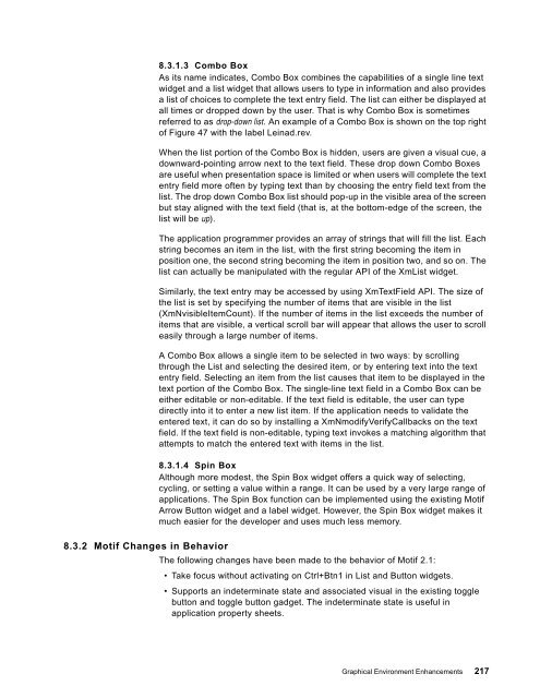
- Page 242 and 243: • Snap-back scrolling, a feature
- Page 244 and 245: • Secondary transfer, also referr
- Page 246 and 247: • Since the check mark sign is pa
- Page 248 and 249: 8.3.4.14 Scrolled Window and Scroll
- Page 250 and 251: • New XmComboBox XmNpositionMode
- Page 252 and 253: This application uses both the X Wi
- Page 254 and 255: 8.5.4 New OpenGL Extensions (4.3.2)
- Page 256 and 257: 232 AIX Version 4.3 Differences Gui
- Page 258 and 259: The browser must be a forms-capable
- Page 260 and 261: Figure 50. Documentation Search Ser
- Page 262 and 263: If you have not run Netscape previo
- Page 264 and 265: Previously, the man command had to
- Page 266 and 267: Single-Byte Character Set Support (
- Page 268 and 269: abandoning its standards-based inte
- Page 270 and 271: • __mblen_std() - For all other c
- Page 272 and 273: Locale method Unicode locales ISO88
- Page 274 and 275: Unicode Locale Chinese (Traditional
- Page 276 and 277: 10.5 Euro Symbol Support for AIX (4
- Page 278 and 279: Any UTF-8 based locale installed on
- Page 280 and 281: Encoding UTF-8 multi-byte: Byte S
- Page 282 and 283: Keyword p_sign_posn n_sign_posn Des
- Page 284 and 285: Table 54 summarizes the AIX keyboar
- Page 286 and 287: 10.5.4 Input Methods for the Euro S
- Page 288 and 289: A selection menu can be closed by p
- Page 290 and 291:
Figure 55. UNIVERSAL Input Method:
- Page 292 and 293:
Table 56 summarizes the new iconv c
- Page 294 and 295:
Converter Type Fileset UCS-2_IBM-11
- Page 296 and 297:
• X11.loc.XX_XX.Dt.rte • X11.lo
- Page 298 and 299:
Figure 56. German UTF-8: Add Additi
- Page 300 and 301:
SMIT uses the chlang command to set
- Page 302 and 303:
os.loc.iso.de_DE bos.loc.iso.en_US
- Page 304 and 305:
• Thai Cultural Conventions (Unic
- Page 306 and 307:
In Japan, most of operating systems
- Page 308 and 309:
X11.base.rte This fileset ships the
- Page 310 and 311:
Documentation Search Service does n
- Page 312 and 313:
Figure 59. Searching Japanese Docum
- Page 314 and 315:
Figure 61. A Japanese Book 10.7.3.2
- Page 316 and 317:
Figure 63. Input Chinese Character
- Page 318 and 319:
Figure 65. A Chinese Book for Insta
- Page 320 and 321:
Client 3 capabilities. In this case
- Page 322 and 323:
Figure 67. Stand-Alone LDAP Directo
- Page 324 and 325:
provides encryption of data and tra
- Page 326 and 327:
Changes to schema definitions previ
- Page 328 and 329:
304 AIX Version 4.3 Differences Gui
- Page 330 and 331:
environments may vary significantly
- Page 332 and 333:
• AIX Version 4 Getting Started,
- Page 334 and 335:
• http://www.lexmark.com • http
- Page 336 and 337:
How Customers Can Get ITSO Redbooks
- Page 338 and 339:
314 AIX Version 4.3 Differences Gui
- Page 340 and 341:
LDIF LFT LID LP LPI LPP LPR/LPD LDA
- Page 342 and 343:
318 AIX Version 4.3 Differences Gui
- Page 344 and 345:
authentication 300 authentication h
- Page 346 and 347:
E ed command 141 EDTMPDIR 141 effec
- Page 348 and 349:
kernel changes. crash command 17 de
- Page 350 and 351:
-command security 166 RDB glue 299
- Page 352 and 353:
web based systems management 95 arc
- Page 354 and 355:
330 AIX Version 4.3 Differences Gui
- Page 356:
SG24-2014-01 Printed in the U.S.A.


