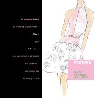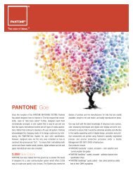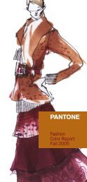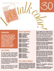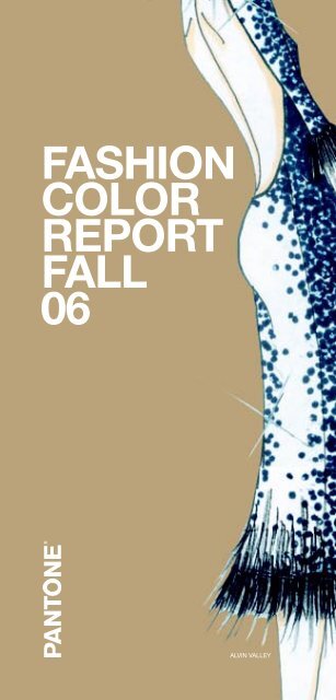
Pantone Fashion Color Report Fall 2006
Pantone Fashion Color Report Fall 2006
Pantone Fashion Color Report Fall 2006

Create successful ePaper yourself
Turn your PDF publications into a flip-book with our unique Google optimized e-Paper software.
ALVIN VALLEY
STEADFAST<br />
AND STUNNING<br />
NEW YORK FASHION WEEK FALL <strong>2006</strong>, FEBRUARY 3-10, <strong>2006</strong><br />
JUST AS DAY TURNS TO TWILIGHT, FALL <strong>2006</strong> COLORS ARE A<br />
SUBTLE DEEPENING OF THE WORLD AROUND, LIT WITH THE FINAL<br />
GLOW OF THE TURNING HORIZON. NEW YORK DESIGNERS HAVE<br />
FOUND THEMSELVES IN A SANCTUARY OF COLOR, FILLED WITH<br />
THE CONSTANCY OF NIGHTFALL.<br />
NEUTRALS TAKE CENTER STAGE AS A SOOTHING REMINDER OF<br />
LIFE’S MANY REASSURANCES: FROM FROST GRAY, EVOCATIVE<br />
OF A QUIET WINTER MORNING, TO APPLE CINNAMON, THE<br />
ESSENCE OF FRESHLY BREWED TEA. THE NEUTRALS, WHILE<br />
SIMPLE, PROVIDE A LANDSCAPE FOR COMPLEXITY. THE TOUCHES<br />
OF RICH TONES IN THE PALETTE ADD AN EXOTIC DIMENSION<br />
TO THE NEUTRALS — ESPECIALLY RELEVANT AS ACCESSORIES<br />
CONTINUE TO PREVAIL. THE COMBINATION OF PALE KHAKI AND<br />
RED MAHOGANY TELLS THE STORY OF A CLASSIC BOOK, BOUND<br />
WITH A VELVET RIBBON. VETIVER PAIRED WITH PURPLE MAGIC IS<br />
A PLUSH COUCH DECORATED WITH A SILK PILLOW.<br />
WARMTH AND VIBRANCY HAVE FOUND A WAY TO HARMONIZE.<br />
THIS SEASON’S ORANGE, GOLDEN OCHRE, GOES TO THE WARM<br />
SIDE WITH AN UMBER UNDERTONE AND A TOUCH OF ELEGANCE.<br />
MINERAL RED ADDS AN INVITING SENSE OF INTRIGUE WHEN<br />
USED AGAINST A BACKGROUND OF SIMPLY TAUPE, A BASIC YET<br />
COMFORTING NEUTRAL.<br />
STRONG THROUGH SEVERAL CONSECUTIVE SEASONS,<br />
NOTEWORTHY BIJOU BLUE GIVES A SENSE OF CONSTANCY, A<br />
COLOR WE CAN RELY ON. LEANING ON TEAL, IT IS A RARE SHADE<br />
THAT UNIVERSALLY COMPLEMENTS ALL SKIN TONES —<br />
A BEAUTIFUL COLOR FOR FLATTERING DESIGNS.<br />
“FALL <strong>2006</strong> IS A TIME TO TRANSITION BACK TO MORE<br />
DEPENDABLE COLORS,” SAYS LEATRICE EISEMAN, EXECUTIVE<br />
DIRECTOR, PANTONE COLOR INSTITUTE ® . WE’RE LOOKING FOR<br />
COLORS WE CAN WRAP OURSELVES IN — A FEELING ACHIEVED<br />
THROUGH CLASSIC NEUTRALS AS A BASE, ACCENTED WITH RICH<br />
HUES. HALF OF THE PALETTE, REMARKABLY, IS EXPRESSED IN<br />
BASIC CHESTNUTS — ALL VERY FAMILIAR, VERY APPROACHABLE<br />
TONES. IT’S AN INVITING WARMTH NOT SEEN IN THE PAST FEW<br />
SEASONS THAT DESIGNERS ARE NOW EMBRACING.”<br />
FOR 12 YEARS, PANTONE, INC. HAS SURVEYED THE DESIGNERS<br />
OF NEW YORK FASHION WEEK TO BRING YOU THE SEASON’S<br />
MOST IMPORTANT COLOR TRENDS. THIS SKETCHBOOK PREVIEWS<br />
COLOR FOR FALL <strong>2006</strong>. IT IS ALSO AVAILABLE ONLINE AT<br />
WWW.PANTONE.COM/FALL<strong>2006</strong>.<br />
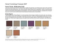
SIMPLY TAUPE<br />
PANTONE 16-0906<br />
C.0 M.9 Y.25 K.27<br />
PALE KHAKI<br />
PANTONE 15-1216<br />
C.15 M.15 Y.46 K.3<br />
APPLE CINNAMON<br />
PANTONE 17-1045<br />
C.0 M.29 Y.79 K.18<br />
GOLDEN OCHRE<br />
PANTONE 16-1346<br />
C.0 M.52 Y.100 K.7<br />
MINERAL RED<br />
PANTONE 17-1537<br />
C.0 M.90 Y.83 K.12<br />
FROST GRAY<br />
PANTONE 17-0000<br />
C.2 M.2 Y.5 K.50<br />
VETIVER<br />
PANTONE 17-0613<br />
C.0 M.1 Y.30 K.50<br />
BIJOU BLUE<br />
PANTONE 18-3921<br />
C.88 M.71 Y.25 K.3<br />
PURPLE MAGIC<br />
PANTONE 19-3540<br />
C.57 M.100 Y.0 K.10<br />
RED MAHOGANY<br />
PANTONE 19-1521<br />
C.0 M.100 Y.90 K.55<br />
www.pantone.com/fall06
BILL BLASS<br />
MICHAEL VOLLBRACHT FOR BILL BLASS<br />
prominent colors lilac and chartreuse; teal and black<br />
inspiration vintage pastoral print from bucol signature color<br />
teal and/or chartreuse color philosophy pretty, feminine soft<br />
colors juxtaposed with earthy hues<br />
PURPLE MAGIC<br />
PANTONE 19-3540<br />
C.57 M.100 Y.0 K.10<br />
www.pantone.com/fall06
GILLES MENDEL FOR J. MENDEL<br />
prominent colors powdery pales like chalk, pumice and<br />
dusty rose contrasted with black currant, the final accent<br />
is pewter metallic threads in the tweeds and gold lamé.<br />
inspiration a sophisticated palette is part of the signature<br />
of the house. signature color either chalk which we used<br />
for several gowns or wild berry, a new sensuous color for a<br />
knockout dress color philosophy powdery pales contrasted<br />
with deep stains<br />
J. MENDEL<br />
PURPLE MAGIC<br />
PANTONE 19-3540<br />
C.57 M.100 Y.0 K.10<br />
www.pantone.com/fall06
BEHNAZ SARAFPOUR<br />
MINERAL RED<br />
PANTONE 17-1537<br />
C.0 M.90 Y.83 K.12<br />
RED MAHOGANY<br />
PANTONE 19-1521<br />
C.0 M.100 Y.90 K.55<br />
CATHERINE MALANDRINO prominent colors creamy<br />
white, metallic dark silver, deep chocolate, cold emerald,<br />
warm honey, rich bourgogne inspiration the “queens” of the<br />
world; the code of the new urban queen signature color<br />
rich chocolate color philosophy rich tones contrasted with a<br />
touch of metallic silver; ultra glossy textures in juxtaposition<br />
with matte surfaces<br />
CATHERINE MALANDRINO<br />
BEHNAZ SARAFPOUR prominent colors i always work<br />
with graphic color combinations such as back and white.<br />
inspiration i am inspired by the idea of all things traditional.<br />
the colors that i am working with are very rich, deep<br />
tones – dark reds, greens and blues.<br />
www.pantone.com/fall06
BIJOU BLUE<br />
PANTONE 18-3921<br />
C.88 M.71 Y.25 K.3<br />
ZAC POSEN prominent colors there is nothing sexier and<br />
more real than navy and jet. inspiration this season’s girl is a<br />
“perfectionist rebel,” so i chose colors that evoke her fierce<br />
and moody side as well as her classic luxury. signature<br />
color midnight navy color philosophy moody and rich with<br />
seductive classics: chocolate, jet and navy with sparks of<br />
sporty colors such as ochre, raspberry and billiard green<br />
ZAC POSEN<br />
www.pantone.com/fall06
ALVIN VALLEY<br />
ALVIN VALLEY prominent colors total eclipse, bitter<br />
chocolate, blanc de blanc, wren, silver, after dark, rustic<br />
brown, loden green inspiration mary tyler moore meets<br />
hollywood; late ‘60s, early ‘70s intellectual and design<br />
movement signature color total eclipse, silver, rustic brown<br />
color philosophy unusual combinations of colors like in the<br />
furniture of that time<br />
BIJOU BLUE<br />
PANTONE 18-3921<br />
C.88 M.71 Y.25 K.3<br />
RED MAHOGANY<br />
PANTONE 19-1521<br />
C.0 M.100 Y.90 K.55<br />
DOUGLAS HANNANT<br />
DOUGLAS HANNANT prominent colors chocolate brown,<br />
mocha, caramel, black, wine, pearl gray, ivory inspiration<br />
demure, soft, romantic signature color chocolate brown<br />
color philosophy sensitive, demure and understated<br />
www.pantone.com/fall06
PETER SOM<br />
PETER SOM prominent colors fall <strong>2006</strong> is about a graphic<br />
mix of jet black and cool dove gray with antique white. warm<br />
shades of reds – from pale rose to lipstick – add femininity.<br />
inspiration cecil beaton’s ascot from my fair lady signature<br />
color dove gray color philosophy this season a graphic<br />
but feminine combination of colors keeps it clean and sleek<br />
without being overpowering.<br />
FROST GRAY<br />
PANTONE 17-0000<br />
C.2 M.2 Y.5 K.50<br />
www.pantone.com/fall06
MINERAL RED<br />
PANTONE 17-1537<br />
C.0 M.90 Y.83 K.12<br />
GOLDEN OCHRE<br />
PANTONE 16-1346<br />
C.0 M.52 Y.100 K.7<br />
RED MAHOGANY<br />
PANTONE 19-1521<br />
C.0 M.100 Y.90 K.55<br />
KATHRYN DIANOS FOR AUSTIN REED prominent colors<br />
warm, earthy neutrals such as camel, mahogany, maple<br />
leaf, forest green and vicuna inspiration the colors of the<br />
woods, pinecones, dry leaves and a source of nature inspire<br />
the collection. signature color camel color philosophy<br />
river thames, sherwood forest, balmoral and sloane street<br />
combine warm, earthy natural colors that give the collection<br />
an organic feel.<br />
AUSTIN REED<br />
NANETTE LEPORE<br />
NANETTE LEPORE prominent colors lacquer red, boudoir<br />
beige, smoky gray, jet black, gunmetal inspiration the<br />
salons of edwardian england; the heart of artistic bohemia<br />
signature color lacquer red<br />
www.pantone.com/fall06
BIJOU BLUE<br />
PANTONE 18-3921<br />
C.88 M.71 Y.25 K.3<br />
FROST GRAY<br />
PANTONE 17-0000<br />
C.2 M.2 Y.5 K.50<br />
CYNTHIA ROWLEY prominent colors intense blues like<br />
cobalt (PANTONE 18-3849TP and PANTONE 17-4433TP)<br />
saturate the fall 06 collection. navy, red and yellow<br />
(PANTONE 19-4241TP, PANTONE 18-1761TP and PANTONE<br />
12-0804TP) are also prominent. inspiration psychology and<br />
the exploration of the mind, the collection will experiment<br />
with unexpected pairings of color.<br />
CYNTHIA ROWLEY<br />
CYNTHIA STEFFE<br />
CYNTHIA STEFFE prominent colors i’m working with<br />
concentrated colors and smoky complements that have an<br />
aged look: smoky yet intense blues, rosy mauves, etc.<br />
inspiration classic menswear, i’m using feminine hues that<br />
work well as complements to a menswear base. signature<br />
color a saturated blue-violet color philosophy colors that<br />
are fresh and flatter the wearer<br />
www.pantone.com/fall06
NICOLE MILLER<br />
NICOLE MILLER prominent colors olive, teal, tobacco,<br />
claret inspiration byzantine plates signature color olive<br />
color philosophy i love unusual color combinations such<br />
as wine with teal and brown.<br />
GOLDEN OCHRE<br />
PANTONE 16-1346<br />
C.0 M.52 Y.100 K.7<br />
VETIVER<br />
PANTONE 17-0613<br />
C.0 M.1 Y.30 K.50<br />
www.pantone.com/fall06
NAEEM KAHN<br />
ESTEBAN CORTAZAR<br />
NAEEM KHAN prominent colors black, espresso brown,<br />
dusty pink and a special xviii century blue called bleu<br />
natier inspiration traveling to versailles last year; marie<br />
antoinette years signature color bleu natier, dusty pink<br />
color philosophy pairing more vibrant colors with black<br />
and brown colors<br />
BIJOU BLUE<br />
PANTONE 18-3921<br />
C.88 M.71 Y.25 K.3<br />
ESTEBAN CORTAZAR prominent colors dusty shades of<br />
blue, smoky rose, antique gold and champagne inspiration<br />
17th century dusty shades of color and delicate textures. the<br />
beauty and movement captured in degas’ ballerina paintings<br />
and the lines, shapes and shadows of the female body.<br />
signature color dusty pink and blue color philosophy dusty<br />
shades bring a feeling of soft delicate beauty and antiquity.<br />
www.pantone.com/fall06
BIJOU BLUE<br />
PANTONE 18-3921<br />
C.88 M.71 Y.25 K.3<br />
FROST GRAY<br />
PANTONE 17-0000<br />
C.2 M.2 Y.5 K.50<br />
ALICE ROI<br />
Y & KEI prominent colors primary colors: ermine white,<br />
almond, gold, carbon black. outstanding accent colors: ink<br />
blue, lavender, sensual purple, amethyst inspiration images<br />
of a crisp winter scene. the pureness of white and natural<br />
colors enhanced with rococo inspired details signature<br />
color ink blue color philosophy a cool elegance of sharp<br />
white and natural colors accented with rich and ornate colors<br />
Y & KEI<br />
ALICE ROI prominent colors black and white, and a light<br />
ashy gray, high impact burnt sienna, washed out teal – all the<br />
colors look as if they were once bright and have now faded<br />
or oxidized. think old polaroid. inspiration washy shades<br />
of burnt sienna and raw umber with bold black and white<br />
signature color burnt sienna color philosophy crisp blacks<br />
and whites alongside washed out acidic colors<br />
www.pantone.com/fall06
MINERAL RED<br />
PANTONE 17-1537<br />
C.0 M.90 Y.83 K.12<br />
GOLDEN OCHRE<br />
PANTONE 16-1346<br />
C.0 M.52 Y.100 K.7<br />
VETIVER<br />
PANTONE 17-0613<br />
C.0 M.1 Y.30 K.50<br />
WUNDERKIND BY WOLFGANG JOOP<br />
prominent colors colors for the fall 06 collection are<br />
muted earth tones: brick red, saffron, camel, midnight<br />
blue, gray and black.<br />
PAMELLA ROLAND<br />
WUNDERKIND<br />
PAM DEVOS FOR PAMELLA ROLAND prominent colors<br />
seasonal fall colors including charcoal, moss green, copper,<br />
dark ruby red and deep jewel-tone blue. a subtle black<br />
undertone adds a sophisticated feel. inspiration artist john<br />
singer sargent and his painting “madame x” influenced<br />
the subtle sophisticated color references in the collection.<br />
the colors include a wide range of oranges, yellows and<br />
grays. signature color navy and deep blue tones color<br />
philosophy infusing the rich and sophisticated colors of<br />
sargent’s portraits and landscapes<br />
www.pantone.com/fall06
BABY PHAT<br />
BABY PHAT BY KIMORA LEE SIMMONS<br />
prominent colors baby phat’s fall <strong>2006</strong> collection is about<br />
luxurious colors mixed with contrasting accents that<br />
punctuate our color story, starting with cool gray tones that<br />
transition into warm tones of rich burgundies and browns that<br />
are weaved with rich metallic hints. inspiration the upcoming<br />
baby phat fall <strong>2006</strong> collection is inspired by the elegance<br />
and panache of 20th century red carpet glamour. expect to<br />
see vamped-up suits, dresses, prints and fabrics where retro<br />
glam meets hip-hop royalty. signature color this season<br />
brown tones with pastel accents will be all the rage.<br />
color philosophy luxury and royalty define the baby<br />
phat color philosophy for fall <strong>2006</strong>.<br />
RED MAHOGANY<br />
PANTONE 19-1521<br />
C.0 M.100 Y.90 K.55<br />
APPLE CINNAMON<br />
PANTONE 17-1045<br />
C.0 M.29 Y.79 K.18<br />
GOLDEN OCHRE<br />
PANTONE 16-1346<br />
C.0 M.52 Y.100 K.7<br />
www.pantone.com/fall06
AKIKO OGAWA<br />
AKIKO OGAWA prominent colors graduations of gray, gold:<br />
PANTONE 13-0000TP moonbeam, PANTONE 15-1305TP<br />
feather gray, PANTONE 17-6205TP elephant skin,<br />
PANTONE 18-0403TP dull gull gray inspiration this season<br />
i was inspired by images of paris in the 1920s by jacques<br />
henri lartigue, most particularly a photograph of wilting<br />
flowers. signature color PANTONE 15-1305TP feather gray<br />
color philosophy for this fall, i wanted my colors to be highly<br />
nuanced and evoke a classical, refined ambience. for me,<br />
this is manifested as a cloudy, hazy palette of graduations<br />
of gray from smoky slate to charcoal.<br />
PALE KHAKI<br />
PANTONE 15-1216<br />
C.15 M.15 Y.46 K.3<br />
VETIVER<br />
PANTONE 17-0613<br />
C.0 M.1 Y.30 K.50<br />
FROST GRAY<br />
PANTONE 17-0000<br />
C.2 M.2 Y.5 K.50<br />
www.panto ne.com/fall06
SIMPLY TAUPE<br />
PANTONE 16-0906<br />
C.0 M.9 Y.25 K.27<br />
PURPLE MAGIC<br />
PANTONE 19-3540<br />
C.57 M.100 Y.0 K.10<br />
RED MAHOGANY<br />
PANTONE 19-1521<br />
C.0 M.100 Y.90 K.55<br />
LAURA PORETZKY FOR ABAETÉ prominent colors<br />
titanium, sapphire navy and onyx. the combinations of<br />
sapphire navy and wisteria and onyx and ginger.<br />
inspiration i was inspired by the warm tones combined with<br />
black in furniture made by bugatti, and my accents were<br />
inspired by the jewel tones that marioni fortuny used in his<br />
silk pleated fabrics. signature color warm gray and navy<br />
color philosophy mix dark with dark<br />
ABAETÉ<br />
YIGAL AZROUEL<br />
YIGAL AZROUEL prominent colors eggplant, mulberry, lilac,<br />
cobalt blue, midnight blue, ochre, army green, black, pearl<br />
and white inspiration gauguin signature color eggplant,<br />
shades of purple color philosophy expect the unexpected:<br />
mustard and midnight, olive and navy, cobalt and pearl.<br />
www.pantone.com/fall06
RED MAHOGANY<br />
PANTONE 19-1521<br />
C.0 M.100 Y.90 K.55<br />
BIJOU BLUE<br />
PANTONE 18-3921<br />
C.88 M.71 Y.25 K.3<br />
PALE KHAKI<br />
PANTONE 15-1216<br />
C.15 M.15 Y.46 K.3<br />
CHARLOTTE RONSON prominent colors cornflower blue,<br />
boysenberry reds, sandalwood brown. i chose a very warm<br />
color palette for a cold fall. inspiration the storybook, hansel<br />
and gretel signature color prussian blue color philosophy<br />
always embrace color for fall.<br />
JAMES COVIELLO<br />
JAMES COVIELLO prominent colors midnight teal,<br />
chartreuse, golden olive and smokey brown; plum wine,<br />
lavender, dusty tangerine and matte fuchsia; tarnished gold,<br />
faded salmon and khaki olive inspiration this season, the<br />
english interwar years (wwi and wwii) and the artists,<br />
tastemakers and aristocrats who peopled them are my<br />
inspiration. signature color midnight teal color philosophy<br />
jeweled tones faded by the sun<br />
CHAROLETTE RONSON<br />
www.pantone.com/fall06
MUST-HAVE ITEM<br />
FOR FALL 06<br />
AKIKO OGAWA Wrap coats in PANTONE 16-1305TP String<br />
ABAETÉ The skinny pant and long jackets will be the must have<br />
items for fall.<br />
ALICE ROI A Burnt Sienna wool jersey dress<br />
COLOR.<br />
ALVIN VALLEY Crystal beaded minidress with matching headband.<br />
Of course the impeccable fit of double cashmere AV classic pants.<br />
AUSTIN REED Suede jacket in Camel or Brown<br />
BABY PHAT BY KIMORA LEE SIMMONS Baby Phat dress embellished<br />
with fur and intricate beading in an either Midnight or Chocolate tone<br />
BETSEY JOHNSON A bow tie and Black satin<br />
MICHAEL VOLLBRACHT FOR BILL BLASS A Chartreuse double-faced<br />
cashmere swing coat<br />
CATHERINE MALANDRINO Deep Chocolate and Bourgogne transparent<br />
tulle dress with handcrafted lace<br />
CHARLOTTE RONSON My double-breasted tailor stripe cropped trench<br />
jacket – in Cornflower Blue of course.<br />
NEVER LOST IN<br />
TRANSLATION.<br />
DANA BUCHMAN A beautifully tailored knit jacket in Smoke Gray<br />
DIANE VON FURSTENBERG A printed wrap dress in Red, Camel<br />
and Black<br />
DOUGLAS HANNANT Olive Green Swakara fitted jacket<br />
ESTEBAN CORTAZAR A Dusty Blue satin structured gown that embodies<br />
the lines, shapes and shadows of the female figure<br />
J. MENDEL Custom-colored sables in either Chalk or Chestnut<br />
JAMES COVIELLO Front-pleated chiffon blouse with neck bow in<br />
Dusty Mauve<br />
KENNETH COLE Paper-thin waxed leather wrap coat in Black<br />
NAEEM KHAN An Espresso Brown capulet<br />
NANETTE LEPORE A decadent Red velvet dance dress<br />
NICOLE MILLER Hooded blouson sweater in Tobacco or Olive<br />
PAMELLA ROLAND Our multi-colored paisley brocade coat with shawl<br />
collar trimmed in leather – it boasts a beautiful mix of fall-toned Greens,<br />
Off-White, Copper and Brown<br />
PETER SOM Dove Gray Metallic lace and tulle cocktail dress<br />
TRACY REESE A structured frock in vampy Aubergine<br />
WILLOW So far there is a sensational shirt/jacket which I love in Petrol Blue<br />
Y & KEI Chic, sharply tailored suit in Ink Blue<br />
PANTONE — the global expert in all things color — created PANTONE<br />
UNIVERSE on the simple principle that color is for everyone. The latest<br />
PANTONE UNIVERSE Collection, with a new home in Tokyo, makes<br />
it easy for design aficionados of all kinds to surround themselves<br />
with bold hues and to style their homes with professional ease.<br />
With striking, modern designs, PANTONE UNIVERSE brings color into<br />
the home through a bold collection of bed, bath, kitchen and lifestyle<br />
products. Like only <strong>Pantone</strong> can do, every chair, sheet, pillowcase and<br />
slipper features designs that either incorporate or are reminiscent of<br />
our signature PANTONE <strong>Color</strong> Chip.<br />
The PANTONE UNIVERSE Home Collection, in partnership with three<br />
manufacturers and under the IFS Japan umbrella, will be available<br />
throughout Japan in <strong>2006</strong> with plans to expand into a global<br />
lifestyle brand in the future. For licensing opportunities, please<br />
email contact@pantoneuniverse.com.<br />
YIGAL AZROUEL Cotton and silk voile blouse in washed Lilac with hand<br />
embroidery detail and ruched neckline<br />
ZAC POSEN Our great tailored cocktail dress in Midnight Navy and Jet<br />
www.pantone.com/fall06
EXPERTS TALK<br />
ABOUT FALL 06<br />
HOW HAS THE HIGHLY POPULAR “NATURAL AND ORGANIC”<br />
TREND – FROM FOOD TO SKINCARE TO TEXTILES – INFLUENCED<br />
CONSUMERS’ FASHION CHOICES? WHAT ROLE DOES COLOR<br />
PLAY IN THIS MARKET?<br />
MICHAEL FINK, SENIOR FASHION DIRECTOR, SAKS FIFTH AVENUE It takes<br />
hours to look natural! Naturals and organics can ooze comfort and cool<br />
sophistication when applied with care. One misstep and suddenly you’re an<br />
earth mother poster child. <strong>Color</strong> is a wonderful solution to pop all of those<br />
Wheat, Oat and Bran colors.<br />
CANDY PRATTS PRICE, EXECUTIVE FASHION DIRECTOR, STYLE.COM<br />
Consumers are familiar with the word “organic” in their food so they trust<br />
skincare products and textiles in the same way – healthier for you and your<br />
body. Pigments like Terracotta, Gold and Henna add the romance.<br />
SIMON DOONAN, CREATIVE DIRECTOR, BARNEYS NEW YORK People have<br />
become more nuanced in their understanding of subtle organic tones –<br />
there are millions of subtle organic tones and a million ways to be sludgy.<br />
ROOPAL PATEL, SENIOR WOMEN’S FASHION DIRECTOR, BERGDORF<br />
GOODMAN The natural and organic trend has been very influential among<br />
consumers. The direction for spring has been toned down and understated.<br />
Attention to texture and diversity within this color palette is key. Crochet,<br />
lace, appliqué and handcrafted techniques are important. Hair and makeup<br />
are much cleaner and natural. Home elements demand a much more<br />
organic approach to different fabrications. Natural and organic may be<br />
toned down, but the need for quality and luxury remains important to the<br />
consumer in regard to some of the “key” spring trends.<br />
NINA GARCIA, FASHION DIRECTOR, ELLE Dior’s <strong>2006</strong> show was the best<br />
example of the natural trend. Ever theatrical in makeup and styling, John<br />
Galliano opted for an entirely nude palette. The message was loud and<br />
clear and the natural look of minimal makeup made an impact. <strong>Color</strong>s<br />
have been influenced by the increased use of natural fabrics: raffia, wood,<br />
crochet, wicker, linens and burlap, and all man-made fabrics have accented<br />
both clothing and accessories. The colors tend to be more sober and less<br />
saturated.<br />
SASHA CHARNIN MORRISON, FASHION DIRECTOR, ALLURE Natural Oat<br />
Couture – every designer on this side of the pond and across it romanced<br />
neutral shades for spring. It’s the new Black. They layered it; they remixed it.<br />
As for consumers becoming attracted to it, it’s the news, its what celebrities<br />
will be photographed in. It will be featured in editorials in magazines and<br />
impossible to ignore at retail. The way it’s merchandised on the floor in<br />
stores, consumers will be interested in the fresh, neutral palette which can<br />
be mixed with just about anything – lace, color, jeans, accessories, dogs,<br />
children. The challenge/fun part (for some) will be choosing the right<br />
nude/neutral for your particular skin tone, much like matching a<br />
foundation to your skin.<br />
THOM FILICIA, INTERIOR DESIGN EXPERT, NBC/BRAVO’S QUEER EYE<br />
Consumers’ fashion choices are being influenced by the popular “natural<br />
and organic” trend through the use of soft tailoring constructed in cashmere,<br />
flax, Sea Island cotton and other natural fabrics. <strong>Color</strong> plays an important<br />
role in this market because consumers don’t see “natural and organic” as<br />
a color, they see it as Beige. But, in fact, there are many colors. Utilizing an<br />
earthly palette with beautiful textures and inviting colors such as Coffee,<br />
Indigo, Moss, Stone, Wheat and Maize is the new face of natural.<br />
HOW HAS THE HIGHLY POPULAR “ORGANIC AND<br />
NATURAL” TREND INFLUENCED YOUR CHOICES IN COLOR<br />
AND TEXTURE AS A DESIGNER?<br />
ABAETÉ I always like organic tones to complement my brighter shades.<br />
AKIKO OGAWA To be honest it wasn’t central to my work for this<br />
season...but in terms of fabric I have gone for a lot of natural fabrics, most<br />
notably silk, and the colors in my collection are soft, serene and<br />
essentially natural.<br />
ALICE ROI There are a lot more Creams, Tans and mélanges present in<br />
the collection because of the organic trend.<br />
CHARLOTTE RONSON I have always loved earthy tones and natural earthy<br />
fabrics that feel like you are wearing a second skin.<br />
DANA BUCHMAN The colors are more muted and natural in feeling.<br />
DEREK LAM This season the collection is really moving toward sharp,<br />
graphic, intense almost neon color while keeping a dark and moody<br />
underlying palette.<br />
DIANE VON FURSTENBERG It hasn’t this season.<br />
ESTEBAN CORTAZAR Organic tones and textures make me feel more in<br />
touch with nature as a designer and they give a certain warm<br />
softness to the designs.<br />
J. MENDEL Our colors are organically based and our textures use many<br />
raw edges to create a fragile feeling in the clothes and furs.<br />
KENNETH COLE Natural jewel tones and shades of neutral Browns<br />
NICOLE MILLER I’m using a lot of metal fabrics which guard against<br />
harmful rays in the environment.<br />
PAMELLA ROLAND The Deep Blue and Black “Leaf” patterned<br />
brocade is influenced heavily by nature. The collection contains a plethora of<br />
natural fibers from cashmere and silk to a truly unique Gray,<br />
Black and White mohair.<br />
PETER SOM Not too much<br />
TRACY REESE Incorporating wood in wonderful earthly<br />
neutral tones – all organic in coloration<br />
WILLOW I do not use generic trends when selecting colors. I go by feelings I<br />
have for that collection and the colors appear to me.<br />
Y & KEI The sharpness and cleanliness of pure White snow on a winter’s<br />
day... the natural shades and textures of Almond and muslin... the rich<br />
earthliness of Charcoal... evoking the bedazzlement of jewels<br />
and lustrous Golds<br />
YIGAL AZROUEL The biggest influence has been in fiber and yarn<br />
selection. I don’t really alter my collections for trend so you wouldn’t see a<br />
heavy influence, only subtle.<br />
ZAC POSEN The “organic and natural” trend has more influenced my<br />
choices in form this season.<br />
www.pantone.com/fall06
SIMPLY TAUPE<br />
PANTONE 16-0906<br />
C.0 M.9 Y.25 K.27<br />
PALE KHAKI<br />
PANTONE 15-1216<br />
C.15 M.15 Y.46 K.3<br />
APPLE CINNAMON<br />
PANTONE 17-1045<br />
C.0 M.29 Y.79 K.18<br />
GOLDEN OCHRE<br />
PANTONE 16-1346<br />
C.0 M.52 Y.100 K.7<br />
MINERAL RED<br />
PANTONE 17-1537<br />
C.0 M.90 Y.83 K.12<br />
FROST GRAY<br />
PANTONE 17-0000<br />
C.2 M.2 Y.5 K.50<br />
VETIVER<br />
PANTONE 17-0613<br />
C.0 M.1 Y.30 K.50<br />
BIJOU BLUE<br />
PANTONE 18-3921<br />
C.88 M.71 Y.25 K.3<br />
PURPLE MAGIC<br />
PANTONE 19-3540<br />
C.57 M.100 Y.0 K.10<br />
RED MAHOGANY<br />
PANTONE 19-1521<br />
C.0 M.100 Y.90 K.55<br />
PANTONE <strong>Fashion</strong> <strong>Color</strong> <strong>Report</strong> Vol. 25, February <strong>2006</strong>. <strong>Pantone</strong>, Inc. 590 Commerce Blvd.,<br />
Carlstadt, NJ 07072-3098. Tel: 201.935.5500 Fax: 201.896.0242. PANTONE <strong>Color</strong>s displayed here<br />
may not match PANTONE-identified standards. Consult current PANTONE for fashion and home<br />
color system publications for accurate color. PANTONE ® and other <strong>Pantone</strong>, Inc. trademarks are<br />
the property of <strong>Pantone</strong>, Inc. EPSON, EPSON Stylus and Ultrachrome are trademarks or registered<br />
trademarks of Seiko Epson Corporation. ©<strong>Pantone</strong>, Inc., <strong>2006</strong>. All rights reserved.<br />
Production by Dusk. Printing by LP Thebault Co. Printed on SMART Paper, Pegasus, Brilliant White, 80 lb cover, smooth. <strong>Color</strong> proofs using PANTONE <strong>Color</strong>VANTAGE TM inks on an EPSON ® Stylus ® Pro 7600.