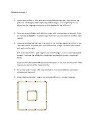
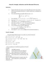
LATEX and WinEdt for MA4053
LATEX and WinEdt for MA4053
LATEX and WinEdt for MA4053

Create successful ePaper yourself
Turn your PDF publications into a flip-book with our unique Google optimized e-Paper software.
3.4 Quotes, dashes, dots <strong>and</strong> accents<br />
Shift+2 should not be used to produce quotation marks. Instead <strong>for</strong> a single<br />
opening quotation mark use the symbol ‘ (found in the top-left of the<br />
keyboard) <strong>and</strong> a closing quotation mark is produced with ’. For double quotation<br />
marks use two of each! The difference between this <strong>and</strong> an erroneous<br />
use of shift+2 is shown by:<br />
”Bad quote” <strong>and</strong> “Good quote”<br />
Other important symbols are hyphens <strong>and</strong> dashes. There are three separate<br />
types of dash: an intraword dash, a numerical range, <strong>and</strong> a dash indicating a<br />
pause in the sentence. These are given by 1, 2 <strong>and</strong> 3 copies of - respectively.<br />
For example<br />
bye-law 1–10 <strong>and</strong> That is true — in this case.<br />
are produced by<br />
bye-law 1--10 That is true --- in this case.<br />
An ellipsis (the symbol . . . ) is produced with \ldots, since typing .<br />
three times produces ... which does not have the correct spacing.<br />
Accented letters such as ã, é <strong>and</strong> ô can be produced by the inputs \~{a},<br />
\’{e} <strong>and</strong> \^{o}.<br />
3.5 Fonts <strong>and</strong> sizing<br />
By default L A TEX documents are set in Computer Modern fonts, which look<br />
fine <strong>and</strong> I would not encourage you to go down the route of trying to change<br />
this. Times Roman, Courier, etc. are available, as are a myriad of <strong>for</strong>eign<br />
scripts (Russian, Korean,. . . ). More important at the moment is the ability<br />
to emphasis words <strong>and</strong> change size. The follow comm<strong>and</strong>s achieve a change<br />
in the shape:<br />
\textit Italics \textbf Bold face<br />
\textup Upright \textrm Roman<br />
\textsf Sans serif \texttt Typewriter style<br />
They can be combined in obvious ways. For example bold sans serif is<br />
achieved by typing \textbf{\textsf{bold sans serif}}. Most of the<br />
time the default is <strong>for</strong> roman upright text so these two comm<strong>and</strong>s are not<br />
immediately useful, except in the statements of theorems <strong>and</strong> the like, when<br />
the default is italics. There is another comm<strong>and</strong>, \emph, that can be used to<br />
emphasis text. In general this achieves the same effect as using \textit, but<br />
5