Select Bus Service Vending Machine Graphics and Interface Redesign
Select Bus Service Vending Machine Graphics and Interface Redesign
Select Bus Service Vending Machine Graphics and Interface Redesign

Create successful ePaper yourself
Turn your PDF publications into a flip-book with our unique Google optimized e-Paper software.
<strong>Select</strong> <strong>Bus</strong> <strong>Service</strong> <strong>Vending</strong> <strong>Machine</strong> <strong>Graphics</strong> <strong>and</strong> <strong>Interface</strong> <strong>Redesign</strong>
<strong>Select</strong> <strong>Bus</strong> <strong>Service</strong> <strong>Vending</strong> <strong>Machine</strong> <strong>Graphics</strong> <strong>and</strong> <strong>Interface</strong> <strong>Redesign</strong>
Wraps<br />
Before<br />
After
Wraps<br />
Before<br />
After<br />
¯<br />
MetroCard Fare Collector<br />
Speed your Ride<br />
PAY BEFORE<br />
YOU BOARD<br />
Use all 3 doors to board the bus<br />
Dedicated bus lanes<br />
Faster, greener service<br />
Dispositivo de cobro de<br />
tarifas con MetroCard<br />
Acelere su viaje<br />
PAGUE ANTES<br />
DE ABORDAR<br />
Use las 3 puertas para abordar el autobús<br />
Carriles dedicados para los autobuses<br />
Servicio más rápido y más ecológico<br />
¯<br />
MetroCard Fare Collector<br />
Speed your Ride<br />
PAY BEFORE<br />
YOU BOARD<br />
Use all 3 doors to board the bus<br />
Keep your receipt<br />
Dispositivo de cobro de tarifas con MetroCard<br />
Acelere su viaje<br />
PAGUE ANTES<br />
DE ABORDAR<br />
Use las 3 puertas para abordar el autobús<br />
Guarde su recibo<br />
¯<br />
MetroCard Fare Collector<br />
Speed your Ride<br />
PAY BEFORE<br />
YOU BOARD<br />
Use all 3 doors to board the bus<br />
Dedicated bus lanes<br />
Faster, greener service<br />
Dispositivo de cobro de<br />
tarifas con MetroCard<br />
Acelere su viaje<br />
PAGUE ANTES<br />
DE ABORDAR<br />
Use las 3 puertas para abordar el autobús<br />
Carriles dedicados para los autobuses<br />
Servicio más rápido y más ecológico<br />
MetroCard machine<br />
MetroCard machine<br />
Challenges:<br />
• “Pay Before You Board” is a<br />
problematic central message<br />
• Cluttered design makes it hard to<br />
underst<strong>and</strong> at a quick glance<br />
• Unnecessary information, for<br />
example, “Speed your Ride”<br />
• Inconsistent information from<br />
one machine to the other<br />
• English <strong>and</strong> Spanish are used on<br />
all sides unnecessarily <strong>and</strong> are<br />
presently relatively<br />
nonhierarchically<br />
Icons reduce<br />
text <strong>and</strong><br />
explain the<br />
difference<br />
between the<br />
machines<br />
Central<br />
message is<br />
changed to<br />
“Get Ticket<br />
Here”, with the<br />
explanation,<br />
“Before You<br />
Board <strong>Bus</strong>”<br />
Br<strong>and</strong>ing is<br />
consistent with<br />
the language<br />
used on the<br />
bus shelter <strong>and</strong><br />
buses<br />
English <strong>and</strong><br />
Spanish are<br />
each on one<br />
side only— one<br />
is always visible<br />
Coin machine<br />
Coin machine
MetroCard <strong>Machine</strong> <strong>Interface</strong><br />
Information<br />
is redundant<br />
<strong>and</strong><br />
exceptions<br />
<strong>and</strong> rules are<br />
not laid out<br />
clearly or<br />
hierarchically<br />
(top <strong>and</strong><br />
bottom decal)<br />
Information is<br />
simplified <strong>and</strong><br />
treated<br />
hierarchically.<br />
1-2-3 instructions<br />
<strong>and</strong> icons,<br />
with their exceptions/qualifiers,<br />
are on top decal<br />
One of the<br />
biggest<br />
problems is<br />
that the Push<br />
to Start<br />
button is hard<br />
to locate—<br />
users try<br />
to push<br />
the screen<br />
because<br />
an identical<br />
machine in the<br />
subway has a<br />
touch-screen;<br />
this machine<br />
does not.<br />
Additionally,<br />
the motion<br />
graphics onscreen<br />
have a<br />
arrow pointing<br />
to the start<br />
button, but<br />
in the wrong<br />
place— we<br />
proposed<br />
to alter this<br />
graphic, but it<br />
was outside<br />
our scope.<br />
Instructions are<br />
color-coded with<br />
the area on the<br />
machine. We<br />
recommended,<br />
but were not<br />
able to<br />
implement as it<br />
was outside our<br />
scope, a<br />
re-ordering<br />
of the start,<br />
MetroCard, <strong>and</strong><br />
receipt modules.<br />
A bullseye is<br />
added to the<br />
start button to<br />
make it more<br />
visible<br />
Explanatory,<br />
identifying, <strong>and</strong><br />
rules information<br />
is on lower decal<br />
Before<br />
After
Coin <strong>Machine</strong> <strong>Interface</strong><br />
Having been designed<br />
originally as a muni meter,<br />
this machine can be<br />
confusing — for example,<br />
because buttons are not<br />
clearly labeled <strong>and</strong> there<br />
are some defunct<br />
functions<br />
Instruction decal does<br />
not clearly state the<br />
user’s options for<br />
starting, <strong>and</strong> colors have<br />
little, no, or an incorrect<br />
relationship to those<br />
on the machine—for<br />
example, Step 1, “insert<br />
coins”, is yellow, but so<br />
is the reduced fare<br />
start button.<br />
Information is simplified<br />
as much as possible, put<br />
in the proper place, <strong>and</strong> is<br />
treated hierarchically.<br />
Instruction decal clearly<br />
states the user’s choices<br />
for starting the machine<br />
Information is colorcoordinated<br />
to the area<br />
on the machine it refers to<br />
wherever possible. Otherwise,<br />
it uses the br<strong>and</strong>ing<br />
colors or colors that are<br />
distinct from others on<br />
the machine<br />
Some text is too small<br />
to be easily read by the<br />
visually impaired<br />
There is unnecessary,<br />
inconsistent or redundant<br />
information<br />
Note: this yellow coin<br />
entry decal was an unknown<br />
condition for both<br />
designer <strong>and</strong> client. We<br />
propose to change this to<br />
green to properly relate it<br />
to Step 2<br />
Before<br />
After
MetroCard <strong>Machine</strong> <strong>Interface</strong> Decals<br />
Coin <strong>Machine</strong> <strong>Interface</strong> Decals<br />
Top decals: There was very little space for basic identifying information or exceptions—<br />
but we were able to fit these two decals at the top of the machine.<br />
Top decal: Colors were chosen to match corresponding parts of the machine— the middle<br />
color did not provide sufficient contrast for the visually-impaired, so we made it darker.<br />
Instruction decal: All text was required to be 18 pt or larger, with the proper contrast,<br />
for the visually-impaired. Step 1 shows the three ways you can start the machine—<br />
this was split up visually in the previous design so the options were less clear.<br />
Bottom decal: Identifying, exception, fare, <strong>and</strong> transfer information were all required.<br />
Fare decal<br />
Bullseye decal: Draws<br />
attention to start button<br />
that was previously hard<br />
to see<br />
Reduced fare decal: This<br />
information was required by the<br />
client. The client had observed<br />
older users’ difficulty at locating<br />
the yellow, reduced-fare button.
SBS System: Br<strong>and</strong>ing<br />
The wrap’s design<br />
relates to both the<br />
overlapping,<br />
gradient curves on<br />
the bus as well as<br />
the simplified bus<br />
shelter panel, shown<br />
at far left.
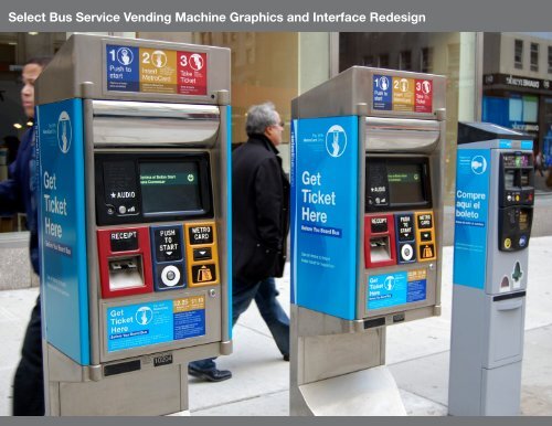
<strong>Machine</strong>s in Use
<strong>Machine</strong>s in Use<br />
Users often wait to get their tickets until they see the bus coming; the system needs to be very quick <strong>and</strong> easy to<br />
use in order for this to work.
<strong>Machine</strong>s in Use<br />
The machines are often used by the elderly <strong>and</strong> non-English speakers. Icons, simple language, <strong>and</strong> legible type<br />
help to make the machines easier to use.
<strong>Select</strong> <strong>Bus</strong> <strong>Service</strong> <strong>Vending</strong> <strong>Machine</strong> <strong>Graphics</strong> <strong>and</strong> <strong>Interface</strong> <strong>Redesign</strong>