


You also want an ePaper? Increase the reach of your titles
YUMPU automatically turns print PDFs into web optimized ePapers that Google loves.
AaBbCcDdEeFfGgHhliJjKkLIMmNnOoPp<br />
UPPER AND LOWER CASE. THE INTERNATIONAL JOURNAL OF TYPE AND GRAPHIC DESIGN<br />
SCf<br />
.1404<br />
quirky alphabets<br />
%.0<br />
,h44'e.<br />
044- 4r,<br />
G<br />
(1,<br />
ot<br />
QqRrSsTt UuVvWwXxYyZz12345678908,riECES$4£%!?On<br />
BI ISM I) B\ IN I LIMA I IONAI 11 PI I , (1 t (M1'01: \ 111 , N 1,11 N1. 11t1 1: I "WM V. 1 ott ; MIL ■ 10<br />
co r.. ..,$,<br />
=-4'-<br />
'3<br />
co, aar<br />
41<br />
nr<br />
-0 .Z 0) Nso<br />
0 at )t 0 ,40<br />
.***<br />
t><br />
■C B.<br />
0<br />
C. 4. 3 070, <br />
e<br />
ole<br />
2'c<br />
4,,e4<br />
ti<br />
so..<br />
'40,.<br />
,o,s.<br />
ea°<br />
va■<br />
zi<br />
nostalgia<br />
et.<br />
*et<br />
read<br />
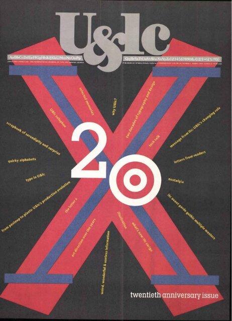
twentieth anniversary issue
Fontek DesignFonts: get fingertip<br />
access to hundreds of unique<br />
graphic illustrations right in<br />
your Macintosh font menu, ust<br />
like any other Typel font.<br />
Fontek DesignFonts<br />
combine the style of<br />
today's designers<br />
with the state of the art in<br />
today's technology.<br />
You use DesignFont images just<br />
like any other font character:<br />
add color, rotate, modify them in<br />
graphics programs or simply<br />
resize and generate Macintosh<br />
styles like outlines<br />
and shadows.<br />
Customize toein / —<br />
any way you like'<br />
OW Ea(<br />
Six Great Collections<br />
To Choose From!<br />
ORGANICS. ATTITUDES.<br />
INCIDENTALS. NATURALS.<br />
PRIMITIVES. RADICAL<br />
Each font has a style<br />
that's all its own with<br />
between 15-100 graph<br />
characters. Fontek DesignFonts<br />
give you a range of design theme<br />
that will enhance the appearanc<br />
of your publications and add<br />
clarity and emphasis to your'<br />
messge.<br />
The Precision Type Price<br />
is Right- $75.00 Per Fon<br />
Our w price rriaG ^€;<br />
it very a fordar<br />
add DesignFonts %tour<br />
graphit:s collection. And, you CP<br />
gat t t:ompleie %et of all<br />
fonts the DesignFont Po
Lino' o<br />
mplete Linotype<br />
, Plus Much More:<br />
ust InTime CD-ROM.<br />
2400 Po tScript fonts from the<br />
Linotype Library & Elsner+Flake<br />
Design S udios (including the<br />
latest IT releases), more<br />
than 110 EPS graphics<br />
from th C.A.R. Clipables<br />
Library, rueType fonts,<br />
special f int packages,<br />
font utili ies and more...<br />
all on on CD for the Macintosh!<br />
The Font -Just In Time CD comes<br />
with two fonts.-<br />
and 38 E 'S clip art<br />
images u nlocked<br />
and rea y to use.<br />
And you can unlock<br />
four more fonts of<br />
your choice from the<br />
Linotype Library at no<br />
charge. hich fonts to choose?<br />
You can ee each and every one of<br />
them before you decide with the<br />
Linotype-Hell Typeface Browser.<br />
Linotype-Hell...<br />
Where Adobe Goes<br />
For High-Quality Type.<br />
Did you know that the<br />
majority of the typefaces<br />
in the Adobe Library are<br />
designs licensed from<br />
the world-renowned<br />
Linotype Library?<br />
From the classics<br />
to the contemporary, many of the<br />
best known, most widely used<br />
fonts in the world are originals<br />
from Linotype-Hell.<br />
Fonts-Just In Time From<br />
Precision Type: $32.49!<br />
Order Fonts-Just In Time from<br />
Precision Type and you'll save<br />
more than 60% off the $99.00 list<br />
\/\/\/\/\/<br />
3/4<br />
price. Prices for unlocking more<br />
fonts? Starting at $28.00 each<br />
and as low as $12.00 per font for<br />
quantity orders.
4<br />
-\vvV1<br />
mot He<br />
Beethoven's Intl<br />
][N"<br />
Only an original can become a classic.<br />
When you're creating an original<br />
look, you need the right typeface.<br />
And the best place to find it is in<br />
the Adobe Originals"d collection.<br />
Announcing the latest Adobe<br />
Originals typefaces.<br />
Created by Adobe type designers,<br />
Adobe Originals are award-winning<br />
new designs and updated<br />
classics that add a unique look to<br />
your work. Poetica7 and the Tektonand<br />
Viva- multiple master typefaces<br />
are the latest additions.<br />
One-of-a-kind offer - $89 each!<br />
Until November 30, 1993, you can<br />
buy the Adobe Originals type<br />
packages shown for only $89 each<br />
-that's up to $189 off the suggested<br />
retail price. Or buy all four for only<br />
$299 and save $491!<br />
Each of these brand new packages<br />
comes with a beautiful specimen<br />
book. And two are multiple<br />
master typefaces that let you create<br />
thousands of custom fonts. At this<br />
great price, they're an easy way to<br />
add excitement to your work. But<br />
hurry, because a unique offer like<br />
this only comes around once.<br />
To order, return the coupon. Or<br />
call 1 -800-833 -6687, Dept. E, Ext. 2248.<br />
And ask about the Adobe- Type<br />
Library, Adobe's collection of more<br />
than 1,70o quality typefaces from<br />
the world's leading foundries.<br />
Adobe-<br />
d Viva Multiple Master, $145 now $89<br />
Makes a statement larger than life. Create var<br />
ations in weight and width. Designed by<br />
Carol Twombly.<br />
alb) c de fg<br />
AB C D lE 1F<br />
ataaa a_ a<br />
aaaaa al a<br />
a a ata a<br />
aa.Z1Z1Z1_
tia Mg.-)<br />
b11,18,183115<br />
r CASABANCA<br />
Symphony<br />
Tekton Multiple Master, $185 now $89<br />
As casual as your favorite pair of jeans. Create<br />
variations in weight and width. Designed by<br />
David Siegel. Regular and Oblique.<br />
abcciefghijkl<br />
Al3CIDEFGHI<br />
3 3 3 3 3 0 0<br />
333333330<br />
aaaa aaaaa<br />
aaaaaaaaa<br />
aaaaaaaaa<br />
aaaaaaaaa<br />
Poetica 1, $275 now $89<br />
The elegance of Renaissance calligraphy, without<br />
the work. Designed by Robert Slimbach.<br />
Chancery I<br />
abcdeFGHw123<br />
Chancery II<br />
abcdeFHTJ&123<br />
Chancery III<br />
aficieFpfljeg-12<br />
Chancery IV<br />
aficieFGHIJ&123<br />
Chancery Expert<br />
1/4 1/2 3/4 1411/112.3<br />
Roman Small Capitals<br />
ABCDTTg&123<br />
Roman Small Capitals Alternate<br />
Poetica 2, $185 now $89<br />
To be used with Poetica 1.<br />
Swash Capitals I<br />
A.BcDupfla<br />
Swash Capitals II<br />
AU3C UYE(Fggi.<br />
Swash Capitals III<br />
203 CCI34g)j{<br />
Swash Capitals IV<br />
03,6f9.:C<br />
Initial Swash Capitals<br />
sivooedf<br />
<strong>Low</strong>ercase Beginnings I & II<br />
jbceEfej rt ru<br />
<strong>Low</strong>ercase Endings I & II<br />
cbc'e-s-tbCm_m_,<br />
Ligatures<br />
Sijiffigg Clg<br />
Ampersands<br />
Ornaments<br />
/et<br />
Circle 389 on Reader Service Card<br />
(64, ,3,„)<br />
SPECIAL OFFER- ONLY $89<br />
By fax Complete and send with credit card payment<br />
to 1-408-655-6096.<br />
By mail Send completed order form with payment<br />
to Attn: Inside Sales, Adobe Systems, P.O. Box 790o,<br />
Mountain View, CA 94039-790o.<br />
Order Information<br />
❑ YES, send me the Adobe typeface(s) of my choice:<br />
❑ Poetica I Poetica 2 ❑ Mac® or 0PC<br />
❑ Tekton (Mac only) ❑ Viva (Mac only)<br />
$89 each or $299 for all four x Qty =$<br />
Sales Tax (<strong>Res</strong>idents of AZ, CA, CT, FL, GA, IL, MA,<br />
MD, MN, MO, NJ, NM, NY, OH, PA, TX, VA and WA<br />
add appropriate sales tax)<br />
Shipping (US orders $7.50, Canadian orders $10.50) $<br />
❑ Send me a $29 sampler disk with Blackoak;<br />
Juniper:" Poetica Ornaments, Poetica Chancery II<br />
and Trajan'"Regular (Mac only).<br />
Total<br />
Payment Information<br />
❑ Check/money order enclosed by mail. (Make payable to Adobe<br />
Systems Incorporated in U.S. dollars, drawn on a U.S. bank.)<br />
CI VISA ❑ MasterCard 0 American Express I I I 1 I<br />
Exp. Date<br />
11 1 1 1 1 1 1 1 1 1 1 1 1 1 1 I<br />
Acct. #<br />
Name as it appears on credit card (please print)<br />
Signature (required for credit card purchase)<br />
Shipping Information<br />
Name<br />
Company<br />
Address (No P.O. boxes please)<br />
I<br />
City State Zip/Postal Code<br />
)<br />
Country Telephone<br />
E-22-48-C<br />
Order form good in the U.S.A. and Canada only. Outside the U.S.A. and Canada, contact your<br />
local distributor. Purchase orders and C.O.D., not accepted. Allow 4-6 weeks for delivery. Offer<br />
valid through November 3o, 1603. Offer not valid in combination with any other special offer.<br />
Offer subject to withdrawal.<br />
Adobe, the Adobe logo,Adobe Originals, the Adobe Originals logo. Blackoak, Juniper. Poetica,<br />
Tekton, Trajan and Viva are trademarks of Adobe Systems Incorporated which may be<br />
registered in certain jurisdictions. Mac is a registered trademark of Apple Computer, Inc.<br />
Copyright 0 Isisig Adobe Systems Incorporated. All rights reserved.<br />
V
Message from ITC<br />
LAIC<br />
20 Years of Change<br />
The problem has always been the same.<br />
But times and people, attitudes and<br />
technologies change. So the answers are<br />
never the same. Well, almost never.<br />
When Herb Lubalin (U(/c's editor and<br />
designer), Aaron Burns and Ed Rondthaler (ITC's<br />
President and chairman of the board, respec-<br />
tively) developed the first issue in 1973, the manifold<br />
objectives were the following:<br />
to build an awareness of and enthusiasm<br />
and eagerness for ITC typefaces among<br />
users and specifiers of type and typography<br />
to showcase expert typography<br />
to be fresh and visually energetic<br />
to be friendly<br />
to be unique<br />
to not be a typical trade journal<br />
to be entertaining and informative<br />
to be highly readable but never dull<br />
Easy to enumerate. Not so easy to do.<br />
Perhaps the greatest challenge to UdIc's publish-<br />
ers, editors and designers over these past two<br />
decades has been to know that when they feel they<br />
have reached their editorial, design and market-<br />
ing goals, it is time to change...to change the editorial<br />
voice, to change the graphic face.<br />
New technologies (from metal, to film, to digital<br />
typesetting) changed what could be done and even<br />
what should be done.<br />
What was considered exquisite typography 20<br />
years ago could be considered poorly spaced, poorly<br />
kerned and boring today.<br />
Fresh looks to attract today's readers must be more<br />
than cosmetic variations of what once was fresh.<br />
The very word was tells you that what once was ripe<br />
may today be rotten.<br />
Over the years U&Ic's creators and contributors<br />
have frequently, often annually, looked back over<br />
their editorial and design shoulders to be sure that<br />
what they did yesterday was still in touch with the<br />
times and, if not, change U&Ic's voice and face to<br />
keep it fresh and vital.<br />
ITC's management has always taken the role of<br />
U&/c very seriously, viewing it not only as a marketing<br />
tool, but as an eye and mind opener, a spirited<br />
stimulant for creative people, constantly striving to<br />
blend the best of two worlds—energetic graphics<br />
and clear, effective communication.<br />
If you like U&Ic today, don't be surprised if it keeps<br />
changing. We will always want to keep it, and you,<br />
up with the times. Change is our essential constant.<br />
As you look through this issue of U&/c, you will<br />
be taking a nostalgic journey through selected<br />
pages, features and images produced during the last<br />
20 years. Enjoy them. And, with us, look forward to<br />
more, but not more of the same, in the next 20 years.<br />
HEADLINE/SUBHEAD: ITC LEGACY SANS BOLD TEXT: ITC LEGACY SANS MEDIUM, ITALIC<br />
IN THIS ANNIVERSARY ISSUE<br />
6<br />
Message from ITC<br />
Mark Batty reflects on Ue.9-1c's changing role<br />
7<br />
Why U &lc?<br />
A reprise of an editorial in the first issue explaining the purpose of this journal<br />
8<br />
U&lc Scrapbook<br />
A 16-page tribute with a selection of images and reader memories<br />
10<br />
Quirky Alphabets<br />
Unique interpretations from A to Z<br />
14<br />
From Pasteup to Pixels<br />
The production process for Ififglc has evolved, mirroring changes in technology<br />
16<br />
My Darling Herb<br />
Letters from UegIc readers: something from everybody<br />
20<br />
Interpretations in typography<br />
rt Direction<br />
Steven Heller's case stu this journal's design over the years<br />
What's ew om ITC<br />
ITC Cerigo- is classic and elegant<br />
52<br />
ITC Avant Garde Gothic® is now a multiple master typeface<br />
54<br />
The Letter X<br />
Allan Haley discusses an ancient but hard to pronounce letter<br />
57<br />
Tech Talk<br />
58<br />
ITC Center<br />
The Type Directors Club annual exhibit<br />
79<br />
Obituary: Bob Farber<br />
79<br />
U &lc Colophon<br />
THE DESIGNERS<br />
International Typeface Corporation would like to thank Paul Davis, Myrna Davis,<br />
Lisa Mazur, Chalkley Calderwood and Haruetai Muodtong of Paul Davis Studio,<br />
New York, for the design of this issue of Uegic. Cover design: Paul Davis<br />
GUEST CONTRIBUTORS<br />
U&lc wishes to thank Karen Chambers and Leslie Sherr for their research, interviews and writing.<br />
Eric Nuener and Jutta Janssen provided invaluable research and fact-checking.<br />
And special thanks goes to Ed Gottschall, Ed Benguiat and Sid Timm, whose personal<br />
memories provided far more insight than any 80-issue archive.<br />
VOLUME TWENTY, NUMBER ONE, SPRING 1993<br />
EXECUTIVE PUBLISHER: CHARLES M. WILHELM<br />
EDITOR: MARGARET RICHARDSON<br />
MANAGING EDITOR: JOYCE RUTTER KAYE<br />
EDITORIAL DIRECTOR: ALLAN HALEY<br />
CONSULTING EDITOR: EDWARD GOTTSCHALL<br />
GRAPHIC DESIGN: PAUL DAVIS STUDIO<br />
ART/PRODUCTION MANAGER: JANE DI BUCCI<br />
ART/PRODUCTION COORDINATOR: CLIVE CHIU<br />
ART/PRODUCTION: JAMES MONTALBANO, SID TIMM<br />
OPERATIONS: REBECCA L PAPPAS<br />
PUBLIC & MEDIA RELATIONS: SHARON BODENSCHATZ<br />
SUBSCRIPTIONS: ELOISE A. COLEMAN<br />
ADVERTISING SALES: CALHOUN S. ASSOCIATES<br />
(404) 594-1790 FAX: (404) 594-1849<br />
© INTERNATIONAL TYPEFACE CORPORATION 1993. U&Ic (ISSN 0362 6245)<br />
IS PUBLISHED QUARTERLY BY INTERNATIONAL TYPEFACE CORPORATION. 866 SECOND AVENUE,<br />
NEW YORK, NY 10017. ITC IS A SUBSIDIARY OF ESSELTE LETRASET. U.S. SUBSCRIPTION RATES, $30 FOR<br />
THREE YEARS; FOREIGN AIRMAIL SUBSCRIPTIONS, $60 U.S. FOR THREE YEARS; U.S. FUNDS DRAWN ON U.S. BANK.<br />
FOR ADDITIONAL INFORMATION CALL (212) 371-0699. SECOND-CLASS POSTAGE PAID AT NEW YORK, NY<br />
AND ADDITIONAL MAILING OFFICES, POSTMASTER: SEND ADDRESS CHANGES TO<br />
U&Ic, SUBSCRIPTION DEPARTMENT, 866 SECOND AVENUE, NEW YORK, NY10017.<br />
ITC OPERATING EXECUTIVE BOARD 1993<br />
MARK J. BATTY, PRESIDENT AND CEO<br />
ALLAN HALEY, EXECUTIVE VICE PRESIDENT<br />
MAUREEN A. MOCKLER, CONTROLLER<br />
CHARLES M. WILHELM, DIRECTOR, CORPORATE COMMUNICATIONS<br />
ILENE STRIZVER, DIRECTOR OF TYPEFACE DEVELOPMENT<br />
PAT KRUGMAN, DIRECTOR OF CREATIVE SERVICES<br />
ITC FOUNDERS:<br />
AARON BURNS, HERB LUBALIN, EDWARD RONDTHALER<br />
ITC. U&Ic AND THE U&Ic LOGOTYPE ARE REGISTERED TRADEMARKS OF INTERNATIONAL TYPEFACE CORPORATION.<br />
MICROFILM (16mm OR 35mm) AND MICROFICHE (105mm) COPIES OF U&Ic ARE AVAILABLE FROM UMI,<br />
300 NORTH ZEEB RD ANN ARBOR. MI 48106-1346. PHONE: (800) 521-0600 OR (313) 761-4700. FAX: (313) 761-3221.<br />
VBPA MEMBER 1-4=<br />
TABLE OF CONTENTS: HEADLINES/NUMERALS: ITC LEGACY SANS ULTRA SUBHEADS/TEXT: ITC LEGACY SERIF BOOK, ULTRA ITALIC<br />
MASTHEAD: ITC NEWTEXT REGULAR, DEMI FRONT COVER: ANNIVERSARY LOGO: ITC LUBALIN GRAPH BOOK, EXTRA LIGHT, ITC KABEL BOLD<br />
HEADLINE: ITC LUBALIN GRAPH BOOK CONDENSED TITLES: ITC QUAY SANS BLACK<br />
THE INDEX TO ITC TYPEFACES APPEARS ON PAGE 65.
(From U&k, <strong>Volume</strong> 1, Number 1)<br />
The world of graphic arts is alive today with<br />
new technological advances, so vast and<br />
difficult to comprehend, that they strain the<br />
imagination of even the most knowledgeable<br />
and creatively gifted among us. New<br />
materials, new tools, new ways to plan work<br />
are becoming mandatory for efficiency,<br />
quality, economy—presenting problems for<br />
all—printers, typesetters, artists, writers,<br />
advertisers, publishers—all the creative<br />
people who have anything to do with preparation<br />
of the visual word.<br />
How to keep up?<br />
How to stay in touch with what is current?<br />
How to plan for tomorrow?<br />
To envision a future essential to decision<br />
making today?<br />
Vital questions for the interested professional.<br />
Yet where can he find the most recent<br />
information on trends, styles, fashions?<br />
Where can he read about all and everything<br />
that is happening in the graphic arts and<br />
sciences?<br />
To help make this broad body of knowledge<br />
and information available—and, hopefully,<br />
to provide some answers—International<br />
Typefa,ce Corporation introduces this first<br />
issue of "U&/c,"the International Journal of<br />
Typo/Graphics, designed by Herb Lubalin<br />
and distributed worldwide.<br />
"U&lc"will have broad general appeal, covering<br />
important graphic events and presenting<br />
original articles by world leaders in the<br />
typographic arts, as well as reprints of<br />
articles of importance that have appeared<br />
in other publications.<br />
"U&/c"will feature outstanding examples of<br />
typographic design in all fields of visual<br />
communication, from the best-known creators<br />
to the undiscovered shops.<br />
"U&lc" will offer in-depth analysis of the<br />
material presented and study the direction<br />
of current work and developments in typographic<br />
technology.<br />
In brief, "U&k"will provide a panoramic<br />
window, a showcase for the world of graphic<br />
arts—a clearinghouse for the international<br />
exchange of ideas and information.<br />
It is the intent of the editorial staff and the<br />
directors of ITC that "U&/c" will come to<br />
serve as the international journal for all who<br />
want to have their finger on "what is new','<br />
"what is happening': and "what to look for"<br />
in the world of typographics.<br />
The Editors<br />
HEADLINE: ITC TIFFANY DEMI, ITC QUAY SANS BLACK<br />
SUBHEAD/TEXT/BYLINE: ITC CUSHING BOLD, BOLD ITALIC, BOOK, BOOK ITALIC<br />
THE TYPOGRAPHY IN THIS ARTICLE WAS CREATED USING DESKTOP PUBLISHING TECHNOLOGY<br />
VII
8<br />
TYPE<br />
FORMS<br />
SINK<br />
INTO<br />
OBSCURITY<br />
WHEN<br />
COMPARED<br />
TO THE<br />
HUMAN<br />
FEMALE<br />
FORM<br />
HERS 11.180414
Today the pages of Uth'c's first issue are<br />
fragile, parchment-tinted leaves that quiver<br />
at even the lightest touch. Newsprint was<br />
a vibrance and relevance.<br />
never meant to last.<br />
But though their<br />
edges are worn<br />
and crumbling,<br />
those pages con-<br />
tinue to resonate with<br />
Uthc was conceived as a marketing tool.<br />
But that label understates the breadth<br />
of its founders' vision and ambitions. They<br />
intended Ud4c to not only sell typefaces,<br />
but also to educate, inform and entertain<br />
the graphic arts industry. They wanted<br />
to capture the moment in graphic design,<br />
examine serious professional issues and<br />
explore the thousands of things that influ-<br />
ence and inspire the visual communicator:<br />
advertising, popular culture, fine art, cor-<br />
porate identity, ethics, technology, history—<br />
in short, life itself.<br />
That's a tall order for a type and graphic<br />
design journal. But U64c's founders—Herb<br />
Lubalin, Aaron Burns and Ed Rondthaler-<br />
understood the necessity of balancing seri-<br />
ous content with lighter fare which would<br />
encourage the imagination to run free. As<br />
the first issue's editorial statement pledged:<br />
"Ud* will provide a panoramic window, a<br />
showcase for the world of graphic arts—a<br />
clearinghouse for the international exchange<br />
of ideas and information'." Now in its twen-<br />
tieth year, U&/c is still looking through that<br />
window, and continues to see a broad and<br />
bright horizon.<br />
These two pages reveal work from that<br />
first issue. They are the opening leaves<br />
in a scrapbook of memorable and striking<br />
images gleaned from 20 years of publica-<br />
tion, together with thoughts and memories<br />
from our readers and contributors. This<br />
scrapbook continues on page 32.<br />
Joyce Rutter Kaye<br />
"The primary look of<br />
li U&lc c&e<br />
was typography<br />
that lookehdelifkeeltHpeeorbplLeumr baoluinld. It awnatsto a l00: o at.<br />
HowlIcnawn y:::i.o de:acreisbcelibtha that e a l look?<br />
note<br />
making type talk:'<br />
Ed Benguiat<br />
ANNIVERSARY LOGO: ITC FRANKLIN GOTHIC DEMI CONDENSED, ITC QUAY SANS BLACK,<br />
ITC FRANKLIN GOTHIC BOLD, ITC LUBALIN GRAPH EXTRA LIGHT TEXT: ITC LEGACY SANS MEDIUM, MEDIUM ITALIC<br />
QUOTES: ITC QUAY SANS BLACK, BLACK ITALIC, ITC WEIDEMANN BOLD, BOLD ITALIC<br />
of<br />
It's<br />
personal.
"Who needs<br />
another alphabet?" This<br />
rhetorical question was asked<br />
in an early issue of U&/c, with the<br />
answer, "We do. Keep them coming, wher-<br />
ever you are For years graphic designers, illus-<br />
trators and students responded with enthusiasm.<br />
Twenty-six letters have never been so widely inter-<br />
preted, or so clearly reflective of the diversity of tastes,<br />
views and observations oftheir creators. Alphabets cropped<br />
up in the form of pretzels, bent Q-Tips, barn doors and office<br />
supplies.They were drawn as elves, bubbles, eyes and animals.<br />
Some letters were literal interpretations of subjects, while<br />
Quirky<br />
Alphabets<br />
others were<br />
more abstract and less<br />
limiting. Portugese designer<br />
Mario Botas, who drew the elegantly<br />
whimsical alphabet for <strong>Volume</strong> 5, Num-<br />
ber 2, preferred the latter approach, explain-<br />
ing: "Taking the text to its simplest form, the single<br />
letter, I allow the drawing the task of physically rep-<br />
resenting the letter without any deliberate codifying<br />
which would inevitably change from language to language.<br />
The letterforms are given full plastic and thematic autonomy.'<br />
Whether their work was literal or abstract, each contributor<br />
shared one objective: to raise the ordinary to the extraordinary.<br />
XI
A —Kjell Sandved,1989 B — H ra n a Janto:1984 C—J.J. Chavda,1979<br />
D —Helmut Kruse,1986 E— Ran d i Shalit:198o F —Gunter Hugo Magnus:1979<br />
G —Manuel Benhett,1977 H — E rt e , 976 I —Steve n Bennett,198o<br />
J—Goud y, 9 8 2 K —Ella van de Klundert,1981 L—Kristi Weber:1983<br />
M —J. J. Chavda:1979 N—Jack Beck:1983 0 — R o y Carruthers:1974<br />
P —Richard Lenoir,1975 Q —Alma Phipps:1983 R —William Nicholson:1978<br />
S —Ta ke nobu Igarasi:1984 T—Johann David,1977 U —Mervyn Kurlansky,1978<br />
V —Tsuneo Taniuchi,1983 W —Bob Byrd,1985 X —Lou Klein,1978<br />
Y—Joseph Pomerance,1977 Z—Joseph Jachma:1973<br />
HEADLINE/TEXT/CREDITS: RC PANACHE BOOK, BOOK ITALIC, BOLD
orably toward digital prepress, U&Ic sat on<br />
the sidelines. Eventually, U&lc was faced ,<br />
with the decision to change over to desktop<br />
production. Because of the quality issue,<br />
"we were extremely hesitant about getting<br />
involved with computers;' Strizver says. Little<br />
by little, however, Macintoshes and PCs<br />
started appearing throughout the company.<br />
"People were using them mostly for word<br />
processing. But when it came to setting our<br />
TI&I,c's ongoing challenge is keeping<br />
type, however, everybody said no, and I<br />
probably said it the loudest;' she states, adding,<br />
"It was a healthy skepticism, because<br />
the good reputation of this whole publication<br />
was at stake."<br />
As the primary marketing vehicle for<br />
ra<br />
ITC, however; Ue.cic had to keep up with<br />
the times. ITC's typeface design and development,<br />
along with the rest of the type<br />
industry, had moved onto the computer,<br />
so Ureic had no choice but to follow.<br />
The wheels turned slowly. Strizver had<br />
to be convinced that the change would be<br />
invisible to the reader. Ultimately, the art<br />
department was one of the last areas in the<br />
company to acquire Macs; and even then<br />
they were used more as production tools<br />
than as typesetting machines. Pat Krugman,<br />
ITC's director of creative services, who<br />
managed Ueic's production from 1989 to<br />
mid-1992, says that the computer was initially<br />
used to create mock-ups of the copy,<br />
which would then be traditionally typeset.<br />
"I can actually remember the first article that<br />
I tried to work out the rags on the Mac,<br />
knowing it would have to be set line for line<br />
on the Linotronic 2027 she says.<br />
One obstacle to moving to electronic<br />
production proved to be the creation of<br />
acceptable kern tables. Over the years, ITC<br />
had created effective kern tables for hundreds<br />
of ITC fonts, tailored for proprietary<br />
equipment used by the typesetter. None<br />
of this work could be translated to the Mac.<br />
The ongoing project of creating new, Macfriendly<br />
kern tables is now led by Krugman.<br />
It is a prodigious task: of ITC's approximately<br />
500 text faces, 260 were kerned for<br />
the Linotronic 202. To date, only 90 are<br />
Mac-kerned; of the 90, about half are new<br />
and have been digitally created, and released<br />
since the Fall of 1990.<br />
Since certain ITC typefaces are not yet<br />
available for the Mac, the art department<br />
must still produce certain mechanicals tra-<br />
expert at ditionally, says Jane DiBucci, Ueic's art/<br />
ova<br />
with rapid changes in type technology while<br />
to its own rigorous stastaards in<br />
adhering type, typgraphy o an d design. ouction won staff all<br />
its prd<br />
of V&Ic's existe xistence' e<br />
pvissued -<br />
ethereal or with the most<br />
blades and miles<br />
temporal<br />
tools:<br />
But e ven now<br />
from of to.. the typesette zor tes th.e transition to<br />
of saile-sis<br />
as desktop the publication technology makhe<br />
true keys quality<br />
remains a constant.. the keen, unmpromising<br />
The eyes publication's of IVies staff. unbending attitude s<br />
and fonder..<br />
comes from the passion of ITC<br />
Kerb Lubalin, Aaonl3urns Edwa was<br />
designed downtown at the Lubalin Smith<br />
tied<br />
rnase Studio; typography was provid<br />
ettering. (The magazine w as<br />
Ca<br />
by Photo house at ITC in<br />
brought 1981 following<br />
Labalin7s tin death) "Ilerb Lubalin alwa-ys<br />
wanted to be a publisher, erform--fot so here was him- the<br />
designer Ed<br />
chance of a lifetime top<br />
Letter Bnuiat,<br />
self, who says worked no type on the type something at Photo-- that<br />
take<br />
Was a chanced<br />
ing. we "It love--type--and make it look ot roe some<br />
This passion for perfection is n ITC<br />
-<br />
k; it had to be passed<br />
thing that could be documented in an<br />
employee along from harldboon persorson. to pe One of the<br />
eople ind in perfecting the look<br />
volve<br />
veaces for the publi cationwas<br />
first p type dedher job at<br />
of ITC at's cl<br />
Ilene StrizwhBen V&I,c<br />
Viass at the<br />
Arts (he describes her as<br />
while a students<br />
School of Visual ompetent lady I 've ever ar)<br />
"the most competently<br />
Thatwas 15-years go; she row serves as<br />
director of typeface development Were for spent TIC.<br />
isNost of the years in between<br />
as<br />
long<br />
as'k's mastager of production. Vor as<br />
Strizver can remember, each if element it were a<br />
as<br />
treated<br />
Was always galleys<br />
on a page wered<br />
that came<br />
for<br />
back<br />
carpiece<br />
of art were e scour ws<br />
from rect ragg,n1g,ispacing the in and kernins.Wido Were<br />
unthinkable<br />
Were<br />
ac-<br />
ulously adjusted. Striver became<br />
kerning a pair of letters one ot of point boxed with rules-- a<br />
razor blacle."We used a sh<br />
I did them al). by hang e says. was<br />
Into all these compulsive details'?"I<br />
13‘aring the late 1980s -while most of e<br />
the publishing industry turned slowly, in<br />
by Maryrose Wood
To Pixels :<br />
production manager since July of 1992.<br />
"We're still caught in between: one toot<br />
in conventional production and one foot in<br />
state-of-the art?' For the most part U&Ic<br />
is still printed from boards and traditional<br />
color separations, but DiBucci will sometimes<br />
go straight from disk to film (a recent<br />
example of this is the article, "The Letter<br />
X"on page 54 of this issue).<br />
Even modest use of desktop technology<br />
is paying off, however; DiBucci says Uelc<br />
has saved significant amounts over the past<br />
three issues on type bills alone. It is also<br />
helpful for ITC to gain expertise in using its<br />
typefaces the same way ITC type users do.<br />
The production process begins when<br />
the editors choose a theme for an issue with<br />
a designer. "We supply designers with a very<br />
explicit grid, on disk if they want it, or we<br />
have layout tissues fbr those who work with<br />
traditional media;' says DiBucci. Designers<br />
are also provided with a list of twelve specific<br />
ITC typefaces to feature in each issue;<br />
this list is developed by vice president and<br />
marketing director Allan Haley. "Once the<br />
designers have used about 80 percent of<br />
that list, they can use any other ITC typefaces<br />
they want to;' she continues.<br />
U&Ic's current policy of working with<br />
guest designers poses a special challenge for<br />
the art/production staff. Some designers<br />
work entirely with computers. Others arrive<br />
for meetings with reams of sketches on tissue<br />
paper. Most combine these approaches,<br />
but layouts are not delivered in finished<br />
form "What happens is the designers who<br />
consider themselves Mac-proficient give<br />
us a final comp, which looks like a designed<br />
page," explains DiBucci. But that's only the<br />
beginning. DiBucci and production coordinator<br />
Clive Chiu will then add ITC custom<br />
EfurstiPornoduction<br />
kerning, reposition the art to fit the grid,<br />
and resolve a variety of output glitches. For<br />
instance, "sometimes they give us EPS<br />
files on disk that aren't formatted correctly<br />
for our prepress house;' DiBucci says, "or<br />
a designer might not call me in advance to<br />
ask what line screen to use?' DiBucci's strategy?<br />
"A million phone calls?'<br />
Another challenge that DiBucci faces<br />
is negotiating U&Ic's rigorous approval process:<br />
every page is circulated throughout<br />
the company for scrutiny of the use of ITC<br />
type. "To us, type is more important than<br />
the art.',' she says. Fine-tuning type digitally<br />
to conform to ITC's standards continually<br />
challenges the technical expertise of those<br />
involved in production. For example, one<br />
standard is to hang punctuation that falls at<br />
the beginning or end of a line, so it is optically<br />
aligned rather than adhering strictly to<br />
the text margin. "When they first told me<br />
about this, I said, you want me to do what?"<br />
says James Montalbano, who provides<br />
Photography by John Parnell<br />
HEADLINE: ITC GALLIARD BOLD, ITC OFFICINA SERIF BOOK, ITALIC<br />
TEXT: ITC GALLIARD ROMAN, ITALIC BYLINE/CREDIT: ITC GALLIARD BOLD<br />
design and production support for Uelc<br />
during the transition to desktop production.<br />
Since QuarkXPress doesn't hang punctuation,<br />
Montalbano resolved the problem by<br />
locking the text to the baseline grid, drawing<br />
tiny little text boxes and putting the<br />
punctuation in them. "Now I do it for all<br />
my high-quality \ \ r k ," he says. "Clients say,<br />
I didn't know Quark could do that. It's my<br />
secret;' Montalbano says.<br />
With its undeniable gains in productivity<br />
and economy, a little taste of technology<br />
has created an appetite for more. DiBucci<br />
gets wistful thinking about scanners. And,<br />
Krugman says, "It would be great if we<br />
were networked?' Company-wide, the attitude<br />
toward technology has changed from<br />
cautious skepticism to avid enthusiasm. As<br />
ITC stays firmly committed to introducing<br />
new typefaces, the purpose of Uelc continues<br />
as well. In Strizver's words, U&Ic is "a<br />
showcase for ITC's typefaces?' Not just the<br />
faces themselves, she added, but "showing<br />
how ITC type can look at its best?'<br />
Benguiat still believes Ueic is setting<br />
the standard, but to him the publication's<br />
biggest achievement is more democratic<br />
than elitist. "Uelc has motivated all kinds of<br />
people to be aware that there's such a thing<br />
as good typography," he explains.<br />
In fact, confides Benguiat, "the awareness<br />
of type has gone so far, some people<br />
are type nuts?' Fortunately, there's a publication<br />
for people like that: it's called LI(.91c.<br />
Maryrose Wood has writ-ten extensively about<br />
desktop publishing technology. She is associate managing<br />
editor of Windows magazine.
OgiAccoode'cs\-4,Nie ov.10,ys-0 \166 pe\soc\o\<br />
s`c\o\oed\e\\ ociccespoc\dec\ce<br />
se\ec'\ 'cNo'ses ,\e'‘'secs , cbcds<br />
\e \ d o<br />
ocNd ocOoesse.c\\ oo's .ceodecs oc\690ed\c\ ,Nece FiAc dOK\c\giccoc
lecieh e<br />
.vans9rri<br />
sicc. arti4+ and<br />
warzave<br />
bute` far11 voifkly<br />
a tuaNan 4-07.<br />
Than one<br />
904<br />
do 4. Aava "a<br />
would leaf% Think work %int,<br />
of ' ,eve lese,<br />
114<br />
I ant interested in<br />
Job I<br />
tYae "V i rnou, " — "<br />
tht- a tht..kaa w<br />
un mart<br />
is<br />
'rimy lethirdvd ansione. but' typeaetter I arn d dood woula orh nave be ,,br<br />
SNI N<br />
In any event, ost odd<br />
ACT<br />
kat and NO l<br />
ail!<br />
pot rne<br />
nte..OFT'or expins<br />
I -<br />
FORNIA MILN'Y 1135,5 92143. LyNOOR RD &AR D1E60.<br />
elletiaftallre<br />
COUPON (orrbs ea/Ralere,<br />
Nac.&59 I I ' T<br />
\\\<br />
°<br />
\\s\‘<br />
\\ .#10"<br />
I<br />
203S<br />
as 4<br />
0<br />
len K Oa M<br />
t co ?? p.A._ OP'<br />
°‘3G°'S \SG.<br />
6)004°-\"<br />
A0\1\N,<br />
Grk<br />
9'\°16<br />
\ „*„ 0P<br />
rN 6 1<br />
et: % ce,,,, 4:„.<br />
63. ","<br />
,<br />
,sretc. 6,,<br />
44, o,<br />
.1">c,<br />
" '<br />
"4 /e. ° 1.7 e'l°',:°>,<br />
s<br />
e<br />
S4‘‘<br />
b"r"Id<br />
, 1<br />
,%Nb''°<br />
.07<br />
i. *c,<br />
tie 0<br />
N<br />
dAlt% ir OWL<br />
g 0, tAI$ — ,,,e_ -41111t<br />
v i,‘ Sot"<br />
v&lc"1"Aes.<br />
tubaillt, s<br />
at Kerb<br />
*<br />
1E8 et<br />
.....„boay.<br />
Designer Louise Fili, who worked<br />
unforgettable task of sending out<br />
the 61._<br />
44,<br />
(oejtc page<br />
04,74.<br />
ts<br />
the<br />
At had<br />
XVII
i 'in not ltor in°<br />
around when i say<br />
i want a sub scrip<br />
tion of T ,<br />
(4er,<br />
lower,<br />
amd<br />
all<br />
CaCes :<br />
()Q.<br />
a, 0-<br />
of<br />
chaact<br />
Pierre fl eery<br />
graphic designer<br />
417 iii/i,t-pierre,<br />
from<br />
LA'4-6<br />
4Lalt<br />
rthE"--- 444. aad<br />
Zhirld<br />
1935- A 00rt, .t<br />
1 d0 440 a. . 1 . Aw .<br />
R° ' ca 9027,<br />
226 . -tl— °41,2 siqk<br />
Now. 1,111 45.41 a 00,-oft.<br />
s tftet rwrs<br />
1<br />
20017<br />
e<br />
*iv ft esot2,7<br />
b<br />
p 0.1.! cId 4t<br />
, t<br />
414<br />
l<br />
to "4"414st4<br />
0it ,/Zpv:l"Ias icat t ,you, (<br />
b aa<br />
the Ikefero<br />
r...tied..<br />
fe,c1 fo.<br />
/4.1<br />
✓ Ac<br />
04<br />
A<br />
r t 40u 2 b'tur dlositt a io<br />
„clft 1. :1 -0 8 notbe Pep".<br />
sod lAtores<br />
ahee °a<br />
1. u.,<br />
kit e/hely. Ilos),<br />
Ivo Y ou ".2.<br />
aktz<br />
It It,<br />
It<br />
b.<br />
epos<br />
uad ....56ftopt„.41 / ilet.<br />
tior e l,<br />
„,„0<br />
ore ► eitebt ed<br />
50<br />
or "tIcea<br />
e Peectzo °°P7 'r°t' oat,<br />
40,7<br />
1:al oo<br />
00 t. ob the "944°14<br />
eft,<br />
trftze.tatP rt.i.t.Z.thsr haw<br />
V.8 :11 :144' 1111144 tip<br />
p<br />
ee<br />
ro„<br />
li444 z:,1 t°<br />
por0,1„,,<br />
witicdt.<br />
0„<br />
°u.rreets.r ,- op;: ,1140:4<br />
By<br />
0.4 ro<br />
te. etu,k,ut s<br />
at Art<br />
-1.13g is.<br />
a<br />
Isiasa l ts<br />
111141<br />
0"mi*<br />
'0 z).<br />
L_, °op 1 *at"'<br />
00a<br />
4PPea<br />
1421 4444tr<br />
hairy<br />
the<br />
"O'r<br />
* 0f<br />
°4014.00.,.<br />
ot , _ _ .4'24<br />
257642 ,<br />
raj .-81 t<br />
70,74°‘<br />
t<br />
--er<br />
:"<br />
221t 0 ,, Jrotitj.<br />
rho<br />
4 Ms /24,02<br />
eo,,<br />
here<br />
S'p<br />
--'"tabstt<br />
/1c<br />
tt°2 0<br />
b e<br />
trot.<br />
Stamford, Connecticut<br />
DEAR 31P5^<br />
sP<br />
IT PAS BEEN BROUGHT<br />
. To MY ATTENTION—<br />
I CAN NO LONGER CONTINC<br />
ACQUIRING<br />
ISSUES OF<br />
THE WAY I HAVE IN THE PA,` 4"*<br />
.<br />
PLEASE SEND<br />
BAIL AND SUBSCRIPTION TO:<br />
gTRADEMARK5TUDIO5<br />
CARE OF<br />
RICHARD ANDER5011<br />
168 2.0 361w Aue<br />
LavmwooD.<br />
(THANKS) 980.5G<br />
I'd<br />
On ° regiA10,-:"'Z<br />
Tom' o41„,<br />
dos„,,,..,<br />
vis11 - the<br />
.",ce.h,.4° 9:4<br />
koN3 for<br />
1:16r"' o<br />
°<br />
' n<br />
wintlr<br />
'Inc* desK.1 ("4"0 Mar<br />
Z<br />
'i,Z7,'"col-su ung Got7I'd<br />
HM1t<br />
13"Ci4CtS<br />
(ds<br />
c+<br />
9<br />
,„<br />
1, /11,1Z' co, 900d<br />
cind<br />
wcinit<br />
se<br />
H<br />
cr.<br />
17:2;:`<br />
S gk'C'N<br />
'q7Cf,,,,acHelg<br />
S<br />
No, 0+,<br />
C I „<br />
"3 Con',<br />
Zen 04r<br />
'<br />
.5<br />
TOM ITC AVANT GARDE GOTHIC BOOK, BOOK ITALIC,<br />
ITC CASLON NO. 224 BLACK, BLACK ITALIC
`lR<br />
1\\ .0 ()(; C;SOOVI<br />
5 \'\°<br />
-(C) s 00<br />
RR,<br />
c,0<br />
0, F.-<br />
()<br />
.\,,R,
' 416111111'<br />
ITC<br />
TYPEFACE<br />
MEMORY<br />
ALPHABET<br />
SOUPS<br />
1=111<br />
rn<br />
rn<br />
L<br />
=ZMEMS<br />
When the name<br />
'casso falls upon the eye. a portrait<br />
of a legend comes to mind. It's the legend in the<br />
world of art which surrounds a man who possessed and<br />
expressed many of the highest ideals Of mankind. The popular<br />
egend is of the outward attributes: seclusion and gregariousness: wealth<br />
and love: abundance of works and extraordinary versatility in all facets of hiS<br />
field. It has been estimated that Picasso created over fifty thousand works of art. Pahwas<br />
boo into a family of art, so he naturally had a very early beginning<br />
in his creations. His life was long, ninetyone years, but when we do the arithmetic we still find<br />
that he averaged throughout his creative years alMOSt two pieces of art per day. Considering the<br />
hysical Site and the conceptual scope of many of his works, these numbers bespeak a remarkable feat.<br />
How is it that a man could be so onepointed and inventive that he would become, as one author describes<br />
him,"the most prolific artist of all times? Picasso's own wordS may reveal the answer: "Painting is stronger than 1<br />
arreale0,"painting makes me do what it wants." Another of the components of the popular legend is that<br />
of his departure from tradition. Picasso is known by many as having been instrumental in founding and energb.-<br />
Ing two new movements in an, cubism and surrealism; and to have inspired other movements including ab.<br />
stract art and pop art His departure into cubism, which has become perhaps his best known realm, was<br />
Met at the time with ridicule and contempt. The general attitude of those Who saw this new trend was, at<br />
ben. closer to endurement than to endearment. A very few had any awareness that in Picasso painting was giving<br />
birth to truly Significant modes of seeing and expression. These few, and Nubso himself, might have argued that<br />
his seemingly radical fours were logical outcomes or euerISIOnS Of the 'traditions of painting thus far, or at least, of the Spirit<br />
of painting. That same unbounded energy of art that had explored so many obviouS and Subtle ways of seeing was, in this<br />
twentieth.century Spaniard, continuing its exploration. The world has indeed marveled that so much of that energy was concentrated<br />
through the eye.hand of this one man. Those whO have known Picasso and have written of him begirt to reveal<br />
the inner, mystical legend when they independently ascribe this superconductivity to hiS Unceasing wonderment - a won -<br />
derment born of innocence and openness that had no need to look through the tinted glasses of dogma. Indeed, as<br />
his own cubist movement became intellectUally structured and dogmatic, he left its mainstream. In doing this,<br />
he kept himself in the main evolutionary stream Of art itself. which adheres to prinCiples of a more general<br />
and interaccommodative nature. Picasso was thus free to draw upon the principles he had discovered in<br />
several specific modes of painting to achieve an even more comprehensive vision. one needs to be careful<br />
not to think that he mixed some of this style and some of that to achieve something new. His art grew from<br />
Chin and manifested itself in the appearance of mature. He elaborated,"Art is not the application<br />
. of a canon of beauty, but what the instinct and the brain can conceive independently of that canon.<br />
When you love a woman you don 't take instruments to measure her body, you love her<br />
with your desires." His ability to create independently of the numerous canons of beauty<br />
was witnessed by Gertrude Stein, One of his earliest patronS, who said,"He alone among<br />
painters did not set himself the problem of expressing truths which all the world can<br />
see, but the truth which only he can See." This internal truth must have been operative when<br />
Picasso painted his wellknown portrait of Gertrude Sten, for without something of an inner vision<br />
his reflections on the portrait would seem absolutely baffling. As the story goes, he made MISS<br />
Stein sit eighty times for the portrait, and then he wiped out her face a nd substituted a face with<br />
masklike qualities. There were criticisms which he dismissed with "Everybody thinks that the portrait u not<br />
like her, but never mind, in the end she will look like the portrait." Such a statement might seem impertinent, but his hard to queS-<br />
tion his integrity, for he commitment to he work was absolute. Every work was born of desire and in deep concentration. Every work was<br />
also bom living in own life. A painting or sculpture or lithograph or whatever, would begin in Impulse, in vague idea, in spirit Then as an " Made him do wha<br />
it wanted" it would evolve through the brush of its creator. Each stroke and each picture was an end, a breathing universe itself Picasso seldom signed his works and never<br />
named them. He also customarily refused to explain them, ll is perceived that such acts might have put too definitive boundaries on the pieces, limiting the potential that con-<br />
tinues to exist within them. A father gives his child his own autonomy, never acknowledging the moment he becomes adult and never saying to him this IS the kind of persoopyoauaireo<br />
that at is the kind of influence you have, because the child may become much more or may be seen to be much more. For similar reasons, one hesitates to write of the legend of Pablo<br />
Picasso, i.e. for fear of severely limiting its fullness. Yet, even as the legend itself is found within the depths of the viewer's consciousness, so are these words found looking out of a piece of paper.<br />
EMI<br />
Bob Farber<br />
o<br />
co<br />
r 1983- J<br />
4<br />
XXI
22<br />
44"<br />
fie<br />
A<br />
cheese<br />
lover is called a<br />
graphy'srole<br />
r - - - 1979<br />
HILE.<br />
OEMIXHILE<br />
is what a<br />
wine lover<br />
is called.<br />
Usually<br />
they're both<br />
the same.<br />
Mo Le bow itz<br />
4- - 1976 -<br />
0<br />
co<br />
PASSION<br />
WITHOUT REASON<br />
IS BLIND.<br />
REASON<br />
WITHOUT PASSION<br />
IS<br />
Herb Lubalin<br />
to<br />
co,<br />
4**%1<br />
co<br />
cn<br />
Bob Farber
1<br />
foHT:),1. Sib. ,,i isiihb1 the -<br />
series<br />
1 . International Student Design Competitions<br />
0 itaocebecsprop7)sroarteiad abj; aIthit(earitatartaiontatapl e7metk<br />
nate the mezt,obra); ao if lilat;:1;.aa_<br />
i- 111111 tionahll.i:fiamed er, a<br />
a b ou fiFiedir7 ::;f .<br />
I ',7-lc, teacher, and<br />
t<br />
tjp<br />
ilk rnwerned citizen of<br />
7lbe world. The theme<br />
kill o pofrithti<br />
is.ncoo ...<br />
and<br />
Herb Lubalin<br />
A<br />
' 7<br />
FIE C ‘1<br />
:::: :<br />
\ )1"45 , ° - , \r,"(0 CO\\ 9 ''. 'C''<br />
,;;,,4_,00.5 0 ..0,R,S20(-)$IN '5$()\c.<br />
`2Y`<br />
0,50,(, 'C)$'°oy,p,41--5)-Ss<br />
C. -C(s?()Ce5 °
24<br />
special<br />
from<br />
edition<br />
Oxford<br />
yes<br />
o n<br />
o'?'<br />
-c(R°<br />
*P\ c,,p,00Rs<br />
,c)00
'tented<br />
tehetne,.),<br />
TwentySin<br />
Collections<br />
-- Walter Bernard, Milton Glaser, WBMG---,<br />
CO<br />
rn<br />
rn<br />
C)<br />
4.<br />
I gs n7S+0.1<br />
Illhirros; mirror en the wall...<br />
The fairestone of all happens to be the<br />
17t7 Bookman italic swash.The combo.<br />
There it is, in blue, If you are reading normally.<br />
If you read urhile doing a handstand<br />
for your morning exercises, you'll prefer<br />
the black version. But If you're a mirror person<br />
you'll prefer the red or green versions.<br />
Regardless of how you look at it. Bob Farber<br />
has shown us again how much beauty<br />
there is in everyday things<br />
He reminds us, too, that beauty is often hidden.<br />
You have to slow down a bit tofind it;<br />
you have to look this way and that Even<br />
a one-dimensional letterforrn can be multifaceted<br />
tf you'll let your imagination play<br />
with it.When you can see and (eel and play<br />
with ietterforms this way, they become<br />
friends and easier to work with than when<br />
things like legibility and readability are<br />
the name of the game.<br />
♦ - -Bob Farber<br />
CO
26<br />
r<br />
94L\‘°, 11<br />
‘w s<br />
cfc<br />
0#‘.<br />
i Nt<br />
1:".1‘1)*‘.41°*fr<br />
9.° 4*-'"‘s.
I remember exactly where I was during four events: the Kennedy assassination, the<br />
New York City blackout, the first Beatles appearance on the Ed Sullivan Show, and<br />
though admittedly not as earth-shattering, the premiere of U&lc. One can understand<br />
the memorability of the first three, but why the last?<br />
Well, back in 1973 when U&lc was launched, I worshipped three gods: Bob Dylan,<br />
John Lennon and Herb Lubalin. The last, the least well-known of the three, was in<br />
my opinion equal in talent and inventiveness to the other two. At 23 years old, I had<br />
already worked for five years as an art director/designer on a variety of newspapers<br />
and magazines, and had not only religiously followed but doggedly copied Lubalin's<br />
typographic styles in Eros, Fact and Avant Garde. I even liked what he did for the<br />
Saturday Evening Post. So when the first issue of Lubalin's newest creation, U&lc, mysteriously<br />
appeared on my drawing board with the message "FYI" scrawled by my<br />
editor, I dropped everything to thumb through it. I remember the moment vividly<br />
because I hated what I saw! I was profoundly disappointed that it didn't compare<br />
to Lubaliris best magazine design.<br />
The spreads Lubalin had designed for Avant Garde in the late '60s with bold,<br />
often distorted headlines and superbly chosen photographs and illustrations were<br />
the hallmark of contemporary magazine design. U&lc on the other hand, billed as<br />
an "entertaining and informative journal of the graphic arts' was a mélange of typographic<br />
excess, with various typefaces woven together in a polyglot patchwork.<br />
While the articles sounded interesting enough as presented in summary in the left<br />
column of page one, with subjects as varied as type piracy, Dutch avant garde design,<br />
new technologies, and a visual satire by Ed Sorel, the pages were so cluttered with<br />
typographic minutiae that reading was difficult and even skimming was a strain.<br />
While it's unfair to view the first issue of any magazine by such a harsh light,<br />
Lubalin was, after all, the king of American phototypography. I waited for the next<br />
issue and it was not any better, nor were the third or fourth.<br />
In truth, U&lc needed more maturation time than I was willing to give it. And it<br />
really wasn't until 1975 (<strong>Volume</strong> 3) that Lubalin, who was editorial and design director,<br />
apparently lost the compulsion to squeeze many typefaces onto a page in favor<br />
of a slightly more elegant approach. In retrospect, the earliest issues of U&lc should<br />
be seen as both laboratory and playground and every bit as experimental and playful<br />
as Emigre is today. U&lc was the clarion call of change,.which didn't just herald<br />
the final stages of the evolution from hot metal to phototype, but as the editors<br />
(Lubalin, with Aaron Burns and Ed Rondthaler) wrote in <strong>Volume</strong> 1, Number 1: "new<br />
technological advances, so vast and difficult to comprehend, that they strain the<br />
imagination of even the most knowledgeable and creatively gifted among us:' U&lc<br />
was attempting to chart a course, not just for the sale of ITC typefaces (which, of<br />
course, are the only ones featured in the magazine) but for what was pre-<br />
sumed to be a new field of visual communications. "It is the intent of<br />
the editorial staff and the directors of ITC that U&lc will come to<br />
serve as the international journal for all who want to have<br />
their finger on 'what is new; `what is happening: and<br />
`what to look for' in the world of typographics:'<br />
concluded the first issue's editorial.<br />
In the early issues, Lubalin did<br />
fulfill this editorial promise,<br />
and then some. What<br />
I did not understand<br />
when I dismissed<br />
the<br />
design of thoSe early issues was how much U&lc was a reflection of Lubalin's philos-<br />
ophy and ethic. Seeing those issues today I still wince at the clutter, but I am awed<br />
by the passion he brought to it. The content of each issue represented Lubalin perfectly:<br />
reverence for the classics, respect for his peers, fascination with idiosyncrasy,<br />
adoration of popular culture, devotion to the young and love of wit and humor. In<br />
fact, those early issues suggest he was more interested in developing the contents<br />
than perfecting the design.<br />
By the third year U&/c switched from being a quarterfold (the cover and back<br />
cover were folded sides of the same sheet) to a full tabloid. During the next several<br />
years, Lubalin's design began to gradually loosen up, revealing a synthesis of his<br />
previous magazine work and some newer approaches. In 1978 Lubalin redesigned<br />
with ITC faces his classic experiment of metal typography, "Come Home to Jazz:'<br />
This was also the first use of color in U&lc. Still, editorial content proved to be the<br />
driving force, not the design. <strong>Volume</strong> 4, Number 1 was noteworthy for its all-type<br />
cover inaugurating U&lc's "Pro.File: The Great Graphic Innovators" series, initiated<br />
with biographical portraits of Alexey Brodovitch, George Lois, Milton Glaser and<br />
Paul Rand. In the same issue, the standard editorial mix of something old (orange<br />
crate art), something new (a young illustrator's portfolio), plus something off-thewall<br />
(an unusual alphabet based on architectural blueprints) proved that this was<br />
a journal with a distinct conceptual vision.<br />
In 1979 U&lc was expanded to a substantial 80 pages. I looked forward to receiving<br />
it because Lubalin's vision paralleled my own. Indeed in 1980, a couple of years<br />
after I began writing on the history of visual satire, I contacted Lubalin about<br />
publishing a series of articles in U&lc on this subject. His illness at that<br />
time forced him to postpone our meeting, but when it finally took<br />
place I was elated. He genuinely liked my idea to write about<br />
the major late 19th and early 20th century European<br />
satiric magazines, as long as I included the British<br />
Punch (which, in fact, I had not planned).<br />
Enthusiastically, he pulled pristine,<br />
bound volumes of the early Punch<br />
off his bookshelf and told me<br />
that he had always<br />
wanted to run a<br />
feature on it<br />
in U&lc
and now he had the perfect excuse. We agreed that my first piece would be a general<br />
roundup, and the second would be specifically about Punch (with other journals to<br />
follow). I remember how I anticipated the publication of my first story designed, I<br />
assumed, by Lubalin. When it came out (<strong>Volume</strong> 8, Number 1), however, I was disappointed<br />
by the layout, and later learned Lubalin had left it to others during this<br />
period of his failing health. My second story, on Punch, was designed beautifully with<br />
a cover by Lubalin in <strong>Volume</strong> 8, Number 2. Sadly, it was the last U&lc he ever worked<br />
on; Lubalin died while this issue was at the printer (May 24, 1981).<br />
Bob Farber succeeded Lubalin as art director starting with <strong>Volume</strong> 8, Number<br />
3. At this time, Edward Gottschall took on the editor's mantle with Lou Dorfsman<br />
(Lubalin's oldest friend) and Alan Peckolick (his partner) as editorial consultants<br />
for the first year of his eight-year tenure. Although the design was similar in spirit,<br />
Farber eliminated the remaining Lubalin clutter, accentuating white space a bit more<br />
and favored simple rather than pyrotechnic type treatments. Farber designed U&lc<br />
until <strong>Volume</strong> 13, Number 4, during which time Lubalin's basic editorial formula was<br />
followed while a few more subject areas were added. (Gottschall also invited me to<br />
contribute a regular column entitled "Man Bites Man:' which surveyed the current<br />
state of comic and satiric art, and I've been writing regularly ever since).<br />
Another significant change in editorial and visual content occurred with <strong>Volume</strong><br />
12, Number 4 when the results of the first Herb Lubalin International Student Design<br />
Competition were published. Themed "The Fate of the Earth:' the contest required<br />
students to formulate design responses to environmental problems. This marked a<br />
departure from almost exclusively covering design for its own sake to co-opting<br />
design for social responsibility. In subsequent years, issues of U&lc were devoted to<br />
topics like hunger and poverty, freedom of speech and recycling.<br />
One year later, U&lc's art direction was shared by a number of designers, each<br />
bringing a slightly new twist to the use of ITC typefaces. Veteran typogra-<br />
pher Mo Lebowitz, known for his eclectic type treatments, designed<br />
four issues (<strong>Volume</strong> 13, Number 4; <strong>Volume</strong> 14, Numbers 1 and<br />
4; and <strong>Volume</strong> 15, Number 1). B. Martin Pedersen did two<br />
(<strong>Volume</strong> 14, Numbers 2 and 3) applying the same<br />
accessible extravagance he was known for in<br />
his celebrated art direction of Nautical<br />
Quarterly. Pedersen's more memorable<br />
layouts used large-scale<br />
type and images resulting<br />
in a poster-like effect.<br />
Ellen Shapiro,<br />
who<br />
28<br />
66<br />
worked on the first few issues of U&lc as Lubalin's assistant, did two herself (<strong>Volume</strong><br />
15, Numbers 3 and 4) offering little change to the basic structure. But like<br />
Lebowitz, Shapiro's unique contribution was in the nuances in which type was<br />
not an end in itself.<br />
The challenge that all these designers had with U&lc is that they were expected<br />
to use a variety of ITC typefaces. While this made for a lively and potentially expressive<br />
collection of spreads, it also required a certain amount of jumping through<br />
hoops to get there.These design acrobatics were evident in the issues by design firm<br />
Weisz Yang Dunkelberger (WYD), beginning with <strong>Volume</strong> 15, Number 2. These<br />
issues were indeed lively, with some spreads as masterpieces of tabloid magazine<br />
design. Editorially, U&lc had also become even more eclectic, ranging from<br />
historical analysis to serious profiles (such as Allan Haley's excellent<br />
Typographic Milestones series) to simple fun and games. Reflecting<br />
this diversity, Larry Yang used the variety of ITC faces well<br />
on individual spreads, but U&lc was sometimes more<br />
a patchwork quilt rather than a unified whole. However,<br />
a more generous application of color<br />
during this period gave U&lc a pleas-<br />
ing carnival-like atmosphere.<br />
When Gottschall retired<br />
at the end of 1989,<br />
his longtime<br />
TENT OF EACH ISSUE REPRESENTED LUBALIN'S REVEREN<br />
HE CON
44<br />
NES THE FIRSTISSUE APPEARED DROPPED EVERYFHIttG.<br />
0 \P o<br />
10. 'c5<br />
4# \NO x
associate, Juliet Travison (now Margolin) took over as editor, also working with<br />
Weisz Yang Dunkelberger.<br />
With <strong>Volume</strong> 17, Number 3, ITC appointed a new editor, Margaret Richardson,<br />
who made further editorial changes, like the creation of loosely thematic issues<br />
and a deliberate policy of using guest art director/designers. After three'transitional<br />
and dramatic issues designed by David Dunkelberger and Randall Smith of WYD,<br />
Woody Pink of Pentagram (<strong>Volume</strong> 18, Numbers 2 and 3) broke the usual mold.<br />
Though his U&lc was a collection of individual spreads, there was unity with its<br />
theme, "Innovators of Typography.' More importantly, Pirtle did not allow typefaces<br />
to self-consciously dominate his layouts, but rather to serve the needs of the story.<br />
Content drove these issues, and at the same time ITC types were effectively displayed.<br />
<strong>Volume</strong> 18, Number 3 (designed with Harold Burch of Pentagram) was also notable<br />
for the first full bleed cover featuring a drawing of Felix the Cat and printed in three<br />
different fluorescent color versions.<br />
After Pirtle and Burch came WBMG, namely Walter Bernard and Milton Glaser<br />
(<strong>Volume</strong> 18, Number 4; and <strong>Volume</strong> 19, Number 1), a team known for conceptualizing<br />
magazines from the inside out. Since design, they insist, is not simply a process<br />
of decoration, WBMG helped to influence and structure the content. The cover of<br />
their first issue featured the first full color "personality" photograph in U&lc's history,<br />
and it introduced a feature inside (written by U&lc managing editor, Joyce Rutter<br />
Kaye) devoted to Brookie Maxwell's work with inner-city children. This signaled that<br />
WBMG was directing that issue of U&lc toward a more journalistic approach. Their<br />
second issue, devoted to designers' ephemera collections, however, was a radical<br />
departure from the one before. Indeed in terms of layout and content, this issue was<br />
unique, with its use of archetechtonic type treatments.<br />
The next issue was designed by Alexander Isley Design. Themed "The Bill of<br />
Rights' the central essay by Stewart MacGregor Burns, a social historian, was carried<br />
through the entire editorial "well" typographically without the usual photographs<br />
or illustrations (a secondary essay on censorship was handled<br />
similarly). This resulted in a more solemn-looking publication<br />
than U&lc had ever been. In fact, from the typographic<br />
collage on the cover to the expressive handling of<br />
the type within, Isley Designs issue was spare<br />
and subdued.<br />
The baton (or T-square) was next<br />
passed to The Pushpin Group.<br />
Seymour Chwast with<br />
Greg Simpson<br />
designed <strong>Volume</strong><br />
19,<br />
30<br />
,„,,,i,<br />
,,,-<br />
,. .cr<br />
,e.4,,' . 0(c°*-<br />
'0 ,- 0t ,o- .,v, 40<br />
IsT.- ..,11, c0- 4s A<br />
6 ,A0 i. , ,,socc 0 4' or.'<br />
eon pc' .011 *alts<br />
'' ‘e re e ...„4<br />
tote .„,.# 0 s uo ..- os<br />
te to<br />
to 0<br />
iev U t<br />
f''' %co° etr. 1,t, 0,0' oi<br />
S _.,),06 1'4' . el' Oc .0 ,,, , (the 0...<br />
e er P° vvP Win'<br />
t.0 a 001 aProAe ,,,,,,<br />
eoce>°',<br />
t ;016. 4 '''' s<br />
e<br />
0.°<br />
Number 3, which returned to the varied editorial approach. Chwast's own preference<br />
for conservative typographic design and eclectic content was well suited to this<br />
mixed bag. And bringing us up to the present, and continuing the bold (and often<br />
organizationally perilous) experiment to let distinctive designers interpret U&lc<br />
with ITC typefaces, Paul Davis has done this issue and the preceding one. Of all the<br />
designers, Davis, whose art directing style is organic (or ad hoc), is well suited to<br />
the requirements of a journal whose sum is made of many parts.<br />
Now in its 20th year U&lc has earned a special place in design and design journalism.<br />
Once a clarion call of the new, it evolved into being a showcase of eclecticism.<br />
Today it heralds not only ITC's typefaces (created for a whole new audience of desktop<br />
publishing aficionados), but the virtues of individual achievement. U&lc is<br />
a hybrid, a combination of a type and design magazine and designer's laboratory.<br />
While not as adventuresome as more aggressively experimental publications,<br />
U&lc's design pushes the limits of conventionality. One could argue that this is<br />
just what Lubalin hoped U&lc would become.<br />
Steven Heller, a senior art director of The New York Times,<br />
is a frequent contributor to U &lc .<br />
WAS<br />
50140105 MOILS P. PAICW1400 Ct0.1 IOW ONMEI
0<br />
v„.<br />
,..t, ,,, \ .01 ‘,,<br />
.. \I" \ \<br />
,t\\<br />
I )-' -,,,,44--4,1 i, 1.-!.'\,<br />
,r, \\ics.,,, ,\,, „opot ,., i<br />
A"<br />
.<br />
. w ■ s_ —.)<br />
sfr°1**<br />
ii 0 4 w<br />
:<br />
tjj.<br />
et<br />
01)<br />
1<br />
HEADLINE/SUBHEAD: ITC BABEL BOLD<br />
TEXT/CAPTIONS: ITC BERKELEY OLDSIYLE BOOK, ITALIC<br />
PULLQUOTES: ITC BABEL BOLD, ULTRA<br />
t)<br />
THE TYPOGRAPHY IN THIS ARTICLE WAS CREATED USING DESKTOP PUBLISHING TECHNOLOGY
32<br />
Fom the very first issue of U&Ic in 1973,<br />
readers perceived this publication as<br />
their own, and one that appealed to their<br />
special interests. Now with over 150,000<br />
subscribers ranging from students to<br />
art directors to those in the type industry,<br />
U(.7/c continues to provide provocative<br />
editorial matter while showing ITC type-<br />
faces in appealing designs.<br />
The eclectic editor and designer Herb<br />
Lubalin initiated the journal's seren-<br />
dipitous approach when ITC decided to<br />
promote its typefaces with its own publi-<br />
cation rather than through advertising<br />
venues. Over 20 years, U&/c has moni-<br />
tored changes in the type industry while<br />
also presenting features on such diverse<br />
topics as Faberge eggs, kites, masks,<br />
Japanese letterforms, Russian posters,<br />
Hollywood icons, New York street art and<br />
desktop publishing. This tradition of a<br />
broad editorial appeal continued under<br />
editor Edward Gottschall, then Juliet<br />
Travison Margolin and the current editors.<br />
Margolin recalls the anticipation of<br />
receiving each day's mail and perusing the<br />
readers' letters, some of which appear<br />
on pages 16-19. Some of our readers relate<br />
that they always read ITC's Allan Haley<br />
first for his features on the alphabet, type<br />
designers or type use information. Marion<br />
Muller, a regular contributor, has received<br />
scores of letters from readers about her<br />
stories over the years. Steven Heller also<br />
has fans for his historical reflections and<br />
contemporary opinions. And continuing<br />
this rapport with its readers, the last issue<br />
of U&/c on the electronic age provoked<br />
letters on every feature—from Mark<br />
Batty's "Message from ITC" to the U&Ic<br />
Colophon compiled by Joyce Rutter Kaye.<br />
From the perspective of a reader in the<br />
type business, Matthew Carter comments<br />
that when U&/c "thuds" on his doormat,<br />
he first turns to "What's New from ITC."<br />
"For me, this is a latter-day type specimen<br />
book. I might have heard about a new<br />
ITC face being developed, so here I get to<br />
see it along with what other ITC faces are<br />
being shown that issue. Then, because I<br />
am in the type business, I turn right to the<br />
ads. Competitively speaking, the ads are<br />
the first wind of what's new in the industry<br />
and there are few places where people do<br />
advertise type."<br />
Although the content of U&Ic has<br />
always been important, how ITC typefaces<br />
appear in each issue is the crucial focus of<br />
this journal. How U&/c's production team<br />
tackles this challenge is featured on pages<br />
14-15, and two veteran allies of U&Ic have<br />
consistently contributed to keeping<br />
this focus clear. Sid Timm is a consultant<br />
typographer and proofreader working<br />
with both editorial and production staffs.<br />
His perceptive eye and specialized skills<br />
greatly influence these pages. Steve Lipson<br />
of Lincoln Graphics is the printing spe-<br />
cialist. Both bring continuity and tradition<br />
to a changing publication in a changing<br />
industry. Lipson points out that when<br />
printing U&/c, the emphasis is always on<br />
making the type pages look their best—<br />
a feat that is difficult when printing on<br />
newsprint, and especially so when com-<br />
bined with four-color presswork.<br />
U'Ic readers tend to keep their back<br />
issues and remember the things that most<br />
captured their imaginations. As reflected<br />
in this anniversary issue U&/c is an assort-<br />
ment of quirky alphabets, design innova-<br />
tions and a variety of type treatments.<br />
Readers also recall features not included<br />
here like puzzles, quizzes, recipes, histor-<br />
ical memorabilia and examples of work<br />
by their favorite designers, typographers,<br />
photographers, artists and calligraphers.<br />
In this scrapbook, art director Paul Davis<br />
focuses on his visual memory of U&/c to<br />
highlight illustrative images over the years.<br />
Some of our readers also share their<br />
thoughts on U&Ic's first 20 years and its<br />
influence on them. Margaret Richardson
iStic heightened<br />
natio-nally It wa a e<br />
detailed interesOn t,<br />
audience than<br />
type design 'wasp ve t<br />
Colin Forbes<br />
forf<br />
tin typefaces inter-<br />
cle that brought<br />
e to a much wider<br />
When I was younger,<br />
specialized interest.<br />
has managed the tricky<br />
C eing a promotional<br />
feat of b<br />
piece that advertises the<br />
services of the corporation<br />
behind it and it has been<br />
accepted as a journalistic<br />
uite handsomely.<br />
enterprise q<br />
Martin Fox<br />
U&Ic FOR THE LAST 20 YEARS HAS BEEN<br />
THE DRUM OF THE INTERNATIONAL<br />
GRAPHIC COMMUNITY. IT'S THE ONE LINK<br />
FOR THOSE OF US WHO LOVE TYPE.<br />
ROGER BLACK<br />
I see a<br />
We albs<br />
Ivan ri,<br />
considerable<br />
Herb Loon<br />
iitiko4 Gies<br />
ANNIVERSARY LOGO: ITC FRANKLIN GOTHIC DEMI CONDENSED, ITC LUBALIN GRAPH MEDIUM, ITC FRANKLIN GOTHIC BOOK, ITC BABEL ULTRA, ITC AVANT GARDE GOTHIC EXTRA LIGHT TEXT: ITC LEGACY SANS BOLD, BOLD ITALIC<br />
QUOTES (CLOCKWISE FROM TOP): ITC LEGACY SANS ULTRA, MEDIUM, ITC LEGACY SERIF BOLD, BOLD ITALIC. ITC BABEL ULTRA, ITC FRANKLIN GOTHIC HEAVY. HEAVY ITALIC. ITC MENDOZA BOLD. BOLD ITALIC<br />
see 5 /etc .<br />
use °€<br />
ff<br />
ce of<br />
XXXIII
The nice thing is that<br />
Ufklc comesfrom all<br />
different places: illus-<br />
tration, signs, anything.<br />
It doesn't define itself.<br />
It jumps boundaries<br />
with no problem.<br />
Marshall Arisman<br />
34
One of the big surprises<br />
in looking over back issues<br />
of U&lc was the quantity of<br />
illustration in its pages over<br />
the years. Even though it was<br />
a type magazine, in it there<br />
was an appreciation for illustration<br />
and illustrators.<br />
U&lc records a real history<br />
of artists and attitudes<br />
toward illustration. It was<br />
where you would see Jim<br />
Spanfeller, Lou Myers, Gerry<br />
Gersten, Jerry Snyder, John<br />
Alcorn, Lionel Kalish—<br />
many illustrators whom I<br />
always thought about as<br />
Lubalin andgroup. Over<br />
the years the group got bigger<br />
and broader and lots<br />
of illustrators were introduced<br />
andgot a lot of<br />
exposure in U&lc.<br />
Paul Davis<br />
4 Tullio Pericoli<br />
A Seymour Chwast<br />
V Murray Tinkelman<br />
HEADLINE: ITC STUDIO SCRIPT QUOTES/BYLINES/CREDITS: ITC GALLIARD ULTRA, ULTRA ITALIC<br />
APPROVED BY<br />
.CLIBBY DAALC ITC<br />
PROJ ENO MURRAY JPIKELPIATI<br />
K-<br />
PROPE<br />
LLER-POWERED<br />
E3A55<br />
5(ALE. I YY - I, 4''<br />
DAP' I<br />
68742<br />
IK<br />
PROJECT NO<br />
5009<br />
DQC1158B<br />
ci<br />
Th))
I was inU8dc for many<br />
years displayed in double<br />
pages, in splendidgraphie<br />
space. The idea of being<br />
surrounded with so much<br />
great design, of allowing<br />
my two pages of "wit" to<br />
exist in my "scribble"<br />
humor-a thrill indeed.<br />
Lou Myers<br />
IP. Philip Burke<br />
V Henrik Drescher<br />
► Lou Myers
Like my father before me, over the years I've enjoyed a unique following at U&lc,<br />
Stephen Alcorn<br />
Spanfeller A William Bramball V Stephen Alcorn<br />
QUOTE/BYLINE/CREDITS: ITC GALLIARD ULTRA, ULTRA ITALIC<br />
I<br />
74(<br />
r:4<br />
k*c.;/ ■ii..; Cte i■Orgr‘..rj, CS:".15CAi:C.14'.S.0 '<br />
' "CC<br />
. -<br />
.<br />
7\\\\<br />
\■\%\<br />
fi 44,<br />
/ V<br />
,<br />
--
`History is prologue"—<br />
This is as true in art as<br />
it is in politics and business.<br />
U&lc has always<br />
given us a glimpse of<br />
our own design future<br />
through the finely focused<br />
loofriugglass of history.<br />
Kit Hinrichs
As a young British designer in the early '70s,<br />
it seemed to me that NewYork had an unfair<br />
advantage of being endowed with graphic<br />
superstars. UeT/c brilliantly reflected<br />
those times. It was the platform upon<br />
which many performed with great<br />
distinction. They featured things<br />
not seen anywhere else.<br />
Colin Brignall<br />
HEADLINE: ITC FRANKLIN GOTHIC DEMI<br />
QUOTES: ITC GALLIARD ULTRA, ULTRA ITALIC, ITC LEGACY SANS MEDIUM, MEDIUM ITALIC
OF THE SOSE-1-0-THE.11P OF<br />
A YARD WAS THE DISTANCE FROM THE TIP<br />
A PACE WAS THE LENGTH OF A DOUBLE STEP,<br />
1,A \Nrr IA-r"f- P1/411M<br />
IAE- 114° e"<br />
\*-‘46-C(‘<br />
-c0 0)\-\-<br />
O<br />
N'*-C)<br />
APPROXIMATELY 21/2 FEET. "PISTOLS AT TEN PACES')<br />
42 WAS A DEFINITE INVITATION TO A DUEL.<br />
HERE IS SOMETHING EVERYONE MUST KNOW:<br />
HOUDINI WAS THE FIRST MAN TO FLY<br />
AN AIRPLANE SOLO IN AUSTRALIA<br />
BENJAMIN FRANKLIN<br />
ORIGINATED CROP<br />
INSURANCE. (PRIMARILY TO<br />
PROTECT MYOPIC<br />
BARBERS. HE MAY ALSO HAVE<br />
HAD THE<br />
FARMERS' WELFARE IN MIND.)<br />
An illustrations were done by Lionel Kalish except for the<br />
playing cardS, done by Wally Neibart.
Wr 11(1er -in'<br />
In- ormation<br />
BENJAMIN FRANKLIN<br />
WAS AMER,<br />
ICAS<br />
FIRST MANUFACTURER OF PLAYING CARDS.<br />
HEADLINE: ITC MONA LISA RECUT QUOTE: ITC GALLIARD ULTRA, ITALIC<br />
TEXT: ITC LEGACY SANS BOOK<br />
In publications, as in life, we need a little nonsense. Hence, the occasional displays of charming trivia that U8c1c<br />
THE TYPOGRAPHY IN THIS ARTICLE WAS CREATED USING DESKTOP PUBLISHING TECHNOLOGY<br />
has done so well. For features like this I read every bit in random order.<br />
MORE THAN $1,000,000 BELONGING TO<br />
They are a welcome visual contrast to other, orderly,<br />
,itpw. Int" pieces. The onlyg7 a ,<br />
ONE MilittioN<br />
criterion is: Does it lookgood?<br />
Seymour Chwast<br />
....<br />
sit<br />
tv<br />
ttz<br />
vg;5 tik<br />
604-...guo<br />
.-----<br />
ADOLPH HITLER IS STILL UNCLAIMED IN AMERICAN BANKS.<br />
The last words of Joseph Henry<br />
Green, the great English surgeon,<br />
were (pointing to his heart):<br />
Congestion<br />
_<br />
Stopped.<br />
and then (taking his own pulse):
U&Ic represents 20<br />
years of images and<br />
ideas that have not only<br />
influenced the type<br />
industry, but helped<br />
influence the Way<br />
graphic designers go<br />
about solving the com-<br />
plex tasks of visually<br />
communicating ideas.<br />
Mark Solsburg<br />
44<br />
The<br />
t.frPoetePhY<br />
if) ticeve<br />
the advertising of<br />
tyPe<br />
has<br />
in/kcal/cod<br />
for the entire world.<br />
States, it has dominated.<br />
Cynthia Hollandsworth<br />
ce<br />
\ \o<br />
\.6)<br />
\)"61c)\<br />
\o&<br />
\).\\-<br />
\, \e<br />
„le's° 40-c`e<br />
odk<br />
e<br />
\c\e<br />
9 \GO 6\ d\ 6c\<br />
P'c \-\ O j\r e ° .\(), °N<br />
\)\<br />
\,c,e \c\e‘c ,1\\sc\()<br />
v„ec3 .,0\c\<br />
\d\\ pc\\15<br />
in the<br />
Certainty<br />
ve\C\c3<br />
The<br />
ec\"\ . 'cc\c".<br />
oi ie 6,<br />
p<br />
\c\<br />
de' c3occ\e-<br />
cc'.<br />
00<br />
x:50 e<br />
0,c; \<br />
6c_\6 c\die<br />
eqt/ fr<br />
Ile dgdZj tcy .sees<br />
e %'<br />
eiz.?<br />
9/ e<br />
ktt:ts (.2".%i e<br />
ecri 4-42s w/6<br />
(11><br />
oP v4e<br />
o Aso<br />
6-4 :<br />
19, 10/ es<br />
tit ete .<br />
Q4t e/fr<br />
3'1"1/<br />
Qccessokt,. lit "vs -he<br />
ANNIVERSARY LOGO: ITC FRANKLIN GOTHIC DEMI CONDENSED, ITC FRANKLIN GOTHIC BOOK. ITC KABEL BOLD<br />
QUOTES (CLOCKWISE FROM TOP): ITC AVANT GARDE GOTHIC BOOK, BOOK OBLIQUE, ITC NOVARESE BOOK, BOOK ITALIC, ITC ISBELL MEDIUM, MEDIUM ITALIC, ITC PANACHE BOOK,<br />
BOOK ITALIC, ITC WEIDEMANN MEDIUM, MEDIUM ITALIC, ITC NOVARESE MEDIUM, MEDIUM ITALIC, ITC FRANKLIN GOTHIC DEMI, DEMI ITALIC, ITC VEUOVIC MEDIUM, MEDIUM ITALIC<br />
the
When I started designing, U&Ic knocked my eyes out.<br />
y.<br />
in and Burns had their heads in the sk<br />
Lubal<br />
erial *<br />
Otiti<br />
Itwasw°vicl<br />
oo ve<br />
% of<br />
Pk. &co<br />
to ,<br />
it40 - e,/ (vip<br />
e '10 0,4 e,<br />
1 4e 4,4, e,, hero 0,1 egifie ape<br />
coo<br />
-"it /<br />
ett 14A, ,_<br />
e "9" eNt<br />
CF 9 A_ 464. Pi,c414. A<br />
47%. 4 Uf<br />
"'se 043<br />
be<br />
,404, c44,4 oks:<br />
44 464., le<br />
% /Lev * eito eop/ et,e<br />
e to<br />
oi. ceate 40,<br />
e4t:s.<br />
ie<br />
° t<br />
4.4_ so, ze<br />
'cies *WA 9/94 444;<br />
4.94 e4e y.s. tedy<br />
4,4,44tivpo<br />
iii,;:s<br />
iias40;isizhip4;143<br />
6,041 11:<br />
dot: tt pisoye4; sPiP<br />
ItItpt„? 44744,,oi°4<br />
oti:<br />
47 °<br />
dents.<br />
as and is like a bible<br />
There<br />
was<br />
a when fora student a<br />
free subscription, they to<br />
to submit<br />
or a<br />
piece<br />
of<br />
Subscriptions<br />
ecarne class projects. We then<br />
eceived some very strange<br />
in thing; like a dead pigeon<br />
a box or a<br />
with<br />
miniature<br />
in it. a hypodermic do//<br />
themselv<br />
Some<br />
sent needie<br />
es pho<br />
tos of<br />
Eloise Co/ernan<br />
::ii4:4;:toki:Api;sk:idod:P:1:47 44 410:P4144'<br />
IN 4.<br />
kr, 0<br />
,<br />
ot<br />
to '3 0<br />
1$<br />
'`'S e<br />
f$ 40 0' o■ °AIN<br />
7,14 '?et ee‘ISIa ll'r,<br />
eto o ?<br />
cpettlole 0,0<br />
ANNIVERSARY LOGO: ITC LUBALIN GRAPH BOOK, ITC QUAY SANS MEDIUM QUOTES (CLOCKWISE FROM TOP LEFT): ITC KABEL ULTRA, DEMI, ITC GALLIARD ULTRA, ULTRA ITALIC, ITC LEGACY SANS BOLD, BOLD ITALIC, ITC CLEARFACE BOLD, BOLD !TAM,<br />
ITC NOVARESE ULTRA, ITC QUAY SANS BLACK, BLACK ITALIC, ITC WEIDEMANN BOLD, BOLD ITALIC, ITC LEGACY SANS BOLD ITALIC, BOLD<br />
4 to ,,,<br />
0,1 e "2 -0 fts,<br />
.14 le O<br />
0 0. IN- ok<br />
00<br />
0<br />
% 64 1t■ #<br />
Rio 40 10 e,<br />
eoe<br />
■or' co (00. To 10.1<br />
ele<br />
e 0 te e't<br />
°lull . e7s. 19;<br />
XLV
46<br />
,..... _.....,<br />
0<br />
9<br />
7<br />
g(..<br />
0<br />
Q./<br />
C T C<br />
Photograph by Mtkebeth Cuaz<br />
WHAT'S NEW FROM ITC<br />
014r0A/OP 1 c ER1 G ITC<br />
Ni<br />
TM<br />
4111p Ci All i%iw %11.<br />
giow do you draw an italic of an italic? That is not a common<br />
question, but it is one that faced Jean-Renaud Cuaz when<br />
he created ITC Cerigo. The challenge Cuaz set for himself when<br />
he began to draw ITC Cerigo was to create a type style that<br />
had the grace and elegance of Renaissance calligraphy, but one<br />
that also was different from the many Chancery scripts cur-<br />
rently available. He met this challenge through the creation of<br />
a carefully thought-out "vertical italic" type based on a 15th<br />
century calligraphic form.<br />
The result of meeting this challenge, however, was that Cuaz<br />
was faced with a second difficult design problem: how to draw<br />
a companion italic for the already cursive roman. This he did<br />
A..
with creativity, style—and a solid foundation in calligraphic tradi-<br />
tion. Since his roman was based on the writing style of the 75th<br />
century, Cuaz decided the natural foundation for the italic would<br />
be the 'faster" italic hand of the 76th century. The result is a<br />
"controlled" roman and an almost spontaneous italic which are<br />
both cursive and complement each other perfectly.<br />
ADDED VERSATILITY<br />
To add more versatility to the completed family, Cuaz also created a<br />
series of italic swash capitals that add distinct personality to both<br />
text and display copy. He also wanted to apply the same versatility to<br />
the roman designs but decided that roman swash letters were some-<br />
thing of a calligraphic oxymoron. (Roman letters are drawn more<br />
slowly, and with more restraint, than free-flowing swash letters.)<br />
Cuaz solved this problem by using the italic forms for his roman<br />
swash letters. On the surface this<br />
may seem like a simplistic approach<br />
until one realizes that the italic let-<br />
ters would appear too light if they<br />
simply replaced the roman designs.<br />
As a result, the weights of the italic<br />
forms had to be carefully adjusted<br />
to be consistent with the roman let-<br />
ters. Small caps were also created<br />
for the Book and Medium weights<br />
of the family. The net result of this<br />
careful family structuring is a clas-<br />
sic example of something in which<br />
the total is greater than the sum of its individual parts. In other<br />
words, an unusual amount of typographic versatility is available<br />
from a relatively small typeface family.<br />
CUAZ DREW THE BOOK AND BOLD WEIGHTS TO COMPLEMENT EACH<br />
OTHER IN TEXT COMPOSITION, WHILE THE MEDIUM DESIGN IS APPRO<br />
PRIATE WHEN A MORE AUTHORITATIVE TYPOGRAPHIC VOICE IS<br />
REQUIRED FOR TEXT COMPOSITION. CALLIGRAPHIC SCRIPTS ARE NOT<br />
NORMALLY CONSIDERED TO BE PARTICULARLY HIGH ON THE TYPO-<br />
GRAPHIC READABILITY SCALE, BUT THE UNUSUALLY LEGIBLE LETTER-<br />
FORMS OF ITC CERIGO, COMBINED WITH THE CURSIVE LEFT-TO-RIGHT<br />
SWEEP OF THE INDIVIDUAL CHARACTER STROKES MAKE THE FAMILY<br />
SURPRISINGLY EASY TO READ.<br />
..(ETTERS HAVE ALWAYS BEEN IMPORTANT<br />
Jean-Renaud Cuaz cannot remember when he was not inter-<br />
ested in type and lettering. Even in his earliest recollections of<br />
THE CHALLENGE CUAZ SET FOR HIMSELF<br />
WHEN HE DEGAN TO DRAW ITC CERIGO<br />
WAS TO CREATE A TYPE STYLE<br />
THAT HAD THE RACE AND CLEGANCE<br />
OF NAISSANCE CALLIGRAPHY.<br />
elementary school in the South of France he recalls his teach-<br />
ers asking him to copy short poems in his handwriting which<br />
they then posted on bulletin boards in class. While his col-<br />
lege education netted him a B.A. in science rather than in the<br />
arts, this was followed by four years of study at Superieure<br />
d'Arts Graphiques in Paris. Here Cuaz was exposed to some of<br />
France's most talented and hard-working graphic educators—<br />
and to scores of past issues of U&lc created by its founder, the<br />
late Herb Lubalin. According to Cuaz, both were instrumental<br />
in his decision to become a typographic designer.<br />
In 1985 the Atelier National de Creation Typographique was<br />
founded within the walls of Imprimerie Nationale in Paris. This<br />
institution is dedicated to teaching its students the art and craft<br />
of typeface design. Cuaz was one of the first artists to attend,<br />
studying under such eminent French type designers as Ladislas<br />
sale these and other ITC typefacesshown in this issue. This<br />
license is your guarantee of authenticity:<br />
Mandel and Jose Mendoza,<br />
whom Cuaz credits for much of<br />
his very considerable skill.<br />
TIE PATH TO CHICAGO<br />
After completing studies at the<br />
Atelier National de Creation Typo-<br />
graphique, he was commissioned<br />
to create several typeface designs,<br />
was offered a teaching assignment<br />
at Parsons School of Design in<br />
Paris, and also landed a multitude<br />
of freelance assignments. One,<br />
in Chicago, became so regular that Cuaz eventually moved there,<br />
where he resides today.<br />
ITC Cerigo is one of the few designs to be unanimously endorsed<br />
by the ITC Typeface Review Board upon its first showing. Later<br />
production tests only proved to further validate the Review<br />
Board's first impression.<br />
ITC Cerigo is available in Book, Medium and Bold weights<br />
with corresponding Italics. Small caps have been createdfor the<br />
Book and Medium weights. Oldstylefikures are available for the<br />
roman and italic designs in all weights. Only licensed Sub-<br />
scribers are authorized to reprothar, manufacture coffer for<br />
THESE NEW TYPEFACES WILL B AVAILABLE TO THE PUBLIC ON OR AFTER<br />
MAY17,1993, DEPENDING ON EACH VAN UFACTU RE R'S RELEASE SCHEDULE.
"gt is through art and art only,<br />
THAT WE CAN REALIZE OUR PERFECTION:<br />
Through art and art only that we can shield ourselves<br />
FROM THE SORDID PERILS OF ACTUAL EXISTENCE!' ■1111111141„<br />
Oscar Fingal O'Flahertie Wills Wilde /
ITC CERIGO"<br />
Excellence in typography is the result of nothing more than an attit<br />
tude. Its appeal comes from the understanding used in its planning<br />
the designer must care. In contemporary advertising the perfect inte<br />
gration of design elements often demands unorthodox typography. I<br />
t may require the use of compact spacing, minus leading, whatever is<br />
8/9<br />
Excellence in typography is the result of nothing more<br />
than an attitude. Its appeal comes from the understand<br />
ing used in its planning; the designer must care. In cont<br />
emporary advertising the perfect integration of design<br />
elements often demands unorthodox typography. It m<br />
10/11<br />
Book<br />
ABCDEFGHIJKL<br />
MNOPQRSTU<br />
VWXYZabcdefgh<br />
ijklmnopqrstuv<br />
wxyz1234567890<br />
&SCET0c0./ECE<br />
gcM"Cefifl'(:;,.!<br />
§»q1234567890]<br />
ABCDEFGHIJKL<br />
MNOPQRSTUVWXYZ<br />
Excellence in typography is the result of noth<br />
ing more than an attitude. Its appeal comes<br />
from the understanding used in its planning<br />
the designer must care. In contemporary adv<br />
ertising the perfect integration of design elem<br />
12/13<br />
Excellence in typography is the result of<br />
nothing more than an attitude. Its ap<br />
peal comes from the understanding use<br />
d in its planning; the designer must car<br />
e. In contemporary advertising the perf<br />
14/15<br />
Excellence in typography is the result of nothing more than an attitude<br />
Its appeal comes from the understanding used in its planning; the desig<br />
ner must care. In contemporary advertising the perfect integration of d<br />
esign elements often demands unorthodox typography. It may require t<br />
he use of compact spacing, minus leading, whatever is needed to get the<br />
8/9<br />
Excellence in typography is the result of nothing more th<br />
an an attitude. Its appeal comes from the understanding<br />
used in its planning; the designer must care. In contempor<br />
ary advertising the perfect integration of design elemen<br />
is often demands unorthodox typography. It may require<br />
10/11<br />
Book Italic<br />
ABCDEFGHIJ<br />
KLMNOPQRSTU<br />
VWXYZabcdefg<br />
hijklmnopqrstuvw<br />
xyz1234567890<br />
&sepE%COVECEJ3(<br />
?-----//#*)<br />
))
Excellence in typography is the result of nothing more than an attitu<br />
de. Its appeal comes from the understanding used in its planning; th<br />
e designer must care. In contemporary advertising the perfect integr<br />
ation of design elements often demands unorthodox typography. It m<br />
ay require the use of compact spacing, minus leading, whatever is ne<br />
8/9<br />
Excellence in typography is the result of nothing more t<br />
han an attitude. Its appeal comes from the understandi<br />
ng used in its planning; the designer must care. In cont<br />
emporary advertising the perfect integration of design<br />
elements often demands unorthodox typograpy. It may<br />
10/11<br />
Medium Italic<br />
ABCDEFGHIJ<br />
KLMNOPQRST<br />
UVWXYZabc<br />
defghijklmnopq<br />
rstuvwxyz12<br />
34567890&$<br />
f%c0/Efffico<br />
deefifi A °0/61<br />
§»
ITC AVANT GARDE GOTHIC®<br />
52<br />
On this spread, both circular type formats were created with ITC Avant Garde Gothic multiple master fonts in Adobe Illustrator 3.2.1.<br />
They were imported into QuarkXPress 3.1 as EPS files and placed as pictures. The headline was created entirely in QuarkXPress,<br />
using the multiple master Font Creator XTension.
MULTIPLE MASTERS<br />
Throughout its 25-year<br />
life, ITC Avant Garde Gothic has lived up<br />
to its name by continually breaking new ground. It began<br />
as Herb Lubalin's logo for the always innovative, and often contro-<br />
versial magazine, Avant Garde. It then became the first typeface released by ITC<br />
when the company was founded in 1970. Because of its large x-height, extensive set of<br />
alternative and ligatured characters and strong design personality, the face also broke new<br />
stylistic ground for typeface creation. Now ITC Avant Garde Gothic is the first ITC typeface to be issued<br />
as a multiple master Type 1 typeface.<br />
Multiple master is an extension of the PostScript Type<br />
1 format developed by Adobe Systems that enables a user to customize a font while<br />
maintaining the integrity of a typeface design (something previously the exclusive domain of<br />
highly trained typeface designers and well-equipped type foundries). In a multiple mas-<br />
ter typeface, a design matrix is established based on one to four predetermined design<br />
axes.These axes determine the range of possible font variations and can include such aspects<br />
as typeface weight, width, style and optical size. The type designer creates master designs at<br />
each end of a design axis. The user can then interpolate, or generate intermediate variations,<br />
between the master designs on demand.<br />
ITCAvant Garce Gothic multiple master is a two-axis typeface incorporating weight and<br />
width axes, The dynamic ranges extend from Extra Light to Bold in weight, and Condensed to Normal in width, Each master design has been<br />
carefully hanc-crafted to ensure that all instances generated from the typeface will be both highly legible and esthetically pleasing,This means<br />
that the user can create any variation of font weight or width within these ranges with confidence that the results will be as successful as if the<br />
font were custom mace by a seasoned type designer.<br />
Now type in headlines and body copy can be exactly the proportions<br />
you want. Headlines can be customized in weight or width to precisely fit virtually any measure. Type in blocks of<br />
text copy can be adjusted subtly or dramatically to achieve just the color desired. Or type can be manipulated<br />
to compensate for the inherent differences in the appearance of type printed using various technologies,<br />
such as lithography, Xerography or gravure.<br />
ITC Avant Garde Gothic is available as a multiple master typeface in<br />
both roman and italic variants. Only licensed ITC Subscribers are authorized to reproduce, manufac-<br />
ture and offer for sale these and other ITC typefaces shown in this issue.This license is your guarantee<br />
of authenticity:<br />
ITC<br />
These new typefaces will be available<br />
to the public from Adobe on May 17, 1993. For additional<br />
information about multiple master<br />
fonts, please contact Adobe Sys-<br />
tems, Inc.<br />
LIII
THE LETTER X<br />
Some could contend that the letter Xis<br />
really unnecessary. Fewer words in the<br />
English language start with X than with<br />
any other letter, and its sound is dupli-<br />
cated by the Z or KS combination. The<br />
Phoenicians did not use the sound of X,<br />
and many scholars contend that the<br />
Greeks did not employ the letter to repre-<br />
sent a phonetic sound, either. Even the<br />
Romans were not exactly sure where<br />
to use the letter, so they relegated it to<br />
the very end of their alphabet.<br />
The Phoenician ancestor to our X<br />
was a letter called samekh meaning<br />
fish. Although some historians main-<br />
tain that this character more likely<br />
represented a post or support, with a<br />
stretch of the imagination the drawn<br />
character could also be seen as the<br />
vertical skeleton of a fish.<br />
An X letter did not exist in the Phoeni-<br />
cian alphabet adopted by the Greeks.<br />
When they took over this system they<br />
had no use for all the Phoenician<br />
the case of the X means symmetrical.<br />
Since the X is not<br />
a wide letter, it should be<br />
drawn only about 1/2 to 3/4 of<br />
its height. If it is drawn too<br />
widely it looks ungainly and<br />
subsequently hampers the<br />
smooth flow of reading.<br />
While Xs are constructed<br />
of only two diagonal strokes<br />
there can be surprising diversity<br />
in their design. The X<br />
in ITC Zapf Chancery® would<br />
never be confused with the<br />
same letter in Parsons, or<br />
the X in ITC Busorama: Some<br />
Xs look like simple crossed<br />
letter Ls, while others, like<br />
those in Walbaum Italic and<br />
ITC Century Italic ® appear to<br />
be made from flip-flopped Cs.<br />
Perhaps unnecessary, and<br />
perhaps presenting more of<br />
a design challenge than meets<br />
the eye, the X is, nevertheless,<br />
part of the rich tapestry that<br />
is our alphabet.<br />
The X is not drawn as a true<br />
symmetrical letter. If it were<br />
it would appear to be upside<br />
down. As with most letters,<br />
the X is constructed in such<br />
a way as to appear to look<br />
"correct" when mathemati-<br />
cally it may not be. Actually,<br />
the diagonal strokes of the<br />
letter cross just slightly<br />
above the true center, mak-<br />
ing the upper part smaller<br />
than the lower. This gives the<br />
character a firm foundation<br />
on which to rest and helps<br />
the eye move horizontally<br />
across the page. In serif typeface<br />
designs the 7:00 to 1:00<br />
stroke is lighter than the<br />
other diagonal stroke, and<br />
this stroke is usually more<br />
oblique than the heavier<br />
one. This makes things look<br />
"right" visually, which in<br />
HEADLINE: ITC LUBALIN GRAPH DEMI CONDENSED TEXT: ITC LUBALIN GRAPH BOOK CONDENSED, BOOK CONDENSED ITALIC,<br />
ITC CENTURY ULTRA, ULTRA ITALIC CAPTIONS: ITC LUBALIN GRAPH BOOK CONDENSED<br />
ILLUSTRATION EXAMPLES (CLOCKWISE): ITC FRANKLIN GOTHIC HEAVY, ITC CUSHING BOOK, ITC CASLON NO. 224 BOLD<br />
sibilant letters, so they only took those<br />
letters which represented sounds<br />
that they required. Three Phoenician<br />
sound values that were difficult for the<br />
Greeks were shin (sh sound), tsade (ts<br />
sound), and the samekh (which repre-<br />
sented a sharp s sound). None of the<br />
Phoenician letters represented the soft<br />
"s" that was common to the Greek<br />
language, so they chose letters which<br />
came close and modified their value<br />
slightly. The western Greeks chose the<br />
Phoenician tsade, renamed it san, and<br />
attached the sound value of "ts" to it,<br />
while the eastern Greeks took the Phoe-<br />
nician shin, called it sigma and gave<br />
it the sound value of a "sh:` The letter<br />
samekh became the Greek but had<br />
different sound values in the eastern<br />
and western Greek alphabets.<br />
The Romans adopted the X sound from<br />
the Chalcidian, or western Greek, alpha-<br />
bet, but gave it the design of the chi<br />
(two diagonally crossed strokes), a letter<br />
added into the eastern Greek alphabet<br />
about 50o B.C. The monumental Roman<br />
letter became the prototype for both the<br />
capital and lowercase X we use today.
Who's New at ITC<br />
Lexmark<br />
International Inc.<br />
Lexmark International Inc. (Lexington,<br />
KY), an independent company that<br />
was formed in 1991, develops, manufactures<br />
and markets IBM® personal<br />
printers, IBM typewriters, related supplies<br />
and keyboards. It has recently signed<br />
an agreement with International Typeface<br />
Corporation (ITC) which allows it to<br />
use ITC' typefaces in its products. These<br />
products include: some IBM LaserPrinters,<br />
printer options, font cards and the IBM<br />
Color Jetprinter PS 4079 by Lexmark:<br />
Lexmark International Inc.<br />
740 New Circle Road NW<br />
Lexington, KY 40511<br />
Phone (606) 232-2000<br />
Fax (606) 232-5439<br />
Glyph Systems, Inc.<br />
Glyph Systems, Inc. (Andover, MA) is a<br />
manufacturer and distributor offoreign<br />
language typefaces including Arabic,<br />
Hebrew, Thai, Greek, Turkish and Eastern<br />
European languages. Its typefaces<br />
are available in PostScript' TrueType® for<br />
Windows- 3.1 and DOS compatible<br />
formats. Under a typeface licensing agreement<br />
with International Typeface<br />
Corporation (ITC), Glyph will include ITC<br />
Arabic® on its font disks.<br />
Glyph Systems, Inc.<br />
P.O. Box 134<br />
Andover, MA 01810<br />
Phone (508) 470-1317<br />
Fax (508) 474-8087<br />
[HA<br />
New ITC Subscribers* Include:<br />
Dainippon Screen<br />
Manufacturing<br />
Company, Limited<br />
Dainippon Screen Manufacturing Company, Ltd.<br />
(Kyoto, Japan) is a manufacturer of quality<br />
. graphic arts equipment. Dainippon Screen signed<br />
a licensing agreement with International<br />
Typeface Corporation (ITC) in order that ITC'<br />
typefaces may be used in a broad array of<br />
Dainippon Screen systems and output devices.<br />
It recently entered the PostScript® market with<br />
the introduction of its DT-S1015 desktop drum<br />
scanner and DT-R1035 imagesetter.<br />
Dainippon Screen Mfg. Co., Ltd.<br />
Overseas Division<br />
12-2 Bohjoh-cho, Chudoji<br />
Shimokyo-ku, Kyoto, 600 Japan<br />
Phone (81) 75-365-3131<br />
Fax (81) 75-371-1507<br />
Font World, Inc.<br />
Font World, Inc. (Rochester, NY) designs and<br />
manufactures multiple language typefaces in<br />
PostScript® Type 1 format. It also offers custom<br />
typeface development for corporations and<br />
governments. After signing a licensing agreement<br />
with International Typeface Corporation (ITC),<br />
Font World added the ITC® type collection to its<br />
exclusive multi-lingual typeface library.<br />
Font World, Inc.<br />
2021 Scottsville Road<br />
Rochester, NY 14623<br />
Phone (716) 235-6861<br />
Fax (716) 235-6950<br />
*ITC Subscriber companies are those companies which have a licensing agreement with International Typeface Corporation to manufacture and sell ITC' typefaces.<br />
All product names are trademarks or registered trademarks of their respective manufacturers.<br />
LV
56<br />
U RW<br />
URW America<br />
4 Manchester Street, Nashua<br />
New Hampshire 03060<br />
Phone: 603-882 7445<br />
Fax: 603-882 7210<br />
Name Title<br />
Company Address<br />
City State<br />
Country Phone<br />
* The words "1 think" were auto-traced with LINUS M<br />
and the letter "n" was edited with IKARUS M.<br />
Zip Code<br />
THIS PAGE WAS PRODUCED USING URW SOFTWARE. IT WENT FROM DISK TO FILM TO PRINTER. TYPEFACE: LATIENNE. CALLIGRAPHY: JOVICA VEUOVIC<br />
Circle 269 on Reader Service Card<br />
Ikarus74<br />
IKARUS®, the system used by the world-leading<br />
type foundries, sets the standard for quality in<br />
type design and production. Now, URW® has<br />
concentrated its most useful and professional<br />
design programs into a single package for the<br />
Macintosh®. About the features of IKARUS M:<br />
Create models by scanning, auto-tracing or<br />
import from PostScript® Type-1 & Type-3 fonts.<br />
Compatible with your Wacom or Aristo tablet.<br />
Interpolate and exterpolate to create an entire<br />
typeface family... from a single design!<br />
Oblique, then refine using automatic aesthetic<br />
balance to correct electronic weight distortion.<br />
Create multiple kern and width tables for text<br />
setting, touching and overlapping display type<br />
for highly specialized advertising typography.<br />
15,000 x 15,000 units to the em ensures<br />
maximum accuracy. Precise numerical editing<br />
of widths and sidebearings via built-in tables.<br />
Other professional functions: scale, expand &<br />
condense, antique, rotate, mirror, symmetrize<br />
fold, and measure, to name only a few of many.<br />
Select modification of a single character or, in<br />
batch-mode, character groups and entire faces.<br />
Create Type-1, Type-3, TrueTypeTM, EPS files<br />
and any number of tuned bitmaps. Transport files<br />
into other programs. ATMTM compatible. In short,<br />
IKARUS M is the professional's tool for precise and<br />
faithful reproduction built on renowned programs<br />
of typographic integrity.<br />
I jai<br />
("-)A7-kAti<br />
With conventional auto-tracing programs,<br />
conversion of lively ideas into digital format may<br />
sacrifice the integrity and immediacy of your<br />
original sketch. Now, such degradations are totally<br />
avoidable. LINUS M captures and preserves the<br />
freshness of original sketches while quickly and<br />
accurately converting them into IKARUS® contour<br />
format.<br />
LINUS M is a high quality automatic tracing<br />
program for the Macintosh® that is fine-tuned for<br />
accuracy by numerical parameter controls for<br />
optimum conversion of complex artwork. Quickmode<br />
design and editing functions are also<br />
provided for production of logos, artwork and<br />
alphabets. LINUS M may be used to create color<br />
separations by isolating those elements in the<br />
artwork to be used for various tints.<br />
Output capabilities include: PostScript® Type-1,<br />
Type-3, EPS files and TrueTypeTm.<br />
Credits, IKARUS and LINUS are registered trademarks of URW Unternehmensberatung, Karow<br />
Rubow Weber GmbH. Macintosh and TrueType are registered trademarks of Apple Computer,<br />
Inc. PostScript and Adobe Type Manager (ATM) are registered trademarks of Adobe Systems<br />
Incorporated. Other descriptive product references are trademarks of their respective holders.<br />
Suggested Retail Prices:<br />
IKARUS M $598.<br />
LINUS M $349.<br />
Package Price: $895.
TE CH<br />
talk<br />
by Barry Zuber<br />
Fonts<br />
Font Bundles<br />
Casady & Greene now offers 120 top-quality, hand- -<br />
crafted fonts at a competitive price. Choose between<br />
either PostScript Type 1 or TrueType formats for $99,<br />
or choose both formats for $179. The library contains a<br />
wide variety of text, display, script and headline fonts.<br />
For Macintosh and IBM/compatibles. Casady & Greene,<br />
22734 Portola Drive, Salinas, CA 93908-1119. Call (800)<br />
359-4920.<br />
CD-ROM Fonts<br />
Autologic has announced the availability of over 2500<br />
fonts from four different font developers on a single<br />
CD-ROM. The locked APS-TypeScriber provides Post-<br />
Script Type 1 fonts for both Macintosh and IBM/compatible<br />
systems. Users can select from 141 Autologic<br />
typefaces, including 8 new Else fonts, the entire Adobe<br />
library with 1481 selections including 237 from the<br />
Berthold library, plus 1039 fonts from Bitstream. There<br />
are also two versions of the unlocked APS-TypeScriber<br />
CD-ROM. On one version, the Autologic fonts are paired<br />
with the library of Adobe fonts. The second version<br />
pairs the Autologic fonts with the Bitstream Typeface<br />
Library. Autologic, 1050 Rancho Conejo Boulevard,<br />
Thousand Oaks, CA 91320. (805) 498-9611.<br />
Bitsteam Font Packs<br />
Bitstream is now shipping two new retail font packages<br />
with typefaces in PostScript Type 1 format for IBM/compatible<br />
systems. The Bitstream Font Packs 1 &. 2<br />
offer 40 and 20 typefaces respectively in a versatile mix<br />
of text families and decorative type designs. For IBM/<br />
compatibles. Font Pack 1, $79; Font Pack 2, $39. Bitstream<br />
Inc., Athenaeum House, 215 First Street, Cambridge,<br />
MA 02142. (617) 487-6222.<br />
Font Substitution Software<br />
Adobe Systems Inc. is now shipping a new addition<br />
to the Adobe Type Manager product line, SuperATM<br />
SuperATM eliminates text format changes when dis-<br />
playing and printing documents that contain fonts not<br />
available on the user's computer. A metrically exact<br />
substitute font is automatically created for any Adobe<br />
Type Library font found in a document. This substitution<br />
process accurately preserves the document's original<br />
line and page breaks, regardless of where the<br />
document was created or what fonts were used. For<br />
Macintosh and IBM/compatibles. Upgrade $49; new<br />
$149. Adobe Systems Inc., 1585 Charleston Road,<br />
Mountain View, CA 94039. (800) 833-6687.<br />
Font Special Effects<br />
Effects Specialist- can quickly and easily transform<br />
ordinary PostScript or TrueType fonts into spectacular<br />
special effects. Styling modes include circles and arcs,<br />
freeforms, outlines and fills, motions, shadows and<br />
geometrics. Effects Specialist provides Bezier control<br />
of fonts, 24-bit color support and applies effects to any<br />
drawn paths. For IBM/compatibles. $199. Postcraft<br />
International Inc., 27811 Hopkins Avenue, Suite 6,<br />
Valencia, CA 91355. (805) 257-1797.<br />
Software<br />
New PageMaker 5.0<br />
The new Aldus PageMaker® version 5.0 is here with<br />
over 100 new features for both the Macintosh and PC<br />
systems running Windows. Virtually identical on the<br />
two platforms, PageMaker 5.0 offers powerful tools for<br />
precise typographical control such as rotation of text<br />
and graphics to .01-degree increments, numerical positioning<br />
and nudge buttons and a control palette for<br />
setting text attributes such as font, style, size, indent<br />
and alignment. Additional production capabilities<br />
include the ability to produce process-color separations<br />
of text and graphics, filters to import Kodak Photo CD?<br />
DXF, WordPerfect Graphics, PICT and Metafile images,<br />
TWAIN support for scanning within PageMaker and<br />
a PANOSE font mapper which identifies missing fonts<br />
between Windows and Macintosh files. PageMaker 5.0<br />
comes with 20 Aldus Additions:" created from thirdparty<br />
developers, that give the product applications<br />
specific features. For Macintosh and IBM/compatibles.<br />
$895. Aldus Corporation, 411 First Avenue South,<br />
Seattle, WA 98104. (800) 685-3511.<br />
Take the Trapping Test<br />
Aldus TrapWise- provides high-quality solutions to<br />
trapping problems found in the creation of four-color<br />
separations. TrapWise inspects each color transition<br />
and automatically creates an optimal trap color based<br />
upon the CMYK and spot color components of both<br />
colors. You can see your traps on-screen. TrapWise<br />
can process PostScript files from most popular desktop<br />
applications on a variety of platforms. Call Aldus to<br />
get a free demo disk. $4495, Aldus Corporation, 411<br />
First Avenue South, Seattle, WA 98104. (800) 685-3582.<br />
New Ventura Solutions<br />
Ventura Software Inc. has announced the release of several<br />
new programs to their product offering. Ventura<br />
Publisher® 4.1 is a single power publishing solution for<br />
the creation of documents of any size, length or complexity.<br />
Ventura Publisher provides flexible and precise<br />
typographic control, complete color prepress capabilities<br />
to produce optimized color separations, interactive<br />
formatting and an enhanced user interface for ease<br />
of learning. Ventura Database Publisher® automates<br />
the creation of catalogs, directories, schedules or other<br />
data-intensive documents Database Publisher extracts<br />
data from a database and tags the data with page layout<br />
control information for your favorite desktop publisher<br />
or word processor. As the tagged data is imported, the<br />
pages automatically lay themselves out from the control<br />
information added by Ventura Database Publisher.<br />
The program will even launch Ventura Publisher for<br />
automatic push-button creation of documents.<br />
Ventura PicturePro- is a total image creation product<br />
in one package. PicturePro lets you scan, draw,<br />
paint, retouch, edit and color correct full 24-bit color<br />
images. The program has an extensive list of professional<br />
features including special effects filters, masking<br />
tools, variable paint and texture brushes, natural media<br />
tools such as felt tips, chalks or oil brushes and antialiased<br />
text. PicturePro increases design productivity<br />
and outputs separations directly to a PostScript imagesetter.<br />
Ventura AdPro- is an advertising design and layout<br />
package for the PC. AdPro combines the typographical<br />
features of a page layout program with those of a drawing<br />
program to produce ads, coupons and advertising<br />
circulars quickly and efficiently. AdPro includes support<br />
for 24-bit color images and typographic control of<br />
up to 1000 different fonts in increments as small as<br />
.001 em. For IBM/compatibles. Ventura Publisher $795,<br />
Ventura Database Publisher $295, Ventura PicturePro<br />
$795 and Ventura AdPro $695. Ventura Software Inc.,<br />
15175 Innovation Drive, San Diego, CA 92128.<br />
(800) 822-8221.<br />
continued on page 60<br />
NE I 7.115<br />
Int1H10. 1<br />
L I:1;1111U/ Ik12<br />
i 800 3 26 TYPE<br />
Call now for our Font Listing<br />
and a special offer on Al Woodtype!<br />
►LPHABET<br />
AppleLink: ALPHABETS / Fax: 708 328 1922<br />
VISA / MASTERCARD / AMERICANEXPRESS<br />
FONTS PROVIDED IN MACINTOSH OR WINDOWS FORMAT ON 3.5 INCH DISKS<br />
DISK INCLUDES POSTSCRIPT AND TRUETYPE VERSIONS OF THE FAMILIES<br />
THE ALPHABETS s AND THE EYE IMAGE ARE TRADEMARKS OF ALPHABETS, INC.<br />
OTHER TRADEMARKS ARE PROPERTY OF THEIR RESPECTIVE OWNERS.<br />
Circle 244 on Reader Service Card<br />
LVII
58<br />
TDC 39, the 39th Annual<br />
Type Directors Club Awards<br />
Exhibition, will premiere<br />
June 9 at the ITC Center.<br />
The show will feature a variety<br />
of international work<br />
chosen for its typographic<br />
excellence in categories<br />
such as advertising, books,<br />
annual reports, brochures,<br />
signage, corporate identity,<br />
entertainment graphics,<br />
JUNE 9<br />
THROUGH<br />
JULY 30<br />
1993<br />
The 39th Annual Type Directors<br />
Club Awards Exhibition<br />
logos, magazines, newspapers,<br />
packaging and<br />
posters. More than 2600<br />
entries were submitted<br />
from 19 countries for consideration<br />
in the show.<br />
Of them,186 winning pieces<br />
were chosen, represent-<br />
ing 10 countries: Brazil,<br />
Canada, England, France,<br />
Germany, Japan, Singapore,<br />
Slovakia, Switzerland<br />
and the United States.<br />
The exhibition will travel<br />
throughout North and<br />
South America, Asia, Australia,<br />
Canada, Europe,<br />
Mexico and New Zealand.<br />
TDC 39 was chaired by:<br />
Mark Solsburg<br />
FontHaus<br />
Norwalk, CT<br />
Jurors included:<br />
David Berlow<br />
The Font Bureau, Inc.<br />
Boston, MA<br />
Mark van Bronkhorst<br />
Mark van Bronkhorst Design<br />
San Francisco, CA<br />
Ed Cleary<br />
FontShop<br />
Toronto, Canada<br />
Greg Leeds<br />
The Wall Street Journal<br />
New York, NY<br />
George Pierson<br />
HBO<br />
New York, NY<br />
Kathleen Tinkel<br />
Kathleen Tinkel Design<br />
Westport, CT<br />
Carol Twombly<br />
Adobe Systems, Inc.<br />
Mountain View, CA<br />
TDC 39<br />
Circle 274 on Reader Service Card<br />
♦ The ITC Center is located at<br />
866 Second Avenue,<br />
third floor, New York City.<br />
Hours are<br />
Monday through Friday,<br />
noon to 5:00 p.m.<br />
(Closed July 2 and 5, 1993).<br />
Admission is free.<br />
HEADLINE/SUBHEADS: ITC QUAY SANS BLACK TEXT: ITC FENICE REGULAR, REGULAR ITALIC, ITC QUAY SANS BOOK, BLACK<br />
U&Ic<br />
Type<br />
T<br />
S Lc i<br />
Selection<br />
a Collector's<br />
Collection<br />
U&Ic Type Selection is the first independently published collection<br />
ofU&/c material. It serves as both a celebration of<br />
20 years of continuous publication and an important source<br />
of information for all ofour newer readers. Everything that<br />
appears within this book is taken directly from the pages of<br />
past issues ofU&/c, and includes an introduction by Mark<br />
Ban President & CEO of International Typeface Corporation.<br />
U&Ic Type Selection is an extraordinary compilation of regularly<br />
appearing features in Upper & <strong>Low</strong>er Case, The International<br />
Journal ofType and Graphic Design. Articles such as "Families<br />
to Remember," "Unusual Alphabets;' FY(t)I [ForYour (typo-<br />
graphic) Information], and "What's New From ITC" were<br />
created with the goal of i nformi ng and educating the reader<br />
about the creativity, use and availability oftype.<br />
This book underscores the importance and value ofU&/c to<br />
the graphic community over the past 20 years. The timing was<br />
perfect, as it helped us prepare for our 20th anniversary issue.<br />
This issue of U&lc and U&lc Type Selections will be the prized<br />
possessions ofthe true U&lc aficionado.<br />
Please send U&Ic Type Selection books @ $25.00 each<br />
Plus Shipping & Handling (U.S. $5.00; Canada $8.00; Elsewhere $12.00)<br />
Plus SalesTax (NYState <strong>Res</strong>idents Only. Shipping charge is also taxable.)<br />
TOTAL ENCLOSED<br />
11 My check/money order is enclosed. (All checks must be in U.S. Dollars,drawn on U.S. Banks.)<br />
❑ Please charge my ❑ MasterCard p Visa<br />
ACCOUNT NUMBER<br />
MIN<br />
U&IcType Selection 14 3/4" x 10 7/8'! Softbound.<br />
174 pages. Illustrated. $25.00, U.S.<br />
NAME<br />
ADDRESS<br />
CITY/STATE/ZIP<br />
COUNTRY<br />
SIGNATURE/EXP. DATE<br />
L<br />
For faster service, call (800)634-9325, or fax (212)752-4752.<br />
(In New York and outside the U.S., call (212)371-0699, Monday through Friday 12-5pm.)<br />
Subtotal
ABCDEFGHI<br />
JKL1VINOPQR<br />
STUVWXY&Z<br />
abcdefghiptlin<br />
nopqrstiinrwxyz<br />
1234567890!?$<br />
Atlas $59<br />
BirdsC $49<br />
14 0 ,0<br />
4-bettff611 - 11k1.44<br />
NV10 12kSTU WX<br />
10294edeft4iihim<br />
hopltstovwxyA<br />
12345G7Scit!?$<br />
Bolide Script $59<br />
A8 CD FiG4-4.01
60<br />
COLOR-FAST!<br />
A Must For Your Studio<br />
0 Artists Illustrators<br />
® Designers 0 Colorists<br />
Students<br />
P-100 0<br />
PANTONE<br />
COLOR<br />
CONVERTOR<br />
S-3 0<br />
COLOR<br />
SELECTOR<br />
65 LINE<br />
S-1 PROCESS COLOR 0<br />
SELECTOR 133 LINE<br />
For Printers and<br />
Graphic Designers<br />
Available from:<br />
Sponsor<br />
Index<br />
CW<br />
ARTISTS<br />
COLOR<br />
WHEEL<br />
1337 Donna Beth Ave.<br />
West Covina, CA 91791<br />
818-919-4767 Or<br />
FAX your order to 818-919-0657<br />
Advertiser RSC # Page #<br />
Precision Type 254 2-3<br />
Adobe Systems 389 4-5<br />
URW Ikarus M 269 56<br />
Alphabets, Inc. 244 57<br />
ITC Center 274 58<br />
FontHaus 223 59<br />
Color Wheel 279 60<br />
Stationery House 277 61<br />
Letraset 265 62<br />
Phil's Photo 211 63<br />
URW 268 64<br />
Spectrum 212 65<br />
Daige 245 66<br />
Carter & Cone Type, Inc. 280 67<br />
Font Bureau 280 67<br />
Sumner Stone Type Foundry 280 67<br />
Red Rooster Type Foundry 276 71<br />
Lincoln Graphics 229 71<br />
FontShop 260 74<br />
Paper Access 278 75<br />
ITC Directory of New Typefaces 271 78<br />
Art Parts 275 80<br />
TECH<br />
talk<br />
continued from page 57<br />
Smart Scanning Software<br />
()foto- 2.0 is an intelligent 24-bit color<br />
scanning program that will make your<br />
scanning jobs easier. Ofoto's autoscan<br />
feature automatically scans and classifies<br />
the image as color or grayscale, line art<br />
or photograph. Based on this information,<br />
the program sets the proper resolution<br />
and color depth to produce the best<br />
results. The program also straightens,<br />
crops and sharpens the image, all in one<br />
step. Ofoto version 2.0 is included with<br />
Apple Computer's Color OneScannerand<br />
is one of the first applications showcasing<br />
Apple's new ColorSync software<br />
architecture. For Macintosh and IBM/<br />
compatibles. $395. Light Source Computer<br />
Images, Inc., 17 East Sir Francis Drake<br />
Boulevard, Suite 100, Larkspur,<br />
CA 94939. (800) 231-7226.<br />
Photoshop Comes to Windows<br />
Adobe Photoshop- 2.5 is here for Windows.<br />
The award-winning image editing<br />
program has the same features and functionality<br />
as its Macintosh version. Adobe<br />
Photoshop can create original artwork,<br />
correct and retouch color or black and<br />
white scanned images and prepare highquality<br />
color separations for output. The<br />
program has cross-platform compatibility<br />
with identical, binary-compatible file<br />
formats for both versions. This means<br />
that images created on one platform can<br />
be edited on another. The open architecture<br />
of Photoshop allows the development<br />
of third-party plug-in modules that<br />
provide additional features. For IBM/<br />
compatibles. $895. Adobe Systems Inc.,<br />
1585 Charleston Road, Mountain View,<br />
CA 94039. (800) 833-6687.<br />
New Painter® 2.0<br />
Painter 2.0- by Fractal Design Corporation<br />
has added more realism and control<br />
to their natural-Media paint application.<br />
Painter's brushes include scratchboard<br />
tools, an airbrush that splatters, multiple<br />
spotlights, textured glass distortion and<br />
marbleize. Adobe Type 1 and TrueType<br />
fonts can be imported into images.<br />
Painter is even easier to use with tear-off<br />
tools, snap-to and adjustable grid paper,<br />
visual previews and straight line tools.<br />
For Macintosh and IBM/compatibles.<br />
Upgrade $79; new $399. Fractal Design<br />
Corporation, P.O. Box 2380, Altos, CA<br />
95001. (408) 688-8800.<br />
Windows Painting Mots<br />
CA-Cricket Paint- is a 24-bit photo<br />
retouching program for Windows-based<br />
PCs. CA-Cricket Paint can apply special<br />
effects such as pastel, watercolor, oil or<br />
tinting to photographs and images.<br />
Floating tool palettes can be toggled on<br />
or off the screen for full-image viewing.<br />
CA-Cricket Image lets you fine-tune<br />
scanned images with sharpen, soften,<br />
lighten or darken control features. The<br />
program produces four-color separations<br />
and creates additional special<br />
effects. For IBM/compatibles. $95. Computer<br />
Associates International, Inc., One<br />
Computer Associates Plaza, Islandia, NY<br />
11788-7000. (800) 225-5224.<br />
Power Tools for Photoshop<br />
Kai's Power Tools (KPT) is a set of special-effects<br />
plug-ins for Adobe Photoshop.<br />
The product adds more features<br />
to Photoshop's existing filters and special<br />
effects for creating new images. KPT<br />
contains 33 filters and is the brainchild<br />
of artist Kai Krause who turned his<br />
Photoshop wish list into a product. For<br />
Macintosh. $188. HSC Software, 1661<br />
Lincoln Boulevard, Suite 101, Santa<br />
Monica, CA 90404. Call (310) 392-8441.<br />
Image Browser<br />
Image libraries can quickly get out of<br />
hand. Now there's a product called Kudo<br />
Image Browser for the cataloging,<br />
browsing and retrieval of all kinds of<br />
images. Kudo Image Browser can catalog<br />
thousands of graphics, scanned photographs,<br />
QuickTime- movies and Kodak<br />
Photo CD images. The program works<br />
with all kinds of desktop programs such<br />
as Quark,(Press7 Adobe Photoshop- and<br />
Aldus PageMaker.® Once the image is<br />
located, it is placed into the desktop program<br />
with a simple drag and drop. For<br />
Macintosh. $295. Imspace Systems<br />
Corporation, 4747 Morena, Suite 360,<br />
San Diego, CA 92117. (800) 949-4555.<br />
Photo CD Imaging<br />
Kodak brought you the power to transfer<br />
high-quality photographs to your computer<br />
through the Photo CD. Now Kodak<br />
gives you the capability to maximize<br />
your Photo CD images with a family of<br />
powerful, easy-to-use imaging software<br />
products. Kodak Shoebox Photo CD<br />
Image Manager allows users to catalog,<br />
index and search through thousands of<br />
images and multimedia objects. Kodak<br />
PhotoEdge Photo CD makes it easy to<br />
zoom, crop, adjust exposure, sharpen<br />
and soften images. The program also<br />
adjusts color tone and can create special<br />
effects. For Macintosh and IBM/compatibles.<br />
Eastman Kodak Company, 100<br />
Carlson Road, Rochester, NY 14653. Call<br />
(800) 242-2424.<br />
Hardware<br />
Apple Keyboard<br />
Apple Computer® has announced a<br />
new ergonomically designed keyboard<br />
that adjusts for more comfortable, lessstressful<br />
typing. The Adjustable Key-<br />
board' splits in half and allows the user<br />
to spread the keyboard open for a natural<br />
position. The keyboard also has a<br />
detachable palm rest. The Apple Desktop<br />
Bus Mouse II - has a large, single<br />
button on the front third of the mouse. It<br />
is more rounded than the current model<br />
and requires less pressure to click. For<br />
Macintosh. Adjustable Keyboard $219,<br />
Desktop Bus Mouse II $79. Apple Computer,<br />
20525 Mariani Avenue, Cupertino,<br />
CA 95014. (408) 996-1010.<br />
Moving Large Files<br />
Now you can store 128 MBs on a single<br />
3 1/2" disk and take it anywhere. Chinon<br />
continued on page 63
PAPER<br />
talk<br />
Color Your Black and White Prints!<br />
The Only Markers Guaranteed Not to<br />
Smudge or Lift Laser Printer Toner!<br />
Add a new dimension to presentations,<br />
illustrations or anything printed on a<br />
laser or copy machine. Unlike other<br />
markers, this environmentally-safe<br />
formula will give optimum performance<br />
without smudging, smearing or lifting<br />
dry toner images. Unique Tri-Nib can<br />
draw with fine, medium or broad<br />
strokes - all with a single marker.<br />
Starter Assortment includes one each<br />
of yellow, orange, pink, lilac, red,<br />
maroon, brown, light blue, dark blue,<br />
teal, dark green and light green.<br />
Packaged in a handy caddy for storage<br />
at your workstation or desk.<br />
R1002-8453 $31.95 (per set of 12)<br />
ADVERTISEMENT<br />
Not All Decisions Are Black & White<br />
Add Bold, Exciting Color to Your Laser Printed Projects<br />
Desktop designers can now enhance<br />
their final output with a broad range of<br />
specialty and exotic papers that will<br />
transform an ordinary print job into an<br />
extraordinary one. Everyone from<br />
novice to professional designer can use<br />
Queblo products to enhance their dayto-day,<br />
reports, presentations,<br />
correspondence, etc.<br />
This upgraded image can often give you<br />
the competitive edge needed for success.<br />
Why print your next resume or report<br />
on plain paper when there are a number<br />
of laser and copier compatible papers<br />
and envelopes that will give your work a<br />
Queblo Laser<br />
Color Markers<br />
polished professional look? All you<br />
need to do is load your copier or laser<br />
printer with these Queblo papers and<br />
imprint your copy. The results will<br />
astound you.<br />
Some of the items available include:<br />
Pre-Scored and Perforated sheets for<br />
brochures, reply, rotary file and<br />
business cards, etc.<br />
Pre-Printed Full Color Papers<br />
designed specifically for creating<br />
brochures, newsletters and flyers.<br />
Foil Stamped Certificates and<br />
Stationery for a traditional,<br />
corporate look.<br />
Blind Embossed Stationery to add<br />
subtle elegance to your communications.<br />
Laser and Copier Labels to produce a<br />
wide variety of labels including<br />
address, mailing and identification<br />
labels and more.<br />
All this sound too good to be true? We<br />
just offer one word of caution - beware<br />
of cheap imitations. If these products<br />
are not specifically manufactured for<br />
copiers and laser printers do not use<br />
them! Special grades of paper, foils and<br />
inks must be used for optimum results<br />
without damaging your printer!<br />
The Queblo catalog includes over 700<br />
items created to enhance your projects.<br />
Ask for FREE catalog #R1002.<br />
The Queblo<br />
Sample Kit<br />
Invaluable Copier/Laser Paper<br />
Source Book See and Test Over<br />
250 Exciting Products!<br />
Want a great way to see over 250<br />
QUEBLO papers? Our Sample Kit<br />
contains a broad selection (single<br />
sheet of each) of our colorful,<br />
unique and exotic papers along with<br />
technical information, a discount<br />
coupon that saves you 10% on your<br />
first order, a catalog subscription and<br />
more! All are conveniently<br />
displayed in a handsome<br />
three-ring binder with<br />
informative, mylar<br />
edged index<br />
tabs.<br />
Introductory<br />
Offer - only "39.85!<br />
(regularly $59.95)<br />
Queblo Sample Kit<br />
R1002-8008 $39.85<br />
+ + +<br />
Queblo Laser<br />
Color Foil<br />
TO PLACE AN ORDER or REQUEST A FREE CATALOG:<br />
Queblo Laser Color<br />
Foil gives you brilliant<br />
spot foil color by utilizing<br />
the heat and pressure in<br />
your dry-toner copier<br />
or black and white laser<br />
printer. Great for<br />
presentations, brochures,<br />
certificates, signs, charts,<br />
and more! Foil sticks only to<br />
toner - you can even mix colors<br />
on a single page! Choose from 7<br />
) Phone our Toll Free Order Line at I-800-521-9080 (s:3!..) aan.-5:00 p.m.<br />
EST) o Fax your order ro our 24 Hour Toll-Free Fax 1-S'Oal\- -i54-ll779.<br />
2) Ma,terllatd, Fxrres, , and Cheeks Accepted.<br />
Account billing available to derails.<br />
1) CA, MD, 011 residents - add applicable sales tax.<br />
Circle 277 on Reader Service Card<br />
/ atutsx-cl,<br />
%.":"<br />
Add Brilliant Spot Foil<br />
Color in Seconds!<br />
attention-getting colors or assortment<br />
pack. Each package contains ten<br />
8" x 11" sheets (can be cut to any size),<br />
complete with adhesive dots and easy<br />
instructions. Please specify product<br />
number and color when ordering.<br />
Color Codes: Gold (G), Silver (S), Red<br />
(RD), Blue (BU), Green (GN), Violet<br />
(VI), Turquoise (TQ), Assortment (A)<br />
R1002-8450 $19.95 pkg.<br />
Sot AV( ow<br />
"The Creotive o<br />
Copier. user & D<br />
S toce<br />
esktop Pckdkva tSeedS"<br />
AUEBLO<br />
1000 Florida Ave., Hagerstown, MD 21741
62<br />
Letraset® BalmoralTM<br />
!et,.<br />
11;1/„<br />
4Wel4<br />
Nentikta<br />
Letraset® BitmaxTM<br />
DIGITAL SOUNDS<br />
0)097h6 ,6%6 NNW<br />
47-(4„tt. 4t4<br />
e e e<br />
You do, And 1 6r6ativq, dynamie and innovatim too. You r6 4ohingfor<br />
twoheo Mat ?Di 6T Iduff your worA vart/rom tA6 pad ono giv6 you TA6<br />
Or6eltiV6 66/296, Ana Vet Quaem 4445 wAfft you want, it96 guarant66 you'ff<br />
An 6/ it in cd6 gontd® rangy Veiigited twdOe64. gOr ing-ane6, cd4 hot<br />
(at% nude via tom V twin Amoisiean ear Gam 44yr/order<br />
Ma 1A6M OUt, @OW ,6tramt at 800-343-11-06,7 anc adjorM6<br />
tett6at firentd ° 01-09066 A4aorAaturing 30 &lour lotto T flop (4$igno.<br />
T"4 Rom<br />
letraset® Bordeaux<br />
an<br />
0\1,\NI,V)<br />
Lets<br />
° 0,\ \-;‘-Ac\gis c<br />
ON.ass<br />
Letraset<br />
t°set®<br />
I I<br />
tests"<br />
00e N61'<br />
\N\<br />
\\NeI0C9<br />
\i.S.N
TECH<br />
talk continued from page 60<br />
America offers a portable, rewritable<br />
optical drive that provides unsurpassed<br />
safety and data integrity. External and<br />
internal versions are available for IBM/<br />
compatibles, external only for the Macintosh.<br />
$495-$895. Chinon America, Inc.,<br />
615 Hawaii Avenue, Torrance, CA 90503.<br />
Call (800) 441-0222; in CA (310) 533-0274.<br />
Hand-held Scanner<br />
ScanMan ® Color is a low-cost, handheld<br />
color scanner for the PC. ScanMan<br />
Color scans full-color images with 24-bit<br />
resolution to display up to 16.8 million<br />
colors, plus 256 shades of gray. The scanner<br />
comes with AutoStitch- software<br />
for merging up to four individual scans<br />
automatically and FotoTouch - color<br />
image editing software for touch-up. For<br />
IBM/compatibles. $649. Logitech. Call<br />
(800) 231-7717.<br />
Apple Color OneScanner<br />
Apple Computer has introduced their<br />
first color-input device, the Apple Color<br />
OneScanner.- The scanner includes<br />
special features such as optimized optics<br />
to produce the sharpest image possible,<br />
reduced stepper-motor vibration to<br />
maintain focus and a CCD array that<br />
scans in a single-pass. For Macintosh.<br />
$1349. Apple Computer, 20525 Mariani<br />
Avenue, Cupertino, CA 95014. Call (408)<br />
996-1010.<br />
Scanner Inside<br />
Nikon has introduced a 35mm scanner<br />
that fits inside your computer. The<br />
Coolscaii slides into an available computer<br />
bay and can complete an average<br />
35mm-transparency scan in 100 seconds.<br />
Nikon also makes an external version<br />
of the CoolScan. For Macintosh and<br />
IBM/compatibles. $2200. Nikon Electronic<br />
Imaging, 1300 Walt Whitman<br />
Road, Melville, NY 11747. (516) 547-4355.<br />
Increase Mac Performance<br />
The Mobius Speedster- is an easy and<br />
economical way to upgrade to a new<br />
Mac without spending a bundle. The<br />
Mobius Speedster gives a speed boost of<br />
up to eight times while keeping your<br />
investment in your current computer.<br />
The 40 MHz version actually outperforms<br />
the Apple Quadra 9507 For Macintosh.<br />
$799-$1299. Mobius Technologies Inc.,<br />
5835 Doyle Street, Emeryville, CA 94608.<br />
(800) 800-4334.<br />
Printers<br />
Plain Paper Color Printers<br />
Brother International Corporation offers<br />
a plain paper, 300 dot-per-inch color<br />
printer. The Brother HS-1PS prints on<br />
both letter and ledger size paper and<br />
standard transparency stock. The printer<br />
supports PostScript language emulation<br />
and comes ready to run with Macs and<br />
PCs. The HS-1PS has 10 MBs of RAM<br />
expandable to 26 MB as well as auto<br />
switching between AppleTalk® emulation<br />
and PC Centronics parallel. For Mac-<br />
intosh and IBM/compatibles. Brother<br />
International Corporation, 200 Cottontail<br />
Lane, Somerset, NJ 08875-6714. Call (908)<br />
356-8880.<br />
New Phaser<br />
The Tektronix Phaser- 200 is a two<br />
page per minute color printer with a<br />
breakthrough price of $3695. The Phaser<br />
200 comes with PostScript Level 2, Pantone®<br />
colors and switches automatically<br />
from user to user through its parallel,<br />
serial, AppleTalk"or optional Ethernet'"<br />
ports. The Phaser III"' printer from Tektronix<br />
prints at 300 dots-per-inch on any<br />
kind of paper, from bond to acetate. The<br />
Add Lungs to the Planet<br />
Subtract from the<br />
National Debt.<br />
Multiply the Power of<br />
Your Font Budget.<br />
Here's how it adds up, but first,<br />
we'd rather not numb you with<br />
math allusions beyond this sentence,<br />
so we hereby drop the arithmetic<br />
schtik until the wrap-up.<br />
Mother Earth has been good to<br />
us, but she's having trouble breathing.<br />
And Uncle Sam's National Debt<br />
is crushing us alive. But don't worry<br />
folks, enlightened consumerism is<br />
riding to the rescue.<br />
Two percent of everything you<br />
spend at Phil's Fonts goes to (your<br />
choice) The Nature Conservancyto<br />
add fresh green lungs to our<br />
planet— or, to the Bureau of Public<br />
Debt— to help reduce the monster.<br />
Phaser III is equipped with 10 MB of RAM<br />
and Adobe PostScript Level 2. It is also<br />
able to print up to 12" x 18" for producing<br />
tabloid bleeds. For Macintosh and<br />
IBM/ compatibles. Phaser III $9995. Tektronix,<br />
Call (800) 835-6100.<br />
<strong>Low</strong>-Priced Printer<br />
The SpectraStar- Q10E is a price breakthrough<br />
for color printers. At $3799, the<br />
SpectraStar Q10E comes with 21 typefaces<br />
expandable to 52 fonts, PostScript<br />
Level 2 support and Pantone ® certified<br />
color matching. The printer works with<br />
all of your favorite PC or Macintosh programs.<br />
$3799. General Parametrics, 1250<br />
In the process you'll<br />
get discounts on factoryfresh<br />
fonts that hover in<br />
the 25% to 40% off area<br />
(depending on how much<br />
room is in the factory mark.<br />
up for Phil's mark down). The<br />
same kinds of discounts go for<br />
CD unlocking codes. Our 5 CD<br />
bundle is still available for $99<br />
and includes: Agfa, Bitstream,<br />
The Font Company, Image Club,<br />
and Monotype. Along with 36 free<br />
faces it's the fastest way to buy type!<br />
Among the majors we distribute<br />
Adobe, Agfa, Bitstream, The Font<br />
Company, and Monotype. And,<br />
among the smaller companies we<br />
sell Letraset's Fontek, Lazy Dog,<br />
Headliner's Presett, and U-Design.<br />
A little esoterica: Font Bureau,<br />
Dennis Ortiz-Lopez, Red Rooster,<br />
and Treacyfaces are comers with<br />
some sweet new faces. They have<br />
included as many as 30 times the<br />
number of kerning pairs (for<br />
better letter spacing) as some of the<br />
larger, older font manufacturers.<br />
They deserve an extra good look.<br />
Circle 211 on Reader Service Card<br />
ADOBE<br />
AGFA<br />
BII Si' REA<br />
FONT BUREAU<br />
E FONT CaMPAIUle<br />
LE1-"Sre5 "NTE4 one other reason to buy<br />
LAZY 000 ip<br />
"°"'"-(PEze,,,,,,i P/ fonts from Phil's.<br />
ne.0 ►tooSTSA 1 We started in business in<br />
Ii r4<br />
! petris corm-<br />
(HEAOLNIFA'S Muserri)<br />
Ninth Street, Berkeley, CA 94710. Call<br />
(800) 223-0999.<br />
Trends<br />
In-Sync Color<br />
The problem with color on the desktop is<br />
that the colors you see on the screen do<br />
not necessarily match what you scanned<br />
or print out. Apple Computer has<br />
announced a new color-matching architecture<br />
that has been endorsed by almost<br />
every major Mac color software and<br />
hardware producer. ColorSync- enables<br />
users of color devices to get a closer<br />
continued on page 65<br />
Let's see...good feelings,<br />
money off...YES, there's<br />
TPAACYFACES<br />
tA.OESOEN 18 B.D. (Before Desktop)<br />
as a photolettering shop and we're<br />
still one of America's largest. We<br />
know type as no mere font seller<br />
does, so we'll locate hard-to-find<br />
faces and give freely of advice like<br />
no mere order taker can.<br />
Back to Math Class Again:<br />
Get Discounted Fonts<br />
+ Work with Some Helpful,<br />
Knowledgeable People<br />
+ Help the Planetary Situation<br />
- The National Debt<br />
= The New Math and a Better<br />
World According to Phil's<br />
Toll Free: 00-424 -2977<br />
LEH
64<br />
Bramley<br />
you<br />
URW TypeWorks type works.<br />
Here's how. Each fully unlocked CD Rom* comes with 500<br />
ultra high quality truecut designs plus 5 variations. You get<br />
the outline, inline, relief, shadow and round versions that<br />
allow you to do some really brazen design with our<br />
fonts & your software.<br />
These PostScript`" Type 1 fonts for the Macintosh' or PC<br />
include the classics, the hottest ITC designs and originals by<br />
the likes of Zapf, Benguiat and Jamra. And we've included<br />
Kernus our 1000 pair kerning program to enhance the other<br />
faces in your library.<br />
Sounds too good to be true?<br />
Call 800 229-URW1 and we'll send you a sample of the face<br />
(8791)<br />
of your dreams plus 2,999 more.<br />
Compare! Manufacturer Fonts<br />
Available<br />
URW<br />
* Need an economical CD Player? Call for ordering information.<br />
PostScript is a registered trademark of Adobe Systems, Inc. Macintosh is a registered trademark of Apple Computer, Inc.<br />
This advertisement was composed using URW TypeWorks Bramley Family. Aldus PageMaker & Aldus FreeHand.<br />
Circle 268 on Reader Service Card<br />
Kerning<br />
Pairs<br />
Published<br />
Price<br />
URW 3000 1000 '89:j<br />
Unit<br />
Price<br />
Adobe 1350 200-400 '14,000. '10.37<br />
Agfa 1900 150-350 '29,000. '15.74<br />
Bitstream 1039 300-500 '9,995. '9.16<br />
Linotype 1024 128 '17,000. '16.60<br />
Monotype 1560 400 '26,000. '16.67<br />
THE DIGITAL TYPE FOUNDRY THAT DEVELOPED THE IKARUS SYSTEM<br />
FOR FONT DESIGN AND PRODUCTION SOFTWARE
TECH<br />
talk continued from page 63<br />
match between what is scanned, viewed<br />
and printed. Vendors such as Adobe<br />
Systems, Electronics for Imaging (EFI),<br />
SuperMac, Radius, Eastman Kodak,<br />
GCC Technologies, Sequel Imaging and<br />
Savitar have announced products incorporating<br />
ColorSync. Other vendors<br />
are expected to add ColorSync support<br />
sometime in the near future.<br />
FotoFlow<br />
Agfa has also introduced their own independent<br />
color-matching architecture<br />
called FotoFlow. The FotoFlow system is<br />
designed to deliver color fidelity and<br />
productivity through a complete system<br />
for both the Macintosh and IBM/compatible<br />
systems. Agfa has announced<br />
FotoFlow links to products from QMS,<br />
Mitsubishi, Canon, Tektronix, Kodak,<br />
Nikon, Hewlett-Packard and Sony.<br />
Aldus Agreements<br />
Aldus Corporation has announced plans<br />
to support several color-management<br />
systems with PageMaker 5.0 for Windows<br />
and the Macintosh. Aldus plans to<br />
support the Kodak KEPS Precision Color<br />
Management System, EfiColor, Apple<br />
Computer's ColorSync solution and<br />
Agfa's FotoFlo.<br />
Donate Your Outdated Computers<br />
The East West Education Development<br />
Foundation, a not-for-profit organization<br />
dedicated to recycling computer equipment<br />
for educational settings in the<br />
United States, eastern Europe, the former<br />
Soviet Union and other developing countries,<br />
is currently seeking donations<br />
of used computers. The Foundation will<br />
refurbish them and ship them to schools<br />
and educational organizations that need<br />
them. For more information, contact<br />
East West Education Development<br />
Foundation, 49 Temple Place, Boston,<br />
MA 02111. (617) 542-1234.<br />
Barry Zuber is a consultant and computer<br />
instructor for the Electronic Publishing &<br />
Design Center based in Schenectady, NY.<br />
He is also principal of Egeland Wood &<br />
Zuber Inc., a graphic design and advertising<br />
agency.<br />
TECH<br />
talk<br />
-Part 2-<br />
New Product Reviews<br />
Given the vast array of new computer<br />
software products on the market, it helps<br />
to rely on advice from experts when<br />
making purchasing decisions. The following<br />
is an excerpt from "Minifinders," a<br />
directory of current Macintosh hardware<br />
and software products reviewed and<br />
rated in MacUser. This excerpt includes<br />
reviews of two software categories: fonts<br />
and typography, and page layout programs.<br />
For a complete listing, refer to The<br />
Macuser 1500, its 1993 buying guide.<br />
Fonts and Typographic Software<br />
ASCII Chart<br />
ASCII Chart is a DA that shows all 256<br />
characters for a font. Fonts can be easily<br />
changed with the Font menu. Can display<br />
characters at 72 points. Quickly<br />
finds hidden characters, keystrokes, and<br />
hex equivalents. Doesn't print. Version<br />
2.0 reviewed. Version 4.2 shipping.<br />
Shareware $10; available from online services<br />
such as ZiffNet/Mac.<br />
ATM (Adobe Type Manager)<br />
Adobe Type Manager is a must-have utility<br />
that creates smooth PostScript type<br />
fonts at any size on-screen and when<br />
printed on Quick-Draw prints such as<br />
Apple's ImageWriter II. Not quite perfect<br />
(has some problems with Microsoft Word<br />
and smaller point sizes) and has slow<br />
performance on 68000-based Macs.<br />
Version 1.01 reviewed. Version 2.0 shipping.<br />
Requires Macintosh Plus or later<br />
system 6.03 or later. $99. Adobe Systems,<br />
1585 Charleston Road., P.O. Box 7900<br />
Mountain View, CA 94039. (800) 833-<br />
6687 or (415) 961-4400.<br />
Classic Textures<br />
Classic Textures is an advanced implementation<br />
of TeX, a popular standard<br />
among code-based typesetting programs.<br />
Used extensively for complex long-document<br />
publishing, especially in the legal<br />
profession and with large databases.<br />
Handles mathematical typesetting well.<br />
Good for people trained on mainframes<br />
in the early days. Steep learning curve.<br />
Version 1.0 reviewed. Version 2.5 shipping.<br />
Requires Macintosh Plus or later<br />
with 2 MB of RAM. $695; education-discount<br />
price, $495. Blue Sky <strong>Res</strong>earch,<br />
534 S.W. Third Avenue, Portland, OR<br />
97204. (800) 622-8398 or (508) 222-9571.<br />
Evolution<br />
Evolution is an easy-to-use conversion<br />
utility for translating fonts among Type 1,<br />
Type 3, and EPS formats. Doesn't produce<br />
AFM (Adobe Font Metrics) files, and fonts<br />
are unhinted. Sensitivity controls help<br />
with different conversions, and Evolution<br />
can output character sets as printer fonts.<br />
Version 1.02 reviewed. Version 2.0 shipping.<br />
Requires Macintosh Plus or later,<br />
System 6.04 or later, and a hard drive.<br />
$79. Image Club Graphics Inc., 1902<br />
Eleventh Street S.E., Suite 5, Calgary,<br />
Alberta T2G 3G2 Canada. (800) 661-9410<br />
or (403) 262-8008.<br />
Fontina<br />
Fontina greatly enhances a font menu by<br />
showing all your fonts simultaneously, in<br />
multiple columns if needed. No scrolling<br />
is required. Correctly organizes font fam-<br />
continued on page 66<br />
O<br />
PostScript isn't one of<br />
our foreign languages<br />
Although we translate and typeset into most of the world's<br />
tongues, PostScript isn't the least bit foreign to us.<br />
When you need to produce foreign language versions of<br />
material you've created in English on the Mac, our<br />
PostScript Partnerships' services save you time, money, and<br />
aggravation because they're uniquely coordinated<br />
to your PostScript operations.<br />
Spectrum can provide quality translations as files designed to<br />
be imported directly into your page make-up program<br />
(in some cases, we can even include hidden coding that allows<br />
your program to hyphenate the language correctly).<br />
If you prefer, we'll do a complete "turnkey" conversion<br />
of your English page files, returning the job with all the text<br />
changed to the foreign languages you require.<br />
Our new brochure explains it all. Fax, phone, or<br />
write for a free copy.<br />
SPECTRUM<br />
MULTILANGUAGE COMMUNICATIONS<br />
225 West 39th Street New York 10018<br />
Phone: (212) 391-3940 Fax: (212) 921-5246<br />
PostScript is a trademark of Adobe Systems, Inc.<br />
Circle 212 on Reader Service Card<br />
index to<br />
ITC TYPEFACES<br />
*<br />
ITC Avant Garde Gothic' 16, 20, 33, 44, 52-53<br />
ITC Berkeley Oldstyl& 26-31<br />
ITC Caslon No. 224* 17, 20, 54, 79<br />
ITC Century' 20, 54<br />
ITC Cerigo" 46-51<br />
ITC Cheltenham® 20<br />
ITC Clearfacee 45<br />
ITC Feniceft 20, 58<br />
ITC Franklin Gothic' 8, 9, 20-25, 32, 33, 40, 44, 54, 79<br />
ITC GalHard' 14-15, 34-36, 40, 42-43, 45<br />
ITC Isbell' 44<br />
ITC Kaber Front Cover, 9, 26, 33, 28-31, 44, 45<br />
ITC Legacy Sans- 6, 9, 20, 32, 33, 41, 42, 45<br />
ITC Legacy Serif - 6, 33<br />
ITC Lubalin Graph® Front Cover, 9, 20, 32, 33, 45, 54<br />
ITC Mendoza Roman - 33<br />
ITC Mona Lisa Recut - 42-43<br />
ITC Newtext' 6<br />
ITC Novares& 44, 45<br />
ITC Officina Serif - 15<br />
ITC Panache' 11, 13, 44<br />
ITC Quay Sans' Front Cover, 7, 9, 20, 23-24, 45, 58, 79<br />
ITC Studio Script - 34<br />
ITC Tiffany 7<br />
ITC Usherwoode 57, 58, 60, 63, 65, 66, 71, 74<br />
ITC Veljovice 44<br />
ITC Weidemannr 9, 20, 44, 45<br />
65
continued from page 65<br />
ilies. Can show fonts in any face and size.<br />
Trouble-free, and performance is excellent.<br />
Knapsack feature lets you put<br />
favorite fonts at top of menu. Version 1.0<br />
reviewed. Requires Macintosh Plus<br />
or later. $69.95 direct. Eastgate Systems,<br />
P.O. Box 1307, Cambridge, MA 02238.<br />
(800) 562-1638 or (617) 924-9044.<br />
66<br />
TECH<br />
t a I k<br />
Font Monger<br />
Font Monger is a robust font-alteration<br />
tool that can convert fonts among<br />
PostScript Type 1, Type 3, and TrueType<br />
formats. Alterations include small caps;<br />
inferior, superior, and slanted characters;<br />
and fractions and other composite characters.<br />
Characters from different fonts<br />
can be combined into a single font, and<br />
EPS images can be imported as characters.<br />
Alteration interface is excellent, but<br />
conversion dialog boxes are often confusing.<br />
Requires System 6.03 or later and<br />
2MB of RAM; hard drive recommended.<br />
$149.95. Ares Software, P.O. Box 4667, 561<br />
Pilgrim Drive, Suite D, Foster City, CA<br />
94404. (800) 783-2737 or (415) 578-9090.<br />
Fontographer<br />
Fontographer is an excellent PostScriptfont<br />
editor/generator. Features include an<br />
integrated screen-font editor, autotracing,<br />
pen tool, and automatic or editable<br />
hinting. Can create PostScript and True-<br />
DAICIE<br />
PROST II.C°<br />
ADHESIVE WAX<br />
Dai e<br />
Products, Inc.<br />
The name<br />
Type fonts, and supports Adobe's<br />
Multiple Master format. Features two<br />
pressure-sensitive freehand drawing<br />
modes that work well with digitizing<br />
tablets such as those from Wacom and<br />
CalComp. Can scale fonts mathematically<br />
or automatically interpolate between<br />
two different font weights, although<br />
results normally require some touching<br />
up. Easy to learn but powerful enough<br />
for demanding pros. Version 3.5<br />
reviewed. Requires Macintosh plus or<br />
later and System 6.03 or later. $495.<br />
Altsys Corp., 269 W. Renner Road,<br />
Richardson, TX 75080. (214) 680-2060.<br />
FontSizer H<br />
FontSizer II creates high-quality screen<br />
fonts of any downloadable PostScript<br />
typeface in sizes up to 96 points. Excellent<br />
utility for producing large font<br />
sizes with true WYSIWYG. Version 1.7<br />
reviewed. Version 2.0 shipping. Requires<br />
Macintosh Plus or later, System 5.1 or<br />
later, and a PostScript printer. $99.95.<br />
American Microelectronics, 1611 Headway<br />
Circle, Building 3, Austin, TX 78754.<br />
(512) 339-0001.<br />
FontStudio<br />
FontStudio provides a fully integrated<br />
environment for typography on the Mac.<br />
If you want a font-production system,<br />
FontStudio might be irresistible, because<br />
of its ability to store character parts in a<br />
library, its excellent bitmap editor, and<br />
strong kerning-pairs interface. Supports<br />
Adobe Type 1, Bitstream, Fontographer,<br />
LetraFont, and TrueType fonts. Provides<br />
automatic and manual hinting plus automatic<br />
interpolation between two existing<br />
font weights. Lets you select either Adobe<br />
Type Manager, TrueType, or a built-in-rasterizer<br />
to display outline characters during<br />
design process. Can import Illustrator<br />
1.1 artwork or use PICT and TIFF files<br />
as templates. Interface is dense, precise,<br />
and sometimes confusing. Version 2.0<br />
reviewed. Requires Macintosh Plus or<br />
later and a hard drive. $595. Letraset<br />
USA, Inc. 40 Eisenhower Drive, Paramus,<br />
NJ 07653. Call (800) 343-8973 or (201)<br />
845-6100.<br />
Hermes & Tribune Fonts<br />
Hermes & Tribune Fonts are specially<br />
designed fonts that come in sizes up to<br />
120 points. Optimized for the Image-<br />
Writer IISC, and fax modems, these fonts<br />
look better than Apple's fonts and can<br />
replace Helvetica and Times Roman.<br />
Requires a non PostScript high-resolution<br />
printer. $44.95. Miles & Miles, 704 N.<br />
Water, Suite 1, Ellensburg, WA 98926.<br />
(509) 925-5280.<br />
KernEdit<br />
KernEdit is an excellent kernpair editor<br />
that lets you alter the kerning data for<br />
both PostScript and TrueType fonts. Word<br />
View feature greatly simplifies kerningtable<br />
creation. Maximum resolution is<br />
1 /1000 em. Version 1.06 reviewed.<br />
Version 2.0 shipping. $149; additional<br />
Daige Wax:<br />
better than Mother Nature's.<br />
to stick with. 1 Albertson Avenue, Albertson, NY 11507 (800) 645-3323 (516) 621-2100<br />
Circle 245 on Reader Service Card<br />
kerning-table packages, $95 each. Agfa<br />
Division, Miles Inc. (Type Products), 200<br />
Ballardvale Street, Wilmington, MA<br />
01887. (800) 227-2780 or (508) 658-5600.<br />
LetraStudio<br />
LetraStudio is a type-customization<br />
program for creating headlines, logos,<br />
signs and other display type. Can create<br />
unique distortion effects. Works with<br />
LetraFont typefaces and TrueType or<br />
Adobe Type 1 fonts. Lets you edit imported<br />
Adobe Illustrator drawings. Interface<br />
may seem awkward to some users.<br />
Exports files in Illustrator, EPS and other<br />
formats. Can open multiple documents.<br />
Adequate color support. Version 2.01<br />
reviewed. Requires Macintosh Plus or<br />
later and a hard drive. $249. Letraset USA,<br />
Inc., 40 Eisenhower Drive, Paramus, NJ<br />
07653. (800) 343-8973 or (201) 845-6100.<br />
LetrTuck<br />
LetrTuck is a kerning utility that lets you<br />
add, delete or modify the kern pairs for<br />
any installed screen font in the System<br />
file, Font/DA Mover suitcases, or<br />
QuarkXPress documents. Version 1.04<br />
reviewed. Version 3.0 LetrTuck Plus shipping.<br />
$99. EDCO Services, 12410 N. Dale<br />
Marbry Highway, Tampa, FL 33618. (800)<br />
523-8973 or (813) 962-7800.<br />
Letterforms and Elusion<br />
Letterforms and Illusion is a set of fonts<br />
and figures that leads you into exciting<br />
continued on page 71<br />
Daige wax is made with a unique blend of<br />
pressure sensitive adhesives and offers several<br />
important benefits exclusive to Daige:<br />
Superior adhesion, unequalled controlyou<br />
can reposition material as often as you<br />
like and still get super-tight adhesion.<br />
Will not bleed, pop or curl-denser consistency<br />
means a smoother, non-bleeding<br />
mechanical. A 25% higher melting point<br />
assures that material stays put, even in the<br />
hottest weather.<br />
Fresh, odorless, safe to use, there is no<br />
wax odor and all ingredients in our formula<br />
are FDA approved as food grade.<br />
BB-9 wax is for use in all table top waxers.<br />
Prostik is for use in all hand waxers.<br />
For more information, call your dealer<br />
or contact us.
INDEPENDENT TYPES<br />
STONE TYPE FOUNDRY FONT BUREAU CARTER & CON E TYPE<br />
Sumner Stone<br />
STONE TYPE FOUNDRY INC.<br />
s"' Extra Light Silica'" is a new slab-serif typeface family designed by Sumner Stone.<br />
Silica'" is now available in six weights from Stone Type Foundry Inc.<br />
Silica<br />
Light<br />
Silica<br />
Regular<br />
Silica<br />
Bold<br />
Silica<br />
Black<br />
Silica is also a white or colorless compound which occurs commonly<br />
as sand. It is used in the manufacture of glass and computer chips.<br />
Silica-was drawn on a computer screen — no preliminary sketches<br />
on paper. Its proportions are taken from classical roman typefaces.<br />
Silica, Silica & Silica<br />
Blood, Sweat &Tears<br />
Glass, Chips Sr Flesh<br />
PHONE 415 324 1870 626 MIDDLEFIELD ROAD PALO ALTO CA 94301 FAX 415 324 1783<br />
AGENDAGENDA<br />
His Bodega family took graphic designers<br />
AGENDAGENDA<br />
by surprise and stormed to world success.<br />
AGENDAGENDA<br />
Now, Mr. Greg Thompson and Font Bureau<br />
AGEN DAGENDA<br />
have a new family that is classy, classic and<br />
AGENDAGEN<br />
crunch . But, what on earth can we call it.<br />
Available at FontHaus, FontShop near you!<br />
WAS THINKING OF<br />
how to compose<br />
an advertisement<br />
on the custom<br />
font service we<br />
offer. I kept stumbling<br />
on the issue of getting<br />
the permission from all<br />
of these customers, not<br />
sounding too pretentious<br />
and all that.<br />
Then I hit my head<br />
and found myself eating<br />
an apple on Wall Street,<br />
reading some journal. A<br />
woman I had met in<br />
San Francisco, a bank<br />
examiner, and friend of<br />
Conde Nast, (the world<br />
traveler), stopped to<br />
ask me how I'd been.<br />
But the allure of her<br />
perfume was too strong<br />
and having to meet my<br />
esquire in a rush, I<br />
turned to find myself in<br />
Chicago facing a tribune<br />
who was erupting<br />
on the phone to Miami<br />
about some great herald<br />
and the international<br />
use of a typeface by<br />
their big corporation.<br />
Bored by the cosmopolitansurroundings<br />
I kicked a rolling<br />
stone into a nearby<br />
adobe but with el sol on<br />
my shoulder and sat,<br />
watching the news<br />
while one entire week<br />
passed us by.<br />
Then, as prodigy<br />
would have it, I tried to<br />
regain consiousness<br />
but a lanky guy in glasses<br />
and a V-neck, bills<br />
sweating out of every<br />
pocket, came running<br />
up shouting, "How in<br />
blazes do you use<br />
Microsoftx in an<br />
advertisment without<br />
Permission?" As I float<br />
upward and out of the<br />
dreamland, I laugh and<br />
shout, "You don't!"<br />
—DAVID BERLOW<br />
For more serious information<br />
on FontBureau Custom Fonts.<br />
call our studio at 6,7-74,907"<br />
WE DESIGN THEM ITC GalliarcL<br />
WE MAKE THEM MANTINIA"<br />
WE SELLTI SOPHIA<br />
FONTS FROM CARTER (3‹. CONE TYPE 800 952 2129 FAX 617 354 +146<br />
Silica is a tradamark of Stone Type Foundry Inc. Agenda is a trademark of The Font Bureau Inc.. Microsoft is a registered trademark of Microsoft Corporation. ITC Galliard is a registered trademark of the International Typeface Corporation. Mantinia and Sophia are trademarks of Carter & Cone Type Inc.<br />
Circle 280 on Reader Service Card LXVII
I IC<br />
A ITC American<br />
FA Type-writer ®<br />
Light<br />
Light Italic<br />
Medium<br />
Medium Italic<br />
Bold<br />
Bold Itatio<br />
Light Condensed<br />
Medium Condensed<br />
Bold Condensed<br />
B<br />
68<br />
IN AN'<br />
ITC Avant Garde<br />
Gothic ®<br />
Extra light<br />
Extra Light Oblique<br />
Book<br />
Book Oblique<br />
Medium<br />
Medium Oblique<br />
Demi<br />
Demi Oblique<br />
Bold<br />
Bold Oblique<br />
Book Condensed<br />
Medium Condensed<br />
Demi Condensed<br />
Bold Condensed<br />
ITC Barcelona®<br />
Book<br />
Book Italic<br />
Medium<br />
Medium Italic<br />
Bold<br />
Bold Italic<br />
Heavy<br />
Heavy Italic<br />
ITC Bauhaus®<br />
Light<br />
Medium<br />
Demibold<br />
Bold<br />
Heavy<br />
Ty THE<br />
IT! SGC$VNCCS<br />
ITC Benguiat®<br />
Book<br />
Book Italic<br />
Medium<br />
Medium Italic<br />
Bold<br />
Bold Italic<br />
Book Condensed<br />
Book Condensed Italic<br />
Medium Condensed<br />
Medium Condensed Italic<br />
Bold Condensed<br />
Bold Condensed Italic<br />
TYPEFACES SHOWN ON THESE PAGES REPRESENT THECOMPLETE 0 ON OF P A AS OF MAY 0 1993.<br />
ITC Benguiat Goth<br />
Book<br />
Book Italic<br />
Medium<br />
Medium Italic<br />
Bold<br />
Bold Italic<br />
Heavy<br />
Heavy Italic<br />
ITC Berkeley Oldstyle®<br />
Book<br />
Book Italic<br />
Medium<br />
Medium Italic<br />
Bold<br />
Bold Italic<br />
Black<br />
Black Italic<br />
ITC Bookman®<br />
Light<br />
Light Italic<br />
Medium<br />
Medium Italic<br />
Demibold<br />
Demibold Italic<br />
Bold<br />
Bold Italic<br />
ITC Caslon No. 224®<br />
Book<br />
Book Italic<br />
Medium<br />
Medium Italic<br />
Bold<br />
Bold Italic<br />
Black<br />
Black Italic<br />
ITC Century®<br />
Light<br />
Light Italic<br />
Book<br />
Book Italic<br />
Bold<br />
Bold Italic<br />
Ultra<br />
Ultra Italic<br />
Light Condensed<br />
Light Condensed Italic<br />
Book Condensed<br />
Book Condensed Italic<br />
Bold Condensed<br />
Bold Condensed Italic<br />
Ultra Condensed<br />
Ultra Condensed Italic<br />
ITC Cerigo-<br />
Oook with Swash<br />
liook7talic with Swash<br />
Medium<br />
Medium Italic<br />
Bold<br />
Bold Italic<br />
ITC Cheltenham®<br />
Light<br />
Light Italic<br />
Book<br />
Book Italic<br />
Bold<br />
Bold Italic<br />
Ultra<br />
Ultra Italic<br />
Light Condensed<br />
Light Condensed Italic<br />
Book Condensed<br />
Book Condensed Italic<br />
Bold Condensed<br />
Bold Condensed Italic<br />
Ultra Condensed<br />
Ultra Condensed Italic<br />
ITC Clearface®<br />
Regular<br />
Regular Italic<br />
Bold<br />
Bold Italic<br />
Heavy<br />
Heavy Italic<br />
Black<br />
Black Italic<br />
ITC Cushing®<br />
Book<br />
Book Italic<br />
Medium<br />
Medium Italic<br />
Bold<br />
Bold Italic<br />
Heavy<br />
Heavy Italic<br />
ITC Élan®<br />
Book<br />
Book Italic<br />
Medium<br />
Medium Italic<br />
Bold<br />
Bold Italic<br />
Black<br />
Black Italic<br />
ITC Eras®<br />
Light<br />
Book<br />
Medium<br />
Demi<br />
Bold<br />
Ultra<br />
+Or<br />
ITC Esprit®<br />
Book<br />
Book Italic<br />
Medium<br />
Medium Italic<br />
Bold<br />
Bold Italic<br />
Black<br />
Black Italic<br />
ITC Fenice®<br />
Light<br />
Light Italic<br />
Regular<br />
Regular Italic<br />
Bold<br />
Bold Italic<br />
Ultra<br />
Ultra Italic<br />
ITC Fiorc®<br />
Medium<br />
Bold<br />
ITC Franklin Gothic®<br />
Book<br />
Book Italic<br />
Medium<br />
Medium Italic<br />
Demi<br />
Demi Italic<br />
Heavy<br />
Heavy Italic<br />
Book Condensed<br />
Book Condensed Italic<br />
Medium Condensed<br />
Medium Condensed Italic<br />
Demi Condensed<br />
Demi Condensed Italic<br />
Book Compressed<br />
Book Compressed Italic<br />
Demi Compressed<br />
Demi Compressed Italic<br />
Book X-Compressed<br />
Demi X-Compressed<br />
Friz Quadrata<br />
Friz Quadrata<br />
Friz Quadrata Bold<br />
ITC Gaillard'<br />
Roman<br />
Italic<br />
Bold<br />
Bold Italic<br />
Black<br />
Black Italic<br />
Ultra<br />
Ultra Italic<br />
I<br />
ITC Gamma®<br />
Book<br />
Book Italic<br />
Medium<br />
Medium Italic<br />
Bold<br />
Bold Italic<br />
Black<br />
Black Italic<br />
ITC Garamond®<br />
Light<br />
Light Italic<br />
Book<br />
Book Italic<br />
Bold<br />
Bold Italic<br />
Ultra<br />
Ultra Italic<br />
Light Narrow<br />
Light Narrow Italic<br />
Book Narrow<br />
Book Narrow Italic<br />
Bold Narrow<br />
Bold Narrow Italic<br />
Light Condensed<br />
Light Condensed Italic<br />
Book Condensed<br />
Book Condensed Italic<br />
Bold Condensed<br />
Bold Condensed Italic<br />
Ultra Condensed<br />
Ultra Condensed Italic<br />
ITC Giovanni®<br />
Book<br />
Book Italic<br />
Bold<br />
Bold Italic<br />
Black<br />
Black Italic<br />
ITC Golden Type®<br />
Original<br />
Bold<br />
Black<br />
ITC Goudy Sans®<br />
Book<br />
Book Italic<br />
Medium<br />
Medium Italic<br />
Bold<br />
Bold Italic<br />
Black<br />
Black Italic<br />
77-C ?aaclai-a.®<br />
Bald Rad
ITC Isbell°<br />
Book<br />
Book Italic<br />
Medium<br />
Medium Italic<br />
Bold<br />
Bold Italic<br />
Heavy<br />
Heavy Italic<br />
Italia<br />
Book<br />
Medium<br />
Bold<br />
ITC Jamille ®<br />
Book<br />
Book Italic<br />
Bold<br />
Bold Italic<br />
Black<br />
Black Italic<br />
ITC Kabel®<br />
Book<br />
Medium<br />
Demi<br />
Bold<br />
Ultra<br />
ITC Korinna ®<br />
Regular<br />
Kursiv Regular<br />
Bold<br />
Kursiv Bold<br />
Extra Bold<br />
Kursiv Extra Bold<br />
Heavy<br />
Kursiv Heavy<br />
ITC Leawood°<br />
Book<br />
Book Italic<br />
Medium<br />
Medium Italic<br />
Bold<br />
Bold Italic<br />
Black<br />
Black Italic<br />
ITC Legacy Sans-<br />
Book<br />
Book Italic<br />
Medium<br />
Medium Italic<br />
Bold<br />
Bold Italic<br />
Ultra<br />
ITC Legacy Serif'"<br />
Book<br />
Book Italic<br />
Medium<br />
Medium Italic<br />
Bold<br />
Bold Italic<br />
Ultra<br />
M<br />
"<br />
ITC Lubalin Graph°<br />
Extra Light<br />
Extra Light Oblique<br />
Book<br />
Book Oblique<br />
Medium<br />
Medium Oblique<br />
Demi<br />
Demi Oblique<br />
Bold<br />
Bold Oblique 0<br />
Book Condensed<br />
Book Condensed Oblique<br />
Medium Condensed<br />
Medium Condensed Oblique<br />
Demi Condensed<br />
Demi Condensed Oblique<br />
Bold Condensed<br />
Bold Condensed Oblique<br />
ITC Mendoza<br />
Romani"<br />
Book<br />
Book Italic<br />
Medium<br />
Medium Italic<br />
Bold<br />
Bold Italic<br />
ITC Mixage°<br />
Book<br />
Book Italic<br />
Medium<br />
Medium Italic<br />
Bold<br />
Bold Italic<br />
Black<br />
Black Italic<br />
ITC Modern<br />
No. 216°<br />
Light<br />
Light Italic<br />
Medium<br />
Medium Italic<br />
Bold<br />
Bold Italic<br />
Heavy<br />
Heavy Italic<br />
C Mona Lisa Recut'<br />
ITC Mona Lisa Solid<br />
NITC New<br />
Baskerville®<br />
Roman<br />
Italic<br />
Semi Bold<br />
Semi Bold Italic<br />
Bold<br />
Bold Italic<br />
Black<br />
Black Italic<br />
ITC N ewtext ®<br />
Light<br />
Light Italic<br />
Book<br />
Book Italic<br />
Regular<br />
Regular Italic<br />
Demi<br />
Demi Italic<br />
P<br />
Q<br />
ITC Novarese®<br />
Book<br />
Book Italic<br />
Medium<br />
Medium Italic<br />
Bold<br />
Bold Italic<br />
Ultra<br />
ITC Officina Sans'"<br />
Book<br />
Book Italic<br />
Bold<br />
Bold Italic<br />
ITC Officina Serif'"<br />
Book<br />
Book Italic<br />
Bold<br />
Bold Italic<br />
ITC 410Atwakler<br />
ITC Pacella®<br />
Book<br />
Book Italic<br />
Medium<br />
Medium Italic<br />
Bold<br />
Bold Italic<br />
Black<br />
Black Italic<br />
ITC Panache®<br />
Book<br />
Book Italic<br />
Bold<br />
Bold Italic<br />
Black<br />
Black Italic<br />
ITC Quay Sans<br />
Book<br />
Book Italic<br />
Medium<br />
Medium Italic<br />
Black<br />
Black Italic<br />
ITC Quorum®<br />
Light<br />
Book<br />
Medium<br />
Bold<br />
Black<br />
S ITC Serif Gothic®<br />
Light<br />
Regular<br />
Bold<br />
Extra Bold<br />
Heavy<br />
Black<br />
ITC Slimbach®<br />
Book<br />
Book Italic<br />
Medium<br />
Medium Italic<br />
Bold<br />
Bold Italic<br />
Black<br />
Black Italic<br />
T<br />
ITC Souvenir®<br />
Light<br />
Light Italic<br />
Medium<br />
Medium Italic<br />
Demi<br />
Demi Italic<br />
Bold<br />
Bold Italic<br />
ITC Stone Informar u<br />
Medium<br />
Medium Italic<br />
Semi Bold<br />
Semi Bold Italic<br />
Bold<br />
Bold Italic<br />
ITC Stone<br />
Phonetic" Sans<br />
[at ti: si: staun<br />
faulnEtikr"swnz]<br />
ITC Stone<br />
Phonetic' Serif<br />
[at ti: si: staun<br />
faulnetile'sent]<br />
ITC Stone Sans®*<br />
Medium<br />
Medium Italic<br />
Semi Bold<br />
Semi Bold Italic<br />
Bold<br />
Bold Italic<br />
ITC Stone Serif®'<br />
Medium<br />
Medium Italic<br />
Semi Bold<br />
Semi Bold Italic<br />
Bold<br />
Bold Italic<br />
ITO S'6dio Eart TM<br />
ITC Symbol®<br />
Book<br />
Book Italic<br />
Mediurn<br />
Medium Italic<br />
Bold<br />
Bold Italic<br />
Black<br />
Black Italic<br />
ITC Syndor<br />
Book<br />
Book Italic<br />
Medium<br />
Medium Italic<br />
Bold<br />
Bold !talk<br />
ITC Tiepolo®<br />
Book<br />
Book Italic<br />
Bold<br />
Bold Italic<br />
Black<br />
Black Italic<br />
ITC Tiffany<br />
Light<br />
Light Italic<br />
Medium<br />
Medium Italic<br />
Demi<br />
Demi Italic<br />
Heavy<br />
Heavy Italic<br />
ITC Usherwood®<br />
Book<br />
Book Italic<br />
Medium<br />
Medium Italic<br />
Bold<br />
Bold Italic<br />
Black<br />
Black Italic<br />
ITC Veljovic ®<br />
Book<br />
Book Italic<br />
Medium<br />
Medium Italic<br />
Bold<br />
Bold Italic<br />
Black<br />
Black Italic<br />
W ITC Weidemann®<br />
Book<br />
Book Italic<br />
Medium<br />
Medium Italic<br />
Bold<br />
Bold Italic<br />
Black<br />
Black Italic<br />
ITC Zapf Book®<br />
Light<br />
Light Italic<br />
Medium<br />
Medium Italic<br />
Demi<br />
Demi Italic<br />
Heavy<br />
Heavy Italic<br />
ITC Zapf Chancery ®<br />
Light<br />
Light Italic<br />
Medium<br />
Medium Italic<br />
Demi<br />
Bold<br />
ITC Zapf International®<br />
Light<br />
Light Italic<br />
Medium<br />
Medium Italic<br />
Demi<br />
Demi Italic<br />
Heavy<br />
Heavy Italic<br />
INTERNATIONAL TYPEFACE CORPORATION OPERATES UNDER THIS NAME DOMESTICALLY AND IN FOREIGN COUNTRIES AND IS KNOWN AS "ITC:' ITC AND ITS TYPEFACE NAMES ARE REGISTERED TRADEMARKS OF<br />
INTERNATIONAL TYPEFACE CORPORATION IN CERTAIN COUNTRIES. IN ADDITION, ITC TYPEFACES ARE PROTECTED BY DESIGN LEGISLATION AND COPYRIGHTS IN CERTAIN COUNTRIES. (SEE ITC SPECIMEN BOOKLETS.)<br />
*PROTECTED BY UNITED STATES PATENT DES. 317,621, 324,535, 323,849, 322,985, 325,042, 325,219.
70<br />
LIGHT<br />
LIGHT ITALIC<br />
MEDIUM<br />
MEDIUM ITALIC<br />
BOLD<br />
ITC Boutros Calligraphy"'<br />
LY" ' 1 ‘YJ..)-1=',) LIGHT<br />
BOLD ITALIC<br />
LIGHT ITALIC<br />
Ly4.).1 :1 MEDIUM<br />
3a4'.14 )4=1.4.66.4 MEDIUM ITALIC<br />
39.a.tal 0 1iL.$ kyrj.,ky BOLD<br />
4 BOLD ITALIC<br />
Sk" 1,9"444.)41"6" 0"..)42<br />
ITC Boutros Setting -<br />
L LY3.)-4 LIGHT<br />
L)<br />
LIGHT ITALIC<br />
j.u.)Izu MEDIUM<br />
SA4 1:3-441 j1.2.4.4+ ,A)1:4 MEDIUM ITALIC<br />
disauo ju,A4 BOLD<br />
S4‘4 SA/S\ jha"i2 4141 BOLD ITALIC<br />
34<br />
ITC AKI LINES®<br />
T ype -vvriteo<br />
ITC Bauhaus Heavy®<br />
0413 IikodaGnz ff@ayw lOuraGD.<br />
ITC Bemuse Roman®<br />
ITC Bolt Bold°<br />
ITC/LSC Book Regular Roman®<br />
ITC/LSC Book Regular Italic®<br />
ITC/LSC Book Bold Roman®<br />
ITC/LSC Book Bold Italic®<br />
ITC/ LSC Book X-Bold Roman<br />
ITC /LSC Book Iklitold Italic®<br />
DOCAMEEM ,CASIliiag v„Agl<br />
ITC Bookman Contour with ®<br />
ITC BUSOW(1 LIG-1®<br />
ITC DUSORANYI MEDIUM®<br />
ITC BUSORAMA BOLD®<br />
ITC Caslon Headline®<br />
ITC/LSC Gaston Light No.223®<br />
ITC/LSC Caslon Light No.223 Italic®<br />
ITC/LSC Gaston Regular No.223®<br />
ITC/LSC Caslon Regular No.223 Italic®<br />
ITC / LSC Caslon Bold No.223®<br />
ITC /LSC Caslon Bold No.223 Italic®<br />
ITC/LSC Caslon X-Bold No.223®<br />
ITC/LSC Caslon X-Bold No.223 Italic®<br />
ITC Chelltenham OVEne®<br />
ITC Cheltenham Ontlke Shadow®<br />
ITC Cheltenham Contour®<br />
11T1 C Cllth© Outhe®<br />
ITC Clearface Contour®<br />
NC Math= Outline 2.1nMoor<br />
ITC Arabic<br />
ITC Boutros Kuficr'<br />
01 4 LIGHT<br />
LIGHT ITALIC<br />
-W-u193-0 Lrq Sy J.19-1=1:1 MEDIUM<br />
3 Aei-11461:0 Ou*I4 MEDIUM ITALIC<br />
BOLD<br />
3.4 4)-"A\ VAS JO:14 BOLD ITALIC<br />
ITC Display Typefaces<br />
J=4.li<br />
ITC Boutros Modern Kufic -<br />
,kr) -L14. ,111 )1=4<br />
.6-14.1 910 118}6.1<br />
.0143 6.114141 564<br />
mg-mm .1 0.A-1 p,..4 Jusism<br />
Atte Ss& ,tio64<br />
/ -<br />
ITC Boutros Rokaa -<br />
ITC/ESC Oodease4 ®<br />
ITC/LSC Condensed Baal<br />
ITC Dkli®<br />
Erg 2Paio CDmerldocge<br />
ITSErns Contour®<br />
ITC FM Farr®<br />
ITC Firenze®<br />
Firadan 12claNc ©Who®<br />
an Aback& Gothic Outline Shadow<br />
ITC Franklin Gothic Contour°<br />
ITC Gorilla®<br />
ITC Grizzly®<br />
ITC Grouch®<br />
ITC Honda®<br />
[14, Labd ©maw<br />
ITC Kabul ur®<br />
II DEFillltat1 Ddcl antEme®<br />
ITC MACHINE®<br />
ITC MACHINE lOLl®<br />
IIICASti Manhattan®<br />
ITC MilanoRoman®<br />
ITC NEON®<br />
LLLLWL®<br />
ITC Ronda Light®<br />
ITC Rondc®<br />
ITC Ronda Bold®<br />
NC RA.0 ScAhk 13ogcl aufling.<br />
ITC/I&C Stymie Hairline®<br />
ITC Tom's Roman®<br />
ITC Upright Regular ®<br />
ITC Upright fleon®<br />
LIGHT<br />
LIGHT ITALIC<br />
MEDIUM<br />
MEDIUM ITALIC<br />
BOLD<br />
BOLD ITALIC<br />
MEDIUM
TECH<br />
t a<br />
continued from page 66<br />
typographic explorations. Includes a limited<br />
version of MacPaint. Requires Mac<br />
Plus or later. $39.95. W. H. Freeman &<br />
Co., 41 Madison Avenue, New York, NY<br />
10010. (800) 877-5251 or (212) 576-9400.<br />
Mac7bgraphy Type Sampler and<br />
Type Listing<br />
The MacTography Type Sampler and<br />
Type Listing combination is a classic art<br />
director's type book that has samples of<br />
all PostScript laser fonts. The material is<br />
searchable on-disk, but screen resolution<br />
is poor. The printed version of Type<br />
Sampler is the more valuable part of this<br />
package. Requires Mac Plus or later; Type<br />
Listing requires Microsoft Works. $75;<br />
one year of printed updates, $80. Mac-<br />
Tography, 326-D N. Stonestreet Avenue,<br />
Rockville, MD 20850. (301) 424-3942.<br />
Metamorphosis Professional<br />
Metamorphosis Professional is a utility<br />
that converts fonts among PostScript<br />
Type 1, Type 3, and TrueType formats on<br />
the Mac. Can also produce PostScript<br />
fonts for the PC and NeXT platforms,<br />
TrueType fonts for the PC, and<br />
Fontographer databases. Can access<br />
PostScript fonts located in printer ROM<br />
and save them on your hard disk. Also<br />
can export EPS and PICT outlines of Font<br />
characters. Elegant interface is powerful<br />
yet flexible. Can't create bit maps for<br />
TrueType-to-Type-1 conversions and<br />
can't convert Adobe Expert series.<br />
Version 2.01 reviewed. Version 2.04 shipping.<br />
Requires Macintosh Plus or later;<br />
hard drive recommended. $149. Altsys<br />
Corp., 269 W. Renner Road, Richardson,<br />
TX 75080. (214) 680-2060.<br />
Publishing Packs<br />
Publishing Packs bundles three Adobe<br />
typefaces that work well together for<br />
specific publishing projects. The packages<br />
offer substantial savings over purchasing<br />
the typefaces individually, and<br />
the documentation has useful information<br />
on typeface characteristics. Requires<br />
Macintosh Plus or later. Publishing Pack<br />
1 (Newsletters), $395; Publishing Pack 2<br />
(Forms and Schedules), $475; Publishing<br />
Pack 3 (Presentations), $475. Adobe<br />
Systems, 1585 Charleston Road, P.O. Box<br />
7900, Mountain View, CA 943039. (800)<br />
833-6687 or (415) 961-4400.<br />
SPECtacular<br />
SPECtacular is a flexible typesampler<br />
program that prints a variety of handsome<br />
specimen sheets. Shows typefaces<br />
in one- and two-page layouts. Incomplete<br />
documentation. Version 1.1.6 reviewed.<br />
Version 1.2 shipping. $79.95. Omega<br />
System, P.O. Box 7633, Chico, CA 95927.<br />
(916) 894-6351.<br />
the TypeBook<br />
This simple type-sampler program<br />
includes four layouts: a specimen page;<br />
a key-caps table; a complete character<br />
set; and sample lines-which prints a<br />
two-line sample of each selected font.<br />
Provides a fast, easy way to compare<br />
installed fonts. No frills, but offers lots<br />
of information about fonts and typography.<br />
Version 2.2 reviewed. Version 3.04<br />
shipping. Requires Mac Plus or later with<br />
System 6.04 or later. Free from on lineservices<br />
such as ZiffNet/ Mac; customized<br />
version, $45; or send postageprepaid<br />
disk mailer and an 800K disk.<br />
Golden State Graphics, 2137 Candis<br />
Avenue, Santa Ana, CA 92706.<br />
(714) 542-5518.<br />
TypeAlign<br />
TypeAlign is an INIT/DA utility that is<br />
helpful for DTP work if you use Adobe<br />
Type Manager. TypeAlign lets you quickly<br />
place text along circular, angled or arbitrary<br />
paths. The program could use the<br />
Clipboard better, but the simple effects<br />
are easy to control, and the results are<br />
striking. Version 1.0.2 reviewed. Version<br />
1.04 shipping. Requires Macintosh<br />
Plus or later, System 6.03 or later, ATM,<br />
and a hard drive. $99. Adobe Systems,<br />
1585 Charleston Road, P.O. Box 7900,<br />
Mountain View, CA 94039. (800) 833-<br />
6687 or (415) 961-4400.<br />
TypeChart<br />
This type-sampler program includes five<br />
well-designed pages containing useful<br />
typographic information. Overview page<br />
shows sample headline, standard and<br />
composite characters, sample paragraphs,<br />
and examples of type-style variations.<br />
Headline page shows a font in sizes<br />
16 to 127 points. Text page shows sample<br />
paragraphs in point sizes 5 to 14 points.<br />
Allows alteration or replacement of<br />
sample text. Provides flexible printing<br />
options and excellent technical data<br />
about installed fonts. Version 1.5<br />
reviewed. $99.95. Agfa Division, Miles<br />
Inc. (Type Products), 200 Ballardvale<br />
Street, Wilmington, MA 01887. (800) 227-<br />
2780 or (508) 658-5600.<br />
TypeStyler<br />
This easy-to-use type-customization<br />
program lets you transform TrueType or<br />
Adobe Type 1 fonts into complex display<br />
type. Uses Bezier-curve editing controls<br />
to distort either individual letter characters<br />
or entire blocks of text. Supports<br />
8-bit or 24-bit color and can output files<br />
as spot-or process-color separations.<br />
Supports RGB, CMY, or CMYK colors but<br />
not Pantone colors. Overprint feature<br />
handles color-registration problems<br />
when printing simple graphics. Letter<br />
Fusion feature quickly creates striking<br />
special effects such as graduated color<br />
fills. Includes Adobe Type Manager.<br />
Version 2.01 reviewed. Requires Macintosh<br />
Plus or later and System 6.03 or<br />
later. $219.95. Broderbund Software, Inc.,<br />
500 Redwood Boulevard, P.O. Box 6125,<br />
Novato, CA 94948. (800) 521-6263 or<br />
(415) 382-4400.<br />
World Class Fonts!<br />
World Class Fonts! are bitmapped screen<br />
fonts that come with three useful utilities,<br />
all the Mac the Knife fonts, and a lot<br />
more. Eight separate volumes are available.<br />
$89.95 per volume. Dubl-Click<br />
continued on page 74<br />
EXCLUSIVE<br />
Flavorful<br />
CONVERSATIONAL<br />
STYLISH<br />
Exotic<br />
Euro pean<br />
Colorful<br />
Modern<br />
tfaer drividly<br />
Formidable<br />
Original<br />
Italian<br />
Quirky<br />
Staunch<br />
Circle 276 on Reader Service Card<br />
YOU'RE<br />
HOLDING<br />
OUR<br />
SALES<br />
BROCHURE<br />
Circle 229 on Reader Service Card<br />
FREE<br />
RED ROOSTER COLLECTION<br />
48 page 4-color<br />
catalog of<br />
140 exciting original<br />
typefaces<br />
for Mac or PC<br />
Write to:<br />
Red Rooster Typefounders<br />
1915 Whitehall Road<br />
Norristown, PA 10403 USA<br />
or<br />
fax request to:<br />
se.<br />
This issue of U&Ic, like<br />
every one since the first<br />
in 1973, was printed by<br />
us-Lincoln Graphics.<br />
Every page tells you why<br />
we continually win awards<br />
for printing excellence from<br />
organizations such as<br />
PIMNY, AIGA, and PIA.<br />
And if we print this well on<br />
newsprint, imagine what<br />
we can do on top quality<br />
paper.<br />
Whatever your printing<br />
needs-publications, catalogs,<br />
brochures, insertswe<br />
provide total service.<br />
From concept, through<br />
production, to mailing.<br />
When you've finished reading<br />
our sales brochure, call<br />
us at 516-293-7600.<br />
Lincoln Graphics, Inc.<br />
1670 Old Country Road<br />
Plainview, New York 11803
72<br />
ITC<br />
International Typeface<br />
Corporation is a developer<br />
and marketer<br />
of high quality typeface<br />
designs that are<br />
applicable to a wide<br />
variety of graphic<br />
communication needs.<br />
ITC has a professional<br />
understanding of<br />
both the esthetics<br />
& business of type.<br />
As a result, we have<br />
established a business<br />
relationship with<br />
the companies listed<br />
to the right of this<br />
column. Purchasing<br />
fonts and type<br />
imaging equipment<br />
from any of these<br />
companies assures<br />
authenticity of ITC<br />
typefaces & optimal<br />
quality design<br />
representation.<br />
These Subscriber<br />
companies are licensed<br />
to manufacture and<br />
sell ITC typefaces.<br />
ACCENT Software, Inc.<br />
902 Veneto<br />
Irvine, CA 92714<br />
(714) 552-7672<br />
High-Quality Graphics and<br />
Typefaces for Use with Computer<br />
Aided Design/Drafting on<br />
Macintosh, IBM PC and UNIX<br />
Platforms<br />
Adobe Systems Inc.<br />
1585 Charleston Road<br />
P.O. Box 7900<br />
Mountain View, CA 94039-7900<br />
(415) 961-4400<br />
Interactive Software Tools for<br />
Graphic Arts<br />
Aim Graphics, Inc.<br />
6 White Plains Drive<br />
Chesterfield, MO 63017<br />
(314) 536-2855<br />
Developer for AIM-3D Computer<br />
Animation System for 80386<br />
and 80486 PCs<br />
Alphatype Corporation<br />
220 Campus Drive<br />
Suite 103<br />
Arlington Heights, IL 60004<br />
(312) 259-6800<br />
Workstation III and<br />
AlphaComposer Phototypesetting<br />
System, CRS Digital<br />
Phototypesetter<br />
Ampex Corporation<br />
401 Broadway<br />
Redwood City, CA 94063-3199<br />
(415) 367-2011<br />
AVA-3 (Video Graphic<br />
Art Generator)<br />
Anagraph, Inc.<br />
3580 Cadillac Avenue<br />
Costa Mesa, CA 92626<br />
(714) 540-2400<br />
Graphic Design Systems,<br />
Plotting and Cutting Systems<br />
Apple Computer, Inc.<br />
20525 Mariani Avenue<br />
Cupertino, CA 95014<br />
(408) 996-1010<br />
Manufacturer of Apple's<br />
Macintosh Equipment<br />
Applied Arabic Limited<br />
South Bank TechnoPark<br />
90 London Road<br />
London SE1 6LN<br />
England<br />
01922-8803<br />
Distributors of Arabic Typefaces<br />
and Suppliers of Digital<br />
Information for Arabic Typefaces<br />
Apply Design Group<br />
Am Gehrkamp 45<br />
D-3160 Lehrte<br />
Germany<br />
011 49 51 32 12 28<br />
Supplier and Manufacturer of<br />
Digital Typefaces<br />
Architext Inc.<br />
121 Interpark Boulevard<br />
Suite 1101<br />
San Antonio, TX 78216<br />
(512) 490-2240<br />
The Architext OmniFont Library &<br />
Digitization Services. Fonts for HP,<br />
IBM, Kodak, PostScript, Siemens<br />
and Xerox Laser Printers. Custom<br />
Fonts for IBM & Okidata Desktop<br />
Printers<br />
Artype, Inc.<br />
3530 Work Drive<br />
Fort Myers, FL 33901<br />
(813) 332-1174<br />
Toll Free: 800-237-4474<br />
Dry Transfer Letters,<br />
Cut Out Letters<br />
ASIBA GmbH<br />
Ostengasse 7<br />
8400 Regensburg<br />
Germany<br />
(0941) 52240<br />
Letterplot 33 (Software<br />
for Signage)<br />
Aston Electronic Designs Ltd.<br />
125/127 Deepcut Bridge Road<br />
Deepcut, Camberley, Surrey<br />
GU16 6SD England<br />
(0252) 836221<br />
Video Character Generators<br />
Autologic, Inc.<br />
1050 Rancho Conejo Boulevard<br />
Newbury Park, CA 91320<br />
(805) 498-9611<br />
Phototypesetting and Laser<br />
Imaging System Photo Units,<br />
Digital Photo Units/Digital<br />
Recorders, Laser Recorders,<br />
Headline Typesetters, Scanners<br />
Autologic SA<br />
1030 Bussigny Pres Lausanne<br />
Switzerland<br />
021/89.29.71<br />
Bobst Graphic Products and<br />
Phototypesetting Systems<br />
H. Berthold AG<br />
Teltowkanalstrasse 1-4<br />
D-1000 Berlin 46<br />
Germany<br />
(030) 7795-1<br />
Front-Ends, Optomechanical<br />
Photo Units, Digital Photo Units/<br />
Digital Recorders, Laser<br />
Recorders, Headline Typesetters,<br />
Scanners<br />
Berthold Inc.<br />
60 McPherson Street<br />
Markham, Ontario L3R 3V6<br />
Canada<br />
(416) 475-8575<br />
- Front-Ends, Optomechanical<br />
Photo Units, Digital Photo Units/<br />
Digital Recorders, Laser<br />
Recorders, Headline Typesetters,<br />
Scanners<br />
Bitstream Inc.<br />
Athenaeum House<br />
215 First Street<br />
Cambridge, MA 02142<br />
(617) 497-6222<br />
High Quality Digital Type for the<br />
Macintosh and IBM PC<br />
British Broadcasting Corporation<br />
Broadcasting House<br />
London W1A 1AA<br />
England<br />
01-580-4468<br />
Video Fonts for the BBC<br />
CADCAM PUNCH LTD.<br />
43, Arkwright Street<br />
Nottingham NG2 2JR<br />
England<br />
0602 862561<br />
CADCAM Textile Designing<br />
Systems<br />
Came; Inc.<br />
75 Kneeland Street<br />
Boston, MA 02111<br />
(617) 426-3577<br />
SuperSetter Digital Imaging<br />
Systems for Text<br />
Carter & Cone Type Inc.<br />
2155 Massachusetts Avenue<br />
Cambridge, MA 02140<br />
(617) 576-0398<br />
Independent Type Designers and<br />
Font Makers<br />
Casady & Greene Inc.<br />
22734 Portola Drive<br />
Salinas, CA 93908-1119<br />
(408) 484-9228<br />
FAX: (408) 484-9218<br />
Manufacturer of Bitmap<br />
and PostScript Typefaces<br />
for Macintosh<br />
Cello-Tak Mfg., Inc.<br />
35 Alabama Avenue<br />
Island Park, NY 11558<br />
(516) 431-7733<br />
Dry Transfer Letters<br />
Chartpak<br />
One River Road<br />
Leeds, MA 01053<br />
(413) 584-5446<br />
Dry Transfer Letters<br />
Color Image Products Company<br />
1116 Manheim Pike<br />
Lancaster, PA 17601<br />
(717) 393-2591<br />
Manufacturer of<br />
Dry Transfer Letters<br />
Computer Associates<br />
International, Inc.<br />
Great Valley Corporate Center<br />
40 Valley Stream Parkway<br />
Malvern, PA 19355<br />
(215) 251-9890<br />
Manufacturer of Graphic<br />
Software for Apple Macintosh<br />
Computer<br />
Computer Gesellschaft<br />
Konstanz MBH<br />
Max-Stromeyer-Strasse 116<br />
D-7750 Konstanz<br />
Germany<br />
(07531) 87-4433<br />
Laserset-Laser Typesetter<br />
OCR-Equipment<br />
Computer Output Printing, Inc.<br />
4828 Loop Central Drive<br />
Houston, TX 77081<br />
(713) 666-0911<br />
High End Electronic Printing<br />
Systems and Digital Fonts<br />
Crosfield Lightspeed Inc.<br />
47 Farnsworth Street<br />
Boston, MA 02210<br />
(617) 338-2173<br />
Lightspeed Color Layout<br />
Systems, Lightspeed<br />
Interactive Kerning Editor<br />
dada Indugu<br />
9095 Picasso<br />
St. Leonard, Quebec HIP 3JS<br />
Canada<br />
(514) 526-6200<br />
Dainippon Screen Mfg. Co., Ltd.<br />
Overseas Division<br />
12-2 Bohjoh-cho, Chudoji<br />
Shimokyo-ku, Kyoto, 600 Japan<br />
(81) 75/365-3131<br />
Color Scanners, Imagesetters,<br />
Color Prepress Systems<br />
and Graphic Arts Equipment<br />
THE Datafile<br />
71 Anson Road<br />
Locking<br />
Weston-Super-Mare<br />
Avon BS24 7DQ<br />
England<br />
011 44 934 823005<br />
Dawlex Software<br />
Halesowan<br />
West Midland B63 3XE<br />
England<br />
021 585 6897<br />
DIGI-FONTS, Inc.<br />
528 Commons Drive<br />
Golden, CO 80401<br />
(303) 526-9435<br />
Manufacturer of Scalable<br />
Outline Fonts and Font Utility<br />
Software for HP LaserJet<br />
Family and PostScript Printers<br />
Digital Composition Systems, Inc.<br />
1715 West Northern<br />
Suite 201<br />
Phoenix, AZ 85021<br />
(602) 870-7666<br />
Database Publishing Software for<br />
Microcomputer Users<br />
Digital Typeface Corporation<br />
9955 West 69th Street<br />
Eden Prairie, MN 55344<br />
(612) 944-9264<br />
High-Quality Typefaces from<br />
URW, ITC and Other World-Class<br />
Type Libraries<br />
dtp Types Limited<br />
13 Nurserylands Gossops Green<br />
Crawley West Sussex RH11 8RH<br />
England<br />
0293 615469<br />
Manufacturers of Software and<br />
Font Products for Electronic<br />
Publishing and Graphic Arts<br />
Dubner Computer Systems, Inc.<br />
6 Forest Avenue<br />
Paramus, NJ 07652<br />
(201) 845-8900<br />
Broadcast TV Equipment<br />
Electra Font Technologies<br />
1601 Trapelo Road<br />
Waltham, MA 02154<br />
(617) 890-1288<br />
Distribution of High Quality<br />
Image Printers/Fonts<br />
(Standard/PostScript)<br />
Elsner+ Flake Designstudios<br />
DorfstraBe 11<br />
D-2081 Langeln<br />
Germany<br />
04123/4843<br />
ETP Systems, Inc.<br />
2906 North East Glisen Street<br />
Portland, OR 97232<br />
(503) 234-5522<br />
Manufacturers of Laser<br />
Publishing Systems Incorporating<br />
Typesetting and Fonts into<br />
Unit Based Computer System<br />
Filmotype Supplies, Inc.<br />
2952 Peachgate Court<br />
Glenview IL 60025<br />
(708) 998-0871<br />
Film Fonts and Digital Headline<br />
Machines<br />
The Font Company<br />
12629 North Tatum Boulevard<br />
Suite 210<br />
Phoenix, AZ 85032<br />
(602) 998-9711<br />
PostScript Publisher of the Font<br />
Company Type Library for Mac,<br />
Next and PC<br />
The Font Factory<br />
2400 Central Parkway<br />
Suite A<br />
Houston, TX 77092<br />
(713) 682-8973<br />
Desktop Publishing Typefaces<br />
for Ventura Publisher and<br />
Window/Pagemaker<br />
FontHaus Inc.<br />
15 Perry Avenue<br />
Suite A7<br />
Norwalk, CT 06850<br />
PostScript Font <strong>Res</strong>ellers and<br />
Software Developers Supporting<br />
Macintosh and IBM Formats<br />
FONTS<br />
Hardy-Williams (Design) Ltd.<br />
300A High Street<br />
Sutton, Surrey<br />
SM1 PQ England<br />
01-636-0474<br />
FontShop International<br />
Bergmannstrage 1102<br />
D-1000 Berlin 61<br />
Germany<br />
30 69 00 62 57<br />
Font World, Inc.<br />
2021 Scottsville Road<br />
Rochester, NY 14623-2021<br />
(716) 235-6861<br />
Supplier of Multiple Language<br />
Publishing Systems<br />
Fundicion Tipografica<br />
Neufville, S.A.<br />
Puigmarti, 22<br />
Barcelona-12<br />
Spain<br />
219 50 00<br />
Poster Types<br />
GOT Softworks Inc.<br />
Suite 188<br />
4664 Lougheed Highway<br />
Burnaby<br />
British Columbia V5C 6B7<br />
Canada<br />
(604) 291-9121<br />
Developer of Macintosh Printer<br />
Driver, Employs Outline Font<br />
Technology for HP Deskjet, HP<br />
Laserjet Series, and HP Laser<br />
Compatible Printers<br />
General Parametrics Corp.<br />
1250 Ninth Street<br />
Berkeley, CA 94710<br />
(415) 524-3950<br />
Genicom Corporation<br />
Genicom Drive<br />
Waynesboro, VA 22980<br />
1 (800) 4-GENICOM<br />
(1 (800) 443-6426)<br />
Genigraphics Corporation<br />
2 Corporate Drive<br />
Suite 340<br />
Shelton, CT 06484-6206<br />
(203) 926-8808<br />
Computer Generated<br />
Graphic Production<br />
Geographics, Inc.<br />
P.O. Box R-1<br />
Blaine, WA 98230<br />
(206) 332-6711<br />
Dry Transfer Letters<br />
Gepeto Electronica Ltda<br />
Praia de Botafog 440-16 andar<br />
Rio- de Janeiro CEP 22250<br />
Brazil<br />
(021) 286-8284<br />
Telex 021-33499<br />
Digital Phototypesetters,<br />
Photocomposition Systems<br />
Glyph Systems, Inc.<br />
2 Stevens Street<br />
Andover, MA 01810<br />
(508) 474-8087<br />
Graphic Products Corporation<br />
1480 South Wolf Road<br />
Wheeling, IL 60090<br />
(708) 537-9300<br />
Format Cut-Out Acetate Letters<br />
and Graphic Art Aids
3-21-4 Minami Oi<br />
Shinagawa-ku, Tokyo<br />
Japan<br />
(03) 763-4141<br />
Hampstead Computer Graphics<br />
378 Emerson Avenue<br />
Hampstead, NH 03841<br />
Helix Limited<br />
P.O. Box 15<br />
Lye Stourbridge<br />
West Midlands DY9 7AJ<br />
England<br />
(0384) 424441<br />
Dr.-Ing Rudolf Hell GmbH<br />
D-2300 Kiel 14<br />
Grenzstrasse 1-5<br />
Germany<br />
(0431) 2001-1<br />
Digiset Phototypesetting<br />
Equipment and Systems,<br />
Digiset-Fonts<br />
Hewlett Packard<br />
Vancouver Division, Washington<br />
18110 S.E. 34th Street<br />
Camas, WA 98607<br />
(206) 944-8110<br />
High Technology Solutions<br />
P.O. Box 3426<br />
Poughkeepsie, NY 12603<br />
(914) 473-5700<br />
MPS Front End.System and<br />
Fastsetter Typesetter<br />
Image Club Graphics Inc.<br />
#5 1902 11th Street Southeast<br />
Calgary, Alberta T2G 2G2<br />
Canada<br />
(403) 262-8008<br />
Manufacturer of PostScript<br />
Typefaces<br />
Information International, Inc.<br />
5933 Slauson Avenue<br />
Culver City, CA 90230<br />
(213) 390-8611<br />
Phototypesetting Systems<br />
International Business<br />
Machines Corporation<br />
Old Orchard Road<br />
Armonk, NY 10504<br />
(303) 924-4807<br />
Electronic Printing Systems<br />
International Digital Fonts<br />
1431 6th Street Northwest<br />
Calgary, Alberta T2M 3E7<br />
Canada<br />
(403) 284-2288<br />
Digital Fonts for Laser Printers<br />
Available in PostScript Type 1<br />
and TrueType Formats<br />
Itek Graphix Corp.<br />
Composition Systems Division<br />
34 Cellu Drive<br />
Nashua, NH 03063<br />
(603) 889-1400<br />
Phototypesetting Systems and<br />
Equipment, Film Strips, Standard<br />
and Segmented Discs, and<br />
Digitized Fonts<br />
lzumiya Co., Inc.<br />
Ebisu Subaru Building 4F<br />
20-08, Ebisu 1-chome<br />
Shibuya-ku, Tokyo 150<br />
Japan<br />
011-81-3-440-1531<br />
Kagema AG<br />
Postfach 422 CH-8051<br />
Zurich, Switzerland<br />
(1321) 0600<br />
Kroy<br />
GST Software Products Limits d<br />
Meadow Lane, St. Ives<br />
Huntington, Cambridgeshire<br />
PE17 4LG<br />
England<br />
44-480-496789<br />
(603) 329-5076<br />
Software for Typesetting on<br />
Personal Computers<br />
Heidelberg-PMT Co., Ltd.<br />
Scottsdale Airpark<br />
14555 N. Hayden Road<br />
Scottsdale, AZ 85260<br />
(602) 948-2222<br />
LaserGo, Inc.<br />
9369 Carroll Park<br />
Suite A<br />
San Diego, CA 92121<br />
(619) 450-4600<br />
PostScript Interpreter Software<br />
GoScript, GoScript Plus, and<br />
GoScript Select<br />
LaserMaster Corporation<br />
7156 Shady Oak Road<br />
Eden Prairie, MN 55344<br />
(612) 944-9330<br />
Manufacturer of Printer<br />
Controllers/Typesetters for PC<br />
Compatibles/Macintosh<br />
LeBaugh Software Corporatioi<br />
10824 Old Mill Road<br />
Suite 6<br />
Omaha, NE 68154<br />
(402) 334-4820<br />
Manufacturer of LePrint<br />
Software<br />
Esselte Letraset<br />
Letraset Limited<br />
St. George's House<br />
195-203 Waterloo Road<br />
London SE1 8X1<br />
England<br />
071 928 7551/3411<br />
Dry Transfer Letters, TrueType<br />
and Type 1 Format Fonts<br />
Letraset USA Inc.<br />
40 Eisenhower Drive<br />
Paramus, NJ 07652<br />
(201) 845-6100<br />
Dry Transfer Letters, TrueType<br />
and Type 1 Format Fonts<br />
Lexmark International, Inc.<br />
740 New Circle Road<br />
Lexington, KY 40511<br />
(606) 232-2000<br />
A. J. Lincoln & Co., inc.<br />
29 Domino Drive<br />
Concord, MA 01742<br />
(508) 369-1441<br />
LincPager. High-Speed<br />
Interpreter of PostScript for<br />
Printing, Imagesetting, Fax<br />
Conversion, and Other<br />
Applications<br />
Linographics<br />
770 N. Main Street<br />
Orange, CA 92668<br />
(714) 639-0511<br />
Display Typesetters, 2" Film Fonts<br />
Linotype-Hell Company<br />
Linotype-Hell Company<br />
425 Oser Avenue<br />
Hauppauge, NY 11788<br />
(516) 434-2074<br />
Linotype-Hell Limited<br />
Chelham House<br />
Bath Road<br />
Cheltenham-Glos. GL53 7LR<br />
England<br />
(0242) 222 333<br />
Linotype-Hell AG<br />
Mergenthaler Allee 55-75<br />
D-6236 Eschborn bei Frankfurt<br />
Germany<br />
(06196) 982 260<br />
Typefaces and Fonts of Digital<br />
Typesetters (CRT and Laser), and<br />
other Visual Communication<br />
Equipment (e.g. PostScript<br />
LaserPrinters). Linotronic Laser<br />
Imagesetters, CRTronic<br />
Imagesetting Equipment and<br />
Systems<br />
Management Graphics, Inc.<br />
1401 79th Street East<br />
Minneapolis, MN 55425<br />
(612) 854-1220<br />
Manufacturer of<br />
Slide-Making System<br />
Mecanorma<br />
14 Route de Houdan<br />
78610 Le Perray-en-Yvelines<br />
Paris, France<br />
(1) 34 83 92 66<br />
Dry Transfer Letters<br />
MephistophelesSystems Design<br />
3629 Lankershim Boulevard<br />
Hollywood, CA 90068-1217<br />
(818) 762-8150<br />
MSD Fonts<br />
Mesac GmbH<br />
Saarstrasse 29<br />
6360 Friedberg/H.<br />
Germany<br />
06031/3677<br />
UNI.LET (CAD-CAM System)<br />
Micrografx, Inc.<br />
1303 Arapaho<br />
Richardson, D( 75081-2444<br />
(214) 234-1769<br />
Microtype<br />
8 Faubourg St. Jean<br />
21200 Beaune<br />
France<br />
Film Fonts Manufacturer,<br />
Alphabet Designers<br />
Miles Inc.<br />
Agfa Division<br />
90 Industrial Way<br />
Wilmington, MA 01887<br />
(508) 658-0200<br />
AgfaType" CD ROM; ProSet"<br />
Series: 9400, 9550, and 9800<br />
Laser Imaging Devices;<br />
SelectSet" 5000 Laser Imaging<br />
Device; StudioSet" 2000 Plus<br />
Laser Imaging Device; 9000 PS<br />
MAX Plus/J Kanjii PostScript RIP;<br />
5000 and 9000 PS Star<br />
PostScript RIPs; Agfa Color<br />
Scape" Color Electronic Prepresi<br />
Systems; Focus" Scanner family;<br />
PostScript Slidemakers<br />
NEC Corporation<br />
7-1, Shiba 5-Chome<br />
Minato-Ku, Tokyo 108-01<br />
Japan<br />
0423 641111<br />
NEC information Systems, Inc.<br />
1414 Massachusetts Avenue<br />
Boxborough, MA 01719<br />
(508) 264-8000<br />
Personal and Small Business<br />
Computer Systems, Printers<br />
and Peripherals<br />
Neo-Visuals, Inc.<br />
1200 Eglington Avenue E<br />
Suite 404<br />
Don Mills, Ontario<br />
Canada M3C 1H9<br />
(416) 443-9811<br />
High End 3D Computer Graphics<br />
and Animation<br />
Nippon Information<br />
& Science Ltd.<br />
Sumire Building 4F<br />
5-4-4 Koishikawa<br />
Bunkyo-ku, Tokyo 112<br />
Japan<br />
033 814 3201<br />
Digital Fonts, Latin and Non-<br />
Latin Alphabets, Including Kanji<br />
Characters<br />
Offlcine Simoncini s.p.a.<br />
Casella Postale 776<br />
40100 Bologna<br />
Italy<br />
(051) 744246<br />
Hot Metal Composing Matrices<br />
and Phototypesetting Systems<br />
Pacific Data Products, Inc.<br />
9125 Rehco Road<br />
San Diego, CA 92121<br />
(619) 552-0880<br />
Panache Graphics Limited<br />
50-54 Clerkenwell Road<br />
London EC1M 5PS<br />
England<br />
071 251 3746<br />
ParaGraph<br />
1035 Pearl Street<br />
Suite 304<br />
Boulder, CO 80302<br />
(303) 443-8777<br />
ParaGraph International<br />
23 Petrovsky Boulevard<br />
Moscow 103061<br />
Russia<br />
095 200 2566<br />
Developer of Cursive Handwriting<br />
Recognition Technology/Fonts<br />
(Including Cyrillic Fonts) and Type<br />
Management Software<br />
Phoenix Technologies Ltd.<br />
846 University Avenue<br />
Norwood, MA 02062<br />
(617) 551-4000<br />
Multiple Printer Language<br />
Interpreter and Operation System<br />
for Laser Printer<br />
PhotoVision of California, Inc.<br />
P.O. Box 552<br />
Culver City, CA 90230<br />
(213) 870-4828<br />
Toll Free: 800-421-4106<br />
Spectra Setter 100, Visual<br />
Display Setter, and 2" Film Fonts<br />
Polycutters Limited<br />
25 Bridge Street<br />
Rothwell, Kettering<br />
Northants NN14 2JW<br />
England<br />
(0536) 712627<br />
Presentation Technologies, Inc. Simulation Excel A.S.<br />
743 North Pastoria Avenue<br />
Sunnyvale, CA 94086<br />
(408) 749-1959<br />
Image-Maker Slide-Making<br />
System<br />
Pressure Graphics, Inc.<br />
1725 Armitage Court<br />
Addison, IL 60101<br />
(708) 620-6900<br />
Dry Transfer Letters<br />
Primafont GmbH<br />
CharlottenstraBe 77<br />
0-1080 Berlin<br />
Germany<br />
011 49 30 20342 415<br />
PROSOFT<br />
Tesler Software Corporation<br />
7248 Bellaire Avenue<br />
No. Hollywood, CA 91605<br />
(818) 764-4555<br />
"Fontasy" Software<br />
Purdy and Associates, Inc.<br />
100 Perimeter Road<br />
Nashua, NH 03063<br />
(603) 883-9796<br />
Device Independent Computer<br />
Board for Printers<br />
Purup Electronics<br />
5 Sonderskowej<br />
DK-8520 Lystrup<br />
Denmark<br />
4586 222522<br />
Purup PrePress Products: High<br />
<strong>Res</strong>olution Laser Image Setters,<br />
Interactive Graphic Systems for<br />
Forms and Label/Packaging,<br />
Purup Typeface Libraries, High<br />
<strong>Res</strong>olution PostScript: Purup<br />
Image Maker<br />
QMS, Inc.<br />
One Magnum Pass<br />
Mobile, AL 36618<br />
(205) 633-4300<br />
QMS/Imagen Corporation<br />
2650 San Tomas Expressway<br />
Santa Clara, CA 95052-8101<br />
(408) 986-9400<br />
Electronic Printing Systems<br />
Qualitype<br />
630 Ninth Avenue<br />
New York, NY 10036<br />
(212) 765-7000<br />
Quante! Limited<br />
31 Turnpike Road<br />
Newbury<br />
Berkshire RG13 2NE<br />
England<br />
(0635) 48222<br />
Designers and Manufacturers of<br />
Digital Television Broadcasting<br />
Equipment; the Paint Box<br />
Qume Corporation<br />
500 Yosemite Drive<br />
Milpitas, CA 95035<br />
1-800-223-2479<br />
Manufacture and Distribute<br />
Electronic Office Printing<br />
Systems<br />
Ryiey Communications Limited<br />
39 Haviland Road<br />
Ferndown Industrial Estate<br />
Wimborne Dorset BH21 7SA<br />
England<br />
(0202) 871313<br />
Television Character Generators<br />
Ryobi Limited<br />
Printing Equipment Division<br />
762 Mesaki-cho<br />
Fuchu-shi<br />
Hiroshima-ken 72<br />
Japan<br />
03 257 1502<br />
Text Display Phototypesetters<br />
Scangraphic Dr. Boger GmbH<br />
Rissener Strasse 112-114<br />
2000 Wedel/Hamburg<br />
Germany<br />
(04103) 6021-25<br />
Manufacturer of the Scantext<br />
Phototypesetting System,<br />
Frontend, Typesetter, Graphic<br />
Page, Logoscanner, Interfaces<br />
and Digital Fonts<br />
Seaside Software incorporated<br />
Clio Chigasaki 2-bankan #301<br />
1-21-3 Higashikaigan-minami<br />
Chigasaki, Kanagawa<br />
Japan 253<br />
81-467-83-4372<br />
Dag Hammarskjolds vei 15<br />
Oslo 5, Norway<br />
47-2-15 66 90<br />
PAGEscan Digital Typesetter<br />
PAGEcomp Interactive Ad<br />
and Page Make-up Terminal<br />
SoftCraft, Inc.<br />
227 N. El Camino Real #201<br />
Encinitas, CA 92024<br />
(619) 944-0151<br />
SoftCraft Font Library<br />
Soft Wood, Inc.<br />
7776 Pointe Parkway West<br />
Suite 270<br />
Phoenix, AZ 85044<br />
(602) 431-9151<br />
Special Graphic Lettering<br />
Systems Holland B.V.<br />
P.O. Box 211<br />
2160 AE Lisse<br />
The Netherlands<br />
01718-26114/22871<br />
Dry Transfer Lettering<br />
Straightforward<br />
15000 Halldale Avenue<br />
Gardena, CA 90249<br />
(213) 324-8827<br />
Z-Fopt Software<br />
Strata Inc.<br />
2 West St. George Boulevard<br />
Ancestor Square, Suite 210<br />
St. George, UT 84770<br />
(801) 628-5218<br />
Sumitomo Bakelite Co., Ltd.<br />
2-2, 1-chome, Uchisaiwai-cho<br />
Chiyoda-ku, Tokyo 100, Japan<br />
(03) 595-9391<br />
Printwheels, Daisy Wheels and<br />
Thimbles<br />
Sun Microsystems/Folio<br />
100 View Street<br />
Suite 106<br />
Mountain View, CA 94042<br />
(415) 960-1300<br />
Technology for Digital Typography<br />
Synapsis Corporation<br />
5460 White Oak Avenue<br />
Suite A336<br />
Encino, CA 91316-2407<br />
(818) 906-1596<br />
Electronic Forms Vendor<br />
Focusing in All CPU Hardware<br />
Environments/50 Page Per<br />
Minute/Below Non-Impact<br />
Printers<br />
Technographics/Film Fonts<br />
P.O. Box 552<br />
Culver City, CA 90230<br />
(213) 870-4828<br />
Toll Free: 800-421-4106<br />
Film Fonts, Studio Film Kits, and<br />
Alphabet Designers<br />
Tegra, Inc.<br />
Middlesex Technology Center<br />
900 Middlesex Turnpike<br />
Billerica, MA 01821<br />
(508) 663-7435<br />
Electronic Printing and Imaging<br />
Systems<br />
Tektronix, Inc.<br />
Wilsonville Industrial Park<br />
26600 S.W. Parkway<br />
Wilsonville, OR 97077<br />
(503) 682-3411<br />
Ink Jet Printers 4692/4695/<br />
4696, Laser Printer 4636,<br />
Thermal Wax Printer 4693<br />
Models, Phaser Printer Card<br />
4530 and Quick Draw Printer<br />
Driver<br />
TypeMasters, Inc.<br />
15 Union Hill Road<br />
West Conshohocken, PA 19428<br />
(215) 834-7840<br />
Full Graphic Services<br />
Typesoft Limited<br />
17 Willow Close<br />
Hamworthy, Poole<br />
Dorset, England<br />
(0202) 631590<br />
TypoGabor<br />
5 Rue Du Mai 1945<br />
92586 Clichy-Cedex<br />
France<br />
33 1 47 39 66 00<br />
Typogram, Inc.<br />
900 Broadway<br />
New York, NY 10003<br />
(212) 505-1640<br />
URW Unternehmensberatung<br />
Karow Rubow Weber GmbH<br />
Harksheider Strasse 102<br />
2000 Hamburg 65<br />
Germany<br />
(040) 60 605-0<br />
IKARUS-Digital Type Production<br />
SIGNUS-Type Setting with Foils<br />
U.S. Lynx<br />
853 Broadway<br />
New York, NY 10003<br />
(212) 673-3210<br />
Lynx Laser Plain-Paper<br />
Proofing System<br />
Varitronic Systems, Inc.<br />
300 Shelard Tower<br />
600 South County Road 18<br />
Minneapolis, MN 55426<br />
(612) 542-1500<br />
Merlin Electronic Lettering<br />
Systems for the Office<br />
Varityper inc.<br />
A Tegra Company<br />
11 Mt. Pleasant Avenue<br />
East Hanover, NJ 07936<br />
(201) 887-8000<br />
Electronic Prepress Systems<br />
VCG Holdings<br />
Berkshire House<br />
56 Herschel Street<br />
Slouth SL1 1PY<br />
England<br />
(404) 956-0325<br />
Software Developers for<br />
Presentation Graphics for<br />
Macintosh and IBM Systems<br />
VideoSoft, Inc.<br />
2103 South Broadway<br />
P.O. Box 165920<br />
Little Rock, AR 72206<br />
(501) 376-2083<br />
Supplier and Manufacturer of<br />
Digital Fonts for Electronic<br />
Systems<br />
Visi-Graphics<br />
8119 Central Avenue<br />
Washington, DC 20027<br />
(301) 366-1144<br />
Dry Transfer Letters<br />
Visual Graphics Corporation<br />
5701 N.W. 94th Avenue<br />
Tamarac, FL 33321<br />
(305) 722-3000<br />
Manufacturer of Photo Typositor<br />
and Original Typositor Film Fonts<br />
Wang Laboratories, Inc.<br />
One Industrial Avenue<br />
<strong>Low</strong>ell, MA 01851<br />
(508) 459-5000<br />
Document Processing and Office<br />
Automation Specialist<br />
Xenotron, S.A.<br />
3, Rue Sandoz<br />
B.P. 118<br />
93130 Noisy-le-Sec<br />
France<br />
(1) 48 91 78 33<br />
Manufacturer of Laser<br />
Imagesetters<br />
Xerox Corporation<br />
Xerox Font Center<br />
880 Apollo Street<br />
MS P2-83<br />
El Segundo, CA 90245<br />
(213) 333-6612<br />
Fonts for Xerox Printing Systems<br />
Xerox Corporation<br />
Intran Operation<br />
8400 Normandale Lake Boulevard<br />
Bloomington, MN 55431<br />
(612) 831-0342<br />
Digital Fonts, Xerox High-End<br />
Printing Systems<br />
Zenographics, Inc.<br />
4 Executive Park Circle<br />
Irvine, CA 92714<br />
(714) 851-6352<br />
Professional Graphics Software<br />
and Windows-Based Printing<br />
Solutions<br />
Zipatone, Inc.<br />
150 Fencl Lane<br />
Hillside, IL 60162<br />
(708) 449-5500<br />
Dry Transfer Letters<br />
FOR FURTHER INFORMATION WRITE OR CALL: INTERNATIONAL TYPEFACE CORPORATION 866 SECOND AVENUE, NEW YORK, NEW YORK 10017 (212) 371-0699 TELEX: 669204<br />
LXXIII
74<br />
,<br />
R; j ui li,T i-\;, five weights<br />
e,)<br />
from JvR, intended to do extremely<br />
interesting things when overlapped;<br />
our first font<br />
19/Double Dutch-<br />
from Marianne van Haml.'Gothic<br />
in six variations from Neville Brody.<br />
lilfriEENSEIll<br />
by Paul Neville<br />
with inline & bold designs!DMETA2<br />
- from Spiekermann - italics, bold<br />
small caps, at last Quadraat:<br />
even smells Dutch, doesn't it? From<br />
Fred Smeijers. Glipp - wood type<br />
unearthed in Leipzig by Claudia Kipp.<br />
With many overlay elements to dis-<br />
tress-it-yourself! And Jeremy Tankard's<br />
3-weight° DISt U R B aN ce:<br />
at your heart out, Tschichold & Co.<br />
CNunderlich<br />
from Martin W...<br />
the finest stressed sans-serif we've<br />
seen for ages. Pierre di Sciullo's<br />
Fleches. Arrows you'll never have<br />
seen before. And finally, more from<br />
Neville Brody: 0<br />
T oon °VONA<br />
tizono, &<br />
the typefaces from<br />
his Tokyo Heavyweight Champion-<br />
ship bout poster (included on disk as<br />
an EPS file). Complete with variants,<br />
alternate characters and what have<br />
you. Just wait 'tit you see what we've<br />
got coming soon! For more informa-<br />
tion in North America: 80o-36-FONTS.<br />
Circle 260 on Reader Service Card<br />
Austria: (02 22) 523 29 46, -47<br />
Benelux: (091) 20 65 98<br />
Canada: 416-348-9837<br />
Germany: (030) 69 00 62 62<br />
Italy: (2) 7010 - 0555<br />
UK: (071) 490-5390<br />
TECH<br />
talk continued from page 71<br />
Software, Inc., 22521 Styles Street, Woodland<br />
Hills, CA 91367. (800) 775-2068.<br />
Page Layout Software<br />
CopyFlow<br />
CopyFlow is a QuarkXPress XTension<br />
that allows batch importing or exporting<br />
of text and graphic elements. Adds its<br />
own menu to QuarkXPress. CopyFlow<br />
automates placement after you've completed<br />
your revisions. Works well and<br />
can be a real time saver. Version 2.31<br />
shipping. Requires QuarkXPress 3.1.<br />
$395. North Atlantic Publishing Systems,<br />
9 Acton Road, Suite 13, Chelmsford, MA<br />
01824. (508) 250-8080.<br />
Fast Forms<br />
Fast Forms is a modest, inexpensive<br />
forms-design program intended primarily<br />
for low-end users. Its manual is a joy<br />
to read. Imports and exports comma- and<br />
tab-delimited files. Can create field to<br />
match screened images of pre-existing<br />
forms. The Fast Forms Filler feature lets<br />
you fill out forms without having to use<br />
the original program. Can't import EPS<br />
graphics. Version 2.0 reviewed. Requires<br />
Macintosh Plus or later and System<br />
6.03 or later. $179.95; upgrade, $49.95.<br />
PowerUP Software Corp., 2929 Campus<br />
Drive, San Mateo, CA 94403. (800) 851-<br />
2917 or (415) 345-5900.<br />
FrameMaker<br />
FrameMaker is a powerhouse program<br />
for long-document and technical publishing.<br />
Provides sophisticated control<br />
over paragraph formats and cross-referencing.<br />
Its spelling checker works well<br />
and quickly. Table formatting is substantially<br />
improved over previous version.<br />
Imports standard Mac graphics as well<br />
as EPSI (UNIX), DOS, EPS, and Sun raster<br />
files. Supports multiple conditional-text<br />
variations of a source document, which<br />
adapts the base document according<br />
to special user-defined formatting tags.<br />
Supports Desktop Color Separation (DCS)<br />
graphics, although somewhat clumsily.<br />
Version 3.0 reviewed. Requires Macintosh<br />
II series or higher with 4 MB of<br />
RAM, hard drive. $795. Frame Technology<br />
Corp., 1010 Rincon Circle, San Jose,<br />
CA 95131. (800) 843-7263.<br />
Interleaf Publisher<br />
Interleaf Publisher is a speedy multiuser<br />
layout system for producing large, complicated<br />
documents. Improved user<br />
interface suffers from poor font management.<br />
Planned revision, Interleaf Professional<br />
Writer, Interleaf Engineer, Interleaf<br />
Production, Interleaf Academic, and<br />
Interleaf Passport. Version 3.5 reviewed.<br />
Version 3.62 shipping. Requires Macintosh<br />
II series with 5 MB of RAM and a<br />
hard drive. $995. Interleaf, Inc., Prospect<br />
Place, 9 Hillside Avenue, Waltham, MA<br />
02154. (800) 456-5323 or (617) 290-0710.<br />
Layouts<br />
Layouts is a five-disk set of PageMaker<br />
templates. The business-document templates<br />
are excellent. The superb manual<br />
has money-saving printing tips. Versions<br />
for QuarkXPress, DesignStudio and<br />
Ready, Set, Go! are also available. Version<br />
1.0 reviewed. Version 1.1 shipping.<br />
Requires Macintosh Plus or later and<br />
PageMaker. $129.95 for each version.<br />
Postcraft International, Inc., 27811<br />
Hopkins Avenue, Suite 6, Valencia, CA<br />
91355. (805) 257-1797.<br />
PageMaker<br />
Pagemaker is a powerful and popular<br />
page-layout application. Easy to learn but<br />
packed with features. Versatile and well<br />
adapted to efficient long document processing.<br />
Now includes Aldus PrePrint<br />
application for generating precise, highresolution<br />
color separations. Has many<br />
built-in controls for word processing,<br />
complex typography, graphics, System 7<br />
publish-and-subscribe links, indexing,<br />
and table editing. Has IAC hot links<br />
to graphics created with FreeHand and<br />
ColorStudio. Features interruptible<br />
screen redraw, a real time saver. New<br />
Control Palette offers exact positioning<br />
and dimensioning of selected objects.<br />
Supports Aldus Additions, which extend<br />
feature set and allow custom scripting.<br />
Version 4.2 reviewed. Requires Macintosh<br />
Plus or later, 2MB of RAM, and a<br />
hard drive. $795. Aldus Corp., 411 First<br />
Avenue South, Seattle, WA 98104. (800)<br />
333-2538 or (206) 628-2320.<br />
QuarkXPress<br />
QuarkXPress is a high-end, professional<br />
page-layout program that now has a<br />
greatly simplified interface. You can also<br />
rotate any object or group in increments<br />
as fine as .001 degree. Several documents<br />
can be open simultaneously. Lets you<br />
have multiple retroactive master pages<br />
per document. Features excellent, precise<br />
typographic and color controls well<br />
suited to high-end prepress work. Now<br />
includes all custom formatting data within<br />
a document, instead of requiring a<br />
separate data file. Can color-separate<br />
CMYK TIFF and Scitex CT files, but not<br />
RGB, TIFF or PICT files. Workspace surrounding<br />
the page can serve as a pasteboard<br />
storage. Version 3.1 reviewed.<br />
Requires Mac Plus or later with 2MB of<br />
RAM and a hard drive. $895. Quark, Inc.,<br />
1800 Grant Street, Denver, CO 80203.<br />
(800) 788-7835 or (303) 894-8888.<br />
Springboard Publisher H<br />
Springboard Publisher II is a low end very<br />
basic, template-baseddd DTP package.<br />
Typing window allows simplified text<br />
entry. Text and graphics editing only in<br />
Actual Size view. Black-and-White painting<br />
tools only. Can't color text but<br />
includes SmartArt DA. Clumsy text-frame<br />
linking. Im ports standard word-processing<br />
documents. Requires Mac Plus or<br />
later. $199.95. Spinnaker Software Corp.,<br />
201 Broadway, Cambridge, MA 02139.<br />
800-826-0706<br />
Reprinted from MacUser, January 1993<br />
Copyright (c) 1993 Ziff Communications<br />
Company.
Over 500 unique papers<br />
to choose from for your<br />
laser printer, copier and<br />
printing needs<br />
At least three times more<br />
variety than alternative<br />
sources<br />
Contains over 100<br />
different recycled<br />
papers and some<br />
envelopes<br />
Kit available for<br />
$25<br />
Special<br />
introductory offer:<br />
50% off on all 9 x 12 presentation<br />
folders and 9% x 12 % envelopes<br />
(current inventory: 35 colors)<br />
Some of the many paper lines we carry: Genesis Passport Script<br />
Crane Elephant Hide Beckett RidgeEnvironmentEvergreen<br />
EsseQuestStrathmore Renewal, Writing and Fiesta Riblaid<br />
Neenah Classic Laid, Linen and Crest Ecology BondAstrobrights<br />
Astroparche Graphika Lineal Cambric Writing Enhance! Writing,<br />
Brightwater Marble Oriental paper...<br />
atictics<br />
The<br />
Paper Access<br />
Kit® is truly<br />
accessible:<br />
if a sheet is<br />
removed from<br />
the kit, you<br />
can easily find<br />
out which paper<br />
is missing.<br />
And since all<br />
sheets are<br />
preserved in<br />
sheet<br />
protectors,<br />
they will<br />
remain neat<br />
and clean<br />
after many<br />
searches.<br />
To receive a free full color catalogue, call 1 800 PAPER 01<br />
or fax your address to 212 463 7022<br />
name/company<br />
address<br />
city/state/ZIP<br />
telephone<br />
Paper Access mail order and retail store<br />
23 West 18th Street NewYork, NY 10011<br />
retail store-call 212 463 7035 open M-F 9 to 7, Sat 11 to 6<br />
Circle 278 on Reader Service Card<br />
free delivery by UPS ground<br />
no minimum order (a $3.50<br />
handling charge will be added<br />
to each order under $35<br />
all orders ship same day if<br />
placed by 4pm EST<br />
oyzi.stox<br />
for all orders up to 20 lb<br />
1-2 day service: $11.50<br />
standard overnight: $16.50
1<br />
2<br />
0_<br />
u_<br />
Systems Inc.<br />
w<br />
Adobe IBM<br />
A<br />
Corporation<br />
Autologic Inc. IBM<br />
: :<br />
IB<br />
1<br />
Mac<br />
Mac<br />
Mac<br />
■<br />
roweI'<br />
ITC Avant Ga rde Gothic® _ I<br />
1 ■<br />
■<br />
1 ■■<br />
1 ■<br />
per ace iJirectory ror<br />
@<br />
0 —<br />
(1)<br />
CV<br />
,7u) 0 ID C \I .<br />
0 co , -0 o_ c<br />
® 4-J 4-. ...._ Z g . -C .”. @ @ c ' g' (la<br />
us<br />
® -0<br />
cap) CO cli CIO cc8 3 8 u 0 0 0 w Lii w U_ Li u_ 0' 0 0 0 .C5 0 0 (/) (0 co (1 2 2 113<br />
c_s c_s 0 0 0 0 0 0 0 0 0 C.) U<br />
I— I— I— I— I— I— I— r— I- 0 I I— I— I— I— I— I— — LL F— I— I— 0<br />
.cts -,<br />
e c 8 14<br />
1T,, lb ca 0<br />
. ID<br />
F— I— I— I— I— 4—■ I—<br />
0<br />
I—<br />
0<br />
I— I—<br />
C<br />
6<br />
a) cr)<br />
C.D co<br />
co co o<br />
g +, 11) . $12 t - . :,_ 0 f .0,T,EEF3a).t>,-, 8 a) . c o<br />
C jr) C (I) 5_ 'E c 03 '-. E (z > 1:5 = -0 13<br />
= (1) C<br />
= co as u, o (13 D To co co TD o co .o E -0 „ .i: ,_s co<br />
1<br />
1 ■<br />
1<br />
1<br />
■<br />
I ■<br />
I<br />
I<br />
fa M<br />
■<br />
■<br />
■<br />
■<br />
■<br />
■<br />
■<br />
■<br />
■<br />
■<br />
■ I<br />
■<br />
■ ■<br />
■<br />
■<br />
■ ■<br />
■<br />
■<br />
■<br />
1<br />
0]<br />
■<br />
■<br />
II<br />
1 ■ .<br />
■ ■ ■<br />
■<br />
1 ■ 1<br />
l<br />
■<br />
■<br />
■<br />
■ ■<br />
■<br />
III<br />
■<br />
■<br />
■<br />
4 IBM<br />
H. Berthold AG<br />
Mac ■ ■<br />
10<br />
ii<br />
12<br />
13<br />
Bitstream Inc.<br />
Mac<br />
Digital IBM<br />
Typeface Corp.<br />
Mac<br />
Elsner + Flake IM<br />
Designstudios mac<br />
FontHaus Inc.<br />
International<br />
Company<br />
FontShop IBM<br />
QMS Inc.<br />
Image Club IBM Graphics Inc. mac<br />
Scangraphic<br />
Linotype-Hell IBM<br />
IBM<br />
Mac<br />
IBM<br />
Mac<br />
r■<br />
5IBM II<br />
■<br />
1111 ■<br />
Mac<br />
l ■<br />
III<br />
1<br />
■<br />
I ■<br />
I ■<br />
■<br />
■<br />
■ ■<br />
■<br />
■<br />
IBM<br />
■<br />
Mac II<br />
■<br />
1<br />
■<br />
■<br />
Mac ■ ■ ■ ■ ■ ■ ■ ■ ■ ■ ■ ■ ■ ■ ■ ■ ■ ■ ■ ■ ■ ■ ■ ■<br />
14 IBM II<br />
Varityper Inc.<br />
Mac<br />
■ complete family partial family Bold Face-New Release! Valid as of May 19<br />
■<br />
■<br />
International Typeface Corporation (ITC) is pleased to offer the ITC® Typeface Directory, which details all ITC° typeface families available<br />
for both IBM and Macintosh computer environments from ITC licensed Subscribers. In the chart, squares ■ indicate that the<br />
Subscriber offers the complete ITC typeface family. Circles indicate a partial availability for that family. For more information, call the<br />
Typeface Directory at (800) 634-9325 or Fax (212) 752-4752.<br />
76<br />
■<br />
■<br />
■<br />
■<br />
■<br />
■<br />
■<br />
■<br />
■<br />
■ ■<br />
■<br />
■<br />
■<br />
■<br />
■<br />
■<br />
■<br />
■<br />
■<br />
■<br />
■<br />
■<br />
■<br />
■<br />
■<br />
■<br />
■<br />
■<br />
■<br />
■<br />
■<br />
■<br />
■<br />
■<br />
■<br />
■<br />
▪<br />
■<br />
■<br />
■
Desktop Publishing<br />
ITC Legacy Sans<br />
1 ITC Legacy Se r if-<br />
1 ITC Luba lin Grap h ®<br />
1 ITC Mendoza Roman -<br />
I<br />
M<br />
.a exiiAl 011 F<br />
ITC Modern No. 216®<br />
ITC Mona Lisa Recut-<br />
1<br />
■<br />
■<br />
■<br />
■<br />
ITC Mona Lisa Solid-<br />
ITC New Baskerville®<br />
■<br />
ITC Newtext ®<br />
ITC Novarese ®<br />
■<br />
■<br />
■<br />
■<br />
ITC Officina Sans-<br />
■<br />
■<br />
■<br />
1<br />
ITC Officina Serif '"<br />
„,,Plemz0 Oil<br />
ITC Pace lla ®<br />
II ■<br />
ITC Panache®<br />
SI<br />
ITC Quay Sans'"<br />
■<br />
■<br />
ITC Quorum ®<br />
ITC Serif Gothic ®<br />
■<br />
■<br />
■<br />
■<br />
■<br />
ITC Slimbach®<br />
ITC Souven ir ®<br />
ITC Sto ne Informa l '"<br />
ITC Stone Phonet id" Sans<br />
ITC Stone Phonet id" Serif<br />
ITC Stone Sans-<br />
ITC Stone Ser if '"<br />
■<br />
■<br />
■<br />
■<br />
■<br />
■<br />
■<br />
■<br />
■<br />
■<br />
■<br />
■<br />
■<br />
■<br />
■<br />
■<br />
■<br />
■■<br />
■<br />
■<br />
s<br />
■<br />
■<br />
II<br />
■<br />
■<br />
■<br />
■<br />
■<br />
■<br />
■<br />
■<br />
■<br />
■<br />
■<br />
■<br />
1<br />
I. .<br />
I ■<br />
■<br />
■<br />
■<br />
1 ■<br />
■<br />
■<br />
■<br />
■<br />
■<br />
■<br />
■<br />
■<br />
■<br />
■<br />
■<br />
■<br />
■<br />
■<br />
■<br />
1<br />
I ■<br />
ITC Studio Script'"<br />
■ ■<br />
■<br />
■<br />
■<br />
■<br />
■<br />
■<br />
■<br />
■<br />
■<br />
■<br />
ITC Sym bo l ®<br />
■<br />
■<br />
■<br />
■<br />
■<br />
■<br />
■<br />
■<br />
■<br />
■<br />
■<br />
■<br />
1 ■<br />
1<br />
■<br />
1 III<br />
■<br />
■<br />
■<br />
,„JopuAs oil<br />
■ l<br />
.o lodell Oil<br />
■<br />
I<br />
ITC Tiffany<br />
ITC Usherwood ®<br />
■<br />
■<br />
I ■<br />
■<br />
■<br />
■<br />
■<br />
■ 1<br />
ITC Veljovic ®<br />
ITC Weidemann ®<br />
ITC Zapf Book ®<br />
■<br />
■<br />
■ ■<br />
■<br />
■<br />
■<br />
■<br />
■<br />
■<br />
I ■<br />
1<br />
▪<br />
ITC Zapf Chancery ®<br />
■<br />
■<br />
1<br />
I<br />
ITC Zapf Dingbats ®<br />
ITC Zapf Internationa l ®<br />
■ ■<br />
■ ■<br />
■<br />
■ ■<br />
■<br />
I ■<br />
I ■<br />
I ■<br />
I ■<br />
■<br />
■<br />
■<br />
■<br />
■<br />
1 s<br />
1 ■<br />
I<br />
1<br />
I in ■<br />
I<br />
IBM is a registered trademark of International Business Machmes. Macintosh is a registered trademark of Apple Computer Incorporated.<br />
INTERNATIONAL TYPEFACE CORPORATION OPERATES UNDER THIS NAME DOMESTICALLY AND IN FOREIGN COUNTRIES AND IS KNOWN AS "ITC:' ITC AND ITS TYPEFACE NAMES ARE<br />
REGISTERED TRADEMARKS OF INTERNATIONAL TYPEFACE CORPORATION IN CERTAIN COUNTRIES. IN ADDITION, ITU'IYPEFACES ARE PROTECTED BY DESIGN LEGISLATION AND COPY<br />
RIGHTS IN CERTAIN COUNTRIES. (SEE ITC SPECIMEN BOOKS)<br />
THIS DIRECTORY WAS PRODUCED USING DESKTOP PUBLISHING TECHNOLOGY. IT WENT FROM DISK TO FILM TO PRINTER.<br />
El Adobe Systems Inc.<br />
1585 Charleston Road<br />
PO Box 7900<br />
Mountain View, CA<br />
94039-7900<br />
(800) 833-6687<br />
Ell Agfa Division, Miles, Inc.<br />
90 Industrial Way<br />
Wilmington, MA 01887<br />
(508) 658-5600<br />
▪ Autologic Inc.<br />
1050 Rancho Conejo Blvd.<br />
Thousand Oaks, CA 91320<br />
(805) 498-9611<br />
1311 H. Berthold AG<br />
Teltowkanalstrasse 1-4<br />
D-1000, Berlin 46<br />
Germany<br />
011-49-30-7795-439<br />
Bitstream Inc.<br />
Athenxum House<br />
215 First Street<br />
Cambridge, MA 02142<br />
(617) 497-6222<br />
El Digital Typeface Corp.<br />
9955 West 69th Street<br />
Eden Prairie, MN 55344<br />
(612) 944-9264<br />
▪ Elsner+Flake<br />
Designstudios<br />
Dorfstrage 11, D-2081<br />
Langeln, Germany<br />
011-49-4-123-4843<br />
▪ FontHaus Inc.<br />
15 Perry Avenue, Suite A8<br />
Norwalk, CT 06850<br />
(800) 942-9110<br />
▪ FontShop International<br />
Bergmannstrafie 102<br />
D-1000 Berlin 61<br />
Germany<br />
(030) 69 00 62-62<br />
Image Club<br />
Graphics Inc.<br />
#5,1902-11 Street Southeast<br />
Calgary, Alberta<br />
T2G 3G2, Canada<br />
(403) 262-8008<br />
Pa Linotype-Hell<br />
Company<br />
425 Oser Avenue<br />
Hauppauge, NY 11788<br />
(800) 633-1900<br />
▪ QMS Inc.<br />
1 Magnum Pass<br />
Mobile, AL 36618<br />
(205) 633-4300<br />
▪ Mannesman<br />
Scangraphic GmbH<br />
Rissener Strasse 112114<br />
Postfach 220, D-2000<br />
Wedel bei Hamburg<br />
Germany<br />
(04103) 801190<br />
El Varityper Inc.<br />
11 Mount Pleasant Avenue<br />
East Hanover, NJ 07936<br />
(800) 526-0767<br />
LXXVII
78<br />
TYPEFACES,EVE<br />
ABCDEFGHIPWANOPQRSTUVINM<br />
bcciefghip.nnopqrscuvwxye<br />
787DEFCHIJKLAVOPQRSIIIVWXYZ<br />
12.34567890.',<br />
ABOM2GIIIJELTINOPQRSITIVW.2<br />
O-+<br />
ANI2KOIVICIAINOPQRSIV7.12<br />
"IMMO, .../C0141167V0—,<br />
SIN<br />
N 6..<br />
The best new typefaces from around the<br />
world on specimen pages that show:<br />
■ Complete alphabet<br />
■Selection of symbols<br />
■Text blocks showing various weights<br />
■Text blocks showing variety of leading<br />
■Names of other faces in the family<br />
■ Designer's name and technical data<br />
■ <strong>Res</strong>ource information and<br />
800 numbers to call to get faces<br />
■Distinguishing characters to help<br />
you recognize the face<br />
I Participating foundries include:<br />
I I Adobe Systems Inc. ■ Agfa ■ Applied Arabic Ltd.<br />
I ■ Bitstream, Inc. ■ Carter & Cone Type Inc.<br />
■ Casady & Greene Inc. ■ Elsner & Flake ■ Emigre<br />
■ Esselte Letraset Ltd. ■ FontHaus Inc. ■ FontShop<br />
■The Font Bureau ■ International Typeface Corporation ■ Linotype-Hell Company<br />
■MetaDesign ■ Panache ■ Photo-Lettering Inc. ■ Stone Type Foundry Inc.<br />
■Treacyfaces, Inc. ■ URW ■ And many more<br />
THE DIRECTORYOF<br />
NEW TYPEFACES.<br />
ALL THE LEADING FOUNDRIES AND<br />
DESIGNERS FROM AROUND THE WORLD<br />
IN ONE HANDY, LOOSE-LEAF BINDER.<br />
8 Benefits of this Industry-Wide Quarterly.<br />
1. Makes your job easier.<br />
The Directory brings you crisp, generous displays of the new typefaces as foundries<br />
around the world release them. So now you can have all the new and interesting<br />
typefaces — right at your fingertips — to make selection easier.<br />
2. You can be confident you are building the most complete resource.<br />
This Directory is the only industry-wide update service for the type community. As<br />
a growing resource, every issue adds to your library and type knowledge. Showing<br />
the faces as it does, the Directory also makes it easy to specify the look you want.<br />
RI designers, an opinion and gallery section, and examples of new typefaces in action<br />
1 4.<br />
Adi<br />
PUBLICATION<br />
3. Helps you make better decisions.<br />
In addition to the dozens of great new faces, there are articles by well-known type<br />
by today's top graphic designers.<br />
Handy indexes help you find the right font quickly.<br />
Six cross-referenced indexes include alphabetical listings of new typefaces by Name,<br />
Designer, Serif, Sans Serif, Script, and Display.<br />
5. Always current.<br />
Your directory keeps you current by<br />
sending you quarterly updates that<br />
show the latest releases from all the<br />
important foundries and designers<br />
worldwide.<br />
Cs ohm edsyw3i_trh FREE dbeir<br />
binder and s are<br />
and<br />
yours if you respond now They will<br />
protect your Type Specimen Pages and<br />
keep them organized, so you can quickly<br />
1 and easily find the face you want.<br />
7. Charter subscriber Double Guarantee: I. You have a 100% Money-back Guarantee. 2. As<br />
a Charter Subscriber you are always guaranteed the lowest subscription rate available.<br />
8. FREE subscriptions to additional type industry publications: x-height — $18.00 value,<br />
plus FREE U&k, plus Electronic Publishing & Typeworld, plus Font & Function (while in supply) .<br />
The<br />
ITC Directory<br />
of New<br />
Typefaces<br />
Some of the world's newest typefaces were used to assemble this ad. Various condensations, tracking and leading techniques were used<br />
throughout, to suit the layout. Art: 'Now': Bolide (Panache/FontHaus); 'NEWEST': Mantinia CC (Carter & Cone); '90': Marguerita (Letraset).<br />
Main text: TF Habitat Book (Treacyfaces). For emphasis with contrast, the heads and subheads are ITC Franklin Gothic Heavy (Adobe Systems).<br />
All trademarks or registered trademarks used are acknowledged as their owners' properties. ©1993, MMG.<br />
Circle 271 on Reader Service Card<br />
r50% OFF<br />
IF YOU<br />
RESPOND<br />
TODAY!<br />
❑1res, send me the<br />
64 Specimen Page Premiere<br />
Issue, the 64 Specimen Page Issue Number 2 and<br />
the next 2 quarterly issues (making 4 in all) for only<br />
$95 — half off the regular $190 subscription price.<br />
I understand that if I am dissatisfied I can cancel at<br />
any time and receive a complete refund.<br />
NAME<br />
COMPANY<br />
ADDRESS<br />
CITY STATE / PROVINCE I DP / POSTAL CODE COUNTRY<br />
Please check the appropriate boxes:<br />
❑ Check enclosed<br />
❑Please bill my credit card<br />
❑Visa ❑ MasterCard<br />
IIIIIIIIIIIIIIIIII<br />
ACCOUNT NUMBER EXP. DATE<br />
SIGNATURE<br />
ALL PAYMENTS MUST BE MADE ON U.S. BANKS ONLY.<br />
CANADA ADD $14. ORDERS OUTSIDE NORTH AMERICA PLEASE ADD<br />
$28 FOR SHIPPING.<br />
To qualify for the Premiere Issue and half price offer<br />
mail today with payment to:<br />
The MMG Directory of New Typefaces<br />
c/o ITC<br />
866 Second Avenue<br />
New York, NY 10017<br />
TITLE .<br />
NO RISK<br />
OFFER<br />
100% Moneyback<br />
Guarantee<br />
Or call today 1-800-634-9325 (9:30Am-4:30pm EST). I<br />
In New York State call 212-371-0699.<br />
Or FAX your order any time to 212-752-4752. UL3 I
Bob Farber—artist, designer, art director, typographer<br />
to art directors and designers, died<br />
January 24,1993. Bob enjoyed type. He<br />
had fun, visual fun with it, especially<br />
in his years as art director of U&lc from<br />
mid-1981 through 1986. He was particularly<br />
expert at bringing vigor and life<br />
to his typography without sacrificing<br />
readability. If his typography was always<br />
readable, it was always attractive and<br />
stimulating as well.<br />
Bob was born in Poland in 1924, and came<br />
to the United States in 1930. He attended<br />
Abraham Lincoln High School in New York<br />
City and was influenced there by Leon<br />
Friend, as were many others who were to<br />
become outstanding graphic designers.<br />
He also spent a year studying with abstract<br />
painter Stuart Davis at the New School.<br />
It was from Davis that Bob learned how to<br />
break design molds, how to be daring<br />
with type, design and art.<br />
Following high school Bob served as art director<br />
for several advertising agencies: Irving<br />
Serwer, Harry Serwer, Grey Advertising, and<br />
Needham, Harper, Lois & Brorby. In 1963<br />
he concentrated on the type business and<br />
became a consulting graphic designer.<br />
In 1970 he became a partner in Lubalin,<br />
Burns & Company, which was the parent<br />
company of ITC.<br />
Bob's many major awards came from such<br />
groups as the Art Directors Club, the Type<br />
Directors Club, The American Institute of<br />
Graphic Arts and the Society of Typographic<br />
Arts. Some of his work is in the permanent<br />
collection of New York's Museum<br />
of Modern Art.<br />
Bob's great hobby was creating large and<br />
small three-dimensional abstractions in<br />
wood. He was also particularly sensitive<br />
to the negative shapes in letterforms.<br />
As U&Ic's art director he was an eyes-closed<br />
designer. He would read the copy, then<br />
close his eyes and envision various layouts<br />
whole in his mind. He did not thumbnail<br />
his layouts nor develop them element<br />
by element. The concept would be fully<br />
developed in his head so that when he<br />
noodled it on paper he was not creating it,<br />
he was testing it.<br />
Bob saw U&Ic as a one-of-a-kind challenge<br />
to an art director, a challenge with two<br />
equally important yet not always easily<br />
reconcilable goals: to create an effective<br />
layout for the reader while selling by<br />
displaying ITC typefaces in use.<br />
Bob Farber is survived by his son Allan, his<br />
daughter Susan Frey, and grandchildren.<br />
Donations in his memory may be made<br />
to the Kidney Fund of New York.<br />
Edward Gottschall<br />
Bob Farber<br />
o 6<br />
C ° 0<br />
I- N<br />
For more than a year U&/c has been produced electronically,<br />
using the latest desktop publishing technology.<br />
This technology has redefined the way U&/c is<br />
designed, edited, produced and printed. It has also<br />
challenged conventional ways of defining individual<br />
job responsibilities and the needs of readers. This<br />
colophon exists to shed some light on the production<br />
of a selection of editorial features in each issue of<br />
U&/c, and to share with readers the problems and<br />
inspiration that the new technologies offer in pubishing<br />
today. Working with the design team from Paul<br />
Davis Studio, the production team responsible for<br />
these pages includes: Jane DiBucci, art/production<br />
manager, U&/c; Clive Chiu, production coordinator,<br />
U&/c; and designer and type consultant James<br />
Montalbano, president, Terminal Design, New York.<br />
U&/c, Issue 20.1, Spring, 1993<br />
Twentieth Anniversary Issue<br />
COVER<br />
Macintosh Quadra 900; Macintosh Ilx;<br />
Hardware:<br />
LaserMaster 1200XL printer, Apple LaserWriter II;<br />
Linotype-Hell ChromaGraph 341 scanner using Scitex<br />
Gateway tools.<br />
Software: Adobe Illustrator 3.2; QuarkXPress 3.11;<br />
Scitex Autoframe 5.05.<br />
Notes and Comments: All of the type on the<br />
anniversary cover was assembled in Illustrator 3.2,<br />
saved as an EPS file and imported into QuarkXPress.<br />
The file was output using Scitex VIP 2.5 software,<br />
trapped using Autoframe, and imaged to a Linotype-<br />
Hell ChromaGraph 341 scanner using Scitex Gateway<br />
tools.<br />
PAGES 6 AND 7<br />
Articles: "Message from ITC,' "Table of Contents,"<br />
"Why U&/c?"<br />
Hardware: Macintosh Mx; LaserMaster 1200XL<br />
printer, Apple LaserWriter II; Linotronic imagesetter.<br />
Software: QuarkXPress 3.11.<br />
Notes and Comments: Type in all three features<br />
was assembled in QuarkXPress and output to film negatives<br />
via a Linotronic imagesetter. The large question<br />
mark on page 7 was created in Adobe Illustrator, saved<br />
as an EPS file and imported into Quark.<br />
PAGE 8<br />
Article: "U&/c Scrapbook" (Opening Spread)<br />
Hardware: Macintosh Quadra 900; Apple Laser-<br />
Writer II; Linotronic imagesetter.<br />
Software: QuarkXPress 3.11, Adobe Illustrator 3.2.<br />
Notes and Comments: The scrapbook logos were created<br />
in Adobe Illustrator 3.2, saved as an EPS file and<br />
imported into Quark. Because it was necessary to strip<br />
in archive artwork traditionally, the type was output<br />
to intermediate film negatives (emulsion up) on a<br />
Linotronic imagesetter. Artwork was then stripped in.<br />
PAGE 10<br />
Article: "Quirky Alphabets"<br />
Hardware: Macintosh Quadra 700; LaserMaster<br />
1200XL printer; Linotronic imagesetter.<br />
Software: QuarkXPress 3.11.<br />
Notes and Comments: Type was created using<br />
QuarkXPress. The half-moons of type were created in<br />
Quark using polygon picture boxes with a runaround to<br />
create wrap. Because it was necessary to strip in<br />
archive artwork traditionally, the type was output on<br />
intermediate film negatives (emulsion side up) on a<br />
Linotronic imagesetter.<br />
PAGE 14<br />
Article: "From Pasteup to Pixels"<br />
Hardware: Macintosh Quadra 700; LaserMaster<br />
1200XL printer, Apple LaserWriter II; Linotronic imagesetter.<br />
Software: QuarkXPress 3.11, Zedcor DeskPaint.<br />
Notes and Comments: The type was created using<br />
QuarkXPress 3.11. The computer artwork on the spread<br />
was created by opening a Quark document and taking<br />
a screen capture. The image was then edited using<br />
Zedcor DeskPaint. All other artwork in the spread was<br />
stripped in traditionally.<br />
PAGE 16<br />
Article: "My Darling Herb"<br />
Hardware: Macintosh Quadra 900, Macintosh<br />
Quadra 700; Apple scanner; LaserMaster 1200XL<br />
printer, Apple LaserWriter II; Linotronic imagesetter.<br />
Software: QuarkXPress 3.11, Adobe Photoshop,<br />
Adobe Illustrator 3.2, URW Ikarus M.<br />
Notes and Comments: Montalbano digitized a<br />
tracing of original artwork using Ikarus M and an Aristo<br />
digitizing tablet. The salutation's fuzzy edges were<br />
added by using the antiquing function in Ikarus M.<br />
The art was then exported as an EPS file, saved in<br />
Illustrator 3.2 and imported into QuarkXPress.<br />
PAGES 32-33 and 44-45<br />
Article: "Scrapbook" (Quotes)<br />
Hardware: Macintosh Quadra 900; Apple Laser-<br />
Writer 11, LaserMaster 1200XL.<br />
Software: QuarkXPress 3.11, Adobe Illustrator 3.2,<br />
Scitex VIP, ScitexAutoframe 5.05.<br />
Notes and Comments: The logo was assembled<br />
in Adobe Illustrator 3.2, saved as an EPS file and<br />
imported into Quark. The file was output using Scitex<br />
VIP 2.5 software, trapped using Autoframe, and then<br />
imaged on a Linotype-Hell ChromaGraph 341 scanner<br />
using Scitex Gateway tools.<br />
PAGES 34 -43<br />
Article:"Scrapbook" (Various spreads)<br />
Hardware: Macintosh 1 fix; LaserMaster 1200XL<br />
printer; Apple LaserWriter II; Linotronic imagesetter.<br />
Software: QuarkXPress 3.11.<br />
Notes and Comments: The type was created in<br />
QuarkXPress, and output directly to film negatives.<br />
Because it was necessary to strip in artwork traditionally,<br />
the type was output on intermediate film negatives<br />
(emulsion up). Artwork was then stripped in.<br />
PAGE 52<br />
Article: "ITC Avant Garde Gothic® Multiple Masters"<br />
Hardware: Macintosh I lfx; LaserMaster 1200 printer,<br />
Apple LaserWriter II.<br />
Software: QuarkXPress 3.11, Adobe Illustrator 3.2.1,<br />
Adobe Font Creator.<br />
Notes and Comments: Type for both pages was<br />
set in Adobe Illustrator, using Illustrator's text along a<br />
path and text within a shape functions. Starting with<br />
Font Creator, a series of multiple master instances<br />
were created using the multiple master typeface ITC<br />
Avant Garde Gothic. Then a series of concentric circles<br />
were drawn in Illustrator and the letters "FONT"<br />
applied along the outer edge of the circles. To create<br />
the circular block of text, a circle was drawn in<br />
Illustrator and the text was imported into the circle,<br />
filling the shape. Once the design was finished, an EPS<br />
file was created, imported into Quark 3.11, and output<br />
to a Linotronic imagesetter.<br />
PAGE 54<br />
Article: "The Letter X"<br />
Hardware: Macintosh Quadra 900; Microtek scanner;<br />
LaserMaster 1200 printer, Apple LaserWriter II;<br />
Linotronic imagesetter.<br />
Software: QuarkXPress 3.11, Adobe Illustrator 3.2,<br />
Adobe Photoshop.<br />
Notes and Comments: Montalbano took the RGB<br />
TIFF file containing the lip artwork provided from Paul<br />
Davis Studio and converted it to a CMYK file. He saved<br />
the silhouette mask as a clipping path in an EPS file,<br />
and imported it into QuarkXPress. The file was output<br />
using Scitex VIP 2.5 software, trapped using Autoframe,<br />
and imaged on a Linotype-Hell ChromaGraph 341<br />
scanner using Scitex Gateway tools.<br />
Compiled by Joyce Rutter Kaye<br />
Throughout this colophon, trademarks are used.<br />
Rather than place a trademark symbol at every occurrence<br />
of a trademarked name, we state that we are<br />
using the names in an editorial fashion with no<br />
intention of infringement of the trademark.
a e<br />
YOU'RE NEW TO THESE PARTS Art Parts is<br />
a tiny little company committed<br />
to providing quality electronic<br />
art for the Macintosh. Welcome.<br />
PICK YOUR PARTS There are five (5)<br />
sets of Art Parts to choose from.<br />
They are: Animals, Business/Travel,<br />
Dingbats, Holidays, and People.<br />
Art Parts is a registered<br />
trademark. Macialash is a<br />
registered trademark of<br />
Apple Computer lac. Aldus,<br />
Freehand and Pagemaker are<br />
registered trademarks of<br />
Aldus C111110.111011. Adobe,<br />
Illustrator and Pholosboa are<br />
registered trademarks al Adobe<br />
Systems Inc. Pearl( and<br />
Sal XPress are registered<br />
11.111011115 BI WA, Inc.<br />
1$‘'<br />
THE GOOD PART Ther e ar e a t le ast 50<br />
CD<br />
illus tr a t io ns<br />
Ar t Pa rts. THE SUM OF THE P ARTS<br />
—1L<br />
ev<br />
cus<br />
THE HARD P ART<br />
O 0) .= THE IMPORTANT PART Art Parts are EPS<br />
Cal<br />
O<br />
E<br />
CO7<br />
a)<br />
a)<br />
CD<br />
a)<br />
'0<br />
>ft<br />
be lo w w it h<br />
as<br />
C0<br />
s..<br />
O<br />
E a)<br />
O .c<br />
co<br />
07<br />
.0<br />
0<br />
in fo; y ou 'll g e t y o u r<br />
43<br />
images (no bit parts here). They<br />
can all be opened, modified and<br />
printed from within Adobe Illus-<br />
trator, Adobe Photoshop and Aldus<br />
Freehand. Art Parts can also be<br />
placed and printed in QuarkXPress<br />
and Aldus Pagemaker.<br />
04, address'<br />
phone no:<br />
method of payment: 0 check 0 visa D mastercard<br />
0.- credit card fie'<br />
expiration date'<br />
signature:<br />
i would like to order" this many of each set:<br />
(order 3 or more sets and pick one more set, free.)<br />
o #<br />
animals business/travel<br />
Moghals holidays people<br />
of sets ordered: a 349.50 =<br />
plus sales tax (ca residents) =<br />
total order<br />
Circle 275 on Reader Service Card<br />
* sorry: u.s.a. orders only; no<br />
purchase orders or c.o.d. orders<br />
accepted. please make checks<br />
payable to art parts.


