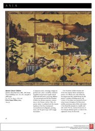
The Case of the Calcite Font - The Metropolitan Museum of Art
The Case of the Calcite Font - The Metropolitan Museum of Art
The Case of the Calcite Font - The Metropolitan Museum of Art

You also want an ePaper? Increase the reach of your titles
YUMPU automatically turns print PDFs into web optimized ePapers that Google loves.
Ff - *<br />
<strong>The</strong> <strong>Case</strong> <strong>of</strong> <strong>the</strong> <strong>Calcite</strong> <strong>Font</strong><br />
by R I C H AR D H . R AN D A L L, J R .<br />
<strong>Museum</strong> <strong>of</strong> Fine <strong>Art</strong>s, Boston<br />
Anyone addicted to detective stories should enjoy<br />
<strong>the</strong> history <strong>of</strong> art, which oSers very close parallels.<br />
Unlike detective fiction, however, <strong>the</strong>re is<br />
not always a solution at <strong>the</strong> end <strong>of</strong> <strong>the</strong> investigation,<br />
since some <strong>of</strong> <strong>the</strong> essential clues may be<br />
missing. On <strong>the</strong> o<strong>the</strong>r hand, <strong>the</strong>re is one extraordinary<br />
advantage for art historians, in that clues<br />
may always turn up at a later date, through<br />
someone else's research or <strong>the</strong> discovery <strong>of</strong> a<br />
new artifact or document, and a stymied investigation<br />
may be started afresh, sometimes after a<br />
lapse <strong>of</strong> decades.<br />
One <strong>of</strong> <strong>the</strong> rrsost famous cases <strong>of</strong> <strong>the</strong> missing<br />
central clue is that <strong>of</strong> <strong>the</strong> carved medieval alabaster<br />
plaques. <strong>The</strong>se small reliefs, measuring<br />
about a foot by two feet and depicting <strong>the</strong> events<br />
I .<br />
<strong>Calcite</strong> font, Mosan, about I 200.<br />
Diameter 5I h incht es<br />
Purchase, <strong>The</strong> Cloisters Collection, 47.IOI.2I<br />
w --;- J<br />
:r<br />
<strong>The</strong> <strong>Metropolitan</strong> <strong>Museum</strong> <strong>of</strong> <strong>Art</strong><br />
is collaborating with JSTOR to digitize, preserve, and extend access to<br />
<strong>The</strong> <strong>Metropolitan</strong> <strong>Museum</strong> <strong>of</strong> <strong>Art</strong> Bulletin ®<br />
www.jstor.org
t s i Fre w Xs<br />
>, e > r<br />
T<br />
W<br />
<strong>of</strong> <strong>the</strong> Passion and <strong>the</strong> lives <strong>of</strong> saints, were found<br />
all over <strong>the</strong> continent <strong>of</strong> Europe in <strong>the</strong> nineteenth<br />
century. As <strong>the</strong> majority <strong>of</strong> <strong>the</strong>m seemed<br />
to come from France, <strong>the</strong>y were <strong>of</strong>ten called<br />
French. <strong>The</strong>re was Sittle conviction behind <strong>the</strong><br />
attribution, however, because <strong>the</strong> alabaster carvings<br />
were in a ra<strong>the</strong>r mannered style, with elongated<br />
and angular figures that did not fit <strong>the</strong><br />
stylistic concept <strong>of</strong> French Gothic sculpture. <strong>The</strong><br />
alabasters were, as a result, always looked at as<br />
a manifestation <strong>of</strong> low or popular art.<br />
As similar alabasters turned up in Sweden,<br />
Spain, Belgium, Germany, Italy-even Iceland<br />
each country in turn was vainly considered as<br />
a possible source <strong>of</strong> <strong>the</strong>se peculiar carvings. A1-<br />
most none <strong>of</strong> <strong>the</strong> panels were found in England.<br />
In that country, however, were innumerable<br />
tombs <strong>of</strong> alabaster still in situ in churches and connected<br />
by documents with quarries and workshops<br />
near Nottingham. After many years, it was<br />
noticed that some <strong>of</strong> <strong>the</strong> English tombs had side<br />
panels related in subject and style to <strong>the</strong> separate<br />
plaques found all over Europe, and it suddenly<br />
became apparent how well <strong>the</strong>se Continental<br />
panels would fit into <strong>the</strong> history <strong>of</strong> English medieval<br />
art. <strong>The</strong> missing clue, <strong>of</strong> course, was <strong>the</strong><br />
fact that <strong>the</strong> panels were almost never found in<br />
England. This is perhaps a tribute to <strong>the</strong> thoroughness<br />
<strong>of</strong> Oliver Cromwell and <strong>the</strong> Protestant<br />
wars in that country, which destroyed so many<br />
English altarpieces, leaving only exported remnants<br />
for <strong>the</strong> art historian to puzzle over.<br />
<strong>The</strong> export <strong>of</strong> works <strong>of</strong> art from productive<br />
centers <strong>of</strong>ten tends to confuse <strong>the</strong> art historian,<br />
and where records <strong>of</strong> workshop activity have<br />
been destroyed, <strong>the</strong> essential clue to identifying<br />
<strong>the</strong> exported material properly is lost. To return<br />
to England for a moment, one finds a huge number<br />
<strong>of</strong> medieval baptismal fonts spread far and<br />
wide about <strong>the</strong> country. Many years ago, it was<br />
recognized that seven <strong>of</strong> <strong>the</strong>se fonts, made <strong>of</strong><br />
very hard blackish limestone, were related to<br />
one ano<strong>the</strong>r. <strong>The</strong> problem was that <strong>the</strong>y were<br />
dispersed along various waterways in regions as<br />
far apart as Winchester in <strong>the</strong> south and Ipswich<br />
2. Side zJie7RJ <strong>of</strong> <strong>the</strong> Cloistersfont<br />
t-;-t W W + *{ -T i- i \uJ iw9 s
t J ff # > ** ,! 8 ' * - w 4<br />
and Lincoln in <strong>the</strong> north. In I 893 Dean Kitchin<br />
read a paper on <strong>the</strong>se fonts before <strong>the</strong> British<br />
Archaeological Association, showing <strong>the</strong>m to be<br />
un-English when compared to <strong>the</strong> many o<strong>the</strong>rs<br />
in <strong>the</strong> country, and suggesting that <strong>the</strong>y had<br />
been imported from <strong>the</strong> Continent. He could<br />
not attribute <strong>the</strong>m to any European area on <strong>the</strong><br />
basis <strong>of</strong> style, but <strong>the</strong> stone was so distinctive<br />
that he suggested <strong>the</strong> region <strong>of</strong> Tournai, where<br />
<strong>the</strong> bluish-black stone is quarried, both to <strong>the</strong><br />
north and south, along <strong>the</strong> river Scheldt.<br />
By I 909 this <strong>the</strong>sis had been generally accepted,<br />
and Cecil Eden wrote a book, Black<br />
Tournai <strong>Font</strong>s in England, in which he related <strong>the</strong><br />
seven English examples to more than forty fonts<br />
on <strong>the</strong> Continent. Some nineteen <strong>of</strong> <strong>the</strong>se were<br />
in <strong>the</strong> north <strong>of</strong> France, eleven were in Belgium,<br />
and o<strong>the</strong>r examples were found in Scandinavia,<br />
Holland, and Germany. Nearly all <strong>the</strong> fonts<br />
were located in churches near water routes,<br />
which was both logicaln as <strong>the</strong> objects were extremely<br />
heavy (and <strong>the</strong>refore difficult to move<br />
except by water) and important as a clue to<br />
<strong>the</strong>ir source. Along <strong>the</strong>se same waterways, one<br />
could show that o<strong>the</strong>r products made <strong>of</strong> <strong>the</strong><br />
same stone had also traveled. For instance, a<br />
tomb <strong>of</strong> <strong>the</strong> blackish stone at Mons is signed by<br />
a Tournai artist, and <strong>the</strong> architectural stonework<br />
<strong>of</strong> <strong>the</strong> churches <strong>of</strong> Oudenberg, near Bruges,<br />
and Nesle, near Amiens, is carved in lournai<br />
stone. <strong>The</strong> export business in stonework in general,<br />
and <strong>of</strong> fonts in particular, from Tournai in<br />
<strong>the</strong> twelfth century seemed to be established. All<br />
<strong>the</strong> clues had been found.<br />
A dozen writers published fur<strong>the</strong>r examples<br />
and reinforced <strong>the</strong> <strong>the</strong>ory <strong>of</strong> a vast industry in<br />
Tournai in <strong>the</strong> twelfth century. Meanwhile,<br />
some o<strong>the</strong>r writers, notably Dr. Raphael Ligtenberg<br />
had quietly suggested o<strong>the</strong>r schools might<br />
be involved, and had collected examples <strong>of</strong><br />
fonts in Holland and Schleswig-Holstein that<br />
were generally related to <strong>the</strong> "Tournai" works.<br />
In I 932 Georg Pudelko re-examined <strong>the</strong> by<br />
now huge group <strong>of</strong> fonts that were widely accepted<br />
as coming from Tournai. He felt that<br />
both stylistically and structurally <strong>the</strong> group was<br />
not homogeneous. He found many fonts <strong>of</strong> a<br />
stone that was grayer and not quite as dense. He<br />
noticed that instead <strong>of</strong> square bowls supported<br />
by a drum and four heavy columns in a thor-<br />
oughly structural way, some <strong>of</strong> <strong>the</strong> fonts were<br />
round and <strong>the</strong>ir columns were thin and merely<br />
decorative ra<strong>the</strong>r than structural. What is more,<br />
he discovered that <strong>the</strong> blacker and sturdier fonts<br />
were largely located on tributaries <strong>of</strong> <strong>the</strong> Scheldt<br />
River, while <strong>the</strong> grayer ones with less architectural<br />
feeling were along water routes issuing<br />
from <strong>the</strong> valley <strong>of</strong> <strong>the</strong> Meuse, on <strong>the</strong> o<strong>the</strong>r side <strong>of</strong><br />
Belgium. Pudelko <strong>the</strong>n wrote a book suggesting<br />
that many <strong>of</strong> <strong>the</strong> fonts were not Tournai work at<br />
all but that <strong>the</strong>y came from <strong>the</strong> Meuse Valley,<br />
probably near Namur, where <strong>the</strong> largest quarries<br />
<strong>of</strong> gray stone were located. He also discovered,<br />
reinforcing this <strong>the</strong>sis, that fragments <strong>of</strong><br />
fonts had been excavated in <strong>the</strong> region <strong>of</strong> Namur.<br />
A new clue has recently appeared that may<br />
help to throw some light on <strong>the</strong> entire situation.<br />
In I 947 <strong>the</strong> <strong>Museum</strong> acquired from <strong>the</strong> Joseph<br />
Brummer Collection a font (Figure I ) attributed<br />
to Tournai. It is circular and is carved with four<br />
stylized heads that project from <strong>the</strong> sides. Between<br />
<strong>the</strong> heads runs a continuous blind arcade,<br />
in which nlany <strong>of</strong> <strong>the</strong> columns rest on bases in<br />
<strong>the</strong> form <strong>of</strong> animals. <strong>The</strong> font is carved <strong>of</strong> a dark<br />
gray and very hard limestone called calcite, <strong>of</strong><br />
a type quarried in <strong>the</strong> twelfth century between<br />
Dinant and Huy.<br />
In building a base for <strong>the</strong> installation <strong>of</strong> <strong>the</strong><br />
3. Section from <strong>the</strong> west cloister, showing <strong>the</strong> recessed<br />
arcade, <strong>of</strong> <strong>the</strong> church <strong>of</strong> J\otre Dame, Tongres,<br />
Belgium. early XIII century<br />
> ;,' A#' '' t s<br />
I<br />
;- ,,w,_
320
font in <strong>the</strong> twelfth century apse from Fuentiduena<br />
at <strong>The</strong> Cloisters, it was discovered that<br />
<strong>the</strong> font was closely related to o<strong>the</strong>rs, like that<br />
at Goesnes in <strong>the</strong> Meuse Valley, in which <strong>the</strong><br />
four columns provided little or no supp ort.<br />
Among <strong>the</strong> fonts with <strong>the</strong>se thinner decorative<br />
columns is one at St. Severin-en-Condroz, also<br />
near <strong>the</strong> Meuse, in which <strong>the</strong> number <strong>of</strong> columns<br />
has been playfully increased to ten. <strong>The</strong>re is a<br />
marked distinction between <strong>the</strong>se works and<br />
those more structural examples, as at Zedelghem<br />
in western Belgium, or <strong>the</strong> seven in England,<br />
which are attributed to Tournai. <strong>The</strong> fonts <strong>of</strong><br />
Goesnes and St. Severin are among those that<br />
Pudelko said came from Namur. <strong>The</strong> bowls <strong>of</strong><br />
several <strong>of</strong> <strong>the</strong> so-called Namur group those <strong>of</strong><br />
Lesquielles St.-Germain, Chereng, and Archennes<br />
have many features in common with<br />
that <strong>of</strong> <strong>the</strong> Cloisters font.<br />
In one detail, however, <strong>the</strong> Cloisters font differs<br />
from all <strong>the</strong> o<strong>the</strong>rs, and this is <strong>the</strong> clue that<br />
may shed new light on several issues. <strong>The</strong> arcade<br />
(see Figure 2) around <strong>the</strong> sides is constructed in<br />
a very unusual manner. Above <strong>the</strong> main arches<br />
<strong>of</strong> <strong>the</strong> arcade is a second, superimposed set, supported<br />
on corbels directly above <strong>the</strong> capitals.<br />
At first glance this looks like an architectural<br />
confusion on <strong>the</strong> part <strong>of</strong> <strong>the</strong> sculptor, as it is a<br />
feature generally unfamiliar in nor<strong>the</strong>rn Romanesque<br />
architecture. In Italy, however, this type<br />
<strong>of</strong> superimposed arch, a kind <strong>of</strong> restatement or<br />
eyebrow above an arcade, is found in innumerable<br />
examples. It can be seen in works as early<br />
as <strong>the</strong> tenth century, such as <strong>the</strong> apse <strong>of</strong> Sant'<br />
Eustorgio in Milan; on <strong>the</strong> facade <strong>of</strong> San A4ichele<br />
in Lucca, finished in I I43; and in <strong>the</strong> gallery by<br />
<strong>the</strong> architect Giudetto at <strong>the</strong> Duomo San Martino<br />
(I I96-I204). <strong>The</strong> detail seems to have<br />
grown logically out <strong>of</strong> <strong>the</strong> early Christian habit<br />
<strong>of</strong> outlining arches in an arcade with colored<br />
stone. <strong>The</strong> later structural system <strong>of</strong> recessing<br />
<strong>the</strong> arcade created a more dynamic quality, using<br />
shadow instead <strong>of</strong> color for <strong>the</strong> effect.<br />
<strong>The</strong> detail is seldom seen in <strong>the</strong> north, and<br />
only <strong>the</strong>n in areas that had considerable artistic<br />
interchange with Italy. <strong>The</strong>re is a long history<br />
<strong>of</strong> interrelations between <strong>the</strong> valley <strong>of</strong> <strong>the</strong> Rhine<br />
and nor<strong>the</strong>rn Italy, through trade, politics, and<br />
<strong>the</strong> mutual large-scale production and exchange<br />
<strong>of</strong> art objects. One is <strong>the</strong>refore not surprised to<br />
4 (opposite), 5, 6. Headsfrom <strong>the</strong> Cloistersfont
7. Animal base from <strong>the</strong> Cloisters font<br />
find an example <strong>of</strong> such a recessed arcade on <strong>the</strong><br />
exterior ambulatory <strong>of</strong> <strong>the</strong> apse <strong>of</strong> St. Gereon in<br />
Cologne. In Belgium and Holland, where <strong>the</strong>re<br />
is little early medieval architecture still in existence,<br />
<strong>the</strong>re are also two examples <strong>of</strong> this detail.<br />
One is in <strong>the</strong> exterior ambulatory <strong>of</strong> St. Servatius<br />
in Maastricht, dating from <strong>the</strong> late twelfth<br />
century, and <strong>the</strong> second is <strong>the</strong> west side <strong>of</strong> <strong>the</strong><br />
early thirteenth century cloister at Tongres (Figure<br />
3). <strong>The</strong> stonework at Tongres shows great<br />
similarity to <strong>the</strong> arcade <strong>of</strong> <strong>the</strong> Cloisters font.<br />
Not only is <strong>the</strong> upper arcade placed in <strong>the</strong> same<br />
nzanner, with <strong>the</strong> corbels directly above <strong>the</strong><br />
capitals, but <strong>the</strong> alternation <strong>of</strong> plain and animalheaded<br />
corbels is nearly identical. In both<br />
works, <strong>the</strong> capitals are uniformly simple.<br />
Both Maastricht, as its name implies, and<br />
Tongres lie in <strong>the</strong> valley <strong>of</strong> <strong>the</strong> Meuse, at <strong>the</strong><br />
opposite end from Namur. <strong>The</strong> Meuse was fa-<br />
mous for enamels and goldsmiths' work, and in<br />
<strong>the</strong>se objects <strong>the</strong>re is certain evidence <strong>of</strong> influence<br />
from <strong>the</strong> north <strong>of</strong> Italy. \Shile <strong>the</strong>re is<br />
good reason to find <strong>the</strong> recessed arcade in this<br />
area, it does not seem to occur around Tournai<br />
in <strong>the</strong> valley <strong>of</strong> <strong>the</strong> Scheldt.<br />
<strong>The</strong>re is ano<strong>the</strong>r feature also that bears out<br />
<strong>the</strong> relation between nor<strong>the</strong>rn ltaly, parts <strong>of</strong> <strong>the</strong><br />
Rhine Valley, <strong>the</strong> Meuse Valley, and <strong>the</strong> Cloisters<br />
font. This is <strong>the</strong> love <strong>of</strong> animal decoration in<br />
architecture. Throughout nor<strong>the</strong>rn Italy, columns,<br />
fonts, and arcades are supported on lions,<br />
half lions, bears, elephants, and a vast variety <strong>of</strong><br />
o<strong>the</strong>r creatures. This is a tradition ra<strong>the</strong>r distinct<br />
from that <strong>of</strong> Spanish and French Romanesque<br />
architecture, in which animal decoration<br />
was largely restricted to use on capitals. One<br />
sees <strong>the</strong> influence <strong>of</strong> this nor<strong>the</strong>rn Italian taste<br />
from <strong>the</strong> ca<strong>the</strong>dral <strong>of</strong> Basel all <strong>the</strong> way down<br />
<strong>the</strong> Rhine. <strong>The</strong> ca<strong>the</strong>dral <strong>of</strong> Worms is particularly<br />
notable for its elephants, lions, and bears<br />
on <strong>the</strong> sills <strong>of</strong> <strong>the</strong> apse windows and for <strong>the</strong><br />
wonderful animal corbels <strong>of</strong> its arcades. <strong>The</strong><br />
same feature appears, as noted, in <strong>the</strong> Tongres<br />
cloister and in <strong>the</strong> lion column supports just<br />
below <strong>the</strong> recessed arcade on <strong>the</strong> apse <strong>of</strong> St.<br />
Servatius at Maastricht. V\;hile <strong>the</strong> latter monuments<br />
illustrate <strong>the</strong> tendency in <strong>the</strong> Meuse Valley,<br />
it seems quite uncharacteristic <strong>of</strong> architecture<br />
along <strong>the</strong> Scheldt. Tournai Ca<strong>the</strong>dral,<br />
which is <strong>the</strong> greatest surviving monument <strong>of</strong> <strong>the</strong><br />
Scheldt school, is virtually animal-less, and <strong>the</strong><br />
fonts attributed to Tournai, such as those <strong>of</strong> East<br />
Meon and St. Mary in Bourne, are carved with<br />
arcades having simple bases and capitals.<br />
<strong>The</strong> similarity <strong>of</strong> architectural detail on <strong>the</strong><br />
Cloisters font with that on buildings in <strong>the</strong> lower<br />
Meuse Valley, where <strong>the</strong> river crosses <strong>the</strong> border<br />
between Belgium and Holland, leads one to a<br />
consideration <strong>of</strong> <strong>the</strong> late twelfth century style <strong>of</strong><br />
depicting figures in <strong>the</strong> same area. In more<br />
monumental works such as <strong>the</strong> lVIajestas Domini<br />
tympanum <strong>of</strong> St. Servatius in Maastricht or<br />
<strong>the</strong> apostle figures from St. Odilienberg now in<br />
<strong>the</strong> Rijksmuseum, one can see only a family resemblance.<br />
<strong>The</strong> heads on <strong>the</strong> font (Figures 4, 5,<br />
6) are treated in a powerful but ra<strong>the</strong>r summary<br />
fashion. <strong>The</strong> lightly incised hair fits over each<br />
one in a sort <strong>of</strong> tight cap, but is <strong>the</strong>n swept back<br />
in a mass projecting beyond <strong>the</strong> skull. <strong>The</strong> beard<br />
322
. . . .<br />
is strongly stylized into a frame for <strong>the</strong> face and<br />
sweeps down from <strong>the</strong> ears to <strong>the</strong> line <strong>of</strong> <strong>the</strong><br />
moutll. Drooping mustaches cut through this<br />
framing line. <strong>The</strong> nearly round eyes are large,<br />
pupil-less, and ringed with stylized eye sockets.<br />
<strong>The</strong> ears are perhaps <strong>the</strong> most peculiar features<br />
<strong>of</strong> all, being attached sideways at <strong>the</strong> top <strong>of</strong> <strong>the</strong><br />
beard.<br />
<strong>The</strong>re is one work in Maastricht itself that is<br />
very closely related to <strong>the</strong>se heads. It is a relief<br />
in <strong>the</strong> facoade <strong>of</strong> <strong>the</strong> Liebfrauenkirche (Figure 8).<br />
<strong>The</strong> miter-shaped plaque contains four figures<br />
and depicts <strong>the</strong> taking <strong>of</strong> an oath, interpreted as<br />
an oath <strong>of</strong> allegiance to Frederick II. It is dated<br />
in <strong>the</strong> decade prior to Frederick's coronation as<br />
German king in I2I5. In <strong>the</strong> right background,<br />
<strong>the</strong> head <strong>of</strong> <strong>the</strong> witness with his hand on his<br />
beard is treated in much <strong>the</strong> same manner as<br />
those on <strong>the</strong> font. <strong>The</strong> head shape is similar, <strong>the</strong><br />
hair cap fits in <strong>the</strong> same way, and <strong>the</strong> hair is<br />
lightly incised. <strong>The</strong> eyes, though oval and drilled<br />
to indicate <strong>the</strong> pupil, are surrounded by a similar<br />
!stylized socket. NVhile <strong>the</strong> ears are placed correctly<br />
on <strong>the</strong> head, <strong>the</strong> beard makes <strong>the</strong> same<br />
sharp frame for <strong>the</strong> face as do those on <strong>the</strong> font,<br />
and <strong>the</strong> drooping mustaches are similar.<br />
Ligtenberg has pointed out that while this<br />
oath relief is in a boldly stylized technique departing<br />
somewhat from <strong>the</strong> more monumental<br />
work on <strong>the</strong> Liebfrauenkirche or on St. Servatius,<br />
<strong>the</strong> sculptor was somewhat <strong>of</strong> an innovator,<br />
working on a secular subject without a tradition<br />
to fall back upon. While his work seems less impressive<br />
than some <strong>of</strong> <strong>the</strong> more conventional<br />
sculpture in Maastricht, it helps to show a continued<br />
originality in <strong>the</strong> sculpture <strong>of</strong> <strong>the</strong> Meuse<br />
Valley until at least <strong>the</strong> first quarter <strong>of</strong> <strong>the</strong> thirteenth<br />
century. <strong>The</strong> Cloisters font reinforces this<br />
idea, for <strong>the</strong>re is a considerable freedom and inventlveness<br />
ln ltS deslgn.<br />
<strong>The</strong> adaptation <strong>of</strong> contemporary architectural<br />
modes, both in <strong>the</strong> use <strong>of</strong> <strong>the</strong> recessed double<br />
arcade and <strong>the</strong> animal bases and corbels, is <strong>the</strong><br />
most striking feature <strong>of</strong> this inventiveness. <strong>The</strong><br />
animals <strong>the</strong>mselves are imaginatively handled.<br />
One bearish animal (Figure 7) that serves as <strong>the</strong><br />
base <strong>of</strong> a column, for instance, has been carved<br />
with his paw stretched out to rest on <strong>the</strong> projecting<br />
column next to him. This freedom <strong>of</strong> interpretation<br />
is seen also in <strong>the</strong> leaning columns and<br />
fudged arches beneath <strong>the</strong> projecting heads, as<br />
well as in <strong>the</strong> strange placing <strong>of</strong> <strong>the</strong> ears to fit<br />
in with <strong>the</strong> flying mop <strong>of</strong> hair and <strong>the</strong> stylized<br />
lines <strong>of</strong> <strong>the</strong> beard. <strong>The</strong> sculptor obviously had a<br />
thorough knowledge <strong>of</strong> local conventions, yet<br />
worked with a great deal <strong>of</strong> spontaneity. One<br />
would suspect that he worked outside a large<br />
workshop where conventions would have been<br />
more likely adhered to. Wherever this was, it<br />
was surely not far from Maastricht and in <strong>the</strong><br />
valley <strong>of</strong> <strong>the</strong> Meuse.<br />
<strong>The</strong> fonts <strong>of</strong> <strong>the</strong> late Romanesque period are<br />
all more or less <strong>of</strong> a size. <strong>The</strong>y average about<br />
three and a half feet in height and are about a<br />
yard wide, <strong>the</strong> bowl being usually a foot or so<br />
deep. <strong>The</strong> baptismal service <strong>of</strong> <strong>the</strong> period called<br />
for immersion a rite ordinarily performed in<br />
early infancy. Although illuminated manuscripts<br />
<strong>of</strong> <strong>the</strong> period sometimes sl-low adults being<br />
immersed, such illustrations (see Figure g) usually<br />
depict <strong>the</strong> conversion <strong>of</strong> hea<strong>the</strong>ns, and except<br />
for such conversions, adult baptism is rare. <strong>The</strong><br />
more common scene is that shown in <strong>the</strong> <strong>Museum</strong>'s<br />
Sacraments tapestries, dating from <strong>the</strong><br />
mid-fifteenth century, in which a child is shown<br />
being immersed in a typical font.<br />
8. Oath <strong>of</strong> allegiance to Frederick 11, relieffrom <strong>the</strong><br />
Liebfrauenkirche, Maastricht, Holland5 I 205-I 2I5
However, as churches were unheated, and<br />
baptism was recommended soon after birth, immersion<br />
was obviously a dangerous process, especially<br />
in winter. In <strong>the</strong> mid-thirteenth century,<br />
<strong>the</strong>refore, <strong>the</strong> procedure was changed to infusion,<br />
or touching <strong>of</strong> <strong>the</strong> forehead with water.<br />
This in turn affected font design, and Gothic<br />
fonts tend to be considerably smaller in dimensions<br />
and at <strong>the</strong> same time taller, as infants no<br />
longer had to be lifted into <strong>the</strong>m. <strong>The</strong> Cloisters<br />
font; shows a step in <strong>the</strong> change from <strong>the</strong> massive<br />
immersion fonts <strong>of</strong> Tournai to those with shallower<br />
bowls and decorative columns more usual<br />
in <strong>the</strong> Meuse Valley. <strong>The</strong> latest examples <strong>of</strong> this<br />
group omit <strong>the</strong> columns altoge<strong>the</strong>r and <strong>the</strong> four<br />
heads project unsupported into <strong>the</strong> air, a convention<br />
carried on into Gothic work.<br />
<strong>The</strong> transitional stage in <strong>the</strong> design <strong>of</strong> fonts<br />
comes roughly at <strong>the</strong> end <strong>of</strong> <strong>the</strong> twelfth century,<br />
and this, considered with <strong>the</strong> dates <strong>of</strong> <strong>the</strong> cloister<br />
at Tongres, <strong>the</strong> apse <strong>of</strong> St. Servatius, and <strong>the</strong><br />
oath relief from <strong>the</strong> Liebfrauenkirche, indicates<br />
a date about <strong>the</strong> year I200 for <strong>the</strong> font.<br />
As a new clue in a long investigation, <strong>the</strong> font<br />
helps to invigorate <strong>the</strong> <strong>the</strong>sis put forward by<br />
Pudelko and Ligtenberg that a distinct sculptural<br />
school existed in <strong>the</strong> Meuse Valley. At <strong>the</strong><br />
same time it suggests that Namur may not have<br />
been <strong>the</strong> only o<strong>the</strong>r center besides Tournai producing<br />
fonts, and will allow in <strong>the</strong> future a<br />
wider re-evaluation <strong>of</strong> <strong>the</strong> fonts and o<strong>the</strong>r works<br />
attributed to Tournai shops. It may also in a<br />
minor way help with <strong>the</strong> architectural history<br />
<strong>of</strong> <strong>the</strong> Meuse area and add to our knowledge <strong>of</strong><br />
sculpture on <strong>the</strong> Dutch border at <strong>the</strong> turn <strong>of</strong> <strong>the</strong><br />
thirteenth century.<br />
R E F E R E N C E S<br />
Raphael Ligtenberg Die Romanische Steinplastik in der<br />
Aordlichen Aiederlanden (<strong>The</strong> Hague, I 9 I 8) .<br />
Georg Pudelko Romanische Taufsteine (Berlin, I932).<br />
i<br />
9. St. Denis Baptizing (left), illumination from <strong>the</strong> Life <strong>of</strong> St.<br />
Denis showing immersion in a Romanesque font, about I250<br />
Biblio<strong>the</strong>que ;Cationale, ms. fr. I098, fol. 37v<br />
324