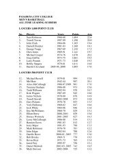
8. tertiary hues (achromatic neutrals) - Pasadena City College
8. tertiary hues (achromatic neutrals) - Pasadena City College
8. tertiary hues (achromatic neutrals) - Pasadena City College

Create successful ePaper yourself
Turn your PDF publications into a flip-book with our unique Google optimized e-Paper software.
<strong>Pasadena</strong> <strong>City</strong> <strong>College</strong>.<br />
Art 31A. Instructor: Silvia Rigon.<br />
<strong>8.</strong> TERTIARY HUES (ACHROMATIC NEUTRALS)<br />
FORMAT 3 (Three) 7,5” X 1,5” strips, divided into 5 (five) 1.5” x 1.5” swatches of complementary <strong>hues</strong><br />
scale (see diagram.) Swatches are painted on Canson or Bristol paper and mounted on 11” x<br />
11” Illustration board.<br />
Students can paint directly on paper, or paint, cut and paste the swatches.<br />
GOAL Create a color chart of spectrum <strong>hues</strong> diluted by their complement to create <strong>tertiary</strong> <strong>hues</strong>.<br />
Observe how each pair reach a different midpoint. Learn to mix colors, observe and understand<br />
the relationships between them<br />
MATERIALS Bristol board for painting swatches<br />
Illustration board for mounting swatches<br />
Winsor and Newton Gouache:<br />
Primary Blue, Primary Yellow, Primary Red (CMY Primary Scale)<br />
Permanent Yellow Deep, Spectrum Red, Ultramarine (Artist Scale)<br />
Paint cups & lids<br />
Mixing brush<br />
Water cups and paper towel or dry cloth to clean brushes.<br />
Brushes: Natural fibers–good quality– flat brushes and pointed brushes for fine details (on<br />
corners.)<br />
Cutting and mounting supplies –ruler, mat, blades, paper cement & pickup<br />
Drawing supplies including ruler, hard pencil, and black pen<br />
SEQUENCE 1. Cut a piece Canson or Bristol paper 11“ x 11” approximately. Mark lightly a<br />
7.5” x 7.5” centered square.<br />
2. Divide the square into 5 (five) 1.5” inch squares ( see diagram).<br />
3. Paint on the 1st, the 3rd and 5th rows. Erase the 2nd and the 4th rows.<br />
3. The first and the last swatches are two complementary <strong>hues</strong> at their maximum saturation.<br />
4. In the second swatch the <strong>hues</strong> on the left is mixed with its complementary hue in the follow-<br />
ing proportion : 3/4 main hue and 1/4 complementary hue.<br />
5. In the middle swatch the two complementary <strong>hues</strong> are mixed in equal proportion.<br />
6. In the fourth swatch the <strong>hues</strong> on the right is mixed with its complementary hue in the following<br />
proportion : 3/4 main hue and 1/4 complementary hue.
<strong>Pasadena</strong> <strong>City</strong> <strong>College</strong>.<br />
Art 31A. Instructor: Silvia Rigon.<br />
Tertiary Hues Grid<br />
7.5”<br />
B O<br />
R G<br />
Y P<br />
1.5”<br />
11”<br />
7.5”<br />
11”
<strong>Pasadena</strong> <strong>City</strong> <strong>College</strong>.<br />
Art 31A. Instructor: Silvia Rigon.<br />
Vocabulary<br />
COLOR The visual response to different wavelengths of light, identified as red, green, blue, etc; having<br />
HUE<br />
VALUE<br />
the physical properties ( such as hue and value...)<br />
The basic qualities of colors are: HUE, VALUE and SATURATION (or chroma).<br />
The common name of a color, indicating its position in the spectrum or on the color wheel;<br />
determined by the specific wavelength in a ray of light. Only six names are needed to describe<br />
a hue: red, orange, yellow, green, blue and violet. Black, white and gray are <strong>achromatic</strong>.<br />
Value refers to the relative light and dark in a sample. Black is the lowest possible value. Values<br />
exist whether or not hue is present. A monochromatic value scale is a single hue illustrated as a<br />
full range of value<br />
PRIMARY COLORS The basic or primary <strong>hues</strong> that cannot be broken down or reduced into component colors; the<br />
basic <strong>hues</strong> of a color system that, in theory, can be used to mix all other colors.<br />
SECONDARY COLORS A color produced by a mixture of any two primary colors--red+yellow=orange<br />
INTERMEDIATE COLORS A color produced by a mixture of a primary color and a neighboring secondary color<br />
yellow+green=yellow green.<br />
TERTIARY COLORS A color produced by a mixture of the three primary colors, or two secondary colors; character-<br />
COMPLEMENTARY<br />
COLORS<br />
ized by neutralization of intensity and hue.<br />
Complementary colors are <strong>hues</strong> that are opposite to one another on the artist spectrum.<br />
Each complementary pair include the tree primary pair in some mix or proportion.<br />
ANALOGOUS COLORS Analogous colors lie between primary and secondary colors. Analogous grouping contain two<br />
primary colors but never include the third.<br />
SATURATED COLORS A saturated color is a hue in its strongest possible manifestation. A saturated color contain one<br />
or two primary color but do not contain a third primary colors or white and black.<br />
TINT A tint is a hue that has been made lighter.<br />
SHADE A shade is a hue that has been made darker. Shades are reduce <strong>hues</strong> experiences.