Title: Some examples of LATIN LETTER OI (gha) (U+ ... - Evertype
Title: Some examples of LATIN LETTER OI (gha) (U+ ... - Evertype
Title: Some examples of LATIN LETTER OI (gha) (U+ ... - Evertype

Create successful ePaper yourself
Turn your PDF publications into a flip-book with our unique Google optimized e-Paper software.
<strong>Title</strong>: <strong>Some</strong> <strong>examples</strong> <strong>of</strong> LATTIINN LETTTTERR <strong>OI</strong>I ((gghhaa)) (<strong>U+</strong>01A2, <strong>U+</strong>01A3) in Tatar and<br />
Uighur printing, with remarks on the recommended glyphs.<br />
Source: Michael Everson, 1999-05-14<br />
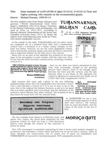
The first samples come from Donja: Xal½qara tatar<br />
gazetas½ (ÔWorld: International Tatar NewspaperÕ),<br />
published 1992-10 in Qazan, Tatarstan,<br />
in the Russian Federation. Latin orthography was<br />
used in Tatar ca. 1927Ð1937, according to<br />
Edward Allworth (Nationalities <strong>of</strong> the Soviet East,<br />
Columbia University Press, 1971). In Donja, the<br />
editors were reintroducing Latin script for Tatar,<br />
with mixed typographic success.<br />
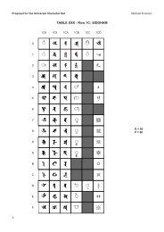
In the sample to the right, TU°ANNAR¼´ and two other words<br />
are composed out <strong>of</strong> a printed DIGIT ZERO and a handwritten<br />
vertical with a j-terminal. It is a rather clumsy attempt. In the<br />
italic text below, however, we see the word Qa±id¬l¬re written<br />
with a historically authentic shape; note that the bowl is sliced flat<br />
and is somewhat thinner on the side next to the vertical.<br />
Below this we see part <strong>of</strong> the alphabet key printed on the front<br />
page <strong>of</strong> the newspaper to assist readers with the Latin text. Here<br />
we see that the letter has been constructed by attaching a hooked<br />
vertical to it.<br />
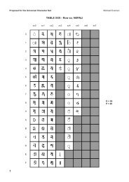
Next we see these two letters presented in text.<br />
They look reasonable, though in the printing<br />
process there doesnÕt seem to be enough space<br />
between the bowl and the vertical, and the join<br />
between them is too black. In the signature the<br />
capital in °osman is constructed very badly out <strong>of</strong><br />
a DIGIT ZERO and a lengthened CAPITAL I.<br />
°ali contains this same ugly capital; in the text following,<br />
qit±alar½nda±½ shows how the typographer has narrowed a lowercase<br />
o and attached a vertical to it. It is not so easy to see in the<br />
scan, but in the original the balance between q and ± is not good<br />
(the ± is looks squished and is too black) and the thickness <strong>of</strong> the<br />
vertical is much thinner than other verticals. The terminal <strong>of</strong> the ±<br />
does have the usual serif, not the unusual hook.<br />
The last example from Donja is in Helvetica style, and<br />
shows very clearly the sliced bowl preferred for this<br />
character (which we shall see from a 1938 dictionary<br />
below), even though the vertical <strong>of</strong> this character is<br />
drawn by hand.<br />
In QA°ID«L«RE we see a very<br />
crude hand-made ligature <strong>of</strong> DIGIT<br />
ZERO and CAPITAL J. The vertical<br />
lacks its usual descender, and the<br />
colour <strong>of</strong> the letter in the text is<br />
bad.<br />
This 1992 newspaper is extremely interesting in that it shows early modern attempts to<br />
reconstruct and reproduce a letter which had been out <strong>of</strong> use for half a century. Many <strong>of</strong><br />
these attempts are unsuccessful, but as noted, two <strong>of</strong> them (in Qa±id¬l¬re and<br />
MR«‚«°«TE) do succeed in reproducing good 1938 typographic practice.
The letter ° has been used for languages other than Tatar, as well. In Henry G.<br />
SchwartzÕs An Uyghur-English dictionary (Western Washington 1992, it is said that<br />
from the mid-1960s until the early 1980s a Latin script was used, though it had been<br />
supplanted by Arabic. The letter shown to the left here is from David K. ParshallÕs<br />
The first step in Uygur (Xinjiang University, 1993). There is a certain flattishness in<br />
the bowl next to the vertical, but the descender <strong>of</strong> the vertical is too short and in text<br />
the letter looks too black.<br />
Schwartz gives a sample ± in<br />
his dictionary; it is unusually<br />
wide and is not used anywhere<br />
else in the dictionary.<br />
In Edward AllworthÕs Nationalities <strong>of</strong> the Soviet East (Columbia University Press,<br />
1971), a number <strong>of</strong> languages are shown as having used this letter at some stage. The<br />
sample, shown on the right does not have the flattened bowl and has a hooked<br />
descender. It is only used in charts, not in text.<br />
Harald Haarman gives a number <strong>of</strong> non-Russian<br />
alphabets from the Soviet Union <strong>of</strong> the 1920s and 1930s<br />
in his book Die Universalgeschichte der Schrift (Campus,<br />
1990). One <strong>of</strong> these alphabets, Avar, has what I consider<br />
to be the canonical °.<br />
I take Nu±ajbik, «mirxan, Qorban and F¬jzuillinÕs Rusca-tatarca syzlek (Russian-Tatar<br />
dictionary) published in Qazan in 1938 to provide the best model for this character, as it is<br />
a large dictionary, and has been carefully typeset. In the two <strong>examples</strong> below, capital ° and<br />
small ± can be seen in both roman and italic style. The sliced bowl and serifed vertical can<br />
be clearly seen.<br />
The Rusca-tatarca syzlek shows another interesting glyph. In the word<br />
FAJDALANUC¼LAR°A below, we see a stylized letter which seems to have been reproduced<br />
in the 1992 newspaper Donja, as shown in the word MR«‚«°«TE on the previous page.<br />
I suppose I should take a moment to remind readers that, although the name <strong>LATIN</strong> <strong>LETTER</strong><br />
<strong>OI</strong> has been applied to this character in ISO/IEC 10646 and Unicode, this name is completely<br />
spurious. The ordinary name <strong>of</strong> this character is ±a or <strong>gha</strong>.