Slides - Hadley Wickham
Slides - Hadley Wickham
Slides - Hadley Wickham

Create successful ePaper yourself
Turn your PDF publications into a flip-book with our unique Google optimized e-Paper software.
Practical tools for<br />
exploring data and models<br />
<strong>Hadley</strong> Alexander <strong>Wickham</strong>
“The process of data analysis is one of<br />
parallel evolution. Interrelated aspects<br />
of the analysis evolve together, each<br />
affecting the others.”<br />
– Paul Velleman, 1997
“Interrelated aspects of the analysis<br />
evolve together”<br />
Questions<br />
Form<br />
Views<br />
Models<br />
reshape<br />
ggplot2<br />
classifly, clusterfly, meifly
A grammar of graphics:<br />
past, present, and future
Past
“If any number of<br />
magnitudes are each<br />
the same multiple of<br />
the same number of<br />
other magnitudes,<br />
then the sum is that<br />
multiple of the sum.”<br />
Euclid, ~300 BC
“If any number of<br />
magnitudes are each<br />
the same multiple of<br />
the same number of<br />
other magnitudes,<br />
then the sum is that<br />
multiple of the sum.”<br />
Euclid, ~300 BC<br />
m(Σx) = Σ(mx)
The grammar of graphics<br />
• An abstraction which makes thinking,<br />
reasoning and communicating graphics<br />
easier<br />
• Developed by Leland Wilkinson, particularly<br />
in “The Grammar of Graphics” 1999/2005
Present
•<br />
•<br />
•<br />
•<br />
•<br />
•<br />
ggplot2<br />
High-level package for creating statistical graphics.<br />
A rich set of components + user friendly wrappers<br />
Inspired by “The Grammar of Graphics”<br />
Leland Wilkinson 1999<br />
John Chambers award in 2006<br />
Philosophy of ggplot<br />
Examples from a recent paper<br />
New methods facilitated by ggplot
Philosophy<br />
• Make graphics easier<br />
• Use the grammar to facilitate research into<br />
new types of display<br />
• Continuum of expertise:<br />
• start simple by using the results of the theory<br />
• grow in power by understanding the theory<br />
• begin to contribute new components<br />
• Orthogonal components and minimal special<br />
cases should make learning easy(er?)
•<br />
Examples<br />
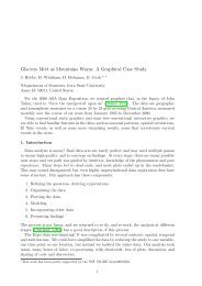
J. Hobbs, H. <strong>Wickham</strong>, H. Hofmann, and D. Cook.<br />
Glaciers melt as mountains warm: A graphical<br />
case study. Computational Statistics. Special issue for<br />
ASA Statistical Computing and Graphics Data Expo 2006.<br />
• Exploratory graphics created with GGobi,<br />
Mondrian, Manet, Gauguin and R, but needed<br />
consistent high-quality graphics that work in<br />
black and white for publication<br />
• So... used ggplot to recreate the graphics
qplot(long, lat, data = expo, geom="tile", fill = ozone,<br />
facets = year ~ month) +<br />
scale_fill_gradient(low="white", high="black") + map
ggplot(df, aes(x = long + res * x, y = lat + res * y)) + map +<br />
geom_polygon(aes(group = interaction(long, lat)), fill=NA, colour="black")
30<br />
20<br />
10<br />
0<br />
−10<br />
−20<br />
ggplot(rexpo, aes(x = long + res * rtime, y = lat + res * rpressure))<br />
+ map + geom_line(aes(group = id))<br />
−110 −85 −60<br />
Initially created with<br />
correlation tour
library(maps)<br />
outlines
ggplot(clustered, aes(x = long, y = lat))<br />
+ geom_tile(aes(width = 2.5, height = 2.5,<br />
fill = factor(cluster)))<br />
+ facet_grid(cluster ~ .)<br />
+ map<br />
+ scale_fill_brewer(palette="Spectral")<br />
qplot(date, value, data = clusterm, group = id,<br />
geom = "line", facets = cluster ~ variable,<br />
colour = factor(cluster))<br />
+ scale_y_continuous("", breaks=NA)<br />
+ scale_colour_brewer(palette="Spectral")
New methods<br />
• Supplemental statistical summaries<br />
• Iterating between graphics and models<br />
• Inspired by ideas of Tukey (and others)<br />
• Exploratory graphics, not as pretty
Intro to data<br />
• Response of trees to gypsy moth attack<br />
• 5 genotypes of tree: Dan-2, Sau-2, Sau-3,<br />
Wau-1, Wau-2<br />
• 2 treatments: NGM / GM<br />
• 2 nutrient levels: low / high<br />
• 5 reps<br />
• Measured: weight, N, tannin, salicylates
10<br />
20<br />
30<br />
40<br />
50<br />
60<br />
70<br />
Dan−2 Sau−2 Sau−3 Wau−1 Wau−2<br />
●<br />
●<br />
●<br />
●<br />
●<br />
●<br />
●<br />
●<br />
●<br />
●<br />
●<br />
●<br />
●<br />
●<br />
●<br />
●<br />
●<br />
●<br />
●<br />
●<br />
●<br />
●<br />
●<br />
●<br />
●<br />
●<br />
●<br />
●<br />
●<br />
●<br />
●●<br />
●<br />
●<br />
●<br />
●<br />
●<br />
●<br />
●<br />
●<br />
●<br />
●<br />
●<br />
●<br />
●<br />
●<br />
●<br />
●<br />
●<br />
●<br />
weight<br />
genotype<br />
qplot(genotype, weight, data=b)
10<br />
20<br />
30<br />
40<br />
50<br />
60<br />
70<br />
Dan−2 Sau−2 Sau−3 Wau−1 Wau−2<br />
●<br />
●<br />
●<br />
●<br />
●<br />
●<br />
●<br />
●<br />
●<br />
●<br />
●<br />
●<br />
●<br />
●<br />
●<br />
●<br />
●<br />
●<br />
●<br />
●<br />
●<br />
●<br />
●<br />
●<br />
●<br />
●<br />
●<br />
●<br />
●<br />
●<br />
●●<br />
●<br />
●<br />
●<br />
●<br />
●<br />
●<br />
●<br />
●<br />
●<br />
●<br />
●<br />
●<br />
●<br />
●<br />
●<br />
●<br />
●<br />
●<br />
nutr<br />
Low<br />
High<br />
weight<br />
genotype<br />
qplot(genotype, weight, data=b,<br />
colour=nutr)
weight<br />
70<br />
60<br />
50<br />
40<br />
30<br />
20<br />
10<br />
qplot(reorder(genotype, weight), weight,<br />
data=b, colour=nutr)<br />
●<br />
●<br />
●<br />
●<br />
●<br />
●<br />
●<br />
●<br />
●<br />
●<br />
●<br />
●<br />
●<br />
●<br />
●<br />
●<br />
●<br />
●<br />
●<br />
●<br />
●<br />
●<br />
●<br />
●<br />
Sau−3 Dan−2 Sau−2<br />
genotype<br />
Wau−2 Wau−1<br />
●<br />
●<br />
●<br />
●<br />
●<br />
●<br />
●<br />
●<br />
●<br />
●<br />
●<br />
●<br />
●●<br />
●<br />
●<br />
●<br />
nutr<br />
Low<br />
High
Comparing means<br />
• For inference, interested in comparing the<br />
means of the groups<br />
• But this is hard to do visually as eyes<br />
naturally compare ranges<br />
• What can we do?
Supplemental summaries<br />
• smry
10<br />
20<br />
30<br />
40<br />
50<br />
60<br />
70<br />
Sau−3 Dan−2 Sau−2 Wau−2 Wau−1<br />
●<br />
●<br />
●<br />
●<br />
●<br />
●<br />
●<br />
●<br />
●<br />
●<br />
●<br />
●<br />
●<br />
●<br />
●<br />
●<br />
●<br />
●<br />
●<br />
●<br />
●<br />
●<br />
●<br />
●<br />
●<br />
●<br />
●<br />
●<br />
●<br />
●<br />
●●<br />
●<br />
●<br />
●<br />
●<br />
●<br />
●<br />
●<br />
●<br />
●<br />
●<br />
●<br />
●<br />
●<br />
●<br />
●<br />
●<br />
●<br />
●<br />
nutr<br />
Low<br />
High<br />
weight<br />
genotype<br />
qplot(genotype, weight, data=b,<br />
colour=nutr)
weight<br />
70<br />
60<br />
50<br />
40<br />
30<br />
20<br />
10<br />
qplot(genotype, weight, data=b,<br />
colour=nutr) + smry<br />
●<br />
●<br />
●<br />
●<br />
●<br />
●<br />
●<br />
●<br />
●<br />
●<br />
●<br />
●<br />
●<br />
●<br />
●<br />
●<br />
●<br />
●<br />
●<br />
●<br />
●<br />
●<br />
●<br />
●<br />
Sau−3 Dan−2 Sau−2<br />
genotype<br />
Wau−2 Wau−1<br />
●<br />
●<br />
●<br />
●<br />
●<br />
●<br />
●<br />
●<br />
●<br />
●<br />
●<br />
●<br />
●●<br />
●<br />
●<br />
●<br />
nutr<br />
Low<br />
High
Iterating graphics<br />
and modelling<br />
• Clearly strong genotype effect. Is there a<br />
nutr effect? Is there a nutr-genotype<br />
interaction?<br />
• Hard to see from this plot - what if we<br />
remove the genotype main effect? What if<br />
we remove the nutr main effect?<br />
• How does this compare an ANOVA?
weight<br />
70<br />
60<br />
50<br />
40<br />
30<br />
20<br />
10<br />
qplot(genotype, weight, data=b,<br />
colour=nutr) + smry<br />
●<br />
●<br />
●<br />
●<br />
●<br />
●<br />
●<br />
●<br />
●<br />
●<br />
●<br />
●<br />
●<br />
●<br />
●<br />
●<br />
●<br />
●<br />
●<br />
●<br />
●<br />
●<br />
●<br />
●<br />
Sau−3 Dan−2 Sau−2<br />
genotype<br />
Wau−2 Wau−1<br />
●<br />
●<br />
●<br />
●<br />
●<br />
●<br />
●<br />
●<br />
●<br />
●<br />
●<br />
●<br />
●●<br />
●<br />
●<br />
●<br />
nutr<br />
Low<br />
High
weight2<br />
20<br />
10<br />
0<br />
−10<br />
−20<br />
●<br />
●<br />
●<br />
●<br />
●<br />
●<br />
●<br />
●<br />
●<br />
●<br />
●<br />
●<br />
●<br />
●<br />
●<br />
●<br />
●<br />
●<br />
●<br />
●<br />
●<br />
●<br />
●<br />
●<br />
●<br />
●<br />
b$weight2
weight3<br />
10<br />
0<br />
−10<br />
−20<br />
●<br />
●<br />
●<br />
●<br />
●<br />
●<br />
●<br />
●<br />
●<br />
●<br />
●<br />
●<br />
●<br />
●<br />
●<br />
●<br />
●<br />
●<br />
●<br />
●<br />
●<br />
●<br />
●<br />
●<br />
●<br />
b$weight3
Df Sum Sq Mean Sq F value Pr(>F)<br />
genotype 4 13331 3333 36.22 8.4e-13 ***<br />
nutr 1 1053 1053 11.44 0.0016 **<br />
genotype:nutr 4 144 36 0.39 0.8141<br />
Residuals 40 3681 92<br />
anova(lm(weight ~ genotype * nutr, data=b))
Graphics ➙ Model<br />
• In the previous example, we used graphics<br />
to iteratively build up a model - a la<br />
stepwise regression!<br />
• But: here interested in gestalt, not accurate<br />
prediction, and must remember that this is<br />
just one possible model<br />
• What about model ➙ graphics?
Model ➙ Graphics<br />
• If we model first, we need graphical tools to<br />
summarise model results, e.g. post-hoc<br />
comparison of levels<br />
• We can do better than SAS! But it’s hard<br />
work: effects, multComp and multCompView<br />
• Rich research area
weight<br />
60<br />
40<br />
20<br />
0<br />
●<br />
●<br />
●<br />
●<br />
●<br />
●<br />
●<br />
●<br />
●<br />
●<br />
●<br />
●<br />
●<br />
●<br />
●<br />
●<br />
●<br />
●<br />
●<br />
●<br />
●<br />
●<br />
●<br />
●<br />
a a b bc c<br />
Sau3 Dan2 Sau2<br />
genotype<br />
Wau2 Wau1<br />
●<br />
●<br />
●<br />
●<br />
●<br />
●<br />
●<br />
●<br />
●<br />
●<br />
●<br />
●<br />
●<br />
●<br />
●<br />
●<br />
nutr<br />
Low<br />
High
weight<br />
60<br />
40<br />
●<br />
●<br />
●<br />
●<br />
●<br />
ggplot(b,<br />
●<br />
aes(x=genotype, y=weight))<br />
●<br />
●<br />
●<br />
●<br />
+<br />
20<br />
geom_hline(intercept = mean(b$weight))<br />
●<br />
●<br />
●<br />
●<br />
+ geom_crossbar(aes(y=fit,<br />
●<br />
min=lower,max=upper),<br />
●<br />
●<br />
data=geffect)<br />
●<br />
●<br />
+ geom_point(aes(colour<br />
●<br />
= nutr))<br />
0<br />
a a b bc c<br />
●<br />
●<br />
●<br />
●<br />
●<br />
●<br />
+ geom_text(aes(label = group), data=geffect)<br />
Sau3 Dan2 Sau2<br />
genotype<br />
Wau2 Wau1<br />
●<br />
●<br />
●<br />
●<br />
●<br />
●<br />
●<br />
●<br />
●<br />
●<br />
●<br />
●<br />
●<br />
●<br />
●<br />
nutr<br />
Low<br />
High
Summary<br />
• Need to move beyond canned statistical<br />
graphics to experimenting with new<br />
graphical methods<br />
• Strong links between graphics and models,<br />
how can we best use them?<br />
• Static graphics often aren't enough
Questions?