Hagen - Pragma ADE
Hagen - Pragma ADE Hagen - Pragma ADE
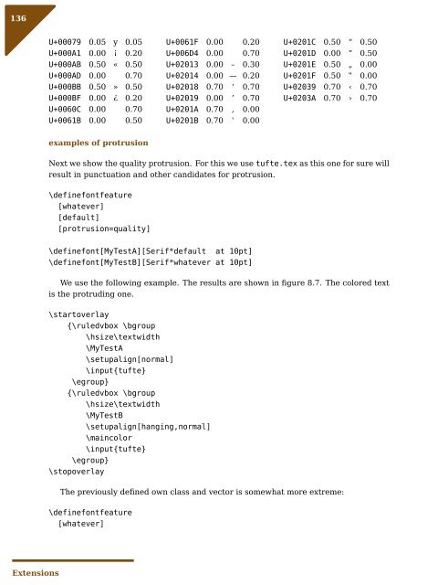
136 Extensions U+00079 0.05 y 0.05 U+000A1 0.00 ¡ 0.20 U+000AB 0.50 « 0.50 U+000AD 0.00 0.70 U+000BB 0.50 » 0.50 U+000BF 0.00 ¿ 0.20 U+0060C 0.00 0.70 U+0061B 0.00 0.50 examples of protrusion U+0061F 0.00 0.20 U+006D4 0.00 0.70 U+02013 0.00 – 0.30 U+02014 0.00 — 0.20 U+02018 0.70 ‘ 0.70 U+02019 0.00 ’ 0.70 U+0201A 0.70 ‚ 0.00 U+0201B 0.70 ‛ 0.00 U+0201C 0.50 “ 0.50 U+0201D 0.00 ” 0.50 U+0201E 0.50 „ 0.00 U+0201F 0.50 ‟ 0.00 U+02039 0.70 ‹ 0.70 U+0203A 0.70 › 0.70 Next we show the quality protrusion. For this we use tufte.tex as this one for sure will result in punctuation and other candidates for protrusion. \definefontfeature [whatever] [default] [protrusion=quality] \definefont[MyTestA][Serif*default at 10pt] \definefont[MyTestB][Serif*whatever at 10pt] We use the following example. The results are shown in figure 8.7. The colored text is the protruding one. \startoverlay {\ruledvbox \bgroup \hsize\textwidth \MyTestA \setupalign[normal] \input{tufte} \egroup} {\ruledvbox \bgroup \hsize\textwidth \MyTestB \setupalign[hanging,normal] \maincolor \input{tufte} \egroup} \stopoverlay The previously defined own class and vector is somewhat more extreme: \definefontfeature [whatever]
We thrive in information--thick worlds because of our marvelous and everyday capacity to select, edit, single out, structure, highlight, group, pair, merge, harmonize, synthesize, focus, organize, condense, reduce, boil down, choose, categorize, catalog, classify, list, abstract, scan, look into, idealize, isolate, discriminate, distinguish, screen, pigeonhole, pick over, sort, integrate, blend, inspect, filter, lump, skip, smooth, chunk, average, approximate, cluster, aggregate, outline, summarize, itemize, review, dip into, flip through, browse, glance into, leaf through, skim, refine, enumerate, glean, synopsize, winnow the wheat from the chaff and separate the sheep from the goats. Figure 8.7 The difference between no protrusion and quality protrusion. [default] [protrusion=myown] \definefont[MyTestA][Serif*default at 10pt] \definefont[MyTestB][Serif*whatever at 10pt] In figure 8.8 we see that the somewhat extreem definition of the comma also pulls the preceding character into the margin. We thrive in information--thick worlds because of our marvelous and everyday capacity to select, edit, single out, structure, highlight, group, pair, merge, harmonize, synthesize, focus, organize, condense, reduce, boil down, choose, categorize, catalog, classify, list, abstract, scan, look into, idealize, isolate, discriminate, distinguish, screen, pigeonhole, pick over, sort, integrate, blend, inspect, filter, lump, skip, smooth, chunk, average, approximate, cluster, aggregate, outline, summarize, itemize, review, dip into, flip through, browse, glance into, leaf through, skim, refine, enumerate, glean, synopsize, winnow the wheat from the chaff and separate the sheep from the goats. Figure 8.8 The influence of extreme protrusion on preceding characters. 8.9 Expansion Expansion is also an inheritance of pdfT E X. 12 This mechanism selectively expands characters, normally upto 5%. One reason for applying it is that we have less visually incompatible spacing, especially when we have underfull or cramped lines. For each (broken) line the badness is reconsidered with either shrink or stretch applied to all characters in that line. So, in the worst case a shrunken line is followed by a stretched one and that can be visible when the scaling factors are chosen wrong. As with protrusion, the solution space is larger but so are the constraints. But contrary to protrusion here the look and feel of the whole line can be made better but at the cost of much more runtime and larger (pdf) files. 12 As with protrusion the implementation in the engine is somewhat suboptimal and inefficient and will be upgraded to a more LuaT E X-ish way. 137 Extensions
- Page 88 and 89: 86 Features featureset=smallcaps] O
- Page 90 and 91: 88 Features } }, When defining the
- Page 92 and 93: 90 Features local defaultfraction =
- Page 94 and 95: 92 Features } } ["LMRoman-Bold"] =
- Page 96 and 97: 94 Features In fact, in addition to
- Page 98 and 99: 96 Features } This time the applica
- Page 100 and 101: 98 Features step 1 I don't wanna kn
- Page 102 and 103: 100 Features If you’re lucky your
- Page 104 and 105: 102 Scripts
- Page 121 and 122: However, when we go the other way,
- Page 124: 122 Math the regular a--z character
- Page 127 and 128: While there are lots of text fonts,
- Page 129 and 130: 8 Extensions 8.1 Introduction One o
- Page 131: [default] [itlc=5] This is demonstr
- Page 134 and 135: 132 Extensions \definefontfeature [
- Page 136 and 137: 134 Extensions characters to improv
- Page 140 and 141: 138 Extensions protrusion classes T
- Page 142 and 143: 140 Extensions [fonts.composing.def
- Page 144 and 145: 142 } Extensions top = { x = -250,
- Page 146 and 147: 144 Extensions
- Page 148 and 149: 146 Hooks
- Page 150 and 151: 148 ) Appendix (LIG C l O 10) (KRN
- Page 152 and 153: 150 ) Appendix (KRN O 177 R 0.056)
- Page 154 and 155: 152 Appendix Notice Copyright 2003-
- Page 156 and 157: 154 Appendix ... KPX seven.prop hyp
- Page 158 and 159: 156 Appendix name = , features = ,
- Page 160 and 161: 158 Appendix [] = "", ... default =
- Page 162: 160 Appendix A.10 Discretionary nod
136<br />
Extensions<br />
U+00079 0.05 y 0.05<br />
U+000A1 0.00 ¡ 0.20<br />
U+000AB 0.50 « 0.50<br />
U+000AD 0.00 0.70<br />
U+000BB 0.50 » 0.50<br />
U+000BF 0.00 ¿ 0.20<br />
U+0060C 0.00 0.70<br />
U+0061B 0.00 0.50<br />
examples of protrusion<br />
U+0061F 0.00 0.20<br />
U+006D4 0.00 0.70<br />
U+02013 0.00 – 0.30<br />
U+02014 0.00 — 0.20<br />
U+02018 0.70 ‘ 0.70<br />
U+02019 0.00 ’ 0.70<br />
U+0201A 0.70 ‚ 0.00<br />
U+0201B 0.70 ‛ 0.00<br />
U+0201C 0.50 “ 0.50<br />
U+0201D 0.00 ” 0.50<br />
U+0201E 0.50 „ 0.00<br />
U+0201F 0.50 ‟ 0.00<br />
U+02039 0.70 ‹ 0.70<br />
U+0203A 0.70 › 0.70<br />
Next we show the quality protrusion. For this we use tufte.tex as this one for sure will<br />
result in punctuation and other candidates for protrusion.<br />
\definefontfeature<br />
[whatever]<br />
[default]<br />
[protrusion=quality]<br />
\definefont[MyTestA][Serif*default at 10pt]<br />
\definefont[MyTestB][Serif*whatever at 10pt]<br />
We use the following example. The results are shown in figure 8.7. The colored text<br />
is the protruding one.<br />
\startoverlay<br />
{\ruledvbox \bgroup<br />
\hsize\textwidth<br />
\MyTestA<br />
\setupalign[normal]<br />
\input{tufte}<br />
\egroup}<br />
{\ruledvbox \bgroup<br />
\hsize\textwidth<br />
\MyTestB<br />
\setupalign[hanging,normal]<br />
\maincolor<br />
\input{tufte}<br />
\egroup}<br />
\stopoverlay<br />
The previously defined own class and vector is somewhat more extreme:<br />
\definefontfeature<br />
[whatever]


