Boggs Chapter 7 (2228.0K)
Boggs Chapter 7 (2228.0K)
Boggs Chapter 7 (2228.0K)

You also want an ePaper? Increase the reach of your titles
YUMPU automatically turns print PDFs into web optimized ePapers that Google loves.
og35079_ch07.qxd 8/29/06 3:28 PM Page 222<br />
7 COLOR<br />
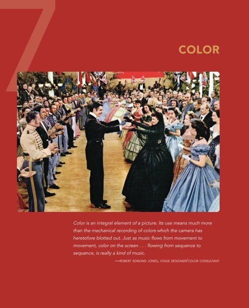
Color is an integral element of a picture. Its use means much more<br />
than the mechanical recording of colors which the camera has<br />
heretofore blotted out. Just as music flows from movement to<br />
movement, color on the screen . . . flowing from sequence to<br />
sequence, is really a kind of music.<br />
—ROBERT EDMOND JONES, STAGE DESIGNER/COLOR CONSULTANT
og35079_ch07.qxd 8/29/06 3:28 PM Page 223<br />
Color holds a powerful position among the elements of film structure. A<br />
kind of universal language, it appeals equally to the illiterate and the sophisticated,<br />
to the child and the adult. Its function on the screen is both<br />
utilitarian and aesthetic. When made relevant to the picture’s subject,<br />
color offers an immediate resonance that vivifies mood, delineates character,<br />
enhances meaning. When structured to further movement from sequence<br />
to sequence, color adds a new richness of film expression that<br />
immeasurably deepens the total work. 1<br />
—LEWIS JACOBS, CRITIC<br />
The added richness and depth that color provides make awareness of color and<br />
its effects on the audience essential to perceptive film watching. Although color<br />
probably gives us more immediate pleasure than any of the other visual elements,<br />
it is also probably more difficult to understand. Human responses to<br />
color are not purely visual responses; they are also psychological or even physiological.<br />
Some of color’s effects on the human mind and body border on the<br />
miraculous: Premature babies born with a potentially fatal jaundice do not require<br />
a blood transfusion if they are bathed in blue light. Decorating restaurants<br />
in red apparently stimulates the appetite and results in increased food consumption.<br />
Blue surroundings can significantly lower human blood pressure, pulse,<br />
and respiration rates. And violent children relax, become calm, and often fall<br />
asleep within minutes when placed in a small room painted bubble-gum pink.<br />
Color attracts and holds our attention; our eyes are more quickly attracted<br />
by color than by shape or form. Any reader skimming through a book with<br />
color pictures looks at those pictures first and looks at them more often than at<br />
pictures in black and white. Advertisers who have run identical ads in full color<br />
and in black and white have gotten fifteen times better results from the color<br />
ads. Practically every package on the supermarket shelves has at least a touch of<br />
red, for red seems to attract attention better than any other color.<br />
Individual responses to color vary, for color is a purely human perception<br />
of a visual quality that is distinct from light and shade. Color is simply radiant<br />
energy. Color—the special quality of light reflected from a given surface—is<br />
greatly influenced by subjective factors in the brain. Color not only is seen but<br />
is felt emotionally by each viewer and is therefore subject to his or her personal<br />
interpretation. The word hue is a synonym for color.<br />
Value refers to the proportion of light or dark in a color. White is the<br />
lightest value perceptible to the human eye, and black is the darkest perceptible<br />
value. Value is a comparative concept, for we generally compare a colored surface<br />
with the normal value of a color—that is, the value at which we expect to<br />
find the color represented on a color wheel (Figure 7.1). Anything lighter than<br />
the normal value is a tint; anything darker is a shade. Therefore, pink is a tint<br />
of red, and maroon is a shade of red.<br />
Color 223<br />
_<br />
_<br />
_<br />
_
_<br />
_<br />
_<br />
_<br />
bog35079_ch07.qxd 8/29/06 3:28 PM Page 224<br />
224 CHAPTER 7<br />
Yellow-orange<br />
Red-orange<br />
Red<br />
Red-violet<br />
Orange Violet<br />
Green<br />
Blue-green<br />
Blue-violet<br />
Yellow Blue<br />
Yellow-green<br />
FIGURE 7.1 An Integrated Color Wheel Artists use this device to help clarify the relationships<br />
between the primary and secondary hues. The squares show the three primary<br />
colors (red, blue, and yellow), and the triangles show the three secondary colors (violet,<br />
green, and orange). These colors are separated by six intermediate colors, appearing in<br />
the circles.<br />
Saturation and intensity are other important concepts. In a discussion of<br />
color, these terms are interchangeable. A saturated color is a hue so unadulterated<br />
and strong that it is as pure as it can be. White and black are both saturated<br />
colors of maximum intensity. Pure white cannot be made any whiter; pure<br />
black cannot be made any blacker. A saturated or high-intensity red is a pure<br />
red—what we might call fire-engine red. It can’t be made any redder. If a saturated<br />
red were made darker (or grayer), it would become a shade of red and<br />
would be lower in intensity. If a saturated red were made lighter (or whiter), it<br />
would become a tint of red and would be lower in intensity. When a color is<br />
lowered in intensity, it is said to be a desaturated or muted color. The term
og35079_ch07.qxd 8/29/06 3:28 PM Page 225<br />
muted is perhaps easier to understand because of its clear association with music:<br />
A mute on a trumpet, for example, makes the sound of the instrument less pure<br />
and clear, less bright, and less loud.<br />
The difficulty in analyzing color is compounded by the fact that objects are<br />
seldom viewed in an atmosphere totally removed from all external optical influences.<br />
There is a clear distinction between local color and atmospheric color<br />
(Figure 7.2). A green leaf pulled off a tree, placed on a white tabletop in a room<br />
with white walls and a white floor, and illuminated by a perfectly white light radiates<br />
local color. A leaf radiates atmospheric color when it is viewed on the tree<br />
on which it is growing: The leaf appears translucent and yellowish when the<br />
sun shines through it; it turns dark green and opaque when a cloud passes over<br />
the sun. As the sun sets, the leaf may first appear ruddy and then look almost<br />
blue as the sun drops below the horizon. Thus, under normal conditions, we<br />
usually see a complex and constantly changing atmospheric color:<br />
Local color is always submerged in a sea of light and air—in an atmosphere which<br />
combines a wide range of color influences. Not only does the sunlight change<br />
constantly through the day, but colored objects influence one another. Neighboring<br />
colors enhance or subdue one another; colored lights literally pick up reflections<br />
from one another; and even the dust particles in the air lend their own color<br />
to the objects. 2<br />
In planning and shooting a modern color film, the director, the cinematographer,<br />
the production designer, and the costumer must be constantly aware of<br />
such factors if they are to control and manipulate the color to conform to their<br />
aesthetic vision.<br />
COLOR IN THE MODERN FILM<br />
With the technology under control and readily available, and with a theater and<br />
television audience not only accustomed to but demanding movies in color, it is<br />
important to understand how color functions in the modern film: how it affects<br />
our experience of a film, how it affects us generally, and what, if any, advantages<br />
color has over black and white. Since the 1950s, the color film has increased<br />
greatly in subtlety and sophistication, and its potential seems almost unlimited.<br />
Effects of Color on the Viewer<br />
To begin, let’s consider certain basic assumptions about the effects of color and<br />
the way it communicates—things that profoundly affect the creative choices of<br />
the director, the cinematographer, the production designer, and the costumer.<br />
1. Color Attracts Attention. The director has several methods of keeping<br />
attention focused on the center of interest. Our eye is drawn to large<br />
objects, to the object closest to the camera, to the object in the sharpest<br />
Color 225<br />
_<br />
_<br />
_<br />
_
_<br />
_<br />
_<br />
_<br />
bog35079_ch07.qxd 8/29/06 3:28 PM Page 226<br />
COLOR AT<br />
THE MOVIES<br />
Since the beginning of motion picture history, filmmakers<br />
and exhibitors have experimented with the use<br />
of color. Color was even used in magic-lantern slide<br />
shows by hand-painting the slides to be projected.<br />
When making that projected picture move finally became<br />
possible, it was only natural that attempts were<br />
made to color the image as well.<br />
It soon became obvious that hand-coloring the<br />
large number of frames required for even a tenminute<br />
film was tedious, painstaking, and expensive.<br />
In Potemkin (1925), the revolutionary battleship flag<br />
was photographed as white because it was intended to<br />
be painted red by hand, In fact, in the official print of<br />
the film, the flag was colored in red ink, individually<br />
in every frame in which it appears, by the hand of the<br />
director, Sergei Eisenstein. This limited use of color<br />
in an otherwise black-and-white film focused the audience’s<br />
attention on the symbol of the entire revolution,<br />
the color red.<br />
A much more important use of applied color during<br />
the era of silent films was tinting, coloring the<br />
film stock before the image was printed on it. Tinting<br />
created a two-color effect: black and whatever color<br />
the film had been tinted. Codes or formulas for the<br />
use of tinting quickly developed. One of the most<br />
common was the use of blue-tinted stock for night<br />
scenes. The film stock of the time was too slow to<br />
allow the filmmaker to shoot scenes at night or to get<br />
a clear image by underexposing daylight footage (later<br />
called day-for-night shooting). Thus, the blue tinting<br />
allowed the filmmaker to indicate that a scene was<br />
taking place at night but to film the scene in natural<br />
daylight. Because modern copies of the old silent<br />
films most often have not reproduced the tinting, we<br />
sometimes fail to catch the difference between a day<br />
and a night. (On American cable television’s Turner<br />
Classic Movies, these films can now occasionally be<br />
viewed in their original form.)<br />
Pioneer director D. W. Griffith, often called the<br />
father of American film, used many tinting conventions<br />
in Intolerance (1916), but because nearly two<br />
thousand feet of the three-and-a-half hour release<br />
Flashback DISCOVERING<br />
print have been permanently lost, it is difficult to fully<br />
understand his use of color in the epic. However, we<br />
can get a clear idea of the effectiveness of tinted stock<br />
from Kevin Brownlow’s restoration of Able Gance’s<br />
Napoleon (1927). In Napoleon, Gance did not stick with<br />
a rigid formula. Although he consistently used amber<br />
yellow for interiors and blue for night exteriors, he<br />
used both sepia and black and white for day exteriors.<br />
For separate battle scenes; he employed both amber<br />
yellow and red.<br />
Perhaps the most sophisticated use of color in the<br />
silent era was in the film that is often called the high<br />
point of Griffith’s career, Broken Blossoms (1919). It is<br />
also possibly the first case of a film director attempting<br />
to capture a painterly effect on film. Inspired by a<br />
series of watercolors of London’s Chinatown by English<br />
artist George Baker, Griffith wanted to capture<br />
a dreamlike ambiance to match those paintings. Hendrik<br />
Sartov, Griffith’s assistant cameraman, used his<br />
special skills in mood lighting and soft focus to create<br />
a highly impressionistic film. A watercolor effect was<br />
achieved by tinting the entire film in soft pastels. Although<br />
Griffith’s experimentation with tinting was<br />
the most artistic of silent era filmmakers’, the practice<br />
of tinting was by no means uncommon. By the 1920s,<br />
more than 80 percent of all American features were<br />
tinted in some fashion by means of chemical baths.<br />
Another technique of applying color to film was<br />
toning, adding dyes to the film emulsion itself so that<br />
the lines and tones of the image were colored. Combining<br />
the toning process with tinted film stock<br />
yielded a two-color image. For example, by using purple<br />
toning on a pink stock, the filmmaker could create<br />
a purple sea against a pink sunset. Green toning on<br />
yellow stock could suggest a green meadow or a forest<br />
against a sunny yellow sky.<br />
Tinting and toning produced a silent cinema much<br />
more expressive than we are able to experience today;<br />
but only a few films remain to represent a whole era<br />
of experimentation. There are copies of Edwin S.<br />
Porter’s The Great Train Robbery (1903) that have<br />
hand-colored costumes, explosions, and gunfire, and<br />
some copies of Intolerance and Henry King’s Tol’able<br />
David (1921) remain with sequences tinted in orange,<br />
green, or blue. Brownlow’s restoration of Gance’s Napoleon<br />
and also the King film are available on DVD.<br />
Of films that were both tinted and toned, only random<br />
stills survive, and no copies exist of Eisenstein’s
og35079_ch07.qxd 8/29/06 3:28 PM Page 227<br />
red flag in Potemkin or of the apt “golden touch” applied<br />
by Erick von Stroheim in his Greed (1925).<br />
The technology needed to capture photographic<br />
images in color within the camera was not available<br />
until the 1920s. Dr. Herbert Kalmus’s two-color<br />
Technicolor film was employed for color sequences in<br />
blockbusters like Ben-Hur (1926) and Phantom of the<br />
Opera (1925). The process was expensive, costing<br />
30 percent more than a similar black-and-white production,<br />
and audiences grew quickly bored or irritated<br />
with the poor registry of the colors. Caucasian<br />
flesh tones, for example, varied from pink to orange.<br />
Several years later, in 1932, the Technicolor Corporation<br />
perfected three-color Technicolor film, and color<br />
film, still expensive and difficult to work with, gradually<br />
came into its own. Although Becky Sharp (1935),<br />
Rouben Mamoulian’s adaptation of William Makepeace<br />
Thackeray’s novel Vanity Fair, was the first feature<br />
film to use the process, it was a commercial<br />
failure. The most celebrated early successes of Technicolor<br />
appeared in Gone With the Wind and in parts<br />
of The Wizard of Oz (both 1939). After its use in a series<br />
of striking Hollywood musicals, the color technique<br />
(and also that genre) perhaps reached its apex<br />
with Singin’ in the Rain (1952).<br />
For decades, the Technicolor Corporation maintained<br />
tight controls over the use of its film, requiring<br />
that each Technicolor production employ its cameramen,<br />
consultants, and equipment. Although the Technicolor<br />
dyes tended to create pure or saturated colors<br />
more strikingly brilliant than colors in the real world<br />
the film was recording, Technicolor’s domination of<br />
color cinematography continued only until 1952,<br />
when the introduction of Eastman Color film made<br />
color production simpler and more economical. Since<br />
the mid-1970s, Eastman Color has been the preeminent<br />
film type. Meanwhile, the Technicolor technology<br />
has survived and flourished exclusively in<br />
mainland China, where, for example, the filmmaker<br />
Zhang Yimou (Hero, The House of Flying Daggers) produced<br />
such richly hued films as Ju Dou and Raise the<br />
Red Lantern. Only in the late 1990s, with the growing<br />
concern for film preservation, has there been a revival<br />
of interest in Technicolor in the United States. Such<br />
movies as Far From Heaven (2002) and the most recent<br />
Vanity Fair, Mira Nair’s 2004 adaptation, contain<br />
Technicolor-like rainbow homages to this indelible<br />
color process.<br />
Flashback<br />
_<br />
_<br />
_<br />
_
_<br />
_<br />
_<br />
_<br />
bog35079_ch07.qxd 8/29/06 3:28 PM Page 228<br />
FIGURE 7.2 Atmospheric Colors A wide<br />
range of color influences come into play in the<br />
four pictures shown here. [[COMP: CAPTION<br />
TO COME HERE]] The rosy flesh colors on the<br />
huge, theater-front poster in All About My<br />
Mother both embolden and engulf the redcoated<br />
woman (Cecilia Roth) standing<br />
bewildered in front of it, and the double black<br />
doors with bars on top are forbidding. [[COMP:<br />
CAPTION TO COME FOR HERE]] In 2001: A<br />
Space Odyssey, the instrumentation-panel lights<br />
in the spacecraft cast a slightly unsettling pinkish<br />
glow over the faces of Keir Dullea and Gary<br />
Lockwood.<br />
228 CHAPTER 7
og35079_ch07.qxd 8/29/06 3:28 PM Page 229<br />
focus, to movement, and to close-ups. Dramatic arrangement of people<br />
and objects and highlighting the object of greatest interest also attract<br />
our attention. Color is another option. By using bright or saturated<br />
colors on the object of greatest interest and placing that object against a<br />
contrasting background, the director can easily capture the viewer’s eye<br />
(Figures 7.3, 7.4).<br />
2. Colors Contribute to Three-Dimensionality. The director can capitalize<br />
on another characteristic of color to ensure that attention is attracted<br />
to the proper object: Some colors seem to advance toward the<br />
foreground, and others seem to recede into the background. Colors such<br />
as red, orange, yellow, and lavender are advancing colors. When given<br />
high intensity and dark value, they seem to advance, making objects appear<br />
larger and closer to the camera than they are. Interior decorators and<br />
others know that a chair covered in red will seem larger and closer to an<br />
observer than the same chair covered in receding colors such as beige,<br />
green, or pale blue. Taking advantage of the advancing and receding<br />
characteristics of color fosters the illusion that the image on the screen<br />
is three-dimensional.<br />
Several other techniques may be used in a color film to create the illusion<br />
of different planes of depth. By controlling the lighting and color<br />
choices, the director can dramatize or accent the illusion of solidity and<br />
form by contrasting darkness against lightness, contrasting pure color<br />
against grayed color, contrasting warm color against cool color, and contrasting<br />
detail, texture, and microstructure against plain or translucent<br />
objects.<br />
The problems of creating the illusion of three-dimensionality in black<br />
and white are simplified in color, according to production designer Robert<br />
Boyle:<br />
Black and white is a little harder to do than color. The difference is you<br />
can separate the planes with color, but with black and white you have<br />
to separate the planes with values. The cameraman’s job in a black and<br />
white film is the difficult one, because you separate the planes with<br />
light, particularly when you are trying to indicate depth. Anybody can<br />
go out and snap a color shot and the planes will just naturally separate<br />
by the intensity of the color, but in black and white you have to do it all<br />
with value. You have to assess whether a yellow and a light red are going<br />
to be different enough in values to separate the planes. There may be<br />
a red room in the foreground and behind that you’ll have a light gray,<br />
and that will separate the planes and help the cameraman. 3<br />
3. Colors Create an Impression or Feeling of Temperature. Colors<br />
convey or at least seem to convey a sense of temperature. The warm<br />
colors are the colors that advance: red, orange, yellow, and lavender.<br />
Color 229<br />
_<br />
_<br />
_<br />
_
_<br />
_<br />
_<br />
_<br />
bog35079_ch07.qxd 8/29/06 3:28 PM Page 230<br />
230 CHAPTER 7<br />
FIGURE 7.3 Seeing Red A saturated red is a great attention-getter, as shown in these<br />
striking photographs from Memoirs of a Geisha (top left), Rocky IV (top right), American<br />
Beauty (bottom left), and The Last Emperor (bottom right).
og35079_ch07.qxd 8/29/06 3:28 PM Page 231<br />
FIGURE 7.4 A Richly Colored Tableau Director Terence Davies commanded a remarkable<br />
color palette in his film adaptation of Edith Wharton’s The House of Mirth (including<br />
the deep purple of plush Edwardian velvet in the photograph used on the movie’s poster).<br />
Here, the work’s protagonist, played by Gillian Anderson, participates in an evening’s entertainment<br />
for wealthy guests: a series of frozen moments of Beauty, briefly revealed, one by<br />
one. She seems to represent Ceres, goddess of the harvest, with her sickle and grain; the<br />
rich browns, greens, and golds are set in sharp contrast to the deep red of her headdress<br />
and lip color—and the delicate pink of her gown.<br />
The cool colors are the colors that recede: blues, greens, and beiges. It is<br />
likely that warm colors are so designated because of their associations with<br />
fire, the sun, and sunsets, and blues and greens are deemed cool because<br />
of their associations with water and the shade of trees (Figure 7.5).<br />
These generalizations, however, are not without certain complications.<br />
There are various degrees of color temperature. Red with a touch of<br />
blue is cooler than a saturated red. Yellow with a hint of green becomes a<br />
cool yellow. A reddish violet seems warm, but a bluish violet is comparatively<br />
cool. A blue with a faint purplish tinge suggests warmth, and some<br />
greens have enough yellow to seem warm. Filmmakers are aware of these<br />
connotations and use them to good effect, as Mark Rydell did in creating<br />
the effects of the warm, loving relationship between two women in the<br />
house and the bitter cold outside in his film of D. H. Lawrence’s The Fox:<br />
[E]very object in the house, every color, was chosen in warm tones to<br />
support the erotic tension in the house and everything in the exterior<br />
Color 231<br />
_<br />
_<br />
_<br />
_
_<br />
_<br />
_<br />
_<br />
bog35079_ch07.qxd 8/29/06 3:28 PM Page 232<br />
232 CHAPTER 7<br />
FIGURE 7.5 Mixing Warm and Cool Colors In David Lynch’s Mulholland Drive, light<br />
and dark, hot and cold are in constant visual opposition, as in this shot of the film’s two central<br />
characters. Naomi Watts (left) has blond hair and is wearing “cool” colored clothing,<br />
white pearls, and a muted shade of lipstick; Laura Elena Harring (right) has black hair, wears<br />
a deep red blouse, and possesses even deeper-red lips.<br />
was in the blue tones to emphasize the cold. Those are the kinds of<br />
things that are done that have an unconscious impact on people. . . . I’m<br />
very careful to select things like that. I think color has real impact. The<br />
choice of colors is seemingly inadvertent—but it’s not. Every garment is<br />
selected for a particular kind of emotional tone. 4<br />
4. Colors Function Together in Different Ways. Certain combinations<br />
of color, or color schemes, produce predictable and consistent visual effects.<br />
Monochromatic harmony results from a scheme based on variations<br />
in the value and intensity of one color. Complementary harmony<br />
results from the use of colors directly opposite each other on the color<br />
wheel, such as red and green. Complementary colors react with each<br />
other more vividly than do other colors. Analogous harmony results<br />
from the use of colors adjacent to one another on the color wheel, such as<br />
red, red-orange, and orange. Such colors create a soft image with little<br />
harsh contrast. Triad harmony results from the use of three colors equidistant<br />
from one another on the color wheel, such as the primary colors:<br />
red, yellow, and blue.
og35079_ch07.qxd 8/29/06 3:28 PM Page 233<br />
Color-conscious directors generally have a clear vision of the color<br />
tone or types of color harmony they want to incorporate into their film,<br />
and they convey that vision to the cinematographer, production designer,<br />
and costumer during an extensive period of preproduction planning. If<br />
special color effects need to be provided by the film laboratory during the<br />
printing process, laboratory technicians may also be consulted. Because<br />
different types of film stock respond to color in different ways, experts from<br />
Eastman Kodak or Technicolor may even be brought into the process.<br />
Color as a Transitional Device<br />
Color has probably been used most often to signal important changes. This can<br />
be accomplished by using color in conjunction with black and white or by<br />
switching to an obviously different color emphasis or style at the point of transition.<br />
Director David Lynch used the latter strategy in Blue Velvet (Figure 7.6).<br />
The most obvious kind of color transition is the technique used in The Wizard<br />
of Oz, where the dull, drab Kansas of Dorothy’s real world suddenly becomes<br />
the glowing Technicolor Oz of her dream (Figure 7.7).<br />
Color also provides a transition between two separate worlds in a unique<br />
time-travel film, The Navigator: A Medieval Odyssey. Produced in New Zealand<br />
and directed by Vincent Ward, the film concerns a journey from the Middle<br />
Ages to the present through the center of the Earth. The title character, a<br />
young visionary from a primitive medieval Christian clan, lives in a gloomy,<br />
stark, black-and-white world but dreams or has visions of the modern world in<br />
muted color. Through his dreams, he “knows the way” and leads members of<br />
his clan through the center of the Earth to deliver a cross to “the other side”<br />
(the modern world). As they enter the great vertical cavern that leads to the<br />
other world, limited color enters the image transitionally as torches dropping<br />
through the pit or carried by the clansmen glow orange without coloring the<br />
cavern walls or the faces of the men. Then, as they emerge into the modern<br />
world on the outskirts of a large city, we see a night scene with full but very<br />
muted color. Pleasantville, a seriocomic examination of evolving American life<br />
during the past fifty years, also utilizes color as a transitional device. Magically<br />
transported to the black-and-white fantasy world of a 1950s television sitcom,<br />
two ’90s teenaged siblings gradually become the catalysts for blossoming color<br />
in characters who manage to attain a strong personal and social awareness (Figure<br />
7.8).<br />
A transition from present to past is keyed through color in D.O.A. (1988),<br />
which opens in a film noir black and white as Dennis Quaid, dying from a slowacting<br />
but fatal poison, staggers into a police station to tell his story. As the detectives<br />
begin taping his testimony, we watch him briefly on a black-and-white<br />
TV monitor until the film goes into a dramatic flashback, changing to color as<br />
Color 233<br />
_<br />
_<br />
_<br />
_
_<br />
_<br />
_<br />
_<br />
bog35079_ch07.qxd 8/29/06 3:28 PM Page 234<br />
234 CHAPTER 7<br />
FIGURE 7.6 Oz in Reverse In Blue Velvet, David Lynch begins his story with an idealized<br />
small-town atmosphere portrayed in glowing colors, with brilliant flowers, white picket<br />
fences, playing children, and cute dogs. Then the director mutes the color, darkens the<br />
image, and takes us on an unforgettable journey into the dark underbelly of vice, evil, and<br />
corruption beneath the surface. Shown here is the overly curious Kyle MacLachlan being<br />
threatened by Isabella Rossellini.<br />
it shows the word color printed on a blackboard, with Quaid as a college English<br />
professor discussing the use of color as metaphor in literature. The film returns<br />
to the film noir black and white in the midst of the final, violent climax of the<br />
flashback.<br />
A more sophisticated use of color for transition occurs in Sophie’s Choice.<br />
During the concentration camp scenes, the color is muted so much that it almost<br />
disappears, thus conveying the grimness of those scenes and setting them<br />
apart from the bright and cheerful colors of the present-time sequences.<br />
Martin Scorsese’s Raging Bull uses color for another unusual transitional<br />
-effect. The opening credits in color are superimposed over a black-and-white<br />
slow-motion image of Robert De Niro (as Jake La Motta) shadowboxing alone<br />
in the corner of the ring. With the color titles, Scorsese seems to be saying,<br />
“This is a modern film.” With the black-and-white image behind the titles, he<br />
seems to be saying, “This is a realistic film. I’m not going to idealize or glorify
og35079_ch07.qxd 8/29/06 3:28 PM Page 235<br />
FIGURE 7.7 Still in Kansas (top) Dorothy (Judy Garland) and Toto sit beneath gathering<br />
storm clouds in a dull, drab black-and-white Kansas during the opening segment of The<br />
Wizard of Oz. Not in Kansas Anymore (bottom) Dorothy and the Scarecrow (Ray Bolger) get<br />
acquainted on the yellow-brick road in The Wizard of Oz.<br />
Color 235<br />
_<br />
_<br />
_<br />
_
_<br />
_<br />
_<br />
_<br />
bog35079_ch07.qxd 8/29/06 3:28 PM Page 236<br />
236 CHAPTER 7<br />
FIGURE 7.8 Lively/Scary Color<br />
In the early sections of Pleasantville,<br />
the television town exists only in<br />
gradations of gray. The inhabitants<br />
of Pleasantville find the gradual<br />
experience of becoming colorful<br />
both frightening and exhilarating.<br />
the subject.” Then, suddenly, near the middle of the film, Scorsese integrates<br />
La Motta home movies, in color, complete with shaky camera movement, fuzzy<br />
focus, and all the other standard ills of home movies. There’s a wedding scene<br />
and a “kids by the pool” scene. The color provides a realistic, compressed interlude<br />
of happier days before La Motta returns to his grim career in the ring.<br />
Expressionistic Use of Color<br />
Expressionism is a dramatic or cinematic technique that attempts to present<br />
the inner reality of a character. In film, there is usually a distortion or exaggeration<br />
of normal perception to let the audience know that it is experiencing a<br />
character’s innermost feelings (Figure 7.9).<br />
In Michelangelo Antonioni’s Red Desert, a variety of interesting color effects<br />
are achieved. Whereas traditional films express characters’ emotions through<br />
acting, editing, composition, and sound, Antonioni uses color expressionistically<br />
to make us experience the world of the film through the mind and feelings of the<br />
central character, Giuliana, the neurotic wife of an engineer. The garish colors<br />
of factory vats, pipelines, slag heaps, poisonous yellow smoke, and a huge black<br />
ship passing through the gray mist of the harbor (along with an almost deafening<br />
roar and clatter of industrial machinery) make us aware that Giuliana is
og35079_ch07.qxd 8/29/06 3:28 PM Page 237<br />
overwhelmed and threatened by industrialization. In her dull, everyday life, the<br />
color is desaturated or muted, taking on a gray, nightmarish cast. But when<br />
Giuliana tells her young son a story reflecting her own fantasies, the colors suddenly<br />
change from dull browns and grays to the brilliant sea greens, the blue<br />
skies, and the golden sand and rocks of a fairy-tale island, calling attention to<br />
the vast difference between the real world she lives in and her fantasies.<br />
One of the dangers of trying to create internalized or expressionistic effects<br />
in color is made clear by two vastly different interpretations of one scene from<br />
Red Desert, the scene in which Giuliana and Corrado make love in Corrado’s<br />
hotel room. One critic describes the scene like this:<br />
Corrado’s room is dark brown paneled wood, the color of earth, when Giuliana<br />
comes in. After they make love . . . the room appears pink (flesh-colored), almost<br />
like a baby’s room. Where she had seen Corrado as a strong, masculine figure, he<br />
seems to her like a child after her disillusion with him—the color, when Antonioni<br />
wants it that way, a correlative of his heroine’s sense of things. 5<br />
Another critic interprets the scene in this manner:<br />
In a later sequence in the engineer’s hotel room, the walls change color from their<br />
original hard gray to warm pink because Giuliana feels them pink, with her body<br />
next to a warm strong man. He, ironically, neither cares how she feels or how she<br />
feels the walls. 6<br />
FIGURE 7.9 Expressionistic Color<br />
Color can be used expressionistically to<br />
make us experience the world of the film<br />
through the mind and feelings of the<br />
central characters. [[COMP: CAPTION<br />
REWRITTEN FOR A REPLACEMENT<br />
FILM STILL]]<br />
Both critics are right about the walls. One wall is dark, paneled wood; the<br />
other three are hard gray. The gray walls are the ones that appear pink. But the<br />
difference in interpretation here indicates a major difficulty with the expressionistic<br />
use of color. We must remember that color is not just seen but is also<br />
Color 237<br />
_<br />
_<br />
_<br />
_
_<br />
_<br />
_<br />
_<br />
bog35079_ch07.qxd 8/29/06 3:28 PM Page 238<br />
238 CHAPTER 7<br />
felt by the individual viewer and is subject to his or her personal interpretation.<br />
At least two critics did not experience the pink room of Red Desert in the<br />
same way.<br />
Color as Symbol<br />
In Ingmar Bergman’s Cries and Whispers, we see evidence of another problem<br />
with communicating clearly with color. In that film, the bedroom of the dying<br />
Agnes is literally drowning in saturated reds: red bedspread, red carpet, red walls,<br />
red drapes, and even a red dressing screen. Bergman has said that the deep-red<br />
sets symbolize his vision of the soul as a red membrane, but individual viewers<br />
may be unaware of this symbolism. The red actually is so appealing to the eye<br />
that it distracts attention away from the subtle drama that the faces and the dialogue<br />
are struggling to convey. Similarly, Peter Greenaway plays with color in<br />
his controversial The Cook, The Thief, His Wife, & Her Lover. In graphically presenting<br />
the erotic passions, jealousies, and angers of its characters, this film first<br />
creates brilliantly individuated color schemes for its interior settings (including<br />
the various rooms of a large restaurant). Then it changes the colors of the characters’<br />
clothing as they walk from room to room. What may be extremely subtle<br />
color symbolism for some viewers may be merely confusing for others.<br />
Surrealistic Use of Color<br />
Surrealism is a dramatic or cinematic technique that uses fantastic imagery in<br />
an attempt to portray the workings of the subconscious. Surrealistic images<br />
have an oddly dreamlike or unreal quality.<br />
The prolonged slaughter at the end of Taxi Driver is separated from the<br />
rest of the film with slow-motion visuals and surrealistic color (Figure 7.10). As<br />
screenwriter Paul Schrader describes it:<br />
The movie goes out of whack at that point. The color goes crazy. You no longer<br />
hear the sounds of the street. You get into that weird slow motion. Intentionally<br />
out of whack. 7<br />
As Travis Bickle (Robert De Niro) shoots the pimp on the doorstep and enters<br />
the building, the dominant color becomes a gritty, sleazy yellow in hallways and<br />
rooms dimly lit by naked tungsten bulbs. In this surreal dim yellow glow, the<br />
film takes on a nightmarish quality: Even the blood, which is literally everywhere,<br />
seems gritty and dirty, more real than real. The creative genius behind<br />
this extremely powerful effect was neither director Martin Scorsese nor his cinematographer,<br />
Michael Chapman, but the Motion Picture Rating Board:<br />
[A]bsurdly, it made Scorsese overlay the final bloodbath with a chemical tint so<br />
that it would look less realistic. The black-red gore turns out to be almost more<br />
powerful than the splattering ketchup of the original. Scorsese thinks it is worse. 8
og35079_ch07.qxd 8/29/06 3:28 PM Page 239<br />
FIGURE 7.10 Surrealistic Color Robert De Niro appears here as the deranged and<br />
suicidal Travis Bickle in the violent climax of Taxi Driver.<br />
Leitmotifs in Color<br />
Directors may employ colors associated with given characters for a kind of<br />
trademark effect. Robert Altman used this technique in his hauntingly beautiful<br />
3 Women. In practically every scene, Millie Lammoreaux (Shelley Duvall) is<br />
dressed in yellow or yellow in combination with another color. Pinky Rose<br />
(Sissy Spacek) dresses, as her name implies, in pink. Willy Hart ( Janice Rule)<br />
wears muted colors, mostly purples, blues, and grays, throughout. As the film<br />
progresses and Millie and Pinky undergo a Bergmanesque role reversal, Pinky’s<br />
pinks go to reds as her personality becomes dominant, and Millie’s bright yellows<br />
are subdued. All retain something close to their basic colors until the film’s<br />
puzzling end, when all three characters merge together into a monochromatic<br />
harmony. Millie has taken over the role of Willy as mother figure and adopted<br />
her style of dress and manner; Pinky has reverted to childhood and acts like a<br />
ten-year-old girl. But all the colors are now muted tints of gray and blue, as if<br />
to suggest that all three characters have lost what little individuality or sense of<br />
self they ever had.<br />
The clashing, garish colors of the Joker’s costume in Batman help to reinforce<br />
his personality (Figure 7.11). As if his evil deeds and twisted mind aren’t<br />
Color 239<br />
_<br />
_<br />
_<br />
_
_<br />
_<br />
_<br />
_<br />
bog35079_ch07.qxd 8/29/06 3:28 PM Page 240<br />
240 CHAPTER 7<br />
FIGURE 7.11 Offensive Colors<br />
Jack Nicholson appears in sartorial<br />
splendor as the Joker in Batman.<br />
villainous enough, he also offends us with his green hair, bright orange shirt,<br />
purple jacket, and bright red lips. The colors of his outfit also set him apart<br />
from the very conservative Batman costume: a rich, dark, formal blue accented<br />
by a touch of yellow. In his Euro-gore classics such as Suspiria, Dario Argento<br />
also uses color intensely.<br />
Color to Enhance Mood<br />
In his romantic tone poem A Man and a Woman, French director Claude<br />
Lelouche experimented with a variety of film stocks, switching from full realistic<br />
color to monochromatic scenes in sepia and blue gray, created by printing<br />
black and white on colored stock. Although the scenes depicting the woman’s<br />
idealized memories of her dead husband (a movie stuntman) are consistently<br />
filmed in Hollywood color, the transitions from color to black and white<br />
throughout the rest of the film follow no logical formula. Nevertheless, these<br />
color transitions blend in perfect harmony with the musical score to enhance<br />
the overall delicate mood of the film. Likewise, John Woo utilizes subtle colors<br />
to build empathy for his protagonists in such films as Windtalkers. And some<br />
cinematographers choose to shoot just before sunset to give their actors a<br />
“golden” glow (Figure 7.12).<br />
Comic Book Color<br />
For comic book–based Batman, production designer Anton Furst constructed a<br />
Gotham that became the single most powerful character in the movie, a per-
og35079_ch07.qxd 8/29/06 3:28 PM Page 241<br />
FIGURE 7.12 The Golden Hour Cinematographers love to shoot during “the golden<br />
hour,” the period just before sunset, when the light has a golden glow and strong side<br />
lighting can create a romantic mood, as in these scenes from A Room With a View (left)<br />
and Lagaan (right).<br />
sonification of contemporary corruption and decay. Vertical towers, domes,<br />
and spires reach high into a polluted sky above a base of sewers and claustrophobic<br />
alleys, creating a unique architectural style that might best be labeled<br />
Deco-Gothic. Sets are angled and lighted for a film noir effect and are further<br />
distorted by high and low camera angles and harsh side lighting from unseen<br />
sources. Deep blue black shadows prevail, and the browns and grays of<br />
brick and concrete are muted, totally without warmth. Gray smoke and white<br />
steam complete the image of pollution and total corruption. Even the occasional<br />
bright spot signals corruption, like the brilliant splash of red in a sleazy<br />
street girl’s outfit or the sickly pulsing pinkish glow of a dirty neon sign. So pervasive<br />
is the atmosphere created by the set that one cannot help but agree with<br />
sniggering mobster Jack Napier ( Jack Nicholson) when he says: “Decent people<br />
shouldn’t live here. They would be happier someplace else.” Often, in<br />
scary sci-fi movies such as War of the Worlds (2005) (Figure 7.13), an equivalent<br />
sentiment is echoed during under-lighted scenes that suggest the presence of<br />
aliens.<br />
Comic Strip Color<br />
Whereas Batman was based on a comic book with relatively sophisticated and<br />
subtle color treatment, Warren Beatty’s Dick Tracy was based on a Sundaypaper<br />
comic strip in which bold, primary colors prevail. To achieve this look,<br />
Beatty and cinematographer Vittorio Storaro decided to shoot the picture in<br />
seven primary and secondary colors, controlling the color by using painted<br />
Color 241<br />
_<br />
_<br />
_<br />
_
_<br />
_<br />
_<br />
_<br />
bog35079_ch07.qxd 8/29/06 3:28 PM Page 242<br />
242 CHAPTER 7<br />
FIGURE 7.13 Prevailing Shadows<br />
[[COMP:<br />
CAPTION TO<br />
COME]]<br />
backdrops (called mattes) behind the live action. The overall effect is unique<br />
(Figure 7.14). The primary colors—red, blue, and yellow—almost explode<br />
from the screen; wet city streets glow crimson, blue, and purple. As Storaro<br />
tells it, each color choice was carefully thought out, especially in developing<br />
what he calls a “dramaturgy of color” for the characters:<br />
Tracy, with his yellow raincoat and yellow hat, represents one side of the color<br />
spectrum: light, day, sun. Tess is mainly represented by orange, a warm color. Red<br />
is the Kid. They face the opposite side—Big Boy, Breathless, Pruneface—who<br />
belong on the inside of our subconscious, which is blue, indigo, violet. So the<br />
story of Dick Tracy and Breathless is really an impossible communion between<br />
the sun and moon, day and night, good and evil. 9<br />
Painterly Effects in Color<br />
More and more directors and cinematographers are beginning to think of filming<br />
as being similar to painting. In addition to their attempts to achieve<br />
painterly effects with lighting, a great deal of experimentation is being done<br />
to create a kind of palette in color film, so that the actual nature of the color can<br />
be mixed to achieve the same kinds of effects that artists achieve with subtle<br />
blendings of the colors on the palette. In What Dreams May Come, Vincent
og35079_ch07.qxd 8/29/06 3:28 PM Page 243<br />
FIGURE 7.14 Comic Strip Colors To achieve a Sunday funnies look for Dick Tracy, cinematographer<br />
Vittorio Storaro limited himself to seven primary and secondary colors and<br />
gave a special color emphasis to each character. Blue, indigo, and violet—colors that<br />
Storaro says “belong on the inside of our subconscious”—suggest the dark side of the<br />
assembled gangsters in this shot.<br />
Ward takes this kind of effect one step further: When the protagonist, Robin<br />
Williams, walks through a beautiful Monet-like landscape, he discovers that its<br />
colors literally become oil paints.<br />
In Moulin Rouge (1952) John Huston attempted what he called “a wedding<br />
of black and white and color” in an attempt to give the entire film the look of<br />
a Toulouse-Lautrec painting. To achieve this look, it was necessary to flatten<br />
the color (rendering it in planes of solid hues) and eliminate highlights and<br />
the illusion of three-dimensionality created by the lighting of rounded, threedimensional<br />
forms. He achieved this by using a filter that was designed to simulate<br />
fog in exterior scenes and by adding smoke to the set so that a flat, monochromatic<br />
quality prevailed. As Huston puts it: “It was the first picture that<br />
succeeded in dominating the color instead of being dominated by it.” 10 Huston<br />
further experimented with color in Reflections in a Golden Eye, where an amber<br />
golden look was given to the whole picture through a laboratory process. Studio<br />
heads, however, did not like the golden look and released the film without<br />
the effect.<br />
Because painters are often associated with certain periods, filmmakers<br />
have sometimes attempted to achieve a sense of time past by using the look of a<br />
Color 243<br />
_<br />
_<br />
_<br />
_
_<br />
_<br />
_<br />
_<br />
bog35079_ch07.qxd 8/29/06 3:28 PM Page 244<br />
244 CHAPTER 7<br />
well-known painter of the period. Franco Zeffirelli created a fairly effective<br />
sense of time past by filtering The Taming of the Shrew through a nylon stocking,<br />
muting colors and softening sharp edges so that the whole film resembles a<br />
faded Rembrandt painting. Some scenes in Barry Levinson’s The Natural had<br />
the look of Edward Hopper paintings, and both Biloxi Blues and Radio Days<br />
were bathed with a warm, yellow-brown, nostalgic glow, approximating a Norman<br />
Rockwell look (Figure 7.15).<br />
For some cinematographers, the perfect period look would be achieved by<br />
capturing on film the sepia-tone look of faded photographs. But as Laszlo Kovacs,<br />
cinematographer of F.I.S.T., tells it, the sepia-tone look is difficult to<br />
achieve:<br />
I would have loved if somehow we could have discovered how to do sepia in color.<br />
That’s the hardest thing to do; I mean, it’s easy to go to amber or to yellowish and<br />
reddish tones, but sepia is a brown which is not a color. It’s a dirt. It’s a combination<br />
of everything. Somehow it’s almost impossible to create that sepia tone, all<br />
that faded quality. It’s always a problem. You see a period picture, and it looks too<br />
new. It should look as if it was really made in the thirties and was pulled out from<br />
a drawer, like old faded prints. 11<br />
Ironic Use of Color<br />
Directors usually plan to use colors to match the mood of their film, but sometimes<br />
they choose color effects that go against the emotional tone of the film.<br />
John Schlesinger has achieved effective results with both approaches:<br />
In Midnight Cowboy, we wanted a garish street look, with the neon signs resonating—it<br />
was grittier, grainier. But with [Day of the] Locust, Conrad [cinematographer<br />
Conrad Hall] and I wanted a much more golden glow over a fairly<br />
dark story. 12<br />
Color patterns are also used ironically in Woody Allen’s Annie Hall in the flashbacks<br />
to Alvy’s neurotic childhood, which are imbued with glowing, warm nostalgic<br />
tones (Figure 7.16).<br />
Special Color Effects<br />
A great many of the uses of color are so subtle that they create the desired effect<br />
but escape our conscious notice unless we are looking for them (Figure 7.17).<br />
In Deliverance, for example, director John Boorman and cinematographer Vilmos<br />
Zsigmond found that the colors of the bright green leaves as naturally<br />
recorded on the film were too cheerful looking. To remedy this, they combined<br />
a black-and-white print with a color print to create a sufficiently dark and foreboding<br />
woods.
og35079_ch07.qxd 8/29/06 3:28 PM Page 245<br />
FIGURE 7.15 Painterly Effects Some filmmakers actively seek to adapt to the motion<br />
picture form color techniques most famously used by painters. Director Vincent Ward offers<br />
a re-markable French Impressionist-inspired landscape for Robin Williams and Annabella<br />
Sciorra in What Dreams May Come. John Madden mixes rich colors and movement in his<br />
Shakespeare in Love, with Gwyneth Paltrow and Joseph Fiennes. [[COMP: CAPTION TO<br />
BE REWRITTEN HERE]]<br />
Color 245<br />
_<br />
_<br />
_<br />
_
_<br />
_<br />
_<br />
_<br />
bog35079_ch07.qxd 8/29/06 3:28 PM Page 246<br />
246 CHAPTER 7<br />
FIGURE 7.16 Ironic Use of Color When, in Annie Hall, Woody Allen occasionally<br />
switches cinematic gears from an exasperating (but funny) love story to a nostalgic reexamination<br />
of Alvy Singer’s childhood (funny too), he also changes visual styles. His<br />
travels into the past are given the warm glow of fond and colorful tales filtered through<br />
the consciousness of the present. And, indeed, in this scene, the adult Alvy actually appears<br />
in that light with his younger self and his elementary school classmates.<br />
In Kathryn Bigelow’s Near Dark, the vampire clan must avoid the sun,<br />
which literally roasts them alive, so much of the action of the film takes place<br />
at night. Cold colors, especially a muted blue, predominate. In one scene,<br />
however, when the vampires are attempting to escape from the sunrise, the unhealthiness<br />
of the sun (to them) is shown by coloring it a poisonous yellowgreen.<br />
COLOR VERSUS BLACK AND WHITE<br />
I still think that black and white has a role in motion pictures, and not<br />
everything should be in color. In fact, unless the color is perfect to the<br />
idea, it can come between the beholder and the idea of the picture.<br />
One’s eye can be deflected by the color. And one’s thoughts as well. For<br />
instance, I cannot possibly see doing Freud in color or other pictures of a<br />
deeply psychological nature. Unless the palette and the values coincide<br />
or are part of the idea, why, it’s better for it not to be in color. 13<br />
—JOHN HUSTON, DIRECTOR
og35079_ch07.qxd 8/29/06 3:28 PM Page 247<br />
FIGURE 7.17 Another Time, Another Place To be believable, fantasy films often<br />
require a special look to convince us that such events really happened in another time,<br />
another place. To achieve this look in Babe: Pig in the City, George Miller commandeered<br />
a rainbow of colors and set his tale in an urban landscape that magically synthesized elements<br />
of many great cities of the world.<br />
In most movies . . . I have restricted myself to a color or two only. Black<br />
and white is like a tuxedo, always elegant. Color, if you’re not careful with<br />
it, can be vulgar. 14<br />
—NESTOR ALMENDROS, CINEMATOGRAPHER<br />
Black and white certainly has a “tuxedo elegance,” its own aesthetic. It is<br />
not simply a poor cousin of color but an entirely separate medium with its own<br />
strengths, idiosyncrasies, and the unique power to communicate. Whereas a<br />
color film can rely on the relationship of colors for effect (with very little need<br />
for shadows), black and white must rely on tonal relationships and contrasts<br />
produced by controlling light and shade. Black and white produces its strongest<br />
impact by emphasizing highlights and shadows.<br />
Perhaps the most important element in the aesthetic of the black-andwhite<br />
film is that the cinematographer is freed from the reality of color. In<br />
black and white, each scene must be reduced to shades of gray, to basic elements<br />
of shape, tone, line, and texture, producing an image that is less representational<br />
than the same scene in color:<br />
Color 247<br />
_<br />
_<br />
_<br />
_
_<br />
_<br />
_<br />
_<br />
bog35079_ch07.qxd 8/29/06 3:28 PM Page 248<br />
248 CHAPTER 7<br />
In contrast to the familiar look of a conventional color photograph, a black-andwhite<br />
picture carries the viewer immediately into the realm of abstraction. Because<br />
it renders colors as light or dark shades of grey, giving its subject new visual<br />
identities, black-and-white film is at its best when used to interpret rather than<br />
merely record. It is superb at capturing patterns and contrasts, textures and<br />
forms, and all manner of tonal relationships, from the most powerful to the<br />
most subtle. 15<br />
Although the theoretical argument about the relative merits of color versus<br />
black and white is continuous, on a practical level there is no longer a real<br />
struggle. Because a vast television audience awaits almost any decent film, the<br />
great majority of films today are made in color to improve their chances for<br />
eventual sale to television. Stunningly beautiful black-and-white films such as<br />
The Man Who Wasn’t There (2001), by the Coen Brothers, and George Clooney’s<br />
Good Night, and Good Luck, have become modern anomalies.<br />
Television has become so saturated with color that advertisers are using<br />
black-and-white commercials to catch the viewer’s attention, however. These<br />
commercials either are completely in black and white or begin in black and<br />
white and then go to color. The most subtle effect is highlighting a single object<br />
in one color and muting everything else to black and white, such as in the<br />
ads for Lemon-Fresh Clorox (bright yellow, with lots of bouncing lemons),<br />
Nuprin (a tiny yellow tablet), Cherry 7Up (a red liquid), and Gatorade (a green<br />
liquid). Steven Spielberg employs a single muted color technique with chilling<br />
effect in Schindler’s List in two brief scenes that emphasize Schindler’s humanity.<br />
Schindler sits on horseback on a hillside watching Jews being driven from their<br />
homes in the Kraków ghetto. A beautiful little girl of five or six (a character not<br />
otherwise developed in the film) appears walking alone in the crowd, accented<br />
by a pale orange red coat, the only spot of color in the black-and-white action.<br />
The camera follows her as she slips into a vacant building, climbs the stairs, and<br />
hides under a bed as the sound of marching storm troopers grows louder. We<br />
see no more color until about an hour later in the film. With Schindler looking<br />
on again, the spot of color reappears briefly as the little girl’s body, piled on<br />
top of other exhumed bodies, is wheeled by on a pushcart to be incinerated<br />
(Figure 7.18).<br />
The apparently insatiable desire of the TV audience to see absolutely<br />
everything in color has drastically reduced the number of black-and-white<br />
films being produced. In fact, so few black-and-white films are now produced<br />
that when one does come out (like Manhattan, Stardust Memories, Celebrity, or<br />
The Elephant Man), it is praised for its daring. More than just daring is involved,<br />
however. Martin Scorsese presented some convincing arguments in his battle<br />
to film Raging Bull in black and white:<br />
Well, they came into my apartment, and I mentioned that I wanted to do the film<br />
in black and white. They said, “Black and white?” And I said yes. The reason was
og35079_ch07.qxd 8/29/06 3:28 PM Page 249<br />
FIGURE 7.18 A Poignant Touch of Color<br />
Steven Spielberg’s Schindler’s List creates one<br />
of cinema’s most touching moments through a<br />
tiny splotch of red in what is otherwise an entirely<br />
black-and-white film. Like Oscar Schindler<br />
(Liam Neeson), an opportunistic German<br />
businessman who nevertheless manages to<br />
save many Jews from certain death, the<br />
viewer suddenly spots the color momentarily<br />
in the coat of a small girl. One’s visual registration<br />
of the image seems almost subliminal.<br />
Later, along with Schindler, we see the same<br />
nameless child again; this time her dead<br />
body is atop a heap of corpses. This delicate<br />
use of color is filled with terror, poignancy,<br />
and, finally, enormous grief for all humanity.<br />
that five boxing films were opening: Rocky II or Rocky III, The Main Event, Matilda,<br />
the Boxing Kangaroo, and two others. They were all in color. I said, “This has got<br />
to be different.” And besides that, I told them that the color stock fades. I went<br />
into the whole business, that I was very upset about the Eastman color stocks fading,<br />
the prints fading in five years, the negatives fading in twelve years—things<br />
like that. I said, “I just don’t want it. I want it to be something very special. On top<br />
of that, though, it would also help us with the period look of the film.” We had an<br />
idea of making the film look like a tabloid, like the Daily News, like Weegee photographs.<br />
That was the concept, so they talked about that, and said, “Okay, all<br />
right.” They were listening. 16<br />
Obviously for some films black and white is simply a more powerful and effective<br />
medium than color. Of course, the director’s decision to use black and<br />
white or color should be determined by the overall spirit or mood of the film. A<br />
clear demonstration of the correct use of color and black and white can be seen<br />
by comparing Sir Laurence Olivier’s productions of Henry V (1945) and Hamlet.<br />
Henry V is a heroic, or epic, drama, much of which is set outdoors. It has<br />
battlefield action, colorful costuming, and pageantry and is ideally suited for<br />
color. The mood of the film is positive; it emphasizes the glorious, heroic character<br />
of King Henry V, who emerges victorious. Hamlet, in contrast, which<br />
Olivier chose to make in black and white, is a tragedy, a somber, serious play of<br />
the mind. Most of the settings are interior ones, and some scenes take place at<br />
night. The brooding, serious, intellectual quality of the hero himself has a<br />
starkness to it, a pensive gloom that, in 1947, could not have been captured<br />
nearly as well in color as it was in black and white.<br />
By 1990, however, new technology enabled director Franco Zeffirelli to capture<br />
the mood of Hamlet and the coldness and starkness of medieval Denmark<br />
Color 249<br />
_<br />
_<br />
_<br />
_
_<br />
_<br />
_<br />
_<br />
bog35079_ch07.qxd 8/29/06 3:28 PM Page 250<br />
250 CHAPTER 7<br />
in color. Throughout Zeffirelli’s film, starring Mel Gibson, the colors are desaturated<br />
(muted). Browns and grays predominate; often the brightest colors<br />
are natural flesh tones. Rich and elaborate regal garments are in pastel blues or<br />
heavily muted reds. Even an occasional glint of sunlight showing through narrow<br />
castle windows provides no cheer or warmth of color and approximates the<br />
effect of low-key lighting in a black-and-white film. Glimpses of green vegetation,<br />
blue sky, and the sea are so brief that they do nothing to relieve the gloom.<br />
The overall effect of black and white can be paradoxical, for somehow it<br />
often seems more true to life, more realistic, than color—despite the fact that<br />
we obviously do not see the world around us in black and white. For example,<br />
it is difficult to imagine that Stanley Kubrick’s Dr. Strangelove in color would<br />
have been quite as real as it is in black and white. Perhaps Mike Nichols’s<br />
Catch-22 would have been much more powerful in black and white for the same<br />
reason. The warmth of the color images in Catch-22—a warmth that is difficult<br />
to avoid when working with color—fights the cold, bitterly ironic tone that underlies<br />
the story. Perhaps its sense of starkness is what makes the black-andwhite<br />
treatment suitable for such film subjects.<br />
The essentially opposite effects of color and black and white might also be<br />
explained in terms of another pair of films, Shane and Hud, both of which are<br />
set in the west. Color is perfectly suited to Shane, a romantic western in the epic<br />
tradition set in a magnificently huge and beautiful landscape with snowcapped<br />
mountains ever present in the background. Hud, on the other hand, is a contemporary<br />
character study of a heel, set in a drab, barren, and sterile landscape.<br />
The film emphasizes the harsh realities and glorifies nothing; this story could<br />
find adequate expression only in black and white.<br />
The difference in seriousness and overall tone in Woody Allen’s Annie Hall<br />
(color) and Manhattan (black and white) also justifies the choices of different<br />
film types for those films. Generally, films that seem to demand color treatment<br />
are those with a romantic, idealized, or light, playful, and humorous quality,<br />
such as musicals, fantasies, historical pageants, and comedies. Also, films with<br />
exceptionally beautiful settings might be better shot in color. Naturalistic, serious,<br />
somber stories stressing the harsh realities of life and set in drab, dull, or<br />
sordid settings cry out for black and white. There are some that fall into a middle<br />
ground and can be treated equally well either way. Sin City, based on a dark<br />
graphic novel, utilizes a remarkable synthesis of monochrome and color that<br />
perfectly fits its subject matter (Figure 7.19).<br />
As experimentation continues, this difficulty will probably be overcome, for<br />
film technology has advanced rapidly in recent years. By using all the technology<br />
and know-how now available, modern filmmakers are able to create practically<br />
any color effect they want to achieve, whether it’s done by special lighting,<br />
diffusion filters, or special film in the camera or by processing the film in a certain<br />
way in the laboratory. This special color effect must of course be consistent
og35079_ch07.qxd 8/29/06 3:28 PM Page 251<br />
FIGURE 7.19 [[COMP: CAPTION TO COME<br />
[[COMP: CAPTION<br />
TO COME HERE]]<br />
in the film from beginning to end, unless it is used only for a special segment set<br />
off from the rest of the film—like a flashback, a dream, or a fantasy.<br />
Regardless of what has been accomplished to this point in developing the<br />
potential of the color film, there always seems to be more territory to be explored<br />
and new worlds to be discovered. A statement by Robert Edmond Jones<br />
in his essay “The Problem of Color” could well apply to the situation today:<br />
Color on the screen is unlike any other kind of color we have ever seen before. It<br />
does not belong to the categories of color in Nature or in painting and it does not<br />
obey the rules of black-and-white picture making.<br />
We are dealing not with color that is motionless, static, but with color that<br />
moves and changes before our eyes. Color on the screen interests us, not by its<br />
harmony but by its progression from harmony to harmony. This movement, this<br />
progression of color on the screen is an utterly new visual experience, full of wonder.<br />
The color flows from sequence to sequence like a kind of visual music and it<br />
affects our emotions precisely as music affects them.<br />
The truth is that a new form of art is about to be born into the world, an art<br />
for which there is yet no name but which holds an extraordinary and thrilling<br />
promise. Shall we call it visual opera? Color music-drama? No matter. It is<br />
enough to say that this new mobile color may quite conceivably turn out to be<br />
the art form of tomorrow. 17<br />
Color 251<br />
_<br />
_<br />
_<br />
_
_<br />
_<br />
_<br />
_<br />
bog35079_ch07.qxd 8/29/06 3:28 PM Page 252<br />
252 CHAPTER 7<br />
Today, filmmakers and audiences alike are becoming more sensitive to the<br />
power of color in film. Various organizations, such as the American Film Institute<br />
and the television cable channel American Movie Classics, are making extraordinary<br />
efforts to preserve the great films of the past—and especially to recapture<br />
their fading colors. Recently, for example, in preparation for yet another<br />
re-release of Gone With the Wind, this most popular film’s Technicolor values<br />
were restored primarily through “dye transfer.” Martin Scorsese has observed,<br />
“Color in the film is important because it reflects the drama . . . and a certain<br />
style.” Scorsese says that Gone With the Wind’s improved look even affects the<br />
audience on an emotional and psychological level, evoking the spirit of the Old<br />
South. [He believes] “it’s as important as the production design or the costuming<br />
or the direction of the film, to see it in the proper color.” 18<br />
QUESTIONS FOR ANALYZING COLOR<br />
1. If possible, watch the most powerful or memorable moments in the film on a<br />
VCR or DVD player with the color on the TV turned off. What is altered in<br />
each of the segments viewed in black and white?<br />
2. If the film uses bright, saturated colors, turn the color down on the TV so that<br />
the colors are muted. What effect does this have on the film?<br />
3. Is color used expressionistically anywhere in the film so that we experience the<br />
world of the film through the mind and feelings of a central character?<br />
4. Are trademark colors used in costuming or set decoration to help us<br />
understand the personalities of any of the characters? If so, what do these colors<br />
convey about the characters?<br />
5. Are obvious changes in color used as transitional devices in the film? If so, how<br />
effective are these transitions?<br />
6. How important is atmospheric color in the film? Do the uses of atmospheric<br />
color reflect some purpose on the director’s part? If so, what is that purpose?<br />
VIDEO EXERCISES<br />
Instructions for locating specific sequences are given on page XX.<br />
1. Color 1. Watch the final segment of Taxi Driver [4900 to the end; 1:38:25 to<br />
end], paying close attention to the color. Describe the quality of the color from<br />
4900 to 5165 (1:38:25 to 1:45:40), and compare it with the color quality from<br />
5165 (1:45:40) to the end.<br />
2. Color 2. For each of these movies, Days of Heaven, 2001: A Space Odyssey,<br />
Summer of ‘42, The Conversation, Taxi Driver, and Moulin Rouge! (2001), first<br />
adjust the color and tint controls on your TV so that the image shows only<br />
black and white, and then watch the first 10 minutes. Then readjust the TV<br />
image to full, balanced color, watch the same 10-minute segment again, and<br />
answer the following questions:
og35079_ch07.qxd 8/29/06 3:28 PM Page 253<br />
a. How is the overall effect of each segment altered by the addition of color?<br />
b. What colors seem to be predominant in the film? Are they generally warm<br />
or cool colors?<br />
c. Are the colors bright and pure (saturated) or toned down and muted (desaturated)?<br />
How is this choice related to the nature of the film and the story<br />
being told?<br />
d. Describe specific moments in each segment where color is used to focus attention<br />
on the object of greatest interest, enhance three-dimensionality, or<br />
suggest something about a character or his or her environment.<br />
e. Describe specific moments in each segment where atmospheric color is emphasized.<br />
What purpose can you attribute to this emphasis?<br />
MINI-MOVIE EXERCISE<br />
The title of Akira Kurosawa’s Dreams<br />
(1990) must first be taken literally.<br />
For the film is supposedly a cinematic<br />
sleep journal of the famous<br />
Japanese director’s, who has greatly<br />
influenced modern American filmmakers,<br />
including, especially, George<br />
Lucas in his Star Wars series. This<br />
film, somewhat like James Joyce’s<br />
early literary masterpiece Dubliners, consists of sections that cohere thematically,<br />
even as each part is a discrete whole. Kurosawa’s late anthology is made up of short<br />
(:10–:15) narratives whose techniques constitute a veritable encyclopedia of formal<br />
possibilities.<br />
Here are the titles of the seven brief works: “Sunshine Through the Rain,”<br />
“The Peach Orchard,” “The Blizzard . . . ,” “The Tunnel,” “Crows” (in which the<br />
film director Martin Scorsese portrays Vincent van Gogh), “Mount Fuji in Red,”<br />
and “Village of the Watermills.” From a DVD print of this movie select one of<br />
these tracks and then closely examine its utilization of color. Within the variety of<br />
hues in each film, you can expect to find both boldness and subtlety. Attempt to<br />
connect the director’s choices in colors not only with his visual image-making skill,<br />
but also with the themes you discern in his work here.<br />
DVD FILMMAKING EXTRAS<br />
The Art of Color in Films<br />
O Brother, Where Art Thou?:<br />
In a fascinating segment titled “Painting With Pixels,” director of photography<br />
Roger Deakins explains how “for the first time, the look of an entire live action<br />
film was manipulated digitally,” with help from Kodak’s Cinesite facilities. Although<br />
the final edited prints of all films require a process called color balancing,<br />
Color 253<br />
_<br />
_<br />
_<br />
_
_<br />
_<br />
_<br />
_<br />
bog35079_ch07.qxd 8/29/06 3:28 PM Page 254<br />
254 CHAPTER 7<br />
in the case of this Coen Brothers movie, as this DVD extra demonstrates, the<br />
photographically captured colors of the entire work were radically changed in<br />
postproduction. For example, bright greens were transformed to muted golds<br />
and browns throughout, and, thus, according to Deakins, “the color in the<br />
movie became a character.”<br />
What Dreams May Come:<br />
A substantive feature on this DVD called “The Painted Word” presents an interview<br />
with visual effects supervisor Joel Hynek and art director Josh Rosen.<br />
The two describe the innovative process by which the film is able to create the<br />
illusion that Old Master–like oil paintings are set in motion.<br />
Pleasantville:<br />
An extended set of featurettes deconstruct “The Art of Pleasantville.” Color<br />
effects designer Michael Southard, producer Bob Degus, and director of<br />
photography John Lindley examine key scenes that were “technically the most<br />
challenging.” Declaring that “1,700 digital effects shots” were used in the film<br />
(a record number at the time of its release), these artist/technicians are especially<br />
revealing in their discussion of how “subliminal” color has been used<br />
in black-and-white sequences. Degus announces that “color in this movie is<br />
a character.”<br />
The General (1998):<br />
Side A of the disc allows the viewer to watch the film in the black and white of<br />
director John Boorman’s theatrical release; side B permits one to view it in an<br />
alternative desaturated color version reportedly demanded (for financial reasons)<br />
by the studio that produced the work. (Note: Even though the DVD<br />
announces that both versions are “presented in the original 2.35:1 aspect ratio,”<br />
they appear to be masked differently, causing the black-and-white image to<br />
cover more of the conventional television screen than the color version.)<br />
FILMS FOR STUDY<br />
Babe: Pig in the City (1998)<br />
Barry Lyndon (1975)<br />
Batman Begins (2005)<br />
Bram Stoker’s Dracula (1992)<br />
Brokeback Mountain (2005)<br />
A Clockwork Orange (1971)<br />
The Conversation (1974)<br />
The Cook, the Thief, His Wife, &<br />
Her Lover (1989)<br />
Cries and Whispers (1972)<br />
The Day of the Locust (1975)<br />
Days of Heaven (1978)<br />
Deliverance (1972)<br />
Do the Right Thing (1989)<br />
Dr. Strangelove 1964)<br />
Elizabeth (1998)<br />
Elvira Madigan (1967)<br />
The English Patient (1996)<br />
Eternal Sunshine of the Spotless Mind<br />
(2004)<br />
Frida (2002)<br />
Garden State (2004)<br />
The Godfather (1972)<br />
The Godfather Part II (1974)<br />
Gone With the Wind (1939)<br />
Good Night, and Good Luck<br />
(2005)<br />
The Grey Zone (2002)
og35079_ch07.qxd 8/29/06 3:28 PM Page 255<br />
Harry Potter and the Goblet of Fire<br />
(2005)<br />
Howards End (1992)<br />
Insomnia (2002)<br />
Ju Dou (1990)<br />
Juliet of the Spirits (1965)<br />
The Lost Boys (1987)<br />
Lost in Translation (2003)<br />
Midnight Cowboy (1969)<br />
The Mask of Zorro (1998)<br />
Moulin Rouge (1952) (2001)<br />
Mrs. Henderson Presents (2005)<br />
Napoleon (1927)<br />
The Natural (1984)<br />
The Navigator: A Medieval Odyssey<br />
(1988)<br />
Near Dark (1987)<br />
The New World (2005)<br />
New York Stories: Life Lessons<br />
(1989)<br />
O Brother, Where Art Thou? (2000)<br />
One Hour Photo (2002)<br />
Pulp Fiction (1994)<br />
Radio Days (1987)<br />
Raise the Red Lantern (1991)<br />
Red Desert (1964)<br />
The Red Shoes (1948)<br />
Rent (2005)<br />
Saraband (2005)<br />
Sky Captain and the World of Tomorrow<br />
(2004)<br />
The Taming of the Shrew (1967)<br />
3 Women (1977)<br />
The Umbrellas of Cherbourg (1964)<br />
Vera Drake (2004)<br />
Y Tu Mamá También (2002)<br />
Color 255<br />
_<br />
_<br />
_<br />
_