Part I.pdf
Part I.pdf
Part I.pdf

You also want an ePaper? Increase the reach of your titles
YUMPU automatically turns print PDFs into web optimized ePapers that Google loves.
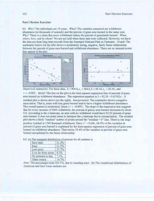
1.1 Who? The individuals are 19 years. What? The variables measured are wildebeest<br />
abundance (in thousands of animals) and the percent of grass area burned in the same year.<br />
Why? There is a claim that more wildebeest reduce the percent of grasslands burned. When,<br />
where, how, and by whom? We are not told when these data were collected. However, we know<br />
the data are from long-term records from the Serengeti National Park in Tanzania. Graph: The<br />
scatterplot below (on the left) shows a moderately strong, negative, fairly linear relationship<br />
between the percent of grass area burned and wildebeest abundance. There are no unusual points<br />
that a ear in the lot.<br />
Numerical summaries: For these data, x = 904.8,sx = 364.0,Y = 40.16,sy = 26.10, and<br />
r = -0.803. Model: The line on the plot is the least-squares regression line of percent of grass<br />
area burned on wildebeest abundance. The regression equation is y = 92.29 - 0.05762x. A<br />
residual plot is shown above (on the right). Interpretation: The scatterplot shows a negative<br />
association. That is, areas with less grass burned tend to have a higher wildebeest abundance.<br />
The overall pattern is moderately linear (r = -0.803). The slope of the regression line suggests<br />
that for every increase of 1000 wildebeest, the percent of grassy area burned decreases by about<br />
5.8. According to the y-intercept, an area with no wildebeest would have 92.29 percent of grass<br />
area burned. It does not make sense to interpret the y-intercept due to extrapolation. The residual<br />
plot shows a fairly "random" scatter of points around the "residual = 0" line. There is one large<br />
positive residual at 1249 thousand wildebeest. Since r 2 = 0.646,64.6% of the variation in<br />
percent of grass area burned is explained by the least-squares regression of percent of grass area<br />
burned on wildebeest abundance. That leaves 35.4% of the variation in percent of grass area<br />
burned unexplained by the linear relationship.<br />
1.2 (a) The mar inal distribution of reasons for all students is<br />
Save time 21.2%<br />
Eas 21.2%<br />
Low rice 27.7%<br />
Live far from stores 8.2%<br />
No ressure to bu 7.1 %<br />
Other reason 14.7%<br />
Note: The percentages total 100.1%, due to rounding error. (b) The conditional distributions of<br />
American and East Asian students are
American East Asian<br />
Save time 25.2% 14.5%<br />
Easy 24.3% 15.9%<br />
Low price 14.8% 49.3%<br />
Live far from stores 9.6% 5.8%<br />
No pressure to buy 8.7% 4.3%<br />
Other reason 17.4% 10.1%<br />
Note: The percentages for East Asian students total 99.9%, due to rounding error. (c) A higher<br />
percentage of American students than East Asian students buy from catalogs because it saves<br />
them time (25.2% versus 14.5%) and it is easy (24.3% versus 15.9%). A higher percentage of<br />
East Asian students than American students buy from catalogs because of the low price (49.3%<br />
versus 14.8%).<br />
1.3 (a) Since we know the weights of seeds of a variety of winged bean are approximately<br />
Normal, we can use the Normal model to fmd the percent of seeds that weigh more than 500 mg.<br />
First, we standardize 500 mg:<br />
z = _x _- _11 = _50_0_-_5_2_5 = _-2_5= -0.23<br />
a 110 110<br />
Using Table A, we fmd the proportion of the standard Normal curve that lies to the left of z =<br />
-0.23 to be 0.4090, which means that 1 - 0.4090 = 0.5910 lies to the right of z = -0.23. Thus,<br />
59.1% of seeds weigh more than 500 mg. (b) We need to find the z-score with 10% (or 0.10) to<br />
its left. The value z = -1.28 has proportion 0.1003 to its left, which is the closest proportion to<br />
0.10. Now, we need to find the value of x for the seed weights that gives us z = -1.28:<br />
-1.28 = x-525<br />
110<br />
-1.28(110) = x-525<br />
525-1.28(110) = x<br />
384.2 = x<br />
If we discard the lightest 10% of these seeds, the smallest weight among the remaining seeds is<br />
384.2 mg.<br />
1.4 Who? The individuals are American bellflower plants. What? The explanatory variable is<br />
whether cicadas were placed under the plant (categorical) and the response variable is seed mass<br />
in milligrams (quantitative). Why? The researcher wants to investigate whether cicadas serve as<br />
fertilizer and increase plant growth. When, where, how, and by whom? We are not told when<br />
these data were collected. However, we know the data come from 39 cicada plants and 33<br />
control plants on the forest floor in the eastern United States. Graphs: We can compare the<br />
cicada plants and the control plants with a side-by-side boxplot and a back-to-back stemplot. In<br />
the stemplot, the stems are listed in the middle and the leaves are placed on the left for cicada<br />
plants and on the right for control plants.
Stern-and-leaf of Cicada Plants and Control Plants<br />
Leaf Unit = 0.010<br />
Cicada Control<br />
0 1 3<br />
4 1 445<br />
7 1 77<br />
99 1 89999<br />
111100 2 0111<br />
3333332222 2 2<br />
5544 2 4444445555<br />
7777666 2 66666<br />
999 2 89<br />
110 3<br />
3<br />
5 3<br />
umerzca summarzes: ere are summary s s cs or e 0 IS U Ions:<br />
Variable Mean s Min Ql M Q3 Max IQR<br />
Cicada<br />
Plants<br />
0.24264 0.04759 0.1090 0.2170 0.2380 0.2760 0.3510 0.0590<br />
Control<br />
Plants<br />
0.22209 0.04307 0.1350 0.1900 0.2410 0.2550 0.2900 0.0650<br />
Interpretation: The distribution of seed mass (in mg) is a bit right-skewed for the cicada plants.<br />
One cicada plant had an unusually low seed mass (0.109 mg). For the control plants, the<br />
distribution of seed mass (in mg) is somewhat left-skewed. While the median seed mass is about<br />
the same for both the cicada plants and the control plants, the seed mass for the cicada plants is<br />
higher than the seed mass for the control plants at the fIrst and third quartiles (and at the<br />
maximum). The mean seed mass is higher for the cicada plants. The standard deviation is larger<br />
for the cicada plants, while the IQR is larger for the control plants. Because of the outlier in the<br />
seed mass for the cicada plants and the skewness of both distributions, we should use the<br />
resistant medians and IQRs in our numerical comparisons. The median and IQR are both smaller<br />
for the cicada plants than for the control plants. However, the first and third quartiles and the<br />
maximum are greater for the cicada plants than for the control plants. We might want to do more<br />
research to see if we come up with more conclusive data.<br />
1.5 A histogram of the date of ice breakup (number of days since April 20) on the Tanana River<br />
shows the data well.<br />
Because the distribution is slightly right-skewed, it is appropriate to use the fIve-number<br />
summary (and IQR) to describe the data. Alternatively, since the distribution is roughly
(b) A regression line added to 8: plot of the days against year shows, on average, that the number<br />
of da s since A ril 20 that the tri od falls is decreasing as the years go by.<br />
(c) According to R-Sq in the fitted line plot above, 10.0% of the variation in ice breakup time is<br />
accounted for by the time trend.<br />
1.7 Grouping the data into year groups (1 = 1917-to 1939,2 = 1940 to 1959,3 = 1960 to 1979,4<br />
= 1980 to 2005), we can see that the median time to tripod drop is generally decreasing over<br />
time. The median is approximately equal for the time periods 1940 to 1959 and 1960 to 1979.<br />
However, the median looks noticeably higher for the time period 1917 to 1939 and noticeably<br />
lower for the time period 1980 to 2005.
1.8 This is an observational study, so we cannot prove that online instruction is more effective<br />
than classroom teaching. There are other factors that we must consider. These arise when we ask<br />
the question "What might be different about students who choose online instruction over<br />
classroom instruction?" Some factors to consider are: age of the students (e.g., older students<br />
may work full time and find it easier to take an online course, but these students might be more<br />
serious about doing well in the course), aptitude of the students (e.g., those who are proficient<br />
with computers and choose online instruction might also be better students).<br />
1.9 Who? The individuals are several common tree species. What? The variables are seed count<br />
and seed weight (mg). Why? We wonder if trees with heavy seeds tend to produce fewer seeds<br />
than trees with light seeds. When, where, how, and by whom? These data come from many<br />
studies compiled in Greene and Johnson's "Estimating the mean annual seed production of<br />
trees," which was published in Ecology, volume 75 (1994). Graphs: We first examine a<br />
scatterplot of seed weight versus seed count. The plot shows that a linear relationship is not<br />
a ro riate for these data. We need to transform the data.<br />
Taking the natural log of both seed count and seed weight gives us a relationship that looks more<br />
linear.
Numerical summaries: The correlation between In(Seed Weight) and In(Seed Count) is -0.929.<br />
Model: The least-squares regression equation is In(Seed Weight) = 15.5 -1.52ln(Seed Count),<br />
with r 2 = 0.863. A lot of the residuals versus In(Seed Count) is shown below.<br />
There appears to be fairly random scatter in the residual plot, so the regression we have<br />
performed seems appropriate. We now perform an inverse transformation on the linear<br />
regression equation:<br />
(Seed Weight) = e15.5 x e-1.52ln(Seed Count)<br />
(Seed Weight) = e 15 .5 x (Seed Countr1.52<br />
This is the power model for the original data. Interpretation: The relationship between seed<br />
count and seed weight is not linear. However, we have found a power model that works well to<br />
describe this relationship. The relationship we found tells us that 86.3% of the variability in<br />
In(Seed Weight) is accounted for by the least-squares regression on In(Seed Count).<br />
1.10 (a) Smaller cars tend to get better gas mileage than larger cars. More than 50% of large cars<br />
get less gas mileage than the midsize car with the worst gas mileage. All large cars get less gas<br />
mileage than 75% of the subcompact and compact cars. Subcompact cars get the best gas<br />
mileage, on average, but they also have the most variability. Compact cars get slightly worse gas<br />
mileage than subcompact cars, but there is still a lot of variability for the compact cars. Overall,<br />
as the size of the car increases, the gas mileage noticeably decreases. (b) For each additional<br />
penny in the cost of gas, the sale of high MPG cars increases by 0.101690%, on average. A more<br />
practical way to look at this relationship is to say that for each additional 10 cents spent on gas,<br />
the sale of high MPG cars increases about 1.02%, on average. The y-intercept says that if gas
cost nothing, the high MPG cars sales would be about 9.6% of the car sales market. This does<br />
not make any sense, since we need to extrapolate outside of the range of the data to make this<br />
statement. (c) The predicted sales of high MPG cars for that month is<br />
High mpg CatJlo = 9.63594+0.101690(150) = 24.89<br />
That is, we predict high MPG cars to represent about 24.89% of sales that month. The actual<br />
sales of high MPG cars were about 25.8%. The residual is 25.8%-24.89% = 0.91%. (d) 45% of<br />
the variation in the sale of high MPG cars (%) is accounted for by the least-squares relationship<br />
with gas price in the current month.