jQuery 1.4 Animation Techniques - Index of
jQuery 1.4 Animation Techniques - Index of jQuery 1.4 Animation Techniques - Index of
9 CSS3 Animations CSS3 brings many impressive new styles to the web-development arena, and even though the specification is far from complete, many aspects of it are being used in the latest browsers. Pure-CSS animation may even make it into the specification at some point, and although at the time of writing few browsers support this, with a little help from jQuery we can create our own CSS3 animations that work with varying degrees of success, across most common browsers. In this chapter, we'll be covering the following topics: The different CSS3 transforms available Animating an element's rotation Using the CSS3 transforms matrix Animating an element's skew with jQuery For further information on CSS3 2D transforms, see the W3C Working Draft specification at http://www.w3.org/TR/css3-2d-transforms/. CSS3 2D transforms CSS3 defines a style property called transform which allows us to transform targeted elements in a two-dimensional space along x and y axes. A range of transform functions can be supplied as the value of the transform property, which dictates how the transformation should be applied.
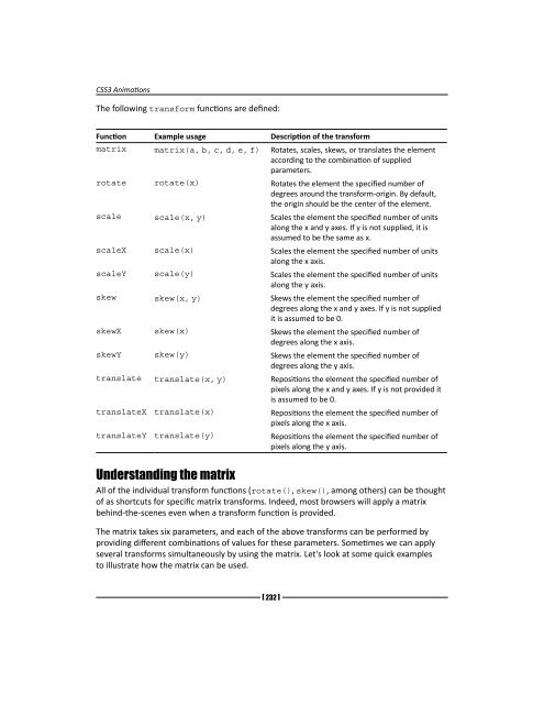
CSS3 Animations The following transform functions are defined: Function Example usage Description of the transform matrix matrix(a, b, c, d, e, f) Rotates, scales, skews, or translates the element according to the combination of supplied parameters. rotate rotate(x) Rotates the element the specified number of degrees around the transform-origin. By default, the origin should be the center of the element. scale scale(x, y) Scales the element the specified number of units along the x and y axes. If y is not supplied, it is assumed to be the same as x. scaleX scale(x) Scales the element the specified number of units along the x axis. scaleY scale(y) Scales the element the specified number of units along the y axis. skew skew(x, y) Skews the element the specified number of degrees along the x and y axes. If y is not supplied it is assumed to be 0. skewX skew(x) Skews the element the specified number of degrees along the x axis. skewY skew(y) Skews the element the specified number of degrees along the y axis. translate translate(x, y) Repositions the element the specified number of pixels along the x and y axes. If y is not provided it is assumed to be 0. translateX translate(x) Repositions the element the specified number of pixels along the x axis. translateY translate(y) Repositions the element the specified number of pixels along the y axis. Understanding the matrix All of the individual transform functions (rotate(), skew(), among others) can be thought of as shortcuts for specific matrix transforms. Indeed, most browsers will apply a matrix behind-the-scenes even when a transform function is provided. The matrix takes six parameters, and each of the above transforms can be performed by providing different combinations of values for these parameters. Sometimes we can apply several transforms simultaneously by using the matrix. Let's look at some quick examples to illustrate how the matrix can be used. [ 232 ]
- Page 201 and 202: Full Page Animations Can we animate
- Page 203 and 204: Full Page Animations display:block;
- Page 205 and 206: Download from Wow! eBook Full Page
- Page 207 and 208: Full Page Animations Have a go hero
- Page 209 and 210: Full Page Animations 4. Save this f
- Page 211 and 212: Full Page Animations 2. The bgpos c
- Page 213 and 214: Full Page Animations nav ul { margi
- Page 215 and 216: Full Page Animations screensize = {
- Page 217 and 218: Full Page Animations What just happ
- Page 219 and 220: Full Page Animations The second sec
- Page 221 and 222: Full Page Animations Pop quiz - cre
- Page 223 and 224: Full Page Animations Time for actio
- Page 225 and 226: Full Page Animations Next we define
- Page 228 and 229: 8 Other Popular Animations This cha
- Page 230 and 231: [ 209 ] Chapter 8 } .slider #scroll
- Page 232 and 233: }), pointerText = "Use your pointer
- Page 234 and 235: [ 213 ] Chapter 8 In the previous s
- Page 236 and 237: prox.mousemove(function(ev) { goAni
- Page 238 and 239: Pop quiz - implementing proximity a
- Page 240 and 241: [ 219 ] Chapter 8 What just happene
- Page 242 and 243: 2. Save the new page as marquee.htm
- Page 244 and 245: [ 223 ] Chapter 8 1. jQuery provide
- Page 246 and 247: clear:both; } div#fadeLeft, div#fad
- Page 248 and 249: Time for action - animating the pos
- Page 250: 2. In this example we used the dele
- Page 255 and 256: CSS3 Animations Units It is of crit
- Page 257 and 258: CSS3 Animations Skew Remember the t
- Page 259 and 260: CSS3 Animations Calculating the sin
- Page 261 and 262: CSS3 Animations The filter property
- Page 263 and 264: CSS3 Animations If, like me, you th
- Page 265 and 266: CSS3 Animations } el.filters.item("
- Page 267 and 268: CSS3 Animations An unfortunate prob
- Page 269 and 270: CSS3 Animations The context of this
- Page 271 and 272: CSS3 Animations Time for action - i
- Page 273 and 274: CSS3 Animations The first variable
- Page 275 and 276: CSS3 Animations Time for action - a
- Page 277 and 278: Download from Wow! eBook CSS3 Anim
- Page 279 and 280: CSS3 Animations We also have to upd
- Page 281 and 282: CSS3 Animations flatMatrix[3] = fla
- Page 283 and 284: CSS3 Animations When updating the s
- Page 285 and 286: CSS3 Animations translate translate
- Page 287 and 288: Canvas Animations Subjects that we'
- Page 289 and 290: Canvas Animations We can set the co
- Page 291 and 292: Download from Wow! eBook Canvas An
- Page 293 and 294: Canvas Animations All imageData obj
- Page 295 and 296: Canvas Animations context.beginPath
- Page 297 and 298: Canvas Animations For the next part
- Page 299 and 300: Canvas Animations Time for action -
CSS3 <strong>Animation</strong>s<br />
The following transform functions are defined:<br />
Function Example usage Description <strong>of</strong> the transform<br />
matrix matrix(a, b, c, d, e, f) Rotates, scales, skews, or translates the element<br />
according to the combination <strong>of</strong> supplied<br />
parameters.<br />
rotate rotate(x) Rotates the element the specified number <strong>of</strong><br />
degrees around the transform-origin. By default,<br />
the origin should be the center <strong>of</strong> the element.<br />
scale scale(x, y) Scales the element the specified number <strong>of</strong> units<br />
along the x and y axes. If y is not supplied, it is<br />
assumed to be the same as x.<br />
scaleX scale(x) Scales the element the specified number <strong>of</strong> units<br />
along the x axis.<br />
scaleY scale(y) Scales the element the specified number <strong>of</strong> units<br />
along the y axis.<br />
skew skew(x, y) Skews the element the specified number <strong>of</strong><br />
degrees along the x and y axes. If y is not supplied<br />
it is assumed to be 0.<br />
skewX skew(x) Skews the element the specified number <strong>of</strong><br />
degrees along the x axis.<br />
skewY skew(y) Skews the element the specified number <strong>of</strong><br />
degrees along the y axis.<br />
translate translate(x, y) Repositions the element the specified number <strong>of</strong><br />
pixels along the x and y axes. If y is not provided it<br />
is assumed to be 0.<br />
translateX translate(x) Repositions the element the specified number <strong>of</strong><br />
pixels along the x axis.<br />
translateY translate(y) Repositions the element the specified number <strong>of</strong><br />
pixels along the y axis.<br />
Understanding the matrix<br />
All <strong>of</strong> the individual transform functions (rotate(), skew(), among others) can be thought<br />
<strong>of</strong> as shortcuts for specific matrix transforms. Indeed, most browsers will apply a matrix<br />
behind-the-scenes even when a transform function is provided.<br />
The matrix takes six parameters, and each <strong>of</strong> the above transforms can be performed by<br />
providing different combinations <strong>of</strong> values for these parameters. Sometimes we can apply<br />
several transforms simultaneously by using the matrix. Let's look at some quick examples<br />
to illustrate how the matrix can be used.<br />
[ 232 ]


 Change language