Complete Proceedings - The Flag Institute
Complete Proceedings - The Flag Institute
Complete Proceedings - The Flag Institute

Create successful ePaper yourself
Turn your PDF publications into a flip-book with our unique Google optimized e-Paper software.
PROCEEDINGS<br />
1
PROCEEDINGS<br />
2<br />
First published in the United Kingdom by <strong>The</strong> <strong>Flag</strong><br />
<strong>Institute</strong> in 2009.<br />
Layout © 2009 <strong>The</strong> <strong>Flag</strong> <strong>Institute</strong><br />
Papers © 2001 Authors as named<br />
<strong>The</strong> authors have asserted their rights under the Copyright,<br />
Designs and Patent Act 1988 and the Berne Convention<br />
on Copyright to be identified as the authors of<br />
this work.<br />
All rights reserved. No part of this book may be reproduced,<br />
stored in a retrieval system or transmitted in any<br />
way or by any means, electronic, mechanical, photocopying,<br />
recording or otherwise without the prior written<br />
permission of the copyright holder.<br />
This book is sold subject to the condition that it shall<br />
not, by way of trade or otherwise, be lent, resold, hired<br />
out, or otherwise circulated without the publishers’ prior<br />
consent in any form of binding or cover other than that<br />
in which it is published and without a similar condition<br />
including this condition being imposed on the subsequent<br />
purchaser.<br />
Whilst every care has been taken in the preparation of<br />
this book, neither the publisher nor the authors assume<br />
any responsibility for errors or omissions, or for damages<br />
resulting from the use of the information contained herein.
Contents<br />
Foreword .......................................................................................................................5<br />
Revd John Hall FFI<br />
About the Congress ........................................................................................................7<br />
Michael Faul FFI<br />
Britannia’s Banners<br />
A Brief Outline of the Development of the Principal British Naval <strong>Flag</strong>s .......................... 11<br />
Bruce Nicolls FFIAV FFI<br />
Chart: “<strong>Flag</strong>s in Argentina” ...........................................................................................19<br />
Gus Tracchia FFIAV<br />
Royal Standards in Southern Africa ...............................................................................21<br />
Bruce Berry FFIAV<br />
<strong>Flag</strong>s in the Canton of Vaud 1798 - 1848 ......................................................................27<br />
Emil Dreyer FFIAV<br />
Past Attempts to Change New Zealand’s <strong>Flag</strong> ...............................................................47<br />
John Moody<br />
Small and Very Small States in Italy that Lasted Beyond 1700<br />
A Vexillological Survey ..................................................................................................51<br />
Roberto Breschi FFIAV<br />
Cornwall - <strong>The</strong> Mysteries of St Piran ..............................................................................57<br />
Phil Rendle<br />
Decorative Motifs Used on the Ottoman <strong>Flag</strong> Finials .....................................................61<br />
Jaroslav Martykán<br />
“One Nation Under God”<br />
<strong>The</strong> Crusade to Capture the American <strong>Flag</strong> ...................................................................67<br />
Whitney Smith PhD LFIAV FFIAV FFI<br />
Trip Around the World ..................................................................................................75<br />
Michel R. Lupant<br />
Maps on <strong>Flag</strong>s ..............................................................................................................89<br />
Mason Kaye<br />
New <strong>Flag</strong>s for an Ancient Country - Bannieloù nevez evit ur vro gozh ........................... 107<br />
Dr Philippe Rault<br />
<strong>Flag</strong>s in Wales ............................................................................................................ 127<br />
Robin Ashburner FFIAV FFI<br />
Symbols of Czech and Slovak Political Parties After the “Velvet Revolution” ..................133<br />
Aleš Brozˇek<br />
<strong>The</strong> International Brigades in the Spanish War 1936-1939: <strong>Flag</strong>s and Symbols ............. 141<br />
Sebastià Herreros i Agüí FFIAV<br />
3<br />
PROCEEDINGS
PROCEEDINGS<br />
4<br />
<strong>The</strong> Story of Scotland’s <strong>Flag</strong>s....................................................................................... 167<br />
Graham Bartram FFI<br />
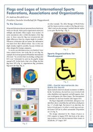
<strong>Flag</strong>s and Logos of International Sports Federations,<br />
Associations and Organizations .................................................................................. 173<br />
Dr Andreas Herzfeld FFIAV<br />
<strong>The</strong> Centennial of Ohio’s <strong>Flag</strong>: From Obscurity to Esteem ............................................ 181<br />
John M. Purcell FFIAV<br />
<strong>The</strong> Origins of the Mexican <strong>Flag</strong> .................................................................................185<br />
Teodoro Amerlinck y Zírion FFIAV<br />
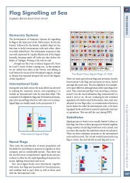
<strong>Flag</strong> Signalling at Sea .................................................................................................187<br />
Captain Barrie Kent FFIAV FFI RN<br />
A Century of Changing Colours on National <strong>Flag</strong>s ......................................................193<br />
Lorenzo Breschi<br />
Tudor <strong>Flag</strong>s ................................................................................................................195<br />
Professor David Loades PhD FRHS FSA<br />
Stamping a Nation’s Image<br />
Currency & Stamps - Australia’s Centenary of Federation ............................................199<br />
Ralph G.C. Bartlett FFIAV<br />
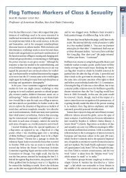
<strong>Flag</strong> Tattoos: Markers of Class & Sexuality ...................................................................205<br />
Scot M. Guenter LFIAV PhD<br />
Chivalry at the Poles: British Sledge <strong>Flag</strong>s ................................................................... 215<br />
Barbara Tomlinson<br />
Dutch Orange Regimental <strong>Flag</strong>s .................................................................................223<br />
Frans Smits<br />
<strong>The</strong> „Höhere Kommunalverbände” in Germany ..........................................................227<br />
Dieter Linder MA<br />
<strong>The</strong> <strong>Flag</strong>s of the Political Parties of Senegal .................................................................237<br />
Lucien Philippe FFIAV<br />
L’Album des pavillons .................................................................................................249<br />
Capt Armand du Payrat<br />
Group Photo of the Particpants ...................................................................................253
Dear Fellow Vexillologist,<br />
<strong>The</strong> Revd John Hall FFI<br />
Chairman<br />
It is with the greatest pleasure that the <strong>Flag</strong> <strong>Institute</strong> publishes the proceedings of<br />
the 19th International Congress of Vexillology, held in York, England in 2001.<br />
<strong>The</strong> event was a memorable time, to renew old friendships and make new ones, set<br />
as it was, in the beautiful surroundings of the Yorkshire Museum, deep in the heart<br />
of one of the United Kingdom’s most historic cities.<br />
<strong>The</strong> site and timing were important to us students of flags, situated merely yards<br />
away from the very site that Constantine was proclaimed Roman Emperor, we were<br />
reminded of the symbolic roots of the eagle and the cross in flags today, and in the<br />
200th Anniversary year of the creation of the modern Union Jack, we considered<br />
one of the most widespread, influential, and instantly recognized symbols in the<br />
world today.<br />
As you will see the quality of the presentations was superb, and goes a long way to<br />
the advancement and deepening of the study of vexillology as a serious geo-political<br />
topic.<br />
I would like to thank all those who were involved in the organization of the congress;<br />
all those who contributed or attended and it is with the greatest of delight that I<br />
commend the following publication to you:<br />
Yours in flags and friendship<br />
<strong>The</strong> Revd John Hall RD BA FFI<br />
Chairman<br />
<strong>The</strong> <strong>Flag</strong> <strong>Institute</strong><br />
<strong>The</strong> Vicarage n Colleswell Lane n Blakesley n Towcester NN12 8RB<br />
United Kingdom n Telephone: 01327 860507<br />
Website: www.flaginstitute.org n Email: chairman@flaginstitute.org<br />
5<br />
PROCEEDINGS
PROCEEDINGS<br />
6
On the evening of Sunday, 22 July, 2001, in the mediæval<br />
splendour of the restored 15th Century Guildhall in<br />
the ancient city of York, amid the flags of 28 countries<br />
and more vexillological associations, Councillor Irene<br />
Waudby, Lord Mayor of York, welcomed delegates to<br />
the XIX International Congress of Vexillology at a civic<br />
reception. <strong>The</strong> following morning, in the same impressive<br />
setting, the Vice Lord Lieutenant of North Yorkshire,<br />
Colonel Edward York, declared the XIX ICV open. He<br />
was introduced by Robin Ashburner, President of the <strong>Flag</strong><br />
<strong>Institute</strong>, who spoke of York’s historical significance and<br />
thanked those who had worked to prepare the Congress,<br />
both in York and elsewhere.<br />
After the opening ceremony the participants and<br />
accompanying persons paraded with their flags through<br />
the streets of York, led by Mr John Redpath, the Town<br />
Crier in full 18th Century costume, ringing his bell to<br />
attract attention of the citizens and, with his cry “Oyez,<br />
oyez!” telling of the reason for the parade and naming the<br />
countries taking part. This colourful spectacle attracted<br />
much interest from York residents and visitors. <strong>The</strong><br />
procession passed York Minster, and went on into the<br />
gardens of the Yorkshire Museum, where the Congress<br />
itself was to take place. Outside the Tempest Anderson<br />
Hall, the venue of the Congress proper, the flag of the XIX<br />
Congress was hoisted by João Lourenço of Zimbabwe,<br />
the youngest delegate present.<br />
A total of 106 delegates from 28 countries attended<br />
the Congress, many with accompanying spouses and<br />
other family members. Five countries, Croatia, Egypt,<br />
Israel, Japan and Zimbabwe were represented at an ICV<br />
for the first time. <strong>The</strong> flags of participating countries and<br />
associations were displayed around the conference hall.<br />
Congress began with a presentation on British naval<br />
flags by Cdr Bruce Nicolls. As the Congress was in Britain<br />
to commemorate the bicentenary of the Union <strong>Flag</strong>, each<br />
session was planned to begin with a British topic. 31<br />
presentations covered a wide range of subjects from all<br />
over the world, almost all of them brilliantly illustrated<br />
with computer-generated images, produced by Graham<br />
Bartram, General Secretary of the <strong>Flag</strong> <strong>Institute</strong>.<br />
Notable among presenters was 93-year-old Teodoro<br />
Amerlinck from Mexico on early Mexican flags, and<br />
teenage delegates Lorenzo Breschi on Analysis of <strong>Flag</strong><br />
Colours and Mason Kaye on Maps on <strong>Flag</strong>s. Lorenzo<br />
could not attend the Congress in person and his paper<br />
was delivered for him by Dr Peter Orenski.<br />
Other papers covered Tudor flags, flags of Argentina,<br />
political flags in the Czech Republic and Slovakia, Royal<br />
Standards of Southern Africa, attempts to change the flag<br />
of New Zealand, flags of Cornwall and the International<br />
Brigades in the Spanish Civil War, signalling flags, flag tattoos,<br />
Ottoman decorative finials, “One Nation under God”<br />
- an analysis of religious aspects of the US <strong>Flag</strong>, flags of the<br />
Canton of Vaud and of Italian states, Dutch military colours,<br />
100 years of flags in Ohio, British sledge flags of polar explorers,<br />
political flags in Senegal, flag stamps of Australia, flags<br />
of Scotland and Wales and porting <strong>Flag</strong>s. <strong>The</strong> last paper was<br />
an interesting and amusing coverage of <strong>Flag</strong>s in Comics, the<br />
Case of Asterix, the Gaul, by Dr Marcus Schmöger, in which<br />
York was shown on the map of England as a stronghold of<br />
vexillology in an otherwise vexi-ignorant wilderness.<br />
<strong>Flag</strong>s parade through York’s streets Over 100 vexillologists attended<br />
7<br />
PROCEEDINGS
PROCEEDINGS<br />
8<br />
During Congress, breaks for tea and coffee were held<br />
in the Hospitium, a 14th Century building, formerly the<br />
guesthouse of St Mary’s Abbey. In the same room was a<br />
display of some 20 British Royal Standards, adding glorious<br />
swathes of colour to the splendour of the building.<br />
<strong>The</strong>se included the actual Royal Standard and Standard<br />
of the Prince of Wales which flew at the opening of the<br />
first Welsh Assembly. Also in the room was a set of the<br />
newly-designed gonfalons of the city of Assisi, seen<br />
outside Italy for the first time, and historic military flags<br />
loaned by the Imperial War Museum.<br />
<strong>The</strong> main flag displays were in yet another historic<br />
building, the 14th Century Merchant Adventurers’ Hall,<br />
the largest timber-framed building in York, home to<br />
what was once the most powerful and wealthy trading<br />
company in the city.<br />
<strong>The</strong> Great Hall had a display of British and Britishderived<br />
flags and ensigns, especially to commemorate<br />
the bicentenary of the Union <strong>Flag</strong>. <strong>The</strong> nearly 100 flags<br />
in the display showed the influence of British design in<br />
naval, civil and civil air ensigns in former British territories<br />
throughout the world.<br />
<strong>The</strong> Undercroft had a more general display, with flags<br />
of Africa, Imperial Germany, Asia and Albania. Most of<br />
the flags were known to vexillologists from books and<br />
charts, but few of them had been seen in reality before.<br />
More unusual flags included German Imperial colonial<br />
designs, approved by Kaiser Wilhelm II in 1914, but<br />
not made at the time, due to World War I. Many of the<br />
flags displayed were from the collections of Bruce Berry<br />
of South Africa and Clay Moss of Mississippi, to whom<br />
the <strong>Flag</strong> <strong>Institute</strong> is greatly indebted for providing and<br />
displaying their flags.<br />
<strong>The</strong> social aspect of Congress included visits to the<br />
Minster Embroideries (not normally open to the public)<br />
for accompanying persons, and the Jorvik Viking Centre,<br />
a dramatic recreation of York over 1000 years ago, on the<br />
actual site and based on archaeological finds. <strong>The</strong>re was<br />
even a Viking Raven Banner!<br />
<strong>The</strong> all-day trip on Wednesday was to Hartlepool Historic<br />
Quay, 60 miles north-east of York. <strong>The</strong> Quay is an<br />
impressive recreation of 18th-19th Century marine life.<br />
Hartlepool has a fine reputation for restoring old ships. At<br />
the centre of the Quay was the frigate Trincomalee. This<br />
ship was built in India in 1817 and is now fully restored<br />
to her original condition.<br />
Accompanying persons also visited Lotherton Hall,<br />
a stately home with a deer park and bird garden. <strong>The</strong><br />
highlight was a picnic prepared by Ethel Faul, wife of<br />
Michael, principal Congress organizer, and two friends.<br />
At the FIAV General Assembly on Monday evening, the<br />
Vexillological Association of the State of Texas, the Japan<br />
Top-left clockwise: the Guildhall decked in flags for the Civic Reception; João Lourenço shows his<br />
flag to the Lord Mayor of York & her consort; Mrs & Col York, FIAV President Michel Lupant, FIAV<br />
Sec-Gen for Congresses Graham Bartram & FI President Robin Ashburner; the Town Crier
Vexillological Association, the Confederate States Vexillological<br />
Association, <strong>Flag</strong>s of the World, Vlaggendokumentatie<br />
Centrum Nederlands, Heraldic and Vexillological<br />
<strong>Institute</strong> (Poland) and the Moldovan Heraldic, Genealogical<br />
and Archivist Society were admitted to membership. <strong>The</strong><br />
officers of the FIAV executive were re-confirmed in their<br />
positions for a further two years, Professor Michel Lupant<br />
of Belgium as President, Mr Charles Adkin Spain of the<br />
United States as Secretary-General and Graham Bartram as<br />
Secretary-General for Congresses. Miraculously, the entire<br />
meeting was completed in one 3-hour session.<br />
<strong>The</strong> Congress ended with the final banquet in the York<br />
Moathouse Hotel, overlooking the River Ouse. This excellent<br />
dinner was the setting for the Congress awards. <strong>The</strong><br />
<strong>Flag</strong> <strong>Institute</strong> President thanked all who had contributed<br />
to the success of the Congress, particularly Michael Faul,<br />
editor of <strong>Flag</strong>master and Membership Secretary.<br />
Cdr Bruce Nicolls, past President of the <strong>Flag</strong> <strong>Institute</strong><br />
thanked Robin Ashburner for the leadership, drive and<br />
practical contribution (in flags and flagpoles) which he<br />
had made to the Congress. He paid tribute to the oldest<br />
and youngest contributors, and referred to the debt<br />
which all vexillologists owe to Dr Whitney Smith the<br />
“father” of modern vexillology.<br />
<strong>The</strong> Vexillon, for the greatest contribution to vexillology<br />
in the past two years, was awarded to Capt Armand<br />
du Payrat of the French Navy, for his work with the Album<br />
des Pavillons. <strong>The</strong> award for the best presentation at the<br />
Congress went to Dr Philippe Rault of Brittany for his<br />
paper on “New <strong>Flag</strong>s for an Old Country”, outlining the<br />
work of the Breton Vexillological Society in encouraging<br />
the design and use of flags in Brittany.<br />
FIAV recognized as Fellows of the Federation Teodoro<br />
Amerlinck y Zírion, Barrie Kent, Bruce Nicolls, Christian<br />
Fogd Pedersen, Lucien Philippe, Whitney Smith, Aldo Ziggioto<br />
and Alfred Znamierowski. Michael Faul was recognized<br />
as a Fellow of the <strong>Flag</strong> <strong>Institute</strong>. Ethel Faul received a<br />
bouquet for her work in assisting with Congress, presented<br />
by her grandson, João Lourenço. She and her assistants<br />
also received bouquets in appreciation of their work with<br />
the Accompanying Persons Programme.<br />
In closing the Congress, FIAV President Michel Lupant<br />
thanked the <strong>Flag</strong> <strong>Institute</strong> for organizing the XIX ICV and<br />
commented on the high quality of the presentations. After<br />
describing the event as an example of the universality of vexillology,<br />
he expressed the hope that we would all meet again<br />
in Stockholm for the XX International Congress in 2003. So<br />
ended a memorable and at times emotional evening.<br />
9<br />
PROCEEDINGS
PROCEEDINGS<br />
10<br />
Top-left clockwise: British flags in the Merchant Adventurers’ Hall (including ensigns from Sarawak,<br />
Bermuda and North Borneo); Breton flags in the Merchant Adventurers’ Hall (including those of Bigouden,<br />
Dinard and Le Juch); <strong>Flag</strong>s of the World (FOTW) attendees; silk kimonos at Lotherton Hall;<br />
Alfred Znamierowski receives his FIAV Fellowship from FIAV Secretary-General Charles ‘Kin’ Spain;<br />
Teodoro Amerlinck with his FIAV Fellowship; Michael Faul with his Fellowship of the <strong>Flag</strong> <strong>Institute</strong>;<br />
Royal Standards (courtesy of HM <strong>The</strong> Queen) in the Hospitium display (from left to right, Other<br />
Members Standard, Australia, Canada, New Zealand and the now obsolete Trinidad & Tobago)
Britannia’s Banners - A Brief Outline of the<br />
Development of the Principal British Naval <strong>Flag</strong>s<br />
Bruce Nicolls FFIAV FFI<br />
<strong>The</strong> Bayeux Tapestry, portraying the Norman invasion<br />
of England in 1066 and the events leading up to it,<br />
shows us that, at that time, flags flown in ships were<br />
of no particular significance. <strong>The</strong> important flags were<br />
those of the principal personalities in the event, notably<br />
that of Duke William himself, the banner presented to<br />
him by the Pope as a sign of his blessing upon William’s<br />
invasion of England.<br />
<strong>The</strong> Bayeux Tapestry<br />
<strong>The</strong> tapestry also shows us that there was a great need<br />
for a better means of identifying the leader, who in this<br />
case had to show his face to his troops to reassure them<br />
that he was still alive after a rumour went round that he<br />
had been killed.<br />
<strong>The</strong> Bayeux Tapestry<br />
It was in the Crusades that this need became critical, with<br />
kings, nobles and knights of several nationalities fighting<br />
together, and now in all encasing armour. Banners<br />
with bold, simple and distinctive devices were adopted,<br />
playing a major part in the development of what became<br />
known as heraldry.<br />
A Crusader<br />
In an era of increasing maritime activity, these banners<br />
also became the means of identifying ships. <strong>The</strong> three<br />
gold lions on a red field, adopted by the English king<br />
in 1198, became the banner of the king’s ships, and the<br />
red cross of St George, widely adopted by the Crusaders,<br />
became the colours of English ships generally.<br />
Seal Showing the England & Cinque Ports <strong>Flag</strong>s<br />
PROCEEDINGS<br />
11
PROCEEDINGS<br />
12<br />
<strong>The</strong> Three Lions of England<br />
<strong>The</strong> <strong>Flag</strong> of England<br />
Seals Showing Banners on Ships<br />
<strong>The</strong> next important early English maritime flag was that<br />
of the Cinque Ports, a group of five ports in south east<br />
England which, in return for certain privileges, undertook<br />
to provide the king with ships and men in time of<br />
war. It was created in the 13th century and combined the<br />
fore parts of the king’s lions and the after parts of three<br />
ships, in a somewhat unsatisfactory practice known in<br />
heraldry as dimidiation.<br />
In the 14th century, when the English king claimed<br />
the thrown of France, he followed the improved practice<br />
of quartering when combining the French fleurs-de-lis<br />
with the three lions, and when the fleurs-de-lis were<br />
reduced to three in 1405, the royal banner thus created<br />
lasted for nearly two centuries. For a while the English<br />
king did rule more of France than the French king, but<br />
Joan of Arc ended that situation.<br />
<strong>Flag</strong> of the Cinque Ports<br />
Royal Banner of 1405<br />
Towards the end of the 15th century, in what became<br />
known as the wars of the roses, there was conflict<br />
between the Houses of York and Lancaster, both claimants<br />
to the throne, and each supported by the private<br />
armies of powerful nobles. In 1485 Lancastrian Henry<br />
Tudor prevailed and became Henry VII. He married Elizabeth<br />
of York, and combined the Red rose of Lancaster<br />
with the White rose of York to create a new royal badge,<br />
the Tudor Rose.
This badge, and other royal badges, principally the<br />
portcullis of Henry’s mother’s family, and a single fleurde-lis,<br />
adorned the deck banners of ships in the King’s<br />
service in place of the banners of the nobles. Henry<br />
had banned their private armies. During this period<br />
enormous streamers flew from mastheads, bearing St<br />
George’s cross and, often, the green and white Tudor<br />
royal livery colours.<br />
Henry and his son, Henry VIII, between them built<br />
up a strong navy, in which the major new development<br />
was the advent of the heavy gun. Gradually, naval tactics<br />
evolved, and sea battles began at a much greater distance.<br />
<strong>The</strong>re was a need for big, bold simple flags to identify<br />
ships at this distance. In 1574, during Elizabeth I’s reign,<br />
a big, bold, simple, striped flag was introduced, the first<br />
naval ensign.<br />
A Tudor Warship<br />
This flag combined the cross of St George, in the canton,<br />
with stripes of green and white, the Tudor royal livery<br />
colours. Stripes of other colours were also used, and in<br />
some flags the St George’s cross was placed overall.<br />
A Tudor Ensign<br />
With Elizabeth’s death in 1603, James VI of Scotland was<br />
invited to become James I of England as well. His banner,<br />
combining the English and Scottish arms and the harp<br />
for Ireland continued in use in the King’s ships, but now<br />
only as the Lord High Admiral’s flag.<br />
<strong>The</strong> new king of Great Britain also decided that he<br />
should symbolise the union by combining the national<br />
flags, although the parliaments, and the peoples,<br />
remained distinctly separate. He apparently felt that he<br />
needed an excuse for doing this, and his Royal Proclamation<br />
in 1606 started with the words: “Whereas some<br />
difference has arisen between Our subjects of South<br />
and North Britain, travelling by sea, about the bearing of<br />
their flags...” James instructed his heralds to combine the<br />
crosses of St George and St Andrew in a flag which was<br />
ordered to be flown by all ships at the main masthead,<br />
with their own country’s flag at the fore. It was described<br />
simply as the “British flag”: the first recorded use of the<br />
term “Union <strong>Flag</strong>” was in 1625.<br />
<strong>The</strong> Lord High Admiral’s <strong>Flag</strong> of James VI & I<br />
<strong>The</strong> First Union <strong>Flag</strong><br />
An English Ship Flying Both <strong>Flag</strong>s<br />
PROCEEDINGS<br />
13
PROCEEDINGS<br />
14<br />
James was now in London, and it was the English heralds<br />
who designed the flag, quite naturally placing St George<br />
over St Andrew. Equally naturally, the Scottish shipmasters<br />
objected to this, and petitioned the King, offering<br />
alternative designs, but the King paid no attention. <strong>The</strong><br />
Scots rarely used the new flag, and on land adopted<br />
their own design.<br />
A Scottish Union <strong>Flag</strong> on Edinburgh Castle<br />
In the early years of the Stuart Kings striped ensigns<br />
remained popular, but in 1621 a plain red ensign was introduced.<br />
Although the crosses of St George and St Andrew<br />
had now been combined in the British flag, St George’s<br />
cross was still used in the canton of the ensign, probably<br />
because the navy was almost entirely English. White and<br />
blue ensigns followed in about 1633, and were used to<br />
distinguish the three squadrons into which the fleet was<br />
now divided. At this stage the white ensign was also a plain<br />
flag. Merchant ships began to adopt the red ensign, and<br />
this was authorised by Royal Proclamation in 1674.<br />
An Early Stuart Ensign<br />
<strong>The</strong> First Red Ensign<br />
<strong>The</strong> First Squadronal Ensigns<br />
Admirals of the three squadrons used plain flags of the<br />
appropriate colour, the Admiral himself at the main masthead,<br />
the Vice Admiral at the fore and the Rear Admiral at<br />
the mizzen. At first the order of seniority was red, blue,<br />
white, but the red, white, blue sequence was adopted<br />
in 1653. Private ships flew pennants of the appropriate<br />
colour at their main masthead, or a pennant of red, white<br />
and blue if they were on detached duty.<br />
A Dutch Ship and the Admiral of the Blue Squadron<br />
Various Pennants<br />
Late in the 16th century a new flag had been introduced<br />
for the use of the Lord High Admiral with a yellow anchor<br />
on a red field, a badge which had been in use for some<br />
time. After the Restoration of the Monarchy in 1660 it<br />
was more formally used to distinguish the Lord High<br />
Admiral when the King was afloat and flying the Royal<br />
Standard himself, especially after 1702 when the Royal<br />
Standard became the Sovereign’s personal banner. For
much of the time from this date the office of Lord High<br />
Admiral was vested in the Board of Admiralty until this<br />
body was dissolved in 1964 with the unification of the<br />
Ministry of Defence, and the Queen became the Lord<br />
High Admiral.<br />
<strong>The</strong> Lord High Admiral’s <strong>Flag</strong><br />
HMY Britannia Flying the Lord High Admiral’s <strong>Flag</strong><br />
<strong>The</strong> Union <strong>Flag</strong> had been in use for nearly thirty years<br />
when, in 1634, a new Royal Proclamation confined its<br />
use to the King’s ships, and instructed merchant ships<br />
to revert to flying just their own country’s flag. This was<br />
partly because they were masquerading as warships and<br />
evading harbour and pilotage dues, but also because<br />
foreign ships were failing to salute British warships in<br />
the “English” channel on the excuse that they were indistinguishable<br />
from merchant ships. In fact, it was because<br />
James II had allowed the navy to become weak, and it<br />
no longer commanded respect.<br />
<strong>The</strong> First Union <strong>Flag</strong><br />
At about the same time it became the practice in warships<br />
to fly a smaller version of the Union <strong>Flag</strong> at the<br />
small mast on the bowsprit instead of a large flag at the<br />
main masthead. At that time the word ‘jack’ was used<br />
as a diminutive, and this smaller flag was described as:<br />
“the King’s Jack” or “His Majesty’s Jack”. <strong>The</strong> name ‘jack’<br />
became associated with a small flag in the bows of a ship,<br />
and the term “Union Jack”, which came into use later,<br />
became the name by which the Union <strong>Flag</strong> was and is<br />
generally known.<br />
A Jack on a Jack Staff<br />
Another Example of a Jack<br />
When Queen Anne came to the throne in 1702, use of<br />
the royal standard as an Admiral’s flag ceased, although,<br />
probably by omission, it remained in use as the signal<br />
for calling a council of flag officers for nearly another<br />
century. Also in that year, a very wide red cross was<br />
added to the plain white ensign to distinguish it from<br />
the white ensign recently introduced in the French navy.<br />
At the same time, a red cross was added to the hitherto<br />
plain white Admirals’ flag.<br />
PROCEEDINGS<br />
15
PROCEEDINGS<br />
16<br />
<strong>The</strong> 1702 White Ensign<br />
<strong>The</strong> 1702 White Admiral’s <strong>Flag</strong><br />
In 1707 an Act of Union combined the English and Scottish<br />
parliaments, and the Union flag replaced St George’s<br />
cross in the cantons of the ensigns. <strong>The</strong> width of the large<br />
red cross in the white ensign was reduced to provide<br />
more room for the Union flag.<br />
<strong>The</strong> 1707 Red Ensign<br />
After this change the principal naval flags remained the<br />
same until 1801, when the red diagonal St Patrick’s cross<br />
was added to the Union flag following the abolition of<br />
the Irish Parliament and the imposition of direct rule<br />
from London.<br />
<strong>The</strong> 1801 Union <strong>Flag</strong><br />
At about this time it became the practice for warships to<br />
hoist the Union Jack as the signal for a pilot. Merchant<br />
ships began to follow this practice and, as they were forbidden<br />
by Royal Proclamation from flying the Union Jack,<br />
the Admiralty became concerned. Following discussions<br />
with the shipping industry, and with a Captain Marryat,<br />
who had introduced a ‘Code of Signals for the Merchant<br />
Service’ in 1817, a new ‘Signal Jack’ was introduced in<br />
1823 as the signal for a pilot. This was a Union Jack with<br />
a white border, one fifth of the breadth of the Union Jack,<br />
which was strictly for use only as the signal for a pilot,<br />
and certain other signals, and a fine of up to £20 was<br />
later introduced for improper use of this flag.<br />
<strong>The</strong> Pilot or Civil Jack<br />
Despite these strict instructions, and encouraged by<br />
ambiguous wording in the flag regulations of subsequent<br />
Merchant Shipping Acts, the Signal Jack was widely<br />
adopted by merchant ships as a ‘jack’ in the bows of the<br />
ship. Now, it is no longer used as the signal for a pilot,<br />
and has been authorised for use as the civil jack.<br />
In 1864 the Admiralty decided that the system of<br />
squadron colours was outdated, inconvenient and expensive,<br />
and that it had become a ‘matter of importance’<br />
to distinguish warships from merchant ships, and also<br />
desirable to distinguish merchant ships in public service.<br />
<strong>The</strong>y therefore allocated the red ensign, already used by<br />
merchant ships, to their exclusive use, the white ensign<br />
to the Royal Navy, and the blue ensign to ships in public<br />
service, usually with their badge in the fly.
<strong>The</strong> Merchant or Civil Ensign<br />
Exceptionally, the Royal Yacht Squadron was permitted<br />
the privilege of continuing to use the white ensign, and<br />
some other yacht clubs were granted the right to display<br />
the blue ensign, or the red ensign with a badge in the fly.<br />
<strong>The</strong> blue ensign was also authorised for use by Royal Naval<br />
Reserve officers in command of merchant ships which also<br />
met certain other conditions. It should be noted that the<br />
blue ensign is not the ensign of the Royal Naval Reserve as<br />
such, as is stated in many flag books. RNR ships are ships<br />
of the Royal Navy, and wear the white ensign.<br />
<strong>The</strong> White Ensign on HMS Victory<br />
<strong>The</strong> Blue Ensign of the MoD Police<br />
With the reduction to the the white ensign alone for<br />
the Royal Navy, the white Admiral’s flag, now with St<br />
George’s cross throughout, became the one Admiral’s<br />
flag. Towards the end of the century the change from sail<br />
to steam brought the two masted battleship, and it was no<br />
longer possible to use the masts to distinguish the three<br />
ranks of Admiral. <strong>The</strong>se two developments brought into<br />
being the present Admirals’ flags. For centuries, vice and<br />
rear admirals afloat in small boats had been distinguished<br />
by the addition of one or two balls to their flags, and this<br />
practice was adopted for ships.<br />
<strong>The</strong> Admiral’s <strong>Flag</strong><br />
<strong>The</strong> Old Small Boats Rear Admiral’s <strong>Flag</strong><br />
<strong>The</strong> <strong>Flag</strong> of a Rear Admiral<br />
Finally, as a footnote, or should it be a headnote, the masthead<br />
pennant, once the main distinguishing flag for a warship,<br />
has become a barely visible little strip of material with a<br />
minute St George’s cross, flown continuously while the ship<br />
is in commission. <strong>The</strong> only occasion on which a pennant<br />
worthy of comparison with the splendid Tudor streamer is<br />
flown is when a ship pays off, as I am doing now.<br />
PROCEEDINGS<br />
17
PROCEEDINGS<br />
18
Chart: “<strong>Flag</strong>s in Argentina”<br />
Gus Tracchia FFIAV<br />
<strong>Flag</strong>s in Argentina could also be called <strong>Flag</strong>s of Argentina<br />
and both titles could be used very nicely since the flags<br />
in Argentina were also flags of Argentina. All belong to<br />
the Argentine-Hispanic-American patrimony.<br />
This type of work will never be finished since many other<br />
flags could have been included, and many other presently<br />
illustrated flags will experience changes. Furthermore, after<br />
the completion of this work, I am sure that many other<br />
new provincial flags are bound to be introduced.<br />
Any reader will agree that historical studies of any kind<br />
are not necessarily a look at the past but the means to take<br />
advantage of past experiences to improve the future. <strong>The</strong><br />
spirit of this work is to rescue the past using flags as the<br />
medium, and by that, enabling new generations to understand<br />
this from a different and visual perspective.<br />
Michael Faul, suggested that the work be divided in<br />
three parts: Hispanic period, Independence and revolutionary<br />
period, and provincial and cities flags as the<br />
third period.<br />
I will comment on the second period because during<br />
a long interval, the idea of an Argentine nation was very<br />
much in doubt. Furthermore, for those that clearly had<br />
a vision of an Argentine nation, the form this nation<br />
will take as a legally constituted state, was very much<br />
under discussion. For that reason, you will find some<br />
flags described as the flag of the United Provinces of the<br />
River Plate, or the flag of the United Provinces of South<br />
America, and sometimes the word “of” is substituted by<br />
the word “in” South America. <strong>The</strong> flag adopted in 1816<br />
was at that time a transitional flag. It was known as “the<br />
lesser flag,” which serve as the “greater flag” until legal<br />
constituted authorities decide on a permanent one. You<br />
will read words which are evidence of the process of<br />
the formation of a modern state. Words like: “<strong>The</strong> Head<br />
of the Government,”which was not the president. “<strong>The</strong><br />
Assembly,” and “<strong>The</strong> Congress,” which were two separate<br />
bodies and sometimes competed with the authority of<br />
the Head of the Government. “<strong>The</strong> authorities seated in<br />
Buenos Aires,” which is not the same as “<strong>The</strong> Government<br />
of Buenos Aires,” or “<strong>The</strong> President of the Nation.” whom<br />
not always resided in Buenos Aires.<br />
Belgrano hoisted a flag of national character in 1812.<br />
However, still doubtful as to what function that flag<br />
played. Was it an “Argentine,” flag? Did the flag represent<br />
a constituted form of government, a state, a nation, or<br />
just an ideal. (<strong>The</strong> term Argentina begun legally and<br />
officially in 1826.)<br />
Belgrano’s intentions seem to indicate the desire of<br />
having a flag of permanent character with an agenda of<br />
becoming the flag of a State. On the other hand, the statehood<br />
aspired by Belgrano and his flag did not spell out<br />
the required control of a populated territory and sovereignty.<br />
It seems that this flag of “national” character was<br />
supposed to be the flag for <strong>The</strong> United Provinces of the<br />
River Plate, which included present Argentina, Bolivia,<br />
Paraguay and Uruguay. <strong>The</strong> Government was appalled by<br />
the idea of a “national flag,” but at the same time tolerated<br />
the display of the color blue and white not as a national<br />
flag of permanent character but as a party/ideological flag<br />
of temporary character and function. Furthermore, the<br />
Government had neither political or military control over<br />
the whole of the territory and population it proclaimed<br />
to preside and represent.<br />
<strong>The</strong> teaching of history in Argentina is vertical and<br />
monolithic perhaps as a result of being a young nation<br />
with a past of civil war and unrest. Argentine children are<br />
taught one official history, of one father of the country,<br />
and one creator of the flag. <strong>The</strong>refore, for Argentines,<br />
the idea of many flags as part of their patrimony is new<br />
, somehow foreign, and resisted by some. Works of this<br />
kind are trying to achieve in the conscience of the people<br />
the idea of belonging to a greater culture whose understanding<br />
is of the utmost importance for the future of any<br />
nation. Knowledge of this heritage will produce cultural<br />
dialogue enabling the explanation of misunderstandings<br />
which kept people apart from each other.<br />
Two types of sources have been used to complete this<br />
work; Direct Source- a) visiting museums and collections<br />
where the actual flags can be seen, as well as contemporary<br />
drawings or paintings. b) Using coins, medals,<br />
and uniforms. <strong>The</strong> second source of information are<br />
documents which we could sub-divide in official documents<br />
and publications, and work published by private<br />
individuals. <strong>The</strong> bibliography consulted is of public<br />
domain; however, the author has researched public and<br />
private archives from vexillologists of Argentina, Spain,<br />
France and the United States. Much of the information<br />
provided in this work are from previous essays by this<br />
author given in International Congresses of vexillology,<br />
or in vexillological publications. Some of these works<br />
are: “Provincial Arms of Argentina,” “Federal <strong>Flag</strong>s,”<br />
“<strong>The</strong> <strong>Flag</strong> of the Argentine Confederation,” “<strong>The</strong> <strong>Flag</strong> of<br />
the Andes.” <strong>The</strong> corresponding bibliography is noted on<br />
each of these works.<br />
PROCEEDINGS<br />
19
PROCEEDINGS<br />
20<br />
For better understanding we have used Italics indicating<br />
actual quotes from official documents, names and<br />
titles of protagonists, and descriptions of flags.<br />
Few works of this kind are written alone. You must<br />
often rely on the assistance of many individuals. In this<br />
particular case the assistance giving generously by individual<br />
and institutions I received from <strong>The</strong> Museum of<br />
National History of Buenos Aires, <strong>The</strong> Argentine Association<br />
of Vexillology, headed by Alberto R. Perazzo, and <strong>The</strong><br />
Interdisciplinary Center of Cultural Studies, whose director<br />
is Professor Anibal Gotelli. <strong>The</strong> grateful assistance and constant<br />
contributions provided by Captain Mario F. Penzotti,<br />
must be acknowledged. To Dr. Carlos Fernandez y Espeso<br />
and Dr. Jose Luis Brugues y Alonso, from the Sociedad<br />
Española de Vexilologia, I thank both for their clarification<br />
on historical aspects and scholarly contributions.<br />
In technical matters, coaching outside the ringside, Dr.<br />
Whitney Smith of the <strong>Flag</strong> Research Center past experiences<br />
in this type of work was considered invaluable by<br />
the author. My thanks to Professor Maria I. Decandido<br />
of the Universidad Nacional de Cuyo, for the historical<br />
guidance provided, clarifying and or confirming many<br />
political Argentine events connected to flags.<br />
One last person remains to be acknowledged; Dr.<br />
Peter Orenski of TME Corp., whose professionalism in<br />
the artwork is commendable. Dr. Orenski’s understanding<br />
of the importance of accuracy in details, color shades<br />
and proportions, pleased this author’s perception of how<br />
to achieve a job well done.<br />
Without his knowledge and experience this work<br />
would have lacked the required professional standing.<br />
Finally, I would like to record my gratitude to the staff<br />
of libraries and curators of museums whom, without<br />
exception, I have found very helpful and a pleasure to<br />
deal with. To these men and women that store books and<br />
documents, preserve flags and uniforms, and make all<br />
these artifacts and documents available for us to enjoy,<br />
learn and disseminate, we are all in debt.
Royal Standards in Southern Africa<br />
Bruce Berry FFIAV<br />
Secretary-General Emeritus of FIAV<br />
<strong>The</strong> use of royal standards in Southern Africa is not<br />
widespread despite the predominance of monopolistic<br />
hereditary chieftainships on the sub-continent. A tradition<br />
of royal flags and banners did emerge in the Kingdom<br />
of Madagascar and since independence in Lesotho<br />
and Swaziland. A more recent development has been the<br />
adoption of a personal royal standard and a flag by certain<br />
ethnic groups in South Africa. <strong>The</strong> use of such flags is now<br />
more widespread in the region than ever before.<br />
<strong>The</strong> first indigenous royal standards in Southern<br />
Africa, in the commonly accepted meaning as being those<br />
flags or banners symbolising the presence or authority of<br />
a monarch, 1 were those used by the monarchs during the<br />
Kingdom of Madagascar in the late 19th century. Prior<br />
to this there is evidence that a flag had been used by the<br />
Kongo Empire during the 17 th century, 2 but this was to<br />
represent the “empire” as a whole and was not solely<br />
for the use of the monarch. Red flags were also used by<br />
the Sultan of Oman on Zanzibar from the 18 th century.<br />
In the Kingdom of Madagasacar, however, the situation<br />
seems to have been different. <strong>The</strong> Hova dynsasty<br />
first ruled on Madagascar in the 15 th century and by the<br />
19 th century their influence extended to two-thirds of<br />
the island. According to Les Drapeaux de Madagascar 3<br />
Queen Ranavalona I, who occupied the throne from<br />
1828 to 1861, used a white flag with her name in red<br />
and the word “manjaka” (for Queen) below. A more<br />
precise description of the use of a royal standard is given<br />
when King Radama II and his Queen ascended to the<br />
throne in an impressive ceremony in Antananarivo on 23<br />
September 1862. In a description of the ceremony, the<br />
Illustrated London News (repeated in Ifulegi) said, “<strong>The</strong><br />
road ... was lined with soldiers in red coatees, shakos &c.<br />
presenting arms. <strong>The</strong> line was marked by poles at every<br />
ten yards with banners, white ground and red border,<br />
with Radama II, and a star”. <strong>The</strong> photograph accompanying<br />
the description of the coronation shows a number of<br />
swallow-tailed vertical banners is shown as Fig. 1. 4 From<br />
the description and the photograph, the banner has been<br />
reconstructed as shown in Fig. 2.<br />
<strong>The</strong> royal flags were red and white banners bearing<br />
the cipher of the monarch and sometimes even their<br />
full names, and were accompanied by a crown and<br />
occasionally a star. In the later years of the kingdom red<br />
began to occupy a portion of the white field as seen in<br />
the flag of Queen Ranavalona II. Queen Ranavalona II<br />
succeeded King Radama II, who was assassinated after<br />
having been only two years on the throne. Several flags<br />
are also quoted as being used during the reign of Queen<br />
Ranavalona II (1863 - 1883) and again they are white with<br />
the name of the monarch in red, edged in black. Queen<br />
Ranavalona III (1883 – 1897) used a flag of diagonally<br />
white over red with her royal cipher (crown over RM)<br />
over all. <strong>The</strong> flag was illustrated on a German cigarette<br />
card in reverse as is shown here in Fig. 3. 5 Red and white<br />
were the royal colours and seem to have been used in<br />
the royal flags of Madagascar since at least the reign of<br />
Queen Ranavalona I. Lucien Philippe refers to a history<br />
of Madagascar by H. Deschamps which states that the<br />
colours are derived from the Sakalave Ménabé, two<br />
princely families who occupied parts of the island. Red<br />
is for the Volamena Prince and white for the Volafotsi<br />
Prince. Philippe finds it strange that these colours should<br />
be united on the Hova royal flags. He offers another<br />
hypothesis, that the red and white refers instead to the<br />
Indonesian origin of the Hovas. 6<br />
<strong>The</strong> Hova royal standard appeared in three forms, namely<br />
in an elongated banner form of the type shown in Fig. 1,<br />
a triangular form as shown in Figs. 2 and 3, as well as in<br />
a rectangular version. In the latter, the flags were divided<br />
diagonally red over white with the letters RM, for Ranavalona-Manjaka,<br />
embroidered in the center under a crown.<br />
1. Royal Banners at the coronation of King<br />
Radama II<br />
Although most references seem to confirm the description<br />
of Queen Ranavalona III’s flag, there has been at least<br />
one dissenting view. Karl Fachinger, responding to a<br />
description of the flag similar to that given above in D.<br />
Ruhl’s Die <strong>Flag</strong>ge des Kriegs und Handelsmarinen, says<br />
this is incorrect, and in fact, the royal standard was the<br />
French tricolore with a golden crown in the white stripe<br />
and the letters RM below. 7<br />
PROCEEDINGS<br />
21
PROCEEDINGS<br />
22<br />
2. Banner of King Radama II<br />
3. Royal Standard of Queen Ranavalona III<br />
<strong>The</strong> New Treaties with Britain (1865) and with France<br />
(1868) recognised the Queen of Madagascar but provided<br />
economic concessions to Europeans trading on<br />
the island. However, France claimed territories in the<br />
north west and “to enforce their claims in June 1862, the<br />
French removed the Queen’s flags from the north-western<br />
territories … a clear denial of Malagasy sovereignty<br />
in that region”. 8 Following a later agreement with Britain<br />
whereby the latter agreed to recognise a French protectorate<br />
of Madagascar in return for French recognition<br />
of a British protectorate over Zanzibar, French forces<br />
landed on the island in May 1895 resulting in the island<br />
becoming a colony annexed to the French Empire. <strong>The</strong><br />
monarchy was overthrown and Queen Ranavalona III<br />
was later exiled to Réunion.<br />
In the period between the overthrow of the monarchy<br />
in Madagascar and the second half of the 20 th century there<br />
appears that there were no indigenous royal standards being<br />
flown in Southern Africa. <strong>The</strong> entire sub-continent was<br />
under colonial rule and local royal standards only started to<br />
reappear with the granting of independence to Lesotho and<br />
Swaziland, each becoming a constitutional monarchy.<br />
Prior to independence in October 1966, Lesotho<br />
was the British Protectorate of Basutoland. <strong>The</strong> local<br />
Basotho inhabitants had resisted successive attacks by<br />
invading Zulus in the 18 th century and emigrant Boers<br />
during the first half of the 19 th century with Paramount<br />
Chief Moshoeshoe I eventually asking Queen Victoria for<br />
British protection “under the great folds of her flag”. On<br />
12 March 1868 the British High Commissioner in South<br />
Africa issued a proclamation declaring the Basotho to be<br />
British subjects and their territory to be British territory.<br />
Despite the brief annexation to the Cape Colony between<br />
1871 and 1883, Basutoland remained under direct British<br />
rule until internal self-government was achieved following<br />
the first general election held on 29 April 1965.<br />
Independence followed on 4 October 1966 when the<br />
country became the Kingdom of Lesotho. Under the<br />
independence constitution, the Paramount Chief (since<br />
1960) became King Moshoeshoe II of Lesotho and a new<br />
national flag and royal standard were adopted.<br />
<strong>The</strong> royal flag (Fig. 4) was based on the new national<br />
flag and is somewhat ambiguously described in the<br />
Gazette Extraordinary (No. 3548, effective 4 October<br />
1966) which led the standard to be incorrectly illustrated<br />
in Smith’s <strong>Flag</strong>s through the Ages and across the World<br />
(1975). In this illustration the national arms are placed<br />
directly against the Basuto hat symbol as shown in Fig. 4. 9<br />
A correct illustration is given in <strong>Flag</strong>s and Arms across the<br />
World (1980) where the national arms are placed below<br />
the Basuto hat in the centre of the blue field (Fig. 5). 10<br />
Following the seizure of power in a coup by troops of<br />
the Lesotho paramilitary force on 19 January 1986, the<br />
new ruling Military Council called for suggestions from<br />
the public for a new national flag. <strong>The</strong> previous national<br />
flag was considered objectionable to many because of its<br />
close association with the ousted prime minister, Chief<br />
Leabua Jonathan, and his Basutoland National Party,<br />
which had ruled the country since independence and<br />
whose colours of horizontal blue, white, green and red<br />
had obviously influenced the design of the country’s<br />
national flag. On the first anniversary of the military coup,<br />
a new national flag was adopted in Lesotho. A new royal<br />
flag was also adopted (Fig. 6) and continued in the tradition<br />
of being a modified version of the national flag. This<br />
flag is described in the Second Schedule of the Emblems<br />
and Public Seal Order (Order No. 2 of 1987) as being:<br />
4. Incorrect illustration of the first Lesotho<br />
Royal Standard
5. Royal Standard Lesotho (1966–87)<br />
“A rectangular tricolour proportion three by two (3 x<br />
2), per bend reversed, white, blue and green, the white<br />
occupying half the surface area of the flag and charged,<br />
with the center line, one quarter (¼) of the distance<br />
from the hoist with the coat of arms of the Kingdom of<br />
Lesotho proper; the blue and green each occupying the<br />
remaining surface of the flag.” 11<br />
6. Royal Standard of Lesotho (1987- )<br />
Unlike the official description of the first royal standard<br />
where no illustration was provided, the new royal standard<br />
is illustrated in this Order. <strong>The</strong> Order also provides an<br />
heraldic description and illustration of the Lesotho Arms<br />
in Schedule 1. <strong>The</strong> Order also specifies that any person,<br />
without the authority of the King of Lesotho, who uses<br />
the royal standard in any manner except for the purposes<br />
for which it is intended, is committing an offence and will<br />
be subject to a fine or imprisonment, or both.<br />
<strong>The</strong>re was no change to the royal standard following<br />
the death of King Moshoeshoe II in January 1996 and<br />
the new monarch, King Letsie III, continues to use the<br />
royal flag adopted in 1987.<br />
In common with Lesotho, Swaziland was also a British<br />
Protectorate prior to attaining its independence on 6<br />
September 1968. Swaziland’s political history is unique<br />
in that its original political structures remained intact<br />
throughout colonial period and continue to play a pivotal<br />
role in the modern state. <strong>The</strong> Swazi nation formed in the<br />
late 15 th century but it was not until the late 18 th century<br />
that it migrated to the area it occupies today. It was in the<br />
19 th century that a coherent nation state emerged under<br />
King Sobhuza I. Swaziland became a British High Commission<br />
Territory in 1902 and King Sobhuza II ascended<br />
to the throne in 1921. Swaziland became independent<br />
as a constitutional monarchy under King Sobhuza II on<br />
06 September 1968.<br />
As in the case of Lesotho, a new national flag and royal<br />
standard were formally adopted by the Kingdom at independence.<br />
<strong>The</strong> national flag is based on the flag granted<br />
by King Sobhuza in 1941 to the Emasotsha Regiment of<br />
the Swazi Pioneer Corps which had fought on behalf of<br />
the Allies during World War II. Again, in common with<br />
the situation in Lesotho, the royal standard was derived<br />
from the national flag and was designed by King Sobhuza<br />
himself. <strong>The</strong> royal standard was the same as the<br />
national flag with the addition of a gold lion centred on<br />
the upper blue stripe. (Fig. 7). <strong>The</strong> lion, the symbol of<br />
the king, is oriented towards the fly and can heraldically<br />
be described as passant contourné. <strong>The</strong> lion has three<br />
paws on the ground and one raised (statant) and is yellow<br />
with a black eye, claws and outlines, and a red tongue.<br />
<strong>The</strong> lion (Ingwenyama) is the symbol of Swazi kingship<br />
and also appears in both the national and royal coats of<br />
arms. <strong>The</strong> King himself can also be called Ingwenyama.<br />
<strong>The</strong> tassels on the spears and shield of both the national<br />
flag and royal standard are called tinjobo and are made<br />
from the lisakabuli (widow bird) and ligwalagwala<br />
(lourie) birds. <strong>The</strong>se tinjobo are only used by the King.<br />
12 <strong>The</strong> royal standard flew publicly for the first time on<br />
5 September 1968 at the Somhlolo National Stadium at<br />
Lobamba during independence celebrations. 13<br />
7. Royal Standard of King Sobhuza II (1968–1982)<br />
King Sobhuza’s death on 21 August 1982 precipitated<br />
a prolonged power struggle within the royal family. Initially<br />
the Queen Mother, Queen Regent Dzeliwe, assumed<br />
the regency and appointed 15 members to the Liqoqo,<br />
a traditional advisory body which Sobhuza had sought<br />
to establish as the Supreme Council of State. However,<br />
due to confusion over the status of the Liqoqo, a power<br />
struggle ensued between the Prime Minister, who sought<br />
to assert the authority of the Cabinet over the Liqoqo,<br />
and members of the Liqoqo. <strong>The</strong> Queen Regent was<br />
pressurised by the Liqoqo to dismiss the Prime Minister<br />
and replace him with a Liqoqo supporter. Subsequently a<br />
power struggle revolved around Queen Dzeliwe until she<br />
was placed under house arrest by the Liqoqo in October<br />
1983. <strong>The</strong> Liqoqo subsequently installed Queen Ntombi<br />
Laftwala, mother of the 14 year old heir apparent, Prince<br />
Makhosetive, as queen regent in late October, and she<br />
PROCEEDINGS<br />
23
PROCEEDINGS<br />
24<br />
accepted the Liqoqo as the supreme body in Swaziland.<br />
Prince Makhosetive was subsequently crowned King<br />
Mswati III on 25 April 1986.<br />
8. Royal Standard of King Mswati III (1986- )<br />
A new royal standard for King Mswati III replaced that<br />
used by King Sobhuza II (Fig. 8). <strong>The</strong> design follows<br />
the same basic pattern of the previous royal standard<br />
and national flag. <strong>The</strong> lion symbol of King Sobhuza has<br />
been replaced with another lion, which is now the most<br />
prominent feature on the flag. This lion is now orientated<br />
to the hoist but faces the observer (statant guardant) on<br />
the central maroon stripe. Small Emasotsha Regiment<br />
shields, of the same type found on the national flag, are<br />
found in the upper hoist and lower fly corners of the<br />
flag and traditional Swazi spears are placed in the upper<br />
fly and lower hoist corners. <strong>The</strong> traditional ceremonial<br />
head-dress of the monarch (Inyoni) is placed in the<br />
centre of the upper blue stripe. <strong>The</strong> royal cipher (M III<br />
R) is found in the centre of the lower blue stripe. <strong>The</strong><br />
new royal standard thus contains many more symbols<br />
relating to the monarchy and is easier to distinguish<br />
from the national flag than the previous standard used<br />
by King Sobhuza.<br />
<strong>The</strong> situation in South Africa is different in that as an<br />
independent republic, the head of state is the President.<br />
However, within the country there are a number of ethnic<br />
groups falling under various political systems. Probably<br />
the most famous of these are the Zulus who were welded<br />
into a centralised militarist kingdom by Chief Shaka<br />
during the early 19 th century and who retained some<br />
degree of local autonomy despite the other political<br />
developments in South Africa as a whole. During the<br />
apartheid era, KwaZulu was the designated area for<br />
the Zulus and during the negotiations leading to the<br />
first democratic constitution of South Africa in the early<br />
1990s, the role and status of the Zulu monarchy was an<br />
important issue. <strong>The</strong> new Constitution of South Africa<br />
recognises “the institution, status and role of traditional<br />
leadership, according to customary law …”. 14 Accordingly<br />
the Zulu monarch has adopted a higher profile in<br />
recent years although the province of KwaZulu-Natal has<br />
yet to formalise the role of the Zulu monarch with the<br />
adoption of its own provincial constitution.<br />
Nevertheless, a personal flag for the current Zulu<br />
monarch, King Goodwill Zwelithini Kabhekuzulu, was<br />
unveiled on 21 December 1999. <strong>The</strong> flag, the first for a<br />
Zulu monarch (Fig.9), comprises seven horizontal stripes<br />
of black, yellow, red, green, white, blue, and maroon<br />
with the royal arms in the centre. <strong>The</strong> colours symbolise<br />
social development factors with black representing the<br />
soil, yellow wealth, red defence, green vegetation, white<br />
purity and peace, blue religion and maroon royalty.<br />
<strong>The</strong> blazon of the Royal Arms is described as:<br />
Arms: Argent, in pale the sceptre of the King between<br />
four huts, over all in base a representation of the Royal<br />
Hut, proper.<br />
Supporters: On a ground sable, two lions Or, armed<br />
Argent and langued sable.<br />
Motto: Ilembe Leqa Amanye Ngoku Khalipha<br />
(Together we shall surmount – is an allusion to the<br />
motto on the former South African arms, Unity is<br />
Strength).<br />
<strong>The</strong>se arms were registered with the South African<br />
Bureau of Heraldry under Certificate number 757 issued<br />
on 02 June 1975. <strong>The</strong> arms were registered without the<br />
Royal Crown that is now placed above the Arms on the<br />
flag. 15<br />
<strong>The</strong> silver (white) shield is derived from the colour of<br />
ox-hide of the royal herd and the sceptre or “Inhlendla”<br />
is the symbol of the King’s authority. <strong>The</strong> Royal Hut never<br />
stands alone and the King is the “Lion of the Zulu”, hence<br />
the choice of supporters.<br />
<strong>The</strong> new royal flag is flown at all royal households, on<br />
all official royal vehicles and on other buildings conducting<br />
royal business.<br />
8. Royal <strong>Flag</strong> of King Goodwill Zwelithini (1999-)<br />
Although the flag for King Goodwill Zwelithini is the only<br />
royal standard within South Africa, another ethnic group<br />
within the country has recently chosen to fly a flag of its<br />
own. What is particularly interesting about this is the use<br />
of the term “Royal”. So while not being a royal standard<br />
in the strictest sense, it nevertheless is worthy of mention<br />
as the flag is used by the Royal Bafokeng Administration
and by the King of the Bafokeng.<br />
<strong>The</strong> Royal Bafokeng occupy an area of some 2 000<br />
km 2 approximately 200 km west of Pretoria adjacent<br />
to the world renowned Sun City resort and comprise a<br />
population of 3 million. <strong>The</strong> Royal Bafokeng are members<br />
of the Setswana- speaking indigenous community<br />
and rose to some prominence during the 1980s when<br />
they demanded compensation and royalties from mining<br />
companies who were mining platinum in the area.<br />
<strong>The</strong> world’s largest platinum reserves are to be found<br />
here and the agreement reached between the mining<br />
companies and the Royal Bafokeng Administration has<br />
resulted in the Bafokeng receiving considerable amounts<br />
in compensation payments and annual royalties.<br />
<strong>The</strong> present Kgosi (Setswana for King) is Leruo Molotlegi,<br />
the 36th recorded Bafokeng king. His father, Lebone<br />
Molotlegi II (on the throne between 1996 and 1999) was<br />
the designer of the current flag of the Royal Bafokeng<br />
Administration, the traditional authority responsible for<br />
administration in the area. <strong>The</strong> flag (Fig. 10) was designed<br />
in 1995 and comprises three horizontal stripes of light<br />
green, light blue and beige, with the Bafokeng logo in<br />
the centre. <strong>The</strong> green symbolizes the algae found in the<br />
water in the area and is a reference to the everlasting<br />
nature of the Bafokeng kingship. <strong>The</strong> blue symbolizes<br />
water and the source of life for the community while<br />
the beige represents the sand found in the rivers. For<br />
the Bafokeng, algae represents a blanket and the sand,<br />
a mattress.<br />
<strong>The</strong> logo of the Bafokeng (Fig. 11) is a modern<br />
representation of the Bafokeng totem, the crocodile,<br />
hence the symbolism of water in the flag as a whole. <strong>The</strong><br />
crocodile of peace has long been the recognized totem<br />
of the Bafokeng people. A statue at the royal residence<br />
at Legato depicts the crocodile of peace and, having a<br />
short tail and only two legs, is representative of a human<br />
being. <strong>The</strong> short tail, and closed mouth, also emphasizes<br />
non-aggression as the Bafokeng people believe that a<br />
long tail would imply aggressiveness. <strong>The</strong> posture of<br />
the crocodile denotes movement towards water, which<br />
the Bafokeng believe to be a sign of contentment. This<br />
results in a common expression, used at meetings, “A e<br />
wele mo Metsing”, which literally translated means “Let<br />
there be peace”. 16<br />
Behind the logo are a crossed pick and shovel, which<br />
refer to the common economic activities in the area,<br />
namely mining and agriculture. Below the logo, in the<br />
center of the beige stripe is a South Africa flag. This symbolizes<br />
that the Bafokeng recognise that although they<br />
are distinctive, they are nevertheless an integral part of<br />
South Africa. 17 This flag can be seen flying at the offices<br />
of the Royal Bafokeng Administration in Phokeng and at<br />
the royal residence of Legato.<br />
9. <strong>Flag</strong> of the Royal Bafokeng Administration (1995-)<br />
10. Logo of the Royal Bafokeng Administration<br />
<strong>The</strong> royal standards used in Southern Africa appear to fall<br />
into two categories. Those used during the Kingdom of<br />
Madagascar, and more recently, in Swaziland are personal<br />
standards, unique to the reigning monarch but containing<br />
elements or colours to pertaining the ruling dynasty.<br />
<strong>The</strong> standards used in Lesotho, however, do not follow<br />
this tradition as the current monarch continues to fly<br />
the standard used by his predecessor, the change in the<br />
country’s royal standard being determined by political<br />
factors rather than by a change in the monarch. It remains<br />
to be seen if this standard will continue to be used by<br />
the successor to King Letsie III.<br />
In South Africa, the standard of King Zwelithini appears<br />
to be for his personal use only, while the flag used by the<br />
Royal Bafokeng Administration represents the nation as<br />
a whole and should continue to fly unchanged despite<br />
future changes in the monarch.<br />
1. Smith, W., 1975: <strong>Flag</strong>s through the ages and across the<br />
world, McGraw-Hill, p. 24.<br />
2. <strong>Flag</strong> Bulletin,1997: No. 176, p.172.<br />
3. Philippe, L., 1994: Les Drapeaux de Madagasacar, Sociéte<br />
française de vexillologie.<br />
4. Ifulegi, 1998: No. 3, p.2.<br />
5. Crampton, W., 1990: <strong>The</strong> World of <strong>Flag</strong>s, Studio Editions,<br />
p.65. Also quoted in Ruhl, D., 1885; 1887: Die <strong>Flag</strong>ge des<br />
Kriegs und Handelsmarinen.<br />
6. Philippe, L.,1969: Quelques Drapeaux du Musee des Arts<br />
Africains et Oceaniens, Vexillologia, Tome II, No. 1-2, p.2-5.<br />
7. Submission by Jaume Ollè to <strong>Flag</strong>s of the World (FOTW)<br />
website (www.fotw.net) on 7 January 1999.<br />
8. Africa Today (3 rd ed), 1996, Africa Books Ltd., p.952.<br />
9. Smith, W., 1987: New <strong>Flag</strong>s: Kingdom of Lesotho, <strong>Flag</strong> Bulle-<br />
PROCEEDINGS<br />
25
PROCEEDINGS<br />
26<br />
tin, Vol. XXVI, No. 4, p.174. <strong>The</strong> error was noticed following<br />
a slide of an actual flag being provided to the <strong>Flag</strong> Research<br />
Center by James Croft after a visit to Lesotho.<br />
10. Smith, W., 1980: <strong>Flag</strong>s and Arms across the World, McGraw-<br />
Hill.<br />
11. Kingdom of Lesotho, 1987: Emblems and Public Seal Order,<br />
Order No. 2 of 1987.<br />
12. Swaziland Dept. of Information, circa 1970.<br />
13. Murdoch, G., 1969: <strong>The</strong> Swazi Royal Standard, <strong>Flag</strong> Bulletin,<br />
Vol. VIII, No. 2, p.173-175.<br />
14. Constitution of the Republic of South Africa, Act 108 of<br />
1996, Chap. 12, p.119.<br />
15. SAVA Newsletter, SN: 27/00, April 2000, p.5.<br />
16. Details from the Royal Bafokeng Administration website at<br />
www.bafokeng.org and personal communication with the<br />
Public Affairs Office of the Administration.<br />
17. Interview with Herbert Mngadi, Public Affairs Executive,<br />
Royal Bafokeng Administration, March 2001.
<strong>Flag</strong>s in the Canton of Vaud 1798 - 1848<br />
Emil Dreyer FFIAV<br />
Secretary-General Emeritus of FIAV<br />
<strong>The</strong> country of Vaud had been conquered from the<br />
Duchy of Savoy by the Bernese in 1536. Though living<br />
in peace and prosperity under Bernese rule, the Vaudois<br />
resented to be treated as second class subjects. <strong>The</strong><br />
French Revolution obviously had a great impact in this<br />
French speaking southern part of the canton, where in<br />
1789 riots against the Bernese authority were severely<br />
repressed. Many Vaudois went into exile in France and<br />
other parts of the world. <strong>The</strong> republican new spirit of<br />
liberty persisted though and on 14 and 15 July 1791<br />
so-called popular “banquets”, a sort of revolutionary<br />
pick-nick, were organised by several revolutionary committees<br />
to commemorate the fall of the Bastille and the<br />
arrest of Louis XVI. At the banquet organised by the<br />
Rolle committee people sung revolutionary songs, stuck<br />
tricolour cockades on their hats, wore liberty caps and<br />
cheered the people of France 1 . In 1792 other banquets<br />
took place in Vaud. But only after the massacre of the<br />
Swiss guard at the Tuileries on 10 August 1792, which<br />
caused a sentiment of mourning and disapproval in all<br />
of Switzerland, did the Bernese start repression. More<br />
revolutionaries had then to seek exile in France, where<br />
a revolutionary “Helvetic Club” had been established in<br />
Paris already in 1790. This club prepared directives for<br />
the revolution in Switzerland with the goal of establishing<br />
a Helvetic Republic 2 .<br />
A few years later, the victorious First Consul Napoleon<br />
Bonaparte, travelling from Italy to Rastatt, was frenetically<br />
cheered in Lausanne on 23 November 1797. On<br />
28 December 1797 the French Republic guaranteed the<br />
rights of the people of the country of Vaud, whereupon<br />
the struggle to break away from Bernese authority started<br />
on a large scale. Civic committees took over power in<br />
several towns, many local troops did no longer obey<br />
Bernese orders, the castle of Chillon was occupied<br />
by revolutionary voluntaries and on 15 January 1798<br />
revolutionaries from Lausanne invited the delegates<br />
of towns and communities of the country of Vaud to a<br />
general assembly 3 .<br />
French troops were closing in to the Bernese territory<br />
and on 18 January 1798 they occupied Geneva. <strong>The</strong> Vaudois<br />
assembly opened session in Lausanne on 21 January.<br />
On 23 January the French crossed the border and the<br />
next day French general Ménard proclaimed the famous<br />
words “Vaudois, the army of Italy gives you cover” 4 .<br />
<strong>The</strong> very same day revolutionary instructions from the<br />
Swiss revolutionary committee in exile under Frédéric-<br />
César de Laharpe reached the assembly at Lausanne.<br />
<strong>The</strong>se instructions were addressed “to the assembly of<br />
representatives of the Lemanic Republic…, precursor<br />
of the Helvetic Republic”, and ordered in its article 13<br />
“to plant liberty trees, to destroy all the canton’s coatof-arms<br />
and to wear the green cockade” 5 . Green had<br />
been chosen by the Swiss revolutionaries as the colour<br />
of liberty. <strong>The</strong>y claimed it had been the colour of William<br />
Tell 6 . <strong>The</strong> people of Paris had rallied in 1789 under the<br />
green colour of hope, putting green leaves and cockades<br />
on their hats, but they abandoned this colour shortly<br />
after (may be because green was the livery colour of the<br />
count of Artois) 7 . Swiss patriots had retained the colour<br />
green, they wore green and tricolour cockades already<br />
during the famous banquets of 1791 and 1792.<br />
<strong>The</strong> whole revolutionary process and the movements<br />
of the French army were perfectly orchestrated from<br />
Paris. Considering the enormous quest from ordinary<br />
people for liberty and renewal and in view of the strength<br />
of the French army and the weakness and decadence of<br />
the Bernese oligarchy, revolution occurred almost unopposed<br />
and almost with no bloodshed.<br />
On 24 January the radical or independence party,<br />
which was known as the “Comité de Réunion”, decided<br />
at a meeting in their club at Palud Square N° 21 in<br />
Lausanne to declare the independence of the country<br />
of Vaud. Eyewitness reports tell us that they hung out<br />
from a window of their club a green flag, which on one<br />
side had the words “RÉPUBLIQUE LÉMANIQUE” and<br />
on the other side the words “LIBERTÉ, EGALITÉ” 8 . <strong>The</strong><br />
assembly of delegates got news of this act but preferred<br />
to constitute itself as a “provisional representative of<br />
the Vaudoise Nation”, refusing complete independence<br />
from the Swiss Confederation.<br />
We do not exactly know how the flag of the Lemanic<br />
Republic looked like, except that it was green and had<br />
those 4 words stitched on it in white letters. <strong>The</strong> archaeological<br />
and historical museum at the Rumine Palace in<br />
Lausanne displays a light green cotton flag with the hand<br />
stitched words “Liberté . Égalité” in the centre of it (Fig.<br />
1). <strong>The</strong> almost square flag measures 125 cm x 115 cm<br />
and has each a white five-pointed star stitched in the<br />
upper hoist and lower fly corners. <strong>The</strong> stitching goes<br />
through the cotton, so that the same emblems appears<br />
mirror-image on the reverse side of the flag. <strong>The</strong> green<br />
cotton tissue, which has several moth holes, can be dated<br />
to the end of the 18 th century. <strong>The</strong> flag is labelled as<br />
PROCEEDINGS<br />
27
PROCEEDINGS<br />
28<br />
being that of the Lemanic Republic, but this is a doubtful<br />
attribution, since the words “République Lémanique” are<br />
missing and since contemporary accounts do not mention<br />
any stars. Museum documentation reveals that the<br />
flag was discovered in 1967 in the community archives<br />
of Penet-Le-Jorat.<br />
Fig. 1<br />
<strong>The</strong> Lemanic Republic, which was not really a republic,<br />
had been but a short-lived dream of a group of radical<br />
patriots, which after the arrival of the French on 28 January<br />
did not develop further. <strong>The</strong> legal power still lay in<br />
the provisional assembly and in local revolutionary committees,<br />
which both used only the term “country-of-Vaud”<br />
(=Pays-de-Vaud, as written in contemporary manner).<br />
<strong>The</strong> psychological effect though of this green Lemanic<br />
flag on the patriotic feelings of the Vaudois population<br />
was enormous. In those 4 days from 24 to 28 January,<br />
when the Vaudois no longer had to be Bernese and the<br />
French liberators still had not arrived, the country lived<br />
in a joyful frenzy of freedom. Liberty trees were planted<br />
everywhere and everybody wore green cockades and<br />
green ribbons, also were many Bernese seals and coatsof-arms<br />
destroyed.<br />
<strong>The</strong> original green flag of the Lemanic republic seems<br />
to be lost. <strong>The</strong>re are but four green flags in Vaudois museums<br />
today, and all of them are attributed to the Lemanic<br />
republic. As will be explained further in the text, these<br />
green flags can most probably be attributed to the period<br />
between 24 January 1798 and the proclamation of the<br />
Helvetic republic on 12 April 1798 - may be even before 15<br />
February 1798, when the new constitution of the canton<br />
of Vaud as a part of the Helvetic republic was voted.<br />
<strong>The</strong> provisional government of Vaud had already on<br />
10 February declared the country as a part of the planned<br />
but not yet established Helvetic republic and had the new<br />
constitution voted 5 days later. Thus, by 15 February<br />
1798, the term “Lemanic Republic” was superseded by<br />
the term “Helvetic Republic”.<br />
Berne surrendered to the French army on 7 March, the<br />
path leading to the unitarian Helvetic republic was free.<br />
After establishment of the Helvetic republic on 12 April<br />
no green flags would have been made, since this regime<br />
tolerated no other flag but the tricolour green, red and<br />
yellow. <strong>The</strong> flag at the Rumine palace museum (Fig. 1)<br />
shows the words “Liberté, Egalité”, which allows to date<br />
it at the utmost - if we accepted that a green flag would<br />
have been made during the Helvetic republic - between<br />
1798 and 1803. <strong>The</strong> Helvetic republic was officially<br />
dissolved by Napoleon on 19 February 1803 (a historic<br />
event putting an end to the civil war between confederates<br />
and helvetics known as the Act of Mediation). <strong>The</strong><br />
canton of Vaud became an independent canton within<br />
the Confederation, adopting on 16 April 1803 a new<br />
coat of arms, a new flag and a new motto, which was<br />
“Liberté et Patrie”.<br />
<strong>The</strong> historic museum of Vevey preserves a green flag<br />
of the Lemanic republic too (Fig. 2): both sides of the flag<br />
show with big printed letters in gold the words “RÉPUB-<br />
LIQUE” and “LÉMANIQUE” in two rows in the centre of<br />
the flag, while the smaller, golden words “LIBERTÉ” above<br />
and “ÉGALITE” below are arranged in a semicircular way.<br />
An accent is missing on the word “ÉGALITE”. Three lead<br />
pieces are attached to the flying end of this square flag,<br />
which causes me to assume that the flag was intended to<br />
be hoisted from a horizontal pole, perhaps to be hanged<br />
out from a window. <strong>The</strong>n, of course, the text would have<br />
to be read in an angle of 90°, but when hoisted from a<br />
vertical pole, as a flag usually is intended to be flown,<br />
the text would have been readable the right way. We do<br />
not really know how the text on the original Lausanne<br />
flag was placed in regard to the pole.<br />
Fig. 2<br />
Most probably the flag at the Museum of Vevey is not the<br />
original flag hoisted in Lausanne, but another flag of that<br />
period manufactured at Vevey. News of the proclamation<br />
of the republic had spread immediately, and several other<br />
green flags, manufactured after what had been heard of
or seen in Lausanne were manufactured and hoisted<br />
in various towns of the country of Vaud. This explains<br />
why different green flags of this short period are still<br />
preserved. <strong>The</strong> original flag of the Lemanic republic had<br />
certainly been made in haste and probably would not<br />
bear such perfectly arranged letters. Also is the Vevey flag<br />
in a very good shape, which supports the thesis that this<br />
flag may date from the centennial celebrations of 1898.<br />
During those festivities some green flags remembering<br />
the Lemanic republic were made. Since documentation<br />
is lacking and no textile analysis has been performed on<br />
this flag, we do not know its age and origin for sure.<br />
<strong>The</strong> municipal council in Bex keeps a big green flag<br />
with golden inscriptions in a glass case (Fig. 3). This is<br />
the only Lemanic flag of which we know the exact date<br />
of adoption: 14 April 1798 9 . This green flag measures 205<br />
cm x 160 cm and shows in big golden characters on its<br />
front side the words “LIBERTÉ” and “ÉGALITÉ”, arranged<br />
one below the other, with a golden garland between<br />
them, while the reverse side shows the printed words in<br />
gold “COMMUNE DE BEX”, arranged in three rows. To<br />
each side of the word “DE” is a tiny golden ornament.<br />
Though Bruckner knew this flag, it disappeared and was<br />
rediscovered in 1966 in the stone floor of the secondary<br />
school in Bex. <strong>The</strong> little town of Bex, where liberty<br />
trees had been planted already on 26 January 1798, sent<br />
their delegates to the national assembly of the Helvetic<br />
republic in Aarau, where on 12 April 1798 the first session<br />
took place. On 14 April the delegates of Bex gave<br />
to the community this honour flag “in recognition of<br />
its zeal for the cause and the country and as a sign of<br />
gratitude for the adoption of the helvetic constitution<br />
by their citizens” 10 .<br />
Fig. 3<br />
Considering the time needed to manufacture this flag, it<br />
was probably made several days before adoption of the<br />
Helvetic tricolour, thus the cloth shows but the colour<br />
green. Contemporary sources state that this flag should<br />
be flown on public holidays. After the end of the Helvetic<br />
republic and the beginning of the new canton Vaud in<br />
1803, the motto “Liberté, Egalité” was no longer politically<br />
correct, and hence the flag probably was no longer used.<br />
Another flag of the Lemanic republic, which until a<br />
few years was kept at the museum in Moudon, but has<br />
seemingly disappeared since, is the old civic flag of the<br />
community of Ropraz. It has a rectangular shape of 75<br />
cm height and 85 cm length and is made of green cotton,<br />
with the word “ROPRAZ” in golden silk letters with a<br />
golden ornament in each corner on the obverse, and<br />
the words “RÉPUBLIQUE LÉMANIQUE .1798 LIBERTÉ .<br />
EGALITÉ” on the reverse side. <strong>The</strong> words are arranged<br />
perpendicular to the flag, i.e. parallel to the hoist.<br />
<strong>The</strong> reverse side of this flag (Fig. 4) is depicted in<br />
black and white on page 350 in the fundamental Swiss<br />
flag book by Bruckner 11 . He writes that the flag is dark<br />
green with golden letters, but mixes up the obverse and<br />
reverse sides. <strong>The</strong> museum records contain black and<br />
white pictures of each side of the flag (record number M<br />
2174). Since the term “République Lémanique” was no<br />
longer used after the Vaudois people voted the Helvetic<br />
constitution on 15 February, this flag must have been<br />
adopted by the village of Ropraz between end of January<br />
and midst of February 1798.<br />
Fig. 4<br />
<strong>The</strong> French arrived at Lausanne on 28 January, where<br />
they were cheered as liberators. <strong>The</strong> revolutionary<br />
government co-operated with the French army in their<br />
common fight against Berne and on 20 February 1798<br />
mobilised two half-brigades of some 2000 men each,<br />
who then fought in different Vaudois battalions and<br />
companies on the French side. About a thousand Vaudois<br />
stayed in the Bernese army. While we know the flag of the<br />
Vaudois legion loyal to Berne (the Rovérea legion), we do<br />
not know if the Vaudois revolutionary troops carried any<br />
flags. <strong>The</strong>y probably used French colours, if any. I have<br />
not been able to trace any record of such flags so far. <strong>The</strong><br />
Lemanic or Vaudois Republic, as it used to be indistinctively<br />
called by the French, had a seal though (Fig. 5).<br />
It shows the republican fasces with an axe, surmounted<br />
by the hat of liberty and a star, symbol of the unitarian<br />
state, in an oval. Within the oval and beneath the fasces<br />
are the words “LIBERTÉ,” and “ÉGALITÉ.”.<br />
PROCEEDINGS<br />
29
PROCEEDINGS<br />
30<br />
Fig. 5<br />
<strong>The</strong> very first flag of a Vaudois unit we know of (Fig.<br />
6) is a green and white colour of the third company of<br />
miners’ volunteers from Bex, which is preserved in the<br />
cantonal archives in Lausanne. This company had been<br />
organised during the first days of April in 1798 by the<br />
director of the salt mines of Bex, François Samuel Wild,<br />
to fight counterrevolutionary forces in lower Valais, and<br />
was not a part of the regular Vaudois half-brigades set<br />
up in February. We do not know the flags of the first and<br />
the second miners’ companies, which Wild had set up<br />
4 weeks earlier (during the first days of March) to help<br />
drive out the Bernese from the Ormonts area. But we<br />
can assume that they probably looked like the flag of the<br />
third company, except for the number of course.<br />
Fig. 6<br />
This flag is the first documented colour of Vaudois troops<br />
and the first proof of a combination of the colours green<br />
and white to denote Vaudois nationality. <strong>The</strong> flag follows<br />
the triband national pattern of the revolutionary ideal of<br />
the time, the French tricolour. <strong>The</strong> flag has three horizontal<br />
stripes of green, white and green, the central white<br />
stripe being somewhat larger than each of the green ones<br />
and bearing on its front side in black printing characters<br />
the words “VOLONTAIRES” and “3 me . COMPAGNIE.”,<br />
whereas the reverse side has on its white stripe the words<br />
“LA PATRIE” and “AVANT TOUT.” in black. <strong>The</strong> word<br />
“patrie” (=homeland) appears for the first time.<br />
About all other Vaudois units from 1798 to 1803 we<br />
only know that they used Bernese equipment and uniforms,<br />
except for the red and black cockade of course,<br />
which had been substituted by the green one, but my<br />
research resulted in no further hint to flags yet.<br />
In January and February 1798 peaceful revolutions<br />
had swept away the old regimes in Basle, Zurich, Saint<br />
Gall, Turgovia, Shaffhousen and Ticino, while several<br />
Argovian towns raised arms against Berne 12 . Liberty trees<br />
were planted, new colours superseded the old ones<br />
and republican constitutions were proclaimed. After a<br />
few small battles Berne had surrendered to the much<br />
superior French forces on 5 March 1798 13 . During the<br />
following days the rest of Switzerland was occupied by<br />
the French, who in some regions were welcome as allies<br />
or liberators, but who met armed resistance in central<br />
Switzerland and the Valais 14 . On 19 March 1798 the “independence<br />
of the Swiss Nation and its constitution into<br />
a democratic and representative Helvetic Republic, one<br />
and indivisible”, was proclaimed. <strong>The</strong> Helvetic assembly<br />
decided on 14 April to adopt a tricolour cockade in green,<br />
red and yellow. <strong>The</strong> colour green was chosen - instead<br />
of the originally proposed colour black - to honour the<br />
country of Vaud, a forerunner of the fight for freedom,<br />
and the first canton to choose the green colour of liberty<br />
for its flag 15 . <strong>The</strong> cantons Turgovia and Saint Gall would<br />
choose green for their flags 4 years later, as would Neuchâtel<br />
some decades later.<br />
Old conservative cantons had been split up and new<br />
cantons were created, like the canton of the Leman<br />
(=canton du Léman), which superseded the would-be<br />
Lemanic Republic, or the country of Vaud, as it was called<br />
more precisely. <strong>The</strong>se cantons were purely administrative<br />
entities and had no individual symbols. On 12 May the<br />
Helvetic republic adopted a seal (Fig. 7), showing William<br />
Tell with his hat of liberty, standing beneath a tree (of<br />
liberty) and receiving in his open arms his jubilant son,<br />
who brings him the apple with the arrow in it, symbol<br />
of the victory of the Helvetic republic 16 . While Helvetic<br />
politicians made an intelligent use of this traditional<br />
Swiss symbol, identifying it with their ideals of “liberty<br />
and equality” in a republic where every citizen is a<br />
beloved child of the paternalistic state, opposing conservatives<br />
continued with the traditional cross symbol,<br />
other religious icons, the flamed flags and the motto “for<br />
God and Country” 17 . <strong>The</strong> William Tell emblem figures as<br />
well on the reverse side of each of the colours of the 6<br />
Helvetic half-brigades (Fig. 8), which were integrated in<br />
late 1798 into the French army 18 . <strong>The</strong>se Helvetic colours<br />
follow the pattern of the French half-brigade flags; they<br />
measure 163 cm in square and bear a French tricolour<br />
cravat at the finial, but they display the Helvetic colours<br />
green, red and yellow and show on both sides not only
French but Helvetic emblems as well, like the liberty hat,<br />
the arrows or the crossbow 19 (Fig. 9).<br />
Fig. 7<br />
Fig. 8<br />
Fig. 9<br />
Though there is no specific law on the flag of the Helvetic<br />
republic until 13 February 1799, green, red and<br />
yellow horizontal tricolour flags appeared soon after<br />
the cockade had been adopted (Fig. 10). <strong>The</strong> first record<br />
of a Helvetic unit with a tricolour flag dates from 10<br />
May 1798 and refers to the guard of the senate. On 13<br />
February 1799 the government ordered “all flags with<br />
emblems of the old regime to be collected and their silk<br />
to be sold to the profit of the nation”, and that the old<br />
emblems should be replaced by “colours and emblems<br />
of the Helvetic republic, one and indivisible”.<br />
Fig. 10<br />
A contemporary euphemistic allegory of a triumphant<br />
France (Fig. 11), which brings the hat of liberty with green,<br />
red and yellow feathers to a Swiss, who had fallen asleep<br />
on top of his old trophies, distracts attention from the<br />
growing weariness and disenchantment of the Swiss, who<br />
suffered from the heavy burden of war imposed on them<br />
by the French and their puppet, the Helvetic government.<br />
<strong>The</strong> only loyal forces of the republic were the Vaudois<br />
soldiers, who manned most of the Helvetic battalions,<br />
which partly were also known as Vaudois battalions.<br />
Fig. 11<br />
<strong>The</strong> military museum in Morges keeps three Helvetic silk<br />
flags with gold inscriptions on both sides of the red stripe<br />
(Fig. 12). <strong>The</strong>se flags are in such a fragile condition, that<br />
PROCEEDINGS<br />
31
PROCEEDINGS<br />
32<br />
it was not possible to remove them from the depot, so<br />
I had to rely on the black and white photographs taken<br />
some 40 years ago by the museum staff. On the front<br />
side of the tricolour is an inscription in embroidered<br />
hand writing characters which reads “Helvetische RépûblicK”,<br />
while the reverse has stamped on its red stripe<br />
the inscription “RÉPUBLIQUE HELVETIQUE” in printing<br />
characters. <strong>The</strong> flags have golden letters and must have<br />
been manufactured in Vaud or in France, as I deduce<br />
from the French-like wrong spelling of the German<br />
word “RépûblicK”. <strong>The</strong>se flags are not quite square, they<br />
measure 170 cm x 154 cm, 166 cm x 154 cm and 167 cm<br />
x 154 cm respectively. <strong>The</strong> flag of 167 cm x154 cm has a<br />
tiny label at the upper fly end of the obverse which reads<br />
“B ON N° 7” (Fig. 13), which almost for sure identifies this<br />
flag as the colour of the battalion number 7, of which we<br />
know it was composed of Vaudois militia.<br />
Fig. 12<br />
Fig. 13<br />
<strong>The</strong> year 1799 saw the war on Swiss soil between France,<br />
assisted by their Helvetic auxiliary troops and the Allies,<br />
until general Masséna succeeded by October 1799 in driving<br />
the Austrians and the Russians out of the country. <strong>The</strong><br />
Helvetic republic then was soon torn in both a political<br />
and an armed struggle between radicals (also known as<br />
unitarians or Helvetics) and confederates (synonymously<br />
called federals or conservatives). After a conservative<br />
coup d’état had overthrown the radical government on<br />
7 January 1800 a period of crisis ensued with disorders,<br />
various coups-d’état and even civil war.<br />
Napoleon retired all his troops from Switzerland in<br />
spring 1802. Once the only forces capable of maintaining<br />
law and order in the country were gone the cantons<br />
of central and oriental Switzerland raised arms against<br />
the government in June 1802. <strong>The</strong>re were uprisings as<br />
well in Argovia, Zurich and the rural areas of Berne. <strong>The</strong><br />
weak Helvetic government sent a Vaudois company (the<br />
compagnie de carabiniers de l’arrondissement d’Aigle)<br />
and two companies of the Helvetic Legion against the<br />
confederate troops in Lucerne, and some Helvetic companies<br />
against Zurich, which all were defeated. On 18<br />
September 1802 the confederate troops under general<br />
Bachmann took Berne, which was defended only by<br />
three Helvetic battalions, two of which were Vaudois<br />
battalions (De la Harpe and Bourgeois). Government<br />
troops retired to Fribourg, where they were forced out<br />
on 28, and then to Faoug, where the small remains of<br />
the Helvetic army of some 1800 men was defeated by an<br />
important confederate force of some 12,000 men on 3<br />
October 1802. At this battle the confederate contingent of<br />
Schwytz captured a Helvetic flag identical to those at the<br />
museum of Morges which have already been discussed,<br />
and which is kept at the archives of federal charters in<br />
Schwytz. After this defeat the Helvetic army disbanded<br />
and the next day the confederates arrived at the doors<br />
of Lausanne, where the government was about to flee<br />
into exile in France.<br />
At this precise moment French general Rapp arrived in<br />
Lausanne (4 October) with a letter announcing the peaceful<br />
mediation of the First Consul Napoleon Bonaparte<br />
and the words that “either there was a Swiss government,<br />
which was a friend of France, or that there would be no<br />
Switzerland at all”. Hostilities ceased and all cantons<br />
agreed to send their delegates to Paris in January 1803,<br />
where under the auspices of Napoleon they worked out a<br />
new constitution, which reverted to the pre-revolutionary<br />
confederate state system, but kept the modern civic rights.<br />
This new confederate constitution, known as the Act of<br />
Mediation, was proclaimed on 19 February 1803.<br />
<strong>The</strong> old cantons continued to use their traditional<br />
flags and coat-of-arms, while the new cantons started<br />
parliamentary debates to adopt a new coat-of-arms and<br />
flag. <strong>The</strong> country of Vaud, which during the Helvetic<br />
era was the canton of Leman, now became the canton<br />
of Vaud. Its great chamber joined in session for the first<br />
time on 14 April 1803. On 16 April a first project for a<br />
coat-of-arms (Fig. 14) was discussed, which of course had<br />
the Vaudois colours green and white 20 . It showed a shield<br />
horizontally divided by white over green with two hands<br />
holding a sword with a liberty hat on top of it. This motif<br />
(which brings into mind the similar national coat-of-arms<br />
of Argentina, born under revolutionary circumstances<br />
10 years later 21 ) was rejected because its symbols were<br />
associated too closely with the defunct Helvetic republic.<br />
A second proposal was presented during the same<br />
session the same day and then accepted 22 : these coatof-arms<br />
were bicolour, white over green too, with the
words “LIBERTÉ ET PATRIE.“ on the white upper part.<br />
<strong>The</strong> Lemanic motto “Liberté, Egalité”, considered to be<br />
too revolutionary and too French, had been replaced by<br />
a more popular and homebound motto.<br />
Fig. 14<br />
<strong>The</strong> first issue of the heraldic calendar of Vaud in 1902<br />
contains an artistic rendering of the flag, of the decree<br />
and of the seal (Fig. 15). <strong>The</strong> official decree of 16 April<br />
1803 states in its article 1, that “the colours of the canton<br />
are light green and white” and in its article 2 describes<br />
the seal, which is identical to the arms, but which has<br />
a ribbon above the arms with the words “CANTON DE<br />
VAUD”. <strong>The</strong> decree does not mention the colour of the<br />
words, which were originally black, nor does it specifically<br />
speak of a flag or a coat-of-arms. In those days the<br />
word colour was applicable for any symbol, be it cockade,<br />
ribbon, coat-of-arms or flag.<br />
Fig. 15<br />
I have not been able to find out any official design for<br />
the very first flags of the canton in 1803, and there are<br />
no exact specifications for the cantonal flag to the day.<br />
Only in 1916 did the official government gazette officially<br />
print the coat-of-arms with yellow letters fimbriated in<br />
black 23 , this pattern being followed until the present.<br />
Early flags were white and green of course, but showed<br />
a variety of inscriptions and slightly different designs of<br />
the coat-of-arms. Early flags usually showed golden or<br />
yellow letters, sometimes fimbriated in black, the smaller<br />
coats-of-arms usually showed black letters, though more<br />
elaborated arms showed golden letters.<br />
<strong>The</strong> historic museum of Lausanne has in its depot an<br />
undated but early flag of the canton (Fig. 16): it is made<br />
of green and white silk, measures 112 cm x 107 cm,<br />
and is badly damaged (the figure shows an old archive<br />
black and white picture). <strong>The</strong> arms of the canton are<br />
painted on the centre of the flag, so that the partition<br />
of the colours of both the flag and coat-of-arms lies on<br />
one line. <strong>The</strong> shield is fimbriated in gold and bears on<br />
its white upper part the black inscription “LIBERTÉ ET<br />
PATRIE.”. Below and above the arms there are each a<br />
golden wreath, the arms are surmounted by a white<br />
scroll with the black inscription “CANTON DE VAUD.”<br />
Such canton flags were in use probably as early as 1803<br />
until approximately the midst of the 19 th century, but<br />
there were other types of flags as well, like for instance<br />
white flags with the painted coat-of-arms, as can be seen<br />
on contemporary iconography.<br />
Fig. 16<br />
<strong>The</strong> military museum in Morges has two silk flags of the<br />
canton of Vaud probably dating from the first years of<br />
existence of the canton. <strong>The</strong> first flag measures 151 cm x<br />
PROCEEDINGS<br />
33
PROCEEDINGS<br />
34<br />
127 cm and has the inscription “LIBERTÉ ET PATRIE.” on<br />
the white band printed in yellow letters and the inscription<br />
“CANTON DE VAUD.” on the green band, with yellow<br />
letters too (Fig. 17). <strong>The</strong> second flag measures 156 cm<br />
x124 cm and has the particularity that there are hand<br />
painted yellow letters on the white stripe, the word “et”<br />
having been replaced by the sign “&”, while the lower<br />
green part carries printed letters in yellow (Fig. 18).<br />
Also, a narrow vertical stripe of silk has been cut away<br />
from the flying end, so that the letter “D.” from “VAUD”<br />
is missing. <strong>The</strong> reverse sides of both flags are identical,<br />
the text reading normally on both sides.<br />
Fig. 17<br />
Fig. 18<br />
One of the very first green and white flags of 1803 is the<br />
flag of the miners’ corps of the salt mines of Bex, which<br />
is preserved in the cantonal archives 24 (Fig. 19). <strong>The</strong> flag<br />
is divided vertically instead of horizontally, green at the<br />
hoist and white at the fly, and bears on the obverse the<br />
golden inscription “CORPS DES MINEURS” and on the<br />
reverse “LIBERTÉ ET PATRIE”. <strong>The</strong> upper and lower fly<br />
show the miners’ symbol, two yellow crossed hammers.<br />
<strong>The</strong> flag is in a very bad shape, the partially missing white<br />
band has been restored in an amateur way. As we have<br />
seen before, the miners were most patriotic and had<br />
adopted their own militia flags already in 1798. <strong>The</strong>y<br />
probably made this corps flag immediately after 16 April<br />
1803, perhaps not knowing the heraldic term “coupé”<br />
(=parted per fess) used in article 2 of the law on the<br />
symbols of the canton to describe the seal.<br />
Fig. 19<br />
On 4 June 1803 the gendarmerie was created, the first<br />
armed forces of the new canton, and on 10 June the army<br />
was organised into 8 regions (=arrondissements) with<br />
each two districts, of which each had several battalions<br />
and companies of infantry (musketeers, grenadiers and<br />
riflemen), as well as a few units of cavalry and artillery.<br />
All these units were divided into elite and reserve units.<br />
Several organizational laws for the army were passed in<br />
1803 and early 1804, all of them referring to uniforms,<br />
equipment, instruction, setting up of new battalions<br />
and companies and the like, but none of them has any<br />
mention of colours whatsoever.<br />
In October 1803 the military department of the canton<br />
of Vaud ordered at a flag factory in Lyon (France) 24 flags<br />
for the elite battalions and 16 flags for the reserve units 25 .<br />
<strong>The</strong> original order, which is in the canton’s archives, does<br />
not contain any picture nor description of the flags.<br />
On 1 st February 1804 the government issued a decree<br />
establishing that each 14 April would be a public national<br />
holiday. A great solemn event was then prepared for the<br />
next 14 April, to be celebrated in Lausanne. A detachment<br />
of each 20 men and each two officers from all the new<br />
military elite units would gather in Lausanne to receive<br />
these 24 new battalion colours. Contemporary accounts<br />
precisely tell us about this important national ceremony<br />
of the young canton 26 , but unhappily enough there are
no pictures nor are any flags described, so we only know<br />
for sure that 24 new battalion flags were presented to<br />
the army on 14 April 1804. Nothing is said about the 16<br />
reserve unit flags either.<br />
Many of the military flags and flags of civic societies<br />
dating from the first years of existence of the canton and<br />
which are still preserved in museums basically show a<br />
white field with a little green flame in each corner of the<br />
flag (Fig. 20). We are not sure how the centre of such flags<br />
originally looked like, but it probably bore the coat-ofarms<br />
of the canton and perhaps had golden inscriptions<br />
above and below these arms on the obverse. A golden<br />
horn might have been added on some military flags, the<br />
horn being the general emblem of the army, while other<br />
more specific unit flags might have carried a golden grenade,<br />
this being the emblem of the grenadiers.<br />
Fig. 20<br />
So these earliest battalion flags of the Vaudois militia<br />
probably were white with a green little flame at each<br />
corner and the coat-of-arms of the canton and a golden<br />
horn in the centre of the flag, like on the reverse side of<br />
the flag of the shooting society of La Sarraz (abbaye des<br />
carabiniers de La Sarraz). <strong>The</strong> flag is exhibited at the<br />
castle of La Sarraz in a glass case, where only the front<br />
side of the flag is visible. I thank Mrs. Kathrin Kocher, a<br />
member of the Swiss Society of Vexillology, who sent me<br />
a photograph of the reverse side of this flag (Fig. 20), Mrs.<br />
Kocher had made this picture during her restoration of<br />
the flag in 1994. <strong>The</strong> flag consists of two pieces of white<br />
silk, which have most probably been manufactured at<br />
the end of the 18 th century and which are sewn together<br />
to form the flag. Its size of 126 cm x119 cm, though not<br />
exactly square, corresponds to a battalion flag size. Little<br />
green flames are inserted in each corner of the flag.<br />
Shooting societies were composed of soldiers and served<br />
both a social purpose and the military training. <strong>The</strong>ir flags<br />
often were similar to military unit flags, having other inscriptions<br />
for instance. <strong>The</strong> society of La Sarraz had been established<br />
on 27 July 1803 27 , so their flag logically displays the<br />
very first form of the canton’s coat-of-arms with black letters.<br />
<strong>The</strong> visible, obverse side of the flag (Fig. 21), has green flames<br />
too and several pieces of white cloth with a brighter shade of<br />
white sewn upon the original tissue, which means that these<br />
pieces are not as old as the flag itself. <strong>The</strong> uppermost piece<br />
of cloth has printed letters in gold reading “14 AVRIL 1803.”,<br />
and immediately below is another piece of cloth, which reads<br />
“ABAYE DLS CARABINIERS DE LASARRA.”. Below the central<br />
square piece of added cloth depicting a soldier aiming at a<br />
target is another rectangular piece of cloth, reading in golden<br />
letters “VIVRE LIBRE OU MOURIR.”. In the shooting scene,<br />
which is painted on cloth, the soldier wears a shako. This<br />
military head dress was introduced by a decree of 25 May<br />
1815 (in 1803 soldiers wore a two-corned hat).<br />
Fig. 21<br />
<strong>The</strong> museum in Morges preserves a tattered white silk flag<br />
of the officers’ association of the grenadiers from the third<br />
military region, measuring 72 cm x 67cm and dated 14<br />
April 1820. It shows soldiers with such a shako too (Fig.<br />
22). During the patriotic festivity of April 14 usually new<br />
flags were presented, a tradition which had been initiated<br />
in 1804 in Lausanne. (Fig. 23) shows a fragment of another<br />
similar flag of that era, where details on the painted grenadier<br />
can be appreciated. <strong>The</strong> military law of 12 June 1819<br />
had introduced red pompons on the grenadiers’ shakoes<br />
instead of the red feathers they had worn since 1813 28 .<br />
Fig. 22<br />
PROCEEDINGS<br />
35
PROCEEDINGS<br />
36<br />
Fig. 23<br />
<strong>The</strong> obverse of the flag of La Sarraz (Fig. 24) shows the<br />
date 14 April too, but the year is 1803, referring to the<br />
founding date of the new canton and not to the founding<br />
date of the society. <strong>The</strong> central white panel covers the<br />
canton’s coat-of-arms and the golden horn, which are<br />
visible through the cloth all the same, exactly as depicted<br />
on the reverse. This makes me believe that both sides of<br />
the flag originally looked alike and that probably later<br />
a possible name and number of the unit was removed<br />
and replaced by the actual inscriptions. Adapting military<br />
flags to civil use, once the unit had been dissolved, was<br />
a common practice of the time. This flag of La Sarraz<br />
represents the best fitting key to identification of the<br />
original battalion flags of 1804 that the present research<br />
has been able to reveal.<br />
Fig. 24<br />
Company flags were smaller in size and probably they<br />
were not regulated, for we find several types of company<br />
flags dating from the early period. One type is the silk<br />
flag of the grenadier company number 1 (Fig. 25), which<br />
is preserved in Morges. Due to its bad state of conserva-<br />
tion, the flag could not be handled for picture taking, so<br />
a black and white archive photograph is used to illustrate<br />
this company flag, which measures 51 cm x 50 cm. <strong>The</strong><br />
obverse is the canton’s flag with the coat-of-arms within<br />
a green wreath and a grenade in each corner of the flag.<br />
<strong>The</strong> name of the unit is written above “COMPAGNIE” and<br />
below the arms “DE GRENADIERS N°.1”. <strong>The</strong> reverse side<br />
is white with a small green flame in each corner and a<br />
painted golden grenade in the centre. <strong>The</strong> date “1803”<br />
is written below the grenade, a green and white cord<br />
surrounds the flag on all free sides. I haven’t been able<br />
yet to check the colour of the inscriptions, but on the<br />
picture the date, the word “COMPAGNIE” and the motto<br />
on the coat-of-arms are very dark and thus seem to be<br />
either black or green, while the rest is light and thus could<br />
be golden. <strong>The</strong> date probably remembers the year the<br />
canton was founded, or may be the year the company<br />
was established.<br />
Fig. 25<br />
Bruckner 29 lists on page 9 of his flag catalogue the flag<br />
of the society of the militia union of Assens (=société<br />
d’union milice d’Assens) and shows a black and white<br />
photograph of the reverse side of the flag (Fig. 26). <strong>The</strong><br />
flag has the battalion flag size of 125 cm x 125 cm and<br />
consists on both sides of white silk with each a small<br />
green flame inserted in the corners. Bruckner describes<br />
the obverse side as having the green and white canton’s<br />
coat-of-arms and the inscription “A L’HONNEUR DE LA<br />
PATRIE” in gold painted on it, while the reverse side<br />
bears the legend “SOCIÉTÉ D’UNION MILICE D’ASSENS<br />
1841” in golden characters and a small federal emblem<br />
(white cross on red). Still in Bruckner’s book a black and<br />
white picture of the obverse of the same flag of Assens is<br />
depicted on page 274 (Fig. 27), but the author identifies<br />
it wrongly as being the flag of the winemaker’s guild of<br />
1791 (=confrérie des vignerons). <strong>The</strong> coat-of-arms in<br />
the centre of this flag is identical to the one on the flag<br />
of La Sarraz, most probably having black letters on the<br />
coat of arms too, as can be deduced from the very dark<br />
shade of those letters in contrast to the light shade of<br />
the other letters, which Bruckner describes as golden.<br />
<strong>The</strong>re is almost no doubt that this former battalion flag<br />
dating from the very first years of the canton was later
transformed, probably in 1841, into the flag of the paramilitary<br />
society of Assens.<br />
Fig. 26<br />
Fig. 27<br />
<strong>The</strong> peculiar pattern of the flames of these Vaudois flags,<br />
being one little flame in each corner, is unique amongst<br />
all the typically flamed Swiss flags. <strong>The</strong> origin of this<br />
Vaudois pattern is not known, but I dare to claim that it<br />
is to be found in the 1791 flag of the winemaker’s guild<br />
of Vevey (Fig. 28), which is preserved at the winemaker’s<br />
guild museum in Vevey and which is the first flag known<br />
with such a type of flames. It was paraded through the<br />
streets for the first time during the very popular wine<br />
festival of 1791 – a festivity, which already had a strong<br />
patriotic Vaudois connotation 30 .<br />
Fig. 28<br />
From what has been presented as evidence we can<br />
assume that the basic pattern for all the battalion flags<br />
of the 1803 to 1817 period of the canton of Vaud was<br />
white with the coat-of-arms in the centre and with a<br />
green flame in each corner. Attributes, like the horn or<br />
an inscription, were frequently added.<br />
Company flags though seem to have shown a varied<br />
design, like the flag of company 8 of carbine riflemen<br />
(=chasseurs carabiniers), which is at the Morges military<br />
museum (Fig. 29). It has a size of 54 cm x 52 cm and<br />
is made of green cotton with silver fringes. <strong>The</strong> black and<br />
white museum photograph shows on the flag’s obverse a<br />
horn with the cipher “8.” and below of it the text “HUI-<br />
TIEME COMPAGNIE DES CHASSEURS CARABINIERS.”. On<br />
the reverse side are the cantonal coat-of-arms and below<br />
of them the same text as on the obverse. <strong>The</strong> horn and<br />
the inscriptions are painted in gold probably.<br />
Fig. 29<br />
A federal military regulation was issued on 20 August<br />
1817, placing the elite troops in Switzerland under<br />
federal command and introducing for each unit under<br />
federal command a “colour with a white cross and a<br />
red and white cravat”. Each canton then had such flags<br />
made, generally with flames in the canton’s colours.<br />
On 12 June 1819 the canton of Vaud passed a law on<br />
PROCEEDINGS<br />
37
PROCEEDINGS<br />
38<br />
military organisation. Article 171 of this law states that<br />
“each infantry battalion will have a flag with the canton’s<br />
colours”, and that “when a battalion will be under<br />
federal command a white cross and a red and white<br />
cravat will be added to the flag”. <strong>The</strong> text of this law<br />
does not include any flag illustration, nor is it precise<br />
enough. Even more, the text gives the impression that<br />
the battalions would have different flags depending on<br />
whose orders they were. In fact, such green flags with the<br />
white cross and with the red and white cravat were introduced<br />
to newly created units under federal command<br />
from 1819 on, while existing units under the authority<br />
of the canton continued to use their old flags until these<br />
flags were tattered enough to be replaced.<br />
Strangely enough, only a couple of these new flags<br />
have survived, like the one preserved at the military<br />
museum in Morges (Fig. 30). It is a green flag with a<br />
white cross and 3 small white flames in each corner. An<br />
inscription is placed along the horizontal arms of the<br />
cross, being “CANTON DE VAUD” in printing characters<br />
in gold above the cross, and “LIBERTÉ ET PATRIE” below<br />
the cross. <strong>The</strong> flag is made of silk, measures 143 cm x<br />
143 cm, shows the same design on both sides and has no<br />
unit identification. Though I have seen the actual, badly<br />
damaged flag I dared not to remove it for photographic<br />
documentation, so the black and white museum picture<br />
is presented instead.<br />
Fig. 30<br />
In those years simple green and white company flags with<br />
a red number were introduced too (Fig. 31). <strong>The</strong>y were<br />
made of linen and measured 90 cm x 100 cm, showing<br />
the same design on both sides. <strong>The</strong> museum in Morges<br />
keeps a set of such flags, which were only used to identify<br />
companies during manoeuvres.<br />
As said before, there are almost no green flags with<br />
the federal cross throughout. Why? During that period of<br />
no foreign threat there were none or almost no federal<br />
units. <strong>The</strong> still existing very few green flags with white<br />
cross bear no unit identification at all, which leads me<br />
to the assumption, that these flags were stocked in case<br />
a Vaudois unit should come under federal command,<br />
but seemingly these flags never got into use. May be the<br />
cross and flame pattern was not very popular among<br />
the Vaudois military, who preferred their white colours<br />
with little green flames, and so they may have ignored<br />
the regulation of 1819?<br />
Fig. 31<br />
Popular discontentment with the policy of the Vaudois<br />
government judged too conservative finally lead on 20 June<br />
1831 to a new and more liberal constitution. <strong>The</strong> years<br />
around 1830 reveal many white flags with green flames.<br />
<strong>The</strong> historic museum of Vevey keeps two such flags.<br />
<strong>The</strong>y have recently been restored by Mrs. Kocher and Mrs.<br />
Sabine Sille. <strong>The</strong> flags were on a special exhibition at the<br />
museum for the first time during the year 2000 under<br />
the auspices of Mrs. Françoise Lambert, conservator of<br />
the Museum and a member of the SSV too. One of these<br />
flags is the flag of the mutual teaching society of Vevey<br />
(=enseignement mutuel) (Fig. 32), a society devoted<br />
to give modern laic teaching to all children according<br />
to the method developed by the British Lancaster and<br />
Bill at the beginning of the 19 th century. <strong>The</strong> first such<br />
public schools were founded in Vaud in 1816, the one at<br />
Vevey was established in 1828 31 . <strong>The</strong> flag most probably<br />
dates from that year. It is made of two layers of white<br />
square cotton of about 1m and has painted on its central<br />
obverse the cantonal coat-of-arms and a green flame at<br />
each corner. <strong>The</strong> arms show black letters. <strong>The</strong> black<br />
letters “ENSEIGNEMENT MUTUEL” are placed above the<br />
arms and “VEVEY” below them. <strong>The</strong> reverse side (Fig.<br />
33) has an armed William Tell embracing the fasces and<br />
beneath him his son holding a green wreath. <strong>The</strong> fasces<br />
have on top a blue hat with a red and a white pompon,<br />
while Tell wears a yellow liberty hat with a red, a green<br />
and a yellow feather. <strong>The</strong>re can be no misunderstand as<br />
to the political credo of this society. <strong>The</strong> text above the<br />
painted central emblem reads in black characters “NOUS<br />
SOMMES AUSSI TES ENFANS” (=we are your children<br />
too). This motto expresses on one side the childrens’
aspiration for protection and education by the state<br />
and on the other side it reflects the political desire of<br />
this society to have the canton of Vaud integrated into a<br />
modern Confederation, symbolised by William Tell and<br />
his revolutionary attributes, which remind of the progressive<br />
goals achieved by the Helvetic republic. This message<br />
is underlined by the red federal flames in each corner<br />
instead of green ones. In 1834 a law on public schools<br />
made the Lancaster schools progressively superfluous.<br />
Fig. 32<br />
Fig. 33<br />
Another typical flag of the early years is the white silk<br />
flag with inserted green flames of the ‘national choir’<br />
(=chant national) (Fig. 34). <strong>The</strong> flag has a rectangular<br />
shape of about 85 cm x 100 cm and on its obverse has<br />
a painted brown and light blue lyre placed above light<br />
greyish clouds and surrounded by a green olive and oak<br />
wreath with a radiant golden sun emerging from above<br />
the lyre. Above the decorative emblem is the golden<br />
inscription “CHANT NATIONAL.” and below it “VEVEY.<br />
30 JUIN. 1834.”. <strong>The</strong> reverse (Fig. 35) is white with green<br />
flames too and has a central painted emblem with two<br />
hands emerging from greyish clouds. <strong>The</strong> hands hold a<br />
green scarf with gold tassels and a knot in the middle<br />
of it consisting of the red and white federal emblem.<br />
<strong>The</strong> text above the emblem reads in gold printed letters<br />
“SERRONS. PAR NOS CHANTS. LE NOEUD QUI NOUS<br />
UNIT.” (=lets fasten, by our songs, the knot which<br />
unites us), and explains the meaning of the emblem,<br />
i.e. to reach a national Swiss unity through popular<br />
songs. <strong>The</strong> ‘national choir’ was founded in 1830 by the<br />
Vaudois pastor Jean-Bernard Kaupert, who organised<br />
popular song teachings in various towns. At the end of<br />
such teachings, which lasted for two weeks and were<br />
free of cost, a concert was given and a choir society was<br />
founded 32 . In Vevey, the concert was given on 30 June<br />
1834 and the flag was adopted on that occasion.<br />
Fig. 34<br />
Fig. 35<br />
Another witness of that era is the flag of the 5 th company<br />
of the elite riflemen (=chasseurs d’élite), which is at the<br />
museum in Morges (Fig. 36). This silk flag is preserved<br />
within plastic layers, measures 64 cm x 64 cm and is dated<br />
1830. It has the peculiarity of shwoing a small federal<br />
canton instead of the usual upper hoist flame. Both sides<br />
of the flag, which has green and white fringes, show the<br />
same emblem - the horn looking away from the hoist on<br />
the obverse and to the hoist on the reverse. <strong>The</strong> horn has<br />
the cipher “5” and the inscription “CHASSEURS D’ELITE.”<br />
painted in gold, the green wreath with red fruits is hold<br />
together by a blue ribbon.<br />
PROCEEDINGS<br />
39
PROCEEDINGS<br />
40<br />
Fig. 36<br />
<strong>The</strong> originally square white flag with a green flame in<br />
each corner adopted in 1842 by the military society of<br />
peasants of Colombier (=société militaire des agriculteurs<br />
de Colombier) now measures 132 cm x 125 cm, a<br />
longitudinal part at the fly is missing (Fig. 37). A scene in<br />
natural colours showing peasants with a plough on the<br />
field is painted on the obverse, surmounted by various<br />
agricultural tools and the motto “SOCIÉTÉ MILITAIRE<br />
DES AGRICULTEURS DE COLLOMBIER.”, written in gold<br />
printing letters above the emblem. Below the emblem is<br />
a golden wreath and below the wreath is an inscription in<br />
gold characters reading “UNION. LIBERTÉ. FRATERNITÉ.”.<br />
<strong>The</strong> reverse side (Fig. 38) shows again an agricultural<br />
scene but this time it is the bringing in of the harvest with<br />
a loaded chariot. <strong>The</strong> name of the society is painted in<br />
gold above the scene while below the scene there is the<br />
inscription ”FONDÉE EN 1842.” in gold.<br />
Fig. 37<br />
Fig. 38<br />
Since about 1830 there was a strong popular movement<br />
towards national unity in a federal state (a historical<br />
period known as “regeneration”), in contrast to the conservative,<br />
confederate constitutions of most of the other<br />
cantons, dating from the period of restoration, which<br />
followed the fall of Napoleon and hence the end of the<br />
Act of Mediation. <strong>The</strong> struggle of progressive cantons like<br />
Vaud, Basle, Zurich, Argovia, Berne, Turgovia, Saint Gall<br />
or Ticino to overcome the conservative attitude of the<br />
cantons of central Switzerland finally ended in the short<br />
civil war of 1847/48, which led to the creation of modern<br />
federal Switzerland. <strong>The</strong> military, students, shooting<br />
societies, gymnastic societies and choir societies were<br />
the motor of regeneration, and this is told by their flags,<br />
which made a profuse use of the white cross on red and<br />
Helvetic and other republican symbols as well.<br />
One of those flags is the flag of the society of the green<br />
and white ribbon (=société du cordon vert et blanc),<br />
which is in the collection of the military museum of<br />
Morges (Fig. 39). Again, there is no colour image, but<br />
a black and white picture from the museum’s photographic<br />
archive. A piece of the flying end having been<br />
lost, the flag measures only 133 cm x 104 cm. It is divided<br />
horizontally white over green and on the obverse bears<br />
the coat-of-arms of the canton with golden motto and<br />
golden wreath in its centre, and crossed behind them<br />
are a fasces and a burning torch with the federal cross<br />
emerging from the central part above the shield. <strong>The</strong><br />
cross is surmounted by another fasces, which carries<br />
on top a liberty hat with a green feather and with red<br />
and white tassels. <strong>The</strong> white stripe has the semicircular<br />
inscription “SOCIÉTÉ DU CORDON VERT ET BLANC DE”<br />
printed in gold characters. <strong>The</strong> last word is missing, but<br />
probably would be “MOUDON”, since the only society<br />
with that name had been founded in 1806 in Moudon.<br />
This flag is not the first flag of the society, since it is dated<br />
1841, the emblems being too modern for 1806 anyway.<br />
<strong>The</strong> reverse shows the inscription “DIEU PROTÉGE LA<br />
SUISSE. 1841.” (=May God Protect Switzerland) within<br />
a circular wreath, all painted in gold.
Fig. 39<br />
<strong>The</strong> flag of the pioneer company of engineers (=sapeurs<br />
du génie) of 1843 (Fig. 40) is at the museum in Morges<br />
and measures 77 cm x 82 cm. Its obverse is made of<br />
red silk, its reverse of white silk. <strong>The</strong> painted emblems<br />
on red show the federal arms within a golden wreath,<br />
accompanied by a grenade and two crossed axes in<br />
natural colours. Above all is the inscription “SAPEURS<br />
du GÉNIE” in golden printing letters and below the<br />
date “1843”. <strong>The</strong> white reverse shows the canton’s coatof-arms<br />
with golden characters placed within a green<br />
wreath and above it the golden inscription “CANTON DE<br />
VAUD”. <strong>The</strong> flag’s reverse looks like one of the canton<br />
flag variants mentioned before.<br />
Fig. 40<br />
<strong>The</strong>se last two flags, dating from 1841 and 1843 respectively,<br />
bear the canton’s coat-of-arms with a golden<br />
inscription instead of a black one, and may thus be a<br />
hint to the time, when this pattern of arms started to<br />
develop more strongly.<br />
On 16 May 1814 the Swiss Confederation had adopted<br />
a white cross in a red field - “the banner of the old Swiss”<br />
- as its seal 33 , and on 3 July 1815 all troops were ordered<br />
to wear a red armband with a white cross on their left<br />
arm. Red flags with white crosses of a varied design identified<br />
the federal cause. Federal flags were widely used at<br />
federal shooting rallies, like the one at Lausanne in 1838<br />
(Fig. 41). On top of the coloured engraving the reader<br />
may appreciate the coat-of-arms of Vaud with black letters,<br />
surmounted by a shooter’s (or Tell’s) feathered hat<br />
on top of the fasces and flanked by a federal flag and by<br />
a white Vaudois flag with the coat-of-arms. Another con-<br />
temporary engraving shows the same federal shooting at<br />
Lausanne, but other types of federal flags (Fig. 42): in the<br />
foreground is a boy with a rectangular flag with quite a<br />
modern cross, while the flag poles in the background fly<br />
rectangular flags with another type of cross.<br />
Fig. 41<br />
Fig. 42<br />
<strong>The</strong> canton Argovia introduced the federal flag for its<br />
troops as early as 1833, the other cantons followed only<br />
after a decree introducing the federal military flag had<br />
been issued on 11 October 1841.<br />
<strong>The</strong> museum in Nyon keeps a plain federal flag with the<br />
date “1842” printed in golden characters on both sides in<br />
the centre of the cross, this being a civil flag (Fig. 43).<br />
Fig. 43<br />
PROCEEDINGS<br />
41
PROCEEDINGS<br />
42<br />
<strong>The</strong> political controversy about the separation of state<br />
from church was going on since the late thirties of the 19 th<br />
century and led to radical events in both the protestant<br />
and the catholic parts of the country. After the canton of<br />
Lucerne had called for Jesuit priests to teach in schools in<br />
1844 the situation deteriorated dramatically and eventually<br />
led to the civil war of 1847/48. <strong>The</strong> people of Vaud,<br />
of protestant religious denomination, urged its conservative<br />
government to vote for immediate expulsion of the<br />
Jesuits at the deliberations of the federal government<br />
on the matter, but the Vaudois assembly of delegates<br />
hesitated. Thousands of people then rallied in protest<br />
in Lausanne under the leadership of Henry Druey, and<br />
when on 14 February 1845 the Vaudois military took the<br />
side of the insurgents, the government had to dismiss. A<br />
radical government ensued after this coup-d-état, placing<br />
himself at the head of the Swiss forces promoting<br />
the expulsion of the Jesuits and the adoption of a new<br />
federal constitution.<br />
<strong>The</strong> historic museum of Lausanne displays two flags of<br />
the 1845 revolution, which have been restored in 1989<br />
by Mrs. Sabine Sille, vice-president of the SSV. <strong>The</strong> white<br />
and green silk flag of the patriotic ladies of Lausanne<br />
of 1845 (Fig. 44) shows on its obverse within a golden<br />
wreath, which at its base is held together by two hands<br />
emerging from clouds in natural colours, the inscription<br />
“HOMMAGE AUX DÉFENSEURS DES LIBERTÉS DU<br />
PEUPLE.” (=Homage to the Defenders of the People)<br />
in golden printing characters. Each a green flame in the<br />
white corners and a white flame in the green corners are<br />
placed on both sides of the flag, which measures 108 cm<br />
x 119 cm. <strong>The</strong> reverse has the same design but for the<br />
text (Fig. 45), which reads “LES DAMES PATRIOTIQUES<br />
DE LAUSANNE LE 10 AOUT 1845.” (=<strong>The</strong> Patriotic Ladies<br />
of Lausanne, 10 August 1845). All emblems on the flag<br />
are oil-painted on the silk, except for the flames, which<br />
are inserted.<br />
Fig. 44<br />
Fig. 45<br />
<strong>The</strong> other flag is a white and green silk flag presented in<br />
1845 by the ladies of Lausanne to the patriotic society (Fig.<br />
46). <strong>The</strong> obverse has an oil-painted circular green wreath<br />
in the centre of the flag and a golden decoration along the<br />
four borders, which at each corner of the flag includes a<br />
green label, of which only three are hardly legible. <strong>The</strong>y<br />
read “Liberté”, “Progrès” and “Égalité”. Within the wreath<br />
are the golden words “AU COURAGE CIVIQUE” (=To the<br />
Courage of One’s Convictions). <strong>The</strong> reverse (Fig. 47) has<br />
the same decoration with green labels at the corners,<br />
but a somewhat different green wreath with the golden<br />
inscription “DES CITOYENNES À LA SOCIÉTÉ PATRIOT-<br />
IQUE 1845.” (=From the Female Citizens to the Patriotic<br />
Society 1845). Only two of the labels are legible and read<br />
“Constitution” and “Vaudoise” in golden characters.<br />
Fig. 46<br />
Fig. 47
<strong>The</strong> political development of the country was paralleled by<br />
a social one. In 1846 the Vaudois society of mutual assistance<br />
(=société vaudoise de secours mutuels) was founded,<br />
being the first health insurance society on a co-operative<br />
basis. <strong>The</strong> flag of the Nyon division of this society, established<br />
in 1846 too, is preserved in the depot of the historic<br />
museum of Nyon (Fig. 48). <strong>The</strong> white and green silk flag<br />
measures 1m square and has the emblem of the society, a<br />
beehive with flying bees within a wreath, all painted on gold<br />
in the centre of the obverse. On the white stripe above the<br />
emblem is a red scroll bearing the golden inscription “UN<br />
POUR TOUS. TOUS POUR UN.” (=One for All. All for One)<br />
and above all is the federal emblem with golden rays. On<br />
the green stripe below the beehive are the golden words<br />
“HUMANITÉ ÉGALITÉ TRAVAIL” (=Humanity Equality<br />
Work). <strong>The</strong> reverse (Fig. 49) has a circular arrangement<br />
of inscriptions around the date “1846” within a wreath,<br />
all painted in gold on the white and green flag. On the<br />
upper part the text reads “SOCIÉTÉ VAUDOISE DE SECOURS<br />
MUTUELS”, while the lower part reads “SECTION DE NYON”,<br />
both parts being separated by a golden flower. <strong>The</strong> wreath<br />
is held together by a thin green ribbon, while a thin golden<br />
decoration runs along all the borders of the flag.<br />
Fig. 48<br />
Fig. 49<br />
<strong>The</strong> times were getting stormy though in 1846, both the<br />
federal government and the separate league preparing for<br />
war. <strong>The</strong> museum of Vevey has a very particular military flag<br />
of 1847, belonging to the third musketeer elite company of<br />
the Vevey military region (Fig. 50). Vevey belonged to the<br />
military region (=arrondissement) number 1, the musketeers<br />
were elite troops, which manned an infantry battalion<br />
together with grenadiers. <strong>The</strong> silk flag, about 80 cm x 80 cm<br />
in size, has a broad white cross on green with the Vaudois<br />
and the federal coat-of-arms fimbriated in gold within a<br />
golden wreath in the centre of the cross. <strong>The</strong> characters<br />
on the Vaud arms, which partially cover the federal arms,<br />
are black. <strong>The</strong> gold inscription with printing characters on<br />
the upper part of the flag reads “CONFÉDÉRATION SUISSE”,<br />
while on the lower part it reads “CANTON de VAUD 1847.”.<br />
Little five-pointed golden stars, the emblem of musketeers,<br />
are placed in the green corners, but both flying corners<br />
have been torn away, so that the stars too are missing, as<br />
are a part of the letter “D” from “VAUD” and the letters “SE”<br />
from “SUISSE”. <strong>The</strong> reverse side (Fig. 51) has a big golden<br />
five-pointed star in the middle of the cross and little golden<br />
stars in the two hoist corners. Above the central star is the<br />
inscription “ARRONDISSEMENT” in gold and below the star<br />
are the inscriptions “..SQUETAIRE D’ÉLITE N°3.” and in a<br />
second row with smaller characters “VEVEY.”.<br />
Fig. 50<br />
Fig. 51<br />
PROCEEDINGS<br />
43
PROCEEDINGS<br />
44<br />
<strong>The</strong> flag was certainly made for the campaign against<br />
the “Sonderbund”, the league of seven catholic cantons<br />
under the leadership of Lucerne opposing the modern<br />
laic policy of the federal government. On 20 July 1847 the<br />
federal government decided by a majority of 12 cantons<br />
that the separate league be dissolved and on 3 November<br />
1847 military operations started. 26 days later, after a few<br />
skirmishes, the separate league had ceased to exist and<br />
the war was over with only a few casualties.<br />
On 12 September 1848 a new federal constitution was<br />
adopted, which in its article 20 specified “that all troops<br />
in federal service will use the federal flag” 34 . Though<br />
the constitution did not mention any national flag, the<br />
red square flag with a cubic white cross finally in 1848<br />
became the national flag of Switzerland.<br />
Acknowledgements<br />
My gratitude goes to Mrs. Françoise Lambert, conservator<br />
of the historic museum of Vevey and a member of<br />
the SSV, for having inspired my enthusiasm towards the<br />
flags of her native canton and for having encouraged my<br />
further research in their history. <strong>The</strong> generous assistance<br />
of Mr. Pascal Pouly, director of the military museum of<br />
Morges and a member of the SSV, merits a very grateful<br />
mention too. I wish to express my deep appreciation of<br />
the following persons who have helped me spontaneously,<br />
sharing with me their time, their knowledge and<br />
their documentation:<br />
Mrs. Sabine Sille, a textile restorer and a member of<br />
the SSV, Mrs. Kathrin Kocher, a textile restorer and a<br />
member of the SSV too, Mrs. Catherine Kulling, curator<br />
at the historic museum of Lausanne, Mr. Vincent Lieber,<br />
conservator of the historic museum of Nyon, and last but<br />
not least the late Casimir de Rham, a Vaudois vexillologist,<br />
whose documentation gave me valuable hints to<br />
my research.<br />
Credit of illustrations<br />
Emil Dreyer: 21, 24, 31, 36, 37, 38, 42, 43, 44, 45, 46, 47, 48, 49<br />
Military Museum of Morges: 12, 13, 17, 18, 22, 25, 29, 30, 39, 40<br />
Historical Museum of Vevey: 2, 32, 33, 34, 35, 50, 51<br />
Archives of the Swiss Society of Vexillology: 8, 9, 10, 41<br />
Bruckner, A. & B., “Schweizer Fahnenbuch”, St. Gallen, 1942: 4,<br />
23, 26, 27<br />
Desponds, Liliane, “Union et Concorde”, Renens, 1998: 5, 6, 7, 19<br />
Calendrier Héraldique Vaudois: 14, 15<br />
Sabine Sille: 1, 3<br />
Casimir de Rham U : 28<br />
Historical Museum of Berne: 11<br />
Historical Museum of Lausanne: 16<br />
Kathrin Kocher: 20<br />
Notes<br />
1 Hubler, Lucienne: „Histoire du Pays de Vaud“, Editions<br />
L.E.P., Lausanne, 1991, ISBN 2-606-00526-0, p. 119.<br />
2 „Die Schweiz & die französische Revolution“, volume accompanying<br />
the exhibition of the Musée Historique de Lausanne<br />
at the Strauhof in Zurich, 1989, Editions du Grand-Pont,<br />
J.-P.Laubscher, Lausanne, 1989, ISBN 2-88148-010-1, p. 20.<br />
3 Maillefer, Paul: «La Révolution Vaudoise, 24 janvier 1798»,<br />
Notice historique dédiée à la jeunesse des écoles par l’Etat<br />
de Vaud à l’occasion du centenaire de l’indépendance,<br />
Lausanne, A. Borgeaud Imprimeur-Editeur, 1898.<br />
4 Flouck, François, Monbaron, Patrick-R., Stubenvoll,<br />
Marianne, Tosato-Rigo, Danièle: „De l’ours à la cocarde,<br />
régime bernois et révolution en pays de Vaud (1536-1798)“,<br />
Editions Payot, Lausanne, 1998, ISBN 2-601-03218-9.<br />
5 Chuard, Corinne: „1798: à nous la liberté, chronique d’une<br />
révolution en Pays de Vaud“, Edipresse Publications SA,<br />
24heures, Lausanne, 1998, ISBN 2-8265-1121-1.<br />
6 Mattern, Günter: „Die <strong>Flag</strong>gen und Kokarden der Schweiz<br />
zwischen 1792 und 1848“, in: Archives Héraldiques Suisses,<br />
Annuaire LXXXVIII, Neuchâtel, 1974, pp. 14-22.<br />
7 Mühlemann, Louis: «Wappen und Fahnen der Schweiz»,<br />
Bühler-Verlag AG, Lengnau, s.d. (1991), p. 139.<br />
8 Desponds, Liliane: „Union et Concorde, la Révolution<br />
vaudoise s’empare du Gouvernement d’Aigle et du Paysd’Enhaut,.<br />
Les Ormonts résistent!“ Association de l‘Académie<br />
du Chablais, Imprimeries Réunis SA, Renens, 1998.<br />
9 Tosato-Rigo, Danièle: «Le cadeau des premiers élécteurs<br />
bellerins à leur commune», in: Revue Historique du Mandement<br />
de Bex, N° XXXI, 1998, pp. 58-61.<br />
10 Community archives of Bex, register 6, 1795-1799, pp. 168-<br />
169, chapter 14, session of 14 April 1798.<br />
11 Bruckner, Albert & Berty: „Schweizer Fahnenbuch“, Zollikofer<br />
Verlag., St. Gallen, 1942.<br />
12 Meier, Bruno, Sauerländer, Dominik, Stauffacher, Hans R.,<br />
Steigmeier, Andreas: „Revolution im Aargau, Umsturz – Aufbruch<br />
– Widerstand 1798-1803“, AT Verlag, Aarau, 1997,<br />
ISBN 3-85502-612-2.<br />
13 Stüssi-Lauterburg, Jürg, Luginbühl, Hans: „Vivat das<br />
Bernerbiet Bis an d’r Welt ihr End! Berns Krieg im Jahre<br />
1798 gegen die Franzosen“, Historischer Verein des Kantons<br />
Bern, 80. Band, Verlag Merker im Effingerhof, Baden and<br />
Lenzburg, 2000, ISBN 3-85648-089-7.<br />
14 Moulin, Alexandra, Antonietti, Thomas: „1798: Revolution<br />
im Wallis“, Kantonales Museum für Geschichte, Walliser<br />
Kantonsmuseen, Sitten, 1998, ISBN 2-88426-037-4.<br />
15 Illi, Martin, Reichen, Quirinus: „Zwischen Entsetzen und<br />
Frohlocken, vom Ancien Régime zum Bundesstaat 1798-<br />
1848“, Bernisches Historisches Museum, Chronos Verlag,<br />
Zurich, 1998, ISBN 3-905312-70-0.<br />
16 Dettwyler, Walter: „Wilhelm Tell: Ansichten und Absichten“,<br />
Bildband 3, Schweizerisches Landesmuseum, Zurich, 1991,<br />
ISBN 3-908025-22-2.<br />
17 Forster, Hubert: „Pro Deo et Patria - Dieu et la Patrie – für
Gott und Vaterland“, in: Vexilla Helvetica, Band IX, 1998/99,<br />
Swiss Society of Vexillology, Zollikofen, pp. 32-59, ISSN<br />
1424-5841.<br />
18 Mattern, Günter: „Die Fahnen der Helvetischen Halbbrigaden,<br />
1798-1805“, in: Vexilla Helvetica, Band IX, 1998/99,<br />
Swiss Society of Vexillology, Zollikofen, pp. 27-31, ISSN<br />
1424-5841.<br />
19 Mäder, Peter: „Fahnen und ihre Symbole“, in: „Fahnen,<br />
<strong>Flag</strong>s, Drapeaux“, proceedings of the 15th international<br />
congress of vexillology, Zurich, 1993, edited by: Dreyer, Emil<br />
& Müller, Harald, Swiss Society of Vexillology, Zollikofen,<br />
1999, pp. 27-37.<br />
20 Ruchet, Charles: „Les armoiries du canton de Vaud“, in:<br />
Archives Héraldiques Suisses, 1905, Zurich, pp. 37-40.<br />
21 „El escudo nacional“, Ministerio de Justicia e Instrucción<br />
Pública, Archivo General de la Nación, Buenos Aires, 1933.<br />
22 Dubois, Frédéric Th., Cornaz, Théodore: „Armorial des communes<br />
vaudoises“, publié sous les auspices de la commission<br />
des armoiries communales du canton de Vaud, Editions<br />
Spes, Lausanne, 1922.<br />
23 Annuaire officiel du canton de Vaud, Lausanne, 1916, p. 73.<br />
24 Mattern, Günter: „Drapeaux des Mineurs des Salines de<br />
Bex“, in: Vexilla Helvetica, Band VI, 1986, Swiss Society of<br />
Vexillology, Zollikofen, pp. 4-10.<br />
25 Mühlemann, Louis: „Armoiries et drapeaux de la Suisse“,<br />
Editions Bühler AG, Lengnau, 1991, pp. 135-139.<br />
26 Amiguet, Frédéric: „Les Milices Vaudoises“, Léon Martinet<br />
Editeur, Lausanne, 1914.<br />
27 Mottaz, Eugène: „Centenaire de la Société vaudoise des<br />
Carabiniers, notice historique 1825-1925“, Imprimerie de la<br />
Société Suisse de Publicité, Lausanne, 1925.<br />
28 Amiguet, F., op. cit., p. 354.<br />
29 Bruckner, A. & B., op. cit., p. 9 of the additional volume,<br />
„Fahnenkatalog“.<br />
30 Gétaz,Emile: „La confrérie des vignerons et la fête des vigneros,<br />
leurs origines, leur histoire“, Editions SA de l’imprimerie<br />
et lithographie Klausfelder, Vevey, 1969.<br />
31 Lambert, Françoise: „Au secours des beaux drapeaux“,<br />
unpublished catalogue of the flag exhibition of 18.6.2000-<br />
7.1.2001 at the history museum of Vevey (Musée historique<br />
du Vieux-Vevey), Vevey, 2001. To be published soon in<br />
Vexilla Helvetica.<br />
32 „La Vie quotidienne“, in: Encyclopédie illustrée du Pays de<br />
Vaud, vol. II, Meylan, Henri, Editions 24heures, Lausanne,<br />
1973, pp. 190-191.<br />
33 Mader, Robert: „Fahnen und Farben der Schweizerischen<br />
Eidgenossenschaft und der Kantone“, Verlag Zollikofer &<br />
Co, St. Gallen, 1942.<br />
34 „Wappen, Siegel und Verfassung der Schweizerischen Eidgenossenschaft<br />
und der Kantone“, Schweizerische Bundeskanzlei,<br />
Bern, 1948, p. 24.<br />
PROCEEDINGS<br />
45
PROCEEDINGS<br />
46
Past Attempts to Change New Zealand’s <strong>Flag</strong><br />
John Moody<br />
Secretary, New Zealand <strong>Flag</strong> Association<br />
In this paper I will give you a brief history of the New<br />
Zealand <strong>Flag</strong>,<br />
a. Reasons for wanting to change it.<br />
b. Reasons for wanting to retain it.<br />
c. Past attempts to change it.<br />
d. <strong>The</strong> current situation.<br />
e. What the flag may be changed to.<br />
f. Concluding by drawing all the above points<br />
together.<br />
Brief Background to the <strong>Flag</strong><br />
<strong>The</strong> New Zealand <strong>Flag</strong> that came into being with the<br />
Ensign Act of 1902, in clause 2 of this act the flag was<br />
described as follow -<br />
“<strong>The</strong> New Zealand Ensign shall be the Blue ensign of<br />
the Royal Naval Reserve, having on the fly thereof the<br />
Southern Cross, as represented by 4, five pointed Red<br />
stars with White borders.”<br />
NB. Reference to the Blue ensign of the Royal Navel<br />
Reserve was later changed to the Blue ensign of His<br />
Majesty’s fleet.<br />
HM King Edward VII signed the New Zealand Ensign<br />
Act on 24 th March 1902. <strong>The</strong> then governor of New Zealand<br />
signed this proclamation on 9 th June 1902.<br />
In clause 3 of this Act it stated that the “ensign should<br />
be recognised of the colony for general use on shore,<br />
within the colony and on all vessels belonging to the<br />
government of New Zealand.”<br />
Because the New Zealand <strong>Flag</strong> retains the Union <strong>Flag</strong><br />
as part of its design there have been calls to change<br />
New Zealand flag to have a more distinctive indigenous<br />
design, more reflective of the unique characteristics of<br />
New Zealand.<br />
<strong>The</strong> New Zealand <strong>Flag</strong><br />
<strong>The</strong> Following Reasons Have<br />
Been Given to Support Changing<br />
New Zealand’s <strong>Flag</strong><br />
a. <strong>The</strong> current New Zealand <strong>Flag</strong> is too colonial and<br />
gives the impression that New Zealand is still a British<br />
colony and not an independent nation.<br />
b. <strong>The</strong> current flag of New Zealand is too similar to the<br />
Australian flag, often creating to unnecessary confusion.<br />
c. <strong>The</strong> New Zealand <strong>Flag</strong> does not adequately represent<br />
the multi-cultural nature of modern day New<br />
Zealand.<br />
Reasons For Retaining <strong>The</strong> <strong>Flag</strong><br />
a. <strong>The</strong> New Zealand <strong>Flag</strong> reflects the strong ties between<br />
the United Kingdom and New Zealand.<br />
b. <strong>The</strong>re have been no viable, attractive alternative flags<br />
put forward to replace New Zealand’s current flag.<br />
c. New Zealanders have fought and died under this<br />
flag in numerous wars and battlefields through out<br />
its history.<br />
Past Attempts to Change New<br />
Zealand <strong>Flag</strong><br />
Along with calls to change New Zealand flag there have<br />
been various flag designs and proposals to replace the<br />
flag of New Zealand.<br />
<strong>The</strong> first noted attempt to change the New Zealand<br />
<strong>Flag</strong>, was made by Mr Clark Titman, in mid-1967. His<br />
design was very similar in appearance to the Canadian<br />
flag. It consisted of two Red stripes on the hoist and fly of<br />
the flag a broad separate blue stripe, separating the blue<br />
and red components of the flag are two thin white stripes.<br />
In the centre of the blue stripe there are four red Stars<br />
with white borders representing the Southern Cross.<br />
Clark Titman’s Design<br />
PROCEEDINGS<br />
47
PROCEEDINGS<br />
48<br />
<strong>The</strong> red stripe on the hoist is said to represent the highest<br />
colour of Maori Manna (Honour). <strong>The</strong> red stripe on the<br />
fly is said to represent the British.<br />
An interesting aside about Mr Titman’s ancestry is that<br />
his ancestor Abraham Clark signed the declaration of<br />
Independence for New Jersey in 1776. In 1777 according<br />
to Mr Titman, Abraham Clark was a member of the<br />
Continental Congress the day the 13 star flag was adopted<br />
for the United States.<br />
In May 1973, at the 57th annual conference of the New<br />
Zealand Labour Party, a remit was presented which called<br />
for “New Zealand to be declared a republic, change the<br />
national flag, and the National anthem” this remit was<br />
subsequently lost.<br />
In November 1979, the Minister of Internal Affairs<br />
Mr Alan Highet, proposed a flag with a silver fern in the<br />
fly replacing the Southern Cross. <strong>The</strong> New Zealand flag<br />
would otherwise be unchanged.<br />
In 1980 the department of Internal Affairs suggested<br />
a “New <strong>Flag</strong> For New Zealand” <strong>The</strong> department thought<br />
it would be appropriate for New Zealand to consider a<br />
new flag for its 150th anniversary in 1990.<br />
1980 also, saw a major news article written by Brian<br />
MacKrewl, in <strong>The</strong> Press - the Christchurch daily newspaper.<br />
<strong>The</strong> headline read “<strong>Flag</strong> Wavers ask if It’s Time For a New<br />
National Banner” This article detailed the history of the<br />
New Zealand <strong>Flag</strong> and what may emerge in the future.<br />
<strong>The</strong> same article inspired Mr AH Calder to forward his<br />
ideas of what an alternative New Zealand flag could look<br />
like. His designs used the NZ ZN logo, which was used for<br />
the 1974 commonwealth Games, held in Christchurch. It is<br />
notable how cleverly this logo includes the Union flag in its<br />
design. One flag uses the logo in its entirety; the other uses<br />
the logo centred on the hoist with four black five pointed<br />
stars, representing the Southern Cross, on a white ground.<br />
AH Calder’s Design<br />
Another proponent of flag change was Mr DA Bale, who<br />
designed a Canadian-styled flag. It differed from Canada’s<br />
<strong>Flag</strong> in that it used blue stripes to replace the red stripes<br />
of Canada, the maple leaf was replaced by a blue koru.<br />
This flag emerged in the early 1980’s.<br />
Canada’s <strong>Flag</strong><br />
DA Bale’s Design<br />
A very serious move to spark debate concerning a new flag<br />
was made by Frederick Hundertwasser, in March of 1983.<br />
His design was a white/green bi-colour incorporating a<br />
green fern spiral, on a white ground. This flag attracted<br />
much media attention as well as much controversy.<br />
Frederick Hundertwasser’s Design<br />
1984 saw a New Zealand Member of Parliament Mr Ken<br />
Shirley; propose a black and white flag. This flag had a<br />
black ground with a white Koru on the hoist, and four<br />
white five pointed stars, representing the Southern Cross,<br />
on the fly. This flag was unfurled on the steps of New<br />
Zealand Parliament.<br />
1984 also saw the newspaper <strong>The</strong> Christchurch Star, run<br />
a competition for a new national flag. Much interest in this<br />
was aroused and many entries received from its readers.<br />
A keen supporter for flag change, Mr Mike Rodwell,<br />
went for simplicity when he designed his flag. It had a<br />
black ground with four, white-bordered red stars, in the<br />
centre of the ground each star having five points. <strong>The</strong><br />
design dates from the mid-1980’s.<br />
In December 1988 a controversy arose when Mr Laurence<br />
Soljack, promoted his flag design. This flag looked<br />
like an elongated version of Mr Titman’s flag. Mr Titman
claimed Mr Soljack copied his design, modified it and<br />
claimed it as his own.<br />
Laurence Soljack’s Design<br />
In 1997 Ausflag promoted a flag very similar to Mr Titman’s<br />
design. Ausflag is an organisation promoting a more<br />
distinctive Australian flag. Mr Titman again claimed that<br />
Ausflag copied his design.<br />
One of Ausflag’s Designs<br />
At the Labour Party conference of 1989 there were<br />
again calls for a new flag for New Zealand. A remit was<br />
forwarded at this conference “Calling for a competition<br />
to Redesign the flag that would discourage use of the<br />
Union Jack” A hand vote was taken on this remit the<br />
remit was lost 144 to 136.<br />
<strong>The</strong> movement to change the national flag came into<br />
greater prominence when the New Zealand Listener<br />
(a popular national publication) ran a national high<br />
profile competition in 1990. This attracted a great deal<br />
of attention and once again much debate arose. Interest<br />
was high from the general public, with many designs<br />
entered. <strong>The</strong> winning design by Mr David Bartlett was<br />
a horizontal tri colour of unequal stripes of blue, white<br />
and green, with four white stars being placed on the fly<br />
of the blue stripe.<br />
David Bartlett’s Design<br />
1992 saw Neil Anderson forward a flag design very similar<br />
to David Bartlett’s flag again this flag used unequal stripes<br />
, this time of blue gold and green. <strong>The</strong> four stars were<br />
white and were placed in the centre of the blue stripe.<br />
Mr Anderson said his flag was based on a 1982 concept.<br />
In 1999 Mr Anderson again promoted this design for<br />
consideration by the general public.<br />
Neil Anderson’s Design<br />
In 1993 Mr Bernard Harker presented a flag design with<br />
a black ground a white kiwi towards the hoist and four<br />
white bordered red stars on the fly. <strong>The</strong> word Aotearoa<br />
appeared in white beneath the kiwi and the stars.<br />
1994 saw a flag design from Mr Peter Watson the flag<br />
had a white ground with a Maori design in the colours<br />
of red, white and blue.<br />
In 1994 Mr James Parr designed a flag with a black<br />
ground, the Union flag appeared in the canton. In the fly<br />
was a white kiwi surrounded by three white ferns.<br />
1998 was to prove a significant year for efforts to<br />
change the flag. This came about with Vexillologist, Mr<br />
James Dignan, leading an Internet discussion about alternative<br />
New Zealand flag designs. A number of designs<br />
came into prominence, with the favoured design being<br />
a silver fern with a red diagonal.<br />
A 1998 Design<br />
In September 1998 the then minister of Cultural Affairs,<br />
Ms Marie Hasler, made the following statements “it’s<br />
time to replace meaningless flag” “flag change inevitable’<br />
“chuck out Union Jack”. Her proposal was a black flag<br />
with a silver fern. <strong>The</strong> then Prime Minister Mrs Jenny<br />
Shipley supported her minister in calling for a new<br />
flag. This proposal attracted much media attention and<br />
national interest, as well as criticism from such groups<br />
as the Return Services Association. This attempt to<br />
PROCEEDINGS<br />
49
PROCEEDINGS<br />
50<br />
change the flag was the most serious seen so far in New<br />
Zealand.<br />
Marie Hasler’s Design<br />
<strong>The</strong> latest attempt to change New Zealand’s flag was<br />
made by Mr Jason Troup in May 2000. His design again<br />
used the colours blue, white and green, with four gold<br />
stars representing the Southern Cross and a white koru<br />
towards the fly. Gold stars were said to represent wealth.<br />
Blue the sky and freedom; white, New Zealand “the land<br />
of the long white cloud” and the spirit of the people;<br />
green for the land, the koru for rebirth and new life.<br />
<strong>The</strong> Current Situation.<br />
a. Changing the flag in New Zealand is meeting resistance<br />
and ingrained conservatism. This can be seen by the<br />
campaign launched by the Returned Services Association<br />
with the slogan “Keep it this Way” featuring<br />
the current New Zealand flag on decals and bumper<br />
stickers. <strong>The</strong>se can easily be found on car windows.<br />
b. <strong>The</strong>re was also “the flag, anthems, and names protection<br />
bill” which was proposed by the then Member of<br />
Parliament Mr Graeme Lee, who wanted a 65% majority<br />
in parliament to favour changing the flag, instead<br />
of a bare majority of 51% . This bill was lost.<br />
c. <strong>The</strong>re is also a timidity from those who would like<br />
to see change, but do not dare risk a backlash from<br />
the general public. Such as our Prime Minister Helen<br />
Clarke, who although an avowed Republican has<br />
stated that she thinks New Zealand’s relationship with<br />
the British monarchy is absurd. She has said “she<br />
considered any re-design of the New Zealand flag to<br />
be well into the future” she further stated “as with the<br />
question of becoming a republic she thought it unwise<br />
to push things to far ahead of public opinion”.<br />
d. Opinion polls continue to show the majority of New<br />
Zealander’s are opposed to changing New Zealand’s<br />
flag, as was shown by the latest poll held in the<br />
National Business Review of August 1999, where 64%<br />
of those polled opposed changing New Zealand’s<br />
flag, with only 24% favouring change. Interestingly,<br />
these percentages changed when an alternative flag<br />
design was presented in this case the black flag with<br />
the silver fern (Ms Marie Hasler design) with those<br />
opposing flag change dropping to 60% and those<br />
favouring change rising to 33%.<br />
e. Opinion opposing flag change is in slow decline with<br />
those in favour of flag change gradually rising, especially<br />
if presented with an attractive alternative design.<br />
What <strong>The</strong> <strong>Flag</strong> May Be Changed To<br />
In my opinion the New Zealand flag will be changed<br />
within the next 10 -15 years for the following reasons:<br />
• <strong>The</strong> declining influence of Britain in New Zealand’s<br />
affairs.<br />
• New Zealand’s increasing self-awareness as an independent<br />
South Pacific Nation.<br />
• New Zealand’s inevitable move to republican status<br />
I think the flag could feature the kiwi, the koru, the silver<br />
fern or the Southern Cross. <strong>The</strong> flag that is in increasing<br />
evidence and use is the black flag with the silver fern. This<br />
may well be the model for New Zealand’s future flag.<br />
Two significant occasions which saw the display of this<br />
flag were celebrations in Auckland when New Zealand<br />
retained the Americas Cup and the march past of the New<br />
Zealand Team at the Sydney Olympics. Team members<br />
were holding this flag with only the official flag bearer<br />
carrying the official New Zealand <strong>Flag</strong>.<br />
It seems that this silver fern <strong>Flag</strong> is gaining defacto<br />
acceptance by the public of New Zealand, surely the first<br />
step towards it becoming a future New Zealand flag.<br />
<strong>The</strong>refore, in conclusion I have walked you through<br />
a history of the New Zealand flag to date, both historical<br />
and current. <strong>The</strong> many reasons for changing the current<br />
flag and reasons to retain the current flag. Past attempts<br />
to change the flag and some suggestions as to what New<br />
Zealand’s flag will become in the future.
Small and Very Small States in Italy that<br />
Lasted Beyond 1700 - A Vexillological Survey<br />
Roberto Breschi FFIAV<br />
Noli, Senarica, Cospaia, Seborga, Piombino, Massa, Torriglia<br />
and Masserano, were small residual principalities<br />
from the old feudal system, or free republics under the<br />
protection of a larger state. <strong>The</strong>y lasted until 18 th or 19 th<br />
century. <strong>The</strong>ir history is briefly described and several symbols<br />
and flags are discussed and illustrated in 24 figures.<br />
Most of these flags have been little-known until now.<br />
Introduction<br />
During several centuries a wide belt in the middle of<br />
Europe, from Denmark to Sicily, was divided into a moltitude<br />
of small self-governing states. Two high authorities<br />
- the Pope and the Emperor - ruled over them from<br />
a distance. Germany and Italy, today’s major states in<br />
this region, achieved national unity in the second half<br />
of 19 th century (Italy in 1861, Germany in 1870), much<br />
later than Spain, France, United Kingdom, or Russia.<br />
This fragmentation of Italy stimulated the appetite of<br />
greater powers and attracted foreign conquerors. As a<br />
result, through the 16 th and 17 th centuries the number<br />
of the separate states in Italy was dramatically reduced.<br />
<strong>The</strong> smaller (and weaker) ones were rubbed off the map<br />
so that around 1700 there were about 20 of them left in<br />
Italy while in Germany there were 300 or 400.<br />
Nevertheless some very small states survived far<br />
beyond 1700, and a few still exist, such as the Republic<br />
of San Marino or, just across the Italian border, the principalities<br />
of Monaco and Liechtenstein. <strong>The</strong>y owed their<br />
survival to the patronage of a larger power or even to<br />
their small size. In fact some of them passed undamaged<br />
through wars, agreements and treaties, much like small<br />
fish escaping through the mesh of a net.<br />
From the vexillological viewpoint, it is necessary to<br />
distinguish between two different types of governement,<br />
no matter the size of the state. Duchies, principalities,<br />
kingdoms, etc. belong to the first type. <strong>The</strong>y were ruled,<br />
just like private estates, by families that had been granted<br />
special privileges by an emperor or pope. <strong>The</strong> flags<br />
they hoisted usually followed jus feudalis, that is, they<br />
were modeled on the coat-of-arms of the ruler house<br />
and did not pay any attention to the local symbols or<br />
traditions.<br />
<strong>The</strong> second type of government was present in the<br />
so-called republics where the people had more or less a<br />
say in the matter of public affairs. <strong>The</strong>ir flags were more<br />
popular and anticipated in every sense the modern<br />
national flag.<br />
Examples of both types will be considered here. Some<br />
of these states are now forgotten, by history as well as by<br />
geography. Nevertheless, they did in fact exist and do not<br />
belong to the category of the suppositious or conjectural<br />
states. <strong>The</strong>y are shown on the map of Fig. 1. Let us start<br />
with a small maritime republic.<br />
1. Map of Italian States<br />
<strong>The</strong> Republic of Noli<br />
<strong>The</strong> Republic of Noli, in Liguria, was established toward<br />
the late 12 th century. Soon Noli made an alliance with<br />
Genoa and fulfilled it up to the very end, that is, until<br />
1797, when Napoleon occupied Liguria. In spite of<br />
its small size, Noli had a safe harbour and an efficient<br />
shipyard and reached the status of a good naval and<br />
commercial power.<br />
<strong>The</strong> flag of Noli (Fig. 2) dates to the 13 th century. It was<br />
red with a white cross, in other words, it had the reverse<br />
colors of Genoa 1 . An original exemplar of the flag is still<br />
preserved at the city hall. At sea the flag was rarely hoisted<br />
because the more authoritative and protective Genoese was<br />
usually preferred. Sometimes, as on the sundial of Fig. 4,<br />
the cross appeared shortened. This was probably done to<br />
avoid confusion with other similar flags of maritime states,<br />
such as Savoy, Malta or Denmark. Moreover, as you can<br />
discern in Fig. 4, there were some figures in the first quarter,<br />
PROCEEDINGS<br />
51
PROCEEDINGS<br />
52<br />
<strong>The</strong>y represenred three saints - the patron St. Paragorio,<br />
St. Eugene and St. Peter - sometimes placed on the flags to<br />
obtain protection. Today the city of Noli claims the historical<br />
right to be considered the fifth Maritime Republic in<br />
Italy, and it claims as well the privilege of placing its coatof-arms,<br />
which is similar to the old flag (Fig. 3), on civil and<br />
naval ensigns, as well as on the jack of Italy, just like Venice,<br />
Genoa, Amalfi and Pisa. If this privilege were practiced, it<br />
could represent a severe test for flag designers!<br />
2. <strong>Flag</strong> of Noli<br />
3. Arms of Noli<br />
4. Sundial showing the <strong>Flag</strong><br />
<strong>The</strong> Republic of Senarica<br />
Let me now speak about another tiny state leaning on<br />
the broad shoulders of a powerful Maritime Republic.<br />
<strong>The</strong> story of the Republic of Senarica 2 , hid in the hard<br />
mountains of the province of Teramo in Abruzzo in<br />
central Italy, is interesting and curious at the same time.<br />
In 1350, Giovanna I d’Angiò, queen of Naples, grateful<br />
to the villagers of Senarica and Poggio Umbricchio for their<br />
brave resistance against the raids of the Visconti soldiery<br />
from Milan, granted them the right of self-rule. <strong>The</strong> highlanders<br />
declared their territory a republic, and though they<br />
had no coastal outlet, took as a model the Serenissima<br />
Maritime Republic of Venice. Imitating the Venetians, they<br />
elected a Doge, a Senate and a Noble Order. Moreover they<br />
drew up a solemn alliance treaty with the Serenissima.<br />
In case of war, Senarica had to send a good two soldiers!<br />
Venice used to call tiny Senarica La Serenissima Sorella,<br />
“the Most Serene Sister”. This little sister of Venice lasted<br />
over four centuries. No one invaded it. But eventually, this<br />
small independent state collapsed from the inside, worn<br />
out by divisions and legal quarrels. By the end of 18 th century<br />
- following Venice in its decadence - it disappeared.<br />
Obviously, the Republic of Senarica had some state<br />
symbols. Its coat-of-arms was a silver lion on a black field.<br />
It was a more modest beast than the Venetian one; it had<br />
no wings, no book, no sword, but was represented seizing<br />
a snake, a probable allusion to the Biscione of the Visconti,<br />
the common enemy to both leonian republics. We can<br />
deduce the exact design of this coat-of-arms from the state<br />
seal in Fig. 5 and from a fresco in the church in Senarica,<br />
the “capital”. We also know that the arms were placed on<br />
golden fabric, but unfortunately the exact shape of these<br />
flags is unknown. Surely there was a gonfalon, more or<br />
less as represented in Fig. 6. It is likely that a standard<br />
echoing the Venetian one was hoisted at important ceremonies<br />
(Fig. 7), while a simple flag, as in Fig. 8, would<br />
have been commonly used. It is important to note that<br />
the last two flags, though logical, are only conjectural. In<br />
my opinion the question of the flags of Senarica deserves<br />
further investigation. I have approached the comune of<br />
Crognaleto, of which Senarica is only a fraction, but without<br />
any results so far. Unfortunately, the Republic ceased<br />
to exist without leaving any archives or annals. A possible<br />
way could be the State Archives of Venice.<br />
5. State Seal of Senarica<br />
6. Gonfalon of Senarica (supposed)
7. Standard of Senarica (supposed)<br />
8. <strong>Flag</strong> of Senarica (supposed)<br />
<strong>The</strong> Republic of Cospaia<br />
<strong>The</strong> history of the Republic of Cospaia is even more unusual<br />
3 . Cospaia is a tiny village on a green hill in northern<br />
Umbria close to the Tuscan border. For four centuries it<br />
was an independent republic. In 1440 the boundaries<br />
between Tuscany and Papal States were redrawn, and a<br />
measurement error excluded from the new map a strip<br />
of land about half a kilometer wide, and Cospaia village<br />
found itself in a no man’s land. Finding themselves without<br />
written laws, or army or, above all, taxes, the inhabitants<br />
hastened to proclaim their independence. What did<br />
it happen? Just on the border there was a river. Neither<br />
geometers from Rome, nor those from Tuscany realized<br />
that the river splitted up in two branches; so each one<br />
measured up to the branch on his side. <strong>The</strong> miniature<br />
state owed its survival to the excellent duty-free business<br />
which the neighbouring states did there, expecially when<br />
in the 16 th century the villagers started to grow tobacco 4 .<br />
Unfortunately the republic started to attract all sorts of<br />
smugglers, and so, in 1826 Florence and Rome agreed to<br />
put an end to the independence of Cospaia. As a compensation<br />
for their lost freedom, the villagers were granted<br />
the franchise to grow half a million tobacco plants. Even<br />
today the best quality tobacco grows in this area.<br />
<strong>The</strong> vexillology of this state is quite poor because of the<br />
almost absolute lack of public institutions. We know that<br />
quite simple flags were hoisted, black and white, usually<br />
diagonally divided, with ornamental tails (Fig. 9) 5 . <strong>The</strong>y<br />
did not exibit any meaning but the primordial simplicity<br />
of the colors as well as of the drawing. <strong>The</strong>re was even a<br />
black and white gonfalon with a lion and the inscription<br />
“Repubblica di Cospaia” on. Obviously, there are no documents<br />
about these symbols. However they are based on<br />
a quite solid tradition (if you consider that the republic<br />
lasted until 1826, so that the father of the granfather of<br />
some older Cospaiese was theoretically able to see these<br />
flags). Even today, they are hoisted in the village during the<br />
festa of the ancient Republic, a popular costume evoking.<br />
9. <strong>Flag</strong> of Cospaia<br />
<strong>The</strong> Principality of Seborga<br />
Let me now come back to Liguria and visit quite a peculiar principality.<br />
Seborga 6 , the ancient Castrum Sepulcri, later Sepulcri<br />
Burgum, is a tiny scenic village in the province of Imperia in<br />
western Liguria, near the French border. In 954 it was ceded<br />
by the Counts of Ventimiglia to the monks of Lerino and in<br />
1079 it became a principality of the H.R. Empire. For over six<br />
centuries Seborga was a rare example of sovereign abbey state.<br />
In 1729 it was acquired by the Kingdom of Sardinia, despite<br />
strong opposition from the Republic of Genoa.<br />
Seborga’s flag (Fig. 10) was white and blue, diagonally<br />
divided. <strong>The</strong> colors were taken from the coat-of-arms which<br />
had a white cross on a blue field (Fig. 11). Seborga’s current<br />
claims of independence, based on a conjectural lack of legality<br />
of the conveyance of 1729, are in my opinion insubstantial, and<br />
its modern symbols, badly copied from the ancient ones, are<br />
without interest to the vexillologist. To tell the truth, neither<br />
the old symbols are quite sure. Perhaps the flag is correct, but,<br />
regarding the shield, I suspect it was copied from the Savoy’s<br />
one, changing red to blue, after the end of the principality.<br />
Any way the colors of Seborga - white and blue – are surely<br />
correct, being those original of the Lerino abbey.<br />
10. <strong>Flag</strong> of Seborga<br />
11. Arms of Seborga<br />
PROCEEDINGS<br />
53
PROCEEDINGS<br />
54<br />
<strong>The</strong> Principality of Piombino<br />
<strong>The</strong> Principality of Piombino 7 , today part of the province<br />
of Leghorn in Tuscany, offers an example of flag strictly<br />
related to a sovereign house.<br />
<strong>The</strong> imperial feud of Piombino, wich also included<br />
the island of Elba, became a principality in 1594 and<br />
was first ruled by the Appiani family, followed in 1634<br />
by the Ludovisi. In 1701 the latter house went to an<br />
end, and a branch of it, Boncompagni-Ludovisi, took<br />
over the state. <strong>The</strong>ir coat-of-arms was placed on white<br />
flags. <strong>The</strong> last one (Fig. 12), adopted in 1701, had the<br />
Boncompagni-Ludovisi blazon, bearing the arms of the<br />
individual families. Note the dragon of the Boncompagni,<br />
wich came from the original family name, Dragona. <strong>The</strong><br />
umbrella with the keys of Saint Peter, in the middle of<br />
the escutcheon, was the symbol of a Gonfalonier of the<br />
Holy Roman Church, a family privilege.<br />
<strong>The</strong> Principality of Piombino lasted until 1801, when<br />
it was occupied by France. <strong>The</strong> Congress of Vienna did<br />
not restore this state.<br />
Sometimes the design of the coat-of-arms on white<br />
fabric reflected lucky and unlucky events of the ruling<br />
family’s life, chiefly wedding and death, as in the case of<br />
the Duchy of Massa.<br />
12. <strong>Flag</strong> of Piombino<br />
<strong>The</strong> Duchy of Massa<br />
<strong>The</strong> Duchy of Massa and Carrara, roughly corresponding<br />
to the modern province with the same name in northern<br />
Tuscany, was an independent state from 1473 to 1829.<br />
It was initially ruled by the Malaspina family (whose<br />
symbol was the thorn tree, in Italian spino). In 1519<br />
they became related to the Cybo family (whose symbol<br />
was the chess, or cubes, in greek kybos) and later to the<br />
Este, which had the eagle as its symbol. A new maritime<br />
flag (Fig. 13) 8 was introduced in 1741, when Maria Teresa<br />
Cybo Malaspina married the duke D’Este of Modena. <strong>The</strong><br />
coat-of-arms had the twin escutcheons of the Este and<br />
Cybo-Malaspina families (the shape was rather variable).<br />
This flag was abolished in 1796 and restored in 1814 after<br />
the Napoleon era, to be hoisted only on land. It remained<br />
in use until the end of the Duchy, in 1829.<br />
In 1790 Maria Teresa died and her daughter Maria<br />
Beatrice ascended to the throne. <strong>The</strong> new duchess modified<br />
the blazon and placed it on coins, letterhead, seals<br />
and flags 9 . However the new flag (Fig. 14) was not very<br />
used. <strong>The</strong> duchy continued to fly the flag of Maria Teresa,<br />
probably to avoid the expense of changing to a new flag.<br />
13. Maritime <strong>Flag</strong> of Massa 1741<br />
14. <strong>Flag</strong> of Massa 1790<br />
Let us now move only a few miles to the northwest.<br />
<strong>The</strong> Principality of Torriglia<br />
<strong>The</strong> Principality of Torriglia 10 , located on the mountains<br />
of Genoa’s hinterland, was a classic example of an<br />
imperial feudal state. <strong>The</strong>re was a castle, the prince’s<br />
residence, dominating the borough (Fig. 15) 11 . Today it<br />
is in ruins, but several furnishing have been preserved.<br />
All around the castle 22 small villages were located in a<br />
wide valley, up to the border with checkpoints garrisoned<br />
by local militia. <strong>The</strong> feud had its own laws, mint, soldiers<br />
and so on, and the emperor’s authority was nominal<br />
and remote.<br />
15. Castle of the Prince of Torriglia<br />
<strong>The</strong> Fieschi family ruled Torriglia from 1252. In 1547, after<br />
the failed Congiura dei Fieschi (Fieschi Conspiracy) in<br />
Genoa, the house of Doria took over the power. In 1760<br />
the marquisate became a principality and in 1797 it was
occupied by Napoleon and united to the Ligurian Republic.<br />
That was the end of the Principality of Torriglia; however<br />
by that time the entire feudal system was at death’s door.<br />
Sometimes one is induced to imagine the ancient<br />
castles decked with flags and banners on every side.<br />
Actually, flags were raised quite rarely on land, and just<br />
one flag waved on the top of the castle of Torriglia. As<br />
one might expect, it was the standard of the Doria family,<br />
the coat-of-arms on a white background (Fig. 16). It is<br />
reported 12 that a special fabric was locally made for that<br />
flag, “white, soft, sumptuous and brilliant silk”. <strong>The</strong> arms<br />
of the Doria family (Fig. 17 shows a seal of Torriglia)<br />
were a black eagle with red beck and claws on a field of<br />
gold and silver. <strong>The</strong>y were the same for all branches of<br />
the family, according to a resolution dating to the 14 th<br />
century. A conjectural armorial flag (Fig. 18) is also mentioned,<br />
but I have not found any evidence of its existence.<br />
From rare residual documents, it would result that the<br />
local colors were red and white, but they did not appear<br />
on any flag. <strong>The</strong>y were the colors of milita uniforms and<br />
perhaps of the sentry boxes.<br />
16. Standard of the Doria Family<br />
17. Seal of Torriglia<br />
18. Armorial <strong>Flag</strong> (supposed)<br />
<strong>The</strong> Principality of Masserano<br />
Masserano, today part of the province of Biella in Piedmont,<br />
northern Italy, was a principality ruled by the<br />
Ferrero-Fieschi house 13 . It was established in 1598 on<br />
the old feudal marquisate and lasted until 1767, when<br />
it was ceded to Kingdom of Sardinia.<br />
Its first flag was the armorial banner of the Fieschi family,<br />
white and blue diagonally striped (Fig. 19). In 1614, the<br />
emperor Rudolf II granted the princely family a new coat-ofarms,<br />
quartered by the arms of the Ferrero house (a blue lion<br />
in a silver shield) and the imperial eagle. This coat-of-arms<br />
was placed on the striped flag (Fig. 20). At the beginning of<br />
the 18 th century, the flag was changed (Fig. 21): it was white<br />
with a centered coat-of-arms similar to the previous one,<br />
except for the superimposed Fieschi escutcheon. <strong>The</strong> design<br />
was more or less complicated, depending on the use of the<br />
flag. As already noted, this type of flag was very common at<br />
that time, primarily celebrating the ruling house and usually<br />
having little relevance to local traditions and symbols. In<br />
fact, in the case of this principality, the coat-of-arms of the<br />
comune of Masserano had little in common with the state<br />
flag (Fig. 22). On the contrary Crevacuore, the second city<br />
of the old state, put its symbol (a heart, in Italian cuore) on<br />
a Fieschi-type escutcheon (Fig. 23). Both coats-of-arms date<br />
back to the 16 th century and are still in use.<br />
19. Arms of the Fieschi Family before 1614<br />
20. <strong>Flag</strong> of Masserano 1614<br />
21. <strong>Flag</strong> of Masserano 18th Century<br />
PROCEEDINGS<br />
55
PROCEEDINGS<br />
56<br />
22. Arms of the Commune of Masserano<br />
23. Arms of the Commune of Crevacuore<br />
Finally, let me show the great blazon of the Fieschi 14 , a<br />
family I have mentioned several times. All around the<br />
escutcheon we can observe a panoply of white flags bearing<br />
the arms of various branches of the house (Fig. 24).<br />
24. Great Blazon of the Fieschi<br />
Notes<br />
* CISV, Centro Italiano Studi Vessillologici.<br />
1 A. Ziggioto, “Le bandiere degli Stati Italiani”, Vexilla Italica,<br />
III, 1, 1976, 1-3.<br />
2 P. Marcozzi, “La Repubblica di Senarica”, Le Vie d’Italia,<br />
XLIII, 12, 1937, 863-866.<br />
3 Comune of San Giustino (Perugia). Tourist promotion.<br />
4 G. Diana, “La storia del tabacco in Italia”, Il Tabacco, 7(2),<br />
1999, 55-62.<br />
5 M. Dalceri, personal records. I am indebted to Mario for his<br />
kindness.<br />
6 A. Ziggioto, “Le bandiere degli Stati Italiani”, Vexilla Italica,<br />
III, 1, 1976, 6-7.<br />
7 A. Ziggioto, “Le bandiere degli Stati Italiani”, Armi Antiche,<br />
1971, 109-110.<br />
8 P. Di Pierro, La Marina di Avenza tra Vele e Bandiere,<br />
Carrara, 1997.<br />
9 A. Ziggioto, “Le bandiere degli Stati Italiani”, Armi Antiche,<br />
1971, 45-51.<br />
10 M. Casale, La Magnifica Comunità di Torriglia, Genova,<br />
1985.<br />
11 M. Casale, Castrum Turrilie, Genova, 1995.<br />
12 Ibidem, pag. 69.<br />
13 M. Dalceri, “Il Principato di Masserano”, Vexilla Italica, 2,<br />
XVI, 1990, 43-47.<br />
14 Courtesy of Mr. Mauro Casale. My gratitude to Mr. Casale, a<br />
deep expert in history of Torriglia.
Cornwall - <strong>The</strong> Mysteries of St Piran<br />
Phil Rendle<br />
I thought of calling this piece “<strong>The</strong> Perils of Piran”, or<br />
“Vexillological Vexations”. However, I have decided on<br />
“Cornwall – <strong>The</strong> Mysteries of St Piran”!<br />
Cornwall’s flag, the flag of St Piran, is a plain white<br />
cross on a black field.<br />
St Piran’s – <strong>The</strong> <strong>Flag</strong> of Cornwall<br />
St Piran was a sixth century holy man who is said to have<br />
floated to Cornwall from Ireland on a mill-stone.<br />
He has become the patron saint of Cornish tinners<br />
and of Cornwall itself, with his Saint’s Day – 5th March<br />
– being celebrated as Cornwall’s national day and his flag<br />
considered by many as Cornwall’s national flag.<br />
Cornwall occupies a peninsula at the far south west of<br />
the island of Great Britain, with the River Tamar forming<br />
the historic border between it and the English county of<br />
Devonshire.<br />
Cornwall is one of the six Celtic countries, three of<br />
which – Scotland, Wales and Cornwall – share this island<br />
with England.<br />
Scotland has its Parliament, Wales its Assembly but Cornwall<br />
is considered to warrant only a County Council.<br />
At present there is a strong campaign for a Cornish<br />
Assembly. <strong>The</strong> Cornish Constitutional Convention, which<br />
has gathered 50,000 signed declarations calling for such<br />
an Assembly, uses 5 active St Piran flags in the form of a<br />
cinquefoil as its emblem.<br />
From its first reference in the 1830s St Piran’s flag has<br />
now become the emblem of Cornwall.<br />
<strong>The</strong> flag has, as it were, passed through the hands<br />
of the antiquarians, the Celtic revivalists, the political<br />
nationalists into those of the people themselves.<br />
I am trying to piece together the history of that passage.<br />
Unfortunately, many of those who were active in<br />
popularizing the flag in the early part of last century are<br />
no longer with us.<br />
Others have forgotten those days. And those who are<br />
neither dead nor forgetful believe that I know everything<br />
about the flag that they do – but I don’t!<br />
So, there is my difficulty in getting this history<br />
together. But, as well as dealing with fact, vexillologists<br />
need also pay attention to theories, inventions, myths,<br />
legends, misidentifications, misattributions and mistakes<br />
concerning the flags they study<br />
<strong>The</strong>re are many of these – because the facts about the<br />
Cornish flag are few.<br />
It almost seems necessary to invent a new science –<br />
paravexillology – to accommodate them!<br />
I am briefly going to look at three areas where I feel<br />
it is necessary to record such “mysteries” and finish with<br />
two brief case-studies to show what we have to put up<br />
with.<br />
<strong>The</strong> three areas are:<br />
1. Creation Myths,<br />
2. Misidentifications and<br />
3. Misattributions.<br />
Possibly what links these three together is patriotic<br />
wishful thinking.<br />
Origin<br />
<strong>The</strong> first time that we know of anyone writing about St<br />
Piran’s flag was in 1835.<br />
Davies Gilbert (1767-1839), towards the end of his<br />
life, finally got round to editing the histories collected by<br />
two previous writers Hals and Tonkin. He added some<br />
statistical and geological details and a few notes of his<br />
own for each of the over 200 Cornish parishes.<br />
He was writing about the parish of Perranzabuloe (St<br />
Piran in the Sands) in 1835 – he gives the date in his<br />
book – which was published in 1938.<br />
Here we find the first know reference to St Piran’s<br />
flag: “A white cross on a black ground was formerly the<br />
banner of St Perran and the Standard of Cornwall; probably<br />
with some allusion to the black ore and the white<br />
metal of tin” 1 .<br />
But where did he get his information from? He gives no<br />
references and apparently has left nothing behind in his<br />
papers to help us. I am not the only one who has looked.<br />
What happened to the notes he made while compiling<br />
his History? I believe there were no notes. He says in his<br />
preface that as well as editing Hals & Tonkin’s work he<br />
added “under each parish, such matters as happened to<br />
occur to my recollection”.<br />
PROCEEDINGS<br />
57
PROCEEDINGS<br />
58<br />
At the time he wrote about Perranzabuloe, St Piran’s<br />
9th/10th Century Oratory was once again uncovered by<br />
the shifting sands. It is possible that that event was what<br />
brought the banner back to his memory.<br />
Clearly he and other nineteenth century writers<br />
believed it to be a thing of antiquity.<br />
In the absence of a known origin, theories are rife.<br />
Here are a few, without comment:<br />
1. Invented by Davies Gilbert himself 2 3 4 .<br />
2. A modern invention 5 .<br />
3. Invented by the great Cornish language scholar R<br />
Morton Nance (1873-1959) 6 .<br />
4. Invented by Helena Charles one of the founders of<br />
the nationalist party Mebyon Kernow who did much<br />
to popularize the flag in the 1950s 7 8 .<br />
5. St Piran made a fire which melted tin in the rocks.<br />
He made a cross of the tin which became the basis<br />
of his banner 9 .<br />
6. Based on the arms of the Earl of Cornwall or the<br />
later Duchy of Cornwall 10 .<br />
7. Based on the many black and white family arms in<br />
Cornwall 10 .<br />
8. Linked to the Breton black cross (Ar Groaz Du) –<br />
because of the colours 11 12 13 14 .<br />
9. Linked to a Breton Admiralty flag – for the same<br />
reason 15 .<br />
10. Derived from St George’s flag and given Cornish<br />
colours 16 .<br />
11. Linked with the black and white livery of the Knights<br />
of St John 17 .<br />
12. Originally derived from the Banner of Victory 18 .<br />
Misidentifications<br />
If the Cornish flag had a recognizable emblem on it – say<br />
a Cornish pasty! – there would be no difficulty in spotting<br />
it in old photographs and even paintings.<br />
Because it is such a commendably simple design,<br />
patriotic wishful thinking sees it flying in black and white<br />
photographs where it may not be.<br />
Many times such ‘discoveries’ are brought to my<br />
notice. Here are a few candidates of flags misidentified<br />
as St Piran’s – some more obvious than others.<br />
1. Denmark – white Scandinavian cross on red.<br />
2. Signal flag ‘R’ – yellow cross on red square.<br />
3. Signal flag ‘4’ – white cross on red triangle.<br />
4. Isles of Scilly Steamship Co house flag – white cross<br />
on blue with red letters I S S Co in the cantons.<br />
5. Italy – a version with the Savoy Arms draped over<br />
a wall seen as St Piran draped over a white wall!<br />
6. Greece – a photo of the Duke of Edinburgh’s standard<br />
on his car visiting Truro. <strong>The</strong> 2nd quarter for<br />
Greece (white cross on dark blue) mistaken as a St<br />
Piran flag 19 .<br />
Misattributions<br />
From time to time assertions are made of the flag flying<br />
before its first known reference – Davies Gilbert 1838.<br />
I take this as due to :<br />
1. patriotic wishful thinking, or<br />
2. artistic licence, or<br />
3. just plain mistakes.<br />
Again a few examples, working back into the past:<br />
1. 1737 Queen Charlotte’s funeral – misinterpretation of<br />
reference to the Duchy Arms in an old newspaper.<br />
2. 1694 Queen Mary II’s funeral – the same source.<br />
3. 1690 <strong>The</strong> Battle of the Boyne.<br />
4. 1642/51 English Civil War – recreationists like the<br />
Society of the Sealed Knot use banners based on St<br />
Piran’s flag.<br />
5. 1549 Prayerbook Rebellion in Cornwall – artists<br />
producing work for commemorations show St<br />
Piran’s flag.<br />
6. 1497 An Gof Rebellion in Cornwall – same thing.<br />
One writer identified St Piran’s flag in the words<br />
“they do paynt the Image of a cross in a rag with<br />
the words ‘Hoc Signo Vinces’” 20 .<br />
7. 1415 the Battle of Agincourt.<br />
8. 1346 the Battle of Crécy.<br />
9. 312 the Battle of Milvian Bridge. This is the most<br />
flamboyant of wishful thinking – “On the eve of<br />
the battle of the Milvian Bridge [Constantine the<br />
Great] had a vision of a white cross on a black<br />
ground... Hence Constantine’s Cross is claimed as<br />
the origin of the Crows Wyn or St Piran’s Cross.” A<br />
spectacular theory only spoiled by the fact that, as I<br />
believe, Constantine saw a sign of the Chi-Rho not<br />
the cross!<br />
Finally I want to close with two anecdotes or object lessons.<br />
<strong>The</strong> first shows how a passing suggestion can be<br />
brought into serious print.<br />
I mentioned before the allegation that Helena Charles<br />
invented the flag. This was stated recently in a letter to<br />
the West Briton newspaper: “<strong>The</strong> so-called Cornish or<br />
St Piran’s flag is neither Cornish nor St Piran’s. It was<br />
seen by Helena Charles being used in German mines<br />
as a warning of explosives and she brought it back for<br />
similar use in Cornish mines.”<br />
I couldn’t resist sending an answering letter: “Would<br />
you wave a black flag in a coalmine to warn of danger?<br />
Even with the lights on?” and challenged the writer to<br />
supply his evidence – none came.<br />
Subsequently, in an article in a journal devoted to<br />
Cornish language studies, referring to the flag, I read “It<br />
has been suggested by some that a white cross on a black<br />
ground was used as a warning before blasting in German<br />
mines.” However the writer continues: “<strong>The</strong>re are many<br />
links between the mining industries of Germany and
Cornwall, but that a predominantly black flag waved in<br />
the cramped and dark conditions underground appears<br />
fanciful to say the least”. So why mention it? 21 .<br />
I finish with what appears to me to be the sanctification<br />
of a myth.<br />
In 1969 the so-called “Falmouth Incident” occurred. A<br />
petty government official demanded that a pleasure boat<br />
skipper “get that load of rubbish down” – referring to<br />
the St Piran’s flag he had been flying for weeks during<br />
the summer holiday season.<br />
This insult to the national flag caused a good deal of<br />
resentment. <strong>The</strong> ensuing publicity led to correspondence<br />
between Cornwall and both William Crampton of the <strong>Flag</strong><br />
<strong>Institute</strong> and Whitney Smith of the <strong>Flag</strong> Research Center.<br />
A Cornish nationalist councillor wrote a long letter<br />
on the flag to William Crampton giving much valuable<br />
information. He also asserted, giving an Encyclopaedia<br />
Britannica article on Cornish wrestling as his source, that<br />
the St Piran’s flag flew at Agincourt with Henry V.<br />
A banner said to have flown at Agincourt is known only<br />
from the poet John Drayton in the line “two wrestlers<br />
the Cornish had for theirs”.<br />
<strong>The</strong> Encyclopaedia Britannica article referred to<br />
a banner flown at Agincourt which is still used by the<br />
Cornish Wrestling Association today.<br />
<strong>The</strong> Cornish Wrestling Association banner is gold with<br />
the black outline of two wrestlers in a hitch and the mottoes<br />
Kernow Bys Vykken “Cornwall for Ever” and Gwary<br />
Wheg yu Gwary Teg “Fair play is good play”.<br />
<strong>The</strong> Councillor’s information was given in good faith,<br />
and has been used in Vexillological material ever since.<br />
Its latest manifestation being “<strong>The</strong> Cornish flag is black<br />
with the white cross of St Piran, patron saint of Cornwall,<br />
and dates back to the beginning of the 15th century”<br />
– <strong>The</strong> World Encyclopedia of <strong>Flag</strong>s 22 23 .<br />
<strong>The</strong>se are the mysteries, perils and vexations of Baneronieth<br />
Kernewek – Cornish vexillology.<br />
1. Davies Gilbert (1838) Parochial History of Cornwall Vol III<br />
p 332.<br />
2. M C V Stephens (1960) (Untitled article) New Cornwall 8(3)<br />
pp 4 & 6.<br />
3. Gwlascarer Kernewek (1960) (Untitled letter) New Cornwall<br />
8(4) p 7.<br />
4. M C V Stephens (1961) “Some Notes on the <strong>Flag</strong> of St Piran”<br />
New Cornwall 9(4) p 9.<br />
5. Colin Gregory (1997) “Is Cornwall lost in a Celtic Myth?”<br />
Western Morning News 21 November 1997. Review of <strong>The</strong><br />
Celts, <strong>The</strong> Construction of a Myth by Malcolm Chapman.<br />
6. Anon (2000) “<strong>The</strong> Breton <strong>Flag</strong>” Gemini <strong>The</strong> Magazine of the<br />
Twinning Committee for Cornwall. Spring 2000 p 4.<br />
7. J W Reid (2000) “Let us all shout ‘Cornwall Forever’, but<br />
scrap all this fake paraphernalia” West Briton 27 July 2000.<br />
8. Phil Rendle (2000) Critic wrote from England” West Briton 3<br />
August 2000.<br />
9. Revd W S Lach-Szyrma (188?) A Church History of Cornwall<br />
and the Diocese of Truro p 16.<br />
10. See 4 above<br />
11. Perig Keroad (196?) “Le Drapeau Cornique” Sturier<br />
Yaouankiz .<br />
12. William G Crampton (1973) “Lesser Known British <strong>Flag</strong>s”<br />
<strong>Flag</strong> Bulletin XII (3) pp 68-73.<br />
13. Philippe Rault (1998) Les Drapeaux Bretons de 1188 à nos<br />
jours Coop Breizh pp 86.7.<br />
14. Divi Kervella (1998) Emblèmes & syboles ds Bretons et des<br />
Celtes Coop Breizh pp 41/2.<br />
15. See 11 and 13 above.<br />
16. See 4 above.<br />
17. Joan Gill (2000) letter dated 24 April 2000.<br />
18. Royston Green (198?) <strong>The</strong> National Question in Cornwall. A<br />
Historical Review Communist Party of Great Britain p 5.<br />
19. Philip Hosken (1998) “Nationalism or plain common sense?”<br />
Cornish World/Bys Kernowyon Sep/Nov 1998 p 6/7.<br />
20. See 7 above.<br />
21. Pol Hodge (2001) “Was Piran Really Kieran? A Cornish<br />
Speaker’s View” Agan Yeth Cornish Language Studies 3 April<br />
2001 p 43.<br />
22. Alfred Znamierowski (1999) <strong>The</strong> World Encyclopedia of<br />
<strong>Flag</strong>s Lorenz Books p 237.<br />
23. Alfred Znamierowski (2000) Encyclopédie Mondiale des<br />
Drapeaux Manise p 237.<br />
PROCEEDINGS<br />
59
PROCEEDINGS<br />
60
Decorative Motifs Used on the Ottoman<br />
<strong>Flag</strong> Finials<br />
Jaroslav Martykán<br />
President of the Czech Vexillological Society<br />
Introduction<br />
While doing research on the forerunners of modern flags<br />
I have realized that fabric flags apparently originate in<br />
the enlargement of till then merely decorative ribbons.<br />
<strong>The</strong>y were attached to the standards or vexilloids in order<br />
to facilitate their better identification from distance due<br />
to their colour. <strong>The</strong> ribbons also contributed to greater<br />
decorativeness of the standard when more colours were<br />
used. <strong>The</strong> signs used as standards’ emblems started to be<br />
painted or embroidered on that piece of cloth. However,<br />
its shape lost previous feature of a ribbon and it was<br />
fastened to the staff laterally in order to enable better<br />
visibility of the painted sign.<br />
While the main element of a flag, ie. field of cloth,<br />
developed from the ribbons during the history, those<br />
elements characteristic for ancient standards – ie. staff<br />
and emblem – lost their significance gradually and the<br />
emblem was transformed to the finial on the flagpole. As<br />
flags proved their greater practicality and aesthetic appeal<br />
than standards they spread all around the world during<br />
the 1 st millennium. <strong>The</strong>y displaced other forms of this<br />
symbol, including the standards as defined above. This<br />
development happened in China and was so strong that<br />
the use of standards has almost disappeared except for<br />
rare cases. And there were the Huns, the Mongols and<br />
other nomadic people living around China who adopted<br />
this new symbol and brought it as far as Europe.<br />
<strong>The</strong> same images standing for strength and victory and<br />
being earlier engraved or cauterised in the spearheads<br />
were later weaved-in, embroidered or painted on the<br />
banners’ cloth. This fact bears witness to the continuity<br />
of ornaments and their symbolism in case of both<br />
spears, spears adorned with a banner, and banners<br />
themselves.<br />
However, the victory of fabric flags was not overwhelming<br />
at all. <strong>The</strong>re are symptoms in some societies<br />
that “perfect” silk flags were used simultaneously with<br />
their primitive predecessors – standards made of horsehair<br />
or feathers (eg. in China). <strong>The</strong> parallel existence of<br />
more advanced flags did not exclude a dignified approach<br />
toward their forerunners, because their symbolism was<br />
probably not identical with that one attached to the<br />
flags. Even when I met the ceremonies during which<br />
both staff and banner were handled as two equivalent<br />
components of one symbol in the present time, I was<br />
notwithstanding taken by surprise when I realized the<br />
importance attached to the flagstaffs and especially to<br />
their metal finials in Turkey. Many of these technically<br />
excellent artefacts are exhibited in the Ethnographical<br />
Museum in Ankara, in the Military Museum in Istanbul,<br />
but first of all in the museum of the former Imperial<br />
Palace Topkapı.<br />
For that reason, when the first comprehensive publication<br />
about collection of the finials in the Topkapı Palace<br />
Museum got into my hands thanks to the book Türk<br />
Sancak Alemleri (Turkish <strong>Flag</strong> Finials) written by Dr.<br />
Hülya Tezcan and Turgay Tezcan, I decided to prepare<br />
a short overview on decorative elements used on the<br />
Ottoman finials exhibited in the said collection.<br />
Ottoman finials in the Topkapı<br />
Palace Museum<br />
<strong>The</strong>re are forty-eight Ottoman finials in the weapons collection<br />
of the Topkapı Palace Museum. <strong>The</strong>y are made of<br />
various metals, especially of tombac (gilding on copper),<br />
and there exist those made of gold or silver, too. Unlike<br />
the Mamluk finials, the use of the Ottoman finials in<br />
the armed forces was limited to the symbolical one – as<br />
a decoration of banners. <strong>The</strong>refore, they show a great<br />
variety of shapes, eg. the flat ones, spherical, in shape of<br />
leaf etc. and plasticity; in general, they are hollow.<br />
Main features of the Ottoman<br />
metal handicrafts<br />
Expanding Turks were regularly affected by the culture<br />
of people living in their newly conquered territories.<br />
<strong>The</strong> impact of the Sassanide arts can be seen in the<br />
metal handicrafts of the early Islamic era. <strong>The</strong> hey-day<br />
of the Islamic metalwork comes together with the Seljuk<br />
Turks. Primary Central Asian features mixed on the<br />
Seljuk metal objects with local characteristic elements<br />
that originated in the antique period and transformed<br />
during the Christian rule. As a result, there appear several<br />
novelties in materials, techniques, forms, and decoration<br />
used on them, and also a wider choice of metal products<br />
available.<br />
<strong>The</strong> Seljuk contribution as for the material used is<br />
brass poured since the middle of 12 th century. <strong>The</strong> colour<br />
of this alloy that is suitable for malleableizing is lighter<br />
and brighter than that of bronze. <strong>The</strong> novelty among<br />
PROCEEDINGS<br />
61
PROCEEDINGS<br />
62<br />
techniques used during the processing of metal is an<br />
ornamental inlaying and perforation (ajouré). One of the<br />
contributions provided by Seljuks to the metal handicrafts<br />
is an increase of variety of the tent finials. No Seljuk flag<br />
finial survived till now. However, the sources inform us<br />
about finials either in the form of crescent or horn. Moreover,<br />
the heart-shaped and gilded finials placed on the top<br />
of tents as depicted on the Seljuk miniatures resemble the<br />
early Ottoman finials surprisingly. Geometric design and<br />
Sufistic idea of infinity are essential for the decoration of<br />
the time. Moreover, the friezes inscribed in calligraphic<br />
styles of kûfî (Cufic script), nasîh, floral kûfî, floral nasîh<br />
and knitted kûfî are very important novelty brought to<br />
the Islamic metal handicrafts by the Seljuks. Fig. 1 shows<br />
an example of the use of ductus known as floral Cufic<br />
script (finial of the flag belonging to the Akkoyonlu ruler<br />
Hasan <strong>The</strong> Tall /1453-1478/).<br />
1. Hasan <strong>The</strong> Tall<br />
Moreover, the presence of the motif of Selçuklu geçmesi<br />
or crossing with knots, which is characteristic for Seljuks,<br />
in the decoration of the Ottoman flag finials supports an<br />
idea that the Seljuk tent finials had been their predecessors.<br />
<strong>The</strong> influence of Iranian arts coming from the East<br />
is visible in the Ottoman metal crafts, too. Through the<br />
work of artists brought from Tabriz by Sultan Selim I <strong>The</strong><br />
Cruel after his victorious battle against Iran in Çaldıran<br />
(1514) the decorative style of adornment born in Herât<br />
during the last years of 15 th century influenced the Palace<br />
arts. Curved branches form another influential style in the<br />
Ottoman metal works and jewellery. <strong>The</strong>y are threadlike<br />
thin so as the ornaments known as Rúmí - an arabesque<br />
decoration, that has been known at least since 17 th cen-<br />
tury. It came to refer from traditional Seljuk arabesque<br />
decoration because the Rum Sultanate was the biggest<br />
state established by the Anatolian Seljuks in the Asia<br />
Minor. Rúmî ornaments were found both on weapons<br />
of the Royal collection and on the finials presented in<br />
the museum. <strong>The</strong> Rúmî decoration is used on the central<br />
medallion from the finial of Sultan Selim II from 1567, as<br />
given in Fig. 2. In addition to many inscriptions (Quranic<br />
verse II/255, names of Muhammad and four caliphs and<br />
Kelîme-i Tewhîd) this floral design is present, too.<br />
2. Sultan Selim II<br />
<strong>The</strong>re existed also a Western impact on the Ottoman<br />
arts. <strong>The</strong> clear influence of the Byzantine metal handicrafts,<br />
of the goldsmith’s trade in particular, is visible after<br />
the conquest of Constantinople. <strong>The</strong> most eye- striking<br />
example of this influence is opening rose calyces inlaid<br />
with stones. <strong>The</strong> Western influence appears in the middle<br />
of 17 th century. Besides the classical motifs in decoration<br />
the new ones appeared – bunches of flowers, but also<br />
single blooms or bouquets sprinkled among inscriptions<br />
fascinate us when examining the finials from this period.<br />
Roses in plastic relief, floral garlands, fluttering ribbons<br />
and bowknots prevail among the decorative motifs<br />
during 18 th century.<br />
<strong>The</strong> Ottoman metal handicrafts produced finials<br />
individual in their shape and decoration by making the<br />
synthesis of all influences they met. Typical motifs of
decoration in the classical period (16 th century) are naturalistic<br />
tulips, carnations, roses, peonies, çintemanî pattern.<br />
Fig. 3 exemplifies the existence of more floral and<br />
leaf patterns used later in the bordure and central medallion.<br />
This finial from 1573 belongs to Sultan Mehmed III<br />
and shows also many winding lines and Hatâyî motifs.<br />
<strong>The</strong> çintemanî motif is finely represented on Fig. 4 that<br />
depicts detail of a golden flag finial manufactured in 16 th<br />
century for Selim II. A cartouche with inscription Kelîme-i<br />
Tewhîd is placed over central medallion adorned by this<br />
decorative design.<br />
3. Sultan Mehmed III<br />
4. Sultan Selim II<br />
Decorative elements on the<br />
Ottoman flag finials<br />
Techniques of decoration: <strong>The</strong> most frequent techniques<br />
in decorating finials are engraving, relief, perforation,<br />
gilding and, rarely, nielloing. Those techniques<br />
were sometimes applied separately, sometimes together<br />
with others.<br />
<strong>The</strong> richness of Ottoman decoration is eye-striking<br />
– naturalistic flowers like tulips, cauliflowers and motifs<br />
known as Saz, Rúmî and Hatâyî. <strong>The</strong> last mentioned<br />
motif is shown on flag finial of Sultan Murad IV (Fig.<br />
5,17 th century). Inscription Kelîme-i Tewhîd is situated<br />
in the upper and lower cartouche, while another cartouche<br />
bearing verse LXI/13 is incorporated into central<br />
medallion decorated with Hatâyî. Generally, the motifs<br />
of writing and naturalistic flowers are the most frequent<br />
among decorative elements used on the finials.<br />
5. Sultan Murad IV<br />
<strong>The</strong> inscriptions in sülüs (one of the styles of Arabic<br />
script), that were more popular, are sometimes freely dispersed<br />
over background and sometimes written in form<br />
of regular lines of writing inside the sections marked off<br />
by lines. <strong>The</strong>y are used in the bordure or inside the cartouches,<br />
too. Knotted inscriptions present on the Seljuk<br />
crossings are found on one of the earliest examples.<br />
Verses from Quran (verse LXI/13 of the as-Saff sura,<br />
II/255 and Kelîme-i Tewhîd - the verses promising victory<br />
and telling that God is one and Muhammad is his<br />
Prophet) are the most frequent quotations on the flag<br />
finials. However, names of Allah, Muhammad and four<br />
caliphs, names of sultans and vefk inscriptions (ie. a kind<br />
of talisman composed of a written formula) can be found<br />
on the finials, as well.<br />
PROCEEDINGS<br />
63
PROCEEDINGS<br />
64<br />
Motifs of naturalistic flowers are either sprinkled<br />
among the inscriptions or they are used to fill up the plain<br />
background. <strong>The</strong>se motifs are usually small verbenas,<br />
peonies, Rûmî design, and palmettos appropriate to the<br />
period of their origin. Sometimes the space surrounding<br />
an inscription is sprinkled with bouquets of flowers. <strong>The</strong><br />
use of those bouquets spread among the letters of an<br />
inscription is a characteristic feature of the era of Sultan<br />
Ahmed III (1730-1754).<br />
I would like to demonstrate various motifs as used in<br />
the ceramics and pottery that is, unlike monochromatic<br />
metal finials, decorated in colours. <strong>The</strong>ir characteristics<br />
become more evident in this case.<br />
In order to fill a plain field two designs were used:<br />
the saz design formed by naturalist flowers with large<br />
leaves and a motif known as çintemanî. Saz design<br />
(Fig. 6) is defined as floral motif including tiny serrated<br />
leaves. However, it also represents many designers´<br />
extravaganzas of overgrown foliage in combination of<br />
the rotational movement of the leaves from the tree<br />
known due to the shape of those leaves as khanjar<br />
- short curved dagger. This movement is contrasting<br />
with the static role of rosettes, which often act as pivot<br />
in the design. <strong>The</strong> Çintemanî (Fig. 7) is a popular motif<br />
through Ottoman art in the 16 th century. It consisted of<br />
two elements, a broad stripe which has been identified<br />
either as a cloud or a tiger-stripe, and three balls, often<br />
shaped like crescent moons.<br />
6. Saz design<br />
7. Çintemanî design<br />
Rúmî is already known as a traditional Seljuk arabesque<br />
decoration (Fig. 8), while another style known as<br />
Hatâyî represents chinoiserie in Ottoman art, that was<br />
called traditionally “from Cathay – Hatayi”, China (Fig.<br />
9). Both terms are useful as they distinguish between<br />
scrolling Ottoman floral elements inspired by the taste<br />
for abstract, geometrically arranged Islamic motifs of<br />
Western Asiatic origin on the one hand, and for chinoiserie<br />
on the other.<br />
8. Rúmî design<br />
Another popular decorative motif used on the finials is a<br />
big knot known as Selçuklu geçmesi (the Seljuk crossing).<br />
Those crossings with knots had been already used in calligraphy,<br />
architectural decoration or on the metalwork in<br />
the Seljuk times. <strong>The</strong> motif of crossing with knots (Fig.<br />
10) is depicted on some Mamluk finials and reflects the<br />
use of this traditional motif in the metalwork, as well.
9. Hatayi design<br />
10. Selçuklu geçmesi design<br />
Conclusion<br />
<strong>The</strong> flags played an important role during the Ottoman<br />
era. Until the reign of Sultan Süleyman the Magnificent<br />
the number of the official flags of the Sultanate called<br />
livâ-î saâdet was four. It rose to seven in March 1529.<br />
Every Sultan had to have seven flags with inscription of<br />
his name made when acceded to the throne. <strong>Flag</strong>s of the<br />
Sultanate were displayed behind the Sultan in the time of<br />
war. Since the sultans did not personally attend the war<br />
campaigns from the 17 th century any more “their” flags<br />
were carried at the presence of the Commander-in-Chief<br />
of the army. From the fact that the Ottoman flag finials<br />
were found on the top of those flags of the Sultanate, we<br />
can presume that they represented the Sultan himself.<br />
This is the reason why they were worthy to be made of<br />
gold, silver and other precious metals and that their workmanship<br />
shows a high level of care provided by jewellers.<br />
<strong>The</strong>ir religious background becomes evident.<br />
<strong>The</strong> religious mysticism (Sufism) expresses a specific<br />
thinking, behaviour and creation; it leads a believer to<br />
the direct rapprochement or even fusion with the divine<br />
substance. It has been reflected mainly in the Islamic<br />
poetry, music and decorative arts in an extraordinary<br />
manner. An abstract ornament and various calligraphical<br />
ducti of the Arabic writing are the basic elements of the<br />
decoration used in the Islamic world. While the ornament<br />
introduces an order and regularity, the writing forms<br />
an asymmetric factor. Combinations of both elements<br />
constitute a perfect harmony in a whole. It is associated<br />
with an Islamic doctrine of Monotheism.<br />
<strong>The</strong> way the Ottoman flag finials are decorated supports<br />
an idea that Sufism lies in the foundation of Anatolian<br />
art in general. Sufism has symbols expressing the<br />
eternity of God, the reflection of many images of God.<br />
Symbols of the light like a candle, the sun, the moon and<br />
stars are a reminder of burning with the love for God.<br />
<strong>The</strong> Central Asia Turks also used the sky (clouds), trees<br />
(floral motifs) and birds as forms related to their former<br />
religion - shamanism. Geometrical, plant and figure<br />
examples were organized according to these common<br />
characteristics. This common point is concerned with the<br />
infinity and eternity variety. <strong>The</strong> element of ornament<br />
ongoing beyond their limits, creating new and various<br />
images at the same time and all of sudden by continuous<br />
intersection, gaining meaning due to these continuous<br />
changes and regenerations explain the reflection of God<br />
by various and innumerable images of the Earth.<br />
Literature<br />
Hülya Tezcan, Turgay Tezcan: Türk Sancak Alemleri<br />
(Turkish <strong>Flag</strong> Finials), Ankara, 1992.<br />
Semra Ögel: Anadolu´nun Selçuklu Çehresi (Seljuk<br />
Countenance of Anatolia), Istanbul, 1994.<br />
Nurhan Atasoy, Julian Raby: Iznik. <strong>The</strong> pottery of Ottoman<br />
Turkey, Alexandria Press London, 1989.<br />
Slovník judaismus-křrestřanství-islám (<strong>The</strong> Dictionary of<br />
Judaism, Christianity and Islam), Mladá fronta Publishing<br />
House Praha, 1994.<br />
PROCEEDINGS<br />
65
PROCEEDINGS<br />
66
“One Nation Under God”<br />
<strong>The</strong> Crusade to Capture the American <strong>Flag</strong><br />
Whitney Smith PhD LFIAV FFIAV FFI<br />
Secretary-General Emeritus, FIAV<br />
Since earliest times fetishes, relics, icons, and other<br />
objects believed to be imbued with sacred power have<br />
provided the social cohesion that guarantees the success<br />
of a government, an army, a social system, and the<br />
country as a whole. Understandably, symbols associated<br />
with those holy objects came to be incorporated in the<br />
battle standards, royal banners, and modern national<br />
flags of countries in all parts of the world. <strong>The</strong> tattoo of<br />
the Polynesian, the amulet of the Ashanti, the scapular<br />
of the European, the sanjak sharif of the Afghani, and<br />
the Blood Banner of the Nazis are all linked together<br />
in essence and in function, if not in form. Each is the<br />
embodiment of the highest principles of a given society,<br />
justifying the power of life and death which the rulers<br />
demand over all citizens, on the premise that they represent<br />
an ineluctable force of the universe.<br />
When the Constitution of the newly formed United States<br />
was drafted in 1787, its provision that “no religious test<br />
shall ever be required as a qualification to any office or<br />
public trust under the United States” therefore constituted<br />
one of the most revolutionary and far reaching of its provisions.<br />
<strong>The</strong> exact opposite idea — namely that the fundamental<br />
qualification for every public servant was defined<br />
by his profession of faith in the state religion — had always<br />
been, in practice if not in law, the operating principle. Even<br />
mere citizenship or participation in the society depended<br />
on adherence to the religious faith of the ruler.<br />
<strong>The</strong> premise of this new secular state was that domestic<br />
harmony could be achieved by having the government<br />
avoid either supporting or suppressing religious sects,<br />
allowing each individual and each group to pursue its<br />
own vision of the “true faith” or to abjure religious beliefs<br />
and practices entirely. In this way truth would presumably<br />
evolve from the free intercourse of ideas, the most<br />
successful religions being those capable of convincing<br />
others of the correctness of their tenets and interpretations,<br />
yet leaving the unconvinced to pursue their own<br />
beliefs. In return the government was to provide an evenhanded<br />
administration of the whole society, free from<br />
the fanatical attempt to promote belief among unwilling<br />
converts which had characterized so much of the past in<br />
Europe and elsewhere. This principle was embodied in<br />
the terse phrase in the 1791 First Amendment to the US<br />
Constitution stating that “Congress shall make no law<br />
respecting an establishment of religion, or prohibiting<br />
the free exercise thereof…”<br />
Americans slowly established myths about the meaning<br />
of their country and of citizenship. Over time the Stars<br />
and Stripes, the highest and most widely beloved of its<br />
symbols, came to be the embodiment and focus of that<br />
Americanism. While the flag was and is a statement about<br />
the meaning, the origins, the future, and the principles<br />
that Americans adhere to, the adulation, reverence, and<br />
respect associated with the flag has in no way replaced or<br />
dimmed the religious fervor of American citizens. Indeed<br />
among developed countries today few match the United<br />
States in the percentage of citizens who profess an active<br />
religious belief and a faith-based lifestyle.<br />
<strong>The</strong> importance of the flag to the country has, however,<br />
meant that many religious organizations and individuals<br />
have sought to co-opt the meaning of the flag, to achieve in<br />
the eyes of the entire citizenry an ineradicable association<br />
between the spirit and meaning of the flag and the specific<br />
religious principles which they hold dear. This sectarian<br />
campaign to “capture the flag” under the slogan “One Nation<br />
Under God” forms the theme of this presentation.<br />
<strong>The</strong> first national flag of the United States, the Continental<br />
Colors, was intentionally chosen to incorporate<br />
two concepts in its design and colors. <strong>The</strong> 13 stripes, by<br />
referring to the number of colonies participating in the<br />
Continental Congress, made a political statement. <strong>The</strong><br />
colors — red and white or red, white, and blue — were the<br />
traditional ones of England and Scotland and thus of the<br />
British American colonies. <strong>The</strong> Union Jack was associated<br />
with the mother country and, appropriately, indicated<br />
the status of the colonists prior to the Declaration of<br />
Independence as British subjects united in demanding<br />
respect from the sovereign for their rights. In this context<br />
its crosses did not have religious significance per se but<br />
were a symbol of the state and the Crown.<br />
<strong>The</strong> adoption in 1777 of the first Stars and Stripes<br />
PROCEEDINGS<br />
67
PROCEEDINGS<br />
68<br />
provided Americans an opportunity to express military,<br />
political, religious, ethnic, or other characteristics of their<br />
new republic. Instead the design chosen focused on the<br />
constitutional structure of the country by symbolizing the<br />
13 states (as the colonies had been renamed), united in<br />
a confederation as free and equal units. <strong>The</strong> distinctive<br />
American national color, blue, formed the background of<br />
the canton which replaced the Union Jack. <strong>The</strong> thirteen<br />
stars “representing a new constellation” referred to the<br />
same units already symbolized by the stripes. It would<br />
not be until 1818 that the present flag pattern — with the<br />
stripes representing the original colonies and the stars<br />
representing all the current states — would be established.<br />
While a ring of stars has, among other uses, long been a<br />
Marian symbol, in the first Stars and Stripes it clearly made<br />
a secular reference to the 13 states. As Preble 1 pointed<br />
out, “Thirteen crosses would have shocked the sentiments<br />
of a portion of the people, who looked upon the cross as<br />
an emblem of popish idolatry.”<br />
This secular symbolism was reinforced with the adoption<br />
in 1782 of the Great Seal of the United States. <strong>The</strong><br />
original explanation of the design and symbolism of the<br />
obverse, while having no legal validity, indicates the<br />
direction of thinking at the time. It states that 2<br />
the colours of the pales are those used in the flag of<br />
the United States of America; White signifies purity<br />
and innocence, Red, hardiness & valor, and Blue, the<br />
colour of the Chief signifies vigilance perseverance &<br />
justice… <strong>The</strong> Constellation denotes a new State taking<br />
its place and rank among other sovereign powers.<br />
While the eye over the pyramid and the motto Annuit<br />
Cœptis (“He Has Favored Our Undertakings”) on the<br />
reverse of the seal are said to “allude to the many signal<br />
interpositions of providence in favour of the American<br />
cause,” it is significant that the reverse of the seal has<br />
never been cut and put into use, nor has it ever played<br />
any significant role in American national political symbolism.<br />
Moreover, the source of the motto Annuit Cœptis<br />
was Virgil’s Aeneid, where reference was made not to the<br />
Judeo-Christian deity but to the Roman god Jupiter.<br />
Many proposals for the Great Seal contained very<br />
explicit references to the Judeo-Christian God, all of<br />
which the committee rejected. William Barton recommended<br />
a Latin motto meaning “With God’s Favor”;<br />
others suggested inclusion in the seal of the “God of<br />
Liberty,” the “Eye of Providence,” a representation of<br />
Moses and the pharaoh at the dividing of the waters in<br />
the Red Sea, the “Children of Israel in the Wilderness,”<br />
or the motto “Rebellion to Tyrants Is Obedience to God.”<br />
Religious sentiments were also largely absent from the<br />
battle flags carried by the Patriots during the American<br />
Revolution. It might be imagined that the slogan Appeal<br />
to Heaven appearing both on a Connecticut regimental<br />
color and on the flag of the Massachusetts Navy 3 was a<br />
religious sentiment. In fact it was a cynical statement,<br />
referring in that era to the use of weaponry in the event<br />
that logical argumentation should fail in some dispute.<br />
In contemporary usage to “appeal to heaven” simply<br />
meant to resort to warfare to obtain one’s ends, the<br />
presumption being that the victor would have achieved<br />
his success because of divine favor. 4 Indeed that phrase<br />
was routinely inscribed on cannon barrels.<br />
Part of the modern sectarian campaign to define the<br />
United States government and political system in avowedly<br />
Christian terms involves the misinterpretation of<br />
historical symbols in order to imply that it had been<br />
overwhelmingly the intention and practice of those<br />
who established the nation to organize it as a Christian<br />
rather than a secular country. In this spirit the symbols<br />
and colors of the Stars and Stripes are repeatedly defined<br />
as being Christian and the assertion is often made that<br />
divine inspiration was responsible for its choice. 5 Given<br />
the exalted role that the flag plays in American nationalism,<br />
culture, and history, these claims about the origin<br />
and meaning of the flag are highly significant.<br />
Lawrence Phelps Tower advanced the thesis in several<br />
publications 6 that the Stars and Stripes was based on<br />
Dutch precedents of which the central theme was the<br />
advancement of religion, specifically Protestant Christianity.<br />
According to Tower, the red and white stripes of the<br />
flag were presaged in Isaiah 53:5, the phrase “with his
stripes we are healed” being interpreted as meaning that<br />
Christ’s favor was shown those who honored his sacrifice<br />
on the cross by manifesting it in their striped national<br />
flag. Tower claimed that the Dutch used red and white<br />
striped flags throughout their struggle for independence<br />
against Roman Catholic Spain. English dissenters living in<br />
the Netherlands then adopted that flag and brought it to<br />
the New World where the 1643 New England Confederation<br />
is said to have flown a flag of four red stripes on a<br />
white field. <strong>The</strong> number of stripes was then increased at<br />
the time of the American Revolution.<br />
An Explicitly Christian Variant of the Stars & Stripes<br />
Tower hypothecated that the stars in the Stars and Stripes<br />
“symbolized the Star of Bethlehem which guided the wise<br />
men to the manger in which the Christ Child was born.” 7<br />
<strong>The</strong> “Star of Bethlehem thesis” had been advanced<br />
decades earlier by Schuyler Hamilton, 8 who said of the<br />
Patriots: “<strong>The</strong>y cast their eyes to the Star of Bethlehem,<br />
and saw the stars singing together in God’s blue heaven.<br />
<strong>The</strong>y looked to God rather than man [for inspiration in<br />
the flag design].” <strong>The</strong> National <strong>Flag</strong> Foundation 9 speaks<br />
of “possibly providential” events during the Revolution<br />
which were to lead to the success of the free enterprise<br />
economic system under the direction of “those men<br />
of extraordinary vision who were America’s Founding<br />
Fathers [and who] saw even in 1776 and 1777, that their<br />
nation would have many states and their flag many stars.”<br />
<strong>The</strong> new constellation referred to in the <strong>Flag</strong> Act of 1777,<br />
according to the Foundation, had been intended by them<br />
to represent “a new relationship of man to government,<br />
government to man, and both to God” and not simply<br />
a union of 13 states.<br />
One religious leaflet 10 explains the colors of the flag<br />
as referring to “the spotless throne of God” (white), “the<br />
blood-drops of Christ which one day dripped on Calvary’s<br />
hill for the sin of the world” (red), and “the color of the<br />
heavens” (blue); “the shining stars remind us that those<br />
who are saved shall shine as the stars forever.” This salvation<br />
theme is reinforced in a handbill, 11 where the Stars<br />
and Stripes appears in color, which directly associates<br />
the promise of the Crucifixion with the United States<br />
flag. Its text proclaims “Your freedom pass to heaven,<br />
at no cost to you — for God paid the charge in the red,<br />
white, & blue.”<br />
“British Israel” adherents — who insist that Anglo-<br />
Saxons rather than Jews are the true descendants of the<br />
original Israelites — have made the Stars and Stripes a part<br />
of their own theory. One of their publications states: 12<br />
It was [George] Washington 13 who described [the<br />
flag] in these words: “We take the star from Heaven,<br />
the red from our mother country, separating it by<br />
white stripes, thus showing that we have separated<br />
from her, and the white stripes shall go down to<br />
posterity representing liberty.” It was destined to be!<br />
This separation and the new nation had been on the<br />
agenda of God…<br />
That we should have a flag at all is found in the early<br />
days of our Israel forefathers… When the United<br />
States selected their flag it was chosen of the Israel<br />
colors of old, only new in arrangement and design<br />
to conform to their national destiny.<br />
This flag of ours is a testimony in emblazonry of the<br />
history and destiny of this servant nation in Israel<br />
— and therefore it is of God. This is the Bible-based<br />
story of Old Glory… <strong>The</strong> climax chapter — titled<br />
“<strong>The</strong> Kingdom of God on Earth”… is to be written<br />
with the peoples of the world as His manuscripts<br />
and, under the direction of the Author himself, Old<br />
Glory will take on a new glory as America becomes<br />
dedicated to the glory of God!<br />
An official booklet issued by the US Marine Corps 14 takes<br />
a more ecumenical point of view in describing the supposed<br />
divine origins of the Stars and Stripes:<br />
<strong>The</strong> star, a symbol of the heavens and the divine goal<br />
to which man has aspired from time immemorial, and<br />
the stripe, symbolic of the rays of light emanating<br />
from the sun, have long been represented on the<br />
standards of nations, from the banners of the astral<br />
worshippers of ancient Egypt and Babylon and the<br />
12-starred flag of the Spanish Conquistadors… to<br />
the present patterns of stars and stripes…<br />
Not all the attributions of symbolism and origin for the<br />
flag are based on the predominantly Protestant segment<br />
of America’s Christians. Professor J. C. Monahan wrote: 15<br />
“A feature of our flag, long neglected… is the fact that<br />
a red, white, and blue flag is a Catholic <strong>Flag</strong>.” <strong>The</strong> red,<br />
he claimed, is for St. Joseph, blue for the Blessed Virgin<br />
Mary, and white for Christ. Colonel James A. Moss 16<br />
insisted that “the colors red, white and blue may trace<br />
their ancestry back to Mount Sinai, when the Lord gave<br />
PROCEEDINGS<br />
69
PROCEEDINGS<br />
70<br />
Moses the Ten Commandments and the book of the<br />
law and they were deposited in the Ark of the Covenant<br />
within the Tabernacle whose curtains were of scarlet<br />
(red), white, blue and purple.”<br />
It is a small step to take from the flag having been<br />
divinely inspired to its having been designed by God<br />
himself. <strong>The</strong>re are many poetic expressions of this concept,<br />
including the poem “<strong>The</strong> <strong>Flag</strong>’s Birthday” by Mary<br />
A. P. Stansbury: 17<br />
Now, as the stars above us together show His praise,<br />
Who set them in their courses and marked their<br />
trackless ways,<br />
Let us upon our banner our states united shine,<br />
And a new constellation proclaim the hand divine!<br />
<strong>The</strong>re are also many who hint that the whole world will<br />
eventually be united under the Stars and Stripes: 18<br />
I’ll bear thee up, thou dear old flag,<br />
Of origin divine,<br />
Until upon they azure fold<br />
A hundred stars shall shine.<br />
Float on, old flag, until they stripes<br />
Shall all the nations heal,<br />
And tyrants over all the earth<br />
Shall thy just vengeance feel.<br />
<strong>The</strong> nation’s Manifest Destiny, which many Americans<br />
believed in especially following the Civil War of 1861-<br />
1865, led to widespread expressions of that sentiment<br />
of the heavenly mission of the Stars and Stripes. Explaining<br />
national success in terms of divine approbation was<br />
characterized by such poems as Kate Putnam’s “Our<br />
<strong>Flag</strong>:” 19<br />
Oh, symbol-hope of all the world!<br />
<strong>The</strong> pledge of Liberty!<br />
A stronger hand than ours unfurled<br />
Thy mighty prophecy.<br />
Let all thy starry splendors shine!<br />
Chime, bells, in sweet accord!<br />
Earth cannot harm that holy sign, —<br />
<strong>The</strong> banner of the Lord!<br />
Franklin B. Ham, a chaplain of the Civil War (Union)<br />
veterans’ organization, the Grand Army of the Republic,<br />
told students of the Vineyard Street Grammar School in<br />
Providence, Rhode Island, 20<br />
And so I say to you to-day, and I solemnly declare<br />
it to be my honest belief, that that flag was created<br />
by a mind which was directed by God Himself Now<br />
if the Creator inspires men to write and think, is it<br />
not just as reasonable to assert that He inspired men<br />
to make our flag, which has proved a boon to the<br />
searchers for freedom and liberty?<br />
Many members of the Church of Jesus Christ of the Latter<br />
Day Saints (Mormons) hold traditions regarding “the<br />
standard of the nation” which is to be raised as the flag<br />
of “the Kingdom of God and his Laws.” 21 <strong>The</strong> design of<br />
the flag of the Earth under that future universal republic<br />
to be known as Zion America has not yet been revealed<br />
but it may prove to be the Continental Colors since,<br />
according to the claims made by High Priest Francis M.<br />
Darter of the Kingdom of God, a Mormon dissident, that<br />
design had been presented by a divine messenger to a<br />
committee of Congress meeting on 13 December 1775<br />
to decide on the first American flag. 22<br />
<strong>The</strong> Stars and Stripes has been widely vaunted as a<br />
flag symbolizing both the will of God and the divine mission<br />
of America, yet paradoxically there are a number of<br />
circumstances where attempts have been advanced to<br />
modify the national flag of the United States, in order to<br />
reflect its presumed Christian orientation more clearly.<br />
Although similar modifications made by others, such as<br />
the imposition of the figure of a Native American or of the<br />
peace symbol on the Stars and Stripes, have frequently<br />
led to charges of flag desecration, the use of a cross on<br />
the flag or as a finial for its staff or as a shape into which<br />
the stars may be rearranged does not seem to engender<br />
similar public opposition, nor has non-military usage of<br />
a religious pennant over the Stars and Stripes, although<br />
such is forbidden by the <strong>Flag</strong> Code.
In 1964, for example, following a decision of the US<br />
Supreme Court that group prayers in public schools<br />
were unconstitutional, religious organizations in New<br />
Jersey, New York, and Connecticut started a campaign<br />
to fly a pennant inscribed One Nation Under God above<br />
the Stars and Stripes. <strong>The</strong> Knights of Columbus and<br />
the Holy Name Society of the Corpus Christi Roman<br />
Catholic Church were successful in getting not only<br />
private homes and businesses to fly that pennant but<br />
also a number of public buildings. <strong>The</strong> American Civil<br />
Liberties Union, the Americans for Democratic Action,<br />
and a number of Jewish and Unitarian groups resisted<br />
use of the pennant on public buildings under the same<br />
provision of the US Constitution which had been cited<br />
by the Supreme Court in the school prayer cases — the<br />
First Amendment prohibition of state-promoted religion.<br />
In rejoinder Mayor John Knowlan of Hasbrouck Heights,<br />
New Jersey, stated that: 23<br />
<strong>The</strong> pennant is a reminder that we have Almighty<br />
God looking out for our national welfare. It is in the<br />
Declaration of Independence, it is in the flag salute,<br />
it is part of the history and tradition of our country.<br />
This is not a specific religion. <strong>The</strong> great things in our<br />
history have been done acknowledging God.<br />
In 1985 the <strong>Flag</strong> Research Center received a letter from<br />
the Reverend Charles L. Abraham Cayton of Trinity World<br />
Mission in Maysville, Missouri, concerning his proposed<br />
alteration of the Stars and Stripes. Based on his Biblical<br />
studies, he had come to the conclusion that the star<br />
which attracted the Magi to Bethlehem when Jesus was<br />
born must have been a six-pointed star, since it was to<br />
symbolize the Messiah. He therefore concluded that<br />
six-pointed stars should be incorporated into the Stars<br />
and Stripes “out of respect, honor, and reverence to the<br />
Christ of our Salvation… the flag of a Christian nation.”<br />
He further insisted that<br />
our beloved Christian president George Washington<br />
commissioned Betsy Ross to use the six pointed star<br />
in the American <strong>Flag</strong> [and] she talked him out of it. It<br />
occured [sic] to me, that she may have been another<br />
Madeline O’Hara [sic for Madalyn Murray O’Hair,<br />
self-described as the “most hated woman in America”<br />
for her role as president of American Atheists].<br />
Cayton’s proposal for changing the flag included the<br />
statement that “our constitution, which states that we are<br />
one nation under God, having the inscription through<br />
out our monitary [sic] system, in God we trust, then it<br />
follows that the American flag should be graced with the<br />
biblical six pointed stars.”<br />
While Cayton erred in his claim about the Constitution<br />
— nowhere does it include the word God — his argument<br />
is a widespread one in the community of those<br />
seeking to promote official recognition for Christianity<br />
in public institutions, procedures, ceremonies, and publications.<br />
Every victory in a legislature or court allowing<br />
the encroachment of religion on public property such<br />
as courthouses, other government buildings, military<br />
bases, and vehicles, and every new medium of expression<br />
for religious sentiments such as coinage, postage<br />
stamps, or documents becomes the basis for a claim<br />
to the legitimacy of further encroachment. Legislators<br />
generally support those demands because it is clear that<br />
opposition could mean potential loss of a future election.<br />
Defending the constitutional principles which protect<br />
the secular character of state-supported institutions is<br />
disvalued by a significant portion of the American public.<br />
Even judges frequently feel great pressure to find justifications<br />
for allowing the spread of religious symbolism<br />
within government.<br />
One of the difficulties faced by opponents of religious<br />
symbols in public life is the fact that many familiar examples<br />
go back for a century or more. Not surprisingly in a<br />
country characterized by strong local political autonomy<br />
and with a population that has always had a professed<br />
majority of Christians, many graphic and written expressions<br />
of religious beliefs were adopted decades ago when<br />
PROCEEDINGS<br />
71
PROCEEDINGS<br />
72<br />
minorities which might have felt them unacceptable did<br />
not protest. One of the widest areas of usage was in the<br />
civic heraldry of American cities, counties, and states. <strong>The</strong><br />
number of instances and the detailed legal arguments<br />
and proceedings involved in legal challenges to them<br />
would require an extensive separate study.<br />
One of the great difficulties for those who have<br />
attempted to maintain America’s constitutionally-mandated<br />
secularism by objecting to public-arena use of<br />
symbols that are clearly sectarian is the recent development<br />
of two arguments which turn all traditional definitions<br />
and understandings on their head. Secularism, the<br />
strict neutrality of government in all matters relating to<br />
religion, neither favoring nor disfavoring it, has itself<br />
become a “religion” according to the sectarian argument.<br />
In other words, those who insist that religion is a<br />
personal matter which governments should not interfere<br />
with and that no religion should be allowed to control<br />
public institutions and practices, simply form one more<br />
sect in a country known for constantly inventing new<br />
religions and cults.<br />
At the same time symbols which for hundreds or<br />
even thousands of years have been considered essentially<br />
religious in meaning are now often designated<br />
by sectarian forces as non-religious “cultural artifacts.”<br />
According to this argument, to display (as in the seal of<br />
Bernalillo County, New Mexico) a cross with the slogan<br />
“In This Sign Conquer” — the well known Constantinian<br />
symbols of militant Christianity — is no more a religious<br />
act than displaying a photograph of the Statue of<br />
Liberty while quoting the well-known poem by Emma<br />
Lazarus. <strong>The</strong>refore those in opposition to that cross and<br />
slogan are identified by the sectarians as adherents of<br />
a perverse anti-American cult they refer to as “Secular<br />
Humanism.”<br />
In this spirit Justice Sandra Day O’Connor of the US<br />
Supreme Court in County of Allegheny v. ACLU, 492 US<br />
at 630 (1989) — a court case concerning the utilization<br />
of public land for religious displays — referred to a certain<br />
class of religious practices as “ceremonial deism,”<br />
suggesting that their religious significance had been so<br />
diluted that one could reasonably label them simply as<br />
American cultural traditions. <strong>The</strong> fraudulence of that<br />
argument is revealed in the aggressiveness of those sectarian<br />
forces who seek by every avenue to maintain and<br />
expand the frequency and venues of such actions.<br />
Practices supposedly “grandfathered” into national life<br />
by the concept of ceremonial deism — even though all<br />
were instituted long after the adoption of the Constitution<br />
— include the use of paid chaplains for legislative<br />
bodies and for the armed forces, public invocations of<br />
God (at presidential inaugurations, in the opening of<br />
court sessions, and in the taking of public oaths), presidential<br />
proclamations of prayer, and use of the slogans<br />
“In God We Trust” and “One Nation Under God.” Thus<br />
the courts found no problem with the prayer offered<br />
by the Reverend Billy Graham at the inauguration of<br />
President George Bush in 1989:<br />
We recognize on this historic occasion that we are a<br />
nation under God. This faith in God is our foundation<br />
and our heritage all this we pray in the name of<br />
the Father, <strong>The</strong> Son, and <strong>The</strong> Holy Spirit. Amen. 24<br />
Proponents of state-endorsed religion constantly use<br />
these supposedly harmless exceptions in their attempt to<br />
enlarge the sphere of their privileges and activities. When<br />
the city of Zion, Illinois, for example, in revising its civic<br />
seal under court order introduced In God We Trust into<br />
the new design, the US Court of Appeals for the Sixth<br />
Circuit determined that that phrase had “no theological<br />
significance.” 25 In 1959 the state of Ohio adopted<br />
the motto “With God All Things Are Possible,” which is<br />
quoted directly from Matthew 19:26 — “but Jesus beheld<br />
them, and said unto them, With men this is impossible;<br />
but with God all things are possible.” On 16 March 2001<br />
the same US Court of Appeals voted 9 to 4 that the Ohio<br />
state motto was constitutionally acceptable, so long as<br />
no reference was made to the source. 26<br />
<strong>The</strong> main thrust of the “One Nation Under God” campaign<br />
began in the 1950s during the Cold War era when<br />
many believed that Americanism and Communism were the<br />
only possible alternatives for a world under the threat of<br />
nuclear war. Since the Soviet Union was avowedly atheistic,<br />
many believed that the United States needed vigorously to<br />
support religion — specifically Christianity — in order to<br />
be successful in the titanic struggle. “One Nation Under<br />
God” was added to the Pledge of Allegiance in 1954 and “In<br />
God We Trust” was made the national motto of the United<br />
States in 1956. Several amendments to the US Constitution<br />
were submitted to Congress which would have recognized<br />
the country officially as a Christian nation.<br />
In 1968 flag desecration for the first time became a<br />
federal offense and 20 years later, following two Supreme<br />
Court decisions determining that such laws were uncon-
stitutional, a campaign began — which is still active today<br />
— to add an amendment to the Constitution giving<br />
Congress the power to enforce anti-desecration laws.<br />
In 2001 “In God We Trust” was added to the new state<br />
flag of Georgia and it has been proposed as an addition<br />
to the state flag of Tennessee.<br />
<strong>The</strong> history of the flag desecration movement and<br />
the use of the mottoes “In God We Trust” and “One<br />
Nation Under God” are only part of many facets in the<br />
political struggle between sectarians and secularists.<br />
Religious symbols, including sectarian flags displayed<br />
in the armed forces, aspects of the Pledge of Allegiance<br />
ceremony in schools, use of crosses, mottoes, and the<br />
Ten Commandments on public lands and buildings, and<br />
the “See You at the Pole” movement are all deserving of<br />
extended study.<br />
<strong>The</strong>se symbols and ceremonies are only a small part<br />
of a wider campaign aimed at capturing legal recognition<br />
for Christianity — largely but not exclusively fundamentalist<br />
Protestantism — throughout the civil and military<br />
structure of the nation, its subdivisions, its schools, and<br />
court systems. As has been indicated, in some cases<br />
documented history has been misrepresented and<br />
supernatural claims have been advanced relative to the<br />
design and symbolism of the Stars and Stripes. In a free<br />
country it is the right of all individuals and groups of<br />
citizens to hold and promote any philosophy, political<br />
agenda, or religion they favor and to seek success in<br />
the electoral arena for those points of view by all legal<br />
means. Victory for the “One Nation Under God” partisans<br />
would, however, radically alter the political and social<br />
life of the United States.<br />
Symbols have no inherent meanings. <strong>The</strong>y are void<br />
of any content of their own but rather reflect the beliefs<br />
and actions of the people who interpret and use them.<br />
Thus over time the cross flags of the Scandinavian nations<br />
have lost most of their religious symbolism, essentially<br />
becoming purely national symbols for countries which<br />
are largely secular in their orientation. Likewise despite<br />
the clear historical and legal precedents which exist in<br />
the United States for considering the Stars and Stripes<br />
a secular symbol, there is nothing to guarantee that the<br />
“One Nation Under God” adherents will not be successful<br />
in converting the flag to an avowedly Christian emblem,<br />
both legally and in the minds of the majority.<br />
Notes<br />
1. George Henry Preble, History of the <strong>Flag</strong> of the United<br />
States of America… (Boston: Williams, 1880), p. 264.<br />
2. Quoted in Richard S. Patterson and Richardson Dougall, <strong>The</strong><br />
Eagle and the Shield… (Washington: Department of State,<br />
1976 [1978]), p. 85.<br />
3. <strong>The</strong> design is misrepresented in a contemporary British<br />
engraving of Commodore Hopkins as having the motto An<br />
Appeal to God.<br />
4. For example, General Nathaniel Greene wrote on 20 December<br />
1775 during the siege of Boston (quoted in American<br />
Archives, IV, p. 367):<br />
<strong>The</strong>re are great preparations going on in England, to<br />
prosecute the war in the spring… we can no longer<br />
preserve our freedom and continue connection with<br />
[England]. With safety we can appeal to Heaven for the<br />
necessity, propriety, and rectitude of [resisting the British<br />
by armed force].<br />
In 1834 William Ladd in the Pacificator (quoted in Devere<br />
Allen, <strong>The</strong> Fight for Peace [New York NY: MacMillan, 1930],<br />
p. 34) stated:<br />
<strong>The</strong> “appeal to heaven” by duel has long since been<br />
condemned by all true Christians, but the “appeal to<br />
heaven” by war, a much greater barbarism, still remains<br />
sanctioned by the Church, and is preceded by fasting<br />
and prayer.<br />
5. <strong>The</strong>re is an apparently unnoticed incongruity inherent in<br />
attributing Christian symbolism to a flag which contains<br />
13 stars and 13 stripes, given the traditional Christian<br />
triskedekaphobia.<br />
6. <strong>The</strong> best statement appears in <strong>The</strong> Untold Story of Our <strong>Flag</strong><br />
(New York: United States <strong>Flag</strong> Foundation, 1956), passim.<br />
7. Harry Millican, “Historian Believes Stars and Stripes Were<br />
Filched from the Early Dutch,” <strong>The</strong> Milwaukee Journal<br />
Green Sheet, 26 August 1955, p. 1, based on an interview<br />
with Tower released by United Press. Tower made several<br />
major factual errors in the flag-related information he presented,<br />
vitiating his religious interpretation of their origin<br />
and symbolism.<br />
8. In his article “<strong>The</strong> Stars in Our <strong>Flag</strong>,” <strong>The</strong> Magazine of<br />
American History, Volume XIX, No. 2 ( February 1888), pp.<br />
150-153.<br />
9. <strong>The</strong> New Constellation, the Story of America As Told<br />
Through Its <strong>Flag</strong>s… (Pittsburgh PA: National <strong>Flag</strong> Foundation,<br />
1977), passim.<br />
10. <strong>The</strong> <strong>Flag</strong> I Love (Westchester IL: Good News Publishers, circa<br />
1971).<br />
11. Les Cox, This Is Your Freedom Pass (Indianapolis IN: the<br />
author).<br />
12. C. S. Warner, “<strong>The</strong> Story of Old Glory,” Destiny (July 1943),<br />
pp. 9, 252-253, and 255.<br />
13. <strong>The</strong>re is no evidence that Washington ever made this statement<br />
attributed to him. <strong>The</strong> earliest citation of the quotation<br />
PROCEEDINGS<br />
73
PROCEEDINGS<br />
74<br />
apparently is in Wayne Whipple, <strong>The</strong> Story of the American<br />
<strong>Flag</strong> (Philadelphia: Altemus, n.d. [1910]), p. 46. It has often<br />
been quoted — and misquoted. On www.smn.co.jp/gallery/<br />
amano/flag.html on 10 August 1999 it appeared in this form:<br />
“<strong>The</strong> first President of the United States, George Washington,<br />
said ‘On the Stars and Stripes, the Stars represent the<br />
heaven, the red our homeland, Britain, and the white stripes<br />
intersecting over the red background the independence<br />
from Britain.’ “<br />
14. How To Respect and Display Our <strong>Flag</strong> (Camden NJ: Alpha<br />
Litho, 1942).<br />
15. American Catholic Historic Researches, Vol. 28 (January-<br />
October 1911), p. 257.<br />
16. <strong>The</strong> American <strong>Flag</strong>: Its Glory and Grandeur (Washington:<br />
United States <strong>Flag</strong> Association, 1929), p. 25.<br />
17. Quoted in Reverend George W. Gue, Our Country’s <strong>Flag</strong><br />
(Davenport IA: Egbert, Fidlar, and Chambers, 1890), p. 44.<br />
18. R. Tompkins, “<strong>The</strong> Soldier’s Pride” as quoted in Gue, p. 33.<br />
19. Quoted in Julia A. M. Furbish, <strong>The</strong> Flower of Liberty (Cincinnati:<br />
White, Corbin, Bouve, 1869), p. 48.<br />
20. Our American <strong>Flag</strong>, Unique Features of its Conception and<br />
Adoption… (Providence: Snow and Farnum, 1901).<br />
21. Francis M. Darter, Ensign of the Nations, Kingdom of God…<br />
(Salt Lake City: the author, 1946), p. 10.<br />
22. Francis M. Darter, <strong>The</strong> Kingdom of God, the USA British<br />
Empire… (Salt Lake City: the author, 1941), p. 19.<br />
23. Quoted in “<strong>The</strong> Pennant on a City <strong>Flag</strong>pole Stirs up a Growing<br />
Religious Storm,” <strong>The</strong> National Observer, 16 November<br />
1964.<br />
24. 135 Cong. Rec. S67 (daily edition of 20 January 1989).<br />
25. United Press and Associated Press reports of 7 and 8 January<br />
1993.<br />
26. John Nolan, “Ohio Motto Given Stamp of Approval,” <strong>The</strong><br />
Boston Globe, 17 March 2001.
Trip Around the World<br />
Michel R. Lupant<br />
President of FIAV<br />
& Director of the Centre Belgo-Européen d’Études des Drapeaux (CEBED)<br />
<strong>The</strong> dream I had had for years to travel around the world<br />
came true in July and August 1999. I had to preside the<br />
XVIIIth International Congress of Vexillology in Victoria,<br />
capital of British Columbia on the Pacific coast of Canada.<br />
It was the occasion to organize that trip and come back<br />
to Belgium through Oceania and Asia.<br />
For many months I organized my itinerary, writing<br />
many letters to all the countries I expected to visit and I<br />
received plenty of information from officials, I hoped to<br />
meet some people to complete my research on flags, and<br />
as a teacher of Geography I wanted to see the beautiful<br />
landscapes of these countries and to take photographs<br />
and video films to show to my students. I wanted to see<br />
many things in a short time and I had to make choices.<br />
I decided to stop in small islands and some cities where<br />
visits were possible in a short time and to select some<br />
sites in particular. Jiri Tenora came with me.<br />
My meetings with local authorities gave me plenty of<br />
material (books, booklets, pamphlets) about flags and<br />
coats of arms, also orders and decorations and I discovered<br />
many unknown emblems. Everywhere the reception<br />
was friendly except in the United Arab Emirates and I<br />
received special authorizations to photograph flags.<br />
<strong>The</strong> goal of that lecture is to tell you about my hobby,<br />
vexillology but also to describe my personal feelings,<br />
some friendly relations established during my meetings<br />
with generally unknown people and which I thoroughly<br />
enjoyed.<br />
As it is impossible to show all the flags I have seen,<br />
I have chosen to present in that lecture some of them<br />
discovered after I have left the XVIIIth International<br />
Congress of Vexillology of Victoria in Canada.<br />
Hawaii<br />
I arrived at Honolulu airport on 3 August. I was welcomed<br />
by a representative of the tour operator, we changed<br />
airports, the internal flights take off from another place.<br />
We received a garland of orchids as a sign of welcome,<br />
the « Aloha » of the Hawaiian. Our correspondent didn’t<br />
know the timetable had been changed two days before<br />
and we missed our flight to Hilo. 3 hours to wait, we<br />
left Honolulu to Hilo in Hawaii island commonly called<br />
the Big island because the name is similar to the State’s<br />
name for the full archipelago.<br />
After our arrival we took off in a small helicopter for<br />
a spectacular flight around the volcano Pu’u O’o’ cone.<br />
<strong>The</strong> following day we visited the landscape: falls, orchid<br />
gardens, and specially the volcanoes national park, it<br />
was grand.<br />
In Hilo I only discovered the seal of the County of<br />
Hawaii on the door of a public car, a red and white<br />
emblem showing volcanoes, the sun, palm trees, the<br />
sea and a traditional boat, the motto “Ola na Moku”,<br />
and around, in black and yellow, the name of the county<br />
and of the State.<br />
Honolulu<br />
Kamehameha the Great was born on the Big island in<br />
1758. In 1782 he emerged as the ruler, after local wars<br />
with two other chiefs of Big island. Kamehameha’s<br />
ambitions extended well beyond sharing control of the<br />
islands. In 1790 attacked and conquered the island of<br />
Maui, after that he conquered Molokai and over the next<br />
few years he conquered all the islands and became the<br />
only chief in Big island. He was the first King of a united<br />
kingdom. His dynasty was overthrown by the Americans<br />
and the Republic was proclaimed on 4 July 1894. <strong>The</strong><br />
last Queen died in 1917. <strong>The</strong> satue of Kamehameha the<br />
Great is near the Royal Palace and regularly decorated<br />
with flowers. <strong>The</strong> old Royal Palace called Iolani is now<br />
restored and opened to the public, it is emotional to<br />
visit it and to discover the Royal Thrones, decorations,<br />
paintings, and furniture listening to the guide’s speech.<br />
I even saw the decoration of the Order of Leopold given<br />
by King Leopold II of Belgium to the Hawaian King at end<br />
of last century when he paid a visit to Europe.<br />
<strong>The</strong> Royal coat of arms appeared on the grids of the<br />
Palace and its evolution around a small pavilion in the<br />
garden.<br />
<strong>The</strong> visit of the Hawaiian Archives allowed me to<br />
discover lots of information on obsolete Royal flags I<br />
was guided in my quick research by a friendly imposing<br />
American woman.<br />
<strong>The</strong> Governor’s House flew the American, Hawaiian<br />
and Governor personal flag, a bicolor blue over red,,<br />
a circle of white eight stars and in the centre the word<br />
“Hawaii”, also in white.<br />
By bus we crossed the city to visit the Bishop Museum,<br />
the biggest in Hawaii specialized in Hawaiian and Polynesian<br />
culture. <strong>The</strong> most impressive thing I saw was a feather<br />
cloak made for Kamehameha I and passed down to<br />
subsequent kings. It was created entirely with the yellow<br />
feathers of the now-extinct mamo, a predominently<br />
PROCEEDINGS<br />
75
PROCEEDINGS<br />
76<br />
black bird with a yellow upper tail. Around 80,000 birds<br />
were caught, plucked and released to create this cloak.<br />
Together with that cloak the kings wore a feather hat.<br />
I tried to find information about the Ka Lahui Hawaii<br />
sovereignty movement. It was not easy but, by chance,<br />
I met a policeman at Waikiki beach who gave me an<br />
address and some months later I receive the constitution<br />
of the movement.<br />
I couldn’t leave Hawaii without visiting the memorial<br />
of Pearl Harbor. On December 7,1941, a wave of more<br />
than 350 Japanese planes attacked Pearl Harbor, home<br />
of the US Pacific fleet. Some 2,235 US soldiers were<br />
killed during the two-hour attack. 1,177 of them died in<br />
the battleship USS Arizona, which sank in less than nine<br />
minutes. Twenty other ships were sunk and seriously<br />
damaged and 188 airplanes were destroyed.<br />
Over 1,5 million people ‘remember Pearl Harbor’ each<br />
year with a visit to the USS Arizona memorial <strong>The</strong> memorial,<br />
built in 1962, stands right on top of the Arizona<br />
without touching it. It contains the ship bell and a wall<br />
inscribed with the names of those perished onboard. <strong>The</strong><br />
average age of the ship’s enlisted men was 19. Looking<br />
through the water from the Memorial you can see the<br />
ship which is still losing oil. You can see a lot of people<br />
throwing flowers and praying inside. In the hall preceding<br />
the wall there are some flags: USA, Hawaii, Defence<br />
Forces and some States are displayed.<br />
Date-line<br />
If you remember the trip of Phileas Fogg in the novel<br />
« <strong>The</strong> trip around the world in 80 days » written by<br />
Jules Verne you know he thought he had lost his bet.<br />
He thought he had arrived on Monday but in fact it was<br />
Sunday in London. At that time there was no date-line. It<br />
is a convention adopted a century ago. <strong>The</strong> conference<br />
chose the meridian 180° to change the date because there<br />
are not many people in that area. When you cross the line<br />
to the East you lose one day but when you cross to the<br />
West, you add one day. <strong>The</strong> change does not depend on<br />
the hours. To prevent some small states or islands being<br />
cut into two different days, the date-line doesn’t follow<br />
the meridian on all its way but follows the boundaries<br />
of the countries.<br />
Fiji<br />
<strong>The</strong> country was granted its independence on 10 October<br />
1970. <strong>The</strong> total land area is 18,300 sq km and there<br />
are 300 islands. I visited the main island, Viti Levu. <strong>The</strong><br />
country is 12 hours ahead the Greenwich Mean Time.<br />
<strong>The</strong> population is the most multiracial of the South Pacific<br />
countries. <strong>The</strong>re are 50% of Indigenous Fiji and 45% of<br />
Fiji Indians. Indigenous Fijians are predominently of<br />
Melanesian origin, but have a strong Polynesian influence<br />
both physically and culturally. Darker Melanesian features<br />
and afro hair are mixed with lighter Polynesian features<br />
and straight hair.Most Fiji Indians are the descendants<br />
of indentured labourers. Race relations on an everyday<br />
basis between ordinary people are generally harmonious,<br />
however racial division is entrenched in Fijian history,<br />
language and politics. Underlying concerns and fears<br />
have been deliberately plied upon and exploited for<br />
political, and religious reasons and consequently reinforce<br />
differences. <strong>The</strong> extremist slogan « Fiji for Fijians »<br />
is still used, and Fiji Indian and Chinese shop owners in<br />
remote areas protect themselves behind barricades.<br />
I arrived early in the morning and I rented a car to<br />
travel inside Viti Levu. <strong>The</strong>re are two main roads from<br />
Nadi Aiport to Suva, the capital. <strong>The</strong> Northern one is<br />
called King’s Road and the Southern one, Queen’s Road,<br />
each of them are around 200 km, the southern one is<br />
more used because the northern one is not yet fully<br />
asphalted, part of it is a gravel road.<br />
Along King’s Road, in a small village I discovered the<br />
Police flag flying in front of a small post. After friendly<br />
discussion the policeman agreed to lower the flag to<br />
take a photograph of the flag but also of himself. It’s the<br />
traditional blue flag with a crowned badge.<br />
Our stay in Suva was quiet, in Pacific countries<br />
everything is closed on Sunday, the day of God ! We<br />
walked in the rain, the tropical rain, to discover the city,<br />
a small business and harbour centre with many bungalows<br />
around. It is one of the biggest city in those small<br />
Pacific islands and the city is the seat of different Pacific<br />
organisations.<br />
On Monday we had to meet a lot of people of South<br />
Pacific Organizations. <strong>The</strong> welcome was friendly. At first<br />
I visited the South Pacific Forum Secretariat, their flag is<br />
blue with the logo in a white canton, yellow Southern<br />
Cross and waves on a blue circle and a green and yellow<br />
palm tree (Fig. 1). That white canton, alone, is used as<br />
car flag by the Secretary, its size is 15:28 cm.<br />
<strong>The</strong> South Pacific Commission has its main seat in<br />
Noumea, New Caledonia, but some offices are in Suva.<br />
<strong>The</strong> traditional light blue flag with a white atoll and a<br />
ring of 27 six-pointed yellow stars and a white and yellow<br />
palm tree. <strong>The</strong> blue of the car flag of the South Pacific<br />
Commission Deputy Secretary is medium but there are<br />
only 26 stars and the palm tree is white. <strong>The</strong> South Pacific<br />
Commision had changed its name to Pacific Commission<br />
due to the admission of States from North of the Equator.<br />
A new emblem was under discussion during our<br />
visit and was adopted some months later. We saw the<br />
proposition which must be submitted to the meeting of<br />
the Organization. I discussed with Mr Blumel Detlef, a<br />
German, working at the South Pacific Commission about<br />
the competition for a new Fijian flag. He said a competition<br />
was held some years ago but it had no success and<br />
there was no plan to change in a near future.
1. <strong>The</strong> South Pacific Forum Secretariat<br />
I had asked in advance permission to photograph inside<br />
the Museum, there is a reconstruction of the King<br />
Cakobau flag, white with a crowned shield (Fig. 2) and<br />
an exhibition of the Fijian decorations. Finally because<br />
the Museum was closed on Sunday, I didn’t see the<br />
original flag.<br />
2. King Cakobau<br />
I met the only Ambassador of Tuvalu (an independent<br />
state of 10,000 inhabitants) in the world. We discussed<br />
over a cup of tea and he showed us the Government flag,<br />
which is the national flag with the coat of arms (Fig. 3). I<br />
had to wait the return of his chauffeur from the car wash<br />
and I took a photograph of the Ambassador’s car flag.<br />
Its size is 15/30 cm.<br />
3. Tuvalu State <strong>Flag</strong><br />
I also researched the Presidential flag of Fiji which was<br />
unknown. I arrived at the gate of the residence. A big<br />
Fijian flag flew in front. I discussed with the guard who<br />
called the Secretary of the President. I waited a short time<br />
outside and received permission to meet the Secretary<br />
who explained the President used a car flag but I had<br />
to come again in the afternoon or next day because he<br />
was at the airport to welcome the Governor General of<br />
New Zealand. A short time later I heard sirens and the<br />
presidential car arrived quickly with the Presidential flag<br />
and the New Zealand flag. I went out of my car, ran to<br />
the gate, asked the officer to meet again the secretary.<br />
Prohibition to enter! But he called her and after some<br />
time she received the presidential permission to show<br />
the car flag, I entered the residence and the car came<br />
to park in front of me! (Fig. 4) <strong>The</strong> flag is blue with the<br />
Fijian arms drawn in gold and a scarved whale tooth with<br />
a size 20.5:32.5 cm.<br />
4. Fijian President’s <strong>Flag</strong><br />
As I had delivered a lecture at Barcelona in 1991 about<br />
the flags of New Hebrides/Vanuatu I looked for the photograph<br />
of a flag of Na’Griamel movement of New Hebrides<br />
published in the local Fiji Times dated January 1976. I had<br />
written many letters at the time of the publication asking<br />
for a better photograph because the flag was cut on the<br />
newspaper but I had never received an answer. As I was<br />
in Fiji I wanted to have a look at the archives. After three<br />
meetings in the day, the woman responsible arrived and<br />
she showed me negatives from that time, they were in a<br />
bad state due to humidity. She promised to print and send<br />
it in Belgium and I paid for that. After three months as I<br />
had not received the photograph, I wrote again and finally<br />
after ten years of research I found that flag with all the<br />
details, there is really a white star beneath the shield!<br />
At the Army National Headquarters, after some discussion<br />
and half an hour wait, I was granted permission to<br />
photograph some military flags, a soldier accompanied us<br />
with an umbrella, it rained so much and he lowered the<br />
flag, it was the Army Defence Force flag, a gold emblem<br />
on a green field. I asked to photograph a flag flying at<br />
the top of the main building, but as it was impossible, he<br />
took us into a small room where he showed a big Army<br />
flag red over green, the emblem in dark yellow (Fig. 5)<br />
but also the former Governor General flag with the Royal<br />
Crest and a light brown whale tooth bearing the word<br />
“Fiji” in black, unusual on such a flag.<br />
PROCEEDINGS<br />
77
PROCEEDINGS<br />
78<br />
5. Fijian Army <strong>Flag</strong><br />
Before leaving I remembered the Fijians had Colours:<br />
it meant new calls to the chief, a new wait and a new<br />
authorization. We saw the 3 rd Fiji Infantry Regiment Presidential<br />
Colour, it was a square red flag, in the canton,<br />
the Fijian national flag, in the upper part of the fly, the<br />
gold cifer III, in the lower part of the fly, the badge of<br />
the Regiment in colour, and beneath the national flag, a<br />
gold scroll bearing the word “Solomons” reference to the<br />
Second World War (Fig. 6). A second flag is the Colour<br />
of the Regiment itself, it differs from the previous one,<br />
it is red, the cifer III in the upper canton, the badge and<br />
scroll in the centre. In front of the building flew another<br />
flag, red over green with the badge on a white shield<br />
having the shade of a shell.<br />
6. Fijian Regimental Colour<br />
I also tried to photograph the car flags of the Ambassador<br />
of Micronesia but it was lunch time and the post<br />
of Ambassador of Nauru was vacant and no flag was<br />
available.<br />
Before leaving Suva for the airport I stopped in front<br />
of the main jail looking for the administration office, it<br />
was not easy but I received permission to photograph<br />
that particular flag, green with a yellow shield (Fig. 7).<br />
Samoa<br />
7. Fijian Prison Service<br />
We left Nadi airport (Fiji) early in the morning on board<br />
an Air Pacific flight. It was a dream to visit the Pacific<br />
countries, my head was full of wonderful pictures but<br />
our first visit in Fiji didn’t meet my expectations. I would<br />
discover the Pacific landscape in Samoa.<br />
For the second time we crossed the date-line but to<br />
the east and we had to substract one day. We left Fiji on<br />
Tuesday for a 3-hour flight but we arrived on Monday<br />
in Apia.<br />
On our arrival, a representative of our hosts welcomed<br />
us at the airport with a big ‘malo’, the local hello. We<br />
travelled to the city centre by local bus. <strong>The</strong> landscape we<br />
flew over before landing was wonderful, the real image<br />
of the Pacific. Western Samoa was granted its independence<br />
by New Zealand on 1 January 1962 and changed<br />
its name to Samoa in 1999. It was a German colony until<br />
the First World War when the country was occupied by<br />
New Zealand.<br />
<strong>The</strong> population, estimated at 161,300 in 1996, is<br />
mainly Polynesian. During our first walk in the city I discovered<br />
the Samoan Olympic badge in front of a building,<br />
a big representation of the national arms in front of the<br />
Government building built by the Chinese. We tried to<br />
obtain some information about the national flag, knocked<br />
at some doors, but nobody was able to help us.<br />
In Apia, I discovered the Police flag flying in front of the<br />
Headquarters. I asked permission to take a photograph,<br />
an officer advised us to come in the evening at the lowering<br />
of the flag. I arrived on time but the policeman who<br />
lowered the flag wasn’t in a good mood and forbid to<br />
take the photo but it was possible some time later when<br />
another policeman showed us the flag in the building<br />
(Fig. 8). It is a light blue flag with the emblem in white<br />
and the word “Western Samoa Police”. <strong>The</strong>se words have,<br />
now probably been changed because the country’s name<br />
is now “Samoa”.
8. Samoan Police <strong>Flag</strong><br />
<strong>The</strong> following day at sunrise we attended the hoisting of<br />
the National and Police Colours in front of the Government<br />
building and the Police Headquarters Office. <strong>The</strong><br />
Police, the only military organisation, have a spectacular<br />
uniform. <strong>The</strong> men wear a light blue uniform: the jacket<br />
with silver buttons is of a modern style together like the<br />
kepi, but in place of trousers they wear a ‘lavalava’ the<br />
traditional skirt together with bared footed in sandals.<br />
As the Polynesians are generally fat you can understand<br />
the parade was spectacular !<br />
After that ceremony I met the Commissioner of Police,<br />
who offered me a metallic badge from the kepi, and the<br />
Chief of the Fire Brigade who promised me a patch I<br />
never received. He advised me to meet a responsible of<br />
the Fire Brigade about the Fire flag. We searched a long<br />
time in the industrial estate to learn the flag was in such<br />
a bad state than they send to Australia to manufacture a<br />
new one. He promised to send a photograph but I have<br />
not yet received it.<br />
We went to Aggie Grey’s hotel, the best in the country,<br />
to see the famous ‘fiafia‘ with spectacular dancing, drumming<br />
and singing, an extraordinary show with dinner.<br />
On the stage here was a big Samoan flag to promote the<br />
pride to be a Samoan.<br />
Our last drive was a discovery of the Milinu’u Peninsula,<br />
west of Apia. It more than anything else it seems to<br />
be a repository for political monuments. One of those is<br />
interesting for a vexillologist: the German <strong>Flag</strong> Memorial,<br />
erected in 1913 just over one year before the New<br />
Zealand takeover of Western Samoa. It commemorates<br />
the raising of the German flag over the islands on 1 March<br />
1900. It’s a small conical monument with a plate: “Hier<br />
wurde am 1.Maerz 1900 die deutsche <strong>Flag</strong>ge gehisst” “O<br />
inei Lava na sisi ai le Fua Siamani I le aso 1.Mati 1900”<br />
“Errichtet 1913”. It translates: “here the German flag<br />
was hoisted on 1 st March 1900”. A stamp was issued by<br />
Western Samoa in 1980 to commemorate the 80 th anniversary<br />
of the raising.<br />
American Samoa<br />
We left Apia to Pago Pago on board a small 20 seater<br />
plane. For the first time in my life I was considered<br />
as luggage. Before getting into the aircraft I had to be<br />
weighed! <strong>The</strong> Polynesians are generally fat (it is a genetic<br />
heritage) and it is necessary to distribute the seats in relation<br />
with the weight. Generally one person uses more<br />
than one seat and it is necessary to adapt special larger<br />
seat belts! When people were seated it was impossible<br />
to walk in the aisle! I entered the last and it was difficult<br />
to reach my seat!<br />
American Samoa is covered by a big tropical forest, it<br />
was wonderful to see it from the sky. It is an American<br />
unincorpored territory, the formal annexion took place<br />
on 17 April 1900 when a deed of cession was signed by<br />
all the chiefs of all the islands involved.<br />
<strong>The</strong> population is around 58,000 mainly on Tutuila<br />
island (95%). <strong>The</strong> land area is only 197 sq km. <strong>The</strong>re are<br />
some 1,500 foreigners who reside there, most of whom<br />
are Koreans or Chinese involved in the tuna industry.<br />
We took a taxi to visit the island.<br />
In front of the Fono, the parliament building, a big<br />
representation of the seal, in wood. A similar seal, but<br />
metallic, decorates the Government building where I<br />
met the Acting Governor who was very friendly and gave<br />
me some material about the emblems researched. <strong>The</strong><br />
Acting Governor promised to send material specially the<br />
law about the flag’s adoption but he wrote he has not<br />
found that information and gave the address of a specialist<br />
on Samoan flag living in Hawaii, Mr Joseph <strong>The</strong>roux<br />
who sent me one of the ten copies of a booklet he had<br />
published some years before (it was probably the last<br />
copy available) about historical American Samoan flags.<br />
It was interesting because I discovered some unknown<br />
flags from 1858 until the present flag, specially about the<br />
German period like the flag of King Malietoa circa 1899<br />
showing a boat landing the King. Some flags have been<br />
reconstructed and I am not sure colours and design are<br />
correct like Manu’a and Swain islands flags.<br />
<strong>The</strong> Chief of Police gave me a patch and the Police star<br />
adorns the police cars but there is no special flag.<br />
At the airport I looked at the badge of the American<br />
Samoa Immigration.<br />
New Zealand<br />
On arriving at Auckland airport I rented a car to visit<br />
the North Island. My goal was to visit the geysers and to<br />
discover the Maori culture.<br />
<strong>The</strong> weather wasn’t very good because in the southern<br />
hemisphere it was winter.<br />
My first stop was in Ngaruawahia, the residence village<br />
of Te Arikinui Dame Te Atairangikaahu, the Maori<br />
Queen who is the Chief of the Tainui Confederation. I<br />
saw her palace with wonderful carved red wooden gates<br />
and by chance I went to Hopu Hopu campsite where<br />
was organized a meeting of the Tainui Parliament. At<br />
the arrival of the Queen I had to leave, people did not<br />
want white people in the neighbourhood, probably for<br />
PROCEEDINGS<br />
79
PROCEEDINGS<br />
80<br />
religious reasons. In front of the gate the flag of Hopu<br />
Hopu Site, white with a turquoise-blue sun, a dark blue<br />
bird and name and a gold constellation of 7 stars. I tried<br />
for one hour to film and photograph the flag but it was<br />
so big and heavy it was imposible to fly. I met the guard<br />
asking for information about the symbolism, after discussion<br />
he proposed to lower the flag and I took a very good<br />
photograph! (Fig. 9).<br />
9.Hopu Hopu Site<br />
My friend Christopher Reed from Wellington wrote to me<br />
later, he thinks “Hopu Hopu” means respect for a person<br />
of high dignity or rank, “a person who has performed<br />
great deeds”, or even “a brave enemy” but probably it<br />
refers to a Maori King, possibly the first Maori King – Te<br />
Wherowhero who was elected by Waikato, Taupo and<br />
some other tribes and took the title Potatau I.<br />
I drove to Rotorua, the city centre of the geyser district.<br />
It was a big surprise to see a lot of smoke coming<br />
from gardens, parks. At first I thought some people were<br />
making fires to burn scraps from their garden ! But it was<br />
hot springs, there were a lot of them.<br />
<strong>The</strong> flag of Te Arawa was displayed in an exhibition<br />
organised in the Rotorua Museum. Later I received more<br />
information about that flag from the head of Curatorial<br />
Services. It is a British flag bearing a seal, the words<br />
Tuhourangi and Arawa 1870. That flag was presented<br />
to Tuhourangi of Te Arawa in 1870 to acknowledge his<br />
loyalty to the Crown of England. Te Arawa had recognised<br />
the Treaty of Waitangi as the binding document<br />
partnership between the Maori people and the crown<br />
of England, in the 1860s.<br />
Wellington<br />
<strong>The</strong> city, 400,000 inhabitants, is built around a wonderful<br />
bay. I stayed a while to visit a New Zealand vexillologist<br />
Christopher Reed, who welcomed us with his wife and children,<br />
for a dinner which was delicious and we tasted local<br />
white wine. <strong>The</strong> reception and discussion were great.<br />
<strong>The</strong> city flag flew on the top of some buildings. It is a<br />
yellow flag with a black cross and the city arms. That flag<br />
was registered by the College of Arms by letters patent<br />
in August, 1963.<br />
700 km and a one day trip to go back to Auckland with<br />
a flat tyre just before driving along the Desert Road.<br />
We stopped again at Ngaruawahia hoping to find more<br />
information about the flag discovered a few days before. I<br />
heard the flag was that of the Tainui people and I received<br />
a sheet with the symbolism of the Maori coat of arms. It<br />
is difficult to receive information about the symbols of<br />
the Maori Queen because of its religious meaning.<br />
Auckland<br />
It is the biggest city and the economic capital of New<br />
Zealand. I visited the city centre, the Maritime Museum<br />
with Polynesian canoes and material about the ships<br />
sailing between Australia and Britain. Inside some Ship<br />
Companies flags as the Union Steam Ship Company,<br />
the Subritzky Shipping Line and the pennant of the TSS<br />
Awatea, a ship launched in 1936.<br />
I discovered some books in a shop and asked permission<br />
to take photographs because there was only one<br />
maori flag in each books!<br />
We visited the Domein, a big museum with sections<br />
of geology, botany, animals and history. I was specially<br />
interested in the Moa, the extinct ostrich and tallest bird<br />
in the world and the historical section with flags, orders,<br />
decorations, military expeditions in Africa and wars<br />
against the Maori Tribes last century. We saw :<br />
- the 1 st New Zealand Mounted Rifles Association<br />
flag<br />
- the Parade flag and banner of the South African War<br />
Veterans: the flag bears the Union Jack over the colours<br />
of the ribbons of the Queen’s and King’s South African<br />
Medals.<br />
- the “Our Soldiers <strong>Flag</strong>”: this flag raised a substantial<br />
sum for the Auckland Wounded Soldier’s Fund, it is hung<br />
as a tribute to those who, with courage and devotion,<br />
served the Empire in the cause of truth and freedom in<br />
1914/1915.It is the New Zealand flag with a hundred<br />
names.<br />
- <strong>The</strong> flag which flew on the fortifications during the<br />
battle of Gate Pa (warriors Ngai-te-Rangi and Koheriki)<br />
in April 1864. <strong>The</strong> flag is red with a white cross, crescent<br />
and star. - Te Porere – the flag of Te Kooti Arikirangi Te<br />
Turiki from the 1860s (795:1940 mm) which is white with<br />
a red and black crescent, red star, red letters.<br />
At the top of the Museum there is a war Memorial with<br />
flags and references to the First and Second World Wars<br />
in Europe and in the Pacific. <strong>The</strong>re are a lot of national<br />
flags and New Zealand Regimental flags like the flag of<br />
the Auckland Regiment NZ Infantry<br />
Australia<br />
That country is so large it was impossible to visit it in<br />
such a short time. I chose to stop in Sydney and in the<br />
capital of the Federation, Canberra.
Sydney<br />
Sydney is a glittering, lively city with a fabulously beautiful<br />
harbour at its centre. It is the largest Australian city with<br />
a population of 3.7 million.<br />
Our Australian friends, Tony Burton and Ralph Kelly<br />
were waiting for me at the airport and organized a few activities<br />
for me the following days. <strong>The</strong>ir welcome was great.<br />
My friends organized a meeting with the New South<br />
Wales chapter of the Australian Vexillological Association.<br />
I enjoyed the meeting and discussions specially about<br />
the proposals for a new Australian flag. <strong>The</strong> discussions<br />
continued later during the dinner.<br />
<strong>The</strong> Council of the City of Sydney erected a flag mast<br />
to commemorate the first saluting of the British flag on<br />
26 th January 1788. A plate bears the following words:<br />
<strong>The</strong> Council of the City of Sydney<br />
This flag mast was erected to commemorate the location<br />
at which the first ceremony of saluting the flag by Captain<br />
Arthur Philipp.R.N. and his company took place to mark<br />
the foundation of Australia on 26 th January 1788<br />
<strong>The</strong> location was determined by a committee of enquiry comprising<br />
<strong>The</strong> Chief of Justice of the Supreme Court of N.S.W.<br />
<strong>The</strong> Hon.L.J.Herron. C.M.G.<br />
<strong>The</strong> Surveyor General of N.S.W.<br />
M r C.Elphinstone<br />
M r J.W. Forsyth<br />
<strong>The</strong> Director of Parks<br />
M r C.S.Garth, A.R.A.I.A. M.A.P.I.<br />
And appointed by the Council of the City of Sydney<br />
at a meeting held on the 5 th August 1965<br />
J.H.Luscombe John Armstrong<br />
Town Clerk Lord Mayor<br />
26 th January 1967<br />
<strong>The</strong> flag which flies is the former Union <strong>Flag</strong> without the<br />
Irish St Patrick cross.<br />
Canberra<br />
When the separate colonies of Australia were federated<br />
in 1901 and became states, the decision to build<br />
a national capital was part of the constitution. <strong>The</strong> site<br />
was selected in 1908, diplomatically situated between<br />
archrivals Sydney and Melbourne. In 1911 the Commonwealth<br />
Government bought land for the Australian<br />
Capital Territory (ACT) and in 1913 decided to call the<br />
capital Canberra, believed to be an Aboriginal term for<br />
‘meeting place’.<br />
Tony Burton picked us up at the hotel for a 600-km<br />
journey. He had organized receptions and meetings in<br />
the capital.<br />
Canberra, population 298,000, has a beautiful setting,<br />
surrounded by hills.<br />
Our first reception was at Parliament House, a special<br />
guided tour had been organized. It is a very modern new<br />
building. You can see the four-legged flagpole on top of<br />
Capitol Hill from all parts of Canberra, that flagmast is<br />
one of the major designs elements of Parliament House.<br />
It is 81 metres high and weighs 220 tonnes. <strong>The</strong> flag is<br />
very big, 6.4 by 12.8 metres, weighs 15 kilogrammes and<br />
is floodlit during the night (Fig. 10).<br />
Opened in 1988, it cost AUS$ 1 billion, it took eight<br />
years to build. It is built into the hill and the roof has<br />
been grassed over to preserve the shape of the original<br />
hilltop. <strong>The</strong> interior design and decoration is splendid.<br />
A different combination of Australian timbers is used in<br />
each of its principal sections.<br />
In the hall the Australian Women’s Suffrage Banner<br />
which is the work of an Australian artist, Dora Meeson.<br />
It shows “Young Australia” (where women had the vote<br />
for the Commonwealth) appealing to “Britannia” to grant<br />
the same rigt to British women.<br />
After that visit we were welcomed at the office of<br />
National Orders where a briefing was organized showing<br />
us the medals and decorations of Australia. Another<br />
meeting took place along the Lake with a representative<br />
of the Protocol. Along the road there is an alley of 60<br />
flagpoles with the flags of the countries having a diplomatic<br />
representation in Canberra.<br />
10. Australian <strong>Flag</strong> at Parliament House<br />
All the buildings of the capital are modern, specially the<br />
Ministry of Justice where a tapestry commemorates the<br />
birth of the nation in 1901, showing the coat of arms of<br />
each state.<br />
PROCEEDINGS<br />
81
PROCEEDINGS<br />
82<br />
We had a guided tour of the War Memorial displaying<br />
a lot of flags from Regimental Australian Units having<br />
participated in different wars from the 1 st and 2 nd World<br />
Wars to the Pacific, Korean and Vietnamese wars. Specially<br />
two Viet Cong flags, one captured at Binh Gia in<br />
Phuoc Tuy Province on December 24, 1967 the other<br />
captured by a South Vietnamese in January 1969. <strong>The</strong><br />
car flag of the Commander of the Resistance Force in<br />
Toulouse (France) is also exhibited. Standards of the<br />
Royal Australian Regiment are also displayed<br />
<strong>The</strong>re was a visit to the War Memorial Reserve and<br />
Conservation Building where women familiarized us<br />
with the restoration of flags. We saw some flags and<br />
particularly a flag of FRETILIN (East Timor independent<br />
movement), of APODETI (East Timor, pro-Indonesian<br />
movement), and the restoration of the Rifle Victoria<br />
Volunteers Corps, Richmond Cy, a beautiful embroidered<br />
flag. During that visit I met Dr Elisabeth Kwan specialized<br />
in the study of Australian flags who invited us for a cup<br />
of tea in her home. Finally we also stayed for dinner, a<br />
delicious dinner prepared by her Chinese husband.<br />
Before leaving Canberra I went to see the illuminated<br />
flag on top of Capitol Hill and the illuminations in the<br />
city. We arrived at Sydney after midnight. I could not<br />
leave Australia without buying a boomerang as a souvenir!<br />
Bali (Indonesia)<br />
I was disappointed with my visit in Bali (2,900,000 inhabitants;<br />
density 520 inhabitants per square kilometre). I<br />
had to leave Sydney airport with an ANZUS flight and a<br />
stop in Darwin. But the flight was delayed for hours and<br />
finally cancelled. I was supposed to arrive in Denpasar at<br />
1am and I arrived at 2 pm. I had organized a full day trip<br />
to visit temples, rice fields and volcanoes with a taxi.<br />
We only saw some national Indonesian flags and<br />
political parties flags.<br />
Brunei Darussalam<br />
Brunei is a small country in the northwest corner of the<br />
island of Borneo along the shores of the South China<br />
Sea and is 5,765 square kilometres. 70% of Brunei’s<br />
land is covered by unspoiled rainforest. <strong>The</strong> population<br />
is only 300,000, of which nearly 100,000 are temporary<br />
immigrant workers. <strong>The</strong> country has one of the world’s<br />
highest per capita GDPs, around $20,000 a year. Its Sultan<br />
is probably the richest man in the world.<br />
In fact my visit to Brunei was my main goal about flags<br />
during that trip. At Victoria I discovered many unknown<br />
flags presented by my friend Scot Guenter from the Coronation<br />
of the Sultan book. I wanted to visit Bandar Seri<br />
Begawan, the capital city to continue my research on local<br />
flags. I knew the country used a lot of flags but many of<br />
them were unknown. When I entered, without my shoes,<br />
the Royal Regalia Museum for the first time,my heart was<br />
beating fast, 119 flags were displayed in the museum and<br />
it was forbidden to take photographs! You can imagine<br />
how I felt at that moment, a lot of unknown flags in front<br />
of you and you can only look! (Fig. 11-12-13).<br />
11. <strong>The</strong> Royal Regalia Museum<br />
12. <strong>The</strong> Royal Regalia Museum<br />
13. <strong>The</strong> Royal Regalia Museum<br />
I knew my predecessor as FIAV President, William Crampton<br />
had visited the Museum and had not received permission<br />
to photograph. When you have been looking for<br />
such information for a long time the stress is big. I stayed<br />
a few hours to visit but also to note all the references of<br />
those big flags and draw some. What to do to get special<br />
permission to photograph? After hours of discussion with<br />
the Director of the Museum and representatives of the<br />
government at the Parliament, I received the book on the
coronation of the Sultan including the flags shown by<br />
Scot Guenter at Victoria but all the flags displayed in the<br />
Museum were not printed in the book. <strong>The</strong> gift of that<br />
book was similar to a movie! After discussions with the<br />
Director of the Museums of Brunei, he said he had probably<br />
one more copy of the wanted book. He searched the<br />
cupboards and shelves for a long time. During that time,<br />
which was so long for me, I felt very tense! He did not<br />
find the book and said he had probably given it to the<br />
National Library before his retirement. I was disppointed<br />
but he called the Library and by chance they agreed to<br />
send one copy by taxi! <strong>The</strong> director suggested I should<br />
visit the national museum while waiting the book, which<br />
I did trying not to show how impatient I was to receive<br />
the book, one hour later I came back to the Director’s<br />
office. He told me he had received the book but he could<br />
not give it to me immediately because the secretary had<br />
to stamp the book but she had left sooner to pick up her<br />
children at school! I saw the book through the window<br />
but the door was locked and the Director did not have<br />
the key! Please come back this afternoon. I came back<br />
around 4pm. <strong>The</strong> Director had left the office! New stress!<br />
But the secretary was present and she finally gave me<br />
the book! I was so happy, I had been looking for that<br />
material for years!<br />
Leafing through the book in my room, I discovered many<br />
flags shown in the Regalia Museum were not published<br />
in the book. I called the Director again and we organized<br />
a meeting two days later. I hoped I would receive<br />
permission to photograph in the Regalia.<br />
When I came I received a friendly welcome and<br />
had breakfast with the Director and other people. <strong>The</strong><br />
Director asked a colleague about other flag books, the<br />
colleague left the room a short time and came back with<br />
4 small books, one flag a page and on each colour design<br />
a transparent paper with the size of each detail of the<br />
flag. He said I’d better photograph these illustrations<br />
rather than the flags in the Regalia. In fact the illustrations<br />
were good and it was easier, I went out with a servant<br />
who helped me and I took photographs in the sunlight.<br />
Returning to the main office I made some xerox copies<br />
but I did not recognize a lot of the flags in these four small<br />
books which were different from the book received two<br />
days before. I only saw that when I developed my films<br />
in Belgium! It was too late to print all the pages!<br />
I discussed again with the Director asking for permission<br />
because the official flags of the Sultan, Sultanah, Heir<br />
of the throne, Army, Police….were not published in the<br />
books he had shown. Finally he agreed and asked a car<br />
and driver with a servant to go with me to the Regalia. I<br />
had become a “guest” and I entered the Regalia through<br />
the main gate and with my shoes on! I photographed the<br />
flags, and also a part of the regalia as the coaches, royal<br />
symbols like crowns, uniforms. I had asked my friend to<br />
wait me at the Regalia but when he arrived he did not<br />
see my shoes outside and he went back to the hotel but<br />
I was inside!<br />
You can imagine, I was wild with delight. I had been<br />
waiting for a long time and the dream had come true, you<br />
enjoy that moment so much! I thanked the Director who<br />
said he remembered I had written letters a few months<br />
before,… but he had never answered!<br />
Before leaving the national museum, I took photographs<br />
of the different crests used by the country since the beginning<br />
of the XXth century. Walking in the streets of the<br />
capital I also discovered many coat of arms and badges.<br />
On board of a very fast bus-pirogue we travelled on the<br />
Brunei river through the rainforest as far as Temburong<br />
to walk in the forest. Brunei is a country divided into two<br />
parts separated by Sarawak (Malaysia) and in the forest<br />
some Malaysian flags flew in front on houses built on<br />
piles It was a hard journey. I had to walk along a path<br />
with lots of steps under big trees (more than 20m high).<br />
It was so hot (40°!) and so humid (95%)<br />
Arriving at the small port, I saw a military vessel flying<br />
the ensign of Brunei. After some discussion I received<br />
permission to go on board to photograph the Ensign.<br />
It was prohibit to lower the flag and there was too little<br />
wind. Finally a sailor displayed an Army flag similar to<br />
the canton of the white Ensign!<br />
At the mosque I also discovered an unknown flag of<br />
Brunei, it was the religious flag. I asked an old man permission<br />
to take pictures. He refused to lower the flag but<br />
showed me a piece of cloth with a similar design but it was<br />
not so interesting. A few minutes later our guide asked a<br />
young man who agreed to lower the flag. I was very happy<br />
because it difficult to photograph flags with crests flying<br />
at the top of high flagpole, the flag is always folded and<br />
you cannot identify the details. And for a religious flag it<br />
was more difficult because of Arabic inscriptions.<br />
In the port I visited the Customs Office where they<br />
showed the Customs flag, a blue flag with the crest in the<br />
middle and the Immigration flag, a light blue flag with the<br />
Brunei flag in the canton and the word “Imigresen” in<br />
white in the middle of the fly. On the river, some police<br />
canoes flew the Police flag I photographed later at the<br />
Police Headquarters.<br />
For my last day in Brunei I went by taxi to have a look<br />
at the Royal Palace. It is one of the most impressive sites<br />
in the capital. It is the largest residential palace in the<br />
world with around 1,000 rooms but you can see the<br />
Istana Nurul Iman from the river. On the top of the palace<br />
a big dome with golden leaves and a flagpole with the<br />
Sultan’s personal standard!<br />
A short after I came back home I have received a<br />
photograph showing the correct flag used by Raja Isteri<br />
Dan Isteri-Isteri Kepada Sultan, the two wifes of HM<br />
the Sultan (Fig. 14).<br />
PROCEEDINGS<br />
83
PROCEEDINGS<br />
84<br />
Malaysia<br />
14. Wife of HM <strong>The</strong> Sultan<br />
I arrived in Kuala Lumpur with Malaysia Airlines very late.<br />
<strong>The</strong> new airport of Sepang is 70km from the city centre<br />
and I had to pay a lot for the taxi.<br />
Kuala Lumpur, population 1.1 million, is the capital<br />
of the Federation of Malaysia. Malaysia has 55% Malayan,<br />
35% Chinese, 10% Indians.<br />
I have visited the city centre, specially Merdeka Square<br />
(Independence square) where independence was proclaimed<br />
in 1957. A flag pole with a big flag is erected<br />
on the grass. It was a few days before independence<br />
national day celebrated on 31st August and many flags<br />
were displayed through the city. Along the square there<br />
is the Sultan Abdul Samat building a mixture of Victorian<br />
and Moorish styles ; in the past it was the Secretariat<br />
Building of the British colonial administration, now it is<br />
the Supreme Court of Justice. In front of that building a<br />
giant flag was built with small plastic rulers, there were<br />
83 vertical “line” each with 140 rulers (Fig. 15)!<br />
15. A Plastic Ruler <strong>Flag</strong><br />
Next to the square, the National Museum displays the<br />
first national Malayan flag hoisted on independence day<br />
on 31th August 1957. Slightly different from the present<br />
flag, it has only 11 stripes and an 11 pointed star for<br />
the 11 States of the Federation of Malaya. That flag was<br />
hoisted on 24h01 in the night of 30 to 31st August 1957<br />
at Selangor Club Playing Field now Dataran Merdeka<br />
(Independence Place).<br />
In the streets there were a lot of vertical banners of<br />
the national flag.<br />
We rented a taxi with a driver for a one day trip to<br />
Shah Alam, the capital of Selangor, and the suburbs of<br />
Kuala Lumpur.<br />
Shah Alam, the new capital of Selangor, is a very<br />
modern and new city. In 1978 it was still a hevea and<br />
palmtree plantation. In 1974 the Sultan of Selangor gave<br />
Kuala Lumpur to the government and it was established<br />
as a federal territory. It was necessary to build a new<br />
capital for Selangor. Around a lake were built government<br />
buildings and a museum specially dedicated to<br />
the Royal family with flags, crowns, jewels, decorations<br />
and local furniture.<br />
In the street, there are a lot of banners from different<br />
colours.<br />
In the museum are displayed the State flag together<br />
with the Sultan and Royal family’s.<br />
<strong>The</strong> Sultan Salahuddin Abdul Aziz Shagh Mosque,<br />
white with blue domes, is the biggest in Malaysia. It<br />
welcomes 24,000 believers.<br />
Along the roads, in the cities and villages, a lot of<br />
political parties flags flew on the tops of houses and<br />
buildings.<br />
I was disappointed with my visit at the Army Museum.<br />
We had to leave our bag and cameras before entering<br />
that Army Camp. In front of the museum the Army flag<br />
flew, a crimson flag with the badge in the middle, a<br />
Joint Defence Force <strong>Flag</strong>, B-,R,B+ (horizontal stripes)<br />
with a badge, the National flag and the “Imbasan Regimen<br />
Semboyan Diraja” : B-/Y/B+/R/V with a badge. 4<br />
unknown flags but no photographs. Inside the museum<br />
the “Panji-Panji Regimen Askar Melayu Diraja”, a former<br />
regimental Malayan flag, green with emblems. You can<br />
also see communist flags from the time of the communist<br />
rebellion in the 50s.<br />
<strong>The</strong> Police Museum is a very nice new erected building<br />
and the exhibit of flags, uniforms, badges, medals<br />
and other police materials was great. It was forbidden<br />
to take pictures but I met an Officer who showed me a<br />
diary book with a manuscript history of the Police flags<br />
from the British rule until the present time together with<br />
illustrations or photographs of all the Police flags used<br />
since 1957. After a friendly discussion he agreed to ask<br />
permission to the Director of the Museum to copy these<br />
photographs. I paid some ringgit (Malaysian currency)<br />
and I received them six months later.<br />
<strong>The</strong> last stop was in front the Royal Palace, the flag<br />
of the King, the Yang di-Pertuan Agong, flew on the top<br />
of the Palace: it is a yellow flag with the State Arms in<br />
the centre.<br />
Singapore<br />
Singapore has a population of 2,95 million, of which<br />
77,5% are of Chinese descent. <strong>The</strong> port is the biggest<br />
in South East Asia and works day and night. It is a strict
state with plenty of regulations that you must respect. Not<br />
only for the speed but you cannot cross if the light is red,<br />
you can’t cross outside the zebra crossings, you cannot<br />
throw paper on the streets... it’s a kind of sterilized city<br />
with a lot of laws you must respect.<br />
At the mouth of the river, there is a statue of the<br />
Merlion, the city mascot, which appears on all touristic<br />
documents. It is a half-lion, half-fish creature which spits<br />
water.<br />
<strong>The</strong> city is divided into areas as Little India where I<br />
looked for flag, arm and currency posters a friend had shown<br />
me in Paris, it was at Mustafa shop and I found them!<br />
In the city streets there were a lot of vertical coloured<br />
banners from the flag or showing the coat of arms or<br />
the merlion.<br />
I discovered two historical political party flags in the<br />
Historical Museum, the Barisan Sosialis Party, red star<br />
and circle on white and the People’s Action Party, a red<br />
flash on blue disc on white (Fig. 16).<br />
16. People’s Action Party<br />
We paid a half day visit to Johor Bahru, the nearest Malaysian<br />
city on the other side of Johor Strait. We crossed<br />
the border with the Mercedes and I visited the Royal<br />
Abu Bakar Museum located in the old Sultan’s Palace.<br />
<strong>The</strong> collection of jewels (crown), flags, furniture, China<br />
crockery, arms, gold plates… show the wealth of the<br />
Royal family. We look at former regimental flags and a<br />
plate with all the Johore flags but weren’t allowed to<br />
take pictures.<br />
<strong>The</strong> palace and the Sultan Abu Bakar Mosque are built<br />
in white and blue. We had a quick lunch in a shopping<br />
centre, but it was too hot and after the purchase of a<br />
Malayan-English dictionary to try to understand some<br />
words, we returned to Singapore.<br />
Sri Lanka<br />
Sri Lanka is an island at the Southern point of India.<br />
<strong>The</strong> capital of the Republic is Colombo, 66,000 sqkm<br />
and a population of 18,2 million. <strong>The</strong>re are two main<br />
ethnic groups, 74% of Cinghalese and 18% of Tamil. For<br />
many years there has been a conflict between the two<br />
communities. <strong>The</strong> Tamil live in the North East and want<br />
to create an independent Republic : Eelam. <strong>The</strong>re has<br />
been a war for twenty years ; many people have been<br />
killed and there have been many bomb attacks, specially<br />
in Colombo.<br />
I arrived at Colombo airport at 3 am. A taxi driver<br />
picked us at the airport for a 115-km drive to Kandy.<br />
3h30’ to cover the distance between the two cities. You<br />
have to know the roads in the Indian world are very bad<br />
and it is not necessary to reduce the speed with laws and<br />
signs. It’s really impossible to drive quickly, the roads are<br />
dangerous, there are a lot of cars, trucks, rickshaws, animals,<br />
even elephants !, we only slept two hours and we<br />
began the visit of Kandy, the old capital of the Kingdom<br />
of Kandy which resisted conquerors for 300 years.<br />
<strong>The</strong> present flag of Sri Lanka is designed from the last<br />
Royal flag of Kandy. <strong>The</strong> authorities added two stripes,<br />
orange for Hindouist and green for Muslims.<br />
Kandy<br />
I looked for information on flags and I only discovered<br />
a Singhalese printed book on flags of the world with a<br />
lot of errors<br />
<strong>The</strong> city has 100,000 inhabitants and is at an altitude<br />
of 500m, the climate is better than in Colombo along<br />
the coast. <strong>The</strong> artificial lake was built in 1807 by Sri<br />
Wickrama Rajasinha, the last King. I visited Dalada<br />
Maligawa, the temple of the Tooth. It is the most important<br />
relic of Sri Lanka. Referring to the legend, the sacred<br />
tooth of Buddha was saved from his pyre in 543 AC, it<br />
arrived in Ceylon in the 4 th century, hidden in the hair<br />
of a princess. Before entering the temple, we walked<br />
through a gallery where on both sides, a procession with<br />
elephants and flags is painted.<br />
Peradeniya was a royal park. <strong>The</strong> British developed<br />
the park into a botanical garden, the biggest of Sri Lanka<br />
with 60ha. You can see orchids, a Java fig tree which<br />
is very large. <strong>The</strong> best is the Royal Palm trees drive. I<br />
rented a rickshaw for the visit. At the top of a tree, there<br />
were hundreds of big bats. In front of the main gates of<br />
the Botanical Gardens, there is a reproduction of the<br />
Ceylonese arms adopted in 1948.<br />
Colombo<br />
I was awaited by my Canadian friend who had organized<br />
my trip in Sri Lanka. He is working at the Canadian High<br />
Commission and with his diplomatic plate we drove and<br />
parked easily in the city. His welcome was great with<br />
a dinner at home and a meeting with the president of<br />
the Sri Lanka Vexillological Association, Mr Kumaran<br />
Fernando. His family name is very strange: it is a Portuguese<br />
name given to many people in the XVIc during<br />
the Portuguese colonization. My friend organized a visit<br />
of the capital.<br />
During that visit we discovered the flag of the city of<br />
Colombo, historical Ceylonese badges on the gates of<br />
PROCEEDINGS<br />
85
PROCEEDINGS<br />
86<br />
a college and my friend showed us a beautiful and rare<br />
book published in 1913. In a very old military post I<br />
discovered the flag of the last King of Kandy painted on<br />
the wall. He was imprisoned in 1815 there before being<br />
exiled to south India by the British, he died in 1832.<br />
That small room is now used as a guard house for an<br />
office building.<br />
<strong>The</strong> police uses a flag divided into four triangles, blue<br />
at the hoist and fly, white at the top and bottom, in the<br />
centre the police badge in blue and white which bears<br />
an elephant (Fig. 17).<br />
I received a table flag representing the Western District<br />
of Sri Lanka flag (Fig. 18). It is a very complicated flag,<br />
like many historical Ceylonese flags, in white, green and<br />
yellow, with leaves, the Kandy lion, a bird and a snake.<br />
It seems the districts have adopted flags but I did not<br />
see anything.<br />
Maldives<br />
17. Police <strong>Flag</strong>, Sri Lanka<br />
18. Western District, Sri Lanka<br />
A technical stop at Male airport on the road to Dubai.<br />
<strong>The</strong> United Arab Emirates<br />
<strong>The</strong> United Arab Emirates (UAE) is a federation of 7<br />
Emirates with a large autonomy. <strong>The</strong> foundation was on<br />
December 2, 1971. When the British left the so-called<br />
Trucial Coast, there were many villages and the first oil<br />
fields were discovered shortly after. <strong>The</strong> capital, Abu<br />
Dhabi, was a small village in the 60s, with the Sheikh<br />
fortress, some houses and some boats on the shore,<br />
now it is a big modern city with plenty of buildings. <strong>The</strong><br />
square area is 83,000 for a population of 2,41 million<br />
(180,000 in 1968!), 60% are foreign workers! <strong>The</strong>se<br />
workers are like slaves, they have no rights and have to<br />
come without their family.<br />
<strong>The</strong> country lies along the shore of the Persian Gulf. It<br />
is a desert but they discovered a lot of oil and gas.<br />
Immediately after we had left the air conditioned<br />
airport, it was the blaze: 41°, 95% humidity!<br />
Outside the main building of the airport a lot of flags,<br />
specially air flight companies flags, were lowered at<br />
half-mast. I think it was to honour the death of a Saudi<br />
Arabian prince. We took a photograph of the flag of<br />
Dubaï Department of Civil Aviation, a white flag with<br />
words in Arabic and English, UAE and the Dubaï flags<br />
crossing a falcon.<br />
We wanted to exchange dinars. It was so hot I walked<br />
drinking water along the way! <strong>The</strong> view on Dubai inlet<br />
was beautiful. In front of the opposite bank, there are a<br />
lot of modern architecture buildings. With a local boat I<br />
rented I made a short trip in the creek. <strong>The</strong>re were a lot<br />
of dhows, local wooden boats, many were taxis to cross.<br />
All these boats flew the UAE national flag<br />
We rented a taxi with a driver for a one-day visit of<br />
the main cities and the desert. We first visited the port<br />
and suburbs of Dubai, a lot of residences for Western<br />
engineers and workers, private clubs with swimmingpools,<br />
big motorways... but 43°. When I left the car to<br />
photograph, it was a nightmare, it was like a sauna and<br />
I had problems with the cameras because of condensation<br />
on the lens.<br />
Along the road to Abu Dhabi, there is a big 5-star<br />
hotel without any clients, because it is too far from cities.<br />
Before our arrival in Abu Dhabi we crossed some new<br />
modern villages, with shops, mosques, flats: everything is<br />
empty, it is too far from the city centre and local people<br />
do not live there. <strong>The</strong> villages were built by the Emir for<br />
his people.<br />
At the entry of the city, I stopped in front of a police<br />
station to take the photograph of the Police badge. It<br />
was prohibited and I was arrested. <strong>The</strong>re were some<br />
discussions and I was sent to another police station to<br />
meet an officer, new discussions with a translator who<br />
told me the police officer had written I had taken a photograph<br />
of the police building which was not true, and<br />
I had to sign papers in Arabic. I did not like it but I had<br />
no choice, hoping to be discharged. No food, no drink<br />
but the chauffeur bought me some things. I was sent to<br />
another police station, the police headquarters. By that<br />
time I had lost my friend and the taxi in the traffic, they<br />
found me hours later. <strong>The</strong>n I began to feel worried, I had<br />
to leave the UAE in the evening for Belgium, it was the<br />
last day of my world trip ! Finally the last police officer<br />
called a judge of the Court of Justice who told him to<br />
take my negative . I had to give it and also to discuss to<br />
recuperate my camera. 5 hours lost and I had paid a lot<br />
of money for the taxi. Immediatly afterwards I left Abu
Dhabi: it is the worst memory of my trip. We stopped to<br />
eat a pizza. At sunset we arrived in Dubaï, the driver and<br />
guide showed us the big racecourse of the Emir, extraordinary<br />
to see that in a desert! First meeting with camels<br />
walking along the road. Our last visit in the evening was<br />
an excursion through the Emirates of Sharjah and Ajman.<br />
In fact kilometers of buildings, shops with furniture and<br />
other things, there is so much money in the Emirates.<br />
In fact I had the copy of the badge on my visa application<br />
form and I could reconstruct the flag, the Police flag<br />
is blue with a white badge (Fig. 19).<br />
19. UAE Police <strong>Flag</strong><br />
Along the streets of Abu Dhabi I saw the city (or Emirate)<br />
coat of arms displayed along the way with banners but<br />
as I was in the Police car and without my camera it was<br />
impossible to take a photograph!<br />
We took a night flight to Amsterdam with a connection<br />
to Brussels. I arrived at 11 am and I was at school<br />
at noon to work !!!<br />
An unforgettable trip and no health problem ! I hope<br />
to travel once again around the world in a few time!!!<br />
I tried to work out how many kilometers I had covered.<br />
It was not easy because I do not know all the air<br />
and sea mileage.<br />
I think I flew 44,000 km, I did 410 km by ship, 5,500<br />
km by car, a total of around 50,000 km in 57 days. A<br />
record!<br />
PROCEEDINGS<br />
87
PROCEEDINGS<br />
88
Maps on <strong>Flag</strong>s<br />
Mason Kaye<br />
Introduction<br />
My goal in this study was to find as many flags with maps<br />
on them as possible, then to see what could be learned<br />
from them. I searched for any flag depicting a map of<br />
a specific territory as a graphic element. I called them<br />
“mappy flags”.<br />
1. Examples of Mappy <strong>Flag</strong>s<br />
Researching flag literature and consulting with my vexillological<br />
colleagues in NAVA and around the world,<br />
I have documented over 370 such mappy flags. <strong>The</strong>y<br />
show wide variety across geography, types of entities<br />
represented, and design styles. I will show about a third<br />
of them during this talk. I concluded that maps appear to<br />
be used on flags for two major reasons: they are unique<br />
symbols, and they are neutral symbols.<br />
Thank you’s<br />
Finding so many maps on flags would have been<br />
extremely difficult for one person to accomplish alone.<br />
<strong>The</strong> task was made less daunting with the help of many<br />
friends and colleagues around the world:<br />
Luc Baronian Donald Healy<br />
Portland <strong>Flag</strong> Assoc. Ralph Bartlett<br />
Ron Hesson John Purcell<br />
Roberto Breschi Rich Kenny<br />
Philippe Rault Frederick Brownell<br />
Albert S. Kirsch Ural Wayne Raymond<br />
Jim Croft Michel Lupant<br />
Whitney Smith Peter Edwards<br />
David Martucci Ron Strachan<br />
Michael Faul Philip Nelson<br />
<strong>The</strong>odoulos Stylianides Erwin Günther<br />
Peter Orenski Gustavo Tracchia<br />
Kevin Harrington Truman G. Pope<br />
Larry Wentworth<br />
I would like to thank all of them for aiding me in my<br />
research. <strong>The</strong> <strong>Flag</strong>s of the World web site proved to be<br />
an extremely valuable source of information and images;<br />
I thank those who are responsible for it. Thank you also<br />
to FIAV and the <strong>Flag</strong> <strong>Institute</strong> for providing me with a<br />
forum to share my research today.<br />
Survey Results<br />
Now let me describe what I found. I was able to compile<br />
images and descriptions of over 370 “mappy flags”. In my<br />
research, I used many different sources of information.<br />
I asked my flag colleagues to help me in this task. Many<br />
responded, with information and flag images from all parts<br />
of vexillology. I read through all of the flag books and<br />
periodicals in my family’s library. <strong>The</strong>n I looked on the<br />
Internet, which provided about a quarter of my data.<br />
I made a page for each flag that I found, with the flag’s<br />
image and a description, and placed them in a binder.<br />
I created a database to keep track of all of the maps on<br />
flags I had documented, especially the ones for which I<br />
had descriptions but not images. For each flag, I listed<br />
ten data points: the name, geographic location, type of<br />
entity (for example: county, municipality, political party,<br />
or organization), the date of adoption, source, territory<br />
depicted, political level, colour (with or without outline),<br />
position on flag, an atlas reference of the geographic<br />
coordinates, and any additional comments.<br />
This project took a year and a half. After this Congress,<br />
I will make a copy of my binder for the library of the <strong>Flag</strong><br />
Research Center in Massachusetts.<br />
Yes & No Examples<br />
My guideline was to accept: “any flag that depicts a map<br />
of a specific territory as an identifiable graphic element<br />
of the flag”. <strong>Flag</strong>s that meet this criterion are Chatham<br />
Island, a dependency of New Zealand, Wayne County, in<br />
Ohio, and the Inter-Tribal Council of Nevada, an Indian<br />
organization. However, such flags as the Earth <strong>Flag</strong> and<br />
the Commonwealth of Nations may have globes on<br />
them, but do not depict a specific territory. <strong>The</strong> flag of<br />
the South East Asia Treaty Organization features a globe<br />
with the southeastern quadrant shaded, but again, it<br />
does not portray a specific territory. Another rule that I<br />
followed was “no highly stylized maps”. A few prefectures<br />
of Japan stylize their maps when on a flag to make them<br />
more graphically appealing. This rule meant that flags<br />
like Kagoshima were excluded from this analysis.<br />
PROCEEDINGS<br />
89
PROCEEDINGS<br />
90<br />
2. Chatham Island, New Zealand<br />
3. Wayne County, Ohio, USA<br />
4. Inter-Tribal Council of Nevada<br />
5. Earth <strong>Flag</strong><br />
6. Commonwealth of Nations<br />
7. South-East Asia Treaty Organization<br />
8. Kagoshima, Japan<br />
Types of <strong>Flag</strong>s with Maps<br />
Different kinds of flags depict maps. <strong>The</strong>y vary across<br />
types of entities—such as governments, political parties,<br />
organizations, military groups, and American Indian reservations,<br />
and across the entire world—from Anzoategui<br />
in Venezuela to Zamboanga in the Philippines. Twothirds<br />
of the mappy flags I found represent some level<br />
of government, and approximately one-fourth represent<br />
organizations and political parties.<br />
9. Anzoategui, Venezuela<br />
10. Zamboanga, <strong>The</strong> Philippines<br />
By Entity<br />
Governmental entities at all levels such as cities, counties,<br />
provinces, states, and nations use maps on flags,<br />
as well as political parties, and international organizations.<br />
Cities around the world, like Södermalm, Sweden,<br />
use maps on flags. Cities in the United States are great<br />
users of maps on flags. In fact, almost one third of all<br />
the maps on flags I found are United States city flags,<br />
like Sharonville, Ohio. Many counties in the United<br />
States use maps on flags, such as Chippewa County, in<br />
Michigan. A recent example of a provincial mappy flag<br />
is a design for Manitoba, Canada, proposed this month.<br />
Many provinces in the Philippines use maps on their<br />
seals as part of their flags, like Sorsogon. Cyprus is the<br />
only country that currently has a map on a national flag,<br />
although other countries have had mappy flags in the
past. Some countries use maps on their arms, such as<br />
Belarus. <strong>The</strong>re are many international mappy flags, like<br />
the Interlingua language movement, and of course, the<br />
United Nations. A few military groups use maps on their<br />
flags, such as the Eurocorps, a first step to a European<br />
army. American Indian reservations in the United States<br />
often use maps on flags, including the Nez Perce, in<br />
Idaho, as do organizations, such as the Affiliated Tribes of<br />
Northwest Indians, based in my home town of Portland,<br />
Oregon. Political parties use maps on flags as well, such<br />
as the Madagascar Socialist Union.<br />
11. Södermalm, Sweden<br />
12. Sharonville, Ohio, USA<br />
13. Chippewa County, Michigan, USA<br />
14. Manitoba, Canada (proposal)<br />
15. Sorsogon, <strong>The</strong> Philippines<br />
16. Cyprus<br />
17. Arms of Belarus<br />
18. Interlingua Movement<br />
19. United Nations<br />
20. Eurocorps<br />
21. Nez Perce, Idaho, USA<br />
PROCEEDINGS<br />
91
PROCEEDINGS<br />
92<br />
22. Affiliated Tribes of Northwest Indians<br />
23. Madagascar Socialist Union<br />
By Geography<br />
Maps on flags fly above all seven continents of the world<br />
(if we include Graham Bartram’s proposed flag of Antarctica),<br />
but some continents fly more than others do.<br />
North America accounts for about half of the world’s<br />
maps on flags. This is due to the large number of counties<br />
and cities that use maps on flags in the United States<br />
and Canada, as well as Native American Tribes. Europe<br />
has about an eighth of the maps on flags. About a tenth<br />
of the maps on flags are from Africa, many depicting the<br />
map of Madagascar, Namibia, or the continent itself. Asia<br />
holds less than 10% of the maps on flags, the majority<br />
of which are from the Philippines. Relatively few come<br />
from Australia or Latin America.<br />
24. Antarctica<br />
50% North America<br />
15% Europe<br />
11% Africa<br />
8% Asia<br />
7% Other Continents<br />
9% Not Applicable<br />
25. Table of Usage by Continent<br />
26. Paulatuk, NW Territories, Canada<br />
27. Frederick County, Maryland, USA<br />
28. Doubs, France<br />
29. Highwall of the Democracy of Madagascar<br />
30. Basilan, <strong>The</strong> Philippines<br />
31. Christmas Island Workers’ Union, Australia
32. Alta Verapaz, Guatemala<br />
Cross-Use<br />
Most maps on flags are of the same political level as their<br />
geographic location. For instance, Cyprus is a country,<br />
and the map of that country is on its national flag. This<br />
is a nation-nation correspondence. <strong>The</strong> flag of Caroline<br />
County, in Virginia, depicts the map of the county. This<br />
is a county-county correspondence. However, some flags<br />
use a different and larger territory as an image than the<br />
entity whose flag it is. For example, the flag of the city<br />
of Amarillo, Texas depicts a map of North America, a<br />
city-continent correspondence, while the flag of Lubbock<br />
depicts a map of Texas, a city-state correspondence. <strong>The</strong><br />
state of São Paulo has a map of Brazil in its canton, a statecountry<br />
correspondence. As would be expected, no flag<br />
depicts a map of a lower political level than its geographic<br />
location. However, in an unusual design, the arms of the<br />
nation of Colombia depict a portion of the country that<br />
no longer belongs to it: the Isthmus of Panama.<br />
33. Cyprus<br />
34. Caroline County, Virginia, USA<br />
35. Amarillo, Texas, USA<br />
36. Lubbock, Texas, USA<br />
37. São Paulo, Brazil<br />
38. Arms of Colombia<br />
Nearly all county flags use county maps, and most city<br />
flags use state maps. About 25% of the political entity<br />
flags with maps depicted a map of a greater political level<br />
than that of the flag, while about 75% depict a map of an<br />
equal political level.<br />
Presentation<br />
Maps on flags are presented in many ways. Some are in<br />
outline form, and others are in a solid block of colour,<br />
sometimes with fimbriations. <strong>The</strong> placement of the<br />
maps is usually in the center, but varies. Some maps are<br />
partially covered, and some are simplified. Some maps<br />
are not complete, and the level of detail differs widely<br />
(some even show longitude and latitude). All flag colours<br />
seem to be used for maps, and at times, maps are shown<br />
at an angle or in three dimensions, or appear as part of<br />
arms or seals.<br />
Outline versus Solid<br />
About two thirds of maps on flags are a solid block<br />
of colour, such as the Orcas Island Yacht Club, or the<br />
Guainia Department in Colombia. Some, like a proposed<br />
flag of Bosnia and Herzegovina, are often outlined with<br />
a fimbriation, to separate the map from the background<br />
or to make it stand out. About one third of the maps<br />
PROCEEDINGS<br />
93
PROCEEDINGS<br />
94<br />
on flags have such outlines. <strong>The</strong>re is no predominant<br />
colour used as an outline—all colours are common. An<br />
unusual outlined map is the Bierzo Party of Castille and<br />
Leon, Spain, which has only a counterchanged outline,<br />
the background of the map is the same as the field of<br />
the flag.<br />
39. Orcas Island Yacht Club, Washington USA<br />
40. Guainia, Colombia<br />
41. Bosnia & Herzegovina (proposal)<br />
42. Bierzo Party, Castille and Leon, Spain<br />
Placement<br />
More than three-fourths of the maps are centred on<br />
their flag, because it is usually the main graphic element,<br />
such as on the old flag of Dallas, Texas. Very few<br />
are in any corner. Most of the remaining maps on flags<br />
are centred either in the flag’s top (Charente, France),<br />
bottom (Armenian Secret Army), fly (Blackfoot Nation),<br />
or hoist (Geographic Sailing Club). On a few flags, the<br />
map is practically hidden, making it hard to notice, as<br />
on the flag of La Gomera Island. <strong>The</strong> map is there, up<br />
in the canton. An image of a map must be kept simple<br />
(that is, few colours and no words) to be recognizable.<br />
If a map is in the center (Australian Aboriginal Variant),<br />
and it is simple, then the whole flag will share the map’s<br />
simplicity. Some flags with centred maps are the Defence<br />
Corps of Cantabria, the Sakhalin Territory in Russia, and<br />
the Pan-Africanist Congress. Almost one third of the maps<br />
are shown within a circle, such as the Guadeloupe 7 th<br />
Communist Congress and the Sulawesi Separatists in<br />
Indonesia.<br />
43. Dallas 1916-67, Texas, USA<br />
44. Charente, France<br />
45. Presumed flag of Armenian Secret Army<br />
for the Liberation of Armenia<br />
46. Blackfoot Nation, Montana, USA<br />
47. Geographic Sailing Club
48. La Gomera Island, Canary Islands, Spain<br />
49. Australian Aboriginal Variant<br />
50. Defence Corps of Cantabria, Spain<br />
51. Sakhalin Territory, Russia<br />
52. Pan-Africanist Congress<br />
53. Guadeloupe 7 th Communist Congress<br />
54. Sulawesi Separatists, Indonesia<br />
Partially Covered<br />
On some flags, the maps are not completely shown, or<br />
have objects covering parts of the maps. One quarter of<br />
the maps on flags are partially covered. Arctic Bay, Nunavut,<br />
has one map covered up by another. <strong>The</strong> Bluewater<br />
Windjammers Association has a blue map of the state of<br />
New Jersey partially covered by a ship. Many of the maps<br />
on flags are plain, or have nothing on them. But one<br />
in every four maps has other objects on it, such as sun<br />
rays, stars, logos, tools, or components of seals. I believe<br />
Chester County has all of these, and more!<br />
55. Arctic Bay, Nunavut, Canada<br />
56. Blue Water Windjammers Association,<br />
New Jersey, USA<br />
57. Chester County, Pennsylvania, USA<br />
Simplification<br />
If one wants to make a simple flag, an option is to put a<br />
map on it, such as on the 1971 flag of Bangladesh. But<br />
sometimes even the map is simplified, instead of the true<br />
representation of the territory. A simplified version of a<br />
map is often easier and better to put on a flag than the<br />
PROCEEDINGS<br />
95
PROCEEDINGS<br />
96<br />
actual map. For example, the map of France could be<br />
represented at different levels of simplification (Centre<br />
and Franche-Compté). However, if a map were so highly<br />
simplified that it became a logo or symbol, I excluded it<br />
from this analysis. For example, this Japanese prefecture’s<br />
logo is the Katakana character “ku” and also expresses a<br />
map of Kyushu Island in white, with the circle representing<br />
Kumamoto.<br />
58. Bangladesh 1971<br />
59. Centre, France<br />
60. Franche-Compté. France<br />
61. Kumamoto, Japan<br />
Partial Maps<br />
One solution to the problem of complexity, if one does<br />
not want to put a simplified map on a flag, is to exclude<br />
parts of the territory. For example, the island of Tasmania<br />
is sometimes not included on flags showing the map of<br />
Australia, such as on the flag of Bumbunga. <strong>The</strong> outline of<br />
continental Australia is still recognizable without Tasmania.<br />
For the same reason, Madagascar is often excluded<br />
from the map of Africa. <strong>The</strong> African-Americans’ flag has<br />
two maps: one of the continental United States, which<br />
does not include Alaska or Hawaii, and Africa, which does<br />
not include Madagascar. <strong>The</strong> flag of the 25 th Annual All-<br />
American Grooming Show has a map of the United States,<br />
without Alaska or Hawaii. A handful of mappy flags have<br />
more than one map on them, such as the Gila River Pima<br />
& Maricopa Indian Reservation, which shows a map of<br />
the reservation as well as the state of Arizona.<br />
62. Self-declared Province of Bumbumga,<br />
Australia<br />
63. African-Americans<br />
64. 25 th Annual All-American Grooming Show<br />
65. Gila River Pima & Maricopa, Arizona, USA<br />
Level of Detail<br />
Some maps are more detailed than others. <strong>The</strong> Defence<br />
Corps of Kosovo is just a red background with a solid<br />
black map of Kosovo. <strong>The</strong> flag of Dunbar, West Virginia,<br />
is a plain yellow map on a white background. On the<br />
other hand, Torrance, California has a map on its flag<br />
that even shows freeways and streets. <strong>The</strong> flag of Jacksonville,<br />
Florida shows a river. More than 10% of the<br />
mappy flags show a star that marks a city or county on<br />
a larger map, like the Coquimbo Region in Chile. <strong>The</strong><br />
French Department of Poitou-Charentes shows lines of<br />
longitude and latitude, as do a few other mappy flags.
While there is a lot of variation in the level of detail on<br />
maps on flags, only about a tenth have details on them,<br />
like the ones above. One in seven maps has writing on<br />
it, like the Bolivian United Left Party.<br />
66. Defence Corps of Kosovo<br />
67. Dunbar, West Virginia, USA<br />
68. Torrance, California, USA<br />
69. Jacksonville, Florida, USA<br />
70. Coquimbo, Chile<br />
71. Poitou-Charentes, France<br />
72. Bolivian United Left Party<br />
Colour<br />
<strong>The</strong> colours on maps on flags vary from the traditional<br />
red, white, blue, green, yellow, and black to purple<br />
(Georgetown, Texas), orange (Yacht Kookaburra), gold<br />
(Coral Harbour, Canada), gray (Dekalb County, Georgia)<br />
and brown (Mojave Tribe, USA). More than two thirds of<br />
the maps I found had more than one colour. <strong>The</strong> colours<br />
seldom seem to have any meaning. However, maps of<br />
rivers and lakes are mostly depicted in blue, such as on<br />
the flag of Webster, Massachusetts.<br />
73. Georgetown, Texas, USA<br />
74. Yacht Kookaburra, Australia<br />
75. Coral Harbour, Nunavut, Canada<br />
76. Dekalb County, Georgia, USA<br />
PROCEEDINGS<br />
97
PROCEEDINGS<br />
98<br />
77. Fort Mojave Tribe, USA<br />
78. Webster, Massachusetts, USA<br />
Other–Angle, 3-D<br />
Most of the maps on flags are two-dimensional. But a<br />
few give the appearance of having three dimensions, or<br />
are depicted at a slant or angle, such as the flag of the<br />
Bersatu Sabah Party in Malaysia, or the Morena party<br />
flag in Panama.<br />
79. Bersatu Sabah Party, Malaysia<br />
80. Morena Party, Panama<br />
Arms and Seals<br />
Sometimes maps appear on coats of arms or seals rather<br />
than flags, such as Cameroon, Burma, Carson City,<br />
Nevada, the North American Vexillological Association,<br />
or the Breton Vexillological Society.<br />
81. Arms of Cameroon<br />
82. Arms of Burma<br />
83. Seal of Carson City, Nevada, USA<br />
84. Seal of North American Vexillological<br />
Association<br />
85. Seal of Breton Vexillological Association
Popular Uses<br />
Maps on flags are used throughout the world in diverse<br />
places. But in some areas their use is very common, like in<br />
French departments, United States cities & counties, the<br />
Philippine Islands, American Indian Tribes, Political Groups,<br />
International Organizations, and Sports Organizations.<br />
French Departments<br />
<strong>The</strong> French departments have many maps on flags. A<br />
good unique representation of any group of people is the<br />
shape of their political boundary; and in France, there are<br />
many political boundaries. Of over 100 French departments,<br />
at least 14 are represented by flags with maps.<br />
86. Bas-Rhin, France<br />
87. Cher, France<br />
88. Haute-Corse, France<br />
US Cities & Counties<br />
<strong>The</strong> state of Texas has a seventh of all the maps on flags in<br />
the United States (Tarrant, San Antonio and Richland Hills).<br />
A possible reason is the Texans’ well-known self-image; they<br />
love Texas, and the state’s outline is a common symbol there.<br />
Texas is also the third most populous state in the United<br />
States. California is a close second (Alpine County and Santa<br />
Clara County), with more than 10% of the maps on flags, perhaps<br />
simply because it is the most populous state. <strong>The</strong> state<br />
of Massachusetts uses many maps on flags (Rutland and New<br />
Braintree), which are very well documented on the state’s<br />
official website. Other states with a significant share of the<br />
maps on flags in the United States are New Jersey (New Jersey<br />
Ratification), Ohio (Celina), and Oklahoma (Sapulpa).<br />
89. Tarrant, Texas, USA<br />
90. San Antonio, Texas, USA<br />
91. Richland Hills, Texas, USA<br />
92. Alpine County, California, USA<br />
93. Santa Clara County, California, USA<br />
94. Rutland, Massachusetts, USA<br />
PROCEEDINGS<br />
99
PROCEEDINGS<br />
100<br />
95. New Braintree, Massachusetts, USA<br />
96. New Jersey Ratification, USA<br />
97. Celina, Ohio, USA<br />
98. Sapulpa, Oklahoma, USA<br />
Philippine Islands<br />
<strong>The</strong> Philippines has many, many islands; it also has many<br />
maps on flags. All provinces consist of islands or parts<br />
of islands—a natural shape for a symbol. This could be<br />
because there are so many islands in the Philippines,<br />
and each is unique. And a way to make a flag a good and<br />
unique representation of a province is to put a map of the<br />
island on the flag. <strong>The</strong> flag of Lanao del Sur has a map of<br />
both North and South Lanao, possibly because they share<br />
the same island. It is the same case for Surigao del Norte,<br />
which has a map of Surigao on the island of Mindanao.<br />
99. Romblon, <strong>The</strong> Philippines<br />
100. Northern Samar, <strong>The</strong> Philippines<br />
101. Tawi-Tawi, <strong>The</strong> Philippines<br />
102. Lanao del Sur, <strong>The</strong> Philippines<br />
103. Surigao del Norte, <strong>The</strong> Philippines<br />
American Indian Tribes<br />
Many American Indian tribes in Canada and the United<br />
States are represented by maps of their reservation or<br />
state, such as the Cheyenne and Arapaho of Oklahoma,<br />
or the Colville Confederated Tribes in Washington. Many<br />
Indian tribes may use maps on flags because they have<br />
a strong connection with the land, particularly the land<br />
that they’re occupying. Another reason could be pride;<br />
the Indians are proud of their land, and may want to<br />
symbolize that pride by putting an outline of their land<br />
on their flag (Klamath). A third reason may be that they<br />
want to distinguish themselves from the states in which<br />
they are located, since they are legally nations at the<br />
same governmental level as the United States (Sisseton<br />
and Wahpeton Sioux). In fact, among American Indian<br />
reservation flags with maps on them, more than twice<br />
as many depict the reservation itself as depict the state<br />
in which they are located.
104. Mille Lacs Band, Ojibwe, Minnesota, USA<br />
105. Cheyenne and Arapaho<br />
of Oklahoma, USA<br />
106. Colville Confederated Tribes,<br />
Washington, USA<br />
107. Klamath, California, USA<br />
108. Sisseton and Wahpeton Sioux,<br />
North & South Dakota, USA<br />
Political Groups<br />
Political groups around the world use maps on flags as<br />
symbols, especially in Africa. For example, in Namibia,<br />
many are illiterate, and cannot read the ballot in order to<br />
vote … like in Florida, in the United States, during our<br />
last election! Parties in many countries choose symbols<br />
that all people can identify with in a non-written format,<br />
such as the outline of Namibia, or the island of Martinique<br />
in the Caribbean. A map is both a neutral symbol, and<br />
can be understood and recognized by all voters. And if<br />
the party opposes the government, the country’s map is a<br />
perfect symbol, because it identifies with the people and<br />
the country, not the ruling government. In Madagascar,<br />
many political parties have maps on their flags – all of<br />
which depict the island of Madagascar.<br />
109. Namibian Political <strong>Flag</strong>s<br />
110. Martinique Worker’s Party<br />
111. National Party for the Independence of<br />
Madagascar<br />
112. Madagascar MTM Party<br />
International Organizations<br />
International organizations use maps on flags because<br />
maps can be powerful symbols of cross-border cooperation.<br />
Such groups as the World Health Organization use<br />
a map of all continents on their flags because it includes<br />
everyone on the planet. International organizations<br />
that span a continent can use the map of the continent<br />
PROCEEDINGS<br />
101
PROCEEDINGS<br />
102<br />
as a symbol, since it does not favour one country over<br />
another, like the flags of the Common Market for Eastern<br />
and South Africa (COMESA), or the Inter-Governmental<br />
Authority on Drought and Development (IGADD). Both<br />
flags have a map of Africa, with certain countries highlighted<br />
in a different colour.<br />
113. World Health Organization<br />
114. Common Market for Eastern and South<br />
Africa<br />
115. Inter-Governmental Authority on<br />
Drought and Development<br />
Sports Organizations<br />
Sports organizations often use maps on flags because, as<br />
international organizations, they should be unbiased and<br />
neutral. Worldwide sports organizations that use maps on<br />
flags almost always show a map of the entire world. For<br />
example, FIFA, the international soccer association, shows<br />
two globes in the form of soccer balls. <strong>The</strong> International<br />
Basketball Federation also shows a globe. <strong>The</strong> European<br />
Union of Football Associations uses a map of Europe.<br />
116. International Dance Sport Federation<br />
117. Fédération Internationale de Football<br />
Association<br />
118. International Basketball Federation<br />
119. Union Européenne de<br />
Football-Association<br />
Dates of Adoption<br />
<strong>The</strong> use of maps on flags seems to be a recent development.<br />
Among the very few whose adoption dates I could<br />
determine, most were designed after the Second World<br />
War, such as the burgee of the Nantucket Sailing and<br />
Wireless Association in Massachusetts, adopted in 1972.<br />
However, the earliest mappy flag I found dated to the end<br />
of the 19th century, a United States military flag from the<br />
Spanish-American War depicting the Philippine Islands.<br />
120. Nantucket Sailing and Wireless Association,<br />
Massachusetts, USA<br />
121. Spanish War and Philippine Insurrection
Research Pitfalls<br />
Sometimes it wasn’t easy finding mappy flags! I was<br />
fooled into thinking that I had hit the mother lode of<br />
maps on flags when searching for the word “map” on the<br />
<strong>Flag</strong>s of the World website. I found over 500 references<br />
to Canadian flags. Unfortunately, this was because of<br />
the maple leaf on the Canadian flag. Because the word<br />
“maple” has the word “map” in it, many, many references<br />
to Canadian flags came up. Another one that fooled me<br />
was the Mapuche people in Chile!<br />
122. Canada<br />
123. Mapuche People, Chile<br />
I also want to thank Jim Croft for pointing out two US<br />
states whose flags themselves are in the shape of their<br />
map: <strong>The</strong> states of Colorado and Wyoming. Each state<br />
has a flag in the shape of its territory!<br />
124. Colorado, USA<br />
125. Wyoming, USA<br />
Analysis<br />
What did examining these 370 maps on flags tell me? It<br />
seems that there are two major reasons why maps appear<br />
on flags: First, a map is a unique symbol of a geographic<br />
territory that can be used by any group or organization.<br />
Second, a map is a neutral symbol that does not carry<br />
the bias that nearly all other symbols might have.<br />
Uniqueness<br />
<strong>The</strong> outline of a territory is very recognizable—especially<br />
to the people it represents, making the map a natural<br />
symbol to put on their flag. Also, a map is nearly always<br />
a distinctive shape. <strong>The</strong> possibilities are unlimited<br />
when depicting a territory, therefore any entity can be<br />
represented by its map, making this form of flag design<br />
accessible to entities from large to small.<br />
Distinctive<br />
A map’s unique silhouette can make a very distinctive<br />
symbol. A New Zealand political party uses a white map<br />
of the country on a black background. <strong>The</strong> French department<br />
of Ariège uses a green map of its territory outlined in<br />
white. Also, the location of a city, for example, on a state<br />
map, is unique to that city, such as Republic, Missouri.<br />
126. New Zealand First<br />
127. Ariège, France<br />
128. Republic, Missouri, USA<br />
Recognizable – Popular Symbol<br />
Many places use the outline of their territory as a<br />
common image, making the map an instantly recognized<br />
symbol. For instance, the flag of the city of Keller uses<br />
a map of Texas, a very popular and well-known shape.<br />
<strong>The</strong> Union Africaine et Malgache has a red map of Africa<br />
outlined in yellow. <strong>The</strong> flag of the Commander in Chief<br />
of UK Forces in the Falkland Islands has a yellow map<br />
of the islands outlined in black.<br />
PROCEEDINGS<br />
103
PROCEEDINGS<br />
104<br />
129. Keller, Texas, USA<br />
130. Union Africaine et Malgache<br />
131. Falkland Islands, C-in-C UK Forces<br />
Accessible to Any Size<br />
Every group of people has a distinct map that represents<br />
it, therefore any group—no matter the size—can use its<br />
map as its symbol. Because the map is accessible to any<br />
group, it is often used by the lower political levels, like<br />
Howard County, in Maryland, which uses a dark green<br />
map of the county. Jura, a French department, uses a<br />
blue and green map of its territory. <strong>The</strong> flag of Aomori,<br />
a prefecture of Japan, uses a slightly simplified map in<br />
green. <strong>The</strong> island is actually very close to this shape.<br />
132. Howard County, Maryland, USA<br />
133. Jura, France<br />
134. Aomori, Japan<br />
Neutrality<br />
A map is also a neutral symbol. As a representation of a<br />
territory - rather than of an idea, party, or religion - a map<br />
is the ultimate symbol without bias. For example, the flag<br />
of Cambodia under United Nations administration from<br />
1992-1994 showed a white map of Cambodia on United<br />
Nations blue. This was used because it represented only<br />
Cambodia; not the Khmer Rouge, not Prince Sihanouk,<br />
just Cambodia. Another reason for maps on flags being<br />
popular with international organizations is that a map<br />
does not favour one country over another. <strong>The</strong> International<br />
Maritime Organization, a United Nations agency,<br />
uses this principle of neutrality in its flag.<br />
135. Cambodia (UN Administration 1992-94)<br />
136. International Maritime Organization<br />
A very real and recent example of this is the Korean<br />
Olympic Parade flag used in the 2000 Olympics in Sydney,<br />
Australia. North and South Korean athletes marched hand<br />
in hand, waving a flag with a blue map of Korea on a white<br />
background. It was not a map of North Korea, nor one of<br />
South Korea, but a map of the entire Korean peninsula.<br />
For the Koreans, the map is a common symbol, as well<br />
as a unifying symbol. Another example is the flag of the<br />
United Nations, which was adopted in 1947 explicitly<br />
to be neutral. It is in no way biased, except perhaps in<br />
which way the map is turned. <strong>The</strong> difference between<br />
the original unofficial United Nations emblem of 1945<br />
and the current flag is that the map is turned 90 degrees.<br />
<strong>The</strong> Prime Meridian is now vertical, rather than the earlier<br />
design that favoured North America.
137. Joint Korean Olympic <strong>Flag</strong><br />
138. United Nations Badge 1945<br />
139. United Nations Badge 1947<br />
<strong>The</strong> designers of mappy flags have rarely left explanations<br />
of why they chose a map as a graphic element on the flag.<br />
However, here are three examples. [Old Cyprus] Whitney<br />
Smith has written, “Composed partially of Greek and<br />
partially of Turkish populations, Cyprus chose a flag of<br />
neutral design and colours when it became independent<br />
in 1960.” 1 <strong>The</strong> colour of the map, first in outline<br />
and then in solid, represents the copper for which the<br />
island has been known since antiquity. [Antarctica]<br />
Graham Bartram’s proposed flag of Antarctica, likely<br />
the most widely known design for the continent, since<br />
it is now used in over 1.5 million atlases, was created<br />
specifically to have “…no political bias, as to not get<br />
into the disputes between the United Kingdom, Chile,<br />
and Argentina”. 2 [OAU] When designing the flag for the<br />
Organization of African Unity, the multinational committee<br />
designed a flag which “ignored personal, political,<br />
and national jealousy and worked on the symbolism of<br />
the flag regardless of the colour or patterns within the<br />
individual states”. 3<br />
140. Cyprus – Pre-Independence<br />
141. Antarctica<br />
142. Organization of African Unity<br />
Favourites<br />
People have asked me what my favourite mappy flags are.<br />
One that I especially like is the flag of the fictional Land<br />
of Oz. <strong>The</strong> country itself is rectangular, divided diagonally<br />
into four parts, with the capital, <strong>The</strong> Emerald City,<br />
in the centre. <strong>The</strong> flag of Oz is simply a depiction of the<br />
country’s map. Among real places, I would say either the<br />
Bierzo Party, or the Australian Aboriginal Movement, both<br />
for their interesting colour choice and colour placement.<br />
But a certain city in Iowa takes the grand prize – Mason<br />
City! It happens to be my favourite tribar, too.<br />
143. Map of Oz<br />
144. <strong>Flag</strong> of Oz<br />
145. Bierzo Party, Castille and Leon, Spain<br />
PROCEEDINGS<br />
105
PROCEEDINGS<br />
106<br />
146. Australian Aboriginal Movement<br />
147. Mason City, Iowa, USA<br />
Conclusion<br />
My goal in this study was to find as many flags with maps<br />
on them as I could, and to see what I could learn from<br />
analysing them. I documented over 370 such flags, finding<br />
a wide variety in their use across geography, entities<br />
represented, and design styles. I concluded many things,<br />
but most importantly that maps on flags appear to be<br />
used for two major reasons: because they are unique<br />
symbols, and because they are neutral symbols.<br />
Acknowledgments<br />
Many people aided me in my search for maps on flags.<br />
Such people as the members of the Portland <strong>Flag</strong> Association,<br />
Luc Baronian, Ralph Bartlett, Roberto Breschi,<br />
Frederick Brownell, Jim Croft, Peter Edwards, Michael<br />
Faul, Jim Ferrigan, Erwin Günther, Kevin Harrington,<br />
Donald Healy, Ron Hesson, Rich Kenny, Albert S. Kirsch,<br />
Michel Lupant, David Martucci, Philip Nelson, Peter<br />
Orenski, Truman G. Pope, John Purcell, Philippe Rault,<br />
Ural Wayne Raymond, Whitney Smith, Ron Strachan,<br />
<strong>The</strong>odoulos Stylianides, Gustavo Tracchia, and Larry<br />
Wentworth contributed in many ways. I would also like<br />
to thank my father, Ted Kaye, for his inspiration and<br />
encouragement of my research, analysis, and preparation<br />
for this project and for his generous support for<br />
my interest in flags.<br />
Notes<br />
1. Whitney Smith, <strong>Flag</strong>s and Arms Across the World, 1980. p.<br />
121.<br />
2. Graham Bartram, http://www.fotw.net/flags/aq!.html<br />
3. Bruce Berry, http://www.fotw.net/flags/oau.html
New <strong>Flag</strong>s for an Ancient Country<br />
Bannieloù nevez evit ur vro gozh<br />
Dr Philippe Rault<br />
Vice-President of la Société Bretonne de Vexillologie (KVV/SBV)<br />
Councillor of the Confederate States Vexillological Association (CSVA)<br />
Introduction<br />
<strong>The</strong> Breton Vexillological Society (SBV) celebrated five<br />
years of existence on 23 June 2001. <strong>The</strong> XIX International<br />
Congress of Vexillology will be the opportunity for us<br />
to display to our colleagues from the five continents the<br />
results of the efforts made by our society in the matter<br />
of vexillological innovations in Brittany.<br />
According to its constitution of 23 June 1996, the<br />
SBV determined several objectives in its rules. Besides<br />
“assembling the most exhaustive compilation possible<br />
of the flags of the towns, countries, associations and<br />
institutions in Brittany, past and present” the SBV would<br />
devote itself above all to the object of<br />
♦ proposing the creation of vexillographically acceptable<br />
flags to the municipalities and institutions of<br />
Brittany,<br />
♦ striving with all our force against ‘logomania’, a true<br />
cancer in the vexillography of our country,<br />
♦ to make our contribution to the safeguarding,<br />
development and promotion of the Breton national<br />
cultural heritage.<br />
If the first of these objectives corresponds to an idea of<br />
Vexillology which may be described as passive or contemplative,<br />
the others conform to the notion of “vexillologie<br />
engagée” or “pro-active vexillology” following the term<br />
adopted by our friend and theoretician of our science,<br />
Dr Peter Orenski.<br />
Brittany was effectively an independent state for more<br />
than a millennium. Victim of the military aggression by<br />
the Kingdom of France in 1488, conquered by blood<br />
and iron, pillaged and ruined, our country was forcibly<br />
annexed as an autonomous province of France in 1532.<br />
<strong>The</strong>n our autonomy itself was unilaterally and illegally<br />
abrogated by the revolutionary government in 1789,<br />
After more than five centuries of French domination, in<br />
spite of, or possibly because of the oppression of Breton<br />
nationality and culture under French domination, the<br />
last decade has seen a renaissance which can only be<br />
described as spectacular. It was in this context of the<br />
cultural renaissance of the Breton nation that the SBV<br />
was established.<br />
Our objective was to show our compatriots that it<br />
was possible for them to provide our countries and<br />
communities with flags and emblems, inspired by our<br />
national cultural heritage, while also conforming to the<br />
graphic rules of Vexillology. We immediately insisted on<br />
the need to resist the idea of logos. <strong>The</strong>se are not just<br />
harmless graphics. In this context they have the effect, for<br />
those in power and who are at best indifferent to. and at<br />
worst actively hostile towards. the Breton identity, due to<br />
cosmopolitanism and so-called “political correctness”, to<br />
sever our people from their national roots and supplant<br />
their emblems and traditional symbolic foundations by<br />
replacing them with designs lacking soul and completely<br />
divorced from tradition.<br />
To this we may add that in Brittany (following the<br />
example of France proper) 90% of the communities, and<br />
towns in particular, lack correct flags, and are more and<br />
more afflicted with the imposition of logo-monstrosities,<br />
printed on white bed-sheets and covered with illegible<br />
inscriptions. In the reverse case of their Spanish, Swiss<br />
and (luckiest of all!) Czech counterparts, who live in<br />
countries where each town already has a vexillologically<br />
perfect flag. Breton vexillologists can do no other than<br />
fling themselves, body and soul, into pro-active, militant<br />
Vexillology, in an attempt to remedy such an emblematically<br />
disastrous situation.<br />
<strong>The</strong> practical aim of national, pro-active Vexillology<br />
on the part of the SBV, is to give Brittany an historicallyrooted<br />
vexillological iconography. This is summarised in<br />
the battle-cry of our society: “Towards an ever-increasingly<br />
and better be-flagged Brittany!”<br />
This XIX International Congress provides the occasion<br />
to present to you our first achievements in this field.<br />
<strong>The</strong> <strong>Flag</strong> of the Bigouden Country<br />
<strong>The</strong> first success in the matter of good quality vexillological<br />
innovation pre-dated the creation of the SBV. This<br />
was the design and launch of the flag of the Bigouden<br />
Country (Bro-Vigoudenn) by Bernard Le Brun, the highly<br />
talented vexillographer and heraldist, member of the<br />
heraldry commission of the General Council of Finistère<br />
and designer of the arms of some fifty communes of that<br />
département. It was only natural that at the foundation<br />
of the SBV, he assumed the presidency.<br />
If the success of the Bigouden flag is not, strictly<br />
speaking, an achievement of the SBV, dating as it does<br />
to before our foundation, the fact that it was the work<br />
of our future president, and that this achievement is a<br />
perfect example of pro-active Vexillology as we conceive<br />
that to be, it is only natural to include it in this account,<br />
PROCEEDINGS<br />
107
PROCEEDINGS<br />
108<br />
in so far as, for our society, this episode constitutes the<br />
archetype of a well-realised project from which we continually<br />
draw inspiration.<br />
<strong>The</strong> Bigouden Country is part of the province of Cornouaille<br />
(Kernev). In essence it is a purely cultural unit,<br />
defined by a form of traditional dress, characterised by<br />
shimmering yellow and orange embroideries on black<br />
costumes. It comprises twenty communes, six of which<br />
are fishing ports and six holiday resorts. This area has<br />
Pont-l’Abbé (Pont an Abad) as its capital, and derives<br />
its name from the traditional headdress of the women.<br />
It has a population of 50,000 strong-minded and enterprising<br />
people.<br />
To symbolise this country, at the end of the 1980s, the<br />
Association for the Promotion of the Bigouden Country<br />
(APPB – an official association of elected local people)<br />
chose a disastrous logo-monstrosity (Fig. 1). This was<br />
a white background, charged with a sketch of a ship in<br />
blue, rigged orange, accompanied by the inscription<br />
“PAYS BIGOUDEN” in red. Oddly enough, the sketch of<br />
the ship showed it travelling in the direction opposite<br />
from that indicated by the billow of the sail. Even among<br />
members of the APPB, this design, which appeared on<br />
stickers and as a flag, was heavily criticised. In an article<br />
entitled “Nil Points for the Bigouden Country Logo”, Mr<br />
Michel le Roy, member of the cultural commission of the<br />
APPB, expressed himself in these terms:<br />
“This Bigouden logo might as well represent Grande<br />
Motte (a port on the Mediterranean coast of France). Is<br />
the intention to extirpate any reference to Brittany in this<br />
sketch? In bowing to modernity, everything resembles<br />
everything else. Why single out only the sea as the symbol<br />
for the region? No regard is shown for the inland areas,<br />
nor for any offence which may be given to them. Who<br />
decided on this new emblem?”<br />
1. First Bigouden <strong>Flag</strong><br />
Following on this declaration, Mr Bernard Le Brun was<br />
approached by officials of the APPB, to invite him to<br />
investigate the creation of a proper flag for the Bigouden<br />
Country.<br />
In choosing the colours for the new flag, Bernard Le<br />
Brun referred to the livery colours of the arms of Pont<br />
l’Abbé (or a lion gules armed and langued azure), hence<br />
yellow and red. <strong>The</strong>n he sought the best way of portraying<br />
the twenty communes, divided among three cantons.<br />
Bernard had already designed two projects. <strong>The</strong> first<br />
(Fig. 2) was a simple checked field of twenty squares in<br />
yellow and red, representing the twenty communes of<br />
the area. <strong>The</strong> other (Fig. 3) was a yellow flag, charged<br />
with the red lion of Pont lAbbé towards the hoist, with<br />
above and below two red bands each charged with ten<br />
spots of yellow counter-ermine. <strong>The</strong>se projects served<br />
him as a starting point for further research.<br />
2. Initial Bigouden Idea<br />
3. Initial Bigouden Idea<br />
In April 1992, three sketches were submitted to the cultural<br />
commission of the APPB. <strong>The</strong> first (Fig. 4) consisted<br />
of a yellow flag with three red horizontal stripes, the<br />
centre one being broken near the hoist by a red lion passant,<br />
girdled by twenty ermine spots also red, arranged<br />
in quincunx formation on two circles. <strong>The</strong> second (Fig.<br />
5) was a yellow flag charged with a red lion girdled by<br />
twenty red ermine spots, the entire emblem encircled<br />
by three red rings representing the three cantons of the<br />
Bigouden Country. <strong>The</strong> final design (Fig. 6) was a yellow<br />
flag in the ratio of 2:3, the hoist third charged with twenty<br />
red ermine spots in quincunx, arranged in eight rows of<br />
three and two, the remaining two thirds being divided<br />
into five horizontal stripes alternately red and yellow.<br />
<strong>The</strong> three red stripes represented the three cantons of<br />
the country and the two yellow the two “communities<br />
of communes”.
4. APPB Submission<br />
5. APPB Submission<br />
6. APPB Submission<br />
At the end of October 1992, the APPB accepted this final<br />
suggestion, but some of the elected members made<br />
known their wish to show twenty-three ermine spots.<br />
This would have annexed the communes of Guiler,<br />
Plonéïs and Gourlizon which, though lacking the Bigouden<br />
culture, belonged to the canton of Plogastel<br />
Saint Germain, 90% of the territory of which was in the<br />
Bigouden Country. <strong>The</strong> president of the APPB having<br />
declared <strong>The</strong>re will be twenty-three ermine spots or<br />
there will be no flag, this rapidly became the accepted<br />
view. In the general hubbub, other members of the APPB<br />
succeeded in demanding that the colour red, which<br />
appeared on the arms of Pont lAbbé, be replaced on the<br />
flag by orange, taken from the famous embroideries on<br />
traditional Bigouden costume.<br />
From this moment there developed a full-scale controversy<br />
between the partisans of red and those supporting<br />
orange. We should also note that all these happenings were<br />
occurring without any consultation with Bernard Le Brun.<br />
Nor was he invited to the official conference of November<br />
1992, where the new flag was unfurled and adopted.<br />
This first Bigouden flag (Fig. 7) was produced in 250<br />
copies measuring 1.20 x 1.80m and at first won great<br />
success with the local population. Often in company<br />
with the Gwenn-ha-Du, the modern Breton national flag,<br />
it took part in all the festivals and fairs, flew in front of<br />
town halls and many Bigouden businesses, accompanied<br />
local folklore groups across France and the wider world,<br />
and won its labour credentials on the barricades of the<br />
Breton fishermen during the riots of 4 February 1994<br />
in Rennes, where it covered itself with glory. Filmed<br />
by the cameras of the world television services on this<br />
occasion, it challenged the vexillologists who saw it on<br />
their screens. It was mentioned in <strong>Flag</strong>master; it became<br />
accepted as something new in Breton vexillology.<br />
7. November 1992 <strong>Flag</strong><br />
Meanwhile, Bernard Le Brun had taken steps regarding<br />
the directors of the APPB, to have certain of the decisions<br />
revised. On 24 June 1996 (the day after the foundation of<br />
the SBV), a meeting of officials of the APPB with Bernard<br />
Le Brun, newly invested with the weight of his position<br />
as President of the SBV, provided agreement on several<br />
points for the development of a second version of the<br />
Bigouden flag (Fig. 8).<br />
♦ <strong>The</strong> red, used in heraldry, would replace the<br />
orange, inspired by clothing. Besides it had become<br />
evident after two years’ experience that the juxtaposition<br />
of the orange and yellow provided poor<br />
contrast and that this combination was not successful<br />
in resisting the ravages of sun and rain.<br />
♦ <strong>The</strong> unnecessary vertical stroke which divided the<br />
field of the flag arbitrarily into two portions 1/3 and<br />
2/3 was removed.<br />
♦ <strong>The</strong> number of ermine spots would be decided<br />
by agreement after consultations with the non-<br />
Bigouden communes within the canton of Plogastel,<br />
as to whether they wished to be represented<br />
on the flag.<br />
PROCEEDINGS<br />
109
PROCEEDINGS<br />
110<br />
Thus was born the present flag of Bigouden (Fig. 8),<br />
which has the ratio of 2:3 and is yellow and red. <strong>The</strong> first<br />
third from the hoist is charged with twenty-two ermine<br />
spots (the commune of Plonéïs having declined to be represented<br />
on the flag) which are arranged in quincunx, in<br />
eight rows of alternate numbers of spots, two and three.<br />
<strong>The</strong> remaining two thirds of the field are occupied by<br />
five equal horizontal stripes alternating red and yellow.<br />
8. <strong>The</strong> <strong>Flag</strong> of the Bigouden Country<br />
We may note for the purpose of this short history, the<br />
use at one local festival of a flag simply halved in yellow<br />
and red, by an individual who no doubt had been unable<br />
to procure a Bigouden flag, due to their having been<br />
sold out.<br />
<strong>The</strong> <strong>Flag</strong> of Trégor<br />
<strong>The</strong> creation of flags for the nine traditional Breton<br />
countries or bishoprics, none of which possessed one,<br />
constituted a major vexillological event, and was the<br />
first wide-ranging task to which the young Breton Vexillological<br />
Society committed itself at the moment of its<br />
foundation.<br />
<strong>The</strong>se nine traditional bishoprics which comprise<br />
historic Brittany, constituted provincial divisions, in a<br />
country where the life of the inhabitants was centred<br />
upon the church: parish, diaconate, archdiaconate,<br />
bishopric.<br />
This grand idea took root at the beginning of 1996, in<br />
the fertile mind of Yoran Delacour, sales manager of the<br />
publisher Coop Breizh in Spézet (Speied) Cornouaille.<br />
In order to bring back into popularity the idea of the<br />
traditional Breton province, as opposed to the French<br />
revolutionary départments, which were the arbitrary,<br />
colonial impositions of an occupying power, Yoran had<br />
decided to produce table-top flags, 12 x 18cm of those<br />
provinces, and to make them available for sale to the<br />
public. <strong>The</strong>y did not exist? So what? Nature abhors a<br />
vacuum, as does vexillology. So he invented them!<br />
However, five of these new flags were vexillologically<br />
questionable, because they were in fact the heraldic<br />
banners of the capitals of the provinces (St Brieuc, St<br />
Malo, Vannes, Nantes and Rennes) which really repre-<br />
sented only those towns, rather than the whole of the<br />
province. <strong>The</strong> flag suggested for Trégor (Fig. 9) was just<br />
a simplified version of the flag of St Yves (Fig. 10), the<br />
armorial banner of the national saint of Brittany, where<br />
the engrailed cross had been replaced by a straight-armed<br />
cross. St Yves being the patron of all of Brittany, he could<br />
not be limited to represent only Trégor, whose patron<br />
saint was St Tudwal.<br />
9. Suggested Trégor <strong>Flag</strong><br />
10. <strong>Flag</strong> of St Yves<br />
<strong>The</strong> SBV twice assembled a vexillographic commission<br />
which, with the collaboration of Yoran Delacour,<br />
provided each of the Breton provinces with its own<br />
special new flag on 12 January 1997 1 . <strong>The</strong>y would next<br />
be produced as table-top flags by Coop Breizh. To the<br />
present time, only the flags of Trégor and Léon have<br />
been manufactured full-size 1 x 1.50m, the latter by an<br />
initiative separate from the SBV. Here we shall present<br />
the history of the flag of Trégor.<br />
<strong>The</strong> suggestion by Yoran Delacour (Fig. 9) was rejected<br />
as an inappropriate variation on the flag of St Yves, which<br />
is a purely religious flag.<br />
Bernard Le Brun had made an original suggestion (Fig.<br />
11), inspired by the flag of St Yves, very popular in Trégor.<br />
He added a charge of a black triple papal cross, with four<br />
black ermine spots in the canton. In fact Tudwal, whose<br />
surname was Pabu had been called the Holy Father or<br />
“le Pape” (the Pope) by his flock, hence the papal cross.
11. Le Brun’s Suggestion<br />
<strong>The</strong> SBV preferred another of the suggestions (Fig. 12).<br />
This flag was yellow, charged with a black centred cross,<br />
with a red wyvern placed overall. <strong>The</strong> yellow and the<br />
black cross were taken from the flag of St Yves, who was<br />
a native of Trégor, and the red wyvern was the emblem<br />
of St Tudwal, Trégors patron. Later on the design of the<br />
red wyvern was revised by the great artist Jakez Derouët,<br />
which in turn gave birth to the definitive flag of Trégor<br />
(Fig. 13).<br />
12. SBV’s Preference<br />
13. Jakez Derouët’s Wyvern<br />
Very soon our Trégor-based colleagues in the SBV<br />
undertook the mission to produce Trégor flags in 1 x<br />
1.50m size, and to make them available to the public,<br />
an indispensable condition if the new emblem were not<br />
to be stillborn. At the time of the first Congress of the<br />
SBV in Dinard, November 1997, a subscription was initiated,<br />
then relayed to the local press and the Mouvement<br />
Breton. When the number of subscribers was sufficient,<br />
a first run of 50 flags was produced.<br />
<strong>The</strong> inauguration of the new flag was organised under<br />
the auspices of the SBV, and forms a perfect example of<br />
propaganda for forward-thinking, militant, pro-active<br />
Vexillology. A meeting was held in the Festival Hall of<br />
Trézélan (Trégor) on 21 March 1998. This was the greatest<br />
crowd-drawer of all the SBVs demonstrations. More<br />
than 60 participants crowded into the hall, decorated with<br />
dozens of flags. <strong>The</strong> new flag of Trégor was presented to<br />
the local press and television. <strong>The</strong> following day the event<br />
was front-page news, complete with colour photograph<br />
in the weekly newspaper Le Trégorř. At midday, the flag<br />
was solemnly hoisted on a flagpole 6 metres tall, outside<br />
the hall and in public, to the sound of the Breton pipes<br />
playing Hymn to the <strong>Flag</strong> of Trégor for the occasion.<br />
This excellent launch certainly contributed to the success<br />
which this flag has had among the public of Trégor. <strong>The</strong> Trégor<br />
flag is now well-known and rooted in Breton cultural life.<br />
<strong>The</strong> burgee of the Yacht Club of Tréguier/Landreger,<br />
the capital of Trégor is based on the design of the Trégor<br />
flag (Fig. 13a). It consists of a white triangular pennant<br />
with a black cross, recalling the ancient Breton marine<br />
ensign, with a yellow canton charged with the red wyvern<br />
of St Tudwal. This too was a great success with the public.<br />
It measures 30 x 50cm.<br />
13a Yacht Club of Tréguier/Landreger<br />
Another interesting initiative by the SBV was to have<br />
produced in flags of 1 x 1.50 m the armorial banner of<br />
Brittany, the Simple Ermine (Fig. 14) which until then<br />
had been unavailable, and which also enjoyed great success.<br />
This historic flag, the personal banner of our Dukes<br />
is used to render them homage on many occasions, for<br />
example to commemorate in flags the birthday of our<br />
glorious Duchess Anne (25 January 1476).<br />
14. Simple Ermine<br />
PROCEEDINGS<br />
111
PROCEEDINGS<br />
112<br />
Notes:<br />
1 For the detail on the working out of the nine flags of the<br />
Breton provinces, see the article by this author devoted to<br />
this subject in Ar Banniel, No 2, Spring 1997.<br />
<strong>The</strong> <strong>Flag</strong> of the Town of Dinard<br />
Dinard “Pearl of the Emerald Coast”, “the most beautiful<br />
coastal site in Europe” was in origin simply the port outlet<br />
for the parish of Saint-Enogat, situated in the Country of St<br />
Malo on the left bank of the estuary of the river Rance. This<br />
particularly enchanting place, blessed by the Gulf Stream<br />
with a micro-climate of sub-tropical type, was noted<br />
during the Second Empire for several wealthy businessmen,<br />
who built sumptuous, Victorian-style villas there.<br />
Within a few decades a great spa, famous internationally,<br />
had been built. Until 1914, this was the most celebrated<br />
(and the most expensive!) seaside resort in Europe, well<br />
before Deauville and St Tropez became famous.<br />
It was in 1996 that my friend, Dr Marius Mallet,<br />
mayor of Dinard, asked for a meeting with our Society,<br />
to launch a new flag for his town. <strong>The</strong> only requirement<br />
was that the flag must include a bear, commemorating<br />
King Arthur, who was the origin of the town’s name: <strong>The</strong><br />
Fort of the Bear (Dinarthù) which came to be in Breton<br />
successively Dinarth and Dinarzh and then in French<br />
Dinart, transformed alas in the XIX century into Dinard.<br />
<strong>The</strong> work of the SBV developed in three phases. <strong>The</strong><br />
Society first presented the municipality with an initial<br />
series of nine suggestions. True to his reputation as<br />
the premier vexillographer of Brittany, our President,<br />
Bernard Le Brun submitted seven of them.<br />
<strong>The</strong> first two had been designed before M. Mallet made<br />
his request, and did not include a bear. <strong>The</strong> first (Fig. 15)<br />
reproduced the armorial banner of the Priory of Dinard,<br />
green with a cross ermine and with a yellow castle in the<br />
canton, representing the Din Arthù. <strong>The</strong> other (Fig. 16),<br />
a simple variant on the first, placed the yellow castle in<br />
the centre of the cross.<br />
15. Initial Idea<br />
16. Initial Idea<br />
<strong>The</strong> third suggestion (Fig. 17) charged the same armorial<br />
banner with a black bear rampant, having yellow claws and<br />
surmounted by a yellow mural crown. <strong>The</strong> crowned bear represented<br />
King Arthur. Placing the black bear on the ermine cross<br />
was an unfortunate choice, as it visually mingled with the black<br />
ermine spots. Changing its colour to ochre was considered.<br />
17. Initial Idea<br />
<strong>The</strong> next suggestion (Fig. 18) reversed the arms of the<br />
Priory of Dinard into an ermine flag with a green cross.<br />
More precisely, it consisted of a white flag with a green<br />
cross and charged with five black ermine spots in each<br />
quarter, the cross in turn charged with a yellow bear<br />
rampant surmounted by a yellow mural crown.<br />
18. Initial Idea<br />
<strong>The</strong> fifth offering (Fig. 19) returned to the traditional<br />
armorial banner, with the addition of a gold bear rampant<br />
in the first quarter, and a gold castle in each of the other<br />
three, evoking the three crowns on the attributed arms of<br />
Arthur. <strong>The</strong>se were blue with three gold crowns, because<br />
he was king of the “Three Britains” – “Lesser Britain”<br />
(Brittany), Great Britain and Scotland.
19. Initial Idea<br />
Bernard Le Brun’s last two suggestions (Figs 20 and<br />
21) offered a modernised version of Dinard’s armorial<br />
banner. This was a green flag with a white cross offcentred<br />
to both hoist and upper edge and bearing nine<br />
black ermine spots, with a yellow castle in the second<br />
quarter and a bear in the fourth. As the polar bear in<br />
Fig 20 was incompatible with the subtropical climate of<br />
Dinard, a preferable alternative was in Fig 21, with the<br />
bear made yellow , and passant in the style of the bear<br />
of the Canton of Berne.<br />
20. Le Brun’s Final Ideas<br />
21. Le Brun’s Final Ideas<br />
Yet another suggestion was offered (Fig. 22). This had<br />
no bear, but rather the constellation of “<strong>The</strong> Great Bear”,<br />
also known as “Arthur’s Chariot”. This is what Arthur<br />
used to cross the sea and come to Dinard, which he<br />
liberated from the Freisian pirates in the spring of AD<br />
513. <strong>The</strong> stars were made into ermine spots, the figure<br />
of seven referring also to the seven letters in the name<br />
“Dinarzh,” and the six waves representing the six letters<br />
of “Dinard”. More prosaically, the Great Bear symbolised<br />
the north (in this case the north of Brittany) and the<br />
waves showed the sea, the pride of Dinard. <strong>The</strong> yellow<br />
and blue colours recalled the assigned arms of Arthur.<br />
22. Arthur’s Chariot Design<br />
I offered a personal suggestion (Fig. 23) which attempted<br />
to symbolise the etymology of Dinard. This was a skyblue<br />
flag, the lower third of which consisted of four<br />
wavy horizontal lines in white and green, symbolising<br />
the sea and the “Emerald Coast”, from which arose a<br />
yellow mountain, representing the Point du Moulinet<br />
where Arthur built his fort in AD 513. On this mountain<br />
appeared an ochre bear passant, symbolising Arthur.<br />
23. Author’s Design<br />
I submitted these nine suggestions to the mayor of<br />
Dinard in the spring of 1997. <strong>The</strong> seven suggestions of<br />
Bernard Le Brun were set aside with the comment: “At<br />
any rate, I do not like green.” Divi Kervella’s offering did<br />
not convince M. Mallet, who still preferred his bear. As<br />
for mine, he summed it up with the remark, “This one<br />
is a flag for a carnival!” At the end of this first phase, we<br />
were right back where we had started.<br />
Later, two new ideas occurred to me. <strong>The</strong> first, which<br />
I called the “tourist inspiration” was to give Dinard a flag<br />
of blue and white stripes, in the style of the beach tents,<br />
sunshades and awnings of the town. In an attempt to<br />
create uniformity, since his arrival in the post of Mayor in<br />
1989, Marius Mallet had made the blue and white stripes<br />
which appeared on all these textile items the new colours<br />
of the town. Blue and yellow were the (admittedly<br />
legendary) colours of Arthur, so a crowned black bear<br />
rampant should appear at the hoist on a yellow field. As<br />
PROCEEDINGS<br />
113
PROCEEDINGS<br />
114<br />
the number of blue and white stripes had no meaning,<br />
I chose an even number, to avoid any suggestion that<br />
they were a specific number, and framed them with two<br />
dark stripes. A striped field of ten seemed to me the most<br />
aesthetic, otherwise the stripes would be too fine. <strong>The</strong><br />
striped field also symbolised the sea, while the yellow<br />
hoist section stood for the magnificent sandy beaches at<br />
Dinard, and also the sun which gilds them in summer.<br />
For the sake of originality, I suggested a wavy line to<br />
separate the yellow hoist and the stripes of the fly (Fig.<br />
24) as an additional reference to the sea. Alternatively<br />
the separation could be arched (Fig. 25).<br />
24. Author’s Design<br />
25. Author’s Design<br />
<strong>The</strong> other idea, which I called the “historic inspiration”<br />
came to me in considering the flag of the town of Dinan,<br />
which is red with a yellow castle and an ermine chief<br />
(upper horizontal stripe). I thought of a blue flag charged<br />
with a crowned yellow bear passant, and an ermine chief<br />
“embattled” (Fig. 26). <strong>The</strong> embattling recalled the legend<br />
of Din Arthù.<br />
26. Author’s Design<br />
Bernard Le Brun, who had been kind enough to draw<br />
all these suggestions, added three more to them. <strong>The</strong><br />
first, (Fig. 27), inspired by my last suggestion, changed<br />
the ermine chief embattled into an ermine pale at the<br />
staff, with a crenellated edge; the bear was crowned with<br />
three legendary crowns of Arthur.<br />
27. Bernard Le Brun’s Design<br />
Another suggestion, simpler but without the bear (Fig.<br />
28), offered a white pale at the hoist charged with six<br />
black ermine spots (for the six letters of “Dinard”), and<br />
with the field bearing only the three crowns. <strong>The</strong> last<br />
suggestion (Fig. 29), was a compromise between the<br />
“tourist” and “historic” inspirations.<br />
28. Bernard Le Brun’s Design<br />
29. Bernard Le Brun’s Design<br />
I offered these suggestions to M. Mallet in the summer<br />
of 1997 and he chose the “tourist inspiration”, to be<br />
precise, Fig 24. He asked that the separation between<br />
the yellow field and the striped fly be straight, that the<br />
crown be placed above the head of the bear, rather than<br />
directly upon it, and that the bear itself be redrawn. <strong>The</strong><br />
upshot of this phase was that the SBV had succeeded in
selling an acceptable design to the mayoralty of Dinard.<br />
<strong>The</strong> third phase, which consisted in the restatement of<br />
the details of the bear, was entrusted to our colleague and<br />
friend, Jakez Derouët, a professional stylist. His first bear<br />
(Fig. 30) had the advantage of being unique, dynamic,<br />
thoroughbred and original, but it was judged as too<br />
frightening and aggressive. It had to be made a bit more<br />
“smoothed out” (Fig. 31) but M. Mallet told us that his<br />
ideal bear was that of the city of Berlin. We would have to<br />
delete its “virile” attributes. Thus, inspired by the Berlin<br />
bear (designed by Dr Ottfried Neubecker)(Fig. 32) the<br />
final modifications consisted in giving the animal a less<br />
curved form, in eliminating the white lines and reducing<br />
the number of points on the crown from 5 to 4.<br />
30. Jakez Derouët’s First Bear<br />
31. Smoother Bear<br />
32. Final Bear<br />
At this juncture, the town of Dinard found itself the<br />
possessor of a truly successful flag (Fig. 33), of which it<br />
could truly be proud. It was hoisted for the first time on<br />
the seafront on 8 July 1998 and received great popular<br />
acceptance thereafter. It thus replaced the old municipal<br />
flag (Fig. 34), derived from the armorial banner by the<br />
addition of four red pales in each quarter, which was<br />
un-heraldic and for which no-one could provide an<br />
explanation. Moreover the unfortunate ermine spots on<br />
the cross were weirdly halved black and white, giving the<br />
impression of “half-spots”. <strong>The</strong> Celtic Circle of Dinard<br />
itself, used a true armorial banner (Fig. 35) or more<br />
precisely a green flag with a white cross charged with<br />
eleven black ermine spots.<br />
33. <strong>The</strong> <strong>Flag</strong> of Dinard<br />
34. <strong>The</strong> Old <strong>Flag</strong> of Dinard<br />
35. Celtic Circle of Dinard<br />
<strong>The</strong> concept and the creation of the flag of Dinard was the<br />
first great victory of the SBV in its attempt to endow the<br />
Breton collectivities with identity-giving flags, as opposed<br />
to the logo-monstrosities then in fashion.<br />
<strong>The</strong> <strong>Flag</strong> of Breton Youth<br />
On 8 June 1997, some of our colleagues who were<br />
participating at Bains sur Oust in the commemoration<br />
of the battle of Ballon 2 were struck by the presence at<br />
the time of a hand-made flag, reproducing the <strong>Flag</strong> of<br />
PROCEEDINGS<br />
115
PROCEEDINGS<br />
116<br />
Breton Youth (Banniel Yaouankiz Breizh), of the old<br />
Breton National Party (Fig. 36). This flag, painted on<br />
cloth, was nevertheless incorrect, in terms of the black<br />
cross being placed centrally and the left-hand rotation of<br />
the triskell 3 . <strong>The</strong> idea occurred to some of us to revive<br />
this flag, fallen into oblivion, yet which remains one of<br />
the most attractive successes of Breton vexillography.<br />
36. Hand-made Breton Youth <strong>Flag</strong><br />
It was in 1941 that the Breton National Party (PNB)<br />
created a youth movement, which would function at<br />
the behest of the party. It was named Bagadoù Stourm<br />
(BS – Combat Units). <strong>The</strong>y were under the command of<br />
Yann Goulet, a fine-arts student and future well-known<br />
sculptor, who in the 1970s in Ireland, would become<br />
the spokesman for the Breton Liberation Front (FLB).<br />
<strong>The</strong> flag of the Bagadoù Stourm (Fig. 37) was an offcentred<br />
black cross, in the centre of which appeared a<br />
right-hand rotating triskell in yellow-orange, placed on a<br />
black, white-bordered disc. <strong>The</strong> black cross was cotised<br />
with a narrow yellow-orange line (at least that is how we<br />
thought of it originally). <strong>The</strong> entire design was placed on a<br />
white field. Yann Goulet and Célestin Laine, who designed<br />
this flag, may have been inspired by the Reichskriegsflagge<br />
of the Wehrmacht, hence the off-centred cross.<br />
37. Bagadoù Stourm<br />
This “<strong>Flag</strong> of Youth” was officially adopted and presented<br />
on 7 September 1941 at the time of the Congress of the<br />
activists of the PNB. Contemporary photographs show the<br />
home-made character of these flags, which were certainly<br />
painted. <strong>The</strong> size of the cross arms, the discs and the<br />
triskells differ from one flag to the next. In addition in the<br />
depiction of the triskell, the branches spiral to a greater<br />
or lesser extent. <strong>The</strong> yellow-orange colour on these flags,<br />
original to Breton Vexillology, could have been inspired<br />
by some Breton Costumes, notably those of Bigouden.<br />
<strong>The</strong> central disc on the flag, bearing the triskell, was<br />
in fact an exact reproduction of the reverse of the badge<br />
of the PNB (Fig. 38). This badge was 15cm in diameter.<br />
38. Triskell<br />
As was the custom among most of the political parties<br />
in Europe in the 1930s and 1940s (and not only among<br />
the fascist-style parties) the Bagadoù Stourm wore a<br />
complete uniform also designed by Goulet and Lainé.<br />
Despite appearances, neither the PNB nor the BS was a<br />
fascist group. Throughout the war, the PNB tried to walk<br />
the line of neutrality between the German Army and the<br />
French Resistance.<br />
Before proceeding to the resurrection of the flag,<br />
so aesthetic in form and so charged with emotion for<br />
many Breton Nationalists, it was necessary to redefine<br />
the design, a difficult task which was entrusted to a talented<br />
professional designer. Taking as a starting point<br />
the contemporary photographs, the exact proportions of<br />
the flag were re-created. <strong>The</strong> details of the triskell were<br />
derived from the badge of the PNB. <strong>The</strong> result more than<br />
matched our hopes (Fig. 39). Regarding the shade of<br />
yellow on the triskell and the cotising of the cross, some<br />
sources referred to “yellow” and others to “orange”, so<br />
it was decided to strike the happy medium and accept<br />
“yellow-orange”, Pantone PMS 123.<br />
39. Redesign Breton Youth <strong>Flag</strong>
More recently a doubt has intruded regarding the exact<br />
shade of colour of the cotises. We first thought that it<br />
should be identical with that of the triskell, basing this<br />
on the colour plate published by Bernard Frelaut in his<br />
book ř<strong>The</strong> Breton Nationalists 1939-1945ř (1985), and also<br />
on more indirect pieces of evidence. In his recent work<br />
<strong>The</strong> Breton Nationalists Under the Occupation (January<br />
2001), Kristian Hamon quotes an article from the<br />
PNB weekly journal řLř’Heure Bretonneř (Brittany Today),<br />
published on 13 September 1941, which reported on<br />
the presentation of this flag during the Congress which<br />
had occurred six days previously. It states: <strong>The</strong> Bagadoù<br />
Stourm now have their own flag, besides the already popular<br />
Gwenn-ha-Du. This flag of our youth, with a black<br />
cross, a yellow triskell and blue stripes is eye-catching.”<br />
So finally, was the cotising yellow-orange or blue. An<br />
historic investigation is now in progress, the result of<br />
which will be published in a future issue of Ar Banniel.<br />
Be that as it may, a subscription was launched to<br />
produce a first issue of 140, in June 1999. This flag is<br />
today enjoying a second youth, especially among the<br />
militants of the Right-wing Breton nationalist party Adsav!<br />
(Rebirth). At least the flags of the Breton Youth now seen<br />
at the commemoration of Ballon (Fig. 40) are historically<br />
and vexillographically accurate (at least so we hope, while<br />
awaiting more complete evidence).<br />
40. Commemoration of Ballon<br />
Notes:<br />
2 Ballon - the great victory of the Breton King Nevenoù over<br />
the Frankish army of Charles the Bald in June 845 AD, which<br />
established the independence of Brittany for seven centuries.<br />
3 Cf the article “Aerial views of Ballon” in Ar Banniel No 4, page 8.<br />
<strong>The</strong> <strong>Flag</strong> of the Commune of Le Juch<br />
Wanting to give its centenary a degree of pageantry, the<br />
little commune (600 inhabitants) of Le Juch/Ar Yeuc’h<br />
in western Cornouaille, near Douarnenez, decided to<br />
organise a series of festivities, over seven days, the starting<br />
point of which would be Sunday, 4 April 1999, the<br />
first day of this memorial week. <strong>The</strong> high water mark of<br />
these festivities would be the presentation and consecration<br />
of a flag representing Le Juch. But this flag had yet<br />
to be created.<br />
<strong>The</strong> idea originated with M Yves L’abbé, municipal<br />
councillor of Le Juch and director of the prestigious<br />
Breton cultural review Ar Men (<strong>The</strong> Rock). He telephoned<br />
me to my home to ask me to create a flag for<br />
his commune. I at once put him in contact with Bernard<br />
Le Brun, and things progressed rapidly, thanks to the<br />
excellent cooperation which existed between these two<br />
citizens of Lower Cornouaille.<br />
Le Juch, a very ancient and important barony had for<br />
long used the arms of its feudal lords, who had disappeared<br />
around the end of the 15th century. <strong>The</strong> arms<br />
were blue with a white lion rampant, with red claws and<br />
tongue. This heraldic animal was retained unchanged as<br />
the basis of the future emblem.<br />
<strong>The</strong> first idea presented (Fig. 41) took the whole of<br />
the local arms, off-setting the lion towards the hoist.<br />
<strong>The</strong> second (Fig. 42) adopted the principal that if the<br />
lion rampant fitted the form of a shield, a lion couchant<br />
might better suit the horizontal format of a flag.<br />
41. Initial Idea<br />
42. Initial Idea<br />
<strong>The</strong> last two ideas (Figs 43 & 44) allowed themselves<br />
rather more imagination, in particular by the use of the<br />
cross and the introduction of black ermine spots, originally<br />
with no special meaning on the part of the designer.<br />
PROCEEDINGS<br />
117
PROCEEDINGS<br />
118<br />
43. Initial Idea<br />
44. Initial Idea<br />
Finally the municipal council, presided over by M. R.<br />
Cloarec, the mayor, chose the third suggestion which<br />
embodied, in their opinion the most local symbols. This<br />
was the commune’s shield superimposed on a cross<br />
which evoked (the council considered) the participation<br />
of the Barons of Le Juch in the first Crusades <strong>The</strong> blue<br />
cross was blue, to conform with Le Juch belonging to<br />
the Glazik country (where the men wear a traditional<br />
costume of blue). <strong>The</strong> number of ermine spots which<br />
flanked the cross indicated the four quarters which<br />
comprised the commune. (That was lucky!)<br />
We should mention here that, when Bernard Le Brun<br />
designed the future flag of Le Juch, he allowed himself<br />
to be guided solely by his artistic flair, without allotting<br />
specific symbolism to the various elements of the flag:-<br />
municipal shield in the centre (classic positioning), a<br />
cross (why not?) in blue (from the field of the arms) and<br />
four ermine spots (because there were four quarters to<br />
fill and the ermine spot is Bernard’s graphic signature).<br />
What was remarkable was that afterwards the municipal<br />
council were able to find a local meaning for each of<br />
these elements.<br />
<strong>The</strong> wish of a great number of the inhabitants to<br />
possess the communal emblem and to make it known,<br />
urged the municipality to request Bernard to provide the<br />
pattern for a vertical banner, 12 x 18cm, which could be<br />
used to decorate the interior of the cars of the inhabitants<br />
(Fig. 45). <strong>The</strong> first convincing result of this initiative<br />
was seen on the day of the flag’s inauguration, when the<br />
streets of the town appeared beautifully decorated with<br />
garlands formed by these banners.<br />
45. Vertical Banner<br />
On the day of the inauguration, the new flag was the pivotal<br />
point and the star of the festivities. Solemnly carried<br />
by eight small children of the commune, it was borne<br />
through the streets of the town, before being hoisted in<br />
front of the Town Hall amid scenes of great emotion. <strong>The</strong><br />
first output of these 1.20 x 1.80m flags was soon sold out,<br />
so successful was its reception by the population. <strong>The</strong> Le<br />
Juch flag also flies proudly before the Town Hall in the<br />
city of Périgord, France, which is twinned with Le Juch.<br />
We may hope that it will make the Périgordians jealous<br />
and give them some good ideas for a flag of their own.<br />
<strong>The</strong> matter of the flag of Le Juch was a model of its<br />
type. <strong>The</strong>re was perfect cooperation between the elected<br />
representatives (highly motivated!) with the experts,<br />
speed and quality of decision-making, an excellent introduction<br />
and the active involvement of the population. It<br />
was a most successful example of pro-active vexillology. It<br />
was a total success largely due to the presence of a patriot<br />
who was competent in the field right in the municipal<br />
council – the opposite of the flag of Winchester, Massachusetts,<br />
USA. 4 .<br />
Note:<br />
4 See the article by Peter Orenski in No 200 of <strong>Flag</strong> Bulletin<br />
for the incredible story of the flag of this town where Dr<br />
Whitney Smith lives.<br />
<strong>The</strong> Raga Breizh<br />
In September 1996 a movement of young Bretons was<br />
established, with the name of Breizh Positive. Its ambition<br />
is to “raise high the colours of a Brittany which<br />
ultimately will be free, equal and fraternal” with a programme<br />
based on “defence of the language, federalism,<br />
interdependent economy, collective enterprise”. One<br />
of its slogans was “Give colours to the Gwenn-ha-Du.”<br />
This is why the members adopted as their emblem the<br />
Raga Breizh, also called Breizh Liesliv (Multicoloured<br />
Brittany), which had already been used since 1994 by<br />
the Breton student association Dazont (<strong>The</strong> Future).<br />
It consisted of a Gwenn-ha-Du in which the five black<br />
stripes were replaced by bands of different colours. From<br />
top to bottom these were yellow, red, violet, blue and
green (although this order was variable). Yellow symbolised<br />
the richness of the Breton language and culture; red<br />
was for the struggles for social equality and solidarity;<br />
violet represented equality between the sexes; blue was<br />
for democracy and Europe; green symbolised ecology.<br />
This flag was inspired by that of the Basque party, Herri<br />
Batasuna, in which the original red and green of the<br />
Basque flag is replaced by the colours of the rainbow.<br />
To the present, this flag exists only on stamps and as<br />
home-made flags, rough and ready, painted onto cloth<br />
(Fig. 46). <strong>The</strong>re is one exception, a giant Raga Breizh of<br />
6 x 9m, used in demonstrations (Fig. 47).<br />
46. Example Raga Breizh<br />
47. Giant Raga Breizh<br />
During its 3rd Congress held at Dinard in October 1999,<br />
the SBV launched the idea of a small subscription for the<br />
making of sewn flags. <strong>The</strong> creation of eleven flags 1.20<br />
x 1.80m was entrusted to our friend Robin Ashburner,<br />
owner of <strong>Flag</strong>makers of Abertawe, Wales, who was<br />
present at Dinard with a delegation from the <strong>Flag</strong> <strong>Institute</strong>.<br />
Breton flag-makers seem not to stock violet material.<br />
This allows me to show a flag which is vexillographically<br />
successful and which deserves its success (Fig. 48).<br />
48. <strong>The</strong> Raga Breizh<br />
<strong>The</strong> <strong>Flag</strong> of Poher<br />
Le Poher/Pocř’hêr or Upper Cornouaille is an ancient<br />
subdivision of the former bishopric of Quimper. It has<br />
had no legal existence since 1789 and its territory is<br />
divided among three départements.<br />
Bernard Le Brun originated the idea for a flag of Le<br />
Poher, three months before the SBV was even founded.<br />
Shortly after the great success of the launch of the flag of the<br />
Bigouden Country, he had the idea to repeat the exploit in<br />
favour of Le Poher, situated in the centre-west of Brittany.<br />
On 15 March 1996 he sent a letter to M. Jean-Pierre<br />
Jeudy, former mayor of Carhaix, the historic capital of Le<br />
Poher. In this, taking the example of the success of the<br />
Bigouden flag, he considered “that it would be a good<br />
thing, helping to re-group all the local energies, if the<br />
entire region, at the time suffering difficulties, were to<br />
group around a flag of Le Poher.” With this he offered<br />
two designs, which he explained in these terms:<br />
“In these two sketches, the starting-point of the designs is<br />
the arms of the lordship of Le Poher, endowed by the Kings<br />
and Counts of Cornouaille, blazoned red, with two gold<br />
lions passant having red claws and tongues. <strong>The</strong> remainder<br />
of the design elements conform to the colours of the arms,<br />
and affirm the unity of this region with the whole of Brittany.<br />
“Suggestion 1 (Fig. 49): lions passant of Le Poher occupy<br />
the field of a red flag, augmented at the hoist with a yellow<br />
triangle, the height being half the base, charged with an<br />
elongated ermine spot. Symbolism: two lions, one country.<br />
49. Suggestion 1<br />
“Suggestion 2 (Fig. 50): on a yellow field, three rows of six<br />
red ermine spots are partly overlain by a red triangle, the<br />
base of which is the hoist and which extends to the centre<br />
of the fly, charged with two gold lions passant. Symbolism:<br />
Le Poher is a region set in the centre of Brittany.”<br />
50. Suggestion 2<br />
PROCEEDINGS<br />
119
PROCEEDINGS<br />
120<br />
Despite a polite answer from M. Jeudy, this suggestion<br />
was shelved, as with so many others offered to our<br />
elected representatives.<br />
Shortly after the establishment of the SBV, Bernard<br />
presented me with his numerous and talented vexillographic<br />
projects and, as a native and resident of Le<br />
Poher, the idea of a flag for my region attracted me. For<br />
me this was not simply a vexillological exercise, with<br />
the idea of creating a new flag to further enrich Breton<br />
symbology, but also, and above all, an act of militant<br />
Breton culture, so as to participate in the renewal of a<br />
15-century-old country, abolished de jure by the French<br />
state since 1789 and chopped up between three départements,<br />
which had not been without negative impact on<br />
local life. We wanted to join in the rebirth of our true<br />
identity as citizens of Le Poher and as Bretons, and also to<br />
oppose the idea of the ‘řdépartement’, a French-imposed<br />
arbitrary, colonial division, and an unnecessary subdivision,<br />
obsolete and incompatible with the development<br />
of the European structure.<br />
<strong>The</strong> name Le Poher derives from the old Pou Caer,<br />
or “Country of the Fortress”; the fortress being Carhaix/<br />
Karaez. It was an ancient possession of the Counts of<br />
Cornouaille, a former archdiaconate of the bishopric<br />
of Quimper, and so has a rich history. Le Poher was for<br />
long the vital, prosperous and active centre of Breton<br />
culture. <strong>The</strong> area has also been faced with a whole series<br />
of quite specific problems, the solutions to which can<br />
only be found in the recognition of a local identity. <strong>The</strong>se<br />
have included rural desertification, the threat of loss<br />
of employment and others. Reason enough to see the<br />
flags of Le Poher flying in all the aspects of this ancient<br />
country, to crystallise this renewed identity and to give<br />
it a strong emblem.<br />
Of Bernard’s two offerings, the second (Fig. 50) was<br />
for me a case of love at first sight. It was more original<br />
and of more appropriate symbolism than the first, which<br />
I thought too banal and looking far too much like the<br />
Norman armorial banner of two gold leopards on red.<br />
Coop Breizh had already produced table-top flags of Le<br />
Poher in 1997. It remained to launch the flag in full-size<br />
so as to endow it with a more realistic existence. During<br />
the III Congress of the SBV, we decided to organise a<br />
subscription to enable the production of the flag in 1 x<br />
1.50m size. I was the chief organiser of the whole operation,<br />
and found inspiration in the success of the launch<br />
of the flag of Trégor.<br />
My first step was to organise a press conference at the<br />
Tourist Information Bureau in Carhaix, to present the<br />
project and to find subscribers. Held in the presence of<br />
Bernard on 25 November 1999, this presentation had<br />
excellent coverage in the local press. Despite the tens of<br />
thousands of readers of these newspapers and a report on<br />
local radio, the net catch of the operation was only three<br />
subscribers. With a great deal of difficulty, the target of 50<br />
subscribers was reached at the end of January 2000, and<br />
we decided to have 100 flags made. <strong>The</strong> colours chosen<br />
were PMS 032 red and PMS 116 yellow.<br />
On Sunday, 19 March 2000, the official launch of the<br />
flag of Le Poher took place in Rostrenen (Fig. 51). <strong>The</strong><br />
new flag was hoisted in the central square on a sevenmetre<br />
flagpole, erected in front of the press office, with<br />
the permission of the owner. Facing a score of SBV militants,<br />
I delivered a speech in Breton, in which I recalled<br />
the import of this initiative. <strong>The</strong> speech was broadcast<br />
the following day on Radio Kreiz Breizh in the course of<br />
a full report on the event.<br />
51. Launch in Rostrenen<br />
Despite all this media exposure, the take-off of the new<br />
flag was decidedly slow. Local societies did not see fit<br />
to associate themselves with the idea, which was a pity.<br />
This resulted in a very modest start for this new emblem,<br />
among a population which had largely forgotten its<br />
history and which as yet did not see the interest and<br />
usefulness of this initiative.<br />
“Nothing great has a great beginning” – William of Orange<br />
<strong>The</strong> Melen-ha-Gwer & Gwenn-ha-Ruz<br />
<strong>The</strong> great advantage of the modern striped Breton flag<br />
called Gwenn-ha-Du is that, while retaining the essential<br />
form but employing different colours, it is possible to<br />
create a whole series of new flags representing specific<br />
causes and bearing precise messages. One such example<br />
is the Raga Breizh. <strong>The</strong>re is also a Breton flag in the colours<br />
of the European Union, yellow ermine spots on a<br />
blue canton and nine stripes alternating blue and yellow,<br />
thus showing a clear message (Fig. 52).
52. European Breton <strong>Flag</strong><br />
<strong>The</strong> Melen-ha-Gwer (yellow and green) (Fig. 53) was<br />
invented some years ago by a group of supporters of the<br />
Football Club of Nantes, whose colours are yellow and<br />
green, and whose football shirts have vertical yellow and<br />
green stripes. This flag existed only on stamps. Not only<br />
was this perfect as an emblem for the supporters of FC<br />
Nantes, but it served also as a battle flag for the return<br />
of the city of Nantes to the Region of Brittany.<br />
53. <strong>The</strong> Melen-ha-Gwer<br />
In fact Nantes, the historic capital of the ancient and<br />
sovereign Duchy of Brittany, had been arbitrarily severed<br />
from the Region of Brittany by the French State in 1941, to<br />
become the capital of an artificial region, created out of a<br />
hotchpotch of territories and called the “Pays de la Loire”.<br />
In the summer of 2000, our SBV colleagues from the<br />
Nantes Country took the initiative to give real life to<br />
the Melen-ha-Gwer. After contacting numerous Breton<br />
cultural and political associations in the Nantes area,<br />
they organised a subscription to produce a first print<br />
of 200 Melen-ha-Gwer flags in 1 x 1.50m in size. <strong>The</strong>se<br />
were made by our friend, Yann Le Mée. This initiative<br />
was rapidly crowned with success, as the first 200 flags<br />
sold like hot cakes, and a second batch was produced.<br />
<strong>The</strong> eleven ermine spots in the canton could here<br />
symbolise the eleven players in a football team. This<br />
flag satisfied a real need on the part of the supporters of<br />
FC Nantes, who were not satisfied with just the Gwennha-Du,<br />
common to the whole of Brittany. Nor was the<br />
Gwenn-ha-Du recognised in the official FC Nantes shop,<br />
which was completely commercial and downright hostile<br />
to everything Breton. Since the coming on the scene of<br />
the Melen-ha-Gwer, hundreds of supporters go to the<br />
stadium with a personal flag which answers the slogan:<br />
“Brittany is yellow and green!” This flag effectively<br />
answers, with a powerful symbol, those in the so-called<br />
“Pays de la Loire” who seek to use FC Nantes as a tool<br />
of anti-Breton propaganda.<br />
Through its form (that of the Gwenn-ha-Du) and its<br />
colours (those of FC Nantes), the Melen-ha-Gwer is not<br />
only the flag of the FC Nantes supporters. It is the best<br />
vexillological indication of the Breton character of Nantes<br />
and the fact that the département of Loire-Atlantique<br />
belongs by right to Brittany. Thanks to the initiative of the<br />
SBV, it will soon be visible in football stadiums, showing<br />
to millions of television viewers the indisputable fact that<br />
the Nantes country belongs to Brittany.<br />
<strong>The</strong> Gwenn-ha-Ruz (white and red) is the emblem<br />
of the Breton trade union Labour e Breizh (Work in<br />
Brittany). It consists of a modern Breton flag, in which<br />
the ermine spots and black stripes are replaced by red,<br />
symbolising social claims. Several hand-made flags,<br />
painted on white cloth were seen in demonstrations.<br />
An artist captured the graphic significance of this flag<br />
(Fig. 54) and gave it a canton of the ermine plain, semé<br />
of ermine spots, symbolising the unnumbered mass of<br />
demonstrators following the trade union.<br />
54. <strong>The</strong> Gwen-ha-Ruz<br />
<strong>The</strong> <strong>Flag</strong> of the Retz Country<br />
Situated just south of the Loire and bordered in the west<br />
by the Atlantic Ocean, the Retz country was conquered<br />
from the Frankish Kingdom by the Breton King Erispoù in<br />
851 after the Breton military victory at Beslé. It was ceded<br />
to the Kingdom of Brittany by the Frankish King, Charles<br />
the Bald in the Treaty of Angers in 851 (which remains<br />
legally binding). <strong>The</strong> local population, comprising Gaulish<br />
Picts, closely related both culturally and linguistically<br />
to the conquering Bretons, had no problem integrating<br />
with the Breton nation, of which it formed part for<br />
eleven centuries. In 1941 the French State separated the<br />
département of Loire-Atlantique (which includes Retz)<br />
from Brittany, but the Breton feeling of the inhabitants<br />
remains strong, considering that in 2000 during a poll,<br />
two thirds of them declared themselves to be Bretons<br />
and demanded their reunion with the Breton region.<br />
<strong>The</strong> Retz country possesses very ancient arms, gold<br />
PROCEEDINGS<br />
121
PROCEEDINGS<br />
122<br />
with a black cross and a banner of yellow with a black<br />
cross centred on the field. This was never much used.<br />
In 1996, Breton cultural militants of the Retz country<br />
decided to create a new flag for their country, which<br />
would permit them to reaffirm that Retz belonged to<br />
Brittany. At the end of that year, this flag was produced as<br />
a table-top flag 12 x 18cm, by the publisher Coop Breizh.<br />
Inspired by the flag of Nantes, it was a white flag, charged<br />
with a black fimbriated cross, with a canton of the arms<br />
of Retz and in the three remaining quarters four black<br />
ermine spots placed in a lozenge (Fig. 55).<br />
55. 1996 Retz <strong>Flag</strong><br />
At the same time, a young and dynamic Breton militant<br />
of the Retz country, Romuald Renaud, treasurer of the<br />
Celtic Cultural Circle of Pornic, conceived a flag corresponding<br />
to the same objective, but which proved to be<br />
a vexillographic disaster (Fig. 56). On a white field the<br />
banner of Retz and the simple ermine appeared side-byside,<br />
underscored by the black legend ”PAYS DE RETZ”.<br />
No points for that one! Having read my book, where he<br />
learned of he table-top flag of the Retz country, which<br />
he had not known existed, he made contact with me<br />
and undertook to provide his country with a new, vexillographically<br />
suitable flag. With our colleagues in Nantes<br />
we focussed on a first attempt (Fig. 57). This was identical<br />
with the Coop Breizh design, except that the four ermine<br />
spots in the second, third and fourth quarters thereafter<br />
became five, arranged three and two, symbolising Brittany<br />
whole, with five départements.<br />
56. Romuald Renaud’s Design<br />
57. SBV’s Design<br />
Romuald Renaud then undertook a lobbying campaign<br />
among the local associations of Retz and all the mayors<br />
of the area. Bolstered by the support of the mayor of<br />
Pornic, the largest town in Retz, he succeeded in persuading<br />
the majority of the communes of Retz to adopt this<br />
flag officially as the local emblem. This was a real coup!<br />
<strong>The</strong> only change was that the fimbriated cross, regarded<br />
as too “Prussian” would be replaced by a simple black<br />
cross (Fig. 58).<br />
58. Revised Version<br />
On 14 September 2000 the newspaper “Courrier du Pays<br />
de Retz” wrote under the headline:<br />
“AN EMBLEM FOR THE BRETON COUNTRY OF RETZ”<br />
“Historically uncontested and incontestable thus is<br />
presented the brand new, first ever flag of the Retz<br />
country, created by Romuald Renaud, on the initiative<br />
of the Celtic Cultural Circle of Pornic.<br />
“From the drawing-board to the issuing, a year and<br />
a half elapsed and in May 2000, this flag with its historic<br />
character and uniquely identifiable appearance<br />
has received the approval of the Breton Vexillological<br />
Society, the Heraldic College of Brittany, the Breton<br />
Cultural <strong>Institute</strong> and the Honorary President of the<br />
Society for Historical Studies and Research in the Pays<br />
de Retz. Furthermore, its design is protected by patent.<br />
Besides this historic recognition, the new flag also<br />
gains from the approval of the Combined Tourist<br />
Information Centre of the Pays de Retz Atlantique. In<br />
fact, thought of as a federating symbol, this flag will<br />
be equally a tool of communication and promotion<br />
of the Pays de Retz and its land.”
Produced in sizes 1 x 1.50m and 1.50 x 2.25m this flag<br />
was presented by Romuald Renaud to the IV Congress of<br />
the SBV in Nantes, 23 October 2000, where M. Renaud<br />
did us the honour of joining our society – a very valuable<br />
recruit. It is already used in Retz on shops, hoisted by<br />
individuals and associations and, following on its inauguration<br />
in October 2000, it flies in front of town halls,<br />
tourist offices, cultural centres and businesses who have<br />
already accepted this development.<br />
Romuald Renaud explains the symbolism of the flag in<br />
these terms: “<strong>The</strong> black cross on a white field represents<br />
the oldest flag common to all parts of Brittany, dating<br />
from the 12th century. Its link with the three ermine<br />
quarters is borrowed from the flag of Nantes, dating from<br />
the 18th century. <strong>The</strong> five ermine spots specify that the<br />
Pays de Retz historically forms part of the bishopric of<br />
Nantes, one of the five Gaelic-speaking Breton bishoprics.<br />
<strong>The</strong> Retz country equally is an integral part of Loire-<br />
Atlantique, one of the five départements which sprang<br />
from the dismemberment of the Province of Brittany in<br />
1789. <strong>The</strong> armorial canton (gold with a black cross) of<br />
the Pays de Retz shows the importance of its rank and<br />
position as playing a full part in the history of Brittany.<br />
A great victory for Breton vexillology.<br />
Taking the same inspiration, there exists today the<br />
flag of the Quadrille Sèvre et Maine of Vertou (Fig. 59).<br />
Vertou is a small town south-east of Nantes, at the confluence<br />
of the Maine and Sèvre Nantais rivers, a little to<br />
the east of the Pays de Retz. <strong>The</strong> Quadrille of Vertou is<br />
a Celtic Circle of Breton vineyards south of the Loire,<br />
which had lacked a personalised parade flag. This has<br />
now been rectified with this black cross on its ermine<br />
field in the fashion of that of the Pays de Retz. <strong>The</strong> canton<br />
is yellow, charged with a yew tree of noble proportions,<br />
flanked by two bunches of grapes and wavy descending<br />
and ascending diagonals, all in green. <strong>The</strong> yew tree is<br />
the principal charge in the arms of Vertou, while the<br />
grapes symbolise the vineyards and the diagonals the<br />
rivers Sèvre and Maine. <strong>The</strong> yellow climate symbolises<br />
the sunny climate south of the Loire.<br />
59. Vertou’s <strong>Flag</strong><br />
A first example of this flag was made (by Robin Ashburner)<br />
in the size 1.20 x 1.80cm and approved by the<br />
SBV at its meeting in Brest on 25 March 2001. It remains<br />
to convince the town hall of Vertou to adopt this as the<br />
official municipal flag. This alas was a setback for our<br />
colleague in the area.<br />
<strong>The</strong> next flag is that of the Pays de la Brière (Fig. 60).<br />
La Brière is a marshy area situated between Nantes and<br />
Guérande/Gwennran, also known as the Black Country,<br />
because of the colour of the marsh turf, as opposed to<br />
the White Country of Guérande, where salt is produced.<br />
60. La Brière <strong>Flag</strong><br />
This is the history of this flag by its re-discoverer, Jean-<br />
Michel Mahé: While watching a video cassette concerning<br />
the work of the painter René-Yves Creston, my attention<br />
was drawn by the characters in one picture. <strong>The</strong>y<br />
were dressed in Breton costumes and carried flags.<br />
Among them was a Breton in the costume of the Pays<br />
de Guérande, holding a flag with a yellow-bordered<br />
black cross, with the first and fourth quarters green and<br />
charged with a yellow duck, and the second and third<br />
quarters showing eight ermine spots arranged 3-2-3.<br />
Considering Crestons birth in St Nazaire as well as the<br />
numerous works which he devoted to the Black Country,<br />
it seems clear that this standard symbolised the Brière<br />
district to which he was so attached.<br />
Inspired with this description, the SBV accepted the<br />
basic design, and only reduced the number of ermine spots<br />
to five. <strong>The</strong> SBV was successful later in popularising this flag<br />
and in giving the Pays de Brière a new symbol of identity,<br />
which has gained great success with the local population.<br />
<strong>Flag</strong>s, <strong>Flag</strong>s, Always <strong>Flag</strong>s!<br />
Before ending, and having reviewed these successes of<br />
pro-active vexillology on the part of the SBV, we shall<br />
mention a few other works of our society.<br />
<strong>The</strong> <strong>Flag</strong> of the SBV : This was the first flag produced<br />
by the society, in November 1996. It resulted from<br />
an internal competition which produced 28 suggestions.<br />
<strong>The</strong> black saltire on white was inspired by the flag “Victor”<br />
in the international signals code, white with a red saltire.<br />
“V” in black and white symbolised Breton Vexillology.<br />
<strong>The</strong> ermine triangle at the hoist recalled our history.<br />
PROCEEDINGS<br />
123
PROCEEDINGS<br />
124<br />
A <strong>Flag</strong> for the OBE: <strong>The</strong> Organisation of Bretons<br />
Abroad (OBE) asked us officially for suggestions to bring<br />
about a flag of its own. We politely delivered about ten<br />
designs of excellent vexillographic quality. Three years<br />
later, the OBE has not yet deigned either to make its<br />
choice, nor even to thank us. Ah well...<br />
A <strong>Flag</strong> of the POBL: A similar request was received<br />
from the Party for the Organisation of a Free Brittany<br />
(POBL). Nine suggestions were provided and finally the<br />
POBL decided that it did not need a flag after all. But<br />
at least it thanked us. Among the suggestions was one<br />
of mine, which I named “the <strong>Flag</strong> of Breton Liberation”<br />
(Fig. 61). It comprises three unequal horizontal stripes of<br />
white, orange and black, in the ratio of 3:1:2. Black and<br />
white are the traditional Breton colours. Black also stands<br />
for the dark past of the Breton nation. White symbolises<br />
the bright coming of independence. Orange is for the<br />
brightness of national liberation, which, little by little,<br />
is overcoming the dark past. <strong>The</strong> Celtic sun symbolises<br />
the new dawn of Brittany, while its nine rays are for the<br />
nine Breton provinces. <strong>The</strong> triskell evokes the Celtic<br />
civilisation to which Brittany belongs.<br />
61. <strong>Flag</strong> of Breton Liberation<br />
This flag was officially adopted during 2001 by the new<br />
Breton nationalist party ADSAV! (Rebirth), which represents<br />
the Right-wing Breton nationalists, and which<br />
made several hundred examples of it. This flag is very<br />
popular among the militants of Adsav and has proved to<br />
be an excellent propaganda tool, waved by many during<br />
demonstrations of the nationalist party, where by virtue<br />
of its aestheticism and colours a strong impression on<br />
observers. This flag of Breton liberation, re-named by the<br />
“Tarzh-an-Deizh” (<strong>The</strong> Dawn), is also seen on t-shirts,<br />
caps, post-cards, stickers and stamps of the party. In<br />
short it is the greatest vexillological success of the Breton<br />
Movement of the 21st century.<br />
<strong>The</strong> Pan-Celtic <strong>Flag</strong>: This charming patchwork<br />
was publicised in 1998 by people outside the SBV (Fig.<br />
62). It immediately found great success and the initial<br />
production was soon sold out. At the end of 2000, the<br />
design was revised in a new production (Fig. 63), notably<br />
in eliminating the useless black lines, and in the correction<br />
of the Trinacria of the Isle of Man. It was produce<br />
in large numbers in sizes 1 x 1.50m and 12 x 18cm and<br />
it is already a success. It will be a very fitting decoration<br />
for the traditional Inter-Celtic Festival in Lorient, which<br />
takes place there each year at the end of August.<br />
62. Pan-Celtic <strong>Flag</strong><br />
63. Revised Pan-Celtic <strong>Flag</strong><br />
<strong>The</strong> <strong>Flag</strong> of the Commune of Pace: Our<br />
colleague, Bernard Parage, thanks to his indefatigable<br />
militant proselytism, succeeded in convincing the council<br />
of the small town of Pace (very close to Rennes) to ask<br />
the help of the SBV in the creation of a municipal flag.<br />
<strong>The</strong> council has already made an advance payment of<br />
2000 francs to the society for our services, but has not<br />
yet decided among the ten or so suggestions offered.<br />
This matter is not yet resolved, but is moving forward.<br />
<strong>The</strong> Renewal of the Black Cross <strong>Flag</strong>: (Figs<br />
64 and 65) One of the effects of the publication of my<br />
book “<strong>The</strong> Breton <strong>Flag</strong>s from 1188 to the Present Day” in<br />
June 1998, has been the very sympathetic renewal of the<br />
traditional flag of the ancient Breton State, the Kroaz Du.<br />
It has begun to reappear almost everywhere, and made<br />
its presence felt at the International Festival of the Sea<br />
in Brest 2000, whereas at the Brest festival of 1996, only<br />
a single one was seen. So much the better!
64. Black Cross <strong>Flag</strong><br />
65. Black Cross <strong>Flag</strong><br />
In Summary: <strong>The</strong> Breton Vexillological Society, in<br />
the first five years of its existence, has acquitted itself<br />
well in the fight for the defence and promotion of Breton<br />
culture, by the application of the principles of pro-active<br />
vexillology.<br />
“For an ever more and ever better be-flagged Brittany!”<br />
Thanks/Trugarez<br />
♦ To my dear devoted wife, Sophie, better known in<br />
the vexillological world by the surname “Madam<br />
Prime Minister”, without whose patient and selfless<br />
assistance I should have been unable to face and<br />
deal with the infernal inventions of Mr Bill Gates.<br />
♦ To Bernard Parage for his good advice, which I<br />
admit I did not always follow.<br />
♦ To Doctor Dominique Lengrand, an unrivalled<br />
fount of information, without whom I should never<br />
have even begun.<br />
Thanks to all! Ho trugarekaat a ran kalz evit ho skoazell!<br />
PROCEEDINGS<br />
125
PROCEEDINGS<br />
126
<strong>Flag</strong>s in Wales<br />
Robin Ashburner FFIAV FFI<br />
Former President of the <strong>Flag</strong> <strong>Institute</strong><br />
As you know this year’s meeting of FIAV is here in the<br />
United Kingdom to celebrate the 200th anniversary of<br />
the Union <strong>Flag</strong> of the United Kingdom.<br />
You may also know that the design of the aforesaid<br />
Union <strong>Flag</strong> is made up from the flags of the constituent<br />
countries of this kingdom. How is it, I hear you ask, that<br />
Wales, the most important country within the kingdom,<br />
is absent from the Union <strong>Flag</strong>?<br />
More than this, how is it that Wales is not represented<br />
on one of the quarters that make up the standard of our<br />
sovereign lady <strong>The</strong> Queen?<br />
This talk is most definitely not a lesson in history but<br />
there does seem to me to be much in history that has<br />
caused what is at present a state of apathy amongst the<br />
Welsh people when it comes to the question of local flags<br />
at country and district level.<br />
It is just worth mentioning how this flag situation<br />
between Wales and England came about. You will I am<br />
sure be aware that Wales has always been classed as a<br />
principality rather than as a kingdom. Llewellyn the last<br />
native Welsh Prince of Wales was defeated by Edward I,<br />
King of England, in 1282, some 700 years ago. Since that<br />
time Wales has as a fact of history been treated in principle<br />
and in law as part of an amalgamated kingdom.<br />
Let me first briefly deal with the Royal flags as they<br />
relate to Wales. In the days when Edward and Llewellyn<br />
fought it was the right of the victor to purloin or commandeer<br />
the arms of the defeated and for the victor to<br />
use these arms as his own by right of conquest.<br />
Having defeated Llewellyn, Edward proceeded, as was<br />
his right, to not only make his own son, later Edward<br />
II, Prince of Wales but also to pass the arms that once<br />
belonged to Llewellyn on to this son as the new Prince of<br />
Wales. This situation has descended down to the present<br />
Prince of Wales.<br />
Llewellyn’s <strong>Flag</strong><br />
It is interesting that now Wales once again has a degree<br />
of self government this flag is starting to take on a new<br />
significance. You will have seen the flag of the Prince<br />
of Wales in its present form. This is the self same flag<br />
that flew over the opening of the new Welsh Assembly<br />
when that assembly was first opened by Her Majesty the<br />
Queen and <strong>The</strong> Prince of Wales in 1999. Now that we are<br />
some two years later this new assembly has decided in<br />
its wisdom that it will fly the flag of Llewellyn - not quite<br />
the flag used by the present Prince of Wales which has a<br />
small shield of escutcheon in the centre but near enough<br />
I feel to cause confusion at some not too distant date.<br />
Standard of the Prince of Wales in Wales<br />
<strong>The</strong> other flag and badge used by the Prince of Wales is<br />
the three white feathers tied with the words lch Dien.<br />
This again was purloined, this time by the Black Prince<br />
of Wales, the great grandson of Edward I in 1345 at the<br />
battle of Crecy when that prince slew the blind King of<br />
Bohemia whose flag this was. For some reason this particular<br />
flag is considered to be a flag of peace.<br />
Badge of the Heir Apparent<br />
Moving on a few years to 1485 we come to the real<br />
reason why Wales has been forgotten when it comes to<br />
PROCEEDINGS<br />
127
PROCEEDINGS<br />
128<br />
the flags of the UK. In that year the Welsh army of Henry<br />
Tudor invaded England and defeated King Richard III and<br />
claimed the throne of England. Henry had fought the war<br />
under his dragon banner; after the war he changed to<br />
using the standard of Richard III, this was only natural, in<br />
those times the standard of the monarch was the equivalent<br />
of today’s national flag - continuity in an uncertain<br />
world was all-important. For a while much that was Welsh<br />
was to be found where it seemed to matter, the Royal<br />
Arms acquired a dragon supporter, the ensigns of the<br />
fleet became green and white. Now however very little<br />
of the Welshness found in the capital of the kingdom of<br />
those times is left. <strong>The</strong> reason for this is that with the<br />
death of Elizabeth I in 1603, James the 6th of Scotland<br />
became James the 1st of England - as the Scottish influence<br />
came in so the Welsh influence went out.<br />
James I as you may know made room on the existing<br />
Royal Arms, which previously had been quartered France<br />
and England by adding the Royal Lion of Scotland. <strong>The</strong><br />
chance had now somehow been missed of adding Wales<br />
to the arms of the sovereign. Was this because Wales was<br />
by then considered to be part of England or possibly<br />
because Wales was only a principality and not a kingdom?<br />
Somehow Wales, as far as the Royal Arms is concerned,<br />
was sacrificed to illusions of grandeur with its place being<br />
taken by an unrequited love of the Fleur de Lis over the<br />
Dragon of Wales. Until 1801 the Kings of England also<br />
claimed the throne of France, so France occupied the<br />
quarter that might have gone to Wales.<br />
For the next 350 or so years both the Welsh language<br />
and to some extent Welsh culture had to survive as best<br />
they could. Survive they have, today the active encouragement<br />
of all things Welsh has meant that at the national<br />
level our tried and tested symbols have now come back<br />
into their own, the most important of these is of course<br />
the one symbol that never left us the Draig Goch or Red<br />
Dragon of Wales.<br />
Y Draig Goch - <strong>The</strong> Red Dragon<br />
<strong>The</strong> Red Dragon has always been considered to be the<br />
flag of the Celtic people of Britain, in the days after<br />
the Romans left, the Red Dragon was undoubtedly the<br />
dominant flag of both England and Wales, probably in<br />
the form of a windsock. However with the arrival from<br />
the continent of the Saxons and other invaders the Celts<br />
and their Red Dragon were gradually pushed back to the<br />
present border of what you today know as Wales.<br />
<strong>The</strong> Red Dragon has always been used to raise Welsh<br />
nationalism especially in times of war. <strong>The</strong> Dragon has<br />
somehow always been the flag of the people rather than<br />
the flag of a person. Perhaps the very survival of the<br />
Dragon flag has been because it served the historic needs<br />
of those who required the service of Welsh soldiers.<br />
Examples of this would be Edward III at Crecy, Henry V<br />
at Agincourt. <strong>The</strong> more recent attempt by the sovereign in<br />
1953 to bring in a Welsh Dragon flag with a Royal theme<br />
was a complete failure, the Dragon is and it always has<br />
been pure and simply a mythical beast. <strong>The</strong> only thing I<br />
must say is that its tail must curl upwards.<br />
Until recently you could always tell an imported<br />
Dragon flag, the tail always curled downwards as though<br />
it was about to go up its back passage. A few years ago<br />
the Western Mail, the daily paper of Wales, listed all the<br />
shops in the city of Cardiff who were flying the flag with<br />
the wrong tail - now we seldom see one of these non-<br />
Welsh Dragons, at least in Wales.<br />
Thus now we have working centre stage our national<br />
flag the Dragon, we have on the wings the flag of<br />
Llewellyn, what else do we have? We have the flag of St<br />
David, which is a yellow cross on a black background. If<br />
you leave this flag flying long enough the yellow fades<br />
and everyone thinks you have a St Piran from Cornwall.<br />
This is again a problem caused by cheap imports.<br />
St David’s Cross<br />
We have one other peculiarly Welsh flag, that is the flag of<br />
the Church in Wales. <strong>The</strong> Church in Wales is a church on<br />
its own to be differentiated from the Church of England.<br />
On this basis the churches in Wales fly either the flag of<br />
the Church in Wales or the flag of the local diocese.
<strong>The</strong> Church in Wales <strong>Flag</strong><br />
It is at this point that the trouble starts and where we<br />
in Wales seem to lose our way. You have seen from<br />
Philippe Rault the magnificent mouth watering collection<br />
of provincial flags used by our Celtic cousins just<br />
across the water. Many of you will have read Philippe’s<br />
fantastic book on the subject, if you have not read this<br />
wonderful book then I suggest it gets to the top of your<br />
must-read list immediately. This book has done more<br />
for Breton flags than years of preaching could achieve.<br />
Philippe is of course wrong on one point - the Croix Noir<br />
is not the oldest flag - this medal must go to the Draig<br />
Goch of Wales.<br />
I wish it were possible to do an equivalent book for<br />
Wales but somehow those who have to join in the process<br />
of getting flags organised simply do not know what<br />
flags are about. I refer here to those involved in local<br />
government.<br />
It is certainly true that most of the county councils<br />
and many of the towns do have perfectly effective coats<br />
of arms, many of which could form the basis either in<br />
total or in part an attractive and recognisable local flag,<br />
but this simply has not happened. Much of the reason<br />
why this has not happened is because those to whom the<br />
decision fails have little experience on the subject. What<br />
is happening is that we have now developed a series of<br />
flags on a theme that goes right across the principality - a<br />
theme best described as commercial or advertising.<br />
<strong>The</strong>se corporate commercially designed flags only<br />
serve as a kind of industrial promotion, nothing to do<br />
with the long term bonding of the local community. What<br />
these communities need is a flag that will be here today<br />
and here tomorrow and to which everyone can identify.<br />
<strong>The</strong> present generation of industrial flags will probably<br />
change with the next council or the next generation of<br />
designers wanting to earn a fast buck.<br />
<strong>The</strong> following slides show for the most part three<br />
images. <strong>The</strong> first is the official arms as and when these<br />
exist. <strong>The</strong> second shows how these arms would from<br />
into a flag. <strong>The</strong> third shows what if any flag now actually<br />
flies.<br />
PROCEEDINGS<br />
129
PROCEEDINGS<br />
130
PROCEEDINGS<br />
131
PROCEEDINGS<br />
132
Symbols of Czech and Slovak Political<br />
Parties After the “Velvet Revolution”<br />
Aleš Brozˇek<br />
Communist totalitarianism did not tolerate the existence<br />
of political parties, nor of any independent organizations<br />
between the state and the family. <strong>The</strong> situation in Czechoslovakia<br />
fortunately was not as severe as in the Soviet<br />
Union. Czech and Slovak citizens could join a limited<br />
number of organisations and associations which mainly<br />
used emblems, although some of them had flags. <strong>The</strong><br />
Vexillology Club researched them in 1977 and published<br />
a report on them in its periodical in 1978 1 . No article has<br />
yet appeared on the symbols of Czech and Slovak political<br />
parties, although such an article should be of interest not<br />
only to Czech vexillologists, but to others too.<br />
After the Communist putsch of February 1948, apart<br />
from the Communist Party of Czechoslovakia four other<br />
parties were tolerated, the Czechoslovak Socialist Party,<br />
the Czechoslovak People’s Party, the Democratic Party<br />
and the Liberation Party. However they had to give up<br />
their own programs, accept that of the Communist Party<br />
and that of the National Front, and to recognise the<br />
so-called “leading role” of the Communist Party. <strong>The</strong><br />
November 1989 revolution meant the end of the oneparty<br />
system. <strong>The</strong> rise of many new political parties and<br />
movements could be expected.<br />
Following the “Velvet Revolution”, Czechoslovakia<br />
was ruled by a coalition of two civil, non-political movements,<br />
the Civic Forum (in the Czech acronym OF) in<br />
Bohemia and Moravia and its sister organisation, the<br />
Public Against Violence (VPN in the Slovak acronym)<br />
in Slovakia. This experiment lasted little more than a<br />
year until February 1991, when OF split. In gatherings<br />
organised by both movements, many flags were seen.<br />
Whereas the Czechoslovak state flag flew over the heads<br />
of participants in Bohemia and Moravia, Slovak national<br />
flags prevailed in Slovakia. <strong>The</strong>se movements did not<br />
adopt their own flags, but only carried logos mainly in<br />
the form of badges. A lighthearted logo of OF combined a<br />
smiling face with its initials in the white-red-blue national<br />
colours (Fig 1). Pavol Št’astný suggested the use of the<br />
letter V for the Public Against Violence with the Slovak<br />
white-blue-red colours.<br />
Fig. 1<br />
Some members of the Czechoslovak Socialist Party, the<br />
Czechoslovak People’s Party and the Communist Party<br />
were instrumental in the rise of the Czech Civic Forum,<br />
but their secretariats maintained their own policy and<br />
did not cooperate with the Civic Forum. <strong>The</strong>y continued<br />
to use their own emblems, which in some cases were<br />
completely and in others only slightly changed in the<br />
following years. It is interesting that all three parties<br />
used the Czechoslovak flag as part of these emblems.<br />
<strong>The</strong> Communists had for a time a red five-pointed star<br />
with a Czechoslovak flag, a hammer and sickle and the<br />
letters KSČ. In about 1994, two red cherries and a green<br />
leaf replaced the star in its striking position (Fig 2). A<br />
French song from the time of the French revolution of<br />
1871 which mentions mellowed cherries is said to be the<br />
reason why the Czech Communists chose them 2 . <strong>The</strong><br />
red star became only a smaller appendix in the emblem<br />
and the hammer and sickle completely disappeared. <strong>The</strong><br />
acronym changed from KSČ to KSČM, because the Czech<br />
Communists tried to reform the party. On 31 March<br />
1990 they founded the Communist Party of Bohemia<br />
and Moravia, whose acronym is KSČM.<br />
Fig. 2<br />
<strong>The</strong> emblem of the Czechoslovak Socialist Party consists<br />
of a crossed hammer and quill, two ears of grain and a<br />
linden leaf. All appear on the Czechoslovak state flag<br />
within a circle (Fig 3). <strong>The</strong>se are well-known symbols of<br />
workers, intelligentsia, and farmers. <strong>The</strong> linden tree is<br />
said to be the Czech national tree.<br />
PROCEEDINGS<br />
133
PROCEEDINGS<br />
134<br />
Fig. 3<br />
<strong>The</strong> Czechoslovak People’s Party (ČSL) first displayed its<br />
emblem after World War II. It is a clear example of an<br />
emblem lacking inspiration (a golden oblong with the<br />
Czechoslovak state flag and the blue letters ČSL) (Fig 4).<br />
Fig. 4<br />
<strong>The</strong> first democratic elections in June 1990 were designed<br />
to legitimise the transfer of power from the Communist<br />
Party to the Civic Forum and the Public Against Violence.<br />
Both non-political movements were winners with more<br />
than 53 and 32 percent of votes respectively. Catholic<br />
parties were also successful in both the Czech and Slovak<br />
halves of the federation. Thus the Movement of Christian<br />
Democrats (KDH) gained 25 seats in both chambers in<br />
Slovakia. This movement adopted both an emblem and<br />
a flag at its founding congress on 17 February 1990.<br />
<strong>The</strong> flag was white with the party emblem in the centre.<br />
It consisted of a white circle with a blue border. <strong>The</strong>re<br />
was a blue cross with a red vertical arm merging into the<br />
letter “D” in the circle (Fig 5). <strong>The</strong> letter is an acronym for<br />
democracy. <strong>The</strong> cross as a symbol of Christianity stresses<br />
that the Christian Democrats follow the principles of<br />
Christianity. <strong>The</strong> circle stands for mutual unification of<br />
citizens who support the ideas of Christian democracy.<br />
White is a symbol of purity. White, blue and red are the<br />
Slovak national colours 3 .<br />
Fig. 5<br />
Regional Moravian, Slovak nationalists and Hungarian<br />
ethnic parties were successful in their respective regions.<br />
Most of these parties used their own flags and emblems.<br />
<strong>The</strong> Movement for Autonomous Democracy – Community<br />
for Moravia and Silesia (HSD-SMS) was founded on 1<br />
April 1990 and flies the yellow over red Moravian colours<br />
and the black over yellow Silesian colours. <strong>The</strong>re is an<br />
emblem (Fig 6) in the centre of these flags. It is divided<br />
pale blue and yellow, with half of the Moravian eagle<br />
checkered in white and red in the dexter and half of the<br />
black armed eagle with a silver perisonium on its breast in<br />
the sinister. <strong>The</strong> Moravian National Party (MNS) describes<br />
its emblem in its constitution as a blue shield bearing an<br />
alighting eagle with yellow claws, checkered in white and<br />
red which is fighting a silver snake. This emblem may be<br />
placed in the middle of a white over blue flag (Fig 7).<br />
<strong>The</strong> eagle symbolises the uncompromising struggle for<br />
political, social and economic rights of the Moravian<br />
nation. <strong>The</strong> snake was originally golden. <strong>The</strong> colours<br />
of the flag are derived from banners of Moravian lords<br />
from 1611 4 . <strong>The</strong> designer of both symbols is Jirˇí L. Bílý,<br />
a former member of the Vexillology Club. Another Moravian<br />
regional party took part only in the 1996 elections.<br />
Its black over yellow over red flag carried an emblem (a<br />
combination of the Silesian and Moravian eagles and the<br />
acronym HSMS for the Movement of Autonomous Moravia<br />
and Silesia – Moravian National Union) in the centre. <strong>The</strong><br />
proportions of the stripes are 1:2:1 (Fig 8).<br />
Fig. 6
Fig. 7<br />
Fig. 8<br />
<strong>The</strong> strongest nationalist party in Slovakia was the Slovak<br />
National Party. It was founded in December 1989 and<br />
was registered in March 1990, when its emblem and flag<br />
were adopted. A red circle with a blue three hill group<br />
and a white patriarchal cross form the emblem designed<br />
by Milan Stano 5 . <strong>The</strong> name of the party can be read in<br />
black letters in the ring (Fig 9). <strong>The</strong> party flag consists of<br />
three stripes, white over blue over red. <strong>The</strong>re is a white<br />
acronym in the middle stripe and the Slovak national<br />
arms in the upper left corner (Fig 10).<br />
Fig. 9<br />
Fig. 10<br />
A white patriarchal cross can be seen also in the circular<br />
emblem of the Slovak People’s Party. <strong>The</strong> cross is partially<br />
covered by the portrait of Andrej Hlinka, a Slovak priest<br />
and politicians (1864-1938). <strong>The</strong> inscriptions in the ring<br />
contain the party motto (For God and Nation) and the<br />
party name (Fig 11). This is the only Slovak or Czech<br />
party emblem to include a portrait.<br />
Fig. 11<br />
<strong>The</strong> emblem of the Hungarian Civic Party can be seen as<br />
an example of a symbol of Hungarian ethnic parties. <strong>The</strong><br />
predecessor of this party was the Hungarian Independent<br />
Initiative which used a letter “F” as the acronym of the<br />
party. A graphically simple design of a bird in green and<br />
red made by Ilona Németh in 1990 accompanied by the<br />
letter “F”. When the Hungarian Civic Party changed its<br />
name on 25 January 1992, only the bird which stands<br />
for liberty was kept (Fig 12).<br />
Fig. 12<br />
An important landmark was the congress of the Civic<br />
Forum on 13 October 1990. It was convened to elect new<br />
leaders and approve a new program and a proposal to<br />
redefine the Civic Forum as a political party. <strong>The</strong> congress<br />
voted 175 to 126 to become a political party on 12 January<br />
1991. <strong>The</strong> “right wing” of Klaus loyalists then formed<br />
the Civic Democratic Party (ODS in the Czech acronym)<br />
which has been a parliamentary party up to now. Its logo<br />
has changed several times. <strong>The</strong> first one drawn by Aleš<br />
Krejí was very simple: the letters “D” and “S” inside the<br />
letter “O” (Fig 13). It followed from a competition, the<br />
designs of which were exposed in a Prague hall Aurora<br />
in June 1991 6 . <strong>The</strong> election campaign in 1992 called for<br />
a more striking logo. Petr Šejdl designed a blue bird on<br />
blue narrowing stripes and a blue acronym ODS below<br />
it (Fig 14). <strong>The</strong> new logo was introduced in April 1992.<br />
PROCEEDINGS<br />
135
PROCEEDINGS<br />
136<br />
<strong>The</strong> party flag was white with the logo in the centre. <strong>The</strong><br />
fact that the Civic Democratic Party uses a bird has evoked<br />
many jokes (Fig 15). Some were a little obscene because<br />
the Czech word for bird can also mean penis. In addition,<br />
the unusual shape of the bird caused that the chairman<br />
of the Social Democrats to refer to it as a magpie.<br />
Fig. 13<br />
Fig. 14<br />
Fig. 15<br />
In September 1996 the logo of the Civic Democratic<br />
Party was embellished with red wavy stripes narrowing<br />
to the right, so that it contained all the Czech national<br />
colours. However this modification, made just before<br />
the 1996 elections, was ridiculed by the present Minister<br />
of Culture Pavel Dostál 7 and by vice-chairman of the<br />
Czech Communists, Vlastimil Balín 8 . <strong>The</strong>y judged that<br />
the red stripes could indicate that many ODS members<br />
were former Communists. <strong>The</strong> logo was modified again<br />
before the 1998 elections, when the wavy stripes were<br />
removed and the bird and acronym appeared in blue and<br />
yellow. A new symbolic strategy was chosen before the<br />
elections to the Senate in 2000 and a red heart apeared<br />
on the brest of the bird (Fig 16).<br />
Fig. 16<br />
<strong>The</strong> nonpolitical centrists of the Civic Forum formed the<br />
Civic Movement (OH in the Czech acronym) in March<br />
1991, led by the Czech Prime Minister. Its emblem was a<br />
blue “H” on a yellow circle resembling the letter “O” (Fig<br />
17). <strong>The</strong> Civic Movement did not pass the 5% threshold<br />
in the 1992 Czech elections and was dissolved.<br />
Fig. 17<br />
A third offspring of the Civic Forum was the Civic Democratic<br />
Alliance, the policy of which was similar to that of<br />
the Civic Democratic Party, and which gained some seats<br />
in the 1992 and 1996 elections. Its first logo contained<br />
the acronym, the full name, the words “the democratic<br />
right” and five broken lines resembling the American<br />
eagle (Fig 18). This ugly design was replaced by a new<br />
one adopted at the 4 th conference on 16 March 1992. Its<br />
designer, Karel Haloun took advantage of the situation by<br />
which the party acronym could be expressed in simple<br />
geometric forms (Fig 19). However, the vice-chairman<br />
of the party, Daniel Kroupa, had the idea that the party<br />
must change its emblem before the 1996 elections.<br />
He introduced a white unicorn on blue (Fig 20). He<br />
explained that this mythical beast was a restless animal<br />
which could not be tamed by violence. Only a virgin can<br />
calm the unicorn who approaches her, lays its head on<br />
her knees, falls asleep and is then as tame as a lamb 9 .<br />
<strong>The</strong> change in the emblem did not prevent financial<br />
scandals within the party and the loss of support by the
public after 1997, so that the party presently has no seats<br />
in Parliament.<br />
Fig. 18<br />
Fig. 19<br />
Fig. 20<br />
<strong>The</strong> corruption of the Civic Democratic Party led to<br />
its split into two parties and to the collapse of Klaus’s<br />
government in November 1997. <strong>The</strong> faction that split<br />
from the Civic Democratic Party formed the Freedom<br />
Union Party on 17 January 1998, and adopted a tree<br />
as its logo on 23 January 1998. <strong>The</strong> logo was designed<br />
by the agency SENS (Fig 21). When it appeared for the<br />
first time, the inhabitants of the town of Jablonec nad<br />
Nisou complained that the tree was similar to that in<br />
their municipal arms. <strong>The</strong> leader of the party, Jan Ruml,<br />
explained that unlike the arms where an apple tree was<br />
displayed, the tree in the logo of the Freedom Union<br />
Party was a linden tree, and symbolised its conservative<br />
policy 10 . Thanks to it, it won 19 seats in the last parliamentary<br />
elections.<br />
Fig. 21<br />
<strong>The</strong> Social Democratic Party has profited from the<br />
weakened position of the Civic Democratic Party since<br />
1996. It was second after the Civic Democratic Party in<br />
the 1996 elections and it won the 1998 elections. After<br />
negotiations about cooperation with other parliamentary<br />
parties failed, it signed an agreement with the Civic<br />
Democratic Party to be able to govern. <strong>The</strong> Czechoslovak<br />
Social Democratic Party is one of the oldest parties.It<br />
was founded in 1878 and was forced to unite with the<br />
Communist party in 1948. It was re-established immediately<br />
in November 1989 and started to use its traditional<br />
emblem, three yellow ears of corn, a blue cogwheel and<br />
yellow inscriptions (Fig 22). This emblem was replaced<br />
by a new one designed by Jirˇí Novotný in 1991. It was a<br />
stylised drawing of a red rose in bloom, with blue leaves<br />
(Fig 23). <strong>The</strong> entire emblem could also be in blue (Fig<br />
24). <strong>The</strong> flag was white with the emblem in the centre.<br />
<strong>The</strong> designer received only 8,000 crowns (about £140) in<br />
1991 for the design. When the party entered Parliament<br />
and its emblem appeared on many party souvenirs, he<br />
asked one hundred times more. <strong>The</strong> leader of the party<br />
called him a cushy jobber. <strong>The</strong> party refused to pay extra<br />
money and organised a new competition for the emblem<br />
in 1998. Petr Mohyla was the most successful of the 200<br />
competitors. His winning design for which he received<br />
200,000 crowns again features a red rose in bloom but<br />
less realistic 11 . Apart from red and blue, green was added<br />
(Fig 25). <strong>The</strong> change in the emblem did not help the<br />
party to avoid paying the copyright fees to Jirˇí Novotný.<br />
He appealed to the court and was aworded the sum he<br />
had requested 12 .<br />
Fig. 22<br />
PROCEEDINGS<br />
137
PROCEEDINGS<br />
138<br />
Fig. 23<br />
Fig. 24<br />
Fig. 25<br />
<strong>The</strong> 2002 elections in the Czech Republic will show<br />
whether the Social Democrats, the Civic Democratic<br />
Party or the Four-Party Coalition will win. <strong>The</strong> Four-<br />
Party Coalition is a good alternative for those who are<br />
disappointed by the policies of the two main political<br />
parties and do not want to vote the Communists. <strong>The</strong><br />
Four-Party Coalition unites the Christian Democratic<br />
Union (Fig 26), the Freedom Union Party, the Civic<br />
Democratic Alliance and the Democratic Union (Fig 27).<br />
All these parties agreed on using a common emblem<br />
and on paying 20,000 crowns to the Freedom Union<br />
Party which commissioned the design of the common<br />
emblem 13 . It was introduced on 17 April 2000 14 and its<br />
nickname is the “Microsoft” (Fig 28). It resembles the<br />
logo of the Windows software, as it is formed by four<br />
squares of green, yellow, red, and blue 15 .<br />
Fig. 26<br />
Fig. 27<br />
Fig. 28<br />
As said, the main political parties which won seats in both<br />
chambers of the Czech Parliament have used emblems more<br />
than flags. <strong>The</strong> exceptions are the Moravian parties whose<br />
flags were shown earlier, and the ultra-right party.<br />
<strong>The</strong> extremist Republican Party (SPR-RSČ) was<br />
established in December 1989 and its symbols were<br />
adopted at the 1st ordinary congress on 24 April 1991.<br />
<strong>The</strong> emblem and flag were designed as a team and are<br />
inaccurately described in the party constitution. Article<br />
14 deals with the party emblem and the party acronym.<br />
Article 15 says that the flag is blue with white upper and<br />
lower borders. <strong>The</strong>re is an emblem in the form of a blue<br />
circle with three lozenges and an inscription “REP” in the<br />
middle of the flag (Fig 29). I have a paper flag with the<br />
stripes in 1:7:1 ratio and the complete emblem. This is<br />
described in Article 14 as a blue or white circle containing<br />
three lozenges of white, blue and red. <strong>The</strong> left side<br />
of the white lozenge and the right side of the red one<br />
are partly covered by the blue one. <strong>The</strong> acronym “REP”<br />
for the Republic is written in capitals in the emblem.<br />
<strong>The</strong> name of the Republican Party (SPR – Republikánská<br />
Strana Československa) is in a white outer ring (Fig 30).<br />
<strong>The</strong> leader of this party, Miroslav Sládek, refused to<br />
collaborate with the Civic Forum and the Public Against<br />
Violence in 1990, and the party tried unsuccessfully to get<br />
votes in alliance with an insignificant party in the same<br />
year. <strong>The</strong>y profited from the votes of citizens dissatisfied<br />
with the economic and politic situation in Czechoslovakia<br />
in the following months, organised demonstrations<br />
under the party flags and gained 6.5% of the votes in both
chambers of the Federal Parliament in 1992. After the<br />
partition of Czechoslovakia, the party did not change the<br />
name, continued using the word “Československa” and<br />
attempted to preserve Czechoslovakia within the borders<br />
prior to 1938 (including Carpatho-Russia). It gained 18<br />
seats in the parliamentary elections in 1996, but lost all<br />
of them in 1998. From the vexillological viewpoint, the<br />
regular demonstrations on 28 October commemorating<br />
the rise of free Czechoslovakia are important, as the<br />
party members and sympathisers use the party flags. <strong>The</strong><br />
demonstration in January 1997 was seen widely in the<br />
media because the party members burned the German<br />
flag. <strong>The</strong>ir charismatic leader explained this act with the<br />
words that it was the flag of Germany and not that of<br />
Czechoslovakia which flew over the concentration camps<br />
during World War II 16 .<br />
Fig. 29<br />
Fig. 30<br />
To be complete, a little can be said also about the<br />
symbols of Slovak political parties after the division of<br />
Czechoslovakia at the end of 1992. However it is difficult<br />
to get exact information from the Czech newspapers and<br />
Czech TV, because Czech journalists rarely refer to the<br />
vexillological situation in Slovakia, and Slovak newspapers<br />
are not easy to obtain. Nevertheless, photos on the<br />
Internet show the emblem of the Democratic Party (the<br />
white letters of “DS” on blue) at several gatherings (Fig<br />
31). <strong>The</strong> texts of constitutions (e.g. of the Party of Civil<br />
Understanding) shown on the Internet confirm that<br />
some Slovak political parties have flags, even though they<br />
are not described in the party constitutions. <strong>The</strong> flag of<br />
the Movement for Democratic Slovakia (HZDS), whose<br />
leader, Vladimír Meiar, was Prime Minister 1993-1998,<br />
was even hoisted on the peak of Mount Everest in May<br />
1998 17 . We can expect that the flag of HZDS contained<br />
the party emblem (Fig 32), rather over the Slovak national<br />
colours white, blue and red, than over a plain white field<br />
that is more common with Czech party flags. <strong>The</strong> flag of<br />
the Party of the Democratic Left (SDL) after it changed<br />
its name from the Communist Party of Slovakia supports<br />
this assumption. As can be seen, the upper white stripe<br />
bears the party emblem that is the acronym in Slovak<br />
national colours, partly covered by the Slovak tricolour<br />
and a red swallow. This bird symbolises spring and the<br />
transformation of the party 18 . A paper flag (Fig 33) with<br />
the emblem designed by the academic painter Anna<br />
Gregorova is the last in this overview. (Fig 34)<br />
Fig. 31<br />
Fig. 32<br />
Fig. 33<br />
PROCEEDINGS<br />
139
PROCEEDINGS<br />
140<br />
Notes<br />
Fig. 34<br />
1. J. Martykán: Vlajky řeskoslovenských spoleřenských a<br />
úřelových organizací. Vexilologie No. 27, p. 415-425.<br />
2. Modrá pravice, řervená levice. Lidové noviny, 25 April 1996<br />
3. A letter to the author from the party secretariat of August<br />
1992<br />
4. A letter to the author from the party secretariat of 28 May<br />
1992<br />
5. A letter to the author from the party secretariat of 3 June<br />
1992<br />
6. A photo in Lidové noviny of 25 June 1991<br />
7. Zítra se bude tanřit všude. Právo, 9 September 1996<br />
8. Levicové praporky v logu ODS? Lidové noviny 6 September<br />
1996<br />
9. Modrá pravice, řervená levice. Lidové noviny, 25 April 1996<br />
10. Jabloneřtí brání svu˚j strom proti Unii svobody, Lidové<br />
noviny, 27 January 1998<br />
11. Mladá fronta dnes, 14 December 1998<br />
12. ČSSD bude platit za své bývalé logo. Mladá fronta dnes, 3<br />
November 2000<br />
13. http://www.deu.cz/clanek.asp?ID=17&word=logo<br />
14. A photo in Slovo of 18 April 2000<br />
15. Mladá fronta, 14 April 2001<br />
16. Lidové noviny, 29 January 1997<br />
17. MF dnes, 7 July 1998<br />
18. A letter to the author from the party secretariat of 1 May<br />
1992<br />
Acknowledgements<br />
<strong>The</strong> writer wishes to express his thanks to Michael Faul<br />
for having gone through the manuscript and for all his<br />
suggestions and corrections.
<strong>The</strong> International Brigades in the Spanish<br />
War 1936-1939: <strong>Flag</strong>s and Symbols<br />
Sebastià Herreros i Agüí FFIAV<br />
Associació Catalana de Vexil·lologia<br />
“To my father”<br />
Someone has described the presence of the international<br />
volunteers in the Spanish War 1936-1939 as the “last<br />
romantic war of the twentieth century”. I think there are<br />
no such romantic wars. All wars are cruel.<br />
In the pre-war theatre of the Second World War, the<br />
Spanish War was the training field for new military tactics:<br />
massive troop transport from Africa to Spain, intimidatory<br />
bombardments over civil targets, etc. <strong>The</strong>se tactics were<br />
used in the following European confrontation: Sicily,<br />
Normandy, Coventry, Dresden...<br />
<strong>The</strong> Spanish War was not only a “Civil War”, but the<br />
confrontation and clash of ideas: defence of democracy<br />
against totalitarism. This confrontation of ideas – IDEA<br />
> IDEAL > IDEALISM > IDEALISATION – fed the romantic<br />
flavour, of defence of ideals, that impregnated the<br />
majority of the “brigadists” who came from all around<br />
the world.<br />
<strong>The</strong> “franquist” propaganda has shown the brigades as<br />
a part of International Communism. Without absolutely<br />
denying this question, it was more a communist effort<br />
to capitalise this action than the main motivation for the<br />
thousands of volunteers that joined the war defending<br />
these ideas. <strong>The</strong> Communist Party structure was used<br />
around the world, and they tried to capitalise the forms<br />
and commandments. It is aso useful to remark that in those<br />
times, when fascist ideas were increasing, the intellectuals<br />
turned to the left, approaching the idyllic communist<br />
panacea. <strong>The</strong> Spanish Republic Government, isolated by<br />
the Non-intervention Committee, was obliged to accept,<br />
at high cost, weapons and equipment from Moscow.<br />
My father was a brigadist; he never was a communist.<br />
He was a convinced democratic republican. His stories<br />
encouraged me to know more about the International<br />
Brigades and my passion for vexillology brought me to<br />
investigate their symbols and flags. <strong>The</strong> fruit of this work,<br />
whose starting point was the presentation of my friend<br />
Luis Sorando at the XIVth ICV in Madrid, fifteen years<br />
ago, is the presentation I’m offering you now.<br />
1. Columns 1936<br />
<strong>The</strong> first brigadists were in Barcelona in July 1936 before<br />
the military rebellion. <strong>The</strong>y were athletes who accom-<br />
panied people gathered in Barcelona to celebrate the<br />
Olimpiada Popular (Fig. 1), meeting organised by several<br />
leftist organisations to show their opposition to the<br />
official Olympic Games of Berlin. This “People’s Olympiad”,<br />
in which a young 18 year old athlete, Isaac Galan,<br />
who later would be registered as the father of my wife<br />
Anne, provided the first 300 brigadists who, organised<br />
in columns, immediately headed for the Aragon front.<br />
Fig. 1<br />
<strong>The</strong> first columns were organised in Barcelona, but there<br />
were also international groups in Madrid and Irun.<br />
In Barcelona were formed:<br />
♦ Grupo Thaelmann<br />
♦ Grupo Italiano<br />
♦ Centuria Thaelmann<br />
♦ Centuria Giustizia e Libertà<br />
♦ Centuria Gastone-Sozzi<br />
♦ Centuria Dombrowski<br />
♦ Centuria Commune de Paris<br />
♦ Centuria Inglesa Antifascista “Tom Mann”<br />
♦ Centuria Dymitroff<br />
♦ Grupo Rakosi<br />
♦ Batallón de la Muerte o Batallón Malatesta<br />
<strong>The</strong> international groups in Irun were three:<br />
♦ Grupo Edgar André (German people)<br />
♦ Grupo Wroblewski (Polish, Francis Palka was its<br />
leader)<br />
♦ Grupo Gorizia (the surname of its Italian leader,<br />
Remigio Maurovich)<br />
In the Sierra of Madrid there was:<br />
♦ Grupo Fernando de Rosa (Italian communists,<br />
Spanish nationalists)<br />
Let’s see which flags we know until now.<br />
PROCEEDINGS<br />
141
PROCEEDINGS<br />
142<br />
1.1. German Centuries<br />
<strong>The</strong>re were two German groups with the same name,<br />
but without any connection.<br />
<strong>The</strong> Thaelmann group was made up of Jewish refugees,<br />
including three women volunteers, and led by Max<br />
Friedeman. <strong>The</strong> group of 11 people left Barcelona for the<br />
Aragon front on July 23. We don’t know their symbols.<br />
<strong>The</strong> second was a centuria organised by Hans Beimler,<br />
who came to the Pedralbes Barracks with his 15 German<br />
friends and one British (Sam Masters).<br />
On August 30 they (60 people) left Barcelona for the<br />
Aragon front as the “31 Centuria de la Columna 19 de<br />
Julio” with the name of “Centuria Thaelmann”<br />
We know a picture of the Pedralbes barracks showing<br />
a flag ~0.70 x 1.80m with letters probably white on a<br />
red field (Fig. 2)<br />
Fig. 2<br />
<strong>The</strong>re is another picture that shows the mentioned flag<br />
as well as another with the name of the column (Carlos<br />
Marx), the battalion (19 July) and the centuria (Thaelmann)<br />
(Fig. 3)<br />
Fig. 3<br />
<strong>The</strong>re is also another one documented (Fig. 4)<br />
Fig. 4<br />
On October 20 at the Tardienta fight, their flag-bearer,<br />
Willy Pukallus died; on October 22, the centuria went<br />
back to Barcelona where in the Carlos Marx Barracks it<br />
received an honour flag from the Central Committee of<br />
the P.S.U of Catalonia. This flag, received by the brothers<br />
Herald, Kay and Auge Nielsen (Danish volunteers arrived<br />
to Barcelona on the bike) is kept in an unknown place<br />
(Inf. Luis Sorando) (Fig. 5)<br />
Fig. 5<br />
<strong>The</strong> flag is ~ 60 x 73cm with the name of the quarter,<br />
the communist symbol and the numbers and names of<br />
the centuria and the battalion. This flag was used by<br />
the Thaelmann Battalion early in 1937, because it is on<br />
pictures of Hans Beimler’s funeral in Barcelona (June<br />
12, 1936).<br />
Also a German poster, remembering Tardienta, shows<br />
another design (Fig. 6)<br />
Fig. 6
<strong>The</strong> Centuria Thaelmann was integrated on October 25<br />
into the 9ª Brigada Móvil, which on November 1 took<br />
the name of XI Brigada Mixta Internacional commanded<br />
by General Emile Kléber.<br />
Ernst Thaelmann (Hamburg, 1886 – Buchenwald,<br />
Turingia, 1944). Member of the Transport Workers<br />
Union, joined the Social Democrat Party in 1903. In<br />
1920 was active in the German Revolution in Hamburg.<br />
In 1920 <strong>The</strong>almann joined Walter Ulbricht,<br />
Erns Toller and Clara Zetkin to form the German<br />
Communist Party (KPD). Thaelmann was elected to<br />
the Reichstag in 1920 and was the party’s presidential<br />
candidate in 1932; he received 13,2% of the votes<br />
against the 30,1 received by Hitler. In the wave of<br />
violence launched by the Nazi Party against the KPD<br />
and other opponents, Ernst Thaelmann was imprisoned<br />
(March 3 1933) and executed in Buchenwald<br />
on August 18th 1944.<br />
1.2. Italian Centurias<br />
In Barcelona, three Italian groups were formed. First a<br />
small one, 10 people, arrived on August 3, who went to<br />
the front from the Carlos Marx barracks into a centuria<br />
of the PSU youth.<br />
On August 17, Mario Angeloni (republican), Carlo<br />
Rosselli (socialist), Umberto Calosso and Camillo Berneri<br />
(anarchist), wrote the act of birth of the Italian Column,<br />
led by Carlo Roselli. <strong>The</strong>y were integrated in the Ascaso<br />
anarchist column on the Aragon front. This column of<br />
about 50 people is known also as the Centuria Giustizia<br />
e Libertà, like the name of the Italian Movement founded<br />
in France by Italian socialists and republicans from outside<br />
Italy. We do not know their flags.<br />
Finally, also in Barcelona, on September 3, the Centuria<br />
Gastone Sozzi was formed by 86 Italians, 29 Poles,<br />
10 French, some Belgians and one Dane; their captain<br />
was Gottardo Rinaldi and the political commissary was<br />
Francesco Leone. On September 9, integrated into the<br />
“Libertad” column, they moved from Barcelona to the<br />
Madrid front, defending the Extremadura route. On<br />
October 25, they made up the majority of the Garibaldi<br />
battalion of the 9th mixed brigade, from November 1,<br />
the XI International Brigade.<br />
<strong>The</strong> flag is red with cut white letters sewn on the<br />
obverse (Fig. 7); the reverse is plain red. <strong>The</strong> Garibaldi<br />
battalion used this flag for several months, until they<br />
got their own.<br />
In Madrid, the Socialist Party organised two battalions:<br />
“Largo Caballero” and “Octubre”; the October’s commander<br />
was the Italian, Spanish nationalised socialist,<br />
Fernando De Rosa, who died in the Sierra of Guadarrama<br />
(September 16, 1936).<br />
Fig. 7<br />
Gastone Sozzi (? – February 7th, 1928). Italian communist<br />
formed by Comintern in Moscow between<br />
1923 and 1925; died in the prison of Perugia.<br />
1.3. English Antifascist Centuria Tom Mann<br />
<strong>The</strong>re is a picture taken in September 1936 where we can<br />
see, from left to right: Sid Avner, Nat Cohen, Ramona,<br />
Tom Winteringham, George Tioli, Jack Barry and David<br />
Marshall, and a big flag, perhaps we can talk of a poster,<br />
probably with white letters on a red field (Fig. 8).<br />
Fig. 8<br />
Tom Mann (1856-1941). He was a British syndicalist,<br />
acclaimed by common consent as the greatest labour<br />
agitator and orator of his time.<br />
“…. <strong>The</strong> future of the world belongs to the youth of<br />
the world, and it is from the youth and not from the<br />
old that the fire of life will warm and enlighten the<br />
world…It is your privilege to breathe the breath of<br />
life into the dry bones of many around you…. Go<br />
forth and achieve.”<br />
Tom Mann: A.E.U. Journal, January 1921.<br />
www.wcml.org.uk/tom_mann.html<br />
1.4. Centuria Dymitroff<br />
As their flag says, it was the 38 centuria of the Carlos<br />
Marx column. <strong>The</strong> flag’s size is about 1 x 1.5m. (Fig. 9)<br />
<strong>The</strong>y preserved this flag during several months, as the<br />
Dymitroff battalion flag.<br />
PROCEEDINGS<br />
143
PROCEEDINGS<br />
144<br />
Fig. 9<br />
Georgi Dimitrov (Kovachevtsi, Bulgaria, 1882 -<br />
1949). He became a printer and was an active trade<br />
unionist. Elected to parliament as a socialist, he<br />
campaigned against the country’s involvement in the<br />
First World War.<br />
In 1923 he led a failed communist uprising in<br />
Bulgaria. At his trial Dimitrov defended himself so<br />
effectively that he was acquitted.<br />
In 1934, Dimitrov moved to the Soviet Union<br />
where he worked as secretary-general of Comintern.<br />
In September 1936 the Comintern began organising<br />
the formation of International Brigades.<br />
With the help of the Soviet Union a communist<br />
government was established in Bulgaria after the<br />
Second World War. Georgi Dimitrov became Prime<br />
Minister until his death on 2 July 1949.<br />
1.5. <strong>The</strong> Rakosi Group<br />
Formed by Hungarian people. Came out to the Aragon<br />
front integrated into the “Columna de Ferro”.<br />
In April 1937 they entered the “Carlos Marx” battalion.<br />
This flag is ~1.20 x 1.40m, white (or gold?) over red<br />
(Fig. 10).<br />
Fig. 10<br />
Matyas Rakosi (Ada 1892 - Gorki 1972). Formed<br />
the Hungarian Communist Party, together with Bela<br />
Kun. In 1919 he emigrated to Austria and Moscow.<br />
He was one of the secretaries of the Commintern<br />
(1921-1924). Arrested in Hungary in 1925, he was<br />
condemned to hard labour for life. Changed in 1940<br />
by some flags captured in 1849 by the Tzar troops<br />
in Hungary! In 1945 he came back to Hungary. Vice-<br />
President of the Council (1945), General Secretary<br />
of the Communist Party (1948-1956) and President<br />
of the Council (1952-1953). With the change against<br />
Stalin he was withdrawn from the Party (1956) and<br />
went to the USSR. Rakosi died in 1972.<br />
1.6. Italian Anarchists<br />
<strong>The</strong> Batallón de la Muerte or Centuria Malatesta was<br />
the best known and spectacular international anarchist<br />
column. Formed by Italians, exiled in France, in their<br />
parade in Barcelona (March 3, 1937) they caused a great<br />
impression because of their uniforms, like fascist ones.<br />
Vicente Guarner, Chief of the Aragon Army from March<br />
1937, in his book “Cataluña en la Guerra de España”<br />
(Ed. G. del Toro) gives us his impression of the anarchists<br />
columns “Giustitia e Libertá” and the “Batallón de la<br />
Muerte”. He explains that they were trained in a “Masia”<br />
of Sant Adrià de Besós; equipped and financed by the<br />
Generalitat through petition of Diego Abad de Santillán<br />
and commanded by Camillo Berneri. <strong>The</strong>y entered in<br />
battle with failure in Almudevar and Montalban; and in the<br />
assault to the Santa Quiteria chapel, they were annihilated.<br />
Guarner says that the rests of the battalion were<br />
incorporated in the Garibaldi and the Ascaso Division<br />
and others to cross the border to France.<br />
<strong>The</strong>y used two flags ~ 1 x 1m (Figs. 11 and 12) the<br />
letters UHP are the capital letters of an anarchist motto:<br />
“Unidos, Hermanos Proletarios”.<br />
Fig. 11<br />
Fig. 12
Luis Sorando gave me a picture that shows Italian comunists<br />
of the 5º Regimiento. <strong>The</strong>ir flags are unknown (Fig. 13).<br />
Fig. 13<br />
1.7. German Anarchists<br />
Also Luis Sorando gave me this reproduction of a flag<br />
with the three-pointed star of the International Brigades<br />
and the word “ROTFRONT” over the anarchist colours<br />
(Fig. 14). What does it mean? I don’t know.<br />
Fig. 14<br />
2. INTERNATIONAL BRIGADES<br />
On September 21, Maurice Thorez, Secretary General<br />
of the French Communist Party, initiated the idea of an<br />
international force of one brigade of 5,000 volunteers.<br />
After the Moscow agreement, in September 1936 the<br />
Commintern began to recruit people. <strong>The</strong> most important<br />
recruiting centre was Paris. <strong>The</strong> headquarters and<br />
training centre were placed in Albacete, because it was<br />
there that the 5º Regimiento (communist militia) had<br />
several facilities.<br />
On October 22, 1936, the Government of the Republic<br />
approved the constitution of the International Brigades.<br />
<strong>The</strong> same day, the German battalion “Edgar André”<br />
(also known as Hans Battalion, by the name of its first<br />
commander Hans Kahle), the French battalion “La Commune<br />
de Paris” and the Italian “Garibaldi” made up the<br />
“9ª Brigada Móvil”.<br />
On November 1, 1936, by decision of the President of<br />
the Council of Ministers, Largo Caballero, the “9ª Brigada<br />
Móvil” changed into the XI International Brigade, under<br />
the commandment of general Emile Kleber.<br />
Until September 23, 1938, when Juan Negrín, head of<br />
the Republican government, announced at the League<br />
of Nations that the International Brigades would be<br />
unilaterally withdrawn from Spain, they were organised<br />
in seven brigades:<br />
♦ XI IB, Thaelmann or Hans Beimler<br />
♦ XII IB, Garibaldi<br />
♦ XIII IB, Dombrowski<br />
♦ XIV IB, La Marseillaise<br />
♦ XV IB, Lincoln<br />
♦ 129 IB, Europa Central<br />
♦ 150 IB, Dombrowski<br />
<strong>The</strong>re was an ephemeral brigade,<br />
♦ XIV bis IB,<br />
and also the<br />
♦ “86 Brigada Mixta” could be considered “international”<br />
from January 1938.<br />
Concerning the Brigade flags before October 31, 1937<br />
we do not know if they follow the general pattern of<br />
the Republic’s Army (Fig. 15). <strong>The</strong>re are several pictures<br />
that show brigade flags as the Republic’s colours with<br />
the Brigades symbol: the red three pointed star; was<br />
this a pattern for International Brigade flags? Perhaps<br />
(Figs. 16-17).<br />
Fig. 15<br />
Fig. 16<br />
PROCEEDINGS<br />
145
PROCEEDINGS<br />
146<br />
Fig. 17<br />
On October 31, 1937, as a gift on the first anniversary<br />
of the International Brigades, General Miaja gave to the<br />
existing brigades: XI, XII, XIII, XIV and XV, a flag of a<br />
new design: on the obverse, over the republican tricolour<br />
there is the “Emblema Antifascista de Madrid” and<br />
on the reverse the red three-pointed star and the motto<br />
“El Frente popular de Madrid – El Frente popular del<br />
Mundo”.<br />
Divisions<br />
Because of the war’s development several divisions were<br />
organised with international brigades and other forces<br />
of the People’s Army:<br />
Kleber Division: Nov. 20, 1936 – Feb. 4, 1937<br />
Luckács Division: Feb. 28, 1936 – Jan. 6, 1937<br />
A Division: Feb. 15, 1937 – May 29, 1973<br />
B Division: Feb. 15, 1937 – Jul. 3, 1937<br />
15 Division: Jul. 4, 1937 – Aug. 4, 1937<br />
35 Division: May 30, 1937 – Oct. 23, 1938<br />
45 Division: Mar. 31, 1937 – Sep. 25, 1938<br />
We do not have any information about the International<br />
Divisions’ <strong>Flag</strong>s; if any of these divisions had had their<br />
own flag, perhaps they could have been similar to the<br />
flag of the 11 Division offered by the workers of the “V”<br />
factory. This flag is preserved today by the PCE (Communist<br />
Party of Spain) in Madrid (Fig. 18).<br />
Fig. 18<br />
XI IB, Thaelmann or Hans Beimler<br />
Formed on October 22, 1936 in Albacete with the battalions<br />
Edgar André, Commune de Paris and Garibaldi.<br />
Its first composition was Germans, French, Poles, Italians<br />
and Yugoslavs. Afterwards, there was a German majority<br />
From the Jarama Battle they took the name of Thaelmann<br />
and from July 1937 they were known as Hans Beimler.<br />
It was demobilised on September 22, 1937. On February<br />
9, 1939, they crossed the French border.<br />
<strong>The</strong>ir flag, kept in the former GDR is of “first anniversary”<br />
model with the particularity that it does not<br />
carry the name of the brigade before the disc with the<br />
number (Fig. 19).<br />
Fig. 19<br />
Hans Beimler (1895-1936): German volunteer. Communist<br />
deputy to the Reichstag; condemned to death<br />
by the nazis, achieved to escape from Dachau. On July<br />
23 he organised the Thaelmann centuria in Barcelona.<br />
He died on December 1 1936 on the Madrid front,<br />
being commissary of the Thaelmann battalion and of<br />
the whole German brigade.<br />
XII IB, Garibaldi<br />
Formed on November 1, 1936 in Madrigueras (Albacete)<br />
with the Italians of the Garibaldi battalion and the<br />
survivors of the Roselli and Gastone Sozzi columns,<br />
the Germans of the Thaelmann battalion and a French-<br />
Belgian battalion named André Marty afterwards; in total<br />
about 1600 people of predominantly anarchist ideology.<br />
From July 1937 they took the name of Garibaldi Brigade.<br />
Demobilised on September 23, 1938, they were quartered<br />
in La Garriga, reorganised the brigade and together<br />
crossed the border on February 2, 1939.<br />
<strong>The</strong>ir flag is of the model sent by the City of Madrid<br />
(Fig. 20).<br />
Fig. 20
XIII IB, Dombrowski<br />
Formed in December 1936 between the towns of Tarazona<br />
de la Mancha, Mahora, Villanueva de la Jara and<br />
Quintanar del Rey. In their first composition they contained<br />
the battalions Louise Michel, Tschapaiev, Henri<br />
Vuillemin and a Balkan company.<br />
Demobilised on September 22, 1938; they were reorganised<br />
on January 23, 1939, in La Garriga, under the<br />
commandment of the Polish Torunczyk and on February<br />
2, 1939, they crossed the border.<br />
XIV IB, La Marseillaise<br />
Formed on December 2, 1936 in Albacete with the<br />
battalions Sans Nom o Des Neuf Nationalités, Vaillant-<br />
Couturier, La Marseillaise and Henri Barbuse.<br />
Demobilised on September 23, 1938.<br />
XIV bis IB,<br />
Organised by Dumont on November 27, 1937, when<br />
being the chief of the XIV IB, he wanted to be a General.<br />
<strong>The</strong> Henri Vuillemin, Pierre Brachet and Six Février battalions<br />
built this new XIV bis IB. On February 23, 1938<br />
all forces were reintegrated into the XIV IB.<br />
XV IB. Lincoln<br />
Formed on January 1, 1937 in Mahora with two groups,<br />
first, the Anglo-Saxon formed by the Lincoln, British and<br />
Washington battalions, and the second, the Latin-Slave,<br />
with the Spanish, Galindo, Six Février and Dimitrov<br />
battalions.<br />
In August 1937 Galindo left and two others entered:<br />
George Washington and the Canadian “Mac-Paps”.<br />
On September 22, it was demobilised; nevertheless,<br />
the next day they were fighting. In January 1939 they were<br />
reorganised, crossing the border through Le Perthus on<br />
February 7, 1939.<br />
<strong>The</strong> flag of Fig. 21 seems to be of the obligatory model,<br />
but is different from the other shown in a picture taken<br />
in Quinto after the battle at Fuentes de Ebro in October,<br />
1937 (Fig. 22).<br />
Fig. 21<br />
Fig. 22<br />
129 IB, Central Europe or of the 40 Nations<br />
Reorganised as International Brigade on February 8, 1938<br />
in Chillón, and formed by the Dimitrov, Djure Djakovich<br />
and Masaryk battalions. After the demobilisation it was<br />
reorganised in Las Planas, the 129 IB was present in the<br />
defence of Vic and afterwards crossed the border.<br />
150 IB, Dombrowski<br />
Ephemeral IB created on May 27, 1937 with the battalions<br />
Dombrowski, Rakosi, André Marty and Palafox.<br />
On August 4, 1937 it was eliminated, the Dombrowski,<br />
Rakosi and Palafox battalions moving into the XIII IB,<br />
and the André Marty into the XII IB.<br />
86 Brigada Mixta<br />
In March 1937, this brigade was created from the “Brigada<br />
Móvil de Puertollano” (three Spanish battalions) plus the<br />
20 International Battalion. In January 1938, this battalion<br />
was unfolded into three: 20, 21, and 22 international<br />
battalions remaining only one single Spanish battalion,<br />
the Pablo Iglesias. <strong>The</strong>n, from this time, in the 86 Mixed<br />
Brigade there were 2,338 interbrigadists and, therefore,<br />
they have to be considered an International Brigade. <strong>The</strong><br />
internationals were withdrawn on October 1, 1938. We<br />
do not know anything about their flags.<br />
3. BATTALIONS<br />
On October 31, 1937, in the same act commemorating the<br />
first anniversary of the International Brigades, the City of<br />
Madrid gave a silk pennant to the existing battalions. <strong>The</strong>se<br />
pennants did not have any success; the battalions continued<br />
using their own flags; the pennant’s size is 37 x 85cm.<br />
<strong>The</strong>se pennants were sent to the battalions: Hans<br />
Beimler, Edgar André, 12 Fevrier and Thaelmann, of the<br />
XI IB; Garibaldi, André Marty and perhaps the three Italo-<br />
Spanish, of the XII IB; Rakosi, Dombrowski and Palafox,<br />
of the XIII IB; Commune de Paris, Domingo Germinal,<br />
La Marseillaise and Henri Barbuse, of the XIV IB; and<br />
Lincoln, British and Mackenzie Papineau, of the XV IB.<br />
<strong>The</strong>re pennant of the Palafox battalion was preserved<br />
and we have pictures of the one of the British battalion.<br />
Let’s make an overview about flags used by International<br />
Battalions. <strong>The</strong>ir order is, more or less, according<br />
to the date of organisation and/or the number assigned<br />
in the International Brigades.<br />
PROCEEDINGS<br />
147
PROCEEDINGS<br />
148<br />
Nº 1. - Edgar André (28/10/1936 –<br />
23/9/1938)<br />
Germans, Balkanics, Slaves, Scandinavians and Flemish.<br />
Nº 2. - Commune de Paris (was the<br />
Nº 9 when they went into the XIV IB)<br />
(22/10/1936 – 25/9/1938)<br />
French and Belgians plus English and Americans.<br />
Formed in October 1936. <strong>The</strong> old Centuria of the same<br />
name was its machine-gun section. It was integrated in<br />
the XI IB until April 1937 when they passed into the XIV<br />
IB and on September 8, 1938 into the XII IB. Demobilised<br />
on September 25.<br />
In the Army Museum of Madrid, the flag is preserved,<br />
sent to this battalion by the communists from Espinardo<br />
(Murcia) in January 1937. When the battalion had a rest<br />
period there. It is made on red silk with gold ribbon and<br />
white letters. On the obverse it shows the republican<br />
tricolour in vertical stripes (?) (Fig. 23).<br />
Fig. 23<br />
<strong>The</strong> “Commune de Paris” Battalion achieved the “Medalla<br />
al Valor” because of their act in Camp-Redó in the night<br />
of June 25th-26th, 1938 (D.O. Nº 208 of August 16, 1938).<br />
Nº 3. - Garibaldi (29/10/1936 –<br />
25/10/1938)<br />
Italians , Swiss from Ticino and citizens from San Marino.<br />
<strong>The</strong>ir origin was an agreement signed in Paris on<br />
October 27, 1936 between republicans, socialists and<br />
communists to form an “Italian Antifascist Legion”. This<br />
legion, commanded by the republican Randolfo Pacciardi,<br />
received the name of Garibaldi and was integrated into the<br />
XII IB. This battalion had four companies: Louis de Bosis,<br />
Mario Angeloni, Gastone Sozzi and Fernando De Rosa.<br />
<strong>The</strong>ir flag is shown in a picture b/w, but probably,<br />
is red with white letters and the italian tricolor in the<br />
canton (Fig. 24).<br />
Fig. 24<br />
Nº 4. – Dombrowski (19/10/1936 –<br />
23/9/1938)<br />
Polish, Hungarians, Czechs, Slovaks, Yugoslavs, Ukrainians<br />
and Bulgarians.<br />
Formed in October 1936, it first moved into the XI IB<br />
and afterwards it was included into the XII, 150 and XIII.<br />
<strong>The</strong>ir flag is a present of the Polish Communist Party,<br />
received in May 1937. It is 1.30 x 1.88 m; red with white letters,<br />
the republican tricolour to the fly and the motto of the Polish<br />
people in 1830: “Por vuestra libertad y la nuestra” (Fig. 25).<br />
Fig. 25<br />
<strong>The</strong>re is another flag with the text: “ZAWASZA I NASZA<br />
WOLNOSC / DABROSZCZACY – CZECHOSLOWACKIM<br />
OCHOTNIKOM / VOLNOSCI”, over the Czech colours<br />
(Fig. 26). It is a banner dedicated from the Polish brigadists<br />
to the Czech ones.<br />
Fig. 26<br />
Jaroslav Dombrowski (Jitomir, 1836 – Paris, 1871)<br />
Officer of the Russian tsar’s army. Imprisoned for<br />
participation in a plot against the tsar’s absolutism<br />
in 1863, was deported to Siberia; evaded, went to<br />
France. In 1871 he became the commander-in-chief of<br />
the French Paris Commune. Died over the barricades.<br />
Nº 5. – Thaelmann (10/11/1936 –<br />
23/9/1938)<br />
German, Poles, Hungarians, 18 British, and some Scandinavians<br />
and Balkans and more, until 11 nationalities.<br />
Formed from October 28, 1936 in Albacete; the old<br />
Thaelmann Centuria was its machine-gun company.<br />
Integred into the XII IB, on December 15, they passed<br />
to the XI IB until their demobilisation.
Concerning their flags, until early 1937 they used the<br />
flag of the old Thaelmann Centuria given by the Catalan<br />
PSU (Fig. 27).<br />
Fig. 27<br />
In 1937 (that year in on the flag) the French Thaelmann<br />
Commitee sent a new flag of red silk, gold ribbon, white<br />
letters and the picture of “La Marseillaise”. This flag is<br />
preserved in an unknown place (Fig. 28).<br />
Fig. 28<br />
Nº 6. - André Marty [Franco-Belga)<br />
(from May 1938, Nº 12) (10/11/1936 -<br />
25/9/1938)<br />
French and Belgians.<br />
Nº 7. - Louis Michel I (absorbed by the XI<br />
IB in July 1936)<br />
Nº 8. - Tchapaief [Veintiuna Naciones)<br />
(18/11/36 – 5/8/37)<br />
Germans, Balkans, the Polish company “Adam Mickiewicz”,<br />
another Yugoslavian company, etc; until 21<br />
nationalities.<br />
Formed in December 1936, their flag has a gold text<br />
over red field with a gold fringe (Fig. 29).<br />
Fig. 29<br />
Tchapaief: Is the central personage of the film with<br />
the same name which was very successful among the<br />
brigadists (I don’t know if the personage is real): A<br />
very short educated, non-commissioned officer of the<br />
tsar army, during the revolution he commanded a<br />
troup of Ukranian partisans; gifted with natural intelligence<br />
and commanding talents, he achieved great<br />
success. It is then, when relaxed, he takes less precautions<br />
and betrayed by a spy, he dies, but through<br />
his death he shows the others to be better and in the<br />
end, the Revolution will be victorious.<br />
Nº 9. - Sans Nom o Des Neuf Nationalites<br />
(15/12/1936 – 16/1/1937)<br />
Balkans, Germans and Poles.<br />
Nº 9. - Italiano (absorbed by the<br />
Garibaldi Battalion on 9/12/1936)<br />
(25/11/1936 – 9/12/1936)<br />
Nº 10. - Vaillant-Couturier [Domingo<br />
Germinal) (2/12/36 – 10/38)<br />
French and Belgians, Czechs, Bulgarians and Scandinavians.<br />
Nº 10. - Henri Vuillemin (from Oct<br />
37, Num. 11; in the XIVbis, Num 14)<br />
(30/11/1936 – 22/4/1938)<br />
French people.<br />
Nº 11. - Louis Michel II: absorbed by<br />
Henri Vuillemin on 27/1/1937 (11/1936 –<br />
27/1/1937)<br />
Nº 11. – Míckiewick (4/10/1937 –<br />
22/9/1938)<br />
Polish.<br />
Formed on October 4, 1937 from the Adam Mickiewick<br />
Company created on November 18, 1936 into the Tchapaiev<br />
battalion; became the 4th battalion of the XIII Brigade and<br />
took part in several battles around the city of Madrid.<br />
Fig. 30<br />
PROCEEDINGS<br />
149
PROCEEDINGS<br />
150<br />
<strong>The</strong> Mickiewick Battalion achieved the “Medalla al Valor”<br />
together with the three other battalions of the XIII IB<br />
(Rakosi, Dombrowski and Palafox) and batteries Liebknecht<br />
and Glowacki (D.O. Nº 225 of September 2, 1938.<br />
Adam Mickiewick (1798-1851): A Polish romantic poet<br />
who began his literary carreer in his country. A fighter<br />
for the independence of his country, in the revolutionary<br />
period of 1848, he organised the “Polish legion”<br />
to fight against Austria. In 1855, at the occasion of the<br />
Crimea war, he organised in Turkey a corps of Polish<br />
volunteers against Russia. He died, victim of cholera.<br />
Nº 12. - La Marseillaise [Ralph Fox from<br />
5/1937) (10/12/1936 – 23/2/1938)<br />
French and British.<br />
Nº 13. - Henry Barbusse (11/1936 –<br />
25/10/1938)<br />
French.<br />
Nº 14. - Pierre Brachet (Num. 16 when<br />
it was in the XIVbis) (1/10/1937 –<br />
22/4/1938)<br />
Nº 15. - Six Fevrier (1/2/37 – 22/4/38)<br />
French and Belgians plus Algerians, Morrocans, and people<br />
from Tangier, Greeks, Syrians, Chinese and Hungarians<br />
Nº 16. - British Battalion [Saklatvala o<br />
Redford) (28/12/1936 – 23/10/1938)<br />
British, Irish, Cypriots, Australians, Jamaicans, North<br />
Americans, Latin-Americans and Scandinavians.<br />
Formed in Madrigueras in January 1937. <strong>The</strong>re were<br />
around 2000 volunteers in the whole Spanish War fighting<br />
in the British battalion.<br />
<strong>The</strong>y got a flag sent by the London Workers (Fig. 31).<br />
<strong>The</strong>re are also pictures of their battalion pennant held<br />
up by Major Frank West Spring 1937 (Fig. 32).<br />
Fig. 31<br />
Fig. 32<br />
Shapurji Saklatvala (1874 - 1936): Shapurji Saklatvala<br />
is said to have been the most radical Indian<br />
involved in British politics. He fought hard for the<br />
rights of the British working class and for the national<br />
liberation of India from British rule.<br />
Born in Bombay, he came to England in 1905 and<br />
was an active member of the Communist Party until<br />
he died in 1936.<br />
He won a seat in Parliament for the Labour Party in<br />
1922, lost it in 1923 , and regained it again in 1924<br />
as a communist candidate. He was very popular with<br />
the working class people of the time.<br />
Nº 17. - Lincoln [Lincoln-Washington<br />
between 7/37 and 9/37] (8/1/1937 –<br />
23/9/1938)<br />
People from the USA and Canada, plus China and Japan.<br />
<strong>The</strong> first volunteers sailed from New York City on<br />
December 25, 1936.<br />
It was incorporated into the XV IB on January 31, 1937.<br />
Because of the casualties suffered in Brunete, the Lincoln<br />
and the Washington battalions were merged into one that<br />
took the name of Lincoln-Washington; in September it<br />
recovered its single name, Lincoln.<br />
Demobilised on September 23, 1938, they crossed the<br />
border on February 2, 1939.<br />
In their parades in Barcelona (January 6, 1937) and<br />
Valencia (January 8, 1937) they showed a red flag with<br />
white letters (Fig. 33).<br />
Fig. 33<br />
<strong>The</strong>re is also a “pancarta”, not a flag, carried in these<br />
parades (Fig. 34) that someone take as a blue flag.
Fig. 34<br />
<strong>The</strong>re was another flag sent to the unit in Barcelona in<br />
the last months of 1937, tricolour with white letters, ~1<br />
x 1.30m. (Fig. 35). <strong>The</strong>ir last commander, Milton Wolff,<br />
preserves this flag.<br />
Fig. 35<br />
A recent film of the war, with original images, shows a<br />
Lincoln’s battalion flag. We are not sure if it is a battalion<br />
or a company flag; it is a triband R-W-R with a B triangle<br />
at the hoist charged by W stars and black letters over the<br />
white stripe. We show a reconstruction sketch from Luis<br />
Sorando. This flag is also in the memory of my fatherin-law<br />
when, 18/19 years old, he went into the medical<br />
services of the Lincoln battalion. (Fig. 36)<br />
Fig. 36<br />
Nº 18. - Dimitrov [Doce Lenguas]<br />
(31/1/1937 – 5/10/1938)<br />
Czechs, Bulgarians, Hungarians, Rumanians, Greeks and<br />
Yugoslavians, plus Poles, Germans, Austrians, Italians,<br />
etc. until 12 languages.<br />
Formed from the old Dimitrov column, it was integrated<br />
into the XV IB on January 31, 1937. It is said that<br />
one of its commanders was Josip Broz, Tito.<br />
<strong>The</strong>ir flag is red with gold letters, the three-pointed<br />
star and gold fringe (Fig. 37)<br />
Fig. 37<br />
Nº 20. - Veinte (15/2/37 - 30/6/37)<br />
French, British, Irish, North Americans, Cubans, and<br />
Mexicans, from Puerto Rico, and Germans and Austrians.<br />
Washington: (February 1937 – July 12, 1937)<br />
Formed in Madrigueras between February and June 13,<br />
1937 with the new North-Americans arrived to Spain.<br />
This battalion was annihilated in the Brunete battle<br />
(July 12, 1937), and the survivors joint with the Lincoln<br />
battalion, with also several injured, formed the Lincoln-<br />
Washington battalion.<br />
Mackenzie-Papineau [Mac-Paps, Patrik<br />
Henry, Thomas Paine or Canadian Battalion]<br />
(5/1937 – 15/10/1938)<br />
Canadians and North Americans.<br />
Established in July 1937 as a battalion from the Lincoln’s<br />
unofficial Canadian section called the Mackenzie-<br />
Papineaus; the group immediately nicknamed itself<br />
Mac-Paps.<br />
Fig. 38<br />
PROCEEDINGS<br />
151
PROCEEDINGS<br />
152<br />
Fig. 38 (cont.)<br />
Fig. 39<br />
William Lyon Mackenzie (Dundee, Scotland, 1795<br />
- Toronto, 1861): Mackenzie left his homeland for<br />
Canada in 1820. He arrived in Montréal, and after<br />
working on the Lachine Canal and as a journalist<br />
for the Montreal Herald, he settled in York (now<br />
Toronto).<br />
Mackenzie began his public life in 1824 when he<br />
founded the Colonial Advocate, a reform paper that<br />
openly criticized the Family Compact. <strong>The</strong> same year,<br />
he moved his paper to Toronto, where his popularity<br />
soared. Mackenzie was elected to the legislature<br />
for the first time in 1828, representing York. <strong>The</strong>re,<br />
he demanded reforms in the areas of agriculture,<br />
commerce and the post. His meeting with President<br />
Andrew Jackson during a trip to the United States in<br />
1829 was a defining moment in Mackenzie’s ideological<br />
development. He returned to Upper Canada<br />
filled with admiration for the American government,<br />
and became increasingly wary of British colonialism.<br />
W. L. Mackenzie led the Rebellion of 1837 in Upper<br />
Canada, fighting the oligarchy of the Family Compact.<br />
His involvement forced him into exile in the United<br />
States until 1849, when the government of United<br />
Canada offered the rebels amnesty. He resigned his<br />
seat in Parliament in 1858. He died in comparative<br />
poverty, in Toronto, in August 1861.<br />
Louis-Joseph Papineau (1786-1871): In June 1808,<br />
he became a member of the Assembly for Kent (Chambly).<br />
He was admitted to the Bar of Lower Canada on<br />
May 3, 1810. In 1814, he was elected in the riding of<br />
Montreal East as a substitute for his father. He represented<br />
this riding in the House of Assembly until<br />
March 1832.<br />
He was Speaker of the House of Assembly from 1815<br />
to 1823 and from 1825 to 1832. With his forceful<br />
interventions in the House and his popularity as a<br />
powerful speaker, Louis-Joseph Papineau became the<br />
champion of the nationalist movement.<br />
As leader of the Canadian Party, which later became<br />
the Patriot Party, he made an important speech in<br />
the House of Assembly on February 28, 1834, on the<br />
Ninety-two Resolutions. London responded to these<br />
requests with the Russell resolutions, which reached<br />
Canada three years later. <strong>The</strong>ir terms only swelled<br />
the discontent, and rebellion took shape. Armed<br />
uprisings broke out.<br />
In 1836, warrants were issued for the arrest of Louis-<br />
Joseph Papineau and the other main leaders of the<br />
Patriot movement. On December 12, a proclamation<br />
was made offering $4000 to anyone who brought<br />
Papineau to justice. He sought refuge in Albany, New<br />
York, where he stayed for two years. He moved to<br />
Paris in 1839, and stayed there for almost four years.<br />
When he returned to the colony, Papineau was<br />
granted amnesty thanks to the influence of Louis-<br />
Hippolyte La Fontaine. He was re-elected to the<br />
Parliament of United Canada in January 1848 as the<br />
Member for Saint-Maurice. In 1852, he was elected<br />
member for Deux-Montagnes. Papineau retired from<br />
politics in 1854. He died at 85 years of age.
Thomas Paine (<strong>The</strong>tford, Norfolk, England, 1737-<br />
New York, 1809): Thomas Paine was an American<br />
Founding Father. Son of a Quaker, after a short basic<br />
education, he started to work, at first for his father,<br />
later as an officer of the excise. During this occupation<br />
Thomas Paine was an unsuccesful man, and was twice<br />
dismissed from his post. In 1774, he met Benjamin<br />
Franklin in London, who advised him to emigrate to<br />
America, giving him letters of recommendation.<br />
Paine landed in Philadelphia on November 30, 1774.<br />
Starting over as a publicist, he first published his African<br />
Slavery in America, in the spring of 1775, criticising<br />
slavery in America as being unjust and inhumane.<br />
On arriving in Philadelphia, Paine had sensed the rise<br />
of tension, and the spirit of rebellion, that had steadily<br />
mounted in the Colonies after the Boston Teaparty.<br />
In Paine’s view the Colonies had all the right to revolt<br />
against a government, for him there was no reason for<br />
the Colonies to stay dependent on England. On January<br />
10, 1776 Paine formulated his ideas on American<br />
independence in his pamphlet Common Sense. Due<br />
to the many copies sold (500,000) Paine’s influence<br />
on the Declaration of Independence of July 4, 1776<br />
is eminent. During the War of Independence Paine<br />
volunteered in the Continental Army. In 1777 he<br />
became Secretary of the Committee of Foreign Affairs<br />
in Congress, but already in 1779 he was forced to<br />
resign because he had disclosed secret information.<br />
In the following nine years he worked as a clerk at the<br />
Pennsylvania Assembly and published several writings.<br />
In 1787 Thomas Paine left for England, initially to raise<br />
funds for the building of a bridge he had designed, but<br />
after the outbreak of the French Revolution he became<br />
deeply involved in it. Though a true republicanist, he<br />
was imprisoned in 1793 under Robespierre, because<br />
he had voted against the execution of the dethroned<br />
King Louis XVI.<br />
After his release he stayed in France until 1802,<br />
when he sailed back to America, after an invitation<br />
by Thomas Jefferson who had met him before when<br />
he was minister in Paris and who admired him. Back<br />
in the United States he learned that he was seen as<br />
a great infidel, or simply forgotten for what he had<br />
done for America.<br />
Patrik Henry (1736-1799): He was a prominent<br />
figure during the era of the American Revolution.<br />
In the opinion of most historians (and most of his<br />
contemporaries), he was one of, if not the most radical<br />
politician of the period. Trained as an attorney,<br />
and noted for his heated oratorical skills. Henry was<br />
elected to the House of Burgesses (legislative body<br />
of the Virginia colony) in 1765. That same year, he<br />
proposed the Virginia Stamp Act Resolutions. It was<br />
possibly the most anti-British (many called it “treasonous”)<br />
American political action to that point, and<br />
some credit the Resolutions with being one of the<br />
main catalysts of the Revolution. Henry is perhaps<br />
best known for the closing words of a speech he<br />
made in the House of Burgesses on March 23, 1775,<br />
urging that legislature to take military action against<br />
the encroaching British military force:<br />
Is life so dear, or peace so sweet, as to be purchased<br />
at the price of chains and slavery? Forbid it, Almighty<br />
God! I know not what course others may take; but as<br />
for me, give me liberty or give me death!”<br />
During the Revolution, Henry led a military force in<br />
defense of Virginia, chiefly in defense of some disputed<br />
gunpowder coveted by the British.<br />
After the Revolution, Henry was an outspoken critic of<br />
the Constitution and urged against its adoption, arguing<br />
it gave the federal government too much power.<br />
He served as the first Governor of Virginia, from<br />
1776-79, and again from 1784-86. He died at Red Hill<br />
Plantation, Virginia.<br />
Nº 21. - Galindo (14/3/1937 –<br />
10/11/1937)<br />
Spanish people.<br />
Nº 24. - Español (5/4/1937 – 23/9/1938)<br />
Hispano-Americans.<br />
Rakosi (12/4/1937 – 22/9/1938)<br />
Hungarians and Czechs, Tartarians from Turkestan,<br />
Ukrainians and Poles.<br />
Italoespañol (2nd of the XII IB) (1/5/1937<br />
– 25/9/1938)<br />
Italians.<br />
Italoespañol [Figlio] (3rd of the XII IB)<br />
(1/5/1937 – 25/9/1938)<br />
Italians.<br />
Hans Beimler (May 1937 – 23/10/1938)<br />
People from Austria, Switzerland and Scandinavia.<br />
PROCEEDINGS<br />
153
PROCEEDINGS<br />
154<br />
Zwolfe Februar (June 37 – 19/10/38)<br />
Volunteers from Austria, Germany and Scandinavia.<br />
Djure Djakovic o Deda Blagoiev (June<br />
1937 – 5/10/1938)<br />
Yugoslavians and Czechs.<br />
Nº 40. - Palafox (4/8/1937 – 22/10/1938)<br />
Poles, Ukrainians, Hungarians and French.<br />
<strong>The</strong> Polish majority decided the name of the battalion:<br />
“Palafox”, in order to clean the stain of the Polish people<br />
in the Napoleon army in Zaragoza.<br />
<strong>The</strong>ir pennant is preserved by the Militaria Arganzuela,<br />
Madrid (Fig. 40).<br />
Fig. 40<br />
In December 1937 their 2nd company was formed by<br />
Jewish people, under the name of Naftalí Botwin (a Polish<br />
Jew who was executed in 1925, after having eliminated a<br />
phyla-fascist spy). Poles, Ukrainians, White Russians and<br />
Hungarians composed this company; they had their own<br />
banner, newspaper and anthem in Yiddish, their official<br />
language. <strong>The</strong>ir banner had inscribed on it in Spanish,<br />
Yiddish, and Polish, “Company Naftali Botwin. For Our<br />
and Your Freedom.”<br />
It is said that the last casualty of the International Brigades<br />
was a component of this Jewish company: Haskel<br />
Honigstein, who died on October 4, 1938.<br />
José Palafox (Zaragoza 1776 – Madrid 1847): Aragon<br />
military who assumed the defense of twice seated<br />
Zaragoza by the French troops (1808-1809).<br />
Italoespañol (4º de la XII) (10/1937 –<br />
25/9/1938)<br />
Masaryk (30/12/1937 – 5/10/1938)<br />
Czechs and some Polish.<br />
Formed in December 1937 it was the reserve battalion<br />
of the 45th division, later passing to the 29 BI. He<br />
covered the retreat of the army in Aragon and Catalonia.<br />
Crossed the border on 9 February 1939.<br />
<strong>The</strong>ir flag was a republican tricolour with white letters<br />
(Fig. 41).<br />
Fig. 41<br />
Tomás Masaryk (Göding, Bohemia 1850 – Lány,<br />
Bohemia 1937): Czech politician, cathedratic of<br />
philosophy at the Prague University. In 1900 he<br />
was one of the founders of the Czech popular party<br />
which fought for the autonomy against the Austrian-<br />
Hungarian empire. Once the independence obtained<br />
of the Czech state, he was elected president of the<br />
Republic 1918-1935.<br />
Divisionario de la 35 DI<br />
Checo-balcánico [or Divisionary of the 45<br />
DI) (3/1938 – 25-10-1938)<br />
Non identified Polish Unit<br />
We could be talking about a flag that would be identified<br />
with the totality of the Polish brigades and not to a determined<br />
company or battalion; though, the presence of a<br />
republican tie indicates that indeed it is a flag of the unit.<br />
Luis Sorando describes it “of red trimmed silk with<br />
gold fringe, measures approximately 1.40 x 2.15m.<br />
It shows in the centre a huge emblem formed by the<br />
red three point star, trimmed with fine lively golden,<br />
on whose vertex there is a white circle which inside it<br />
has a sky-blue semi-circle with the map of Spain and a<br />
clenched fist and at the bottom a red five point star on<br />
a golden sun. In the upper part of the cloth a motto in<br />
Polish JEDNOSE LUDU PRACULACEGO TOSMIERE FASZISMU!<br />
(<strong>The</strong> union of the working people is the thumb of fascism!)<br />
in white letters. It wears a republican three-colour<br />
tie with golden edge” (Fig. 42).<br />
Fig. 42
Spanish Battalions<br />
<strong>The</strong>re were some Spanish battalions incorporated in<br />
short periods into the International Brigades:<br />
♦ Astúrias Heredia (28/XI/36 – 7/XII/36 into the XI IB)<br />
♦ Juan Marco (1/IV/37 – 5/VIII/37 into the XIII IB)<br />
♦ Madrid (14/I/37 – 31/I/37 into the XI IB)<br />
♦ Madrid-2 (17/I/37 – 8/III/37 into the XII IB)<br />
♦ Otumba (1/IV/37 – 5/VIII/37 into the XIII IB)<br />
♦ Pacífico (14/I/37 – 31/I/37 into the XI IB)<br />
♦ Pasionaria (III/37, Guadalajara battle, into the XI IB)<br />
4. COMPANIES<br />
Among the more than two hundred companies existing<br />
in the International Brigades, probably all of them with<br />
specific flags, we know only three: <strong>The</strong> British “Major<br />
Attlee Company”, the Irish “Connolly”, and the North<br />
American “Tom Mooney”.<br />
4.1. Major Attlee<br />
It was the 1st company of the British Battalion. Early<br />
December 1937, Clement Attlee, Ellen Wilkinson and<br />
Philip Noel-Baker, leaders of the British Labour Party,<br />
visited the British Battalion; from this time, their first<br />
company took the name of Major Attlee.<br />
In the XV IB newsletter, there is information about<br />
this company and their flag, a gift of the London workers:<br />
MAJOR ATLEE PRESENT WHEN COMPANY HONORS HIS NAME<br />
…<br />
English Battalion Gets Banner<br />
<strong>The</strong> ties of solidarity between the democratic people<br />
of Britain and the members of the British Battalion in<br />
Spain were further strengthened by the presentation of<br />
colours to the 57th (English) Battalion as the gift of the<br />
London workers.<br />
An impressive Battalion parade was reviewed by<br />
Brigade Commander, Lieutenant Copi, Brigade Commissar<br />
Dave Doran, Chief-on Staff Major Merriman and<br />
Bill Rush, British working class leader, who brought and<br />
presented the banner.<br />
…<br />
About this flag there are a lot of pictures but, nobody<br />
says if the letters are white or gold on a, probably, red<br />
field (Fig. 43).<br />
Clement Richard Attlee (London 1883 – 1967):British<br />
politician. Labour deputy as from 1922. Was a part<br />
of the MacDonald government (1929-1931). Entered<br />
in the coallition government of Churchill 1940-1945.<br />
Head of the Labour Party, became Prime Minister after<br />
winning the elections of 1945. Maintained himself<br />
in the job until 1951 when he was defeated by the<br />
Conservatives of Winston Churchill. Was the head of<br />
the opposition till 1955 when he retired from active<br />
politics. In 1956 the Queen made him an Earl.<br />
Fig. 43<br />
PROCEEDINGS<br />
155
PROCEEDINGS<br />
156<br />
4.2. Connolly Column<br />
<strong>The</strong> Connolly Column was the Irish Section of the 1st<br />
Company (Guiteras-Connolly) of the XV IB. Organised<br />
in Ireland by the Irish socialist Peadar O’Donnell, they<br />
got the name of this socialist hero, James Connolly. In<br />
December 1936, Frank Ryan and 80 volunteers arrived<br />
to Spain; the majority came from the Free State but there<br />
was also a group of socialists from Belfast.<br />
We know their flag through the pictures of the celebration<br />
of the 60th anniversary of the creation of the<br />
International Brigades. Because of the excellent condition<br />
of this flag I suppose it is a reconstruction of the<br />
original one (Fig. 44).<br />
Fig. 44<br />
James Connolly (Edinburgh 1868 - 1916) He joined<br />
the British Army and served in Ireland. He deserted<br />
in 1889 and returned to Scotland.<br />
Connolly became a socialist and in 1896 moved to<br />
Dublin as an organiser of the Dublin Socialist Society.<br />
Later he founded the Irish Socialist Republican Party.<br />
In 1902 Connolly returned to Edinburgh. He immigrated<br />
to the USA in 1903 and established the Irish<br />
Socialist Federation and the newspaper, “<strong>The</strong> Harp”.<br />
In 1910 Connolly returned to Dublin where he joined<br />
the Socialist Party of Ireland. In 1912 Connolly and<br />
James Larkin established the Irish Labour Party. By<br />
1913 the Irish Transport and General Workers’ Union<br />
had 10,000 members and had secured wage increases<br />
for most of its members. Attempts to prevent workers<br />
from joining the ITGWU in 1913 led to a lockout.<br />
Connolly returned to Dublin to help the union in its<br />
struggle with the employers. This included the formation<br />
of the Irish Citizen Army.<br />
During the Eastern Rising, Connolly’s Irish Citizen<br />
Army fought alongside the Irish Volunteers. Connolly<br />
served in the General Post Office during the fighting<br />
and was severely wounded. James Connolly was<br />
executed on 9 May 1916.<br />
4.3. Tom Mooney<br />
<strong>The</strong> Tom Mooney was the machine-gun company of<br />
the Lincoln battalion. <strong>The</strong>ir flag is documented from a<br />
picture and also we are not sure about the colour field,<br />
red (probably) or blue, and letters and machine-gun in<br />
white or gold? (Fig. 45)<br />
Tom Mooney (Chicago, December 8th, 1882 - March<br />
6th, 1942).<br />
Mooney’s father was a coal miner who died of tuberculosis<br />
at the age of 36. In 1908 Mooney joined the<br />
Socialist Party of America. He married Rena Hermann<br />
in 1911 and became the publisher of “<strong>The</strong> Revolt”, a<br />
socialist newspaper in San Francisco. In July he was<br />
arrested with his wife and others, in relation with the<br />
bomb that went off in San Francisco on July 22nd, 1916,<br />
when employers organised a march through the streets<br />
in favour of an improvement in national defence.<br />
Mooney was sentenced to death and billings to lifeimprisonment.<br />
<strong>The</strong>re were protests all over the world<br />
and President Woodrow Wilson called on William<br />
Stephens, the Governor of California, to look again at<br />
the case. Two weeks before Mooney was scheduled to<br />
hang, Stephens commuted his sentence to life imprisonment<br />
in San Quentin. Soon afterwards Mooney<br />
wrote to Stephens: “I prefer a glorious death at the<br />
hands of my traducers, you included, to a living grave.”<br />
In November 1938 Culbert Olson (Democratic Party)<br />
was elected as Governor of California. Soon Olson<br />
ordered that Mooney should be released from prison.<br />
A crowd of 25,000 greeted Mooney in San Francisco.<br />
He was a sick man and a month after being released<br />
from prison he had an emergency operation to<br />
remove his gallbladder. For the next two years he<br />
had three more operations and spent most of his time<br />
in hospital. Tom Mooney died on March 6th, 1942.<br />
Fig. 45a
5. BATERIAS<br />
Fig 45b<br />
<strong>The</strong>re was a total of 21 International Batteries; from them<br />
we only know one flag: the Gottwald anti-flight battery.<br />
5.1. Gottwald<br />
This was an anti-flight battery, created in January 1937<br />
and formed by Czechs, Slovaks and Yugoslavians. Demobilised<br />
on September 25, 1938, after having shot down<br />
51 aeroplanes.<br />
<strong>The</strong>ir standard was a gift of the “siderurgia” of Sagunto<br />
workers’ in May 1938. Now it is in the Military Museum<br />
of Prague and on the front side, over the republican<br />
tricolours, in white letters, is the text: “Los obreros de la<br />
siderúrgica de Sagunto a la 17 Batería DECA” (Fig. 46).<br />
Fig. 46<br />
Klement Gottwald (Dedice, Moravia 1896 – Praga<br />
1953): Czech politician. Militant of the social democrat<br />
and of the communist party ever since its foundation<br />
(1921). Secretary of the Czech communist party,<br />
he went to the USSR (1938-1945). At his return he was<br />
president of the counsel (1946) and organised (1948)<br />
the coup that gave the power to the Communists<br />
President of the Republic between 1948 and 1953.<br />
6. BASE Y ESCUELAS<br />
Apart from the Base of Albacete, the international brigades<br />
organised the Superior Military School and the<br />
School of Officers of Pozorrubio which, probably, had<br />
their own flags.<br />
6.1. Base Albacete<br />
<strong>The</strong> General Headquarters of the International Brigades<br />
was seated in Albacete, because of the premises disposed<br />
there by the communist “5º Regimiento”. Afterwards, in<br />
April they moved to Barcelona to a villa in Horta and on<br />
the Tibidabo mountain.<br />
<strong>The</strong> flag of the “Base. Estado Mayor. Albacete” was paid<br />
by a people’s subscription, and sent to them in October<br />
1937. It is almost square ~1x1 m; in the obverse there<br />
was a big red five-pointed star and text and fringe in gold;<br />
the reverse was different: star, rays and probably, the<br />
three-pointed star of the International Brigades (Fig. 47).<br />
7. AVIACION<br />
Fig. 47<br />
International volunteers joined the Republican Air<br />
Forces, basically, in four squadrons:<br />
<strong>The</strong> “Escuadrilla España”, organised by the French<br />
writer André Malraux, member of the Anti-fascist World<br />
Committee. Created in Barcelona in July 1936, they<br />
moved to Madrid on August 16, 1936. This squadron<br />
flight was increasing until half a hundred aeroplanes<br />
and three hundred people (pilots and other personnel).<br />
In the “Grupo 11 de Caza Nieuport 52” with base<br />
in Getafe there were the Soviet pilots, first arrived to test<br />
the aeroplanes, and some British and Italians.<br />
Also in the “Escuadrilla de Bombardeo” based in<br />
Alcalá de Herares there were Soviet pilots who tested<br />
the Breguet XIX and some French, Hungarian and Italian<br />
pilots.<br />
In the “Grupo 14 de Caza Nieuport NI-52” and in<br />
the air force based in Bilbao and Lamiaco, there were<br />
also some international volunteers.<br />
PROCEEDINGS<br />
157
PROCEEDINGS<br />
158<br />
Related with the international air forces’ symbols, we<br />
can only show their insignia (Fig. 48).<br />
Fig. 48<br />
In general, republican aircraft were decorated with<br />
large areas in red colour on the fuselage and wings and,<br />
normally, they retained the tricolour on the rudder and<br />
the republican roundel (Fig. 49).<br />
Fig. 49<br />
8. MEDICAL SERVICES<br />
Concerning medical services, the Spanish War was also an<br />
experimental field of new proceedings and technologies.<br />
Moises Broggi, head surgeon of the mobile hospital of<br />
the brigades, in his book of memoires, explains us the<br />
three important improvements in military healthcare<br />
that were realised during the war: the mobile hospitals,<br />
the blood bank and the systematisation of the treatment<br />
of the wounds.<br />
Fig. 50<br />
Fig. 51<br />
Fig. 50 reproduces the flag of the Health Company of the<br />
45 Division of the International Brigades. It is necessary<br />
to underline the maltese cross situated in a circle above<br />
the three pointed star. Would this be the symbol of the<br />
Health of the BI?<br />
On the photo of Fig. 51 appears a pennant of the SRI<br />
(International Red Help) on a van of the “Canadian Blood<br />
Transfusion Service”; from the greys of photography, they<br />
probably were red letters on white field.<br />
9. OTHER SYMBOLS<br />
We want to give you a few words about other symbols of<br />
the International Brigades, different from flags, standards<br />
and pennants: <strong>The</strong> Seal, the Three-Pointed Star, special<br />
Medals and the Cemetery of the International Brigades<br />
in Fuencarral.<br />
9.1. Seal<br />
We know the official seal of the International Brigades<br />
through several posters and it is now used by several<br />
ex-fighters’ associations.<br />
<strong>The</strong> seal is slightly different in the type or star, fivepointed<br />
(Figs. 52-54-55-56) or three-pointed (Fig. 54)<br />
and in the dates, 1936-1937 in posters of that time (Figs.<br />
54-55) and 1936-1939 in their use after the war (Fig. 53).<br />
I do not know if the flag reproduced on the poster<br />
shown in the Fig. 55, red with the seal placed to the hoist,<br />
was ever used as an official flag of the whole International<br />
Brigades; I presume that it is an invention of the designer.<br />
Fig. 52<br />
Fig. 53<br />
Fig. 54
Fig. 55<br />
Fig. 56<br />
9.2. <strong>The</strong> Red Three Pointed Star<br />
It is absolutely clear that the Tree-Pointed Star was the<br />
most representative symbol of the International Volunteers.<br />
But, what was its origin?<br />
Some put it in the Paris Commune of 1871 and others<br />
say that the three-pointed star was the symbol of the<br />
“Frente Popular Internacional” (International People’s<br />
Front) and the “Socorro Rojo Internacional” (International<br />
Red Help).<br />
Luigi Longo, one of the IB organisers, in his book<br />
about the International Brigades, identifies the threepointed<br />
star as a distinctive symbol of unity and symbol<br />
of the People’s Front all over the world. Also, momentaneously,<br />
the use of the red flag “without inscriptions<br />
or party symbols” was permitted.<br />
“Para cortar de raiz cualquier motivo de sospecha<br />
o desacuerdo político, se prohibe en las formaciones<br />
militares de los voluntarios internacionales el uso de<br />
cualquier insignia o distintivo de partido, de sindicato<br />
o de cualquier otra organización partidaria. La<br />
bandera española es nuestra bandera oficial, por cuya<br />
victoria combatimos. Por el momento se tolera el uso<br />
de la bandera roja –sin inscripciones o símbolos de<br />
partido- como símbolo de la solidaridad internacional.<br />
Como distintivo particular de los voluntarios y de los<br />
cuerpos internacionales se adopta la estrella de tres<br />
picos, símbolo del frente popular en todos los paises.”<br />
Let’s take an overview on graphical use of this symbol:<br />
As an international army symbol:<br />
57 58<br />
59 60<br />
61<br />
As a symbol for youth and women’s movements<br />
62 63 64<br />
PROCEEDINGS<br />
159
PROCEEDINGS<br />
160<br />
Representing the International Red Help (Socorro Rojo<br />
Internacional)<br />
65 66<br />
67 68<br />
Today, of course, the three-pointed star is of general use<br />
in veterans’ societies and it is present in different types<br />
of supports in monuments, badges, pins, etc.<br />
69<br />
71<br />
70<br />
72<br />
9.3 Medals<br />
Medal of the international volonteers<br />
Fig. 73<br />
<strong>The</strong> “Hans Beimler Medal”<br />
Established by the Deutsche Demokratische Republik<br />
(DDR) in 1956. <strong>The</strong> Hans Beimler medal was awarded<br />
for services in the “International Revolution and Liberation<br />
Struggle of the Spanish Peoples 1936-1939.” <strong>The</strong><br />
medal is silver in appearance and has a diameter of 32<br />
mm. On the obverse stands a Portrait of Hans Beimler.<br />
On the upper outer portion of the obverse is the inscription<br />
of the years of Hans Beimler’s lifespan “1895-1936.”<br />
<strong>The</strong> reverse displays the emblem of the International<br />
Brigades, whose points are superimposed over the inner<br />
circle of letters spelling out the words “INTERNATIONALE<br />
BRIGADEN” and surrounded by an outer ring of letters<br />
“KAMPFER SPANIENS FREIHEIT 1936-1939” (FIGHTER FOR<br />
SPANISH LIBERTY 1936-1939) with the years of the Spanish<br />
Civil War placed at the bottom. <strong>The</strong> medal is suspended<br />
on a rectangular ribbon bar of red, yellow, and violet<br />
horizontal strips; on the outer edges of both sides are<br />
narrow vertical stripes of black, red, and gold, the colors<br />
of the German <strong>Flag</strong>.<br />
Fig. 74<br />
<strong>The</strong> “Jaroslaw Dabrowski Brigade Commemorative<br />
Decoration” (Odznaka Pamiatkowa<br />
Dabrowszczakow)<br />
<strong>Institute</strong>d in 1945 to honour the soldiers of the Jaroslaw<br />
Dabrowski XIII International Brigade, which fought on<br />
the Republican side during the Spanish civil war of 1936-<br />
1939. Badge: 35 mm in diameter, made in white metal.<br />
<strong>The</strong> central part has the form of the three-pointed star<br />
depicting the bust of General Dabrowski. At the points<br />
of the star there is the inscription XIII / IB : 1936 : 1939.
A laurel wreath surrounds the star with a scroll containing<br />
an inscription in Spanish “Por vuestra libertad y la<br />
nuestra” (for your liberty and ours).<br />
Fig. 75<br />
<strong>The</strong> Polish “Medal for Your Liberty and<br />
Ours”<br />
<strong>Institute</strong>d by decree of the Polish State Council of<br />
October 18, 1956. Awarded to Polish volunteers who<br />
participated in the Spanish War of 1936-1939 on side<br />
of the Republic.<br />
Badge: silver medal, 35 mm of diameter.<br />
Obverse: head of one of the Republican army commanders,<br />
Gen. Swierczewski, circumscribed “ZA WASZA<br />
WOLNOSC I NASZA” (for your liberty and ours). Reverse:<br />
a three pointed star, surrounded by a laurel wreath,<br />
and with the inscription: XII / B I / 1936-1939 on it, and<br />
with the year of institution1956 below; around runs the<br />
circumscription “DABROWSZCZAKOM” (to members of<br />
the Dabrowski battalion).<br />
Ribbon red with a white central stripe (of the Spanish<br />
Military Order of Merit).<br />
Fig. 76<br />
Bulgarian Communist Veteran’s Medal for<br />
the Spanish Civil War 1939<br />
<strong>Institute</strong>d on 28 May 1974 and awarded to Bulgarian and<br />
foreign citizens who participated in the struggle with<br />
the International. <strong>The</strong> obverse of the medal is 33 mm<br />
in diameter, circular in shape, and made from yellow<br />
metal. Pictured on the obverse is a map of Spain with<br />
the three-pointed star and an image of a clenched fist.<br />
Written in Bulgarian are the words for “Fighters Against<br />
Fascism and Capitalism.” On the reverse is the fivepointed<br />
communist star, the bust of the Bulgarian Prime<br />
Minister, George Dimitrov, with the words “Bulgarian<br />
International Brigades – Spain – 1936-1939” positioned<br />
around the outer edge. <strong>The</strong> medal is suspended from<br />
a five-sided ribbon holder with a multi-coloured ribbon<br />
in equal widths of red, yellow, violet, white, green and<br />
again red stripes that symbolize the national colours of<br />
Bulgaria and Spain.<br />
Fig. 77<br />
Ex-Presidium of Supreme Soviet of USSR:<br />
Medal for Veteran-Internationalist /<br />
Медаль «Ветерану-интернационалисту»<br />
(unofficial), also known as “Umalatova<br />
Alternative Medals”<br />
Created 16 October 1999 and awarded to a wide range of<br />
“veteran internationalist warriors” including those who<br />
fought in Afghanistan. This is an unofficial “Umamatova<br />
Decoration”. Obverse: A circular bright bronze medal with<br />
latitude and longitude lines and an overlaid hammer and<br />
sickle and an AK-74, muzzle upright. From the muzzle of<br />
the rifle a red-enameled carnation emerges. Below, there<br />
is a red-enameled ribbon bearing a gold five-pointed<br />
star. Surrounding the central design there is a Russian<br />
legend “ВЕТЕРАНУ - ИНТЕРНАЦИОНАЛИСТУ”<br />
or “To a Veteran-Internationalist”. Reverse: A six-line<br />
legend in Russian “ИСПАНИЯ h СЕВЕРНАЯ КОРЕЯ<br />
h КУБА h БЛИЖНИЙ ВОСТОК h ВЬЕТНАМ h<br />
АФГАНИСТАН” or “Spain, North Korea, Cuba, Near<br />
East, Vietnam, Afghanistan” with a wreath below and a<br />
five-pointed star above; this is, in turn, surrounded by<br />
a Russian legend “УЧАСТНИКУ НАЦИОНАЛЬНО-<br />
ОСВОБОДИТЕЛЬНОГО ДВИЖЕНИЯ” or “Participant<br />
in the National Liberation Movement” around the edge<br />
of the medal. Ribbon: A complex, 24-mm multi-colored<br />
ribbon, representing the areas in which service was<br />
rendered: gray, gold, green red, black, yellow, blue,<br />
gold, and gray. Suspended from a “Warsaw Pact” style<br />
pentagonal suspender.<br />
Fig. 78<br />
PROCEEDINGS<br />
161
PROCEEDINGS<br />
162<br />
Jubilarna Zna ka Jugoslovenskin Dubrovoliaca<br />
Spanske Republikanske Vojske.<br />
Medal ‘International Brigades in Spain’,<br />
Yugoslavia<br />
Zalka Mate Medal, Hungary<br />
9.4. International Brigades Cemetery at<br />
Fuencarral<br />
<strong>The</strong> International Brigades Cemetery at Fuencarral is<br />
another kind of symbol; at the time of its organisation<br />
it was (I suppose) a propagandistic symbol and a perpetual<br />
remembrance of all international fellows who died<br />
defending Democracy, as the “flame to the Unknown<br />
Soldier” memorials all over the world.<br />
Immediately after the war, Franco ordered its total destruction.<br />
Now, there, near the original place, there is a reproduction<br />
of the old tablet and several memorial monuments.<br />
In the village of Fuencarral, now an area of Madrid, my<br />
mother Francisca Agüí was born, and my grandfather was<br />
the “Secretario Judicial” helped by my father Francisco<br />
Herreros, also “Secretario Judicial” of Alcobendas and<br />
San Sebastián de los Reyes.<br />
<strong>The</strong> history of this symbol is very badly known, there<br />
are several pictures in books but there is not any explanation.<br />
Luigi Longo in his memoires says:<br />
“Hay muchos héroes caídos por la defensa de Madrid,<br />
de todas las nacionalidades y orígenes sociales. La<br />
muerte ha reunido a los hijos de muchos pueblos, todos<br />
ellos militantes de un solo ideal de libertad y progreso.<br />
Un pequeño cementerio, el de Fuencarral, que ya es<br />
inmenso en el recuerdo de los pueblos, recoge los restos<br />
de los caidos que la piedad y el heroismo de los camaradas<br />
han podido recuperar de los campos de batalla.<br />
Una inscripción en francés grabada sobre el mármol<br />
a lo largo del muro que rodea el cementerio, recuerda<br />
brevemente a los caidos: “Voluntarios de las Brigadas<br />
Internacionales ... caídos como héroes ... por la libertad<br />
del pueblo español, ... el bienestar y el progreso de la<br />
humanidad”. Sobre cada tumba una sencilla lápida de<br />
mármol consigna el nombre, la nacionalidad del caido<br />
y la fecha del sacrificio.”<br />
Fig. 79<br />
Fig. 80<br />
Because of the direct implication of my father, let me<br />
explain you my traditional memory:<br />
In July 1936, when the civil war started, my father<br />
tried to join the Republican Army but, because of his<br />
job, was militarised and mantained in his duty in justice<br />
administration. Through this service my father had the<br />
opportunity to participate in a not very well known<br />
historical fact: the creation of the International Brigades<br />
Cemetery at Fuencarral.<br />
Around Novenber or December 1936, my father was<br />
informed about the presence of a cadaver on Mount El<br />
Pardo. Collaborating with his father (with problems of<br />
mobility) he went to fulfil his job, in spite of knowing<br />
that the body was in a militarised zone. Being there he<br />
was arrested by a patrol that took him to the command<br />
point. <strong>The</strong>y were soldiers of the XII International Brigade<br />
who at that time were camped between Fuencarral and<br />
El Pardo. When my father justified the motive for his<br />
presence in the military zone, the commander who was<br />
interrogating him (or who simply was present) showed<br />
to be very interested. It happened to be the chief of the<br />
Brigade, General Paul Lukacz (name with which the wellknown<br />
Polish writer Mate Zalka was known). He then<br />
proposed my father that, integrated in the XII BI, but, as<br />
it seems, depending on the “ Inhumation Services of the<br />
International Brigades, he would take care of organising<br />
a cemetery which would serve as a last resting place for<br />
those “Voluntaries of the International Brigades, killed<br />
heroically for the freedom of the Spanish people, welfare<br />
and progress of humanity”. And thus he did.<br />
Fig. 81
This is the document issued by the Military Registry of<br />
Salamanca that recognizes the adscription of Francisco<br />
Herreros to the Inhumation Service of the International<br />
Brigades with the grade of Lieutenant.<br />
Fig. 82<br />
In relation with this “Inhumation Service of the International<br />
Brigades ”, I have not been able to find more<br />
information than what is mentioned here above. This<br />
lack of data is confirmed by Fernando Rodríguez de<br />
la Torre, doctor in Geography and History, menber of<br />
tghe Albacete <strong>Institute</strong> for Studies, great scholar of the<br />
international brigades and author of the first “World<br />
Bibliography about the International Brigades and the<br />
participation of foreigners in favour of the Republic”<br />
,who, when knowing the data referred to by my father,<br />
picked it up in an article published in the newspaper<br />
La Verdad , Albacete, 2 December 2001. Fernando<br />
Rodríguez, in the e-mail in which he forwarded me the<br />
above said article concludes: “After having read in many<br />
languages over a thousand books about the I.B. I have<br />
neither found anything related with this Service, documented<br />
by you in the Registry of Salamanca.”<br />
We will keep searching!<br />
EPILOGUE<br />
Figures never will be clear; nevertheless, the last and<br />
most credible investigation put the number of international<br />
fighters between 35,000 and 40,000. From them,<br />
the most represented nationalities were:<br />
France 25,4%, Poland 10%, Italy 10%, Germany 10%,<br />
USA 6,5%, Great Britain 5,4%, Belgium 5,2%, Czechoslovakia<br />
5,5%, Hungary 3,6%, Yugoslavia 2,5%, Austria<br />
2,5%, Canada 1,9%, the Netherlands 1,7%, Bulgaria 1,3%,<br />
Switzerland 1,1%, Romania 1%, Sweden 1%. Less than<br />
1% were volunteers from: Abyssinia, Albania, Andorra,<br />
Arabia, Algeria, Argentina, Australia, Bolivia, Brazil, Chile,<br />
Chinese from the USA, Cuba, Denmark, Equator, Estonia,<br />
Philippines, Finland, Greece, Guatemala, Haiti, Honduras,<br />
India, Indochina, Ireland, Island, Israel, Jamaica,<br />
Japanese from the USA, Latvia, Lithuania, Luxembourg,<br />
Morocco, Mexico, Mongolia, Montenegro, Nicaragua,<br />
Norway, Paraguay, Peru, Portugal, Puerto Rico, San<br />
Marino, Dominican Rep., Syria, Tangiers, Turkestan,<br />
Turkey, Ukraine, South Africa, USSR, Uruguay and Venezuela.<br />
<strong>The</strong>re are some other undetected nationalities.<br />
60 years after their arrival, Spanish people said<br />
thank-you to the Internationals. From a Parlamentary<br />
proposal of the groups of “Izquierda Unida - Iniciativa<br />
por Cataluña”, “Vasco (PNV)” and “Socialista” the “Congreso<br />
de Diputados” (Spanish Congress) approved the<br />
concession of the Spanish Nationality to the Volunteers<br />
of the International Brigades who fought in the Spanish<br />
War 1936-1939, defending Democracy and their ideas.<br />
(Royal Decree 39/1996, of January 19th)<br />
Fig. 83<br />
Bibliography<br />
We mention here those books, articles and web pages<br />
that have been consulted and which contain information<br />
related to the symbols of the International Brigades:<br />
Álvarez, Santiago; Cabra Loredo, Dolores: Historia<br />
política y militar de las brigadas Testimonios y documentos.<br />
Madrid, 1996<br />
Armero, José Mario; González, Manuel: Armas y pertrechos<br />
de la guerra civil española. Madrid, 1981<br />
Broggi, Moisès: Memòries d’un cirugià (1908-1945).<br />
Barcelona, 2001<br />
Bueno, José Mª: Uniformes Militares de la Guerra Civil<br />
Española. Madrid, 1997<br />
Calvo Pérez, José Luis; Grávalos González, Luis: Banderas<br />
de España. Madrid, 1983<br />
Cierva, Ricardo de la: Brigadas Internacionales 1936-<br />
1939. La verdadera historia. Mentira histórica y error<br />
de Estado. Madrid, 1997<br />
Delpierre de Bayac, Jacques: Les brigades internationales.<br />
Paris, 1968<br />
Kühne, Horst: Krieg in Spanien 1936-1939. Berlin: Militärverlag<br />
der DDR, 1986<br />
Eisner, Alexei: La 12ª brigada internacional. Valencia,<br />
1972<br />
Engel, Carlos: Historia de las brigadas mixtas del ejército<br />
popular de la república, 1936-1939. Madrid, 1999<br />
Flores Pazos, Carlos; Recio Cardona, Ricardo: Uniformes<br />
y pertrechos. Ejército popular republicano, 1936-1936.<br />
Madrid, 1997<br />
PROCEEDINGS<br />
163
PROCEEDINGS<br />
164<br />
Grimau, Carmen: El cartel republicano en la guerra<br />
civil. Madrid, 1979<br />
Harrington, Kevin:<br />
Jackson, Gabriel; Centelles, Agustí: Catalunya, republicana<br />
i revolucionària 1931-1939. Barcelona, 1982<br />
Longo, Luigi: Las brigadas internacionales en España.<br />
México, 1969<br />
Lozano, Jesús: La 2ª República. Imágenes, cronología y<br />
documentos. Barcelona, 1973<br />
Manzano Lahoz, Antonio: Las Banderas Históricas del<br />
Ejército Español. Madrid, 1996<br />
Nierga i Planes, Joan; Alemany i Oliveres, Joan: Memòries<br />
d’un soldat de la república. Barcelona, 1994<br />
Schwartz, Fernando: La internacionalización de la<br />
guerra civil española. Barcelona, 1999<br />
Sorando Muzás, Luis: Banderas de los Internacionales<br />
en la guerra civil española. Bando republicano, 1936-<br />
1939. XI Congreso Internacional de Vexilología, Madrid,<br />
1985. Comunicaciones. Barcelona, 1987<br />
Sorando Muzás, Luis: Las brigadas internacionales en<br />
la guerra civil española. Defensa, revista internacional<br />
de ejércitos armamento y tecnología. Núm. 99. Madrid,<br />
1986<br />
Termes, Josep; Miravitlles, Jaume; Fontseré, Carles:<br />
Carteles de la República y de la Guerra Civil. Barcelona,<br />
1978<br />
Vidal, César: Las Brigadas Internacionales. Madrid, 1998<br />
vvaa: Carteles de la guerra civil española. Madrid, 1981<br />
vvaa: Imágenes de la guerra civil española. Barcelona,<br />
1986<br />
vvaa: La guerra civil espanyola. Exposició organitzada<br />
per la Direcció General del Patrimoni Artístic, Arxius i<br />
Museus. Ministeri de Cultura. Barcelona, 1981<br />
vvaa: La intervención extranjera II. Biblioteca de la<br />
Guerra Civil. Barcelona, 1996<br />
vvaa: Las brigadas internacionales según testimonio de<br />
sus artífices. Comité de Información y Actuación Social.<br />
Barcelona ~194?<br />
vvaa: No pasaran!. Vojenský Historický Ústav. Vojenské<br />
Muzeum / Expozice Csla. Praha, 1986<br />
vvaa: Catálogo de la exposición: Voluntarios de la<br />
Libertad. Las Brigadas Internacionales. Asociación de<br />
Amigos de las Brigadas Internacionales. Albacete, 1999<br />
Wyden, Peter: La guerra apasionada. Las brigadas internacionales<br />
en la guerra civil española. Barcelona, 1997<br />
Zaragoza, Cristóbal: Ejército popular y militares de la<br />
Republica (1936-1939). Barcelona, 1983<br />
Web pages<br />
http://www.fut.es/~aabi/ http://www.brigadasinternacionales.org<br />
(Asociación de Amigos de<br />
las Brigadas Internacionales)<br />
http://www.alba-valb.org/index.html (ALBA<br />
Abraham Lincoln Brigade Archives)<br />
http://www.fotw.ca/flags/es^civil.html (<strong>Flag</strong>s of<br />
the World: Spanish Civil War 1936-1939)<br />
http://www.klahrgesellschaft.at/Fahnen.html<br />
(Alfred Klahr Gesellschaft Archiv- und Bibliotheksverein)<br />
http://www.geocities.com/CapitolHill/9820/<br />
index.htm (<strong>The</strong> Spanish Revolution & Civil War)<br />
http://www.intst.net/humanities/vs/spain/<br />
index.htm (Virtual School: Europe and the Spanish<br />
Civil War)<br />
http://www.spartacus.schoolnet.co.uk/Spain.<br />
htm (Spanish Civil War)<br />
http://www.guerracivil.org/BRIGADAS/brigadas.html<br />
(Manuel Sanromà: Las Brigadas Internacionales)<br />
http://www.cucaracha.de/index.htm (<strong>The</strong> Spanish<br />
Civil War)<br />
http://www.international-brigades.org.uk/ (<strong>The</strong><br />
International Brigades Memorial Trust / <strong>The</strong> British Battalion<br />
of the International Brigades)<br />
http://site.voila.fr/espana36/brigades/brigade1.htm<br />
(Les Brigades Internationales)<br />
http://www.nodo50.org/age/page3BBII.htm<br />
(Archivo Guerra y Exilio: Brigadas Internacionales)<br />
http://www.historiasiglo20.org/enlaces/<br />
brigint.htm (Brigadas Internacionales: Enlaces)<br />
http://www.guerraspagna.too.it/ (La Guerra di<br />
Spagna 1936-1939)<br />
http://www.anpi.it/guerra_di_spagna.htm (Associazione<br />
Nazionale Partigiani d’Italia: La guerra di<br />
Spagna 1936-1939)<br />
http://www.romacivica.net/anpiroma/antifascismo/Guerraspagna12.htm<br />
(Guerra di Spagna: Le<br />
Brigate Internazionali)<br />
http://members.lycos.co.uk/spanishcivilwar/<br />
Contents.htm (General material on Ireland and the<br />
Spanish Civil War)<br />
http://www.intst.net/humanities/vs/spain/<br />
nations/sweden1/index.htm (Sweden and the Spanish<br />
Civil War)<br />
http://www.emering.com/medals/spain/ (<strong>The</strong> Medal<br />
Hound: Spanish Civil War – Foreign Participants)<br />
http://www.geocities.com/fare_web/index.htm<br />
(F.A.R.E. Fuerzas Aéreas de la República)<br />
http://usuarios.lycos.es/mrval/index.htm<br />
(Aviones de la Guerra Civil Española)<br />
http://www.geocities.com/Vienna/Choir/5129/<br />
portada.htm (L’aviació a la Guerra Civil Espanyola)<br />
http://www.zi.ku.dk/personal/drnash/model/<br />
spain/SpainAir.htm (Aircraft of the Spanish Civil War)<br />
http://www.libs.uga.edu/flyers/ (Flyers of Fortune:<br />
American Airmen in the Spanish Civil War)<br />
http://web.forodigital.es/uphm/mgl/buques/<br />
buques.htm (Buques de la Guerra Civil Española)<br />
http://www.nodo50.org/arevolucionaria/
articulos/brigadas%20int0.htm (Las Brigadas<br />
Internacionales)<br />
http://idd003x0.eresmas.net/index.html (Altavoz<br />
del frente)<br />
http://burn.ucsd.edu/scwtable.htm (Spanish Civil<br />
War: <strong>The</strong> Posters of the Spanish Revolution)<br />
http://www.library.brandeis.edu/SpecialCollections/SpanishCivilWar/posters.html<br />
(Posters)<br />
http://www.komradeweb.com/espanol/p_spa0.htm<br />
(Carteles de la República Esapañola)<br />
http://www.guerracivil.org/Carteles/Index.<br />
htm (Carteles republicanos de la Guerra Civil Española)<br />
http://www.chisholm-poster.com:16080/<br />
chisholm/sCivil/ (Posters)<br />
http://www.art-for-a-change.com/NoPasaran/<br />
spain.html (Posters)<br />
http://orpheus.ucsd.edu/speccoll/posters/<br />
index.html (<strong>The</strong> Visual Front. Posters of the Spanish<br />
Civil War)<br />
http://www.english.uiuc.edu/maps/scw/photessay.htm<br />
(A Spanish Civil War Photo Essay)<br />
http://www.el-mundo.es/larevista/num55/<br />
textos/civil.html (El regreso de las Brigadas Internacionales)<br />
http://site.voila.fr/espana36/brigades/<br />
tonelli.html (Vincenzo Tonelli: « J’ai été de la Brigade<br />
Garibaldi »)<br />
http://www.anna-sebas.org/brigadasinternacionales/<br />
(Associació Catalana de Vexil·lologia:<br />
Homenatge a les Brigades Internacionals)<br />
Our special thanks for their information to:<br />
Kevin Harrington<br />
Andreas Herzfeld<br />
Jordi Pérez<br />
Luis Sorando<br />
Alfred Zanamierowski<br />
Barcelona, March 2003<br />
PROCEEDINGS<br />
165
PROCEEDINGS<br />
166
<strong>The</strong> Story of Scotland’s <strong>Flag</strong>s<br />
Graham Bartram FFI<br />
Secretary-General for Congresses of FIAV<br />
& Chief Vexillologist of the <strong>Flag</strong> <strong>Institute</strong><br />
<strong>The</strong> story of Scotland’s flag has to start with the story<br />
of our modern patron Saint, Andrew (before the 9th<br />
Century St. Colum Cheile (or Columba) was the patron<br />
saint, having brought Christianity to Scotland):<br />
Despite Andrew being one of the original apostles<br />
(along with his brother Simon-Peter) little is known<br />
about his life. He was a fisherman from Bethsaida on<br />
the Sea of Galilee in what is now Israel. After the crucifiction<br />
of Jesus he took the message to the people of<br />
the Scythian Steppes and Asia Minor. He was crucified<br />
by the Romans at Patrae (now called Patras) in Achaia,<br />
near the entrance to the Gulf of Corinth. He asked to be<br />
crucified in a different manner from Jesus, as he didn’t<br />
feel worthy of emulating the messiah. So he was crucified<br />
on two diagonal pieces of wood. This is the origin of his<br />
symbol, the saltire.<br />
His body was entombed, and about 300 years later,<br />
in 340AD, Constantine II decided to move the relics of<br />
Andrew to Constantinople (now Istambul in Turkey).<br />
According to legend a Greek monk called St. Rule (or St.<br />
Regulus in Latin) was warned by an angel in a dream that<br />
Constantine intended to move the relics and was told to<br />
take them to “the ends of the earth” to keep them<br />
safe. <strong>The</strong> monk managed to remove a tooth, an<br />
arm bone, a kneecap and some<br />
fingers from St. Andrew’s tomb<br />
and took them as far away as he<br />
could. Scotland was pretty much<br />
the end of the known world in<br />
those days and it was here that<br />
St. Rule came, only to be shipwrecked<br />
off the Fife coast. <strong>The</strong><br />
Pictish settlement that he came<br />
ashore at is now called St. Andrew’s.<br />
A complication in this tale is that one<br />
of Colum Cheile’s followers in Ireland<br />
was St. Reaghail or Regulus. He dwelt<br />
at ‘Mucinis’, an small island in a loch.<br />
‘Mucinis’ means ‘Isle of the Pigs’<br />
and an old name for St. Andrew’s is<br />
‘Muckross’ - ‘Headland of the Pigs’. <strong>The</strong><br />
Irish St. Regulus has his Saints Day on<br />
16 October while the St. Andrew’s St.<br />
Regulus has his on 17 October. <strong>The</strong>y<br />
may well be the same person.<br />
Another, and possibly more<br />
likely, tale is that a Bishop of<br />
Hexham, called Acca, who was a renowned relic collector,<br />
brought the relics of St. Andrew to the settlement in<br />
733AD, after being banished from his See. <strong>The</strong>re certainly<br />
seems to have been a religious centre at St. Andrews at<br />
that time, either founded by St. Rule or by a Pictish King,<br />
Angus, who reigned from 731 - 761AD and the Abbey in<br />
Hexham was dedicated to St. Andrew.<br />
Whichever tale is true, and there are others, the relics<br />
were placed in a specially constructed chapel. In 1160AD<br />
the chapel was replaced by St. Andrew’s Cathedral, and<br />
the town became the ecclesiastical capital of Scotland and<br />
draw for Mediaeval pilgrims who came to see the relics.<br />
<strong>The</strong> relics have now disappeared, probably destroyed<br />
during the Scottish Reformation, when the strictures of<br />
Calvinism tended to wish to remove traces of Catholic<br />
‘idolatry’. <strong>The</strong> site of the relics is now marked by a plaque<br />
in the ruins of the Cathedral, which was also destroyed<br />
by the Calvinists.<br />
Most of St. Andrew’s remains were stolen from Constantinople<br />
in 1210AD and are now to be found in Amalfi<br />
in Southern Italy. In 1879 the Archbishop of Amalfi sent a<br />
piece of the Saint’s shoulder blade to the re-established<br />
Roman Catholic church in Scotland.<br />
In 1969, Pope Paul VI visited Scotland and gave the<br />
people some more relics of St. Andrew with the words<br />
“Saint Peter gives you his brother”. <strong>The</strong>se are now<br />
displayed in a reliquary in St. Mary’s Roman Catholic<br />
Cathedral in Edinburgh.<br />
So that is how St. Andrew became associated with<br />
Scotland.<br />
<strong>The</strong> National <strong>Flag</strong><br />
<strong>The</strong> origins of the national flag are also shrouded in<br />
mystery and legend. <strong>The</strong> story, as generally agreed,<br />
originates in a 9th century battle near Athelstaneford<br />
in Lothian. <strong>The</strong> earliest know account is in the 1165AD<br />
Register of St. Andrews. In 832AD a Pictish army under<br />
Angus Mac Fergus, High King of Alba, along with a Scots<br />
detachment led by Eochaidh Mac Etsin, King of Dalriada<br />
(the grandfather of Kenneth Mac Alpin, the first High King<br />
of Scotland), was surrounded by a much larger force<br />
of Angles under Athelstane. Some historians claim the<br />
encounter followed a cattle raid by the Picts.<br />
Before the battle, King Angus prayed to God for<br />
a victory, despite his smaller army. During the battle<br />
clouds appeared, forming a white diagonal cross against<br />
the blue sky - the very cross on which St. Andrew was<br />
PROCEEDINGS<br />
167
PROCEEDINGS<br />
168<br />
martyred. Angus promised that if St. Andrew helped his<br />
forces to victory, then he would make St. Andrew his<br />
kingdom’s patron saint. <strong>The</strong> Picts and the Scots defeated<br />
the Angles and St. Andrew became Alba’s patron saint.<br />
When Kenneth Mac Alpin, who may have been at the<br />
battle with his grandfather, united the Scots and Picts<br />
and named the new kingdom Scotland, Andrew became<br />
the patron saint of the whole realm.<br />
According to legend this is also how Scotland<br />
acquired its national flag, but unfortunately there is no<br />
documentation to corroborate this. Sixteenth century<br />
historians appear to believe the legend, but they may<br />
have had access to documents or sources that are now<br />
lost. <strong>The</strong> 18th Century writer, Nisbet, says “After the victory,<br />
the two confederate Kings, out of a sense of singular<br />
mercy, went in procession to the Church of St.<br />
Andrews (where his arm was said to be a relic) to thank<br />
God and his apostle, for the victory; purposing that they<br />
and their successors, should in all time coming use, on<br />
the ensigns the Cross of St. Andrew. How well the Picts<br />
performed I know not, being overcome and expelled<br />
afterwards by the Scots; but it has been the constant<br />
practice of our Kings to carry a white saltire cross, on a<br />
blue banner.”<br />
<strong>The</strong> first known use of St. Andrew’s cross in Scotland<br />
was as a religious, not national, emblem in the<br />
seal of the Chapter of St. Andrew’s Cathedral in about<br />
1180AD. St. Andrew also appears on the seal of Bishop<br />
Gamelin, Chaplain to Alexander II and Chancellor of<br />
Scotland in 1254AD.<br />
In 1286AD we have the first known appearance of<br />
the figure of St. Andrew as a national emblem. <strong>The</strong><br />
seal of the Guardians of Scotland, appointed on the<br />
death of Alexander III, shows St. Andrew on his cross,<br />
surrounded by the words “ANDREA SCOTIS DUX ESTO COM<br />
PATRIOTIS” (“Andrew, be the leader of the Scots your<br />
compatriots”) 1 or possibly “ANDREA DUX EST ET COMPATRI<br />
OTIS” 2 (unfortunately part of the edge is damaged)<br />
<strong>The</strong> Obverse of the Seal of the Guardians of<br />
Scotland 1286AD<br />
<strong>The</strong> first evidence of the use of the cross, without the<br />
saint, as a national emblem is on soldier’s uniforms,<br />
rather than as a flag. <strong>The</strong> Scottish Parliament decreed in<br />
1385AD that ‘Item every man French and Scots shall have<br />
a sign before and behind, namely a white St. Andrew’s<br />
Cross, and if his jack is white or his coat white he shall<br />
bear the said white cross in a piece of black cloth round or<br />
square’. <strong>The</strong> French probably wore white which accounts<br />
for the last part of the ordinance.<br />
We can see here that blue was not the automatic<br />
background colour, indeed black is specified. Over the<br />
years blue became the predominant colour. It may well<br />
be that the white saltire on blue were the arms assigned<br />
to St. Andrew in the early part of the last millennium,<br />
much as the red cross on white had been assigned to<br />
St. George. Technically it was the saltire, not the background<br />
that was the badge of the Scots. <strong>The</strong>re are several<br />
explanations as to the blue background: it may<br />
come from the legend of the cross of clouds in the sky,<br />
from the arms assigned to St. Andrew, or possibly due<br />
to the alliance with France, whose flag at the time was a<br />
white cross on blue 3 .<br />
<strong>The</strong> standard of the Earl of Douglas was supposedly<br />
carried by his younger son Archibald at the Battle of<br />
Otterburn in 1388AD. It is sage green with a white saltire<br />
at the hoist with two small red hearts. <strong>The</strong> lion, the Tau<br />
Cross and the motto “Jamais Areyre” are in white.<br />
Standard of the Earl of Douglas reputedly<br />
1388AD<br />
In the late 15th Century there are several references<br />
to flags with a St. Andrew’s Cross, but it unclear as to<br />
whether it was the only emblem on the flags.<br />
<strong>The</strong> first certain use of a plain St. Andrew’s Cross<br />
flag - but the field was red, not blue - occurs in 1503AD<br />
in the Vienna Book of Hours.<br />
In 1512AD the Accounts of the Lord High Treasurer<br />
of Scotland include an entry for payment for a roll of<br />
blue woollen bunting for the banner of a ship ‘with St.<br />
Andrew’s Cross in the middle’.<br />
During the reign of James IV Scotland’s navy was at<br />
its height, with the flagship “Great Michael” (built in<br />
1511AD) being the greatest ship of its time. In 1513AD<br />
a staggering £72 7s 6d was spent on a “main standard”<br />
for the ship. <strong>The</strong> flag appears to have had a St. Andrew’s<br />
cross on a blue background at the hoist and a fly of red<br />
and yellow with the royal badges of the red lion and<br />
white unicorn.<br />
<strong>The</strong> Accounts give us another entry in 1540AD for<br />
red and yellow taffeta to make three ensigns, with white<br />
taffeta of Genoa to make the crosses.
A Model of the Great Michael<br />
<strong>The</strong> first certain illustration of the St. Andrew’s Cross<br />
on a blue field as we have it today is in the armorial of<br />
Sir David Lindsay in 1542AD. A carved stone panel in<br />
Newhaven, dated 1588AD, shows a Scottish ship flying<br />
three saltires.<br />
Carved Stone Panel from Newhaven<br />
Another ancient flag is the “Blue Blanket’ of the Trades of<br />
Edinburgh. This is reputed to have been made by Queen<br />
Margaret, wife of James III (1451-1488AD). It is of blue<br />
cloth with a white saltire in the canton.<br />
<strong>The</strong> “Blue Blanket” of the Trades of Edinburgh<br />
In 1606AD James VI & I combined the white saltire on<br />
blue with the red cross on white of St. George to create<br />
the “British <strong>Flag</strong>” the original “Union <strong>Flag</strong>”. In 1707AD<br />
when the Act of Union between England and Scotland<br />
required a new national flag Queen Anne decided to<br />
continue with James’s design. At this point the old Scottish<br />
ensign ceased to be used. It was also the start of a<br />
quieter period in the flag’s life that was to last well into<br />
the 20th Century.<br />
<strong>The</strong> 1606 British or Union <strong>Flag</strong><br />
Many Scots were not happy with the new flag which they<br />
believed gave precedence to England and came up with<br />
their own variant, shown here flying over Edinburgh<br />
Castle in about 1693AD in an engraving by John Slezer,<br />
Captain of Artilery and Surveyor-General of Stores and<br />
Magazines in Scotland.<br />
Unofficial Scots Variant of Union <strong>Flag</strong><br />
<strong>The</strong> white saltire on blue appears in military flags such<br />
as those used by Scottish forces used at the Battle of<br />
Preston in 1648AD and Dunbar in 1650AD. Some of these<br />
were captured by Cromwellian forces and drawings of<br />
them survive.<br />
PROCEEDINGS<br />
169
PROCEEDINGS<br />
170<br />
Scottish Colours captured by Cromwell at<br />
Preston 1648AD<br />
Scottish Colours captured by Cromwell at<br />
Dunbar 1650AD<br />
In 1801AD Ireland joined the Union to create the United<br />
Kingdom of Great Britain and Ireland, and the Geraldine<br />
“Cross of St Patrick” was added to create the modern<br />
Union <strong>Flag</strong>.<br />
<strong>The</strong> 1801 Pattern Union <strong>Flag</strong><br />
<strong>The</strong> rise of the Scottish Nationalist movement in the<br />
1970’s brought the Saltire back to the fore, with SNP<br />
councils using it instead of the Union <strong>Flag</strong>.<br />
July 1st 1999 saw the Reconvening of Scottish Parliament.<br />
For the opening the Parliament flew a Union<br />
<strong>Flag</strong> and a Saltire, but normally it only flies the Saltire.<br />
<strong>The</strong> Queen’s title as Queen of Scots was confirmed by<br />
no less than the Presiding officer (Speaker), Lord Steel,<br />
during his welcoming speech. It was very much a day<br />
for Saltires. <strong>The</strong> badge of the Scottish Parliament shows<br />
a banner of the Saltire surmounted by a Scottish style<br />
crown.<br />
<strong>The</strong> Badge of the Scottish Parliament<br />
That same year saw the Saltire, along with the national<br />
flags of the other constituent countries of the United<br />
Kingdom added to the official publication “<strong>Flag</strong>s of all<br />
Nations”. In order to add the flag we needed to know<br />
what colour to make it. Some modern Saltires are on light<br />
blue backgrounds, and some on dark blue. To choose a<br />
shade we used a Pantone chart and a day when the sky<br />
was a beautiful azure. Comparing the sky to the chart<br />
we selected Pantone 279 as the most suitable colour. To<br />
double check we asked the Lord Lyon’s office what colour<br />
their artists use when painting the Saltire. <strong>The</strong>y use an<br />
ultramarine blue with added white. This ruled out dark<br />
blue as a colour, and confirmed Pantone 279, which is<br />
made of blue ink with added white. Coincidentally Pantone<br />
279 is UN blue. [Since this paper was originally given<br />
in York the Scottish Parliament has selected Pantone 300<br />
as the colour of the flag.]<br />
<strong>The</strong> Royal <strong>Flag</strong><br />
<strong>The</strong> Modern Saltire<br />
<strong>The</strong> story of Scotland’s other flag, the Lion Rampant is<br />
slightly simpler.<br />
William the Lyon (1143-1214) is usually credited<br />
with adopting the Lion Rampant as the Royal emblem,<br />
but we have no real evidence of this. Certainly his seals<br />
show no such arms. According to Fordun and Boece,<br />
William got his name as “<strong>The</strong> Lion of Justice”. Other historians<br />
suggest he was called the Lion for his bravery.<br />
<strong>The</strong> first known example of the arms is on the seal<br />
of his son Alexander II in 1222. <strong>The</strong>se appear to show<br />
the Lion Rampant and the Tressure, but the arms can<br />
be seen clearly on the seal of his son, Alexander III<br />
(1249-1285).
Seal of Alexander II<br />
<strong>The</strong> reverse of the seal of the Guardians of Scotland<br />
(the obverse was is shown above) clearly shows the Lion<br />
Rampant and Tressure. It can be seen that this seal is very<br />
important in the hostory of Scotland’s national symbols.<br />
<strong>The</strong> Reverse of the Seal of the Guardians of<br />
Scotland 1286AD<br />
Why such a complex coat was chosen is not certain. It<br />
may well be that it is related to Scotland’s old alliance<br />
with France. Indeed Nisbet claims that King Achaius was<br />
in alliance with Charlemagne, and that for the services<br />
of the Scots the French king “added to the Scottish lion<br />
the double tressure fleur-de-lisee to show that the former<br />
had defended the French lilies, and that therefore the<br />
latter would surround the lion and be a defence to him.”<br />
Interestingly the Fleur-de-lys did not appear on French<br />
arms until Louis VIII (reigned 1223-1226AD) and therefore<br />
they appeared on Scotland’s arms first! Despite this<br />
the lily was certainly a French symbol from much earlier<br />
times, a 870AD sceptre ends in fleur-de-lys.<br />
<strong>The</strong> Lion Rampant<br />
Nisbet reports that the lion may have been the symbols of the<br />
Scots kings since Fergus I in 300BC! Chalmers says in Caledonia<br />
that “the lion may possibly have been derived from the<br />
arms of the old Earls of Northumberland and Huntingdon,<br />
from whom some of the Scottish kings were descended”. We<br />
have no evidence of either of these origins. At the Battle of<br />
the Standard in 1138AD the Scottish Royal Standard was a<br />
dragon, at least according to the contemporary report of St.<br />
Aelred, Abbot of Rielvaulx Abbey in Yorkshire.<br />
<strong>The</strong> arms remained unchanged until Mary Queen of<br />
Scots married the Dauphin of France, when they were<br />
impaled with France. When the Dauphin died the arms<br />
reverted. When James VI became King of England he<br />
quartered the arms with the already quartered arms of<br />
England, and those of Ireland. <strong>The</strong> Royal Arms went<br />
through several changes in the following centuries that<br />
are beyond the scope of this paper.<br />
During all this time the unquartered arms remained in<br />
use as the flag of a representative of the monarch. <strong>The</strong>y are<br />
still used for this purpose today, in the person of the First<br />
Minister (as Keeper of the Great Seal), Lord Lyon, the Lord<br />
High Commissioner to the General Assembly of the Church<br />
of Scotland and the Lord Lieutenants of the Counties.<br />
On 3 September 1934, George V issued a Royal<br />
Warrant permitting Loyal Scots to use the flag as an indication<br />
of their loyalty. Today this is interpreted as allowing<br />
the use of flags in the hand, but not on a flagpole.<br />
As a footnote to the story in 1998 the Queen started<br />
to use a different Royal Standard in Scotland, with the<br />
ancient Scottish arms in the 1st and 4th quarters. This<br />
now matches the Scottish version of the Royal Arms.<br />
<strong>The</strong> Royal Standard for use in Scotland<br />
<strong>The</strong> Royal Arms for use by the Government in<br />
Scotland<br />
1. Birch, Scottish Seals. i. pp. 32-33 and plate 14<br />
2. Anderson, Diplomata 1739<br />
3. Gordon, <strong>Flag</strong>s of the World, p.223<br />
PROCEEDINGS<br />
171
PROCEEDINGS<br />
172
<strong>Flag</strong>s and Logos of International Sports<br />
Federations, Associations and Organizations<br />
Dr Andreas Herzfeld FFIAV<br />
President, Deutsche Gesellschaft für <strong>Flag</strong>genkunde<br />
To the Sources<br />
All sports federations that are presented in my book were<br />
written to directly. Many sports organizations answered<br />
willingly and detailed. Often inquire were needed. Of<br />
some associations only a verbal description of the flag<br />
exist. In those cases the flag was reconstructed and<br />
slight differences from the original might be possible.<br />
Whenever a federation did not answer the information<br />
was taken from their official website. Also in this case<br />
slight mistakes might be possible, because websites are<br />
often designed by foreign companies.<br />
To receive any information was a very hard job. Some<br />
times nobody knows, how looks like its own flag. Par<br />
example, the secretary general of Panathlon International<br />
(PI) wrote: “No, we don’t have an own flag, our flag is the<br />
IOC’s one” Fortunately he send me the graphic design<br />
manual of PI. In this book a find a lot of flags: the first<br />
flag from 1951 (Fig. 1), organizations flag, presidents<br />
flags and club flags (Fig. 2).<br />
Fig. 1<br />
Fig. 2<br />
An other example. <strong>The</strong> office Manager of World Police<br />
and Fire Games send me a replica of the flag and wrote:<br />
”After I send you the message, I realized that the replica<br />
is not quite like the flag.” (Fig. 3)<br />
Fig. 3<br />
Sports Organizations for<br />
Handicapped<br />
Fig. 4<br />
CISS – Comité Internationale des<br />
Sports des Sourds<br />
Sports clubs for deaf were already in existence in 1888 in<br />
Berlin. Nevertheless, the deaf were never involved with<br />
other disabilities and organized, and still organize, their<br />
own world games; the Silent Games. <strong>The</strong> International<br />
Committee for deaf was founded 24th August 1924.<br />
<strong>The</strong> flag is diagonally to left divided, dark green over<br />
dark blue; above a dark blue bar and below a dark green<br />
bar, 1/7 of width high. <strong>The</strong> letters CI are dark blue, the<br />
letters SS dark green. In yellow a world map and rays,<br />
the letters CISS are in yellow surrounded. Proportions<br />
are 2:3 (Fig. 5).<br />
<strong>The</strong> design submitted by Mr. Chante (France) at<br />
CISS congress in August 1935, first hoist at the opening<br />
ceremony of the 6th International Silent Games in<br />
Stockholm, 24 th August 1937.<br />
PROCEEDINGS<br />
173
PROCEEDINGS<br />
174<br />
Fig. 5<br />
CP-ISRA – Cerebral Palsy –<br />
International Sports and Recreation<br />
Association<br />
This organization is open for sportsmen with cerebral<br />
palsy or paraplegia and was founded in 1979.<strong>The</strong> flag is<br />
the blue logo on a white background and was introduced<br />
in 1979. <strong>The</strong> logo depicts a world map and the letters<br />
CP-ISRA (Fig. 6)<br />
Fig. 6<br />
IBSA – International Blind Sports<br />
Association<br />
<strong>The</strong> word “blind” will be always understood as meaning<br />
“blind or visually impaired”. <strong>The</strong> goals of IBSA are:<br />
To promote and foster sports for the blind and visually<br />
impaired, either directly or indirectly, through the<br />
authorities of all the nations, the homogenisation of the<br />
bodies or entities responsible for this area and the legal<br />
treatment that should be afforded to them.<br />
<strong>The</strong> flag, they are three “waves” in red (Pantone 021),<br />
violet (Pantone Violet C) and green (Pantone 326C) <strong>The</strong><br />
background is white. <strong>The</strong> date of flags introduction is<br />
circa 1981,when the organization is founded (Fig. 7).<br />
Fig. 7<br />
INAS-FID – International Sports<br />
Federation for Persons with an<br />
Intellectual Disability<br />
Old Name: INAS-FMH: International Association for<br />
Persons with Mental Handicap (from 1986 to 11 th March<br />
1999).<br />
<strong>The</strong> logo is blue (pantone blue 072); and depicts a<br />
world map surrounded by a band with the name of the<br />
federation, which embraces the world. <strong>The</strong> flag is the logo<br />
on a white background, and was introduced 11 th March<br />
1999, when organizations name was changed (Fig. 8).<br />
Fig. 8<br />
Old logo and flag: white flag with blue INAS-FMH logo,<br />
since 1986? (Fig. 9)<br />
Fig. 9
IPC – International Paralympic<br />
Committee<br />
In 1982, the CP-ISRA, IBSA, ISMGF and ISOD created<br />
the “International Co-ordinating Committee Sports<br />
for Disabled in the World” (ICC). CISS and INAS-FMH<br />
joined in 1986, but the deaf still maintained their own<br />
organization. In 1989 was founded a new, democratically<br />
organized institution, the IPC.<br />
<strong>The</strong> IPC is the international representative organization<br />
of elite sports for athletes with disabilities. IPC<br />
organizes, supervises and co-ordinates the Paralympic<br />
Games and other multi-disability competitions on elite<br />
sports level, of which the most important are world and<br />
regional championships.<br />
Number of affiliated national federations: 160 and 5<br />
disability specific international sports federation (CP-<br />
ISRA, IBSA, INAS-FID, ISMWSF and ISOD).<br />
<strong>The</strong> logo depicts three Tae-Geuks one in green, red<br />
and blue. <strong>The</strong> flag is white with the colour logo in the<br />
middle. Proportions are 2:3. <strong>Flag</strong> was introduced in<br />
1991 (Fig. 10).<br />
Fig. 10<br />
<strong>The</strong> old logo incorporated five Tae-Geuks in a configuration<br />
similar to the Olympic rings. <strong>The</strong> flag was white with<br />
the colour logo in the middle, and introduced during<br />
the Summer Paralympic Games in Seoul in 1988, i.e. this<br />
flag is older then the organization (Fig. 11).<br />
Fig. 11<br />
ISMWSF – International Stoke<br />
Mandeville Wheelchairs Sports<br />
Federation<br />
On 28 th July 1948 was founded the international wheelchairs<br />
sports organization. After the Second World War<br />
in Europe lived many paraplegics and amputees, sitting<br />
in a wheelchair. For their better integration was founded<br />
special sports clubs, and later wheelchairs sports organizations.<br />
Sorry, no flag information available (Fig. 12)<br />
Fig. 12<br />
ISOD – International Sports<br />
Organization for Disabled<br />
ISOD offered opportunities for those athletes who could<br />
not affiliate to ISMGF (now ISMWSF): blind, amputees,<br />
cerebral palsied and paraplegics. At the start, 16 countries<br />
were affiliated to ISOD and the organization pushed very<br />
hard to include blind and amputee athletes into the 1976<br />
Paralympics in Toronto and cerebral palsied in 1980 in<br />
Arnhem. It’s aim was to embrace all disabilities in the<br />
future and to act as a co-ordinating committee. Nevertheless,<br />
other disability-orientated international organizations<br />
such as CP-ISRA and IBSA were founded later.<br />
<strong>The</strong> flag is only the blue logo in the centre on a white<br />
background an was introduced in 1964 (Fig. 13).<br />
Fig. 13<br />
SOI – Special Olympics International<br />
Special Olympics is an international program of yearround<br />
sports training and athletic competition for more<br />
then one million children and adults with mental retardation.<br />
To be eligible to participate in Special Olympics,<br />
you must be at least eight years old and identified by<br />
an agency or professional as having one of the following<br />
conditions: mental retardation, cognitive delays as<br />
measured by formal assessment, or significant learning or<br />
vocational problems due to cognitive delay that require<br />
or have required specially-designed instruction.<br />
In 1968, Eunice Kennedy Shriver organized the First<br />
International Special Olympics Games at Soldier Field,<br />
Chicago, IL, USA.<br />
<strong>The</strong> logo depicts in teal (dark greenish blue) a man<br />
and four smaller, flying men; beneath the words Special<br />
PROCEEDINGS<br />
175
PROCEEDINGS<br />
176<br />
Olympics in red.<br />
<strong>The</strong> flag has the colour logo in the middle on a white<br />
background. This flag was introduced circa 1968 (Fig. 14).<br />
Fig. 14<br />
International Umbrella<br />
Organizations<br />
Fig. 15<br />
CISM – Conseil Internationale du Sport<br />
Militaire<br />
<strong>The</strong> CISM uses the playing field to unite armed forces<br />
of countries that may have previously confronted each<br />
other because of political and ideological differences.<br />
By doing so, and as is outlined by its philosophy and<br />
the ideals stated in its mission statement signed by all<br />
member countries in 1998, CISM is contributing to<br />
building world peace. <strong>The</strong> CISM was founded on 18 th<br />
February 1948 in Nice.<br />
Logo: In gold the hilt of the sword and the palms; in<br />
silver or grey the oceans on the map, the five blades of the<br />
swords; in white the continents, the mention “ Conseil<br />
Internationale du Sport Militaire” , on royal blue ground;<br />
and the five circles in red (Fig. 16a).<br />
<strong>The</strong> colour logo is located in the middle of the flag.<br />
<strong>The</strong> background is white with a border in royal blue,<br />
border is 1/16 of length. Proportions are 2:3. This flag<br />
was introduced circa 1950 (Fig. 16).<br />
Fig. 16<br />
Fig. 16a<br />
FISU – Fédération Internationale du<br />
Sport Universitaire<br />
<strong>The</strong> Universiades are open for students from 17 to 28<br />
years old.<br />
<strong>The</strong> official FISU emblem was inspired by the “U” from<br />
university accompanied by five stars that symbolise the<br />
five continents. <strong>The</strong> original emblem was created by the<br />
C.U.S.I. (Italian University Sports Centre) during the<br />
Universiade 1959. And was changed in 1989.<br />
<strong>The</strong> emblem consists of a black letter U on a white<br />
background, centred over five stars divided into two<br />
lines. <strong>The</strong> three upper stars are from left to right respectively:<br />
blue (Pantone Process Blue), black (Pantone Process<br />
Black) and red (Pantone Warm Red); and the two
lower stars are yellow (Pantone Yellow 109) and green<br />
(Pantone Green 355). <strong>The</strong> “FISU” logotype, in black<br />
(process black), is centred beneath the stars.<br />
<strong>The</strong> current flag includes the colour logo in the<br />
middle, on a white background, proportion are 2:3 and<br />
was introduced in 1989 (Fig. 17).<br />
Fig. 17<br />
<strong>The</strong> old flag was introduced in 1959. This is the old logo<br />
on a white flag, proportion 2:3 (Fig. 18).<br />
Fig. 18<br />
GAISF – General Association of International<br />
Sports Federations<br />
In the 1960’s, Roger COULON, president of FILA, felt<br />
and expressed the needs brought about by the rapid<br />
evolution of the sports movement. <strong>The</strong> recognition of a<br />
more important role for the IFs (International Federations)<br />
was needed. For the non-Olympic federations, a<br />
forum which would permit them to better express their<br />
points of view was necessary. <strong>The</strong> creation of a stable<br />
organization assuring the permanence of relations of the<br />
IFs between themselves, Olympic or not, no matter what<br />
their statutes might be, thus appeared to a larger number<br />
of officials the logical continuation of the meeting which<br />
took place frequently but without rules or fixed organization.<br />
<strong>The</strong> common preparation of these meetings with<br />
the IOC could thus better assured. It would also permit<br />
a constant liaison between the IFs and the outside world.<br />
<strong>The</strong> GAISF was founded in 1967.<br />
<strong>The</strong> logo depicts five arrows in the Olympic colours<br />
and a white map on them (from below to above: yellow,<br />
red, green, blue and black).<br />
GAISF don’t have a special flag, but the logo is reproduced<br />
on flags (Fig. 19).<br />
Fig. 19<br />
GSSE – Games of the Small States of<br />
Europe<br />
<strong>The</strong> requirement to be a member are the following: Any<br />
European nation with a population of less then 1,000,000<br />
and has a National Olympic Committee is eligible to<br />
became a member.<br />
<strong>The</strong> logo is a grey torch with a black line, a red flame,<br />
and with four interlinked blue rings on each side. <strong>The</strong> flag<br />
is the colour logo in the middle on a white background<br />
and was introduced in 1989 during 3 rd games (Fig. 20).<br />
Fig. 20<br />
ACNO – Association des Comités<br />
Nationaux Olympiques<br />
<strong>The</strong> Association of National Olympic Committees is<br />
founded, to coordinate and represent the needs of the<br />
National Olympic Committees. It has five subdivisions,<br />
one for each continent.<br />
<strong>The</strong> logo is very complicate: <strong>The</strong> Olympic rings, triple<br />
each of them, the logo of each continental organization<br />
in the centre of one ring, the letters ACNO with light<br />
blue shadow below.<br />
ACNO’s flag has the colour logo in the middle. In<br />
the centre of the blue rings is the EOC logo, black rings<br />
– ANOCA logo, red rings – PASO logo, yellow rings – OCA<br />
logo and green rings – ONOC logo. <strong>The</strong> background is<br />
white. <strong>The</strong> flag was introduced in 1997 (Fig. 21).<br />
PROCEEDINGS<br />
177
PROCEEDINGS<br />
178<br />
Fig. 21<br />
Old flag and logo: <strong>The</strong>y are, the black letters ACNO with<br />
light blue shadow, a black world map with light blue<br />
oceans and white continents and the Olympic rings in<br />
white above. <strong>The</strong> flag was white with the colour logo<br />
in the middle, introduced in1979, when ACNO was<br />
founded (Fig. 22).<br />
Fig. 22<br />
ANOCA – Association of National<br />
Olympic Committees from Africa<br />
Sorry, no flag information available.<br />
EOC – European Olympic Committees<br />
Logo: on a blue background Europe and the Olympic<br />
rings in white.<br />
<strong>The</strong> flag is simple: the blue/white logo in the middle<br />
on a white background. Fortunately introduced in 1959,<br />
when EOC was founded (Fig. 23).<br />
Fig. 23<br />
OCA – Olympic Council of Asia<br />
<strong>The</strong> OCA was founded in 1982, and introduced it flag at<br />
the same time. <strong>The</strong> flag is white with the colour logo in the<br />
middle. <strong>The</strong> logo depicts a red star, a light brown chain, the<br />
text in blue and the Olympic rings in colour (Fig. 24).<br />
Fig. 24<br />
ONOC – Oceania National Olympic<br />
Committees<br />
<strong>The</strong> ONOC don’t have a flag in use.<br />
PASO – Pan-American Sports<br />
Association<br />
<strong>The</strong> PASO logo includes a brown torch, the flame in red,<br />
yellow and white; the rings in blue, red, white, green and<br />
yellow. <strong>The</strong> flag is white, and has the colour logo in the<br />
middle. <strong>The</strong> possible date of introduction is 1955, when<br />
the organization was founded (Fig. 25).<br />
Fig. 25<br />
IVV – Internationale<br />
Volkssportvereinigung<br />
<strong>The</strong> International Federation of Popular Sports (IVV) is<br />
the international body composed of national associations<br />
of popular sports. Popular sports are walking, bicycling,<br />
swimming, cross country skiing, skating, snow shoeing<br />
etc. which are non-competitive and have no specified<br />
time limits or „winners“.<br />
<strong>The</strong> flag was introduced in 1995. It is the black IVV<br />
logo on a red world, in black the signs for walking, swimming,<br />
skiing and bicycling surrounded by the flags of<br />
members countries. <strong>The</strong> background is white (Fig. 26).
Fig. 26<br />
Old flags: Since 1972 is the current design in use. Only the<br />
number of flags was changed in dependence on number<br />
of members. From 1968 to 1972 on a white background<br />
the flags of the founder countries (Germany, Austria, Switzerland<br />
and Liechtenstein) over the IVV logo (Fig. 27).<br />
Fig. 27<br />
FIFA – Fédération Internationale de<br />
Football Association<br />
<strong>The</strong> World Football, or Soccer, Association was founded on<br />
21st May 1904. Now, the FIFA has 204 member federations.<br />
First January 1999 was introduced a new flag (Fig. 28).<br />
<strong>The</strong> flag depicts the new colour logo in the middle, the<br />
words FIFA and “For the Good of the Game” in white.<br />
<strong>The</strong> background is dark blue. This design is more a<br />
comic then a flag.<br />
Fig. 28<br />
Old flag and old logo were better. <strong>The</strong> two footballs are<br />
in white and the continents in black. FIFA and founded<br />
1904 in yellow, the background is blue (Fig. 29).<br />
Fig. 29<br />
This is only a short trip across the world of sports. In<br />
my book you find the flags from more then 125 sports<br />
organizations in past and present.<br />
PROCEEDINGS<br />
179
PROCEEDINGS<br />
180
<strong>The</strong> Centennial of Ohio’s <strong>Flag</strong><br />
From Obscurity to Esteem<br />
John M. Purcell FFIAV<br />
<strong>The</strong> State of Ohio in the United States of America will<br />
celebrate its bicentennial as a state in the year 2003 (Fig.<br />
1). For almost the first century of its existence–99 years<br />
to be exact–Ohio had no official state flag. <strong>The</strong> average<br />
Ohioan of the present, when he or she is apprised of<br />
that fact, typically responds with a puzzled, “What took<br />
so long?” <strong>The</strong> complete answer to that question would<br />
take longer than most of those who ask it would care to<br />
hear, so the short answer might be that it was not felt<br />
to be needed in the early years. A fuller explanation is<br />
somewhat more complex.<br />
1. Ohio in the United States<br />
<strong>The</strong> apparent delay in the adoption of a state flag was<br />
not just a phenomenon found in Ohio. In 1902, when<br />
Ohio finally did adopt its flag, only 19 of the 45 states<br />
then in the Union had adopted flags. Some indication<br />
as to why this might be the case may be seen in work<br />
done by George Henry Preble, who, in the mid-nineteenth<br />
century, did one of the first surveys of U.S. state<br />
flags by writing to the individual states. In a letter dated<br />
December 29, 1866, that he received from William H.<br />
Smith, Ohio’s incumbent Secretary of State at the time,<br />
one finds that the principal need for a flag to differentiate<br />
among the states was to denote the state militia and<br />
other military units formed from a particular state. 1 In<br />
the case of Ohio, Secretary Smith writes,<br />
Ohio has no legally authorized State flag. <strong>The</strong> militia of<br />
the State in Indian wars and in the war of 1812, and the<br />
Ohio troops in the national service during the war with<br />
Mexico and the civil war, carried the stars and stripes. <strong>The</strong><br />
regimental colors differed from the ordinary flag only in<br />
having a large eagle, with the number of the regiment,<br />
and the prescribed number of stars above. 2<br />
Possibly because of a lack of a characteristic state flag,<br />
citizens tended to associate the various state regimental<br />
flags as those that marked their state apart from the<br />
others. Whitney Smith points out that the U.S. Civil War<br />
gave impetus to this tendency and, in fact, a good many<br />
of the present state flags appear to have been influenced<br />
by the old regimental colors identifying a particular<br />
state’s troops. Such flags had a dark blue field with the<br />
state’s coat-of-arms and the elaborate scrollwork favored<br />
at the time. 3<br />
Certainly another reason that many state flags did not<br />
appear earlier was the prevailing attitude among the<br />
citizens of the time that such flags were unnecessary,<br />
and, perhaps, could even be viewed as disloyal to the<br />
respected national flag. In 1906, just four years after Ohio<br />
did adopt its state flag, the following editorial appeared<br />
in the first issue of Ohio Magazine:<br />
Many Ohioans may not be aware that their state has a<br />
flag, and among those who have been aware of it from the<br />
enactment of the law a disposition has been manifested<br />
to regard it with scant courtesy–more’s the pity. It has<br />
been asserted with a great show of national patriotism,<br />
that the stars and stripes “ought to be good enough” for<br />
Ohio and that we “don’t need” any other banner. But the<br />
good people who have thus expressed themselves have<br />
never suggested substituting the seal of the United States<br />
for the seal of Ohio, and have never objected to the latter<br />
on the ground that it places narrow and local restrictions<br />
on the scope of patriotism, as has been charged with<br />
reference to the flag. But if a state of the Union is to have<br />
a seal of its own, why not a flag? <strong>The</strong> fact is that both are<br />
fitting emblems of a commonwealth that is fully able to<br />
justify its separate and peculiar existence, as well as its<br />
identity as part of the federal union. 4<br />
One finds the same sentiment elsewhere. For example,<br />
in 1896, when the City of Cleveland, Ohio, adopted<br />
its civic flag (Fig. 2), a spirited debate arose in the city<br />
between opponents of a city flag and its supporters,<br />
with the former declaring that such an action was “un-<br />
American and calculated to detract from the one and only<br />
flag which we, as citizens, soldiers and true Americans<br />
delight to honor.” <strong>The</strong> supporters responded that “<strong>The</strong><br />
people of Cleveland have just as much right to be proud<br />
of their city as they have to be proud of their country.” 5<br />
Ultimately the supporters won, and the flag was adopted<br />
(24 February 1896), but to appease its opponents somewhat,<br />
the ordinance of adoption referred to the flag as<br />
the “city banner.”<br />
PROCEEDINGS<br />
181
PROCEEDINGS<br />
182<br />
2. Cleveland, Ohio<br />
Manifesting a similar conviction as those opposed to<br />
Cleveland’s city flag, Ohio’s neighboring State of Indiana,<br />
in 1901, adopted the forty-five-star national flag then<br />
in use as its state flag, making it virtually impossible to<br />
ascertain when the flag was meant to represent only the<br />
state or the nation as a whole. It was not until 1917 that<br />
the current state flag was adopted, as a state “banner,”<br />
thus adopting the same semantic posture taken a few<br />
years previously with the Cleveland city flag 6 (Fig. 3).<br />
3. Indiana<br />
Notwithstanding the patriotic fervor of some of the<br />
Americans of the time that mitigated against the adoption<br />
of any other flag besides the Stars and Stripes, sentiment<br />
gradually began to favor the development of specialized<br />
state flags as a means to promote a state’s interests in<br />
places where it was desirable, for commercial interests<br />
and state pride, to have a distinctive emblem. Interstate<br />
and international expositions provided likely venues,<br />
and it was one such exposition that gave impetus to the<br />
design and adoption of the Ohio state flag.<br />
In the summer of 1901, the Buffalo Pan-American<br />
Exposition opened in the State of New York. Ohio was<br />
represented at the gathering with a building that had<br />
been designed by John Eisenmann, an architect from<br />
Cleveland. <strong>The</strong> incumbent Governor of Ohio, George K.<br />
Nash, was visiting the Exposition on July 18, when State<br />
Senator Samuel L. Patterson presented the governor with<br />
the flag that had been adopted by the Ohio Commission<br />
as their official exposition banner (Fig. 4). Coincidentally,<br />
the same John Eisenmann, who had designed Ohio’s<br />
Exposition Building, had also designed the flag. His inspiration<br />
for the swallow-tailed shape, as Whitney Smith<br />
suggests, may have been the U.S. Army cavalry guidon in<br />
use from 1862 until 1885 7 (Fig. 5), although otherwise<br />
the two flags are not much alike. <strong>The</strong> cavalry guidon’s<br />
swallow-tailed shape has the familiar 13 red and white<br />
stripes, but the stars of the canton are gilt rather than<br />
white, placed so that there are two concentric circles of<br />
stars, and one in each corner of the canton.<br />
4. Ohio Commission Banner<br />
5. U.S. Army Cavalry Guidon 1862-1885<br />
Symbolically the triangles formed by the outline of Ohio’s<br />
flag (Fig. 6) betoken the state’s hills and valleys, while the<br />
stripes denote its roads and highways. <strong>The</strong> thirteen stars<br />
at the hoist side of the blue triangle mark the original<br />
thirteen states, grouped around a circle that represents<br />
the Northwest Territory from which the state was carved.<br />
<strong>The</strong> four additional stars toward the fly signify the fact<br />
that Ohio was the seventeenth state to join the Union, in<br />
1803. <strong>The</strong> white circle with the red center is suggestive,<br />
of course, of the initial letter of Ohio and the fact that<br />
it is called the “Buckeye State.” (<strong>The</strong> buckeye is a tree<br />
indigenous to Ohio that was named by Native Americans<br />
who noticed a strong resemblance between the shiny<br />
brown nut of the tree and the eye of a buck deer. 8 ) <strong>The</strong><br />
proportions of the flag are 8 x 13.<br />
6. Ohio’s <strong>Flag</strong>
<strong>The</strong> Ohio Commission’s flag at the Exposition was<br />
generally favorably received, although varying critical<br />
comments included the assertion that the red disc in<br />
the flag looked too Japanese, and therefore the state seal<br />
should be substituted in its place. Another criticism from<br />
someone who evidently had not seen the Puerto Rican<br />
flag, designed in 1895, was that the Ohio flag looked too<br />
much like the Cuban flag. 9 Nevertheless, the following<br />
year in the General Assembly, Ohio’s legislature, three<br />
state legislators proposed Eisenmann’s design for adoption<br />
as the state flag. 10 <strong>The</strong> bill moved swiftly through<br />
the committees, and on May 9, 1902, the flag was made<br />
official.<br />
As we have seen above, general acceptance of the new<br />
flag was not immediate, but gradually as time passed,<br />
the flag gained more and more popularity. Today it is<br />
not an exaggeration to say that Ohio’s flag is one of the<br />
most popular state flags in the nation. In some states, as<br />
one travels about, one is hard put to find the state flag<br />
flying anyplace but a state government building. Such is<br />
not the case in Ohio, where the flag proliferates and is<br />
widely flown by the citizenry. In Columbus, at the rear<br />
of the State Capitol building, there is a prominent display<br />
of 88 state flags to honor each of the counties and<br />
their war veterans (Fig. 7). Candidates for state office<br />
frequently embrace it in their campaigns as a widely<br />
recognized symbol, and Ohioans are proud that their<br />
state flag is the only one of the fifty state flags that has a<br />
swallow-tailed shape (even though some flag manufacturer<br />
in Taiwan apparently misinterpreted this fact by<br />
incongruously placing the flag’s basic design on a white<br />
rectangle) (Fig. 8).<br />
7. State <strong>Flag</strong>s at the State Capitol<br />
8. Taiwanese version!<br />
<strong>The</strong> shape of Ohio’s flag has influenced many of its civic<br />
flags. At present, of the some 160 civic flags in Ohio, 29<br />
have the swallow-tailed shape, proportionately far more<br />
than any other State. Three examples will show how<br />
varied they are:<br />
Englewood (Fig. 9), in the southwestern part of the<br />
state, has a white field bordered in yellow with a large<br />
floral emblem in a diamond-shaped pattern near the<br />
hoist. <strong>The</strong> emblem has four cursive letter E’s in green<br />
on a gold background. <strong>The</strong> E’s, of course represent the<br />
first letter of the city’s name. 11<br />
9. Englewood<br />
Mentor (Fig. 10), a northeastern city, has a flag patterned<br />
closely after the state’s, except that the device on the blue<br />
hoist triangle bears a red cardinal, the state bird, facing<br />
the fly on a large white circle. Curved above the cardinal<br />
on the hoist side is the national motto, “In God We Trust,”<br />
and curved below on the fly side of the cardinal is the<br />
legend, “Incorporated 1963.” Two white stars appear<br />
on the blue triangle at each of its points, placed so as to<br />
follow the curvature of the circle. 12<br />
10. Mentor<br />
Worthington (Fig. 11), in the state’s center, has a flag with<br />
a dark red field bordered in dark blue. Running across<br />
the center is a white cursive letter W that extends from<br />
the hoist edge to the fly edge through the blue border. In<br />
the canton position is an old quilting pattern known as<br />
the “Star of Ohio.” It is a red diamond on a white square.<br />
From each of the sides of the square are two yellow<br />
isosceles triangles on a dark blue field. Surrounding the<br />
whole is a white letter O for Ohio, which indicates that<br />
the city considers itself the “Star of Ohio.” 13<br />
PROCEEDINGS<br />
183
PROCEEDINGS<br />
184<br />
11. Worthington<br />
As Ohio prepares for its bicentennial year in 2003, certainly<br />
its flag will fly even more widely. <strong>The</strong> flag that faced<br />
an uncertain future at its inception, has now become<br />
intrinsically linked with its identity. Ohioans, justifiably<br />
proud of their heritage, may perhaps be excused for<br />
agreeing with the rather effusive comments of John<br />
Robert Gebhart, a vexillologist who wrote, in 1973, “<strong>The</strong><br />
Ohio state flag is superb. It is patriotic individualism” 14<br />
(Fig. 12).<br />
12. Ohio’s State <strong>Flag</strong><br />
NOTES<br />
1 George Henry Preble, Origin and History of the American<br />
<strong>Flag</strong> (1872, 1880; reprint ed., Philadelphia: Nicholas L.<br />
Brown, 1917, 2 vols.).<br />
2 Preble., 639. It will be noted that conventions of capitalization<br />
have changed in the past century. Nowadays we capitalize<br />
the War of 1812, the Civil War, and the Stars and Stripes.<br />
Perhaps historical distance lends more distinction! (See also<br />
note 4.)<br />
3 Whitney Smith, <strong>The</strong> <strong>Flag</strong> Book of the United States: <strong>The</strong> Story<br />
of the Stars and Stripes and the <strong>Flag</strong>s of the Fifty States<br />
(New York: William Morrow & Company, 1970), 91.<br />
4 Ohio Magazine 1 (July, 1906): 96.<br />
5 <strong>The</strong> Cleveland Plain Dealer, 20 July 1941.<br />
6 Smith, 139. <strong>The</strong> “state banner” was renamed as the “state<br />
flag” in 1955.<br />
7 Smith, 182.<br />
8 John Robert Gebhart, Your State <strong>Flag</strong> (Philadelphia: Franklin<br />
Publishing Co., 1973), 77.<br />
9 Ohio Magazine: 97.<br />
10 W. Sanford Bittner, “A <strong>Flag</strong> and Flower for Ohio,” Echoes,<br />
Vol. 4, No. 4 (May, 1965): 1. <strong>The</strong> legislators who introduced<br />
the bill for adoption were three members of the Exposition’s<br />
Ohio Commission: State Representatives C. L. Swain of<br />
Cincinnati and William S. McKinnon of Ashtabula, and State<br />
Senator Patterson of Waverly. (McKinnon was incumbent<br />
Speaker of the House of Representatives in the General<br />
Assembly.)<br />
11 Englewood’s flag was designed by David Arnold, a city councilman,<br />
ca. 1977.<br />
12 It is believed that Mentor’s flag was designed by a high<br />
school student about 1985. (<strong>The</strong> mayor’s office apparently<br />
has no accurate record.)<br />
13 Worthington’s flag was designed by Cathleen Chrystal<br />
DeCoster. <strong>The</strong> flag was adopted on May 4, 1992.<br />
14 Gebhart, 78.
<strong>The</strong> Origins of the Mexican <strong>Flag</strong><br />
Teodoro Amerlinck y Zírion FFIAV<br />
Michoacán is the name of a state of the United States of<br />
Mexico, washed by the waters of the Pacific Ocean to the<br />
south, bordered to the north-east by the states of Colima<br />
and Jalisco, to the north by the state of Guanajuato, to<br />
the east by the state of Mexico, and to the south-east by<br />
the state of Guerrero. It covers 60,080 square kilometres.<br />
It never belonged to the Aztec Empire, with which it was<br />
frequently in a state of war.<br />
<strong>The</strong> state’s present-day capital is the city of Morelia.<br />
It was called Valladolid after the Spanish Conquest, a<br />
name given to it in 1521 by Viceroy Don Antonio de<br />
Mendoza, Count of Tendilla, in honour of the Spanish<br />
city of same name, renowned for its ancient university,<br />
founded around 1260. On 12th September 1828, after<br />
the War of Independence, the city was renamed Morelia,<br />
in honour of one of the principal insurgents, José María<br />
Morelos y Pavón.<br />
<strong>The</strong> city can be found in the valley known to the locals<br />
as Guayangareo.<br />
This area has been inhabited for a long time, but in the<br />
thirteenth century, many people known as Chichimecas<br />
or Tarascos settled there. <strong>The</strong> Tarascan Empire, as it was<br />
called in the Aztec language, Náhuatl, covered an area of<br />
some 75,000 square kilometres. Its capital was Tzintzuntzan,<br />
the ‘place of hummingbirds’. This city has always<br />
been very attractive to tourists thanks to its geographical<br />
position and the number of archaeological sites it retains.<br />
<strong>The</strong> Tarascan people did not indulge in the cruel<br />
practices of the Aztecs, who offered the hearts of their<br />
enemies to their gods, and then ate the corpses. <strong>The</strong><br />
Aztec emperors Axayacatl, Ahuizotl and Moctezuma<br />
Xocoyotl (or Moctezuma II, who was on the throne at<br />
the time of the Spanish conquest) all wanted to conquer<br />
the Tarascan Empire, but were always prevented from<br />
doing so by the existence of a fortified frontier between<br />
the two nations.<br />
<strong>The</strong> migration of the Tarascans, known to the Aztecs as<br />
Michoaques (‘the people from the fish country’), but now<br />
called Purépechas after the work of anthropologist Otto<br />
Schondube 1 , appears to have begun around 1250, and<br />
then rapidly gathered pace. Over the next two hundred<br />
years many settlements grew up, particularly around<br />
the village of Zacapu and the shores of Lake Pátzcuaro.<br />
Tariacuri, whose name means ‘strong wind’, was the<br />
one of the most important kings, or Cazonci, of the<br />
Tarascan (or Purépechas), reigning at the end of the<br />
fourteenth and beginning of the fifteenth centuries. He<br />
was the the supreme overlord of the Empire as well the<br />
military commander and chief priest of their religion.<br />
After the death of King Tariacuri, the kingdom was<br />
divided between the members of his family, as was the<br />
custom; the succession was decided between the main<br />
members of his family and the most important chiefs.<br />
So it was that, after his death, Tariacuri was succeeded<br />
by three lords – his son Huiguingare and his nephews<br />
Hirípan and Tangáxoan. Huiguingare established himself<br />
at Pátzcuaro, by the lake of the same name; Hirípan at<br />
Coyuca, a village created in the fourteenth century and<br />
now in the state of Guerrero; and Tangáxoan at Tzintzuntzan,<br />
a town at this time of twenty or thirty thousand<br />
inhabitants.<br />
<strong>The</strong> Lord of Tzintzuntzan had as his emblem the green<br />
feathers of the hummingbird; the Lord of Pátzcuaro, the<br />
white feathers of the dove; and the Lord of Coyuca the<br />
red feathers from the head of the parrot.<br />
<strong>The</strong>se three emblems were used until the Spanish conquest.<br />
When the Aztecs, or ‘mexicas’ sent an embassy to<br />
the Tarascans, seeking an alliance against the Spaniards,<br />
the Tarascans refused, even when the Aztecs showed<br />
them a captured Spanish crossbow and sword. Despite<br />
the presence of captured weapons, the Tarascans refused<br />
to ally with their traditional enemy, probably putting<br />
their faith in Spanish military superiority and following<br />
the example of the Tlaxcatec and Cholultec, who likewise<br />
hated the Aztecs, and had therefore chosen to ally<br />
themselves with the Spanish, confirming the dictum that<br />
the conquest of Mexico was not the work of the Spanish<br />
but also of the Indians peoples who supported them.<br />
<strong>The</strong> lack of armed resistance to the invaders, who<br />
under the orders of Nuño de Guzmán, took possession<br />
of the Tarascan lands in 1522, allowed the extraordinary<br />
Don Vasco de Quiroga to complete the conversion of the<br />
area without too many obstacles, arriving in Michoacán<br />
in 1533, and taking as his inspiration the book Utopia by<br />
the recently canonised Thomas More, introduced many<br />
industries into the region that were previously unknown<br />
to the natives. <strong>The</strong> memory of this great missionary is<br />
still venerated today.<br />
Let us pass on to a more recent era. In 1820, the<br />
Royalist colonel Augustin de Yturbide, named General<br />
of the South on the 16th November, was given the task<br />
of suppressing the rebellion of Vicente Guerrero, who<br />
fought for independence from Spain.<br />
Faced with the difficult task of winkling out Guerrero<br />
PROCEEDINGS<br />
185
PROCEEDINGS<br />
186<br />
from his stronghold in the western Sierra Madre mountains,<br />
Yturbide instead invited him to join together to<br />
form an independence movement, to fight for a Mexican<br />
Empire of which the King of Spain would be the Emperor.<br />
On 24th February 1821 Yturbide formed what he<br />
called his Army of the Three Guarantees, and adopted<br />
as his flag the colours green, white and red.<br />
A tailor from Michoacán, José Magdaleno Ocampo,<br />
made up the flag with the approval of those two sons of<br />
Michoacán, Yturbide and Guerrero (who had been born<br />
in Tixtla, in the province of Michoacán). Perhaps some<br />
distant memory of the symbols of the ancient lords of the<br />
region prompted these two men to choose the colours<br />
that they did.<br />
<strong>The</strong> first colour, the green of the hummingbird, associated<br />
with Hope, represented the guarantee of independence;<br />
the white of the dove symbolised the purity of the<br />
Catholic religion, like Yturbide himself, professed by<br />
almost all the people of the new Empire; and the red of<br />
the parrot symbolised the equal union of all the peoples<br />
of this vast empire, without any discrimination.<br />
<strong>The</strong> first flag of the Three Guarantees had the three<br />
colours arranged diagonally. But soon the flag found<br />
its definitive arrangement; when the Army of the Three<br />
Guarantees entered Mexico City in triumph, the three<br />
colours were arranged vertically, and in the centre of the<br />
white stripe could be seen an eagle, its wings spread,<br />
wearing an imperial crown, the new Mexican coat of<br />
arms.<br />
When King Ferdinand VII was restored to the full<br />
exercise of his powers by a French army commanded by<br />
the Duke of Angoulême, the son of the Count of Artois,<br />
the future Charles X, he issued a decree declaring null<br />
and void all laws forced on him by the so-called ‘Constitutional<br />
Government’ between 6th March 1820 and his<br />
liberation on 1st October 1823.<br />
Whilst captive of the liberals, the King had been frightened<br />
of enjoying the same fate as his uncle Louis XVI.<br />
<strong>The</strong> Viceroy Don Juan Ruiz de Apodaca was appointed<br />
on 20th September 1816; then, on 31st May 1820, having<br />
been granted full political powers by the Constitutionalistas,<br />
he proclaimed the re-establishment in Mexico<br />
of the 1812 Constitution of Cadix, backed up by units<br />
of the Spanish army. <strong>The</strong> constitution was attacked by<br />
the clergy, and prompted a conspiracy, known as the<br />
Profesa (after a fine church in Mexico City), led by Canon<br />
Monteagudo, with the aim of abolishing the constitution.<br />
Ruiz de Apodaca, Count of Venadito, taking his title<br />
from the site of his decisive engagement against the<br />
Spanish guerilla turned Mexican revolutionary Francisco<br />
Xavier Mina, was deposed by a military coup on 21st July<br />
1820. Before leaving for Mexico in September 1820, his<br />
replacement, Don Juan O’Donoju, accepted the Three<br />
Guarantees Plan and signed a treaty with Yturbide on<br />
24th August 1821 in the town of Cordoba, in the province<br />
of Veracruz, creating a Mexican Empire with Ferdinand<br />
VII, or one of his relatives, as Emperor. Yturbide entered<br />
Mexico City with Guerrero on 27th September, acclaimed<br />
by almost everyone.<br />
O’Donoju had installed himself in the Viceregal Palace<br />
on 25th September 1821, and had there received the<br />
submission of the rebellious Colonel Francisco Novella,<br />
who had toppled Apodaca, and temporarily assumed his<br />
powers. <strong>The</strong> new Viceroy ordered Spanish troops not to<br />
oppose the Three Guarantees Army.<br />
<strong>The</strong> Spanish Government would not permit Ferdinand<br />
to accept the Treaty of Cordoba, who they feared would<br />
agree to travel to Mexico as Emperor to free himself from<br />
his guardians. Faced with Spanish refusal to recognise<br />
Mexican independence, the Mexican Congress elected<br />
Don Augustin de Yturbide as Emperor of Mexico in May<br />
1822. <strong>The</strong> new country absorbed the kingdom of Guatemala,<br />
and covered 4,500,000 square kilometres<br />
To establish the flag on a firm legal footing, the<br />
Regency of the Empire asked the Supreme Governing<br />
Junta on 7th October 1821 to resolve the issue of its<br />
appearance. On the 9th November, the latter issued an<br />
ordinance to the effect that the national flag and the<br />
regimental colours of the army were to be tricoloured,<br />
green, white and red in vertical stripes, with a crowned<br />
eagle on the central stripe in the form shown in an<br />
attached drawing.<br />
Thus was approved the arrangement of the flags of<br />
the Army of the Three Guarantees as it had been since<br />
its entry into the capital city of Mexico. Had the green,<br />
white and red been adopted by those who created the<br />
flag in remembrance of the ancient colours of Michoacán?<br />
Some people think that they were.<br />
1. Arquelogia vol. 4, number 19, p.142.
<strong>Flag</strong> Signalling at Sea<br />
Captain Barrie Kent FFIAV FFI RN<br />
Numerary Systems<br />
<strong>The</strong> development of Numerary Systems for signalling<br />
by flags in the latter part of the 18th century, first by the<br />
French, followed by the British, enabled ships for the<br />
first time to hold conversations with each other, albeit<br />
in a rather stilted form. <strong>The</strong> enthusiastic response to this<br />
was well expressed by Captain Blackwood of the frigate<br />
Euryalis, keeping watch off Cadiz two days before the<br />
Battle of Trafalgar. Writing to his wife he said:<br />
“...though our fleet was at sixteen leagues off, I have<br />
let Lord N. know of their coming out...At this moment<br />
we are within four miles of the Enemy, and talking to<br />
Lord Nelson by means of Sir H Popham’s signals, though<br />
so distant, but repeated along by the rest of the frigates<br />
of this Squadron.”<br />
International Code<br />
During the next half century the main effort was devoted<br />
to refining the numerary system, and expanding it to<br />
include an International Code for merchant ships. This<br />
consisted of 26 Alphabetic flags and 10 Numeral pennants,<br />
plus a few special flags which we will come to in a minute.<br />
Signal flags are usually made in the proportion 5:4.<br />
International Signal <strong>Flag</strong>s<br />
Naval <strong>Flag</strong>s<br />
<strong>The</strong>n came the introduction of steam propulsion and<br />
the ability for naval ships to manoeuvre together in close<br />
company, and at considerable speeds. Thus there was<br />
the need for more comprehensive signal books and procedures<br />
to allow for the rapid signalling of manoeuvres,<br />
tactics, fighting instructions and so on.<br />
New naval signal books were introduced, together<br />
with many new flags and pennants for Naval purposes,<br />
and warships had to carry these as well as those used<br />
with the International Code.<br />
<strong>The</strong> Royal Navy Signal <strong>Flag</strong>s of 1940<br />
<strong>The</strong>re are many special naval flags and pennants, but the<br />
International Code flags and pennants are there, buried<br />
amongst the naval ones. <strong>The</strong> two alphabets, for example,<br />
were quite different, although many of the same flags were<br />
used. Thus international flag Y was naval flag A, international<br />
E was the naval submarine flag, international A is<br />
naval U and so on. All very confusing for the wretched<br />
signalman who had to learn both systems. Also, each navy<br />
adopted its own flag codes, so communication between<br />
navies had to be either by international code, or by lending<br />
signal books and liaison teams for particular exercises<br />
or operations. This was still the case during WW2.<br />
Substitutes<br />
Signal groups (or hoists) were usually limited to three or<br />
four flags, but if two or three groups were hoisted together<br />
a large number of each flag would have to be carried, and<br />
to reduce this number the substitute system was adopted.<br />
<strong>The</strong>re are three substitute pennants in the international<br />
code and four naval. <strong>The</strong> 1st sub would represent the top<br />
flag in a hoist, the 2nd sub the second flag and so on.<br />
PROCEEDINGS<br />
187
PROCEEDINGS<br />
188<br />
Inglefield Clips<br />
Speed and accuracy in signalling became paramount.<br />
<strong>The</strong> rope eye and toggles were not conducive to speed,<br />
especially in cold weather when the ropes tended to<br />
freeze solid. Edward Inglefield, flag lieutenant to the<br />
C-in-C Channel Squadron in 1888 described how the<br />
signalmen had to open the rope eyes with their teeth,<br />
and he thought of designing clips “rather like putting<br />
the forefinger and thumb together with a slight opening”.<br />
He had some made for trial and immediately his<br />
ship began winning all the flag signalling competitions.<br />
Eventually other ships realised the reason for this, and by<br />
about 1900 the Inglefield Clip had become the standard<br />
fitting for naval flags.<br />
Inglefield Clips<br />
To speed up flag hoisting, flags were stowed in the locker<br />
with the clips outward, so that the signalman could bend<br />
on three or four flags and then the halyard pulled the<br />
whole lot out as the group was hoisted. In the first half<br />
of the 20th century, even with the advent of wireless,<br />
manoeuvring by flags still held sway. It could only be used<br />
by day of course, but then it was not policy to engage in<br />
full scale battles at night. <strong>Flag</strong>s were an efficient system<br />
for ships in close company, and popular because admirals<br />
and captains could see what was happening and they felt<br />
firmly in control of the situation.<br />
I mentioned that each navy had its own flag codes,<br />
and surprisingly it was not until after WW2 that all NATO<br />
navies adopted a common flag code.<br />
Manoeuvring by <strong>Flag</strong>s<br />
Here are examples of how simple manoeuvres are signalled.<br />
Most basic manoeuvres involve ships either turning<br />
together, or following each other round in succession.<br />
TURN 9 means “Turn together 090° to starboard”. Other<br />
ships hoist the ANSWER pennant ‘at the dip’, half way up,<br />
to indicate that they have seen the hoist. When they have<br />
decoded and understood the meaning, and are ready to<br />
carry out the manoeuvre, they hoist it close up.<br />
To ‘execute’ the manoeuvre the flagship hauls down<br />
the signal, and other ships haul down the ANSWER pen-<br />
nant. If it is difficult for some ships to read the signal,<br />
for example when in single line ahead, ships in between<br />
will repeat the flagship’s hoist instead of the ANSWER<br />
pennant, first at the dip, then close up.<br />
To turn to port instead of starboard, the position of the<br />
flags is reversed, thus 9 TURN means “Turn 90° to port”.<br />
To order a turn in succession, also called a wheel, the<br />
CORPEN pennant is used. Thus CORPEN D 045 DIV means<br />
“Alter course by wheeling to 045° by Divisions”.
If more than one signal is hoisted at the same time, as<br />
here in the flagship of a battle squadron, then the upper is<br />
read before the lower, and if there are hoists on the same<br />
yardarm, starboard before port. In this case in the naval<br />
code of the day the upper hoist is: <strong>Flag</strong> Zero Pennant<br />
5 which is the address of the 5th Battle Squadron, and<br />
the lower hoist is: <strong>Flag</strong> G Numeral flags 25, which means<br />
“Speed is to be 25 knots”. When other ships have their<br />
ANSWER pennants close up the Admiral is free to execute<br />
the manoeuvre by smartly hauling down both hoists.<br />
Sometimes things go wrong, like ‘Hoist Adrift’. <strong>The</strong>n<br />
someone has to go aloft to recover the halyard, or possibly<br />
use a gadget like this. <strong>The</strong> only thing for the flagship to<br />
do is quickly hoist the same signal on another halyard.<br />
Marching Manoeuvres<br />
Training Signalmen was of course vital. This was done by<br />
what were called Marching Manoeuvres. Here each man<br />
represents a ship, the ‘Admiral’ with an appropriate flag,<br />
the others with ANSWER pennants. <strong>The</strong> ‘Admiral’ shouts<br />
out the flag signal, the ANSWER pennants are held out<br />
horizontally, or at the dip, until the signal is understood,<br />
then held up vertically until the Admiral shouts ‘Execute’<br />
and off they go. Of course the aim of the class would often<br />
be to try to delay or misunderstand the signal so that the<br />
class would go galloping through the flower beds.<br />
Disaster<br />
If the correct procedure was not followed, disaster could<br />
result. In 1893 the British Mediterranean Fleet was being<br />
manoeuvred by the C-in-C, Admiral Tryon, prior to<br />
anchoring off Beirut. <strong>The</strong> admiral was a great innovator<br />
and manoeuvring expert and loved testing his captains<br />
with new ideas . Like most admirals of the time, he had<br />
a beard, looked pretty fierce and was both feared and<br />
respected by more junior officers.<br />
Admirals Tryon and Markham<br />
His second-in-command was Rear Admiral Markham, who<br />
commanded the 2nd Division. <strong>The</strong> C-in-C’s plan was to<br />
reverse the course of the fleet by each Division wheeling<br />
inwards, then turning together towards the anchoring<br />
position. At the start the two columns were 6 cables<br />
(1,200 yards) apart, and as the ship’s turning circles<br />
were about 4 cables, this was too close to carry out the<br />
proposed manoeuvre. To be safe the columns needed<br />
to be at least 10 cables apart, that is twice the diameter<br />
of the turning circles plus at least two cables. <strong>The</strong> staff<br />
pointed this out to the admiral, rather diffidently, but he<br />
said “Leave it as it is”. Despite their misgivings, the staff<br />
assumed that he knew what he was doing and no doubt<br />
had something clever up his sleeve.<br />
PROCEEDINGS<br />
189
PROCEEDINGS<br />
190<br />
So up went the two hoists, one telling the 1st Division<br />
to wheel to port, the other for the 2nd Division to wheel<br />
to starboard.<br />
Other ships hoisted their ANSWER pennants at the dip,<br />
but kept them there while they checked what the signals<br />
meant. <strong>The</strong>y all realised that the manoeuvre appeared to<br />
be impossible, but like the admiral’s staff they assumed<br />
their much respected admiral had a solution, and one<br />
after the other the ANSWER pennants went close up.<br />
Except in the Camperdown, where Admiral Markham<br />
and his flag captain still pondered what to do. However,<br />
the C-in-C, tired of waiting, had the Camperdown’s<br />
identification pennants hoisted, a standard method of<br />
issuing a rebuke for tardiness in obeying orders, and<br />
at the same time had his Yeoman signal by semaphore<br />
“What are you waiting for?”. This so unnerved Markham<br />
that he ordered his ship to go ‘close up’, the flagship’s<br />
signals were executed, and the two leading ships started<br />
turning towards each other.<br />
Inevitably disaster struck, Camperdown rammed Victoria,<br />
and within twenty minutes the flagship had sunk<br />
with the loss of some 400 men. Admiral Tryon himself<br />
was drowned, his last words said to have been “It was<br />
all my fault”. Well it was, but the disaster would have<br />
been avoided if the other ships had refused to hoist their<br />
ANSWER pennants close up.<br />
Could anything else have been done? Obviously Admiral<br />
Tryon’s staff should have insisted that the manoeuvre<br />
was unsafe, and the Captains of both the Victoria and<br />
Camperdown should have refused to put their helms<br />
over, but of course in those days it wasn’t easy to argue<br />
with such a senior officer. If Admiral Markham had been<br />
quick off the mark, he could have turned his Division<br />
to port, the signal 2 BLUE perhaps (Turn together two<br />
points to port), and then back to starboard (BLUE 2) as<br />
soon as they were out to a safe distance.<br />
<strong>The</strong> only explanation seems to be that Tryon had a<br />
mental aberration, in some way confusing the mathematics<br />
of the manoeuvre.<br />
<strong>The</strong> accident happened mid-afternoon. Back in Malta,<br />
Lady Tryon was holding a reception at Admiralty House,<br />
and at about the same time several guests were surprised<br />
to see the Admiral coming down the stairs...<br />
<strong>The</strong> Jutland Deployment Signal<br />
An important flag signal in the history of the Royal Navy<br />
is the Deployment signal which was the opening move<br />
at the Battle of Jutland. <strong>The</strong> Grand Fleet, 24 battleships<br />
commanded by Admiral Jellicoe (who as a young Lieutenant<br />
had been a survivor from the Victoria), was approaching<br />
the supposed position of the German High Seas Fleet<br />
in six columns, the normal approach formation.
A battleship action was fought in line ahead and the aim<br />
was to deploy into a single line so that you “crossed the<br />
T” of the enemy. This gave you maximum advantage, with<br />
most of your guns able to bear on the leading ships of<br />
the enemy while most of his guns were either blocked<br />
by ships ahead, or were too distant.<br />
For a successful deployment you needed to know the<br />
direction of the enemy. <strong>The</strong> problem at Jutland was<br />
that it was very misty, there was much doubt as to the<br />
whereabouts of the enemy, and although the battle cruisers<br />
ahead of each fleet had been hammering away at each<br />
other for a couple of hours, they failed to make clear<br />
reports by wireless to tell Jellicoe what was going on, and<br />
there were serious navigation differences between the<br />
two groups. Just in time Jellicoe realised the enemy was<br />
coming up on his starboard bow, so he hoisted the signal<br />
to deploy on the port column. <strong>The</strong> whole manoeuvre was<br />
ordered by this three flag signal, in the jargon of the day<br />
EQUAL SPEED CHARLIE LONDON.<br />
Jellicoe got it right, and this simple three flag signal<br />
started the ships moving into their single battle line, led<br />
by the port column, the others following on behind. <strong>The</strong><br />
manoeuvre was only half completed when the German<br />
battlefleet appeared through the mist in exactly the<br />
right position, so that the T was nicely crossed. Taken<br />
by surprise the Germans immediately did an about<br />
turn, reversing course after only a few salvos had been<br />
exchanged, and they disappeared behind smoke back<br />
into the mist. Jellicoe was slow to follow them, fearing<br />
torpedo attacks by German destroyers and submarines.<br />
However some twenty minutes later, when British ships<br />
gun’s crews had been let out to get some fresh air, the<br />
German battlefleet suddenly re-appeared out of the mist,<br />
again in exactly the wrong position for them. <strong>The</strong>re was<br />
more surprise and confusion on both sides, the Germans<br />
turned about once more and disappeared into the mist<br />
and gathering darkness. It is thought they miscalculated<br />
and had meant to cut across the rear of the Grand Fleet<br />
and head for home.<br />
By then it was dark, and although there were skirmishes<br />
during the night between destroyers, again there<br />
was a lack of coherent wireless reports and Jellicoe did<br />
not realise that the two fleets were steaming south within<br />
a few miles of each other. Jellicoe thought he was ahead<br />
of the enemy, but in fact the Germans gradually pulled<br />
ahead and by dawn were out of sight and well on their<br />
way home. This three flag Deployment Signal has become<br />
famous in the RN; it is used as a blazer badge, and the flags<br />
are hoisted over the Signal School on special occasions.<br />
Indeed it is also hoisted occasionally in other strange<br />
places, in this case by the Saint Francis Yacht Club in San<br />
Francisco whenever RN ships are present, by courtesy<br />
of Lieutenant John Hau, USNR. And the White Ensign<br />
as well! Actually, as the Equal Speed pennant no longer<br />
exists he has to use the blue and white TURN pennant<br />
which has one less white stripe.<br />
PROCEEDINGS<br />
191
PROCEEDINGS<br />
192<br />
Jokey Signals<br />
<strong>The</strong> signal codes are often used for other purposes.<br />
Quotes from the Bible are favourites — there is something<br />
for almost any occasion.<br />
Here is a brooch given by King Edward VII to his Mistress,<br />
Mrs Keppel, after sailing during Cowes Week.<br />
How Not to Do It<br />
Finally two examples of strange mistakes. This is a painting<br />
of HMS Hampshire, which struck a mine in the North<br />
Sea while carrying Field Marshal Kitchener to Russia.<br />
<strong>The</strong> ship was lost and Kitchener drowned. <strong>The</strong> painting<br />
hangs in his old house near Canterbury in Kent. As you<br />
see, it has a Jackstaff in the bow from which is flying the<br />
White Ensign! Ensigns of course are flown at the stern or<br />
from a gaff on the mast, and the Jack is flown from the<br />
bow but only in harbour. At sea nothing is flown from<br />
the jackstaff which indeed would be struck down as it<br />
would be damaged by heavy seas, or shot to bits by ones<br />
own guns! How did such an error occur without anyone<br />
spotting it and telling the artist?<br />
And this is almost worse! <strong>The</strong> British are well known for<br />
finding it difficult to know which way up to fly the Union<br />
<strong>Flag</strong>, but this splendid spinnaker on a naval yacht has the<br />
Union <strong>Flag</strong> the wrong way round! An expensive mistake<br />
and again, how on earth did no one notice!<br />
On a happier note, here is the Gin pennant which invites<br />
officers from other ships in harbour to come over as the<br />
bar is open. Obviously it is best flown when there are<br />
not too many ships present!<br />
So, hopefully, the bar is now open here though possibly<br />
only for coffee!
A Century of Changing Colours on<br />
National <strong>Flag</strong>s<br />
Lorenzo Breschi<br />
<strong>The</strong> Calendario Atlante De Agostini is a geographical<br />
and statistical yearbook well known in Italy. It has been<br />
published since 1904 and contains a table of flags of<br />
independent states.<br />
I have chiefly considered two different editions:<br />
the first dating from 1904 and the second from 2000.<br />
Moreover, I have consulted a third, intermediate edition,<br />
dating from 1950.<br />
For each I counted how many times a single color is<br />
present on the flags (if there was a coat-of-arms, I did not<br />
consider it), and I have summarized the data in Table 1.<br />
Some remarks can be made.<br />
Red, white and blue are the three most common colors<br />
on the flags in 1904 as well as in 2000, even if their frequency<br />
is somewhat decreased. <strong>The</strong> popularity of these<br />
colors is due to the fact that several of today’s national<br />
flags were inspired by those arising from the two great<br />
revolutions, the American and French ones. Moreover,<br />
important and authoritative states, apart from United<br />
States and France – like the United Kingdom, the Neth-<br />
erlands and Russia – hoist ancient flags with the same<br />
tree colors. And these flags have been very influential,<br />
too. For example, in 1917 the King of Thailand added<br />
the blue on the previous national flag (which had only<br />
red and white stripes), to display the same three colors<br />
of the leading world powers of that period.<br />
In 1904 red, white and blue were followed by the other<br />
colors at greatly lower frequency: the most common,<br />
yellow, was three times less frequent than red; green was<br />
almost six times less frequent than red and black no less<br />
than 23 times. But all three have seen a strong increase<br />
during the last century. Green gained most, being present<br />
on nearly half of all flags in 2000. It has surpassed yellow<br />
is approaching the frequency of blue.<br />
<strong>The</strong> principal cause for this strong increase of green<br />
on the flags is that several African states between the<br />
1950’s and 1970’s became independent, and widely<br />
adopted flags containing green. <strong>The</strong> Table 2 shows the<br />
development of African flags, based on the Calendario<br />
Atlante De Agostini.<br />
It is plain that African flags have grown much more<br />
rapidly than the total number of flags: 13 times versus<br />
3.7, and more than 80% contains green. It is even clear<br />
that the growth has occurred mainly after 1950. In fact,<br />
in that year the African flags reported were still only 7<br />
out 84.<br />
Why is the geen so attractive to the Africans? We can<br />
find at least four reasons.<br />
1. <strong>The</strong> Panafrican colors. In the 1904 issue of Calendario<br />
only one flag out of four African flags (Egypt, Congo,<br />
Liberia ed Ethiopia) contained green: it was the redyellow-green<br />
tricolor of Ethiopia. This flag has been<br />
Color 1904 (percent) 2000 (percent) Variation 1950 (percent)<br />
Black (N) 3.5 20.3 +16.8 9.5<br />
Blue (B) 63.2 50.0 -13.2 59.5<br />
Green (V) 14.0 43.8 +29.8 23.8<br />
Red (R) 80.7 72.4 -8.3 77.4<br />
White (W) 75.4 70.3 -5.1 75.0<br />
Yellow (Y) 26.3 42.2 +15.9 26.2<br />
Others* 0.0 7.8 7.8 3.6<br />
* Orange, purple and brown.<br />
§ Total number of flags: 57 in 1904, 84 in 1950 and 192 in 2000.<br />
Table 1<br />
PROCEEDINGS<br />
193
PROCEEDINGS<br />
194<br />
Year Total flags African flags African flags<br />
containing green<br />
a sort of seed. Ethiopia was a nation never submitted<br />
to foreign powers, and it was considered a symbol of<br />
freedom. So in 1957, when the British Colony of the<br />
Gold Coast became independent as the Republic of<br />
Ghana, it adopted, as a sign of liberation, the Ethiopian<br />
colors. Since then, red, yellow and green have been<br />
the continental colors and they should represent the<br />
United Africa. Unfortunately, an African Union has<br />
never been realized until now, but a wide number<br />
of newly independent African states followed the<br />
example of Ghana.<br />
2. <strong>The</strong> colors of the Panafrican Movement. In 1914 Marcus<br />
Aurelius Garvey (1887-1940), a Jamaican of African<br />
roots, organized a revolutionary movement to build<br />
a new African homeland to receive black Americans<br />
wishing to come back. Garvey’s colors were green,<br />
black and red. His project was unsuccessful, but some<br />
African states, upon becoming independent, adopted<br />
the green, black, and red on their new flags.<br />
3. Islamic colors. Green is the Islamic color par excellence,<br />
and is present in the flags of various African<br />
Muslim states, for example Libya (hoisting a plain<br />
green flag), Algeria, Comoro Islands, Mauritania,<br />
Sudan, etc.)<br />
4. <strong>The</strong> meaning of green. It is very likely that the great<br />
popularity of this color is due to the its symbolism, which<br />
recalls the luxuriance of nature as well as the agricultural<br />
resources. Most of all, it represents the blooming youth<br />
% of African flags<br />
containing green<br />
1904 57 4 1 25.0<br />
1950 84 7 3 42.9<br />
2000 192 52 42 80.8<br />
Table 2<br />
and the hope for a propitious future. Nothing better<br />
suits a recent independent people and therefore several<br />
African nations chose green (among them Madagascar,<br />
Seychelles, Namibia, Gabon, and so on) for this reason<br />
rather than the first three reasons cited above.<br />
Yellow attained a frequency of 42.2% in 2000 from 26.3<br />
% in 1904. This increase is attributable to the fact that<br />
yellow is among the Panafrican colors. In fact, in 1950,<br />
before African independence, the flags containing yellow<br />
were 26.2 %, practically the same figure as in 1904.<br />
Black is another color that has had a strong increase,<br />
from only 3.5% (just Belgium and Germany) in 1904<br />
to 20.3% in 2000. In fact, black is among the four Panarab<br />
colors – the others being red, white and green. It<br />
appeared on the flags of some Arab states that reached<br />
their independence before 1950. And after that year,<br />
black has been chosen by several African states, too.<br />
As I already observed, all the three most frequently<br />
used colors in flags - red, white and blue - show a<br />
decrease in usage. Blue has had the greatest variation,<br />
-13,2%. This is due to the absence of blue among the<br />
Panafrican colors, as well as among the Islamic and<br />
Arabs ones.<br />
In conclusion, one can say that there has been an<br />
“African factor” heavly affecting the chromatic vexillological<br />
trend. It is not surprising. In fact 27 flags out<br />
100 are today from Africa while in 1904 there were only<br />
seven out 100.
Tudor <strong>Flag</strong>s<br />
Professor David Loades PhD FRHS FSA<br />
We do not have the text of Professor Loades presentation,<br />
but Rob Raeside has kindly supplied the following precis:<br />
<strong>The</strong> presentation mainly concerned flags used at sea<br />
by Henry VIII’s navy. Such flags served three purposes<br />
- decoration, identification, and information transfer.<br />
Decorative flags were used to glorify the prince, and were<br />
not used during rough weather or in battle. In order to<br />
understand the use of flags in battle in the early 16th Century,<br />
it must be noted that the concept of the sea battle<br />
was still being developed. Before the invention of guns<br />
on board, galleys fought mainly by ramming each other.<br />
With the appearance of guns in the early 15th Century,<br />
galleys began to fight as individual ships, although such<br />
battling was rare outside coastal waters or more sheltered<br />
seas like the Mediterranean. Sailing ships in use up to<br />
the late 16th Century were clumsy, and major sea battles<br />
were more by accident than by design. Sea battles<br />
were essentially land-type battles, fought at sea. Ships<br />
therefore copied land-based forces, and carried the arms<br />
of the travellers. To demonstrate the decoration used by<br />
Henry VIII’s ships, consider the record of purchase of<br />
flags for Grace à Dieu, his new flagship, in 1514. It was<br />
decorated with a 51 yard green and white streamer, 3<br />
20 yard streamers, 3 5.5-yard long streamers, 10 3-yard<br />
long streamers, 10 St. George cross flags, and the image<br />
of the lion, the dragon and the greyhound (all provided<br />
at a cost of £112 19/8d). (See image above for an idea<br />
of the appearance of the streamer.) Some flags at this<br />
time were mostly streamers or banners, and some were<br />
made in metal. Special flags were made in fine wool or<br />
silk and embroidered.<br />
1.<br />
At this time, ships were made or commandeered as<br />
needed for battle. After the battle, most ships reverted<br />
to the previous tasks. After the French War of 1512-14,<br />
Henry retained a fleet of 15 ships, essentially the beginning<br />
of the English navy. By 1545, the Naval Council<br />
existed with about 60 ships. Even in a smaller fleet, it was<br />
necessary to denote which ship carried the admiral, and<br />
this was accomplished by flying the St. George Cross flag<br />
from the mizzen mast. With the introduction of a larger<br />
fleet, flags became used as signals of the squadron to<br />
which the ship belonged, initially by flying a flag on either<br />
the foremast, the top mast, or the mizzen mast. Arms were<br />
used abundantly to identify who was on board.<br />
Henry VIII died in 1547, and by 1588, only the royal<br />
arms, the national flags, and the squadron ensigns (by<br />
this time red, blue and white flags, for the first, second<br />
and third squadrons respectively) were used.<br />
2.<br />
PROCEEDINGS<br />
195
PROCEEDINGS<br />
196<br />
3a.<br />
3b.<br />
4a.<br />
4b.<br />
5a.<br />
5b.<br />
5c.
6.<br />
PROCEEDINGS<br />
197
PROCEEDINGS<br />
198
Stamping a Nation’s Image<br />
Currency & Stamps - Australia’s Centenary of Federation<br />
Ralph G.C. Bartlett FFIAV<br />
Secretary-General Emeritus, FIAV<br />
& President, <strong>The</strong> <strong>Flag</strong> Society of Australia<br />
As we are all aware 2001 is a very significant year for<br />
vexillology. It is the one hundredth anniversary of the<br />
Commonwealth of Australia and its national flag, and<br />
coincidentally the two hundredth anniversary of the<br />
United Kingdom’s current Union <strong>Flag</strong> – Australia’s colonial<br />
and constitutional parent.<br />
Upon the proclamation of the Commonwealth of<br />
Australia on the 1st. January 1901, we had no official<br />
distinctive national symbols, currency, postage stamps<br />
or even an effective capital city. Sydney was the venue<br />
to launch the new federal Commonwealth, but its Parliament<br />
was to commence sitting in Melbourne in May 1901.<br />
Even worse, Australia’s government took 9 months to<br />
approve a preferred national flag. As an interim measure<br />
Australians flew a variety of locally designed “national”<br />
flags. <strong>The</strong> most predominant of these were the Federation<br />
Movement <strong>Flag</strong> (Fig.1) and the Herald Federal<br />
<strong>Flag</strong> (Fig. 2). Following an international competition,<br />
on the 3rd September 1901, the Federal Government<br />
announced the winning design for the new national flag<br />
for Australia (Fig. 3).<br />
1. 1893-1901 Federation <strong>Flag</strong><br />
2. 1900-01 Herald Federal <strong>Flag</strong><br />
3. 1901-03 Australian Nat. <strong>Flag</strong><br />
<strong>The</strong> purpose of this lecture is to share with you all<br />
how Australia has vexillologically presented itself on its<br />
postage stamps and currency. <strong>The</strong> first postage stamps<br />
to commemorate the birth of the Commonwealth of<br />
Australia did not appear on “Australian” stamps, but on<br />
stamps issued by the then existing official postal serv-<br />
ices of New South Wales and Queensland who issued<br />
identical stamps in 1903 (Fig. 4). This stamp depicts<br />
a “Commonwealth” arch with each State’s initials and<br />
founding years on the columns, inside of which is a<br />
seated Britannia holding a “Federation” Shield.<br />
4. (1903) State “Commonwealth” Stamps<br />
5. (1910) Australian Threepence Coin<br />
6. (1913) 1d (Penny) Stamp<br />
<strong>The</strong>se stamps were originally to be the first Australian<br />
postage stamps, but the six States and the Federal Government<br />
could not agree on the financial re-structuring<br />
of the existing six postal services into a single national<br />
postal service. Hence the two year delay in issuing the<br />
Stamp, and then only in two States.<br />
<strong>The</strong> first Australian coins were minted in 1910. In<br />
that year Threepence, Sixpence, 1/- (Shilling) and One<br />
Florin coins were issued showing King Edward VII on one<br />
side and the then Commonwealth Coat-of-Arms on the<br />
other side (Fig. 5). On the 1st January 1913, the Federal<br />
Postmaster-General’s Department officially issued the<br />
first postage stamp to represent the Commonwealth of<br />
Australia (Fig. 6). This was the 1d. (Penny) Red, with a<br />
Kangaroo in the centre of the Australian continent. Also<br />
during 1913, the first distinctive Commonwealth of Australia<br />
paper monetary notes were issued in the denominations<br />
of 10/- (Shillings) and £1, £5 & £10 (Pounds).<br />
Each of these notes contained an unofficial rendition of<br />
the recently changed Australian Coat-of-Arms (Fig. 7).<br />
PROCEEDINGS<br />
199
PROCEEDINGS<br />
200<br />
7. Australian 10/- Shillings – 1913<br />
In 1938, the rendition of the Australian Coat-of-Arms<br />
on the 1 Florin coin was updated to show the correct<br />
shield and supporters but with a Tudor Crown above the<br />
shield instead of the Commonwealth Star and striped<br />
bar (Fig. 8).<br />
8a. 8b. 8c.<br />
Australian 1 Florin (2/- Shillings) Coins<br />
1910, 1926 and 1938<br />
Vexillologically related designs on Australian postage<br />
stamps did not start until the 18th February 1946, with<br />
the issuing of a 3½d (Penny) blue “Peace” stamp, showing<br />
a Dove flying across a waving Australian national flag<br />
(Fig. 9). It should be noted that this Stamp and its two<br />
accompanying stamps are generally recorded in various<br />
stamp catalogues as having been issued exactly one year<br />
later in 1947, but this is incorrect. This was the first of<br />
48 postage stamps to have designs related to flags or<br />
coats-of-arms. On the whole these postage stamps have<br />
been issued either to commemorate or promote different<br />
aspects of Australia’s history and life style. Listed below<br />
are all the flag and arms stamps issued divided into various<br />
theme groups;<br />
History<br />
18th Feb. 1946 “Peace” Series – Commemorating<br />
World War II ending. (Fig. 9)<br />
1st May 1951 Golden Jubilee (50th Anniv.) of the<br />
Cwlth. of Australia.<br />
26th Sep. 1956 Centenary of Self-Gov. in N.S.W.,<br />
Victoria & Tasmania. (Fig. 28)<br />
20th Apr. 1970 Captain Cook Bi-Centenary Miniature<br />
Sheet (5 Stamps)<br />
5th Jan. 1976 75th Anniversary of the Cwlth. of<br />
Australia (Fig. 11)<br />
6th Jun. 1979 150th Anniversary of Western Australia<br />
(<strong>Flag</strong> Logo)<br />
14th Jan. 1999 50th Anniversary of Australian Citizenship.<br />
(Fig. 13)<br />
1st Jan. 2001 Centenary of the Commonwealth of<br />
Australia. (Fig. 26)<br />
Culture<br />
Oct.1949-<br />
Jan. 1950 Commonwealth Coat-of-Arms<br />
Definitive Series. (Fig. 10)<br />
31st Mar. 1970 Royal Visit of H.M. Queen Elizabeth<br />
II. (Fig. 17)<br />
24th Sep. 1979 Christmas “<strong>Flag</strong>” Parcels. (Fig. 29)<br />
21st Apr. 1981 Queen’s Birthday - Personal <strong>Flag</strong> for<br />
Australia (Fig. 30)<br />
22nd Apr. 1985 Queen’s Birthday - Sovereign’s<br />
Order of Aust. Badge. (Fig. 29)<br />
26th Sep. 1986 America’s Cup “Triumph ‘83”-<br />
Boxing Kangaroo <strong>Flag</strong>. (Fig. 29)<br />
9th May 1988 Opening of the new national Parliament<br />
House.<br />
21st Jun. 1988 Bicentenary Joint Aust./ UK “<strong>Flag</strong> &<br />
Culture” Issue. (Fig. 22)<br />
1988 Living Together “Parliament” (17<br />
Feb.), “Tourism” (Arms)(28 Sept.)<br />
& “Telecommunications” (16 Mar.)<br />
(Fig. 12)<br />
11th May 2000 Nature and Nation “<strong>Flag</strong> & Kangaroo”.<br />
(Fig. 32)<br />
Australia Day<br />
26th Jan 1978 Australian National <strong>Flag</strong> “Waving”.<br />
(Fig. 18)<br />
26th Jan.1979 <strong>Flag</strong> raising at Sydney Cove in 1788.<br />
21st Jan. 1981 Raised Australian <strong>Flag</strong> map.<br />
(Fig. 19)<br />
23rd Jan.1987 Australian flag on a circuit board.<br />
(Fig. 20)<br />
10th Jan.1991 Aust. Nat., Naval, Air Force & Merchant<br />
<strong>Flag</strong>s. (Fig. 21)<br />
International<br />
23rd Feb. 1955 50th Anniversary of Rotary International.<br />
2nd Oct. 1968 Mexico City Olympic Games.<br />
8th April 1994 Friendship Bridge – Thailand-Laos<br />
(Aust. Aid).<br />
11th May 1995 50th Anniversary of the United<br />
Nations.<br />
10th Aug. 1995 50th Anniversary of World War II<br />
Peace. (Fig. 9b)<br />
15th Sep. 2000 Sydney Olympic Games<br />
Out of all these postage stamps there are a few which<br />
I believe have greater significance on how Australia has<br />
portrayed itself to the world.
9a. WWII 9b. WWII<br />
Peace Stamp 1947 50th Anniv. 1995<br />
<strong>The</strong> first flag stamp, the 1946 blue “Dove & <strong>Flag</strong> Peace”<br />
stamp (Fig. 9) which commemorated the end of World<br />
War II one year earlier, shows a Blue Ensign version<br />
of the Australian flag. This stamp was issued just when<br />
Australians and their government were trying to work<br />
out which flag, the blue or red national ensigns, should<br />
be used as the “peoples” national flag. While there is no<br />
direct evidence, I believe that the portrayal of only the<br />
blue national ensign finally convinced the government<br />
that this was the only national ensign that should be<br />
flown by the citizens of Australia and not just for official<br />
use. <strong>The</strong> full series of three “Peace” postage stamps were<br />
re-issued in 1995 to commemorate the 50th anniversary<br />
of the ending of World War II (Fig. 33). <strong>The</strong> only difference<br />
was the updating of each stamp’s denomination<br />
and the inclusion of the year “1995” in the lower right<br />
corner of each stamp.<br />
10. Commonwealth Coat-of-Arms<br />
Definitive Series 1949-50.<br />
Australia’s national Coat-of-Arms have featured on 5<br />
issues of postage stamps. Of this five issues the Coats-of-<br />
Arms are best portrayed on postage stamps issued in 1947<br />
and 1999 (Figs. 10 & 13). <strong>The</strong>y have also appeared in a<br />
comical cartoon form in 1988 (Fig. 13) as part of larger<br />
“Living Together” series for Australia’s bicentenary. It<br />
should also be noted that on the 9th November 1983, a<br />
series of 9 pre-stamped envelopes were issued featuring<br />
the National, six States, Northern Territory and City of<br />
Canberra Coat-of-Arms (Fig. 14) in full colour.<br />
11. 75th Anniversary of the<br />
Commowealth of Australia 1976<br />
12. “Living Together”<br />
Series-Tourism 1988<br />
13. 50th Anniversary of Australian<br />
Citizenship Act 1999<br />
14. Pre-stamped Envelopes Showing<br />
National and State Arms<br />
All of Australia’s paper (bank notes) money contained a<br />
rendition of the national Coat-of-Arms (Fig.15) up until<br />
the introduction of decimalisation, with Dollars and<br />
Cents, on the 14th February 1966. Only the new $1.00<br />
paper note showed the Coat-of-Arms (Fig. 16), a combined<br />
Aboriginal / Heraldic rendition. This note remained<br />
in circulation until 14th May 1984 when it was replaced<br />
with a copper/gold coloured $1.00 coin.<br />
PROCEEDINGS<br />
201
PROCEEDINGS<br />
202<br />
15. Australia’s pre-decimal notes<br />
£½ (10/-), £1 & £5 (1959-66)<br />
16. Decimalised $1.00 notes (1966-84)<br />
On the 11th June 1974 the title on all notes,<br />
”Commonwealth of Australia” was changed to just “Australia”.<br />
Turning back to postage stamps. <strong>The</strong> first stamp to show<br />
the Australian national flag in colour was the commemorative<br />
1970 “Royal Visit” 30¢. (cents) (Fig. 17). Since then the<br />
national flag has always been shown in colour. <strong>The</strong> next<br />
stamp to show the flag was the first “Australia Day” stamp<br />
in 1978 (Fig. 18). It is interesting to note that this rendition<br />
of the national flag was used as part of the logo of the<br />
Australian Labor Party between early 1980-April 1994.<br />
17. 1970 18. 1978<br />
19. 1981 20. 1987<br />
Since then the national flag has been shown on a further<br />
three “Australia Day” issues, in 1981, 1987 and 1991<br />
(Figs. 19, 20 & 21). <strong>The</strong> 1991 “Australia Day” issue also<br />
included additional stamps for Australia’s Naval, Air Force<br />
and Merchant flags. In 1988 the Australian <strong>Flag</strong> formed<br />
the background of a joint Aust./UK issue commemorating<br />
the Bicentenary and our cultural & constitutional<br />
links (Fig. 22).<br />
21. 1991<br />
22. Joint Australia / United Kingdom 1988<br />
<strong>The</strong> Australian Fifty Cent (50¢) coin has hosted the<br />
national coat-of-arms and flag on the technically called<br />
“reverse” side of the coin (Fig. 23). In the year 2000 the<br />
Royal Australian Mint issued two 50¢ coins (Fig. 24),<br />
commemorating the “Millennium Year” (showing the<br />
Australian flag) and “Royal Visit” (showing the national<br />
parliamentary flag pole & flag, plus the St. Edward’s
Crown). I should also point out that the parliamentary<br />
flag pole and national flag appear on the reverse side<br />
of our new $5 polymer (plastic) note as part of a drawing<br />
which shows the old and new national Parliament<br />
Houses with the large flag pole and Australian national<br />
flag flying at the top.<br />
23. Fifty (50¢.) Cent Coins 1966 (Round)<br />
& 1975 (12 sides since 1969)<br />
24. Year 2000 Double 50¢ Coins<br />
Millennium and Centenary of Federation commemorations<br />
also resulted in two proof “Colour” 50¢ Coins<br />
being released, one each in the years 2000 and 2001.<br />
<strong>The</strong> first shows the Australian National <strong>Flag</strong> and the<br />
next the Australian Coat-of-Arms (Fig. 25). Not only do<br />
they look great but they are also a great advance in coin<br />
production.<br />
25. Colour “Millennium” 50¢ Coin (2000) &<br />
Colour “Aust. Coat-of-Arms” 50¢ Coin (2001)<br />
On the 1st January 2001, the exact centenary of the<br />
establishment of the Commonwealth of Australia, four<br />
commemorative postage stamps (Fig. 26) and a commemorative<br />
polymer (plastic) $5 note (Fig. 27) were<br />
issued, which show various images from 1901.<br />
26. Centenary of Australian Federation<br />
Stamps 2001<br />
27. “Centenary of Federation”<br />
$5.00 Note 2001<br />
Thank you for your attention, and thank you United<br />
Kingdom for agreeing to grant us the Commonwealth<br />
of Australia.<br />
28. Centenary of Self-Government<br />
29. Christmas 1979<br />
30. America’s Cup 1983<br />
PROCEEDINGS<br />
203
PROCEEDINGS<br />
204<br />
31. Queen’s Birthday 1985<br />
32. Queen’s Australian <strong>Flag</strong> 1981<br />
33. State Shields on the $5.00 note – 2001<br />
Acknowledgements<br />
Ms. Georgia Cribb<br />
Exhibitions Section, Philatelic Group, Australia Post.<br />
Mr. Dave Renalds<br />
Note Print Australia, Reserve Bank of Australia.<br />
Public Relations Dept.<br />
Royal Australian Mint, Canberra, A.C.T.<br />
Figures 1, 2 & 3 - Original artwork prepared by Hart and<br />
Boyd Design (1992) for the National Australia Bank Ltd.<br />
Reproduced with permission.<br />
References<br />
Australian Postage Stamps - <strong>The</strong> Early Commonwealth<br />
Period, P. 9 (Aust. Post Office 1973)<br />
Australian Postage Stamps - Aust. Commemorative &<br />
Air Mail 1927-51, P. 26 (Aust. Post)<br />
<strong>The</strong> Colour Catalogue of Australian Stamps - David<br />
Mortimer (1st Edition, 1976)<br />
<strong>The</strong> Australasian Stamp Catalogue - Seven Seas Stamps<br />
Pty. Ltd. (20th Edition, 1983)<br />
Crux Australis - <strong>Flag</strong> Society of Australia (Vol. 1, No. 4,<br />
December 1984 – Pages 6-8)<br />
Australian Stamp Bulletins - Australia Post,<br />
No. 169, Nov.- Dec. 1983, P. 4-5;<br />
No. 178, Apr.-Jun. 1985, P. 8;<br />
No. 186, Sep.- 1986, P. 2-3;<br />
No. 188, Jan. 1987, P. 10;<br />
No. 193, Jan. 1988, P. 6-9;<br />
No. 194, Apr. 1988, P. 6-7;<br />
No. 195, June 1988, P. 2-4;<br />
No. 197, Oct.-Dec. 1988, P. 4;<br />
No. 208, Jan.- Feb. 1991, P. 2-3;<br />
No. 224, Mar.- May 1994, P.12<br />
No. 229, Mar.-May 1995, P.14-15;<br />
No. 231, Aug.-Sep. 1995, P.6-7<br />
No. 248, Jan.-Feb. 1999, P.3;<br />
No. 254, Mar.- May 2000, P.12-13;<br />
No. 256, Aug.-Sep. 2000, P.12-13;<br />
No.258, Jan.- Feb. 2001, P. 3-6.<br />
Coinage of Australia Poster - Woolworths Ltd (1986)<br />
Banknotes of Australia Poster - Woolworths Ltd (1988)<br />
Australian Encyclopaedia - Australian Geographic<br />
Society (Vol.3, Page 891 – 1988)<br />
NAVA News - North American Vexillological Association<br />
(Vol. XXVII, No. 4, July-Aug. 1994, P.3)<br />
34. Nature and Nation Series - 2000
<strong>Flag</strong> Tattoos: Markers of Class & Sexuality<br />
Scot M. Guenter LFIAV PhD<br />
Professor of American Studies, San José State University<br />
Over the last fifteen years, I have often argued that practitioners<br />
of vexillology need to be more interested in<br />
intellectual movements and developing methodologies<br />
in complementary fields in the social sciences, in the arts<br />
and humanities, and in the emergent interdisciplinary<br />
discourse known as culture studies. With resolution and<br />
determination, vexillology needs to move beyond classification<br />
and categorization to profound considerations of<br />
the function and use of flags in creating and changing individual<br />
and group identities, in maintaining or challenging<br />
the power structure in any given society. 1 Although the<br />
response to date has tended to be underwhelming, and<br />
cross-fertilization in these categories has not in any way<br />
tapped the potential I am convinced is there for vexillology,<br />
I am heartened by revitalized discussions that suggest<br />
as we move into the 21 st century some active vexillologists<br />
might again be looking for input from such disciplines as<br />
sociology and quantitative demography. 2<br />
In the past, I have sometimes suggested rudimentary<br />
models for how one might connect vexillology to what<br />
is going on in such academic pursuits as cultural geography,<br />
women’s studies, children’s literature, music, art, or<br />
anthropology. 3 Today—admittedly in a very limited fashion—I<br />
would like to raise the topic area of flags as tattoos,<br />
and then sketch out possibilities for further work in this<br />
area to explore the dynamics of flag tattoos as markers of<br />
social class, and more complexly, sexuality. As is often the<br />
case in such ruminations, I shall raise many more questions<br />
than I shall answer; nevertheless, I believe that encouraging<br />
the international community of vexillologists to see<br />
the merit in such areas of inquiry—indeed, the need for<br />
such areas of inquiry—is a worthy pursuit in and of itself.<br />
I started thinking about the special significance of<br />
a flag tattoo—as opposed to, say, a flag decal or a flag<br />
poster—when I was chuckling again over a rereading<br />
of Abbie Hoffman’s autobiography Soon to be a Major<br />
Motion Picture. 4 <strong>The</strong>rein lies a passage in which the<br />
infamous Yippie leader recounts the fracas that occurred<br />
in October 1968 as he was en route to testify for the<br />
second day before the House Un-American Activities<br />
Committee regarding Yippie activities at the Democratic<br />
Convention in Chicago. You might recall, that day he<br />
was the first person arrested for breaking the first U.S.<br />
federal law against flag desecration, also passed in 1968.<br />
Police grabbed him for daring to wear a U.S. flag shirt as<br />
he entered the building to testify. Here’s the delicious<br />
part—as the shirt was ripped off in the scuffle that ensued,<br />
and he was dragged away, Hoffman’s back revealed a<br />
body-painted image of a different flag. As he tells it:<br />
<strong>The</strong> next day I stood before the judge, [still] bare to the<br />
waist. <strong>The</strong> tattered shirt lay on the prosecutor’s table<br />
in a box marked Exhibit A. “You owe me fourteen<br />
ninety-five for that shirt,” I mentioned. Bail was set<br />
at three thousand dollars. “Get out of here with that<br />
Viet Cong flag. How dare you?” the judge intoned.<br />
“Cuban your honor, “ I corrected. 5<br />
Hoffman was a master at using both guerrilla theater and<br />
symbolic warfare to make a point, and he knew well the<br />
media coverage that would ensue. Realizing the American<br />
flag shirt would no doubt be forcibly removed, he<br />
painted into his skin the flag of Cuba. A powerful and<br />
direct insult to the government arresting him, it was at<br />
the same time a dynamic assertion of his rights to think<br />
and believe as an individual under the U.S. Constitution.<br />
Choosing the flag of Cuba was a clear affront, but it was<br />
a smarter public relations move for Hoffman’s guerrilla<br />
theater intentions than the Viet Cong flag would have<br />
been in 1968. Eventually, in this case, the paint would<br />
be removed. Clearly, though, much of the impact of a<br />
tattoo comes from our recognition of its permanence, of<br />
it getting literally under the skin of the person wearing<br />
it. As markers, then, flag tattoos emphasize and imply<br />
extremely powerful personal identifications.<br />
Tattoos have enjoyed a long and varied history in many<br />
different cultures around the globe, across the span of<br />
many centuries. A useful reference for more information<br />
here would be Stephen G. Gilbert’s Tattoo History: A<br />
Source Book. 6 Certainly, flag tattoos as markers of class<br />
and sexuality can carry very different meanings in different<br />
cultural and historical contexts. I wish to confine my<br />
reflections here to the re-emergence of tattoos in western<br />
European and American culture in the past 230 years,<br />
which I believe is directly tied to the spread of imperialism,<br />
of capitalist economies in search of natural resources<br />
and new markets. <strong>The</strong> South Pacific exploratory voyages<br />
of Captain James Cook, from 1769 on, brought the practice<br />
from Tahiti to western consciousness, and the very<br />
word “tattoo” is taken from the Tahitian word “ta-tu”<br />
which means “to mark” or “to strike.” 7<br />
Two distinct groups became caught up in what sociologist<br />
Clinton R. Sanders has described as a “tattoo<br />
rage”, a fad which was noticeable in Great Britain in<br />
the middle of the nineteenth century and had securely<br />
PROCEEDINGS<br />
205
PROCEEDINGS<br />
206<br />
spread to America by the end of that century. <strong>The</strong>se were<br />
the nobility or elite, who most directly benefited from<br />
the expansion of these capitalist markets; and sailors,<br />
craftsmen, and the military, who more directly labored to<br />
assure the elite’s benefits from this imperialism. Among<br />
the elite, tattoos tended to be stylish Oriental depictions<br />
received upon a trip to Asia or family coats-of-arms, both<br />
suggesting power and affluence. Among the nobility who<br />
proudly bore such tattoos were Czar Nicholas II of Russia,<br />
King George of Greece, King Oscar of Sweden, Kaiser<br />
Wilhelm of Germany, and most of the male members of<br />
the British Royal Family. 8<br />
<strong>The</strong> various European elite uses of coat-of-arms<br />
imagery as opposed to other tattoo options, evaluated<br />
based upon historical, geographical, and interfamilial<br />
contexts, would be a fascinating study to pursue. <strong>Flag</strong><br />
tattoos, however, are more readily and consistently<br />
found among the latter group, the military and working<br />
class. <strong>Flag</strong> tattoos and variant civil religious iconography<br />
in tattoos have been a popular option among the military<br />
and working class folk seeking tattoos in America<br />
since the middle of the nineteenth century. Prior to the<br />
Civil War, evidence suggests the female personification<br />
of the United States referred to as “Columbia” was a<br />
popular tattoo in New York City. During the Civil War,<br />
the popularity of patriotic tattoos accelerated, many<br />
soldiers receiving them in battlefield camps in what can<br />
understandably be seen as rituals of nationalism. 9 But<br />
the information I have found so far does not question<br />
the range or number of patriotic icons employed in<br />
these tattoos. I wonder, just how popular were flag tattoos<br />
as opposed to other patriotic icons, such as eagles<br />
or Lady Liberty? Did any shift in status parallel the rise<br />
of the cult of the flag? When and how were flags parsed<br />
(that is, suggested by style and design) and when were<br />
they directly represented without modification in tattoo<br />
imagery? To date, as far as I can tell at this point, no one<br />
has attempted to delineate the rise and/or fall of flag tattoos<br />
as compared to other civil religious tattoo iconography—or<br />
the relative popularity of civil religious tattoos as<br />
compared to other types of tattoos (such as declarations<br />
of eternal love or religious symbols). Although retrieving<br />
total data at this point would be impossible, there are<br />
remaining nineteenth century tattoo selection books and<br />
historical description references that could be reviewed<br />
for evidence. 10 It would be intriguing to check and see<br />
how the dissemination of parsed flag or direct flag tattoos<br />
in the United States in the second half of the nineteenth<br />
century compared to the rise and dissemination of the cult<br />
of the American flag, because although the middle class<br />
in America never became caught up in the nineteenth<br />
century “tattoo rage,” they were integral to the successful<br />
establishment of the cult of the American flag. How<br />
distinct American social classes differed in flag usage and<br />
interpretation, and how they complemented and fed each<br />
other’s coalescing of a nationalist consciousness, would<br />
be another unexplored area for students of American<br />
vexillology ready to expand its boundaries of inquiry.<br />
To my mind, probably the most influential book to be<br />
published in the past five years, for what it suggests by<br />
implication for cross-cultural and anthropological pursuits<br />
in vexillology, would be Carolyn Marvin and David Ingle’s<br />
Blood Sacrifice and the Nation (Cambridge Press, 1999). 11<br />
Although their study focuses upon flag ritual in the United<br />
States, a website they set up prior to publication suggests<br />
how the paradigm could be applied to Israeli culture,<br />
and a student term paper in my university vexillology<br />
class in 2000 argued a similar application to Australian<br />
flag culture. 12 To do the complexity of their paradigm<br />
justice, I heartily recommend a close reading of the book<br />
to all of you. Briefly, they adapt Durkheim’s model of the<br />
totem taboo as the organizing principle of group consciousness—in<br />
this case, American nationalism. As their<br />
title suggests, the totem—the American flag—demands<br />
a regular blood sacrifice to hold the group’s identity<br />
together. A totem class develops to protect and serve the<br />
flag (soldiers, sailors, police, etc.) while affiliative groups<br />
are fraternal tribal structures that “covet totem power<br />
and wish to seize it.” 13 I see very strong overlap between<br />
Marvin’s “totem class” and the social groups involved in<br />
the “tattoo rage” of the nineteenth century. Furthermore,<br />
as tattooing came to be seen as increasingly vulgar, unacceptable,<br />
and deviant from middle class standards—a<br />
perspective growing at the turn of the twentieth century<br />
and clearly well defined by the 1920s in America 14 — so<br />
did tattoo culture and popularity of flag tattoos spread<br />
beyond the totem class to these affiliative groups. It took<br />
the historical establishment of the cult of the American<br />
flag in national consciousness to spur the adoptive and<br />
challenging use of American flag tattoos by affiliative<br />
groups, many of whom experienced their own “tattoo<br />
rages” in the twentieth century. Abbie Hoffman explains<br />
his “symbolic warfare” strategy of flag appropriation in<br />
his autobiography, and he used the American flag in all<br />
kinds of creative and controversial ways as strategies to get<br />
Americans to requestion what the country’s central ideals<br />
truly were. 15 Affiliative groups are engaged in a corollary<br />
activity, although perhaps not as self-consciously aware,<br />
when they adopt and adapt American flag tattoos.<br />
When affiliative groups use flag tattoos, they are<br />
defining themselves as warriors, as equals to the status<br />
of members of the totem class such as marines, soldiers<br />
and sailors. Our modern equivalent of warrior-gladiators,<br />
professional sportsmen, certainly carry on this tradition.<br />
Brief examples of flag tattoos used in this way include<br />
“Captain Canuck” Paul Benoit of professional wrestling,<br />
who enters the ring in Canadian flag mask, Canadian flag<br />
cape, red and white tights, the Canadian flag carried in
his arm, and a big Canadian flag tattoo on his massive<br />
chest. 16 <strong>The</strong>n there’s Chris Johnson of the Brisbane Lions<br />
team in the Australian Football League, who is much<br />
admired for this aboriginal flag tattoo. 17<br />
1. Chris Jordan’s Tattoo<br />
You might not be aware of this, but 45% of the National<br />
Basketball Association’s membership now are tattooed,<br />
and that percentage continues to rise. Parenthetically,<br />
a controversy has recently ensued over whether these<br />
athletes have the right to sell space on their skin—so often<br />
viewed by millions around the globe on television—as<br />
rental turf for logos and corporate icon tattoos. 18 Perhaps<br />
ultimately, in the end, we will discover the true taboo<br />
secret that our blood sacrifice in the United States is not<br />
to the American flag, as Marvin suggests, but rather to<br />
the Golden Arches or the Nike swoosh.<br />
Not all affiliative groups are as beloved by members of<br />
the dominant culture as these athletes. Some interesting<br />
and powerful images of affiliative group uses of flag tattoos<br />
include members of the American Nazi party. 19<br />
2. Members of the American Nazi Party<br />
Note that, like the Ku Klux Klan, the American Nazi<br />
party will often opt for the direct appropriation of the<br />
complete flag image. Many of the white supremacist<br />
political groups, as documented and depicted in James<br />
Ridgeway’s Blood in the Face, have a penchant for using<br />
flags and flag imagery in their movement, not only the<br />
U.S. flag, but others, such as the Confederate Battle <strong>Flag</strong>,<br />
the flag of the White Aryan Resistance movement, the Nazi<br />
Swastika, or the flag of the Christian Identity Church. That<br />
religious group has done a lot of evangelical outreach<br />
through the Aryan Brotherhood, a white supremacist<br />
prison gang that also draws upon the strong and distinct<br />
tradition of prison tattoos in asserting affiliative group<br />
identity. Not surprisingly, given these overlappings, and<br />
the social class positioning, one notices popularity of<br />
tattoos among the Skinheads as well. 20<br />
A U.S. District Court federal judge in Houston, Texas,<br />
ruled on 24 January 2000 that the presence of a Confederate<br />
flag tattoo on the arm of a white city official could not<br />
be allowed as evidence in a race discrimination lawsuit<br />
brought by two African American city employees. <strong>The</strong> same<br />
judge had allowed the tattoo admitted as such evidence in<br />
an earlier trial that ended with a hung jury. In the interim,<br />
the South Carolina clash over the significance of that flag<br />
symbol had ensued in the media, and for the new trial, the<br />
judge ruled it was unclear what the tattoo truly meant to<br />
its owner, especially as he had received it decades earlier<br />
in his life. <strong>The</strong> ruling suggests not a celebration of free<br />
speech rights, but rather recognition by the government<br />
that the interconnections and layers of personal and group<br />
meaning in a flag tattoo are undeniably complex. 21<br />
Many of the less political or non-sports affiliative<br />
groups, although still concerned about the masculine,<br />
warrior cultural identity, are more likely to employ a<br />
parsed American flag motif in their tattoo traditions.<br />
Excellent and abundant examples here can be found in<br />
such groups as the Hell’s Angels.<br />
3. Hell’s Angels<br />
PROCEEDINGS<br />
207
PROCEEDINGS<br />
208<br />
Hunter Thompson’s classic new journalism study of<br />
the group, published in 1966, includes a popular and<br />
powerful parable much beloved in oral traditions among<br />
the bikers. A deaf and dumb biker known as “the Mute”<br />
was stopped by a cop for speeding near the Boardwalk<br />
in Santa Cruz and ordered to remove his Levi jacket<br />
displaying the Hell’s Angels “colors.” Communication<br />
was done with pad and pencil, and the Mute obliged, to<br />
reveal a leather jacket beneath bearing a Hell’s Angels<br />
decal. He was ordered to remove that and did so. Beneath<br />
was a wool shirt resplendent with more Hell’s Angels<br />
symbols—he was told to remove it—then an undershirt<br />
with the same imagery—he was told to remove it. As<br />
you might guess at this point, the angry cop called for<br />
the removal of the last shirt from the Mute, who silently<br />
and proudly displayed a great Hells Angels death head<br />
tattoo upon his chest. <strong>The</strong> group’s telling of the parable<br />
ends with the cop driving away in disgust, with the Mute<br />
ready to bare more if necessary to show his affiliative<br />
allegiance emblazoned in his very skin. 22 Predating but<br />
highly parallel to the Hoffman incident, here the tattoo<br />
speaks loudly and victoriously for a man who cannot<br />
use his voice.<br />
Studying the changing iconography and possible<br />
shifting uses of parsed flags in a group such as the Hells<br />
Angels over time would help us better understand complex<br />
and never completely stable structures of group<br />
and personal identity for such participants as the Mute<br />
or the biker bearers of these tattoos. 23<br />
4 & 5. Biker Tattoos<br />
Around the same time period that the Mute and Abbie<br />
were displaying their tattoos to American law enforcement,<br />
tattoo culture in the United States was beginning<br />
a Renaissance. Connected to the significant cultural<br />
shifts occurring in the tumultuous decade of the 1960s,<br />
the middle class began to entertain, in modest ways, the<br />
acceptance of tattoos, and more and more individuals<br />
found meaning in using tattoos as a way to establish<br />
and celebrate their personal identity. 24 Because I live in<br />
California my perspective may be skewed, but it seems to<br />
me nowadays tattoos may be found much more among<br />
the middle class than in my youth, and also more women<br />
openly wear them. Even the Father of Vexillology himself,<br />
Whitney Smith, now sports a flag tattoo. 25<br />
Not everyone wears flag tattoos for the same reasons,<br />
and many flag-tattooed people are probably not themselves<br />
aware of the complexity of social forces that led<br />
them to this option. Let us move to a consideration of the<br />
rise and use of flag tattoos and new types of flags in gay<br />
culture. 25 1969, the year after Hoffman was arrested, was<br />
the year of the Stonewall Riot, the symbolic outing of an<br />
evolving gay culture in America that had been present but<br />
taboo for many, many decades. An excellent source for more<br />
information on the cultural antecedents of this, confined<br />
to a very specific regional focus, but like Marvin’s work in<br />
anthropology truly important as a model for the application<br />
of a paradigm to better understand the complex dynamic of<br />
distinct social class markers in variations of an evolving gay<br />
identity, is George Chauncey’s Gay New York. 26<br />
I don’t wish to give you a lecture on the details of gay<br />
history—I’m sure no one came here today expecting that.<br />
However, I continue to affirm that students of flag culture<br />
must be willing to enter any and all areas of social and<br />
cultural analysis where the use of flags and flag-related<br />
symbols are involved in the complex creation of individual<br />
and group identity or in the struggle for power and<br />
control in any society. 27 Not all gays now share the same<br />
culture, and the very definition of the category “gay” is<br />
problematic in different temporal and cultural contexts.<br />
Still, within the American gay subculture that coalesced<br />
during the 1970s and has evolved to the present, there<br />
are some applications of Marvin’s ideas about affiliative<br />
group identity applied to flag tattoo use that lead us into<br />
territory not regularly explored in vexillology: perceptions<br />
and definitions of both masculinity and sexuality.<br />
Chauncey spends part of his study documenting a<br />
flourishing but covert range of man-man sexual activities<br />
1890-1940 in which many participants would neither selfidentify<br />
or be seen determined by the dominant culture<br />
to be gay. <strong>The</strong> stereotype of the effeminate, limp-wristed,<br />
swishy fellow equaled gay in this period—he might be<br />
called a fairy or a pansy—while masculine men who<br />
enjoyed gay sex but could pass for heterosexual eluded<br />
detection and suspicion. Chauncey approaches this<br />
“butch/fem” dichotomy as a phenomenon and process<br />
that varied according to social class, ethnicity, and race.<br />
Even today in the 21 st century, especially in many<br />
cultures where a high emphasis is placed on machismo,<br />
the old stereotype persists that a man can only “really” be<br />
determined gay if he acts like a drag queen. I leave these<br />
fascinating and shifting intersticings of masculinity and<br />
sexuality for you to reflect upon at a later date, but I ask<br />
you to note the correlation and overlap between these<br />
groups studied by very different scholars: many of those<br />
belonging to Marvin’s totem class and affiliative groups
categories are in the social classes that experienced Sanders’<br />
“tattoo rage.” <strong>The</strong>y are the same men who, according<br />
to Chauncey’s paradigm, would be in denial to the<br />
middle class culture of homosexual activity if and when<br />
it occurred, and the middle and upper class custodians<br />
of culture would gladly participate in this denial; yet, as<br />
Chauncey reports, this homosexual activity WAS occurring,<br />
far more often than the dominant culture wished<br />
to recognize. 28 Moreover, in the fetishizing of working<br />
class male sexuality, the tattoo takes on an undeniably<br />
erotic significance, and the flag tattoo becomes a special<br />
marker of a totem class or affiliative group ideal for many<br />
gays. 29 Let us briefly consider this semiotic process, then<br />
look at some examples of elements of it at work.<br />
Most vexillological work on gay culture and<br />
flags to date has been limited to documenting and giving<br />
the origin of the Rainbow <strong>Flag</strong> and its variants, such as<br />
James J. Ferrigan III did at ICV 12 in San Francisco, 30<br />
6. <strong>The</strong> Rainbow <strong>Flag</strong><br />
and perhaps more recently, describing the Leather <strong>Flag</strong><br />
or the Bear <strong>Flag</strong> and their variants to the uninitiated.<br />
Two websites that are very useful in this latter context<br />
are the Rainbow Icon Archive and Chris Pinette’s colorful<br />
“<strong>Flag</strong>s of the Gay, Lesbian, and Bisexual Community.” 31<br />
Such documentation is of course essential, but as with<br />
all flags around us, vexillologists can and should push<br />
on not only to describe flags but to analyze how and<br />
why they function in different cultural contexts. Within<br />
vexillology itself, people sometimes joke about how gays<br />
are attracted to flags (both their use and their study!) and<br />
generally such joking evokes a sensibility of gay –as-interior-decorator,<br />
gay-as-aesthete, gay-as-Auntie Mame at a<br />
parade. I make no complaint or apology here, for certain<br />
groups do seem to be drawn to certain professions or<br />
vocations in different cultural and historical milieus: the<br />
Irish did move into jobs as firemen and policemen in late<br />
19 th century America, the Cambodians have taken over<br />
the donut shop businesses in contemporary California,<br />
and in that same state as we speak the Vietnamese are<br />
making great inroads in the running of manicure shops.<br />
We should not automatically discredit such assertions<br />
if statistically proven, we should be asking why? <strong>The</strong><br />
answers will never be simple. I do have some initial<br />
thoughts on evolving gay culture and its connection to<br />
some new flags and the use of flag tattoos.<br />
In post-Stonewall gay culture, hypermasculinity<br />
was understandably fetishized by those looking for<br />
alternatives beyond the categorization of sissy-boy or<br />
drag queen. In a chart he prepared to summarize the<br />
acquisition process and self-definitional/identity consequences<br />
for contemporary Americans getting tattoos, in<br />
1989 sociologist Clinton R. Sanders pointed to masculinity<br />
as first and foremost in what he labeled “affiliative<br />
meanings” for tattoos. 32 Let me attempt to explain the<br />
particular significance of this semiotic connection for<br />
emergent gay culture by a specific example. Think of the<br />
disco group <strong>The</strong> Village People. Recall how successful<br />
they were, during the early years of this gay liberation<br />
movement, at combining campy gay fetishizing of male<br />
stereotypes with mass marketable recordings that went<br />
to the top of the charts. Millions across America sang<br />
along about joining the Navy or going to the Y.M.C.A.,<br />
surely not all cognizant of the gay cultural connotations<br />
conveyed throughout such songs. <strong>The</strong> members of the<br />
group—the cop, the soldier, the construction worker, the<br />
cowboy, the Indian, the biker—they embody stereotypes<br />
of the tattooed masculine ideals of the totem group and<br />
affiliative groups. Not only were they sexual fantasies,<br />
but they became models for emergent gay subcultures<br />
devoted to uniforms, leather, and bears—subcultures<br />
with a definite penchant for flags. <strong>The</strong> musical group<br />
actually mediated the process, building on stereotypes<br />
and fantasies harkening back generations while helping<br />
to spread and codify them in the liberated gay world.<br />
<strong>The</strong>n and now, tattoos continue to be significant<br />
markers of masculinity in these gay subcultures, and<br />
not coincidentally, the use of distinctive flags as decorations,<br />
apparel, and icons used in group rituals by these<br />
subcultures has flourished. I am thinking here specifically<br />
of the Leather Pride flag, first displayed on 28 May<br />
1989; the original Bear <strong>Flag</strong>, designed in 1992; and the<br />
International Bear Brotherhood <strong>Flag</strong>, designed in 1995;<br />
and all their variants. 33<br />
7. Leather Pride <strong>Flag</strong><br />
PROCEEDINGS<br />
209
PROCEEDINGS<br />
210<br />
8. Bear <strong>Flag</strong> 1992<br />
9. International Bear Brotherhood 1995<br />
I would be interested to learn from flag retailers and<br />
manufacturers about the growth and reliability of markets<br />
for leather and bear flag paraphernalia in the past decade,<br />
and I do not believe it is a coincidence that distinctive<br />
flag use or tattoos would flourish in these particular gay<br />
subcultures more than other gay subcultures.<br />
<strong>The</strong> flags are affiliative masculine, the tattoos are affiliative<br />
masculine, thus flag tattoos are emphatic in their<br />
masculinity, in gay parlance, incredibly butch. Here is<br />
an example of an International Bear Brotherhood <strong>Flag</strong><br />
Temporary Tattoo available from a website. 34<br />
10. Temporary Tattoo<br />
Here are some other gay flag temporary tattoos also<br />
available on line. 35<br />
11. Temporary Tattoos<br />
12. Temporary Tattoos<br />
Here is but one example of a flag tattoo as marker of<br />
potent sexuality readily discernable to gay readers of<br />
image as text, downloaded from the Internet: a Puerto<br />
Rican flag evokes layers of meaning-- working class,<br />
exotic, macho, perhaps dangerous?—on this so-called<br />
banjee boy.<br />
13. Puerto Rican Tattoo
However, while also sensual, the flag of the Netherlands<br />
tattooed and prominently displayed on the right upper arm<br />
of a smiling, welcoming blond jock on a Dutch gay payper-view<br />
website suggests a happy member of a sexually<br />
progressive society, not so secretive, taboo, or illicit. 36<br />
Much more work can be done on how and why different<br />
types of people choose to burn flag tattoos into their<br />
skin. What the tattooed folk believe they are saying about<br />
themselves and how others in the society interpret the<br />
flags will not always be the same. Sexual orientation and<br />
where someone belongs on the continuum between total<br />
masculinity and total femininity are clearly not the same<br />
thing, yet both are elements central to an individual’s<br />
identity. How flags are used in the process of constructing<br />
or altering that identity for the individual is a question we<br />
should be asking. How gays and other affiliative groups<br />
use flags to shape personal or subcultural identity in<br />
society needs to be addressed.<br />
14.<br />
15.<br />
16.<br />
<strong>The</strong>re is so much more to learn about ourselves and the<br />
world around us, and flags play such a fascinating role in<br />
individual and group identity formation. I sincerely hope<br />
scholarly explorations and considerations of flag meaning<br />
and usage in these and similar ways have not reached an<br />
end, but a new beginning in the 21 st century.<br />
Notes<br />
17.<br />
1. This was a theme of my talk “Vexillology, the Academy,<br />
and the Future ”delivered at NAVA 28 in Portland, Oregon,<br />
8 October 1994. Also, see “A Note from the President” in<br />
NAVA News 25.1, 25.2, 26.1, 26.6 for more examples.<br />
2. See Ron Hassner, “God for Harry! England and Saint<br />
George!: <strong>The</strong> Evolution of the Sacred <strong>Flag</strong> and the Modern<br />
Nation-State,” <strong>The</strong> <strong>Flag</strong> Bulletin 39.1 (2000): 5-47; Peter<br />
Orenski, Quo Vadimus? An Essay on the State and Future of<br />
Vexillology, copyright 2001, 2003 Peter Orenski.<br />
3. By category, some quick references: cultural geography—<br />
“<strong>The</strong> Power of Place, the Power of Icons,” Crux Australis 7<br />
PROCEEDINGS<br />
211
PROCEEDINGS<br />
212<br />
(1991): 86-95; women’s studies—see quote from one of my<br />
NAVA News columns in Orenski, “Quo Vadimus?” Part I, note<br />
56; children’s literature—see <strong>The</strong> American <strong>Flag</strong> 1777-1924:<br />
Cultural Shifts from Creation to Codification (Rutherford,<br />
NJ: Fairleigh Dickinson, 1990) Chapter 5; music—“<strong>The</strong><br />
National Anthem,” John and Mary’s Journal 11 (Summer<br />
1988): 13-22; art—“<strong>The</strong> <strong>Flag</strong> of an American Impressionist”<br />
NAVA News 21 (Sept.-Oct. 1988): 9; anthropology—<strong>The</strong><br />
American <strong>Flag</strong> 1777-1924, Chapter 1.<br />
4. Abbie Hoffman, Soon to be a Major Motion Picture (New<br />
York: Perigree, 1980). Hoffman always wanted his life<br />
story told on film, but fans of the activist agree he would<br />
be disappointed by the inaccuracies and the misrepresentations<br />
in the attempt made in 2000, Steal This Movie! See<br />
Jared Hohlt, “Tales of Hoffman,” Slate Archives 21 August<br />
2000, http://slate.msn.com/LifeAndArt/00-08-21/LifeAndArt.<br />
asp 23 March 2001; also, “New Movie About Abbie Hoffman<br />
Has Friends Furious,” 31 August 2000, http://lists.village.<br />
edu/lists_archive/sixties-l/1722.html 23 March 2001.<br />
5. Hoffman 169.<br />
6. excerpt from Stephen G. Gilbert, Tattoo History: A Source<br />
Book, Chapter Fourteen: U.S.A. at Tattoos.Com, the premier<br />
body art E-zine. http://tattoos.com/jane/steve/usa/html 18<br />
March 2001.<br />
7. Clinton R. Sanders, Customizing the Body: <strong>The</strong> Art and<br />
Culture of Tattooing (Philadelphia: Temple UP, 1989) 17.<br />
8. Sanders 15.<br />
9. Mike McCabe, “<strong>The</strong> New York City Tattoo: <strong>The</strong> Origins of a<br />
Style,” Tattoos.Com, the premier body art E-zine. http://tattoos.com/bowery.htm<br />
23 March 2001.<br />
10. as reported in the Gilbert Chapter Fourteen excerpt above,<br />
“One of the first professional American tattoo artists was C.<br />
H. Fellowes, whose design book and tattooing instruments<br />
were discovered in 1966 by a Rhode Island antique dealer<br />
and are now in the collection of the Mystic Seaport Museum<br />
in Mystic, Connecticut.”<br />
11. Carolyn Marvin and David W. Ingle, Blood Sacrifice and the<br />
Nation: Totem Rituals and the American <strong>Flag</strong> (Cambridge,<br />
U.K.: Cambridge UP, 1999).<br />
12. Carolyn Marvin and David W. Ingle, “<strong>The</strong> Rabin Assassination,”<br />
Blood Sacrifice and the Nation: Revisiting Civil<br />
Religion, posted sometime in 1996 http://www.asc.upenn.<br />
edu/usr/fcm/jaar.html 22 March 2001. See also Jessica<br />
Boverio, “Tug of War: <strong>The</strong> Changing Face of Australia,”<br />
Humanities 190 Senior Seminar Paper, San José State University,<br />
San José, CA, 19 May 2000.<br />
13. Marvin and Ingle (the book—not the website) 186.<br />
14. Sanders 18.<br />
15. Hoffman 128.<br />
16. [Dav Pinnick] “Captain Canuck—Paul Benoit” http://www.<br />
angelfire.com/tx/DavsRoom/Benoit.html 22 March 2001.<br />
17. “Brisbane Lions Player Profile—Chris Johnson,” <strong>The</strong> Official<br />
Australian Football League Web Site http://www.afl.com.<br />
au/players/player_profile_960212.htm 22 March 2001.<br />
18. Jim Litke, “Tattoo Advertising Could Be Next in NBA,”<br />
ABCNews.com 21 March 2001 http://abcnews.go.com/sections/sports/DailyNews/tattoos_010321.html<br />
21 March 2001.<br />
19. With grateful appreciation, images are taken from “Tattoos”<br />
file, <strong>Flag</strong> Research Center, Winchester, MA, 15 February 2001.<br />
20. James Ridgeway, Blood in the Face: <strong>The</strong> Ku Klux Klan, Aryan<br />
Nations, Nazi Skinheads, and the Rise of a New White Culture<br />
(New York: Thunder’s Mouth Press, 1990) passim, 163.<br />
21. “Judge Won’t Allow Tattoo as Evidence,” Amarillo Globe-<br />
News: Texas News 26 January 2000 www.amarillonet.com/<br />
stories/012600/tex_LD0642.001.shtml 23 March 2001.<br />
22. Hunter S. Thompson, Hell’s Angels: A Strange and Terrible<br />
Saga (New York: Ballantine, 1967) 87-88.<br />
23. “Tattoos” file, <strong>Flag</strong> Research Center.<br />
24. Sanders 19.<br />
25. For greater philosophical ruminations on this topic, see<br />
Susan Benson, “Inscriptions of the Self: Reflections on Tattooing<br />
and Piercing in Contemporary Euro-America,” in Jane<br />
Caplan, ed., Written on the Body: <strong>The</strong> Tattoo in European<br />
and American History (Princeton: Princeton UP, 2000):<br />
234-254.<br />
26. George Chauncey, Gay New York: Gender, Urban Culture,<br />
and the Making of the Gay Male World 1890-1940 (New<br />
York: Basic Books, 1994).<br />
27. Little has been done in this area of analysis, though some<br />
promising cross-cultural inquiry was begun by Robert<br />
Tobin, a German professor at Whitman College. At the<br />
2000 meeting of the Pacific, Ancient, and Modern Languages<br />
Association in Los Angeles, CA, he gave a brief talk entitled<br />
“Camping the <strong>Flag</strong>,” abstracted here: “This paper is a<br />
comparative examination of the American and German flags<br />
in queer culture. While the American flag has been evoked<br />
in queer culture from postcards to ACT-UP, in the German<br />
context any appeal to patriotism in an assimilationist way is<br />
bound to have an appearance of nationalism that is virtually<br />
unspeakable in post-war Germany. Thus the possibilities<br />
of complex, multiple interpretations that are necessary for<br />
good camp do not exist for the German flag.” Pacific Coast<br />
Philology 35.2 (2000): 170.<br />
Autobiographical quasi-erotic recollections of flag tattoos in<br />
urban Chicago in the early 1950s: Samuel M. Steward, Bad<br />
Boys and Tough Tattoos: A Social History of the Tattoo with<br />
Gangs, Sailors, and Street-Corner Punks 1950-1965 (New<br />
York: Harrington Park, 1990): 80.<br />
28. See, for example, Chauncey, Chapter 3: “Trade, Wolves, and<br />
the Boundaries of Normal Manhood.”<br />
29. For a suggestive essay by an anonymous female tattoo artist,<br />
articulating the (taboo?) generally unspoken possibility that<br />
the getting of a tattoo is itself a powerful psychological/<br />
sexual exercise, see Phthaloe, “Are Tattoos Sexual?” http://<br />
bme.freeq.com/tatoo/A10311.tatareta.html 22 March 2001.<br />
30. James J. Ferrigan III, “<strong>The</strong> Evolution and Adoption of the<br />
Rainbow <strong>Flag</strong> in San Francisco,” <strong>The</strong> <strong>Flag</strong> Bulletin 28(1989):<br />
116-122.
31. Rainbow Icon Archive: Icons for the Gay, Lesbian, Bisexual,<br />
and Transgender Community http://www.enqueue.com/ria<br />
23 March 2001; Chris Pinette, “<strong>Flag</strong>s of the Gay, Lesbian, and<br />
Bisexual Community” http://www.pinette.net/chris/flags/gay<br />
23 March 2001.<br />
32. Sanders 59.<br />
33. Pinette.<br />
34. Gay-Mart—Bear Pride—International Bear Brotherhood<br />
<strong>Flag</strong> Temporary Tattoo http://www.gaymart.com/bear_pride/<br />
2item/i007605.html 23 March 2001.<br />
35. Don Ling’s Gay and Lesbian Temporary Tattoos http://www.<br />
gayweb.com/306/home.html 23 March 2001.<br />
36. Downloaded from adult gay websites and newsgroups,<br />
anonymous sources.<br />
Image Sources<br />
1. “Brisbane Lions Player Profile—Chris Johnson” <strong>The</strong> Official<br />
Australian Football League Web Site http://www.afl.com.<br />
au/players/player_profile_960212.htm 22 March 2001.<br />
2. “Tattoo” file, <strong>Flag</strong> Research Center, Winchester, MA, USA.<br />
Dated 1993.<br />
3. Outlaw Biker Tattoo Revue #24, January 1993, p. 51, from<br />
“Tattoo” file, <strong>Flag</strong> Research Center.<br />
4. Outlaw Biker Tattoo Revue #24, p. 49.<br />
5. Outlaw Biker Tattoo Revue #24, p. 63.<br />
6. http://www.pinette.net/chris/flags/gay 23 March 2001.<br />
7. http://www.pinette.net/chris/flags/gay 23 March 2001.<br />
8. http://www.pinette.net/chris/flags/gay 23 March 2001.<br />
9. http://www.pinette.net/chris/flags/gay 23 March 2001.<br />
10. http://www.gaymart.com/bear_pride/2item/i007605.html 23<br />
March 2001.<br />
11. http://www.gayweb.com/306/gay1.jpg 23 March 2001.<br />
12. http://www.gayweb.com/306/gay28.jpg 23 March 2001.<br />
13. –16. anonymous sources from the Internet.<br />
PROCEEDINGS<br />
213
PROCEEDINGS<br />
214
Chivalry at the Poles: British Sledge <strong>Flag</strong>s<br />
Barbara Tomlinson<br />
Curator, <strong>The</strong> National Maritime Museum, Greenwich, UK<br />
In 1999 Captain Robert Falcon Scott’s sledge flag was<br />
sold by the family and purchased at Christies on 17<br />
September by the National Maritime Museum. This is<br />
what we may call Scott’s official sledge flag recognizable<br />
in the photographs of the ill-fated polar party at<br />
the South Pole and subsequently recovered from their<br />
tent by Atkinson’s search party on 12 November 1912.<br />
<strong>The</strong> flag is in heavyweight silk sateen, machine-stitched<br />
with a cross of St. George at the hoist, the rest of the flag<br />
divided horizontally, white over blue. <strong>The</strong> Scott family<br />
crest of a stag’s head and the motto “Ready Aye Ready”<br />
are embroidered in brown in the centre.<br />
Captain R F Scott’s Sledge <strong>Flag</strong><br />
This is not the only surviving sledge flag belonging to<br />
Scott, another of similar design, carried on his first expedition<br />
in Discovery was presented to Exeter Cathedral<br />
by his mother and now hangs on the south wall of the<br />
nave 1 . A second Scott sledge flag from the Terra Nova<br />
expedition was bought in the 1999 sale by a private<br />
collector. This flag appears hung behind Scott, in the<br />
photograph of the Midwinter Day Dinner 22, June 1911<br />
and is described by Frank Debenham in his diary “One<br />
flag presented to Captain Scott has a nicely worked pair<br />
of grey wings on a white background with the words<br />
‘Wings stretched towards the South’ 2 . <strong>The</strong> inscription in<br />
fact reads “Stretched wings towards the South” in other<br />
respects the flag is the same as the others. An offer to<br />
purchase the flag by the National Maritime Museum was<br />
refused by the owner who had to withdraw his application<br />
for an export license. 3<br />
This may be an opportune moment to re-examine sledge<br />
flags. <strong>The</strong>re were never very many of them as they were<br />
a British phenomenon with a short history. <strong>The</strong> topic<br />
was fairly thoroughly covered in an article in “Mariner’s<br />
Mirror” by H. G. Carr 4 to which this is something of a<br />
footnote.<br />
Photograph of one of Scott’s Expeditions<br />
Various types of flags were used on polar expeditions...<br />
ensigns, depot marking flags and the Union flag taken<br />
to plant at the Pole should a sledge party arrive there.<br />
<strong>The</strong>re is quite a close relationship between sledge flags<br />
and boat flags. British expeditions were seeking a route<br />
through the Canadian archipelago or attempting to reach<br />
the North Pole over the sea ice of the Arctic Ocean- a<br />
complicated mix of ice and water. William Edward Parry’s<br />
North Pole expedition of 1827 used sledges and boats<br />
constructed with runners to cross the hummocky pack ice<br />
and the channels of water which opened up in summer.<br />
Boat ensigns were sometimes made of silk at this time,<br />
and such ensigns were made by Parry’s wife Isabella for<br />
the expedition boats 5 . A silk Union <strong>Flag</strong> presented to the<br />
surgeon and naturalist of the expedition, Charles James<br />
Beverley, went though the salerooms in July 1999 and<br />
was sold to a private bidder. 6 Though Parry achieved<br />
a record for furthest north that stood until 1876, his<br />
seaman made very little progress in dragging their boats<br />
over the sea ice drifting in the opposite direction.<br />
Much nineteenth century Polar exploration was undertaken<br />
by ship. With vessels beset for much of the year,<br />
commanders began to turn their attention to ways of<br />
extending their journeys by sledge. Techniques of naval<br />
sledging were largely developed during the search for<br />
the missing ships of Sir John Franklin’s 1845 expedition.<br />
Over forty expeditions took part, some were privately<br />
financed, others were naval expeditions financed by the<br />
government. In addition to the now traditional book<br />
aimed at the general reader, lengthy official reports were<br />
produced to justify the expenditure to Parliament and<br />
the taxpayer. <strong>The</strong> report produced by the expedition led<br />
PROCEEDINGS<br />
215
PROCEEDINGS<br />
216<br />
by Captain Horatio Austin and Captain William Penny in<br />
1850 was generously illustrated. 7<br />
A Page from the 1850 Report<br />
This was perhaps due to the presence of an enthusiastic<br />
artist in Sub Lieutenant William Walter May. Sketching<br />
was a skill expected of naval officers, particularly before<br />
the advent of photography. May had real talent and his<br />
style at this time shows the influence of contemporary<br />
cartoonists. <strong>The</strong> report contains a table indicating the<br />
names of the expedition sledges, their mottos and drawings<br />
of their flags. <strong>The</strong> sledges were man-hauled by naval<br />
seamen, used the tent floor cloths as sails when the wind<br />
was in the right direction and were generally treated in a<br />
slightly tongue-in-cheek way as boats. <strong>The</strong> names were an<br />
aid to esprit-de-corps and competition; they also made<br />
life easier for readers of reports giving an account of<br />
particular sledge journeys. <strong>The</strong> illustrations of the sledge<br />
flags on the table differ slightly from those on individual<br />
sledge reports which are generally more detailed.<br />
George McDougall describes the “launch” of one<br />
of the sledges attached to Resolute, one of the vessels<br />
in the last naval search expedition led by Sir Edward<br />
Belcher. “<strong>The</strong> finishing stroke was put to a sledge built<br />
on board for Captain Kellett and being St. Patrick’s Day<br />
the captain, as a loyal Irishman determined on launching<br />
the sledge with all the honours. Ways were accordingly<br />
laid from the gunwale to the floe; the colours were<br />
hoisted on board, whilst the sledge itself was decorated<br />
with a boats ensign, and a green flag with the captain’s<br />
crest embroidered thereon. <strong>The</strong> launch took place at 5<br />
P.M. and H.M. Sledge “Erin” glided down the inclined<br />
plane at a great rate amidst the enthusiastic cheers of the<br />
assembled arctic public” 8 .<br />
George McDougall’s Description of the Sledge Erin<br />
Naval ships were traditionally launched dismasted with<br />
the Union flag, Admiralty flag and Royal Standard on<br />
flagstaffs. Captain Kellett’s green flag, had the Union in<br />
the canton, the Irish harp in the fly and his crest in the<br />
centre (an arm holding a staff).<br />
Print of the Sledges<br />
<strong>The</strong> sledge flag was always a personal badge of the<br />
officer stumping on ahead with the gun. Francis Leopold<br />
McClintock, referring to two of Kellett’s other sledges<br />
says, “<strong>The</strong> sledges were named by their crews “Star of<br />
<strong>The</strong> North” and “Hero”. Also very handsome appropriate<br />
banners were given them by Captain Kellett, which had<br />
purposely been made for them by a few young ladies (the<br />
friends of Sir Edward Belcher) whose highly commendable<br />
zeal cannot be sufficiently admired.” 9 McClintock<br />
harks back to an age of chivalry in which ladies embroider<br />
tokens for their favoured knights. Though many
of the Austin and Belcher expedition sledge flags look<br />
like house flags or signal flags and are referred to in the<br />
sledge packing check lists as ‘distinguishing flags’, some,<br />
like Commander George H. Richards’s flag, incorporate<br />
personal heraldry - his lamb and flag crest on a blue<br />
background with the motto “LAUS DEO”. This flag has<br />
survived in private hands.<br />
Commander George Richard’s <strong>Flag</strong><br />
<strong>The</strong> sledge flag made for Lieutenant Bedford Pim by Lady<br />
Franklin is preserved in the collections of the National<br />
Maritime Museum. This is made of ribbed blue silk, with a<br />
gold foul anchor, and the motto “HOPE ON HOPE EVER”<br />
in appliqué on one side only. <strong>The</strong> lettering and motif are<br />
picked out in narrow gold-coloured silk. <strong>The</strong> motto is that<br />
of Sir John Barrow, late Second Secretary of the Admiralty<br />
and an enthusiastic promoter of exploration. <strong>The</strong> flag was<br />
flown by the sledge “John Barrow” which Pim took on the<br />
journey to rescue the crew of the trapped Investigator.<br />
This vessel sailed into the North West passage via Bering<br />
Strait and its crew left it via Lancaster Sound and Baffin<br />
Bay, the first Europeans to do so. <strong>The</strong> same flag was also<br />
used by another sledge, the “Murchison”.<br />
Lieutenant Bedford Pim’s <strong>Flag</strong><br />
Walter May’s sketches of man-hauling seem to indicate<br />
that sledge flags were not flown all the time, perhaps only<br />
when sledges set out or on other special occasions.<br />
McClintock, who was perhaps the most influential<br />
developer of naval sledging techniques, had three differ-<br />
ent sledging flags during the 1850’s. <strong>The</strong> flag of the sledge<br />
“Perseverance” which he commanded during Austin’s<br />
expedition had a blue cross on a white ground. <strong>The</strong> flag<br />
of “Star of the North” was blue with a seven-pointed star<br />
and the motto “BE THOU OUR GUIDE”. <strong>The</strong> McClintock<br />
family retained the flag for many years, mounted as a fire<br />
screen. When the British government eventually abandoned<br />
the search for Franklin, Lady Franklin sent her<br />
own expedition, funded in part by public subscription<br />
and commanded by McClintock.<br />
Print of the Lady Franklin Expedition<br />
<strong>The</strong> flag of his sledge “Lady Franklin” is now at <strong>The</strong><br />
Prince of Wales Northern Heritage Centre, Yellowknife.<br />
Worked by the sisters of Captain Collinson, it is made of<br />
red-coloured silk with the Franklin family motto “NISU”<br />
(by struggle) in the centre, worked in gold silk thread;<br />
above in an arc is the inscription “THE LADY FRANKLIN”<br />
and round the edges a floral border and a gold fringe. 10<br />
<strong>The</strong> sledge flag of his second in command Lieutenant<br />
William Robertson Hobson is now at St. David’s Cathedral,<br />
Hobart 11 . This is blue, embroidered with the same<br />
inscriptions and laurel branches. Sledge parties led by<br />
McClintock and Hobson were to confirm the deaths of<br />
Franklin and his men, whose remains were scattered<br />
across the hitherto uncharted west coast of King William<br />
Island.<br />
Crucial to the continuing use of the sledge flag, was<br />
the presence on the Austin expedition of Midshipman<br />
Clements Markham. In spite of his enjoyment of polar<br />
exploration Markham left the navy shortly afterwards and<br />
pursued his interest in exploration on other continents<br />
as a civilian. By the 1870’s Markham was Honorary Secretary<br />
of the Royal Geographical Society. At this time the<br />
society supported a campaign to explore Smith’s Sound<br />
and the North Pole region. <strong>The</strong> government eventually<br />
decided that this should be carried out by a Treasury<br />
funded naval expedition but Markham still involved<br />
himself in the details of planning, including the designs<br />
of the sledge flags. <strong>The</strong>se had hitherto been rectangular<br />
or swallow-tailed. Markham, an enthusiast for genealogy<br />
PROCEEDINGS<br />
217
PROCEEDINGS<br />
218<br />
decided they should resemble medieval standards and<br />
bear the personal heraldry of the officer concerned.<br />
Markham’s Designs<br />
<strong>The</strong>y all had St. George’s cross at the hoist “this was to<br />
denote that whatever family the bearer may belong to,<br />
he is first and foremost an Englishman.” 12 <strong>The</strong> fly was<br />
of the colours of the arms, swallow tailed with overall<br />
the owner’s crest or principal charge. Equipment from<br />
this expedition survives in some quantity and the Scott<br />
Polar Research <strong>Institute</strong> holds sledge flags belonging to<br />
Wyatt Rawson, Pelham Aldrich and George Egerton. <strong>The</strong><br />
expedition, led by George Nares, wintered at a record furthest<br />
north and a sledge party with Clement Markham’s<br />
cousin, Albert Markham in charge headed towards the<br />
pole. <strong>The</strong> sledges “Marco Polo” and “Victoria” carried<br />
boats to deal with the gaps in the ice. Markham says that<br />
each sledge carried its commander’s standard and “in<br />
addition the two boats displayed from their mast-heads<br />
Captain Nares’s Union Jack and a white ensign” 13 . <strong>The</strong><br />
National Maritime Museum holds three of the flags above<br />
mentioned. A. A. C. Parr’s flag from the sledge “Victoria”<br />
is silk hand-sewn and embroidered with the crest of a<br />
queen’s head (not Queen Victoria) in the centre. We also<br />
have the White Ensign from the boat, again hand-sewn<br />
in silk with the name “Victoria” and a leafy bough<br />
embroidered in the second canton. <strong>The</strong> dimensions are<br />
only 89 x 60 cms. <strong>The</strong> Union Jack from “Marco Polo” is<br />
hand-sewn silk with flowers embroidered in the centre<br />
surrounded by the words “GOD” and “COUNTRY”. <strong>The</strong><br />
dimensions are 61 cm x 99 cm.<br />
Captain Nares’s White Ensign<br />
<strong>The</strong> Most Northerly Encampment by Richard Bridges Beechey
A.A.C. Parr’s <strong>Flag</strong> from the Sledge “Victoria”<br />
<strong>The</strong> Union Jack from “Marco Polo”<br />
Markham’s sledge flag is in the collections of the Royal<br />
Geographical Society. <strong>The</strong> usual red cross of St. George<br />
is embroidered onto the silk fabric, the fly is divided<br />
yellow over blue with the lion of St. Mark embroidered<br />
in the centre. <strong>The</strong> flag is bordered with yellow and blue<br />
cord. <strong>The</strong>se flags can be seen in the painting of the<br />
party’s most northerly encampment by Richard Bridges<br />
Beechey and the lithographs of the sledge party’s return<br />
after watercolours by Dr E.L.Moss. A combination of<br />
Arctic pack ice and scurvy eventually defeated the polar<br />
party though they broke Parry’s previous farthest north<br />
record. Beechey’s painting does not represent their final<br />
point, ten men traveled a little further to ensure being<br />
within 400 miles of the Pole, taking with them all their<br />
colours and banners.<br />
Markham began campaigning for the renewal of<br />
Antarctic exploration. When he was elected President<br />
of the Royal Geographical Society in 1893 planning<br />
began in earnest. In 1898, the first expedition to set up<br />
a base and winter on the continent was led by Carstens<br />
Egeberg Borchgrevink, this was privately financed and<br />
quite independent of Markham’s plans. Although the<br />
expedition did not travel very far, Lieutenant William<br />
Colbeck, and Borchgrevink established a record furthest<br />
south. Colbeck’s sledge flag has been lent to the<br />
National Maritime Museum by his family. It is actually<br />
the burgee of the Pirate Yacht Club, Bridlington, made<br />
of machine-sewn wool bunting, printed with a skull<br />
and cross bones. <strong>The</strong> Pirate Yacht Club is no longer in<br />
existence having gone out of business before the First<br />
World War.<br />
<strong>The</strong> Burgee of the Pirate Yacht Club<br />
<strong>The</strong> National Antarctic expedition of 1901 was organized<br />
in much the same way as the large naval expeditions of<br />
the 1850’s and 1875. Markham wrote a brief biography<br />
of each participant illustrated with their arms and sledge<br />
flags. <strong>The</strong> sledge flags were of the same sort of design<br />
as those of the Nares expedition. Expedition members<br />
were quite enthusiastic. Debenham’s diary says... “I have<br />
learned quite a lot about sledge flags that I had wished<br />
I had known before. As it is, the only part that Griff and<br />
I got right is the shape, but it doesn’t matter and I was<br />
jolly proud of my two and they were much admired. <strong>The</strong><br />
proper design is something like this - the flag of pennant<br />
shape about 2½ ft long and 1 ft wide, the square<br />
nearest the lanyard being filled with the Cross of St.<br />
George whereas Griff and I have a Union Jack there....<br />
Each officer of the landing parties has one, whether he is<br />
likely to go sledging or not”. 14 <strong>The</strong> flags were hung out<br />
for special occasions back at base, displayed at the start<br />
of major sledge journeys, and during photo opportunities<br />
en-route.<br />
<strong>The</strong> National Antarctic Expedition of 1901<br />
A coloured chart of the various flags was produced by<br />
Edward Wilson for the expedition internal newspaper<br />
<strong>The</strong> South Polar Times. Surgeon and zoologist, Wilson<br />
acted as expedition artist on both the Discovery and<br />
Terra Nova expeditions as Walter May had done in the<br />
1850’s. Shackleton and Wilson accompanied Scott on<br />
his first sledge trip towards the Pole. Wilson writes “On<br />
PROCEEDINGS<br />
219
PROCEEDINGS<br />
220<br />
each of the three sledging excursions I have been on<br />
so far I have flown my flag, but the Captain has taken a<br />
dislike to his and says there will be no flags on the long<br />
southern journey. I said I should certainly not go without<br />
mine, if I have to sew it into my shirt.” 15 As an Irishman,<br />
albeit of Yorkshire extraction Shackleton’s sledge flag<br />
was completely different from everyone else’s. It was<br />
square, yellow with a red stripe across the centre charged<br />
with three buckles, lozengy, tongues upwards, palewise;<br />
on a red canton a yellow cross humettee. In the event,<br />
members of the sledge crews on both of Scott’s attempts<br />
on the pole took their sledge flags. A photograph of the<br />
start of Shackleton’s own attempt on the Pole in 1909<br />
shows that his men also took sledge flags, although<br />
predominantly square ones.<br />
Sledge <strong>Flag</strong>s from the South Polar Times<br />
<strong>The</strong> only example I have so far come across of a sledge<br />
flag made during an expedition rather than by wives and<br />
mothers beforehand, is recorded by Raymond Priestley, a<br />
member of the northern party of the Terra Nova expedition.<br />
“As I had joined the expedition at the last moment,<br />
I had not had one made at home, but, resolving not to<br />
be outdone, I borrowed a white silk handkerchief from<br />
Levick, cut it in two, sewed the two halves together, and<br />
then trimmed it to the correct shape. <strong>The</strong> St. Georges<br />
Cross was then made out of two pieces of bright red braid<br />
off some dog-coats we found in Borchgrevink’s hut, and<br />
the flag looked quite respectable from a distance” 16 .<br />
<strong>The</strong> sledge flag of Engineer R W Skelton is now at<br />
Dundee with Discovery. William Colbeck’s second sledge<br />
flag as commanding officer of relief ship Morning was on<br />
loan to the National Maritime Museum for several years<br />
from the Colbeck family. <strong>The</strong> Scott Polar Research <strong>Institute</strong><br />
has the flags of Edward Wilson and Charles Royds<br />
from the Discovery exhibition, and those of Wilson and<br />
Henry Bowers from the Terra Nova expedition 17 . E.L.<br />
Atkinson’s flag is at Forest School London E17, Gonville<br />
and Caius College, University of Cambridge has another<br />
Wilson sledge flag, Victor Campbell’s is at the Memorial<br />
University of Newfoundland 18 , and Canterbury Museum,<br />
New Zealand has Sir Philip Brocklehurst’s sledge flag<br />
from Shackleton’s 1907-9 expedition.<br />
A Sledge <strong>Flag</strong><br />
<strong>The</strong> British Graham Land Expedition of 1934-37 was the<br />
last the use sledge flags. By now the British were using<br />
dog sleds, but then sledge flags had always occasionally<br />
been used by dog sleds even though they are chiefly<br />
associated with the man-hauling tradition and subsequent<br />
criticism of it.<br />
A photograph the interior of the expedition hut shows<br />
an expedition member smoking a pipe whilst knitting<br />
a sock in the foreground with a Markham sledge flag<br />
pinned to the wall behind a bunk in the background. 19<br />
Brian Roberts flag from this expedition is preserved at<br />
the Scott Polar Research <strong>Institute</strong>.<br />
<strong>The</strong> use of weighted silk in their construction is making<br />
surviving sledge flags increasingly fragile. <strong>The</strong>ir rarity, and<br />
historical importance, I think justify any resources required<br />
to ensure their long-term survival.<br />
1. Information from Alex. Chatwin<br />
2. <strong>The</strong> quiet Land, the Antarctic Diaries of Frank Debenham J.D.<br />
Black (ed.) (Huntingdon, 1992) p31<br />
3. Export of Works of art 1999-2000 Department of Culture Media<br />
and Sport.<br />
4. H.G. Carr Sledge <strong>Flag</strong>s; their origin and development “Mariner’s<br />
Mirror” January 1941 pp 5-13.<br />
5. Anne Parry Parry of the Arctic (London, 1963) p110<br />
6. Phillips, Bath,12 July 1999 lot 112.<br />
7. Additional Papers relative to the Arctic Expedition under<br />
the orders of Captain Austin and Mr. William Penny,<br />
(London,1852) p11 (table)<br />
8. George F. McDougall <strong>The</strong> eventful voyage of H.M.Discovery<br />
ship ‘Resolute’ to the Arctic Regions in Search of Sir John<br />
Franklin (London, 1857) pp204-5
9. Further papers relative to the recent Arctic expedition in<br />
search of Sir John Franklin and the Crews of HMS ‘Erebus’<br />
and ‘Terror’. (London, 1855) p587<br />
10. Information from Prince of Wales Northern Heritage Centre.<br />
F.L. McClintock A Narrative of the discovery of the fate of Sir<br />
John Franklin and his companions (London, 1859) p.247 says<br />
the embroidery is white.<br />
11. Information from the Dean, Dr Stuart Blackler.<br />
12. Sir Clements Markham Antarctic Obsession: A personal narrative<br />
of the origins of the British Antarctic Expedition 1901-1904<br />
(edited Clive Holland) (Harlesdon, 1986)p65<br />
13. Captain Albert Hastings Markham RN the great frozen Sea, a<br />
personal narrative of the voyage of the ‘Alert’ during the Arctic<br />
expedition of 1875-6” (London, 1878) p292<br />
14. Debenham p32<br />
15. Edward Wilson Diary of the ‘Discovery’expedition to the<br />
Antarctic 1901-1904 (Blandford Press, 1966) pp189-90<br />
16. Raymond E Priestley Antarctic adventure; Scott’s Northern<br />
Party (London, 1974) p112<br />
17. Information R K Headland<br />
18. <strong>The</strong> wicked mate: the Antarctic Diary of Victor Campbell (ed.<br />
H.G.R.King (Harlesdon, 1988)<br />
19. John Rymill Southern Lights; the official account of the British<br />
Graham Land Expedition 1934-1937 (London, 1938)<br />
p116<br />
PROCEEDINGS<br />
221
PROCEEDINGS<br />
222
Dutch Orange Regimental <strong>Flag</strong>s<br />
Frans Smits<br />
Attaché - Army and Military Tradition, Legermuseum, Delft<br />
<strong>The</strong> Royal Netherlands Arms and Army Museum possesses<br />
a library with 300,000 books and documents and<br />
a collection of 160,000 objects. An important part of<br />
the collection consists of flags, banners, standards and<br />
fanions. <strong>Flag</strong>s from the wars of the seventeenth and<br />
eighteenth century against Spain and France, captured<br />
flags from our colonial wars, German flags and flags of<br />
collaborating Dutch nationalist socialist organisations<br />
from the period of the Second World War. But also flags<br />
of subdivisions of the Army and the Royal Regimental<br />
colours and standards of the Army and the last Reserve<br />
of the Army, the BVL, a kind of yeomanry. <strong>The</strong> BVL was a<br />
para-military organisation which gave support to the government<br />
in periods of revolt. <strong>The</strong> device “Als het moet”<br />
(If it Must) was used “For God, Queen and Country”, in<br />
the period between the two World Wars.<br />
That Orange Feeling<br />
Regularly, several times a year, we Dutch lovers or supporters<br />
of the noble art of soccer or speed-skating, are<br />
confronted with the phenomenon of Orange. A national<br />
feeling among the Dutch population - a feeling like a<br />
fever. Not the red white and blue of our national flag<br />
or the official name of our country, <strong>The</strong> Netherlands,<br />
or our unofficial name, Holland, but only orange. <strong>The</strong><br />
Queen’s birthday on the 30th of April, the marriages of<br />
our royal princes and to a lesser degree the ceremonial<br />
opening of the two chambers of Parliament on the third<br />
Tuesday of September evoke that special traditional<br />
Orange-feeling.<br />
Abroad often national feelings are represented by<br />
national flags. Army Colours in France, United States,<br />
Great Britain, Belgium and many more countries of<br />
the world consist of the national flag with additional<br />
names and numbers of regiments and battlefield honours,<br />
decorated with edgings and ribbons. But not in<br />
the Netherlands. Army, Navy, Air Force and <strong>The</strong> Royal<br />
Constabulary, covered by the Ministry of Defence and<br />
Parliament, do not carry the national tricolour but an<br />
Orange Regimental Colour.<br />
<strong>The</strong>re is one exception to all this orange: the Colours<br />
of the corps of midshipmen at the Royal Naval College in<br />
Den Helder: <strong>The</strong>se Colours are red, probably because the<br />
were derived from the original flag of the college.<br />
Within the Netherlands Armed Forces, what are the<br />
deeper thoughts about and around the Colours and<br />
Standards? Colours and Standards are significant signs of<br />
commemoration, recognition, valuation and solidarity in<br />
need. <strong>The</strong>y give form to ideals. In the Netherlands Armed<br />
Forces regimental Colours were and are not handled with<br />
overdone pomp and circumstances. <strong>The</strong>y were and still<br />
are not surrounded with a haze of hovered mystic. In the<br />
past, Colours were always in battle front lines. In modem<br />
warfare or peacekeeping and enforcing operations the<br />
Colours stay in the barracks. <strong>The</strong> Colours are symbols of<br />
the highest values for Armed Forces units and regiments,<br />
corps and branches. Soldiers always get into action as a<br />
group not as individuals. <strong>The</strong>re is always a chance the<br />
soldier does not survive the action. <strong>The</strong>refore solidarity<br />
in fate plays a great role in a soldier’s life.<br />
A 19th Century Illustration of a Colour<br />
A 19th Centruy Illustration of a Standard<br />
PROCEEDINGS<br />
223
PROCEEDINGS<br />
224<br />
<strong>The</strong> Colour of the Midshipmen’s Corps<br />
<strong>The</strong> personal historical grown link with members of the<br />
House of Orange-Nassau from the battlefields of the 16th,<br />
17th, 18th, and 19th century via the development inside<br />
the parliamentary system came to be to what we know<br />
today. Typical modern no nonsense, just like daily life in<br />
the modern society of the Netherlands. Now and then we<br />
went orange-mad on fixed days or on sports events.<br />
After the restoration of our independence in 1813,<br />
two years later the newly formed Royal Netherlands<br />
Army obtained the first battle honours at Quatre Bras and<br />
Waterloo. But our regiments fought the battle without<br />
Colours and Standards. Some units had some Fanions<br />
at their disposal.<br />
<strong>The</strong> soldiers on the battlefield felt the lack of these<br />
symbols. <strong>The</strong> newly formed Kingdom of the Netherlands<br />
needed its own Colours. A defence committee deliberated<br />
about Colours for infantry regiments and Standards<br />
for cavalry regiments. <strong>The</strong> size of a Colour was fixed as<br />
one ell square, that is 87cm. <strong>The</strong> size of a Standard was<br />
to be five decimetres (50cm). In the years 1819 and<br />
1820 the famous Dutch history-painter J.W. Pieneman<br />
(1779-1853) designed and painted on silk the first Colours<br />
and Standards. On the recommendation of aide de<br />
camp Captain Gambier in Brussels the sculptor from the<br />
southern part of the Netherlands, Gilles Lambert Godescharle<br />
(1750-1835), designed the ornamented ensign and<br />
the staff. <strong>The</strong> staffs were delivered by the government<br />
arms factory at Delft. <strong>The</strong> order was officially given by<br />
the Commissioner-General of War, General d’ Aubrémé.<br />
During September and October 1820 17 Colours and 19<br />
Standards were handed over to the different commanders<br />
of the regiments of infantry and cavalry. We still use the<br />
Pieneman and Godescharle design.<br />
First of all the Pieneman design: for the price of eighty<br />
guilders he in fact painted one Colour only. <strong>The</strong> orange<br />
silk was supplied by the firm of Blanchon of Lyon. <strong>The</strong><br />
colour tassels and cords were made by Kraeutler Lace-<br />
man. Only in 1925 was the Pieneman design laid down<br />
by Royal decree. <strong>The</strong> text of the decree gives us the following<br />
description:<br />
A bunting of orange coloured silk, 87cm long<br />
and wide, embroidered and fringed with gold.<br />
Parallel along the four sides an orange branch is<br />
embroidered. <strong>The</strong> Colour buntings of the Guards<br />
regiments are fringed with gold lace 11cm wide.<br />
On the front there is an embroidered golden<br />
crowned W. Under the W, the name of the regiment.<br />
In one or some corners of the Colour are<br />
embroidered battle honours in gold. <strong>The</strong> reverse<br />
shows us the coat of arms of the Kingdom of the<br />
Netherlands. A black staff, of which a small part,<br />
comes out above the bunting, is fitted with a gilt<br />
wreath of oak leaves. Above the wreath there is a<br />
box shaped rectangular pedestal with a resting<br />
lion holding a sword in his paw. Attached to the<br />
staff on the inside of the wreath there is a pair of<br />
gilt tassels and cords with a horizontal connecting<br />
strap (this is the place for ribbons with campaign<br />
medals and distinction orders for bravery given<br />
by the sovereign). <strong>The</strong> length of the staff is two and<br />
a half metres. On both end faces of the pedestal is<br />
a relief “W”, the monogram for our Kings William<br />
I, II III and Queen Wilhelmina. (Afterwards this<br />
“W” was replaced by the “J” of Juliana and the “B”<br />
for Beatrix.) On both long sides of the pedestal the<br />
mottoes: “For Queen (King) and Country”. This<br />
slogan is encircled by a snake. <strong>The</strong> whole is made<br />
out of a gilt copper alloy. <strong>The</strong> Standard has the<br />
same design as the Colours, but it is smaller, the<br />
bunting is 50cm long and wide. <strong>The</strong> length of the<br />
staff measures two metres. Our Minister of War is<br />
charged with the enforcement of this decree.<br />
Het Loo, <strong>The</strong> Second of August 1925<br />
Wilhelmina<br />
<strong>The</strong> Obverse and Reverse of a Colour<br />
<strong>The</strong>se Colours were totally embroidered instead of painted.<br />
A novelty was that they had the addition of battle honours,<br />
after a decision taken in 1896. King William the second
and King William the Third added many decorations and<br />
medals to several Colours. Our Queens continued this<br />
tradition. Godescharle designed the lion and the wreath.<br />
<strong>The</strong> ensign is an example of Napoleonic Empire style and<br />
so a close replica of an Ancient Roman Insignia or Ensign,<br />
the Roman eagle on its pedestal with SPQR; the wreath is<br />
the oak leaves version of the Corona Muralis. <strong>The</strong> lion as<br />
heraldic animal is very well known in the Netherlands and<br />
therefore often present on banners and coat of arms. <strong>The</strong><br />
lying or resting lion with the sword and bundle of arrows,<br />
is on guard against danger. And the danger in Europe of<br />
those days was France. <strong>The</strong> snake, on the long sides of the<br />
pedestal, bites its own tail. It is the symbol for eternity.<br />
Henry Heyvaert, engraver, bronze founder and gilder at<br />
Brussels manufactured the ensigns.<br />
<strong>The</strong> Obverse and Reverse of a Standard<br />
In 1846 there was already the first large replacement. Not<br />
bullets and shrapnel had damaged the Colours but the<br />
wear and tear of time and the long row of successive reorganisations.<br />
In 1890, Wilhelmina succeeded her father<br />
King William the Third. But it was impossible to unroll the<br />
threadbare Colours for ceremonies. Despite the fact that<br />
between 1846 and 1890 there had already been unofficial<br />
replacements. On the twenty first of September 1893 nine<br />
embroidered Colours and three Standards were officially<br />
handed over by the Queen Mother Emma and the future<br />
Queen Wilhelmina to twelve commanders of regiments.<br />
<strong>The</strong> reorganisation of 1913 brought another thirteen new<br />
Colours. <strong>The</strong> firm Van Heynsbergen delivered the Colours<br />
and Standards. <strong>The</strong> prices was 446 guilders each. A price<br />
list: the bunting cost ƒ275, cords and tassels ƒ45, staff<br />
and ensign ƒ100, and the tinned iron flat box with lock<br />
and key. shoulder belt and sheath ƒ26.<br />
Colours are utensils. When regiments are founded,<br />
put together or abolished the Colours are always handed<br />
out or taken in by or on behalf of the sovereign. <strong>The</strong><br />
sovereign is always the owner. <strong>The</strong> reorganisation of the<br />
army in 1994 caused the abolishment of four regiments<br />
of infantry. For three years one regiment was refounded.<br />
<strong>The</strong> old Colours were handed over again on behalf of the<br />
Queen by the Commander-in-Chief of the Army. For four<br />
months two regiments, Transport and Army Service Corps<br />
were put together to a new large Logistic regiment.<br />
Colours are exposed to all sorts of weather. Stringent<br />
rules and close supervision by the Quartermaster General<br />
and the committees for tradition accompanied and guarded<br />
the production and quality. Nowadays the bunting is manufactured<br />
by the firm of Stadelmeier at Nimegen. <strong>The</strong>y still<br />
used pure orange silk. Now a Colour would cost ƒ35,000!<br />
<strong>The</strong> Royal Netherlands Army and Arms Museum insists on<br />
preserving these relics and also beautiful painted and embroidered<br />
textiles for posterity. <strong>The</strong> combination of pure orange<br />
silk. a linen inner bunting, embroidery with fringings and lace<br />
cause the department of textile restorations a lot of attention<br />
and work in the passive as well as in the active field.<br />
<strong>The</strong> museum, on behalf of the Queen possesses 61<br />
Colours and Standards in storage or on display. <strong>The</strong> Rijksmuseum<br />
has 22 Colours and Standards in its collection. In<br />
various small regimental collections about 15 are still left.<br />
During the last forty years there were two changes. A<br />
new type of Colour with different measurements was introduced<br />
for armoured car infantry regiments. <strong>The</strong> bunting<br />
is 60 cm square. <strong>The</strong> other change was the cravatte.<br />
This is an orange silk fringed ribbon, an additional item<br />
specially-designed to provisionally bear new texts which<br />
were eventually to be placed on a new Colour or Standard.<br />
<strong>The</strong> situation nowadays: for two years the standardisation<br />
committee for Colours and Standards of the Army, Navy,<br />
Air Force and Royal Constabulary was established. In the<br />
run of nearly two centuries, little differences on the original<br />
design were growing greater and greater. Mariska Pool<br />
and I are members of this inter-service committee. Our<br />
task is to give historical and technical advice in the production<br />
and repairing of the Colours and Standards. For<br />
instance a “new” design was made based on the the first<br />
Pieneman Colours and Standards and the embroidered<br />
ones of 1893. Definite choices are made. <strong>The</strong> first result<br />
was the Colours of the new logistic regiment, presented<br />
by our Queen Beatrix in March 2001.<br />
To bear a regimental Colour is a very great honour<br />
and also a heavy job. I had the experience. I was for a<br />
long time ago the Colour bearer of the Regiment of the<br />
Army Reserve.<br />
Colour Bearers at a Parade<br />
PROCEEDINGS<br />
225
PROCEEDINGS<br />
226<br />
Photograph of a Colour<br />
An Exhibit at the Legermuseum Showing<br />
Relative Sizes of a Colour and Standard<br />
Photograph of a Standard<br />
Drawings of Two Colours from<br />
Queen Juliana’s Reign
<strong>The</strong> „Höhere Kommunalverbände” in Germany<br />
Dieter Linder MA<br />
<strong>The</strong> Höhere Kommunalverbände<br />
within the Administrative<br />
Structure of the Federal<br />
Republic of Germany<br />
Since her re-unification Germany now comprises<br />
16 States. Below the federal and state level<br />
there are the municipal territorial authorities<br />
(the „kommunale Gebiets körperschaften”).<br />
<strong>The</strong>y hold a high degree of self-government. 1<br />
At present the municipal territorial authorities<br />
comprise about 14,000 municipalities,<br />
117 kreisfreie Städte (municipal districts, i. e.<br />
towns not belonging to a Landkreis) as well<br />
as 323 Landkreise (rural districts) 2 and 17 socalled<br />
höhere Kommunalverbände. From here,<br />
three municipal levels may be derived whereby<br />
the kreisfreie Städte take a special position<br />
in holding simultaneously the function of a<br />
municipality and of a Landkreis (Fig. 1). 3<br />
Fig. 1<br />
Since the municipal government is subject to the exclusive<br />
legislation of the States, they are entitled to order<br />
their municipal subdivision by constitutional or common<br />
law. Whereas there are municipalities in all of the 16<br />
States, Landkreise exist only in 13 States, and höhere<br />
Kommunalverbände exist only in seven States (Fig. 2).<br />
<strong>The</strong> 17 höhere Kommunalverbände (higher associations<br />
of local governmental bodies), whose symbols will be dealt<br />
with in this lecture, bear distinct designations from State<br />
to State and differ sometimes considerably in their tasks,<br />
responsibilities, and budgets (Fig. 3). 4 <strong>The</strong>y are authorities<br />
of public law comprising as members municipalities, kreisfreie<br />
Städte, and Landkreise from the lower and intermediate<br />
level of the municipal scheme. <strong>The</strong> höhere Kommunalverbände<br />
look after the tasks exceeding the administrative and<br />
financial ability of their single members. <strong>The</strong> associations’<br />
territories mostly follow historical boundaries.<br />
<strong>The</strong> Symbols of the Höhere Kommunalverbände,<br />
Ordered by the<br />
States 5<br />
Baden-Württemberg<br />
In Baden-Württemberg the two Landeswohlfahrtsverbände<br />
mostly correspond to the former States of Baden<br />
and Württemberg.<br />
Landeswohlfahrtsverband Baden<br />
<strong>The</strong> Landeswohlfahrtsverband Baden uses its logo in<br />
public relations. Proper arms are not in existence. <strong>The</strong><br />
logo decorates, in a version as tall as a man, the outer wall<br />
of the administration building in Karlsruhe. It was created<br />
in the 1970’s, modernized in 1993, and is based on the<br />
association’s abbreviation „LWV”. <strong>The</strong> organization’s logo<br />
is the initials LWV superimposed over a stylized pyramid<br />
(Fig. 4). <strong>The</strong> pyramid recalls the tomb of the founder of the<br />
city of Karlsruhe, site of the association’s headquarters. 6<br />
Fig. 4<br />
Fig. 2<br />
PROCEEDINGS<br />
227
PROCEEDINGS<br />
228<br />
State Höherer Kommunalverband Site<br />
Baden-Württemberg Landeswohlfahrtsverband Baden Karlsruhe<br />
Baden-Württemberg Landeswohlfahrtsverband Württemberg-Hohenzollern Stuttgart<br />
Bavaria Bezirk Oberbayern/Upper Bavaria Munich<br />
Bavaria Bezirk Niederbayern/Lower Bavaria Landshut<br />
Bavaria Bezirk Oberpfalz/Upper Palatinate Regensburg<br />
Bavaria Bezirk Oberfranken/Upper Franconia Bayreuth<br />
Bavaria Bezirk Mittelfranken/Central Franconia Ansbach<br />
Bavaria Bezirk Unterfranken/Lower Franconia Würzburg<br />
Bavaria Bezirk Schwaben/Swabia Augsburg<br />
Hesse Landeswohlfahrtsverband Hessen/Hesse Kassel<br />
Lower Saxony Ostfriesische Landschaft/Eastern Frisia Aurich<br />
North Rhine-Westphalia Landschaftsverband Rheinland Cologne<br />
North Rhine-Westphalia Landschaftsverband Westfalen-Lippe/Westphalia-Lippe Münster<br />
North Rhine-Westphalia Landesverband Lippe Lemgo<br />
North Rhine-Westphalia Kommunalverband Ruhrgebiet/Ruhr Essen<br />
Rhineland-Palatinate Bezirksverband Pfalz/Palatinate Kaiserslautern<br />
Saxony Landeswohlfahrtsverband Sachsen/Saxony Leipsic<br />
<strong>The</strong> traditionally used flag does not have any reference to<br />
the logo: For ceremonial occasions the old Baden flag is<br />
hoisted (Fig. 5). Thus the flag of the State of Baden, which<br />
disappeared in 1952 from the historical scene, survived<br />
without legal sanction in a roundabout way through the<br />
Landeswohlfahrtsverband Baden.<br />
Fig. 5<br />
Landeswohlfahrtsverband Württemberg-<br />
Hohenzollern<br />
In contrast to the historical flag used by the Landeswohlfahrtsverband<br />
Baden, the Landeswohlfahrtsverband Württemberg-Hohenzollern<br />
prefers a more modern corporate<br />
identity. <strong>The</strong>ir flag was adopted in the autumn of 2000.<br />
<strong>The</strong> flag echoes the house colours of dark blue (HKS<br />
42). <strong>The</strong> association’s name appears in full and shortened<br />
form in grey colour (Fig. 6). <strong>The</strong> initials with its forward<br />
leaning font type are to symbolize, according to the corporate<br />
design manual, a future looking orientation and high<br />
competence. <strong>The</strong> flag will be hoisted during the meetings<br />
of the plenary assembly and of its committees. 7<br />
Until 2000 the association lacked a flag. <strong>The</strong> old logo<br />
from 1972 showed an indigent individual (black circle)<br />
supported by a strong welfare institution, the Landeswohlfahrtsverband/LWV<br />
(Fig. 7).<br />
Fig. 3<br />
Fig. 6 Fig. 7<br />
Bavaria<br />
In the Free State of Bavaria the three traditional ethnic<br />
groups, Bavarian, Franconian and Swabian are found<br />
in their representative Bezirke. <strong>The</strong> “Old” Bavarians in<br />
Upper and Lower Bavaria and in the Upper Palatinate;<br />
the Franconians in Upper, Central and Lower Franconia;<br />
and the Swabians in Swabia. A total of seven individual<br />
Bezirke or höhere Kommunalverbände are in Bavaria. 8<br />
Bezirk Oberbayern/Upper Bavaria<br />
Whereas the arms were granted in 1964, considerations for<br />
a flag did not start before 1978. <strong>The</strong> Bezirk favoured patterns<br />
with a dominance of the colours white and blue.<br />
But some regulations do not allow municipal territorial<br />
authorities to adopt the symbols of the State, i. e. the<br />
colour combination white and blue. That’s why up to this<br />
day no flag was officially adopted.<br />
Despite that, the Bezirk implemented a flag (Fig. 8)<br />
without authorization embodying its ideals and takes<br />
quite effective use of it. <strong>The</strong> single existing example<br />
measures 6 m x 1.5 m and echoes the motifs of the arms
(Fig. 9) in a quartered arrangement, also illustrating the<br />
Bavarian colours of white and blue. This flag is hoisted<br />
only on special occasions in front of the Bezirk’s headquarters<br />
or decorates its assembly hall. Thus the flag is<br />
little known to the public.<br />
Fig. 8<br />
Fig. 9<br />
A short time ago the Bezirk also put into practice a logo<br />
in place of the arms (Fig. 10). 9 This is strongly promoted<br />
in the public relations of the Bezirk, eg. on the web site,<br />
to make it known to the citizens.<br />
Fig. 10<br />
Bezirk Niederbayern/Lower Bavaria<br />
At first the Bezirk aimed to adopt a flag showing the<br />
Bavarian lozenges, but there was no approval. Further-<br />
more, the proposal from 1961 of an armorial banner,<br />
was refused by the responsible ministry.<br />
In the meanwhile the Bezirk unofficially adopted a<br />
red and white striped flag defaced by the arms (Fig. 11).<br />
This symbol could get the official grant at any time, but<br />
the Bezirk does not pursue it. This illustration shows<br />
the flag in front of the art nouveau theatre hall of the<br />
Bezirk’s hospital Mainkofen, accompanied by the town<br />
flag of Deggendorf (Fig. 12). 10<br />
Fig. 11 Fig. 12<br />
Bezirk Oberpfalz/Upper Palatinate<br />
<strong>The</strong> flag of this Bezirk was granted on 17 March 1976 and<br />
hoisted for the first time at the 21 st Bayerischer Nordgautag.<br />
Numerous municipalities in the Upper Palatinate are<br />
also provided with a sample of the Bezirk flag and use<br />
it on the occasion of festivities. <strong>The</strong> flag is composed of<br />
three horizontal stripes in the colours of yellow, blue,<br />
and white with the superimposed Bezirk arms (lion for<br />
the Electoral Palatinate, lozenges for Old Bavaria, keys<br />
for the Bezirk’s capital Regensburg). It is used in the different<br />
variations of hanging (Fig. 13), hoisting (Fig. 14),<br />
and parade flag. 11<br />
Fig. 13 Fig. 14<br />
Bezirk Oberfranken/Upper Franconia<br />
Upper Franconia already introduced in 1960 a flag<br />
(Fig. 15) as well as arms (Fig. 16). <strong>The</strong>y recoursed to the<br />
supposed all-Franconian colours of white and red. Moreover<br />
these colours could be conceived as „the colours of the<br />
Old Reich” pointing to the numerous former possessions<br />
of the German Empire in Upper Franconia. 12 In normal<br />
cases the arms of the Bezirk will be superimposed.<br />
PROCEEDINGS<br />
229
PROCEEDINGS<br />
230<br />
Fig. 15 Fig. 16<br />
Bezirk Mittelfranken/Central Franconia<br />
Since about 1980 the Bezirk uses a red over white flag<br />
(Fig. 17) decorated with the arms (Fig. 18). <strong>The</strong>re are<br />
both hanging and hoisting flags in two different sizes.<br />
A formal grant was not given. <strong>The</strong> colour arrangement<br />
generally symbolizes Franconia. 13<br />
Fig. 17 Fig. 18<br />
Bezirk Unterfranken/Lower Franconia<br />
A formal grant of the flag has not taken place. Nevertheless<br />
the Bezirk Lower Franconia hoists a red over white<br />
horizontally striped flag (Fig. 19) with the arms of the<br />
Bezirk (Fig. 20) placed on it. 14<br />
Fig. 19 Fig. 20<br />
Bezirk Schwaben/Swabia<br />
In 1965 Swabia was the last of the Bavarian Bezirke to<br />
adopt arms (Fig. 21). At the same time the red over yellow<br />
striped flag was formally granted. It may be shown with or<br />
without the arms. <strong>The</strong> illustration shows the flag draped<br />
during a session of the Bezirk diet (Fig. 22). 15<br />
Fig. 21<br />
Fig. 22<br />
Hesse: Landeswohlfahrtsverband Hessen/Hesse<br />
<strong>The</strong> Landeswohlfahrtsverband Hessen is congruent with<br />
the State of the same name. It was created by a merger<br />
of the former Bezirkskommunalverbände of Kassel and<br />
Wiesbaden in 1953.<br />
<strong>The</strong> represented arms were granted by the Minister<br />
of the Interior of Hesse on 25 August 1954 16 , the flag<br />
was presented to the assembly of the Landeswohlfahrtsverband<br />
Hessen on 15 March 1955 during its 6 th<br />
plenary meeting. From 1954 there are even records of<br />
the adoption of a car flag („Kraftfahrwimpel für den<br />
Landeswohlfahrtsverband“).<br />
<strong>The</strong> flag shows the arms in the centre of a horizontally<br />
striped flag in the Hessen colours of red over white
(Fig. 23). <strong>The</strong> arms combine the lions of Hesse and<br />
Nassau (Fig. 24). Nowadays the flag is out of use. 17<br />
<strong>The</strong> logo incorporates the arms in a simplified graphic<br />
design.<br />
Fig. 23<br />
Fig. 24<br />
Lower Saxony: Ostfriesische Landschaft/Eastern<br />
Frisia<br />
Lower Saxony is not subdivided in her entity in höhere<br />
Kommunalverbände, but only the historical Eastern<br />
Frisia was constituted as höherer Kommunalverband.<br />
This „Ostfriesische Landschaft” (ie. corporation in the<br />
sense of the medieval estates) comprises the Landkreise<br />
Aurich, Leer, Wittmund, and the town of Emden, which<br />
does not belong to a Landkreis.<br />
Both the arms and a flag are shown by the Ostfriesische<br />
Landschaft, but no logo. <strong>The</strong> coat of arms in present use<br />
(Fig. 25) were confirmed and embellished in 1678 by<br />
emperor Leopold I to the county of Eastern Frisia. <strong>The</strong><br />
design consists of a knight in armour on a red field, standing<br />
on a green hill near to a naturally coloured oak tree,<br />
the „Upstalsboom“. It is a symbol of Frisian liberty. 18<br />
Fig. 25 Fig. 26<br />
In addition, the many-partitioned arms of Count Rudolf<br />
Christian (1626-28) of the Cirksena dynasty (Fig. 26) is<br />
sometimes seen as a symbol of Eastern Frisia. 19<br />
<strong>The</strong> colours of the Eastern Frisian flag derive from the<br />
mantling of these arms. <strong>The</strong> flag (Fig. 27) is horizontally<br />
striped in black over red over blue – quite a rare colour<br />
combination in Germany. 20 It was embodied in 1989 in<br />
the statutes of the Ostfriesische Landschaft, but had traditionally<br />
been used for a long time before by the people.<br />
It is also hoisted on the building of the Ostfriesische<br />
Landschaft in Aurich (Fig. 28). 21<br />
Fig. 27<br />
Fig. 28<br />
North Rhine-Westphalia<br />
In North Rhine-Westphalia there are four höhere Kommunalverbände.<br />
<strong>The</strong> Landschaftsverband Rheinland<br />
and the Landschaftsverband Westfalen-Lippe together<br />
cover the whole State and derive from former Prussian<br />
provinces.<br />
<strong>The</strong> Landesverband Lippe corresponds to the former<br />
State of Lippe. Furthermore there is a Kommunalverband<br />
Ruhrgebiet.<br />
Landschaftsverband Rheinland<br />
<strong>The</strong> Landschaftsverband Rheinland employs a logo<br />
(Fig. 29) adopted 17 May 2001, which is also used on the<br />
current flag. A comment from their web site states: 22<br />
„<strong>The</strong> old, clumsy, and authoritarian logo, modelled<br />
on the formal arms with the Prussian eagle and the<br />
Rhine, will be replaced by the friendly and smiling face<br />
of a service provider close to the citizen. <strong>The</strong>rein are all<br />
the aspects essential for the Landschaftsverband Rhein-<br />
PROCEEDINGS<br />
231
PROCEEDINGS<br />
232<br />
land: the blue Rhine, the green countryside, and a red<br />
bridge linking all together and rendering it human: the<br />
Landschaftsverband Rheinland. A sympathetic ensign.<br />
We would be happy if you like it, too.”<br />
Fig. 29<br />
Nevertheless the symbols (colours, flag, arms [Fig. 30],<br />
and seal) established in the statutes from 3 November<br />
1954, § 2, phrase 3, stay in force. <strong>The</strong>se ensigns had been<br />
modelled on the 1926 arms of the Rhenanian Province<br />
of the Free State of Prussia. 23 Consequently, the soaring<br />
Prussian eagle still holds a lesser known official status<br />
– even after the dissolution of Prussia on the 25 February<br />
1947 by a decision of the Allied Control Council!<br />
<strong>The</strong> recent logo may be conceived as supplemental<br />
to the still existing symbols. <strong>The</strong> flag with the Prussian<br />
eagle (Fig. 31) is still hoisted on ceremonial occasions,<br />
such as German constitution day (23 May). 24<br />
In consequence this means that the Landschaftsverband<br />
Rheinland makes a distinction between everyday<br />
and ceremonial symbols.<br />
Fig. 30<br />
Fig. 31<br />
Landschaftsverband Westfalen-Lippe/Westphalia-Lippe<br />
Since May 2000, the Landschaftsverband Westfalen-Lippe<br />
uses a logo-styled flag, reproduced in about 100 samples<br />
and hoisted at local institutions (Fig. 32). On the flag<br />
is an outlined heart, which is barely recognizable on a<br />
waving flag. This design is said to outline the territory of<br />
the Landschaftsverband and to emphasize its closeness<br />
to the hearts of its men in Westphalia-Lippe. 25<br />
At the same time the so-called „Westfalenflagge“<br />
(Fig. 33) is still hoisted on special occasions. It’s a plain,<br />
horizontally striped bicolour of white over red without<br />
any further charges. 26<br />
<strong>The</strong> arms (Fig. 34) show a white horse on red, appearing<br />
in a stylised version on the letters of the Landschaftsverband<br />
Westfalen-Lippe.<br />
Fig. 32 Fig. 34<br />
Landesverband Lippe<br />
Fig. 33<br />
In the course of the reorganizations after World War II<br />
the Free State of Lippe had to renounce its autonomy<br />
and to unite with the State of North Rhine-Westphalia in<br />
1947. <strong>The</strong> princely fortune, since 1919 publicly-owned,<br />
was transformed to extraordinary funds for the use and<br />
the cultural welfare of the population.<br />
<strong>The</strong> 12 th of October 1949 gave birth to the Landesverband<br />
Lippe, to whom was passed the administration of<br />
these funds. Its statutes from 13 April 1973 stipulate in<br />
article 1 a seal and a flag:
„<strong>The</strong> Landesverband Lippe employs as official seal the<br />
previous arms of Lippe (rose of Lippe) with the inscription<br />
‘Landesverband Lippe’ and as a flag the former<br />
State flag of Lippe (two fields in the colours yellow and<br />
red).”<br />
<strong>The</strong>re are no additional emblems on the flag (Fig. 35)<br />
which is widely used by the inhabitants. Whereas proper<br />
arms are not used, a logo (Fig. 36) is employed, eg. on<br />
the web site. 27<br />
Fig. 35<br />
Fig. 36<br />
Kommunalverband Ruhrgebiet/Ruhr<br />
<strong>The</strong> Kommunalverband Ruhrgebiet originates in the<br />
„Siedlungsverband Ruhrkohlenbezirk” (Land-Settlement<br />
Society Ruhr Carbon District), founded in 1920<br />
by several municipalities. By law from 6 September<br />
1979 the Parliament of North Rhine-Westphalia created<br />
the „Kommunalverband Ruhrgebiet” as legal successor.<br />
Eleven towns not belonging to a Kreis and four Kreise<br />
constitute its members.<br />
<strong>The</strong> logo (Fig. 37) outlining the borders of the Kommunalverband<br />
Ruhrgebiet was created in 1985. It picks<br />
up the colours of North Rhine-Westphalia (green, white,<br />
and red), but reverses their order. <strong>The</strong> logo is a central<br />
element of their public relations and is also an element<br />
of their white flag (Fig. 38). Proper arms do not exist. 28<br />
Fig. 37 Fig. 38<br />
Rhineland-Palatinate: Bezirksverband<br />
Pfalz/Palatinate<br />
Rhineland-Palatinate is not subdivided in her entity<br />
in höhere Kommunalverbände, but only the previous<br />
Bavarian Rhine Palatinate constituted herself for historical<br />
reasons as höherer Kommunalverband named<br />
„Bezirksverband Pfalz”. This continuity dates back until<br />
1816 when the Rhine Palatinate was part of the Kingdom<br />
of Bavaria and a diet was established. Until 1946 she<br />
constituted the eighth Bavarian Bezirk when she merged<br />
in the new State of Rhineland-Palatinate.<br />
In 1986, the diet adopted arms and a flag (hoisting<br />
and hanging flag [Fig. 39] versions). Since 1990 a logo<br />
(Fig. 41) is additionally employed. Both the flag and the<br />
logo integrate the shield of arms. This recalls with its<br />
colours of black and gold and the lion, the long-enduring<br />
Electoral Palatinate under the dynasty of the Wittelsbachs.<br />
<strong>The</strong> wavy flank represents the Rhine. 29<br />
Fig. 39 Fig. 40<br />
Fig. 41<br />
Saxony: Landeswohlfahrtsverband<br />
Sachsen/Saxony<br />
<strong>The</strong> Landeswohlfahrtsverband Sachsen is congruent with<br />
the Free State of the same name. It was established by law<br />
of the Parliament of Saxony on 22 January 1993.<br />
<strong>The</strong> Landeswohlfahrtsverband Sachsen does neither<br />
have a flag nor a logo, but uses on its web site the arms<br />
of the Free State of Saxony (Fig. 42) without any modification.<br />
30<br />
PROCEEDINGS<br />
233
PROCEEDINGS<br />
234<br />
Fig. 42<br />
Summary<br />
As dissimilar as the functions performed by the höhere<br />
Kommunalverbände, so are the designs employed as<br />
their symbols. With the introduction of new logo flags<br />
replacing traditionally striped flags the time-honoured<br />
arms are being thrust into the background.<br />
<strong>The</strong> tendency away from the hoisting flags, towards<br />
the more serviceable hanging flags may also be observed<br />
here.<br />
Nearly all of the 17 höhere Kommunalverbände introduce<br />
themselves on the Internet with web sites, where<br />
they try to present themselves as modern mainly by the<br />
use of designer logos.<br />
<strong>The</strong> symbols of the höhere Kommunalverbände are<br />
less known to the public than the flags of the municipalities<br />
or the Landkreise. Here they have been presented<br />
for the first time among experts.<br />
Notes<br />
1. Die HöHEREN KOMMUNAlvERBäNDE IN DER BUNDESREPUBlIK DEUTSCH<br />
lAND. Struktur und Aufgaben. Ed. Bundesarbeitsgemeinschaft<br />
der Höheren Kommunalverbände, Typescript [Stuttgart<br />
1990].<br />
2. For the flags of the Landkreise cf.: lINDER, ERICH DIETER:<br />
German Landkreise Emblems, in: <strong>The</strong> <strong>Flag</strong> Bulletin,<br />
XXXIV:1, no. 162 (July-August 1995), pp. 2-23.– lINDER,<br />
ERICH DIETER: Die <strong>Flag</strong>gen deutscher Landkreise, in: Der<br />
<strong>Flag</strong>genkurier. Zeitschrift der Deutschen Gesellschaft für<br />
<strong>Flag</strong>genkunde, no. 2 (January 1996), pp. 4-10.– lINDER, ERICH<br />
DIETER / SCHMIDT, FAlKO: Landkreisflaggen Deutschlands. Teil<br />
1, Bayern. Heutige Landkreise, in: Der <strong>Flag</strong>genkurier. Zeitschrift<br />
der Deutschen Gesellschaft für <strong>Flag</strong>genkunde, no. 12<br />
(December 2000), pp. 10-22.– GüNTHER, ERwIN: Wappen<br />
und <strong>Flag</strong>gen der Stadt- und Landkreise Sachsen-Anhalts,<br />
der ehemaligen Provinz Sachsen und des Landes Anhalt.<br />
Präsentation zum 5. Deutschen Vexillologentreffen am 12.<br />
Oktober 1996 in Ansbach, Limbach-Oberfrohna 1996.– GüN<br />
THER, ERwIN: Wappen und <strong>Flag</strong>gen der Stadt- und Landkreise<br />
Brandenburgs und der ehemaligen Grenzmark Posen-Westpreußen.<br />
Präsentation zum 7. Deutschen Vexillologentref-<br />
fen am 10. Oktober 1997 in Erfurt, Limbach-Oberfrohna<br />
1998.– GüNTHER, ERwIN: Wappen und <strong>Flag</strong>gen der Kreise und<br />
Kreisstädte in Pommern. Präsentation zum 9. Deutschen<br />
und 1. Tschechisch-Deutschen Vexillologentreffen am 9.<br />
und 10. September 2000 in Usti nad Labem, Limbach-Oberfrohna<br />
2000.– UllE, HARTMUT: Die <strong>Flag</strong>gen der Landkreise<br />
und kreisfreien Städte des Freistaates Thüringen, Teil 1, in:<br />
Der <strong>Flag</strong>genkurier. Zeitschrift der Deutschen Gesellschaft für<br />
<strong>Flag</strong>genkunde, no. 10 (December 1999), pp. 31-35.– UllE,<br />
HARTMUT: Die <strong>Flag</strong>gen der Landkreise und kreisfreien Städte<br />
des Freistaates Thüringen, Teil 2, in: Der <strong>Flag</strong>genkurier.<br />
Zeitschrift der Deutschen Gesellschaft für <strong>Flag</strong>genkunde,<br />
no. 11 (June 2000), pp. 36-43.– UllE, HARTMUT: Wappen und<br />
<strong>Flag</strong>gen des Freistaats Thüringen und seiner Landkreise<br />
sowie kreisfreien Städte. Ed. Landeszentrale für politische<br />
Bildung Thüringen, Erfurt 2000, 2nd edition.<br />
3. It should be added that there are further municipal and<br />
governmental associations like neighbourhood or regional<br />
planning associations. <strong>The</strong>y will not be considered in the<br />
following.<br />
4. <strong>The</strong> höhere Kommunalverbände act chiefly in the communal<br />
social sector. In federal states without höhere Kommunalverbände<br />
the governmental administration itself will act in<br />
these tasks. A special feature of the two North Rhine-Westphalian<br />
Landschaftsverbände is their responsibility for the<br />
translocal road network – a competence that was discontinued<br />
by law effective 1 January 2001. However, the Landschaftsverbände<br />
have brought this matter into the state’s<br />
constitutional court to have the responsibility reinstated.<br />
<strong>The</strong> budgets of the höhere Kommunalverbände are<br />
principally covered by apportionments charged to the affiliated<br />
Landkreise and municipalities. Below are some annual<br />
budgets (2000 or 2001) for comparison:<br />
Höherer Kommunalverband Mio. EUR<br />
Landeswohlfahrtsverband Baden 537<br />
Landeswohlfahrtsverband Württemberg-Hohenzollern 692<br />
Bezirk Oberpfalz/Upper Palatinate 337<br />
Bezirk Schwaben/Swabia 522<br />
Landeswohlfahrtsverband Hessen/Hesse 1.097<br />
Landschaftsverband Rheinland 5.266<br />
Landeswohlfahrtsverband Sachsen/Saxony 368<br />
5. <strong>The</strong> consulted sources are archival records, articles of associations,<br />
publications, correspondences, and the Internet<br />
web sites of the various associations (if not quoted otherwise<br />
looked up in March through June 2001). All these quoted<br />
letters, faxes, emails, phone calls and other information were<br />
addressed to the author if not indicated otherwise.<br />
6. From a letter of the Landeswohlfahrtsverband Baden dated 5<br />
February 1997.– In addition: http://www.lwv-baden.de/.<br />
7. From emails and faxes from the Landeswohlfahrtsverband<br />
Württemberg-Hohenzollern March 2001. From a letter of the<br />
Landeswohlfahrtsverband Württemberg-Hohenzollern from<br />
27 November 1996.– In addition: http://www.lwv-wh.de/.
8. Cf. for the flags of the Bavarian Bezirke: lINDER, ERICH DIETER:<br />
Rauten, Adler, Löwe, Schlüssel, Rad. Less known: Die<br />
Wappen und <strong>Flag</strong>gen der bayerischen Bezirke, in: Unser<br />
Bayern. Heimatbeilage der Bayerischen Staatszeitung,<br />
vol. 46, no. 4 (April 1997), pp. 28-29.– lINDER, ERICH DIETER:<br />
Die Wappen und <strong>Flag</strong>gen der bayerischen Bezirke, in: Der<br />
<strong>Flag</strong>genkurier. Zeitschrift der Deutschen Gesellschaft für<br />
<strong>Flag</strong>genkunde, no. 5 (November 1997), pp. 3-13.<br />
9. Vocal information from 22 September 1998, Department of<br />
Public Relations. <strong>The</strong> photo was produced and provided by<br />
them especially for this lecture.– Letter of the Bezirk from<br />
21 October 1996 including a sketch of the flag.– In addition:<br />
http://www.bezirk-oberbayern.de/.<br />
10. Email including illustration from 26 March 2001, Department<br />
of Public Relations and Partnerships of the Bezirk<br />
Niederbayern.– Several correspondences in the records of<br />
the Generaldirektion des Bayerischen Hauptstaatsarchivs<br />
(= Bavarian Central Office of Records) starting in 1959 (Reg.<br />
d. Gen.-Dir. d. BayHStA, no. 602-1).– In addition: http://<br />
www.bezirk-niederbayern.de/.<br />
11. Letter of the Bezirk from 7 March 2001 (including the shown<br />
black-and-white sketch).– Correspondence in Reg. d. Gen.-<br />
Dir. d. BayHStA, no. 602-1.– In addition: http://bezirk-oberpfalz.de/.<br />
12. Letter of the President of the Bezirk Diet from 7 November<br />
1996.– In regard to the colours white and red cf. vEIT vAlEN<br />
TIN / OTTFRIED NEUBECKER, Die deutschen Farben, Leipsic s. d.<br />
[= 1929], pp. 1-12.– No web site known.<br />
13. Email from 7 March 2001, enclosing photos of the flag and<br />
the arms in their actually used design.– Some calls to the<br />
Bezirk in October 1993.– In addition: http://bezirk-mittelfranken.de/.<br />
14. Letters of the Bezirk from 15 March 2001 (including illustrated<br />
photo) and 24 October 1996.– BayHStA on 30 July<br />
1996 (copy in Reg. d. Gen.-Dir. d. BayHStA, no. 602-1).– In<br />
addition: http://www.bezirk-unterfranken.de/.<br />
15. Letter of the Bezirk from 23 March 2001 (shown photo<br />
enclosed).– Information given by phone from 23 October<br />
1996.– Evidence of the Bayerisches Hauptstaatsarchiv from<br />
17 September 1965 (Reg. d. Gen.-Dir. d. BayHStA, no. 602-<br />
1).– In addition: http://www.bezirk-schwaben.de/.<br />
16. „Azure, a lion per fess, barry of four gules and argent [correct<br />
would be: argent and gules], and or.” Illustration of the<br />
arms on the cover of the commemorative publication to the<br />
25th anniversary of the Landeswohlfahrtsverband Hessen,<br />
received by email from the Landeswohlfahrtsverband Hessen<br />
in June 2001 and shown in this lecture (Fig. 23).<br />
17. Emails from June, April and May 2001; letters from 19 June<br />
2001, 30 April 2001, 8 January 1997 and 21 January 1997.–<br />
In addition: http://www.lwv-hessen.de/. Present-day information<br />
to the flag or a colourful photo could not be provided<br />
by the Landeswohlfahrtsverband Hessen. <strong>The</strong>refore a black<br />
and white photo of the assembly of the association from<br />
1 February 1995 will be shown here (source: lANDESwOHl<br />
FAHRTSvERBAND HESSEN, ed. LWV Hessen, Kassel 1995, p. 6).<br />
18. DETERS, wAlTER: Das Wappen der ostfriesischen Stände, in:<br />
Emder Jahrbuch 1978, vol. 58, pp. 68-79.<br />
19. lENGEN, HAjO vAN: Das Ostfriesische Wappen, in: Quellen<br />
und Forschungen zur ostfriesischen Familien- und Wappenkunde,<br />
vol. 34 (1985), no. 7-10, pp. 74-77.<br />
20. Black = family Cirksena, red = family tom Brok, blue =<br />
Harlingerland (Wittmund).<br />
21. KOCHHEIDElBERG, HINRICH: Die ostfriesischen Landesfarben.<br />
<strong>Flag</strong>genkundliche Ranken um Schwarz-Rot-Blau,<br />
in: Heimatkunde und Heimatgeschichte. Beilage zu den<br />
Heimatzeitungen der Arbeitsgemeinschaft ostfriesischer<br />
Verlagsdruckereien, no. 10 (September 1950), pp. 37-38.-<br />
Emails and letters of the Ostfriesische Landschaft and of the<br />
Upstalsboom-Gesellschaft für historische Personenforschung<br />
und Bevölkerungsgeschichte in Ostfriesland e. V. from June<br />
and April 2001 as well as from October 1997.– In addition:<br />
http://www.ostfriesischelandschaft.de/.– This Eastern<br />
Frisian flag should not be confused with the historical flag<br />
of Northern Frisia (yellow over red over blue horizontal<br />
stripes), with the flag of the Kreis Nordfriesland (blue field,<br />
red and yellow borders on the upper and lower edge, three<br />
yellow ships superimposed), with the flag of the Landkreis<br />
Friesland (blue over red horizontally striped with the arms),<br />
or with the flag of the Dutch province of Frisia (ie. Western<br />
Frisia; seven diagonal descending blue and white stripes,<br />
covered by seven red water lilies).– <strong>The</strong> flags of Eastern<br />
and of Northern Frisia are reproduced on the flag wall<br />
chart FlAGS OF ASPIRANT PEOPlES edited by the <strong>Flag</strong> Society of<br />
Australia, Melbourne 1994, ill. no. 74 resp. 75; the flag of the<br />
Kreis Nordfriesland is shown by SCHURDEl, HARRy D[IETER]: Die<br />
Hoheitszeichen des Kreises Nordfriesland. Wappen, <strong>Flag</strong>ge,<br />
Siegel, in: Schleswig-Holstein 1984, no. 4, pp. 18-20.<br />
22. Source: http://www.lvr.de/, translated by the author.<br />
23. <strong>The</strong> arms picks up the eagle of the former Free State of<br />
Prussia and represents the Rhine as a silver bend wavy on<br />
green. <strong>The</strong> flag is according to the statutes a plain bi-colour<br />
of green over white, though in reality the arms are always<br />
superimposed.– Emails from March to May 2001, letters<br />
of the Landschaftsverband Rheinland from 28 February<br />
2001, 26 November 1996, and 29 October 1996.– NAGEl,<br />
ROlF (ED.): Rheinisches Wappenbuch. Die Wappen der<br />
Gemeinden, Städte und Kreise im Gebiet des Landschaftsverbandes<br />
Rheinland, Cologne 1986, p. 42.<br />
24. Information of the Law Department of the Landschaftsverband<br />
Rheinland with background details sent per email from<br />
30 May 2001. <strong>The</strong> photo illustrates the green over white<br />
flag of the Landschaftsverband Rheinland alongside to the<br />
flags of North Rhine-Westphalia and the Federal Republic of<br />
Germany.<br />
25. Email of the Landschaftsverband Westfalen-Lippe from 29<br />
May 2001, letters from 19 March and 6 April 2001.– In addition:<br />
http://www.lwl.org/.<br />
26. Both the „Westfalenflagge“ – here reconstructed by the<br />
PROCEEDINGS<br />
235
PROCEEDINGS<br />
236<br />
author – and the arms are established in the statutes of the<br />
Landschaftsverband Westfalen-Lippe from 20 June 1986,<br />
article I, § 2. <strong>The</strong> arms derive from the ones of the Provincial<br />
Association of Westphalia in 1929 and are very similar to<br />
those of Lower Saxony.– <strong>The</strong> colourful arms of the Landschaftsverband<br />
Westfalen-Lippe are reproduced in: vEDDElER,<br />
PETER: Das Niedersachsenroß. Geschichte des niedersächsischen<br />
Landeswappens, Hanover 1996, p. 131.<br />
27. Phone call and letter from 18 June 2001, Department of<br />
Public Relations of the Landesverband Lippe.– In addition:<br />
http://www.llb-detmold.de/lvl/ as of 29 May 2001. Statutes<br />
translated by the author.– For the arms of Lippe cf. (but with<br />
no special regard to the Landesverband Lippe): vEDDElER,<br />
PETER: Die lippische Rose. Entstehung und Entwicklung des<br />
lippischen Wappens bis zur Gegenwart, Veröffentlichungen<br />
der Staatlichen Archive des Landes Nordrhein-Westfalen, vol.<br />
C 6, Detmold 1978.– <strong>The</strong>se symbols may not be confused<br />
with those of the Kreis Lippe.<br />
28. Phone from 25 June 2001 and letters from 27 June 2001<br />
and 31 May 2001. A lot of the smaller logo flags (1 m x 1 m)<br />
were often stolen to be later used as fan flags for Ruhr soccer<br />
clubs at matches.– In addition: http://www.kvr.de/ as of 29<br />
May 2001.<br />
29. Letters and emails from 17 April 2001, 5 April 2001, and 23<br />
October 1996. <strong>The</strong> large-sized photo of the Bezirk flag was<br />
provided and produced by the Bezirksverband Pfalz, Department<br />
of Public Relations, especially for this lecture.– <strong>The</strong><br />
other photo shows the flag-decorated city of Speyer on the<br />
Open Day in 1990. You may see the flags of the Bezirksverband<br />
Pfalz (Fig. 40: horizontally striped in black over yellow<br />
with the arms) and of the city of Speyer (horizontally striped<br />
in red and white, in the last one the unattached motif of the<br />
city arms, the cathedral of Speyer). This photo was taken<br />
from the booklet BEzIRKSvERBAND PFAlz, ed. by Bezirksverband<br />
Pfalz, [Kaiserslautern] 1990, p. 11.– In addition: http://www.<br />
bv-pfalz.de/.<br />
30. Phone from 25 June 2001, email from 13 June 2001 with the<br />
Landeswohlfahrtsverband Sachsen and http://www.lwvsachsen.de/.
<strong>The</strong> <strong>Flag</strong>s of the Political Parties of Senegal<br />
Lucien Philippe FFIAV<br />
At the beginning of the nineteenth century, Senegal<br />
consisted of a number of small independent kingdoms,<br />
none of which had succeeded in achieving any kind<br />
of long-lasting national unity. In 1445, a Portuguese<br />
named Gadamosto landed on the Cap Vert peninsula,<br />
and established himself on the island of Gorée. But the<br />
Portuguese did not stay for long. In 1659, a Frenchman,<br />
Louis Gaullier, established a trading post that he named<br />
Saint-Louis on the island of Ndar at the mouth of the<br />
Senegal river. Other Frenchmen from the Compagnie<br />
Normande set up a post on Gorée. It was succeeded by<br />
several other French companies until in 1758 the French<br />
posts were occupied by the British - a state of affairs that<br />
lasted until 1779, and was repeated between 1809 and<br />
1814 1 . <strong>The</strong> first governor of the French trading posts<br />
was then appointed. In 1854, General Louis Faidherbe<br />
was appointed governor. He succeeded in establishing<br />
control over the valley of the river Senegal as far as<br />
Médine, forcing the Moors back to the right bank. In 1857<br />
Capitaine de Vaisseau Auguste Protet founded Dakar.<br />
In 1864, Faidherbe, who had received the submission of<br />
much of the interior, was named governor of the colony<br />
of Senegal, a post he held until 1865.<br />
In 1871, the inhabitants of the towns of Dakar, Gorée<br />
and Saint-Louis were granted French citizenship. In 1880,<br />
this privilege was extended to Rufisque 2 . This state of<br />
affairs was confirmed by a law of 1916. From 1946, all<br />
Senegalese became French citizens 3 .<br />
<strong>The</strong> law of 23rd February 1956 permitted Senegal to<br />
create its own territorial assembly, and governing council.<br />
On 25th April 1958, Senegal became an independent<br />
republic within the Franco-African Community.<br />
<strong>The</strong> Federation of Mali was officially created on 6th<br />
April 1959, comprising the republics of Senegal and<br />
Soudan. This federation broke up on 20th August 1960,<br />
when Senegal declared its independence.<br />
<strong>The</strong> first political parties<br />
Inspired by Ficounda Diop, the Union Républicaine<br />
des Jeunes Sénégalais was founded in 1924. A Parti<br />
Socialiste Sénégalais was formed about 1928 by Charles<br />
1 Stovkis, Anthony, Manuel d’histoire, de géographie et chronologie<br />
de tous les états du globe.<br />
2 Liberation, 18th October 1994; a letter to the author from<br />
Mr. Diop.<br />
3 Encyclopaedias Universaelis volume 14, ‘Le Sénégal’<br />
Graziani, the president of the Dakar Chamber of Commerce,<br />
together with supporters of Lamine Gueye. Pierre<br />
Diagne’s Mouvement Nationaliste Africain began after<br />
1942. <strong>The</strong> Mouvement Autonomiste Africain, founded<br />
by Amadou Ba, appeared at around the same time, as<br />
did a communist ‘study group’. In 1946, the Mouvement<br />
Nationaliste and the Mouvement Autonomiste formed<br />
an alliance with the Fédération Socialiste, under the<br />
title of Bloc Africain. In September 1947, at a congress<br />
at Koalak, the Bloc Démocratique Africain was formed,<br />
uniting the Union Générale des Originaires du Fleuve,<br />
the Mouvement des Forces Démocratiques de Casamance<br />
and the Association des Toucouleurs du Fouta Toro. In<br />
1946, the former communist study group adopted the<br />
title of the Union Démocratique Sénégalaise 4 . With one<br />
exception, the flags of these groups are unknown; that of<br />
the Mouvement des Forces Démocratiques de Casamance<br />
was plain green 5 .<br />
<strong>The</strong> socialist parties of Lamine Gueye<br />
On 2nd March 1937, Lamine Gueye created the Fédération<br />
Socialiste SFIO du Sénégal. This party was banned<br />
in 1939, and did not reappear until after 1942. Léopold<br />
Sedar Senghor, one of the original members, quickly fell<br />
out with Gueye, and left the SFIO in September 1948 to<br />
form the BDS (Bloc Démocratique Sénégalais). <strong>The</strong> SFIO<br />
then changed its name to the Parti Sénégalais d’Action<br />
Socialiste (PSAS). In 1951, the socialists created the Red<br />
Berets, a militia armed with clubs and knives, and wearing<br />
the three green arrows badge of the party, which<br />
also appeared on its flag (Fig.1). <strong>The</strong> BDS responded by<br />
forming their Green Berets 6 . In 1958, the PSAS amalgamated<br />
with Senghor’s BPS to form the Union Progressiste<br />
Sénégalaise 7 .<br />
4 Zuccarelli, François, Un partie politique africain: l’Union<br />
Progressiste Sénégalaise (Paris, Librarie générale de droit et<br />
de jurisprudence, 1970) preface.<br />
5 <strong>The</strong> green flag represented the agricultural wealth and the<br />
forests of the Casamance region. It was adopted by Victor<br />
Diatta, who in 1930 became the first African Bachelor of<br />
Letters, when he founded the MFDC in 1947. He was assassinated<br />
on 20th November 1948 (Corbic, Michael, Franciae<br />
Vexilla, No.7, November 1997).<br />
6 Zuccarelli, op.cit.<br />
7 Ibid.<br />
PROCEEDINGS<br />
237
PROCEEDINGS<br />
238<br />
Figure 1<br />
<strong>The</strong> socialist parties of Léopold Sedar<br />
Senghor<br />
In September 1948, Senghor left the SFIO to form the<br />
Bloc Démocratique Sénégalais, in opposition to Lamine<br />
Gueye. It adopted a green flag bearing a red star in the<br />
centre (Fig.2). <strong>The</strong> star was that of socialism, and the<br />
green field symbolised the vegetation of Senegal. Its colours<br />
were the direct opposite of the socialist red flag with<br />
three green arrows 8 . In April 1956, the Bloc Populaire<br />
Sénégalais (BPS) was formed, uniting the BDS, Assane<br />
Seck’s Mouvement Autonomiste Casamançais and the<br />
Union Démocratique Sénégalaise (formed from a mixture<br />
of communist students and some socialists).<br />
Figure 2<br />
In April 1958, the BPS under Senghor amalgamated<br />
with Gueye’s PSAS to form the Union Progressiste<br />
Sénégalaise (UPS). Its first congress took place between<br />
the 20th and 22nd February 1959. <strong>The</strong> party’s statutes<br />
were created as a result of a declaration of 6th August<br />
1959. <strong>The</strong> flag remained unchanged (Fig.2). In June<br />
1960, it absorbed the Parti de la Solidarité Sénégalaise<br />
(PSS) of Sheikh Tijdian Sy and Ibrahima Seyou Ndaro.<br />
Senghor was elected President of the Republic on 20th<br />
September 1960. On 12th September 1961, the Parti de<br />
Regroupement Africain (PRA) allied itself with the UPS.<br />
In 1966, the PRA became the only political party, a state<br />
8 Letter from Léopold Sedar Sengor dated 23rd September<br />
1986.<br />
of affairs which lasted until 1974, when a multi-party<br />
state was re-established. At the end of December 1976,<br />
the UPS changed its name to the Parti Socialiste du<br />
Sénégal (PSS), but retained the same flag (Fig.2) 9 . On 1st<br />
January 1981, Senghor was succeeded by Abdou Diouf.<br />
On 12th March 2000, Diouf was himself succeeded as<br />
President by Abdoulaye Wadé, General Secretary of the<br />
Parti Démocratique Sénégalais. Diouf remained General<br />
Secretary of the PSS.<br />
<strong>The</strong> democratic parties of Sheikh Anta<br />
Diop<br />
In 1951, Professor Sheikh Anta Diop, even before Nkrumah,<br />
put forward the idea that the future of independent<br />
Africa lay in a federal state. On 15th September 1961, he<br />
formed the Bloc des Masses Sénégalaises (BMS), which<br />
was dissolved on 14th October 1963. He then formed<br />
the Front National Sénégalais (FNS), which was dissolved<br />
in the following year. <strong>The</strong>se parties formed the rightist<br />
opposition. On 6th February 1976, Diop formed the<br />
Rassemblement National Démocratique (RND), becoming<br />
its General Secretary 10 .<br />
<strong>The</strong> party was legalised on 18th June 1981 with the<br />
registration of its statutes, of which Article 2 stated<br />
that the party colour was gold (thus the flag was plain<br />
yellow) 11 .<br />
<strong>The</strong> next General Secretary was Ely Madiodio Fall 12 ,<br />
who was succeeded by Professor Madior Diouf, who<br />
stood as a presidential candidate on 21st February 1993.<br />
<strong>The</strong> party’s flag was by this time yellow bearing a deep<br />
yellow and brown eagle in the centre, with the letters<br />
RND on either side in red (Fig.3) 13 . Today, Diouf is still<br />
the party’s General Secretary 14 .<br />
9 Letter from the Party Secretary dated 5th July 1978, cited<br />
in ‘Les partis politiques sénégalais’, Revue des Institutions<br />
Politiques et Administratives du Sénégal, Oct-Dec 1982<br />
10 Le Monde Diplomatique, April 1986.<br />
11 Revue des Institutions Politiques et Administratives du<br />
Sénégal, Oct-Dec 1982<br />
12 Le Sénégal d’Aujourd’hui 1987, (an official brochure).<br />
13 From a coloured drawing of 14th August 1992 by Didier<br />
Philippe, who was living in Dakar at the time of the presidential<br />
election of 21st February 1993.<br />
14 Quid 2001.
Figure 3<br />
Parti Démocratique Sénégalais<br />
Maître Abdoulaye Wadé formed the Parti Démocratique<br />
Sénégalais in July 1974, and it was legalised after the<br />
publication of its statutes on 8th August 1974. Under<br />
Article 5 of its statutes, its flag is blue, the symbol of<br />
immensity, of the infinite and of energy. In the centre is<br />
the party symbol – a golden head of millet, placed lower<br />
hoist to upper fly – signifying germination, creation and<br />
creativity (Fig.4) 15 .<br />
Figure 4<br />
Wadé was a presidential candidate in February 1993. <strong>The</strong><br />
party flag was altered. Its field remained blue, but the<br />
head of millet was placed in the other diagonal (Fig.5) 16 .<br />
On 19th March 2000, Wadé was elected President of<br />
the Republic, whilst remaining General Secretary of the<br />
PDS 17 .<br />
15 From a coloured drawing by Abdoulaye Wadé of 9th August<br />
1979. <strong>The</strong> party’s statutes appear in Revue des Institutions<br />
Politiques et Administratives du Sénégal, Oct-Dec 1982<br />
16 From a coloured drawing by Didier Philippe, in a letter of<br />
14th August 1992; Afrique-Asie, 7th August 1994, communicated<br />
by Michel Corbic.<br />
17 Quid 2001.<br />
Figure 5<br />
Marxist-Leninist parties<br />
Parti African de l’Indépendance (PAI)<br />
<strong>The</strong> party was formed in September 1957 by Majhemout<br />
Diop. It was dissolved in 1960. It then had a clandestine<br />
existence until its legalisation on 24th August 1976 18 . Its<br />
statutes do not mention either a flag or an emblem. However,<br />
according to a letter dated 15th May 1986 from the<br />
party’s General Secretary, the flag is red bearing a hammer<br />
crossed with a hoe, below a star, all in black (Fig.6). Red<br />
is the traditional colour of power and of revolution,<br />
whilst black represent Senegal and Africa. <strong>The</strong> hammer<br />
represents its alliance with the manual workers of the<br />
towns and cities, whilst the hoe represents its alliance<br />
with the manual workers of the countryside. <strong>The</strong> single<br />
black star represents both the entry of Africa into the era<br />
of independent countries, and African unity 19 . Mahjemout<br />
Diop remains the General Secretary of the PAI 20 .<br />
Figure 6<br />
Parti de l’Indépendance et du Travail<br />
du Sénégal (PITS)<br />
This party was formed from the Parti Africain de<br />
l’Indépendance after the latter was dissolved in 1960.<br />
Its first party congress was held in secret in 1962, and<br />
its General Secretary was Seydou Cissokho. <strong>The</strong> party<br />
was legalised on 9th July 1981. Article 17 of its statutes<br />
18 Revue des Institutions Politiques et Administratives du<br />
Sénégal, Oct-Dec 1982.<br />
19 Letter from Majhemout Diop 15th May 1986.<br />
20 Quid 2001.<br />
PROCEEDINGS<br />
239
PROCEEDINGS<br />
240<br />
concerns the party’s flag and symbols. <strong>The</strong> flag is red<br />
and bears in the upper hoist corner a hammer crossed<br />
with a hoe, below a black star (Fig.7). <strong>The</strong>y symbolise<br />
the alliance between the working class and the peasants<br />
with the star of African unity.<br />
Figure 7<br />
This flag was seen at the Festival of Humanity at La<br />
Courneuve, near Paris, on 11th September 1982, along<br />
with another, red with a single black star (Fig.8). This<br />
party is not mentioned in Quid 2001.<br />
Figure 8<br />
Ligue Démocratique (Mouvement Pour<br />
le Parti du Travail) (LD-MPT)<br />
This party was founded in 1974 as the result of a breakaway<br />
from the PITS. Its General Secretary was Babacar<br />
Sane. It was legalised on 9th July 1981. <strong>The</strong> first article<br />
of its statutes gives a description of the party’s flag and<br />
symbols. <strong>The</strong> field is red, bearing in the centre, a device<br />
consisting of a crossed hammer and axe, below a fivepointed<br />
star, all within a wreath consisting of a head of<br />
millet and a head of rice. <strong>The</strong> device is all in black (Fig.9).<br />
Its motto is ‘Unity, Democracy, Work’ 21 .<br />
21 Revue des Institutions Politiques et Administratives du<br />
Sénégal, Oct-Dec 1982.<br />
Figure 9<br />
<strong>The</strong> party symbol can also be found on its newspaper<br />
Fagaru (Fig.10).<br />
Figure 10<br />
Sane was succeeded as General Secretary by Professor<br />
Abdoulay Bathily 22 . He was a presidential candidate<br />
in 1993. <strong>The</strong> party’s flag was altered at this time: the<br />
device was placed on a pink background, within a black<br />
circle (Fig.11) 23 . Professor Bathily is still the General<br />
Secretary 24 .<br />
Figure 11<br />
22 Le Sénégal d’Aujourd’hui 1987, op. cit.<br />
23 Coloured drawing by Didier Philippe, in a letter of 12th<br />
August 1992.<br />
24 Quid 2001.
<strong>The</strong> Vive Le Marxisme Léninisme<br />
Movement<br />
This tiny group, inspired by the Albanian Workers’ party,<br />
distributed a magazine, Le Prolétaire. In issue 5 (January<br />
1981) was a red flag, bearing a white star charged with a<br />
crossed hammer and sickle, in red (Fig.12).<br />
Figure 12<br />
<strong>The</strong> extreme left parties of Landing<br />
Savane<br />
In 1965, Landing Savane created a clandestine pro-Chinese<br />
Marxist organisation. In 1968, he amalgamated several different<br />
groups under the banner of the Nouvelle Gauche.<br />
In 1975, he formed the And-Jef (Association des<br />
Travailleurs, S’Unir Pour Agir) from a number of other<br />
Marxist organisations. <strong>The</strong>y were joined by a breakaway<br />
faction from the Union pour la Démocratie Populaire<br />
and by the Organisation Démocratique Prolétarienne<br />
in 1980. <strong>The</strong> Mouvement Révolutionnaire pour un<br />
Démocratie Nouvelle (And-Jef) (MDRN) was legalised<br />
on 6th July 1981. Its statutes give details of the party’s<br />
flag: the field is yellow, representing the earth, symbol<br />
of the peasants, with a diagonal, from lower hoist to<br />
upper fly, in red, the colour of the working class. <strong>The</strong><br />
three five-pointed red stars in the upper hoist corner<br />
symbolise anti-imperialism, anti-hegemony and antifeudalism<br />
(Fig.13) 25 .<br />
Figure 13<br />
25 Jeune Afrique No.1538 of June 1990; Revue des Institutions<br />
Politiques et Administratives du Sénégal, Oct-Dec 1982.<br />
In 1991, Savane changed the name of the party to the<br />
Association des Travailleurs (And-Jef) Parti Africain<br />
pour la Démocratie et le Socialisme (PADS) 26 , legalised<br />
on 14th April 1992 27 . A new flag was adopted: this was<br />
yellow, with in the centre a disc bearing a map of Africa.<br />
<strong>The</strong> disc was divided diagonally, with the map red on<br />
yellow towards the upper right, and the reverse towards<br />
the lower left. <strong>The</strong> location of Senegal is marked by a<br />
yellow star (Fig.14) 28 .<br />
Figure 14<br />
Savane was a presidential candidate in 1993. He adopted<br />
a new flag, in which the central device was now a red disc<br />
with a yellow map of Africa, and a black star, symbolising<br />
Senegal, to the lower left, all enclosed within a black<br />
circle (Fig.15) 29 .<br />
Figure 15<br />
Trotskyist parties<br />
Ligue Communiste des Travailleurs (LCT)<br />
first appeared in 1972. A revolutionary Marxist group,<br />
it remained clandestine, supported in France by Alain<br />
Krivine’s LCT. Its flag was red with a device consisting<br />
of two hands, one holding a sickle, the other a hammer,<br />
in black (Fig.16).<br />
26 Quid 2001.<br />
27 Letter from the Minister of the Interior, 23rd February 2001.<br />
28 Coloured drawing by Didier Philippe, in a letter of 14th<br />
August 1992.<br />
29 Letter from the Ministry of the Interior, 23rd February 2001.<br />
PROCEEDINGS<br />
241
PROCEEDINGS<br />
242<br />
Figure 16<br />
<strong>The</strong> Groupe des Ouvriers Révolutionnaires<br />
(GOR), a similarly clandestine group, was<br />
formed in France in 1973. Its flag was similar to the<br />
previous one, but with the letters GOR in black down<br />
the hoist (Fig.17).<br />
Figure 17<br />
<strong>The</strong> Organisation Socialiste des Travailleurs<br />
(OST) was formed from the GOR. Its General<br />
Secretary was Abaye Bathely. It had links with Alain<br />
Krivine’s Ligue Communiste Révolutionnaire. It was<br />
legalised on 4th February 1982 30 . Its flag was similar<br />
to the previous one, but with the letters OST down the<br />
hoist (Fig.18).<br />
Figure 18<br />
<strong>The</strong> Ligue Communiste des Travailleurs<br />
(not to be confused with the previously mentioned group<br />
of the same name) has links with the international Communist<br />
Party (French section of the Fourth International).<br />
Its General Secretary was Mahmoud Salk. After several<br />
30 Revue des Institutions Politiques et Administratives du<br />
Sénégal, Oct-Dec 1982.<br />
years in the shadows, it became legalised on 8th July 1982.<br />
According to Article 9 of its statutes, the party symbol is a<br />
crossed hammer and sickle, with the figure 4 superimposed<br />
on them. Article 11 states that they are red (Fig.19) 31 . <strong>The</strong><br />
party motto is ‘<strong>The</strong> emancipation of the workers will be<br />
the work of the workers themselves’ (Article 10). <strong>The</strong><br />
General Secretary is currently Doudou Sarr 32 .<br />
Other parties<br />
Figure 19<br />
Union Démocratique Populaire<br />
This party was created in May 1968. It is a non-Marxist<br />
revolutionary party. Its General Secretary was Racine<br />
Guisse. It was legalised on 20th July 1981. Its flag has<br />
four colours. <strong>The</strong> field is red; in the centre are three<br />
concentric circles in black, green and yellow, and in the<br />
centre are a crossed hoe and hammer, symbolising the<br />
alliance of workers and peasants (Article 8 of their statutes)<br />
(Fig.20) 33 . This party does not appear in Quid 2001.<br />
Figure 20<br />
Parti Africain Pour l’Indépendance<br />
des Masses<br />
This party became legal on 30th July 1982. Its flag is white<br />
and green, bearing a device of a fist placed on a map of<br />
Africa (Article 5 of its statutes) 34 . Its General Secretary is<br />
31 Ibid; a party leaflet showed the exact design.<br />
32 Quid 2001<br />
33 Revue des Institutions Politiques et Administratives du<br />
Sénégal, Oct-Dec 1982.<br />
34 Ibid.
Aly Niane. In a letter of 8th April 1986, he explains that<br />
his party is not Marxist, and that the white half of its flag<br />
represents the light which makes the African continent<br />
one of the sunniest places on Earth. It also represent<br />
purity in thought and in faith. <strong>The</strong> white disc represents<br />
both the sun and the Earth, since its bears a map of Africa<br />
outlined in black. <strong>The</strong> map is charged with a right hand<br />
made into a fist to symbolise the power and the desire<br />
for togetherness and the unity of the African people. <strong>The</strong><br />
party’s aim is the creation of a United States of Africa. <strong>The</strong><br />
green part of the flag represents the savannah and forests<br />
of Africa. A drawing was attached to this letter (Fig.21).<br />
Figure 21<br />
Mouvement Démocratique Populaire<br />
(MDP)<br />
This party became legal on 6th July 1981. Its General<br />
Secretary is Mamadou Dia. <strong>The</strong> flag represents the sunrise<br />
over the green countryside of Senegal, according the<br />
Article 2 of its statutes. On 2nd April 1987, Bara Mbaye,<br />
co-ordinator for foreign relations, sent me a coloured<br />
drawing of the flag, divided horizontally in yellow over<br />
green with a rising red sun on the yellow section (Fig.22).<br />
In June 1988, the MDP amalgamated with the LCT.<br />
Figure 22<br />
Mouvement Républicaine Sénégalais<br />
This party became legal on 7th February 1979. Its General<br />
Secretary is Maître Boubcar Gueye. According to Article 2<br />
of its statutes, the party’s colour is white and its symbol is<br />
a sun; so the flag consists of a red sun on white (Fig.23) 35 .<br />
35 Ibid.<br />
Figure 23<br />
Parti Populaire Sénégalais<br />
This party became legal on 12th October 1981. Its General<br />
Secretary is Dr. Oumar Wone, who has his headquarters<br />
at Rufisque. According to Article 8 of its statutes, the<br />
party’s colour is yellow. Its symbol is Pegasus, borne on<br />
the yellow flag in red (Fig.24) 36 .<br />
Figure 24<br />
Parti Pour la Libération du Peuple<br />
This party became legal on 31st March 183. Its General Secretary<br />
is Babacar Niang. According to its statutes, the party’s<br />
colour is white, hence its flag is plain white. Niang was a<br />
presidential candidate in 1998. He then adopted a new<br />
flag consisting of a white field charged with a yellow letter<br />
V with a small disc and the letters PLP in red (Fig.25) 37 .<br />
36 Ibid.<br />
37 Ibid.<br />
Figure 25<br />
PROCEEDINGS<br />
243
PROCEEDINGS<br />
244<br />
Union Démocratique Sénégalaise<br />
Renovation<br />
This party became legal on 25th June 1985. Its General<br />
Secretary is Mamadou Fall. Its flag is pink with a green<br />
sun in the centre (Fig.26) 38 .<br />
Figure 26<br />
<strong>The</strong> party’s objective is to bring about national unity by<br />
democratic means, through dialogue, co-operation and<br />
the mobilisation of all parties of goodwill in the task of<br />
national construction 39 .<br />
Parti Démocratique Sénégalais Renovation<br />
This party was created by Serigné Diop, a university lecturer,<br />
who broke away from Abdoulaye Wadé’s PDS. <strong>The</strong><br />
party became legal on 2nd July 1987. Its flag is blue. In<br />
the centre, it bears a map of Africa in red, with Senegal<br />
marked in yellow (Fig.27). <strong>The</strong> PDSR is working towards<br />
African unity, and in Senegal, the creation of a pluralist<br />
democracy 40 .<br />
Figure 27<br />
Convention des Démocrates et des<br />
Patriotes (Garab-gi)<br />
This party was formed in 1992. ‘Garab-gi’ is the name of<br />
a tree, as well as meaning ‘a cure’. Its General Secretary<br />
38 Letter from the Minister of the Interior, 22nd April 1986.<br />
39 Letter from General Mamadou Niang, Minister of the Interior,<br />
23rd February 2001.<br />
40 Ibid.<br />
is Professor Iba Der Thiam, a presidential candidate<br />
in 1993. Its flag is orange, and bears two hands surrounded<br />
by a wreath and the name of the party, all in<br />
black (Fig.28) 41 .<br />
Figure 28<br />
Parti Républicain du Sénégal<br />
This party became legal on 15th May 1992. Its General<br />
Secretary is Amadou Manel Fall. Its flag is white with a<br />
green ring in the centre (Fig.29).<br />
Figure 29<br />
<strong>The</strong> party’s objective is to serve the people by working<br />
towards a nationalism, which maintains the traditional<br />
values of Senegalese society, such as dignity, probity,<br />
social justice and solidarity 42 .<br />
Front pour le Socialisme et la<br />
Démocratie (Benno Jubel)<br />
<strong>The</strong> party became legal on 9th April 1996. Its General<br />
Secretary is Sheikh Abdoulay Dieye, a landscape architect.<br />
Its flag is white with a green star (Fig.30).<br />
41 Coloured drawing by Didier Philippe, in a letter of 14th<br />
August 1992.<br />
42 Letter from General Mamadou Niang, Minister of the Interior,<br />
23rd February 2001.
Figure 30<br />
<strong>The</strong> party’s objective is to defend the principles of socialism,<br />
democracy, social justice, fairness, and respect for<br />
the rights of man, and above all, to safeguard national<br />
sovereignty and independence 43 .<br />
Rassemblement des Travailleurs Africains<br />
du Sénégalais<br />
This party became legal on 27th March 1997. Its General<br />
Secretary is El Hadji Momar Sam, whose headquarters<br />
are in Dakar. Its flag is divided upper hoist to lower fly,<br />
dark brown over white. In the fly are the letters ‘FRAP’<br />
(ie., Front Révolutionnaire d’Action Populaire) in white,<br />
and in the hoist is a clenched fist, in brown (Fig.31).<br />
Figure 31<br />
<strong>The</strong> objective of the party is to obtain political power<br />
and preserve national sovereignty<br />
Parti de l’Unité et du Rassemblement<br />
This party became legal on 3rd February 1998. Its General<br />
Secretary is Khakifa Albacar Diouf, who provided<br />
this coloured drawing of his party’s flag on 31st March<br />
2001. It is white with a map of Africa, green at the top,<br />
white at the bottom, outlined in black, with the letters<br />
PUR also in black, and a white disc to mark the location<br />
of Dakar (Fig.32).<br />
43 Ibid.<br />
Figure 32<br />
<strong>The</strong> objective of the party is to take up social, political<br />
and economic challenges facing it, and meet them by<br />
democratic means 44 .<br />
Mouvement National des Serviteurs<br />
des Masses<br />
This party became legal on 12th March 1998; its flag was<br />
black charged with six yellow stars arranged in a circle<br />
(Fig.33).<br />
Figure 33<br />
<strong>The</strong> objective of the party is to create the political, social,<br />
cultural and economic conditions that give all power to<br />
the people 45 .<br />
Union Pour le Renouveau Démocratique<br />
This party became legal on 30th July 1998. Its General<br />
Secretary is Djibo Laïty Ka. Its flag has a grey field, bearing<br />
in the centre an open hand with three fingers raised, the<br />
thumb pressing against the little finger (Fig.34).<br />
44 Ibid.<br />
45 Ibid.<br />
PROCEEDINGS<br />
245
PROCEEDINGS<br />
246<br />
Figure 34<br />
Its objective is to achieve power by democratic means to<br />
put in place the projects and ideas that underpin modern,<br />
democratic societies 46 .<br />
Mouvement Libéral Pour le Peuple<br />
Sénégalais<br />
This party became legal on 1st October 198. Its General<br />
Secretary is Khadim Faye. Its flag is blue with a white<br />
dove in the centre (Fig. 35).<br />
Figure 35<br />
Its objective is to work for the creation of a fraternal,<br />
united, cohesive and truly democratic Senegalese society,<br />
based on concepts of national unity 47 .<br />
Parti Libéral Sénégalais<br />
This party became legal on 30th June 1999. Its General<br />
Secretary is a lawyer, Al Hadji Gusmane Ahound Ngom.<br />
Its flag is yellow bearing a circle of ten black stars (Fig.<br />
36).<br />
46 Ibid.<br />
47 Ibid.<br />
Figure 36<br />
Its objective is to ensure the equality of all citizens before<br />
the law, and to develop all national resources and wealth<br />
to benefit the whole community without any form of<br />
discrimination 48 .<br />
Alliance des Forces du Progrès<br />
This party became legal on 13th August 1999. Its General<br />
Secretary is a civil servant, Moustapha Niass. Its flag is<br />
white with a central green stripe and two narrow black<br />
diagonals, one in the upper hoist corner, the other in<br />
the lower fly corner (Fig.37).<br />
Figure 37<br />
Its objective is to achieve power by the vote, the development<br />
of Senegal at the social, economic and cultural level,<br />
as well as regional and sub-regional integration within<br />
West Africa, and the construction of African unity 49 .<br />
Front d’Action Pour le Renouveau<br />
(Yoonwi)<br />
This party became legal on 21st September 1999. Its<br />
General Secretary is Bathie Sock, whose headquarters<br />
is at Thiès. Its flag is blue bearing a white star in the<br />
centre (Fig.38) 50 . <strong>The</strong> blue symbolises water, not only<br />
the source of life but also of the seas and oceans that<br />
circle the five continents. <strong>The</strong> five-pointed star shows<br />
48 Ibid.<br />
49 Ibid.<br />
50 Drawing supplied by M. Ndiaye, Secretary for Culture and<br />
Arts, 15th March 2001.
the party’s openness to the five continents, that is, to<br />
all races. <strong>The</strong> party symbol is a map of Senegal in the<br />
national colours, which symbolises one’s love of the<br />
country. <strong>The</strong> sun in the centre symbolises light, a source<br />
of transparency in running the country (Fig.39).<br />
Figure 38<br />
Figure 39<br />
<strong>The</strong> party’s objective is to create a climate of national<br />
unity and friendship in a civic spirit, and to contribute<br />
to improvements in social renewal 51 .<br />
Action pour le Développement<br />
National<br />
This party became legal on 26th June 1996. Its President<br />
is Massadou Moustapha Diop Djamil, ‘Guide of the Silent<br />
Revolution’. Its headquarters are in Dakar.<br />
<strong>The</strong> motto of the party is ‘Peace, Patriotism, Prosperity’.<br />
Its flag is yellow with a yellow letter A placed on a<br />
violet star. <strong>The</strong>re is also another version with a violet<br />
field and letter A, and a yellow star (Fig.40). <strong>The</strong> colour<br />
violet symbolises the Silent Revolution. It was inspired<br />
by a flower, the violet, which flowers silently, only in<br />
shade. <strong>The</strong> letter A is the initial letter of the party’s name.<br />
<strong>The</strong> colour yellow evokes campaigning wealth. <strong>The</strong> star<br />
with five equal points symbolises equality between the<br />
different races of Senegal 52 .<br />
51 Letter from General Mamadou Niang, op. cit.<br />
52 Letter from Mbaye Diop, the son of the President, whilst a<br />
student at Amiens University, dated 27th August 2001.<br />
Conclusion<br />
Figure 40<br />
<strong>The</strong> flags of all the political parties of Senegal, taken<br />
together, make up a living illustration of part of the<br />
country’s history. <strong>The</strong> range of different parties that are<br />
actually legal demonstrates that even the most diverse<br />
opinions are respected.<br />
This is true to the real democracy that exists in this<br />
country. Senegal has been strongly influenced by France<br />
in its political and administrative structures, and could<br />
serve as a model for a number of African countries,<br />
where tolerance leaves something to be desired. Such a<br />
country, having kept its strong links with France, deserves<br />
to be supported and helped by her for the benefit of its<br />
institutions and people.<br />
PROCEEDINGS<br />
247
PROCEEDINGS<br />
248
L’Album des pavillons<br />
Capt Armand du Payrat<br />
Editeur (1996-2003), L’Album des pavillons nationaux et des marques distinctives<br />
Je me présente, Capitaine de Vaisseau (R) Armand du<br />
Payrat. Après 33 années de navigation dans la Marine<br />
Française, j’ai mis mon sac à terre et depuis 11 ans je<br />
travaille au Service Hydrographique de la Marine à Brest.<br />
Ce service produit les cartes et ouvrages nécessaires aux<br />
marins tant militaires que civils, aussi bien en France<br />
qu’à l’étranger.<br />
Depuis janvier 1996, j’ai hérité de la responsabilité<br />
de l’Album des pavillons nationaux et des marques<br />
distinctives.<br />
La Décision<br />
En juin 1998, le stock de l’édition 1990 de l’Album<br />
arrivait à épuisement.<br />
Fig.1<br />
Fig. 2<br />
Le problème se posait de son remplacement :<br />
suppression;<br />
ou retirage à jour;<br />
ou coédition avec organisme étranger ou éditeur privé;<br />
ou édition papier ou CD ROM<br />
Six mois plus tard, le Directeur de l’EPSHOM décide<br />
une édition papier nettement améliorée,<br />
la finalité restant comme dans celle de 1990 de<br />
montrer aux navires tous les pavillons et marques qu’ils<br />
peuvent rencontrer; mais en plus :<br />
• le format des pages est agrandi à 21 x 29,7 (A4) et en<br />
conséquence les illustrations sont plus lisibles ;<br />
• l’ouvrage devient bilingue franco-anglais et les légendes<br />
portées sous les illustrations;<br />
• pour les pavillons nationaux, seront indiqués le code<br />
des couleurs et la grille d’emploi FIAV.<br />
Pour tous les états on trouvera — pavillon national<br />
reconnu;<br />
• marque du chef de l’état;<br />
• cocarde aéronefs.<br />
De plus pour tous les états maritimes — pavillon de<br />
nationalité des navires;<br />
• beaupré, flamme de guerre;<br />
• marque de la hiérarchie marine;<br />
• marques des services maritimes d’état;<br />
• provinces maritimes autonomes ou sécessionnistes.<br />
La Préparation<br />
Le 17 décembre 1998, le Ministère des Affaires étrangères<br />
adresse à toutes les ambassades françaises à l’étranger<br />
une circulaire les invitant à recueillir et à nous envoyer<br />
les éléments.<br />
PROCEEDINGS<br />
249
PROCEEDINGS<br />
250<br />
Fig. 3<br />
Sans attendre, je commence la rédaction du manuscrit,<br />
cela me prendra 9 mois jusqu’en juillet 1999, et j’envoie<br />
les pages pour saisie à Daniel Roudaut, mon graphiste,<br />
en 20 lots de 10 pages.<br />
Fig. 4<br />
Le 23 février 1999, Michel Lupant est pressenti pour<br />
rédiger l’avant-propos.<br />
Le Contrôle<br />
Chaque lot saisi (épreuve 01) est tiré en 5 exemplaires<br />
couleurs et soumis pour contrôle à<br />
— Michel Lupant ;<br />
— David Prothero ;<br />
Fig. 5<br />
— Philippe Rault ;<br />
— + un vexillologue spécialiste du pays concerné<br />
Fig. 6<br />
Le retour des critiques m’amène à refondre, parfois très<br />
profondément, la page initiale,<br />
Monsieur Roudaut en tire une épreuve sur papier<br />
Matchprint. que j’examine très attentivement, notam-
ment pour l’exactitude des couleurs.<br />
Enfin, après les nombreux va-et-vient nécessités par<br />
les corrections, le “Bon à tirer” est signé lot par lot<br />
(entre décembre 1999 et mai 2000).<br />
La Fabrication<br />
L’impression est faite en tirage offset à l’imprimerie du<br />
SHOM, en septembre 2000, bien sûr je m’y intéresse<br />
de près.<br />
Le 1er exemplaire relié sort le 19 octobre 2000, et<br />
après un dernier contrôle le Directeur de l’EPSHOM<br />
signe la Décision de Mise en Service.<br />
La Distribution<br />
Fig. 7<br />
Tous les navires et unités de la Marine Française sont<br />
servis, ainsi que les hautes Autorités de l’État.<br />
Les “clients” de l’ancien Album (ceux qui avaient<br />
demandé les corrections) sont avisés.<br />
Fig. 8<br />
Les journaux français reçoivent un communiqué. Les<br />
ambassades en France reçoivent une information avec en<br />
particulier un extrait de l’Album les concernant. Je préviens<br />
le réseau de mes correspondants, avec l’aide notamment de<br />
la NAVA, de la SFV, du <strong>Flag</strong> <strong>Institute</strong> et de bien d’autres.<br />
L’ouvrage est actuellement distribué à un rythme de<br />
30 exemplaires par mois, et un retirage sera bientôt<br />
nécessaire.<br />
Et maintenant...<br />
La correction N° 1 est rédigée avec les nouveautés survenus<br />
durant le processus et les erreurs signalées.<br />
Fig. 9<br />
L’ouvrage devrait être maintenu à jour sur la base de une<br />
correction payante par an.<br />
Vous pourrez vous procurer le nouvel Album ici même<br />
grâce à l’initiative du <strong>Flag</strong> <strong>Institute</strong>, et ultérieurement<br />
auprès d’un quelconque de nos revendeurs ; je suggère<br />
comme le plus important:<br />
Librairie maritime et d’outre-mer<br />
17, rue Jacob<br />
75007 Paris - France<br />
Fax: +33 1 43 29 96 77<br />
Web: http://www.librairie-outremer.com/<br />
Enfin je serai toujours heureux de recevoir vos observations:<br />
Armand du Payrat<br />
EPSHOM - BP 426<br />
29275 Brest cedex - France<br />
Tel: +33 2 98 22 14 27 - Fax: +33 2 98 22 14 32<br />
e-mail: dupayrat@shom.fr<br />
PROCEEDINGS<br />
251
PROCEEDINGS<br />
252
Group Photo of the Particpants<br />
1. Graham Bartram<br />
1A. Andreas Herzfeld<br />
2. Robin Ashburner<br />
3. Phil Rendle<br />
4. Michael Stamford<br />
5. John Ford<br />
6. Hansi Witherow<br />
7. Željko Heimer<br />
8. Bruce Nicolls<br />
9. Hugh Witherow<br />
10. Elena Monzon<br />
11. José Brugués<br />
12. Dov Gutterman<br />
13. Ray Allen<br />
14. Yolanda Fink<br />
15. Roger Baert<br />
16. Jarig Bakker<br />
17. Irene Allen<br />
18. Vladislav Sokolov<br />
19. Ethel Clingman<br />
20. Ilkka Ahlava<br />
21. Hugh Boudin<br />
22. Mason Kaye<br />
23. Roger Sacher<br />
24. Claire Le Roy<br />
25. Alain Raullet<br />
25A. Charles “Kin” Spain<br />
26. Alfred Znamierowski<br />
27. Gustav Söderlund<br />
28. Karin Söderlund<br />
29. Rolf Hinterberger<br />
30. Aino Stolt Törnqvist<br />
31. Peter Exner<br />
32. Barbara Tomlinson<br />
33. Jack Lowe<br />
34. Sten Dahlström<br />
35. Ingrid Dahlström<br />
36. Michael Faul<br />
37. Lars Stolt<br />
38. Mike Clingman<br />
39. Ethel Faul<br />
40. Joäo Lourenço<br />
41. Ian Sumner<br />
42. John Hall<br />
43. Debra Kaye<br />
44. Rob Kaye<br />
45. Scot Guenter<br />
46. Emil Dreyer<br />
47. Kim Suominen<br />
48. Ulla Petrel<br />
49. Ted Kaye<br />
50. Elizabeth Bartlett<br />
51. Kevin Harington<br />
52. Jean Le Roy<br />
53. Ralph Bartlett<br />
54. Geoff Parsons<br />
55. Michel Lupant<br />
56. John Moody<br />
57. Gerd Vehres<br />
58. John Purcell<br />
59. David Lister<br />
60. Michael Frijs<br />
61. Carita Culmer<br />
62. Harry Oswald<br />
63. Peter Orenski<br />
64. Clay Moss<br />
65. Philippe Rault<br />
66. Roberto Breschi<br />
67. Jaroslav Martykan<br />
68. Aleš Brožek<br />
69. Marcus Schmöger<br />
70. David Martucci<br />
71. Ron Strachan<br />
72. Rob Raeside<br />
73. Janet Martucci<br />
74. Ralph Kelly<br />
75. Wendy Raeside<br />
76. Peter Wraag<br />
77. Maria van Leeuwen van Rijt<br />
78. Dieter Linder<br />
79. David Prothero<br />
80. John York<br />
81. Daan van Leeuwen<br />
82. Rudi Longueville<br />
83. Tim Fallows<br />
84. Bruce Berry<br />
85. Armand du Payrat<br />
Index prepared by Harry Oswald<br />
PROCEEDINGS<br />
253
PROCEEDINGS<br />
254<br />
Notes
Notes<br />
PROCEEDINGS<br />
255
256<br />
38 Hill Street, Mayfair, London W1J 5NS, United Kingdom