Evolution of the Written Language + Letterforms
Evolution of the Written Language + Letterforms
Evolution of the Written Language + Letterforms

Create successful ePaper yourself
Turn your PDF publications into a flip-book with our unique Google optimized e-Paper software.
<strong>Evolution</strong> <strong>of</strong> <strong>the</strong> <strong>Written</strong> <strong>Language</strong> + <strong>Letterforms</strong><br />
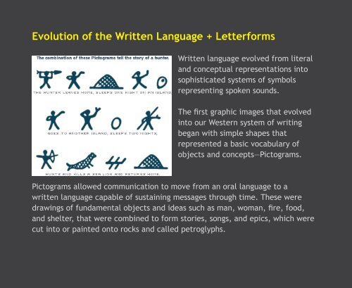
<strong>Written</strong> language evolved from literal<br />
and conceptual representations into<br />
sophisticated systems <strong>of</strong> symbols<br />
representing spoken sounds.<br />
The first graphic images that evolved<br />
into our Western system <strong>of</strong> writing<br />
began with simple shapes that<br />
represented a basic vocabulary <strong>of</strong><br />
objects and concepts—Pictograms.<br />
Pictograms allowed communication to move from an oral language to a<br />
written language capable <strong>of</strong> sustaining messages through time. These were<br />
drawings <strong>of</strong> fundamental objects and ideas such as man, woman, fire, food,<br />
and shelter, that were combined to form stories, songs, and epics, which were<br />
cut into or painted onto rocks and called petroglyphs.
Over time, symbolic drawings were<br />
developed to express more complex<br />
objects and concepts, Ideograms.<br />
The next stage in <strong>the</strong> evolution <strong>of</strong><br />
written language is <strong>the</strong> Phonogram.<br />
Syllabic signs and symbols representing<br />
primary oral sounds, ei<strong>the</strong>r syllables<br />
(fa-mi-ly) or basic sounds (f-a-m-i-l-y).<br />
Although diminished in resemblance<br />
to <strong>the</strong>ir original forms, <strong>the</strong> letters in<br />
modern Western alphabets are <strong>the</strong> simplified renderings <strong>of</strong> <strong>the</strong>se beginnings.<br />
The complete system <strong>of</strong> alphabetical writing was not <strong>the</strong> achievement <strong>of</strong> one<br />
particular culture. It is <strong>the</strong> work <strong>of</strong> several gifted cultures <strong>of</strong> <strong>the</strong> ancient world,<br />
as <strong>the</strong> development <strong>of</strong> efficiency in writing was taking place in a number <strong>of</strong><br />
countries at about <strong>the</strong> same time; through trade and travel, alphabetic systems<br />
were passed to o<strong>the</strong>r societies who altered form and meaning to suit <strong>the</strong>ir<br />
requirements.
The Greeks <strong>the</strong>n embraced <strong>the</strong> Phoenician alphabet around 1000 BCE,<br />
continuing <strong>the</strong> evolution <strong>of</strong> <strong>the</strong> alphabet and <strong>the</strong>n passed it on to <strong>the</strong> Romans.<br />
The Romans used 2 styles <strong>of</strong> writing, <strong>the</strong> Uncial and <strong>the</strong> Semi-Uncial. Originally<br />
invented by <strong>the</strong> Greeks in <strong>the</strong> 2nd cen. BCE and adopted by <strong>the</strong> Romans.<br />
The Uncial was written between 2 guidelines that were 1 uncial apart<br />
=one Roman inch.<br />
Freely drawn forms which allowied for quicker writing because <strong>the</strong> curves<br />
added to <strong>the</strong> stroke <strong>of</strong> <strong>the</strong> letterforms reduced <strong>the</strong> number <strong>of</strong> strokes required<br />
to draw <strong>the</strong> letterforms.<br />
Semi-unicials were <strong>the</strong> first phase in <strong>the</strong> evolution <strong>of</strong> <strong>the</strong> lowercase letterform,<br />
allowing for development <strong>of</strong> ascenders and descenders.<br />
Uncials Semi-unicials
Asian Contribution c. 2000 BCE<br />
Papyrus was invented by <strong>the</strong> Egyptians c.3500 BCE by <strong>the</strong> Eyptians<br />
Paper was invented c.105 BCE by Ts’Lun.<br />
This invention deosn't reach Europe until <strong>the</strong> 1200's<br />
Wooden movable type was invented by a Chinese alchemist, Pi Sheng, c.1040 BCE<br />
This invention deosn't reach Europe until <strong>the</strong> 1400's<br />
Chinese Movable Type c. 1300 BCE
The Roman capital letters in our modern alphabet, were <strong>the</strong> formal<br />
letterforms that were carved into ancient Roman monuments and buildings to<br />
highlight Roman achievements.<br />
Letters were first painted onto <strong>the</strong><br />
facades <strong>of</strong> buildings as a template for<br />
<strong>the</strong> stone carvers to chisel.<br />
ABCDE<br />
FGHIJK<br />
LMNOP<br />
QRSTVW<br />
XYZ<br />
Trajan Typface designed in 1989 by Carol Twombly<br />
for Adobe. The design is based on <strong>the</strong> letterforms <strong>of</strong><br />
capitalis monumentalis or Roman square capitals.<br />
Monumental Capitals, Trajan Column 114 CE<br />
TRAJAN THE MOVIE FONT http://www.youtube.com/watch?v=t87QKdOJNv8&feature=player_embedded
The Development <strong>of</strong> <strong>the</strong> Serif<br />
Two <strong>the</strong>ories:<br />
1. It was hard to create a perfect end stroke with a paintbrush so <strong>the</strong> letterers<br />
would lift <strong>the</strong>ir brushes at <strong>the</strong> end <strong>of</strong> each stroke, making a serif.<br />
2. The serif was designed as a preventive measure to keep <strong>the</strong> carved area <strong>of</strong><br />
<strong>the</strong> primary strokes from cracking at <strong>the</strong> ends over time.<br />
Capitalis monumentalis or Roman square capitals were used from 2nd cen. CE<br />
until 5th cen. CE <strong>the</strong>n <strong>the</strong> Barbarians conquered Rome in 476 CE, marking <strong>the</strong><br />
beginning <strong>of</strong> <strong>the</strong> Middle Ages.
Medieval (Dark) Ages c.5th cen.<br />
Lasted for 1000 years until <strong>the</strong><br />
Renaissance in <strong>the</strong> 15th cen.<br />
Typographic contribution(s):<br />
1. Illuminated manuscript<br />
2. Classification: Blackletter<br />
Christian church was <strong>the</strong> controlling force<br />
and established <strong>the</strong>mselves as <strong>the</strong> center<br />
for intellectual, cultural, and educational<br />
affairs.<br />
Most classical anthologies and artifacts were lost during <strong>the</strong> fall <strong>of</strong> <strong>the</strong> Roman<br />
Empire so <strong>the</strong> Church decided to create illuminated manuscripts to ensure <strong>the</strong><br />
knowledge from that period could endure and survive.<br />
The manuscripts were hand written under <strong>the</strong> guidance <strong>of</strong> monastic leaders.<br />
Ornately decorated books, generally accompanied by illustrations, and usually<br />
filled with sacred religious writings.
Caroline (Carolingian) Minuscule 8th C. (789)—1100's<br />
Emperor Charlemagne was crowned emperor in 800 and he decreed that a<br />
standard style <strong>of</strong> writing be used across <strong>the</strong> Holy Roman Empire as a<br />
means <strong>of</strong> unifying his reign.<br />
Centuries later, during <strong>the</strong> Renaissance, <strong>the</strong> Carolingian handwriting was<br />
mistaken for <strong>the</strong> original Roman and copied as a "Classical" type style.
For 1000 years <strong>the</strong> illuminated manuscript continued to be made until <strong>the</strong><br />
Renaissance. The invention <strong>of</strong> metal movable type in <strong>the</strong> 15th cen. rendered<br />
<strong>the</strong> illuminated manuscript obsolete by <strong>the</strong> 16th century.<br />
Prior to th 15th cen. <strong>the</strong>re was little to read in <strong>the</strong> Western world and many<br />
were illiterate.<br />
Fewer than 50,000 volumes <strong>of</strong> writing extisted in all <strong>of</strong> Europe, and were only<br />
accessable by <strong>the</strong> Church or <strong>the</strong> wealthy.<br />
" Renaissance Humanism is <strong>the</strong> spirit <strong>of</strong> learning that developed at <strong>the</strong> end <strong>of</strong><br />
<strong>the</strong> middle ages with <strong>the</strong> revival <strong>of</strong> classical letters and a renewed confidence<br />
in <strong>the</strong> ability <strong>of</strong> human beings to determine for <strong>the</strong>mselves truth and<br />
falsehood."<br />
Italian scholars, centered in Florence, sought to restore <strong>the</strong>ir lost heritage by<br />
reexamination <strong>of</strong> <strong>the</strong> literature <strong>of</strong> ancient Greece and Rome<br />
The central feature <strong>of</strong> Humanism was <strong>the</strong> commitment to <strong>the</strong> idea that <strong>the</strong><br />
ancient world (defined effectively as ancient Greece and Rome) ... was <strong>the</strong><br />
pinnacle <strong>of</strong> human achievement, especially intellectual achievement, and<br />
should be taken as a model by contemporary Europeans.
During this period:<br />
• Collapse <strong>of</strong> feudalism<br />
• Move from rural to ubam areas<br />
• Growing middle class <strong>of</strong> merchants and tradesmen<br />
• More opportunity to attend schools and universities<br />
ALL = demand for knowledge and books<br />
Johannes Gutenberg (Mainz, Germany) 1450, started experiementing with<br />
metal-working techniques to develop a printing technology and printed his first<br />
typographic book, <strong>the</strong> 42-line bible in 1455.<br />
With <strong>the</strong> invention <strong>of</strong> movable metal type came <strong>the</strong> invention <strong>of</strong> <strong>the</strong> term<br />
typography.<br />
The prcoess remained unchanged until Industrial Revolution 400 years later.
Gutenberg’s System for<br />
Casting Type<br />
A steel punch is used to stamp<br />
an impression <strong>of</strong> <strong>the</strong> letterform<br />
onto a s<strong>of</strong>ter brass matrix.<br />
The matrix is slipped into <strong>the</strong><br />
bottom <strong>of</strong> <strong>the</strong> two-part type<br />
mold, <strong>the</strong> mold is filled with<br />
<strong>the</strong> molten alloy to cast a piece<br />
<strong>of</strong> type.<br />
The lead alloys cools and <strong>the</strong><br />
lead type is removed.
The bible was printed in Textura, a<br />
blackletter style; similar to <strong>the</strong><br />
calligraphic letter style <strong>of</strong> <strong>the</strong> hand<br />
lettered manuscripts.<br />
Gutenberg revolutionized <strong>the</strong><br />
distribution <strong>of</strong> knowledge by<br />
making it possible to produce a<br />
large number <strong>of</strong> copies <strong>of</strong> a single<br />
work in a relatively short amount<br />
<strong>of</strong> time.<br />
The Western alphabet had a need<br />
for movable reusable type that<br />
could be perfectly aligned.<br />
Woodblock printing was not an<br />
exact arrangement, this suited<br />
<strong>the</strong> calligraphic characters <strong>of</strong><br />
<strong>the</strong> Orient, but not <strong>the</strong> precision<br />
required by <strong>the</strong> Western alphabet.
The process <strong>the</strong> spread to o<strong>the</strong>r German cities in <strong>the</strong> 1450s, Italy in <strong>the</strong> 1460s,<br />
and <strong>the</strong>n to France and <strong>the</strong> rest <strong>of</strong> Europe.<br />
In Italy two printers, Conrad Sweynheym and Arnold Pannartz, recovered<br />
Caroline minuscule, dating from 9th cen. Thinking <strong>the</strong>y had found au<strong>the</strong>ntic<br />
Roman script, <strong>the</strong>y set out to syn<strong>the</strong>sis <strong>the</strong> Roman writing with <strong>the</strong> currently<br />
used blackletter from <strong>the</strong> Medieval period.<br />
They created a more cohesive<br />
Roman alphabet that became<br />
a model for today’s Roman<br />
alphabet.
Italy 1495, Francisco de Bologna, AKA Griffo,<br />
designed and cut a typeface, still used today,<br />
Bembo.<br />
It later became <strong>the</strong> inspiration for Claude<br />
Garamond to design his namesake typeface,<br />
Garamond, in <strong>the</strong> 16th century.<br />
1501, Griffo designed <strong>the</strong> first italic typeface,<br />
creating a new classification, Italic.<br />
The style is based on a slanted handwriting style called Cancellaresca Script,<br />
utilized by scholars for its quick and informal character <strong>of</strong> writing.
By <strong>the</strong> 16th cen. 3 classifications <strong>of</strong> type:<br />
1. Roman/Serif, which develops into Humanistic/Old Style<br />
2. Blackletter<br />
3. Italic<br />
France 1500’s/16th cen.<br />
Building on Griffo’s designs, <strong>the</strong> Roman type<br />
style continued to evolve in France. The most<br />
noteworthy type designer <strong>of</strong> <strong>the</strong> time was<br />
Claude Garamond.<br />
His letterforms were influential in ridding<br />
Europe (except Germany) <strong>of</strong> <strong>the</strong> Gothic<br />
(Blackletter) style, which had existed since<br />
Medieval times.<br />
Garamond, a beautiful, light weight, and legible typeface, achieving more<br />
precise letter-fit and closer word spacing.<br />
The design reflected <strong>the</strong> changes that were starting to take place in <strong>the</strong><br />
language <strong>of</strong> <strong>the</strong> typography. Handwriting was a lessening influence on <strong>the</strong><br />
typographic form, while <strong>the</strong> printing press and <strong>the</strong> letterforms created from<br />
Gutenberg's type casting system were becoming more influential and this was<br />
reflected in Garamond’s work.
With <strong>the</strong> design <strong>of</strong> Garamond <strong>the</strong>re are now 4 classifications <strong>of</strong> type:<br />
1. Roman/Serif<br />
2. Blackletter<br />
3. Italic<br />
4. Humanistic/Old Style<br />
In <strong>the</strong> 1600's/17th cen. <strong>the</strong>re was little motivation to design any new typefaces<br />
or attempt anything innovative related to typography because <strong>of</strong> an abundance<br />
<strong>of</strong> typographic material, such as punches, matrices, woodblocks, and<br />
ornaments, surviving from <strong>the</strong> 16th century.<br />
Thus, it wasn’t until <strong>the</strong> 1700's/18th cen., during <strong>the</strong> Rococo period in France,<br />
that new strides were made in typography.
Rococo,1700's/18th century, France<br />
An ornate period <strong>of</strong> art, architecture and typography, a style sometimes<br />
considered frivolous.<br />
The 1700’s “an epoch <strong>of</strong><br />
spectacular typographic<br />
originality”.<br />
The period contributed to <strong>the</strong><br />
concept <strong>of</strong> a “family <strong>of</strong> fonts”<br />
by experimenting with casting<br />
techniques to produce fonts in<br />
larger sizes.<br />
Typographic contribution:<br />
New classification, Transitional.<br />
Increased contrast between thick<br />
& thin strokes, sharp horizontal<br />
serifs.
The first Transitional typeface was designed, called <strong>the</strong> Romain du Roi, by Philippe Grandjean, in 1702.<br />
The typeface was unique because <strong>of</strong> its construction.<br />
To create <strong>the</strong> capitals, a square was drawn and divided into a grid <strong>of</strong> 64 units,<br />
<strong>the</strong>n subdivided into 36 smaller units, for a total <strong>of</strong> 2,304 squares.<br />
Each letter was <strong>the</strong>n plotted on <strong>the</strong> grid using a combination <strong>of</strong> ma<strong>the</strong>matics,<br />
drafting, and human judgement.<br />
The lowercase and italic letters were drawn in a similar fashion
1700's/18th century, England<br />
In 1722, Caslon designed <strong>the</strong> first size <strong>of</strong> his typeface Caslon Old Style with<br />
italic, establishing his reputation as a successful typeface designer.<br />
After that, England used Caslon fonts for almost all <strong>of</strong> <strong>the</strong>ir printing needs.<br />
Caslon designed strong legible typefaces that became <strong>the</strong> dominant typographic<br />
style throughout <strong>the</strong> British Empire for over 70 years, well into <strong>the</strong> 19th cen.
Toward <strong>the</strong> end <strong>of</strong> <strong>the</strong> 1700's/18th cen.<br />
Renewed interest and return to classical inspirations <strong>of</strong> Greek and Roman<br />
antiquity, due in part to <strong>the</strong> cultural and political changes occurring throughout<br />
Europe, particularly in France with French Revolution.<br />
Disdain for anything extravagant and ornate, thus a new typographic form was<br />
needed in place <strong>of</strong> <strong>the</strong> outdated ornate Rococo style = MODERN<br />
Giambattista Bodoni designed <strong>the</strong> first modern typeface, BODONI<br />
thus solidifying a new category <strong>of</strong> roman type.<br />
1. Roman/Serif<br />
2. Blackletter<br />
3. Italic<br />
4. Humanistic/Old Style<br />
5. Modern
The basic letterforms <strong>of</strong> <strong>the</strong> modern alphabet have changed very little since<br />
<strong>the</strong> days <strong>of</strong> ancient Rome but <strong>the</strong> appearance <strong>of</strong> written and printed letters<br />
have evolved over time.<br />
These variations in style are due largely to changes in <strong>the</strong> applications <strong>of</strong><br />
written language and <strong>the</strong> tools used to create it:<br />
• Stone-carved letters <strong>of</strong> ancient Roman monuments<br />
• Hand-drawn illuminated manuscripts <strong>of</strong> gothic monks<br />
• Hand-cut wooden type used in early printing<br />
• The advent <strong>of</strong> acid-etched metal type<br />
• Photocomposition<br />
• Typefaces designed for modern digital output<br />
Each advancement has contributed to <strong>the</strong> evolution <strong>of</strong> typographic styles.
Futurism, 1909-1944, Italy<br />
Emphasized <strong>the</strong> dynamism, speed, energy, and power <strong>of</strong> <strong>the</strong> machine and <strong>the</strong><br />
vitality, change, and restlessness <strong>of</strong> modern life in general. Glorified <strong>the</strong> new<br />
technology <strong>of</strong> <strong>the</strong> automobile, <strong>the</strong> beauty <strong>of</strong> its speed, power, and movement<br />
Futurist Manifesto - The history <strong>of</strong> Futurism begins on <strong>the</strong> 20th <strong>of</strong> February,<br />
1909 in Paris with <strong>the</strong> publication <strong>of</strong> <strong>the</strong> first Futurist manifesto in, Le figaro,<br />
written by Filippo Tommaso Marinetti.<br />
After an opening narrative describing an exhilarating car wreck on an industrial<br />
road, Marinetti’s manifesto <strong>of</strong>fers solutions to embrace speed, war, machinery<br />
and danger.<br />
Sparked by his manifesto, Futurism took a modernist stance, embracing<br />
industrialization, mechanization, and acceleration in <strong>the</strong> name <strong>of</strong> patriotism. It<br />
was geared towards an uprooting <strong>of</strong> Italy’s allegedly sedentary mind set <strong>of</strong> <strong>the</strong><br />
time, and maintained that total industry, violence, and war were <strong>the</strong> cure for a<br />
stagnating nation.
The political and cultural schisms brewing in Europe fuelled rising feelings<br />
<strong>of</strong> anxiety and marginalization among artists and writers, and culminated in<br />
<strong>the</strong> violence and brutality <strong>of</strong> World War II. This helps to account for <strong>the</strong> <strong>of</strong>ten<br />
extreme nature <strong>of</strong> <strong>the</strong> work: <strong>the</strong> Futurists’ glorification <strong>of</strong> violence and <strong>the</strong><br />
Dadaists’ nihilistic anti-logic.<br />
The typographic experimentation <strong>of</strong> <strong>the</strong> early Futurists brought about a new,<br />
more intense and expressive language <strong>of</strong> communication, nei<strong>the</strong>r literary nor<br />
graphic, but a syn<strong>the</strong>sis <strong>of</strong> both.<br />
Futurist typography was <strong>the</strong> deconstruction <strong>of</strong> language, text and typography:<br />
“Ancient life was all silence. In <strong>the</strong> nineteenth century, with <strong>the</strong> invention <strong>of</strong><br />
<strong>the</strong> machine, Noise was born. Today, Noise triumphs and reigns supreme over<br />
<strong>the</strong> sensibility <strong>of</strong> men.” – Luigi Russolo, <strong>the</strong> art <strong>of</strong> noise
Marinetti despised <strong>the</strong> traditional grid.<br />
His 1912 piece CHAIRrrrrrrRR is an early<br />
attempt at breaking down <strong>the</strong> grid.<br />
He attempts to fight conventional rectilinear<br />
constraints in <strong>the</strong> piece, but is seen to<br />
ultimately work within <strong>the</strong>m.<br />
This is a result <strong>of</strong> <strong>the</strong> use <strong>of</strong> letterpress,<br />
on which letters cast into metal blocks<br />
are set into a strictly rectangular frame to<br />
print. This speaks <strong>of</strong> <strong>the</strong> reliance on certain<br />
mechanical limitations that are inherent to<br />
industrialization.
Zang Tumb Tumb is Marinetti’s 1912-14 poem<br />
Illustrates for his “words in liberty” concept by depicting and glorifying <strong>the</strong><br />
sounds and experience <strong>of</strong> war, and shifts focus to <strong>the</strong> primal violence <strong>of</strong> sounds<br />
and images ra<strong>the</strong>r than any literal meaning.<br />
Illustrates a breakdown <strong>of</strong> grid in a more fluid manner. This is a result <strong>of</strong> <strong>the</strong><br />
use <strong>of</strong> <strong>the</strong> process <strong>of</strong> <strong>of</strong>fset lithography, which used totally grid-free plates for<br />
reproduction ra<strong>the</strong>r than letterpress’ perpendicular constraints, and allowed<br />
<strong>the</strong> creation <strong>of</strong> cut-and-paste typographic composition.
Dadaism<br />
A movement, that began in Zurich (peaked from 1916 to 1922) among avant-garde artists<br />
who rejected <strong>the</strong> existing culture <strong>of</strong> post-World War I Europe on <strong>the</strong> grounds<br />
that it belonged to <strong>the</strong> same society that had produced <strong>the</strong> war.<br />
Dada stretched <strong>the</strong> visual vocabulary <strong>of</strong> Futurism and continued to push<br />
typography fur<strong>the</strong>r from it traditional usage. Releasing <strong>the</strong> letterform from<br />
traditional phonic symbolism Dada pushed <strong>the</strong> concept <strong>of</strong> <strong>the</strong> letterform as a<br />
concrete visual shape.<br />
The Dadaists’ pamphlets, posters, and books employed free, abstract layout, a<br />
great mixture <strong>of</strong> type sizes and faces, and an attempt to create mood through<br />
typography.<br />
Dadaism. Its absurd evokes <strong>the</strong> relevant reaction. Shocking destruction <strong>of</strong> <strong>the</strong><br />
forms, broken, confusing - DADA is impossible to be understand.
Kurt Schwitters, Small Dada Evening poster, 1922.
Kurt Schwitters and Theo van Doesburg, Scarecrow Fairy Tale, 1925.
Fortunato Depero, 1929.