

specimen pdf - nonpareil type
specimen pdf - nonpareil type
specimen pdf - nonpareil type

You also want an ePaper? Increase the reach of your titles
YUMPU automatically turns print PDFs into web optimized ePapers that Google loves.
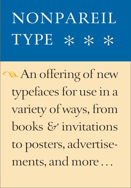
NONPAREIL<br />
TYPE ***<br />
#An oªering of new<br />
<strong>type</strong>faces for use in a<br />
variety of ways, from<br />
books & invitations<br />
to posters, advertise-<br />
ments, and more . . .
DAVID CLASSIC roman, italic<br />
ABCDEFGHIJKLM<br />
abcdefghijklmnopqrstuvwxyz<br />
NOPQRSTUVW&XYZ<br />
E P I G R A M M A T A titling (caps, small caps)<br />
ABCDEFGHIJKLMNOPQRSTUVWXYZ<br />
E M E R S O N roman, italic, small caps, display roman, display italic<br />
ABCDEFGHIJKLM<br />
abcdefghijklmnopqrstuvwxyz<br />
NOPQRSTUVWXYZ<br />
K E L L Y S A N S roman, italic, bold roman, bold italic (in process)<br />
ABCDEFGHIJKLM<br />
abcdefghijklmnopqrstuvwxyz<br />
NOPQRSTUVW&XYZ<br />
R I L K E roman, italic, small caps, display roman, display italic<br />
ABCDEFGHIJKLM<br />
abcdefghijklmnopqrstuvwxyz<br />
NOPQRSTUVW&XYZ<br />
2
ABOUT<br />
NONPAREIL<br />
TYPE<br />
Nonpareil <strong>type</strong> is a small, independent firm oªering a specialized<br />
collection of fonts. Our first <strong>type</strong>faces range from revivals of important<br />
historical <strong>type</strong>faces (Epigrammata), through significant designs (David<br />
Classic and Emerson) by twentieth century masters, to new fonts (Rilke<br />
and Kelly Sans) shown here for the first time.<br />
The first goal of these offerings is to make available new <strong>type</strong>s that are<br />
unique, and appropriate for an assortment of purposes – from display<br />
and titling to text setting. Special attention is given to quality designs and<br />
useful character sets, including appropriate ligatures and ornaments with<br />
each font.<br />
Our <strong>type</strong>s have been drawn by designers for designers. We have endeavored<br />
to keep the cost for these new <strong>type</strong>s affordable. Types are sold as<br />
Postscript Type 1 fonts, unless otherwise specified.<br />
(See last page for complete ordering information.)<br />
www.<strong>nonpareil</strong><strong>type</strong>.com<br />
3
oman<br />
ABCDEFGHIJKLM<br />
abcdefghijklmnopqrstuvwxyz<br />
italic<br />
4<br />
ABCDEFGHIJKLM<br />
abcdefghijklmnopqrstuvwxyz<br />
NOPQRSTUVW&XYZ<br />
[:,-!–(1234567890)—?.;]<br />
@$&/<br />
NOPQRSTUVW&XYZ<br />
ABCDEFGHIJKLM<br />
abcdefghijklmnopqrstuvwxyz<br />
NOPQRSTUVW &XYZ
David Classic<br />
Ismar David (1910–1996) was one of the foremost graphic artists<br />
of the twentieth century. Most of David’s work centered on<br />
his distinctive calligraphy, but he also was well known as an<br />
illustrator and designer. His seminal David Hebrew <strong>type</strong>face is<br />
arguably the most used font in Israel, and is extensively<br />
employed around the world wherever Hebrew typography is<br />
required. His roman fonts were created for specialized <strong>type</strong><br />
companies, and therefore had very limited distribution. Now,<br />
for the first time in digital form, his Classic <strong>type</strong>face with an<br />
expanded character set is available to a wider public. Available<br />
in roman and italic.<br />
5
oman bookweight<br />
6<br />
ABCDEFGHIJKLMNOPQRSTUVWXYZ<br />
abcdefghijklmnopqrstuvwxyz<br />
italic bookweight<br />
ABCDEFGHIJKLMNOPQRSTUVWXYZ<br />
abcdefghijklmnopqrstuvwxyz<br />
small caps<br />
roman display<br />
abcdefghijklmnopqrstuvwxyz<br />
ABCDEFGHIJKLMNOPQRSTUVWXYZ<br />
abcdefghijklmnopqrstuvwxyz<br />
italic display<br />
ABCDEFGHIJKLM<br />
abcdefghijklmnopqrstuvwxyz<br />
NOPQRSTUVWXYZ<br />
fiº [:,-!–(1234567890)—?.;] ªfl<br />
ABCDEFGHIJKLMNOPQRSTUVWXYZ<br />
abcdefghijklmnopqrstuvwxyz
Emerson<br />
Joseph Blumenthal (proprietor of the famous Spiral Press in New York) designed<br />
the Emerson <strong>type</strong> in the 1930s. Originally cut by hand in metal as a<br />
foundry <strong>type</strong> for hand composition under the name “Spiral,” the font was later<br />
released for machine composition under the name “Emerson” (after the handprinted<br />
Spiral Press edition of Nature by Ralph Waldo Emerson). For the hot<br />
<strong>type</strong> version, an italic and set of small caps were added.<br />
When originally reviewed in Signature Emerson was praised as being well<br />
suited to various printing methods; aside from the then-dominant letterpress:<br />
“The open counters, absence of fine lines and sturdy, though not heavy, serifs<br />
make it particularly suitable for offset and gravure reproduction.” With that in<br />
mind it is ironic that Emerson is the only one of the <strong>type</strong>faces deemed by<br />
Mono<strong>type</strong> to be among the twenty classics that had not been offered in a digital<br />
version – until now.<br />
7
titling (caps, small caps)<br />
abcdefghijklmn<br />
A.B.C.D.E.F.G.H.I.J.K.L.M<br />
N.O.P.Q.R.S.T.U.V<br />
W.X.Y.Z<br />
8<br />
ABCDEFGHIJKLM<br />
abcdefghijklmnopqrstuvwxyz<br />
NOPQRSTUVW&XYZ<br />
[:,”-!–(1234567890)—“?.;]<br />
@$&•ª º∞°<br />
opqrstuvwxyz<br />
∞<br />
¬•º ∆º∞•°<br />
[1•2·3·4•5·6•7·8•9·0]
EPIGRAMMATA<br />
The origin of the sixteenth-century model for these letters is not<br />
known for certain. It is possible that the <strong>type</strong> was originally cut<br />
by the son of Peter Schoeffer the younger, son of Gutenberg’s<br />
foreman and partner at the second press in the West, Fust &<br />
Schoeffer. The font may very well be the most popular titling face<br />
ever, being in continuous use for well over a century in Europe –<br />
from Germany and Switzerland (where the <strong>type</strong> was particularly<br />
widely accepted), to Italy, France, Spain, England, Holland – just<br />
about everywhere roman <strong>type</strong>s were employed. Surprisingly, despite<br />
the enormous fame of this unusual design, no revival has<br />
been made before now, with Nonpareil Type’s Epigrammata <strong>type</strong>.<br />
Capitals, small caps, figures, punctuation, and ornaments only<br />
(no lower case).<br />
9
oman bookweight<br />
ABCDEFGHIJKLMNOPQRSTUVWXYZ<br />
abcdefghijklmnopqrstuvwxyz<br />
italic bookweight<br />
10<br />
ABCDEFGHIJKLMNOPQRSTUVWXYZ<br />
abcdefghijklmnopqrstuvwxyz<br />
small caps<br />
roman display<br />
abcdefghijklmnopqrstuvwxyz<br />
ABCDEFGHIJKLMNOPQRSTUVWXYZ<br />
abcdefghijklmnopqrstuvwxyz<br />
italic display<br />
ABCDEFGHIJKLM<br />
abcdefghijklmnopqrstuvwxyz<br />
NOPQRSTUVW&XYZ<br />
fi ª [:,-!–(1234567890)—?.;] º fl<br />
@#%*+=•<br />
ABCDEFGHIJKLMNOPQRSTUVWXYZ<br />
[abcdefghijklmnopqr stuvwxyz
Rilke<br />
Rilke is an original design by Jerry Kelly in a “transitional” style.<br />
Baskerville and Bell would be two examples of historical <strong>type</strong>faces<br />
in the transitional vein. While these fonts are among the<br />
most popular today, and transitional style alphabets are widely<br />
employed for a large variety of applications –from flyers and advertisements<br />
through fine book work – there are few modern<br />
versions in the style. (By contrast, there is a plethora of modern<br />
renderings of renaissance roman styles, in addition to the perennially<br />
popular re-drawings of the historical fonts of Garamond,<br />
Caslon, Bodoni, and others.) In addition to the characteristic<br />
roman, there is a graceful italic, useful small caps, and a refined<br />
display version of both the roman and italic.<br />
11
oman regular<br />
italic regular<br />
12<br />
ABCDEFGHIJKLMNOPQRSTUVWXYZ<br />
abcdefghijklmnopqrstuvwxyz<br />
ABCDEFGHIJKLMNOPQRSTUVWXYZ<br />
roman semibold<br />
italic semibold<br />
ABCDEFGHIJKLM<br />
abcdefghijklmnopqrstuvwxyz<br />
NOPQRSTUVW&XYZ<br />
[:,-!–(1234567890)—?.;]<br />
@#$%*+=£¢ §•<br />
abcdefghijklmnopqrstuvwxyz<br />
ABCDEFGHIJKLMNOPQRSTUVWXYZ<br />
abcdefghijklmnopqrstuvwxyz<br />
ABCDEFGHIJKLMNOPQRSTUVWXYZ<br />
abcdefghijklmnopqrstuvwxyz
Kelly Sans<br />
(in process as of Summer 2007)<br />
Kelly Sans is a humanistic sans serif <strong>type</strong>face, in the tradition of Gill Sans<br />
and Syntax (other styles of sans serif would be geometric sans serif styles –<br />
like Futura or Kabel – and Swiss sans serif styles – like Helvetica and<br />
Univers). With Kelly Sans we have endeavored to come ever closer to classic<br />
proportions and purity of letter design, adjusting the forms and widths<br />
carefully towards the goal of matching the classical ideal, albeit in a monolined<br />
letter without serifs.<br />
The “fit” (spacing between letters) of Kelly Sans is more open than most<br />
sans serif fonts, which are usually so closely spaced that the characters almost<br />
appear to melt into each other in smaller sizes. Again, this feature of<br />
Kelly Sans brings the font closer to a classic roman font.<br />
The bookweight has been calibrated to match the “color” of a typical<br />
roman font. The semibold is noticeably heavier, while not being so bold as<br />
to shout, or lead to excessive distortion of the letterforms. The italics are<br />
essentially sloped roman forms (with the exception of the “ball-and-stick” a<br />
and g), again designed the goal of maximum clarity and classical form.<br />
13
DAVID CLASSIC<br />
14<br />
EXAMPLES OF<br />
Italic calligraphy<br />
From the Renaissance<br />
to Modern Times<br />
THE GEYER GRAPHIC ARTS PRESS<br />
Nassau · 2003<br />
David<br />
EX LIBRIS<br />
Smith<br />
Mr. and Mrs. Albert Yardley<br />
&Mr. and Mrs. Joseph Hayes<br />
request the honor of your presence<br />
at the marriage of their children<br />
JENNIFER & HERBERT<br />
on Saturday evening, the<br />
twelfth of May at half past<br />
eight o’clock<br />
Helene Country Club<br />
Washington, Connecticut<br />
#<br />
Kindly respond by May 1
A SERMON BY Robert Frost<br />
SPOKEN ON THE FIRST DAY OF<br />
THE FEAST OF TABERNACLES AT<br />
THE ROCKDALE AVENUE TEMPLE<br />
CINCINNATI · OHIO · THURSDAY<br />
MORNING · OCTOBER · 10 · 1946<br />
The<br />
Joseph Blumenthal<br />
Collection<br />
CORNELL<br />
UNIVERSITY<br />
LIBRARY<br />
THE SPIRAL PRESS<br />
THROUGH FOUR DECADES<br />
An exhibition of books and<br />
ephemera, with a commentary<br />
by Joseph Blumenthal<br />
The Pierpont Morgan Library<br />
New York<br />
15<br />
EMERSON
EPIGRAMMATA<br />
16<br />
∆ THOSE<br />
WHO SEEK<br />
FOR GOLD<br />
DIG UP<br />
MUCH<br />
EARTH &<br />
FIND<br />
A LITTLE<br />
XXII<br />
1996 1986<br />
H·A·P·P·Y H.A.P.P.Y<br />
N.E.W Y.E.A.R<br />
1987 1997<br />
N·E·W Y·E·A·R<br />
heraclitus<br />
xvii–xix<br />
The many do not take<br />
heed of such things –<br />
as those they meet with –<br />
nor do they mark them<br />
when they are so taught,<br />
though they think that<br />
they do.<br />
If you do not expect the<br />
unexpected, you will<br />
not find it; for it is hard to<br />
be both sought out and<br />
difficult.<br />
W hen<br />
they are born,<br />
they wish to live<br />
and to meet with their<br />
dooms, or rather to rest,<br />
and they leave children behind<br />
them to meet with<br />
dooms in turn.<br />
a bookmark from<br />
the classics<br />
bookshop
PRINTING, the art of making multiple copies of an<br />
image, originated in China. Even the system of moveable <strong>type</strong>, that is to<br />
say individual pieces (usually of some metal alloy), each with a repeatable<br />
image of an individual character on its face, was developed in the East –<br />
in Korea, well before Gutenberg began his work in Europe in the fifteenth<br />
century. However, Gutenberg did bring a unique genius to combining<br />
and perfecting several existing processes, such as punch-cutting,<br />
casting in metal, press and ink manufacture, and others (all of which already<br />
existed in some form in the mid-fifteenth century), adapting these<br />
to his purpose, and inventing the novel mechanism of an adjustable<br />
mold in which one could cast metal pieces at a variable width while<br />
maintaining the same height and depth. He thereby created the first<br />
practical method of printing a significant quantity of a given text. The importance<br />
of Gutenberg’s work to the development of civilization would<br />
be difficult to overestimate. Through Gutenberg’s process the thoughts<br />
of mankind can be mechanically duplicated, allowing them to be spread<br />
far and wide and become permanent. In addition to the overwhelming<br />
significance of Gutenberg’s invention, the aesthetic level of his work set<br />
a standard that has never been surpassed. A HISTORY OF PRINTING<br />
PLEASE JOIN US<br />
TO CELEBRATE THE PUBLICATION OF<br />
JOEL PERLMAN: A SCULPTOR’S JOURNEY<br />
BY PHILIP F. PALMEDO · ABBEVILLE PRESS, 2006<br />
BOOK SIGNING BY THE AUTHOR AND ARTIST<br />
SATURDAY AUGUST 26, 2006<br />
5–7 P.M.<br />
GLENN HOROWITZ BOOKSELLER, INC.<br />
87 NEWTOWN LANE<br />
EAST HAMPTON, NY<br />
17<br />
KELLY SANS
RILKE<br />
18<br />
GUILD OF BOOK WORKERS<br />
THE SECOND ELEGYEvery Angel is terror. And yet,<br />
ah, knowing you, I invoke you, almost deadly<br />
birds of the soul. Where are the days of Tobias,<br />
when one of the most radiant of you stood at the simple threshold,<br />
disguised somewhat for the journey and already no longer awesome<br />
(Like a youth, to the youth looking out curiously).<br />
Let the Archangel now, the dangerous one, from behind the stars,<br />
take a single step down and toward us: our own heart,<br />
beating on high would beat us down. What are you?<br />
Early successes, Creation’s favourite ones,<br />
mountain-chains, ridges reddened by dawns<br />
of all origin, – pollen of flowering godhead,<br />
junctions of light, corridors, stairs, thrones,<br />
spaces of being, shields of bliss, tempests<br />
The Committee on Public<br />
of storm-filled, delighted feeling and, suddenly, solitary<br />
Exhibitions mirrors: invites gathering you their & own out-streamed beauty<br />
your back guest into to the their opening faces again. of<br />
Guild of Book Workers’<br />
For we, when we feel, evaporate: oh, we<br />
Centenary Exhibition<br />
breathe ourselves out and away: from ember to ember,<br />
yielding us fainter fragrance. Then someone may say to us:<br />
‘Yes, you are in my blood, the room, the Spring-time<br />
A retrospective is filling with of you work . . . What by use is that: they cannot hold us,<br />
we vanish inside and around them. And those who are beautiful,<br />
notable Guild members,<br />
oh, who holds them back? Appearance, endlessly, stands up,<br />
curated in their by Peter face, and Verheyen, goes by. Like dew from the morning grass,<br />
& an what exhibition is ours rises of contem- from us, like the heat<br />
porary from work, a dish juried that is bywarmed.<br />
O smile: where? O upward gaze:<br />
Karen<br />
new,<br />
Hanmer<br />
warm, vanishing<br />
& Don Rash.<br />
wave of the heart–;<br />
Tuesday, September 19,<br />
2006, 6:00 to 8:00 pm<br />
THE GROLIER CLUB<br />
47 East 60th Street<br />
New York, NY 10022<br />
Business Attire<br />
18<br />
Tobias. The Book<br />
of Tobit in the<br />
Apocrypha (5:4,16)<br />
tells the story of<br />
Tobit the Israelite,<br />
who ordered his<br />
son Tobias to go<br />
and recover some<br />
of his property<br />
from Media. The<br />
Archangel<br />
Raphael, disguised,<br />
guided the young<br />
man. ‘So they went<br />
forth, and the<br />
young man’s dog<br />
with them.’<br />
Elizabeth<br />
176 east 70th street nyc 10016<br />
212-656-0092<br />
Goodwin
TO ORDER<br />
E-mail: info@<strong>nonpareil</strong><strong>type</strong>.com<br />
Phone: 212-581-0344<br />
*Types available as of summer 2007:<br />
Rilke: Roman, Roman Display, Italic, Italic Display, small caps<br />
Emerson: Roman (book), Roman Display, Italic (book), Italic Display, small caps<br />
EPIGRAMMATA (TITLING with small caps)<br />
David Classic: Roman, Italic<br />
pricing<br />
Each font is licensed for use on up to two computers.<br />
Licenses for additional computers are $20 per font per computer.<br />
Please inquire about special discounts for art departments of 12 computers or more.<br />
One font (i.e.–Rilke roman / David Classic italic / Epigrammata) $ 49.<br />
Nonpareil ornaments (1 font) $ 29.<br />
Complete <strong>type</strong> families priced as follows:<br />
Rilke family (5 fonts): roman, italic, small caps, roman display, italic display $199.<br />
Emerson family (5 fonts): roman, italic, small caps, roman display, italic display $199.<br />
www.<strong>nonpareil</strong><strong>type</strong>.com<br />
Types are sold as Postscript Type 1 fonts, unless otherwise specified.<br />
Copyright 2007 Nonpareil <strong>type</strong>. Nonpareil <strong>type</strong>, David Classic, Epigrammata,<br />
Kelly Sans and Rilke are trademarks of the Nonpareil Type.<br />
Unauthorized duplication is a violation of the law<br />
19