Commercial - Resene
Commercial - Resene
Commercial - Resene

You also want an ePaper? Increase the reach of your titles
YUMPU automatically turns print PDFs into web optimized ePapers that Google loves.
Liquorland<br />
Nationwide Re-brand<br />
Liquorland is a national franchise business<br />
throughout New Zealand. They recently<br />
undertook a nationwide re-image of<br />
their branding and colour schemes as the<br />
previous branding had reached its best<br />
before date and was looking very tired.<br />
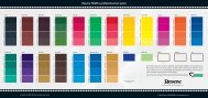
The predominant colour for the new<br />
brand is a special green which was not a<br />
standard colour within the <strong>Resene</strong> colour<br />
range so we had them provide several<br />
drawdowns of various options before the<br />
final one was chosen. This has now been<br />
formulated specifically for the Liquorland<br />
client and is available nationwide at the<br />
<strong>Resene</strong> stores.<br />
Being such a striking colour we had to<br />
introduce another element to take the<br />
possible harshness off the store fronts<br />
so we introduced a panel of natural<br />
Shadowclad, which was stained in a<br />
warm natural timber colour.<br />
Highlights and specific building<br />
architectural details are brought out in<br />
the use of a grey and a black, all of which<br />
have been coded to Liquorland Corporate<br />
Colour for ease of order for the network.<br />
The rebrand has been a great success<br />
with turnovers increasing and the<br />
identification of stores made better by<br />
the strength of the colours. In fact a story<br />
has emerged where a franchisee was<br />
congratulated for setting up a store in a<br />
particular block of shops as the customer<br />
commented that “it was on his way home<br />
162<br />
so he would be putting all his custom that<br />
way”. You can imagine the customer’s<br />
reaction when he was informed that the<br />
store had in fact been located there for<br />
some seven years previous.<br />
The power of brand, colour and overall<br />
treatment is evidenced in just that simple<br />
exchange.<br />
The other point that made the entire<br />
process a real winner was the ability<br />
for us to procure wintergrade paint that<br />
cures at low temperature from <strong>Resene</strong> so<br />
those stores in the colder climates could<br />
still revitalise the brand eliminating a lot<br />
of potential downtime.<br />
Architectural Specifier: Mark Ellery,<br />
Ellerymuir Associates Ltd<br />
Painting Contractor: Andrews<br />
Property Services<br />
Retail Brand Agency: Hot Foot<br />
<strong>Resene</strong> Digital Green