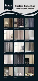
Commercial - Resene
Commercial - Resene
Commercial - Resene

You also want an ePaper? Increase the reach of your titles
YUMPU automatically turns print PDFs into web optimized ePapers that Google loves.
REF77<br />
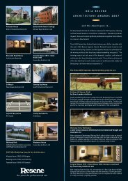
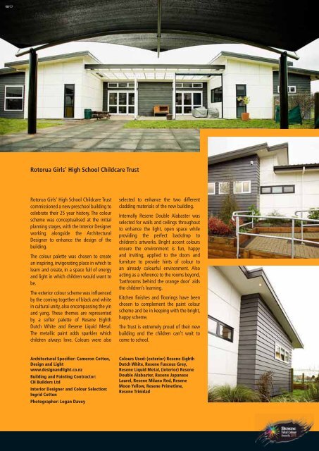
Rotorua Girls’ High School Childcare Trust<br />
Rotorua Girls’ High School Childcare Trust<br />
commissioned a new preschool building to<br />
celebrate their 25 year history. The colour<br />
scheme was conceptualised at the initial<br />
planning stages, with the Interior Designer<br />
working alongside the Architectural<br />
Designer to enhance the design of the<br />
building.<br />
The colour palette was chosen to create<br />
an inspiring, invigorating place in which to<br />
learn and create, in a space full of energy<br />
and light in which children would want to<br />
be.<br />
The exterior colour scheme was influenced<br />
by the coming together of black and white<br />
in cultural unity, also encompassing the yin<br />
and yang. These themes are represented<br />
by a softer palette of <strong>Resene</strong> Eighth<br />
Dutch White and <strong>Resene</strong> Liquid Metal.<br />
The metallic paint adds sparkles which<br />
children always love. Colours were also<br />
Architectural Specifier: Cameron Cotton,<br />
Design and Light<br />
www.designandlight.co.nz<br />
Building and Painting Contractor:<br />
CH Builders Ltd<br />
Interior Designer and Colour Selection:<br />
Ingrid Cotton<br />
Photographer: Logan Davey<br />
selected to enhance the two different<br />
cladding materials of the new building.<br />
Internally <strong>Resene</strong> Double Alabaster was<br />
selected for walls and ceilings throughout<br />
to enhance the light, open space while<br />
providing the perfect backdrop to<br />
children’s artworks. Bright accent colours<br />
ensure the environment is fun, happy<br />
and inviting, applied to the doors and<br />
furniture to provide hints of colour to<br />
an already colourful environment. Also<br />
acting as a reference to the rooms beyond,<br />
‘bathrooms behind the orange door’ aids<br />
the children’s learning.<br />
Kitchen finishes and floorings have been<br />
chosen to complement the paint colour<br />
scheme and be in keeping with the bright,<br />
happy scheme.<br />
The Trust is extremely proud of their new<br />
building and the children can’t wait to<br />
come to school.<br />
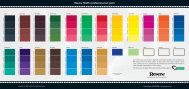
Colours Used: (exterior) <strong>Resene</strong> Eighth<br />
Dutch White, <strong>Resene</strong> Fuscous Grey,<br />
<strong>Resene</strong> Liquid Metal, (interior) <strong>Resene</strong><br />
Double Alabaster, <strong>Resene</strong> Japanese<br />
Laurel, <strong>Resene</strong> Milano Red, <strong>Resene</strong><br />
Moon Yellow, <strong>Resene</strong> Primetime,<br />
<strong>Resene</strong> Trinidad<br />
145