- Page 2 and 3:
Qualitative data analysis Learning
- Page 4 and 5:
First published 1993 by Routledge 1
- Page 6 and 7:
Glossary 283 References 285 Index 2
- Page 8 and 9:
9.1 Categorizing data—1 120 9.2 C
- Page 10 and 11:
3.1 Personal ads 42 5.1 ‘The libr
- Page 12 and 13:
Preface A new book on qualitative d
- Page 14 and 15:
analyse humour from any number of p
- Page 16 and 17:
Q. What colour is snow? A. White. C
- Page 18 and 19:
INTRODUCTION 3 approaches, interest
- Page 20 and 21:
INTRODUCTION 5 qualitative methods.
- Page 22 and 23:
INTRODUCTION 7 First of all, I take
- Page 24 and 25:
INTRODUCTION 9 the purposes of anal
- Page 26 and 27:
WHAT IS QUALITATIVE DATA? 11 distan
- Page 28 and 29:
WHAT IS QUALITATIVE DATA? 13 contem
- Page 30 and 31:
WHAT IS QUALITATIVE DATA? 15 ‘ric
- Page 32 and 33:
classified. Take the example in Ill
- Page 34 and 35:
Figure 2.1 Describing a bit of data
- Page 36 and 37:
WHAT IS QUALITATIVE DATA? 21 home;
- Page 38 and 39:
Figure 2.4 Nominal variable with mu
- Page 40 and 41:
Figure 2.6 Interval variable with f
- Page 42 and 43:
ILLUSTRATION 2.2 EXAMPLE OF A GRADI
- Page 44 and 45:
WHAT IS QUALITATIVE DATA? 29 what a
- Page 46 and 47:
Chapter 3 What is qualitative analy
- Page 48 and 49:
Figure 3.2 Three aspects of descrip
- Page 50 and 51:
WHAT IS QUALITATIVE ANALYSIS? 35 co
- Page 52 and 53:
WHAT IS QUALITATIVE ANALYSIS? 37 en
- Page 54 and 55:
WHAT IS QUALITATIVE ANALYSIS? 39 Th
- Page 56 and 57:
CLASSIFICATION WHAT IS QUALITATIVE
- Page 58 and 59:
nature; photograph preferred but no
- Page 60 and 61:
WHAT IS QUALITATIVE ANALYSIS? 45 vi
- Page 62 and 63:
WHAT IS QUALITATIVE ANALYSIS? 47 Fi
- Page 64 and 65:
Figure 3.6 Formal and substantive c
- Page 66 and 67:
WHAT IS QUALITATIVE ANALYSIS? 51 ne
- Page 68 and 69:
WHAT IS QUALITATIVE ANALYSIS? 53 If
- Page 70 and 71:
Figure 3.10 Qualitative analysis as
- Page 72 and 73:
Chapter 4 Introducing computers ‘
- Page 74 and 75:
ecording of an index of information
- Page 76 and 77:
Figure 4.1 A link between text held
- Page 78 and 79:
Computer transformations • Search
- Page 80 and 81:
Chapter 5 Finding a focus A Zen sto
- Page 82 and 83:
FINDING A FOCUS 67 Sheila The solic
- Page 84 and 85:
FINDING A FOCUS 69 to reflect upon
- Page 86 and 87:
For example, here are some question
- Page 88 and 89:
Transposition: Doctor: ‘I’m afr
- Page 90 and 91:
Figure 5.2 Main themes for analysin
- Page 92 and 93:
Chapter 6 Managing data Piles of pa
- Page 94 and 95:
MANAGING DATA 79 setting, by source
- Page 96 and 97:
MANAGING DATA 81 Interviewer Maybe
- Page 98 and 99:
Figure 6.1 Case documents kept in a
- Page 100 and 101:
MANAGING DATA 85 ‘Show the full r
- Page 102 and 103:
Chapter 7 Reading and annotating Ac
- Page 104 and 105:
• Official/bureaucratic commitmen
- Page 106 and 107:
READING AND ANNOTATING 91 women wer
- Page 108 and 109:
Techniques for interactive reading
- Page 110 and 111:
we can write our comment on a separ
- Page 112 and 113:
Figure 7.1 Relating data to key the
- Page 114 and 115:
READING AND ANNOTATING 99 may retur
- Page 116 and 117:
CREATING CATEGORIES 101 types of ph
- Page 118 and 119:
CREATING CATEGORIES 103 conceptual
- Page 120 and 121:
CREATING CATEGORIES 105 Categorizat
- Page 122 and 123:
Table 8.1 Alternative category list
- Page 124 and 125:
This is only a starting point. Our
- Page 126 and 127:
CREATING CATEGORIES 111 undertaking
- Page 128 and 129:
Figure 8.2 Weighing up the degree o
- Page 130 and 131:
CREATING CATEGORIES 115 Although co
- Page 132 and 133:
CREATING CATEGORIES 117 for an adeq
- Page 134 and 135:
CREATING CATEGORIES 119 well as con
- Page 136 and 137:
Figure 9.2 Categorizing data—2 Fi
- Page 138 and 139:
are entitled to expect some consist
- Page 140 and 141:
ASSIGNING CATEGORIES 125 we ought t
- Page 142 and 143:
ASSIGNING CATEGORIES 127 the data.
- Page 144 and 145:
have annotated this data. Suppose w
- Page 146 and 147:
ASSIGNING CATEGORIES 131 suddenly t
- Page 148 and 149:
• What generally constitutes a
- Page 150 and 151:
Databits Categories 5. Now she is u
- Page 152 and 153:
Chapter 10 Splitting and splicing T
- Page 154 and 155:
Using Hypertext linking, whenever n
- Page 156 and 157:
SPLITTING AND SPLICING 141 databits
- Page 158 and 159:
Category Subcategories Suffering Di
- Page 160 and 161:
Figure 10.1 Levels of subclassifica
- Page 162 and 163:
ILLUSTRATION 10.5 SUBDIVIDING DATAB
- Page 164 and 165:
Figure 10.2 Initial relationships b
- Page 166 and 167:
If we want to make this change, it
- Page 168 and 169:
Figure 10.5 Reassessing relationshi
- Page 170 and 171:
SPLITTING AND SPLICING 155 Although
- Page 172 and 173:
Figure 10.8 Comparing subcategories
- Page 174 and 175:
Figure 10.9 Shifting the analytic e
- Page 176 and 177:
Chapter 11 Linking data Categorizin
- Page 178 and 179:
Figure 11.2 Multiple hyperlinks bet
- Page 180 and 181:
example, we may ask what it is abou
- Page 182 and 183: Figure 11.5 Linking and categorizin
- Page 184 and 185: Figure 11.7 An explanatory link bet
- Page 186 and 187: Table 11.2 Multiple links between d
- Page 188 and 189: our reasons for making decisions an
- Page 190 and 191: Figure 11.11 Conditional and causal
- Page 192 and 193: Chapter 12 Making connections Imagi
- Page 194 and 195: Figure 12.1 The difference between
- Page 196 and 197: Table 12.1 Concurrence between cate
- Page 198 and 199: Table 12.4 Boolean operators for ca
- Page 200 and 201: From Table 12.6 we can tell that mo
- Page 202 and 203: Notice how this cross-tabulation co
- Page 204 and 205: substantive connections between cat
- Page 206 and 207: Figure 12.5 Following a trail of di
- Page 208 and 209: Figure 12.7 Retrieving chronologica
- Page 210 and 211: This approach is very exploratory,
- Page 212 and 213: MAKING CONNECTIONS 197 Table 12.10
- Page 214 and 215: MAKING CONNECTIONS 199 a consequenc
- Page 216 and 217: Chapter 13 Of maps and matrices A n
- Page 218 and 219: Table 13.1 Comparing information ac
- Page 220 and 221: OF MAPS AND MATRICES 205 [In a calm
- Page 222 and 223: Table 13.5 Data indices by case and
- Page 224 and 225: Table 13.7 Recoding data to express
- Page 226 and 227: Table 13.11 Cross-tabulating ‘occ
- Page 228 and 229: Figure. 13.4 The history of the uni
- Page 230 and 231: Figure 13.7 Incorporating detail by
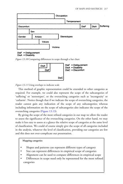
- Page 234 and 235: Figure 13.13 Adjusting scope of mos
- Page 236 and 237: Figure 13.17 Comparing strength of
- Page 238 and 239: Figure 13.20 Identifying positive a
- Page 240 and 241: OF MAPS AND MATRICES 225 undercurre
- Page 242 and 243: Chapter 14 Corroborating evidence
- Page 244 and 245: CORROBORATING EVIDENCE 229 There is
- Page 246 and 247: CORROBORATING EVIDENCE 231 describe
- Page 248 and 249: CORROBORATING EVIDENCE 233 of these
- Page 250 and 251: Figure 14.1 Concurrence between cat
- Page 252 and 253: CORROBORATING EVIDENCE 237 possibil
- Page 254 and 255: CORROBORATING EVIDENCE 239 that the
- Page 256 and 257: CORROBORATING EVIDENCE 241 seductiv
- Page 258 and 259: CORROBORATING EVIDENCE 243 research
- Page 260 and 261: Chapter 15 Producing an account ‘
- Page 262 and 263: PRODUCING AN ACCOUNT 247 An analysi
- Page 264 and 265: Figure 15.2 The whole is greater th
- Page 266 and 267: Figure 15.3 Tree diagrams represent
- Page 268 and 269: PRODUCING AN ACCOUNT 253 associatio
- Page 270 and 271: worrying unduly about the connectio
- Page 272 and 273: Figure 15.5 Different writing strat
- Page 274 and 275: PRODUCING AN ACCOUNT 259 the vibrat
- Page 276 and 277: Figure 15.7 Procedures for assignin
- Page 278 and 279: PRODUCING AN ACCOUNT 263 consistent
- Page 280 and 281: Table 15.1 Databits assigned to cat
- Page 282 and 283:
Table 15.3 Distribution of response
- Page 284 and 285:
PRODUCING AN ACCOUNT 269 To be subj
- Page 286 and 287:
PRODUCING AN ACCOUNT 271 analysts t
- Page 288 and 289:
Figure 16.3 Analysis as an iterativ
- Page 290 and 291:
CONCLUSION 275 empirical analysis o
- Page 292 and 293:
Appendix 1 ‘If the Impressionists
- Page 294 and 295:
APPENDIX 1 279 though it had been o
- Page 296 and 297:
Appendix 2 Software The reader look
- Page 298 and 299:
Glossary Associating categories the
- Page 300 and 301:
References Allen, Woody (1978) ‘I
- Page 302 and 303:
REFERENCES 287 Sperber, Dan and Wil
- Page 304 and 305:
Capra, F. 29, 64, 99 case studies 1
- Page 306 and 307:
Galtung, J. 14 Geer, B. 7, 8, 29, 5
- Page 308 and 309:
connections; description qualitativ